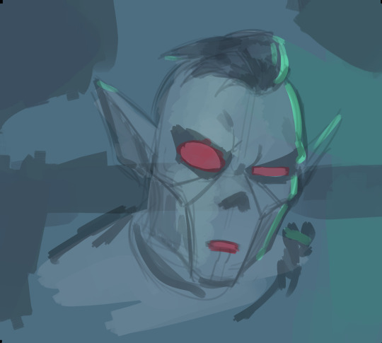
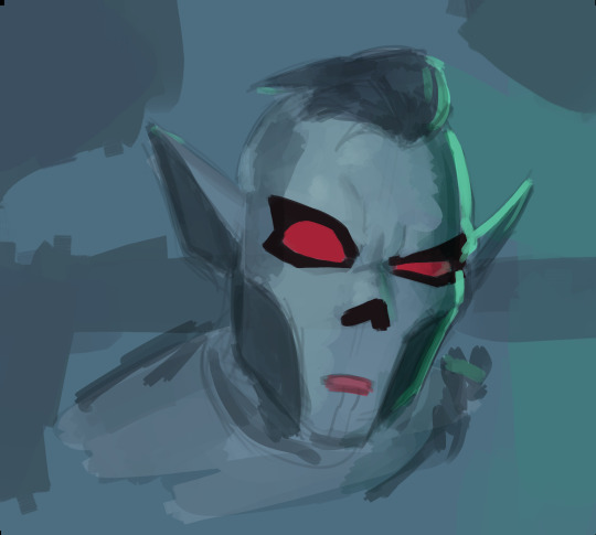
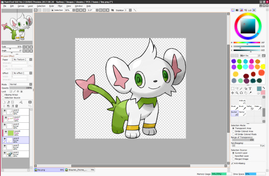
#yall get a base color and then a shading and a highlight
Text
Help, I love him
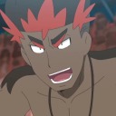
#fhr ortega#fhr Ricardo Ortega#fhr charge#fallen hero: retribution#fallen hero#I’m allergic to using more than three colors per thing#yall get a base color and then a shading and a highlight#AND THATS IT
100 notes
·
View notes
Text
EMERGENCY COMMISSIONS
(Please, if you can’t financially help me, at least reblog this. It’s just a reblog)
Ok people since im tired im gonna (try) do emergency commissions because im broke im gay and i live in the least encouraging and supportive household ever. For people telling me to get a job dont worry hun ive a got one but try getting your tattooing license one month before covid hit and then trying to find clients during the worst time for networking ever. And in a country where the tattooing apprenticeship doesnt exist. Also try doing that while living with parents that don't believe in you and literally think you don't want to do anything in life and you'll amount to shit! So yeah ive gotta skedaddle because if I dont do it fast then im not totally sure im gonna survive this the third year in a row!!! Im literally not gonna! Yay!
Anyway let's start being serious. First off I'm gonna say if you can't commission me, consider making a small donation on my kofi page. Thank you.
The commission pricing is
15€ black and white (linework/etching shading or minimal shading) 20€ flat coloring (no rendering basically, no shading/highlights) 30€ complete rendering with shading highlights a background ecc it goes 5€ up every two hours of work and first two hours are included in base price.
I only accept paypal payments and to commission me you can either dm me here on tumblr or request it through this form
I can do this style for The Beloveds (also b&w) :

And if you dont want pynch I can draw literally whatever character from the trc/cdth verse I can even draw Monmouth or Fox Way or The Barns literally WHATEVER you want. If you dont want fanart at all then you must know I like doing pet portraits or portraits in general like these bad boys n gals:


If yall want to see more stuff I like doing style-wise and my more illustrative pieces head over on my instagram you're sure to like something on it.
Again thank you to everyone who will at least reblog this you are a literal angel and I love you
#commissions open#emergency commissions#gofundme#pynch#pynch fanart#pynch commission#ronan lynch#adam parrish#trc#the raven cycle#cdth#adam x ronan#ronan x adam#tdt#trans artist#artist support#gay artist#lgbt gofundme#financial help#help#donations#kofi#kofi commissions#my art#transgender man#transgender gofundme#ftm#trans man#transgender
71 notes
·
View notes
Note
I would love to hear your thoughts on YJS3
sure! fair warning, though, I'm a ranty person by nature so this might end up being a bit long. sorry in advance ♡
anyway! things I liked:
the humor: s3 was pretty funny lmao, theres that whole collection of outta pocket scenes from throughout the season that I find hilarious each time + the humor was a little more dirty which is nice bc the audience has also grown up from the kids they might've been when they watched it on CN
dickbabs!: I'm not a huge fan of dickbabs, I prefer dickkory (no hate to dickbabs stans btw I just vibe more with dickkory) but this dynamic between the two of them was so sweet and well-balanced I couldnt help but squeal everytime they were on-screen
Clark and Conner getting along: them calling each other brothers was so CUTE I canttt
FORAGER: an absolute legend 10/10 freaking love him
That Episode With The Hallucination: mmmmmmm I miss wally. SO MUCH. and the og 6 I was Super Mad about the first timeskip so it was nice to see them all together again🥰
yeah that's about it for things I liked lmao. now time for the Much Longer list of Things I Hated:
HALO: young justice the bar was so fucking low how are you still successfully doing the limbo what the fuck. you take a muslim immigrant in what is VERY CLEARLY a hijab and 1. infantilize her to an exceptionally uncomfortable degree (I KNOW SHE WAS THE MOTHERBOX, I DONT CARE) to the point where she resembles a five-year-old with every sentence she speaks or action she takes 2. you made a visibly muslim girl claim that she's actually no longer muslim, she's just wearing the hijab as some kind of security blanket???? I'm sorry??? what the fuck were you aiming for here exactly 3. why did you have to name her violet harper. what. 4. really?? the immediate romance with brion? What the shit was up with that...you make her Muslim in some aspects like victor not seeing her hair when she brushes it but her LITERALLY making out with brion like I'm sorry what the fuck are you doing??? you had one muslim character and you fucked up so bad holy shit...like...it could've been simple as hell, man, but no...Big Yikes.
M'gann: I've said this before but I really feel like once they introduced artemis m'gann immediately became a side character whose only job is to be villainised again and again even though it doesn't really vibe with her character. Secret teams?? Lying to Conner??? This isn't s3 but that whole thing with their breakup in s2...what the shit are they doing to M'gann, man. I loved her so much in s1, she's literally trying her best after having gone through so much and it's never fully explored...like we get half explanations every season but we're never shown half the shit that we were given for artemis. And by making her the Uncool Girlfriend at points it just looks like they're trying make her easy to hate like what the fuck. no. stop it
The Plot: too overcomplicated, too many characters. It's only season three, why are you introducing Apokolips already. Why are there so many characters?? what's with all the subplots yall were switching location cards every five minutes. And it's so convoluted...like...what was going on with Beast Boy and the monkey-god-doom-patrol-exposition stuff? I can't even remember if there were two granny goodnesses or just the one. All of those meta kids left over from the last season are a cute cast but like...I was so bored??? we know you can do well-written self-contained storylines a la s1, so hop to it, yeah?
THE ANIMATION: ok ok ok so. season 1 and two (one especially) had a very distinct feeling to them and that feeling was very late-2000s Cartoon Network Action Show - the base model for the males and females is the same (like Ben 10 Alien Force) the colors were not dynamic (stayed the same no matter the lighting, lots of cel shading, and generally were realistically colored in the sense that suspension of disbelief was not entirely necessary) CHEEKBONES, gritty textures and purple skies (Batman the Brave and the Bold). overall theres a certain Tone to the earlier seasons that spoke a lot to the animation capabilities of the studios at the time, as well as the general feel of the show. however, season three was a MAJOR downgrade in terms of animation. they made it both simpler and more complicated - they started using their DCAMU animation style which while it does give muscles to the women, adds too many unneeded shadows and a strange stiffness and dullness to every character. There are now extra lines and uncessesary shadows on the face of every character, and their eyes and facial features are almost identical. There's also less highlights, and the hairstyles are way too overcomplicated now to be appealing (see mgann and dick) - the hair is unspeakably dull and and the skin tones and hair colors are painful on the eyes. This isn't even taking into account the shitty backgrounds they've started using (AHEM AHEM ARTEMIS'S KITCHEN) because while the earlier seasons may have had unappealing, mostly empty settings, the characters still fit in to the scene, unlike now.
the lack of sisterhood????: apparently, only artemis goes to see zatanna for her Dr. Fate appointments. Apparently, M'gann barely talks to Artemis after the very tragic apparent death of Wally. the two of them, dare I say even the THREE of them, should be close as hell considering they spent their early years super-heroing together on a team full of boys. M'gann LITERALLY called Artemis her sister in the SAME EPISODE she was introduced, and neither of them had any real girlfriends other than each other at this point. M'gann who fell apart so hard Artemis died in her head that she almost killed them all in her grief. Like. You're telling me, you're SHOWING me that these two aren't each other's support system? Where is the sisterhood, bitch????
Lastly: the costume design. I understand that they're constrained by the need to make it simple enough to animate, but COME ON. if you're going to borrow Diana's DCAMU/JL: War costume, at least keep the metal silver. What the fuck is that green-gold. And Tigress? god DAMN that mask is ugly. Cassie looks like she robbed a goddamn supermarket discount clothing aisle for her outfit. Why is bart's outfit Like That it's so ugly it makes me want to cry. @ young justice costume designers Please Rethink Your Decisions
that's about all I can think of right now. it got REALLY negative whoops, but theres just so much I didn't like about this season :/ hopefully the next one will better ;-;
30 notes
·
View notes
Photo

Eyy a step by step painting process for yall. I’ve seen a lot of new beginners when it comes to painting lately and that makes me really happy too see bcs its a really useful technique. My english isnt the best so if anything is unclear dont be afraid to ask.
Lets start with the tools you’ll need. Ofc the color wheel (or whatever shape its in the program you’re using), a textured brush or one who’s opacity is controlled by pen pressure, and the color picking tool/color selector tool. I recommend having a button for the last one bcs its gonna be used a lot.
Normally I use a textured brush, but for this one I went with a hard square one to make it more clear how I work. Its one of the default brushes in krita.


First, make a quick sketch, dont put too much detail into it bcs its all gonna be painted over eventually anyway. If you’re someone who have a bad habit of putting too much detail into the sketch, use a thicker brush. That way you wont be able to spend too much time on it.
Next lower the opacity of the sketch and throw on some colors on a new layer. Keep the colors muted, we’re gonna be building them up as we go. At this point its also good to leave the mindset of cell shading at the door. The base colors, light, shading, its all the same step. I honestly recommend painting on one layer to not start separating them, but its not a requirement.
Having a background is very helpful when painting, even if its just one color. It helps keeping the colors balanced and its easier to see if you are using too saturated or too bright colors.
Make sure the brush you’re using is somewhat big. Let it get smaller and smaller though the entire process. You wanna save the smaller details towards the end. Treat the picture as clay.
Now the fun begins! Start building up the colors and three dimentionality as you go. A good thing to keep in mind is that a surface that is facing away from you is gonna be darker than the surface facing you. This isnt always super visible depending on where the light comes from, but take any cylindrical object (ex: toilet paper roll) and really look at it and you will see it.

If two light sources meet, add a a dark border to separate them. Now is also the time to start adding more colors. Dont go full out with them, let them build up through the process. I usually use layer effects to help with the building process, but dont rely too much on it. Remember: this is painting, not cell shading.

Keep building up the piece with a larger brush until you get to a point where you feel like no more can be done. Now its time to start cleaning the edges and add the details.
I usually end up adding some more highlights at this point. Remember that light bounces. If you look at the hair you can see that the colors of the forehead have been reflected onto it.

And then the very last step, throw on some layer effects. I went with an overlay with blue and green splotches and a big splotch with a blue luminosity layer in the middle. Ofc you can keep going and making it look even cleaner than this but its not a requirement, whenever you feels its done its done. If you use a textured brush the edges between light and shadows wont be as visible as in this pic.
Now go my children! Paint! Experiment! And use references!
504 notes
·
View notes
Text
rating mankai company based on character design
Note: I will take into account hair, color scheme, sprite poses, mostly outfits that are not from plays or scouts, and memorability. This is half an objective view and half my personal opinion.
Disclaimer: I curse a lot for comedic effort. I am mean because I am funny. No, you cannot disagree.
Spring 🌸
sakuya: you get what you see. a literal spring babey. his hair and color scheme’s a little generic, but he’s mankai’s poster boy, so that’s understandable. speaking of generic, his main pose is just this emoji 🧍♂️ his outfits tend to be kinda basic, but any outfit with a mostly pink top gets him bonus points. 6/10
masumi: okay his hair is elite. probably one of the most memorable character design aspects among the cast. his mole and eyes also make him very pretty. love my boy’s dark color scheme. unfortunately, points must be docked for baiting us with the emo fit, then as the story progresses, he starts dressing like the trust fund kid he is smh. 9/10
tsuzuru: i love you tsuzu but. my mans is so basic. if he didn’t have such a great personality, he’d be as bland as untoasted white bread. the saya of a3. his best design aspect is the fact that he doesn’t dye his roots. his outfits look comfy, but not necessarily eye-catching. 4/10
itaru: everyone who starts a3! with no knowledge of these characters has one (1) thought about itaru. sec sea man. so obviously there’s something appealing/good about his character design. i think part of the appeal is his fuck-all demeanor. obviously, his eyes and hairstyle are attractive, but the way the artists draw him gives him an air of not caring, which is also attractive in a way. his dyed tips are also nice. he looks kinda lame when he dresses professionally, but his casual outfits hit. especially the ones with light pink. 8/10
citron: although i’m not a big fan of the “character is foreign and therefore must talk and dress different and be funny” trope in these types of media, his fashion does make him stand out from the other characters who tend to have more basic clothes. citron’s summer, travel, and autumn outfits SLAP and anyone who says otherwise has bad taste. his hair and eyes are interesting, but his overall color scheme can be a bit repetitive. 7/10
chikage: i hate this guy’s fucking bowlcut. fucking salad bowl lookin ass. every outfit is the same turtleneck and sneakers in two alternate colors. his outfits are so plain. only thing i like is his casual outfit glasses. HOWEVER. that’s the point. he’s supposed to look boring and blend in because he’s a spy. it’s a smart design, i just don’t like it so im docking points. stay mad about it. 5/10
Summer ☀️
tenma: im yawning. you think tsuzu was boring? this guy has orange hair and i still find his design boring. that’s how you know he’s basic. he’s got generic messy shounen protag hair. he could be from any property. if i drew fanart of him, people would ask where he’s from. he either dresses like your slightly homophobic frat boy classmate or a grandfather who gets his shit stolen by the asshole kids next door. 2/10
yuki: he has the r a n g e. all of yuki’s casual outfits hit. they’re all different, but cute in their own way. to no one’s surprise, one of the best styled characters. though i like his general color scheme, i’m personally not the biggest fan of his hairstyle. it’s okay, but a little plain at times. but i think it suits him well. 7/10
muku: i love him. muku’s design is what i love about this game. you see him, and you immediately know what his character archtype is supposed to be. he’s the soft, cute boy. and if this was a mediocre series, that’d be all muku is. but since this is a3, he’s so much more than that. he’s smart, passionate, sensitive to others’ feelings, and protective. a3 does a great job designing characters that look exactly like their archtype, but having a much more developed personality than that. getting back to the actual subject at hand, i love his hairstyle and color, as well as his outfits. you can never go wrong with light pink hair. i may be biased but fuck you. 10/10
misumi: another great memorable design. his eye shape and hair style are really unique. his outfits also elevate his design. street fashion is always a plus for me. though sumi’s design is special in the world of a3! where most of the characters are just. guys. regular lookin dudes. i think that outside of the game, his design would not be as unique. 8/10
kazunari: personally, im a fan. maybe it’s cause i have an affinity for blonde anime boys. but his hairstyle is pretty unique and his trendy looks set him apart from most characters, even outside this game. and he has a pretty lovable expression in his sprites. his fatal flaw is that his fits are either a hit or miss. they’re either really cute or wtf. at least he’s memorable. 8/10
kumon: i love that he reminds me of an owl. his hair and eyes are very cute and his color scheme is great. and i think they did a great job making him look related to juza, but still very much his own character. but he dresses like your classmate from middle school that looks like a nike-sponsored highlighter. yeah, he’s the sporty one, and i like the windbreakers but... i cannot excuse his summer fit. also, i find his design a little tame compared to some of the other characters in the game. 6/10
Autumn 🍂
banri: i hate his hair. i hate it so much. i know in canon it’s nice and he takes good care of it, but it looks so fucking greasy. the style makes him look so greasy and it makes me mad. he looks like an asshole. i mean, he is, so it fits. if this dumb bitch changed his hair more often, i’d like his design so much more. you saw this coming; his love for cheetah print is fucking repulsive. BUT, maybe unpopular opinion, minus the animal print, his sense of fashion is not bad. why do yall clown on it. if the fit is fresh, the fit is fresh. anyway, he looks like an ass, but objectively his design is kinda eh. 5/10
juza: im sorry im DEADLY fucking biased when it comes to juza, but he’s so handsome. his hair is a such a rich, pretty shade of purple and his eyes are so mesmerizing. his hairstyle is so attractive. his face is so pretty. yeah his design isn’t crazy unique, but the simplicity just works. im so sorry im this man’s whore i didn’t choose this life... but i can stop being a simp for one second to say that he has a boring fashion sense. i mean it’s kinda hot how simple his outfits are but his travel fit is good-- wait a minute i just remembered the fucking sandals. docking one point. 9/10
taichi: okay shut the fuck up i LOVE taichi’s design. so eye-catching and fun. as i’ve said i love street fashion, and taichi’s lil e-boy fits are right up my alley. that shade of bright red goes so well with his fashion sense, making a really cohesive design. with his main outfit, you can tell he purposely dresses like that to be trendy and it’s so smart. 10/10
omi: im sorry omi stans but his design is kinda,, boring. i legit had such a hard time identifying him when i first got into this game. the scar saves it a bit. but... only a bit. he’s just got. hair. and a dad outfit. i mean his tits are huge, but i don’t think i can call that a character design aspect. kinda forgettable design. i don’t dislike it though, so he ranks higher than tenma did. 3/10
sakyo: im not sure why but i really like sakyo’s design?? the contrast of his light hair and his dark clothes is nice. also, megane rights. even when i thought he was an npc during my first playthrough, i really dug his design and thought he was memorable. i actually cannot pinpoint a reason why. i wish i had more constructive things to say... but upon thinking about it, he has a karen haircut, which kinda dampers my thoughts on his design. i like his moles, but i honestly did not notice them until the game pointed them out. 7/10
azami: azami has a damn good design. i don’t think anyone can deny that. the long hair, the contrast of black hair and bright blue eyes, his eye shape. all very eye-catching design aspects. and the street fashion style strikes again. the color scheme matches well with everything. this review is lame, but there’s really only good things i can say about his design so. 10/10
Winter ❄️
tsumugi: it’s so late and im so tired of looking at these sprites. anyway, tsumugi’s design is okay. i think his color scheme’s a bit limited and his outfits are a bit meh. he has a more respectable bowlcut than chikage, but it’s still a bowlcut and it’s still boring. i think the best part of his design is his eyes, they’re very soft and kind. but other than that, tsumugi looks pretty basic. 5/10
tasuku: tbh, i didn’t even realize that the godza member tasuku was the same character as the winter troupe guy in the game’s opening until the middle of episode 3... yeah. im slow. ooooooor... tasuku has the worst fucking design in the game. yeah i said it. come at me, but tasuku’s design fucking sucks. i literally thought he was a minor character until they forced me to realize he wasn’t. his fashion sense is... questionable at best. i look at that man’s hair and think he doesn’t shampoo. he looks so bland i could dry up from looking at him. im sorry but his tits do not make up for the sheer fucking snorefest of his character design. he’s so boring i won’t elaborate anymore. 1/10
hisoka: ya get what ya see part 2. i like that i can tell he’s the sleepy and mysterious character just by his design, but honestly, that’s a character trope im generally not a big fan of. so i wasn’t thrilled by hisoka’s design at first. but it’s effective. i like the hairstyle with the white hair, but i’m not too fond of his color scheme. his outfits look comfy and soft though. it makes sense, but it’s nothing too memorable if you compare him to characters outside the game. 5/10.
homare: ah, now this is a memorable character design. his hairstyle annoyed me in the beginning, but now i love it. it’s so unique and fun. and i like the purple. i also like his outfits. very classy. but honestly, most of his charisma lies in his face. i think that the pure eccentricity of the hairstyle is enough to put him in the top tier without considering any other element. you really could not find this design in any other media. fuck it. i don’t need to consider anything else. 9/10
azuma: i’ll be honest. im not a fan of long-haired anime men. especially the pretty, flirty types. i don’t know, i just don’t vibe with them. originally, i didn’t like azuma’s design, but now i do. i don’t know how, but i think it’s because azuma is just that powerful. his ponytail makes it more bearable for me and i like the way his bangs frame his face. he just has pretty eyes and face. unfortunately his color scheme is a little too repetitive for me and his casual outfits are a little boring. 6/10
guy: maybe it’s because he looks dead inside, but i love him. i don’t even know this character that well yet, but i think his deadass expression is great. the darker under-eyeline sets him apart from the other characters and i love how he dresses. i think his hair is kinda eh. i personally like it, but objectively, it’s meh. it’s a solid design, but ngl it’s nothing special when i really think about it. 6/10
#for legal reasons this is a joke#this entire post should be underlined with a /lh#i love them all very much im sorry for being mean#except for chikage he deserves it#long post#a3!#a3! act! addict! actors!#A3! Actor Training Game#mod tsuzu talks
63 notes
·
View notes
Text
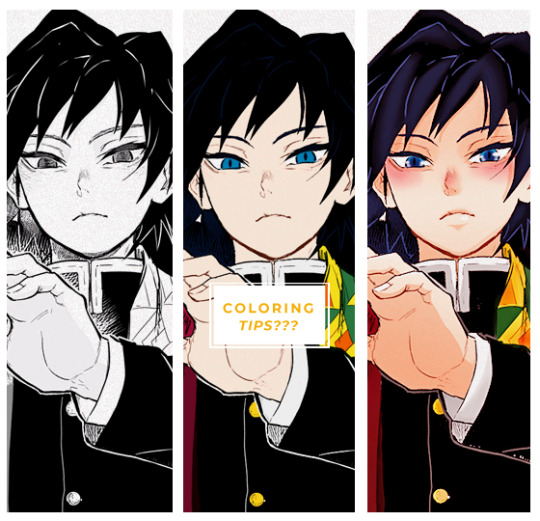
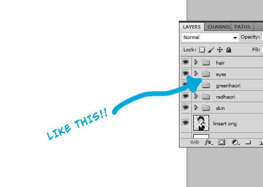
SAi edits tutorial
Hello youtube yall it’s my first tutorial on this blog so I wanted to show how I do my edits (asked to on the discord)
I’ll put it under a read more so it’s easier
1/ okay so first get your pic to edit (I get mine from pokepedia n often use waifu2x if it's too small)

2/ then I select the area I want (usually one color only) w the select tool w these settings n copy it on another layer

3/ then I go in filter>color adjustement>brightness and contrast and try to make it look white w/o getting rid of shadows n highlights
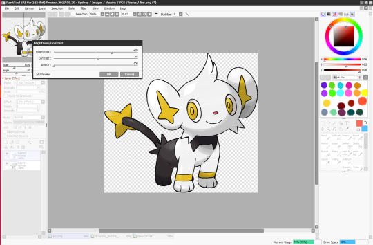
4/ rinse and repeat until your entire subject is white for a clean base
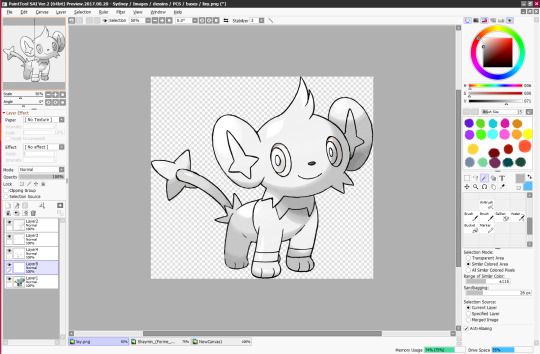
5/ Use another layer set to shade and clip it to easily color them. if you decide a layer need 2 different colors instead u can just use the brush rather than separate layers
Optional/ I added layers on overlay under the shade ones to give more colored shading and overall make the colors look better but it's not necessary

other stuff i didnt mention:
Sometimes I only use color mode layers for simple edits
I often need to use my tablets for small details (here the 2 shades of green in the eyes, correcting the lineart if I fucked up w the select tool etc..)
I actually use my tablet for everything in edits lmao
This is ofc my way of doing edits so you don’t have to follow this 100%, it’s just the easiest for me uwu
#edit tutorial#long post#pokemon#shay edit#i've already made the farquaad white meme in the discord u don't have to send asks#i'm 37 parallel universes ahead of you#also I'll post this edit later when i do the 2nd one
56 notes
·
View notes
Photo
Here are few tips to color manga panels. This is not a tutorial bc I’m a loser but I hope it helps someone in someway~
FIRST: You need to now the basics regarding cleaning manga, once you get your manga cap ready we can start.
1) I prefer to get ride of all the gray scales because this way your coloring look less messy. When you leave the grayscale the outcome isn’t bad per se but you can see it throught the coloring you know?

2) Once your manga cap is ready select your layer > go to channels > load channel as selection > supr
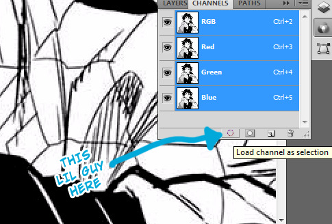
3) Duplicate your original layer, set the layer blend in multiply and then you can add your base colors between the orig layer and the duplicated one!
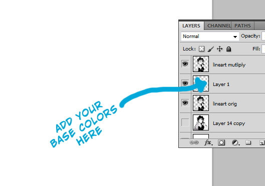
4) To make your workspace more friendly separate each color into groups and name them!
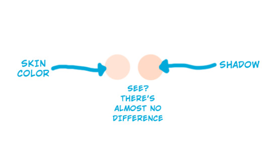
5) Once you’re done putting the base colors you can start adding shadows. I tend to choose a color slightly darker than the one I use for the base
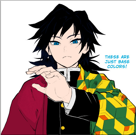
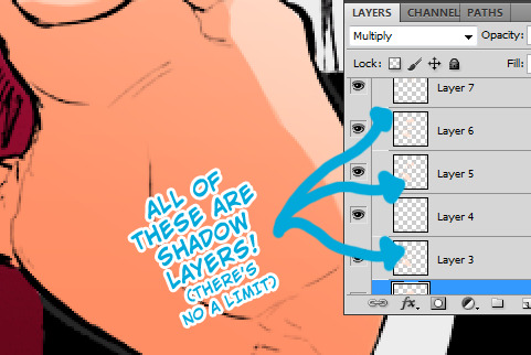
6) add a new layer > set it in multiply > add the shadows here. You can add as many shadow layers as you want.
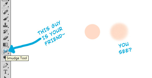
6) Smudge tool is your friend when woking with shadows, I use it a lot bc it helps to blend the colors / make your shadows look more smoth (or if you’re super lazy you can select your layer > filter > blur > gaussian blur)
A FEW NOTES
I put all the base colors before I start shading AND I don’t care about the amount of layers I use to add shadows
When it comes to add highlights I always add them when the shadows are done. Usually white > soft light blend mode
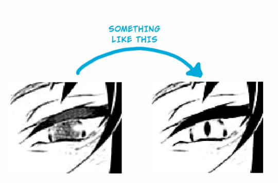
I redraw most of my manga caps bcs I don’t like sfx sounds, to redraw certain patterns/lines clone stamp tool is your fried.
When it comes to coloring eyes I usually redraw them again so I can color them properly:
here’s a lil tutorial on how coloring eyes:
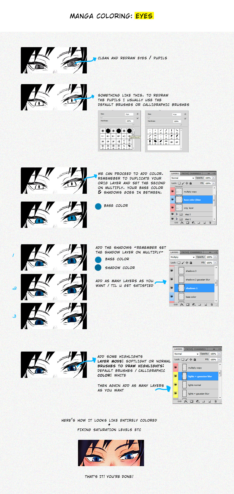
Once your entire coloring is done you can start to play with saturation, levels, curves etc. I tend to do this procces in a new document, to do it so I save the colored page as png and then I open it again to add some effects/textures/etc.
I can’t think in anything else to add, so if yall wanna know something and I can help just let me know and I’ll add here asap~
#I'm sorry if this isn't /that/ helpful tbh#these are just basics but if it helps someone then GOOD.#bc as i said im a loser who is still improving#but i repeat if you wanna know something specific just reply here and i'll try to add it~#gfx asks
468 notes
·
View notes
Note
HEY I JUST LOOKED AT YOUR INSTA YOUR COSPLAYS ARE SO GOOD!!!! I LOVE THE MAKEUP YOU DO IT'S SO SO PRETTY!! I just started actually caring about makeup for my own cosplays, do you have any tips specifically for eyes?? it's just so good gshsdg I really want to eyes like yours you look great!!
ASDSGJD THANK YOU
I don’t know how much you already know about makeup, so I’ll just go through the stuff I feel are the most useful!
I went WILD and added practically my whole eyemakeup bible under the cut pfft
1. Always use eyeshadow primer! It makes the eyeshadow more pigmented, longer lasting and prevents creasing.
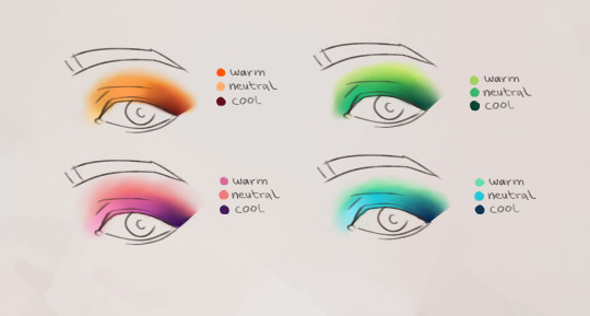
2. The handy little formula pictured below always works no matter what look you’re going for! Bright, shimmery shades for the areas you want to highlight and dark, matte shades for the places you want to deepen. This example is good for sexy, “mature” looks (lmao) cause it elongates the eye.
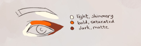
With more cutesy looks you want to make the eyes appear bigger, which you can do by making the wing shorter and bringing the shadow down a bit below your lashline.

3. Cut crease! In more dramatic or dark looks, your eyes can easily get lost in the eyeshadow. To make them pop without loosing the mood, use some kind of light tacky formula (I use foundation) and paint a sharp line tracing your crease and then apply a bright color on top. This really carves out your eye making it more defined!

4. Warm and cool colors! The more hues you layer the prettier it’ll look, especially if you let the gradient flow from warm to cool tones. I mentioned this in an earlier post but here are some examples:
5. I know eyeliner is a bitch for most people (I’m still struggling, and I’ve done my eyeliner for like 8 years), so here are two Hot Tips:
It’s ok for your eyeliner to look a lil wack when your eyes are closed. The folds of the eyes are different from person to person, and a lot of the time your eyelid shape can wreck your whole business. I do this:
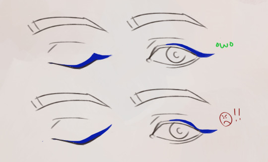
Instead of drawing it on smooth I put a sharp spike right where my eyelid ends, that way when I open my eyes the line looks even instead of disappearing into my crease. This is different for all eyes and it’s all about getting to know your own face and experimenting!
Another thing I’d recommend is to always fill in your upper waterline. If you’re cosplaying with full facepaint, darkening your lashline is extra important. So for a male troll for an example, I’d wear mascara + a thin smudged line of eyeliner + filled in waterline. That way your facepaint will look more natural, instead of like you got hit in the face with a bag of grey flour lmao

Some people fill in their bottom waterline with white, which works well for anime looks! I personally never do it though, cause white eyeshadow pens tend to irritate my eyes.
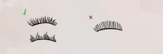
6. My last tip is to wear false eyelashes. They take a while to get the hang on, but they make such a huge difference! Your eyelashes never show up when you’re wearing a lot of eyeshadow, especially not on photos. Here are some basic tips:
- Always buy natural and messy lashes or lashes with a pattern. Lashes that are perfectly spaced make no difference and just cover up your eyeshadow.
- Try to find ones that have shorter hairs towards the inner corner of the eye and longer at the edges. When you place them on your eyes, leave some space in the corner, that makes the lashes more comfortable to wear and makes them look more natural!
- Always curl your real lashes and apply mascara before you put on your false lashes! Mine are flat and blonde, so they’d really stand out against my falsies if I didnt. If you have naturally black lashes you still need to curl them so that they follow the curve of the false lashes.
- Let the glue dry until its a little tacky and transparent, then place the lashes on your lashline with your fingers. Quickly, before the glue dries, put the edges in place with a tweezer and pull the base of the false lashes towards your lashline. Try to get the lashes as close to your real lashes as possible.
To wrap up: These tips are all very specific, but just like all art makeup is about exploring and being creative! Every face is unique and even slight differences in technique can completely transform a look, so make sure to try a lot of dumb shit and see what happens!
If yall want me to explain my process when it comes to facepaint or crafting or smth, let me know! The one thing I really suck at is wigs, so if you guys have any tips for buying and styling those bastards then please send them my way :s
#makeup tutorial#cosplay tutorial#extracosplays#talking shenanigans#god this got so longggg#but yeah this is everything I've learned about eyemakeup the last 10yrs
252 notes
·
View notes
Note
Lollipop 🍭
Lollipop - favorite makeup products? ill just do one per step i think
primer - i dont really have one that has completely blown me away bc theyre fucking expensive and i‘m broke/cheap so i use a maybelline one for dewy foundations and a dewy sephora one for matte foundations since i have combo skin
eyebrows - yall im too lazy to do my eyebrows LMAO but i like benefit and ABH’s brow stuff
foundation - i like the maybelline dewy fitme foundation and the matte and poreless fitme (ive tried a bunch of high-end foundations like the born this way and kat von d’s lock it and didn’t like them much so i’ve decided to just stay with my drugstore ones i like most)
concealer - tarte shape tape, colourpop no filter, i also like to use maybelline fitme concealer as a base for eyeshadows
contour - i like the wet-n-wild contour palette in dulce de leche and kat von d’s shade and light palette is a classic
bronzer - physician’s formula’s butter bronzer is bomb and smells so good i also like marc jacob’s bronzers
highlight - colourpop’s highlighters in stole the show and flexetarian are bomb and any highlighter by OFRA
blush - ive been using the same tarte blush palette for years so yeah tarte blushes are bomb, very pigmented and last forever
eyeshadow - i got the colourpop zodiac palette which is very cute and i love the colors!! + ABH’s modern renaissance is a classic. I also love a couple of tarte’s eyeshadow palettes. as for individual eyeshadows, i like colourpop’s super shock shadows a lot. my favorite is get lucky
eyeliner - colourpop’s eyeliners for the water line, kat von d’s tattoo liner
mascara - urban decay’s perversion mascara!! + benefit’s bad gal lash and lancome’s monsieur big
lipstick - urban decay’s conspiracy, colourpop’s Cookie (idk if they have this anymore and ill be so sad if they dont bc im almost out), maybelline’s matte lipsticks are pretty good, colourpop’s ultra satin lips are also v good
setting spray - urban decay all nighter
1 note
·
View note
Text
My Makeup Go To’s/What I Use!
HEY HEYYYYY
I’ve always wanted to share my makeup go to’s in a blog of my own.... since I do have my own log.... why not hehehehe
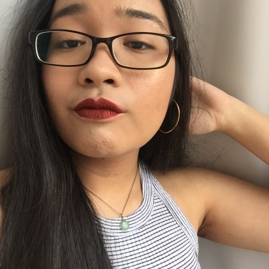
Just an fyi, I was never really into makeup UNTIL 2016. I would say it was mostly my mom who made me started wearing makeup. Like after I had prom in late 2015 I just thought why not? I only ever wore foundation and a nude lippie in early 2016 but only late 2016 and 2017 I’ve slowly progressed my makeup game!!!! Here’s a lil comparison below: the first is early 2016 and the second is like the middle of 2017,,

Me.... with some foundation... and barely any lipstick??? circa early 2016

Me now..... better foundation,,, highlight poppin and LIT LIPSTICK (and more stuff on my face too but due to sunlight you can’t see MUCH LOL) (keep reading there’s more)
I give creds to my uni friends too who helped me out with introducing stuff to me like contouring, using highlighters and shit like that. Without further or do let’s start!
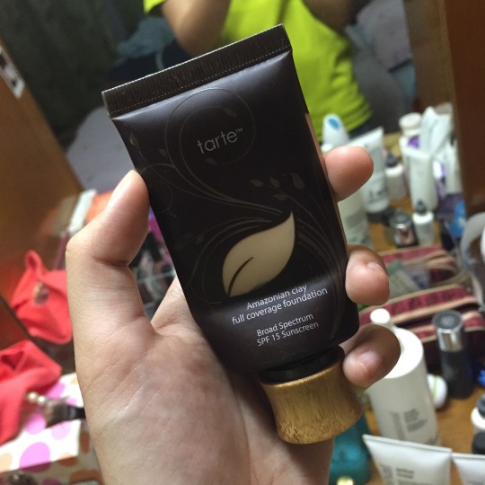
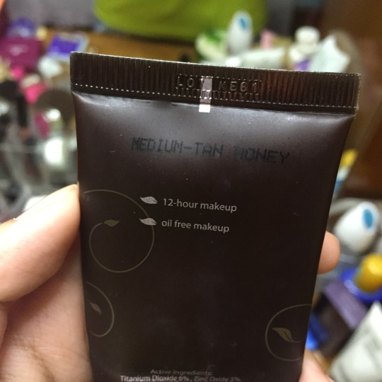
The foundation that REALLY worked for me is Tarte’s Amazonian Clay Full Coverage Foundation. Bought it from Sephora in Suria KLCC. It costs RM164 in Sephora and I got it in the shade Medium-Tan Honey. My past foundations made me look kind of blotchy-ish but I found this foundation and I just...... look somewhat natural lmao. Oil free and its true it lasts for 12 hours!!!! & has SPF15!!!!!! I go to uni with this foundation and I stay long hours there and yet my foundation is still presentable!!! Bitch!!!!!!! 10/10 product it’s worth it.
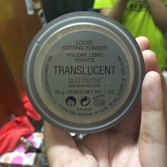
Next would be my Laura Mercier Loose Setting Powder!!! i got the translucent one. This one is a popular one and it’s usually sold out in most stores in Malaysia!!! That’s how GOOD it is! It really sets your face perfectly. Luckily my mom pre ordered ours at a Laura Mercier outlet.... in Pavillion Shopping Mall I presume. From the looks of it Laura Mercier is out of Sephora so no price there but I searched up its $38.

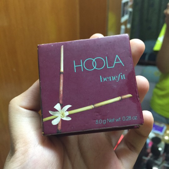
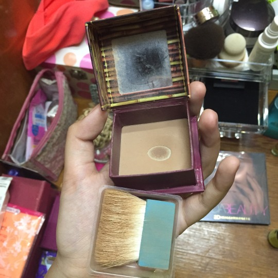
Next my contouring,,,, I use a bronzer jdskkjaskhj. I use Benefit’s Hoola Bronzer. Mom got this in Sephora. It fits most skin colors and personally like the color on me (pics at the end of this post). Its RM80 in Sephora.
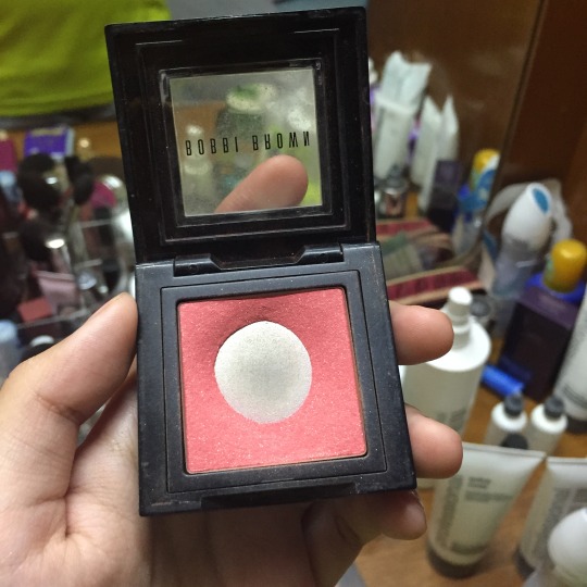
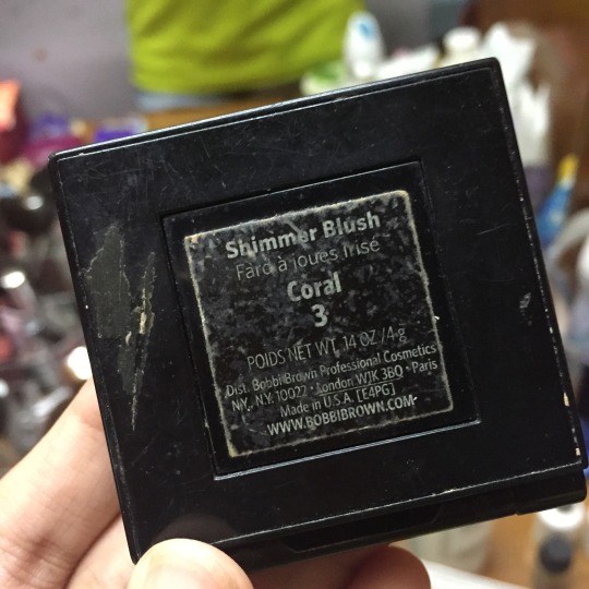
Next up is my very own blusher that I use since my mom doesn’t want it anymore! It’s the Bobbi Brown Shimmer Blush in Coral 3! Ya as you can see it looks pretty used up lmao but it’s a good color on me skin!! Its $30 and my mom most prob got it from a local Bobbi Brown outlet.

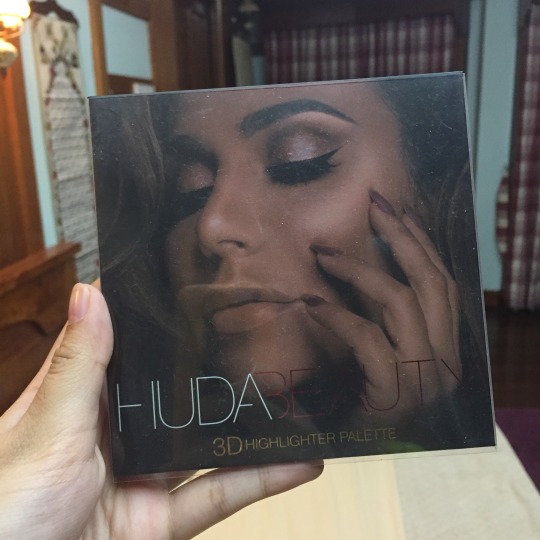
NOWWWW one of my few faves, is this amazing highlighter, ladies and gentlemen,,,, its the Huda Beauty 3D Highlighter Palette. Got this at Sephora while I was in Sydney since Australian Sephora outlets sell Huda Beauty products and it costs 80 AUD. Me and my mom always wanted to try to get ourselves a highlighter palette and we ended up finding this! The one we got is the Golden Sands version btw. The Golden Sands version fits for medium to dark skin tones while lighter skin tones fit the other palette which is the Pink Sands palette.
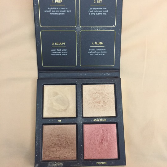
As you can see in the second pic, the first one (Fiji), is actually a creamy base and you’re supposed to dab it on your face for sculpting. The second (Seychelles) is a powder base which basically sets Fiji. Tahiti can be used for contouring but tbh I rarely use it since I got the Benefit one. The last one (Zanzibar) is a mix of pink + some gold blusher which really fits this golden sands theme. I wear this all the time when I have outings and I am so happy with the product. Highly recommended!
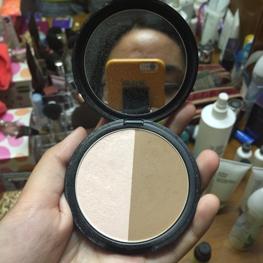
I also have another palette to highlight my nose and chin, which is the 3CE (3 Concept Eyes) Magic Touch Facemaker. Mom got it from a local Sephora outlet and costs RM61. It comes with 2 powders which are Gold Beige and Brown. There are 2 types, the other has Pink Gold instead of Gold Beige! The Brown can also be used for contouring but I mostly used the Gold Beige to sculpt my nose and chin.

Now other fave part, lipsticks! Or basically, liquid lipsticks lmao. Let’s get into it:
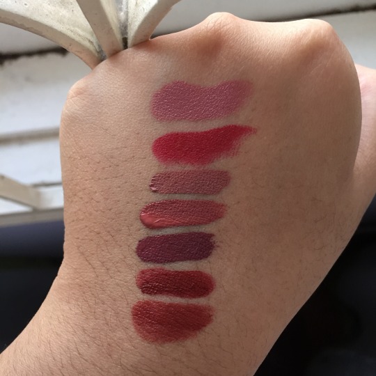
These the lippies I got (in early 2016, got more later tho lol) Only 2/3 shades are on this pic above are my go to’s/faves (Lolita II & #OBSESSED) which is (from top to bottom: Lolita II- 4th shade & #OBSESSED- 6th shade). I didn’t swatch Iconic sorry guys :((((
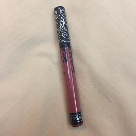
My most overused or my go-to lippie is the Kat Von D Everlasting Liquid Lipstick in Lolita II. Lolita II is described as a terra cotta nude! Bought it in Sephora Mid Valley (?) and costs RM99. I swear to god I almost regretted getting it even though I did like it when I first tried it in Sephora. It was just so bright for me,,,, probably because I’m so used to nudes that getting something like that is just... wild for me lol. However I started wearing it often and I realized how good I look in it, especially with my skin tone. Literally, everyone I know,,, are prob used to me wearing this lol. It’s quite matte unless you eat oily ass food then it might be a problem and you should bring the lipstick with you at all times. :x Either way, love the color and I too love the formula, so props for them!
Next is Huda Beauty’s Liquid Matte Lipstick in Icon. I initially had the normal one but we also got the same shade in a mini version. It came as a bundle with 3 other shades which are called Gossip Gurl, Trophy Wife & Socialite. All of them are shades of pink and the bundle is called The Pink Edition Liquid Matte Minis. We bought it from Sephora while we were in Sydney too and it costs 59 AUD per bundle.

I LOVE the color and I wear it on my good days but hoenestly it REALLY doesn’t last at all especially if you’re eating out. Once you eat something, a lot of the lipstick will be smudged off already. Once you use it you’ll realize how watery it is from typical liquid lipsticks. I know we should highlight the liquid part but still.... too liquid for me imo. Like it was so liquid to the point it dripped some on my leather MK bag..... tragic. I think that’s something that Huda Beauty should work on BUT HOWEVER I LOVE THE SHADE WHATSOEVER AND I’LL STILL WEAR IT EVEN THOUGH ITS QUALITY AIN’T SOOOO GREAT. But of course, that’s just my opinion.
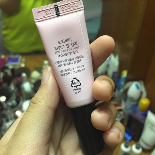
THE LAST WOOOO, is a new fave actually. I’ve owned this for a while but I only used it recently and I LOVED IT SOOOOO MUCH. It’s the 3CE Liquid Lip Color in #OBSESSED. It’s a dark red shade basically. Bought it at Stylenanda in Gangnam I presume while I was in Seoul and it costs 18 USD. Click here to read up my adventures in Seoul in Day 1 hehhehehehehe.

Before I end this, here are some looks I’ve made with all the products above!

YALL probably wonder why I didnt show any eyeshadow palette’s nor even a liner,,,, its bcs I haven’t exactly mastered it... yeah dont laugh pls....
I ONLY JUST LEARNT HOW TO HIGHLIGHT NOT LONG AGO BFHFDFJDS
So like...... if I ever get to learn,,, I’ll probs post abt the products soon... idk when.. .but sooon
THANK YOU SO MUCH READING THIS POST AND THIS BLOG LOL I TOTES APPRECIATE IT BEAR WITH MY WRITING IM TRYING MY BEST TO DO BETTER OK HSJHSGFHJSH
For now, goodbye! I plan to maybe make a post about movies or if I’m rajin enough.... do day 3 of seoul lols,,, ciao!
#tarte#laura mercier#benefit cosmetics#bobbi brown cosmetics#huda beauty#makeup#highlighters#contouring#blusher#foundation#3ce#kat von d#liquid lipstick
0 notes
Last Seen Blogs
tatooinetourism
not okay, but in a fun way
isssaaev
isssaaev
sinqueen69
SinQueen69
kiawenoie
kiawenoie2020
sprytesukii
EVERYONE ADORES YOU.