#I may have posted these before but now they have the logo!
Text


Mew Suppasit and Tul Pakorn | Leisure Projects x Sunne
#mewtul#mew suppasit#tul pakorn#thai actors#I may have posted these before but now they have the logo!
9 notes
·
View notes
Text
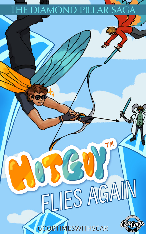
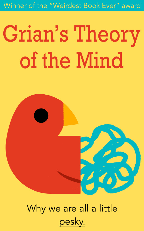
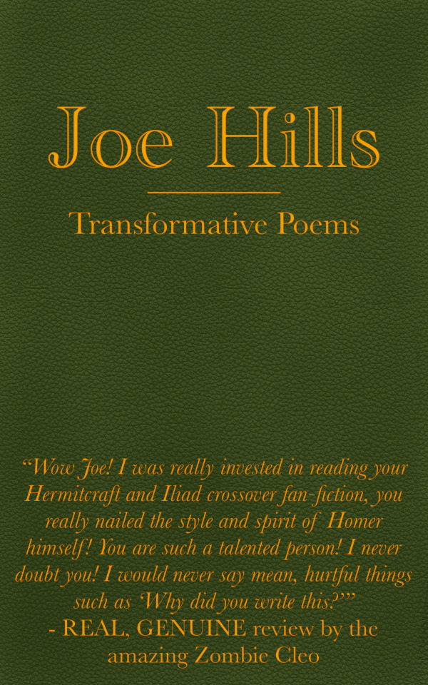
fake book covers based on Cub’s museum gift shop and the signs he posted with fake book titles! This was a lot of fun haha. I know there are more fake books, and now he’s getting signed books from hermits, so I plan on making more soon! May even make a Reddit account just to post these guys on the subreddit
design notes under cut!
The Diamond Pillar Saga: Hotguy(TM) Flies Again - this title evoked such a visceral image of something you’d find in a Scholastic book fair so I went for sort of pre-teen superhero action novel, the kind with a bunch of pictures and stupid chapter titles. I imagine in-universe Scar is trying to sell as much Hotguy merch as possible so whilst he has stuff for the adults (shirtless calendars) he’d also have comic books and novels for the kids. There’s a concorp logo because I like to think the Hotguy brand is owned by concorp and it was just a cool touch
Grian’s Theory of The Mind - have you ever seen books on like psychology and breaking habits and behaviour, that kind of stuff? They always look like this. There’s a yellow background, a simple abstract design, a bunch of book awards/reviews, and a single sentence hook. This one was the easiest and most fun to design!
Joe Hills: Transformative Poems - this was based on the “Joe Hills Poetry Corner”. Transformative poems is from “transformative works” meaning… fanfiction basically. Joe has written fanfic before and I thought an Iliad/Hermit crossover would be something he’d do. Joe made the cover himself so it has a dyed leather cover and a simple design. He tried to ask Cleo for a review so he could put one on the front but she was kinda mean about it and laughed at him so he wrote a fake one instead
Ren the King: A Complicated Legacy - this one had no explicit author but I decided Cleo made the most logical sense. Historical non-fiction books often have these B+W photo backgrounds with some dramatic, fancy text overtop, so I painted the Crastle and added then messed around with text. There’s a reduced sticker over Cleo’s name because this is Cub’s gift shop and he wouldn’t want to give her credit (but still wants to stock up his shop)
#posting this on the alt since this isn’t really my normal art#locus fandom time#hermitcraft#hermitblr#gtws#gtwscar#goodtimeswithscar#grian#Hotguy#crastle#Joe hills#hermitcraft fanart#book cover#book design#art#artists on tumblr#hermitcraft s9#fanart#locus art time
3K notes
·
View notes
Text

My Gender is [NOT] Human Zine is Now Accepting Submissions!
Xenogender: A gender that cannot be contained by human understandings of gender; more concerned with crafting other methods of gender categorization and hierarchy such as those relating to animals, plants, or other creatures/things.
This zine will be a collection of artwork, writing and more created by alterhumans and nonhumans to express both their species identity, gender, and how they intersect. While this zine will have an xenogender slant, everyone who has something to share about how their species and gender overlap are encouraged to submit pieces! Similarly, if you are currently questioning, you are still welcome to participate. Anonymous submissions are accepted.
What Can I Submit?
Both fiction and nonfiction pieces are accepted. As long as what you have in mind fits the theme, it’ll probably be a-ok.
Off the top of our head, we’re thinking of:
Essays of your personal experiences
Short stories
Poetry
Advice columns
Artwork
Fictional advertisements
Comics
Mock interviews
This is far from an exhaustive list, we welcome you to think outside the box!
How to Participate
Please email your completed submission to ruffledgryphon(@)gmail(.)com and title the email “My Gender is Not Human Zine Submission.” Also make sure to include the following information in your email:
A name you would like the piece attributed to
Title of your submission
Any content warnings that you feel are necessary for the piece
Any social media handle or personal website you’d like listed in the contributor section
A logo or icon for the contributor section
**If you would like to stay anonymous please let us know
Members of systems are welcome to submit individually or collectively. Please let us know your preference when it comes to attribution.
Once the deadline has passed, the submissions will be crafted together into a single zine and it will be posted on our itch.io as a free PDF.
Submissions are due by May 1, 2024.
Our itch.io: https://ruffledgryphon.itch.io/
Submission Guidelines
Each individual may submit up to 3 works to be featured in My Gender is [NOT] Human. Comics and multi-image works count as one piece. Individuals within a system may each submit up to 3 works. All work must be your own! Anyone caught plagiarizing or submitting AI-generated work will be barred from entering My Gender is [NOT] Human and any future zines from us.
Written submissions should not exceed 30 pages and multi-part art entries should not exceed 10 pages. Please keep in mind the zine’s pages will be 8.5x11 and entries will be scaled accordingly to fit that size. We request all art submissions to be sent in either .jpg or .png file formats.
For stories that use multiple different fonts, we will do our best to preserve the general “feel” of your piece but cannot guarantee we will be able to use the exact fonts or sizes due to restrictions in what fonts we have access to, readability and overarching zine style.
Submissions must fit the thematic criteria of
About the intersection of gender and species identities
If you’re not sure if you count, feel free to reach out to us. However, we will be leaning on the side of “Yes! We’d love to hear from you!”
FAQ
Q: Where will the zine be hosted? What will it cost?
A: The zine will be hosted digitally on our itch.io and will be free to download. Our itch.io can be found here: https://ruffledgryphon.itch.io/
Q: Is there a cap on submissions?
A: There is none, as long as the file doesn’t start getting too big for our computer we’ll do our best! If there are an unprecedented amount of submissions, we may have to delay the release. In the event that happens, we would communicate that through updates on our tumblr.
Q: Can I update my application after it’s been submitted?
A: Yes you may, as long as that is communicated to us before the submission deadline.
Q: Can I rescind my submission?
A: Yes you may, as long as that is communicated to us before the submission deadline. This is because once we begin work on the zine, having to remove content mid-way through would throw off the formatting of everything else after. Please take this into account before submitting.
Q: Will this zine allow NSFW entries?
A: No, nothing 18+ will be accepted.
Q: What is your timeline for the project?
A: Our submission deadline is May 1, 2024. We are then planning to spend the next month compiling all of the entries. Our goal is to have the zine live by June 1, 2024. If something unforeseen happens and we are unable to make that deadline, we will post an update about it on our tumblr.
Q: I have another question!
A: Feel free to reach out to us at our email ruffledgryphon(@)gmail(.)com or here on tumblr with any other questions you have about the zine.
#My Gender is Not Human Zine#otherkin#therian#fictionkin#alterhuman#nonhuman#xenogender#nova squawks
313 notes
·
View notes
Text
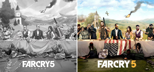
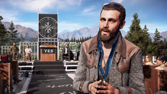
From the Inquisitor to the Baptist: The Evolution of John Seed

From the early stages of the development of a video game to the day it gets released, its gameplay, story, and characters usually go through many modifications. Far Cry 5 is no exception to this rule, and thanks to promotional images, trailers, interviews, official side material, and even deleted content still available in the game’s files, we can get a glimpse of what Hope County and its residents used to be like. John Seed, in particular, seems to have undergone quite a few alterations, both physical and moral.
In these posts, I will be listing and discussing all the changes I noticed in John and explaining why the man who used to be known as “The Inquisitor” isn’t identical to “The Baptist” we met in Far Cry 5.
All the sources and references indicated by the superscript numbers will be given in the last post.
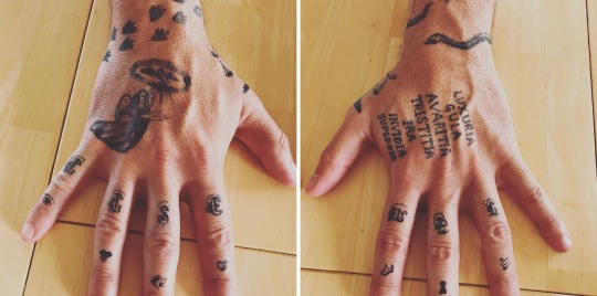
Part 1: Physical appearance, clothes, and tattoos (concept art, promotional content, and side material)
What seems to be the earliest portrait of the Seed family is a piece of concept art that Lead Graphic Production Artist Nick Arnett shared on Instagram¹:
As you can see, many things look different from what we are used to, from the Eden’s Gate cross (behind Joseph’s head) and logo (on the pulpit, with an eagle) to the Seed siblings’ outfits. The man on the right seems to be John, and he’s sporting a two-tone blue shirt that resembles the one he will end up wearing in the game, but he doesn’t have a vest. Instead of a belt, he has suspenders, and his pants and shoes look darker and more formal than his usual jeans and boots. He already has a beard and, while his hair is slicked back, as it is in the game, it’s a little longer. He doesn’t have any visible tattoos, but if you look closely, you’ll notice that he does have something on his hand: blood, running from his knuckles.
In May 2017, nine months before Far Cry 5 came out, the game was officially announced and a few promotional pictures were released, notably these two²:
But before that, we can see what John looked like at an even earlier stage of the game’s development, during the making of those two aforementioned pictures, thanks to early sketches and visuals shared by AmCo Studio³ and Fire Without Smoke⁴:
John’s iconic vest and sunglasses have appeared, and while his shirt became white, it’s now partially unbuttoned and the sleeves are rolled up, which is how he wears it in the game. As for his hair, it’s shorter than it was in the first family portrait and looks more similar to his final design. We still don’t see any tattoos on his arms, but he has a watch.
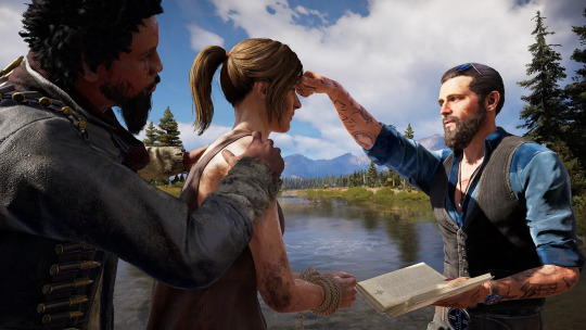
In the final version of what I would call the “Last-Supper-like” images, John looks even more like himself, but there are still a few differences:

Although they are not strictly identical to the ones he has in the game, he’s wearing sunglasses with blue lenses on his head. His shirt became blue again, his vest is striped, and he now has his “EG” (Eden’s Gate) earring and belt buckle, grey jeans, and bunker key around his neck. He’s also wearing a coat, but while, at first glance, it looks like the one we all know, the pattern isn’t the same; instead of planes, there are “EG” symbols on it. The buttons, however, are already golden and decorated with scales.
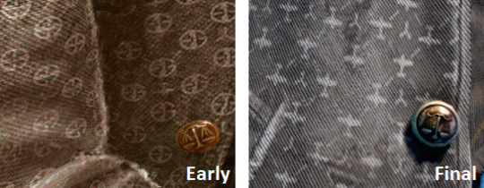
In the pictures, especially the first one, the siblings are associated with symbols: a crown for Joseph (on his jacket and napkin), a sword for Jacob (on his music box), a pair of scales for John (on his coat’s buttons and in the bread/cake), and intoxicating Bliss flowers for Faith, a reference to the Four Horsemen of the Apocalypse: Conquest, War, Famine, and Death, respectively, who. In John’s case, the scales could also be a nod to the fact he’s a lawyer. Indeed, scales are commonly used to symbolize justice.
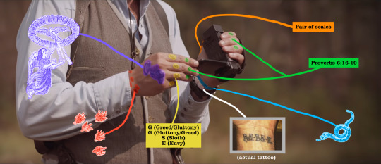
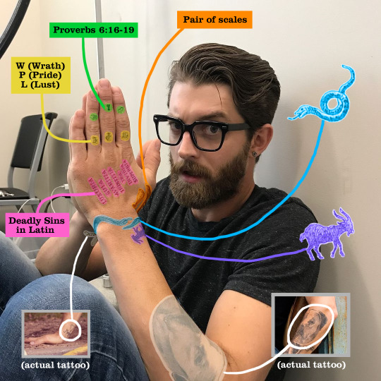
This time, he finally has tattoos, and while some of them are the ones he will have in Far Cry 5, others are different. He already has small symbols on his fingers: an eye, a tongue, a hand with a drop of blood on it, a heart, a foot, a keyhole, and waves. The meaning of these symbols used to be a mystery to me, but it turns out they were inspired by Bible verses, specifically Proverbs 6:16-19⁵:
There are six things the Lord hates, seven that are detestable to him: haughty eyes, a lying tongue, hands that shed innocent blood, a heart that devises wicked schemes, feet that are quick to rush into evil, a false witness who pours out lies and a person who stirs up conflict in the community.
The flames on his right wrist will be in the game as well, but here, they are smaller. This tattoo seems to have been taken directly from this illustration:
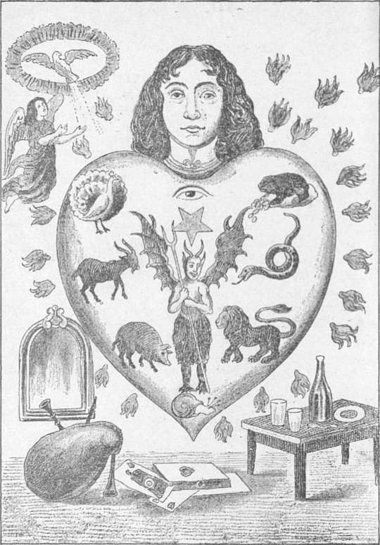
It’s from a French (Breton, to be precise) collection of “Taolennoù Ar Mission” (literally “mission paintings” in Breton) by François-Marie Balanant, who was a priest, and it depicts a human soul being afflicted by the seven deadly sins⁶. “Taolennoù” were created in Brittany in the sixteenth century by the Catholic clergy in an effort to make religion more accessible to the faithful, some of whom were illiterate, with the help of drawings.
This particular image can be found on the Wikipedia page dedicated to the seven deadly sins⁷, which seems to have been the primary source of information and inspiration for several of John’s tattoos.
Clearly, the angelic figure with the dove, on his right hand, also directly comes from the drawing (upper left corner). This tattoo will later be redesigned and decorate the inner face of his left forearm.
As explained on Wikipedia, there used to be eight mortal sins, and their Latin names were:
Gula (Gluttony)
Luxuria (Lust)
Avaritia (Greed)
Tristitia (Sorrow)
Ira (Wrath)
Acedia (Sloth)
Vanagloria (Vainglory)
Superbia (Pride)
Tristitia and Acedia would later be combined, as well as Vanagloria and Superbia.
In the two promotional pictures, John has seven of these sins (except Acedia) tattooed on his left hand, as he does in Far Cry 5.
John also has letters on his fingers, but while, in the game, they spell “E-D-E-N” and “G-A-T-E”, here, we see G, G, S, E, W, P, and L, most likely the first letter of each deadly sin in English.
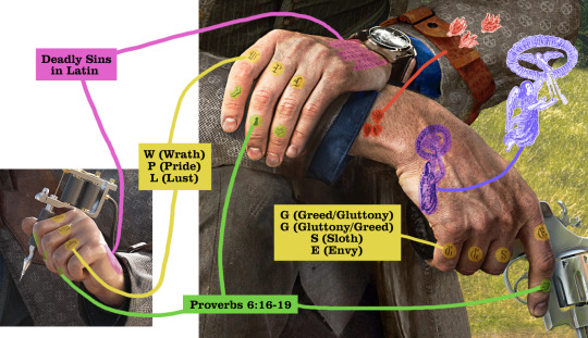
On his chest, instead of a scar and the mutilated word “SLOTH”, he has a tattoo. We see two crossed rifles, the number seven in tally marks (probably yet another reference to the deadly sins), what seems to be the words “Bros & Sis” above the design, and what probably is “Til Death” under it. It looks like an infantry tattoo, very similar to the example included below (center) by tattoo artist Garrett Tankersley, known as tat2garrett on Instagram⁸:

Finally, in one of the images, John is holding a tattoo machine. In the other, he’s holding a revolver. In the game, however, this weapon is nowhere to be seen.
Even though he will never use it in Far Cry 5, John was represented by this gun again on one of the game’s old official websites⁹:

At the time, as you can see, his title was also “The Inquisitor” instead of “The Baptist”.
On the PlayAsia blog, on a page dedicated to Far Cry 5, short information sheets about a few of the game’s characters were posted¹⁰. They look official, but since I have only ever seen them on this website, which was not created by Ubisoft, their origin and therefore the accuracy of the information they give are uncertain.
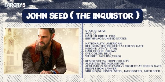
While most of what the picture says is either true (blue eyes, brown hair) or plausible (his height), John mathematically can’t be only 32 years old because he was already working as a lawyer about ten years before the events of the game, which is set in 2018. According to my research, it takes 7 years after graduating high school to become a licensed lawyer in the United States. In 2008, John couldn’t be younger than 18+7=25 years old, so it’s impossible for him to have been born after 1983. He could have skipped grades, but since this is never mentioned anywhere, I assume he didn’t and that he’s in fact older than 32 in Far Cry 5.
It’s possible, however, that he really was supposed to be 32 years old when the picture was made but that his backstory (and consequently his age) was then modified.
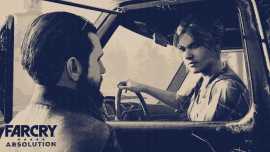
In the novel Far Cry Absolution, a few details are given about John’s appearance. For example, on page 6:
He was ten years older than [Mary May] and near six foot with brown hair and a beard that covered the lower half of his face.
Mary May is 29 (almost 30) in the novel, which makes John approximately 39 or 40 years old in the book. This age is more plausible, I think.
Then, on page 31:
John Seed, the younger brother of The Father, slighter in build, but cut from the same cloth. Both bearded and tattooed, and both with those all-seeing eyes that seemed to search through the dark with a kind of nocturnal prowess.
This isn’t the only time in the novel that John’s gaze is described as intense. The word “predatory” is even used on page 145.
Interestingly, and despite the fact it’s absent from Far Cry 5, the gun seen in his hand in one of the promotional pictures is mentioned in Absolution as well. It’s described as “a large revolver” on page 31 and as a “big magnum revolver” on page 57. He also uses a rifle “with a wood stock and bolt-action lever” (page 48) at one point, but this weapon isn’t in the game either.
Overall, aside from this detail, his physical description in the book is rather consistent with what we see in the game. And in this official picture posted in January 2018 to promote the book¹¹, he apparently looks the same as he does in Far Cry 5.
In the live-action short film Inside Eden’s Gate¹², Joseph is the only member of the Seed family who is played by the actor who also plays him in Far Cry 5, Greg Bryk. In the game, while John is played by Seamus Dever, in the movie, it’s another actor named Rob Evors who was cast in the role. His voice and face obviously don’t sound and look exactly like John’s, so these differences are not significant.
His outfit, however, has gone through several changes. I don’t know if the design was deliberately altered or if the clothes Rob Evors has in the film simply are the closest real-life equivalent to the ones John is wearing in the promotional pictures that the movie’s costume designers could get their hands on. Like in the development sketches for the “Last-Supper-like” images, his shirt is light-colored (but still blue, apparently) and he’s wearing his sunglasses normally, not on his head. They don’t seem to have blue lenses, but again, maybe the team could only find “regular” sunglasses. He has his Eden’s Gage belt buckle and earring, but instead of being grey, his coat, vest, pants, and shoes are brown/beige. The coat is decorated with “EG” logos, exactly like the one John is wearing in the promotional pictures, but lighter in color.
As for his tattoos, they are identical to the “old” ones we’ve seen so far, but two more are visible: the pair of scales on the side of his thumb and the snake (from the Taolennoù Ar Mission again, but uncoiled), which represents Envy, around his left wrist. These two new tattoos will be part of John’s final design in the game.
There’s another one between the snake and his watch, but it’s simply one of Rob Evors’¹³.
In the film, John’s tattoos were actually hand-painted¹⁴. Here’s a better look a them, from Makeup Artist Casey Lynn Stuckey’s Instagram account:
His sleeves are never rolled up in Inside Eden’s Gate, but it’s most likely because that would have meant covering up the actor’s actual tattoos and possibly painting more, so I suppose they thought it was more convenient to just hide them.
The last notable change regarding John’s appearance in the short film is that, for the first and seemingly only time, he’s wearing a shoulder holster, but his gun is not the revolver we’ve seen for far. Instead, it looks like a semi-automatic pistol, maybe a 1911. Since, in Inside Eden’s Gate, Joseph also has this type of gun and not the revolver he carries in Far Cry 5 (albeit rarely, and he never uses it), it’s possible that, once again, the team couldn’t find the right weapons for the movie and used the available props.
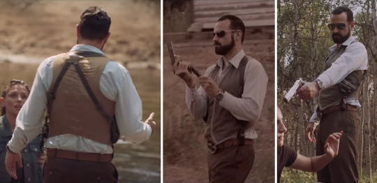
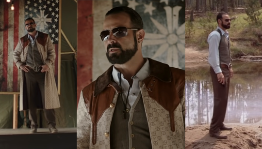
In the live-action TV spot “Anything Can Happen, Everything Will”¹⁵, John is this time played by model and actor Jon Oswald, who jokingly described the character as “the asshole in the Gucci trench coat” when he shared the video on his Instagram account¹⁶.
John’s outfit looks identical to Rob Evors’ in Inside Eden’s Gate (except the shoes and the holster, it seems), so it’s likely that they just reused the same clothes. Like in the film, John’s sunglasses (which are not blue) aren’t on his head; he’s wearing them. His hair is a bit different, but it’s probably simply because Jon Oswald’s hairstyle looked close enough to John’s and they thought it didn’t need to be modified, so I don’t think this “change” is significant.
Thanks to the pictures that Mackenzie Lawrén Johnson (better known as Kenz Lawrén), who plays Faith Seed in the short film and the TV spot, posted on Instagram¹⁷, we can have a better look at him and his tattoos.
They haven’t changed much compared to the previous ones, but we can now see a goat (a symbol for Lust, also directly from the Taolennoù Ar Mission) next to the snake on his left arm. In the game, the goat will disappear from his hand, be redesigned, and end up on his right forearm. We see two other tattoos in the picture, but they simply are Jon Oswald’s¹⁸.
In the image below, drawn by Anthony Winn, who made storyboards for the TV spot¹⁹, the character on the far right (who is not Joseph), wearing a vest and sunglasses, and standing next to a woman who is probably Faith, appears to be an early version of John. This time, he’s holding a rifle, different from the one described in Absolution, and not a handgun. For once, his sister is armed as well.
In The Book of Joseph²⁰, John, as a child, is described as “the best looking, the least odd” of the Seed brothers, which is why the narrator, Joseph himself, believes he was adopted first after they were sent to an orphanage. When they meet again as adults, Joseph says his younger brother is “strikingly handsome, elegant”, wears “tailored suits” and very expensive shoes, has gleaming hair, shiny teeth, and manicured hands. He also writes that, as John Duncan (the name of his adoptive parents), “physically, he was society’s very model of success”. Psychologically, however, it was another story… but this will be discussed later. Although the John Seed we meet in the game isn’t exactly the same person as John Duncan was anymore, he’s still “elegant” and seems to take care of his appearance. Joseph doesn’t mention tattoos, but it’s likely that John got them later, after the Project was created.
An official guide for Far Cry 5, by Prima Games, was released alongside it. In the book, which was written in 2017, we get to see what John looked like when the game was still in development.
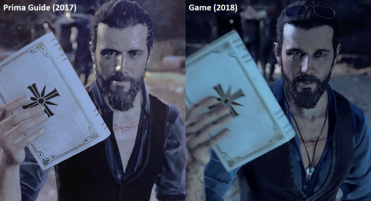
This design is very close to the final one, but for some reason, his sunglasses, bunker key, earring, and tattoos are all (temporarily) gone. However, the “SLOTH” scar has now appeared on his chest instead of the tattoo he previously had, even though it’s a bit closer to his collarbone than it will be in the game. His outfit and facial features look slightly different, but this is also true for many other characters in the guide.
On IGN’s YouTube channel, a video titled “Far Cry 5: Why John Seed Is Your Charmingly Deadly Enemy” was uploaded in February 2018²¹. In it, we get a glimpse of an early version of the “You have been Marked” TV broadcast²², and although the setting looks different, John’s appearance is very close to his final one.

By the way, if you look at the noticeboard behind the TV, you’ll see that the Testicle Festival was supposed to take place in 2017 instead of 2018. When this early in-game footage was recorded, Far Cry 5 was probably still scheduled to come out in September 2017 (which is what the first rumors said and could also explain why all the calendars in the game suggest we are in September).
In the thumbnail of the YouTube video, John looks exactly like himself:
He does too in the “Four Horsemen of the Apocalypse” artwork²³, this promotional screenshot²⁴, and this poster²⁵:

And in a trailer posted by Ubisoft three weeks before the release of Far Cry 5, a “character spotlight”²⁶, John has his final design as well. The only difference is that, although the game was about to come out, they still called him “The Inquisitor” instead of “The Baptist”.
Then, on March 27, 2018, Far Cry 5 was released.
To be continued…
#far cry 5#john seed#joseph seed#jacob seed#faith seed#far cry absolution#mary may fairgrave#the book of joseph#inside eden’s gate#rob evors#jon oswald
254 notes
·
View notes
Text
ASK KASPER AND LAMPERT FROM REVERSAL ANYTHING YOU’D LIKE!
The rules, regulations and information for this ask blog are listed below.

above is the logo for this AU. Ask before using!
A bit of background before we get into rules and all of that,
This ask blog is for the Reversal AU. If you don’t know what that is or you’ve never seen it before, please look at this website for more information, or read below!
THE STORY:
Reversal (or Reversal Au) is an alternate universe inspired by Regretevator and SCP-3008, and it follows the characters Kasper and Lampert. But, instead of Kasper becoming the infected one who forgets his best friend, the roles are reversed. Essentially, Lampert becomes the one who forgets his best friend instead. So, this entire story and universe is centered around that and how the two acted back then versus now.
How did he forget?
Lampert, unfortunately, forgot his best friend, Kasper, because he was brainwashed. He was in the wrong place at the wrong time, and was almost killed before the employees of SCP-3008 realized that his abilities could be useful.
So, instead of leaving him to die, they took him and brainwashed him to use him as a valuable asset for their ever growing hive mind army, in hopes that they can one day be able to possibly achieve more than what they currently have now.
(please view the website that I also linked above for all of the links to the creators who inspired this AU!)
RULES/BEFORE YOU ASK..
This ask blog is ran and created by one person. ( @n3ptun1cal , they/them or ask!) With that being said, please be patient when it comes to possible slow response times or anything of that sort. This is a one man project!
You are welcome to ask the author things and/or you are able to ask Kasper 🎮 and Lampert 🛋️ things directly as well! Out of character responses, or responses from the author, will be tagged accordingly with “ooc response” beforehand to make it less confusing. Also, please specify who you’re directing your question(s) towards! For example, putting “for Lampert-” or “for Kasper-” at the beginning of your asks, (you can even ask both of them if you’d like) Specifying these things helps me know who to draw responding to the ask though so it’s really helpful!!
This story is dependent on the audience to find out and piece together themselves. There’s so much more you are all able to find out just through asks! You never know what things you might uncover with just a simple ask..
Do NOT ask or say anything suggestive or sexual about these two. They are both aroace, and the owner of this blog is aroace as well. Please respect that!
This AU is not a ship, at all. They will never love each other, they were just really close friends who even could be considered brothers.
I have the right to delete any ask or refuse to answer any ask that I may deem against the listed rules and regulations, and I have the right to block anyone who makes me uncomfortable. Please contact me directly and privately if you have any issues!
Please ask questions in our inbox on this blog only, questions in the comments will most likely not receive answers!
All ask blog posts will use the #reversalasks tag.
THE CURRENT DESIGNS FOR REVERSAL KASPER AND LAMPERT:
#reversalasks#infected regretevator#kasper regretevator#regretevator fanart#regretevator#Roblox#alternate universe#regretevator art#regretevator asks#ask blog
124 notes
·
View notes
Note
I don’t know who types up the ask answers on this blog but to whoever’s reading this: how do you all feel about being alive and sentient? What keeps you going, what purpose propels you through this chaotic void? What do you think (or hope) waits for you after your inevitable end? What do you think constitutes a life well lived?
I'm going to answer this in the most wayward and stupidly overlong manner possible, because the previous ask had me thinking about puppets, and I was already mid-way through writing up a book recommendation that's semi-relevant to your questions.
Everyone (but especially people who've enjoyed The Silt Verses and all the folks on Tumblr who loved Piranesi by Susanna Clarke) ought to seek out Riddley Walker by Russell Hoban.

Riddley Walker is a wild and woolly story set in post-apocalyptic Kent, where human society has (d)evolved into a Bronze Age collective of hunter-gatherer settlements. Dogs, apparently blaming us for our crimes against the world, have become our predators, hunting us through the trees. Labourers kill themselves unearthing ancient machinery that they cannot possibly understand.
A travelling crowd of thugs led by a Pry Mincer collect taxes and attempt to impose themselves upon those around them with a puppet-show - the closest possible approximation of a TV show - that tells a mangled story of the world's destruction, featuring a Prometheus-esque hero called Eusa who is tempted by the Clevver One into creating the atomic bomb.
Riddley himself, a twelve-year-old folk hero in-the-making surrounded by strange portents, ends up sowing the seeds of rebellion and change by becoming a conduit for the anti-tutelary anarchic madness (one apparently buried in our collective unconscious) of Punch 'n' Judy.
It's a book in love with twisted reinterpretation, the subjectivity of interpretation, buried or forbidden truths coming back to light (the opening quote is a curious allegory about reinvention and cyclical change from the extra-canonical Gospel of Thomas, which is a good joke and mission statement on a couple levels at once) and human beings somehow stumbling into forms of wisdom or insight through clumsy and nonsensical attempts to make sense of a world that is simply beyond them.
It rocks.
The book starts like this:
On my naming day when I come 12 I gone front spear and kilt a wyld boar he parbly the las wyld pig on the Bundel Downs any how there hadnt ben none for a long time befor him nor I aint looking to see none agen. He dint make the groun shake nor nothing like that when he come on to my spear he wernt all that big plus he lookit poorly. He done the reqwyrt he ternt and stood and clattert his teef and made his rush and there we wer then. Him on 1 end of the spear kicking his life out and me on the other end watching him dy. I said, 'Your tern now my tern later.'
Riddley's devolved language - a trick which has been nicked/homaged by many other works, most notably Cloud Atlas and Mad Max: Beyond Thunderdome - is a masterwork choice which may seem offputting or overwhelming at first, but which has its own brutal poetry and cadence to it, and ultimately which makes us slow down as readers and unpick the wit, puns, double-meanings and playful themes buried in line after line.
(Even those first five sentences get us thinking about cyclical change, ritual and myth in opposition to the dissatisfactions of reality, and 'tern' to paradoxically indicate a rebellious change in direction but also an obedient acceptance of inevitable death.)
In one of my favourite passages in literature and a statement of thought that means a lot to me, Riddley has been smoking post-coital weed with Lorna, a 'tel-woman', who unexpectedly declares her belief in a kind of irrational, monstrous Logos that lives in us, wears us like clothes, and drives us onwards for its own purpose:
'You know Riddley theres some thing in us it dont have no name.'
I said, 'What thing is that?'
She said, 'Its some kynd of thing it aint us but yet its in us. Its lookin out thru our eye hoals...it aint you nor it dont even know your name. Its in us lorn and loan and shelterin how it can.'
'Tremmering it is and feart. It puts us on like we put on our cloes. Some times we dont fit. Some times it cant fynd the arm hoals and it tears us a part. I dont think I took all that much noatis of it when I ben yung. Now Im old I noatise it mor. It dont realy like to put me on no mor. Every morning I can feal how its tiret of me and readying to throw me a way. Iwl tel you some thing Riddley and keap this in memberment. What ever it is we dont come naturel to it.'
I said, 'Lorna I dont know what you mean.'
She said, 'We aint a naturel part of it. We dint begin when it begun we dint begin where it begun. It ben here befor us nor I dont know what we are to it. May be weare jus only sickness and a feaver to it or boyls on the arse of it I dont know. Now lissen what Im going to tel you Riddley. It thinks us but it dont think like us. It dont think the way we think. Plus like I said befor its afeart.'
I said, 'Whats it afeart of?'
She said, 'Its afeart of being beartht.'
While Hoban is, I think, deeply humanistic to his bones and even something of a wayward optimist, the notion of human beings as helpless and ignorant vessels, individual carriers - puppets, if you like - for an unknowable and awful inhuman power-in-potentia and life-drive that lacks a true shape or intent beyond its own continued survival (even when that means destroying us or visiting us with agonising atrophy in the process) conjures up the pessimism of Thomas Ligotti, another big influence on our work and a dude who was really into his marionettes-as-metaphor.
Let's go to him now for his opinion on the thing that lives beneath our skin. Thomas?
Through the prophylactic of self-deception, we keep hidden what we do not want to let into our heads, as if we will betray to ourselves a secret too terrible to know…
…(that the universe is) a play with no plot and no players that were anything more than portions of a master drive of purposeless self-mutilation. Everything tears away at everything else forever. Nothing knows of its embroilment in a festival of massacres…
Nothing can know what is going on.
Curiously, both Ligotti and Riddley Walker have appeared in the music of dark folk band Current 93, whose track In The Heart Of The Wood And What I Found There directly homages the novel and ends with the repeated words,
"All shall be well," she said
But not for me
These words, in turn, hearken back to Kafka's* famous reported conversation with Max Brod:
'We are,' he said, 'nihilistic thoughts, suicidal thoughts that rise in God's head.'
This reminded me of the worldview of the gnostic: God as an evil demiurge, the world as his original sin. 'Oh no', he said, 'our world is only a bad, fretful whim of God, a bad day.'
'So was there - outside of this world that we know - hope?'
He smiled: 'Oh, hope - there is plenty. Infinite hope, just not for us."
So, we walk on.
We carry this thing that's riding on our backs, endlessly bonded to it, feeling its weight more and more with every passing day, unable to turn to look at it. Buried truths come briefly to life, and are hidden from us again. Perhaps they weren't truths at all. We couldn't stand to look the truth directly in the eyes in any case.
If there is hope, it's for the thing that looks out from our eyeholes, which thinks us but cannot think like us. We'll never get to where we're going, and the thing will never be born. There's no hope for it. Perhaps we don't want it to win anyway. It's nothing, and the key to everything.
The Jesus from the Gospel of Thomas says:
'When you see your own likeness, you rejoice. But when you see the visions that formed you and existed before you, which do not perish and which do not become visible - how much then will you be able to bear?'
Kafka, writing to his father, begins by expressing the inexpressibility of his own divine terror:
You asked me why I am afraid of you. I did not know how to answer - partly because of my fear, partly because an explanation would require more than I could make coherent in speech…even in writing, the magnitude of the causes exceeds my memory and my understanding.
Kafka concludes that while he cannot ever truly explain himself, and that the accusations in his letter are neat subjectivities that fail to account for the messiness of reality, perhaps 'something that in my opinion so closely resembles the truth…might comfort us both a little and make it easier for us to live and die.'**
It doesn't bring comfort to Kafka, whose diarised remarks both before and after the 1919 letter make it clear that he views his relationship with the things (people) that birthed him as an endless entrapment that prevents him from attaining any kind of self-actualisation or even comfort, since he cannot escape their influence or remember a time before them:
I was defeated by Father as a small boy and have been prevented since by pride from leaving the battleground, despite enduring defeat over and over again.
It's as if I wasn't fully born yet...as if I was dissolubly bound to these repulsive things (my parents).*** The bond is still attached to my feet, preventing them from walking, from escaping the original formless mush. That's how it is sometimes.
Samuel Beckett returns again and again (aptly) to this pursuit of a state of true humanity and final understanding that is at once fled and unrecoverable, yet to be born, never to be born, never-existed, endlessly to be pursued, pointless to pursue. From the astonishing end sequence of The Unnameable:
alone alone, the others are gone, they have been stilled, their
voices stilled, their listening stilled, one by one, at each new-com-
ing, another will come, I won’t be the last. I’ll be with the others.
I’ll be as gone, in the silence, it won’t be I, it’s not I, I’m not
there yet. I’ll go there now. I’ll try and go there now, no use
trying, I wait for my turn, my turn to go there, my turn to talk
there, my turn to listen there, my turn to wait there for my turn
to go, to be as gone, it’s unending, it will be unending, gone where,where do you go from there, you must go somewhere else, wait somewhere else, for your turn to go again
I’m not the first, I won’t be the first, it will best me in the end, it has bested better than me, it will tell me what to do, in order to rise, move, act like a body endowed with despair, that’s how I reason, that’s how I hear myself reasoning, all lies, it’s not me they’re calling, not me they’re talking about, it’s not yet my turn, it’s someone else’s turn, that’s why I can’t stir, that’s why I don’t feel a body on me, I’m not suffering enough yet, it’s not yet my turn, not suffering enough to be able to stir, to have a body, complete with head, to be able to understand, to have eyes to light the way
From Thomas' Jesus:
When you make the two one, and you make the inside as the outside and the outside as the inside and the above as the below, and if male and female become a single unity which lacks 'masculine' and 'feminine' action, when you grow eyes where eyes should be and hands where hands should be and feet where feet should stand and the true image in its proper place, then shall you enter heaven.
Tom's Jesus makes a particularly Gnostic habit of both insisting that the hidden will be revealed and demonstrating the impossibility of attaining a state where the hidden ever can be revealed. Contrary to C.S. Lewis, we will never have faces with which to gaze upon the lost divine and the mysteries that shaped us, and crucially, as Christ puts it, we would not be able to bear the sight of ourselves if we did.
We will never become the thing that's riding on our backs.
Jesus again:
The disciples ask Jesus, 'Tell us how our end shall be.' Jesus says, 'Have you found the beginning yet, you who ask after the end? For at the place where the beginning is, there shall be the end.'
The Unnameable:
I’ll recognise it, in the end I’ll recognise it, the story of the silence that he never left, that I should never have left, that I may never find again, that I may find again, then it will be he, it will be I, it will be the place, the silence, the end, the beginning, the beginning again, how can I say it, that’s all words, they’re all I have, and not many of them, the words fail, the voice fails, so be it
The final passage of The Unnameable, which often is hilariously shorn and misinterpreted as an inspirational quote about how if you don't succeed, try again:
all words, there’s nothing else, you must go on, that’s all I know, they’re going to stop, I know that well, I can feel it, they’re going to abandon me, it will be the silence, for a moment, a good few moments, or it will be mine, the lasting one, that didn’t last, that still lasts, it will be I, you must go on, I can't go on, you must go on. I’ll go on, you must say words, as long as there are any, until they find me, until they say me, strange pain, strange sin, you must go on, perhaps it’s done already, perhaps they have said me already, perhaps they have carried me to the threshold of my story, before the door that opens on my story, that would surprise me, if it opens, it will be I, it will be the silence, where I am, I don’t know. I’ll never know, in the silence you don’t know, you must go on, I can’t go on. I’ll go on. †
We bear this thing that's riding on our backs. We'll never get to where we're going, and the thing will never be born. If it was born, it'd be too terrible for us to bear. There's nothing riding on our backs.
It will never speak us into being.
We keep on calling out into the silence, we keep trying to explain or understand the thing that's riding on our backs, searching for a way to birth it before we die. Our words about the thing are crucial, and they're meaningless, and they're all we have, and they're nothing at all. We cannot name it and we cannot express it, but we cannot stop trying, and we will keep turning back to our words about the thing, obsessing over them, tearing them to pieces, putting them back together.
I'm fumbling at something I can't think or say, but fumbling is all we're capable of. There could be beauty and meaning and comfort in the fumbling, but it's also vain, and foolish, and pointless, and we're lying to ourselves about the beauty and the meaning and the comfort, and we're indulging ourselves pointlessly by going on and on about the pointlessness of it. Nothing can know what's going on. We will never get close enough to understand without being destroyed.
Thomas' Jesus again, warning those who seek to reveal what's hidden:
He who is near me is near the fire.
Riddley Walker, reflecting on the Punch puppet's inexplicable desire to cook and eat his own child:
Whyis Punch crookit? Why wil he al ways kill the baby if he can? Parbly I wont ever know its jus on me to think on it.
If you got to the end of this, congratulations: but the above is honestly the most appropriate patchwork of what I believe, what propels me, what I feel.
As for what comes after life, I think it's fairly straightforwardly a nothingness we are tragically incapable of fully knowing or accepting - it's Beckett's unimaginable and unattainable silence, a silence that his characters' voices keep on shattering even as they cry out for it.
-Jon‡
*I can't remember if Kafka makes prominent reference to Czech puppets in his work, which is interesting in its own right given the thematic relevance (the protagonist in The Hunger Artist is perhaps a kind of self-directing puppet show?).
However, Gustav Meyrink - who some unsourced Google quotes suggest was pals with Czech puppeteer Richard Teschner - did write a strange little story, The Man On The Bottle, about an audience watching a 'marionette show' who are too wrapped up in performances and masks to interpret the reality that they're actually watching a human being suffocate to death.
**Thomas Ligotti: "Something had happened. They did not know what it was, but they did know it as that which should not be.
Something would have to be done if they were to live with that which should not be.
This would not (be enough); it would only be the best they could do."
***Beckett's Malone Dies actually kicks off with a related sentiment:" I am in my mother’s room. It’s I who live there now. I don’t know how I got there...In any case I have her room. I sleep in her bed. I piss and shit in her pot. I have taken her place. I must resemble her more and more."
† I don't necessarily align myself in humour with Ligotti on a lot of this stuff but I imagine he would recognise both Beckett's writing and Kafka's frustrations re explaining the causes of his hatred for his father as sublimation: finding artistic and philosophical ways of sketching the inexpressible horror and uncertainty of our existence in order to reckon with it at a remove without destroying ourselves. A higher form of self-deception, but self-deception nevertheless.
‡Muna's more of an anarcho-nihilist, I think.
151 notes
·
View notes
Note
the show chb logo was also ripped from fandom, like in the past decade all the official chb shirt had the logo without the circle and then the fandom started doing and the show went for it, sorry your tags reminded me of that
[Link to post/tags in question]
Yeah, I know Delphi Strawberry Service has done more circular-based CHB shirt designs for ages, and I've seen the more circular-based designs floating around for awhile. I think Magicbysab's circular-based CHB shirt designs also predate the show design? Those are just the ones I can think of off the top of my head. I understand on a level that if they did base it off fandom designs, particularly if they're basing anything on widespread fanon or fandom-based concepts, it can be difficult to pin down credit or may even seen unnecessary. But if they're going to be doing that I feel like at least they could hire like, a fandom consultant of sorts? Instead of just ripping off from the fandom, hire someone from the community who produces that already so at least there's some recognition and acknowledgement of where it originated.
Heck, in some instances if you ask around in the fandom it's not hard to pinpoint who specifically popularized certain concepts! I could talk for ages about Cherryandsisters being a driving force behind photokinesis!Will, or Saberghatz with plague!Will (tbh between the two they spearheaded a ton of early Will/Solangelo fanon), and I swear Drksanctuary alone is behind like 50% of Alabaster fanon, etc etc etc. People in the fandom know these things! Heck, we know ReadRiordan company knows how to do that kind of thing! They commissioned Viria for the official art, and the UK Riordan newsletter reaches out to fans all the time to feature their work (with credit, they're one of the better ones)! Though in Rick's book tours he did showcase Viria's art (at least with credit) without asking before she got commissioned, and during the Tower of Nero book tours they actually straight up stole a solangelo edit from Pervysloth with completely zero credit (link is to my canon url readriordan parody blog).
I think it doesn't help as well that Rick and his editor allegedly use the fandom wiki in place of a series bible. The PJO wiki is notorious for putting inaccurate information or fanon onto pages at random and having no sources. (What I wouldn't give for the PJO wiki to have frequent book/page sources a la Warrior Cats wiki...) There are what, now almost 18 books in the main series alone? Of an extremely renowned best-selling series that's 20 years old and now being adapted for TV? And they STILL don't have a series bible? That's like, step 1 of writing a series. This kind of reliance of the fandom for resources and concepts definitely isn't new for them.
It just feels so bizarre as to what it says about how the ReadRiordan company views the fandom and the creatives within it. I understand that trying to figure out how to give credit to the concept of "CHB shirt design, but circular!" is difficult, if you even can find out who did that first or popularized it. But if you're going to rip things from fandom, at least find somebody to try and credit? Show that you put in even the tiniest amount of effort? And if you get it wrong and people know, they'll correct you and that's that! But ReadRiordan just keeps trying to actively obscure these kinds of things, even with their own media, not ripped from the fandom, which makes it feel all the worse when it gets pointed out. And a lot of the time the whole reason those concepts get popular is because they're filtered through big names in the fandom! The fandom is a community! We know these people! We can point to them and explain exactly what they popularized! Remember how Velinxi popularized long haired Piper with the heart-shaped flyaways? Goodness only knows how many fandom designs are heavily influenced by Viria and Minuiko and Burdge (and Indigonite and Fuocogo and Ikimaru and Thecottonproject and Joker-ace and Sixofclovers and Vikingmera and Saber and Cherry and and and-). If you are in the community this stuff is easy to find. But Rick and the ReadRiordan company clearly being ~5 years behind with fanon pretty obviously tells me that they're not in the community at all, and aren't bothering trying.
#riordanverse#pjo#readriordan#pjo tv crit#rr crit#Anonymous#ask#long post //#sorry i am passionate about fandom history and crediting artists#its late and im too lazy to proofread right now so im just throwing this one out there#apologies if it's nonsensical#anyways Rick and ReadRiordan stop ripping off literally everyone challenge#stares pointedly at Rick blatantly recycling his own writing. its not a fun callback my guy thats just lazy writing#percy making a dam joke to himself in SoN? cute callback#solangelo falling into tartarus scene in TSATS being a direct rip of percabeth in MoA/HoH? what the hell man
55 notes
·
View notes
Text
April's drawings and doodles!! Get ready! 🎉🌟
At first, I was gonna draw ARG tangled in some rope, but then the rope looked like a ribbon, so I made Gangle into a monster instead. Also, I drew two of the most underated cats from Warriors ever, especially Lionheart.
(I started this first but finished it second). Drawings of certain characters cause their birthdays this month, except for Colin his birthday is at the end of March. I just forgot to draw him. I just love how Cody, Popee, and Waluigi share the same birthday, tho. 🎉
Edit: (No offense to those born on April 1st, btw).
I was writing a story with these six, inspired by The New Prophecy. But I haven't written it in some time. Idk if I'll ever continue it. I don't think I'll post it anywhere, either. Probably.
The next two drawings I started a month or so ago but didn't finish until this month.
Took quite a while to finish, but I'm glad I did. Idk where this takes place yet, but it is a scene from that crossover I keep thinking about but never really writing down.
Either takes place before or after the drawing above it, I don't really remember. What I do know, tho is that I drew these drawings because idk I just felt like Adam would have interesting interactions with some other characters.
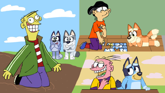
I rushed this at the end. I did not want to leave it out. I want a clean slate next month. God damn it. I love crossovers, how bout you?
More about the Multifandom lore and other stuff below if you want:
Characters who die in canon that end up in the place (idk what to call it) keep being in the clothing that they died in. (Rip Ram and Kurt from Heathers: the Musical). (Spoilers warning if needed) So Adam is stuck with his robe he wore during the war with Charlie and the others from the hotel.
Also, about the 3rd drawing, like I said, it's an idea I had that, yes, takes place in the same crossover thing I think about. The colors in the background of each kiddo are involved in it, too.
The first two drawings are pretty much just some random doodles (idk what to do with the one with ARG and monster Gangle) while the other three kinda have stories to them that may or may not be written or animated on someday. (God, I hope that last sentence made sense).
Oh, and Bluey, Bingo and their cousins got to visit the Cul-De-Sac cause of a reason that's also in the multifandom/crossover I think about, I don't know if I should explain it or not. Meh.
BTW I've tried to match the original art styles of everything before, but this time, I've taken some steps forward. The hardest thing to figure out is the claynimated ones like Orel, Clay, and Claire. But I managed (for now, probably).
Edit: i went back and fixed it, I feel so much better about it now.
I even tried to have it seem like Bluey and others are slowly transitioning to the EEnE art style a bit.
But anyways, thanks for looking at my art and reading my rant! (If you did, if not, don't worry)
Have a good one! 🌟✨️✨️👋
(i keep forgetting to include my logo in my fanarts, but whatever, maybe next time, maybe next year ill start. Idk.)
#warriors#warrior cats#wordgirl#the amazing digital circus#ed edd n eddy#bluey#dont hug me im scared#total drama#popee the performer#super mario bros#diary of a wimpy kid#moral orel#bobs burgers#bob's burgers#south park#foster's home for imaginary friends#jack stauber's opal#self insert#king of the hill#multifandom#crossover#fanart#camellia salazar#ed edd n eddy x bluey#crossover art#crossover fan art#lionheart wc#whitestorm wc#hazbin hotel#idk why i missed that tag
46 notes
·
View notes
Text
Marketing Analysis of Byler
Marketing Concepts and Theory
Before I begin analysing the actual marketing content used by Netflix and Stranger Things for Byler, I’d like to mention some basic marketing concepts and theory which are used.
One of the main techniques used by marketers is Classical Conditioning, a theory originally conceptualised by Pavlov. In brief, this theory states that you can increase attention and understanding to whatever you are marketing by using associations. For example; McDonald’s use branding such as their Golden Arches and logo. When a consumer sees this logo you immediately think of McDonald’s right? You may also think of burgers, fries and just food in general. But then comes the hunger associated with just simply seeing this logo, your brain associates it with pleasure and hunger. So marketers can use key associations to help consumers understand their products through emotional connections and psychological connections. This helps to not only formulate better understanding but also to increase attention and awareness. If people don’t understand your products or have no connection, usually they won’t use your service or buy your products.
So before I begin analysing marketing conducted for Stranger Things, I just want to put the above into context. It’s clear that the Duffer Brothers have planned this story out and they have already now told Netflix executives the ending of season 5. With this in mind, they would inform Netflix and social media administrators as to which content they should produce. Note, however, that they would not tell them the plot as this could lead to unwanted leaks. They can push for certain content to be produced though, which I believe is happening.
Stranger Things and Netflix accounts therefore would publish certain content to hint to the audience as to what is happening next. Taking Classical Conditioning and psychological connections into account, they would post Byler related content to help the general audience to gain a further understanding of the potential for Byler. Over time, using a reinforcement strategy in marketing has shown to increase positive reception and connotations amongst consumers. By feeding Byler content over time, this allows them to soften the potential for a backlash and so the general audience simply cannot say that it “came out of nowhere”.
Analysis of Marketing Content
To start let’s look at some of the content that was released pre-season 3.

As you can see above this photoshoot was conducted pre-season 3. What is interesting is the couple choices above. You have Jopper, Lumax and Jancy which are all likely to be endgame couples. It’s important to note they were important pairings to each other in season 3 too. What’s interesting is Mike and Will doing a couple shoot? If that’s not intentional marketing then someone needs to be fired, because that is obvious. To me it looks like they are subtly promoting Byler as an endgame couple. Additionally, Millie was apparently available at the time, yet they still chose Byler. Those who use surface level analysis will, of course, not notice but this is not the only material promoted.
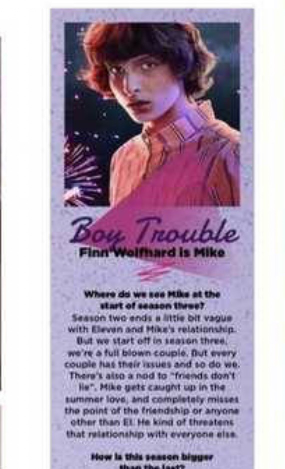
Next we have an interesting excerpt from the SFX section of a magazine for season 3. You can see it reads “boy trouble”. Interestingly, they decided to use boy trouble instead of girl trouble to summarise Mikes story arc in season 3. Foreshadowing perhaps? Clever marketing again it seems. You may say it’s a stretch but “everything is intentional”. In marketing I can assure you, you are told all of the small details to include by the creators or hierarchy. These promotions take a lot of work.
Moving on to the next piece, this is from the game Puzzle Tales (Chapter 7).

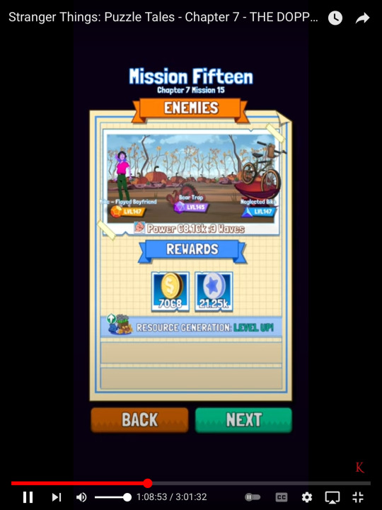
Interestingly, this part of the game was seemingly from Wills perspective and Mike is referred to as being “boyfriend material”. “Flayed boyfriend” is also used for Mike. Again this is a piece of internal marketing used inside the game to condition people to assume the possibility of Byler being a thing. You may say, do people really pick up on this? Some do, yes. Do lots of others? No, not explicitly, but perhaps subconsciously. You see, marketing is all about subconscious influence. Even if you think something has not influenced you in any way, it’s likely to have had an impact. Whilst you may think Byler will be unpopular, many will come round to the idea because of the marketing used, alongside of course clever onscreen subtext and Easter eggs.
Lastly, some more recent promotions that have really hinted at Byler.
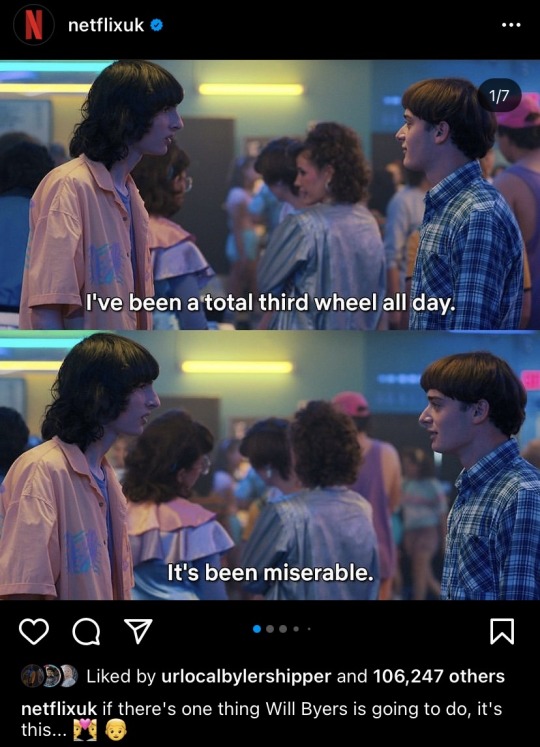
I mean just read the caption, it speaks volumes. But the fact they are really trying to get the message across of Will being a third wheel and there being a love triangle involved, is obvious. Alongside the subtext, they are using marketing content like this to demonstrate further to the audience that something is happening here and it needs to be noticed. Ambiguous captions draw people in and get conversations started, allowing people to work it out for themselves. This allows people to start getting adjusted to the idea, especially if they have no clue about it.
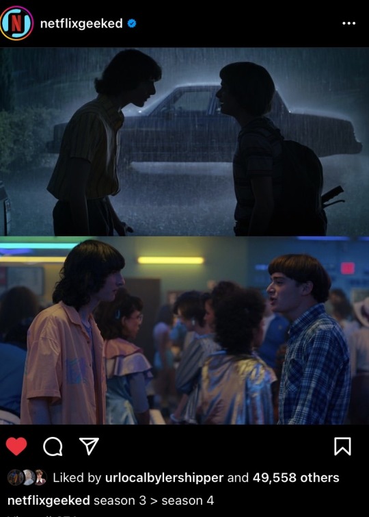
This next promotion post I love because it’s subtle yet, so obvious at the same time. Just to clarify, they aren’t saying that they prefer season 3 compared to 4 in the caption. The arrow is used to show that in both seasons they are having a fight and the scenes are paralleled. Clever, using marketing to show subtext in the show for those who missed it. They are trying to illustrate to the audience that these fights are very significant and are closely associated with Byler. Both fights were based around their relationship and how distant Mike is making himself due to his relationship with El. We are being told that this relationship is causing problems not just to Mike and El, but to his friends and best friends too, but mainly Will.
Mike deflects his emotions onto Will in both of these scenes. In season 3 he says “it’s not my fault you don’t like girls” and “what did you think, really, that we were never going to get girlfriends”. This sounds like he’s deflecting his own issues and making them Wills fault and projecting himself onto Will. The girlfriends line is used in association with growing up as that was, in the 80s, seen as the “normal” thing to do. But being aware of that Mike simply knows it’s not true, so he projects. Same with season 4. He says Will is “being a douche” and that maybe he should’ve “reached out more”. Mike is scared of his feelings and so he projects them, making it seem like Will is the problem. He creates distance so he doesen’t have to face the truth. So paralleling this and using it in marketing is clever as it’s reiterating what the show wants you to see and understand, conditioning you to make these associations and realise what’s happening.
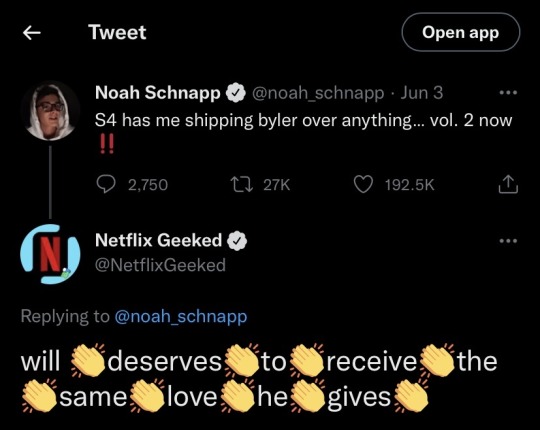
This last post I wanted to use because not only do I find this funny, it’s one of the most blatantly obvious pieces of marketing. Actors are sometimes informed by either the writers, producers or anyone with that power to hint at certain plot-lines or to make certain social media posts. By doing so, it creates hype and gives the audience an insight into the direction of the show moving forwards. This post shows Noah hinting at volume 2 having even more Byler content and that volume 1 made him ship Byler over all of the other ships. The Netflix reply, however, is pure gold dust, “Will deserves to receive the same love he gives”. They emphasise the caption with hand claps in between each word. They want you to realise that just having Will love Mike wouldn’t be a worthy story and that he deserves more than it just being a one sided crush. Reciprocation is deserved, and is highlighted with this piece of marketing.
Before anyone says that you should take Netflix Geeked posts with a pinch of salt, I do believe that they are told to hype up certain content on purpose. Whilst you can argue maybe they just have that opinion for the reply, it’s more of the fact that they are fuelling the hype that speaks volumes, not the caption itself. They didn’t have to comment at all, yet they have been told they need to hype up Byler. This is because they need to condition the audience to the idea of it happening. That way, people can slowly adjust and accept it.
Overall, I would’ve analysed more but I ran out of photo space. I picked out the most interesting marketing material that I believe hints strongly at Byler. Many are worried about queer baiting due to past experience, I totally get that. I do agree that if Byler is one-sided, then it is queer baiting. However, I don’t think Byler is queer bait. The way that all of the cast, crew and social media admins go to great lengths to emphasise Byler, that’s not a coincidence or hype scheme. They use great subtext and marketing alongside, to slowly introduce the idea of Byler, so that the general audience is not shocked and give it a negative reception. Another reason as to why it’s a slow burn. Although the Duffers did recently state that they are writing the story “that feels right” and are not giving into “the noise”. I think that just demonstrates, alongside this post, that this is not queer bait. This is different to before. Everything that is happening is intentional, we are meant to notice. Start believing, not dreaming!
#byler#byler season 4#byler is endgame#byler s4#byler is real#byler theory#byler proof#byler evidence#will byers#mike wheeler
2K notes
·
View notes
Text
Actually going to make this reply its own separate post. TLDR: I have a theory that Chester, Norris, and Augustus are essentially spooky AI created from datasets from the fears/tapes.
Now, @gammija and @shinyopals weren't sure how Augustus fit into this. Right now, the leading theory is that he is Jonah Magnus. He only had one statement in the show, so there's basically no data to collect, so why would he be an AI?
Hypothetically speaking, let's say he isn't Jonah. Or at the very least, he isn't the Jonah we know.
Here's an idea: Augustus isn't the TMA Jonah Magnus, but rather the Jonah Magnus of the TMagP universe.
Here's my current thoughts as to why this may be the case:
1) TMA Jonah is dead. Jon had to kill him in order to control the Panopticon. While I won't discount TMA Jonah's and TMagP's Jonah's memories combining, I don't think it can be entirely TMA's in there.
2) I'm pretty confident that Freddie has connections to the Institute, for a variety of reasons. If nothing else, Freddie could have been connected to them before the Institute burned down in 1999. And unless it's a different Magnus starting the Institute, I'm just going to assume for now that Jonah started the Institute in both universes.
3) Augustus already separated himself out from Norris and Chester in two ways. He speaks less than the two of them but also his case is really odd which I'll go into next.
4) Augustus is the only Text-to-Speech voice who didn't say where his case came from. Norris and Chester so far have always told us where they're reading from. They say links, they mention threads and who said what in each thread, and we know each different email sent. Meanwhile, Augustus can't even tell us who the case giver is in "Taking Notes". This wouldn't mean much, but... we also know that all the papers in The Institute are gone. Noticeably so. Perhaps even integrated into the Freddie system.
5) Tbh... I just think it would be more interesting if they aren't all three from the same place. We know from the promotion, the Ink5oul case, especially the design of the logo that alchemy will be a major part of TMagP. Transformation and immortality. I wouldn't put it past this universe's Jonah to try to search for immortality in his own way.
And this is less of a point and more of a general obversation. We have zero clue how these three got to this state. Even if we assume "fears stuff" generally the fears and how they transform people have some sort of logic to it, dream or not. I don't currently understand the logic yet on why they've become this. Also, we don't know what triggered them integrating into Freddie in the first place.
There's an outside force at play here, and I think it would be interesting if Augustus was a key factor to understanding it.
#tmagp#tmagp spoilers#tmagp speculation#ngl half of this is just 'I think it would be neat and lead to an interesting path for the story to take'
43 notes
·
View notes
Note
Hello! If you’re still taking requests for Eddie and cheerleader reader, could I request reader decorating his locker? A big football or basketball game coincides with a big night for hellfire so like all of the other cheerleaders who are decorating their jock boyfriends’ lockers, reader decides that Eddie’s needs to be decorated as well :)
This is absolutely adorable. I hold you don't mind I made this into a headcanon :)
I giggled the whole time. I love the fluff and my heart needed it 🥹 thank you so much

Y/N, a name everyone in the school knew
A senior on the cheerleading team
A sweet girl but has a very mean edge
A big lover but huge fighter
And also the freaks girlfriend
Yeah....as in Eddie Munson
A huge talk around the school
No one understands the pair
But those two were in love and it was easy to see
Y/N adored that Eddie was more into the nerdy things than sports
She may cheer, but basketball and football? Hella boring
Nothing was more entertaining than watching her man lead his hellfire club into battle
The way he loses himself in it
His sexy voice narrating the story
She honestly would record his stories to fall asleep at night, if she was crazy enough
And hellfire, she adored those boys
Loved how they protected her baby when she wasn't around
But one thing she hates about Eddie not being a jock
She misses out on all the cute couple things that the school pairs up
The football and cheerleading dance routine ( where she had to dance with a loser on the team while her boyfriend was in the stands)
Or basketball and their stupid "make a sign for your player" she didn't care to have a player, her player was on the other side of the school perfecting his campaign. And looked hot as hell doing it, she just knows
BUT!
One thing she could do....
Decorate his locker
The basketball team was going to state (woohoo)
And it was tradition to decorate the teams lockers
She still decorated a random players locker with basketball stickers and his number
But no heart in it
She had the idea to also decorate her boyfriend's locker
It was the final night of his campaign
Months and months of all of his hard work came to the big final battle
And she hated that she had to miss it
Wishing more than anything to watch how it all played out
She knows if she asked, Eddie would direct it play by play just for her
Basketball Is going to state- blah
Her boyfriend's final campaign - now that deserved real decorations
She spent the whole night drawing the hellfire logo
Drawing all his characters
Creating stickers of the weapons his boys use
Sneaking in a few little pictures of them together- photos of their relationship and some of just him that she took
Some photos she took of hellfire mid session
Some photos of him with hellfire
And of course she printed out the yearbook photo
She may have a copy in her room for personal reasons
Little lipstick marks with her kiss on post it notes
She drove to school herself, she went early so Eddie was easily not interested
She taped up everything she made the night before
Excitement filling her stomach as she looked it over
The whites, reds, and blacks all blended perfectly
The pictures fit perfectly
Her kiss marks taped to make the shape of a heart
The stickers she made scattered around
EDDIE MUNSON <3 written in her red lipstick across the bottom
She was proud and knew he was going to love it
"damn, poor Brandon. He got like two basketballs and his number" Chrissy teased as she passed the locker
"is it too much?" Now she was worried
Maybe her boyfriend wouldn't like all the attention on him
"god no. You two are literally the it couple of this school. He's going to love it" Chrissy reassured her, both heading their side of the school where their lockers were
Eddie Munson hated school
He had bullies who made it hell
Then he fell in love with her
And she had no problem telling people where exactly they can go if they are mean to him
Walking into school he wasn't shocked to see people looking at his locker
He spent many days cleaning the mean words off of the metal during classes
It was like a show for everyone. Let's all see what's written on the freaks locker today!
Eddie sighed and walked closer
"excuse me" he shoved himself through the crowd
But froze when his eyes landed on it
It was decorated for sure
But it wasn't painful to see
He actually felt himself blushing as he looked it over
Moving closer to trail his fingers over the photos
Smiling as he remembered every single memory
Smirking to himself when his fingers traced the post it notes with her kiss on it
His name written in his favorite shade of lipstick
"awww look at what your little girlfriend did" Dustin awed
Eddie blushed deeper and shoved his shoulder, "zip it"
"and he looooooves it because he looooooves her" Gareth teased, making kissing noises
Eddie rolled his eyes but a smile was on his face
Pushing Gareth's head into the locker
He noticed the jocks sending glares his way
He knew he had a target on his back dating her
Everyone wanted her
And they didn't like that they lost to someone like him
He flipped them the finger as they stared
Eddie couldn't keep the smile off of his face all day
Making up random excuses to why he needed to stop at his locker after every class
He also snatched one of the kiss marks off the locker - keeping it in his wallet
When the day ended, he was kinda sad
He didn't want to leave it at all
"do you want me to decorate your closet door at home baby?" She appeared out of nowhere
Wrapping her arms around her boyfriend from behind
"you don't have to...." He said, trailing off
"okay baby. I'll bring over my supplies after the game and after your amazing campaign"
Eddie may have struggled through life
But he got rewarded for it
Tags!
@bmunson86 @mxcheese @ladymunson @michaelfuckinglangdon @z0mbie-blah @biittersweet @mirrorsstuff @slightlyvicked @micheledawn1975@ago-godance@magnificantmermaid
#eddie munson x reader#eddie munson#eddie munson fanfic#eddie stranger things#eddie munson request#eddie munson x female reader#eddie munson fluff x reader#eddie munson fluff#eddie munson headcanon
675 notes
·
View notes
Text
DPxDC Week 2023
19: Clockwork/Accidental Baby Acquisition/Misunderstandings
Ao3
yeah i forgot to post this here lol
Me, earlier in EctoberHaunt: I mean,, it's not really a DC Crossover? It's with Lucifer (TV) and that comes from the comic which comes from the Sandman which is kinda in the DC Universe... but that's a bit of a stretch to me, so I won't tag it as DPxDC.
Me, now: LOOK AT THIS SANDMAN (WHICH IS FROM DC, BTW) CROSSOVER, WHICH TOTALLY QUALIFIES EVEN IF NONE OF THE MAIN DC CHARACTERS ARE PRESENT!
Also spoilers for The Sandman.
- - -
“This is perhaps, the most important thing I will ever ask of you.” Clockwork said with a serious face unlike his usual one, where it just reflected his demeanour, but instead showed genuine concern the likes of which the so-called uncaring Master of Time never showed.
And with no hesitation, Danny had accepted the task.
“Get the baby away from the chaos duo, and take him back to his mom…” Danny looked at the baby in his arms, babbling happily whilst patting Phantom’s logo. “Now who exactly is your mom, buddy? And why are you guys so important that even gramps is having me interfere?”
“Baahh!”
“Not saying that you have to be relevant or something to deserve help! I’m just wondering if you’ll be some kind of superhero too! You may even save the world rather than destroy it.”
Seeing Danny’s saddened expression, the baby made an unhappy sound and tapped at his chest again, making the boy smile.
“You’re allowed to kick my butt if I ever grow to be Dan again.”
“Dah!”
“I think we’re around the same age, actually, so it won’t be just some kid kicking my ass.”
“Aass!”
“Oops.” Danny shifted his arms to more securely hold the baby and started floating just a couple of metres off the ground. “Now off to find your mom, future Daniel-defeater.”
“Dan-eel!” The baby cuddled up to him, and Danny felt the blond curls ticklke under his chin.
Invisible and in the air, Phantom looked for a distressed woman similar to the baby in his arms before she made a big mistake, even if he didn’t know about it.
-
Back in his Tower, Time watched as Daniel Fenton carried Daniel Hall to safety and stopped Lyta Hall from bringing doom upon the Dreaming.
He looked away, towards his grandson’s head as he sang his sorrowful song in the face of unending life. Clockwork still had work to do, and having no way to kill himself nor a ready successor wouldn’t simply make his son develop lust for life, but it would stall him, and one more second alive was infinite hope that Dream would choose change, and that was all a father could hope for.
#Danny Phantom#DC Comics#DPxDC#dpxdc week 2023#Danny Fenton#The Sandman#Clockwork#accidental baby acquisition#misunderstandings#Time#Daniel Hall#ghostly-scrypts
93 notes
·
View notes
Text
like you little, don’t want no riddle (cbg)

your art club president, Hwang Hyunjin complains about you doing nothing for them. so you do what they tell you which is to go to the newspaper committee for their new news story. but there’s one problem, Choi Beomgyu is running the story and he may or may not have a crush on you.
Paring: Journalist!Beomgyu x Fem! Reader
Theme: One shot; fluff
Word Count: 2.0K
Warnings: none
------------------------------------------------------------
You are currently in the art room; you decide to stay late because of your new art project. You had at least a week to get it done so you need extra time. Sure, you could have done it at home, but you would most likely not be motivated, and just procrastinate on it.
Today is also a Tuesday, which is when you have a meeting with your art club. It’s a club for students who want to do more art and participate in school art projects like murals, logo designs, etc. Initially, when you saw the club was posted, you didn’t want to join because of the amount of artwork you already had in your regular art class.
But that all went away when your friend, Seulgi dragged you into the club. So here you are now, waiting for your club manager Hyunjin, who is also in your club, to start the meeting.
The door opens, signaling that Hyunjin has arrived, so you set down your paint brush and turn around in your chair. He sets down his art supplies before sighing.
“Alright, let’s get this meeting started shall we?” He asks as you all nod, “Okay, so I have just gotten some sudden news, which is why I have brought more art supplies with me today. The newspaper committee would like us to explain the history of different art pieces around this school and would also like a demonstration of our art work” He says.
You nod, must be that they needed a new story for the school’s newspaper. “So I would like Y/N to do it for us.” Your eyes widen as everybody turns to stare at you, “Huh? Why me? Can’t you see I’m working on something right now?” You point to your art project.
“Yes, I can see Y/N, but you have barely done anything for this club, so this will be a good way to show your loyalty to us.” You scoff, “What do you mean?! I literally did the mural and worked on the logos for our football team”
"Yes, but there were other people that worked on those things too; you haven’t done anything by yourself. Now stop being so stubborn and go over to the newspaper committee. They will need this story finished up by Friday so then they can publish it”
You groan and roll your eyes before getting up. You make your way towards the door when Hyunjin speaks again. “Oh, and apparently Beomgyu is going to be the one running this story, so please be nice to him”
You tense up, Beomgyu? The boy that apparently had a crush on you, there was no way he would be running it. You sigh before opening the door and walking out.
There has been a rumor going around that the upperclassmen Choi Beomgyu had a crush on you. When Seulgi first told you, you were in disbelief, there was no way he liked you.
He barely even talked to you! Though when you went to your gym class, one day you saw Beomgyu’s eyes on you the whole time, which made you believe it a bit.
But when Valentine's Day came around, you saw him giving flowers to Park Yeji, so you were a bit disappointed, but at least he didn’t like you that much.
------------------------------------------------------------
You soon arrive at the newspaper committee's door. You take a deep breath in and out before opening it. You see them all stopping what they were doing to stare at you as you chuckle.
“Well, hello Y/N, what do you need?'' asks Miyeon, coming over to you. “Oh, um. I’m here for the school’s art history story. Hyunjin sent me over,” you say, smiling.
Her eyes widen as she looks behind you. You turn around to see what she was looking at and you see Beomgyu. His hair is brown and it is very fluffy. He has a blue vest on, and underneath is a white tee shirt paired with some white pants and white sneakers.
He is holding his camera in his hand and he smiles, “Y/N, good to see you! I can’t believe they sent you over,” he says, walking towards you. “Yeah, they said they needed me to ‘actually’ do something, so here I am,” you say awkwardly, chuckling.
Silence soon fills the room as you clear your throat. “Let’s get this done, shall we?” you ask him as he nods and you both head out of the room. You both begin to walk as you hear Beomgyu fiddle with his camera.
“So, where are we going first?” he asks, looking at you. “Oh, I was thinking we could go down the social studies hallway first.” He nods as you soon enter the hallway.
“Alright, so you see those drawings along the tops of the lockers?” he nods, “Those are the specific drawings for each class. Before the seniors graduate, they get to pick out what they want to do for their class, so they talk with the people taking an art class and they work something out. Then it gets put onto the wall along with their class number, and a lot of people get to sign their names as well.” You say.
He nods as he takes some pictures, he then gets his notepad and pen out. “So since I’m a senior, my class would get to pick what we wanted and we would have something like this?” he asks.
You chuckle, “Yes, though I don’t know where we would put it, there are a lot of years in this hallway.” He nods as he begins writing something down. “How far does it go back?” You sigh, trying to remember when it was.
“Maybe as long as this school has been? Like 1800 I think.” He nods and smiles. “Alright, where do we need to go next?” he asks. “The library, well at least the outside of the library.” He nods as you guys turn to go up the stairs.
Once you reach the area before you enter the library, you stop. “Alright, so you see the paintings along the walls?” he nods, “Those were chosen specifically for the library, they are from different books.” He nods and starts taking some pictures.
“I’m pretty sure we don’t update them often because it’s hard to get the color of the wall back where it was before, but we are working on a new one.” You motion him to follow you.
You then point to a blank space on one of the walls. “We are going to paint a new one here once we have time.” He nods and opens his notepad. “So, what are these stories or books?”
“Well, most of them tell you where they came from, but the librarian is the one who gets to pick what book to do. I’m pretty sure we are going to do Frankenstein here.” You say.
He nods and starts writing something down again. “Well then, I guess I’ll have to come up here once it’s done.” He smiles at you as you chuckle. “Yeah, we would love the feedback.”
He nods as you both stare at each other for a little. You then break eye contact and look somewhere else. “Where to next?” “We’re going to see one of the school's murals.”
You both soon arrive at the counselor's office. “Hopefully the room is empty” you say, looking at him as he nods. You open the door and turn your head to see the secretary of the office at her desk.
She smiles at you both. “Hello, you two need something?” she asks. “Well, we’re currently doing a news story about the school’s art history and we were wondering if we could use the mural in your room.” She smiles, “Of course! Go right ahead.”
You smile at her before looking at Beomgyu, motioning him to come along. You then make your way over to the wall. You stop and look at Beomgyu before looking back at the wall.
“This is one of the many murals the school has. It is specially for the counselor's office.” He nods as he takes a picture. “Did you work on this one?” he asks, looking at you as you shake your head.
“No, but I’m going to be working on another one with the people in our art club.” He nods as he takes his notepad out. “So, how do you get inspiration for these types of things?” he asks.
“Well, the people who want the mural done usually know what they want, so we just do as they have requested.” “So this one is done based on what the counselors wanted?” You nod, “Yup.”
He nods and starts writing something down. “Where’s the other one that you’re going to be working on?” he asks. “It’s going to be in the room where the police officers hang out.
You know where that is, right? The one that’s right by the art room?” He nods and writes something down again. “Alright, so where's the next stop?” “This will be our last stop, so we’re going back to the art room.”
He nods as you both thank the secretary again before walking out of the room. The walk to the art room is long since the counselor’s office was on the other side of the building compared to the art room.
You hear a click so you turn your head. “Did you just take a picture of me?” Beomgyu chuckles, “Sorry, but you’re just so pretty.” You can feel your face start to heat up.
“Well, thanks” you say as you smile at him. You then reach the art room and open the door, “Alright, I’m back and I brought-'' you stop when you realize the room is empty, huh, must be they had to go do something.
“Where did everybody go?” asks Beomgyu, looking around. “I don’t know, they must have had something else to do.” You look up at him as he nods. You then gesture Beomgyu to sit beside you, as he pulls up a stool next to you.
“So, what’s this?” he asks, looking at your painting. “This is my new art project I’m working on.” He nods while taking a picture of it. “What made you become so interested in art?” he asks as you pick up your paintbrush and dip it in paint before working on it.
“Ever since I was little, I loved to draw, so I just carried that skill with me when I got into school.” He nods, “Do you like art?” You nod, “It’s kinda like an escape for me to do whatever I want.” He nods while looking at your painting.
“You're very good at it,” he comments as you blush. "Thanks, I mean there are probably some people who are better than me in my class, but I’ll take it.” “Well, I don’t think that.” You look back at Beomgyu.
“I think you’re wonderful,” he says, giving you a small smile as your heart begins to race. “W-well thanks," you stutter, giving him a weak smile. He chuckles before putting his hand on your jaw.
Your eyes widen as you drop your paint brush. He then smirks before bringing you in for a kiss. It’s nice and soft and slow. He then pulls away as you blush. You turn away and he laughs.
“W-what the hell was that?!" You ask, looking back at him, as he is dying of laughter. “Oh, your face was too good.” He then trails off. “I like you a lot, Y/N,'' he says, grabbing your hand, which rests on your thigh. “I hope you like me as well,'' he says, smiling.
------------------------------------------------------------
Once you’re both done, you walk back to his club room. Before going back in, he looks at you. “Can I get your number?” he asks, pulling out his phone from his pocket.
“Of course,” you tell him your number as Beomgyu puts it in his contacts. “Alright, don’t be alarmed if you get a text from a random person, okay?” he asks as you nod.
“Well, I have to go. See you around, Y/N,'' he says, giving you one last peck before going into the room. You stand there for a second wondering, how could boys like him like you.
#txt#txt moa#txt fanfiction#txt fanfic#txt fic#txt fluff#txt beomgyu#choi beomgyu#cbg#beomgyu fluff#beomgyu imagine#txt imagine#beomgyu x reader#beomgyu x y/n#beomgyu x you#txt x reader#txt x y/n#txt x you#tomorrow x together#txt beomgyu fluff#txt choi beomgyu
291 notes
·
View notes
Text
TADC Theory - The Tape Recorder
A few months ago, I (re)watched the trailer before the next episode was due to drop. And something has really intrigued me since the first time I laid eyes on it:
Or atleast, what I think is a tape recorder. But let's assume it is for now
When I think of tape recorders in games, I usually think of either Bendy or FNaF: Help Wanted. In both games, the tape recorders are used to give us players the lore of problems going on within the in-lore companies of both games. And since the circus is implied many times to be an old 90s game, I've been thinking:
Could these tape recorders be hidden messages from the dev of the in-world game?
Some of you may know about Shipwrecked 64, the only ARG about a video game that you can actually play as an actual game. There are plenty of hidden tapes you can find as you go further down to discover more of the game's secrets, but I won't say anymore for those who are still discovering them.
In FNaF: Help Wanted, the tape recorders were hidden by a beta tester who knew something was up during development, while in the games of the Bendy franchise, the recorders weren't hidden, but they definitely gave us a whole soup-full of lore about what was going on at the in-world cartoon studio.
One thing I want to note that judging by the atmosphere of the room around the tape, this is during the haunted mansion episode with the little ghost and the teal glowing lady. So either it's part of the adventure, or we may finally get a little bit of backstory behind the mysterious C&A.
Not many people might remember this, but in the pilot, there was a logo that showed up as Pomni was running through the hallways of the (unfortunately fake) exit.
I myself and a few others have a theory that C&A this is the company that created the game that TADC is. But the real questions are how it became a digital prison, and how did a mere VR headset bring those poor unfortunate souls inside?
I guess we'll have to wait and see.
But anyway, that's all I have for now! If you guys would like to hear more theories from me, just let me know! And hey, whoever spots all the references I slipped into this post gets a cookie and a hug!
Take care everyone and have a great day, afternoon, or night, where ever you are. And remember: stay weird, and God bless you.
20 notes
·
View notes
Text
No. 55 - British Airways, Part One - British (European) Airways and British (Overseas) Airways (Corporation)
British Airways.
Starting this post was harder than actually writing it. It's hard to start a post about British Airways, because it's a deceptively weird airline. If you very precisely altered my memory, kept my knowledge of the United Kingdom and of flag carriers but erased all I knew about British Airways and asked me to speculate about the UK's flag carrier, what I came up with would look absolutely nothing like British Airways. British Airways is weird. It was weird when it came into existence in 1974. It's weird now. It's a completely typical airline in terms of things like...routes and safety and in-flight meals and...I don't know...contribution to human rights abuses. But that's not what I talk about here.

The story of British Airways' livery is interesting. It's messy. It's political. All of that comes in due time. More than most other airlines, it just can't keep to a livery for too long - and that's when it even has a livery. In its early youth, British Airways couldn't really figure itself out at all. And in its even earlier youth...well, actually, British Airways isn't that old. It's also not the UK's first flag carrier.

image: British Airways
There is a reason that two of British Airways' fleet of retro liveries wear wordmarks that say other names. To discuss the history of the British Airways livery, I have to first begin by discussing the fact that British Airways...is a weird airline.

British Airways. IATA code BA, ICAO code BAW, callsign SPEEDBIRD. Flag carrier of the United Kingdom.

Honestly a better logo than at least 40% of actual airlines.
Well, it's actually a subsidiary of the unimaginatively named International Airlines Group, Europe's third-largest airline holding company, below Ryanair and the Lufthansa Group but ahead of Air France-KLM. IAG is a member of the oneworld alliance and is the parent company of British Airways, Iberia, Aer Lingus, Vueling, and LEVEL, and just last year acquired Air Europa and began the process of absorbing it away from SkyTeam. To anyone who may have had the thought enter their head: yes, they do now basically have a monopoly on Spanish airlines. To any Spaniards reading, my condolences. At least you still have EasyJet.
Their largest shareholder is Qatar Airways, so when you really think about it British Airways is kind of a subsidiary of Qatar Airways a little bit. Their share is still only 25%, though, so that actually just completely isn't true, but in a vibes sense it feels that way from the outside looking in. Of course, all these airlines have maintained their own identities and operate independently. This is not a LATAM situation. British Airways adopted its present-day livery long before it merged with Iberia to form the IAG in 2011. I'm still not totally sure why they did that. Maybe they wanted to one-up Air France. Iberia's not exactly KLM, but - no, this is not that post.
British Airways. I've always thought it was a little bit strange that it was called that. Few places love reminding the world they're at least nominally still a monarchy more than England. KLM isn't the only airline with 'Royal' in the name - Royal Air Maroc, Royal Jordanian Airlines, and Royal Brunei Airlines are just a few other examples. And yet the United Kingdom has never had an airline, at least not a major one, named anything like The Queen's Royal Air Fleet, which is what I would have expected of them. No. British Airways.
There's not much gravitas to that, is there? Not really any punch. Nothing making it better than Air France. 'British Airways' is a pretty sterile name for a flag carrier.
Their callsign is SPEEDBIRD, though. And that's not sterile. That's awesome. That's Europe's equivalent to Pan Am's CLIPPER or China Airlines' DYNASTY, just pure style. But what is a speedbird, other than a really cool name for a jet?
This is a speedbird. Rather, this is the logo for Imperial Airways. Not to be confused with the very strangely named 1964-1986 Californian commuter airline Imperial Airlines, Imperial Airways was a very early precursor to what British Airways is now. In the inter-war years it served destinations like South Africa, Hong Kong, and Australia - the sorts of places two dozen or so wealthy individuals of power might have reason to go quickly. Unlike Imperial Airlines, Imperial Airways had a very fitting name.
So here's another weird thing about British Airways: it's young. Really young for what it is. Most flag carriers are pretty old, and the few exceptions are airlines founded in the 21st century to replace flag carriers which went defunct in the 90s and on, like Brussels Airlines or ITA Airways. Even when you discount centenarians like KLM and Finnair, most of the names you'd recognize in the rest of the world (and plenty you probably haven't heard of) existed by the 1940s, with the major Axis powers being forced to reboot theirs in the 50s. Even the places Imperial Airways served, despite not having the resources of an empire at their disposal, have far older flag carriers. British Airways didn't exist until 1974, making it younger than my mother, the Boeing 747, the Twin Towers, 2001: A Space Odyssey, and the moon landing.
The primary reason for this was, as far as I can tell, bureaucratic shuffling about, but I'm not especially well-versed or interested in the history of UK corporations so that's where I'll leave this bit off. It is possible, and indeed likely, that someone reading this has the urge to say that I'm being uncharitable and that British Airways is functionally just BOAC or BOAC is just functionally Imperial Airways (or maybe nobody thinks that - I simply don't know enough about the corporate side of it to confidently dismiss the possibility of this indeed being the case). It's just not relevant because I'm ultimately here to talk about the airline as an entity in the public eye that has a livery, and in this sense Imperial Airways, British Airways, and the intermediate steps are fully distinct. So, for my taste, British Airways began operations less than a month before the release of the novel "Carrie". That's strange. British Airways is strange.
Still, even though in most other cases the process was significantly faster, very few flag carriers we'd recognize today were founded outright in their current state.
This timeline, compiled by Yesterday's Airlines, documents the 'family tree' of airline mergers that has built up today's British Airways. It actually goes back far earlier. Debatably it began with manufacturer Airco and its subsidiary airline Aircraft Transport and Travel, founded in 1916. Though it went under in 1920, its assets were repurposed by Daimler Airway (singular), which was one of the four airlines (mostly all subsidiaries of aircraft manufacturers) which in 1924 became Imperial Airways. That's right, even the building blocks on this chart are themselves built from blocks!
There are plenty more long-forgotten airline mergers beneath where this graphic cuts off, but this is all to say that the speedbird emblem originated with Imperial Airways, and it has floated to the top of this soup of assorted vaguely British brands, many of which nobody has thought about in decades. Speedbird aside, British Airways resembles basically none of its component parts in any ways that aren't just explained by them both being British, and Airways.
The speedbird was created by notable art deco designer Theyre Lee-Elliott, who created several pieces of iconography and many graphics and posters for the UK government, among other things, like the first-edition cover of "A Farewell to Arms" that an English teacher of mine once had as a poster on her wall. Much of his early work was for airlines, and the speedbird happened to stick.
Left poster isn't anachronistic - 'British Airways' was the name of a late-30s airline, itself merged from three other airlines, which would go on to join Imperial Airways as one of the components of BOAC.
Airlines didn't really have liveries as we know them now back when the speedbird was invented, so it would lie dormant as an emblem used on posters and signage for a little while. It was the only part of Imperial Airways' identity which survived when, in 1939, it merged into the British Overseas Airways Corporation.
'British Overseas Airways Corporation' has the same nostalgic punch to it as 'Pan American World Airways'. It was almost always just called BOAC, though, even in the wordmarks of its airplanes. When BOAC came into being the airplane livery was not what it is today. They began with just a painted tail and cheatline, scarcely worth showing or commenting on.
image: RuthAS
Okay, I'll show it, but I don't think it needs any further comment.
There's only one BOAC livery that was really recognizable a BOAC livery. It was still fairly boring. More like BOA(rin)C(g). (That one needs work.)

The only interesting thing about the BOAC livery, to me, is the way that sort of face mask shape combined with the tail almost gives it a sort of diagonal symmetry - the front with a blue dip below the white center, the end with a peak above it. It is a very efficient and deceptively effective, potentially unintentionally, use of geometry. I also appreciate the restraint of sticking to blue and white and leaving out red. The minimal nature of it increases the geometric feeling, really saving this livery from my complete disdain. The speedbird logo is really well-centered on the tail, feeling almost like a diagonal slash cut right through it, and I like the use of greyish gold instead of white, which makes it appear less jarring while still being clearly visible. For its day, these positives are certainly not to be fully ignored, though saying that this is a pretty alright 60s white-and-blue cheatline livery is not that high of a compliment. It is cleanly done but in no way exceptional, with a neat bit of art deco angularity to it that you really only notice if you stare at pictures of airplanes as a hobby.
On the other hand, it has a nothing wordmark that honestly just irritates me by breaking up that big clean white block in the same way an old scratch breaks up the flatness of an iPhone screen and it does that thing I hate where a cheatline sort of just...trails off under the tailplane that a fair number of 747 liveries do. It feels like they just couldn't think of anything to do with the end of the plane, which is never what you want from a livery, especially not from an airline that takes itself as seriously as BOAC did. It also uses the isolated tail block, which is a design feature I dislike. At least the extreme matteness of BOAC's midnight-blue-on-white makes it a bit less awful, and the white forward trim is a nice touch.
On balance, I'll give it a BOAC-. That is referring, of course, to the face mask livery, which I think is straddling the fence between 'adequate' and 'forgettable'. I truly have so little to say about the earlier liveries that I'm not going to even give them a grade.

The BOAC livery briefly flew again in 2019 (which British Airways claims to be centenary based on the foundation of Aircraft Transport and Travel, except I've mainly seen that said to be 1916 and most people's consensus is that British Airways was founded in 1974 and no earlier) when it was painted on the 747-400 registered G-BYGC. She was the last 747 to fly for British Airways, just a year after the livery was applied, and there were plans to preserve her in the heritage livery which never materialized. Sadly, she was scrapped in late 2023.
But there was that speedbird on the tail! The speedbird was so damn iconic that it was even BOAC's callsign. So where did it go?
We'll get to that. There's more to British Airways than BOAC.
BOAC was state-owned, and it held a place of national prominence...so it was the flag carrier, right?
Sort of. It was a flag carrier. BOAC was the UK's Pan Am, specializing in long-distance international flights (hence 'overseas' in the name). There was also British South American Airways, a short-lived national carrier which was absorbed into BOAC after two years, with its most notable contributions to history being the disappearances of its planes Star Tiger and Star Ariel, but a significantly more enduring brand was BEA.
This initial logo, also the work of Theyre Lee-Elliott, had a key motif to accompany BEA's slogan, 'the key to Europe'. I adore it. I like BEA a lot.
While initially founded as an offshoot of BOAC (which I suppose was the singular flag carrier from 1939 to 1946), British European Airways Corporation specialized in, as the name implied, flights within Europe (and other relatively nearby destinations). It was something of a VASP-and-VARIG situation. Nobody ever called it BEAC, though, even though it sounds like 'beak' and birds are a whole thing, because...flying...well, look, we can all understand, in retrospect, that one of the great tragedies of aviation history is that I wasn't there to have ideas. That said, maybe it's a good thing I never planted this seed, because their callsign was BEALINE, which is...just the most adorable thing I think I've ever heard. It genuinely makes me smile. It may be my favorite ever callsign.
They did eventually change their official name to just British European Airways. Sort of a shame, if you ask me - you could have been twinsies. Ah, well. Also a shame is the perplexing choice to shelve their rather nice and meaningful original logo and replace it with what I can generously describe as 'a square' in 1957. I think SAS did it better. I can't rule out that I just hate it because the old one was so much better, though. I've seen far uglier, but again - this is a square.

image: Adrian Pingstone
When it's on the livery, it's not even well-aligned! And it's difficult to imagine negotiating this onto an aircraft tail, even when dealing with a generously square fin like the Trident's. (BEA loved their Tridents, which were essentially designed for the airline's operations, and operated 70 of the 117 airframes completed. This makes me like them, because I love the Trident too.) That said, I think that if you're using a logo that is just the name of your airline, putting it on the tail rather than the front side fuselage is a bold move. Today it rarely pays off, but in the era of cheatlines and half-bare planes it actually avoids the issues of legibility and vertical space that a lot of other contemporary liveries struggled with.
Still, the square. It will simply never not look strange to have two straight vertical lines on a fin that's more or less diagonal to them, and I'm not sure how that could be fixed. They did the best they could, I think, but this was just doomed from the start.
On the other hand, I do enjoy its placement within the cheatline. It helps keep a sense of pace but doesn't break up the line, and it just feels like it clicks into place in a way I love. I like the continuity with the black line at the tip of the horizontal stabilizer, and I like that the white paint doesn't extend down as far as on a lot of liveries of the time, leaving the cheatline to taper above the Trident's rear-mounted engines instead of underlying them as many other airlines' did.
This logo and livery were designed by Mary de Saulles, who was trained as an architect rather than a graphic designer. I think it shows in the very simple shapes and lines present here, and it also shows in the fact that despite it technically not doing anything too unusual the BEA livery was very distinctive when actually on the apron.
BEA's liveries weren't terribly more innovative than BOAC's at first glance. But their black-and-red 60s livery was actually, deceptively, a standout of the era.

images: Ralf Manteufel | Adrian Pingstone
The red wings on BEA's aircraft were absurdly stylish. There are dozens of reasons involving weight and heat and aerodynamic properties that prevent airlines from painting the wings on their airliners anything but a very dull drab, and I despise it, but when even the all-black Air New Zealand plane has white wings it begins to feel like it's just not possible to do anything else. Actually, it is hypothetically possible, though expensive, as long as you avoid the leading edges, though I'm sure the margins for shape and weight of a wing are far more precise on a 787 than they were on a Viscount. Still, I can't help but wish airlines would swallow the costs of painting wings (not like liveries aren't already a needless expense if you're trying to really optimize), because just look at this. It's absolutely stunning. It brings BEA's livery all the way from completely forgettable to by far the most eye-catching in the approach pattern.
And, you know what? I'll give them a BEA for that.
It might seem like a bit of a strange evaluation when I spent two paragraphs complaining about that square, but just imagine being on the ground and seeing a Comet landing, the lack of underwing pylons leaving that big red wing, like the lining of a cloak. That's a real Riyadh Air first impression. So while yes, the square is a square and certain aspects of the livery's implementation on various models range from forgettable to clunky, I am disregarding all of that, because this is like Dracula showing up to a board meeting. They are literally flying Louboutins.
BEA's livery and branding evolved over time in a way BOAC just didn't. BOAC never had anything I would identify as a 'rebranding' - it sprang fully formed from the Queen's (or something) head and stayed in its pristine state until the day it abruptly vanished. This was not quite the case for BEA.

image: Adrian Pingstone
This is a preserved airframe, hence the very anachronistic car models in the foreground. Still, the livery is accurate.
Their final livery, introduced 1968, was this - the 'speedjack' livery. The speedjack is, more specifically, that delightfully pointed Union Jack emblem on the tail. I do like the speedjack itself, being one of the only decent uses of a Union Jack base I've ever seen. It feels obvious yet brilliant to turn the intersecting lines of the flag into an arrow shape. Unfortunately, far more was changed than just the logo.
My beloved flying Louboutin was gone. They still sometimes had the red wings at this point, but in every other way it was a new livery. I actually find that something is lost here, because the old BEA livery had red but not blue, and the BOAC livery had blue but not red, so they were sort of a matching set. Also, um, that wordmark is legitimately hideous.

It's a bit less horrible when it's not red letters on a white background, at least. And it does have a forward slant, a continuity...but this lacks the brilliance of Lee-Elliott's key or the charm of the de Saulles square.
The speedjack, logo, and livery were created by FHK Henrion, whose work has appeared on this blog before, though I failed to mention it. He designed the KLM crown logo!
...a logo I used to think was fine until learning about the absolute beauty they had from 1930 to 1938. Henrion designed the totally palatable 1961 version, and further modifications were made by the firm Henrion, Ludlow & Schmidt, with at least the 1991 change being the work of Ludlow. It's certainly gone downhill, but maybe I just think that because of how much I adore the 1930 iteration.
image: Piergiuliano Chesi
As for BEA - at the very least they kept the red wings. This is sort of a double-edged sword, though. This livery was, overall, far less distinct from its surroundings than the de Saulles livery, and the addition of the lighter blue to the fuselage really dulls the impact of the red against the stark black it used to share the airframe with. It just feels...flat. Neutered. Like an interim livery when one airline has bought out another and the paint jobs are changed out piecemeal. (And I think a red-only speedjack on a black tail would look fantastic, for the record.)
The details aren't much better. The cheatline feels almost too thin for the cockpit windows and the tiny wordmark makes the white fuselage feel as empty as it is without the little BEA logos making sure that isn't what you're focused on. Some models, like the Trident Three and Super One-Eleven, get their status indicated by text on the tail that looks like the default font of a word processor. It's just sloppy. Henrion's effort went to the speedjack, where a firm which specializes in image identity generally would be directed, and some interest was taken in the wordmark, but the livery itself feels like a pieced-together afterthought.
This gets a grade of...please just go back. I want to say D+.
How much of that grade comes from genuine dislike of the Henrion livery versus just thinking it's worse than what came before, I don't know, but it's one of the most immediate downgrades I've ever seen and the attempt to keep the most striking feature of the old livery while sapping it of its power feels almost insulting. It feels messy and pieced-together, and it's angling dangerously close to having the same approximate color layout as the old SAS livery - you know, the only thing that's ever failed the Star Alliance Test.

And, at least from the side, and from farther away, it really doesn't fail the Star Alliance Test. It's serviceable, and I wouldn't be nearly this harsh on it if I didn't know what came before. But I've committed to a chronology of what would become British Airways, so I have to mention both, and that includes looking at them, reading about their design processes, and forming detailed opinions of them. This livery was just doomed by its predecessor.

Even British Airways seems to agree with me, given that when they painted an A319 (G-EUPJ) in a BEA retro livery they chose the older black-and-red. Some liveries are simply iconic. Some simply aren't.

And, yes - the wings are red. At least, the bottom is. The top was forced to remain grey for reasons of 'reflectivity', which is fairly vague. Still, this should be a sign to other airlines - your planes will make an impression from below, and that impression could be as powerful as the one BEA used to make.
image: Ben Brooksbank
BEA, at its height, flew more passengers than any other airline in Europe. It had subsidiaries, including...Cyprus Airways. (Yes, the same one that's still the flag carrier of Cyprus. That's its own story.) They even operated helicopters.
image: RuthAS
Cursed? You decide.
And then, as the 70s began, the decision was made to merge the two state-owned airlines - something which I would personally have done earlier, and apparently people did try to do earlier but were prevented from doing by...politics. You know, just a couple people with titles that begin with 'Secretary of' passive-aggressively fighting over financial things. In 1974, what was probably inevitable finally became a reality.
image: Piergiuliano Chesi
It takes a while to repaint a full airframe. When two airlines merge the change is often done bit by bit, making sure the wordmark's right but not bothering with the rest. In 1975, G-AWZA, pictured here, still wore the speedjack, but the wordmark above her cheatline said something new entirely, and a new airline was using the callsign SPEEDBIRD.

And this is where I will conclude today, thwarted by image limit. Of course, being the person I am, I couldn't help but make my return for the new year not just a two-parter but a three-parter. Having dispensed with the British Airwayses that weren't British Airways, part two will cover the British Airways of the surprisingly recent past.
In the meantime thank you to all readers, old and new. I'm thrilled to be back from my break, and I hope you'll stick around for another year of Runway Runway.
#tarmac fashion week#region: west/central europe#region: united kingdom#grade: a#grade: c-#grade: d+#british airways#british european airways#boac#double sunrise#era: 1950s#era: 1960s#era: 1970s#klm royal dutch airlines#imperial airways#long haul
34 notes
·
View notes
Note
need your thoughts on hawkeye & black widow #1 so badly tbh !!
this is like the third story in a decade where clint is being pursued for an assassination that he may or may not have committed and then reveals "well maybe i Did. you ever think about that???" "but clint...that's against your code!" "oh so NOW we remember that- i mean yes. i SHOT them." (explanation pending)
it is also the second story where multiple assassins are pursuing him simultaneously and then they explode him and break his ribs and cut up his leg and poison him but the first one had all that happening in the sewers after he got a prescription for his UTI so that one was funny. also those villains were in dog costumes and juggling.
ANYWAYS! i feel like they were unsure of who the secondary character in a black widow story was gonna be, and then someone remembered "oh shit! it's her and hawkeye's 60th anniversary!" and voila. i mean, i'm glad someone remembered? if only they remembered to make a corner box logo earlier than 15 minutes before press. it very much feels like a black widow story
which leads us to the bobbi page. it's as if everybody expected someone to have run with the bobbi-clint story threads post-thunderbolts, and then went "oh, wait, nobody actually did that?" bc what was that explanation. why is bobbi cool hanging back and mostly just listening to the CIA. i may retract my complaints if bobbi comes out of the woodwork with a plan or maybe even if they go on a date bc i can be bought off.
i do enjoy some whump myself, but i have to admit that many a series since fraction & aja's hawkeye v4 have clint smash head-first into the concrete early into an issue so he can have bandages all over his nose and face in all subsequent panels, but ignoring any other aspects of injuries? his humanness isn't just for aesthetic purposes--it's his whole thing! in said dog and juggler assassins hunting him down in the sewers storyline, clint was limping and slowed down by his injuries, having trouble drawing his bow; showing operating in a superhuman realm as a human is an impressive feat, but it has its consequences, injuries have consequences! here, we had an ambulance ride and slow-down, so that was nice. but also at the end he's standing around, face bandaged--i think this is just me nitpicking after historical portrayal. lest we forget mr. "i was underneath a taxi. yeah i lifted it up. i am fine."
in conclusion: oh shit guys clint's in a comic again?
#maybe i am developing a reflexive aversion to nose bandages. sorry#but the corner box is objectively ugly that i will not let go#we're only on issue 1 so let's see where we go#i am intrigued by the poisoning to come
26 notes
·
View notes
Last Seen Blogs


katogical
Hope you enjoy

foodworksfriedchicken-blog
food works fried chicken

ameliabones-fatosrp-blog
Amelia Bones
frenchsoda
Soda