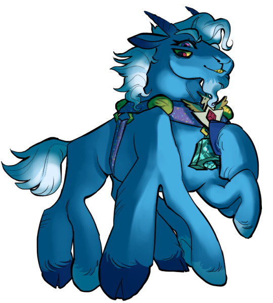
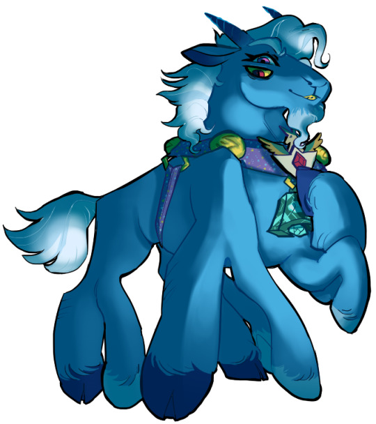
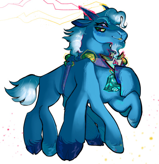
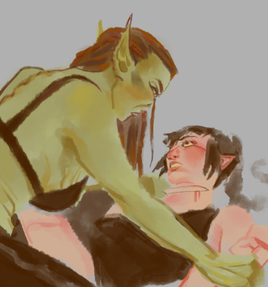
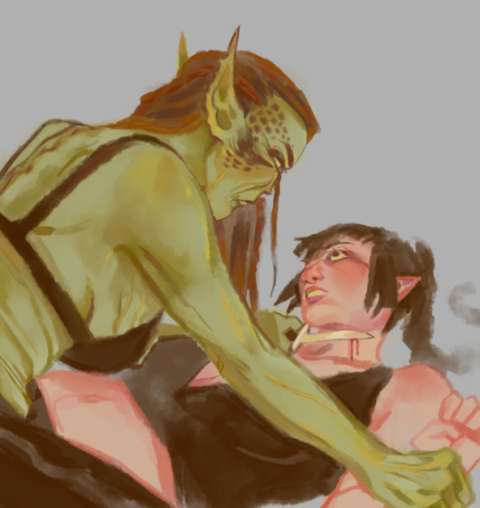
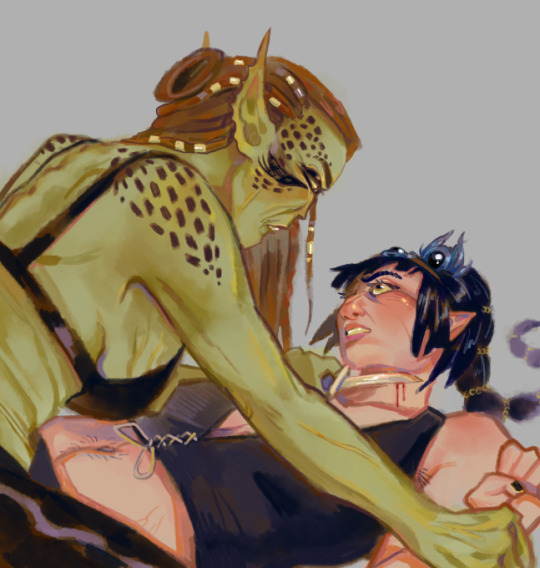
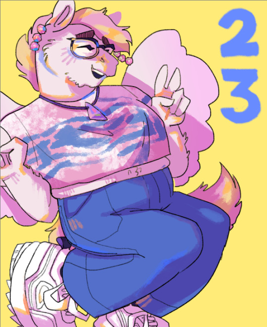
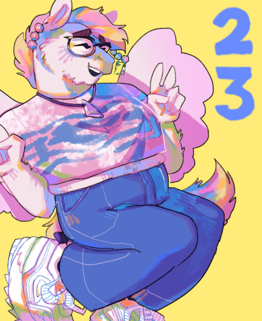
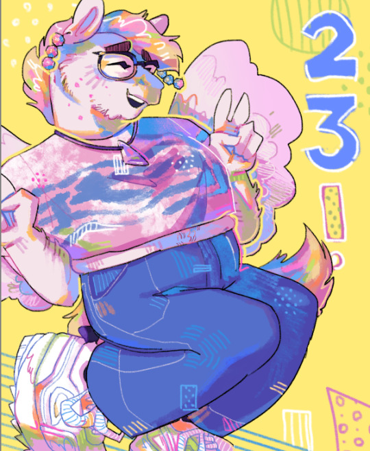
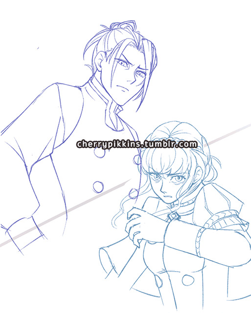
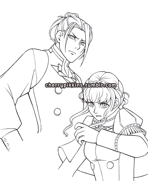
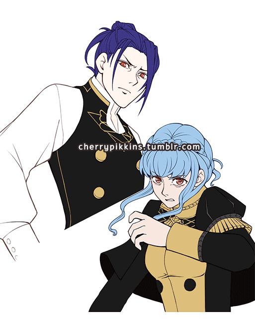
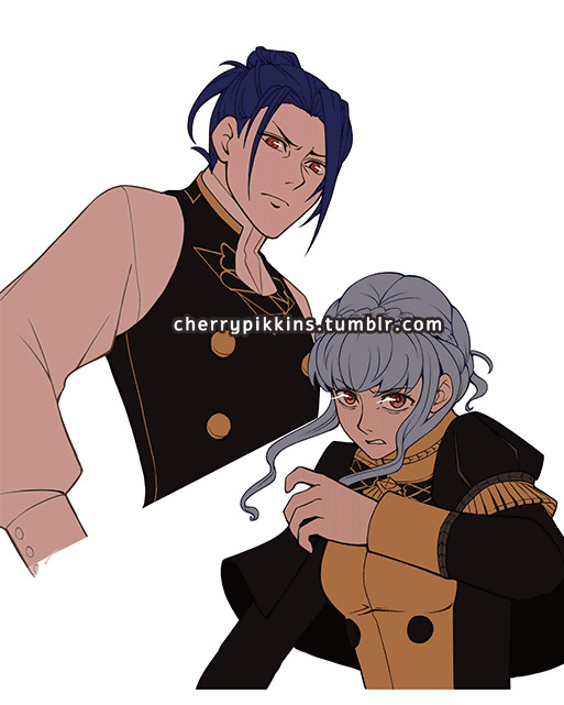
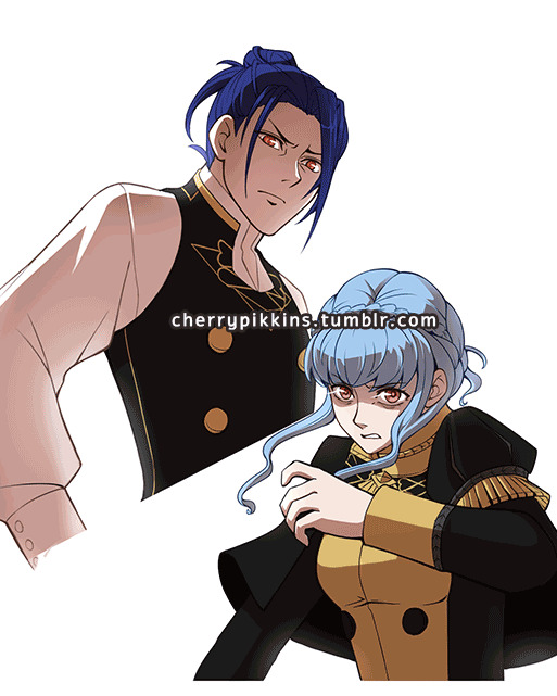
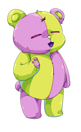
#all of my linearts were colored multiple times
Text
me *realizing i participated in a coloring event*: huh maybe i should check tumblr to see- WHAT THE
#literally thank you all#so much#all of my linearts were colored multiple times#with sam being the favorite by a long shot#(dont worry shes my favorite too#also definitely what my invisobang fic is gonna be about)#but this event was so much fun#greenwithenvy2023#danny phantom#also there are still more rbs on the way...
10 notes
·
View notes
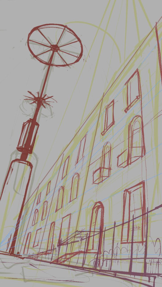
Photo
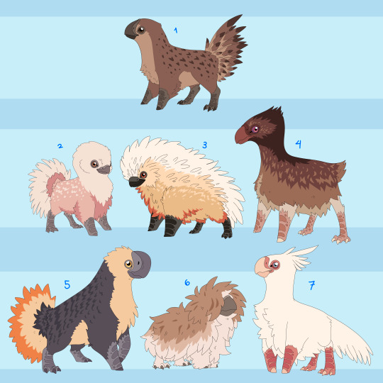
Wanted to expand on some domesticated animals of Mirum. These are basically cat-dog birds, ranging in size from cat to medium sized dog. Still need a name for group over all, suggestions appreciated! In depth info below the cut!
1. The OG
This is the wild ancestral form, basically the wolf to the dog. They are from the grass/shrub lands of Mirum and spend most of the year scrounging around for food until the end of the wet season. Once the floods are over they pop out babies like nobodies business while feeding on the debris left by the flooding. By the time fire season rolls around their numbers are pretty scarce. They travel in little groups with multiple hens and one big buff man! But this man does not necessarily need to be a male, or a bird even! They were the first species domesticated by the chimera and the only one to leave Mirum with them.
The ‘Natural’ Breeds
These are just the morphs bred into these fellas without any magical manipulation involved, so they still look relatively close to their wild ancestors.
2. The Cupid
These are purely pets, originally kept just for eggs they lost that purpose as more efficient birds came around for that. Now they just make docile lil lapbirds. Though inattentive owners will find old eggs hidden throughout the house if they’re not careful. Most of the time though they tend to stay by their owners ankles.
3. The Ruff
Fluffy lil guys who make for great pest control, they’re a very sporty breed despite everything and need a lot of energy to stop them from destroying their surroundings out of boredom. Will do well with another ruff or dog of similar size, though they can be a bit of a bully in the care of a lax owner.
4. The Gallop
Literally just made for running, can keep up with a chimera at full sprint and at a normal long distance run. For those with a more active lifestyle. Though they will just as happily laze around all day, just happy to be included honestly. These are also the best swimmers of the natural breeds with their extra oily coat.
5. The Dome
This is a purely ornamental bird, stocky and colorful they are the most relaxed of all the birds. Most prefer chimeric company to that of other birds and have a habit of separation anxiety when not with their owner. In line with that, these are the most accepting of chimeric ‘talk’ with most quickly getting accustomed to projected commands. Though please don’t overwhelm your bird, casting the full range of sentient experience unto lesser beings CAN and WILL cause them existential distress! Not to mention your personality may displace your pet’s.
6. The Fluff
The original pillow stuffing. These guys feathers are softer than any other. Keeping a mostly downy ‘undercoat’ for their whole life. That being said these guys can get absolutely RANCID if not kept clean and tidy. Only for the most advanced and attentive of owners unless you want an unholy dingleberry beast skulking around. They also are VERY bitey.
7. Crested
These are historically for eating, but have grown to be a very pish posh fancy breed. Most are pure white, thanks to inbreeding, and albeit are not the sharpest tools in the shed. But if you are looking for a bird who may just ignore your commands but love you eternal, this is your bird!
That’s them so far, will make the magical monstrosities later. Also wanted to try a different lineart style. Thin is nice but I miss my chunky brush. Glad to have tried it though!
#mirum#chimera#chimera adjacent really#fantasy#birds#need name aaaah i cant think of a good one for these still tho HM#speculative biology#spec bio#Speculative Evolution#spec evo#art#no true north
502 notes
·
View notes
Note
talk shop tuesday!! (´꒳`)♡ awhile ago you mentioned that you were messing around with some new color palettes to help with artblock. your color choices are really interesting to me, esp the colors you choose for lineart, and i was wondering what you tend to gravitate towards color-wise and why?
thanks for the ask!!
so fun story, one time i brought my laptop and graphic tablet over to my friend's house and we had a fun session of my friends drawing and me watching them. the result is as follows:
colours used by them vs my colours before that
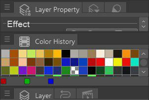
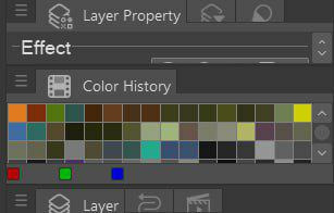
[id in alt text]
so i guess it's pretty telling.
i tend to lean more towards muted darker colours and my default background grey because a) my eyes get tired of staring at white screen b) it's actually better for later colour picking and rendering because something in colour theory about contrast.
my lineart is either solid black or dark grey when inking, but when i use softer brush i get to colour code characters or scenes or mood with which i associate that piece.
in drafting i use different colours to differentiate sketch layers in the drawing to not get confused when inking later. i tend to use red, blue, green and magenta since they are high in contrast (at least the ones that i use)
[id in alt text]
(i save my works in various stages all the time including just taking a screenshot bc my laptop had blue screened on me and corrupted my files multiple times before)
as for colour palettes, it was more of a change of pace, a trick to get myself out of artblock by changing how i approach the process. with limited colour palette it was interesting to figure out what colour goes where which basically ment building a piece backwards because colour is always an afterthought of mine
#great question! i tried to dig up some interesting insight sketches so hopefully these are good examples#l&co#amphibia#sketch#talk shop tuesday#inbox#id in alt text#.mypost#artpost
11 notes
·
View notes
Note
How do you manage multiple projects? Like seriously you have verse, seekerquest, and redux and they are all amazing!
Also a side note but I get so freakin excited for new chapters every week, I absolutely love this series!
(Seeker and Verse)
Thank you so much for enjoying my projects! It's a very good feeling to have someone read and like all these things that are so precious to me. I'm just as excited as you are when I post a chapter (and another one's coming tomorrow, to my delight).
As for managing all of them...it's a number of things.
I have a lot of free time thanks to my job, which allows me to work on stuff for a large portion of the day. That's the most major factor - I can afford to be busy creatively all I want, which I know I'm extremely lucky to have as an option. If I were working a 9-to-5, I would not be able to do all of this thanks to how much that would suck out my energy and inspiration. So, blessed be my fortune there.
Besides that, I've figured out how to manage my efforts and time into a pattern. Three days of working on Verse (one day each of sketch, lineart, color), followed by a free day to rest, then back to Verse. Mind that Verse is specifically designed to be efficient and easy to draw/script, so when I'm done for the day I still have energy to do other things - largely, write for Iterum. On my off days, I can get an entire chapter written, but on Verse days, I have to limit myself to a smaller amount of writing.
There's also the fact that...well, honestly, I just really love doing this. It's my favorite thing in the world. It actively feeds me all of the happy chemicals when I'm linearting a page or I've gotten to a chapter I've been really excited to write, so it's something I spend a lot of time doing and feel happy about. Obviously, I have periods of time where I'm not keen to draw or write this particular part, but I've gotten myself disciplined enough to just power through those until I get to the fun bits. That's not to say I don't give myself breaks (no matter what my friends tell you), I just know when I need a break and when I need to be tough and get the thing over with.
I would say that, if I'm to give any advice on how to do two or more things at once, it's "learn your limits". How much effort can you put into multiple comic pages before it becomes too much work? How long can you work on a chapter of a fic before you're exhausted and crash for three days? Can you do a long animatic by yourself, or do you need support? Questions like that are essential to creating without killing yourself - and once you figure out exactly where you can settle down comfortably without giving too much or too little, the sky's the limit. Don't be afraid to take breaks, but don't be afraid to push yourself past that bit of dialog you weren't eager to write. There's a balance there, a sweet spot that you CAN find and will be comfortable in.
16 notes
·
View notes
Note
hiii!! your artstyle is SO COOL to me- as in sometimes i'll just stare at some of your pieces because theyre all so great. i was wondering if you were comfortable sharing your process when it comes to art?? i'd love to see how you do things!
Hi!! I'm sorry this took so long to answer, I hope you still find it useful. It means a ton to me that you enjoy my art so much! <3 It's easy to feel discouraged by the Invisible Hand of Internet Engagement, so I really appreciate your ask.
General thoughts (NOT rules, just things I consider or do a lot):
Things that appear one solid color irl can be broken down into multiple colors through artistic interpretation. I see a lot of beginner artists paint trees as solid green, when there's a lot of yellows, blues, and browns in there! A FANTASTIC example of this is jadenvargen, whose color use is masterful and I can only aspire to emulate one day.
Base colors are not saturated; saturation is reserved for pops of color and details
Shadows are purples, blues, and greens
Reference is your best friend!!!
So the nitty gritty for those who want to see: with digital art there's two main avenues I take. The first one is lineart, and the second is painterly. All IDs are in alt text.
My process for lineart pieces:
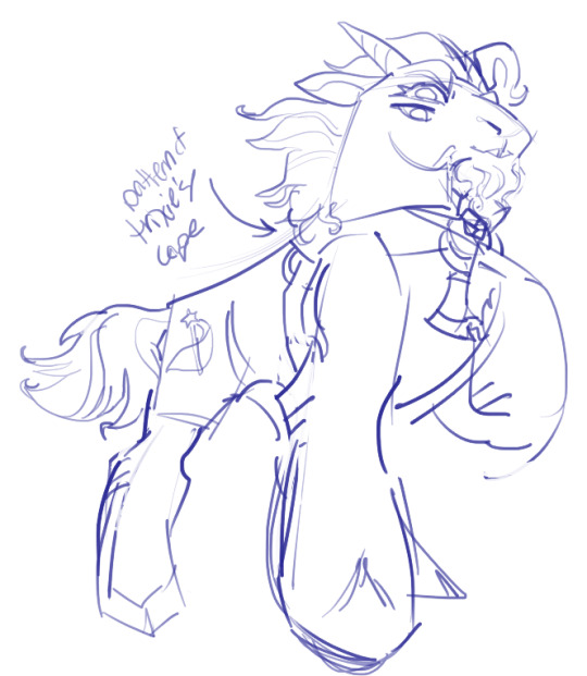
I always start off with a sketch; for this example I'm using one of my pieces from @/mylittlefusions (that isn't actually posted yet but will be later today) - a Grogar and Trixie MLP G4 fusion. I like to fiddle with brush selections until I get the effect I want, and then go slow on the lineart to make sure it's how I want it, so this can be time consuming!
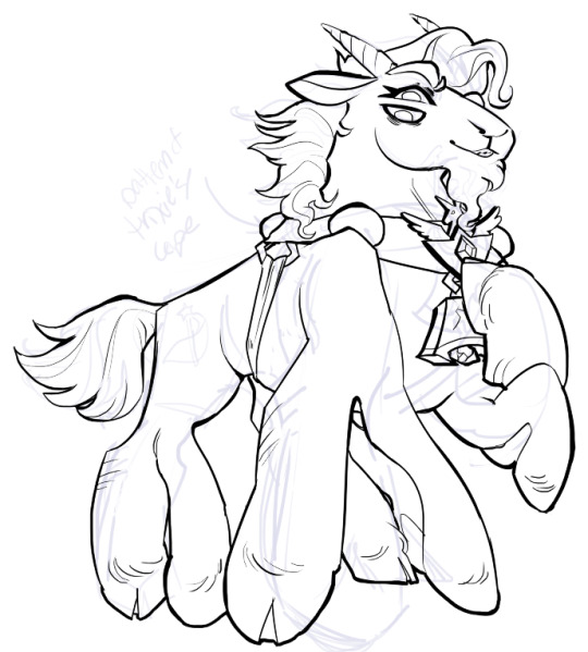
I've been trying for distinct shapes; I hate when my art gets muddled, I feel like the end piece is less impactful when I don't put in the right amount of contrast and distinctive silhouettes. Just something I've been thinking about and trying to improve.
Then I add base colors, going for slightly desaturated colors. I like to use saturated/bright tones to contrast or draw attention to something. I put the base-base colors down in one layer and then add details as a mask layer:
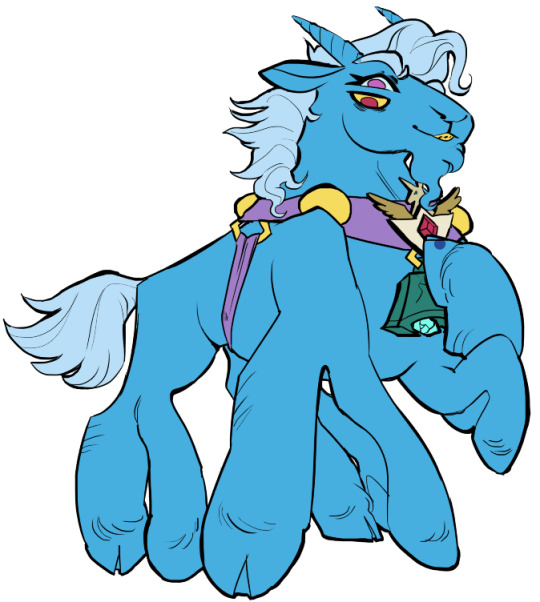
Then comes shading!! I'm a big fan of a multiply layer set to cool tones like blue, so I usually start there. If I think it needs to be different I can change it later. In this instance, I filled the whole canvas in the shading color as a mask over the base colors, and then erased where needed. Now that the shading is done, I often go back and color the lineart :)
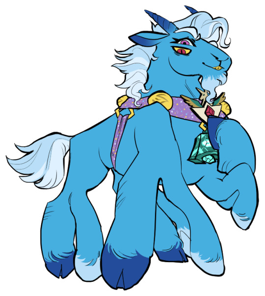
Last but not least is my favorite part, painting on top! The extent to which I do this depends on what I think is needed, but I usually at least paint on top of the multiply shading to add some nuance, i.e. the greener bits on the background limbs. Here I added bright magic outlines to pop from the more desaturated character.
My more painterly style is a different story though! I use the same thoughts about color and shading, but I usually forgo multiply layers entirely and just do colors by eye. I still do a sketch, usually. Here is an example using my Lae'zel / Shadowheart piece.
The sketch is a disaster zone lol - but I painted below it using base tones, again desaturated. Once I feel I don't need the sketch anymore, I keep painting, making a new layer when I feel like being cautious about a change I'm making.

After I feel that I've got base colors down, it's time to get more contrast in using darker and/or more saturated colors! Then, like with my lineart process, I paint more details on top of everything else - reflections, jewelry, body hair, etc. I try to communicate shadow and distance with purples and blues, but I'm still working on it.

Another example real quick, where i did my typical lineart process base work and then painted on top of the shadow layer and the entire piece as a whole:
Thanks for reading if you stuck around, and thank you for the ask, friend! ^^
6 notes
·
View notes
Text
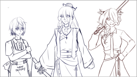
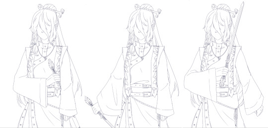
For anyone who is curious, here was my process for doing the Felix vs Marianne swordfight illustrations!
Since I had to complete multiple images in sequence, I wanted to focus on lighting contrast and inked lines while making sure everything was done consistently while not spending an obscene amount of time.
The tools used were PaintToolSai 1.0 and Wacom Intuos 4S.

1) I start with the rough draft and composition. Since the poses are most important at this stage, characters are drawn from memory
2) I do the underdrawing. I check the official character art and make sure the designs and outfits. This step will ensure that I know where the rendered black lines should go. Transformations can be done at this stage to ensure proportions (such as head vs body size) are correct.
3) I render the lineart in black. This is the most time-consuming part. Because of all the double-checking I did in step 2, there is no need to keep looking at references. I may apply minor transformations to adjust proportions. I use different line weights to make the lineart more appealing - heavier for outer lines, thinner for details
4) Color placement - I choose similar colors as the official art, but adjust for higher contrast. I also do the eye detail.
5) I create a shadow layer using the Multiply mode, with clipping enabled. I used a color that complements with blue and provides a shadow tone for the skin. Since the illustrations feature two characters in combat, a single shadow layer keeps everything simple.

6) I decide on the directional lighting and use Sai's transparent brush at a solid setting to erase away at the shadow layer on one side. Then I use a soft airbrush on the other side. I decided not to blend shadows too much or do a separate layer for ambient occlusion so that the lighting is more dramatic.
7) I create a highlight layer at Luminosity setting, but all I did was use the airbrush very sparingly for a slightly backlit effect. If this were a more detailed illustration I would also add highlights using a more solid brush, but I skipped this step since the shadow layer provided a lot of contrast already

8) Here is what the image looks like with only the lineart and shadow layers. At this point, it is mostly touch up. The shadow layer is airbrushed with darker or lighter colors at the edges either to make it more intense or to soften the lighting. Color is added to the line art, but not too bright colors since it still needs to stand out.

9) Finally, a bit of background accent is added. The image is also cropped for better composition.
And that should be it! I'm always happy to share my process and will answer any questions to clarify things. :) I'm by no means an expert and am always learning. This process skips a lot of the usual steps that I would normally use for a full and more detailed illustration, but was effective for emphasizing action and form while keeping multiple images consistent. Why overdo it, ya know? XD
Hope that helps!
#felix hugo fraldarius#marianne von edmund#fe3h felix#fe3h marianne#fire emblem three houses#fe3h#fe3h art#tutorial#paint tool sai#gif#blue lions#golden deer
40 notes
·
View notes
Note
I absolutely love following along with your art and the process behind it! I'm curious about more behind the scenes stuff, as I have picked up digital art after not having drawn regularly in 10+ years.
When you do your drawings, what steps do you take? Do you use real references? Skeleton sketches? I'd love to know more about how you approach things digitally!
Oooh, first of all, thank you so much @emeraldzephyr! It is such a lovely thing that you decided to pick it up again!
As for how do I organize myself for drawing, every person works with a different procedures and it is important to know what works for you. For me is organization and inspiration.
For me, the most important thing is having references. It is more important than experience, more important than skill and even than inspiration. When you start messing with a blank canvas you need to know first hand where you want to go, or at least, have an idea. I won't likely start drawing without some references pictures. I learnt this when I took classes last year and this is probably the only thing that actually fully stuck.
My main resource for them is Pinterest, and I navigate through it with intent. I also have multiple packs of pictures of models and references that I have purchased in Artstation. Either way, references, to me, are essential and necessary. In Pint for example I have different boards, some for poses or compositions, some other for finishing, some other for colors palettes, or effects, or styles. I may have (and it is likely to be that way) multiple references for a single illustration ("I like the composition of this one, but the color palette of this other one, but the light works incredible in here, and wait, how was exactly the curvature of the nose of Joe Quinn in this perspective...? Shit! Keery's moles!! How were them distributed in the right side of his face? asdfadfs").
So you see, this is the first and the main thing I do. And I am also fattening with pins all my boards anytime I've got the chance (on my way to work, in public transport, waiting in lines, etc.), so I don't run out of ideas.
When it comes to actually drawing, I always make my canvas extra large and fit the main reference there so I don't get it out of sight (probably the one I'm using for composition) and make a first sketch than I later proceed to fix because it is often that I get wrong the proportions or the perspective, and that's okay. I can do five or six layers of sketches and then I do a first lineart that is messy, but it compiles everything that I have from different references. I spend a lot of time with this. Before shit gets serious and you start with colors, it is important for me to be happy with the sketch, or I may work a lot of hours on this particular illustration and you will end up hating it because "fucking shit, that ear is too small, how didn't I see it before!!!! [yes, I have no shame in showing what I think I failed miserably, the next piece was better, and so on. I keep learning everytime. I trust the process in broader aspects of art, not only in piece by piece]).
I create folders for the color process and try to organize the layers in it, first painting them with plain colors in separate layers and then adding layers once the whole illustration is fully coloured, first starting with shading, and then to light.
For me it is really important to play with the different effects of layers, play with opacity, gradients, brushes, tools, etc etc. I always find some effects that I wasn't expecting and the quality of my work will rise up just because I just found something interesting that weren't expecting at all, so, yeah. I play a lot with my software. All the time.
And finally when I am happy with it as a whole, I add a few filters (noise, blurs, etc.) If I want a very specific effect and I don't know how to do it, I have no doubt in stopping for a minute and finding a tutorial that teaches me how to do it (like the flare in this illustration, or the video effect moving color channels in this one). I always keep in mind that I should not get frustrated when I don't know how to do anything because I can always google it and it is a great opportunity to learn something new.
I am so so so sorry if this was too long, and probably it wasn't interesting enough, but that's what I do. And again, I want to make myself clear when I say that there is not a correct way to do things when it comes to art, this is just what works for me. I am no expert, I had to try and fail many many times to find the right approach for me without getting sad or frustrated. I, myself, have reconnected with art not that long ago after a decade, too.
I wish you the best of luck with your reunion with digital art!! Looking forward to seeing your pieces <3
13 notes
·
View notes
Text
✨Weekly Progress 2024 #13-15✨
I thought I missed 2 weeks, but turns out it was 3 🤐
Weekly Progress #13
Submitted DGM Page
Submitted 1/2 Fan Project checkin
Fleshed out about 1/3-1/2 P^3 outline
Read through + ID'd illustration points for Fan Project #2
Weekly Progress #14
Made SYVNH Script plan
Copied SYVNH + Side B to renpy
Talked with SFB musician
Drafted a pitch
Initial scripting pass for SYVNH main story
Sketched SFB Dove & Avia sprites (additional poses + outfits)
Linearted SFB Raven sprite
Weekly Progress #15
Initial scripting pass for SYVNH Side B
Finished 19 new additional SYVNH art assets
Coded in additional SYVNH art
Programmed in Side B link in main menu
Scripted in additional SYVNH art
I had a lovely two weeks of scripting 🙂🙂🙂
Yes, I lost my mind. Yes, it was mostly missing to begin with so no harm done.
Stuck in a Yandere Visual Novel...HELP!!
As I discussed before, I do my scripting in multiple passes. Though, this time I checked to make sure my staging is good before doing sound bites and audio. I'll admit that it's mostly so I can listen to streams as I go through the rather mindnumbing task. There were 10 files for the main story remaining so I tasked myself to script 2 files per day. Each file varied from as little as 150 lines (like 1 file) to 200 lines (most files) to 300+ lines (1 ending) and completing 2 files/day took about 6-8 hours.
Scripting mistakes result in both above and below. ...This is what I get for calling MC's sprite "mcs" and the male extra sprite "ms" One missing letter gives me a black shadow jumpscare.
The Side B scripting was a bit forgiving. It's only 28 pages compared to Scenes 5-6's 55 pages. So altogether Side B only took me 2 days for first pass scripting. That gave me time during the rest of the week to draw... new art assets... that I realized I needed during scripting. Some of them weren't required, but I felt would make a scene flow better.
And since I'm an artist?
Of course I did all 19 of them.
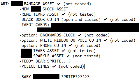
Wait, this wasn't updated- Just trust that I did 19 new image assets, including 3 new sprites 😂
Here are some previews. Is that a familiar character? Maybe~
So yeah, I've coded and scripted in all the new art, but I haven't tested everything yet. I plan to do that when I add in the soundbites.
A Sky of Falling Birds
...Still don't know what sort of visual I want for the game so I just started making sprites and lineart. I might make a demo with just the flat color at this rate tbh.
I got some positive reactions on their sprite sketches, so that makes me shy happy ;//v//;
Peter Pan Project = P^3
Still no title, but I've gotten used to calling it P^3 right now haha.
I didn't get very far with this project in the last 3 weeks, but about a third-half the story is outlined.
The story comes in 2 parts. The first part is 2/3rds outlined (1.7k+ words). The second half of the story is two bullet points lol. Granted, The second half may be a rapid descend to a conclusion. The planning document is already 2.3k+ words, which surprised a few folks...? I think my longest planning document was 11k+ words.
Hopefully next time I update, I'll have more info to share.
[Fan Projects]
Not too much/anything I can show yet as project rules have me not sharing until specific dates. It will be for Ace Attorney and D. Gray Man c:
3 notes
·
View notes
Note
Hi hi!! I’m getting into drawing humans and I would love to see your process for your lined and coloured digital pieces! I would also love some advice for drawing in any nature if you can~
No problem at all!! Sorry this took a minute to get to, but I wanted to get a good drawing to show a step by step process for lol. And since I’m extremely aware of the fact that my handwriting’s crap lol, under the cut is a transcription!
NOTE: I’M NOT AN EXPERT. THERE ARE TOTALLY BETTER EXPLANATIONS OUT THERE LOL
Roughs, imo, help just understand wtf you’re doing lol. They don’t have to be neat in any sense, and they just serve the purpose of you understanding how you’re gonna go about whatever
I am literally insane and do lines in one layer 99% of the time. And usually my “lines” are what most artists consider their sketch. I’m just an impatient artist fhfhdbfb
In my experience, changing the lines after helps find spots that were missed when coloring much easier! Whether that’s with the fill bucket or by hand, it’s super annoying when it misses stuff. Happens to the best of us


If I could marry a stage of art, it’s these two. I feel like I black out and wake up when I do them, but they’re so fun. I apologize for the last one not really having advice, but it seriously is up to the artist on what to do here! I add gradients with different layer types to make colors pop, but the colors can change depending on where they are or even what character it is. There’s no set-in-stone advice there, at least in my experience, and that can go for both stages 4 and 5.
AND I GOT A HUGE TIP FOR DRAWING HUMANS: REFERENCES!!! USE THEM!!!! I am a big fucking idiot for not using them more, since a kid I’ve been resistent and IDK WHY, IM A BIG STUPID IDIOT, USE REFERENCES PLEASE. It helps so much and makes your art make sense. By that, I mean that the gestures are so much clearer and everything. Your best reference? YOU!! Take a photo of yourself doing a stupid-ass pose! I did that for my recent animation, where this exact frame was taken from me, posing in front of my camera!

(His fuckin pancakes :,( fhshhd im sorry)
Do not be scared to use references, please. I beg of you, I beg of ANYONE reading this. USE REFERENCES. TAKE STUPID CRINGE PHOTOS OF YOURSELF FOR YOUR ART.
Hope that helped!! And again I am not a professional and none of this is saying to copy me exactly. It’s purposefully leaving out some of my process so you can explore your own approach at drawing humans! I wish you luck, anon!! :Dcc
Transcript:
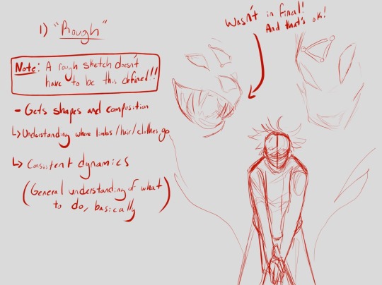
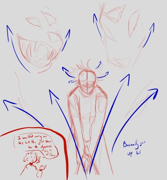
1) “Rough”. Note: A sketch doesn’t have to be this defined!! Gets shape and definition; understanding where limbs / hair / clothes go, consistent dynamics. General understanding of what to do, basically. Pointing at dog face: Wasn’t in final, and that’s okay! (Extra image: I wouldn’t worry about this, but this just shows how the dynamics try to flow. Basically just up lol)
1) “Rough”. Note: A sketch doesn’t have to be this defined!! Gets shape and definition; understanding where limbs / hair / clothes go, consistent dynamics. General understanding of what to do, basically. Pointing at dog face: Wasn’t in final, and that’s okay! (Extra image: I wouldn’t worry about this, but this just shows how the dynamics try to flow. Basically just up lol)
1) “Rough”. Note: A sketch doesn’t have to be this defined!! Gets shape and definition; understanding where limbs / hair / clothes go, consistent dynamics. General understanding of what to do, basically. Pointing at dog face: Wasn’t in final, and that’s okay! (Extra image: I wouldn’t worry about this, but this just shows how the dynamics try to flow. Basically just up lol)
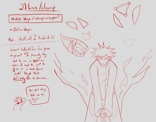
2) Lines/Cleanup. Multiple stages can happen!!! Defines shapes… And that all I kinda do loll. Lineart differs from person to person! I personally try not to use the stabilizer unless I need to, just to give it a hand-drawn look! Though that definitely has its downsides… This part takes me the longest…
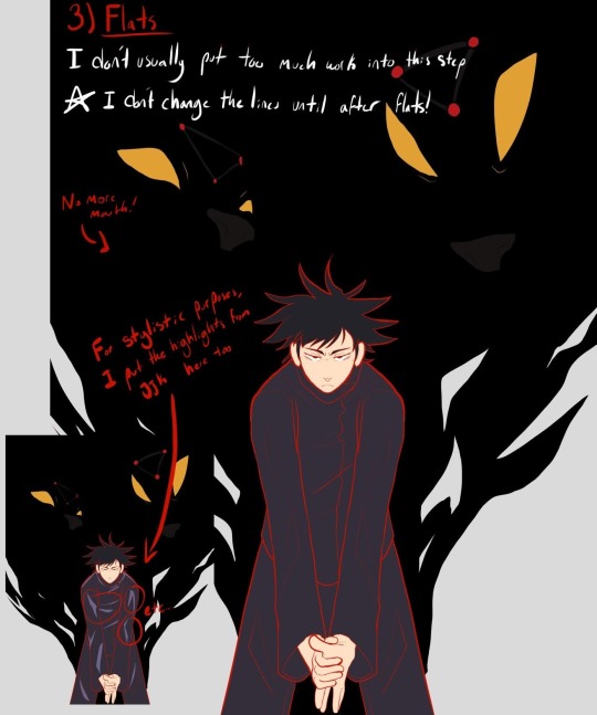
3) Flats. I usually don’t put too much work into this step. I don’t change lines until after flats! Pointing to dog face: No more mouth! Pointing to bottom image: For stylistic purposes, I put the highlights from JJK (Jujutsu Kaisen) here too
#if i had a nickel for every time I wish I had better handwriting#but yeah! i am seriously no expert and make it look so simple#i swear art is some form of wizardry. even going through it /i/ was surprised#it doesn’t feel that easy and it definitely isnt but how can it look that easy#anyways I hope this helps in some form anon! don’t be scared to look up tutorials and other stuff! no harm in doing so!!#my art#ask#cotgar rambles#long post
16 notes
·
View notes
Text
As someone who is slowly learning how to do digital art alone, I may have some advices to give to those who want to start and don't have time/resources to spend a lot of time trying and testing out drawing processes.
These are some things that I've found useful but Boi, it got me a lot of time to get to it. Of course, this is just what I think can be a good advice for who is a newbie like me, you can try it as a way to start your coloring process but it's not something professional t.t so take it with a bit of salt
First advice I wanna give is to do like I did during this drawing process: while I keep everything on different layers (skin tone / armor / hair /detail / background), don't just start with one layer and then start another one after rendering the first one.
Multiple times I've noticed how the different tones didn't match to each other, or the colors were simply horrible to see next to each other. I've spent a lot of time fixing this type of issues in my old drawing, always deleting the layers (fully rendered) or trying to change the tone with horrible results.
Instead, if you too happen to have this problem, I'd advice you to first coloring everything with the base color. As you see in the video, as first thing I simply filled the lineart with base colors. It's not clear but I assure you I've changed his skin tone multiple times because it didn't match the armor. Same with the mask and the red details.
This is something you can easily do at the beginning to see if the colors match and are nice to see all together in the bigger picture.
It's really something easy and I'm 100% sure they teach you this literally at the beginning of art school but Boi I'm stupid. I only learn when I do things myself t.t
Change colors as much as you want until you've reached your desired tones. Be careful of saturation levels. To make everything more balanced, play with the hue level for every base color you've used. You don't like how the red is in contrast with the blue? Change the red layer' hue/saturation values a bit and you'll find the perfect type of red you need.
After you are happy with the overall results, start with the rendering.
This is something I recommend to do if you still aren't used to the use of tones/saturation.
If you need some examples of the pieces where I struggled, here you go: this one is probably my fav one even now that I draw from pc.
Before:
As you can see there isn't balance in the colors. Fulgrim's skin is too much out of everything and in general there is too much differences between the colors. It just doesn't look harmonious. Then:
I assure you I haven't re-drawn anything here, just fixed the saturation, tones and hue levels (and added a bit more of shadows), yet now everything matches. (i also have changed the color of the lineart in a few places, look at the hair for example).
This might looks obvious to others, but I've spent a lot of time on this piece with the only focus on making those colors look nicely together and with time I've learned from my mistakes.
Another example: the commission I did a few weeks ago. I had to draw an Imperial fist, so you'd expect to see a yellow armor. Considering that I painted the background with red colors, bright yellow would have been quite a shock to see: that's why the base color is not yellow but orange. Same thing the clothes aren't white anymore but a light pink.
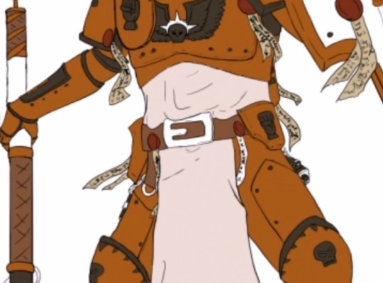
On a white background it looks weird for an IF armor, yet this is the result at the end:
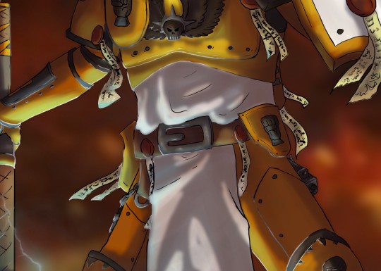
Yellow is only for the parts hit by the light, where the shadow are more on the red tones. (don't mind the light blue for now)
Of course, you have to take in consideration many things before changing the hues of the original colors, but I hope this could help c:
#Art tips#For newbies like me#Just in case you're struggling with the colors like used to do#Kind of rambling#Video#My art#Digital art#Long post#Might also be wrong but at least it's a start
18 notes
·
View notes
Text
yk what mutuals are asleep im gonna blab abt how much i love ibispaint :3
ibispaintx is my favorite mobile art app as someone whos been using it for like. three? four? years now.
the majority of its features are free. if you watch a short ad you unlock all the brushes for 18 hours, and while the ads are annoying and the fact that there are some features that are locked for premium users sucks, i still think it's worth it. (the most notable locked premium feature for me would be the lack of the gradient adjustment layer
stabilization. LIFE CHANGER TO ME <- guy w shaky hands and wasn't used to drawing w their finger. this + forced fade could be helpful to anyone having trouble with lineart esp bc we don't really have enough room to work from our shoulders nkjbhgvfc. it's honestly my favorite part about ibis. it's not super adjustable unfortunately but i really like it.
reference window. this ones a rather new feature but it can help a lot w proportions and ofc regular references :) you can add multiple pictures and resize both the picture and the window as you please AND you can color pick from it. the pictures will stay the same from canvas to canvas though but i just use that as an opportunity to have an image of batman looking silly on every drawing i do on ibis.
fonts. sooo many fonts and! you can download fonts into ibis too!
brushes!! you can customize them (its not the best but like. it works) and download them :) there's a color mixing mode that makes it really easy to blend colors and its super fun to play w that if you're not very good at colors yet. theres also fun textures. i think their pencil textures are the best pencil textures ive seen in an art program.
THE UI! ALSO ONE OF MY FAVORITE THINGS ABT IBIS EVER. the ui is super beginner friendly imo and it's not as cluttered as other programs (which is sm i personally like bc i find it hard to focus if the small screen im using is also cluttered. i struggle w the reference window sometimes
automatic timelapse + drawing time :)) good for keeping track of time and progress! it's vv rewarding to see the difference of a piece that took me 3 hours a year ago vs a piece that took me 30 minutes today.
clipping masks and alpha lock. I MISS THEM SO MUCH I WISH KRITA HAD THEM THE SAME WAY IBIS HAD THEM
SO MANY ADJUSTMENT LAYER OPTIONS. these were sooo fun when i had a vaguer understanding of color
ill update this list later it is so hot im dying brbsies. <3
#art stuff tag#anyways all this is to say if youre a mobile artist w no intent on spending money on an art program#and need stabilization and a beginner friendly ui that isnt cluttered#try out ibispaint :3
5 notes
·
View notes
Text
HOW TO IDENTIFY AN IMAGE FROM MIDJOURNEY, DALLE-2, OR STABLEDIFFUSION & WHY YOU SHOULDN’T CLAIM IT AS YOUR OWN
people are pieces of shit and pretend that their “art” is actually theirs and not from AI. i like AI and find it fascinating and as someone with any inkling of a following, i want to let people know of this.
i am not affiliated with any of the AIs i talk/post about and i am not being sponsored by any of these to put down one and prop up another. i am trying to spread information on how this works and why it’s not okay to claim AI “art” as one’s own.
all images used in this post were either generated by me or were publicly available.
---
WHY SHOULD PEOPLE NOT USE AI TO CREATE THEIR “ART”?
the way AI pictures such as the ones from these websites and apps is by taking images from around the web to combine into one image based on prompts. this is accomplished by finding images attached to descriptions and putting them in a GAN; i have more information on that here.
so essentially, by generating new images, you are ultimately taking someone else’s work and smashing it all together to create something new, most likely without permission.
this is also how artbreeder works, which was more evident in its old name of “ganbreeder” (which contains “GAN”).
since this is technically at the end of the day someone else’s work, this is also why they shouldn’t be sold as NFTs (not to mention the complete lack of effort put into them; you just come up with a prompt and type it in and the ai does the work. at least with stuff like bored apes someone had to draw all of the initial variables individually so an AI could mash them all into a single image with no rhyme or reason).
---
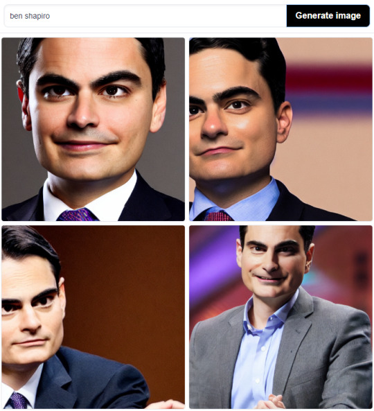
HOW TO IDENTIFY AI-GENERATED IMAGES FROM MIDJOURNEY
midjourney images have a very specific look; they tend to look very painted with sort of... muted colors a lot of the time. youtube channel SolarProphet has many videos that feature midjourney. they all tend to look like paintings and i’ve found that the AI very much likes to make portraits with a character front-and-center.

---
HOW TO IDENTIFY IMAGES FROM DALLE-2
dalle-2 images can be harder to identify because the AI is very advanced with many data points.
it is able to generate images with multiple art styles, but also may generate things that look like photographs.
the best way i can describe dalle-2 images is just looking... off. if you look carefully, something will look wrong. in the picture below the top eyes are mismatched, etc. something would be subtly off. you have to look carefully.

in this one: one of the eyes looks smudged and the spoon handle doesn’t seem to be leading to anything.

dalle-2 can also generate rather convincing clipart at times, but they also may have something off about them. this picture of a frog looks normal at first glance, but if you look carefully, you can see that it’s missing a toe, coloring on the far arm is wonky, the lineart on 2 of its fingers is bulging out, there is an extra line on the top shirt pocket that cuts off a yellow band, the legs are oddly shaped, etc.

yes, some artists may draw like this, but most likely they would keep proportions consistent, no? (saying this as an artist myself btw)
---
HOW TO IDENTIFY IMAGES FROM STABLEDIFFUSION
stablediffusion is a lot like dalle-2. due to lack of resources i can’t really give the best answers on it. it is much more customizable than either midjourney or dalle-2. the web apps can go up to 150 steps on dreamstudio and 50 on the huggingface website, which affects quality (unlike midjourney and dalle-2 where the number of steps is fixed (to my knowledge, anyway)).
my computer struggles to run stablediffusion locally due to my graphics card (i CAN run it but it basically eats all my memory). i also don’t know how many steps midjourney and dalle-2 use to make their images, so i can’t make pictures with exactly the same amount of steps to compare it all to.
i got these using both web apps and as you can tell, they are off and not quite right, though i expect with more steps, they would be better. i expect the way of telling that they are AI generated is similar to dalle-2?
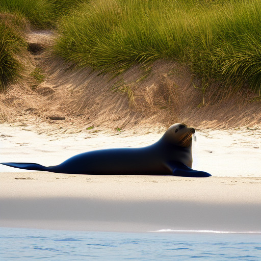
---
it’s hard to explain how i personally tell when an image is generated by ai, and of course my method is not foolproof and it will never be. humans are imperfect creatures, after all. these are just patterns i’ve noticed personally.
#midjourney#dalle 2#dalle-2#stablediffusion#stable diffusion#ai#ai generated#sorry about ben shapiro i was just using the stuff i already had lol#hopefully will get back to posting soon fingers crossed emoji#not ganbreeder#long post#info
7 notes
·
View notes
Text
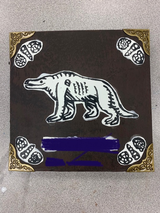
Dinovember day 16: triceratops! With no help from tumblr for deleting my first draft…. Also a little late because my wifi went down! Hopefully you’ll still take it…?
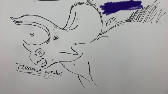
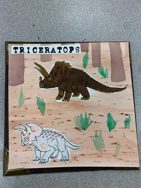
Just a couple things I made in art class a while ago! The first is a whiteboard doodle of a triceratops because I had free time, and the second is from a book I made! Our project was to make a book with at least 8 pages using multiple medias. I decided to make my book comparing vintage/pop-culture “dinosaurs” versus the modern ones! The backgrounds are all water color, the “old” in acrylic, the “new” in colored pencil and pen, and the names in letter stamps! The cover used acrylic, hand carved stamps, and book corners. I chose paint for the “old” dinosaurs to mimic oil paintings, and the lack of lineart helping represent our fuzzy understanding of them. The “new” dinosaurs have lineart, representing how much clearer they are to us, and the (cheap) colored pencil represents the new generation of paleontologists and paleoartists. The watercolor backgrounds were meant just to be out of the way, putting focus on the animals. The letter stamps are meant to resemble that of a typewriter. I was originally going to hand write info blurbs, but I ran out of time- for that same reason the paintings aren’t very refined and my book has no title on its cover and my name is sloppily hand written instead of stamped in. The title was supposed to be “a more modern Mesozoic” as a play on “a more ancient dorcet”, which is regarded as one of the first true paleoart pieces.
I realize too late that I could’ve used pages from this book for days that I had no motivation, so why not post them now? Under a cut, of course.
My name is of course blotted out once again. The details on the shells and the megalo nearly killed me since I had no fine detail carving tools or skill, but I persisted!
My name is of course blotted out once again. The details on the shells and the megalo nearly killed me since I had no fine detail carving tools or skill, but I persisted!
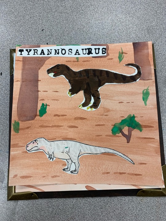
Dinovember day 13: Tyrannosaurus!
I’m not a fan of how static the poses are, and the painting could definitely be way better. As you can see I had a… small accident and got a bit of paint on my modern rex. Guess he was just born with a really weird birthmark. I also meant for him to be bigger than his fictional counterpart, but as you can see, that didn’t work out how I’d hoped.
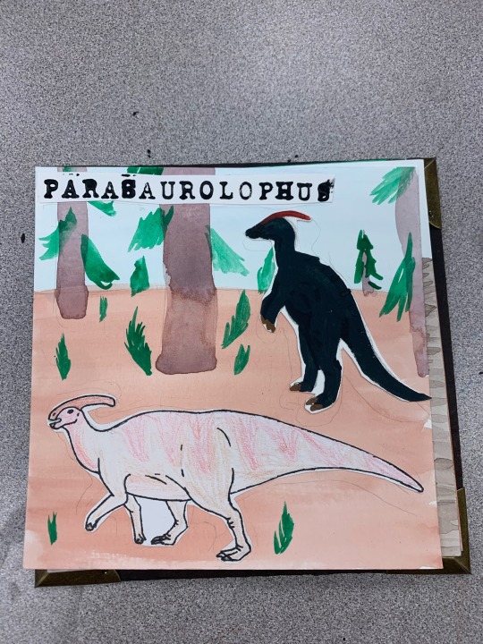
Dinovember day 14: Parasaurolophus!
I actually did make a separate drawing for day 14, but it must have been hidden due to the warnings I put on it, because no one seemed to notice it. Oh well I guess. This is one of the pages, if not the page I dislike the most. The old one is too dark, the new one is too bland with bad patterning and pose, and I don’t even know what I was doing on that background. Guess para is just bad luck for me!
#art#dinosaurs#dinosaur#traditional art#paint#pencil#stamp carving#linocut#dinovember 2022#dinovember#triceratops#megalosaurus#tyrannosaurus#parasaurolophus
3 notes
·
View notes
Note
MAGS YOUR ART IS SO GOOD WTF. WTF. YOUR SUNGHOON ART I AM SCREAMING ON THE FLOOR IN TEARS. THAT JUNGWON PIECE FROM RECENTLY OH MY GOD. i love how soft your artwork looks !! and VERY NICE WOLFBAT I THINK HE IS VERY NEAT
i actually used to hang upside down from monkey bars and things bc it felt nice on my back tbh its so nice and my posture is ALSO shit! my friends tell me i look like a human question mark! THE IMAGE OF SOLON STARING DOWN AT THE PILE OF LIMBS AND TWIGS AFTER JAKAH AND NOA FALL DOWN IS PRICELESS. HED JUST “i don’t believe in god but i believe that’s karma”
truly pretty privilege is So Real because exactly the boys would get pardoned for so much weird shit just bc they’re cute- see the previous headcanon of jino with burn scars. if we’re being honest that would freak the hell out of anyone (i wish it didn’t, people should be more accepting of scars </3) because it’s jino suddenly he’s got a tragic heroic past that makes him ~so romantic.~ no one questions that noa is literally draped over the rafters in the hallways. solon just straight up disappears for a week every month bc of the full moon (he’s under the blankets trying to not go full wolfy all week). jaan literally bodyslams his brothers when they get annoying like these bitches are WEIRD
i love the idea of them having glowing eyes as they pace in the hallways at night- i can see it creating an urban legend that decelis’s administrators hires these Creatures to catch students who leave their dorms past curfew. i wonder if anyone would be able to figure out one of the “phantoms” is solon- since he’s odd-eyed, it can’t be That hard to put two and two together
-vrvr anon
AAAAAA THANK YOUUUUU I AM. ALSO CRYING. i really like working in that sort of color-blocky, soft, lineart-less style, so it makes me so happy that you like that about it shfjbfjfng ;v;
im vv proud of that jungwon one i think (conceptually and process-wise at least) it may be one of my favorites ive ever made .. it was just so FUN and i made it in a complete creative fever at like 2 am or something after very suddenly drawing a connection between that jungwon shot and the fallen angel painting. like i wasnt even planning on doing anything artistic that night but then all of a sudden i Had To Make Art Out Of It.
also ill tell you a secret (that isnt really a secret because ive told multiple people and made several posts about it already): i am currently working on a far more detailed heeseung art piece ... its coming along very well so far and im very happy with it !! all the facial features and clothes are done and im just stuck on the hair now—im determined to actually FINISH it and not just abandon it like i have some pieces in the past (theres this one sunoo piece that i started and got pretty far into last year in may after carnival era... and i have not touched it since. i WANT TO. but i was new to digital art at the time and used a strategy that took, to put it plainly, Way To Much Fucking Time, and in order to complete the piece with consistent style id have to keep using that same strategy and im honestly going to avoid that for as long as possible)
okay now on the subject of vampires . omfg LITERALLY the vamps probably do so much shit that would not fly if they were your average growing, acne-ridden teens... they are, fundamentally, the weird kids of decelis, but nobody notices because they're both jocks and attractive and i bet it drives all the people that ARENT attracted to them up the wall to no end. like maybe theres a scenario where a new student transfers to decelis like sooha does, except theyre some variety of aroace and completely immune to the brothers' "charm". and they come into the school with basically all their classmates aggressively simping for this group of seven dudes and it piques their curiosity a bit, because what's so special about these guys to get the entire school population in love with them? then they actually SEE the brothers and theyre just like. what. because yeah they ARE objectively pretty attractive and theyre good at sports and stuff but also theyre just. DORKS. and the student is like these guys? really? yall are simping for these guys? damn. okay
in a world where the decelis authority ARENT aggressively anti-vampire and actually let the brothers into the school to PROTECT THEM... maybe the staff are all perfectly aware of who the "phantoms" wandering around the school after hours ARE but they dont do anything to stop it because it discourages the other students from breaking curfew. and i imagine someone figures it out at some point—either a student comes across one of the "phantoms" for the first time after only hearing rumors of them and screams a little out of fright, only for heli to step out of the shadows and be like "omg im sorry i didnt mean to spook you im just taking a walk." or yeah like you said a student sees a phantom with one yellow eye and one blue... then sees solon in class the next day... and cue the "oh yeah, its all coming together" meme LMAO
0 notes
Photo
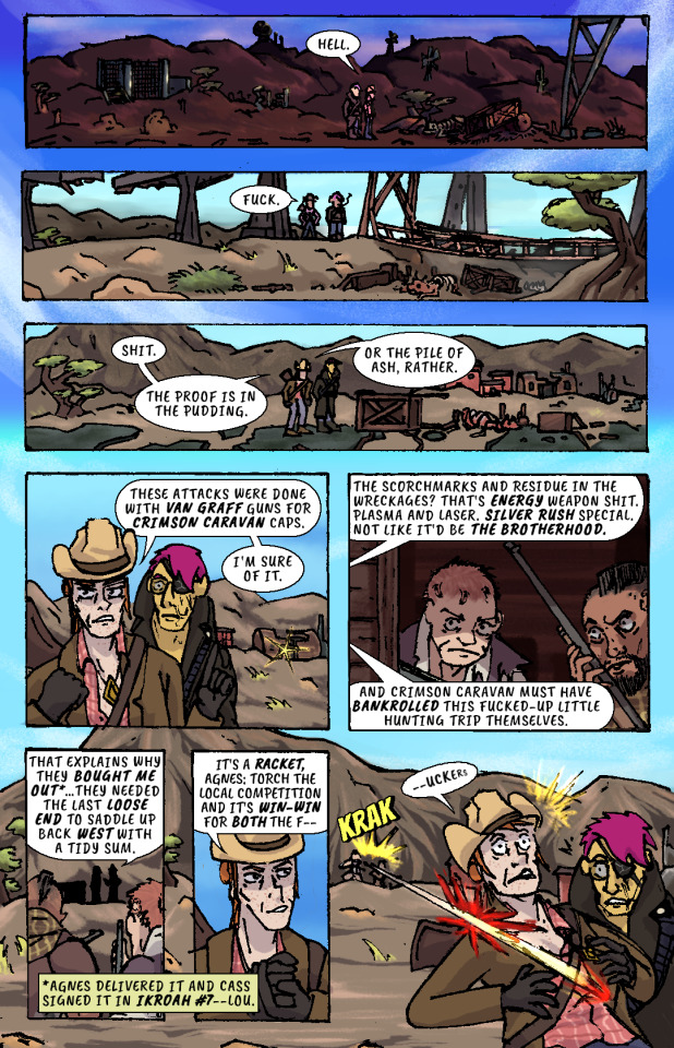
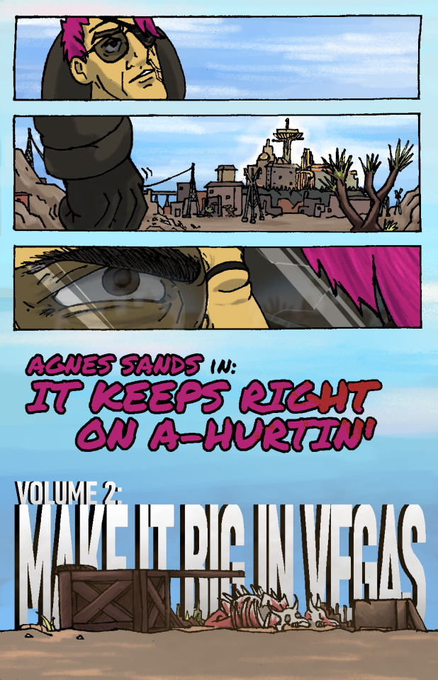
Whiskey river, take my mind,
don't let her memory torture me.
Whiskey river, don't run dry,
you're all I got, take care of me.
—“Whiskey River,” Shotgun Willie (1973)
It Keeps Right On a-Hurtin’
#15 - Vegas Outskirts
Collaborative Issue!
Guest Colorist: @malpaislegate / @socksual-innuendos
Archive Links
«« First | « Previous || Next » | Last »»
Read IKROAH on Archive of Our Own
Notes / Original Pencils / Transcript:
Notes:
MAN that’s gotta hurt!! Volume 2 kicks off with a bang, literally if you count the gunshot and honorifically if you count Socks’ knockout color job on this issue. Look at those lovingly rendered bullet wounds!! Muah!!!
It’s been a relief having a month off from the comic as I handled a bunch of other things but there’s a lot to look forward to in Volume 2, as you can probably tell from that very forboding fist clench at the end there. Will Agnes and Cass get the revenge they’re looking for? Can they make it big in Vegas? Will it keep right on a-hurtin’? Find out next ish as Cass leads Agnes to meet the first of their new “friends.”
Original Pencils:
The pencils for this issue are like an autopsy report of all the things that can go wrong with your art if you don’t plan ahead and pay attention. Listen, friend, to my tale of woe, and learn from my mistakes so they don’t become yours!
First, you can see a lot of places where there’s floating objects, empty backgrounds, and incomplete heads. Part of this is because I always intended to just copy and paste repeated elements across each panel instead of drawing them multiple times, but other times I was forced to just because of my lack of planning. The top three panels on page two, for example, required me to draw the background I’d use for them on a separate page.
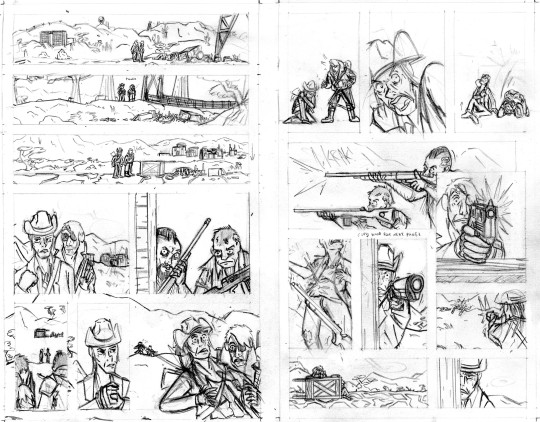
Second, you can probably tell that I actually had to flip the two raiders around in the final lineart because I forgot to keep the hands their were holding their guns in consistent—and since I couldn’t flip the middle panel on the second page without ruining the composition, I decided to flip all of their other appearances so that they’d be lefties. I doubt you even can seamlessly wield those particular guns left-handed.
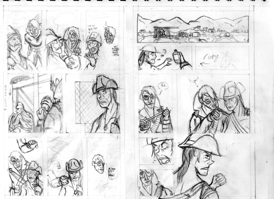
Third, the size of the cart that Agnes and Cass are kneeling behind changes CONSTANTLY and is dramatically oversized from the third page onward. After inking these pages, it took a lot of work to correct the inks and shrink that cart in each panel, but fortunately it came out looking good.
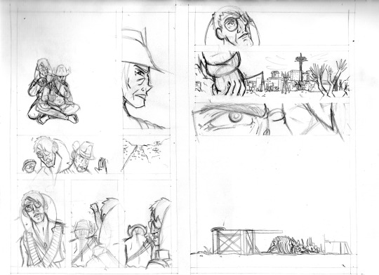
And finally, I completely redrew the second panel on the fifth page because it wasn’t until I had already handed he pages off to my colorist that I realized having a second profile shot of Cass so soon after a first one was just...redundant and lazy-looking. So I went back to my sketchbook and whipped up a much more unique, striking angle (I also just wasn’t satisfied with the quality of my art on that panel, so I’m very glad I redrew it). But again, my failure to plan ahead bit me in the ass and my redraw attempt wound up taking up a lot more space than I thought it would, so after inking it I had to basically surgically remove it from the other inks.
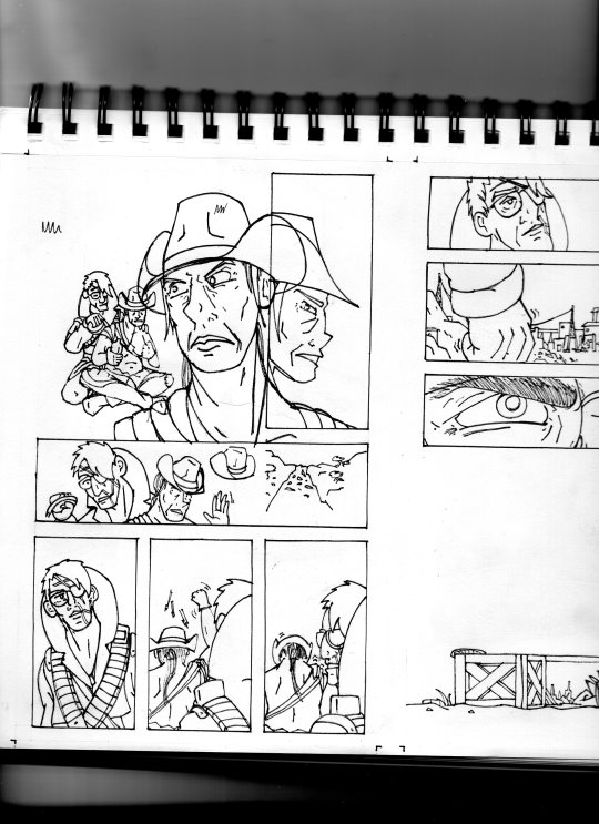
I’ll be honest with you folks: part of the reason that I work in such simple, thick, high-contrast lineart is because it’s very easy to make corrections and adjustments with stuff you could technically color in Microsoft Paint.
Transcript:
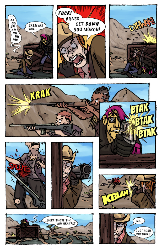
EXT. SOMEWHERE IN THE MOJAVE, morning. AGNES SANDS and ROSE OF SHARON CASSIDY stand over the wreckage of a caravan, scattered over a dirt road.
CASS: Hell.
EXT. SOMEWHERE ELSE IN THE MOJAVE, midday. Looking over a second wrecked caravan, at the bottom of a ditch.
CASS: Fuck.
EXT. PRE-WAR HIGHWAY OUTSIDE OF VEGAS, mid-afternoon. AGNES and CASS survey a third wrecked caravan.
CASS: Shit. The proof is in the pudding. Or the pile of ash, rather. These attacks were done with Van Graff guns for Crimson Caravan caps. I'm sure of it.
As CASS explains her theory to AGNES, a short distance from the caravan two RAIDERS peer at the two of them from inside a barn at a ruined farmstead. They have snake-bite tattoos on the sides of their shaved heads and are holding rifles.
CASS: The scorchmarks and residue in the wreckages? That's energy weapon shit. Plasma and laser. Silver Rush special. Not like it'd be the Brotherhood. And Crimson Caravan must have bankrolled this fucked-up little hunting trip themselves.
The RAIDERS move out from the barn, sneaking up on two passers-by who’ve stopped at the caravan wreckage.
CASS: That explains why they bought me out...they needed the last loose end to saddle up back west with a tidy sum.
(NOTE: *Agnes delivered it and Cass signed it in IKROAH #7—Lou.)
CASS: It's a racket, Agnes: torch the local competition and it's win-win for both the f—
SFX: KRAK
A gunshot rips out from one of the RAIDERS’ rifles and sears across CASS’ shoulder.
CASS (gasping): —uckers.
CASS slumps down beneath the overturned caravan wagon on the road, clutching her shot shoulder.
CASS: —Aaggghghhhhhhh.
AGNES: Cass! Are you—
CASS: Fuck! Agnes, get down you moron!
AGNES ducks behind the cover of the wooden caravan wagon just as another gunshot splinters the top lip of it.
SFX: DTHWAK!
The RAIDERS advance on CASS and AGNES’ position, firing at them from off the road.
SFX: KRAK
AGNES leans over the top of the wagon with her pistol, returning fire.
SFX: BTAK BTAK BTAK
AGNES lands a shot right in one of the RAIDERS’ guts, and she drops her weapon and falls down.
SFX: SPLUT
CASS, leaning out the side of the wagon, takes as careful of aim as she can with her shotgun by holding it with her good arm. Trembling, she fires, connecting with the other RAIDER.
SFX: KBLAM
The would-have-been RAIDERS are dead.
AGNES: ...were those the Van Graffs?
CASS: No. Just some vultures.
CASS leans back behind cover to sit against the bottom of the overturned wagon again, wincing from her shoulder injury.
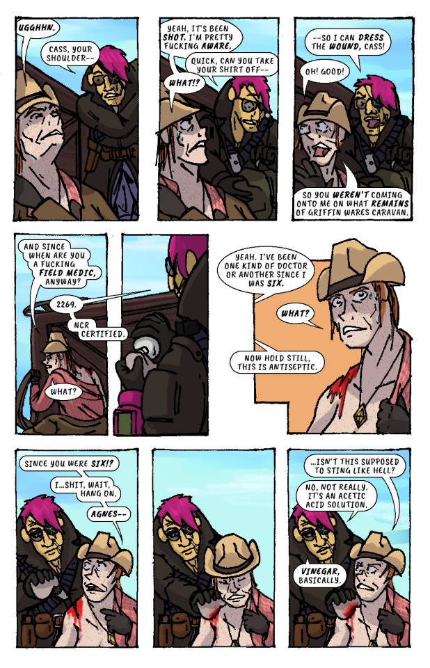
CASS: Ugghhn.
AGNES (slipping off duffel bag): Cass, your shoulder—
CASS: Yeah, it's been shot. I'm pretty fucking aware.
AGNES (unzipping bag): Quick, can you take your shirt off—
CASS: What!?
AGNES: —so I can dress the wound, Cass!
CASS: Oh! Good! So you weren't coming onto me on what remains of Griffin Wares Caravan.
CASS starts removing her shirt while AGNES produces a bottle of something from her duffel bag, and dampens a rag with its contents.
CASS: And since when are you a fucking field medic, anyway?
AGNES: 2269. NCR Certified.
CASS: What?
AGES: Yeah. I've been one kind of doctor or another since I was six.
CASS: What?
AGNES: Now hold still, this is antiseptic.
CASS: Since you were six!? I...shit, wait, hang on, Agnes—
AGNES pressess the rag onto CASS’ shoulder wound, and CASS winces instinctively. But, confusingly, there isn’t any pain.
CASS: ...isn't this supposed to sting like hell?
AGNES: No, not really. It's an acetic acid solution. Vinegar, basically.
AGNES begins cleaning the wound with the rag.
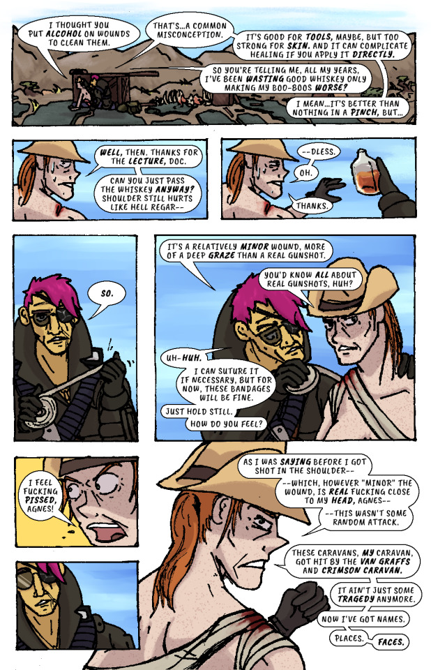
CASS: I thought you put alcohol on wounds to clean them.
AGNES: That's...a common misconception. It's good for tools, maybe, but too strong for skin. And it can complicate healing if you apply it directly.
CASS: So you're telling me, all my years, I've been wasting good whiskey only making my boo-boos worse?
AGNES: I mean...it's better than nothing in a pinch, but...
CASS: Well, then. Thanks for the lecture, doc. Can you just pass the whiskey anyway? Shoulder still hurts like hell regar—
AGNES hands her the whiskey bottle. She’d already gotten it out.
CASS: —dless. Oh. Thanks.
AGNES unspools a roll of bandages in her hands, then begins wrapping it over CASS’ shoulder and across her chest..
AGNES: So. It's a relatively minor wound, more of a deep graze than a real gunshot.
CASS: You'd know all about real gunshots, huh?
AGNES (unfazed): Uh-huh. I can suture it if necessary, but for now, these bandages will be fine. Just hold still. How do you feel?
CASS: I feel fucking pissed, Agnes!
AGNES recoils, taken aback slightly.
CASS: As I was saying before I got shot in the shoulder—which, however "minor" the wound, is real fucking close to my head, Agnes—this wasn't some random attack. These caravans, my caravan, got hit by the Van Graffs and Crimson Caravan. It ain't just some tragedy anymore. Now I've got names. Places. Faces.
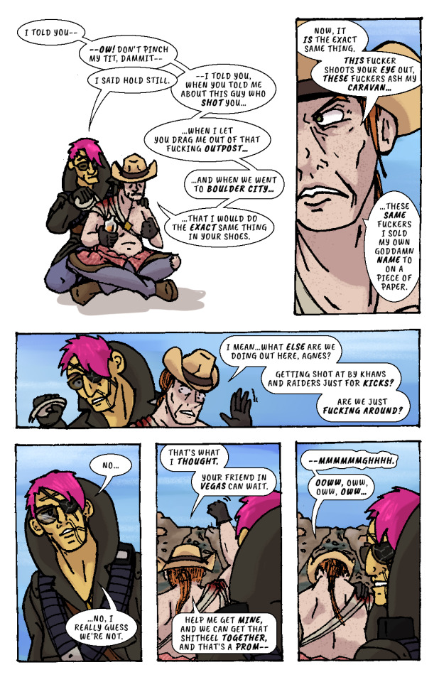
AGNES resumes bandaging CASS.
CASS: I told you—ow! Don't pinch my tit, dammit—
AGNES: I said hold still.
CASS: —I told you, when you told me about this guy who shot you...when I let you drag me out of that fucking outpost...and when we went to Boulder City...that I would do the exact same thing in your shoes. Now, it is the exact same thing. This fucker shoots your eye out, these fuckers ash my caravan...these same fuckers I sold my own goddamn name to on a piece of paper. I mean...what else are we doing out here, Agnes? Getting shot at by Khans and Raiders just for kicks? Are we just fucking around?
AGNES finishes bandaging CASS, then leans back, pensive.
AGNES: No...no, I really guess we’re not.
CASS: That's what I thought. Your friend in Vegas can wait. Help me get mine, and we can get that shitheel together, and that's a prom—
CASS raises her arm to shake her fist as she speaks, straining her shoulder injury.
CASS: —mmmmmmghhhh. Ooww, oww, oww, oww...
CASS grabs her shoulder in pain while AGNES looks off in the distance and stands up. She looks out towards the horizon—towards VEGAS, and the pre-war casinos and hotels that still gleam and glitter in blinding sunlight.
Her fist clenches. Her brow furrows. Her body tenses, all over, staring at that city, that place.
The caravan wreckage remains alone on the highway, brahmin bones long picked clean by scavengers.
AGNES SANDS IN: IT KEEPS RIGHT ON A HURTIN’
VOLUME 2: MAKE IT BIG IN VEGAS
176 notes
·
View notes
Note
This my have came off as rude or weird but like
Is there any tips on sketching?
Like the way you sketch is just
✨ Chefs kiss ✨
Not rude at all!
And mm I never thought about it actually since I don't exactly have a set process per se with sketching, unlike I do with other parts of drawing, but some tips that I believe would be beneficial if you want to improve on it:
Life drawing! Nothing better for practice than sketching out the things that surround you. You obviously don't have to go out for this, just look up pics of what you'd like to practice. Personally this one helps me when I'm having a hard time with proportions when going off muscle memory alone so going back to basics is a good way to fix that
Get comfortable with action lines. It can make or break a drawing later on if you don't capture the fluidity of movement that you need in a pose early on
Don't add lots of details from the get go, try to pinpoint the pose you want, then the proportions and then add the rest
Try to get comfortable with expressing what you need in fewer lines (something I still struggle with tbh)
Try out warm up sketches when you feel like you need to. I won't be a hypocrite and say you absolutely NEED to do them at all times since I myself don't bother with them often but sometimes doing little thumbnails to see what pose/composition/etc you like best can help immensely
These are assuming you're sketching as a base for a full drawing. However if you're asking about the sketches I occasionally post like my doodles of Donna here's how I personally go about those:
A kneadable eraser is your best friend (i personally use one from faber castell)
My steps are: very loose sketch to pinpoint proportions - erase that until it's very light - more detailed sketch - "lineart"
Ballpoint pens tend to be more forgiving with mistakes than inking pens and allow you to do very light lines so I use that for these sketches (tho it's entirely a preference thing and I mix it up sometimes)
Tho a little cheat sheet: ballpoint pens are good if you want softer looking lines while inking pens are good for sharp, clean lines, both equally useful to master
Ft a comparison between ballpoint and inking pen respectively:
Tho be careful about erasing something under the ballpoint pen lines since it tends to smudge
Consider using colored pencils as opposed to graphite since graphite tends to smudge but again, personal preference
Not sure if this was the exact answer you were looking for but remember that everyone has their own processes and it's important to get your tips from multiple sources until you put together something that works for you💕
49 notes
·
View notes
Last Seen Blogs