#lokta
Photo
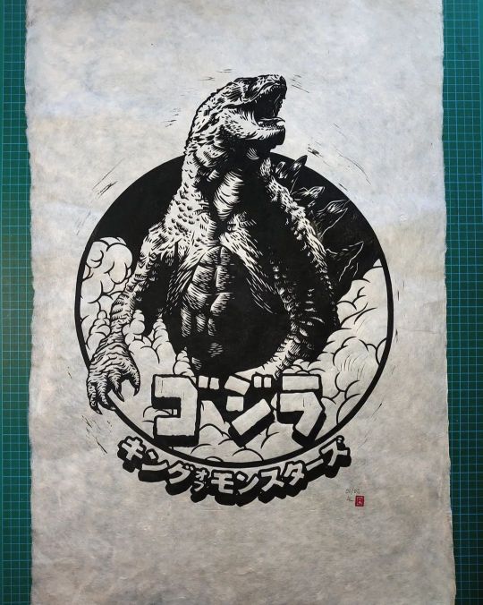
"Gojira" relief print Happy new year! And look who's here! It's Gojira! Really happy to add these super limited edition prints to my shop. This edition of 6 is printed on 20"x30" 30gsm Nepalese lokta paper, which is really nice and soft, and has lovely decked edge. These babies now available for £50 plus P&P. . . . . #godzilla #gojira #godzillaart #fanart #newart #newartwork #newprint #print #printmaking #reliefprint #reliefprinting #linocut #artwork #art #lokta #loktapaper #speedballart #speedballink @speedball_art #supergraphic #kingofthemonsters (at Ipswich, Suffolk) https://www.instagram.com/p/Cm4SS8LIMBI/?igshid=NGJjMDIxMWI=
#godzilla#gojira#godzillaart#fanart#newart#newartwork#newprint#print#printmaking#reliefprint#reliefprinting#linocut#artwork#art#lokta#loktapaper#speedballart#speedballink#supergraphic#kingofthemonsters
5 notes
·
View notes
Text

Happy anniversary to poetry
#traffic smp#double life smp#pearlescentmoon#scott smajor#dangthatsalongname#my art#and in true Lokta fashion this is a day and then some late LOL#had to draw something for the life series that got me back into hermitcraft cmon#pls don't mind the rough composition#this was just supposed to be a small doodle and then colour suddenly appeared on the canvas whoops
3K notes
·
View notes
Text

a few linocuts from this past year
#man do I love lokta and kitakata huh#they’re just so nice to print on#and I love a warm creamy white paper#linoprint#printmaker#printmaking#block printing#relief print#salted snail studio#reliefprint#block print#kitakata paper#lokta paper#linocut#Linocut printmaking#Linocut prints#relief printmaking
153 notes
·
View notes
Text
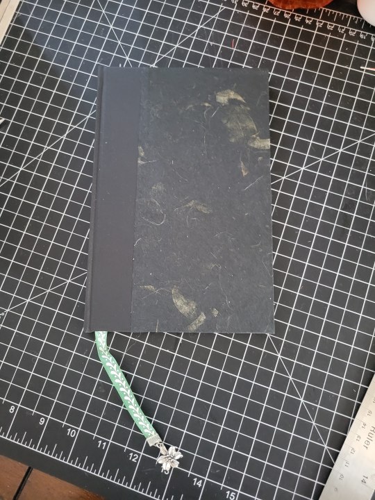
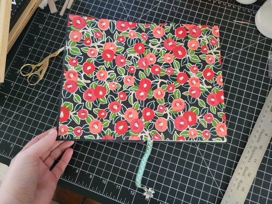
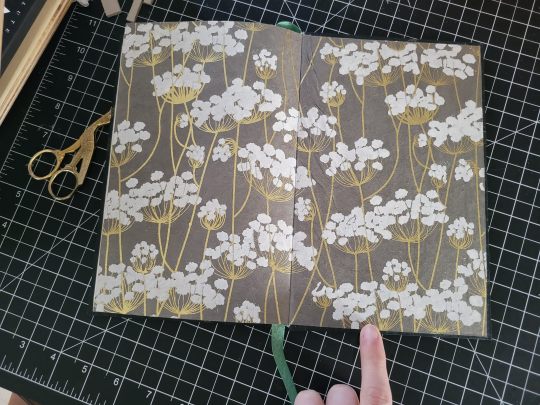
My second book with the imprint! Crest Control is special to me because I got a chance to witness this story's whole creation process, from the earliest concepts through to the posting of the final chapter on AO3. I love the story in particular for how it tackles trauma and recovery, and how that process is neither linear nor swift -- but it's not impossible, even if there are backslides in the process.
Given that this is a shorter story overall, making it a flat back bind was an easy choice. Because of the heavy focus on flowers throughout the narrative, I decided to go with a plant theme for the entire bind: the covers have visible leaves in the paper, and the front and end papers are different to show the arc of progress throughout the story. The text ornaments are also handmade, keeping with the plant theme and transitioning from thorny vines to budding branches to a blooming rose throughout the narrative arc.
I really love how this bind turned out, and I'm so happy I could get a copy to @cheeseandcake-from-ao3 -- this story is a wonderful achievement, and I'm honored that I could both witness its creation and make it into a book for the author to hold as proof of the amazing work they did. ❤
Text Block
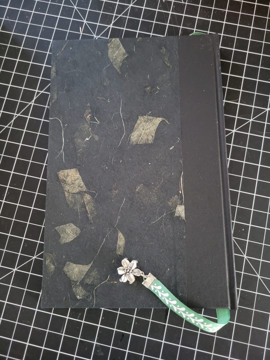
Title: Horrible Brush
Chapter Headings: Horrible Brush (Chapters 1-3), The Monster (Chapters 4-8), ediana (Chapters 9-12), and Ralgani (Epilogue, Gallery, Appendix)
Body Font: Baskerville Old Face
Front Matter and Appendix: Garamond
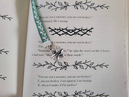
Center Ornaments: Modified from generic text decorations including thorny vines, budding branches, and a blooming rose
Sewing: Dark Green Irish Linen
Case
Cover Papers: Black Mango Leaf Tissue
End Papers: Red and Coral Flowers Chiyogami (Front) and White and Gold Flowers on Slate Lokta (Back)
Book Cloth: Jet Black Starched Linen Bookcloth
Headband: Green and White Cotton Check
Bookmark: Sprig Green and White Twill, 3/8"; Silver end crimp and Sterling Silver Lily charm
#fanbinding#ficbinding#fire emblem: three houses#i had so much fun with this one#though it definitely taught me to pay attention to endpaper order#lokta paper is really wet and wrinkles easily when glued#so starting with that one when doing pastedowns is a good idea#the second copy turned out so nicely with that lesson in mind
10 notes
·
View notes
Text
4 notes
·
View notes
Photo
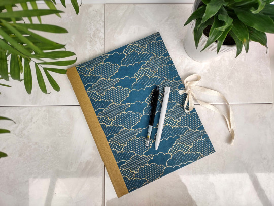
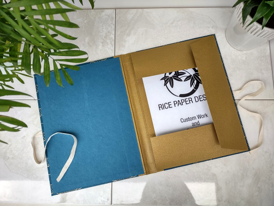
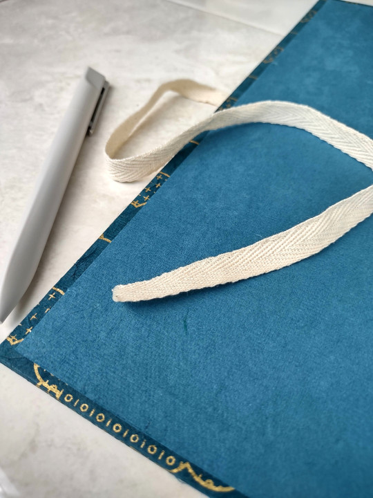
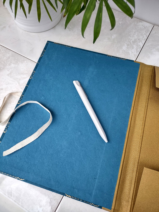
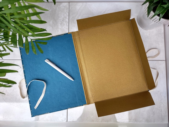
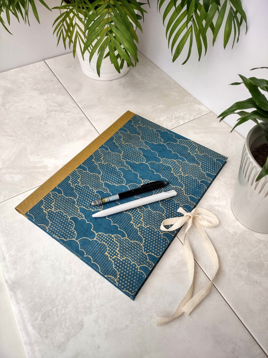
Handmade hardback portfolios are an item that I wish were more popular. They are a beautiful way to protect your art or documents, and far nicer and better for the environment than the black plastic ones that are typically sold online or at art supply stores.
It takes a lot of time, patience, and material to make one of these. But I think you'll agree that the final outcome is worth it.
This portfolio is made with beautiful handmade Lokta paper from Nepal, gold cotton bookcloth, and cream cotton ribbon. At 9x12 inches it comfortably holds letter size items.
💚 Available
#hardback portfolio#portfolio#artist portfolio#art supplies#bookbinding#slowmade#lokta paper#ricepaperdesigns
20 notes
·
View notes
Text
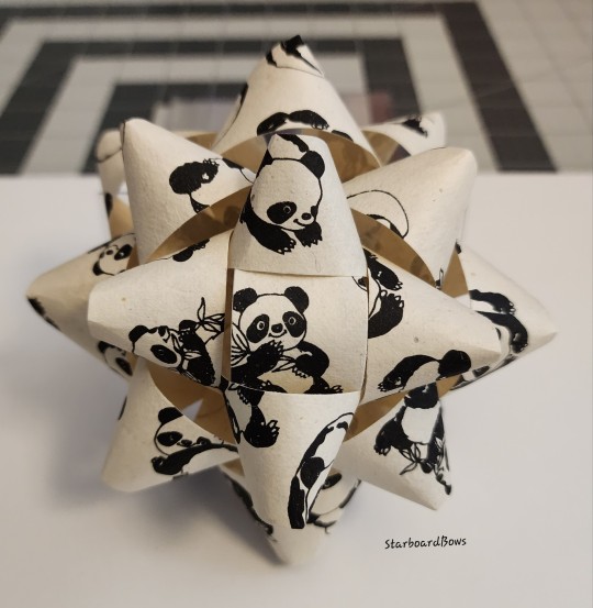
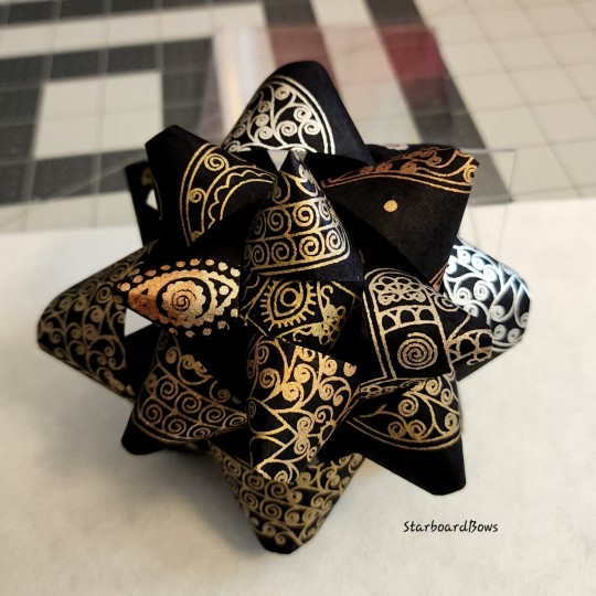
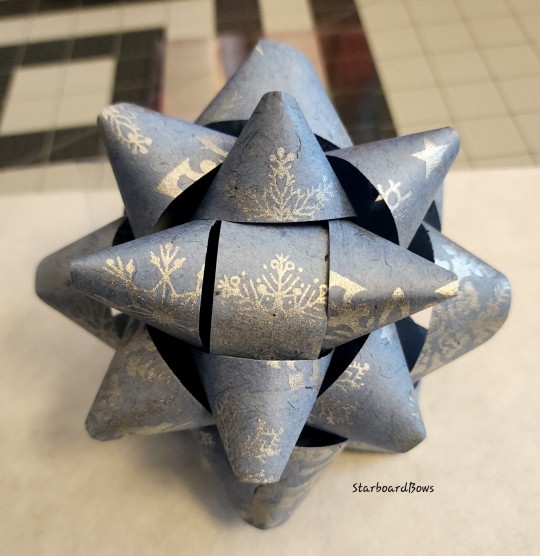
Some of my Lokta paper bows
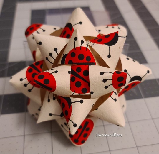
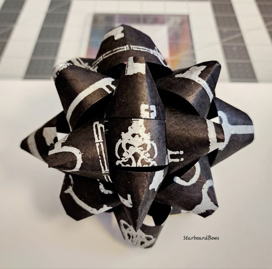
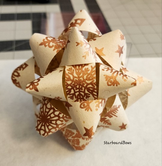
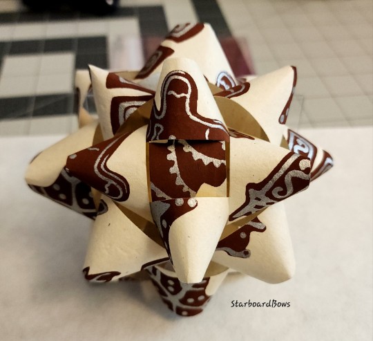
3 notes
·
View notes
Text

I visited the dick blick in the city, and I think the best items there were the traditional paper made primarily by women in Nepal, the colorful gamblin palette knives in the Frida Kahlo inspired display, and colorful measuring tapes.
#art haul#traditional art#folk art#folk paper art#handmade paper#lokta paper#gamblin art supplies#gamblin palette knives#textile art supplies#dick blick#blick art materials#personal#blog
2 notes
·
View notes
Text
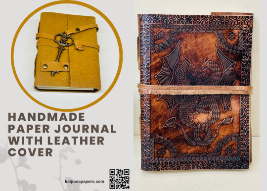
The Art of Journaling: Exploring Handmade Paper and Leather Journals
#Kalpana Handmade Paper#Handmade Paper Journal#Paper Journal#Journal#Handmade Leather Journal#Leather Journal#Leather Notebooks#Leather Diary#Leather Diaries#moonster leather journal#lokta paper journal#deckle edge journal#lokta journal#handmade spiral notebook#italian leather journals#handmade amalfi pages#handmade recycled paper journal#lokta paper notebook#deckle edge notebook#moonster refillable leather journal#handmade recycled paper notebooks#journal with handmade paper#leather journal handmade paper#homemade paper journal#lokta notebook#hand made paper journal#handmade sari journal#leather bound handmade paper journal#leather journal with cotton paper#leather bound journal handmade paper
0 notes
Note
*slides over some shiny pebbles* 2G for Grian please!!
I always appreciate a bit of a bribe
-> Send me a (character) + expression!
#lokta.txt#letterbox#anon#grian#hermitcraft#grian fanart#expression meme#my art#lokta when they have the chance to give facial hair to the designs LOL#yes pens have been changed I wasn't vibing with the last one
49 notes
·
View notes
Text

Light My Way
J. Alexander
Linocut on 6”x7” lokta paper
#linoprint#linocut#relief print#printmaking#lantern#candles#candle lantern#printmaker#block printing#lokta paper#cottagecore#autumn colors#ochre
10 notes
·
View notes
Text
so, you wanted to start bookbinding?
so @princetofbone mentioned on my post for "factory settings" about wanting to know more about the binding style that i used for it. so i thought i might make a post about it.
i was as terrible as i always am for taking in progress shots, but i can link you to the resources i used in order to make my book. i would also like to point out that "factory settings" is my 120th bind, and i have been doing bookbinding as a hobby for just over 3 years now. unfortunately this means some of the methods that i used for that bind aren't particularly beginner friendly, just in terms of the tools and methods i have used, but i would love to point you in the right direction when it comes to resources. i dont say this to sound pretentious which i fear i might come across, just so that youre fully informed. getting into this hobby is fun and rewarding, but it can definitely be intimidating.
with that caveat, heres a list of links and resources that i have used for bookbinding in general, with additional links to methods i used specifically in regards to this bind.
ASH's how to make a book document. it gives you a great introduction into typesetting fics (where you format the text of fics to look like a traditionally published books) and then turning them into a case-bound book (the style i used for "factory settings"). it is comprehensive, and explains how to use microsoft word to do your bidding. it was invaluable to me when i was just starting out! currently i use affinity publisher to typeset/format my fics for printing, but i only bought and learned how to use that after i had been binding books for a year and a half. i made some beautiful typesets with word, and some of my close friends use it still and design stuff that i never would be able to in my wildest dreams (basically anything by @no-name-publishing)
DAS Bookbinding's Square Back Bradel Binding. a great style to do your first bind in! this method requires, when making the case, to attach the cover board and the spine board to a connecting piece of paper, which makes it so much easier to match the size of the case to the size of the text block (your printed out and sewn fic). using this method is what allowed me to get much more accurately fitting cases, and made me much more confident with the construction of the books i was making. a well-made book is something that is so wonderful to hold in your hands!
DAS Bookbinding's Rounded and Backed Cased Book. This is the specific method that i used to create my bind for "factory settings"! even before i could back my books, i found that watching DAS's videos in particular helped me see how books were traditionally made, and i was able to see different tips and tricks about how to make nicer books.
Book Edge Trimming Without... i trim the edges of my text block using my finishing press and a chisel i have sharpened using a whetstone and leather strop with buffing compound on it. i follow the method for trimming shown in this video!
Made Endpapers. i follow this method for my endpapers, as i used handmade lokta endpapers, and they can be quite thin, but they look beautiful! i used "tipped on" endpapers (where you have your endpaper and then put a thin strip of glue on the edge and attach it to your text block) i used for a very long time before this, but these feel like they are much more stable, as they are sewn with your text block.
Edge Sprinkling. this is the method that i used for decorating the edges of my text block. but the principle is basically clamping your text block tight and then sprinkling the edges. i do not believe you need to trim the edges in order to do sprinkles on the edges, and that's what makes it accessible! i personally just use really cheap acrylic paint that i water down and then flick it onto the edges with my thumb and a paint brush.
Double-Core Endbands. i sew my own endbands, which i followed this tutorial for. that being said, it's kind of confusing, and this video is a bit easier to follow, but it is a slightly different type of endband.
Case decoration. i used my silhouette cameo 4 to cut out my design for "factory settings" in htv (heat transfer vinyl). i also used my cameo 4 to cut out the oval of marbled paper on the front, as i honestly didn't want to try my hand at cutting an oval lol. i also glued some 300 gsm card with an oval cut out of the centre of it onto the cover before covering it with bookcloth, to get a kind of recess on the cover. i then glued the oval of marbled paper onto the top of the recessed area once it was covered with bookcloth, so that it was protected. the images i used were sourced from a mix of rawpixel, canva and pixabay. a more accessible way to get into cover decoration is by painting on a design for your cover as described in @a-gay-old-time's tutorial just here. or even doing paper labels, which look classy imo.
physical materials. sourcing these will depend on your country. i am located in australia, and have compiled a list with some other aussie bookbinders of places to buy from. here is a great post describing beginning materials for getting started binding.
@renegadepublishing. this tumblr is great! its what got me started bookbinding, and being in the discord has been inspiring, motivating, and honestly just one of the best online experiences i have ever had. it is full of resources, and most people in there are amateur bookbinders, with a couple of professionals thrown in. the discord is 18+, and anyone can join!
i'm sorry this post got so long, but i hope that this has a lot of information for you if you would like to get started bookbinding. its one of the best hobbies ive ever had, and i genuinely believe i will have it for the rest of my life.
3K notes
·
View notes
Text
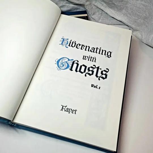
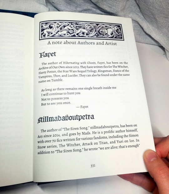
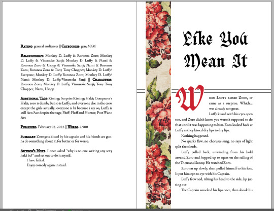
Fanbinding: Hibernating with Ghosts by @fayet
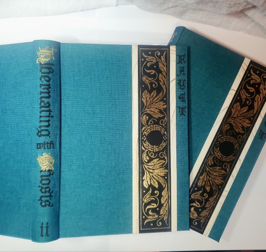
Getting stuck in Kaedwen in winter had never been on Jaskier's plan.
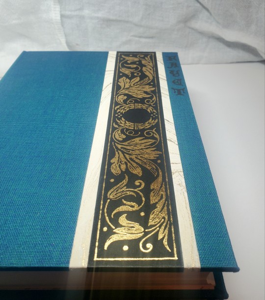

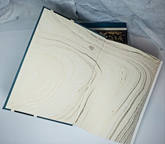
Hyped to share photos of the set I made at the end of 2023 for the @renegadepublishing annual exchange! In addition to "Hibernating With Ghosts" these volumes include 30 pencil illustrations by @saeculorum-art, the fic's prequel Silent friend of many distances, and a song (The Siren Song) by @stillmadaboutpetra. I was over the moon that they all agreed to allow their work included so i could make this for the lovely Kitty / @perfectlynormalbooks (thank you for the intro to the wonderful fic!!).


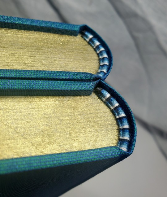
This book was bound in Duo dragonfly cloth, with marbled lokta and hand-foiled cover accents. All art not by saeculorum is sourced from public domain woodcuts. I went a little harder than usual on the typeset, but it was a lot of fun and I finally had a good reason to use a vertical header (the chapter titles are SO LONG) and colored dropcaps (i was printing color for the art, anyway!). I justified my embroidery thread spending with a fun five-color color endband, and I colored the top edge.

I had a lot of fun making this and trying our a few different ways of doing things! Thanks again to everyone for a wonderful Renegade Exchange!
#fanbinding#celestial sphere press#ficbinding#renegadeexchange2023#renegadepublishing#the witcher#geralt of rivia#jaskier#geraskier#hibernating with ghosts#this is actually the first Witcher fic i have bound#what a great place to start!
454 notes
·
View notes
Text

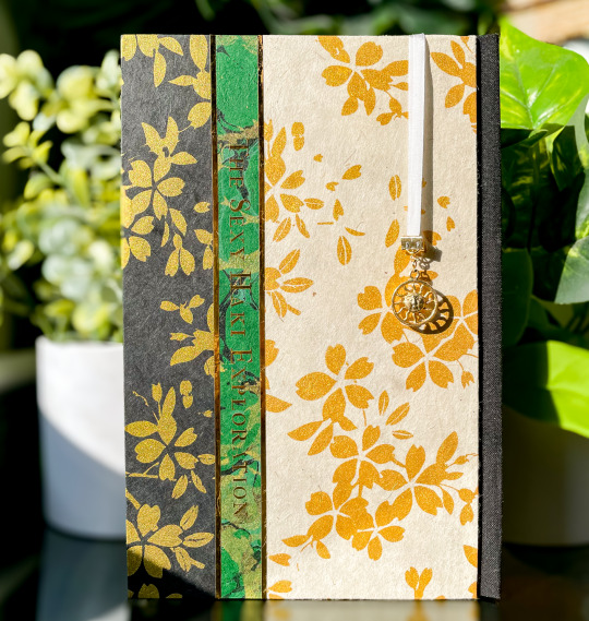
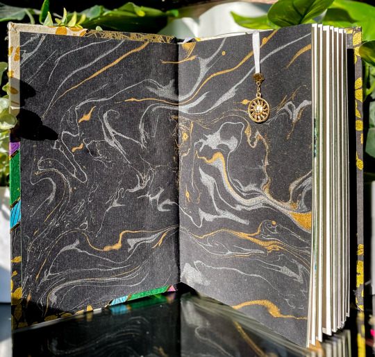

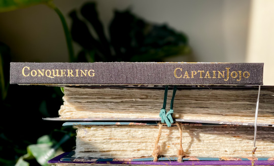

the eagle has landed, and now i can talk about it >;3c
i had the pleasure of typesetting and binding @starshipcaptainjojo's zolu series conquering, and this was a delightful project from start to finish.
the bind is a three-piece bradel with covers made from individual pieces of marbled, splattered, or stamped lokta paper and gold heat transfer foil. on the back cover, i've also foiled the series's tagline. i wanted to mirror the typeset, which includes images of historical rugs, tapestries, and paper at the beginning of each story in the anthology--and i think it succeeded! (even if i ended up unintentionally making a mardi gras bind. that i finished on mardi gras. incredible.)
the endsheets are a thicker black silver/gold marble, and the bookmark is a looped 4mm silk ribbon tipped with an 18k gold clasp and a sun charm. i'm particularly proud of this bind's edges, which i painted with two layers of diluted acrylic: dark green and metallic light green shimmer. like the gold foiling, it doesn't come through well in pictures... but i promise this book is very shiny :3c
last but certainly not least, i also got permission from @/veryqueerdraws to include a comic they drew for jojo's fic stamina, which i won't include photos of lest tumblr obliterate me on sight for... obvious reasons. i believe its posted on their twitter, though!


203 notes
·
View notes
Text
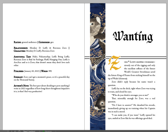
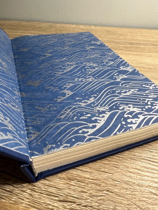
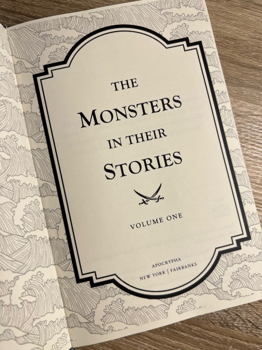
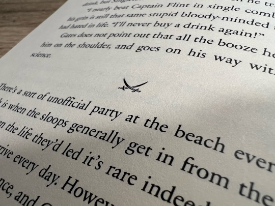
My First Fanbind! A Black Sails Fic Anthology Series
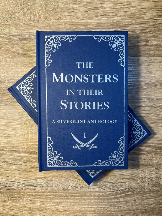
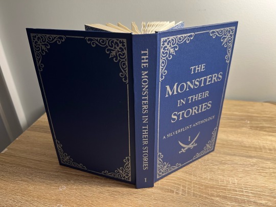
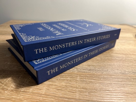
It took me a year (and a lot of anxious research) before I worked up the courage to bookbind fanfiction, and after months of on-again-off-again work, my first fanbind is finally done!
I knew that if I was going to bookbind fic, I had to bind something from the Black Sails fandom, aka the fandom and show that have had the biggest impact on my life. Y'all, I almost went into academia to study slavery in the 17th-18th century Caribbean because of this show - when folks say this show rewires your brain chemistry, they are NOT kidding. THEE show of all time. Happy 10th anniversary to Black Sails! This fandom is small but mighty. May we continue to get our hearts and souls blasted to smithereens by this show for many years to come.
Ao3 abounds with magnificent Black Sails oneshots, so I decided to put together an anthology of my favorite Silverflint fics under 20k, which I split into two volumes. Included are works by @justlikeeddie, @vowel-in-thug, @balloonstand, @annevbonny, @francisthegreat, @nysscientia, and more! Thank you, thank you all, you brilliant wonderful people, for gracing the Internet with such amazing writing. When I read the fics in these anthologies I want to fling myself into the sun.
More on the design and binding process below the cut!
Vol. 1 Page Count: 270 (12 fics)
Vol. 2 Page Count: 248 (11 fics)
Body Font: Sabon Next LT (10.5 pt)
Title Font: Goudy Old Style
Other Fonts: IM Fell English, pirates pw
The typeset (which I did in Word) took a while, mainly because I'd never done it before. Manually adjusting the hyphenation line-by-line was especially tedious. After making these books, I abandoned Word in favor of InDesign, in large part because InDesign gives you way finer control over your justification and hyphenation settings.
Regarding my actual design choices, I'm happy with how the ocean motif on the title page turned out (it's not the same pattern as my endpapers, but they're complimentary) and I'm very fond of my divider dingbats, which are little swords! Goudy Old Style was a fun title font to use, since it's the font that Black Sails uses as its logo. The stories in Vol. 1 are divided into parts based on what Silver WAS at that point in the show (cook, quartermaster, or king), and Vol. 2 is split up into comedies, histories (AUs set in the canon universe) and tragedies - befitting Black Sails' Shakespearean ~vibes~.
I stuck to a flatback binding, as I wasn't feeling quite ambitious enough to try rounding and/or backing. I've learned that I ~Anakin Skywalker voice~ hate sanding, enjoy folding/sewing, and don't LIKE edge trimming but enjoy the results enough to make it worth it.
The real adventure was decorating the cover, which remained bare for months. After agonizing over Illustrator and experimenting unsuccessfully with HTV and lokta paper embossing, I ultimately turned to using stencil vinyl to paint on the designs. There was a bit of seepage under some of the stencils, but I was able to scrape off the excess with my Cricut weeding tool without damaging the coated surface of the bookcloth (probably Arrestox Blue Ribbon from Hollander's). Even though it was very time-consuming, I'm so happy with the end result of the stenciled paint job and I intend to stick with stencils for my foreseeable future binds.
Are there things I would change? Sure. It was humid out when I printed, so the pages have got a wave. There’s an extra two pages in Vol 2. that I have no idea how I missed, and I got a line of glue in the middle of one of my Vol. 2 endpapers. I’m pretty sure I didn’t case in quite right, since my endpapers pull away from the case at the spine. I think the inner margins are a bit too big, and despite going line-by-line there’s still some wacky justification spacing in the typeset. But man, am I proud of these books! It is so satisfying to learn a new skill - MANY new skills, if we’re being honest - and to make something both beautiful and practical. If I’m still binding in two years or so, I can see myself redoing the typeset in InDesign, cutting out the existing text block, and reusing the cases. I’m also already planning for Vol. 3, which will be Silverflint Modern AUs.
Thanks for reading!
#bookbinding#fanbinding#ficbinding#my books#black sails#silverflint#fanfiction#bsanniversary#10yearsblacksails#10bsfest
270 notes
·
View notes
Text

Nagasaki state 4
woodblock print, ink and colored pencil on Thai Lokta paper
229 notes
·
View notes
Last Seen Blogs

westernconnecticut
Unwind in Connecticut

gogo12
Untitled

4taro
she knows she gets away with murder

lovelyow-blog
Pilipino sa puso't diwa.
vnprinces
Visual Novel Boys