#read the alt text
Text
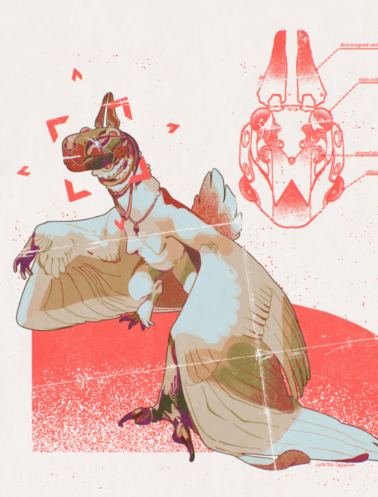

heads-up display visor
#harpy#a little treat for me after finishing an assignment :)#will post the full art & extras for me ko-fi members#edit some ppl do be tagging this as a biomech or whatever. no it's just a helmet. it comes off#read the alt text#setting: siren
4K notes
·
View notes
Text
God I hate tumblr
Yeah bitch im interested
2 notes
·
View notes
Text

The water spilled into the tub from the faucet with a rhythmic pressure. Iscend timed her breath with each exertion. She'd dropped the top of her dress to reveal her toned shoulders and a sleeveless undershirt. Heia watched Iscend out of the corner of her eye as she worked
...
Iscend took to a stool next to the bath and dared forward, still, "Your Grace, if I may be honest, I am aware of the isoamorist leanings of your house."
Content as promised. My Heia/Iscend lesbian period drama:
#the traitor baru cormorant#iscend comprine#fanart#fanfiction#this bitch dyes her hair blonde#she does not dye her eyebrows#falcrest loves bleach#the masquerade#baru cormorant#Baru cormorant fanfiction#Haradel Heia#read the alt text
44 notes
·
View notes
Text

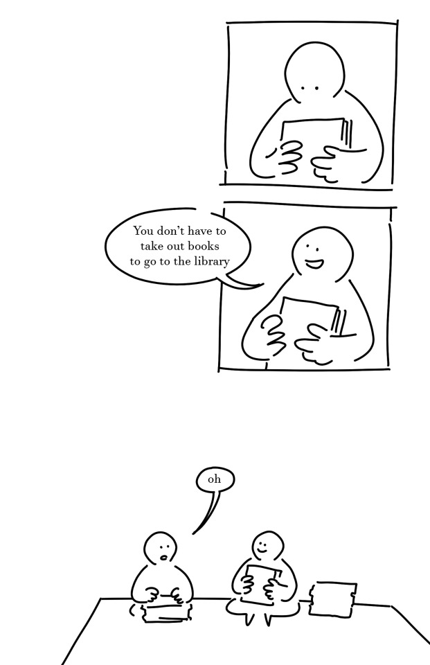
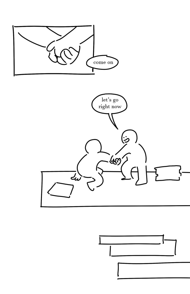
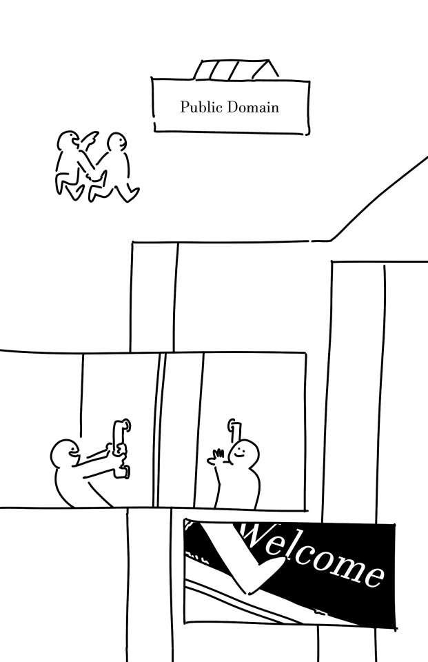

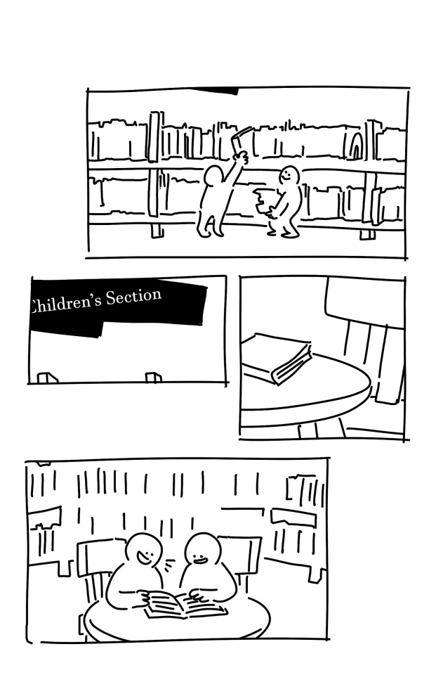
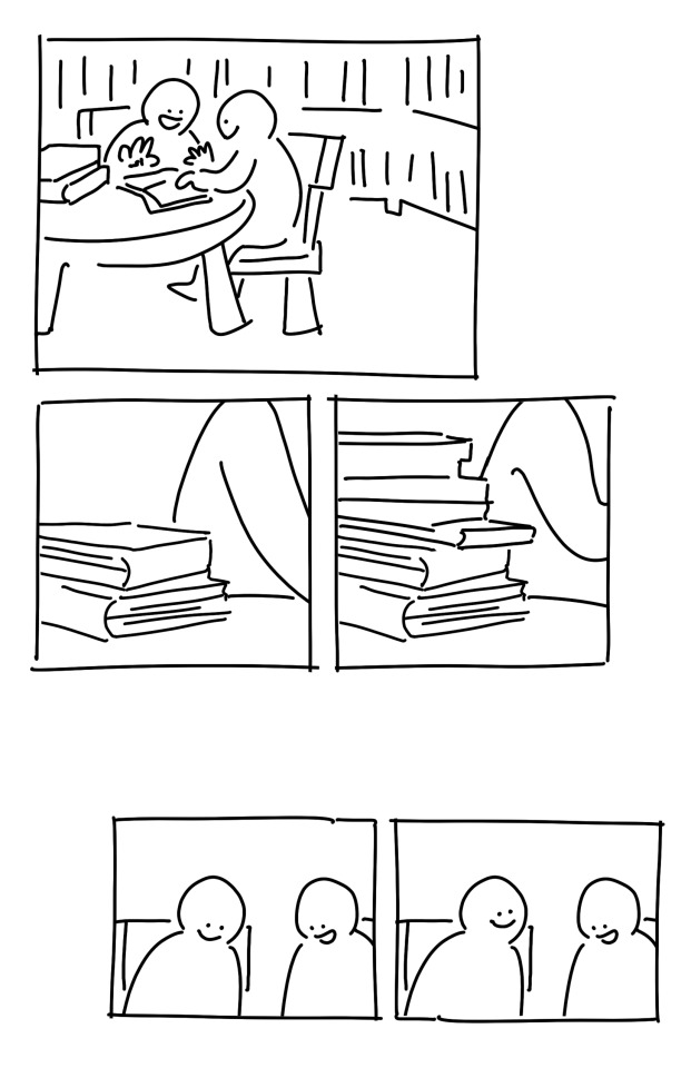
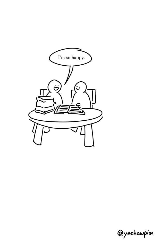
#original comic#we go together#id in alt text#webcomic#indie comics#comic#library#artists on tumblr#reading#my comic#my art
29K notes
·
View notes
Text


#teehee#just wait until you see chillcuck#also maybe read the alt text#chilchuck#chilchuk tims#delicious in dungeon#dungeon meshi#チルチャック#チルチャック・ティムズ#ダンジョン飯
15K notes
·
View notes
Text

TEMPO DI ZUPPA
#dungeon meshi#delicious in dungeon#falin touden#dungeon meshi spoilers#dunmeshi#fanart#id in alt text#THATS RIGHT. (<- meowth voice) the once in a blue moon fanart i had planned lololll#enjoy it bc i dont know when itll happen again#PLS READ DUNGEON MESHI
9K notes
·
View notes
Text


i remembered a schmando vtuber AU the drawfee mods and i came up with like 2 years ago and immediately became possessed
#doodle#schmando#nando#schmidt#alt text included bc i was likeyeah lets make this as hard as possible to read on the pic
4K notes
·
View notes
Note
The world needs more Yue and Zuko friendship, I squeal just thinking abt the parallels. They deserve a life changing field trip together and if u have abt ideas I’m all ears 👀
Hiii anon this ask fermented in my inbox and in my brain for so long,, so take this??? Post canon yue lives/no war au arts?? Anyway aside from the Parallels and their political position & their duty before hoes grindset I think they could learn a lot from each other. With zuko learning the gift of patience & diplomacy from yue & Yue learning that allowing yourself to feel anger and speaking up can actually be Good.

anyway hypothetical life changing trip outcome: zuko takes an intro gender studies class and yue says fuck

(oh and also must not forget the crush on sokka)
#id in alt text#‘toph should say fuck’ ‘let sokka say fuck’ if there’s one person who deserves to say fuck here it’s YUE#i rest my case#also yea i think comparing his life to yue’s would open zuko’s eyes towards Gender Inequality ksbfhd#he’s like you’re mai but prep what do u mean you can’t throw knives 😤#i can accept sexism but i draw the line at banned military indoctrination 😤😤#i like to think that at one point yue shows zuko how to prepare & butcher small game and he does an absolute shit job at it#+ feels queasy for 3 days#zuko#yue#my art#ash replies#ALSO I MUST SAY!!! DRAWING THIS WHILE READING LIKE THE SUN CH4??? NOT FEELING WELL BESTIES#oh also since we’re talking fics…. js if u see this…… dywtjtb will always be famous
14K notes
·
View notes
Text
Do you ever see something like this:

and think, "This'll be a fun little thing to read while I wait."
And then you read it and you're fundamentally changed as a person and you're left staring off into the middle distance as you contemplate life and love and connection and what it all means?
4K notes
·
View notes
Text
as a bi person, the bisexual flag brings me infinite joy and always puts a smile on my face, however as a person who has a Passion for Graphic Design, that undersaturated shade of purple infuriates me when it's used digitally
like, on an actual flag - which was its original purpose - it looks great!

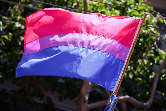
those look fine! lovely, even! with the semi-transparent fabric, the way it catches the sunlight, it looks beautiful!
but now look at how it looks digitally

the pink and blue are so vibrant compared to the sad, lonely lavender!
and let's look at this statement from Michael Page, the creator of the bi flag:

(sidenote: he created this flag in 1998, so if his takes on bisexuality is different from yours, it's okay to notice that! a lot has changed since the 90s when it comes to lived experiences and the way we describe them. but, it's also important to respect his thoughts about this and the way he presented them, even if today, we'd probably not say that bi people "blend unnoticeably into both the gay/lesbian and straight communities.")
so in pantone colors, the pink is 226 C, the blue is 286 C, and the purple of the flag is 258 C.
but...here's the deal
Michael talks here about how the key to understanding the symbolism is to know that the purple blends into both the pink and blue. and on a physical flag, I think you can see that!
but digitally, it absolutely does not blend. it clashes badly, and looks oddly separate from the other two colors.
which got me wondering...what purple do you get if you actually blend 226 C and 286 C?
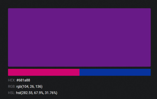
oh! oh, my god.

look at that! look at how nicely it fits between those colors!
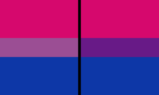
look at it next to the original color scheme! look at how much more vibrant the purple is!
and friends. this is just blending through rgb! you get even more purple variations when you use other color spaces!
let's compare all of them:


(top: original, lab. middle: lrgb, lch. bottom: rgb, hsl)
look at all of the different purple options you can get just by combining these two colors!
if you want almost too-vibrant saturation, you can go hsl, if you want something more relaxed that's closer to the original, you can go lab or lrgb. and if you want to split the difference, lch is bright and violet, while rgb is there with its saturated but darker purple.
anyway, I guess I don't really have a point here? this isn't so much an informational post as it is Me Getting Weird About Colors, but I think it is a useful lesson about how colors look very different on screens compared to how they look on objects in real life.
and sometimes, I think it's okay to compensate for that.
out of all of these, this is my favorite bi flag:

it's the one where the colors were blended in lab color space. for me, the lighter, softer purple is close enough to the original bi flag purple, while also feeling like a smoother blend of the blue and pink
but that's just me! and it might not even look the same to you, since every screen is different, because technology is a nightmare!
anyway, thank you for coming with me on this colorful journey! I will now retreat back to inkscape and make pained sounds about inkstitch gradients until something tangible pulls me back into reality
#bi#bisexual#bisexuality#bi flag#bisexual flag#sbs rambles#graphic design is my passion#id in alt text#but#the ids are probably deeply unhelpful for the different variations of flags#in the alt text of the six flags all grouped together#I just put what method the purples were blended with#and then tried to describe them more in the paragraph below#but this is an inherently visual post#so if you're reading it with a screen reader I am sorry :(
19K notes
·
View notes
Text
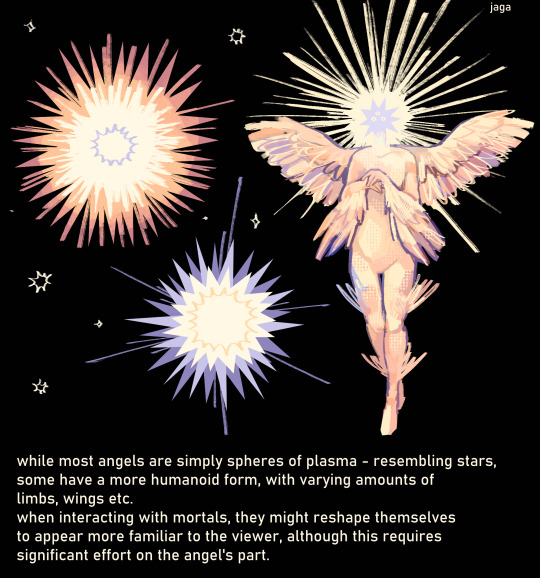
some angel lore because they make me happy : )
i've considered having their form be based on some sort of angel hierarchy - it's been a lot of fun reading how they've been classified in different religions - but i'm not sure if i want to use that after all! for now, they're all equal.
the angels quickly realized that most creatures would fear them less if they looked similar to them. while the results weren't perfect - the "reshaped" angel would still be made of the same substance and glow - it was enough for them to approach most animals. humans were an interesting case. while many required the same treatment as other creatures, some didn't seem to mind their real form - and some were even interested in seeing it.
#id in alt text#my art#angel#art#i love reading ppls takes on these. also if you have any questions i'd love to hear them: )#oc
7K notes
·
View notes
Text
been going a little bit insane about this sentence from Ace by Angela Chen for the past week
#replace this with any other type of significant relationship too#also! this book actually rules btw i really recommend it#i didnt read it when it first cane out bc i was like. well i am already pretty familiar with asexuality and not rly interested in 101 stuff#but it turns out it doesnt feel 101-y at all its a super awesome piece of queer theory and also chen has Good opinions#and not weird watered down ones that i am sometimes wary of in aspec communities (frankly especially ace ones)#i think maybe if more people approached asexuality the way chen does (including and maybe even especially ace people)#i would be more inclined to still ID as ace#but anyways!#aro#aromantic#<- tag selections that reflect how i personally engage with this quote#also#described in alt text#also also#j tag#:/#aro media
8K notes
·
View notes
Text
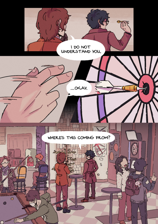

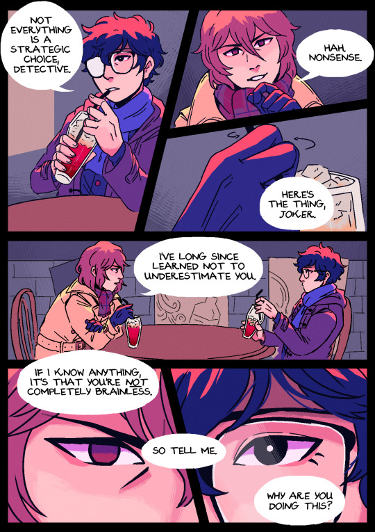


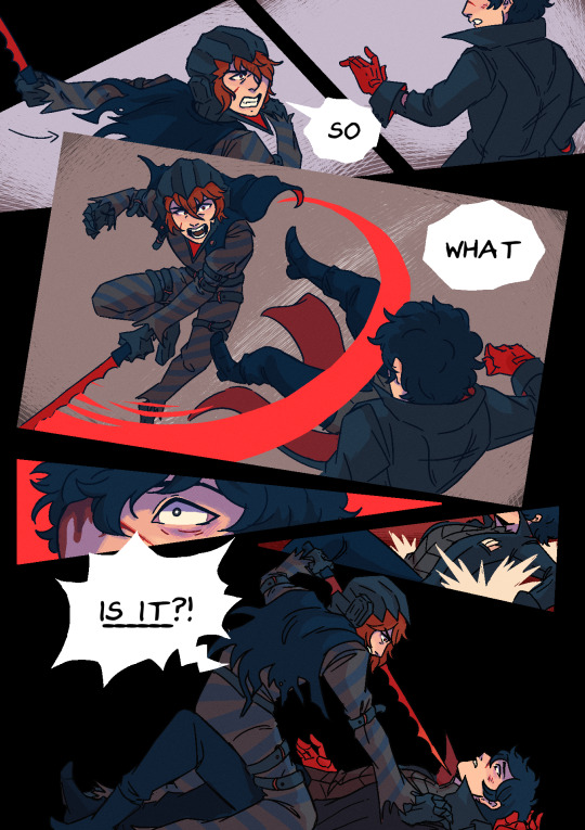

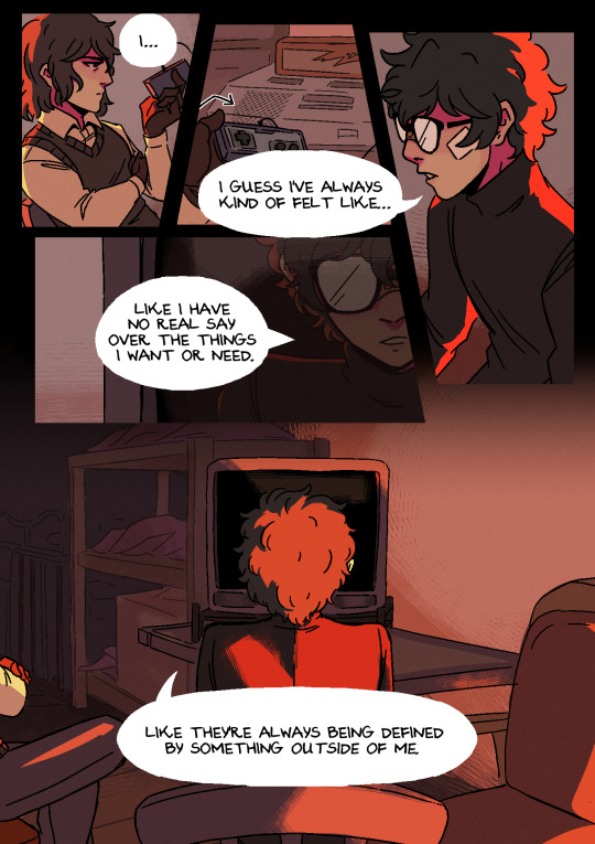
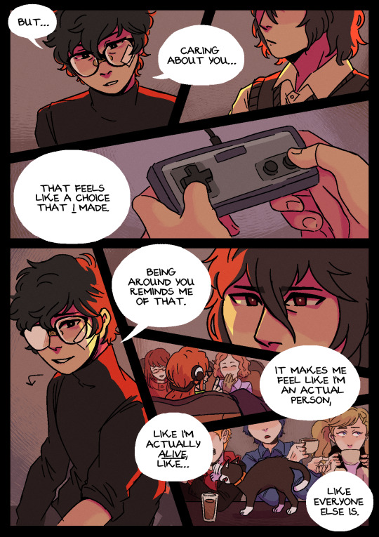
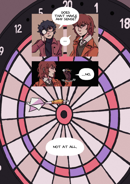
on the agency of puppets
#persona 5#persona 5 royal#akira kurusu#ren amamiya#akechi goro#goro akechi#shuake#akeshu#artists on tumblr#comic#drawings#alt text in image#p5r spoilers#alternatively ''on the agency of a protagonist'' but that doesn't flow as well#special thanks to: mads @twinkle-art for saying something that immediately gave me an enormous hell brainworm that inspired this#and also vada my friend vada who read over my script & then called me gay. and also told me it wasnt completely unintelligible#i cant look at this anymore. i hope it makes sense. i'm going to lie down. i'm passing away
14K notes
·
View notes
Text
Hi sorry I need to do some more Pokemon posting bc this is the funniest shit. the cute-looking Pokèmon TCG series is making "TM10" part of its branding. Like, TM10 from the games - its the TM for the move Hidden Power, thats cute! Its reflecting the main character discovering herself in the same way the move works in the game, what a cute little detail!
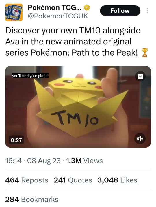
Except uh. Just one problem.
Game Freak in all their brilliance removed Hidden Power from the franchise four years ago in Generation 8* and its still not able to be used in Scarlet and Violet. Its not just that you cant teach it to Pokèmon anymore, you straight up cannot use the attack even if you trade in Pokèmon from older games who know it. Its like a banned technique.
So then that begs the question – if the TCG show is gonna be referencing TM10 this much, but TM10 *isn't* Hidden Power anymore, surely that means TM10 is another similarly inspiring attack - Stored Power, or Calm Mind, or Smart Strike?
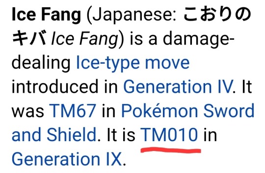
Well, depending on if its Gen 8 or 9, I hope the kids will have fun Discovering Their Own Magical Leaf and/or Discovering Their Own Ice Fang. Truly inspiring words. love how well managed this franchise is
#pokemon#pokemon scarlet and violet#pokemon sword and shield#pokemon path to the peak#pokemon tcg#pokemon cards#pokemon games#the funny#mel alphabet soup#those games gastrodon is from#hi for you reading the tags one small correction#yes hidden power WAS brought back in Brilliant Diamond Shining Pearl#BUT it was exclusively for that game bc it has Unown#and they dont know wtf to do with those guys otherwise#very funny either way#added alt text btw
6K notes
·
View notes
Text
THE KING IS BACK
#itsallmine#Dracula#dracula daily#jonathan harker#I’m so excited omg he’s back#time to read bram stokers classic gothic novel again#aaaaaaaa#someone has probably already made this joke but idc#patch notes: pictures now have alt text
12K notes
·
View notes
Text
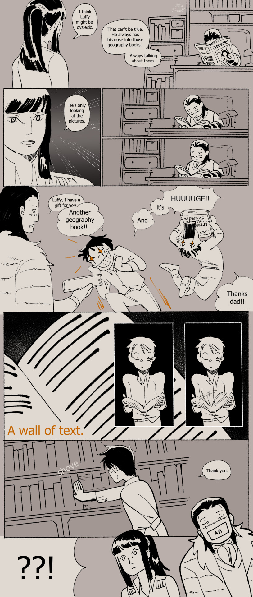
Mr 0 and Miss All Sunday investigate.
(timeline)
#one piece#nico robin#sir crocodile#monkey d luffy#crocodad au#my art#my comic#described in alt text#ive finished it!! :'DD this comic was about how no matter the universe luffy just cant read. i love how easily it is to read luffy as bein#neurodivergent/having (at least one) learning disability. so i wanted to put it here in the au. its important to me. also. quietly#establishing a few things for later. meheh
6K notes
·
View notes
Last Seen Blogs

wally1377
Untitled

imoviegifs
gifs from movies

yaozhim
yaozhim

jaumegaixas
cristales

healthpotionremade
(๑ᴖ◡ᴖ๑)