#they are the perfect mix of all my favorite character design things
Note
Since you said it's ok to send you random ask, i've always found your "monsters" design to be really really gorgeous, and I wanted to know : in any form of media you've interacted with, what's PEAK monster design for you ?
i have been thinking about this ask alot bc ... i dont ... know? theres a problem with what counts as a monster really too, most are either some sort of anthro/furry or the horror gore type of monster that instills you more with disgust than awe
i guess theres some i really like but idk if thats what id call 'peak' (though its rarely JUST the design but their vibe and stuff too);
(its a lot of zelda.. sorry)
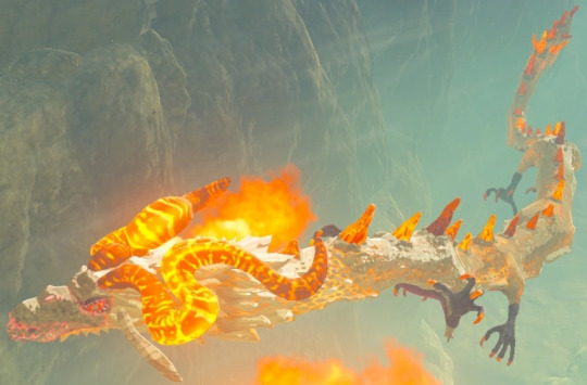
Eldra, Farodra and Naydra (engl Dinraal, Farosh(?)) though Eldra is def my fav one of them, i like how they are a little more less typical dragon- with the fur around the neck the floppy ears and kinda goofy face yet manage to be the most ethereal, awe inspiring creature i have ever seen in a game with how they act and are presented as (in BOTW!!! do not mention anythign sonau/zonai with stupid magic pebbles to me about them i will manifest worms into your tea)
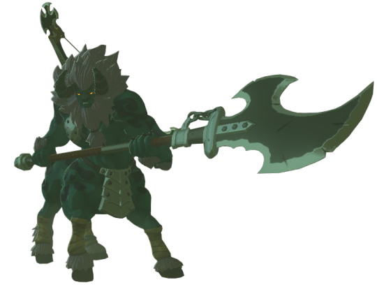
Leunen (Lynels) (botw) -i could not find a better picture wtf, fav are white and silver ones)
FINE they had some pretty neat new horn designs in totk- idk i just like them alot, rather simple if you think about it, horse lion plus horns- but its so well put together it just kinda scratches my brain in a good way (also how intelligent they clearly are, like the way they fight and act and also even their death animation is so??? huh?? you are just gonna treat them like any other mindless monste- *remmbers they treat ganondorf even even worse all things considered* .. nevermind you're good)

'Beast' Ganondorf (twilight princess)
its my favorite beast ganon design (even if it technically is just kinda a man boar .. again) though if ww gan had a non puppet beast form that one would most definitely be my fav lol
(i will not get over the fact that some descriptions call this a hideous beast EXCUSE ME???? WHERE???)
(honorable mention here, darkbest ganon from botw, pig on fire but it looks cool as fuck)
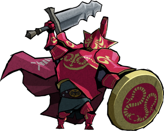
Nimbusgarde (ww) .. (engl .. darknuts?) do i need to say anything? (i could throw alot of ww design here) not sure if it counts as monster but they are not human so ????


the pathless bosses- (here in order, Cernos, the Godslayer, and Kumo) all of them are rad as hell (except for the final version of the godslayer ... liek im sorry but it looks to boring compared to any other one lol) again not just the design but man do i love them
since i dont know what would count as a monster or no i could just list my fav characters here bfmjbfmjsbmj like radahn (elden ring) is just kinda a zombie, aurelion sol (league of legends) is a space dragon, the forest god in princess mononoke, Narisha (skyward sword- sky whale)- i could go on but this post is long already
(honorable mention to Omus in nausicäa, weird bugs but also something divine, though it is much more how they are treated and the vibe etc)
in all honesty though i cant think of one that i would describe as perfect, what i want of a monster design is to be ... cool but also a little weird, big hulking monsters that have something off about them and something that makes them 'other', but also not, as much as i like bloodborne, just bloody gory messes of rotting flesh, AND not just as a monster to kill, i just crave a game or otherwiese piece of media where the cool monsters arent just there for you to kill- the perfect one i guess would be something kinda big scary weird and off but while non verbal clearly not a mindless beast?
and here is the thing; my own characters do not furfill that, my designs are really rather conservative, much to my dismay, anthro of a mix of animals, maybe an extra arm thrown in- Eadrya, one of my favorites, is really just a blueish furry (yes they have fur) and their demon form is a mix of seals and catfish with some extra arms, too many teeth and a mouth that goas wayy to far (if they want) - Shargon is a feather dude with extra arms and his demon form is really just a chinese type dragon crossed with a bird, throw some darts at the color wheel, done
together with my problem of my monster characters losing their 'otherness' vibe within the story rather fast bc the majority of my characters are non human and speak and you see them in all sorts of emotions and parts of life- they lose that divine, unknown vibe and i HATE that that happens, i want them more akin to the forest god in mononoke but thats not possible unless i start from scratch
and i really dont mean to make myself look bad to sound self depre- ... however you spell that; i really am rather dissatisfied with my own designs but mostly just roll with what i got bc i never seem to be able to actually achieve what i want
even my redesigns often really make things LESS interesting (unless maybe the og was just ... human, but they are blue eyed with golden hair and white so that makes them divine you seE-), the skyward sword dragons as i redesigned them made them much more classical dragon, in part intentional bc i was drawing a connection of them becoming the botw dragons at some point, but by all means the canon design is much more weird and unusual than what i did with them, you could apply the same to even demise, his canon design might seem a little uninspired but really what did i do? inject him with some classic satan spice like that makes it in any way less stereotypical evil demon ??? lol
im sorry this post devolved into whatever this is but i really am trying to answer sincerely, i am confused about it myself, what counts as a monster, what doesnt, there must be more that i really loved but why cant i think of them, why do i design characters like this when i really want something much more different, i dont know, i feel like my brain is in a cage, why do i keep making things less interesting in an effort to make it interesting, am i falling into the corporate trap of cool sells who am i what am i doing
(theres a zelda artist with a style so strikingly genuis in shape, color and just .. DESIGN that i want to chew my nails off bc i cannot design like them, their designs and redesigns are so different yet sensical and so full of crisp shapes i have never seen before it drives me nuts and i would want to give them a shoutout but i think they dont like me so aaaaarhekjbfhgdknbgdfklbg)
#ganondoodles answers#hhhhhhhhhhhhhhhhhhhhhh#this ask was so innocent and nice#what did i do to it#me trying to think of my favorite monster design spiraling into me realizing i am making things often more boring than the og#and in general just dont achieve what i want to even with my own creations#i have infinite possiblities of creativity at my fingertips and yet what to i draw#blue furry :)#i feel like an ant that just experienced cosmic horrors of realization#(to be clear- having infinte possibilites and yet deciding to just draw furries is FINE AND VALID if thats what you want#(do -I- want that though??????????????????????
56 notes
·
View notes
Note
Will your review neopets the same way you review Pokémon? Will you review the beloved. The Korbat.
(I have a few requests for Neopet reviews, so I'll be mixing these in with the Pokemon reviews based on request order.
Neopets are different than Pokemon because you have the base color, which is usually pretty plain, and then dozens upon dozens of paint brush colors. I can't possibly review all the colors in one sitting, so I'll instead just review the base and pick out three of my favorites for that species. If you guys want a specific species + color combo, you can mention it in the requests or request afterward.
Also, no character reviews either, just the pets themselves. Characters can also be requested separately if it's something you guys would be interested in.)


Korbats are—you're not going to believe this—bats. They're fairly standard as far as bats go, but they do have the interesting addition of a long tail, something bats aren't exactly known for. What's really cool is that they use this tail to hang upside-down with, which feels like something bats would do if they did have tails:
(Side note: I love them hanging off the circle like this, but weirdly enough only two unconverted colors had this pose instead of the standard circle pose—not even non-standard body type colors either. Weird.)
I really like how Korbats are white by default, instead of the standard bat black. It gives the basic colors a nice pop of color instead of just making the entire body a single color the way most species of Neopets do. Yellow and red are especially good in this regard because the wing color is accented by the feet and ears respectively.
However, something about Korbats never quite clicked with me personally if I'm being honest, even though I love bats. I think the reason is the face—bats have very distinct noses and sometimes fox-like muzzles, depending on species, but Korbats have Kacheek-like faces and something about them feels kind of generic.

I think conversion doesn't help with this. Korbats benefited from conversion in the sense that their art was very old and dated, but things like adding eyebrows and making the eyes bigger and less dot-like looses something, even if it's technically more in-line with other Neopets. Also, putting the ears behind the heads was a big mistake—now their foreheads look gigantic. Not to say the converted version is bad or anything, as the art itself is a big upgrade, but those subtle tweaks throw it a bit.
Favorite colours:
Candy: I absolutely adore this color. It feels like an apology letter for the Halloween Korbat, which I always thought was pretty mid for the Neopet probably most associated with the color. The candy corn concept is great and the execution is perfect, with the tri-colored wings and tail.
Maraquan: Manta ray! Absolutely perfect concept and a great execution. Love the touch of bubbles under the "wings" to break up an otherwise plain design and help further convey the underwater aspect.
Relic: Another fantastic concept, and they went the extra mile by giving it an extra fierce expression. I also love how weathered the stone looks.
79 notes
·
View notes
Text
Birthday
A/N: it’s my birthday soon so yeah lol and this was half-asses at most
Fandom(s): Genshin Impact
Character(s): Dainsleif, Alhaitham, Cyno, Diluc, Kaeya
Genshin Impact:
Dainsleif would use this day to cherish you and treat you like the goddess you are. You deserve the world and he’d gladly take the archons on all at once to give it to you. Now, he usually does cherish you today he amps it up even more. With some planning of certain things like outfits and places taken care of a week before other things had been in works longer. He helped design a beautiful piece of jewelry and placed an order for a bouquet full of flowers that reminded you of him. For Dain this is the only holiday he takes part in with his chest. You are his safe place, and his home that he never thought he would find again.
While he knows things like these don’t truly matter Alhaitham tries for you. He knows for sure that when your feelings aren’t “positive” he doesn’t like it. So he gets you mostly practical things that you needed and something that you wanted. I can picture him giving you socks and underwear cause you mentioned that you needed them but in the mix of that there would be a book or plushy you wanted! He would also know that with socks and underwear could not only be practical but also fun for both of you! He would take you out for brunch after giving you the present at home. He means well but he’s also too smart for his own good, even Kaveh tried to say something but was shut down instantly.
Cyno tries to gift from the heart. He knows he’s away a lot but he also wants you to know he’s always thinking about you even then. He might commission a TCG card or two from a certain alchemist that is the both of you in your favorite place or he might make a scrapbook! The scrapbook would be full of pictures he took, some with you and some that he took of the landscape when he was missing you, along with some description of where it was and possibly even how he was feeling. He’d also include some pressed flowers that he specifically asked Tighnari the meaning of.
Diluc will take this opportunity to spoil the ever loving shit out of you. He is a man with a plan and he will make sure it goes down perfectly. From bouquets to meals you won’t have to do anything but cuddle up to him and thank him. He would gift you something(s) he saw you eyeballing for a while, surprising you with how vigilant he was with everything in his world. Such a king. He’d be extremely willing to try some of your hobbies today rather than any other day.
Once he was done doing the major things he needed to do, Kaeya would slink back to you with a bouquet, a nice bottle of wine, your favorite meal, and a simple necklace that was in the shape of his pupil. He knew you loved his eyes, despite him being indifferent to the fact it was different, so he thought this would be perfect! Spending the rest of his night with you and cherishing it while avoiding the minor problems that would have popped up during his working day.
#teaskies headcanons#genshin impact#genshin impact x reader#genshin impact headcanons#genshin impact dainsleif#dainsleif x reader#genshin impact alhaitham#alhaitham x reader#genshin impact cyno#cyno x reader#genshin impact diluc ragnvindr#diluc ragnivindr x reader#genshin impact kaeya alberich#kaeya alberich x reader
252 notes
·
View notes
Text
This is not an update to the Comic, but it still has something to do with it !!!
(call it a little gift for the Wish Rewrite and KoW fandom)
Hello my little stars! How are you?
I mentioned in the last post in the series that I would be traveling for a week or two and that's why I wouldn't be working. Well I'm still traveling Lmao.
It's been a lot of fun, I'm visiting my Prince Charming and family, both of whom I haven't been to in a long time. Still, I couldn't stop thinking about KoW and Wish's Concept Arts. Disney sealed the fate of its fan artists by discarding so much good material, now they are embedded in our minds and we will not be able to rest until we see them realized. This is crazy but it's beautiful to see how much these discarded concepts generated creative potential in the fandom.
Because of all this I couldn't help but make some small sketches! And well, I came to show them here. They are not sketches of Comic panels, but they have something to do with it and I will show the photos and explain how.
This first one, very faded, are Magnificent and Amable's clothes (designed by @uva124, for the characters in @annymation's rewrite of Wish "The Kingdom of Wishes"). The drawings that Aled did are very complex, I don't judge her for that, in fact I thank her, she gave beautiful clothes to the centuries-old Disney villains and they are perfect. I really wish I could draw them with all the details, but I will do everything by hand, alone and seeking a minimally professional quality (I want to be a comic artist/book illustrator one day. This comic is my first step Lmao, and I want to do something that conveys the best I can give at the moment), so I need to make some things easier for myself. The costumes are one of those things.
" Better something simple and well done than complex and poorly done." — This is my motto for this Comic and for my life.
The next sketches are related to aesthetics. I've been watching a lot of "Analyzing the Art" videos of some Disney films and I was inspired to adopt some "Disney Style" features in my arts for this comic (not everything obviously, because I don't want to be sued by Disney lmao).
What you'll see next is me trying to mix this influence with my own style in some KoW character sketches.
(this last art specifically references a meme in which @rascalentertainments tagged me, Thanks for that, by the way! <3 )
(credits to the artist, I don't know who it is because I was just tagged in this meme and I was busy So I didn't look for more information, but I'll leave the post link and you can check the official credits)
Speaking of aesthetics. Anny received Chiara's aesthetic from someone — the north star, "daughter of Aster", created by his magic at the very end of Anny's fanfic. This Aesthetic inspired me to create an aesthetic for Asha and Aster too and these were the results:
What's your favorite?
Lmao, It took a lot of work to make Aster's. There are almost no things for "starboys" on Pinterest.
I'm leaving this up to you to share as you wish, consider it a gift to the fandom!
Lastly, I want to say that the artistic analysis videos They also inspired me to put together a moodboard for KoW and I'll be leaving it here. Not even Anny and Aled know about this and I can't wait to see their reactions! I wish I could print this painting and leave it on the wall, but unfortunately I don't have a printer T-T.
This moodboard is helping me with the artistic direction of colors, style and is a visual motivation to stay active at work.
I hope you like it too!
That's it for today, it's already midnight in Brazil and I should be sleeping instead of posting crazy things on the internet. I'm going to tag my friends and go to sleep, Lmao.
Kisses full of light and stars!
~ Emy
@wings-of-sapphire @flicklikesstuff @frogcoven88 @chillwildwave @gracebethartacc @gracebethartacc @kstarsarts @oh-shtars Come and get your therapies after the anguish caused by certain publications by Anny!
#kingdom of wishes#wish reimagined#wish rewrite#wish 2023#disney wish#artists on tumblr#asha wish#starboy#starsha#the kingdom of wishes desings#the kingdom of wishes au comic#the kingdom of wishes au#behind the papers?#behind the scenes#aesthetic#scketchbook#scketchs#please write tags for me when reblogging#I am feeling lazy
29 notes
·
View notes
Text
My Favorite Comics of 2023
Sometimes I think I should review all the comics I read as I read them. Then I realize I read like...40 comics a month and decide to not do that. But I figured I could at least round up my favorite books of 2023!
So as not to bury the lede...
My Favorite Comic of 2023: Green Arrow
Was there ever any question? All I have ever wanted for like 20 years at this point is Arrowfamily shenanigans, and this book has been all about reassembling the gang and letting them romp through the DC universe. This is an Ollie who is overflowing with love and bad ideas, and that's perfect. Every character and relationship has gotten a chance to shine so far, and I can't wait until they bring the girls in. I especially love how clear it is that Roy is Williamson and Izaakse's favorite. ME TOO, GUYS, ME TOO. The fact that this is now an ongoing instead of a limited series is the best gift DC could have given me.
The rest of my faves...
Alan Scott: The Green Lantern: I did not expect to be as moved by this book as I am. The overall plot is a bit hard to follow, but that's not really the point of the comic. What blows me away every issue is how unflinching and occasionally brutal the book is in its portrayal of 1940s-era homophobia, including Alan's internalized self-hatred, and yet how simultaneously incredibly kind the book is. The love and validation, especially in #2 and #3, is so generous and beautiful. Also, it's the best and most beautiful I've ever see Cian Tormey's art look - he gives everything such a hazy, heartbreaking softness here. Please read this book.
Batman/Superman: World's Finest: This continues to be one of the most enjoyable books DC is putting out right now. Mora is one of those artists, like Doc Shaner, who draws the DC universe exactly 100% the way it looks in my hindbrain, and Waid is absolutely in his sweet spot of classic heroes, Silver Age lore, and extremely comic book-y adventure. Plus, Tamra Bonvillain is doing that thing she does with colors that taps directly into the happiness center of my brain - they are so rich and sunny and joyful.
Birds of Prey: I love everything Kelly Thompson writes and I'm so glad we finally have her at DC. She is the absolute perfect writer for this book, too - she gives such good superheroine. The banter! The action! The way she mixes and matches her cast in such fun combinations! Leonardo Romero's layouts are so kinetic and fun, and Jordie Bellaire's colors, YOU GUYS, JORDIE BELLAIRE'S FUNKY SEVENTIES COLORS! I can hear the soundtrack of this book. Love love love.
The Flash: To be clear, I mean the Jeremy Adams run that ended earlier this year with #800. I will forever be salty that DC canceled this delightful book, which was all of the action and humor and heart and love of continuity that I crave in comics, in favor of the so far completely mid Spurrier series. RIP Adams run, you were too good for this world.
Fire & Ice: Welcome to Smallville: This book got off to a slightly slow start, in my opinion, but every issue just gets better and better. It is so funny, and I want Natacha Bustos to design every outfit I ever wear for the rest of my life. Plus, Tamra Bonvillain is doing the color thing here, too! I want to live in her world.
Poison Ivy: I trust G. Willow Wilson with my life. This is such a good, complex, nuanced take on Ivy. (Also messy and poly and queer.) I have no idea where this story is going but I'm on this ride 'til the end.
And finally...
Favorite Backlist Title: Starman (1994): You guys. YOU GUYS. I mainlined all 80 issues of this series this year at an absolutely blistering pace because I did not want to stop reading it for even a single second. It's everything I love about comics: truly serialized storytelling with a huge cast and lots of intertwining subplots, tons of twists and foreshadowing that pay off in immensely satisfying ways, a deep dive into continuity that's still accessible to people who know almost nothing about Starman (me), a love letter to a fictionopolis, and one funky little dude trying his best at the center of it. I am BEGGING you to read Starman. Please.
36 notes
·
View notes
Photo
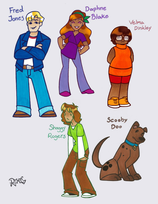
Because of REASONS, I remembered my Scooby-Doo character designs from a few years ago. I decided to touch-up the picture a bit and fix a few things. So, here they are again! If I were to totally make my own “dream version” of Scooby-Doo, this isn’t exactly the “style” I’d prefer them in (something a little closer to the classic), this is just a cute and simple style I use when I want to get an idea for basic body-types, hair, and outfits. As for the story, I’d toss together all my favorite things from every previous version, but the basic plot would go like this; the kids all originally met when they were very little, trick-or-treating on Halloween, and solving the mystery of some mean older kids who were stealing candy. During middle school, they wound up moving away from each other for various reasons... but all reunited in high school! They had a fairly normal time, solving mundane mysteries and such. After graduation, they decide to take a road trip together, and THAT is when they truly become Mystery Inc. A mixture of the old-school plots, some new adventures, and yes- sometimes the spooky things ARE real! I’d honestly aim for it to be PG-13, it doesn’t need to be turbo-edgey and grim-dark, but they can say swears. There would one F-bomb in the whole show, and Freddy gets to say it~
(some character notes below)
I drew Velma first because I’ve always wanted to update her outfit as sort of a sleeveless sweater-dress kind of thing. I gave her red shorts instead of a skirt, and I think it somehow made her look more sporty but still cute. Some orange high-tops sort of bring it together. I wanted her hair to have something like a flapper-girl style, and I kept classic style square glasses because she works them (and still can’t see without them). Velma is easily the most adorable. She’s still the “smart one”, but she doesn’t know EVERYTHING about EVERYTHING; history, science and chemistry, literature, and math are what she excels at. She also has a near photographic memory, and although she understands a lot about technology (in terms of software/programming/coding), she isn’t too great with machines. Some background for her; Velma is mixed Japanese/Mexican and Jewish. She’s also trans and a lesbian~
I knew I wanted Daphne to look really fashionable, but also in something simple and comfortable. I gave her a purple halter top/skirt with a leg-cut on one side, and loose lavender jeans. She almost never has pants in her main outfit, but I think it gives her a fun nostalgic look of the 60s and 70s. I moved her green scarf up to her hair, and gave her matching green earrings. I like the idea that because she’s a little clumsy (Danger-Prone-Daphne) she’s taken lots of athletic lessons to try and make up for it; she’s done ballet, gymnastics, Karate, boxing, archery, played different sports like soccer/basketball/baseball/tennis, swimming lessons, and equestrian classes. Basically, when she’s in “alert-mode”, she could probably handle just about anything… but when she’s not paying attention she tends to trip (though, she’s kinda of backwards-lucky by stumbling into clues this way). Daphne can speak several languages fluently, she’s got perfect pitch, is super sensitive to textures so she can recognize any material, and has a gift for being very charming and intuitive. Some background for her; her dad is Iranian, and her mom is Scottish. She’s also bi~
I always wanted to give Fred a blue jacket. I just think it suits him. He’s also got light-blue jeans, and a white long-sleeve shirt (with a red collar to replace the ascot haha). He’s got a little bit of a farm-boy vibe (hence the belt and work boots). He’s all about cars and other machines, a real Mr. Fix-It, and he loves taking stuff apart to see how it works. As a result he’s pretty good at his other hobby besides mechanics… TRAPS. Fred also practices being an escape artist, so if he ever gets caught he’ll be able to get out of almost anything. Although he’s certainly not “stupid”, he has a tendency to be a bit oblivious and a little too headstrong. He’s got a heart if gold though, and everybody who knows him would agree that he’s endlessly kind. Some background for him; Fred’s parents went missing around when he younger, and so he’s had a few different foster families. He doesn’t get reunited with his folks until much later (learning more about his family, he finds out he’s mixed Italian/Norwegian). He’s also bi~
Shaggy doesn’t need much changing (if I altered too much, he just wouldn’t look like Shaggy anymore). I have him a white long-sleeved shirt under his classic green one, changed his brown pants into cargoes (all loose fitting, Shaggy likes it baggy), and gave him some black sneakers. He’s naturally still got long hair and a scruffy chin (plus some sideburns). Even though he’s a well known scardey-cat, Shaggy has a deep love for horror movies and fictional spooky stuff doesn’t seem to bother him. His various fears and phobias have actually made him a safety expert; not only does he usually carry a back-pack with a fully stocked first aid kit, he knows how rescue somebody who is drowning, all the safety procedures for different vehicles/aircraft, CPR, and survival tactics (he actually knows more medical facts than Velma). Despite being so thin and lanky, he is almost always eating, sometimes thinking with his stomach rather than his head. He’s always happy to share though, and he even cooks great meals for his friends (mindful of allergies and what-not). Some background for him; he’s Canadian First Nations and Jewish on his mother’s side. He’s also trans, bi and ace~
Scooby was maybe the most difficult to draw… he’s so iconic, and I wasn’t sure how to draw him in this style but still make him look like Scooby. I’m not sure if I succeeded, but I think the result isn’t too bad. Shaggy found Scoob as a pup, and they have been best friends ever since. Like Shaggy, Scooby loves to eat and hates to be afraid, but he’s only a coward when something threatens him; if a monster or villain is going to hurt one of his friends, Scooby always comes to their defense. People forget that he’s actually a very big strong dog because he’s usually so gentle and silly. Scoob knows all sorts of trick from the typical “sit/roll-over/shake” to more impressive stunts. Although he loves attention and praise, the best way to get him to do anything is to bribe him with a Scooby Snack! He’s a very smart animal, and the fact that he can communicate when he smells or hears something suspicious that people might miss is a real asset for solving mysteries. Like any good dog, Scooby is loyal and lovable~
191 notes
·
View notes
Note
i dont know anything ab vivziepoop or whatever her name is and her work but could you give some examples and like. maybe explain how far they are from actual demonology? i love haterisms and i love learning things
kisses you on the mouth id love nothing more than to spread hate and infodump abt demonology. let me preface this by saying ive never watched any of their content so i cant speak on much besides what ive absorbed via osmosis of being on the internet and what i can see in their designs
so my special interest has always been on the 7 Princes of Hell aka the 7 Deadly Sins so thats what I'm gonna focus on. I'm also gonna bring beloved otome game Obey Me into the mix for another example of modern interpretations of them. also keep in mind im not a believer in these figures, though my research comes from both christian and pagan sources, i just like them a lot
so lets start with Mammon, the prince of greed. mammon is always depicted as a very money and power hungry kinda guy. in heaven, he was so obsessed with the golden pavement that they kicked his ass out first. hes super powerful and has 6,660,000 demons under his control that he makes build the capital of hell called Pandemonium. im not making this up demonology is silly as hell. hes associated with wealth, gold, jewels and emperors.

you may be surprised by this interpretation from the dictionaire infernal, but from my understanding/perspective, i believe this is supposed to be a lure to get more money as a begger? normally hes described as decked out in robes and gold and jewels and all that. but you can see in the illustration the bags of money.
so yeah hes like a super money hungry emperor type- in my mind i always kinda think of trump ngl. power hungry, money hungry, you get it. so if youre like me, for a character design, youre thinking a ceo with lots of expensive clothes and jewelery.
now, lets see what our friend viv has to say-
... they made him.... a clown? keep in mind, i literally know nothing abt the role he plays in the show, but... why? why is he a clown? if anything, him being a jester is the opposite of the typical emperor depiction. like a king vs a court fool. completely erases the whole idea of his greed for power. part of that greed is that he already has it but he wants more! this jester angle doesnt make sense.
okay, now lets look at obey me. theres a lot of things i dont like abt obey me's interpretations, but theyre so much better than vivs.
first of all, the white hair and blue eyes are actually accurate! the colored illustration above of begger mammon is actually colored wrong, hes often described as having very light hair and icy blue eyes. this interpretation of mammon, while yassified from the old man and the emperor, is fairly faithful. hes obsessed with money, hes constantly stealing money from other people, he wears the most expensive designer brands, and he has gambling issues. its not perfect, but hes clearly based on the demon mammon.
now Asmodeus. asmodeus has always been my favorite. hes the Prince of Lust, but he himself isnt horny. he teaches people Forbidden Arts and Crafts and also geometry, hes a disabled king (walks w two walking sticks), he likes messing with people and he hates the smell of fish liver. one time he threw someone 400 leagues and stole his identity. what a guy
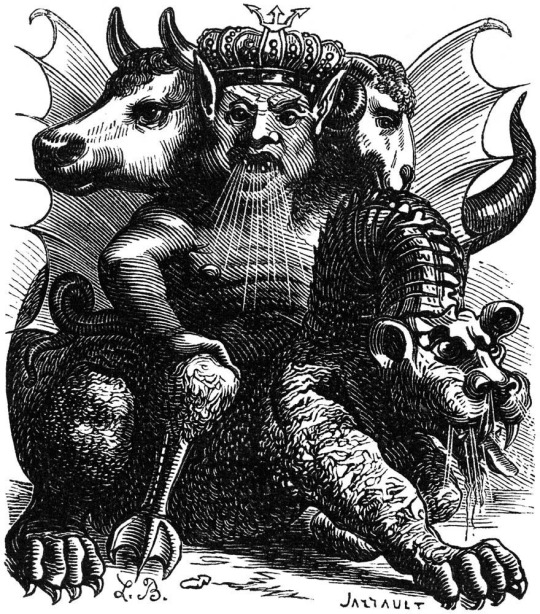
asmodeus is particularly monstrous. hes got 3 heads, a bull, a demon, and a ram, hes got a duck bottom, and he has a dragon cat service animal. i think hes beautiful <3 but you can see a lot of potential symbols you can incorporate into a design! all these animals, esp his three heads, are just waiting for a cool design. so vivs, whatd you do?
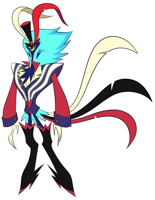
... okay. hes... kinda got the heads, but its the cowards route. he has... that weird ass body that vivs loves to give men. theres... some feathers so he kinda has bird symbolism? im pretty sure he owns a casino, which is actually accurate. but like. thats #notmyasmodeus. this guy couldnt throw me 1 league if he tried. hes not monstrous looking at all. his legs are thinner than my patience.
since we couldnt really dissect viv's mammon, ill bring this up here. a big issue i have with these designs is that theyre afraid to make demons ugly on purpose. dont get me wrong theyre all ugly as hell. but not gross. not monstrous. these sanitized tumblr sexymen designs completely betray what makes the original designs so fun. asmodeus doesnt have 3 heads, he has one that looks like an evil sesame street character. the design is simultaneously trying way too hard and so fucking generic. literally if you take out the two tiny head motifs in his... hair? theres no indication that this is based on the demon asmodeus
okay, lets look at obey me.

again, hes sanitized, hes conventionally attractive, and he doesnt have any of the demon asmodeus' symbolism. hes also super horny. he doesnt do geometry or arts and crafts or even own a casino. not faithful to the source at all.
before you accuse me of being a hypocrite for liking obey me, hold on. let me get through beelzebub.
Beelzebub is known for being "lord of the flies". its literally what his name means. i cannot emphasize enough that he has fly motifs. he is the Prince of Gluttony, aka overindulgence. its typically associated with food. but beelzebub is *extremely* powerful. in Paradise Lost, hes Lucifer/Satans right hand man. all other demons respect him immensely. hes supposed to be so powerful that summoning him is supposed to run a high risk of seizures and death. he also fucking loves architecture. when a ton of demons were called on by solomon to build, the other demons were so appauled that beelzebub was being made to do manual labor, but his crazy ass was giving solomon building advice
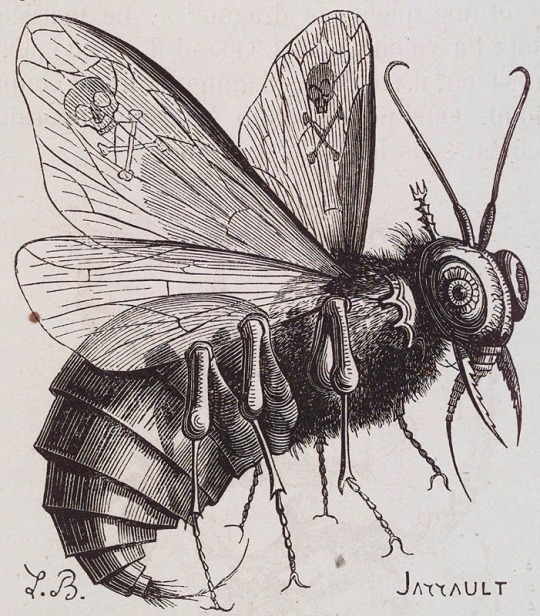
hes a bug! hes big beautiful bug. the crowd cheers. so the motif is kinda obvious here. i mean, its kinda hard to miss it, right-
what the fuck. what the actual fuck. "but grim shes got a bee motif-" shut the fuck up. this... fox? wolf? furry thing needs to be put down asap. i genuinely think theyre using beelzebub as an bad excuse to introduce their kesha dog character. bro what the fuck thats not a fucking bug. thats not even a goddamn bee. i hate it here
i cant do this anymore show me obey me.
hes a fucking fly thank god. sure hes conventionally attractive but hes not a dog with the smallest waist ive ever seen and disproportionate birthing hips. he eats all the time bc hes gluttony. okay fine whatever as long as hes a fucking bug im ok
so. lets address why i like obey me and i hate vivziepops interpretations. first of all i just fucking hate vivziepop so jot that down. but more importantly, obey me doesnt pretend to be anything it isnt. its a dating sim. of course the characters are gonna be hot and fit into archetypes. ive made my peace with that. besides, the game actually makes their sins pretty interesting by showing how they affect their personalities, motivations, relationships and lifestyles. its not super faithful, but its not supposed to be.
but helluva boss isnt trying to do that. from my (admittedly limited) understanding of it, its supposed to be a dark comedy gritty adult animation. the characters are supposed to be questionable and unconventional because theyre literally in hell. so i ask the question: why are they so afraid to lean into that with their character designs? why does everyone have to have barbie proportions? why is no one (purposefully) unpleasant to look at or monstrous? its sad to see a creator trying so hard to make something thats supposed to be graphic and brazen in its depiction of hell and demons, and yet is afraid to actually confront the conventionally unappealing aspects of the source material, or even touch the motifs of the demons
i love the 7 princes of hell. if you want to read about the strangest characters with the oddest stories, symbols and trivia, go read some websites about them. none of it makes sense. lucifer and satan are the same person but also not and sometimes the other 5 are also the same guy. belphegor is in love with paris and is the infernal ambassador to france and has a toliet wheelchair. satan is depressed. lucifer is sometimes depicted as an whiny brat child and sometimes as a humongous terrifying beast. leviathan does jack shit and just boils the ocean and eats boats. its literally so much fun. also please feel free to add onto this! demonology is fun in part bc theres so many different interpretations and facts from all over the place that make it a wild ride
tldr: vivziepops designs are lazy and unadventurous when it comes to their source materials
55 notes
·
View notes
Text
In my personal and 100% valid opinion
Aside from actual motion of the characters, the og Crystal artsyle was beautiful and very closely resembled Naoko Takeuchi's artstyle.

The problem was the lack of consistency. The artsyle in seasons 1 and 2 is highly detailed as is Takeuchi's artsyle. But this isn't very ideal with animation. However, I think if handled *better* it could've been an absolutely beautiful anime.
I know that I talk about how season 3 vastly improved the anime, and it did. But it also made it feel less familiar. The style and movement feels less like Sailor Moon. I've never watched the Precure series but the artstyle is like crazy similar to that anime. It's cute but I don't know if it works too well.
That includes the transformation animations. There is some nice work with glitter and spotlights, shininess and whatnot. Nothing to say about the inner and outer senshi sequences since they're remakes of the classic ones. But in Sailor Moon's case, she has a unique one each time. (At least up to episode 32-ish) and how to put this... Usagi's s3 transformation sequence animation is *jarring* there's like- too much exaggeration. And tbh I don't like it at all.
So going back to season 1, the CG that I've talked about before? Yea its jarring too if you're not expecting it. However its also really beautiful. Specifically Usagi's sequence!


Look. At. The. Camera. Angles!!! Like the focus on her hands (which is a consistency in this anime) and the use of panning! Especially in the Tiara shot how it revolves around her as the beams light up from her forehead. It's just so pretty!
And the other recurring clips are really nice too!
Look at the arch that Usagi's arm makes as she performs her signature intro! I love looking at this scene everytime for that part! And the timing with raising her arms before quickly bringing them down as she says "Oshiokyo!" (or "I'll punish you" in dub) Those are things that this clip do better than every other version of this iconic gesture.

And then here, the camera angles again are on point. And the forshortening on her hand is just *chef's kiss*
And something I just wanted to mention, Makoto looks gorgeous in some of these shots from s1 and s2. The artstyle is like perfect for her.

Moving on now, I wanna touch on Eternal. In terms of quality, Eternal is easily my favorite. The character pallets are accurate, and the character animation is excellent.
However. In terms of matching Naoko's artstyle, well it doesn't. Its an homage to the 90s anime. They even recreate the transformation sequence animations for Usagi. Things like the character's hair having less strands and detail. Actually there's less detail in general. But the eye highlights match the manga pretty well. I mean it all works. I could endlessly rant about all I love from Eternal because literally the only issues I've found are with the pacing of the whole thing. I've seen people say that the characters are still really expressionless. I personally don't see that? But like its a valid opinion when comparing it to the 90s anime they were clearly honoring.
I would have loved to see the outer Senshi in the s1 artsyle. Specifically Michiru. One of the things I love about the way Naoko draws her is her flowing gorgeous wavy hair. And she draws it fairly long. Past her shoulders and sometimes longer.

Crystal s3 her debut season, usually drew her hair as long as it should be. And she looked as gorgeous as her manga counterpart. But then Eternal came, and Michiru's character design more resembled the 90s anime. And no offense, but I hate her 90s anime hair. She always looks like someone awkwardly chopped her hair right at her shoulders. Its just not nearly as pretty as she should be designed. Eternal did a mix of the two. Its still pretty but also inconsistent. Because in some scenes it has the choppy look. So yea I'd love to see Michiru and all the other characters in the s1 artsyle. I know it will never happen but still wanna see it.
This is my long winded way of saying I am in the minority and love Crystal seasons 1 and 2 for all its faults and successes. It really had amazing potential to be absolutely beautiful and a big win for shojo anime. If only the time and care was put into the show as a whole and not only certain individual frames or clips.
Because there's some really fricken great sh*t if you look long enough!!
#sailor moon#pretty guardian sailor moon#sailor moon crystal appreciation#manga#anime#sailor moon eternal
31 notes
·
View notes
Note
Hello Ian! ♡
I hope you're doing well! ♡
I saw the Twst ask game you reblogged, and I was wondering if I could ask questions 11 and 12 please!
Thank you! ♡
hi hi sheep!! :DD
thank you! i hope you're doing well too!! 💕
and thank you so much for the ask as well!
(also i know the questions didn't need me to explain why but i wanted to hdlsjflk i kinda rambled)
━━━━━━✦
11. Favorite character from each dorm?
Heartslabyul: Riddle
augh i love riddle
his ob flashback really hit hard for being the first one
was sobbing at it bc it hit a bit close to home 😭
and it doesn't help that the VAs are really good too
so their lines just REALLY HIT
other than that i just love his entire alice-in-wonderland queen-of-hearts aesthetic! i think his design is just very pretty
Savanaclaw: Leona
other than heehee hoohoo pretty lion man i kind of relate to him as well???
he has this "i give up, what's the point" attitude but at the same time i believe there's still something at the back of his mind that still wants and believes there's "hope" of being something more
that's just how i interpret his character tbh
bro also seems to have a soft spot for the first years (jack and epel specifically i believe) and i think that's cute
Octavinelle: Jade
i honestly just like the idea that he might be more insane than floyd but people assume he's the more reserved twin because of how he carries himself
Scarabia: Jamil
*looks at entire blog*
sigh
i ;;; i cant, i cannot write an essay -
Pomefiore: Vil
i saw that the EN version apparently assassinated his character???
but idk
i really like him because from what i see, vil sees the potential in everyone and he doesn't like it when people don't try to be their best self
and people assume that he's really confident and thinks highly of himself but even HE knows he's not perfect (which is like the whole conflict in book 5 i think)
but anyways uhhh
vil pretty man
he's pretty
Ignihyde: Ortho
ortho my baby boy
he's just really cute .w.
he's just as unhinged as his brother tbh
ortho is just more innocent in a sense
Diasomnia: Silver
aurora was like my favorite disney princess as a kid
and silver is just ough
so sweet ;;;
it doesn't help that i got his ssr during his showcase and i fell in love with his vignette
and his part in book 7??? I'm 😭
he's honestly so cute
and HIS EYES??? so pretty
━━━━━━✦
12. Least favorite character from each dorm?
Heartslabyul: Trey
i just don't feel too strongly about trey in general ;;;
and out of the five i think he's the most uninteresting one to me???
i do like his dynamic with riddle but by himself ;;;
he's just a guy 🧍
Savanaclaw: Jack
he's also just a guy to me 🧍🧍🧍
Octavinelle: Floyd
to be honest my feelings about the octatrio are pretty neutral so in terms of favorites they're all on the same level ;;;
but to explain, i chose floyd because i kind of disliked him in the beginning
but i learned to appreciate his character more until he's in the same level as azul and jade
Scarabia: Kalim
KALIM IS LIKE A CLOSE SECOND TO JAMIL IN TERMS OF FAVORITE
and considering they're just two people i really have no other choice -
kalim ;;; my beloved sunshine boy
it's weird labeling you as least favorite scarabia character
Pomefiore: Rook
rook is another level of UNHINGED omg
i like seeing how others interpret him though, it's so funny
amping up his stalkerish behavior, which is the thing that really puts me off about him
but i do like that he sees the beauty in everything
that's like the only redeeming quality i can think of for him hfdksjfldj
Ignihyde: Idia
another instance of having no other choice because it's only two characters in the dorm 😭
the only reason i chose him here is because i disliked idia at first because of his ;;; tendencies in general
but he's kinda grown on me recently especially after book 6
Diasomnia: Sebek
i have ;;; mixed feelings about sebek tbh
didn't like him at first
but book 7 and interpretations of him had me thinking a bit differently
i think i just like him in the context of the rest of the diasomnia cast ;;;
━━━━━━✦
(ask game here! feel free to send me more!)
#i seem to have a bias for the housewardens#to be fair they seem to be the more fleshed out characters considering all of them (minus one) are the ob boys#and im sorry to the stans whose boys i kind of slandered 😭#if i get an individual ask for a character i can like do my full-on thoughts on them even the ones that i'm very neutral on ;;;#all these thoughts are very condensed to not make them so long#[—#✦'-asks#✧'-ask-game#★'-twst-rambles#twst#twisted wonderland#—]
9 notes
·
View notes
Text
Blue Lock Is the New "It" Sports Anime (Anime Review)
Honestly, I should be finishing the anime I need to finish. Why am I procrastinating and watching Blue Lock instead? I can’t help it. It’s so good (and I totally didn’t watch for Chigiri). I actually like watching sports anime. I love Kuroko’s Basketball, Haikyuu!!, and Yowamushi Pedal. There’s just something that’s charming about sports anime that I cannot fully explain.
The first thing that caught my attention with Blue Lock was the character designs. They’re all so detailed. I also love the way the eyes are drawn. I love how unique all of the characters look, even the minor, unimportant ones. Afterwards, I’ve been seeing a lot of fan art drawn by talented artists. I’ve been liking them left and right on Twitter. After liking a lot of fan art, I’ve decided that it was time for me to sit down and watch Blue Lock.
What makes Blue Lock so unique compared to other sports shows? This one has more risks as it’s a sports series mixed with a survival game. Given that I am someone who’ve watched Produce 101—all four of them—and got emotionally wrecked all the time, I knew this would be the perfect show for me. Was I wrong? I wasn’t. There was drama, suspense and everything else you can find in sports and survival shows.
The story is about Yoichi Isagi, who lost a soccer match by passing the ball to his teammate, costing his team to lose their chance at going to Nationals. He becomes frustrated at the fact that he decided to pass and not take a score for himself. Soon, he gets an invitation by Jinpachi Ego, a member of the Japanese Football Association, in order to partake in a project called Blue Lock where he’s searching for someone who can change Japanese soccer for the better—to become the best striker in the world. It turns out that he and 299 other strikers were selected. The Blue Lock project is one of survival—only the best can become the best striker. Isagi gets placed in a room with 11 other people and their first task is to eliminate someone and end their soccer career for good—those who get eliminated in Blue Lock cannot play for Japan Nationals ever again. With Isagi deciding to take out the strongest player in the room, Ryosuke Kira, the guy he had faced in his soccer match, he learns that he has to become selfish in order to become the best. In order to prove to his colleagues and to Ego that he’s the best, he needs to evolve, get stronger, and survive.
The first episode was super intense with the way Isagi decided to go for Kira and not Igarashi. The fact that he had ended his soccer career and felt good about it shows that this sports anime is definitely different than the norm. The episodes afterwards gets more intense as Team Z, Isagi’s team, are very dysfunctional and have to find a way to cooperate in order to survive.
The First Selection Arc was great in itself. This arc is getting to learn about Team Z and why they play soccer. For Kunigami, he wants to be a soccer superhero. For Bachira, he wants to find someone who can quench the monster inside of him. For Chigiri, it’s to find a way to give up on soccer. The fact that everyone has unique pasts makes the group diverse and makes people want them to succeed, even if it means they have to get eliminated later on. The matches with Teams X, Y, W and V were intense. Z vs X was pretty much a curb-stomp due to Z’s dysfunctional dynamic and X’s ace member Barou being too OP for them to handle. It’s when they face Team Y is when they finally cooperate, albeit begrudgingly. This is also when Isagi gets more aware of his ability of spatial awareness, where he can visualize the field and predict where a goal can be made and who he needs to use in order to utilize that path. My favorite match was Team Z vs Team W because of the Chigiri spotlight and also the fact that Kuon betrayed Team Z to Team W, a plot point that shows that no one in Blue Lock is an ally and that anyone can use whatever tactics they have in order to survive. If not for Chigiri finally getting motivation to play soccer again and doing it because he loves outrunning everyone, Team Z would have lost; this also cemented Chigiri as my favorite character. Team Z vs Team V was an intense match too. It’s second place because Chigiri doesn’t get as much focus here, but that’s okay. Team V is the strongest team because they have three aces, Reo, Nagi and Zantetsu with Nagi being their strongest player. Reo and Nagi only played soccer for six months while Zantetsu can outrun Chigiri, making them menaces. Nagi, who normally only moved whenever Reo asked him to do so, decided to move on his own once the score became equal. Team V loses because of Isagi and Team V experiences their first loss.
I think the best thing about the First Selection arc is the character bondings. While Isagi does befriend his fellow teammates, he becomes especially close with Bachira, Kunigami and Chigiri. Given that I am a fujoshi, this did fuel my BL kicks (It’s amusing how the initials of Blue Lock are BL). Because this is a survival game, the character bondings get a bit dramatic as characters need another in order to survive. Speaking of which, Reo and Nagi are probably fruitier than Bokuto and Akaashi from Haikyuu and that’s saying something.
The Second Selection Arc is where the drama kicks in as nobody are teammates any longer. You have to make a team of three and then advance by defeating other teams and taking their teammates. You only survive to the Third Selection once you get a team of five. Isagi causes two breakups to happen and he had to lose Bachira in the process. However, this arc is where many characters show off more of what they can do, so I feel like it’s a good ascension to the first arc. Isagi learns to handle the most unorthodox of people and manages to win via unpredictability, spatial awareness and main character power. While he had no specific rival in the first arc, the second arc solidifies Rin Itoshi as his rival as he is the cooler, most advanced version of himself. The fact that Isagi loses to Rin twice shows that while Isagi is improving, he still has a long way to go before he reaches his own full potential. I do like how while Isagi is strong enough to take down foes like Barou, Kunigami, Chigiri and Reo, it was because he had already faced them before. In Rin’s case, he had never played with him before and was only aware of his existence once the second arc started. I do like Rin’s inclusion into the story, as someone Isagi needs to beat.
The anime ends on the first half of the third arc, I believe. The Third Selection has two parts. The first being that the newly formed team of five has to challenge 5 world renowned athletes from different countries. I feel like Isagi got a bit cocky during the match and that was the reason why his team got pulverized. However, it also showed that Isagi still has a long way to go before he reaches foreign athletes’ levels. Fortunately, that portion was an assessment. Once six other teams of five make it to the Third Selection (RIP Kunigami), the anime ends with Ego announcing that his original plans for the third selection had changed and that his new plan is to get the Top 35 to face off agains the U-20 team with their recent addition being Sae Itoshi, Rin’s older brother. Given that the third selection was towards the last two episodes, there wasn’t much time for me to get used to it or Isagi’s new team since they haven’t really bonded as a team of five.
My favorite match of this entire anime was the match between Isagi, Nagi and Barou vs Chigiri, Reo and Kunigami. I think this match was the most exhilarating of them all. The reason is that Isagi has to be up against two of the teammates he’s the closest to back in the first selection and Nagi has to be up against his ex-boyfriend former partner Reo whom he abandoned because he wanted to team up with Isagi. Barou had to learn how to cooperate after being completely disobedient since his introduction. It also showcases how good the Kunigami and Chigiri are without Isagi and how well Reo can play without Nagi. It was an intense battle that legit got me hyped up for what’s to come in future seasons.
My only gripe with this anime is the lackluster animation quality. For an anime that revolves around a lot of movement, the animation is only good during important sequences, but it’s not very good at slower, non-soccer scenes. There’s a lot of CG usage too, especially when showing scenes of other players chasing the ball. I think Episode 8 was the worst offender since that was the one with the worst animation quality.
I’m honestly wanting more Blue Lock now. I might read the manga just to see what’s ahead. Blue Lock Season 2 and a movie adaptation of the Nagi side story has been announced, so I’ll definitely check those out! Until then, thanks for reading my long review of Blue Lock!
#blue lock#anime#anime review#review#isagi yoichi#bachira meguru#chigiri hyoma#kunigami rensuke#Mikage reo#nagi seishiro#barou shouei#itoshi rin#sports anime#ecargmura#arum journal#this is the longest review I've written
30 notes
·
View notes
Note
I assume Mundays is asking the mun question idk how these things work X3 BUT who was your favourite character to design, who is your favourite to draw and who's your go to for like getting in the drawing groove?
I think that's the basic idea, but I know other mods do fancier events and stuff.
BUT of the cast specifically, I'd have to say Six was my favorite to design, Eve is my favorite to draw, but Lilith is the one I randomly doodle most for no good reason.
Six was the most fun to design both initially and when I went back to add stripes to the twos. For both her and M1, I found a pixel mewtwo base, gathered a ton of screenshots from their respective films, and went to town on trying to figure out what colors I liked most. I probably still have the psd somewhere, I could show some of that work if anyone was curious. I really wanted to make both of them stand out from the sea of mew/two blogs that existed then (and even more now), but ultimately Six's disabilities ended up being the most interesting thing about either one. Then I added the stripes. Six's specifically are based on the Clone Blastoise from Mewtwo Strikes Back, with some elements of Venusaur's lighter color stripes and the original mew design mixed in. Since Blastoise's markings are mostly on his shell, I took a lot of creative liberties. I initially wanted her to have only the lighter color stripes, but added the darker ones to replicate the points on original mew's tail and feet. She has the most complex stripes of everyone, but finally starting the comic has shown me that they're not that bad once you figure them out.
I just love Eve. Her design is heavily based on an "ancient mew" I made years ago in an attempt to capture the sharp mewtwo-ness of the canon Ancient Mew drawings in the card and the original movie. The perfect missing link. Basically the only changes I made to put her in the blog were to give her a pronounced sternum and refine the shaping of her tail. Plus, the original OC was way more mean and aloof than Eve is. She's fun, she's simple, she's relaxing, she hits all the right notes. I almost said Syn for this, but he's actually a pain in the ass, and I think all of the crackships for him have kind of burnt me out on enjoying him. ... Speaking of which I still have more to do. Oops. Plus, he keeps kicking my ass in Pokken's story mode. To his credit though, he is the one I know most well due to extensive chatting with @mushroom-for-art and such.
Lilith, I love Lilith, I love her hate and anger, I love her badassery, I love her beauty, I want her to rip me in half, I'd thank her for it. She's the reason this blog exists and, prior to the stripes, was the main thing to set this blog apart from the others. Her demeanor is based on the idea that, in the original Japanese script for the film, Mew is written to be a god displeased with the clone made from it. It jokes and mocks and overall doesn't take mewtwo seriously until it realizes how much power its progeny actually has. My headcanon is more that she stopped the battle because she was tired and bored and pissed off, getting mewtwo and the clones to leave so the stupid humans could get out of the way and they could actually finish their battle on her terms. At the moment, I don't know if that rematch ever actually happened or not, though. Anyway, she is usually my go-to because I love her and her character, she's pretty and soft, and she's hard to get right.
Hope that wasn't too long or too dry of a read. Thank you for the ask!
7 notes
·
View notes
Text
Ranking the Major Live-Action Superman Suits Since 1978
Because I have a lot of thoughts.
8. Superman & Lois (Tyler Hoechlin)
I adore this show, and I think Hoechlin does a fantastic job as both Superman and Clark Kent. However, I HATE this suit. SO MUCH. It just looks like a regular dude in a Halloween costume, and it keeps getting worse and worse with each season. I hate the muscle highlighting (it looks cheap and forced), the neckline needs to be lower and more square, the boots could be taller, the S shield is too small and way too dark, and the colors are too dark and faded. I genuinely cannot understand who thought this suit was ready for filming in any way. It is absolutely hideous, and I will die on that hill.

7. Superman Returns (Brandon Routh)
I like that this suit stays so close to the source material, but it’s just … off. It would be completely fine if it weren’t for several little things that combine to make it underwhelming. Firstly, the colors are off: On screen, the blue looks almost turquoise, and the red often looks brownish (just a few shades lighter and brighter would’ve been a huge improvement). The S shield is too small, and I personally don’t like how raised it is. The thing I hate the most is the neckline — it needs to be lower and more square. Show some collarbone and shoulders, you cowards.

6. Zack Snyder’s Justice League (Henry Cavill)
I know a lot of people really like this suit and its symbolism, but I have mixed feelings about Cavill’s suits in general. Personally, I prefer bright colors, and the fact that Cavill never got bright colors at all made the black suit just another dark outfit (and therefore less special, which harmed the intended symbolism). I appreciate the comic reference, but if the filmmakers really wanted to go for it, they should’ve traded the cape for a mullet (mostly kidding).

5. Lois & Clark: The New Adventures of Superman (Dean Cain)
I don’t really have feelings about this one. It’s the classic Superman look, and there’s nothing really special about it, but I don’t mind that. It’s cheesy, but I don’t mind that either. The show doesn’t take itself too seriously, and neither does the suit.
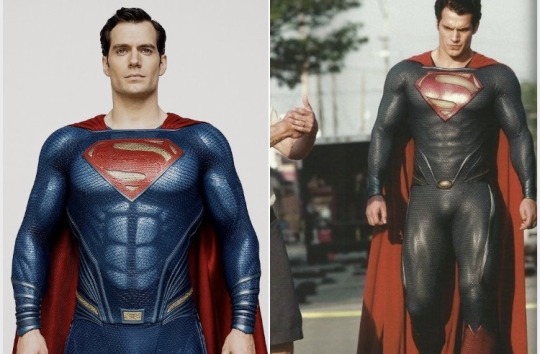
4. DCEU (Henry Cavill)
I was VERY torn about how to rank this one. The love-hate relationship is strong. Cavill looks good in it, but I honestly don’t like it that much. Even at the best of times, the blue is WAY too dark (I mean, sometimes it’s more black than blue). I resent Zack Snyder’s aversion to color. I understand they wanted to modernize the suit and get rid of the trunks, but it needs something red to break up the blue. Unpopular opinion, but I also don’t like the way all of Cavill’s muscles are highlighted. However, this is my all-time favorite Superman cape. It’s floor length and billowing and amazing, and for that reason this suit is ranked this high.

3. Supergirl (Tyler Hoechlin)
Now, if you want to ditch the red trunks, this is the right way to do it. The red belt breaks up the blue similar to how the old trunks did, the colors are just right, the cape looks good (although the material isn’t my favorite), and the size and design of the S shield are perfect. If the trunks have to go, this is my favorite suit.
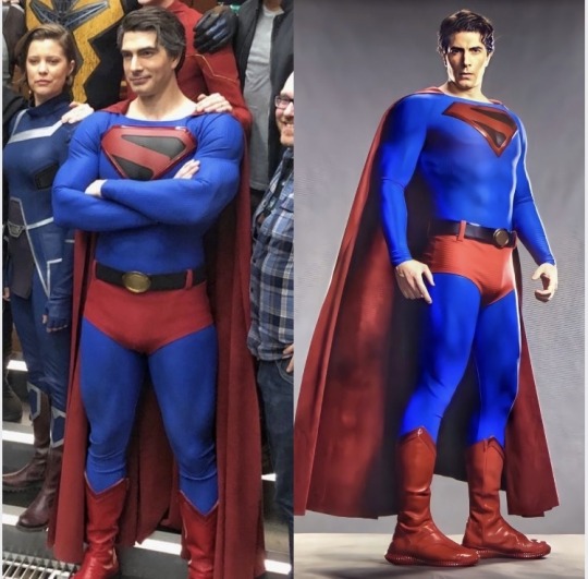
2. Crisis on Infinite Earths Crossover (Brandon Routh)
This is perhaps the best modern Superman suit. It’s a lovely blend of tradition and modernity, and of course the Kingdom Come reference is awesome. Everything about it is perfect. I love it. It looks great on Routh, and the style and colors suit the character and context. I desperately want Routh to have his own Superman show and wear this in it.

1. Superman I-IV (Christopher Reeve)
What can I say? I’m a sucker for nostalgia. This one is definitely dated, but despite that, it remains quintessentially Superman. When I picture Superman, this is the suit I see. It’s iconic, it’s a near-perfect recreation of the comics, and Reeve wears it in a way that makes it real and authentic.
#superman#superman suits#superman & lois cw#superman & lois#supergirl#supergirl cw#arrowverse#crisis on infinite earths#kingdom come#DCEU#man of steel#batman v superman#bvs dawn of justice#zack snyder's justice league#lois & clark: the new adventures of superman#superman the movie#superman 1978#superman returns#tyler hoechlin#brandon routh#henry cavill#dean cain#christopher reeve#clark kent#dc#dcu#dc comics
51 notes
·
View notes
Note
Oh mannnnnn Neopets reviews…how do you feel about my fav, Blumaroo?
Blumaroos are very vaguely based off of kangaroos, but they don't share too much in common other than jumping ability and the -roo name. Instead, they have a great abstract design that feels pretty realistic while being a complete fantasy creature, with floppy trunk-like noses and details that they can bounce on.
Visually, the soft pink accents of the nose are complimented by the ears, and this base works as a good neutral to match any color. They have these nice dot eyes and smiles that capture their happy-go-lucky nature, and just have a nice shape to them. I also like them having their own land and distinct personalities; it helps them stick out a lot in my mind.
Customization-wise, the Blumaroo is a mixed bag. On the plus side, their old artwork was dated and needed a refresh (note the almost complete lack of shading). I like the way they're fatter now, the loss of the belly button is an improvement because it felt weird that they had one to begin with, and they come across as a bit happier in the new art.
But on the minus side, the lose of their old pose is a tragedy. Blumaroos bouncing and standing on their tails was one of their most interesting characters, and while it's obviously still a trait of the species, it's a shame that it's no longer shown in their art. This is particularly sad because their adorable heart-shaped feet are also hidden from view, which has the side-effect of no longer carrying the pink through the design as well as it used to.
I get that customization needed to regulate the poses a bit more, but seeing as each item has to be redrawn anyway, would it have been that hard to keep them on their tails? It's not like the Lutari where the pose would've made it difficult to see clothing or something. It's otherwise a fine conversion, but man, it would've been perfect if we got both the new art and old pose together.
Favorite colours:
Plushie: Blumaroos already look pretty huggable, but the plushie form ramps it up to 11. I love the soft blue color with just a few pops of color on the eyes and tail patch—it gives the impression of an old and much-loved plushie. The converted version isn't bad, but it unfortunately can't compete with the unconverted version, which has much bigger, floppier ears, a thicker tail, and a very cute pose.
Tyrannian: Speaking of colours that looked better unconverted, dang, the Tyrannian Blumaroo got it rough. I love the original's brows and horn-ears, with this nice neutral dappled brown serving as the base. The converted version had to change some things obviously, but it also feels like they didn't really try—why doesn't it keep the same expression (unconverted Darigan Blumaroos have different eyes, so it's obviously not a problem to change them)? Why is the brown on the tail so much lighter to the point where it's barely noticeable? Why is the ruff now red instead of the dark brown of the wings? Why are the horns so small, and why is the perspective wrong on them relative to the ears? Bleh. At least the original's still great.
Oil Paint: Thankfully, here's a Blumaroo color that looks great with the customized pose. Such a beautiful color palette, combining little strokes of colors with pretty flower-like blotches interspersed throughout. I love how the colors also flow with the body, like how the torso goes from green to red, or how there's red right around the feet. Lovely all around.
42 notes
·
View notes
Note
Hey Dook, I really hope the upcoming year brings you nothing but good vibes and a perfect harmony in your awesome art! Your new pieces always make my day, seriously. You're such an inspiration, so dang talented.
Quick question for you: I often find myself stuck when I try to draw in my free time. How do you always come up with such cool ideas? Share your secrets on finding inspiration and drawing as expressively as you do, please!
(´。• ω •。`) Ah, you're so kind. Thank you for the good wishes.
I wish you an awesome upcoming year as well.
. . . . . . . . . . . . . . . . . . . . . . . . . . .
That's a good question! It's relevant for many fellow artists out there.
SUMMARY: Mix: your passion, your favs, a theme, portfolio and art goals. Power up with your references collection.
In details ⤵️
For me, stumbling onto those bright ideas that really click, started with digging into who I am and what I love.
It's mainly about recognizing the roadblocks and figuring out a fix that fits you.
And it's like having a chill heart-to-heart with yourself:
you: I'm stuck. Can't figure out what to draw!
mind: Okay. What is your main objective? Work or hobby?
you: Feeling a bit rusty. Maybe I should start with something personal, you know, for practice.
mind: Got it. First things first, let's jot down your favorite things. Got a list handy?
you: Uh, not really. They're all up in my head.
mind: No biggie. We can roll with that. It might spark some inspiration. But hey, to spice it up, let's create a visual board of you as an artist. Your focus, your style, your values — everything. Think of it like a moodboard.
you: Sounds kinda complex. I just wanted to doodle in my downtime.
mind: Trust me, this won't eat up much of your time. It's a breeze, and the result might just be the secret sauce for your future drawings. Start a bit now, pick it up later.
. . . . . . . . . . . . . . . . . . . . . . . . . . .
I, actually, aided it further.
All my ideas that wake me up or keep boiling in my head, I write into digital lists (in my case is TickTick app). Because when I see something inspiring (or someone) I can attach a link where needed, or add a custom note with markdown available.
Then I began to fill up my reference folders.
I work on them from time to time with a timer (20-30 mins). In my case, when I focus on character design, I have a collection of styles I want to try (including art from my favorite games cuz sure I want to learn how pro artists do it), coloring and drawing tutorials, educational (anatomy and all that), poses/faces/expressions, fashion, etc.
*can be on your device, online drive, or a platform like Pinterest.
Each set is not enough on its own. To make it work - combine things.
Example: pick a pose, add a face to it, choose something trendy and fashionable, add your favorite colors/items/theme, throw some VFX.
Mix and mash, don't be afraid to combine incompatible.
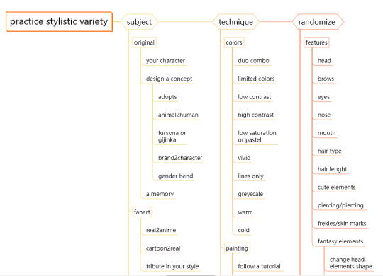
By establishing my priorities, I made lists (yet again, my obsession) of what I want to practice and then added each category in a randomizator to pick for me 3 elements to match and challenge. Here is my approximate plan (WIP).
Random color generator (one of many out there)

I trained myself not to take too broad themes and stick to what I want to have in my portfolio (what drives my future commissions) while staying versatile. Takes practice.
I hope it helps somehow. It's something that works for me these days but might change in the future.
Find your own way because no one knows you like you do, so the most comfortable way to resolve an issue is the one that's crafted by you. Believe, your mind can find shortcuts and tips for you if tasked to do so. Don't forget to research and store.
8 notes
·
View notes
Text
Ok, babe, gonna try to do this without spoilers. But here we go:
The normies have really been freaking out about this one and like...it's not anything to freak out about re: the psychosexual stuff. Like, it's not as wild as they seem to think it is.
But that doesn't stop it from being a really good time!!! I had so much fucking fun watching this movie from, like, 15 minutes onward. The only thing that made the first 15 minutes difficult for me to watch was the realism of it--Oliver is so painfully an outsider that it physically hurts to watch.
Speaking of, there are few things that make me experience secondhand embarrassment or really make me squirm uncomfortably. But those things do exist and they're both in this movie and no one warned me because everyone who has never been on AO3 was too busy talking about the bathtub scene: social isolation at school and wrong side of the tracks fish out of water syndrome. This movie has both in spades for the first, like, 45 minutes.
And as I said, the writing and acting are so good and realistic that it was downright painful. Which is great--that's what they were going for and they nailed it. It was just difficult to know what I was heading into before hand because everyone was talking about other stuff.
Speaking of something that got overlooked in all the hype: I've yet to hear anyone talk about how wickedly funny this film is?? It's a thriller for sure but the darkly comedic elements are they and they really shine.
It's set in '06 and the mid-naughts glitz and sleaze is so fucking perfect. There are some real throwbacks culture wise but it never distracts, just adds to the ambiance.
What else...Rosamund Pike is phenomenal, as per. Plays the perfect WASP. Fucking kills it. But then again, everyone is acting their asses off in this.
Everyone wants to talk about the 'shocking' scenes but I think my favorite (you'll know it when you watch it) is the lunch scene. The red one? Yeah. Incredible writing, incredible acting.
Cinematography? Beautiful.
Soundtrack? Bumpin'.
Sound was also great, I was very impressed by the fact that it was the first modern film I've watched in a long time that wasn't mixed like pure dookie garbage. The music was never too loud that you couldn't hear dialogue (unless explicitly by design), nor were any diegetic sounds treated like a freight train barrelling through your living room.
Wardrobe also fucking smashed it.
Set dec was on point.
My only gripe is that it was 2 hours long. I know that's how long movies are nowadays. It didn't stop me from needing to get up every 15-30 minutes to stretch my legs or smoke a cigarette. That being said, the movie is very character driven which I think is best for a two hour run time, as it allows tension to build and arcs to unfold, etc. So ultimately it's fine bc that's a me-specific gripe and the pacing was actually very good.
It's not groundbreaking cinema by any means but it's a tightly contained story that had me thoroughly entertained. 10/10 for a fun, fucked up little movie.
And @apoptoses if you watch it you gotta come yell at me about it because I cannot wait for someone I know to have seen it.
6 notes
·
View notes
Text
Thinking about kayn and his skins
I swear I'm gonna make it the length of this post without being a freak.
What is it about knock off Sasuke thats stuck in my craw? Its not like league has a shortage of edgy designs to choose from, so why does Kayn hit so differently?
For me the answer is pretty clear, the most interesting thing about kayn... is rhaast.
Kayn and rhaast deserve each other, a pair of power hungry killers fighting to consume the other and achieve incredible power. The never ending battle for control of kayn's body plays out every time you lock him in. Which of them will snuff out the other this time? Will kayn master his abilities? Or succumb to his demons?
There's no other champion like it, by playing kayn you actively play out his lore. It's so satisfying every time I see rhaast vanquish his naive counterpart or kayn purge the darkin once and for all. Genuinely never gets old.
Theres THIRTY-TWO MINUTES of voice over content, banter between him and rhaast that still makes me laugh even though I've been playing this skin for 5 years. To be clear, odyssey kayn is my favorite skin in the game, an absolutely perfect reimagining for a champion with so much potential.
The odyssey skin took it one step further. It made the characters... interesting. Gone are the try hard lines and grittiness, replaced with campe gregarious fun. Kayn goes from stuffy and dull in canon to a flamboyant and tyrannical space emperor. Rhaast retains much of the role he had before, the devil on kayn's shoulder trying to tempt him to embrace power until its too late. But as kayn let's his hair down, so does rhaast, letting him have a lot more fun dialogue as well. The amount of personality these two have crammed into them... Odyssey kayn and rhaast are an absolute delight to listen to.
youtube
My affection for odyssey aside, kayn has been fortunate. He's recently received a second legendary skin for the heartsteel event. This skin is a bit of a mixed bag for me, visually it's my favorite of the line, I love his loud colors and bright pink hair. I love the look of the scythe and the vfk. His verse in the music video was awesome, sounded just like rhaast rapping. But where odyssey succeeded in realizing the character's potential, Heartsteel falls short of the mark.
Heartsteel kayn only gets 11 minutes of voice over, which was already a red flag for me when I was hoping for more banter between the two characters. But a grand majority of this is base kayn peacocking, delightful to be sure, but... where's rhaast? Rhaast echoes almost every line base and odyssey Kayn say, he's constantly taunting him constantly chiming in. But he has maybe a quarter of lines that kayn does in heartsteel, and often they're standalone.
This skin takes a different approach to the relationship between kayn and rhaast, in the heartsteel universe, rhaast isn't kayn's enemy but more his... alter ego. If anything they seem to be allies in this skin, they even hang around after kayn's passive is completed and one usually dies. But this doesn't feel explored at all by the voice work.
youtube
If the purpose of this skin was to explore a scenario in which Kayn and rhaast are allies, then it's a failure. It seems more like this skin was meant to hide rhaast entirely, which is a damn shame since... Rhaast is the most interesting thing about kayn. It's a nice skin, but doesn't compare to odyssey imo.
(Cough cough) Also the voice over doesn't get new lines after transforming... which is a feature base kayn has... so its less that kayn/rhaast stick around after the transformation and more that this skin only has 1/3 of the voice work that base and odyssey do...(cough)
11 notes
·
View notes
Last Seen Blogs
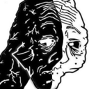
blown-to-kingdom-come
OWWHH FUUUUCK
ask-loathsome-leonard
Loathsome Leonard
dasha-ko-art
Dasha KO's page
electrodroidz-blog
ElectroDroid