
mrpatch
Mr Pat.ch | Art & Graphic Design
Patrick Reinhart is a graphic artist, book dealer, web developer, and publisher based in Denver, CO.
147 posts
Don't wanna be here? Send us removal request.
Last Seen Blogs

nocturne-sketches
Chicken noodle soup with a soda on the side
blog-anytime
Blog | MetaMoJi Note

legreyman12
Untitled

lei-sure-lin-ess
🛸 방사하다 ⛲️

alphinias
Did you tell JJ?
Text
A silly quick sketch prompted by an ill-informed autocorrect.
8 notes
·
View notes
Text
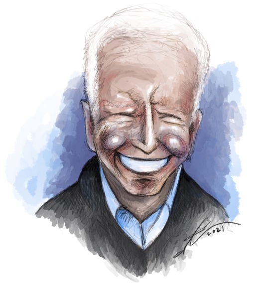
Only a few days late, but it’s.... PRESIDENT JOSEPH R. BIDEN JR!!
#illustration#clip studio paint#clip studio paint pro#digital art#digital painting#drawing#color#sketch#joe biden#caricature#president joe biden
0 notes
Photo
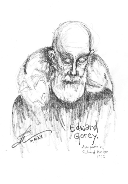
Edward Gorey! a quick sketch after the iconic photo by Richard Avedon. Quick and imperfect sketch (that wonky left eye), but I achieved my goal: a quick, expressive sketch that captures the likeness, with some attention to facial structure. Also practice with my mechanical pencils! still loving that 5.6mm clutch pencil, but also brought in a regular-sized mechanical pencil for some details. I might finish it up in Clip Studio Paint but then again I might just leave it be.
Edward Gorey is an absolute idol of mine.
Photo sourced from The New Yorker.
0 notes
Photo
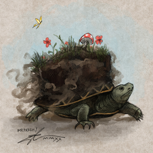
There is a lot I want to explore with this idea; the turtle with a world (of whatever size) on its back. This is based somewhat on a photo of a snapping turtle emerging from hibernation in muddy ground. Supposedly this is where certain cultures got the idea of the Earth being carried on the back of a turtle. And yes, I am a huge fan of Terry Pratchett’s Discworld, which is carried upon the back of Great Atuin (well, upon the backs of four elephants who in turn stand upon Atuin).
#digital art#world turtle#earth turtle#great atuin#discworld#terry pratchett#clip studio paint#clip studio paint pro#concept art#digital painting
53 notes
·
View notes
Photo
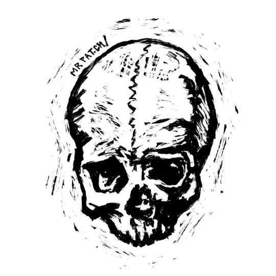
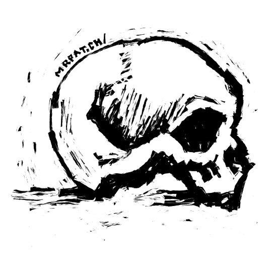
A couple of skull sketches.
There’s a basic graphic quality to a skull; shape and deep shadows against the white bone. Perfect practice with this particular ink pen in Clip Studio Paint Pro - a pen that I think was intended more for Chinese calligraphy, but seems to work well for a faux-block print style. You can get messy with it, vary the line width drastically, and still get a solid-lookin’ skull. I kinda wanna draw hundreds of these!
1 note
·
View note
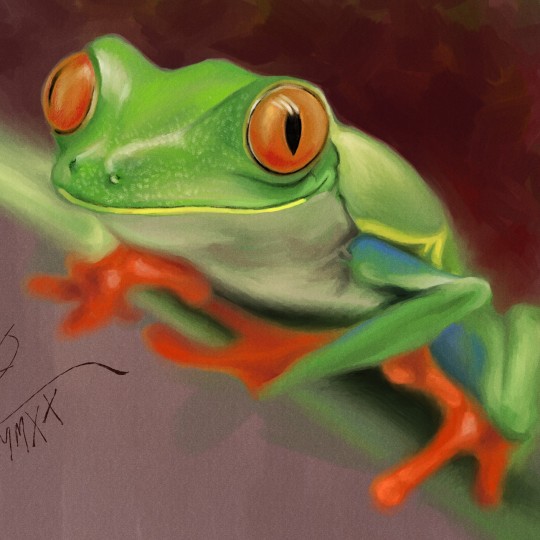
Photo
youtube
Further forays into realism. I’m happy with how it turned out, but I do have mixed feelings about pursuing realism as an art style. As practice, it’s great; there’s a lot of technical art concepts that I need to learn about, understand, and put into practice that you learn best by studying life as it is. All of that experience will then inform your individual art style, whether it tends toward the realistic or is low-brow silly and more “amateur”-looking. (Hey, an amateur is just someone who loves what they’re doing! And so to be an amateur is nothing to be ashamed of, in itself.)
Part of my antipathy towards realism is that it takes so long to do (there is a point where I lose patience with any drawing or painting). In the scheme of things, two and a half hours is still time well spent, but what if I could do it more stylized and get the same personality of the frog in a mere 10 minutes?
1 note
·
View note
Photo
youtube
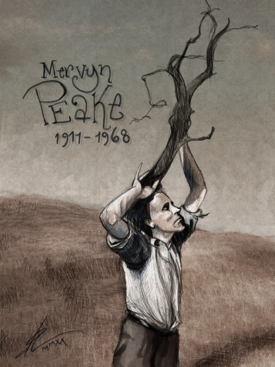
Mervyn Peake in Sark, circa 1940s.
One of my all-time favorite authors, he was also a poet and prolific illustrator of several classic works of literature. Best known for his Titus Groan books, comprising Titus Groan, Gormenghast, Titus Alone, Boy In Darkness (short story), and Titus Awakes (written by his wife Maeve Gilmore based on a brief outline Mervyn had written before he died in 1968).
Now with time-lapse video of the process! In real time this took me 90 minutes. The field photo is by Crina Parasca, courtesy Unsplash. And I figured out how to keep the canvas static, and add music! Yay!
#mervyn peake#gormenghast#titus groan#illustration#timelapse art#clip studio paint#clip studio paint pro#digital art#author#author portrait
9 notes
·
View notes
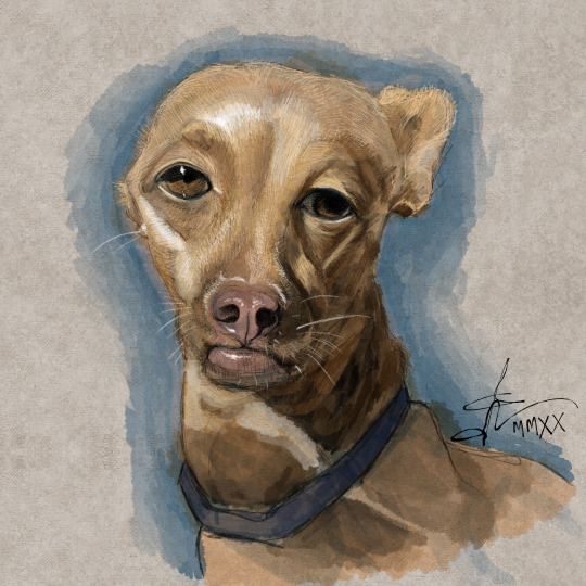
Photo
youtube
A digital painting of my sister’s dog Bennie (@bennieandthefosters on Insta). WITH ADDED BONUS TIME-LAPSE OF THE PROCESS! The painting itself took me around 80 minutes, and the sped-up version is 5 minutes. I’m hoping making these will allow me to look at my process objectively and see what I could be doing better. Hopefully I can figure out how to do it so the entire canvas remains in one place next time!
I wasn’t quite prepared for how happy I was going to be with this one! I almost never go into a drawing with the idea of anything even close to photo-realism (and this one has a long ways to go to be considered photo-realistic) but this is the closest I’ve come in a long time.
Painted with Clip Studio Paint Pro, recorded with OBS Studio, and sped-up with OpenShot.
#clip studio paint#clip studio paint pro#dog#painting#digital art#digital painting#dog portrait#process video#pet portrait#timelapse#timelapse art
1 note
·
View note
Photo
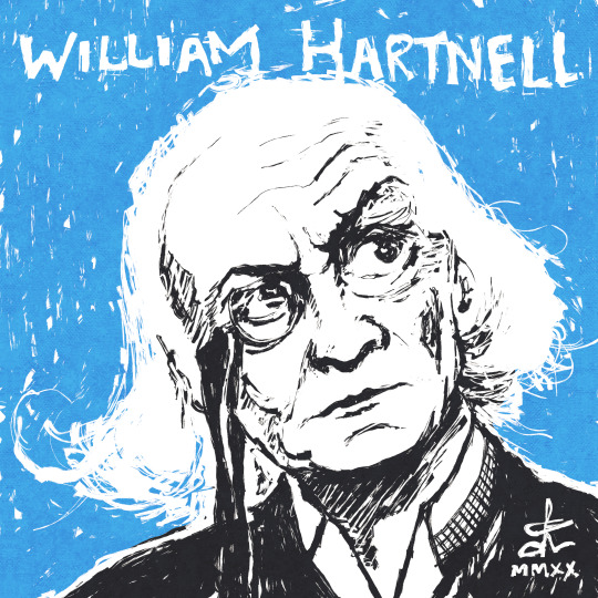
William Hartnell, aka Doctor Who #1 from 1963-1966. Two stylistic variants... one full-blown block-printish style, the other more in my comfort-zone and more in line with the style I want to cultivate. Not that I have to be exclusive to one or the other at any given time.
Tangentially:
Last night I tried recording my process of a quick portrait of Conrad Veidt (done in Clip Studio Paint Pro and using OBS). I think it could help me understand my process and how I might improve. I was inspired to do so by watching a bunch of those “speed-painting” videos on Youtube - always fun, but sometimes the artists are so good they’re intimidating. Because I knew I was going to speed up the recording, for some reason I felt like I had to be quicker, too, which is absurd and is probably the reason that drawing isn’t as good as it could have been. Stay tuned for that!
#doctor who#dr who#illustration#1960s#sci-fi#science fiction#william hartnell#drwhofanart#fan art#dr who fan art#doctor who fan art#clip studio paint#clip studio paint pro#classic doctor who#classic dr who
96 notes
·
View notes
Photo

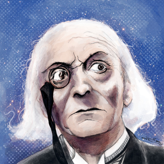
Patrick Troughton, aka Doctor Who #2 from 1966-1969.
I have a soft spot for his incarnation of the Doctor. In many ways he was more of a template for the Doctor, moving forward, than Hartnell was, however essential Hartnell is to the history of Doctor Who. But mostly I just like the personality he brings, the eccentric style that I like to cite as a personal influence, his great companions, and great stories. And we share a first name, so that’s a plus.
One of these days I’ll get myself some linoleum blocks, the necessary tools and inks, and get my hands proper-dirty. Until then, this faux-linocut style is incredibly satisfying, too!
One obvious element I need to learn is best practices for shadows/toning in this style
#doctor who#patrick troughton#fan art#doctor who fan art#doctor who fanart#second doctor#1960s#bw#linocut#woodblock#blockprinting#science fiction#portrait#illustration#vintage science fiction
7 notes
·
View notes
Photo
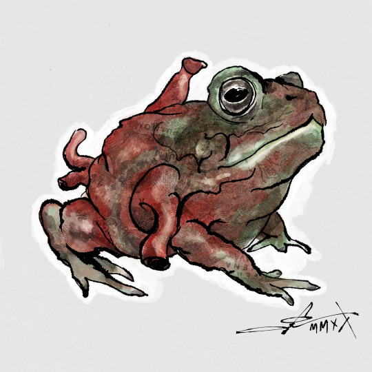
Heart-things, apparently a mini-theme here.
I present to you... THE TOAD/HEART CREATURE! I had this idea for a story years ago and did a little sketchy-sketch along these lines, and I finally decided to finish it up. The original sketch lacked a face entirely to emphasize that it was a heart-creature. Also, it was a frog... but come on, a toad just works better, past-Patrick. ... Probably the heart part of him isn’t terribly accurate, but neither is a heart/toad creature.
The original photo of the toad is under there serving as some texture, as is an old, illustrated diagram of a heart, which is why you can see some printing.
In other news, a potential illustration gig is in the works. Very different subject matter but I hope to utilize some of my new-found tools and skills.
And hopefully one of these days I can focus on writing and illustrating a little story of my own.
#clip studio paint pro#clip studio paint#digital art#surrealism#surreal#heart#love#color#illustration#toad
3 notes
·
View notes
Photo
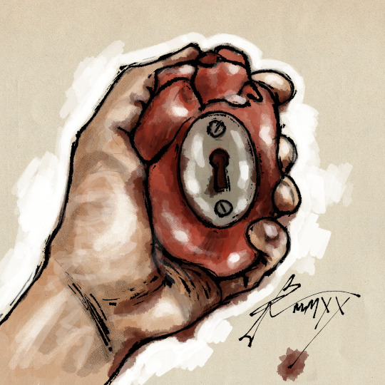
Heart-lock. From photo reference, with a small rubber heart - which I have displayed under a glass dome above my desk, and the key around my neck. Using the India ink brushes in Clip Studio Paint I was able to create a sorta faux-woodcut kinda look, which is an effect I’d love to develop, too.
0 notes
Text
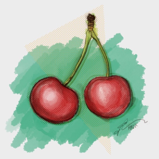
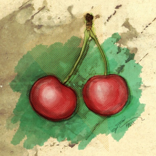
Cherries, done in Clip Studio Paint Pro. ... I love the paper texture and the stains and everything, but I don’t want to lean on those kind of additions. I want the drawing to be able to stand on its own before anything else. Still, I don’t think it’s too distracting, do you?
1 note
·
View note
Text
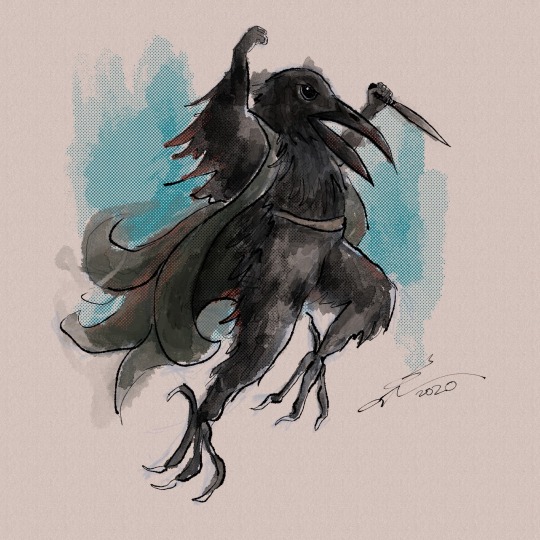
KENKU! Goodness. Can you tell I play D&D? Only just started, but last meeting we came across a bunch of kenku... raven people, basically. For this sketch I didn’t want to bother with a lot of clothes and incidental details. It’s definitely still a sketch, even tho I might not ever go in and “finish” him up. Lots of subtle stylistic quirks to play around with here.
#illustration#clip studio paint#color#sketch#patrick reinhart#kenku#dungeons and dragons#dnd 5e campaign#raven people#clip studio paint pro#roleplay#digital art#digital drawing
6 notes
·
View notes
Text
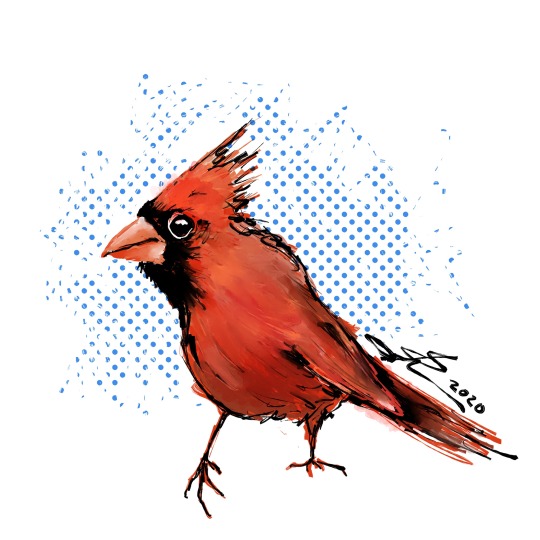
New illustration-centric Instagram account! @reinhart.illustration Doesn’t mean I’ll stop posting here, but it will likely mirror pretty closely.
#illustration#clip studio paint#patrick reinhart#color#sketch#cardinal#india ink#clip studio paint pro#instagram
0 notes
Text
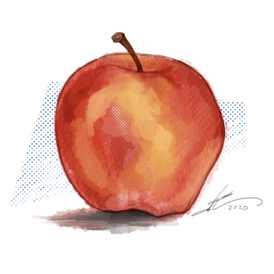
An apple a day...
Another one done in Clip Studio Paint Pro. Further refining this style, actually using a photo reference, cleaning up edges, so forth. In addition to the question of how “finished”-looking I’ll want it comes the question of the screen tone: I’ve never really used it, and I’m not sure I’ll use it much strictly as intended as tone, but more so as texture. Gotta study up on old comics or something, figure out how to get that pretty offset look, and just experiment a ton. Just download the Clip Studio app for my tiny phone (free for an hour a day) and so far it’s pretty cool, too!
0 notes
Photo
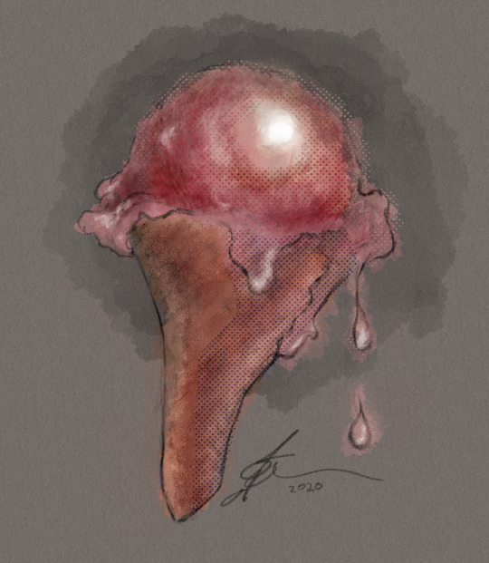
Gloppy, ploppy ice cream cone. Revisiting Clip Studio Paint Pro. Trying to develop a style that’s long been in my head, and so far being pretty successful matching my idea of it. It will take much experimenting. The question I need to explore: how far do I need to work it until it feels “finished”, in terms of the style I’m trying to achieve?
#clip studio paint#digital art#ice cream cone#ice cream#patrick reinhart#mr patch art and design#experimenting
0 notes