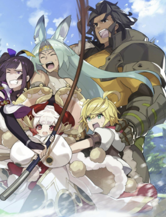
#cm comparison sets
Note
Hi! Would I please be allowed to ask for Regulus black smut + size kink please??
Pairing: Regulus Black x fem! Reader
Warnings: NSFW, size kink, lots of ‘good girl’, daddy issues taming lol
A/n: this idea is absolutely mouthwatering. Wrote this in my heavy fit of daddy issues so beware.
Regulus is bigger. Always has been, even since you met in the second year of Hogwarts, when mostly girls tended to be taller than boys due to physiological reasons - he still was a few centimeters taller. With years, those few centimeters turned into few decimeters and now, in your seventh year, Regulus is almost two heads taller than you, causing you a lot of neck pain because you have to crane your neck while speaking to him and visually dwarfing you just by standing next to you.
- That’s a good girl, taking me so well, - Regulus murmurs softly, hovering above you. His forearm is resting on a pillows next to your head, propping up most of his weight, his other hand is wrapped around the base of his cock as he sinks slowly inside of you, preventing it from slipping out of your slicked tightness.
You mewl at the praise and tight stretch of your walls - no matter how often you two have sex, first penetration is always hard for both of you. Your own arms are wrapped around Regulus’ lean torso, hands gliding up and down his sides, caressing soft skin there with gentle touches.
He’s not all the way in. He never is. Even when he reaches so impossibly deep within you, his pink cockhead pressed tight against your cervix, creating a bump on your tummy - there are always about 4 cm left, your pussy too small to take all of him in. But he never complains. In fact, Regulus loves it oh so much, just how tiny you are in comparison to him. How cute you look when you struggle to take three of his fingers inside, how fucked-our you look just when he buries his dick inside of your tight little pussy, not having fucked you yet. And even if he wants a stimulation of his full length - he can always shove his dick down your throat, sometimes he wonders who gets off more from it, considering how blissed-out you look when he fucks your mouth stupid.
- That’s it, nice and easy, - Regulus coos as he buries his cock deep inside of you, your inner walls flutter around his mighty girth, trying to accommodate his size. His now free hand rests next to your head too, fully caging your body underneath his bigger form.
Black gives you some time to adjust, staying still while his hot lips wander all over your face and neck, leaving butterfly kisses and whispering sweet nothings and confessions of love into your skin. He starts off slow, pulling out just a bit and then rolling his hips gently back into yours, eliciting sweet moans and whimpers escaping your kiss swollen lips. Regulus picks some speed eventually, setting a rhythmic pace, just how he knows you like it - not too fast, but deep and firm, hitting all your right spots with his cock.
You buck your hips against Regulus, trying to impale yourself impossibly deeper on him, but one his big hand grips your hip tightly, effectively stilling all of your movements.
- That’s all right, little girl, none of that. Just lay there prettily as I fuck you into the mattress, mkay? - Regulus drawls from above you, small smile lingering on his handsome face as his eyes study your blushing face closely.
You pout but agree nevertheless:
- Mkay, - you copy his words, relaxing in his arms, letting him do whatever he wanted to your body. Regulus’ smile widens into a sly grin as his hips resume their previous tempo, fucking you into your bed just like he promised.
Your hand comes to cradle his nape, his skin there is wet with sweat from the strain of how good he fucks you, soaking wet those cute little curls on the back of his head. You bring Regulus’ face down towards your own, your noses bump together with every deep thrust of his hips against yours, his obsidian eyes never leaving your teary ones. A high-pitched squeal escapes your lips with particularly firm roll of your boyfriend’s hips, your eyes flutter closed, Regulus’ name on your lips like a mantra.
- Look up at me while I fuck you, - Regulus rasps and you force your eyes open again, staring up at your boyfriend with immense adoration. His thick curls fall on his forehead, getting into his eyes as he tries to blow them out unsuccessfully, your hand reaches up to card through his silky locks, combing them back from his face. - That’s it, look at me while I make you feel good, that’s my pretty little princess. Rub your clit f’me, yeah?
Your heart picks up pace at his choice of words, you unravel one of your arms from around your lover’s neck, trembling hand makes it’s way down to where your bodies connect, finding your clit and circling it in skilled moves. Your pussy tightens deliciously at added stimulation, clenching around Regulus tightly, eliciting quiet ‘fuck’ mumbled under his breath from him.
- Reggie, gonna cum, - you utter breathlessly and your lips brush against his with every word, he just pecks you encouragingly.
- C’mon, cum on my cock. Be a good girl and make a mess for me.
You feel your stomach tighten and you chase the feeling desperately, nimble fingers rubbing on your clit faster and sloppier, feeling warmth surely growing within you. It took only a few more thrust to send you right over the edge, white-hot sensation surging through your veins, filling every cell of your body with euphoria.
Regulus never stops, fucking you right through your orgasm; black eyes don’t dare to leave your beautiful face, trying to carve every second of your pleasure into his memory. His hips still only when you start whimpering from overstimulation, staying buried snugly inside of you.
You look up at Regulus with teary unfocused eyes, realization that he didn’t cum with you starts to hit slowly. But his lips are on yours already, shutting you up with a reassuring kiss, not giving a chance to start rambling. Bumping his nose against yours affectionately, Regulus pulls out of you carefully, giving your thigh a playful squeeze.
- Roll over on your tummy, baby. Gotta be a good boyfriend and fuck my girl nice and good, don’t you think?
Likes, reblogs and comments are highly appreciated, they inspire me on creating even more content for you💖
#regulus black#regulus#regulus black x reader#regulus black x you#regulus black x y/n#regulus x reader#regulus black smut#regulus black x you smut#regulus black x y/n smut#regulus black x reader smut#harry potter#harry potter writing#harry potter x reader#harry potter x you#harry potter x y/n#smut#harry potter smut#marauders#marauders x reader#marauders era#noble house of black#harry potter fanfiction
7K notes
·
View notes
Note
Happy with the staff content this year but am I the only one who is disappointed with the PV we got? It's basically a slideshow of art we've already seen, major downgrade from the year 1 PV that had literally all the events. There was a drop in quality of the anniversary PVs over the years and it really shows this year. Sorry if you find this too negative I don't mean to hate I just wish Twst would do better for it's ANNIVERSARY.
[For everyone's reference, here are the anniversary PVs in order of release: 2021 / 2022 / 2023 / 2024]

Mmm, now that you mention it, I noticed this trend with the Halloween PVs 🤔 For year 1, there was a video that showed all members of the NRC casy, even those that did not receive cards at that time. There were then several short variants of the PV released for year 2/Endless Halloween Night (part 1 / part 2 / part 3 / part 4). Altogether, they feature all of the characters, including the students from year 1 but heavily shadowed and with glowing eyes to indicate ghostly possession.
Even Glorious Masquerade features all of the students that get new cards for the event plus Rollo, although there are notably more still shots here. The Stage in Playful Land CM, by comparison, is significantly shorter and only shows us the three SSRs (Ace, Ortho, and Kalim) as well as the two new characters (Fellow and Gidel).
As this anon has said, the anniversary PVs have changed a lot over time too. The first one was the most animated and integrated several event outfits. The second one was also animated a fair amount, but you can tell corners were cut in some places where they transition to photographs/still images. This alone works thematically given that the player is a photographer, but you can still catch dips in quality when it comes to the art style. I remember finding Deuce running and the Kalim + Silver flying scene odd, as well as Jade and Trein's faces strange in general.
Then the third PV rolls around and it only features the third years; the animation also seems to be much more sluggish (although this could be a stylistic choice; not sure). A friend actually recently pointed out to me that Lilia's pose looks like he was pulled straight from other assets; his artwork in the animation is almost the exact same as his smiling expression in the game.
This year's is the most different (+ most static) and, like year 3's PV, only provides "new" content for a select few characters (the dorm leaders). They also reuse pre-existing illustrations already found in the game that don't seem to be picked for any particular reason (like, there are random Master Chef/Culinary Crucibles groovies in there). This direction, I'm guessing, is less costly and more efficient than making an entirely original animation, which is what was done in previous years. (Not that Disney or Aniplex is hurting for money to fund this, lol)
Would I have preferred another PV in the style of year 1's? Yeah, for sure. I want to see other events and their outfits animated! Was what we got this year bad? Not necessarily; I think the production and editing was very technically impressive, but I'm still sad we didn't get anything substantially "new" to chew on (as someone who isn't a fan of most third years or the dorm leaders). Maybe it's just something we perceive as a deficit only because year 1 set the bar so high. It is what it is; whoever was in charge of the anniversary PV was probably doing the best they could with whatever budget they were given 😔 Let's hope that next year's will be a return to form, or that at least the money/effort is being redirected to other bigger projects (maybe the anime?).
#twisted wonderland#twst#notes from the writing raven#disney twisted wonderland#disney twst#spoilers#twst anime#twisted wonderland anime#Silver#Kalim Al-Asim#Lilia Vanrouge#Deuce Spade#Jade Leech#Mozus Trein#Ace Trappola#Ortho Shroud#Rollo Flamme#Gidel#Fellow Honest#Riddle Rosehearts#Leona Kingscholar#Malleus Draconia#Idia Shroud#Ignihyde#Vil Schoenheit#Azul Ashengrotto#Cater Diamond#Trey Clover#Rook Hunt
218 notes
·
View notes
Text
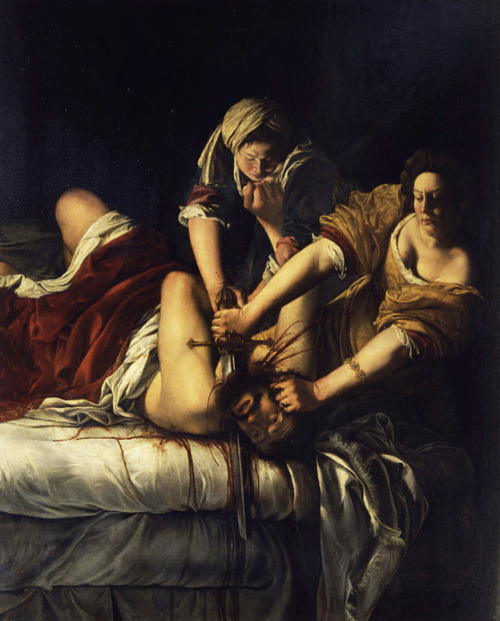
SET FOUR - ROUND ONE - MATCH EIGHT
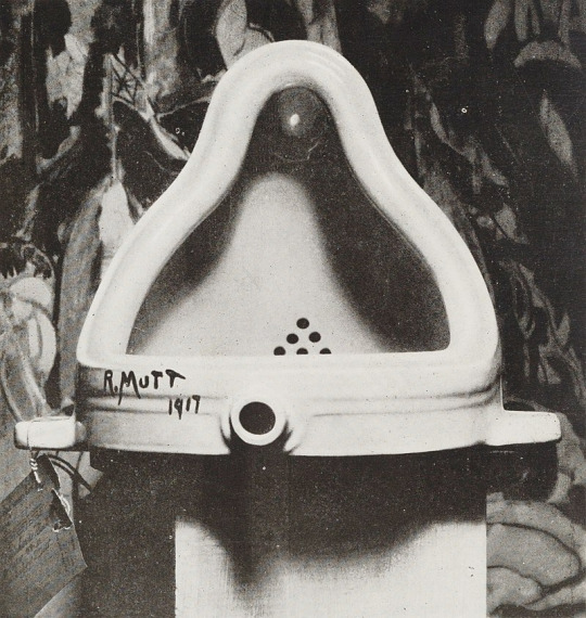
"Fountain" (1917 - Marcel Duchamp) / "Judith Slaying Holofernes" (c. 1620 - Artemisia Gentileschi)
FOUNTAIN: I know, I know, if this was something you saw today in an art museum, it would be cliche and a little cringey, but this was not from 2023! Its from 1917, in France. In context, it is such a punk piece of work, such a fucking, fuck you to art elitism. While modern art movements were growing in Europe, France had a very real tension between older, traditional styles of art and the growing newer, less realistic and more abstract schools. There was a clear delineation between institutional traditional styles and the newer styles, whose artists were often working on the periphery or entirely outside of french art circles. So by putting this in a museum - saying yeah, this urinal is just as worthy as your shit to be here. Such a fuck you! It got rejected from several exhibitions for being "immoral and vulgar" and "a plagiarised object, or rather a commercial piece of plumbing art." And then the immoral, vulgar (and of course, why is this immoral or vulgar? and why are the objects of plumbers excluded from being art) piece got exhibited!
Our current understandings of art might not need this sort of philosophical challenge to "what is allowed to be art," but in 1917, the French art world definitely did (@travelingsmithy)
JUDITH SLAYING HOLOFERNES: This is one of my favorite Baroque/Renaissance paintings ever. First, it has that dynamic and theatrical lighting you get with Baroque pieces, where the background is dark and unimportant and the scene has very dramatic and intense lighting. Second, its so visceral, so violent in a way that women typically were not allowed to be in art. Judith is shown as powerful and strong, and its the same with her maidservant Abra (thanks wikipedia). Holofernes was clearly fighting back but was overcome by the two, there is blood splattered all over the bed, Judith has got her hands gripping his hair and just dragging the knife through his throat.
The context to the scene, is that this is retribution for Holofernes raping Judith, that she is getting her revenge and justice. She is a fully active participant, this is her decision and action, and its just so clear in the painting. For reference, this is Carvaggio's version and it is so different. There is a distance and fakeness to the scene, where the women are timid and almost uninvolved in the violence. Here that could not be less of the case. Judith and Abra are fully in the scene, with the strain of the murder clearly showing in their figures. It is such a far cry from the typical depiction of women in this era of art, from their form to their expressions to their actions. There's a level of personhood that is typically denied to women that is present here, the painter allowing the figures to be present in the violence of the scene, to be full actors and perpetrators, knowledgeable and determined.
On its own, it stands as an incredibly evocative piece of art. In comparison to other takes on this same scene, it completely rises above the rest (@travelingsmithy)
("Fountain" is a sculpture by French artist Duchamp that consists of a porcelain urinal signed "R. Mutt". The original was lost, but about 15 replicas exist worldwide.
"Judith Slaying Holofernes" is an oil on canvas painting by Italian artist Artemisia Gentileschi. It measures 6′ 6″ x 5′ 4″ (158.8 cm × 125.5 cm) and is located in the Uffizi Gallery in Florence.)
#art that fucks you up tournament#polls#atfyu polls#id in alt text#one of our most popular submissions#can't wait to see the comments on this one#also just remember that more commentary will be cycled into the next round!#cw blood#cw gore#cw eye contact
226 notes
·
View notes
Text
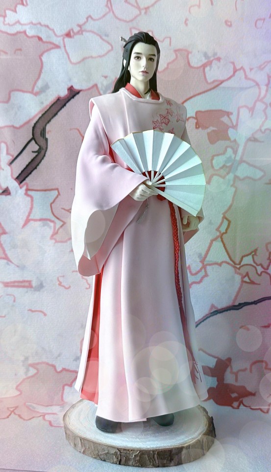
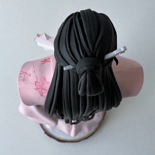
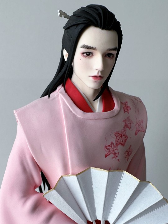
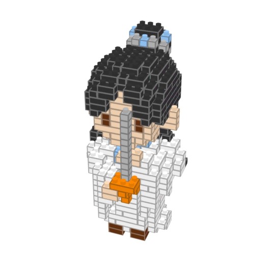
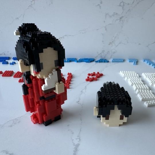
Taolin Forest Wen Kexing (Handcrafted)
This beautiful figure showed up on the artist's Xianyu page as an immediately available in-stock piece, and I pounced on it. You can tell by my profile pic how much I like this costume, after all!
The artist works in ultralight clay, which has been a new medium to me, and so far I've been impressed. It is very light (as the name suggests!) and appears to be extremely flexible. I was initially very worried about her figures breaking in transport, as they all have very delicate thin little details, but everything seems surprisingly sturdy. It bends, but doesn't deform, and doesn't seem to break with careful treatment. I do baby my figs, but shipping / customs is always a wild card.
For something like this, I would normally absolutely air column wrap it to protect it from crushing damage. I don't worry about the fig breaking parts off - I worry about it getting squished! If this fig got crushed it would certainly destroy it, given all the thin, flat loops of clay making up most of this figure.
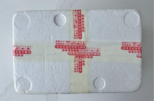
But, I didn't have to, because the artist packed it in a rigid styrofoam cooler box. This is of course deadly on the shipping fees, especially since my warehouse flags the wooden base as air freight only. But, the only thing worse than paying volumetric air freight charges is getting a crushed figure, so what can you do?

I too am deeply disappointed by my lack of quality unboxing photos. Why did I not remove this top layer of bubble wrap? NOBODY KNOWS.

This is an extremely tall figure, by far my largest figure by a wide margin. The full size, including base, is 27 cm, of which 2cm is the base. This makes the figure itself about 10 inches high for us Americans.
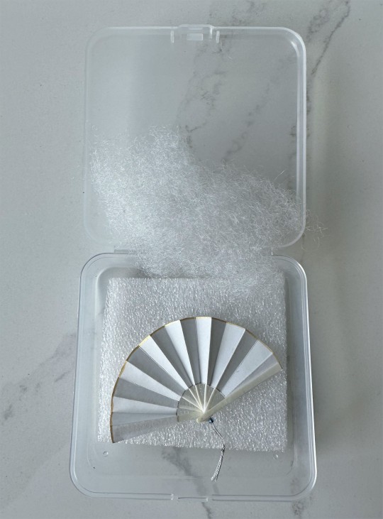
The fan is not clay but paper, which was a nice surprise. I would have been fine either way, but I like the paper. I'm also very appreciative that the artist included it in this rigid plastic box so keep it from getting squished inside the protective cooler. Box. Protective box.
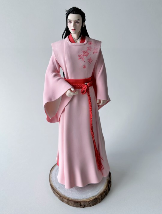
Here he is without the fan. He's gorgeous! You can really see the detail on his belt and his long, elegant fingers.
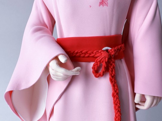
In fact, here's a closeup of those hands and the beautiful detail on the belt. His fingers may look even a bit longer than you might expect, but that's because they need to hold the fan. You can even see the slight indent for the fingernails. This artist is just amazing. She says she puts her whole heart into crafting these figures, and you can tell.

Holding the fan as so. If you don't think I wasn't a little stressed out carefully wedging the fan in between those beautiful fingers, you have somehow (incredibly) missed all the other cases of my fig related anxiety on this blog. I'm not even a high stress person! Normally.
Alright, let's spin this beauty around, shall we?


My camera decided to focus on many things, but Wen Kexing's perfect face was not always one of them. So we'll get some closeups. But first, let's do our bottoms-up and top-down pics:

Please do note the beauty mark on the middle finger of his right hand!
For size comparison, here's Wen Kexing with his OG official fig counterpart:

You can definitely see what I mean by how big this fig is! Maybe I should call it a statue instead of a fig.
Alright, time for our close ups.

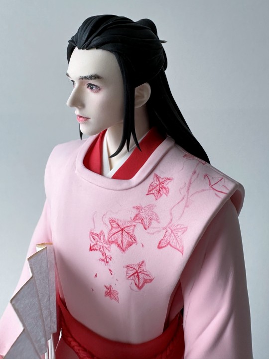
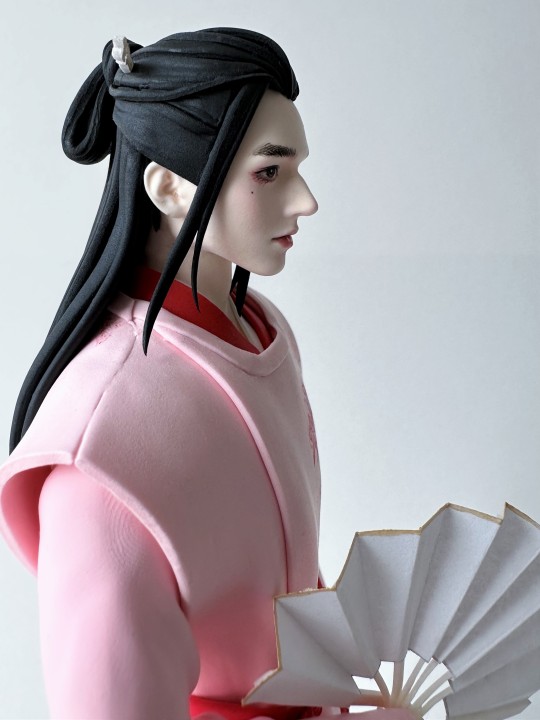
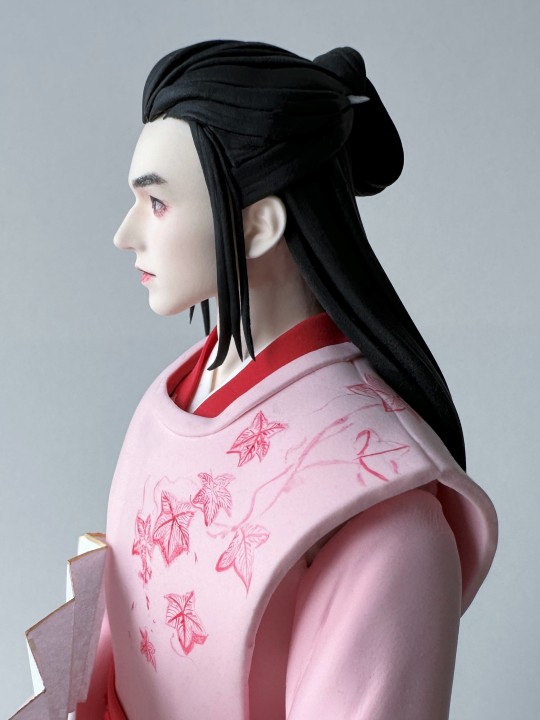
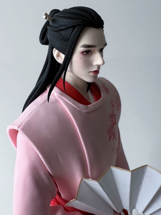
Just beautiful. I'll need to commission a matching A-Xu in the Taolin forest costume so I can have them heading off to Siji Manor.
This figure was an incredible price - less than $50 USD. An absolute bargain. I can't even imagine the time that went into this. This was less expensive than other individual figures or pairs of this size, so perhaps I just got lucky with the artist clearing space.
I had really wanted semi-realistic figures like this when Word of Honor was released and I watched it for the first time, so getting this now makes me really happy. The artist also had a snowy mountain set that I picked up around the same time, which should be arriving here relatively shortly. Please look forward to it! I can't wait myself.
Material: Ultra-light clay
Fig Count: 386
Scene Count: 26
Rating: Pure artistry
[link back to Master Fig Index for more posts]
104 notes
·
View notes
Text
Bear with this very wordy post, there are pics at the bottom that may be useful for doll rebodying fans! Also this is post 1 of 2 so check out the others as well.
If you collect custom Pullip dolls (or really any fashion type doll that comes with a sub par standard body) you’ve probably spent an inordinate amount of time and money looking for a replacement body that better suits your needs. For Pullip collectors it is generally either an Obitsu body, a Pure Neemo body, or a Barbie Made to Move body. Each has its advantages and disadvantages.
Made to Move poses amazingly well and feels very solid, but is much taller than the default Pullip body,the hands and joints aren’t the prettiest, and it is difficult to color match to the paler Pullips color range (for the mocha and tan Pullips Made to Move is the best/only option though). This body does allow for head tilted poses.
Obitsu is also a great option and poses amazingly well, has pretty hands and joints, and matches the paler Pullip colors very well (unfortunately there is no Obitsu option for darker toned dolls unless you can find the long discontinued coconut Obitsu). The main issue with Obitsu for Pullips is that the large head tends to be wobbly on the Obitsu body, and the torso has a tendency to come apart for the same reason. In general the Obitsu body can become floppy very easily when used with Pullip head. This body does allow for head tilted poses.
Pure Neemo is super pretty, and has some colors that match the paler Pullips well and also have tan and brown shades available in some of their bodies. The Pure Neemo bodies are also really solid and feel much sturdier than the Obitsu. However the range of motion in the joints isn’t as good as the Made to Move or Obitsu bodies. This body does not allow for head tilted poses.
So which way to go?
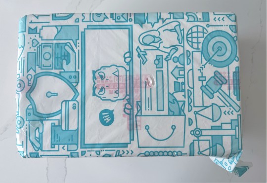
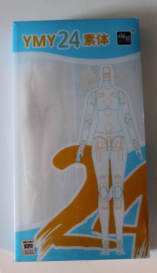
I found another option (maybe everybody else already knows this body but I hadn’t seen it before) - the YMY Female Doll Body 24. This body actually is 22 or 24 cm depending on which arms/legs you attach, has a small or large bust, multiple sets of very pretty hands, has a nice solid feel and texture and is a good color match for the paler Pullips (you will want the Milky White, the Super White is in fact ssssuuuuuppppper white). This body does allow head tilt poses if you use the neck pegs that come with it which will work for Blythe dolls or most other fashion type dolls but the peg doesn’t work for Pullips so the workaround needed to make it work for a Pullip does lose the head tilt option. This body can be purchased on Amazon and costs about $18 USD.
Note: YMY does make a male body as well that I will be trying with one of my Taeyang dolls and will update with the result. The male bodies do also offer a tan option so we will see how it works with a tan doll.
Here is the packaging the YMY body comes in:
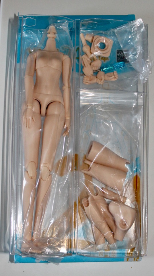
And inside we see the body along with the alternate leg/arm/chest pieces, hands, and neck adapters:
As noted, the neck adapters included will work for Blythe, Barbie, and most other fashion type dolls but will not work for a Pullip. Instead I used a couple of the adapter pieces in conjunction with a screw and some vinyl bands. I removed the default neck bob and used a dremel to drill a small hole inside the neck to attach the screw, and used the adapter pieces and vinyl bands to create a new neck bob that would work with Pullip (you will need to remove the eye mech and install the neck peg behind it):

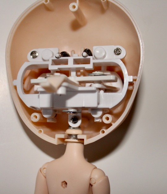
Below you can see the body on the doll with the default Pullip body and an Obitsu body that the doll was previously on:

Next post will have some comparison pics!
#dolls#doll#pullip#pullip doll#custom doll#custom pullip#custom dolls#barbie#custom Pullips#art doll#art dolls
17 notes
·
View notes
Text
One thing I always loved about taking things at face value instead of thinking of the more logical, meta reason why this is the case is that it leads to situations like this:
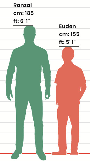
How do we get here?
The answer is art. Well, that, and trying to fit in multiple characters into a single frame coupled with Ranzal being too short to allow the rest of them normal-er heights.
It all starts at this early dragalia life comic, and this panel specifically:

So, apparently somebody (whether the artist actually asked anyone else or just winged it, I don't know!) decided Ranzal was 6'1. Fair, a pretty tall height for such a big dude, right? Well, it's not tall enough when we then put this in mind with pretty much every art with him in the picture and can't be explained by perspective (ie, everyone is likely on a relatively flat surface)
(Yes I know Euden's kneeling in that one but still, don't think standing is going to help him much in this case! He's still got more in common with Daikokuten the Mouse Dragon in that picture than any human or sylvan...)
And yes, these are some of the more egregious examples, but just the fact there's more than one makes this so funny trying to re-contextualize everyone else's height around Ranzal when we look at art like this. Because, as the very first image suggests, Euden is at best 5'1 in some of these arts if Ranzal is 6'1. And since Dragalia seemed to go with a vague 'comparison heights' to keep in line that Euden is taller than Zethia, but not Luca, etc, means quite a few people are absolutely tiny with the only fact that they're shorter than Euden as evidence needed.
Now, of course you can easily ruin this by logical, unfun recognition that Euden is also one of the most egregious size-shifters in Dragalia over the years (which by itself might make for some funny headcanons that he doesn't know/can't remember his own height and just guesstimates if there's some sort of conscious mental influence in trying to return to human form after shifting...Like if he's feeling on top the world, powerful when he's shifting back everyone is suddenly wondering why he looks so much taller, etc), as evidenced by even just these dragalia life panels:
(This would put him at about 5'9/152 cm)
...Whereas this likely only cracks 4' something or another. You get the picture: heights aren't exactly stable in comics or art. And I get it, it'd be a pain to try and keep everything consistent 24/7 over so many comics and artworks.
But oh, is it funny to imagine that everyone in Grastea is falling into one of two camps: huge-normal and very small. There is almost no in-between. You are either 6'+ or you are 4'8. Like...
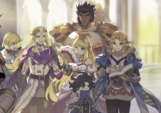
A party approaches, two taller figures and three small ones. One of them looks like a the leader of this group, a bulky frame and commanding, harsh presence that signals not to play games with him. Surely that's the most dangerous member of the party, right? He looks like he eats whole horses for breakfast and it all turns straight into muscle.
...And then the one 5'1 kid randomly multiplies in size several times over and is now a huge freakin' dragon and setting you on fire/sending a tidal wave at you/kicking up a tornado/electrifying you/breathing poison/etc...
Appearances....can be deceiving?
So yeah, there we have the hilarious and unintentional effects by that one damning comic so long ago provides, if you so choose to take it at face value instead of introducing silly things like facts and logic and an understanding of the difficulties of being an artist!
Bonus round (ie, edit)
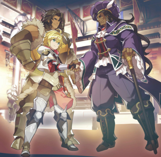
Also, judging by this exact one (1) piece of art, Emile very well is taller than Phares. Emile looks like he's hunching over somewhat and is still about even with Phares:
So yeah. Figured I should share that Emile might be way taller than I thought, at least.
45 notes
·
View notes
Note
Are all the akatsuki members underweight? I remember reading that Hidan weighed around 57kg at 177cm and that Kakuzu weighed less than 65kg at 185 cm which is wild
Tbh I can’t tell if it’s because it’s a manga and Kishimoto just made everyone weigh less than what is realistic or if it’s because Kakuzu is mainly made up of threads so he doesn’t weigh that much
When thinking about these things, you need to take into account:
1. Averages for the country of origin.
Different regions have different distributions for traits like this. Averages vary based on what they are in comparison to. An average in one place will be seen as "abnormal" in a different place. So like, people from Nothern China tend to be, on average, taller than people in Southern China, so on and so forth.
2. Time period.
Naruto takes place in a psudo-feudal type Japan setting. The distribution for weight and height used to be different if you take the era into account. (If you are a keener, you can do a nutritional thought exercise based on what people commonly ate in feudal Japan, but I'm not good at it, and my weightlifting friends who know nutrition have weird regiments.)
3. Target audience for the story
This is the main explanation, but when you are creating a story with an audience of teenagers in mind, you need to take into account how they perceive the world. It doesn't have to be ultra-realistic. It can just exist to be related to by a teenager. It's part of the reason protags and all the characters are so young. On average, people tend to enjoy things where they can establish a quick connection to the character. To them, smaller numbers make more sense and are easier to comprehend.
Think of when you were 13 watching Naruto and thought 35-year-old Sasori was an old, ancient man. To how now, you look at the ages and height/weight ratios like, "This makes no sense/is concerning."
#shonen in general as an adult dont take anything at face value sometimes you are just not target demographic for certain things and that's#ok#BUT PERSONALLYYYY i think kakuzu is a bit more lean while hidan has more bulk#hidan is shown to be bad at cardio but his scythe moves take a lot of upper core strength like my guy lifts#kakuzus stats are generally very average hes neither the best nor the worst at anything in the Akatsuki so#i think he just does standard balanced exercise routine#as for threads it like depends on how much you are into body horror LOL#i like the idea that the threads are just his bloodvessels#but you can go the route that he essentially doesn't even have organs#up to you!#brainworms#also valley of lies brainworms are coming but i need to finish chapter 3 of my fic first teehee
22 notes
·
View notes
Photo
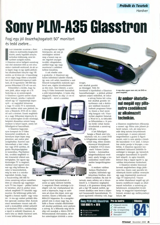
Sony PLM-A35 Glasstron on PC Format (2000-11)
Translation in English:
Take a properly folded 507 monitor
and put it in your pocket...
WE ARE LOOKING FOR A TRUE GIFT Among SONY's video and multimedia accessories, a device that is as much a technical curiosity as a convenience. The Glasstron glasses are more than just something to wear for a night's reading, but anyone who thinks they're just another gaming controller or VR device is mistaken. The similarity ends there, as this device also has two small screens, but each with a resolution of 180 000 pixels.
The question may arise, if it is not a toy, then what is the main function of the new glasses. According to the manufacturer, Glasstron provides a picture as if you were watching a 52" screen from 2 meters away - this is roughly twice the size of large 72 cm TVs. In this case, the story is not about games, but about movies, DVDs and videos. Accordingly, in addition to the high-resolution screen, the glasses also feature a high-quality, built-in dynamic stereo sound system that can be used with two headphones. The Glasstron has traditional composite and S-Video inputs and can display any image that can provide a signal for them. for home video or DVD set, digital camera and camcorder, PlayStation, as well as a computer with a suitable video output. This can be done by an ordinary TV, and for the same price you can get a pretty nice piece, even if it is not from the top category. The question is whether in what cases can glasses costing approximately HUF 200,000 be a good choice compared to a large-screen TV - for example, anywhere and anytime, where and when we don't have a suitable TV set or monitor. If you need an everyday example, the best is a long plane or train journey: 14 hours in a trying session can be quite boring. The traveling manager of our time, on the other hand, just pulls out the portable DVD from the depths of the crocodile skin reticle, connects the Glasstron, which also works from the power supply, and the ideal home theater set is ready.
A non-ordinary example would be a photojournalist recording a jungle fight, who can view the material recorded during a long day in good quality in the evening for further selection, without having to carry around a large monitor in his pocket.
After a lot of theory, practice. The Glasstron was supplied with a bunch of different cables, so it was not difficult to connect it to any of the already listed compatible devices, and the live test could immediately follow. Where possible, we used the S-Video input of the glasses for better image quality. The effect is quite convincing, since the barely 1.5 cm screens - since they are located very close to the eyes - fill almost the entire field of vision.
The quality of the movies I watched was also satisfactory, although it was undeniably visible on the screen that it does not provide as sharp an image as a monitor, since the resolution is only 800x225 pixels. This is not such a big problem for moving images, but it can cause problems when separating fine lines, such as text. This resolution was still more than enough to read the subtitles of the Mátrixr DVD, for example, but when we connected the glasses to a computer, there were already problems with sharpness. We tested the usability of Glasstron at several resolutions - the games, for example, worked quite well, but when the text was important, there were already problems: we could comfortably run programs only from the icons on the desktop, since the Start menu was quite noisy. We also ran Word as a basis for comparison, and the 16-point letters were clearly legible on the glasses' LCD at a resolution of 640x480.
The sound of the two earphones was crystal clear during the movies, and the music DVD also sounded in impeccable quality, the built-in AVLS (Automatic Volume Limiter System - Automatic volume control system), which cuts off unpleasant volume spikes that lead to distortions.
The system can provide a really effective film edge, ex. in a comfortable armchair, first, in a staked room. While we're at it, let's talk about comfort. Glasstron is surprisingly light, the weight of 95 grams is dwarfed by old VR helmets, so there would be no obstacle to longer use of the screen. However, there was a unanimous opinion that the Glasstron is quite tiring for the eyes: after half an hour it was nice to have a rest, some people thought it was comfortable for even less time the glasses.
The manufacturer also warns about the strain on the eyes, which is why it does not recommend using the device under the age of 15. The last point of comfort is also important, mobility. Glasstron can be operated both from the mains (it supports several voltages, so it can be used in any country) and from a rechargeable battery. The whole device is light even with the power supply, so it is really comfortable to carry.
Glasstron will certainly be a rather expensive toy for the few, as it can only compete with a large-diameter monitor or TV screen under special circumstances. However, one inevitably stops for a moment to marvel at the technology used: the glasses are feather-light, yet provide excellent sound and convincing image quality, all in a space the size of a vest pocket.
Although it does not protect against the sun, it is just right for DVD
One inevitably stops for a moment to marvel at the technique used.
Pros and cons:
√ Amazing size
√ USB connection
√ Picture and sound quality
X dazzling
X For how much?
Opinion: 84%
40 notes
·
View notes
Text
Wanted to know how much faster spinning on my wheel is compared to spinning on a supported spindle--specifically, I wanted to compare the yardage I could produce on each tool within a given amount of time. I chose to use my russian supported spindle because it was next to me and empty, and spun on a 13.5:1 drive ratio (the medium whorl) since thats what my wheel was already set to (and to be fair, i rarely use another ratio). I spun some nice gray roving because i didnt want to use hand prepped fiber for it.
The experiment was thus: I set up my spindle/wheel (attaching fiber and spinning just enough to get started, then marked my place with some scrap fiber), set a timer for 20 minutes, and spun continuously until the timer ran out. I chose not to include the set up in my timing because that only happens at the beginning, and in a test this short i was pretty sure it would skew the results a little. I also never paused the timer when the fiber broke and i had to reattach it, since that can happen repeatedly while spinning and realistically does affect how fast one can spin.
After 40 minutes of spinning, i had these two singles, shown on the bobbin/spindle and then skeined up.
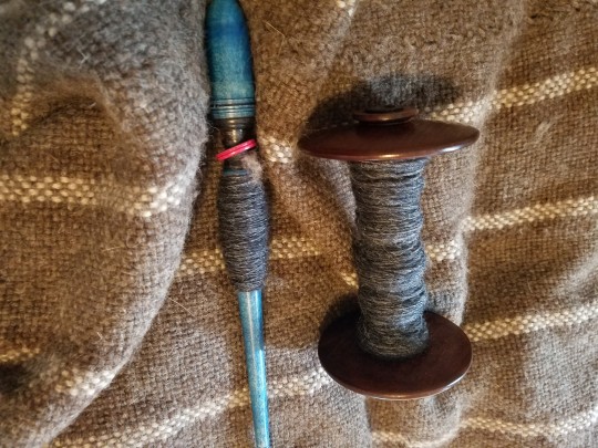
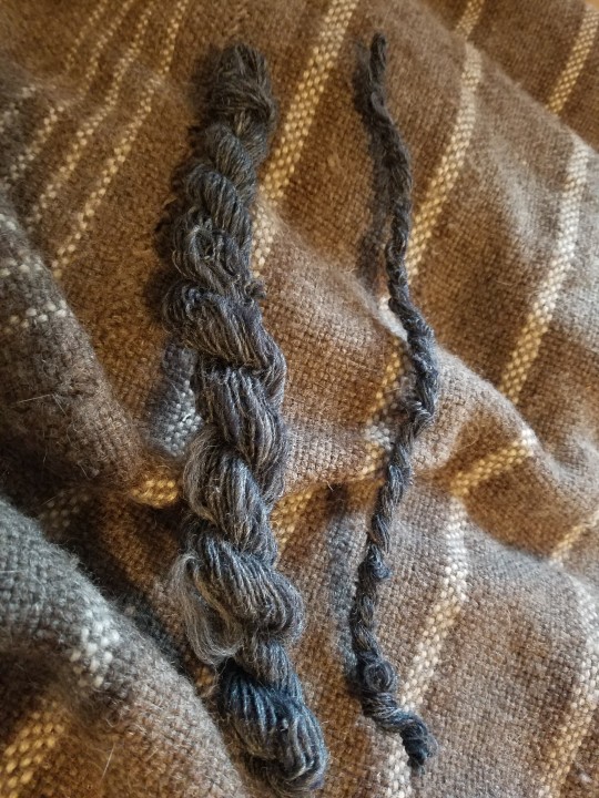
No surprise there--obviously i spun more on the wheel. The pictures are actually pretty deceptive though, since i was not aiming for a particular weight and just spun what came naturally. On the wheel its much much thicker than on a supported spindle--a heavy fingering weight singles compared maybe a heavy cobweb singles. But the purpose of this experiment was to see the yardage specifically, and--
On my wheel, I spun 54 yards/49.3 meters in twenty minutes
On my spindle, I spun 17 yards/15.5 meters in twenty minutes
Which is just over 3 times faster on my wheel. I'm actually pretty shocked by that--I was predicting AT LEAST 5 times faster on my wheel, and I honestly wouldnt have been surprised if it was closer to 10. But nope, a measly 3.
Which is pretty cool to know. Before this experiment, if I had to spin something on a deadline, I would always have picked my wheel to spin it on. But now im actually thinking it may be a draw, maybe weighted just slightly in favor of the spindle for a few reasons--i have limited ability to spin on my wheel since it's more painful by far, but also my spindles are way more portable. So if, for some reason, i had to spin a hat's worth of laceweight singles ASAP, doing it on spindles that i can use in the car/on the train, at work, in bed, etc, would probably be a more efficient way of doing it than sitting at my wheel for two hours, ending up in quite a bit of pain and potentially triggering a flare up.
The chief slowdown of the spindles is the logistics of the temporary cop, since it means that for every length of yarn you produce, you are winding it by hand three times--the first time onto the temporary cop, the second time onto your hand once the temporary cop is full, and then the third time onto the actual cop at the base/middle of the spindle. This is kinda unavoidable--you dont need a temporary cop for drop spindles, for example, because youre spinning much longer lengths of yarn at a time, so for each time that you have to wind it up the spindle stick to get to the tip, youve spun at least an armspan of yarn, potentially up to 2. Whereas on a supported spindle, much less (anywhere between 3 inches/7.5 cm to 12 inches /30.5 cm depending on what I'm spinning). I dont know exactly how much slower it is to forego a temporary cop, but i highly suspect its far more than the slowdown of winding thrice. Maybe ill check at some point, but i dont really want to (ive tried it, and its extremely tedious).
Anyway, suprising but heartening results ! Would be very interested to hear the results of others if anyone else wanted to give it a go for their own edification. (Im actually really curious what other spinners speed is ! And would be interested to hear drop spindle or other hand spindle speeds even without a comparison to another tool !)
#im also pretty pleased to learn that i spin close to a yard a minute on my spindles#and bear in mind that russian spindle is not among the fastest spindles that i have. pretty sure with a full cop im easily spinning#a yard a minute on my faster spindles#long post#yarn experimentation#handspun yarn#spinning#supported spindle#spinning wheel
53 notes
·
View notes
Text
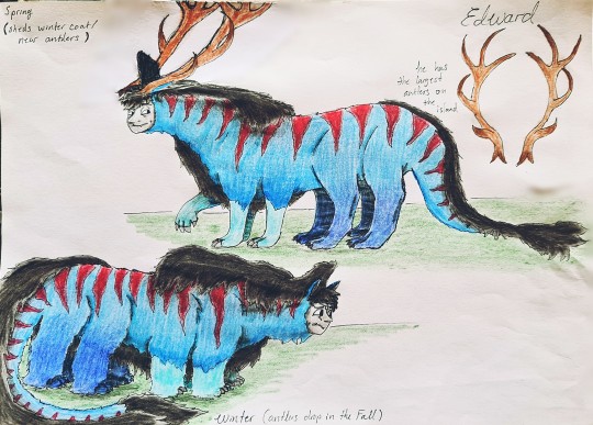
Edward the Herd-Elder. He sports the largest set of antlers on the island.
Here for comparison...

The Dampfross grows new and bigger antlers every year, though they dont grow as rapidly as they age like with most deer. Every year their antlers grow about a cm. With younglings the antlers grow more than a cm until they reach a specific age. When they throw off their antlers they grow a winter coat to help them in the cold. They shed the coat when the new antlers start growing around the end of winter/ start if spring.
#thomas and friends#thomas the tank engine#ttte#ttte art#ttte edward#edward the blue engine#dampfross#old iron edward#Imma call them Dampfross#ttte au
31 notes
·
View notes
Text
I LOVE WINX CLUB PIXIES!!
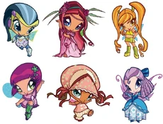
The Pixies are magical creatures of the Magic Dimension. They appear in Winx Club as being bonded to many fairies. In the PopPixie miniseries, they appear as main characters.
Bloom, Stella, Flora, Musa, Tecna and Aisha have all bonded with their own Pixies. In "The Tree of Life", Bloom promises the Pixies that one of them will bond with the Last Fairy on Earth, Roxy. This did not end up happening.
The Pixies are small creatures with heads that are larger in comparison to their baby-like body. The wings are varied and simple, like fairy's Winx wings. Baby Pixies are about 5 cm tall, young Pixies are about 8 cm tall, and adult Pixies are about 10 cm tall.
In PopPixie, however, there are some minor changes for the Pixies. Female Pixies have ribbon-like wings while Male Pixies have angel/bird-like wings in civilian form; both of them are small pairs of wings. Once transformed, their wings are also transformed, become bigger and colorful, some are multi-layered. Unlike in Winx Club, they wear different clothes, and outfits once transformed are different from the ones in civilian form, much like how the setting works for fairies.
Winx Club
Called "minifate", meaning "mini-fairies" in the Italian version, Pixies are creatures in the Magic Dimension that can bond with fairies and help them in their way of becoming real accomplished fairies.
Prior to the introduction of the Pixies in Season 2, the Witches used the term "pixies" as an insult to the fairies in the first season of the 4Kids dub, which at the time had no other meaning in the series.
in: Pixies, Pixie Village, Winx Club,
and 20 more
Pixie
VIEW SOURCE
Overview
Series
The Pixies in the movie Magical Adventure.VIEW IMAGE
The Pixies are magical creatures of the Magic Dimension. They appear in Winx Club as being bonded to many fairies. In the PopPixie miniseries, they appear as main characters.
Bloom, Stella, Flora, Musa, Tecna and Aisha have all bonded with their own Pixies. In "The Tree of Life", Bloom promises the Pixies that one of them will bond with the Last Fairy on Earth, Roxy. This did not end up happening.
Contents
1Aparência
2Clube das Winx
3PopPixie
4Lista de todas as Winx Club e PopPixie Pixies
4.1Duendes Guardiões
4.2Pixies ligados ao Winx Club
4.3Outros
5Habilidades Mágicas
6Curiosidades
Appearance
Amore and Chatta in their detective suits.VIEW IMAGE
The Pixies are small creatures with heads that are larger in comparison to their baby-like body. The wings are varied and simple, like fairy's Winx wings. Baby Pixies are about 5 cm tall, young Pixies are about 8 cm tall, and adult Pixies are about 10 cm tall.
In PopPixie, however, there are some minor changes for the Pixies. Female Pixies have ribbon-like wings while Male Pixies have angel/bird-like wings in civilian form; both of them are small pairs of wings. Once transformed, their wings are also transformed, become bigger and colorful, some are multi-layered. Unlike in Winx Club, they wear different clothes, and outfits once transformed are different from the ones in civilian form, much like how the setting works for fairies.
Winx Club
Called "minifate", meaning "mini-fairies" in the Italian version, Pixies are creatures in the Magic Dimension that can bond with fairies and help them in their way of becoming real accomplished fairies.
Prior to the introduction of the Pixies in Season 2, the Witches used the term "pixies" as an insult to the fairies in the first season of the 4Kids dub, which at the time had no other meaning in the series.
PopPixie
A group of inseparable friends who are always ready to help each other; Pixies are well-mannered and caring, cheerful, courageous and spunky, each with their own strengths and weaknesses.
They are full of energy and always ready to lend a hand. More than anything, Pixies would like everyone to be as happy because of these times they tend to exaggerate.
When they become PopPixies, they have new powers with spectacular effects and are able to transform and have new costumes, somewhat like the Fairy Forms of the Winx Fairies.
They live in Pixieville, where they are the neighbors of the Gnomes, Elves, and Magic Animals.
Unlike the original Winx Club series, male Pixies can be seen in this series and their heads are less disproportionate compared to their bodies, they no longer have unique wings in civilian form, but small alike wings, and even baby pixies like Piff can talk.
Guardian Pixies
Main article: Guardian Pixies
There are four Guardian Pixies that protect the Codex at the four main places in Magix which are: Alfea, Red Fountain, Cloud Tower, and the Pixie Village, respectively Concorda, Athena, Discorda and Ninfea. They are more powerful than the other Pixies.
Pixies bonded to the Winx Club
Lockette is the Pixie of Portals, and thus, knows her way anywhere. Lockette is Bloom's bonded pixie.
Amore is the Pixie of Love ('amore' is Italian for 'love'). She is Stella's bonded pixie.
Chatta is the Pixie of Chatter and is Flora's bonded pixie.
Tune is the Pixie of Etiquette, or Good Manners, and her bonded fairy is Musa.
Digit is the Pixie of Nanotechnology (technology on an extremely small scale) and is Tecna's bonded Pixie.
Piff is a baby Pixie of Sweet Dreams. She is the bonded Pixie of Aisha.
Cherie is the Pixie of Weather and is Musa's alternative bonded Pixie.
Caramel is the Pixie of Super Strength and is Tecna's alternative bonded Pixie.

#magical crystals project#winx stella#winx flora#winx bloom#winx club#enchantix#winx fanart#fate the winx saga#poppixie#fairy circle#fairy art#fairy#fairycore#winx club oc#winx
8 notes
·
View notes
Text
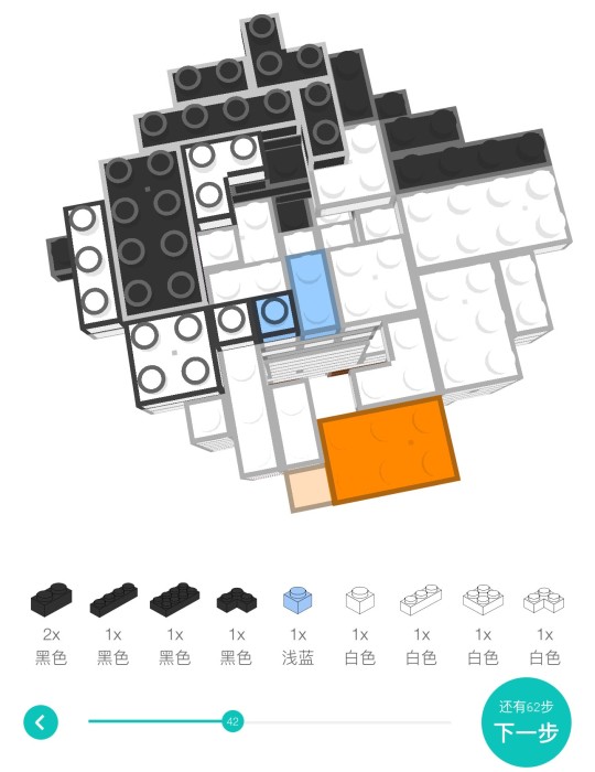
cm dev log #4 - february 2024
happy march! i can’t believe this is already my 4th dev log… that means i’ve been working on this game for one third of a year…
i know in the january log i said i wanted to tackle gameplay, and i guess i did a little of that, but it ended up being mostly an art/asset creation month. towards the 3rd week of february my wrist started to hurt, so i’ve slowed down a little bit since then. thankfully, i still have some cool art to show off!


[start image description: 3 variations on the same bookshelf sprite: one with all empty shelves, one neatly packed with different encyclopedia-like sets, and one with mostly unrelated books tending more towards leaning against one another or being stacked horizontally. end image description.]
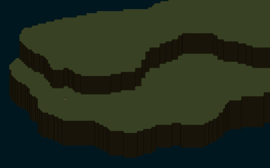
[start image description: a very zoomed-out view of a basic environment, cliffs overlooking water. the player character is extremely small in comparison. end image description.]
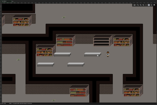
[start image description: a view of an indoor environment with brick walls, four tables, and several of the previously-described bookshelf assets. end image description.]
the thing about art/asset creation, i’ve noticed, is that it’s generally a bit more of a convoluted process than coding… when i want to code something into the game, it’s more a matter of figuring out how to code it → and then coding it. (and then fixing it if i need…) art is different, though, because a lot of the things i draw end up going through several different iterations before i settle on what i want them to look like. i’m still not entirely sold on some of the basic structures i have in place for myself, but it’s still been really satisfying to slowly start to build up these areas. even just the bookshelves and tables have added a lot of depth & feeling i think ^_^
aside from art, i also made a few minor coding tweaks. i added a little bit to the enemy AI: now enemies will only chase you if you come within a set distance, and if you leave this distance, they will walk slowly back to their spawn point. (basically “running away from and/or avoiding everything you encounter” is now a viable strategy.) the sounds that accompany a character speaking are now a little more fluid re: keeping pace with the text, and i adjusted the depth & drawing code for the player character so her weapons are drawn over other objects (such as tables and bookshelves) as opposed to underneath.
i’ve been having a bit of trouble classifying february as a ”productive month” in my mind, but i know how important it is to keep slowly chipping away at long-term projects like this, so i’m happy at least i have stuff to share with you all! in march i want to really hone in on building some more tools for myself: my close friend stevie suggested whipping up something with Twine when i expressed having difficulty keeping track of characters/plot threads, which is such a genius idea. it’s not something that is easily “shown off” but is definitely sorely needed for me at this point in development, if for no other reason than just keeping me sane...
as always, i really appreciate everyone who has been keeping up with the process! it's always super encouraging to receive feedback and hear people ask about how it's all going. i will see you all in april... springtime approaches :)
5 notes
·
View notes
Note
Hi, I'm wondering how you came up with mario characters' heights (how did you measure them) cuz I'm curious ?
I first asked lethalhedgehogs but told me you discussed that together before and recommended me to ask you directly.
hi! So basically there's exactly one source that lists canon heights, and it's a pamphlet for the first movie, The Great Mission To Rescue Princess Peach. However, this isn't very good for reference in terms of the games or illuminations movie, as a simple glance shows that the heights in relativity to each other are incorrect.

It states Mario is 150cm tall, Luigi is 158 cm and Peach is 160 cm, or 4'11, 5'2 and 5'3. This is correct for THESE heights, but not for the illuminations movie.

This leaves us with a solution: Take one person's height as "canon/real", and compare the rest from that one. Using Tracker, I was able to set a meter reference at varying heights and adjust it to match the proper height of the "real" one, and compare the rest to other characters, and I did this for each character to get a table of potential comparisons.
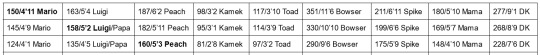
I also added a few extra characters NOT present on this chart by scrubbing for good comparison footage next to somebody else (Namely Spike, DK, Mama and Papa Mario, and Bowser, who is slumped in this and not standing at his normal posture.) and bolded the reference height which I compared the rest to. This gives a set of potential heights to use as reference, but it only works well for the illuminations movie, because the relative heights to other characters changes constantly between games. After all, if Peach was 6'2/187 CM, Pauline would be nearly 8 feet tall.
This also leads to another interesting factoid, that the technology in the mushroom kingdom is also BIGGER than that of Brooklyn's, and forever ago I did some height comparisons from Mario Odyssey that I should revisit if people want. This post is getting pretty long though. It'd be much easier though with tracker, because back then I had to painstakingly count by pixels and make my own measurement rods, and it was inaccurate and torture for my dyslexic ass.
#super mario#asks#hi thanks for allowing me to vaguely infodump here#I could talk about SO much mario stuff you have no idea#from diets to social norms to cultures to anything at all.
13 notes
·
View notes
Text
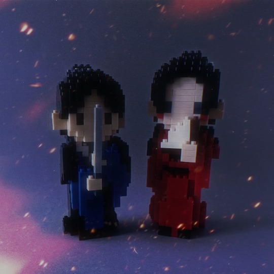
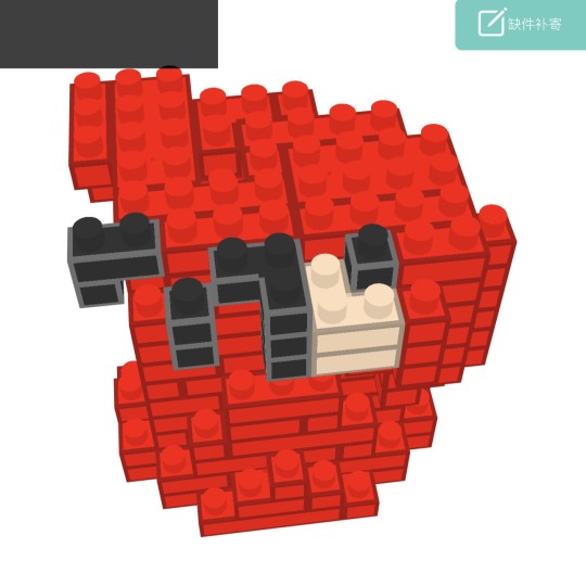
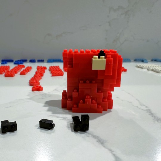
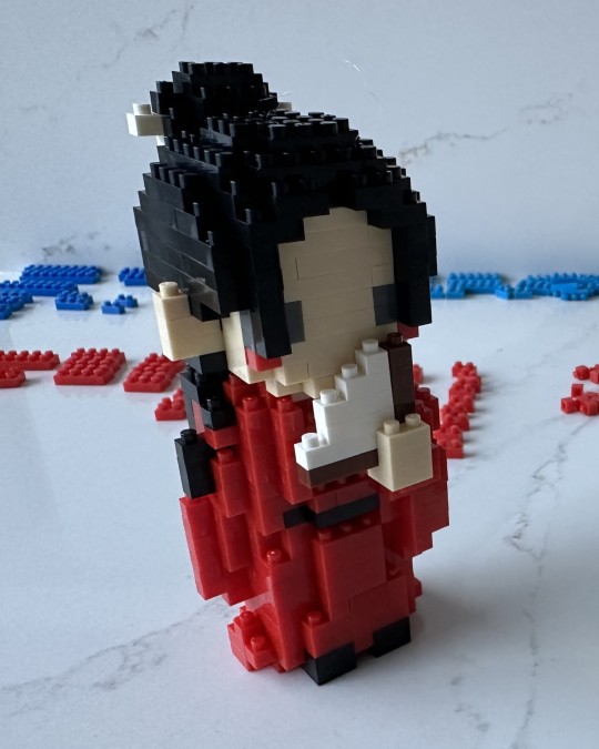
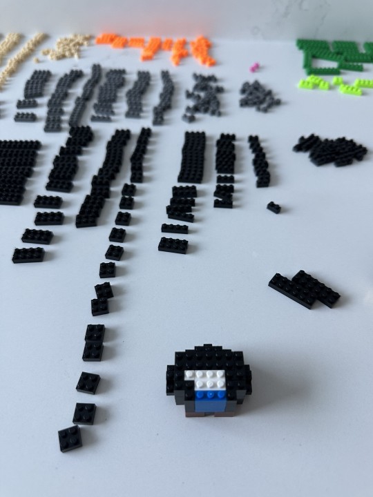
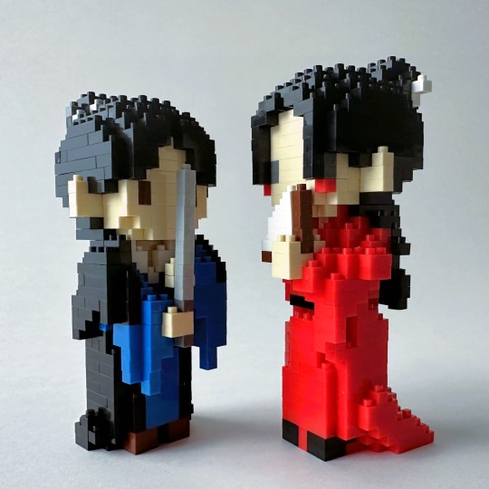
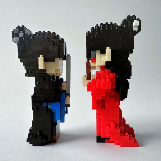
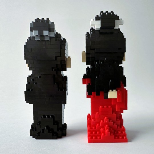
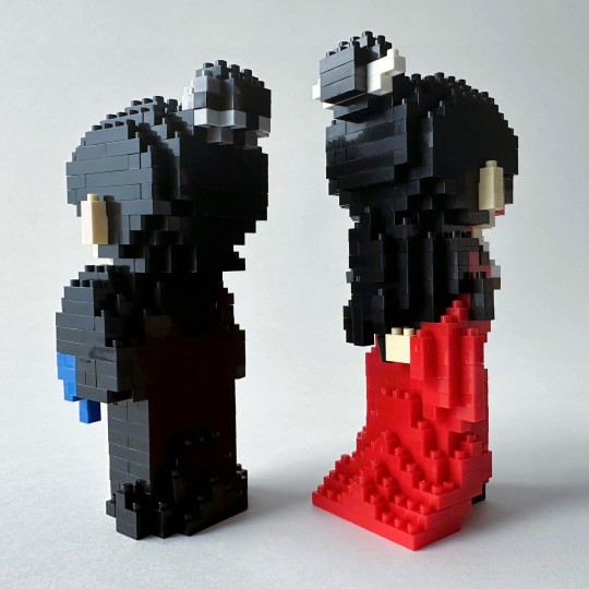
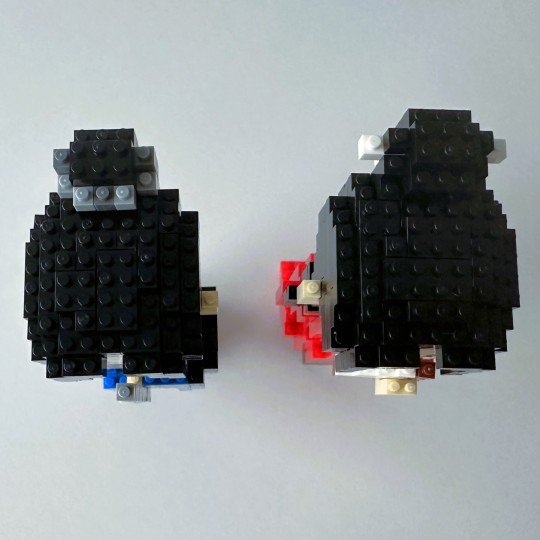
Building Block Figs - Two Devils
Following up on the last few days of building block fig posts, this is the last kit that I have to post about. I have three more incoming, but they won't arrive for at least a month, if that.
I actually started on these figs a while ago - they were the second set I started to make, after my first kit of Beautiful Fight Scene in the Middle of the Lake. That one was so involved that I figured I'd relax a little on an easy set before tackling the next scene.
Ahahaha. Little did I know.
First, I had such a big problem with this set that I originally wasn't sure I was going to buy it. The full, long name of this set is: Ghost Valley Valley Master and Tianchuang Leader. Great, love it, right? Always a fan. Except, this was the picture:
Right, you see the problem. Valley Master Wen is all dressed in his Episode 1 red finery, but our Tianchuang Leader definitely is not dressed in his midnight-hued civil servant assassin best. Why on earth would Zhou Zishu be in white? This is not "Rescue from Tianchuang Jail" A-Xu (although I kinda wish it was, that would be great).
Also, less egregious but still not great is the fact that Zhou Zishu's hair is Jianghu-styled half down, and that Baiyi has a cross-guard. This whole fig is just not working for me!
But, as you can tell (and as you would already have suspected anyway), I bought it, and just planned somehow to figure out a solution to change up the entire fig.
Somehow. I had no actual idea how to do it, but I felt confident I would somehow figure it out. So confident, that I even went ahead and put together Valley Master Wen first.
He, at least, was not going to require changing. The only thing I'd change up with him is to give him a gold guan instead of his hairpin, but I used up all my extra yellow bricks on the Catching Light fig, so I was out of luck. That's alright, I don't mind this one so much. The Valley Master would wear his hairpin at times, that makes sense.
Oh, I should say, in comparison to the other building block sets, these two together totaled 856 bricks - 424 for Wen Kexing and 432 for Zhou Zishu. The figs stand 4.4 x 5.2 x 10.2 cm and 5.2 x 5.6 x 10.2 cm respectively, and each one is rated 2 hours to complete. Like all of these kits, the time to complete is pretty right on, if you follow the directions.
The two figures came together in a set. I wouldn't have minded if they split up the two figures in two different bags, but nope, they're all mingled in there together!
Here's a sample progress pic:
This one wasn't too bad - it's always a little harder for the ones that are mostly one color, since it makes it easy to miscount as the colors all blend together. But, I didn't make any mistakes and it went pretty smoothly.
I finished the body and moved on to the face. They have you do the fig in pieces, and then put it all together at the end. You can tell the passage of time from the quality of the light in these photos, but I pretty much finished this one over the course of a day and an evening.
I had to laugh as I saw his red cheeks/eyeliner. Very cute!
And here he is! Photographed at a rakish angle, as well. He looks great!
While I was at it, I decided to click through the directions for Zhou Zishu, and see if I could figure out any ideas in advance of working on the fig. By this time, even one (and a half) sets in, I could see that they had provided lots of extra bricks, so the idea that was starting to half-bake in my head was that I would have enough bricks at the very end of all my kits to do something instead of the white.
While clicking though, I realized that I could skip the body part and do the head, which would help use up some of the necessary bricks. So the head it was! That way, I would really only have leftover bricks at the end.
That I got done very quickly. It wasn't bad at all! And, the best thing was that this head didn't have any long hair attached to it. So, I could just ignore the long hair when building the body, and use the head as is. Things were looking up!
I mean, Valley Master Wen looks horrified, but don't worry Lao Wen, he'll get better.
I set aside these two, and went on to the rest of the sets.
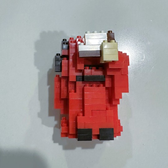
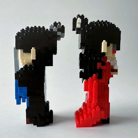
That brings us to this morning. I woke up, pulled out my SHL reference book, sat down with all the brick remainders, and figured out, I think, a pretty good plan of attack.
Technically, all his clothes are midnight shades of blue and wine, but those are not colors I had available, sadly.
I had a lot of black bricks left over since I wasn't doing the half-long hairstyle, and plus extras from the other sets. That being said, there wasn't a ton of the smaller sized bricks in black. Also, I didn't really want a fig that was black on black on black, and technically his robes are that deep midnight blue anyway. The biggest problem with that was that I didn't have enough of the darkest blue bricks. Or really any of the blue bricks, and of course going lighter would get us right back to a non-canon compliant fig. So, I decided to try and do his cloak and body with as much of the black bricks as possible, and try to use the blue ones as judiciously as I could, in the hopes of stretching them far enough.
I'm a little annoyed at myself I didn't take a pic of all the remaining bricks left so you could see what I was working with, but at least here you can see the start of the fig and the remaining black bricks left. You can also see where I started off making the interior white, to try and use as few black or blue bricks as possible. My plan was to make the cloak as enveloping as possible in order to use the least number of blue pieces.
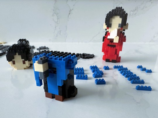
You can see here how very few blue pieces there are left, and how far I have to go. You can also see here how I started changing up Baiyi, to make the hilt dark grey vs. the neon orange.
I will note at this point I was about two hours in on the body, which sounds ridiculous, but let me assure you, it gets worse. I stopped here for lunch, and then came back ready to finish this up.
Unfortunately for me, though, this is where I started to get into real trouble. I was changing up the sword, the top hand position (inadvertently, since I got rid of the cross-guard), I was trying to make the cape wrap around the front robes, ignore the directions for the long hair in the back and therefore revise the back (which is half hair). And I had no idea what I was doing with any of it, other than to desperately stretch out my remaining dark blue pieces. For each blue piece I did use, I was trying to figure out if I'd be better off using a bigger piece, or multiple smaller pieces, or if I might need those exact configurations later.
Basically, I was doing way too much off script, and didn't have the skills to back it up. The directions at this point were almost useless.
You can see how the step I was theoretically on looked nothing like the fig I was trying to make!
I must have reworked this piece here three different times. It doesn't help that the arms are asymmetrical, which only complicated something that I really didn't need to be any more complicated.
The biggest problem, of course, was that I was just way out of my depth, and kept making mistakes that I would have to go back and fix. And unfortunately, I have extremely poor visual short term memory, so when I disconnected a piece to fix a mistake or replace a brick, I couldn't remember how to reconnect it. And since I was so far off book with the instructions, I couldn't use that to help. I just had to figure it out new each time.
It was pretty rough going, I'm not going to lie.
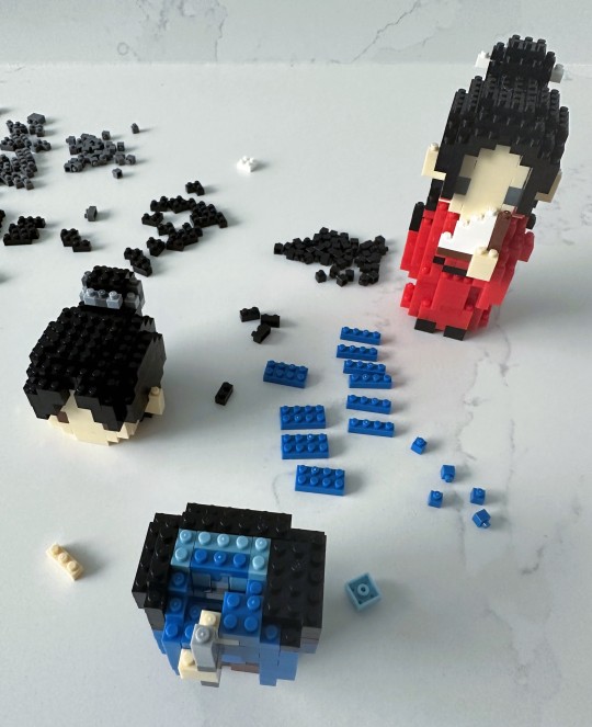
Somewhere in this I ditched the two-brick configuration for Baiyi and made it into the slimmest, whippiest, greyest version I could.
At this point, those were all the blue bricks remaining, and I was critically short just a few pieces. So, I went to the lake raft set from Beautiful Fight Scene in the Middle of the Lake, which I'm going to re-work next to make the raft brown vs. blue and green. I pillaged a few dark blue bricks from the raft in advance of.
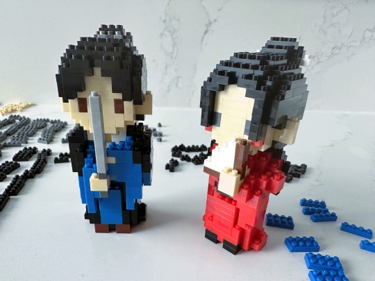
Finally, after three (more) hours, I was done! I couldn't almost believe it. Very happily, I started to take some pics.
And that's when I noticed that Zhou Zishu was actually taller than Wen Kexing. I was like, wait a minute. How is this possible?
It was possible.
At this point, I was really, really tempted to just say, you know what, it's good enough. Clean up the bricks and move on with life. But the bricks were still out, and I just couldn't let it go. After all this time, working so hard? No way.
I figured here the easy way out was to extend Wen Kexing's legs. Gong Jun is all legs anyway, so it would work.
I didn't take any pictures of this, because at this point I was losing the will to live, but basically not only did I extend his legs, I ended up extending the train of his robes just a little bit. Just to make it a little more like the show! I had plenty of red bricks, so this was actually fairly straightforward.
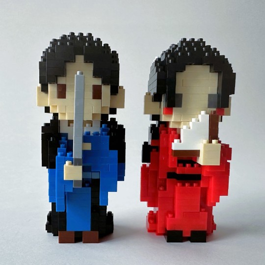
So NOW it was done. Unlike this extremely long blog post. Picture time it was!
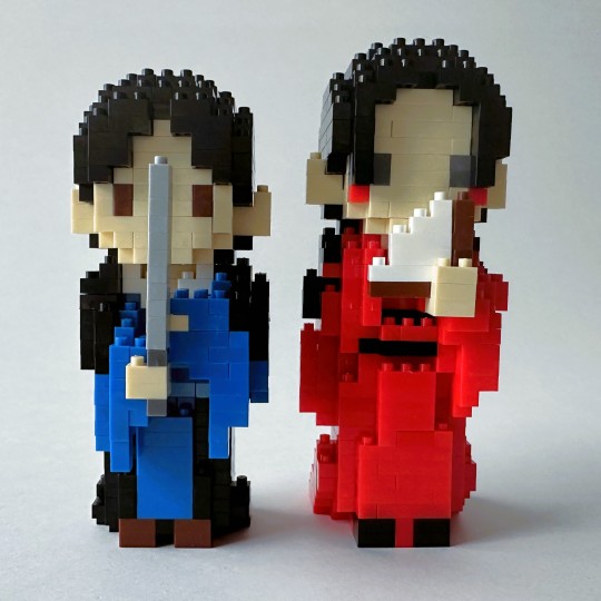
You can see he's quite a bit taller now.
Don't judge my fig-designing skills too harshly, please! I was struggling. Desperately.
This is actually the first time I am really looking at them since I finished, so I'm curious about this too.
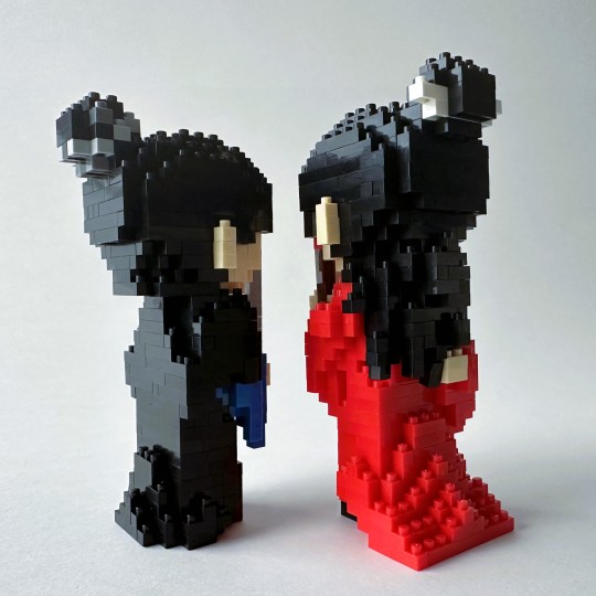
Oops, I see in my fugue state I knocked a little tendril of the Valley Master's hair off kilter. I'll have to fix that.
Ah ha, I did fix it! I have to say I really love how we have Wen Kexing's hand behind his back here - love this modelling. This is a good angle to see the train here - I just added that last two rows, nothing special.
Hmm, I guess I should have done a straight box down at the back for Zhou Zishu's cape, vs. trying to shape the shoulders and arms from where he's holding the sword. There isn't a ton of black bricks left, but I might go back and see if I can streamline it some.
Ok, this doesn't look too bad from this angle. I could have curved his bottom back part of his hair a bit more, but I suppose it can be the braid in back.
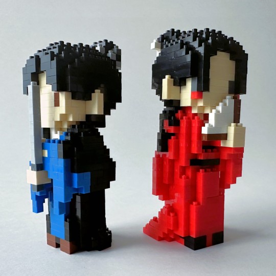
Well, Baiyi looks good!
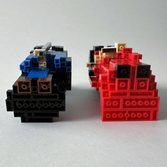
Finally, I remembered to take a good bottoms-up pic for these building brick figs!
And the top here. Oh, I forgot to mention I had changed up Zhou Zishu's hair tie too - it was originally light grey and light blue, but I made it light and dark grey.
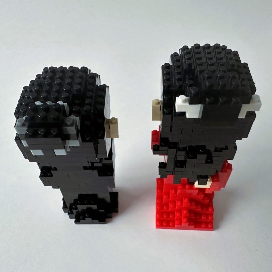
Alright, I'm at 30 pics, so there we have it. Clearly not the best, and there's still clean up work to be done, but I'm pretty happy how he turned out, considering everything. At least he's not wearing white robes.
In conclusion, I will not be giving up my day job for a brick designer job, that's for sure.
Well! Thanks for tagging along with me through brick festivities! I am looking forward to the next sets coming - they look wonderful. And best of all, I don't think I'll have to change a single thing on them!
Material: Plastic bricks
Fig Count: 508
Scene Count: 35
Rating: 8 hours of build time
[link to the Master Post Index]
#word of honor#shan he ling#wenzhou#wen kexing#zhou zishu#word of honor merch#figthusiast#happy new year's eve!
9 notes
·
View notes
Photo
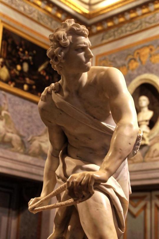
MWW Artwork of the Day (5/10/23)
Gianlorenzo Bernini (Italian, 1598-1680)
David (c. 1623-24)
Carrara marble statue, 170 cm. high
Galleria Borghese, Rome
When he tackled his David in 1623-24, Bernini knew that he was risking comparison with works in a sculptural tradition that included the great names of the artistic culture of the Italian Renaissance, from Donatello to Verrocchio and Michelangelo. He subverted the traditional way of representing David. Instead of depicting the static figure after killing Goliath (as had Donatello and Verrocchio) or the measured strain of the act itself (as had Michelangelo), Bernini once again countered with the dynamic charge of the spiral. It is well known that he took his inspiration from the so-called Borghese Gladiator, now in the Louvre but at the time one of the prize pieces in Cardinal Borghese's collection. From the Gladiator derive the feet planted widely apart and the twisting torso.
For more of Bernini's work, see this MWW Special Collection:
https://www.facebook.com/media/set/?vanity=TheMuseumWithoutWalls&set=a.371960352909340
18 notes
·
View notes
Note
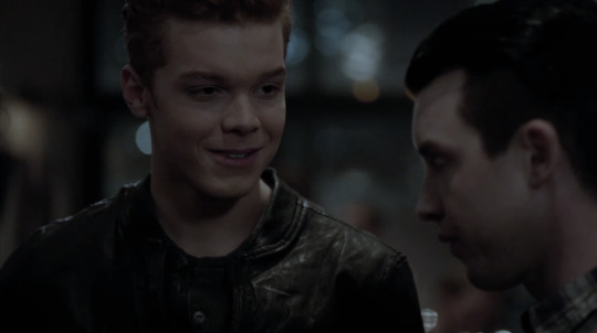
hi! i’m wondering if you can explain a bit how you made those gifs if ian looking at mickey in the s4 ep at the party. like how you made their skin tones show and stuff cause the original scene is really yellow? i hope that makes sense. no pressure im just curious!!
hiii sorry I took so long to answer this, im not really good at explaining these things but im going to try! ill put it all under the cut:)
(the gif set in question)
To preface, I make gifs in Photoshop!
okay, so basically my best friend when it comes to color correcting scenes is the Channel Mixer tool. I'm sure there are other ways to do it, but after a lot of experimenting I've found this method to work the best for me.
The way the CM tool works is kinda hard to explain, esp because I only figured out how to use it through trial and error, but essentially it breaks your canvas (gif) down into 3 primary colors: Red, Green, and Blue. Each color will have 3 channels: the primary channel (for blue it's blue, red is red, and green is green) and two secondary channels for the other two colors. The primary channel will always default to +100, and the secondary channels will default at 0.
Using the tool, you can adjust each color's channels to add more or less of a certain color to the existing colors in your scene. For example, you can add more blue to the greens and reds on your canvas, or more red to the blues and greens, etc. In my experience, you will not need to adjust the Green settings very often other than for very minor adjustments to complement the other channels. It requires somewhat of a preexisting understanding of color theory (what combinations of colors will create what end result, what too much of one color will look like and what color will balance it, etc), but it's not too hard to figure out, especially if you play around with it and experiment with what each channel does and how it affects each gif.
The main goal of using the Channel Mixer for correction is to adjust the coloring of a scene to be as neutral as possible, and then to edit from there.
So with this particular gif set, the lighting was very yellow tinted. When using CM, yellow is a color that's grouped into the red family. So when you have a scene that is yellow-washed, you want to push more blue into it to start balancing it out.
Here is the original:

Now, like I said, we need to add some blue. In the Blue settings, I adjusted the channels to the following: Green +14, Red +14, Blue +100 (default). When using CM, small adjustments go a long way. Here is what our gif looks like now:

As you can see, it's less yellow tinted, but now it's a little rose colored. To fix that, we will go into the Red settings and lower the primary channel to +75. Here is the result:
The scene is still very dark and unsaturated, but the coloring is much more neutral now and will make editing much easier. After getting the gif to this point, I added a few more adjustment layers: Levels, Curves, Brightness/Contrast, and made some slight adjustments with Hue/Saturation and Selective color. Here is the final result (this is before sharpening):
For comparison:

I hope this makes sense! Feel free to let me know if you have any questions!
#tutorials#<- I GUESS...#lmk if anyone knows of any better/easier to understand explanations of channel mixer cause I know I kinda beefed this#asks#anonymous
13 notes
·
View notes
Last Seen Blogs
xlappy
Sanzu’s-Girlfriend (on a litte break)

cumapalooza69
My Cum & Cock Tributes

owi-77
Omar🍇

jozzy242
Sin título
thearith123
Untitled