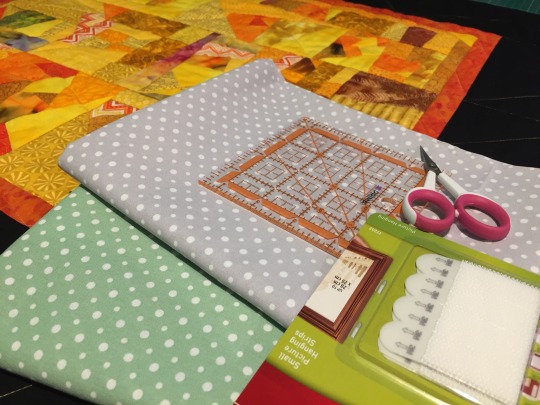
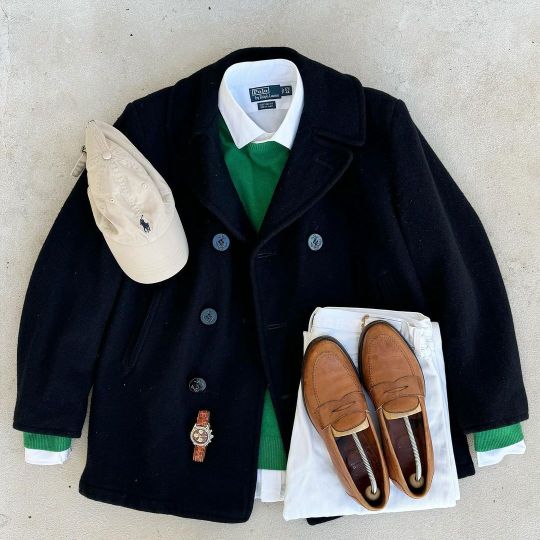
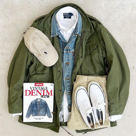
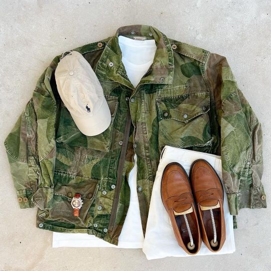
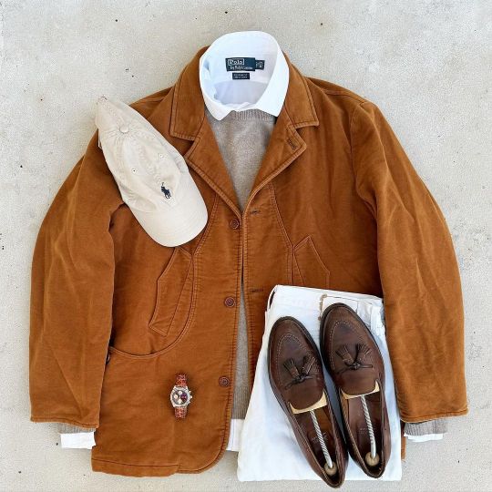
#fabric shopping
Text
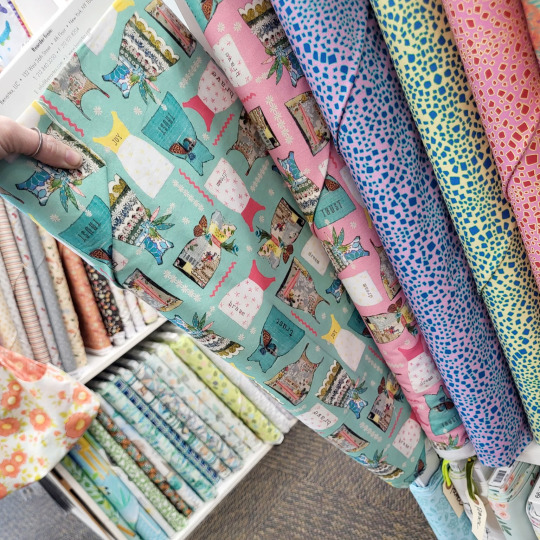
Picking quilt prints to use in lolita fashion
You're going to find different opinions on if you can use quilt fabric for handmade lolita fashion. Some say that it's fine, and some say it'll never work. The actual answer is really simple: you can definitely absolutely sometimes in some applications use some quilt prints, maybe.
Aren't we glad we've cleared things up?
One of the difficult things about using quilting fabrics in lolita fashion is that prints that read really well in a quilt do not always read very well in a garment. Quilts are made up of small squares of fabric, usually somewhere between 12" (30cm) and 2" (5cm) on a side. This means that a lot of quilt prints are meant to have the majority of the print contained within that small space.
Garments, on the other hand, especially lolita skirts, have very large amounts of fabric in them. I cut a lot of skirts at about 88", or twice the full width of the fabric. When some patterns repeat every 7" or so, it starts looking boring or muddy when it's gathered up into a big lolita skirt.
Quilts also are generally viewed from up close. The backing of a quilt is a large expanse of fabric. However, it's also usually only viewed from a couple of feet away, the distance between a person and their bed or their lap. If someone is viewing my skirt at the same distance that they're viewing a quilt, they are much too close to me.
This is about prints, but I'm going to include a couple of fast tips about quilt fabric. 1) If you're making a garment with quilt fabric, lining is not optional, even in skirts. 2) If at all possible, when you're still learning how to spot good lolita quilt prints, go to a physical store. Ideally, see if you can go to a quilt store with a lot of prints and a lot of collections. Just like how we need certain scales of print for our garments, quilters need different scales of prints for different applications in the quilt. Quilt collections have coordinated fabrics with several different scales, so if you find a fabric that you love and that just plain won't work, you have other options of related fabrics. For what it's worth, most quilt stores can get you higher quality prints for less than you pay for them at Green Craft Store and other similar fabric places. Your local quilt store can't necessarily match Green Store's $5/yard thingies but they'll have pieces comparable to Green Store's $18.99 prints, but for $12.99. If you find the perfect
So, let's break into the main thing about working with quilt prints for lolita fashion: how well does any given fabric look when a large chunk of it is viewed at a distance. Shopping in a physical store is great for this, because you can see the scale close up.
We're going to talk about motif prints (prints with things on them, like animals or food or plants) instead of geometric things like polka-dots or stripes. There's plenty of existing images for how to work those things into a dress, so I'm going to jump in to the more complex element of picking detailed prints.
If a fabric can work largely depends on four components: how large the motif is, how far away the motifs are from each other, how the motifs are laid out on the fabric, and color palette/contrast.
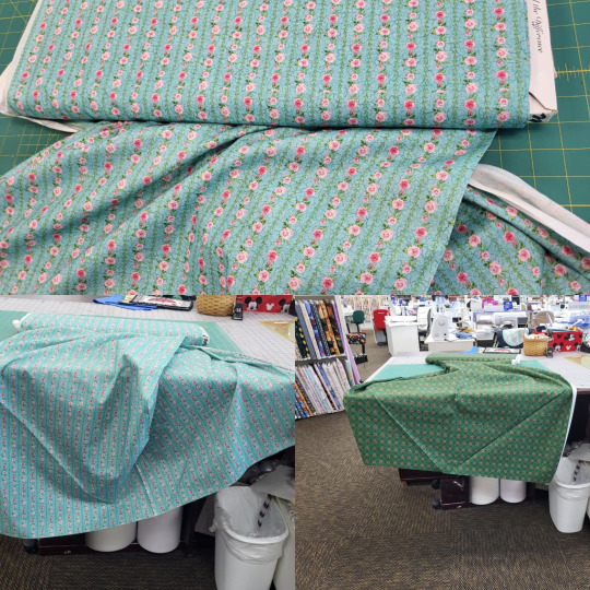
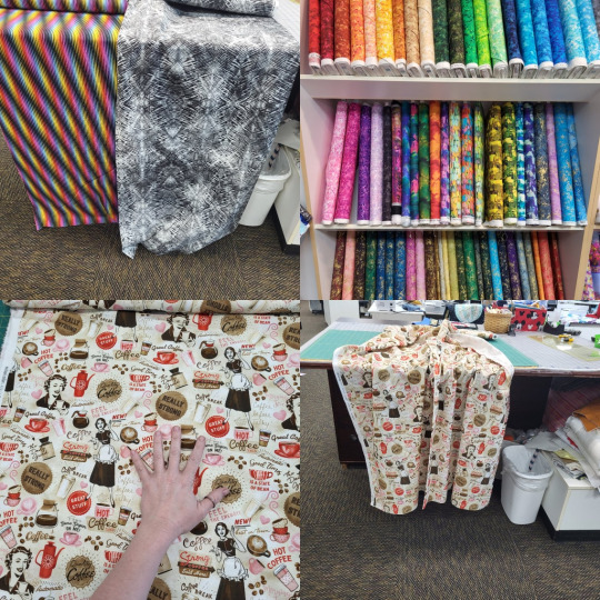
This print, while cute, is something that I won't use. It does fine in one of the categories, and not fine in three of them.
Motif size in this case is how big the dresses on the print are. Here, you can compare them to my thumb. What size of motif you have is going to depend on your garment. A headbow, which is much smaller than a skirt, might need a small motif, so that you can see all of it in the finished piece. A skirt can use a much bigger motif, since it's a very large space, and the whole motif will be visible. These dress motifs on that pattern are large enough to show on a skirt, but small enough to be visible on a bodice. This is a motif of a usable size.
Motif spacing is the one that's going to kill most print spaces. Let's look at how much space there is between the dresses. There's pretty much none. There's a few filler patterns in between, which clutter up the space a little bit. However, look at just the dresses in the print. While this condensed space works really well in a quilt block, they don't have any breathing room.
On a lolita print, we often have more space between the motifs than we have motif. This is very hard to find in a quilt print, but remember that it's the look we're going for.
Another element of motif spacing is how much fabric you go through before the motif repeats. If we use the dress with the yellow bodice as our reference point, we can see that it repeats twice in the 22" of fabric that we can see. This isn't too close together, but keep in mind that a fabric that repeats the print every 10" is going to have the same print motif a lot when it's on a skirt.
Motif alignment is just taking into account that garments are inherently directional. Your dress has a distinct top and bottom. You can't put on your socks upside-down or wear your blouse with the collar around your waist. Because clothes have a top and a bottom, prints that are intended to be viewed from any angle often look like part of them is upside-down when you use them in a garment. If we make a dress out of this dress fabric, half the dresses will be flipped.
Color palette is how many different colors there are in the fabric, as well as how close they are to each other on the color wheel, how much contrast there is between the lightest and darkest shades of each color, and the colors in general. For this print, we have a lot of colors: teal, yellow, pink, white, and a little bit of green and brown.
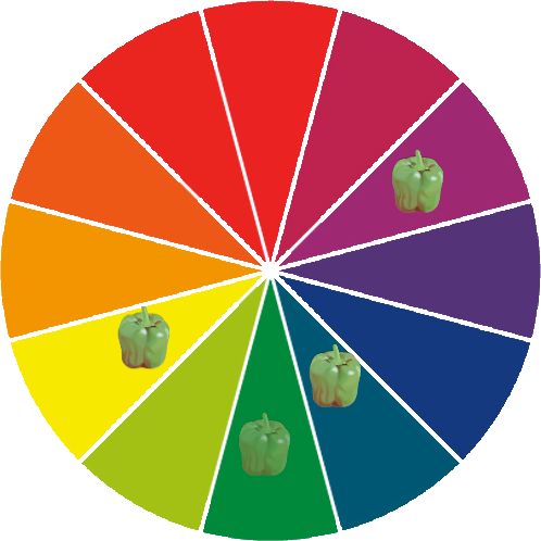
When we plot those colors on a color wheel, we see that the colors aren't particularly close. We have two of the most dominant colors being directly opposite on the color wheel. While it's totally okay to have complementary colors in your print, when both of them are dominant colors, the print can start to read as muddy when you look at it from far away. You don't need to plot every print on the color wheel, but it's a good way to show where the colors fit.
So, let's just look at a bunch of fabrics, and how I feel they do and don't work for lolita fashion. Some of this is just kind of my opinion. Some of these would look okay with good styling, and some wouldn't look okay unless there's good styling. But let's jump in.
Here's some small prints with geometric repeats. I like the teal one for lolita. Even though you can't really see the details from a distance, you can see the geometric stripe pattern. When you get a little closer, you can see the pattern, and the motif there is a nice lolita-applicable concept. I grabbed the one on the right because I thought it reminded me of a skirt by The Black Ribbon, but when I looked it up, it didn't look at all like that. That said, it still looks okay from a distance. The color reads as green, and isn't muddy or ugly. You get a little bit of geometric texture from a distance, and you can see the motif when you're a little closer.

Here's some that don't work. While the cupcakes and the teapots are both nice ideas, and we love cupcakes and teapots in lolita prints, they're not in a good presentation here. The teapot fabric has the teapots so close together that you can't actually tell what they are from a distance. The cupcakes are also very tightly packed together, making it hard to tell what the image is. Look at the cupcakes with the light brown swirl on the top, and look at how many times you can see it in this one image. The fruit is another example of the repeat being too close together, as well as having a bad color palette. You can see how many times the red fruit repeats, as well as how the red and green right next to each other doesn't read well from a distance.
Not sure why I stuck these four in the same collage, but let's go. Up top, we have some fabrics that don't work due to color palette and texture. Some of these are actual rainbows, and the way they're arranged gives them the feeling of movement. When this is on a garment, it starts making your eyes tired. In lolita fashion, we don't want people to be exhausted just looking at us. The gray one would just read as kind of messy and dirty, since the print is a more grunge print. The ones on the shelf also have the same problem of either having too many colors that are too far apart on the color wheel, or having really irregular patterns that would read as dirty or messy.
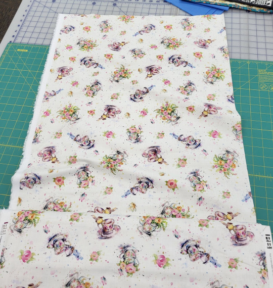
This coffee one is something that I really want to work, but the print spacing kills it. On the left, we can see that the standing coffee lady three times in a single 11" square. Also, between every large motif is a lot of filler text. Sadly, this just reads as a mess from a distance. This would be a lot more usable if we could delete all the "it's coffee time!" text. As far as fabrics go, it's not the worst on this list, but it's not ideal.
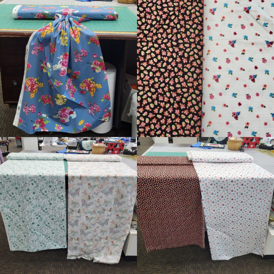
The blue fabric at top left is a good choice! You can see how much space is between each flower. It's a nice, empty space, and it reads well when you gather the top up. I'd wish that it'd have more detail in the print, so the flowers could look better up close, but I went through so much fabric here and it was nice to find one that felt good.
Top right, we have two small motif fabrics, with very different spacing. When you look at both of them from a distance (bottom right), you can see how the one on the black background reads more yellow than black, and the one on the white background reads as dots on a white background. This is just something to keep in mind when you're looking at motifs.
On the bottom left, we have two prints that have some color palette issues. The green one has some lovely leaves that could work in some more classical applications, but it doesn't look good from a distance. All of the green shades are very close together, without a really dark shade to make the shapes distinct from a distance. The butterfly one also doesn't have enough dark colors to look good from a distance.
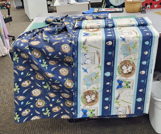
Here's a nice example of why shopping at places that have collections is a nice idea. This line has an all-over pattern with bird's nests, and a border fabric with a much larger print. If we stacked these two, we'd have a nice print on our hem, without the large print being too big for a bodice. The bird nest fabric has a more wide print spacing than some other prints. While I wouldn't use it as a standalone fabric, it works well when paired with the print. The extra-large scale of the border fabric helps the all-over fabric look more spaced out.
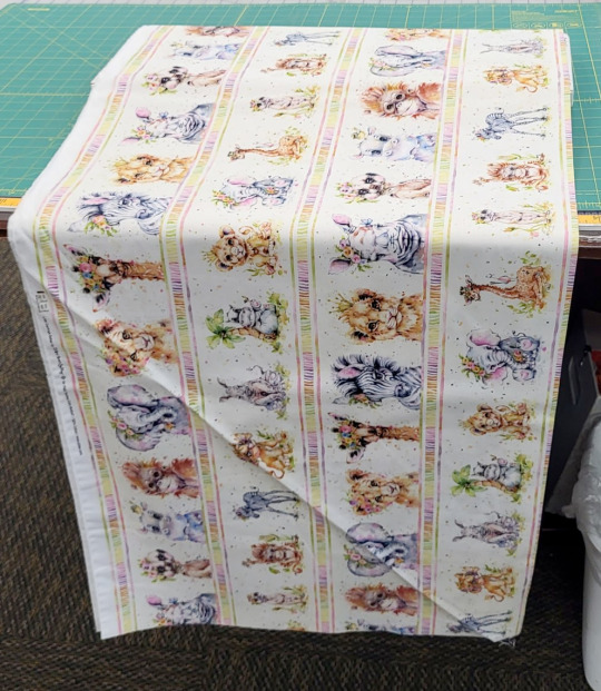
These terrifying baby animals with too long of eyelashes would feel like it wouldn't do too well as a dress. The print is nice for a skirt, but kind of big for a bodice. There's a lot of colors here: orange, gray, green, yellow, pink.

However, there ARE dresses that use horizontal stripes all over, which have mostly this color scheme. The pop of green is unusual, but not unheard of. This is one of those ones that is going to need some really careful styling. This is also why it pays off to window shop and make lists of things you do and don't like in lolita fashion.
This one is pretty damn adorable, and it's got a wider spacing than most prints, but you would have to figure out how to come to terms with the fact that no matter how you cut it, some teacups will be upside-down.

If you can find some border prints, definitely consider them! Most premade lolita print dresses and skirts are made of a border print fabric. This geometric metallic print isn't an ideal example of a border print for lolita fashion, but it does demonstrate the different ways that motif spacing can work. If you look at the very center of the fabric, you'll see that the little motifs have a huge amount of space between them. This is more the spacing that we want for many of our pieces. At the bottom, they're all packed together, and in the middle, they're spaced out like most quilt prints are. It's okay to have a lot of detail on the hem of your skirt. The petticoat holds the print out and makes it more visible. If the print is just at the hem, it doesn't overwhelm the whole piece, even if is much closer spaced than you'd want in the area around your waist.
So, let's get some basic guidelines for buying quilt prints for lolita fashion:
a) How much of the background color of the fabric can you see? To make sure you're getting good spacing, you want to see a lot of background.
b) How many times does a part of a print show up in a 10" square? Is there a big, notable piece that shows up multiple times in your sample space? Watch out.
c) Can you determine what's right-side-up and what's upside-down on this fabric? If there's highly directional motifs, you don't want your garment to always look like it's on wrong.
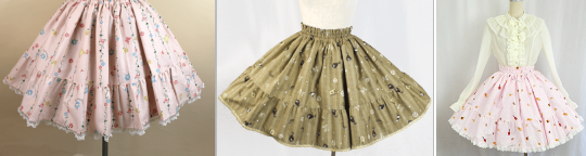
d) how much does this look like fabric used in extant lolita pieces? If you get this fabric, are there references available for how to style it? It never hurts to have some references for what you're trying to make!
And now, a quick reminder about buying fabric: quilt fabric shrink, maybe a lot. It often comes with a sizing on it, which makes it easier to quilt with, but harder to determine what the fabric will really look like. Having worked in Green Store for almost five years, I can assure you that I've never personally seen their quilt fabric shrink more than 10" in width when it was first washed. I'll leave a significant pause after that statement and let you fill in some blanks. Some cheaper quilt fabric will shrink a whole lot, or lose pigment, or really change feel when you wash them. Some expensive fabrics will do the same. I really recommend doing a prewash with liquid fabric softener on the first wash. I know a lot of people hate fabric softener, but you only need to do it once per project. If you don't mind smelling like pickles and reducing the longevity of your garment, you can use white vinegar instead of fabric softener. Just get that sizing out and pre-shrink your fabric so that you know what you're working with.
As a final note: the more you actually transform some fabric into a garment, the more you're going to learn about how to do it. We all have things we look back on and wish we changed. Don't let your fear of it being imperfect stop you from making the thing you want to make. It will be imperfect. It will always be imperfect. Everything is imperfect. We learn when we make decisions that weren't ideal. You will learn when you try.
Some old posts from this blog that are related: Print Scale from 2018, and A Quick Guide to Prints from 2015 (Which, yes, was actually photographed with a potato. I believe that camera was 2.1 megapixels).
111 notes
·
View notes
Text
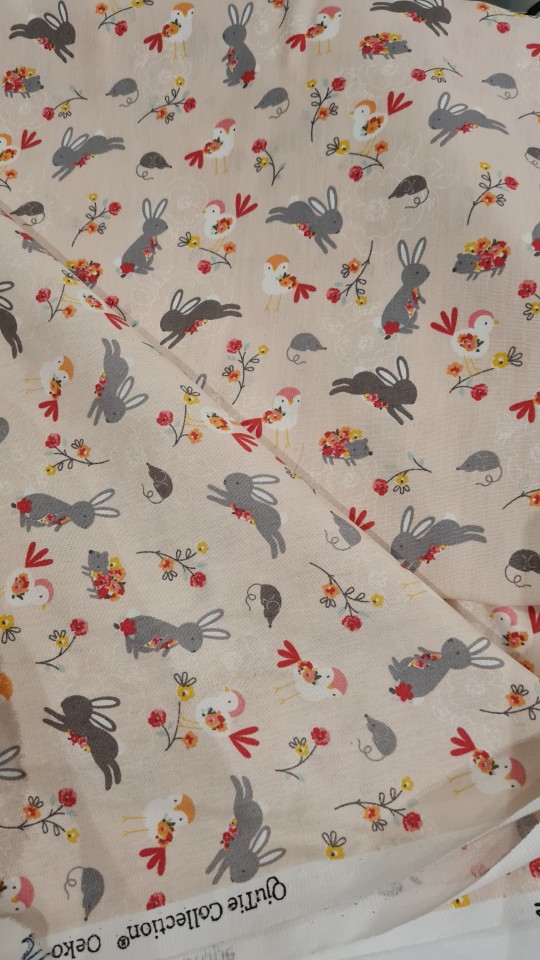
Two cottons I picked up in Athens (only 6 euro per metre!). I broke my promise not to buy any more fabric 😱 but it doesn't count on holiday
I had to get the guy to get down the second one for me, and I said "the one with rabbits please" and he went 🤨 "there is also mice on this, and... chicken"
4 notes
·
View notes
Text


I could get used to running in the morning. There is no wind and very few people on the beach. Today the sand was firm due to overnight rain. I ran down the beach for a bit then headed back home. Daughter was coming to collect me. We had an adventure planned for my birthday. We headed to Rangiora a small town about 20km from Christchurch for a day of shopping and visiting lovely eateries. We had a lovely time. We went to a cafe for morning tea which had a working beehive in it. Of course I was fascinated with that, they also had lots of houseplants for sale. I resisted the plants as I really do have too many. Fabric shopping also happened and birthday earrings were purchased. All in all it was a lovely relaxed day with my favourite girl.
25 notes
·
View notes
Text
Barely restraining myself from purchasing fabric
#i don’t need her#but I NEED her if ya feel#found a better fabric for my bf’s ren faire cape (not that he even remembers that he asked for it 🙄)#and some lovely fabrics to go with some outfits I’m making#I can’t help it#I see linen and I go absolutely feral#she’s so lovely#and they have a silk tulle I’m DYING to try out#AND a cotton velveteen that would be perf for a mockup of my wedding jacket#okay I’m definitely bot going to be able to restrain myself fully lol#:)#the fiend speaks#sewing#fabric#fabric shopping#please I want to find my people
3 notes
·
View notes
Text
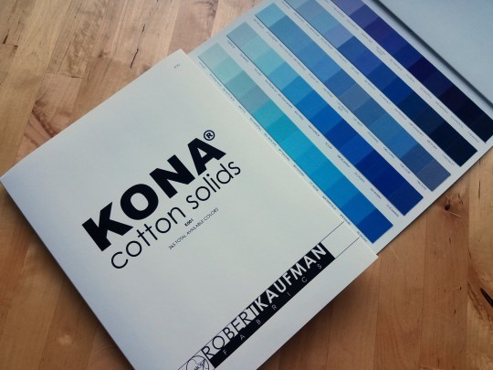
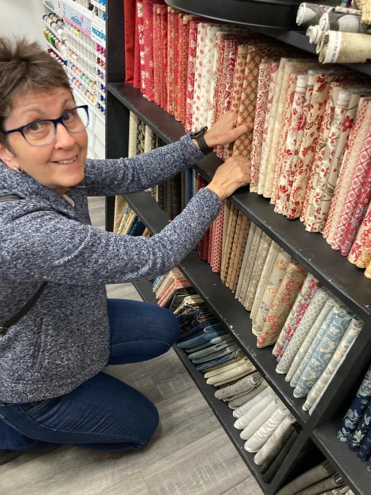
As I do not have a quilting store nearby, I have to do most of my fabric shopping online. Therefore, I splurged on this fabric sampler book of Kona cotton, to have references. It really is impressive, all those colours!
9 notes
·
View notes
Text
Tying up loose ends
Back from vacation and ready to show off my latest make, a lobster-themed tie front shirt from #McCalls8620. This was a perfect addition to my vacation wear!
View On WordPress
#Button down shirt#Fabric shopping#homemade clothes#McCalls patterns#McCalls8620#Sewaholic Crescent skirt#Tie front shirt#Travel#vacation fabric
0 notes
Text
I’m shook! I went on Silk Baron to order some swatches (I’m pondering something special for a character I love) and I don’t really know about silk so I was looking at the different kinds. You guys my heart is still racing! Like I had a visceral physical response like if you came face to face with a tiger or something! It’s so expensive 😭😭😭
I learned one thing about silk - I won’t be using Bridal Silk at $67 A YARD!!!
I ended up getting swatches of charmeuse and something called batiste? aka voile? It’s a silk/cotton blend. Once the samples get here I can begin experimenting :D
#cosplay life#fabric shopping#i hope the batiste works because it's a lot cheaper than charmeuse#but charmeuse is so pretty with its perfect drape and sheen and buttery texture...#fortunately i don't need much so i could be ok#i'm also going to price silks at some of the other fabric websites but first i think i'm gonna lie down#i'm also going to try the technique i'm considering with some synthetics if i can find ones with a similar look and weight
0 notes
Text
This Store In Lajpat Nagar Has Got All The Celebrity Approved Outfit Fabrics That You Will Not Be Able To Take Your Eyes Off From.
#Alia Bhatt#bridal shopping#Celebrity Approved Outfit Fabrics#celebrity approved outfits#celebrity outfits#deepika padukone#DIY outfits#fabric shop#fabric shopping#kajol#lajpat nagar#lajpat nagar shopping#ramji sons#shopping trends#tara sutaria#Wedding Outfits#Wedding shopping#Wedding Shopping In Delhi
0 notes
Text
LA Fabric Shopping Tips
LA Fabric Shopping Tips
Tips:
Make a list of upcoming projects or speciality things you won’t be able to find at home or online. I used my Notes app to list projects and material references I could quickly look at while shopping. Bring cash and a card. Some places charge for using card or have minimums. And if you’re just buying $5 in fabric, you might as well hand over cash. Have a solid idea of how many yards you…
View On WordPress
1 note
·
View note
Text

carpet weaver
#the old guard#Yusuf al-Kaysani#tog#tog fanart#the old guard fanart#Yusuf al-Kaysani fanart#tog art#joenicky#immortal husbands#you know looking st this now i really forgot all about their sunmoon symbolism when doing the patterns ahdkdkd#mind you it was before the polls#but like that would have been a great starting point wtf#anyway this started as a fabric shop idea but carpets show off a lot more and carpet shops are soooo beautiful#anyway pretty proud of this one 🥰#yusuf my beloved <3#kaysanova#digital art#fanart#Photoshop#accessible art#accessible fanart
851 notes
·
View notes
Text
- yasha saying "i had a really bad dream" and all of us acquainted with her magical.phetic dreams going ?
- yashas dream being about beau falling in love with someone else :(((
- beau saying oh god no you dont have to worry about this
- beau APOLOGIZING for dream beau being an ass. with the tone of people who have discussed this regularly
- yasha complimenting beau's dream partner and calling them hot
- the concept of polyamory is being floated now
- caleb weighs in with the importance of communication in polyam relationships
- oh right, the Weird Moon Shit
#critical role#cr spoilers#the mighty nein reunited: echoes of the solstice#echoes of the solstice#beauregard#yasha#beauyasha#cr liveblogging#I MISSED THESE FUCKS SO MUCH okay actually fabric shopping time#c2#caleb wigogast
394 notes
·
View notes
Text
I am starting to think about the next baby quilt. My son's boss is having a baby, due in June, so we are going to make her a baby quilt. I needed hooks to hang my little bit of improv quilt so today after a long noisy day in the office I headed for Spotlight and got pretty much everything on my shopping list. When I got home I did a strength workout. While I was doing the last plank in a set of three it dawned on me that I had been doing these workouts since last September. When I started I did not have the strength to get through all the exercises and I really struggled with the planks at the end of each set. It used to take me 40 ish minutes to get through all three sets if I made it at all. Today I was all done with extra clams and dead lifts thrown in at the end in 36 minutes. Sweaty but very pleased with myself. I awarded myself a super hero sticker with sparkles.

#exercise#walk#walking commuter#crafts#craft supplies#fabric shopping#with sparkles#strength workout
8 notes
·
View notes
Text
Introducing: Mr. Archive
What better way to kickstart 2024 than with one the most beautifully curated, styled and fair-priced vintage stores out there?
Mr. Archive has been one of my go-to places the last few months, be it for visual inspiration on their instagram profile or the browse some of the most interesting pieces around. To be fair, after 15 years of working in this industry is getting more and more difficult for me to find garments and brands that are truly exciting and fresh. If on top of that we take into account the price point of some of these labels, many of which produce in Portugal with accessible costs, my enthusiasm dims even further.
I’ve always been passionate about the universe of vintage and pre worn garments, but this love has been fueled in recent years by the appearance of highly specialized shops that seem to be perfectly in tune with my personal style. I’ve had the chance to chat with Matteo, the mastermind behind Mr. Archive to learn more about this outstanding project.
BF: I came across Mr. Archive fairly recently and I must say that it definitely hit a soft spot within the range of vintage providers currently on my radar. How long have you been in business? What drove you to create it?
Matteo: I'm passionate about my job, believe I have a somewhat general knowledge of the fashion world, but about 4 years ago, I got fascinated by this industry, even though I already knew it. I come from a family that has always worked in the clothing industry.
BF: For me, your selection is perfectly curated, bringing a mix of military and navy-inspired garments, with a twist of Americana. Is this an extension of your own style and taste, or is it more business-oriented?
Matteo: What I propose is all based on my personal taste; I create outfits on the spot, drawing inspiration from magazines, newspapers, etc., and then I elaborate and create. My mom is an artist, and I think I took inspiration from her.
BF: Vintage has always inspired me ever since I got into fashion roughly 15 years ago. There's just something distinctive about the fabrics and the history behind each garment that you can not replicate with new items. How/where do you source your amazing selection?
Matteo: My pieces come from warehouses worldwide; I'm constantly looking for new things, and that's the wonderful thing about my job! I have strong trust in my suppliers!
BF: With sustainability being the word of order when it comes to fashion, have you noticed an increase in demand for pre-owned garments? Do you think part of the solution can be provided by vintage?
Matteo: Recently, there has been an increase in the purchase of vintage and second-hand clothing items. To be honest, I believe that a few years ago, not many people knew about this world, but now it's expanding and captivating even those who knew little about it.
BF: I noticed you have a small capsule of garments carrying your own label, namely selvedge denim and accessories. What's the story behind those? Can we expect more designs in the future?
Matteo: I won't deny that creating my own clothing line would be a great personal satisfaction, a significant growth. I recently created a small line, "MRARCHIVE," currently composed of jackets, pants, and hats. One day, I'd like to expand, but I still have much to learn and study.
BF: Any tips or advice you wish to leave for those more reluctant to explore the world of previously owned items? It's still somewhat taboo for some people.
For many people, this world is still a taboo; they're still stuck in the thought of "they're used clothes." What I think is that one should see the story and originality behind each piece to appreciate its value, both from a historical and an aesthetic perspective. Sometimes, I compare some clothing items to paintings—they should be framed.
You can find Mr. Archive here.
#Mr. Archive#menswear#men's fashion#vintage#pre-owned#style#fashion#inspiration#beyond fabric#men's style#collection#lookbook#store#shop responsibility#military#navy
181 notes
·
View notes
Text

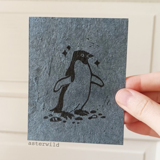
Adélie penguin block print
#id in alt#penguins#adelie penguin#animals#wildlife#birds#block printing#these are in both my etsy & kofi shops!#will put them on fabric patches eventually
231 notes
·
View notes
Text

“The world is ever-changing, but our resolve is unwavering.”
#cael does art#FFXIV#final fantasy XIV#yshtola rhul#y’shtola rhul#this was honestly just everything I enjoy painting#I was in a fabric mood#might be the last one I do before Kupocon#but I just ordered prints for it today#and tapestries!!#which someday I’ll update my shop with
334 notes
·
View notes
Text
In 1957, Walker Evans shot scenes of shops and street vendors on the Lower East Side for a Fortune magazine feature called "The Pitch Direct." These are some of the photos. All are from the Metropolitan Museum of Art.
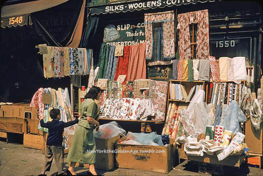


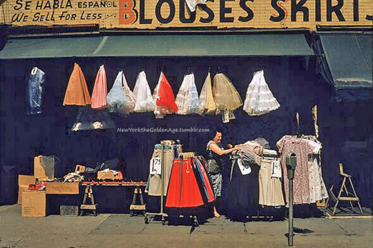
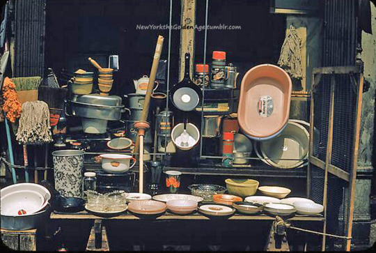
#vintage New York#1950s#Walker Evans#shops#street vendors#Lower East Side#fabric store#produce market#skirts on sale#tchochkes#home goods#color photography
172 notes
·
View notes
Last Seen Blogs

critgemhero
I just can't

fangirlingintellectual
My Personality is basically 60% Tumblr Quotes;
dry-valleys
asquith

notjustanotherdancestudio
Not Just Another Dance Studio Blog

hinadonuts
hina's kin stuff !