#i love all these actors
Text
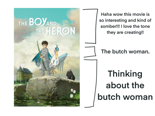
Mostly spoiler free summary of my viewing experience
#The boy and the heron#how do you live#studio ghibli#ghibli#in all honesty that movie was legitimately so fantastic and im like changed as a person#Story wise as well! It hits really hard if you know a bit about miyazaki and his legacy. Its a very personal movie i think#And you can feel it in every aspect#The eng dub voice actors were really good as well and the animation was beautiful as always#Also really loved the tone!!! The story really relied a bit on the use of negative space in both sound and pacing and i enjoyed that alot#in conclusion go read a article about miyazaki and his son and then go watch the movie it’s probably going to be one of my favorites#image id in alt
12K notes
·
View notes
Text
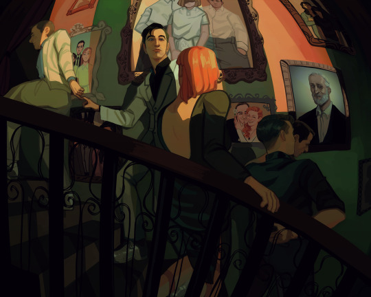
One wedding and three funerals
Background paintings under the cut
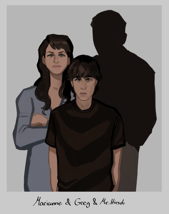
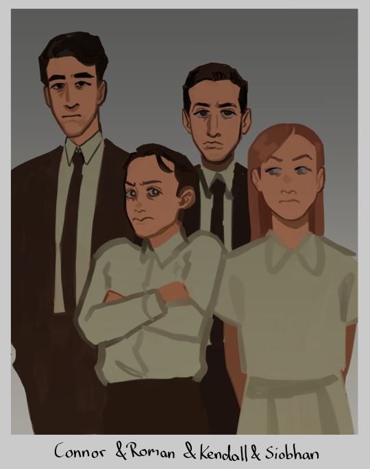
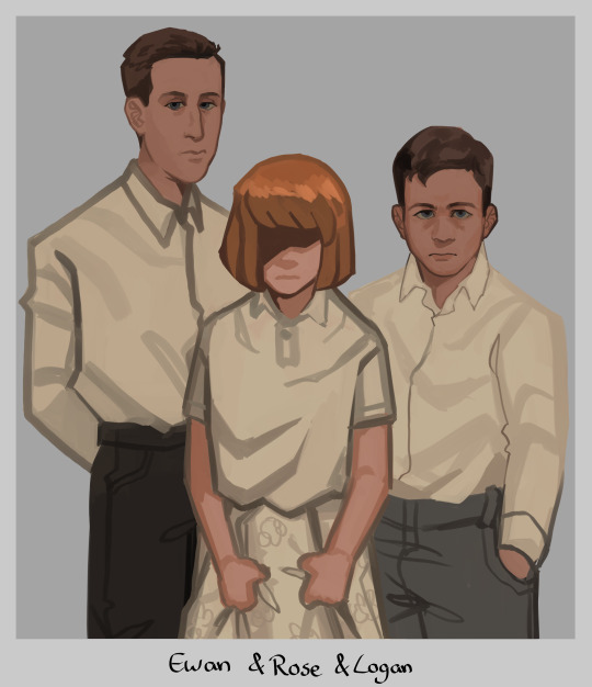
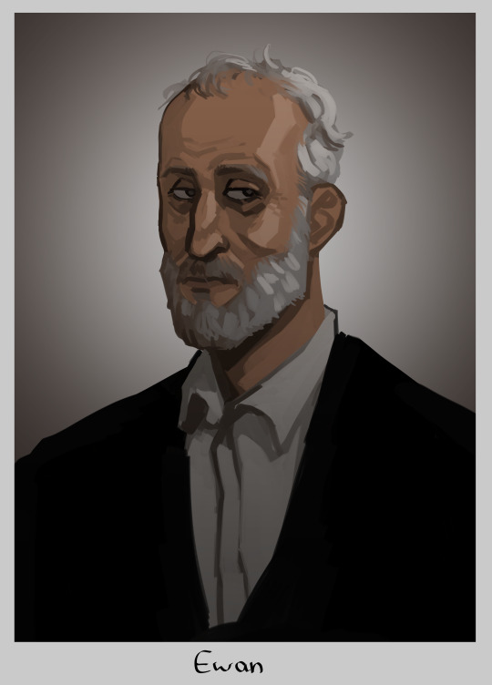
#tomgreg#succession#tom wambsgans#greg hirsch#shiv roy#roman roy#kendall roy#yeah no im not tagging everyone thats too much#this is me going 'how much implications themes and symbolism can i fit in one painting'#yes i gave rose shivs haircolor. if we ever find out how she looks like and its not like this im just gonna pass away i guess#but yeah i hope yall connect the dots#i put waaay too much thought and work into this. i was googling pictures of all the actors as kids just for reference (sigh)#honestly kinda wanted to make tom and greg link pinkies as like. a pinkie promise. but that was too hard to draw in this angle#at least not without obstructing the view of the ring which is important to see so ya#my fave is actually the tomshiv wedding pic i went off with that. i love them... they should have run away to become sheep farmers fr fr#anyway im so glad im done with this UGH!! finally i can draw smth else without being like oh noooo i need to finish this#i see a lot of you wondering why there is no portrait of logan but one of ewan#it's bc the placement of the painting represent their standing. logans portray would not hang next to the stairs#his present portrait hangs at the end of it. all the way up at the top. alone and withering away#basically the picture you see underneath ewan to the right? its where toms parents would be. the right side of the wall is tom and gregs#and the left one is the roy siblings theirs. since they grew up rich rich. and tom and greg didn't#but ya thats why ewan hangs here and logan does not :)
14K notes
·
View notes
Text
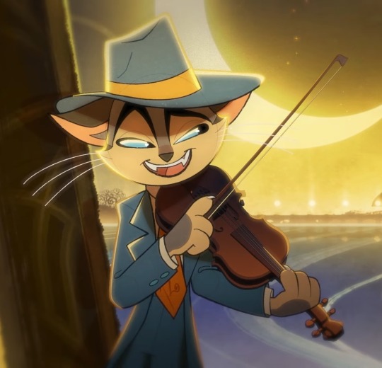
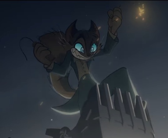
#i love rocky#AND MICHAEL KOVACH VOICES HIM#I LOVE MICHAEL#i'll miss him so much in hazbin hotel my god#his angel dust was perfect#well high hopes for the new voice actor#ANYWAY#BACK TO ROCKY BECAUSE HE DESERVES ALL OF MY ATTENTION#THE VIOLIN??#THE FUCKED UP PART??#THE WAY HE FELL DOWN FROM THAT TOWER RIGHT ON HIS FACE LIKE A CARTOON CHARA... oh#LAUGHED A LOT AT THAT#AND HIS RELATIONSHIP WITH MITZI IS SO ADORABLE#LOVE THEM#LOVE HIM#LOVE THIS SHOW ALREADY#lackadaisy pilot#lackadaisy#lackadaisy animation#rocky rickaby
10K notes
·
View notes
Text

Vincent Price guest stars on The Muppet Show (1977)
#vincent price#the muppets#the Muppet Show#jim henson#muppets#kermit the frog#vinny p#i love him so much#i love how he turns into a child around the muppets and has a blast#he gives it all hes got#i love your face#ahhhhhh#such a gilf#so sexy#i love this campy sexy bisexual#horror#old horror movies#vintage#movie#actor#handsome#gif#my gif#gif made by me
4K notes
·
View notes
Text
I think a lot about Leo’s tendency to push his way into the spotlight despite clearly being a natural in the shadows. Hell, you could argue that his worst moments are when he’s forcing himself onstage, and his best are when he does things no one notices until it’s already been done.
#rottmnt#rise of the teenage mutant ninja turtles#rottmnt leo#rottmnt headcanons#rise leo#His aptitude with subterfuge sleight of hand stealth and speed really push how being a ninja really comes naturally to him.#it’s arguable that his desperation for the spotlight and validation is an act of subterfuge against himself#note that when he’s offered a job as a mascot he’s fine being unknown#when he and splinter win the battle nexus Leo immediately says ‘they love YOU pops’#idk I think so much about how good a ninja Leo is#and how much his persona is more an actor#Leo as a tot is shown a natural skill at katana too so hear me out-#every Leo is a natural ninja but every Leo’s route in life is directly tied to their splinter so#since rise splinter is an actor Leo too aims for it#and he brings it into his whole life - masking always because a Leo makes what they do who they are#I think that Leo naturally falls more in line with that of a typical ninja#his eccentric performer self is his subterfuge skill just set to an 11 at all times#not that that’s NOT him - like I said it’s still undoubtedly a part of Leo#but? idk I think about little moments like Leo being the only one to choose stealth in bug busters#or Leo being the only one to almost get Gus’s dog tags in The Ninja Art of Hide and Seek (he was so close but luck was against him alas)#like- he’s clearly in his element there and he falls into those skills so easily#it’s like how everyone has skills in so many things but some exceed more in some than others do#like Raph? Raph’s the biggest Hero of the bunch of them let’s be perfectly real here. Raph is THE Hero#All the boys are smart in their own rights but Donnie is THE Genius.#and they all have mystic powers but Mikey is THE Mystic Warrior with immense untapped potential#likewise Leo I feel is THE Ninja#but yeah I love how much Leo goes for the spotlight anyway for better or for worse#he IS a performer again make no mistake! but again the way he does it still lines up with his natural ninja aptitude and I love it#Leo loving magic tricks and magicians so much works doubly well here because like#you’d think he’s focused solely on the performance flair - no it’s ALSO and ESPECIALLY the DECEPTION
526 notes
·
View notes
Text
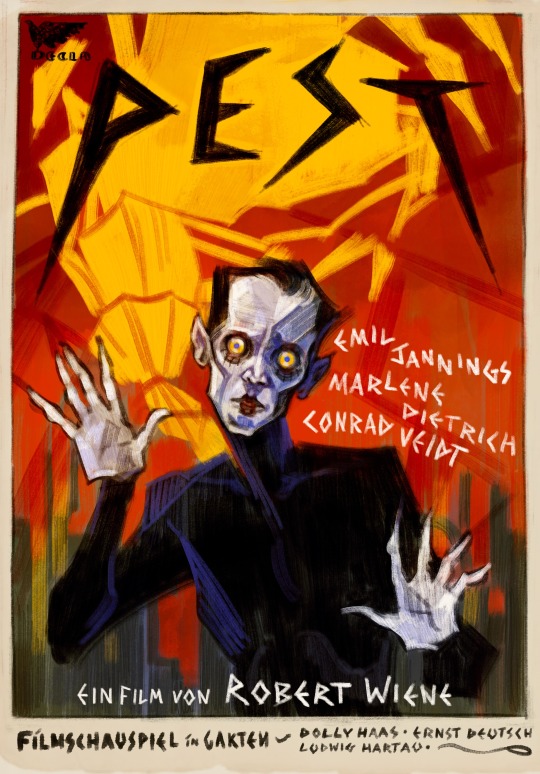
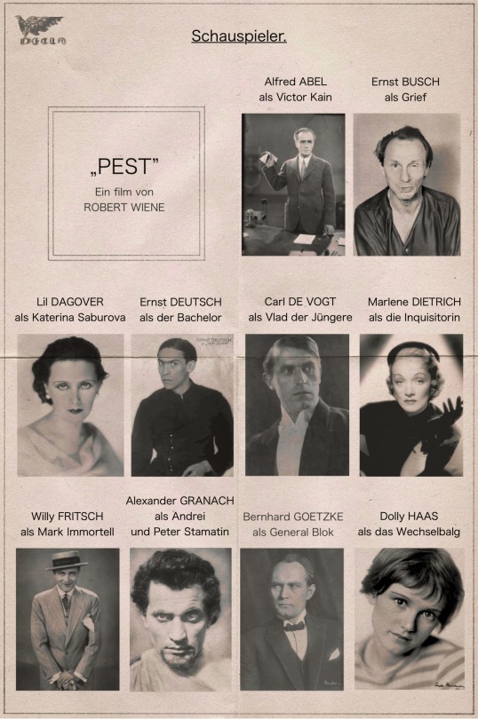

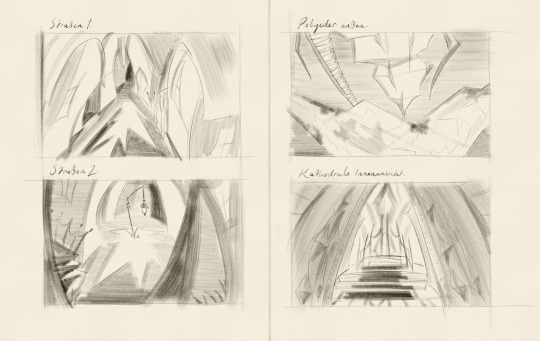
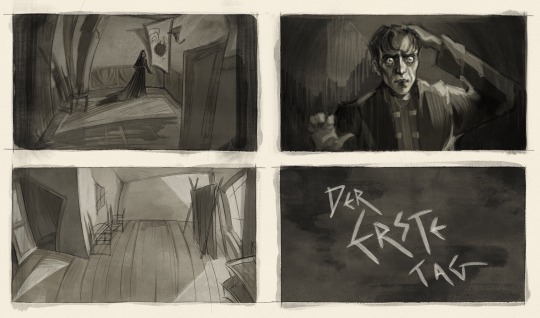
pathologic but it's a lost 1920s german expressionist film [id under cut]
[id:
image 1: a digital drawing of a fake poster, using bright colours and rough, painterly brushstrokes. the title, 'pest' (german for 'plague'), is written at the top in spiky black text. in the foreground a man dressed as a tragedian is staring intently at the viewer, his hands raised and splayed as if in horror. in the background, the town is framed against a red sky, with the polyhedron in yellow behind.
images 2 and 3: fake casting sheets for the film, with the names of the actors and the characters they are playing above a black-and-white portrait photograph of them. all the text is in german. in english it reads:
'Pest', a film by Robert Wiene
Alfred Abel as Victor Kain
Ernst Busch as Grief
Lil Dagover as Katerina Saburova
Ernst Deutsch as the Bachelor
Carl de Vogt as Vlad the Younger
Marlene Dietrich as the Inquisitor
Willy Fritsch as Mark Immortell
Alexander Granach as Andrey and Peter Stamatin
Bernhard Goetzke as General Block
Dolly Haas as the Changeling
Ludwig Hartau as the Haruspex
Brigitte Helm as Anna Angel
Brigitte Horney as Maria Kaina
Emil Jannings as Big Vlad
Gerda Maurus as Yulia Lyuricheva
Lothar Menhert as Georgiy Kain
Asta Nielsen as Lara Ravel
Ossi Oswalda as Eva Yan
Fritz Rasp as Stanislas Rubin
Conrad Veidt as Alexander Saburov and Tragedian
Paul Wegener as Oyun
Gertrud Welcker as Aspity
image 4: four digital sketches of set designs for various locations. all are strongly influenced by expressionist imagery, using extreme angles, warped perspective, and dramatic shapes. they are labelled 'street 1' (a street lined with houses), 'street 2' (a square with a lamppost and a set of steps), 'polyhedron exterior' (the polyhedron walkway), and 'cathedral interior' (the dais at the far end of the cathedral).
image 5: four digital drawings in a black-and-white watercolour style, showing fake stills from the film. all are similarly distorted and lit by dramatic lighting. the first shows katerina's bedroom, with katerina standing in the centre of the floor. the second shows the interior of an infected house. the third shows daniil staring out of the frame in horror, one hand on his head and the other raised as if to ward something off. the fourth shows an intertitle with jagged white text reading 'the first day' against a dark background.
end id.]
#pathologic#artwork#conrad veidt#(i know there are many other actors but i dont have tags for them my bad)#anyway :D this has been my brain project for the past week or so i have been thinking about it so much#i have so many more things i want to draw for it but i am trying to hold myself back. for the sake of my Wrists#also obviously the cast list is way whiter than it should be for pathologic but german expressionist cinema was not particularly diverse an#i was trying to go for realism so apologies for that#i had so much fun with these i dont normally draw locations because i prefer drawing people but i found it so much more enjoyable#when i could mess around with the perspective and make stuff look wacky. thank you expressionism i love you expressionism#also it goes without saying that i was most heavily inspired by the cabinet of dr caligari (which is why i went with robert wiene. he would#do such a great job i think)#i hope you are all well my friends :D kiss you
445 notes
·
View notes
Text
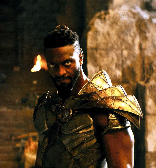
THANK YOU YOUNG MIHAWK ACTOR FOR BLESSING US WITH THIS PICTURE🙏🙏🙏
#monkey d dragon#monkey d. dragon#dragon one piece#one piece dragon#dracule mihawk#hawkeye mihawk#mihawk#his actors name is Theo Le ray btw it’s on his Insta#buggy the clown#buggy#shanks#akagami no shanks#I LOVE THEM ALL SM
463 notes
·
View notes
Text
Not to be that person, but if Stranger Things ends up with Steve and Nancy getting back together, either Will or Robin dead, no ronance, no steddie, no byler, nothing beyond ‘up to interpretation’ of Will’s sexuality, Mike and El happy together... I don’t know, as a queer person, I will be upset.
#this is just my opinion but alas#i will still enjoy the show#BUT#if you're queer#you get me#im sure#stranger things#i would love byler but if it doesnt become a canon thing i will be disappointed but not surprised#but these?#yeah#and dont get me wrong#we all know will's gay#but id bet some casual viewers still dont agree#some people need it spelled out#im not actually expecting steddie or ronance but like#the actors are acting very sus#st4#byler#ronance#steddie
17K notes
·
View notes
Text

well, alex is so in love he could die.
#this still. is. killing me. DEAD.#rwrb#firstprince#red white and royal blue#prince henry fox mountchristen windsor#alex claremont diaz#these actors deserve all the praise#i mean JUST LOOK AT THEM#it's alex and henry in the flesh#im so in love i could die#nicholas galitzine#taylor zakhar perez
1K notes
·
View notes
Text

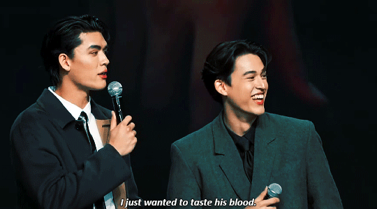
#it's the visuals for me
+
#jossgawin#joss wayar#fluke gawin#gawin caskey#gmmtv 2024#thai actors#my gifs#bypiningbisexuals#hottest bl couple of all time bruh#I love how pompam leo and gawin himself pointed out that even though he's hella tall he looks small next to joss hahaha#to be fair everyone does :')))#my translations
924 notes
·
View notes
Text
hey so friendly reminder
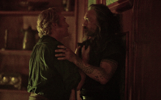
stede gives *full body* kisses
#I love it when actors just go full-body like that#because yes kisses with LOTS OF SPACE in between is a thing that happens!#but they're not the *only* kind#and there is a *very particular message* about a full-body one#especially on screen#and that message is#'somebody said we must live in two separate bodies - but my skin says it misses you -#and my blood remembers when it ran through both our veins -#and every part of me just wants to prove a motherfucker wrong - so let's kiss#and kiss -#until our bodies become one again -#and we can finally take a full deep breath of air#instead of the lonely half-measures that sustained us#for all the years it took to find our other halves again#(...which tbh is kind of a lot for one man's hip-to-hip full-dick action kiss to accomplish but like. I calls it like I sees it)#our flag means death#our flag means death s2 spoilers
904 notes
·
View notes
Text
I haven't seen any posts about this yet but l've seen some fan art that makes me feel this needs to be said:
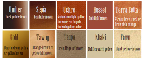
Don't forget Leah Sava Jeffries has darker skin when making Annabeth Chase fan art!
She is much closer to Lupita Nyong'o than Zoe Kravitz when it comes to shading, reflection, and complementary color usage :).
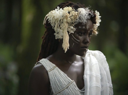
Lighting for dark skin is different on light skin. Light skin gets changed by lighting, and dark skin reflects the lighting. Below is a lovely shot of Nyong'o's character from Wakanda Forever in mourning. The filmmakers emphasize the umber qualities of her skin in contrast to the funereal white and (arguably harsh) light across her shoulder below.
Try to pick spots that aren't directly in or near the light, and try mixing 3 or more! You can put it into a color mixer online, or even color pick, lower the opacity, and lay the shades over each other until you find one that fits. And of course, the more 'realistic' you want to go with shading and lighting, the more shades you're going to want to be able to explore vivaciously :D.
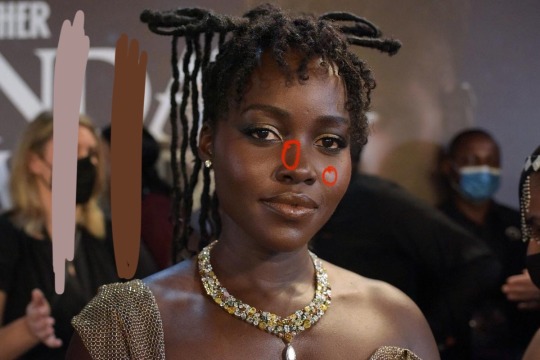
Let's take a look at the same 3 beautiful actresses I mentioned at the beginning, with a bad color picked area and a better-ish color picked area. (Please keep in mind, these are not perfect comparisons, as I was not able to find pictures of all 3 actresses under the same kind of lighting.)
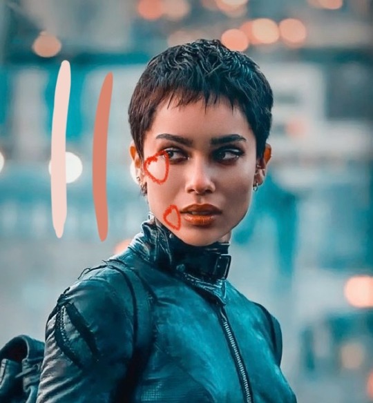
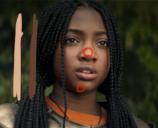
Kravitz's has a clear difference between the two, but they aren't too far apart, in comparison to Nyong’o’s and Jeffries’s. Note the dullness in the poorly picked shades as opposed to the better ones. Also keep in mind that while Kravitz has a rosy undertone (at least in that picture - it’s from The Batman, which has stylized coloring) Nyong’o has a slight cool undertone (I can’t pin down quite what, but the picture is definitely not stylized like Kravitz’s).
Jeffries runs more ochre or russet, but neither of those are pink. They are more red than terracotta or umber, but to call Jeffries’s face rosy would be wrong. Err more towards the golden when drawing her.
^^saved an image from a writing tutorial long ago, but can’t seem to find it. If someone recognizes it, I’ll link it.
EDIT: it’s from this post. Thanks @autumnrowancollector ! <3
And also, the darker skin gets, the less likely warm undertones are going to appear. Don't be afraid to use blue or purple or even green on occasion!
Additionally, cool lighting on dark skin is always a win imo.
(I was going to use that picture of Jeffries as Annabeth by the lightning bolt, but then I realized the lighting on her face doesn’t quite match up with where it should hit from that angle, and I realized they kind of just turned everything bluer, so screenshot time!)
(Also if you want another really great live action example, check out anything Aldis Hodge is in, like Leverage and Black Adam)(and of course there’s Spiderverse <3 but I want to post pictures of Hodge)
Now, to here’s a list of more experienced people’s advice:
Black facial features & hair
Shading digitally for a (somewhat) monotone Black character
Stylistic choices and places to start looking for inspiration (besides a search engine).
Coloring Black people’s lips
A better coloration tutorial
Also a nice tutorial for Indigenous skin tones, just in case yall want to draw Piper or use this information for other dark skinned characters :).
EDIT: Some actresses who are closer in skintone to use for Annabeth, provided by the lovely @blackfemmecharacterdependency ! If you can’t find a reference for Jeffries in a specific lighting, maybe check out these ladies’ pictures! It’s a reblog, so scroll down.
TLDR: Don’t make Annabeth pink and pale, make her dark and golden.
#Annabeth chase#Percy Jackson#percabeth#leah sava jeffries#pjo#leah jeffries#art tutorial#percy jackon and the olympians#I love superheroes and so of course all of the actors I thought of were from superhero movies lmao#also for the record my advice is mostly from reading others’ tutorials and observation#and I don’t really use it a lot because I stick to lineart a lot lol#like down to mentioning Hodge (love himmmm) as a reference for good lighting on dark skin#there’s another post floating around here that specifically mentions him and Leverage for that#I’m tagging this as an art tutorial but really i want it to be more of a master post#master post so yall can see the tutorials I usually use#but then I ended up writing about Jeffries specifically because I’m dumb#I wanted to go to sleep four hours ago I’m dumb#I really want to draw her and ginger Percy but#irl it’s starting to get busy at school again :/
351 notes
·
View notes
Text
My Shounen Brave illustration in this special day🌿✨✨
#happy anniversary!! ;;#this is from two years ago but I still love it! made it with all of my heart!#kagerou#kagepro#kagerouproject#heat haze days#kagerou project#mekakucity actors#kagerou daze#marry kozakura#seto kousuke#marryseto#shounen brave#kgpr_FA#カゲプロ#カゲプロ12周年#カゲロウデイズの日#artists on tumblr#art#digital art#illustration#fanart#support artists#myart
1K notes
·
View notes
Text
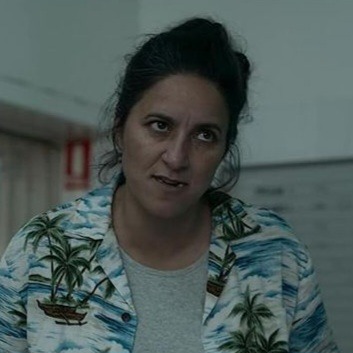

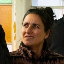
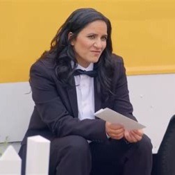
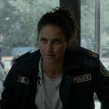


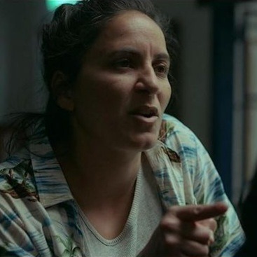


Everybody needs to stop what they're doing and look at her immediately
#madeleine sami#i mean!!!#her smile is sooo gorgeous. and so is her scowl <3#the fact that she does taskmaster nz in a tux is so dangerous i may hyperventilate#i am literally in love 😭 god im down bad rn#also she's such a good actor??? an absolute scene stealer in deadloch and i didn't even recognise her from ofmd???#catch me watching all her other projects. don't look at me rn im blushing
283 notes
·
View notes
Text
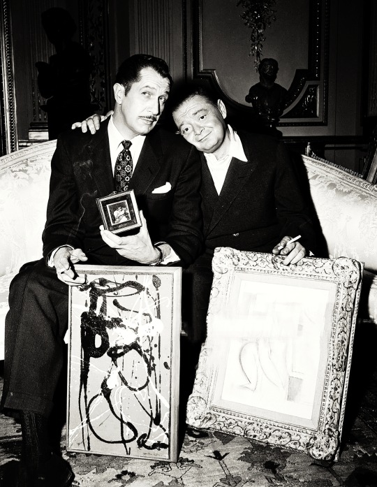
Vincent Price and Peter Lorre...
You have no idea how much I love these guys and this photo. Best fucking picture ever!!
#vincent price#peter lorre#bromance#bromantic#photo#photo edit by me#these guys#the Raven#the comedy of terrors#tales of terror#left fist of david#i love them your honor#vinny and his long legs .....mmmmmm....#he can wrap those legs around me any time he wishes...#what?#I'm feral...#apologies all around#bicon#bisexual#icon#horror#old horror movies#vintage#movie#actor#handsome#art#painting
173 notes
·
View notes
Text
Hey did this moment viscerally hurt anyone else or?
#god I love when actors fucking ACT#orym of the air ashari#critical role#cr spoilers#cr3#ashrym#toramundas clips#its the desperately looking through his character sheet for anything at all that can help in this moment#its the sound of uncomfortable denial in his voice#you can HEAR him processing what he’s looking at and he sounds shaken#Liam is such a fucking good actor my GOD
351 notes
·
View notes
Last Seen Blogs

caffeineinmyspleen
*Procrastination intensifies*

turkishdramas157
Untitled

shopnerd66
my world

milkbreak10
The Journaling of Kinney 112

gemsweater
star trek queer