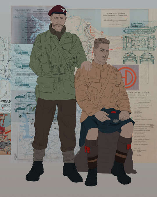
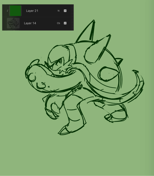
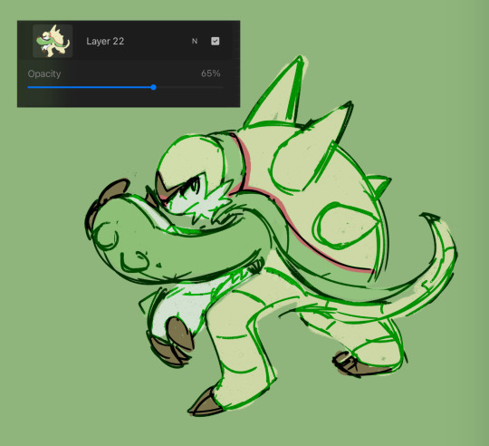
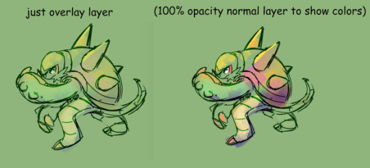
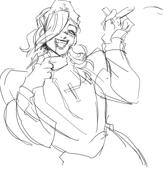
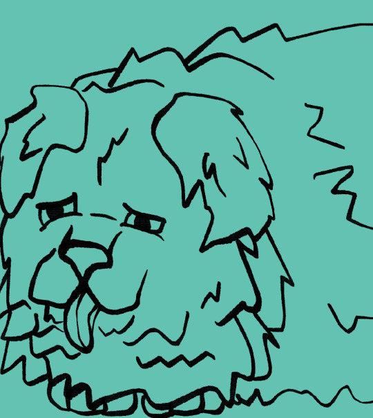
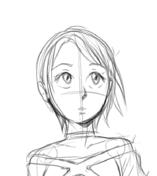
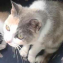
#trying to keep that rough sketch render thing going
Text
Oh, bookstore girl
I wonder what your name is
#ffxiv#lalafell#Ninira Nira#Bookshop AU#work doodle#trying to keep that rough sketch render thing going#this one ended up cleaner tho by virtue of needing to be redrawn from the photo of the one in my notebook#it feels like less atmosphere and emotion than my last one but that's okay I guess#maybe it's not less and just different#touches her face ilu#bookshop au bc I didn't know what to draw her in and slapped a cardigan on her but something about the expression too#anyway posting art at 1am on a thursday 👍#art: mine
91 notes
·
View notes
Text
Ok! I've finally decided to put together a (somewhat) comprehensive tutorial on my latest art~
Please enjoy this little step-by-step 💁♀️
First things first--references!
Now I'm not saying you have to go overboard, but I always find that this is a crucial starting point in any art piece I intend on making. Especially if you're a detail freak like me and want to make it as realistic as possible 🙃
As such, your web browser should look like this at any given point:

Since this is a historical piece, it means hours upon hours of meaningless research just to see what color the socks are, but...again. that isn't, strictly, necessary 😅
Once I've compiled all my lovely ref pics, I usually dump them into a big-ass collage ⬇️
(I will end up not using half of these, alas :'D)
Another reference search for background material, and getting to showcase our models of choice for this occasion~
When picking a reference for an actor or model, the main thing I keep in mind (besides prettiness 🤭) is lighting and orientation. Because I already kinda know what pose I'm gonna go with for this piece, I can look for specific angles that might fit the criteria. I should mention that I am a reference hound, and my current COD actor ref folder looks like this:
Also keep in mind, if you're using a ref that you need to flip, make sure you adjust accordingly. This especially applies to clothing, as certain things like pants zippers and belt buckles can be quite specific ☝️
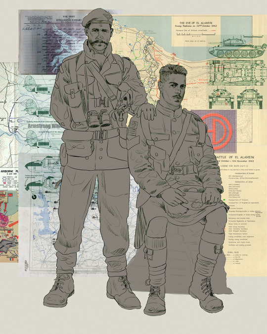
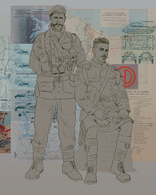
Now that we've spent countless hours googling, it's time to start with a rough sketch:
It doesn't have to be pretty, folks, just a basic guideline of where you want the figures to be.
The next step is to define it more, and I know this looks like that 'how to draw an owl' meme, but I promise--getting from the loose sketch above to below is not that difficult.
Things to keep in mind are--don't go too in-depth with the details, because things are still subject to change at this point. In terms of making a suitable anatomically-correct sketch, I would suggest lots of studying. This doesn't even have to be things like figure drawing, I genuinely look at people around me for inspiration all the time. Familiarize yourself with the human form, and things like weight, proportions, posing will seem a little more feasible.
It's also important at this stage to consider your composition. Remember to flip the canvas frequently to make sure you're not leaning to one side too often. I'm sure something can be said for the spiral fibonacci stuff, which I don't really try to do on purpose, but I think keeping things like symmetry and balance in mind is a good start ✌️
Next step is just blocking in the figures. Standard. No fuss 👍
Now onto the background!
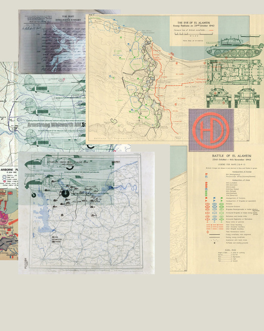
It's frankly hilarious how many people thought I was *hand-drawing* these maps and stuff 😂😂 I cannot even begin to comprehend how insanely difficult that would be. So yeah, we're just taking the lazy copy and paste way out 🤙
I almost always prepare my backgrounds first, and this is mostly to get a general color scheme off the bat. For collage work, it's really just a matter of trial and error, sticking this here, slapping this there, etc. I like to futz around with different overlay options until I've found a nice arrangement. Advice for this is just--go nuts 🤷♀️
Next, I add a few color adjustments. I tend to make at least 2 colors pop in an art piece, and low and behold, they usually tend to be red and blue ❤️💙There's something about warm/cool vibes, idk man..
Now we move on to coloring the figures. This is just a basic block and fill, not really defining any of the details yet.
Next, we add some cursory values. Sloppy airbrush works fine, it'll look better soon I promise 🙏
And now--rendering!
I know a lot of beginner artists are intimidated by rendering, and I can totally understand why. It's just one of those things you have to commit to 💪
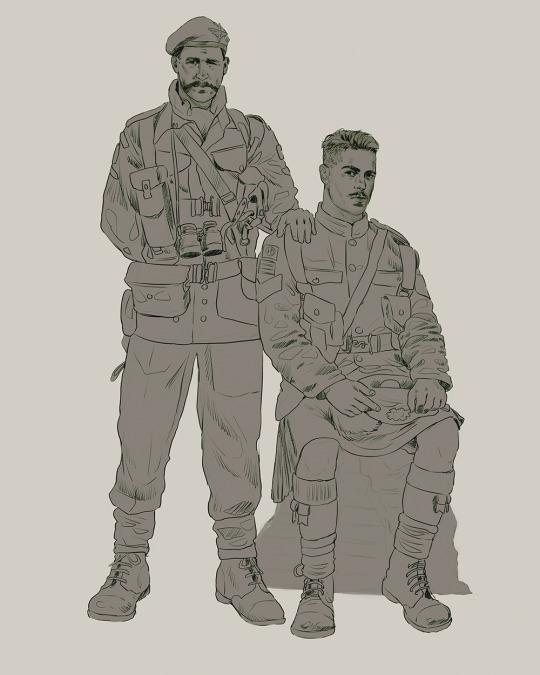
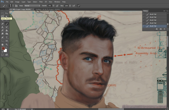
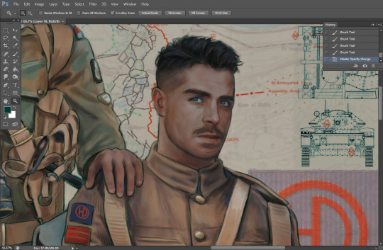
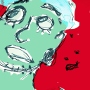
I've decided to show a brief process of rendering our dear Johnny's face here:
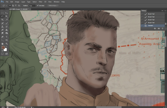
Starting off, I usually rely on the trusty airbrush just to get some color values going. Note--I've kept my sketch layer on top, but feel free to turn it on and off as you work, so as to not be too bound to the sketch. For now, it's just a guideline.
This next stage may look like a huge jump, but it's really just adding more to the foundation. I try to think of it like putting on make-up in a way~ Adding contours, accentuating highlights. This is also where I start adding in more saturation, especially around areas such as ears, nose and lips. Still a bit fuzzy at this point, but that's why we keep adding to it 💪
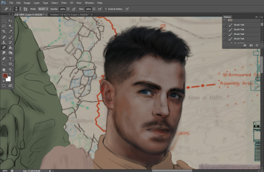
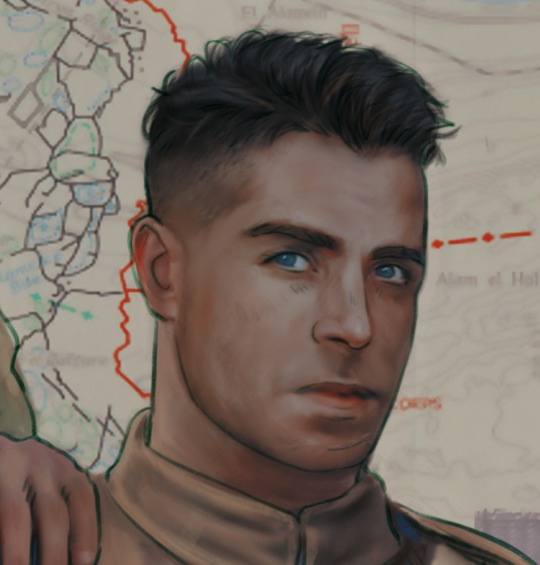
A boy has appeared! See--now I've removed most of the line layer, and it holds up on its own. I'll admit that in order to achieve this realistic style, you'll need lots and lots of practice and skill, which shouldn't be discouraging! Just motivate yourself with the prospect of getting to look at pretty men for countless hours 🙆♀️
I'll probably do a more in-depth explanation about rendering at some point, but let's keep this rolling~
Moving forward is just a process of adding to the figures bit by bit. I do lean towards filling in each section from top to bottom, but you can feel free to pop around to certain parts that appeal to you more. I almost always do the faces first though, because if they end up sucking, I feel less guilty about scrapping it 😂 But no--I think he's pretty enough to proceed 😚
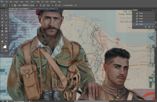
They're coming together now 🙆♀️ Another helpful tip--make sure you reuse color. By that, I mean--try to incorporate various colors throughout your piece, using the eyedropper tool to keep a consistent palette. I try to put in bits of red and blue where I can
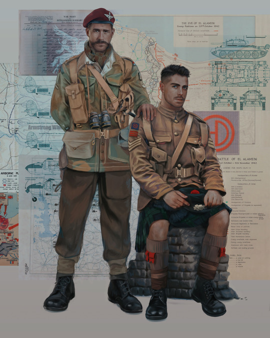
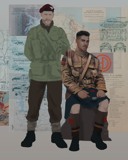
Here they are fully rendered! Notice I've made a few subtle changes from the sketch, like adjusting the belt buckles because I made a mistake 😬 Hence why you shouldn't put too much stock in your initial sketch~
The next step is more of a stylistic choice, but I usually go over everything with an outline, typically in a bright color like green. Occasionally, I can just use my initial line layer, but for this, I've made a brand new, cleaner line 👍
And the final step is adjusting the color and adding some text:
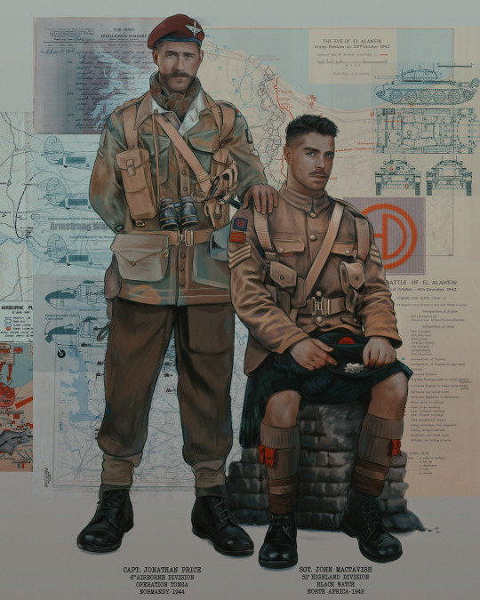
Tada!! It's done!
All in all, this took me the better part of a week, but I have a lot of free time, so yeah ✌️
I hope you appreciated that little walkthrough~ I know people have been asking me how I do my art, but the truth is--I usually have no clue how to explain myself 😅 So have this half-assed tutorial~
As a bonus, here is a cute (cursed) image of Johnny without his mustache:
A baby, a literal infant child !!! who put this wee bairn on the front lines ??! 😭
Anyway! peace out ✌️
#tutorial#my art#art tutorial#since people have been asking#I remembered to save my process from this latest work~#enjoy 🙆♀️
1K notes
·
View notes
Note
have u ever talked anywhere about your coloring or composition processes? u are honestly one of my favorite artists and i would love to hear any insight on how you make pieces 💓
wahh thank you TTT !!! I did sorta give a very simplistic answer here but it was more of my simpler sketchy style so lemme redo that, ill try to be consise and make this understandable ?? its a bit hard cuz it honest to god depends on what Kind of piece im even drawing, cuz for some i go the whole length of doing lineart flats and all that, others i just just fuck around untill it looks right?
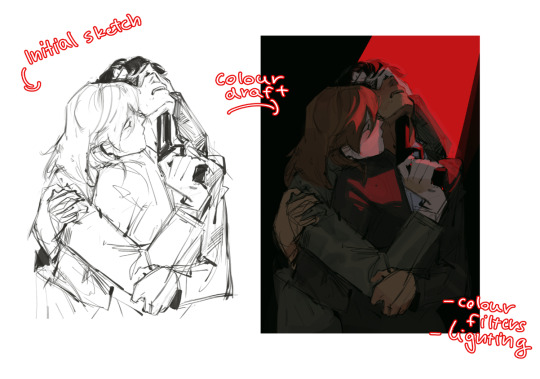
i do usually start with a rough sketch or colour draft, especially with more compley pieces this helps with figuring out the feel, honestly i should spend more time drafting properly, figuring out poses and such but im so lazy i just go w the first thing that looks good
then just lines over the colour draft, fixing lots of anatomy and proportion stuff, and depending on how i wanna do the colours ill either keep the colour layers or merge them together and have the edited colours as the base colour (this might not even make sense help)
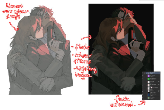
see this piece at the time gave me an insane ammount of trouble with lighting and colours, so after trying to render i ended up merging everything together....which i dont USUALLY do but the rendering is pretty similar except usually i have colours be seperated by layer,
ANYWAYS sadly i dont have a process on how it got from flats to this specific render for this piece...but i still followed my initial drafts/plans with vibe and colours and just painted over it, its why i make it after all!
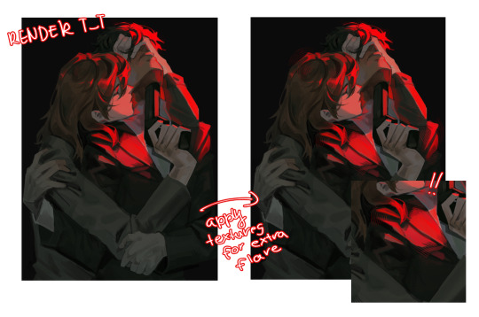
but honestly a lot of times its just very simple colours and just trying to mainting good contrast and values !!!! and THEN fucking around with colours and rextures, for other pieces i kinda just paint as i go? i have this timelapse of my justice piece that may be a bit more help!
it includes the initial colour draft, the cleanup/lining process, flats, rendering, and all that so its probs the most accurate timelapse of my morecomplex work processes, with stuff that doesnt include heavier backgrounds, which is a whole OTHER topic honestly
im sorry if i cant explain it more cohesively, i genuinely barely know what im doing most times and go by muscle memory and stuff i Know but cant. Explain? like i know how light and folds work since i observed and studied them but i cannot put it into words at all )--)0
my brushes also contribute a lot to how i render and colour, depending on what i use, you can find the swatches for them here !
133 notes
·
View notes
Note
I wanna know about your art style. How you draw like that??
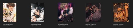
i tried putting down considerations as well as a (very) general step by step of what i do; if there's anything more specific you want me to explain lmk i guess?
first off, general (self imposed) constraints / purpose of project -- this informs what i draw & how i draw it
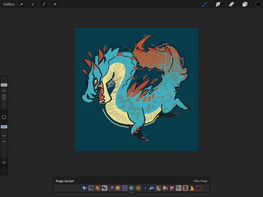
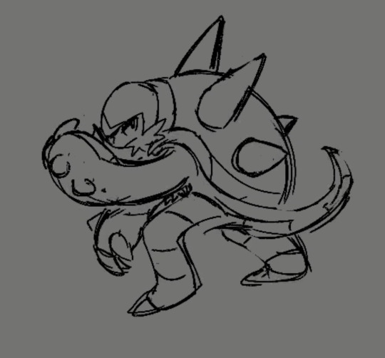
i.e. "kuradex" is pretty different from my normal art (my 5 latest rough illustrations):
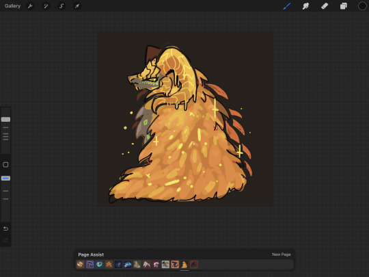
or my monster hunter charms:
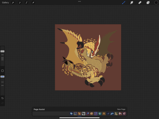
or my pokemon tcg contest illustrations that im not allowed to show until june (😉):
although i've said its for merch purposes, ive started drawing these because i wanted to practice conveying "liveliness" and noticing key features / nuances of a given design, but i didn't want to spend a large amount of time on each one.
so what i came up with is
i want to draw things on-model in terms of proportions ( + take note of weight / tapering of shapes / etc )
no backgrounds & minimal "props"
experiment with / practice line/texture/color/flow/rhythm/etc
spend <1 hr on each pokemon on average (this is a bit more difficult for me to track, but for example, the cyndaquil line took me less than 42min to color, combined, and means at some point in time instead of focusing on cleaning up the art as much as i can, i stop after cleaning up most of it)
that said, the pose & the rhythm/flow of lines are key in conveying liveliness, and if i have a concept in mind i usually end up going with it, but i may go thru a few if i dont.
i consider pokemon origin / lore or a key point in its design, and if i'm particularly stuck, i try looking up pokemon card illustrations for inspiration. (i noticed the research i do is essentially a truncated version of how Atsushi Furusawa does research before doing an illustration.
(& even despite all this i do get stuck sometimes and don't exactly understand a pokemon and just opt for "as cute or cool as i can make it i guess?", but i think it's part of the process...?) (theoretically things that are A Shape should be really easy to draw but with what i want to practice in perspective i find them difficult...)
this is from my latest paid req but these are my first sketches of chesnaught -- i was thinking of how one of its inspirations is a warrior / tanker from RPGs, so i drew a pose where it's shielding its face.

i do another pass and take note of details.
in general i draw overlapping shapes and erase (it's a bit visible on one of the spikes)
because i opt for quickness i start coloring at this point -- i actually just use a colored "color burn" layer & i actually colorpick official art & lay down messy flats & set the color layer to 60%
60% multiply layer for shadows. i tend to use both hard and soft brushes
for bigger projects i would use 2-3 shadow layers to create more "layered" shadows
here i use overlay layer (60%). this is just throwing colors at it and seeing what works and doesn't work. i personally prefer to throw red under the eye and a yellow or blue near the top of the head. this is mostly done with a soft brush

before this point, everything is under the rough lines, but now i actually start drawing/painting over it, color picking the colors that have been laid down from the previous steps and cleaning up / rendering textures (making the green on its arms look fuzzy) / fixing anything that i forgot or looks too off (i.e. the spike on its shoulder and the way the tail curves)

I could potentially keep cleaning this up, but this is where i usually stop 🫡
105 notes
·
View notes
Note
Have u ever posted your comic or animation workflow anywhere? Im super curious on how you tackle the process, especially not using a drawing tablet. I know you have a very simple (and adorable) style so that probably helps in terms of workflow -- Im just curious about the steps you take.
Thank you! With both comics and animation my key thing is to not spend too much time on any particular thing, just draw loose and fast. Honestly the only downside to drawing with a mouse is that I can tell my arm has extremely specific muscle memory regarding it- if my mouse breaks and I get a new one I have to spend a good month or so just letting my hand get used to it again lol. Same with if my setup gets readjusted too much- right now my setup is my mouse on one of those padded mousepads, on top of 2 books, with my elbow resting on my 3DS case (I'll get an actual pillow or something for it eventually lol). But luckily thanks to this I suffer very minimal wrist pain 👍
(...Okay I started to go really in depth in my process here, so sorry if this is way more than what you were asking. Putting it under a readmore just to save space lol)
With MFM in particular, I start by writing out the entire script for the next story arc, which really is just all of the dialogue and vague notes about any important actions. Then I do the paneling with very loose stick-figure like sketches of where the characters are and what they're doing. I prefer having very little planning when it comes to character poses and panel shapes, coming up with those on the fly makes things much more exciting and faster to make. But it's the opposite with dialogue... it needs to be 100% FINAL before I draw a single line lol.


That's part of my script for my most recent chapter, as well as what my extremely loose goofy thumbnail sketching is like. I write the script as one big thing and don't separate it into pages until I actually start drawing- then I go and color change it just to keep track of what dialogue goes on each page
After that, I go back and do the ACTUAL sketch, as well as the lettering (I don't believe this is how it's done professionally. I used to do lettering as the very last step in the process... but then found it hard to cram speech bubbles in the right places lmao.) After that is lineart, coloring, background flat colors, then shading/rendering for all of it. I do each step in batches, as in I sketch out ALL pages of a chapter before moving to lineart, I line ALL pages before starting coloring, etc. I find it way easier to be productive when it's broken up like that, though when I first started the comic I used to draw each page to completion before starting the next (but also, the comic's style was DRASTICALLY simpler back then haha)
(Unfortunately I merged some of the shading to the background flat colors so it's not entirely accurate... oops) FireAlpaca has a sand texture feature that I only found out about last year- adding that to the backgrounds makes them look 10x better with WAY less effort.
With animation, it depends on the project. For simple 5-10 second animation I make for fun, there's very little planning lol. I skip some steps in the process- I'll sketch out the keyframes (and maybe any difficult inbetweens if necessary), line those, then go straight into making linework inbetweens. I'm not a cleanup artist and have no experience in that, so I always find trying to line my rough animation makes everything jittery and wobbly. If I do it with a clean line from the start then I can avoid that and save a lot of time 👍
For my bigger projects (such as the Parvey cartoon and the MFM Kickstarter trailer), I do the whole animatic with final audio first and foremost, with the animatic being almost like the keyframes. I split them up into individual shots, .mp4 files anywhere between 1-30 seconds usually, and animate those one at a time. I'm a huge fan of free to use programs and try to use them as much as I possibly can, here's a list of the ones I use:
FireAlpaca- for the actual drawing part itself (storyboarding/animating/etc). FireAlpaca has a feature that lets you export every frame as it's own drawing, as well as an onion skin mode
Windows Movie Maker- for compiling all of those frames into video format, creating individual shots. If you upload all of your frames and set them to around 0.08 seconds, it equals about 12fps (I usually animate at 0.10 seconds/10fps, its a bit slower but looks nice)
Onlinesequencer.net- for making music. It's the place I've made all of my songs on, like the timeloop song, hyperworkaholic, and the background music for the MFM Kickstarter trailer.
Audacity- for editing audio/music. Also great for recording things directly from your desktop
DaVinci Resolve- for editing and putting together all of the shots into one big video. Can get kind of intensive on the computer during rendering, so watch out.
YouCut (app)- also for editing and compiling shots, I used this one a lot a couple years back but I'm not sure how well it holds up. Doesn't need much phone storage to download but needs a lot to render videos.
MS Paint (yes really)- for typing up text. FireAlpaca has a text option but I don't like it as much as Paint's.
...The only thing I genuinely can't do alone is voice acting. Luckily there's a big voice acting community on Twitter and they're all amazing to work with!
This got... way more in depth than I planned for it to be, so sorry if this is way more than what you were asking lol. But that's my general process when it comes to my art 👍
32 notes
·
View notes
Note
what's your process for coloring like? the look of that elendira is so textured and interesting, i can't figure out how you do it
AA THANK YOUU ^__^ !! textures & brushwork are my favorite things abt my art, so im happy you find it interesting hehe . its SOO cool to look at & so much fun to draw imo
i prefer to color by building in layers , if that makes sense 🤔!! hundreds of them !! such that i'm always drawing on Top of previous layers, working from big & messy blocks of color to, eventually, small and refined blocks of color until it feels processed enough. as a result, i rarely ever erase (!!) and i rarely ever draw lineart aside from the initial sketch
a rough, patchy textured brush is key here, as it'll give you dimension and variability w/ your colors. i recommend "Brush and various sets of fountain pen style (万年筆風ブラシと色々セット)" on Clip Studio (ID: 1679706) !! :3

im terrible with explanations though, so i'm going to show a step by step of that elendira drawing if you dont mind :3
sketch layer !! because i mostly render through color alone, i try to make this as close to the finished thing as possible . ^__^ i hateee drawing the same thing over and over and like the expressivity and movement of my sketches anyways , so the more i can preserve at this step, the better. if u were to look at a side by side of my sketches and finished pieces, youd notice a lot of those og lines are present in the final drawing :3

2. flats !! pretty self explanatory, but the solid background gives me an idea of where the figure begins & ends while the colors themselves help distinguish whats what . i stick to ambient lighting @ this point because im usually not sure what i want to do with the overall palette or lighting yet . having two tones (ex, dark and light in her hair or dark and light on her skin) can also help in identifying key features early on that u wanna preserve. as you build layer by layer, sometimes these areas will remain untouched and i think it makes for a rly lovely feel at the end

3. start blocking !!! to be totally honest with you, i dont really know what i do here HAHAHA. like i just scribble the shit out of it, usually focusing on what i might want to do with lighting (ex: grey areas to accentuate folds in her costume). i think i like to start "erasing" the sketch where possible by coloring on top of it .. like if you look at her hat or her arm , you can tell i'm starting to get a sense of the shapes i like vs the ones i dont. it's at this point that the final image starts to emerge in my mind , like im gradually pulling her from a tarpit of scribbles until shes recognizable lol. chipping away at the marble until i can free her. tbh.

4. keep blockingg...when u think u are done , block some more . as you can probably see, the brushwork becomes more intentional as i add more shape, with specific focus on line weight. this is also where the patchiness of that textured brush comes in - notice how none of the colors seem totally uniform (ex: the red cross or the original sketchlines for her waist). you can see bits and pieces of the layers underneath pushing through and i really like that !! ^__^ its very fun and sketchy to me, so i try to keep them around. those areas are also great to colorpick from, because it'll give you "new" colors to work w/ that are already part of your palette.

5. GRADIENTS & GRADIENT MAPS !! TONE CURVE !! COLOR PICKER !! this is the best stage tbh. flatten your image so its all on one layer and just go crazy with all the color settings in ur program. add gradient layers and set them to darken, or overlay, or subtract, orrr. lighten or dodge glow or divide or soft/hard light.! OR!! edit the hue, saturation, luminosity and contrast.and then color pick from these edits, block even more on top of ur image, flatten, color edit again, etc. etc. until u feel satisfied.
ANYWAYSS . i hope that makes sense @__@ sry i wrote this out and deleted it like 23 times trying to make it make More sense but thats what ive got HAHA i hope its useful though :3 !
#SRY I STRUGGLED 2 EXPLAIN THIS#dude its like my brain bcomes stuffed w/ cotton anytime i try 2 write#i hope it makes sense tho..#it also probably sounds so redundant to make new layer one after the other for just a few brushstrokes#but those brushes i linked have a multiply property so if you draw on top of prev lines they'll create dark patches#and so if im working over a large area ill generally need like . 5 layers each with one brushstroke :sob: if that makes sense#this one had . 84 i think. total. layers i mean. the merylvash one had 300+ HAHAH so it rly depends#like YEAAH i could just use a normal brush but i really like the way this looks#andd sometimes the multiply function works really well or will give me the proper shadow tone im looking for#anywas.wanywaysn anyways#asktag#anonymous#long post
58 notes
·
View notes
Note
May I have Thomas Hewitt or Bubba Sawyer giving their S/O breast massages after breastfeeding their baby (Slashers and their S/O's baby) You can add other slashers if you like. Even I'm starting to like the Sinclairs
Bodacious boob brimming ask bro!
Thomas Hewitt, Bo Sinclair, Vincent Sinclair, and Lester Sinclair, AFAB! Reader, gender neutral reader, racially ambiguous reader, fluff, some suggestive content, headcanons, mentions of breastfeeding, boob massaging, not really NSFW but I still tagged it since I go into some light detail
Thomas Hewitt
you rarely breastfed your baby directly
instead you opted to pump then store the milk for later
while you didn't mind Luda Mae or Thomas watching you breastfeed your baby, Hoyt and Monty were another thing
So you pumped, stored, bottled, then fed your baby like that
But the silicone flange on your pump cracked then tore rendering the device useless until you can get new ones
So you opted to do things the old fashioned way
You never realized how spoiled you were with that fancy pump until you actually had to have your baby drink directly from the tap
It wasn't an unbearable pain but man did you prefer the pump
Afterwards it felt like your breasts were twice as sore than usual
And lucky you with your big bear of a man to come to your rescue
Thomas held you in his lap with your back to his chest and took handfuls of your breasts
He softly rolled your boobs in his hand trying to be careful not to get too rough with your poor sore body
And while you were getting relief from your previous feeding session, Thomas was starting to use your breasts as stress balls
There is just something about how soft and squishy your chest is that really helps him relax
Honestly, he turns massaging your breasts into a daily thing
It's less of a sexual thing with Thomas and more of loving way to destress with you
Bo Sinclair
He can't keep it in his pants
However, it surprised you that he mind your breastfeeding
It wasn't sexual to him, you're the parent of his child doing your part in taking care of it
"Now don't you go drinkin' 'em dry," Bo teased one day, "gotta save some for your pops."
A teasing comment once every blue moon was all that came from him
If you're really tired, he'll hold your guys' baby for you while the little thing suckles
Now when you asked for him to rub your breasts?
Bo went and took it the wrong way
He immediately went for your nipples and became confused when you hissed and pulled away
"Not like that!" you whined grabbing his calloused hands, palm down, to press to your sore breasts
Bo is still turned on by this but will gladly massage your breasts
You don't have to ask him twice
"My baby's all spent and sore?" he'd coo in a low voice as his hands worked wonders in easing the tension in your tits
Having Bo massage you would most likely turn into sex
He just can't help himself with your beautiful body that gave birth to his kid relaxing under his hands
Maybe if you weren't so irresistible, Bo would be less horny
Vincent Sinclair
Vincent suggested that you pump in private or breastfeed in private since he doesn't know how Bo will react
The last thing he wants is some sleazy comment being slung at you by his brother
But Vincent was delightfully surprised when Bo didn't say anything
Sure he glanced to see if he could see some titty but other than that he didn't care
"Glad I dont have to worry 'bout accidentally drinkin' your breastmilk," Bo joked when he learned how you'd rather breastfeed than pump
Vincent on the other hand
He was pretty pumped, pun intended, to drink from you
Massaging your breasts? He's already on it
Long fingers gently rolling the fat of your chest against his palms
Holding and lifting them a little so you could get some relief from their weight
A teasing swipe over your nipple that has you sending a playful warning glance at him
Sit on his lap while he sketches and he'll use your boob like a stress ball with his free hand
Vincent is so gently with your sore breasts you'd honestly fallen asleep one time while he massaged and played with them
Lester Sinclair
Lester gets slightly flushed when he sees you breastfeed
it's less him getting turned on by the act but more that your titty is out
And boy does he love your boobs
He'd help you pump if that's easier
While he does get a little flustered while you're breastfeeding, he still loves to cuddle up to you and your baby while it feeds
Lester would run his hand along the back of the baby's head just in awe at what you two had created
He's at your beck and call whenever you're breastfeeding
Lester has 100% hand fed you while you breastfed your baby
Now when the baby has its post-meal nap, you don't even have to ask twice
His hands are on your breasts the second you put your baby down
It's 50/50 whether Lester turns the massage sexual
Sometimes he just likes reviling in the trust you have for him and how much he loves you as his hands work on your sore boobs
Lester massages your breasts to he's worship the body that birthed his child
The course skin on his hands dragging over your shirt covered breasts as they work out your soreness
He absolutely melts when you lean into him while he's rubbing your boobs
The relaxed look on your face makes him want to cry and hold you until you realize how much he absolutely adores you
Other times, Lester likes to try to get you riled up during the massage
A quick kiss to your neck, a little jiggle, oops did he rub your nipple?
Honestly, he's tried your breastmilk out of curiosity more than any sort of kink
Lester isn't one to actively seek our your breastmilk but he does love sucking your titties and he isn't disappointed when he gets a little snack in the process
#my writing#slashers#slasher#slasher fandom#vincent sinclair#bo sincalir#lester sinclair#thomas hewitt#slasher smut#vincent sinclair x reader#bo sinclair#lester sinclair x reader#slasher x reader#slasher x reader smut#slasher fluff#slasher x reader fluff
164 notes
·
View notes
Text
Gonna try out this commissions thing
For now I'm gonna keep it fairly simple, might end up offering to do more rendered and nsfw commissions once I'm more confident/better able to secure that kind of thing.
Prices
Sketch: $20 (half body), $25 (full body)
Examples:
Lined Art: $35 (half body), $40 (full body)
Examples:
Mono Color: $45 (half body), $50 (full body)
Examples (would not include speech bubbles unless requested):


Flat Color: $55 (half body), $60 (full body)
Examples (would not include speech bubbles unless requested):
Backgrounds are +$15, and additional characters are $+20
You can best contact me through Tumblr, or Discord if we happen to run in the same ones. Keep in mind I might not reply right away, particularly on weekends.
Current estimated turnaround time is 1-2 weeks for a lineart piece, and 2-3 for a mono/flat color piece. I will reach out first with the initial rough sketch concept, then the cleaned up sketch for your approval before finalizing it with lined art.
Important quantifiers below the cut.
If your piece involves an OC, I request some form of your own reference art. It can literally be a stick figure on a napkin, just give me something to go off of.
If your piece involves a character from a piece of media I'm not familiar with, I may ask you to provide some context for me to work from. Yes, I do live under a rock, so it's best to not assume I'll know what you know about your favorite media.
If you do not, for whatever reason, want to provide reference art or context, I will be happy to draw what *I* interpret from your request instead. I don't recommend this option.
I don't typically draw a lot of mech/robot stuff, but I wouldn't say no to giving it a shot for a request. Just....expect it to be very much in my own style.
I can accept payment through paypal, buymeacoffee, or kofi. I request payment upfront.
I am currently not taking NSFW requests, but may in the future. I may also take comic requests in the future - I'm just trying to figure out commissions pricing for that since it's not something I've really seen elsewhere.
Commissioned work is not for commercial use. I am open to commercial and for-profit projects though. That would be best worked out in a private discussion.
You may freely repost your commission, though I request credit where possible. I would also, by default, want to post the commission to my Tumblr and other social medias. If this is an issue for any reason, please let me know upfront.
I do not permit any usage of my work for AI programs or NFTs
66 notes
·
View notes
Text
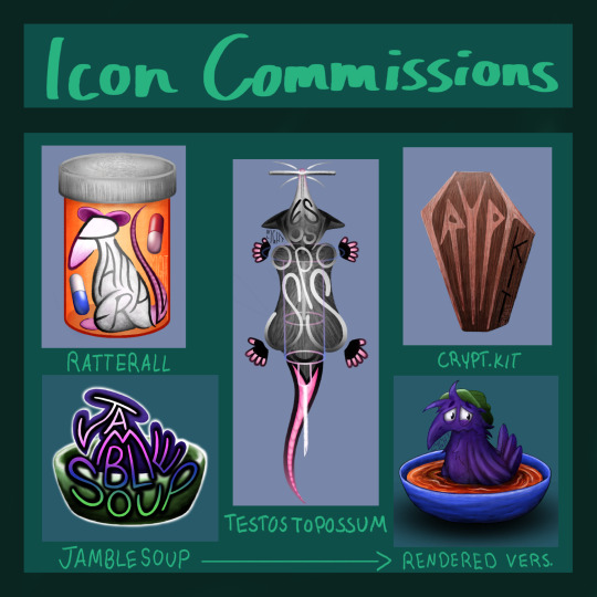
hey hey gamers, moneys getting a bit tight so i wanted to open up commissions for icon/signature designs! ive been using typography to make icons that also double as signatures/watermarks for art, so if there's any artists out there who have been struggling with your personal branding i'm ur guy LOL
pricing is $10 for a basic signature design, $15 for a full icon version like these, and $20 if you also want a render version (see jamblesoup examples above). alternatively if youre not looking for signature/branding help then a regular icon would just be $15.
if you'd like one you can message me on here, or i have a link to my ko-fi in my pinned post. you can find more examples of my art at @nightlight-art or in the #gingeryart tag on this blog!
limits and some extra details on my commission process below the cut:
will not draw:
incest/rape/pedo/you get the gist
will draw but don't have a lot of experience:
furries/mechs/gore/nsfw
commission process:
i'll make you a few sketches based on your prompt, number of which will depend on how specific it is. ill send you them and you can request as many changes as youd like.
once we've decided on a final sketch and rough color palette, i'll proceed to rendering, and send you a heavily watermarked mostly-finished version for final edits. side note, i have had people take advantage of me to get multiple works for the price of one by making me redo things entirely based on issues that should have been pointed out in sketch stages, so i ask you try to be as descriptive as possible during sketching and keep final edit requests to around like 2-5 things, but that's not a hard line as i know those people are rare. as long as it's clear you're trying to work with me and not run me in circles, we'll be good dw.
once we're happy with the final draft, i'll finish up the remaining details and remove watermarks. if you're going through paypal, this is the point where i'll ask for payment, but obv if you're going through ko-fi that'll have already happened.
i'll let you decide if you want me to post the final product publically or not (if yes i'll be sure to tag you!), and i'm happy to send it via email or something to get you the highest resolution
#artists on tumblr#commissions#art commissions#digital art#open commissions#origibberish#gingeryart#also in case anyone is curious only one of these is not a real url and thats testostopossum#my friend was workshopping url ideas so i made a bunch of different icons for them to practice kandksnfk
13 notes
·
View notes
Text


process stages & comments below
( original painting )
process:
i did 70% of this (up to img #6) on my samsung tablet, on my train commutes, battling motion sickness & neck pain lmao
drawing on my tablet is still a lot harder & feels more restrictive for me bc i'm limited by unfamiliar software (still learning CSP) and lack of keyboard shortcuts (my digital art workflow for years). i also struggle with starting / continuing artworks on my tablet unless i've already planned / sketched most of the composition on my PC. likely because 90% of the time when i'm drawing on the tablet, it's on the train. hard to get in the zone as it turns out lol
this is the first full painting i've started and made substantial progress on purely with my samsung tab, so i'm happy it's starting to feel a bit more natural.
also first time i've tried doing a funky gradient map as a colour base. then applied colour on top with multiply blending mode. 10/10 would use fun gradient maps again - helped me introduce more colour variation bc i feel like my colours are usually quite flat by comparison
given the nature of the fucking bumpy melbourne trains & my broken commutes, i can still only do so much rendering on my tablet. the more refined painting will probably always happen using photoshop on my PC bc that's where i feel i have the most control
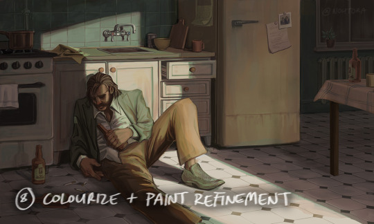
i tried not to overwork / overpaint it too much as i often tend to do, and kept the brush strokes rough and loose as much as possible. made sure my brush wasn't set smaller than a certain size so i wasn't tempted to go into fine detail. you can see i didn't refine harry's form/clothes much beyond img #4 because i didn't want to lose the soft/loose quality of the clothing folds. pretty damn proud of that shoe though. but then i posted it before i realised i forgot to paint in his fucking tie lmaoooo
but yeah, i got my tablet as a secondary drawing device to help me draw more often so i'm gonna keep trying to get the hang of it !!
composition/concept:
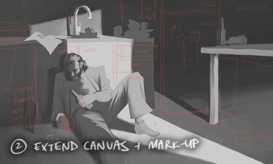
the pose was referenced from this shot of arthur in peaky blinders and i had a vision of HDB slumped over in his kitchen like this

the composition was built around that, and i had the idea of framing it him in shadow and having a strip of light from a doorway illuminating his body. evidence of his drinking and smoking are kept in the shadows.
the original idea was to have a silhouette of someone standing in the doorway (likely jean finding him), but it didn't work with the overall balance & i felt like it interrupted the shape of the light too much / wasn't very legible at that angle. kitchen design was inspired by soviet & post-soviet era style kitchens.
*** feel free to send in an ask if you actually want me to explain how i did things in more detail. these are mostly thoughts for my personal reference
#disco elysium#harry du bois#art process#nohtora art#nohtora wip#sorry my notes aren't comphrensive/intelligible - it's more for me to remember & not a tutorial#always welcome to ask further though <3
59 notes
·
View notes
Text

This is so crazy to me because that is like the one place where you just objectively can't put ai. It wouldn't work. There's no way to make it work. Like fuck them for trying to put it anywhere in the pipeline at all but storyboards are the last place you would ever want it. I'm a firm believer that no matter where you put AI tech in art it's at best going to give you something mediocre and difficult to work with. It's just too much of a black box with too few direct controls. But there are some applications where I can at least see the argument. Background painting for animation is an amazing and complex art form but I can understand how you could use AI to get something mediocre but serviceable by generating a full render based on a sketch. Inbetweening is tedious and while I'm sure AI wouldn't hold a candle to a human for subtle acting I can see where someday you might be able to create a better version of auto-tweening that could handle more complex timing. Hell, clean up and coloring are both slow fiddly tedious processes that would make sense to cut corners on. Again I think cutting any of those jobs is a lazy and poorly thought out idea that you'd only pull if you're creatively bankrupt and only in it for the money but I can see how it would actually save money while still actually making something that resembles a show you could watch. But storyboarding is the one thing that this kind of statistical model will never be able to do. Statistical learning models cannot comprehend things, they don't know what a story is. They can't even tell a knock knock joke let alone a compelling story because they have no way of remembering the events that have happened in the story already or understanding that the pixels and words that they are assembling even relate to the concept of an event. They mash phrases and colors into something that vaguely resembles other stuff that they've been told contains keywords. That's it.
But you expect me to believe you're going to get one to understand enough film language to tell a compelling story over a thousand separate images while consistently keeping the characters believably in the same space and recognizable? And it's gonna do that faster than a person doing thirty second sketches? Nah. I don't buy it.
The amount of bullshit you have to do to convince the black box to put the correct character on the left side of the screen facing the right direction in one image would already be more work than doing rough thumbnails of the whole scene. There is so much specific problem solving that has to go into making a storyboard. We have a hundred years of highly specific cultural baggage that defines how we interpret films. No generative statistical training model will ever be able to do that because they are just not remotely capable of understanding what they're making. They aren't and can't be conscious entities with the ability to interpret meaning, no matter how many objects they can recognize or words they can predict would be likely to follow other words. At best you'll wind up with a jumble of blobs that vaguely resemble the compositions of other films thrown together in an order that makes no sense and some poor worker who you've demoted to a revisionist position will have to sort through them and try to turn them into something that makes any sense and it's going to be slower and worse than if you'd just paid someone to do it right the first time.
If this is true and there are executives who think this is going to happen, they're gonna have a bad wakeup call when they realize their expensive machines aren't capable of more than the visual equivalent of word salad.
8 notes
·
View notes
Note
i don't know how to phrase this any other way so i hope you don't find this rude or anything:
you are (imo) a very skilled, very prolific art toaster. it's great quality artwork obviously, but your turnaround is wicked crazy fast to me. what does burnout look like for you? how do you manage to toast so many arts? what dark magics must you employ??
The hard truth is I worked in journalism for two years between 2010-2012 and customer service/hospitality starting at 16 years old in 2007 all throughout my life until 2022 and I don't want to go back to any of it now that I'm almost 33 - that's the main motivator to keep my freelance gig career doing art commissions going as long as possible. Fear and loathing of going back to that work environment keeps me focused.
In action...I'm not quite sure if I ever experience 'burn out'? I do experience art 'block' in that I can't think of anything to draw on my own or feel really unsatisfied with my work...so I just goof off with my canvas or do studies, but this doesn't interfere with doing commissions where I am told what to draw.
I just enjoy the physical act of drawing. Sometimes when I'm bored and restless and going for a walk doesn't help, I just draw more. When I was a kid I would just come home from school and draw crap between playing Gameboy/N64/Gamecube or browsing Elfwood/Newgrounds/DeviantART/Gaia Online, so it's literally just a habit now. If I don't draw for a long time I feel anxious and unwell. Somehow I just programmed my brain to think that art = leisure fun time, even if it's for work. I also tend to get into a "zone" sometimes and just put on video essays or music and a few hours later I'll have worked through some commission stuff.
I have three 'task lists' for my workflow:
A public trello board organized by work order types (N/SFW link)
A personal trello board organized by type/date in chronological order
A coloured tagging and folder system in my emails where I can just see the actual dates/timestamps of my last correspondence with a client so I know exactly who in my taskboard needs to be prioritized for their next WIP update
I hold myself to a standard of sending a client a WIP in stages:
rough draft (1-14 business days)
revisions (1-5 business days)
line art (1-14 business days)
revisions (1-5 business days)
final render (1-14 business days)
tweaks (1-2 business days)
So ideally, the client gets a finished commission in 3-6 weeks, so about 1-2 months. For larger projects I send more WIPs and the process is obviously longer. For simpler stuff like chibis, it's rarely a full six weeks. Over holidays I add an extra two weeks to my noted turn-around to account for IRL time off. On all my terms of service I have a maximum four months turn-around, essentially doubling the time I know my work flow is just in case there's some sort of medical or equipment emergency in my life that I need to account for that gives me a buffer (I also notify all clients)
Monday to Friday I wake up usually...late morning/early afternoon? I do anywhere from four to eight hours of artwork, broken up by walks, stretching, eating, cleaning, cooking, hanging out with my partner, etc. I look at my personal trello taskboard and emails to see what must be done and what can wait. I try to get at least 1-2 things done in a day though, be that sketches/line art/renders/revisions.
Right now I am looking at my email and task board, and the client with the highest wait time chronologically is someone who is waiting for their final render (sketch and line art already revised and done for them). Last email correspondence with them on the email says 9 days ago (so 7 business days, I'm supposed to take Sat-Sun off). Their order was paid in full and confirmed by me on November 9 and it is currently December 13, so I'm at about the 5 week mark (not accounting for delays in clients getting back to me of course) and I am very much On Course for my work load, no one has been without contact from me for 14 days or more so I'm pretty ahead of my game right now! I could take tomorrow off if I wanted, or only do 3-4 hours of work if I feel like it.
However the more work you finish and post, the more you show prospective clients your ability to finish orders and show your audience more art for engagement, so ideally I always like posting stuff when I can, it just creates a cycle of positive production and income.
17 notes
·
View notes
Note
you create so much art so quickly how are you so fast
Alright gonna answer this honestly instead of just 'uhh i guess xD' lol
1. Work Ethic
(not sure if Ethic is the correct word) I think I have a short attention span, and also work better/faster in shorter bursts when I feel that itch to draw a lot. I try to work with this by setting a limit of the number of slots I think I can handle during this 'hardworking' phase and just going all out.
Also trying to be as disciplined as possible by working only on comms when I open them. This means during this whole time whenever I'm free, I only work on the comms. I only game once I head to bed. I don't have much social interaction or outings during this time.
I emphasize that not EVERYONE must work this way and it will not be healthy if you do this for the long term. I myself have overextended and burnt out (when I disappeared for that 1 year+ 😬)
In fact, many work better by taking short breaks or working on personal stuff in between, and still get things done. For me, I've always preferred to suffer through getting all the work done first and enjoying my break after lol. Just make sure your clients know your working style beforehand in your terms, let them know you might need breaks or just give them a rough schedule.
2. Art Style
Over the years my style has changed quite a bit. When I first started out I would do very detailed, painterly rendering with minimal lineart, or cleaning/redrawing the lineart.
Now I've settled on what I call a 'sketch-loose' style. It works with my working style above. it emulates a little pencil/traditional feeling which I like (so instead of drawing new lineart, I clean up the existing sketch to retain that roughness) , I get to be more loose with my brush strokes (for my impatience), and I think the overall end result still looks fine!
So yea consider having an art style specifically for comms if you want complete as many as possible. It can also be simply offering more options like 'sketch only' or 'flat colors only'.
And of course the more you practice/draw with the same style, the quicker you'll get at it! And the result will only keep improving over time.
Thank you for reading, hope this helps anyone!
37 notes
·
View notes
Note
How to draw Elise
Ooo sure!

When starting with any human, I always begin with a basic outline of the figure. Since I draw Elise with Anime proportions versus realistic ones like her original version, I can bend the realism a bit more to get that effect I want.
Just a note, I can mostly eye things at this point due to just drawing so much for so long and having done many studies of realistic and anime figures, that this sort of thing I can whip up thanks to having a trained eye for it. I recommend reading up figure drawing books and tutorials for learning from real life first before studying into anything stylized like Anime. Learn the rules before breaking them!
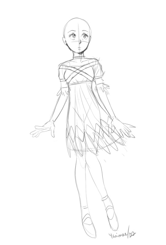
Satisfied with the base figure proportions, I start roughing out the clothing and facial features. Normally I'd do the hair with the face but for the sake of this tutorial, I felt it's easier to see the face without adding it. The base outline helped me know how to fold the clothing around her so it looks believable as to how it drapes on her body. Note that I'm forgoing any details as this is just about charting out how it's functionally going to look before I define things too much.
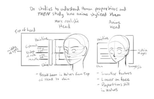
The face is a tougher subject to explain since it's all based on my collected knowledge gained from studying the human figure. I tried to condense it in this little diagram but I strongly recommend doing studies of your own to improve your internal visual library on how faces work. Broadly speaking, this is about how it's broken down from realism to Anime-ish proportions. (I hope this spaghetti makes sense haha)
Since I'm pretty satisfied with her face, I'll roughly outline the hair and get that sorted out. Elise is a very dainty character with wispy features so her hair should be close to the head versus having too much volume. It ties well with her overall theme of "feathers" and lightness, like someone who is easily guided around by the wind (aka Sonic).
Thematic things like this are informative because for me the artist, I want to capture that quality of her since it's strongly indicative of how she's presented. Too many harsh, dark lines or clunky details could easily make her appear too heavy which takes away the "airy" aspect she emits, if that makes sense.

With everything now charted out, I can THEN start refining the edges of things with heavier lines where it'll help for eventually rendering this if I choose to do so. For a sketch though, I think this is enough. I changed her left hand to suit the angle her arm was at and to feel daintier/more comfortable.
Her feet and hands are larger than a regular person's simply because that's the Sonic way :^)
I also keep in mind that Elise is a teenager. I'm not a huge fan of how elongated and tall she looks in Sonic 06 because it makes her feel too adult for her age (This is mostly due to how small her head is compared to her body). I gave her more youthful features like a bigger head, slightly shorter figure and large anime eyes to hint that she's quite young without being AS young like Maria.
I'm at a point where I can do most of these things without breaking it down into such specific steps but for a beginner, it helps to try doing things in this way to help you learn how everything is built on top of basic shapes without getting overwhelmed with details and busy work. Build it up a step at a time. Over time you get a feel for how you're doing it!
#Sonic 06#Princess Elise#fanart#tutorial#onlyart#sketch#Sonic the Hedgehog#art help#ask#anon#people#girl#ask and you shall recieve#this was fun!
122 notes
·
View notes
Text
Health and Art Updates (And a couple of sketches below)
Those who may follow me on my twitter account might know some of what is going on (I'm more active with my posts/interactions there), but for those that don't:
I'll state bluntly, I am developing a condition of some kind in my drawing hand. I'm already disabled and have chronic conditions that affect my energy and time/ability to do activities. But unfortunately some of said conditions make it much more likely to develop certain kinds of arthritis. And right now its not looking good for my hand in particular.
I wont go into details, but it already seems to progressively be getting worse. I will be seeking tests and medical help, though I already have other plans in the way that have to come first, so it will take time before I have definite answers and a treatment plan.
As things are now, I'm resting and trying to take it easy, but still trying to keep up with drawing.
I don't know what this means for my future.
I will still do art, I wont let my conditions stop me. But I don't know how much this may affect the amount of time and care I have to put into it later on.
I'm no stranger to pain, its the time and mobility that really gets to me. I don't know if things will get slower in the future, or more difficult. And I will probably try to continue on as normal as possible, because I'm a stubborn fool that hates change and the limitations I already have enough. But I wont delude myself into thinking that nothing will change and that I don't have to prepare for it.
So, as it stands now, I don't really know what to expect or do. All I can really do is wait at this time.
I don't know if art will take more time for me, or if I may have to make changes regarding how I approach the creating process. I may even have to consider making more bursts of sketch-work rather than full renders at times. (But, again, I'm stubborn)
I state all this here so y'all can be aware of potential changes in the future, and art taking more time. And I will also keep updating every once in a while as things progress.
In the meantime, I have managed a burst of sketches of certain art plans in the future, before my current flareup.
Some really rough examples: I have a full sheet filled with 6 new Zora designs currently in the works. (Jellyfish types this time. I wonder if anyone can guess their inspirations.)
As well as some character work non-Zora related. I don't usually post my non Zelda OCs here much, but I figured I could this time.
So
Regardless of what happens, I will keep drawing. Even when things get difficult.
I just ask and hope you all will be patient with me in the meantime.
#sorry for the long post#just figured i should say something#I will update whenever something new develops#i hope my extra slowness doesnt become a problem#I already hated and was super critical of how much time I took before :<#i will adjust I always do#for those that have enjoyed my work so far- thank you#I hope y'all stick around#health#art#sketch#zora#oc#personal
3 notes
·
View notes
Photo

made a little process image... just so i could remember what i did, mostly, lol. i don’t work digitally much so this is something i’ve been feeling out.
1) rough sketching... reasonably straightforward, but i had a complicated pose in mind so i made sure to keep the key complex parts (like the hand) separate, so erasing and tweaking the position wasn’t too much of a faff (i forget i can do this usually pff). i like having the face fairly well defined but i try and keep it rough and not cover the pose with clothes
2) cleaner sketch & clothing - again fairly straightforward, but this is where composition consideration comes in since the billowing cape and plume is coming into play. sketch shown here wasn’t really doing it for me dynamics wise!!
3) lines & blocking - owing to the complexity and overlapping parts, i wanted to keep different parts of the clean lines on different layers - similar to the sketch, so i could move/alter without affecting overlapping sections. i made colour blocks to match so i could keep track of what was where - in ugly as sin colours so nothing would go unrendered later
4) a step i usually miss/skimp on - tone and colour thumbnailing. not really a thumbnail in this case but i started with the rough green image to get a wrangle on tone - both for an idea of where my planes for shading will be and also to get a focal point sorted! i wanted a nice line between the brightest parts of the image so his face was tonally the focus >:3
after that, i slapped down the “neutral light” base colours and used my tone sketch + gradient maps to sort out how they would be lit. i wanted a sort of sickly but not entirely cold vibe, so i kept the green, added a nice warm gradient map, and then made sure the contrast was nice with a grayscale layer. the result was the image at the top of 4!
5) using a main shade from 4 for each area, i got down the block colours and then started picking through the rendering. technically i started with the main cape bit since the rendering was key to understanding the shape, but after than i worked from the backmost layer to the front - which ended up being a sort of spiral. tweaks to hue and brightness happened as i went - including deepening some shadows and dipping into the lineart occasionally to make the highlights pop >:3
6) not actually pictured but there’s not much to show - background and effects was last - mostly just adding a nice glowy effect to the nails and making some rough flames with a default brush.
there’s definitely some things i wanna go back and fiddle with but... yeah turns out stage 4 is a good one lmaooo
#usually i just have a thought in my head and try and pull the lighting outta my butt#it's a bad habit from my lazy traditional rendering lmaooo
25 notes
·
View notes
Last Seen Blogs
queer-omens-in-the-archives
goncharov (1973)
lofilrk
013
stxrrlit
ʚ🤍ɞ

offranklongbottom
Frank Longbottom
dungeonmastersconsortium
THE DMC