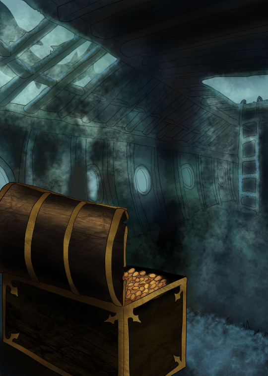
#BACKGROUND IS SO PRETTY. COLORS & TEXTURES SO SOFT. EVERYTHING IS GORGEOUS
Text
reply for @nadiamorgan
She was fortunate in the sense that her home had been freshly renovated by the owner’s before her. While the decor was in major need of someone with taste, the foundation of the home itself was quite gorgeous. “It’s mine too. I learned the hard way that regular coffee doesn’t do much for me these days. I blame New York. Before I went there, I was fine with anything. Except for Lucky Joe’s coffee. If anyone tries to get you to drink that, do yourself a favor and don’t. Their bagels? They’re to die for though.” It was wise advice that she offered out sparing someone the same mistake she’d made years ago. Everyone that was local or had the knowledge of a local knew that their name was entirely misleading.
While busying herself with their coffees, she tuned into every suggestion that fell smoothly off the woman’s lips. “You’re the professional. I’m not going to argue whatever you think, but I’d like to see what you were thinking for the backsplash and accent wall? The cabinets are a nice color but you’re right. maybe they could use a fresh coat of paint.” With two shots poured into two cups, she turned to sit them on the island between herself and the other woman before reaching into the fridge and filling both cups with a small amount of oat milk. “Help yourself with the flavors,” she offered, chin tilted upwards slightly towards the small coffee bar she’d made. “I think I’m more of a minimalist? Less has always been more for me.”
"Lucky Joe's...no to the coffee, yes to the bagels. Noted. It's weird how most shops do one or the other great. The amount of places in California I'd go to specifically for either breakfast or bakery items but no coffee was astronomical." Karuna laughed. "I always thought maybe it was just me, because I typically like my coffee strongly caffeinated but also really really sweet."
This was Karuna's favorite part. Laying down ideas and seeing what hit with a client. That moment when she could see in their eyes that the right option had clicked was everything she worked for. "Okay so here's a few options I was thinking of for the backsplash. Grey is always the color scheme I think of first for minimalist, and it's easy to play with creating a little bit of texture without it feeling too wild. There's this subway tile option if you want something a little bit bigger. Or there's this really pretty quartz background that has a little bit of a sleek shine to it and a marbled effect that gives you a little something to draw the eye without it being blocky." She's focused and inspired, her voice professional but clearly excited about the conversation as she pushed over the pictures she'd pulled for the backsplashes. "If you wanted to repaint the cabinets we could keep the color scheme you've got now but maybe pick a slightly lighter shade, that would go beautifully with the grey. And then we could change out the hardware on the cabinets, get rid of the big round knobs and do more of a silver bar. Give it more of a sleek minimalist clean line vibe. And then for the accent wall, if you wanted more of a monochromatic vibe we could go for a nice dark grey accent wall. If you wanted to switch it up a little we could also do a soft green wall, maybe with some wood accent pieces that match the color of your dining table."

1 note
·
View note
Note
Art question: your colors and lighting are always so gorgeous - what’s your process look like for colors in terms of layering/combining colors?

Ok, time for the end boss, this is probably gonna be a long one so I hope this is still gonna be understandable and not too much as a text post.
First up I’m just gonna put a quick and very basic break down of how I often approach coloring before I go more into detail.
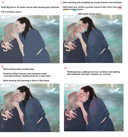
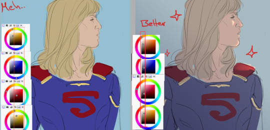
I’d definitely recommend to not leave your canvas white while painting, I either rough in my background first or give the canvas a grey-ish blue color if it doesn’t have one. The bright white of the canvas will make it harder for you to judge colors, having a nice midtone will help you make better color decisions and get more accurate colors!

Here’s a little snippet from a previous post about how I pick color! (check out full post for some useful links)
Here is one of the brushes I really like using in paint tool sai2! Other than that I might use the standard marker tool with a square shape. In clipstudio i try to use similar textured brushes.
To blend or to create soft edges, which really helps you to sculpt your drawiing/painting, I often just start painting on a new layer above the one with the base color and then use a soft eraser! I might also use paint tool sai’s water tool, which I find really useful and pretty unique, I sadly haven’t really been able to replicate it in programs like clip studio.
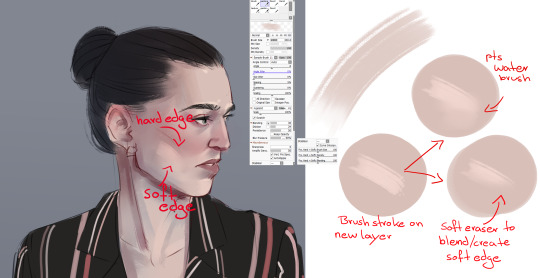
In the two pictures above I already did a lot of defining and painting before I moved to a layer ontop of the lines because the lines were fairly clean already. Sometimes my “underpainting” looks way rougher though and I just put in some blobs of color for hue variation, especially the more red-ish areas and then do most of the painting above the lineart layer!
Not sure if there’s much to say to the overpainting stage, as mentioned before this is just where I clean up the whole drawing and define the features more, especially the eyes, eyebrows and lips.

NOW, the real fun begins....
After I’m mostly done with painting, I start to properly establish the lighting, some people find it easier to do it the other way around, and sometimes I do so too. But often I push for the strong lighting at the end so I can focus more on painting.
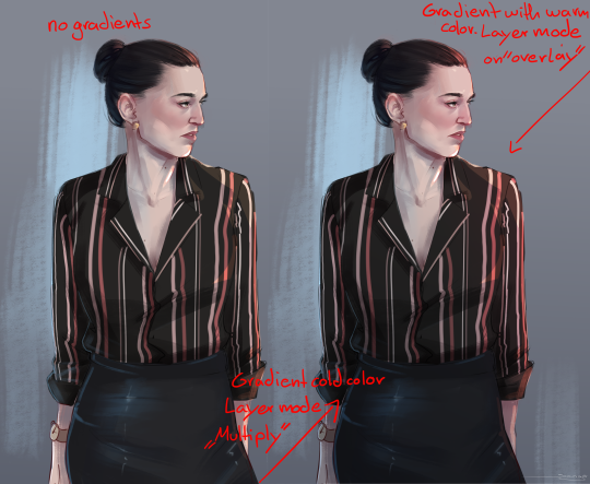
This is where I play around a lot with layer modes, usually I use a combination of overlay and shine to put in some bright warm light from one direction!

The way I do it is I usually put all the layers of the person/object into a folder so it’s separated from the background, then I make a new layer on top of that folder and use clipping group. It works similar to a layer mask, whatever i do in those clipped layers will only affect the layers that are in the folder! Since only my character is in that folder, my background will be left alone.

As mentioned before, I now use gradients to give the entire picture more hue variation and to properly give it strong lighting. Make sure the gradient tool is set to “color to transparency”. I use a warm orange/red color for the top right side where I want the light to hit and put it in overlay mode. And then use a colder purple/blue color on multiply mode and pull it up from the bottom to the middle.
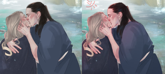
At the end I often adjust the colors a bit, I like to use cool colors in the background to make the warm colors of the skin etc pop! So often I push those reds of the characters a little more! In paint tool sai I just adjust the hue and saturation a bit. In more complex programs like CSP I do it in the color balance option.

You can see how I pushed it a bit more towards red here, to make it stand out more against the blue-ish background. I also pushed the blue’s in the hair color. Giving dark hair blue-ish undertones can make for a really good contrast compared to the warm colors in the skin!
I think this last part is really the most important to me,lighting can REALLY change your entire picture, and I think gradients are a super easy and fast way to do it! If I pull up the picture from the beginning again, you can see just HOW MUCH the picture changed again after I was pretty much done painting by adding strong lighting! It’s a good way to pull the attention to a certain spot, in this case the faces/the kiss, where all the strong saturated colors are!
I also think that a good contrast between warm and cool colors is really important! As you can see I often use that to make my characters stand out from the background. If you put everything in cool colors or everything in warm colors it’s easy to make your object get lost in the background.
I recently found this guys YT channel, he talks alot about warm vs cold colors, which I think is so helpful! I’ve hardly seen any other artists talk about it that much.
If any parts were unclear or I left something out/ someone wants to know more about a certain topic just let me know! Thanks to everyone who’s sent me asks
940 notes
·
View notes
Text
Scarlett and the Professor - a startling revelation
[continued from] [contains brief NSFW material]
The way that Scarlett had kissed him when they parted lingered in Hennessy’s mind far longer than was fit for his intentions towards her. As he fell asleep in the nights that followed; when he woke up in the dark, needing to use the loo. Making him wonder if she was sleeping soundly, warm and soft, and far from his bed. Making him hope that he was the stuff of her dreams.
But this was ludicrous! Untenable and undisciplined. And even as he watched her, innocently sitting two rows back from his desk—modestly attired in a knee length dress of pale peach, silk chiffon, the flawless skin of her throat and decolletage beckoning to him nonetheless—he sure as hellfire intended to do something about it.
Thus far, she had made no obvious attempt to garner his attention. Throughout Monday’s class and today’s—which was quickly winding down—Scarlett had played the part of a model student. Seated demurely while studiously taking notes, alert and attentive, and even raising her hand in bids to answer questions. True, when he allowed himself to call upon her, the slight flush that colored her cheeks was surely on his account, but she answered so confidently that it almost felt like she was daring him to correct her.
She’d worn her hair loose today and on Monday too, instead of her customary chignon. Distracting him with thoughts of how it felt pooled in his hands, spread across the skin of his chest, and—for Christ’s sake!–brushing against his thighs when she worshipped him with her mouth. Goddammit! How the hell had she insinuated herself into his forebrain this way, and after such relatively little time? It boggled the mind.
Hennessy was particularly aware of her scent; the combination of her shampoo, the natural aroma of her skin, combined with her light, delicate perfume. He knew that couldn’t be helped, of course, as he’d worn her scent on his skin during their many hours of sin, and it had lingered on his sheets until his cleaning woman had changed them out. Whenever Hennessy walked the aisle where Scarlett sat, it assaulted his senses, made his mouth water, and caused him just the slightest hesitation in delivery of his lecture.
Even now, as he backed up the aisle on his way to his desk, she didn’t even react when his fingertips just grazed her arm where it rested on her desk. Scarlett before the series of sensual lessons he had granted her would have given a quiet gasp and wouldn’t have been able to tear her eyes from him. This Scarlett was gazing at the blackboard while she absentmindedly nibbled on the end of her pencil, seemingly unaware of how that action made him lick his own lips as he considered the taste and texture of her pretty, precious mouth. Hennessy realized he must do something soon to change the trajectory he was on.
He was so immersed in his thoughts that the noon bell took him by surprise, but he quickly recovered and muttered his dismissal. Scarlett was up and out of his classroom with the rest of the students, not even granting him a moment’s acknowledgement of their wicked secret. How was this to be borne! No lover had turned the tables on him so effortlessly before, and without even trying. But what could he do about Scarlett?
Hennessy took to his chair, mulling over his options, and each seemed less satisfactory than the previous one. His mobile buzzed with a text alert, and he grabbed his phone from the pocket of his jacket, which was draped across the back of his chair. “Well...I’ll...be...damned...” he grinned, his dexterous fingers skating across the keypad in reply. This is practically a deus ex machina, he chuckled, with timing that couldn’t be more perfect.
_______________________________________
Hennessy was nursing his second scotch on the rocks, taking his drink slowly as he figured he’d be hitting the road not long after his awaited guest arrived. This wasn’t so much a bar, as a seedy, roadside dive, but considering the nature of their meetup, it suited the mood perfectly. His belly felt tight with anticipation, further piqued by the burn of the liquor as he scanned the room, satisfied to see that the other few, isolated patrons were involved in minding their own business.
She was late, of course, a perpetual habit which he’d grown accustomed to years ago, but he expected her arrival at any moment now. And sure enough, as though he had summoned her by thought alone, his favorite tall and leggy redhead strolled through the door.
Sylvie Martin, Professor of Biology, specializing in Humans and Primates. Sylvie Caldwell nee Martin, he reminded himself as she approached and he caught the flash of her huge and rather gaudy diamond engagement ring. Interestingly, she was wearing it on her right-hand ring finger rather then her left. A portent of good things to come, as far as Hennessy was concerned.
She wore a snug, silk dress with a Mandarin collar and a slit up one side, with a dark green, Oriental print embossed on it’s emerald green background, along with her trademark spiked heels, in matching green. Sylvie knew that color flattered her best, and she certainly was a sight for sore eyes. Once she spotted him, she moved with unflappable focus towards his booth. “Darling...Henns!” she greeted him as he rose to embrace her, allowing him the familiarity of lingering his palm against her back. No bra...all the better, he thought, breathing in Dior’s J’adore, which had always been her favorite perfume, and wondering if she had arrived sans thong as well. He’d likely discover the answer for himself soon enough.
“Sylvie, you dazzle me as always,” he proclaimed, kissing her cheek, “And honestly, the island hasn’t been the same since you decamped.” Hennessy motioned to the cocktail waitress to bring the round of drinks he’d preordered for them; a dirty martini for Sylvie and another tumbler of scotch for himself. He waited for his guest to slide into the booth and then joined her, not at all hesitant to press his thigh against hers. “So tell me, darling- what brings you back to us now? Business...or pleasure?
“Hennzy,” she smirked, tracing the rim of her glass before eyeing him sideways, “A little bit of business, as I finally found a buyer for my old place.” Sylvie turned to him and ran the same finger along his cheekbone. “And as for pleasure, well...” she sighed and batted her eyes, “...I was counting on you for that.”
“Moi,” he exclaimed, feigning shock, “I thought those days were done! I mean, what would Gerald say?”
“That he married an insatiable tart,” she huffed, then took a deep swallow of her martini, “And that a leopard can’t change her spots, no matter how much luxury you lavish upon her...”
“Ahhhhh, my poor, dear Sylvie,” he tutted, biting his lip against a smirk of his own. Hennessy had been certain when she’d left the University without giving even a week’s notice, and had barely bid farewell to even her closest friends as she pursued the 50-something tech mogul that had feted her through a whirlwind courtship---following him to his home base in the States---that she would be back one day. In the finest gold digger tradition, they had married within a month. Hennessy hoped now, as he had when he first read her text announcing the news, that she’d been smart enough to get a generous prenup. “I’ll be only too glad to help, of course,” he patted her hand in mock consolation, knowing that her heart had never truly been invested in that relationship, “Just tell me what you need, darling.”
Sylvie laughed slyly, confirming what he had expected from the moment he had gotten her text this afternoon, “Well, we could start with a night full of shameless shagging.” Leaning into him, she murmured in his ear, “You know that you were always my favorite fuck buddy for that, Henns.” She tugged his earlobe between her teeth as she pulled away, and his prick twitched with the need she had awoken. “Please don’t say no, darling,” she pouted as she eyed him hungrily, “It’s been ages since I’ve been properly railed.”
Why the hell not, he thought, astounded that the universe had hand delivered the perfect answer to his dilemma. She’s the most delectable, effortless and no-strings-attached distraction that I ever could have asked for. Hennessy grabbed his glass and downed the remaining liquid in a single, hearty swallow. “What the fuck are we waiting for,” he growled, “Which will it be, darling- your place or mine?”
___________________________________
As Sylvie had arrived by Uber, they took took the Spitfire back to her hotel. Never one to stand on ceremony, she didn’t even wait two minutes before she snaked her hand across his thigh. “Mmmmm...good old Hennessy,” she purred, “And your...mmmmm...incomparable...dedicated...always delicious cock...”
He shifted slightly, instinctively thrusting his pelvis up to maximize her access, even while warning her, “Christ, woman---let me get us there in one piece first...”
“I can’t help it, baby,” she whined, “I’ve missed this...missed you...sooooo verrrrry much.”
Hennessy turned her way just enough to note the naked lust in every line of her gorgeous features. There’s never been anything subtle about her, he recalled, as a moue of distaste whispered at the back of his mind; but sometimes a man wants subtlety. Sometimes he wants a woman who’s soft and pliable, and...aching to follow his lead.
He gave a rough shake of his head, banishing that very uncharacteristic course of thought, and pressed his foot down harder on the gas pedal. Sylvie threw back her head at the sudden acceleration, laughing hard and taking that as a sign of his eagerness. “Oh, Henns, you know I’ve always adored when you go fast!” She gave the bulge in his trousers a hearty squeeze.
He grunted back, then plucked her questing hand from his crotch and raised it enough to give it a half-hearted kiss. “Not in everything, Sylvie,” he reminded her, his eyes remaining squarely on the road ahead, “And never when it’s crucial to go slow.”
“Hmmmmm...right. I’d forgotten that sometimes a devil like you can show the patience of a saint,” she trilled, taking back her hand and laying it next to the gear shift, “So I suppose I’d better follow your example---for the time being.”
“You best believe it, Syl...” Much to his chagrin, Hennessy was beginning to remember the slew of things about his friend-with-benefits that used to get on his nerves, and always ended with them going their separate ways for months at a time. Until one or the other of them had an itch for the kind of raw, filthy sex that had been their perpetual default setting. Of course, that was exactly what he was in need of now. At least once we begin, he reckoned, she’ll just shut up and put her mouth to better use than stating the obvious.
She stayed fairly silent for the rest of the trip, likely having picked up the vibe that he wasn’t in the mood for trifling. Sylvie did grab his hand when they exited the car---pulling him along from the parking lot and through the airy lobby, and then into the elevator up to her suite. As soon as the doors slid shut, she had draped her arms around his neck, pressed her body to his as tightly as she could, and captured his mouth with a relentless, probing kiss. Hennessy had answered her advance by cupping her bottom in both hands---finding that ‘yes’ was the answer to his earlier speculation that she might be completely bare under her dress.
He was thinking what a cliche this was, and that he wished she was making their liaison at least a bit challenging. Worse still, Hennessy was finding himself more than a little sorry for Sylvie, wondering just how miserable she must have been since the fresh bloom of her hasty marriage had faded away. That she’d fooled herself into thinking she could endure a union that had no true spark, and that Caldwell’s money would be enough to make her happy with a man who clearly didn’t understand or appreciate her true nature.
But as she swiped her keycard to grant them entry to her rooms, Hennessy reminded himself that he wasn’t here to be her therapist or confessor. He wasn’t going to ask about what problems she was having---be they marital or otherwise---and he hoped that Sylvie wouldn’t try to tell. They each had pressing needs to fulfill, and as far as he was concerned, this was simply a palate cleanser. A chance to put some distance between himself and the threat that he was developing an obsession for the most unlikely of candidates.
Once across the threshold, Sylvie headed towards the bar cart, where sat a sealed bottle of Glenlivit 12-Year, alongside a covered ice bucket. The sight immediately sobered him, as though the universe wanted to remind him of the very memories he was trying to blot out. It’s just coincidence, he tried to convince himself; besides which, Sylvie knows what I like. Of course she’d have that waiting for us, on the presumption that we’d end up here tonight. Hennessy didn’t say a word as she poured out for the both of them---moving to her side instead, to take the tumbler she offered him and set it back down on the bar.
Perplexed, she started to ask why, but he shook his head and then took her face in his hands, to land a needy kiss upon her willing mouth. All that he wanted now was to be in the moment; to spare no thoughts for the past several days, nor any for the future beyond what would happen in the confines of these rooms.
Ensnared in hungry, almost violent kisses to begin with, their hands plucking at one another’s clothing, they ended up on the sofa with Sylvie straddling his hips, bending low to slather his skin, his nipples, the contours of his ribs, with further hot, impatient kisses. Hennessy was well aware where she was leading, and he thrust both hands into her flame-red tresses, gradually guiding her down to her inevitable destination. She slid her body further down so that she could undo his trousers and nuzzle his erection through his briefs.
He groaned at the scrumptious sensation, watching her intently, and she looked up at him with a knowing smile. “Bet I still give the best head on the island, Hennzy,” she proclaimed, then wet her lips and smacked them hard.
“I’ll be the judge of that, Syl,” he countered, laying his head back while tightening his fingers in her hair, “Talk is cheap. Just fucking show me. Right fucking now...”
She tugged his clothing far enough down to give herself full access to his works. And good god, yes, she hadn’t lost a trick; her tongue was as silky and as talented as he remembered. Her fingers knew just what he liked. Her mouth welcomed him greedily, and it all felt bloody fantastic.
Yet something was missing. Something elementary, but vital enough that despite how great it was, he felt a sort of cool detachment. That he was experiencing a purely mechanical act, carried out by rote, devoid of...joy. Stripped of warmth and any connection beyond the physical. Sylvie was dedicated alright, relentlessly sucking and taking him deep, caressing his bollocks and teasing them with her manicured nails, groaning as she worked him---and yet, Hennessy didn’t feel any nearer to his climax. And shockingly, he didn’t care if he came or not.
Without intending to, his fingers went slack in her hair, although Sylvia didn’t seem to notice. He squeezed his eyes tighter, aghast at the sudden notion of losing his erection before she was finished with him. Desperately, he searched his mind for images to help him stave off a humiliation he had never experienced before. His heart jumping ahead, supplying the answer which he couldn’t deny.
Scarlett.
His soft, compliant, delectable Scarlett.
Hennessy drew a sudden gasp---Sylvie would take it for a gasp of pleasure---as the images flooded his mind. Scarlett kneeling before him in the sand, woefully inexperienced and skittish, but bravely following his first demand of her. In his study, sliding onto the floor from his lap, eager to please him, to taste him, but turning shy in the aftermath, at the relish she had taken in their shared sin. His Scarlett. The pure dedication in her eyes as she looked up at him before she began, and the small, sweet sounds she gave over as she generously loved him---which always felt like proof of her devotion. The astonishing beauty of her head and hands adoring him, reflected in the mirror above his bed. And then how she clung to him afterwards, leaving trails of soft, loving kisses on his thighs.
“Yes...yes...mmmmm...that’s my girl,” he murmured, beginning to thrust himself into Sylvie’s mouth. “My darling, little lamb,” he panted, repeatedly hitting the back of Sylvie’s throat, as he imagined it was Scarlett doing the deed, with her pretty, pouty mouth. Her tender, loving tongue. “Fuck...oh fuck, that’s good baby,” he groaned, the need to explode into his orgasm building and building all through his pelvis and his loins, as it hit him that when Scarlett did him, each moment of bliss she gave him arose from her generous and loving heart. “Mine...mine...” he cried out, arching his body off the sofa cushions, grunting with each hard pump of his hips and tugging hard on Sylvie’s hair. “...mine...my jo...” he sighed as he finished, the euphoria and warmth spreading through his veins, mercifully allowing him to forget for a little while that he’d been forced to fantasize in order to reach his to satisfaction.
Sylvie propped herself above him, her lipstick smeared, her mouth and chin slick with her saliva and his semen, and looking very pleased with herself. “God, how I’ve missed that, Henns! Just like old times,” she laughed, “But what’s with this little lamb shit? Where the hell did that come from?”
Hennessy had no problem fibbing his way through that faux pas. His mouth dropped open as though he was shocked and he huffed cynically, “Honestly, Syl? I have no fucking clue...”
She narrowed her eyes and frowned slightly as she looked for the lie on his face. “Alright then- but don’t do it again. If you’re going to call me by a pet name, I’d rather it weren’t a farm animal.”
“Got it,” he winked, “Let’s forget it ever happened.”
“Forgotten already,” she told him, then brushed a quick kiss on his mouth, before clambering off of him. The top of Sylvie’s dress was bunched around her waist, but she didn’t seem to care as she headed to refill her glass and fetch his. This time, when she offered him the scotch, he took it and immediately swallowed half ot it---for he knew he couldn’t avoid what was coming next.
“So, Henns...”Her voice had taken on a pouty, singsong quality, “Not to be gauche, but you owe me one now...”
Christ! Was she always like this, he wondered; and was I just blinded by the sex?
”...well, at least one,” she added, “Although I know you’re good for...many more.” She tossed back the rest of her scotch, gave a shake of her head as the burn went down, then wagged her head in the direction of the bedroom. “How about we crack on, as you Brits like to say?”
“Righto.” Hennessy finished his drink and stood up, resigned to the unsavory outcome he’d wrought for himself. Knowing that he was obliged to a small degree---the wheels in his head busy spinning as he searched for a way to extricate himself with his dignity intact, before he was quite literally in too deep.
tagging: @strangelock221b @thelostsmiles @letterstosherlock @splunge4me2art @tsukuyomi011 @emilyinnj4real @aeterna-auroral-avenger @frowerssx2 @groovyfluxie @humanbornarchangel @elizaaugust @ravencatart @doctor-stephenstrange @ben-c-group-therapy @cumbercougars
#my writing#Scarlett and the Professor#buyer's remorse#Scarlett Campbell#OFC#OMC#not my OMC and used with permission#(as long as tacit permission remains)#Scarlett's wicked Professor#Professor Hennessy#Hennessy.#OFC.#Sylvie Martin
11 notes
·
View notes
Note
🎨 (if u want to!)
HELLO SUNSHINE 🥰🥰🥰 I'm very excited to be able to give you some compliments!!! ❤️ mostly because we haven't had a chance to talk properly yet and for the past two months I'm PROPERLY SLACKING at talking in tags so like people probably think i don't wanna comment when before i used to write essays under all reblogs sksjjs but THAT'S NOT IT I'M JUST LAZY!!! 💀💀 but also I LOVE ALL YOUR STUFF DEARLY ❤️❤️ so let's get into itttt
LITERALLY A FAIRYTALE ✨💘 don't mind my jaw laying somewhere on the floor as we speak but THIS. 🧎♀️ THIS THING. i wanna hang it on my walls do you know what i mean???? 🥴 IT'S SO SIMPLE BUT SO FREAKING PRETTY LIKE I JUST KNOW, IF A GIF COULD SMELL, IT'D SMELL LIKE BUBBLEGUM AND DRIED FLOWERS 🥺 i love the whole color palette this shade of pink is just so good and makes the whole composition so cute and pulls everything together 🥺 AND ALL THESE TEXTURES ALL THE FLOWERS AND THE GIFS ITSELF ITS SO PRETTY AAAA ❤️
one of the prettiest colorings of this performance i've ever seen in my entire life?????? (mind me that we literally got to see this two days ago so like not my ENTIRE life but YOU KNOW WHAT I MEAN OMG MY PUNS ARE SO LAME IGNORE THIS AKSJSJSK) but let me start off with how in ✨love✨ i am in the colors of their skin 😫 it's so golden and beautiful just perfect and it looks so amazingly good paired with beautiful cherry lips (as some of you may noticed i love to focus on color of lips on my gifs skhsjssj so like I'm just OBSESSED) I LOVE THE USE OF CURVES HERE BECAUSE I'M AGAIN OBSESSED WITH IT and the contrast is so soft it looks mind blowing ❤️ I LOVE THE BACKGROUND COLORS SO MUCH THIS BEAUTIFUL VIBRANT CYAN AND ROSE-ORANGES TOGETHER ARE THE PRETTIEST 😍 I love how HQ this is because their outfits look like i could literally touch my screen and feel this silk against my fingers sksjskskks AND I'M OBSESSED WITH THE COLORING ON THEIR OTUFITS TOO OKAY I'LL END HERE LOL ❤️
IS THIS REAL? LIKE FOR REAL???? I WAS SO IN AWE WHEN I SAW THIS 😭😭😭😭 LITERALLY WHAT 😭 and the fact that you said in tags that you colored all of this from scratch *soul leaves the body*.............. it's so amazing i'm literally out of words I CANNOT IMAGINE how long it took to make it i literally don't want to know ALL I KNOW YOU DESERVE ALL THE LOVE FOR MAKING THIS BECAUSE ITS SO GORGEOUS 🥺 at first i thought all of these had one color each but then I SAW THE TRANSITIONS BETWEEN COLORS AND I LITERALLY CALLED OUT FOR MY ENTIRE NEIGHBORHOOD TO COME AND SEE BECAUSE WTF I NEVER SEEN SOMETHING THIS COOL 🤧🤧🤧 💘❤️
okay i'm done screaming LOL you're super talented and I love seeing you on my dash ❤️❤️❤️❤️
creators send me 🎨 & I’ll tell you my favorite of your last ten creations and why
6 notes
·
View notes
Note
Oh pls ✨✨ kurootetsuros(.)tumblr(.)com/mine
hi audrey !! i’m sorry i took so long but here it is!! 😭😭
touka edit i love love these colors omg the red/orange stand out so well and that water effect in the background *chef’s kiff* touka queen 👑
viktor gifs other than the fact that this scene broke my heart, viktor is so pretty and you made him even prettier with this coloring idk i just really love this it’s gorgeous 😭💕
haikyuu!! day coloring this is so cuteeeee ahhhh!!!!!!! teach me how to color pls they look so cute and soft 🥺💕& it’s not much but i like the little highlights you add on their hair and cheeks !!
hinata coloring again pls teach me your ways 😭 this is so good !! i love the way you colored his hair so much (and everything else tbh) i absolutely stan the grainy texture too omg (i can’t stop staring at it help)
gangsta coloring thank you so much for coloring the underrated masterpiece that is gangsta omg again i absolutely love the way you color !! i like the fact that the nail polish and the blood are the same color idk it’s a nice detail asdfghjkl
5 notes
·
View notes
Note
Hi aki!!♡ ✨?? hope you're doing ok!💕
hi camy!! i hope you’ve been doing amazing as well, ilysm ♡♡
Mikasa Ackerman gfx - This is honestly one of the prettiest Mikasa edit I've ever seen AHHHH the soft pastel colors are so stunning, I can stare at it forever and still be in love with it <3 I really like those soft flower brushes/textures in the background. The fonts that you chose made it look so elegant too!!! (My personal fav from this edit is the last one~)
Tanjirou and Nezuko coloring - These are so precious!! I just love these panels that you chose to color, you’re truly doing the fandom a big favor Camy 🥰 I also really admire the way you colored their hair too, it looks so smooth and glossy!
Kamado Tanjirou gifset - This one holds a special place in my heart since it was one of the first gifsets that I’ve seen from you! I remember seeing this and was like "whoa, gorgeous gifs" and smashed that follow button immediately 😆 Tanjirou always look pretty in your colorings <3
Kimetsu no Yaiba gifset - I keep choosing kny edits I can't help it AAAAAAA,,,,,, I couldn't resist this one, everything about this just looks so so soft and makes me so happy <3 This is my absolute favorite gifset of this scene!!!
Levi Ackerman gfx - This just seriously looks so cool! I loveee the purple colors here. The sky in the middle edit stands out to me the most. I really love the layout in all of these kinds of edits (where you turn some of the pictures into sketches), it’s impossible to not know that it is your work once you’ve seen it in your dashboard. It’s always so creative and unique! ♡♡♡
4 notes
·
View notes
Note
Hey! Feel free to not answer this, but I was wondering how you do your Night Sky backgrounds with all the cool stars and galaxy stuffs? It’s gorgeous and I can’t seem to get it nice and flowy like I want- if that makes any sense- Anyways!! You’re very sweet and your art is gorgeous! Feel free to ignore this if it’s too bothersome aaaa thanks bye-
Oohboy. I did do a bunch of screen-capture vids for these, so if you’d like I can edit those and make a few speed-drawing videos if you think it might help more than me trying to talk it out (because tumblr isn’t liking me putting pictures into here) >w
For the most part, a lot of it has to do with using a Really soft brush, a color palette that blends together really well (but also Pops and feels Bright, especially if you want that nebula/galaxy look)
For night skies, Your darkest color is generally gonna be your base, usually that is gonna be a dark-almost-black blue/purple (of course, depending on your lighting, you can get away with a lot of other colors). (you can use black-black, but, that’s gonna be harder to blend other colors with unless they’re closer to grey-scale)
Your nebula/galaxy effect colors are mostly gonna be fairly bright-feeling mid-tones, they should pop against your background if you used a pen-tool or something on it. Which brings me to the Trick! For the most part, you’re gonna be using something like an air-brush tool throughout the whole process until you get to the stars. Use a low-opacity pencil/pen tool for those finer details, but for the most part, you’re gonna be acting like you’re painting clouds.
(Use a full-opacity pen tool if you’re gonna have something like a spotlight effect or a bright horizon/sun/ect. Give yourself transition colors between your darkest color and your brightest color- And then BLUR the HELL out of it or airbrush over it until the transition is nearly seamless)
MKay back to the Not-clouds- aka nebula. I’m gonna be totally honest and tell ya after I air-brushed my baseline colors (again, treating it like I would clouds, making a bunch of rather fluffy soft strokes, I used a cloud-preset pen-tool (if you’re using Sketchbook like I am, find the ‘clouds’ tool set and use the ‘cotton ball’- a life saver). I’d say it acts fairly similar to a sponge tool though.... IDK. Key point is, it blends, but with a soft cloudish texture.. The Texture is probably the most important point to getting it to Feel like a Nebula or even just the Milky Way.
You mostly gotta work in kinda like, half circles. Bubble up. Straight lines are your Enemy. (mostly. we’ll get there.)
So, start with the midtone closest to your bg color (so if you have dark blue, use a brighter blue, or if you have a dark purple, use a bright purple- ect), and then after you get the desired amount of that, switch to your other midtones if you have them (you’re gonna want at least 2, most of the time.) Depending on the effect you want, you might just add a little bit of other colors, or you’ll want a lot! but starting w/ a base color range will help everything blend into the bg
After that, you work in details w/ your brighter colors, dont be afraid of shadow! Go back over w/ your darkest color and get some bubbles back, that’ll give you depth! Depending on how much you want it to take center stage, you’ll decide how much detail you wanna put into highlighting it.
All in all, you’ll want to work with about 3-5 colors for everything. Try not to plop in one random color or tone if you don’t intend to use it across the whole scene, unless you want something to draw Attention.
Your stars aren’t usually gonna be White, they’re probably the Lightest highlight color you have. I usually use a bright blue or purple. Use white when you want something to just pop right out of the screen.
I use another layer and just have a tool for dots of varying sizes and I just fill where I need stars w/ that, and then erase excess. Easier than drawing a million little tiny dots for hours. (I’ve done it. having a tool is 100 times easier, and it make Much more dots than I ever could) After I erase my excess, I blur out or lower the opacity of a few of them to give a feeling of distance/brightness for others. (but if you’re hand drawing all of your tiny little stars you can control that as you make them) And then I go back in and make my Bright Stars w/ their pretty Star Shape (I usually only have about 2-6 of these)
Then that’s about it! All in all, I say your key factors are gonna be Color, Texture, and blending. Just play with it! See what you like! See what comes naturally to you, find tools that make things easier. Do you & have fun! ^u^
30 notes
·
View notes
Note
hi kath!!! congrats on 1.5k wow!! you deserve every single one of them + thousands more love! can i have ☁︎ & *? (ill send the creations & question in a pm since its easier) so i started following you 2 years ago for your gorgeous sw content. you reblogged, and posted the most gorgeous graphics and i was immediately drawn to it! i also really loved the aesthetic of your blog, everything matched and looked so nice!!
Hi, Tippy ♡ Thank you for joining my celebration, I’ll gladly answer both of these, I love your creations so I’m expecting some fun time analyzing them. JOIN MY CELEBRATION
☁︎Reviewing/commenting on creations of your choiceTHIS GIFSET -Aw, gifsets always amaze me simply because differently than other kinds of creations they require a lot of attention ( ooking for good scenes, coloring, setting everything in place etc.) I do earnestly like this exact one, especially because it’s not completely bw and has that bluesih hue. I love the combination of dark and bright scenes and especially this exact gif, I’m simply in love with “object in background” gifs. I personally like a little slower gifs that that but it’s not too disturbing. Overall I’ll give it ★★★★/★ nevertheless. (4.5 stars)THIS GRAPHIC - AW YES! I don’t even need to look at it as I’m commenting simply because I remember it so well from the first time I saw it! I truly like it, especially because of the dirty rose color. You chose appealing textures for the background and I especially like the brush one for the bottom one. As for my favourite detail it would be something seemingly silly but the text bacgkround in the second graphic (pink kind of border or whatever) really gives me that aesthetic vibe. I’ll rate it a strong ★★★★★.THIS GRAPHIC -Aw, to be completely honest, this is one of my favourites. I haven’t seen the show itself so it’s hard to say if it’s character accurate but in terms of PS skills it’s an absolute masterpiece. My secret pleasure is this kind of graphics. They are so misc and aesthetic and just- simple at the same time, great job there. Also the font is honestly pretty, I can’t tell which one it is but it is often used in graphics and it gives me that look of completeness. A good choice for sure. I personally would have played around with this one but that’s just my inability to enjoy color hah. I do love this one A LOT. The fact that you made more than two and had inspo to make evn 6 and also A GIF is an absolute miracle uwu. LOVE IT! A big big ★★★★★.
*Answering an and all editing questions/consulting personally Q: How to erase background when making screencap graphics and add textures instead? A: First of all, let’s begin with what’s best for removing background and having only the characters visible. If you are lucky, by googling a characters name +the word png you’ll find some pretty pictures and will be able to use it for your graphics. And if you need a specific scene to cut, I recomment using the quick selection tool. It’s easy to use, simply select the object you wish, and if you want to deselect something click this and work around it the same way. When everything is selected, before cutting it out I recomment clicking here and playing around with the smoothness and edges when setting the background opacity to 0. It will give you a preview of what everything will look like. Then right click on the object and “layer via copy”. That’s it, delete the background layer and enjoy your png!Now, set the background color to whatever you wish it to be. Have your psd on top. Simply paste/add manually the texture/pattern you need and then play around witht the blending modes. Which one the texture requires to look a certain way can depend on what it is. For example a texture like this will likely look good with darker color, multiply, darken as it empahises the dark spots of the image. The opposite with the ones that have light patterns then use lighten, screen, soft light etc. It’s a game, play around, there is no rule! And that’s it, feel free to ask more if it’s still unclear ♡
1 note
·
View note
Text
some cool music things i noticed about say my name !!!!
ok right off the bat im gonna preface this with the fact that i am HEAVILY biased bc imo this song right here ?? already one of the bests of 2019 u can quote me on this i dont care but im saying it now ok (im not even gonna go into the choreo/mv/concept OOF)
overall i just think its so well produced and epic sounding and feel-good but still clean and its just. its just done so well but anyways !! lets get into it
immediately it starts off with just this guitar and flute-y thing (??) duo with super minimal percussion, but it sets off the tone of the song perfectly and the guitar does a rlly good job of establishing the groove
something about a high flute always feels rlly pastoral/pirate-y/bandit-y/wild wild west-y so its a smart choice of instrumentation definitely
(imo it was the perfect decision to have hongjoong start off the song, not only bc its symbolic of the group but also bc his voice starts off nice nd soft but then it transitions into a deeper and darker tone and wow he rlly did that)
the percussion starts to kick in a bit after ATEEZ PRESENT which is nice bc its like theyre introducing themselves as a group and then building up the energy of the song. idk i just think its nice nd it makes a lot of sense
having the vocals bounce back and forth between the rap parts after the intro is rlly smart to keep the ear interested
when seonghwa comes in with the “modu yeogiro” part theres a synth in the background that sounds like an emergency siren (?) almost and its super cool bc it builds up both the energy and the mood of the song woWOwooWow its a new element sonically that still fits and reinforces the whole “bandit” thing
jonghos vocals OOOOOF one of the biggest things im impressed with in this song is how well the vocals seem to pull off and also make the song stand out. its not an easy concept at all but theyre all crazy talented and each members vocal color and tone fits and gives it that nice extra oomph that it needs
for example, jonghos tone is bright and rich and full when he sings the “soneul deureora” part and it gives that extra humming push of tension to the song and its just gorgeous ugugughufhgu
the prechorus is ,, amazing. one of the best ive heard from ateez tbh. the vocal layering is gorgeous (one thing ateez does absolutely perfectly always is their harmonies. its just so *clenches fist* harmonic) the mild drone in the background rlly helps out with that too
during wooyoungs “yessir” part the percussion kind of drops out and it comes back in during the drop (say my name say my name) and its a small thing but it rlly helps to reinforce the epic, bombastic, theatrical nature of the chorus
the prechorus as a whole is sort of staccato, choppy sounding, broken up like, and it sets up this great textural difference with the chorus when the smooth and dark “say my name” part comes, and everythings all melodic and cool
another thing that helps the transition rlly well so that it doesnt sound disjointed or out of place is hongjoongs “yessir bureume eungdap” bc its touched with a small bit of autotune and it fits perfectly imo (@ ppl who dont think autotune is a valid effect to use in songs figHT ME) and then the almost morphed, molasses sounding chorus makes a lot of sense
THE CHORUS
the chorus is so deep and powerful and swaggering and dark and its rlly helped along by these random little synths mimicking brass (??) in the background picking out notes from a minor (modal ??? someone smarter than me fact check this pls) scale
whoevers doing most of the singing at that part (minus all the layering ofc) has just got the PERFECT tonal color and texture (i think its mingi or maybe seonghwa ??? not quite sure but its like ,, so deep its nearly demonic ??? but its so so so so good it feels like its pulling at something deep inside you dragging it up to the surface sjdksjdsk) im not sure if theres an effect on it that makes it sound so dark and satisfying
but it works rlly well bc its also not like constantly super dark and monstrous its interpersed with lighter lines and pieces (for example, hongjoongs line that starts w “nareul bulleojwo” bc his naturally higher and more nasally ? rapping tone sets off the contrast rllly well)
mingis tonal color is just perfect for this song esp during his rap verse. his voice is dark and well rounded but unique and stable oof can u tell i love him
same with hongjoongs style its light and quick and agile which is a nice contrast to both mingis rap style and the song as a whole zooM IN HERE CAUSE IM THE CAPTAIN
the bridge is where everything smooths out and theres rlly nothing left in the instrumental except a melodic tinkling piano and its soothing and pretty but it still moves and builds when the vocals start doubling and especially with all of them singing those “woahs” in the background until the last line w jonghos gorgeous vocals and this air horn ?? comes in you know like the ones used in memes except it fits rlly well here
a teensy thing i noticed is that at the start seonghwas vocals cut in a bit louder/more up close in the mix than others ??? and then after his part it goes back to normal which in all honesty i have no clue if that was on purpose but its definitely not something from my end (it plays like that on my phone, laptop, headphones, etc. and its in every single other video out there like reactions or stuff like that) idk if its important but its something that kind of jumped out at me and whatever it is it does a good job of establishing the softer and more intimate sound of the bridge
and then, oh my god
everything, all the instrumental, drops out and then this absolutely godly “say my name say my name say my name” just fills the entire space of the track and listen idk about you guys but this part feels nearly like a spiritual experience theres something about the harmony and the voices layering and ugh its just. its just so good
when the instrumental kicks back in its just grand and masterful and the chord progression is the kind that just feels so epic and satisfying to the soul
anyways thanks for coming to my ted talk
i probably missed a bunch of other super cool things and im rlly sorry if there are any technical mistakes ya girls a dumb bitch™ but uh yeah
stan talent stan ateez :’)
#ateez#atiny#kq fellaz#say my name#kpop#kim hongjoong#park seonghwa#jeong yunho#kang yeosang#choi san#song mingi#jung wooyoung#choi jongho#kpop rookies#treasure ep 2: zero to one#personal#kpop music theory#uhhhhh i dont rlly know what to tag this as ahhhh#this was in all honesty more for me to get all my thoughts out somewhere#hongjoong#seonghwa#yunho#yeosang#san#mingi#wooyoung#jongho#kq entertainment#zero to one
112 notes
·
View notes
Photo
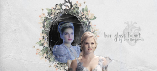
Art Spotlight: Her Glass Heart [Cover Art] by @possibilityofmagic!
This is GORGEOUS. I could probably just stare at it forever?? It's so soft and so pretty and I LOVE IT!!!... I haven't read the fic yet, or the book, but this art is such a wonderful draw. That ornate frame with the flowers is gorgeous. And the soft colors and whisper of trees are so inviting, but mostly it's the depiction of the characters that make me really want to dive in… it certainly would grab my attention if i were to see this as a book in the store… I ADORE the softness here?? In the way everything works together: your color scheme, the brushes, the textures you used, their EXPRESSIONS. <3… The emotion in all the chosen stills too really give the entire thing a theme, a feel, a look. It's Regina looking like she doesn't know how to feel and Emma trying to reach her… In the center panel regina looks so LONGING for Emma, it's heartwrenchingly evocative. It's so so beautiful… i love the whole vibe and tone of it. the way it's soft and also heartbreaking. you've achieved a balance between the harsh shatter of having a heart incapable of love and a heart reaching out to love anyway and it's amazing… The shattered glass behind Regina and the anatomical heart are a nice tie in to the title; and the font you used for the title is gorgeous… The colour scheme and the little cracks along the entire picture that draw the eye to the broken mirror is stunning…The softness of the Emma background is such a cool juxtaposition to the sharp jaggedness of the broken glass around regina… I love the texture of the background with the trees just visible, and the border on the mirror is gorgeous. I also love how detailed the edges of the broken glass are, they look insanely real… This is so STUNNING WOW I love the soft pastel colors you used, the broken shards of glass melded in the background… I was going to try and pick out a favourite thing but I can’t because everything is so pretty and it all works so nicely together to create this beautiful piece of art.
Enjoyed this art? Be sure to give back and feed the artist! A happy, appreciated artist is one who’s going to be more motivated to gift us all with more of their beautiful work.
10 notes
·
View notes
Photo


April 2018 Favorites
Skin Care:
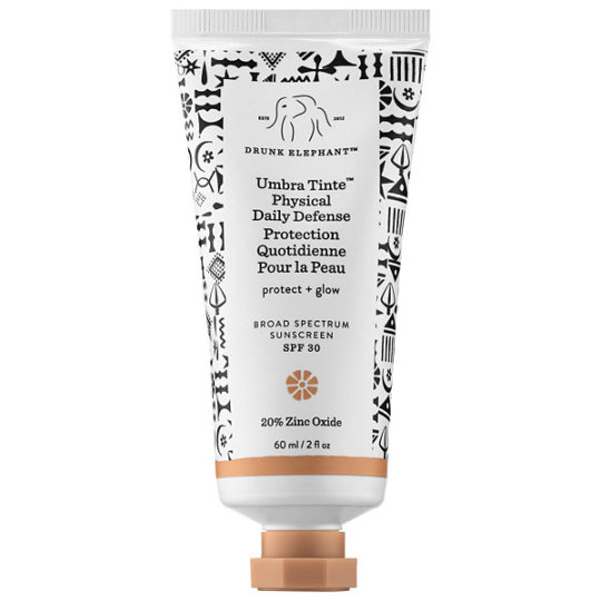
Drunk Elephant Umbra Tinte Physical Daily Defense
This was a standout product this month. I love everything about this sunscreen! It’s a physical sunscreen, so it’s great for sensitive skins and you get that guaranteed broad-spectrum protection. The texture is soft and spreadable. I find I can use this and skip moisturizer in the AM. The tint is GORGEOUS- it makes my face look rosy and glowy and it blurs imperfections. If I’m feeling cheap, I can mix this product into another sunscreen and it still gives me some color (I like to do this for my neck and décolletage). Just so fantastic! I can’t recommend it enough. Wait for the next VIB sale (or don’t 😉) and pick up a tube!
DHC Deep Cleansing Oil
I had a little mishap with EBay, where I ordered a HUGE 400ml bottle of what I thought was the Muji Sensitive Skin Cleansing Oil. I ended up buying the Mild version by accident- my skin ended up reacting to it. And because it’s EBay, it was not worth sending it back. OTL
So, I was stuck with a gigantic bottle of oil cleanser I can’t use on my face, the last bits of my Eve Lom cleanser that I’m hoarding, and no other options. Amazon immediately comes to mind in those situations. Prime shipping 🙌
It never occurred to me that the DHC Deep Cleansing Oil and the Muji Sensitive both have very similar ingredients lists. I picked up a bottle of the DHC and I’m so glad I did. It’s a great product. Super simple and gentle ingredients list, emulsifies beautifully- it’s definitely a more accessible alternative to the Muji. I’m very happy with it.
Caudalie Grape Water
I’ve mentioned how much I like this product in the past. I’ll start with the can itself- all mists can be judged based on the kind of spray action they use. This is an aerosolized can, so the mist comes out BEAUTIFULLY. It’s a fine mist that slowly but surely covers your whole face; no random droplets smacking your face. The product itself is solid. I personally love the light raisin scent. Elevating itself from other watery mists, it contains antioxidants. I like to use this after a shower, in between skin care steps, and throughout the day to keep my face hydrated.
Body:
Burt’s Bees Body Lotion for Dry Skin with Cocoa & Cupuaçu Butters
Everyone loves a good body lotion. This one by Burt’s Bees does the job and does it well. It’s full of butters and oils, but it doesn’t feel heavy on the skin. You’ll notice an instant and lasting increase in hydration. The smell is also lovely- it’s a vanilla and cocoa scent, but it’s very light. If you have super dry skin, this may not be enough, but for your average skin I think this is a perfect balance of giving your skin what it needs without feeling greasy. Also, if you’re into “natural” beauty, this is for you.
Miu Miu Eau de Parfum
This is the perfect fragrance to transition into nicer weather with. It’s a super pretty floral, with a hint of pepper/wood in the background. It lasts a good amount of time, and I always find myself sniffing my shirt during the day cause it smells sooo good. Also, I love Miu Miu in general, so I smile whenever I look at the packaging (reminds me of my favorite clutch).
Hum Nutrition Base Control
Base Control is such a simple, perfect little multivitamin. I’ve struggled with anemia for years (which many women also struggle with), so I had to make a point of using a multivitamin with iron in it. It covers all your bases. (*wink wink*) Funny enough, it’s also become my go-to during a hangover! Not that it has any immediate effect, but alcohol depletes the body of essential nutrients. I try to make up for the damage! I find that I wake up, drink a big glass of water, fry up some eggs in copious amounts of butter, and pop a Base Control. 👍 If you’re interested in buying any Hum products, you can get $10 off your purchase with my referral code: 13EAEC
Entertainment:
The Alien Movie Franchise
Come on, don’t tell me the concept of watching the entire Alien series, in in-universe chronological order, doesn’t appeal to you? 😉I like the series (Sigourney Weaver 🤤), and horror in general, so I had a lot of fun watching how all the movies fit together.
#skincare#skin care#beauty#product recommendation#sephora#drunk elephant#dhc#Japanese skincare#caudalie#Burt's Bees#miu miu#Hum Nutrition#alien#sunscreen#oil cleanser#face mist#monthly favorites#skin care reviews
101 notes
·
View notes
Text
All about that base.
Hi there! So recently I’ve been working on putting a lot more effort into my backgrounds in order to make my pictures better tell the story of whatever gorgeous fanfic I’m working with. This one is from @mistresspandora ‘s Destiel Reverse Bang story Daylight Gold. It’s actually great fun because I get to play with all these fun new tools, parts of Clip Studio Paint (formerly Manga Studio) which I hadn’t really used before. Just one month ago I was messing around painstakingly drawing three hundred trees on a hill. No more! I’ve discovered brushes and now there’s no going back.
“Brushes, you say? I have brushes. Why do they make backgrounds more fun?” Well for me it’s like this: backgrounds used to be excruciating because I’m drawing the characters, so drawing one leaf at a time that nobody’s going to pay much attention to always seemed to feel like a waste of time. There is, of course, 100% room for meticulous gorgeous foregrounds complete with individual leaves, but using brushes you can get a similar effect without spending forever on it. The background above took three hours, and compared to how long it would have taken me, I’d say it was pretty quick! Brushes give you that flexibility and speed, which means more art and more complexity without sinking massive amounts of time into it.

Follow the cut below, and I’ll walk you through the process of building this background and show you the secrets of a few other recent projects I’ve worked on.
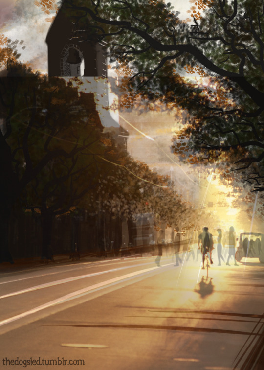
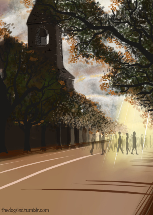
So the first thing I do when I’m planning a picture is think about lighting and composition. I might find an image which suits the picture perfectly, like the one above, or create a mood board with fractures of pictures I want to use. These often feature clouds or forests or mountains, people’s clothing, individual trees, and most frequently the back of people’s heads. When lighting is involved, particularly when it’s distorted such as through blinds or clouds, I concentrate on finding just a few references which show me how the light works. This man cycling down a street at sundown gave me the glow I really wanted and showed me how the visible would be obscured by the brightness of the light in the background, something I really wanted in the final image. I’ve superimposed the original over the final image here--see how the people I put in the street are standing on the original road surface?

So at this point I strip off all the image and go right into the background. I had some pictures of clouds to work from, and a variety of different ‘cloud’ brushes which I used to create the different densities here. This is actually five different layers on the base yellow color. Using a watercolor brush I painted burnt umbre on the left and then on another layer the white sunlight on the right. This isn’t the only layer of sunlight I’ve used, since I wanted to show it as shining down on Dean in the final image. The clouds are a single white/grey layer with two more layers of large accents and highlights/lowlights.
Here’s the image without the white/grey layer in the background so you can see how the clouds are constructed. I didn’t worry too much about how authentic they were given I expected them to be mostly obscured by the time I was done. This lack of worry about being exact or precise lets me move faster, and working on layers means I can remove things from the image which don’t work; the more the better!

I’ve removed the clouds so as to keep from cluttering the image. The road surface is two layers; the solid milk chocolate brown with the dark smudges is airbrushed on the bottom, and then I’ve used the same tool to paint the markings on the road. You can see how carelessly I’ve used color here, and again that’s because these layers are right at the bottom, and as we build texture up the simplicity vanishes.

So here’s my next brush tool at work. There’s three different kinds of brush leaves here, again applied quickly and effortlessly, with a variety of soft colors which will help the deep contrast of the leaves appear to have light shining through them. This is what makes trees appear lighter in places--you’re not just seeing through the gaps of the tree, but through the leaves themselves. As you can see I’ve put another layer on here with the first sunbeam passing through it. It’s not the only one, but having these semi transparent layers lets you create light which is brightened by layers of light underneath. Imagine a stage where two spotlights intercept each other--the place where the light crosses is brighter than the beam itself.

Here’s some more greenery. Using leaf brushes I’ve built up the levels here, starting with the smaller ones right at the back and working forward and larger to match the perspective. The leaves here took twenty/thirty minutes. Imagine if you were putting on all those leaves one at a time! It’s simple but it’s effective, and that’s what we need. Also take note of the layer of light colored leaves I’ve put over the bottom layers to show the way the light swallows up the foreground objects.
As well as putting in the tree trunks (you’ll note some of them are behind the foliage and some in front of it, building foliage on multiple layers will let you do this), I’ve put the clouds back in so you can see the way that we’ve really started to build this image up. The light looks like it’s falling on the road, and the compostion is really starting to come into its own. Time to build a steeple!
In this story Dean and Cas barricade themselves inside a church, so it made sense when adding some interest to this image to add a church steeple. I started with a simple dark brown outline, filled it in and added some highlights where the light would catch the brickwork.

Here’s three more layers, one behind the others to show the bell and the inside of the tower, making it 3D, and two of the outside, one giving it light down one side, and another drawing the shadow lines on the brickwork. It was more than enough so I left it at that. Finally all we needed to do was add some people, and Clip Studio comes with its own crowd brush which you can adjust to make your people whatever size you like. Super useful!
After putting in the figures, I added some last minute foreground light to this image, just to make everything glow. Believe it or not the people took longer than the background! So here you go--all done!
Here’s some more of my recent backgrounds, you can find the finished pieces here and here. These are all created with the same general idea - reference material, background, lighting, layers, textures and brushes.


If you enjoyed this post please reblog it, support me by ko-fi or redbubble or just let me know! I would be more than happy to make more posts like this in the future if it’s of interest to anyone, exploring the backgrounds of different pieces, or showing you how to use Clip Studio’s 3D poser, texture effects or anything else you're interested in!
#tutorial#clip studio paint#my art#fanart#backgrounds#brushes#using brushes#digital painting#some people call it cheating i guess#but what is cheating?#it's art#you use the tools you have to do nice things#and share the vision within your head with the world the best you can#cheat your little hearts out i say#anything else is just gatekeeping
26 notes
·
View notes
Video
youtube
NONAME FT. SMINO & SABA - ACE
[6.70]
A Chicago rapper who needs nointroduction...
Julian Axelrod: Three of the best rappers in Chicago the world go in over a bed of whispers, warm breezes and fluttering coos with some of the most conflicted flexes in recent memory. Smino's sidewinder croon hops on and off beat like a kid touching a hot stove before easing into a hook so smooth it practically floats off into the atmosphere. Noname's quietly virtuosic bars gleam with the joy of discovery, a young genius reveling in her new love of weed and sex and the life-affirming act of declaring these other rappers ain't shit. And just when you think it can't get better, Saba comes through with perhaps the crowning achievement of his already incredible year. His motormouth musings elicit some holy mix of pride, elation and astonishment from the depths of my soul, and yet his boasts are so nonchalant it feels like you stumbled into a conversation with the smartest guy at the party."GOAT TRIO TYPE SHIT" is right.
[8]
Matias Taylor: There's a conversational quality to the lyrics, the delivery, and the ebb and flow of the track itself (amplified by the mood-setting acapella sample in the beat). Everything is in sync here; it sounds like the best kind of jam session, or like a late night conversation with good friends -- warm, funny, honest, and never trying too hard to show it.
[8]
Nicholas Donohoue: Luscious, silly, precious, and good-natured. The audio of an early fall drive with your friends commenting on everything out the window, enjoying the laughs and the silence, and holding that feeling that everything will be alright eventually.
[8]
Lilly Gray: Woof, this is smooth. Sometimes minimal, chill work like this ends up sounding empty or missing an element to me, but the pillowy woo background, seeming clipped from a music box or Fantasia, provides soft closeness that keeps it all together. That and the obvious enjoyment of the vocalists (the smile at the end of "wait and just hear me out"), whose complementary textures and flows wind through the scenery without causing more than a ripple. I also have the attention span of a goldfish, so smooth rapping in the same cadence over any length of time can lull me into a state perfect for astral projection or a nap. This isn't ideal for parties or getting work done, but is pretty ideal for laying around daydreaming, floating from voice to voice and thought to thought.
[6]
William John: I went to Noname's Melbourne show about ten days ago. It was a short set -- perhaps 50 minutes in total, including an encore -- and she played only three songs from the newly released Room 25, one of which was added to the setlist spontaneously and put the audience momentarily into the position of a voyeur in the rehearsal room. Despite my caveats, it was an enjoyable show, not least because Noname is one of rap's most charismatic newcomers, and because Telefone, most of which was performed that night, has since its release been one of my favourite gloaming records -- music to play on still, warm nights when dusk stretches long, while downing Negronis as the delights of the dark night grow near. "Ace," too, is attuned to these same circumstances -- a spirited, gorgeous posse cut that belies its drowsy tempo.
[8]
Anna Suiter: Noname's verse cuts off like she's being interrupted. It's clever, but the problem is that Noname barely feels like she's present in the song at all. Even if her verse should be the highlight, it doesn't feel like she's highlighted at all. The general mood of the track doesn't make it easy to pull much out of it either.
[5]
Joshua Minsoo Kim: One's appreciation for Room 25 will directly correspond to their opinion of Noname's spoken word tendencies. As she adopts a more poetic lyricism and delivery, Phoelix's production lays out an open canvas with which she can roam free. One shouldn't confuse the album's neo-soul leanings for objective maturation (lest they be victim to a gullible and untenable rockism), but it does alter the way one interacts with and responds to Noname herself. Such is the stark contrast between Telefone and Room 25 -- both personal, both intimate, but different avenues through which we peer into the Chicago rapper's psyche. "Ace" is the album's most digestible track: standard single length, familiar features, recognizable hook. Frankly, it stands out for being one of her least personal tracks, hindered by a constricting structure that limits her voice's capabilities. Her verse features a competent flow, but it tricks the listener into thinking she's said something particularly noteworthy. Specifically, she relies on a spattering of words that act as signifiers for a vague cool, all of which tumbles into an accidental Chance impersonation in "Room 25 the best album that's coming out." Saba's verse is similarly stiff, bringing the song to a complete halt when he delivers the only line that falls completely flat: "Since I left the road, I got more hits than a deer." Smino's "fuck is you saying?" is incredibly magnetic, but hearing it repeated four times within a single minute only drains it of its energy. All three rappers here have done better, and will continue to do better elsewhere; sometimes, a posse cut isn't conducive to everyone's strengths.
[4]
Maxwell Cavaseno: Dreary faux-gospel/R&B blends as repackaged by James Blake done by people who should know better, and rappers who meander into obnoxious precociousness to the point they sound less like they care about beats and more about backing for a poetry slam. Smino's pinched delivery sounds utterly contrived, Noname's murmury cast-asides act are the work of an ever more sophomoric pseud who can be mercifully less infantile and shrieky than collaborator Chance but likewise is a behemoth of agonizing pretense. Even Saba, usually colorful and capable, sounds fully committed to the youth pastor pap of this record, making it a slog if you happen to be the person for whom self-righteousness, even draped up in faux-humility, is an obnoxious cudgel of tedium.
[2]
Juan F. Carruyo: The main musical leitmotiv -- a multitracked choir singing a jazzy chord progression -- is enough to make me hear this 10 times in a row, but the young guns dropping words on top about what it takes to make it on your own in the music industry these days and how better off they are without any record label providing support is just the D.I.Y. dream come true.
[9]
Jacob Sujin Kuppermann: A few miraculous things about "Ace": (1) the Noname/Smino/Saba/Phoelix (here relegated to just production duty) quartet, two years on from "Shadow Man," still holds together, with an easy and lived-in camaderie. (2) Said quartet, despite the massively increased fame and attention the mid-west psuedo-spoken word rap scene has received since Chance the Rapper's 2016, have not hardened or fallen into the vain self-seriousness that rappers frequently become mired in following breakthroughs. (3) In fact, they're maybe even more fun than before, looser and freer after various sojourns to the West Coast. (4) Even given her guests' best efforts, from Smino's elastic-voiced hook to Saba's double-timed come-up tales, Noname shines as the brightest light in "Ace"'s constellation, weaving together a stream-of-consciousness flow that strings together globalization, weed, vegan food, and Chicago without ever feeling forced.
[9]
[Read, comment and vote on The Singles Jukebox]
2 notes
·
View notes
Photo
I’M SCREAMING
We’re 3 months away from this glitter-bomb and they gave us some stuff to scream about. I think I’ll do just that. I took my sweet time putting this together, I know, but there’s a fair bit to unpack and a lot to be excited about so, let’s go through it all!
Animation

Okay, so first things first: people are calling this a 2D movie and that’s not really that accurate.
It certainly has some 2D elements, like the backgrounds, but the style of animation only makes the characters look 2D, when in fact they’re 3D models.
You can tell in how they move. If I were to give you a still screen shot, you might guess that it was from a 2D animation, but in motion, you can tell what it actually is: cel-shading.
I had a hunch that’s what it was so I asked a storyboarder who worked on the MLP movie (and the show) if I was right and she said:
The program they’re using is ToonBoom, which does rigs with 2D toon shaders, among other things!
You know, I don’t often call things, but I fucking called it. Let me have this. Just to give you a quick definition from Wikipedia:
“Cel shading or toon shading is a type of non-photorealistic rendering designed to make 3-D computer graphics appear to be flat by using less shading color instead of a shade gradient or tints and shades.”
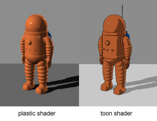
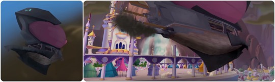
3-dimensional figure with cel shading, has the effect of making it look 2D. Typically seen with thick outlines on the outside and little to no outlines on the inside:
(Team Fortress 2 itself isn’t normally cel shaded, but that’s a great example a fan made of what cel shading usually looked like when I was growing up)

Cel shading without outlines, as seen in Wind Waker.

Like I said, just seeing this still image, it looks 2D, but watching it move, you can tell there’s a 3rd dimension to the character with the features and lineart mapped out onto the models to make it look 2D
Which by the way, is really unique for a major release! I don’t know about anyone else, but I was excited that MLP: The Movie seemed to be 2-D since there hasn’t been a domestic 2-D animated movie since Winnie the Pooh in 2011. 6 damn years! While I maybe would’ve ideally liked a completely 2-D animated movie, the backgrounds and the cel shading works in really neat ways, and it will definitely make the movie stand out
The purely 3-D objects seem unfinished at the moment (but that’s not out of the ordinary, CGI seems to be one of the last processes). It needs texture or shading or something, and I can tell because most of the ship looks too soft (too much like a model) to be metal. I really think this will be fixed for the final product, but that’s probably the most jarring part of the style at the moment
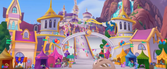
Not all of the 3-D looks unfinished, but the best looking parts are still the painterly, 2-D stuff (look at those towers; they’re really stylized, but you can tell they’re 3D in a more 2D environment)
THAT DIGITALLY PAINTED VERSION OF CANTERLOT THOUGH:

The light effects are definitely 3-D in the fireworks and rainboom
Oh, and speaking lighting, so much of it looks so pretty! There are one or two times when the colours are slightly off, but the majority of the time it looks freaking gorgeous
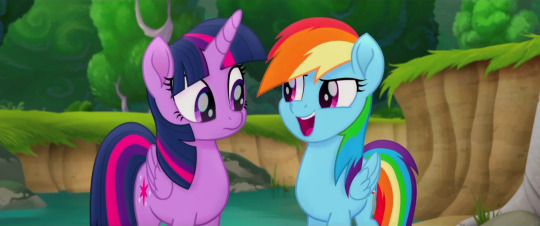
You can kinda see by looking at Rarity that the shading is juuust slightly off here (kinda like they were for the teaser trailer), but then you look in the background and see this BEAUTIFUL background and Twilight all upset and worried about this invasion, and it feels like such a nitpick to worry about what will probably still be cleaned up before it hits theaters
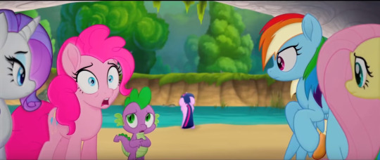
We also get some really great expressions, so they’re not really limited by the 3D models underneath (if I’m right about that)
Also, just as one last little note here, the style is detailed enough to see little things about the characters we didn’t know up until now, like the fact that the spines on the side of Spike’s head are translucent, or that the colours of RD’s mane aren’t 100% perfectly separated
Overall with the animation, I’m so impressed not only by how gorgeous it is,but by how willing they were to take a risk and incorporate a 3D element in the form of (I think) cel-shading. This only really matches the creative spirit of the MLP team, though. Whether or not you agree on how well they always execute everything, they always try to step up their game with every new season and push themselves to be and do better.
And while I will say that if some of the more 3D parts (yeah, I’m talking about the zeppelin/airships mostly) aren’t fixed for the final release, I would have a bone to pick with them, but I have faith that we’ll be seeing a much smoother integration of that 3D on the big screen.
Story and Character Details
I really appreciate that they didn’t outright spoil anything too big. It’s definitely a well-cut trailer! We basically only know about the same information we did before, with just a hint or two as to things like who the true villain is.
Just based on the focus given to these characters in the trailer (and what I know of the Storm King’s characterization in the first Movie Prequel comic that was just released), seems like he’s not as big of a threat as the commander of his fleet, Tempest.
It’s a kind of villain we haven’t seen on the show or even in EQG, and not only that, but
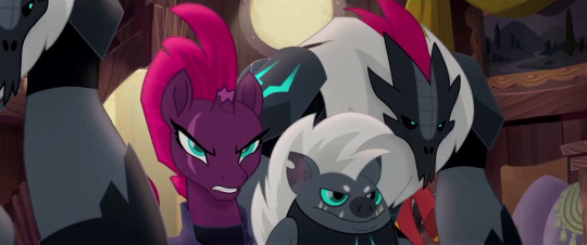
She’s got a fantastic voice actress behind her, so she can pull off the deliciously evil vibe well without, say, reminding us too much of Chrysalis or other powerful animated villains from Disney classics
Plus her design with the broken horn and her magic sparking up out of it is instantly intriguing to me: for such a powerful presence, it’s awesome to see her weakness (and most likely shady past) is always on display---especially for a commander character, that’s just really cool
Grubber seems to be pretty standard so far, nothing he’s done has really impressed me quite yet, but I’m hoping his best stuff is saved for the movie itself
The sky pirates (or skyrates) look like a lot of fun, and in context I can see how well the bipedal birb pirate blends with the universe (the bipedal designs were the ones I had the most trouble with)

On top of that, we have sea ponies at last! And they’re far more adorable than I ever could’ve hoped
The original sea pony designs from G1 looked a lot more like sea horses, with curling tails and fins on either side, but I think the meraid-ish look is both more marketable for Hasbro and more appealing to look at (the original sea ponies always seemed like a joke in the fandom to me, I admittedly never understood why people would actually want it in G4)

And a-ha! Good queens do exist! Poor Celestia and Luna. Always a princess, never a queen.
Oh, and Seaquestria? It’s freakin’ beautiful. I LOVE the rich blues and purples here. If you haven’t had a chance to check out the 360 image of the underwater palace complete with an excellent piece of background music, treat yourself.
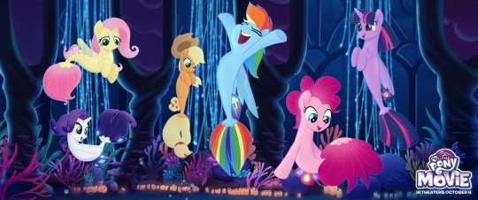
The Mane 6′s sea pony designs are pretty dang adorable. I don’t have anything interesting to say, I just like the cute water horses, okay?
Minor Details and Incidentals
I’ll start out by saying Twilight’s narration in the trailer is pretty standard, but still heartwarming (mostly because I already know and love these characters though). It sort of reminds me of the bits of narration from the How to Train Your Dragon movies, although those had a bit more character to them.
The what could possible go wrong? line, though. It just makes me laugh thinking of all the flashbacks we could have to the series.
I guess she’s talking about that festival specifically that she’s organizing, and in that way it’s a show of character development (in a similar way to the character development on display in A Flurry of Emotions, where Twilight is told she’s late and doesn't have a panic attack or worry about what could go wrong... too much), but it’s still hilarious to contrast the idea that nothing could go wrong in Equestria to... literally all of the show.
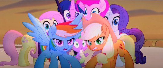
AJ and RD protecting their friends even before the others have gotten over the shock of whatever they’re seeing tho
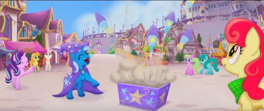
Starlight and Trixie get a bit of screen-time together and it’s adorable. Starlight might be stuck in Canterlot for the duration of the adventure, but I’m glad to see her included. Characters like Discord who might be too hard to explain to new audiences are understandable losses, but even if Starlight’s cameo is brief, it’s good to see her role acknowledged

In terms of music, Sia’s looking adorable so far, and Lukas Graham’s as of yet unreleased Off to See the World sounds pretty catchy (it’s the song at the end of the trailer), so they’ve got talent behind the vocals!
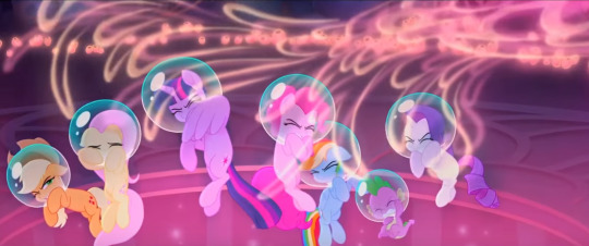
Jumping back to little details, it’s neat how sea pony magic has a very distinct look from unicorn/alicorn magic. Also, the bubbles are really cute

And, okay, I just wanted to take a minute to appreciate how serious this ponk is. Can we all just stop and take a look, because in this scene Twilight’s saying how she’s the one Tempest is after, and she should probably face this alone, which seems to be our Princess of Friendship’s big dilemma in this movie, and Pinkie’s clearly trying to tell her she’s crazy
Gotta love that they didn’t just go for hyperactive comic relief Pinkie Pie; they don’t seem to be boiling down these characters to just one trait (which is partially why I loved the moment where RD and AJ defend the girls; RD’s ego will no doubt be on display throughout the movie, but you’ll also see she’s ready to lay down her life for her friends)
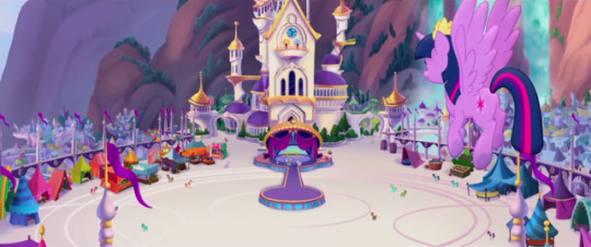
And hey, lookie here! Canterlot got a make-over... and a contractor. There’s more pink than there typically is and it doesn’t necessarily match what we’ve seen of it in the show. Especially places like the throne room:
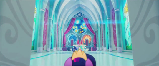
And you know, I’m a little torn on this detail? It’s beautiful, and I’m digging the starry night mosiac they’ve got going on back there, but it would’ve been nice to see the throne room we know and love rendered in this new style, you know? I’m gonna miss the deep magentas and the stain glass windows of the Mane 6′s accomplishments. I know that’s mostly the fangirl in me, but I like seeing continuity nods back to the show (like hey look: Cadence gets a cameo!)
Unless Canterlot gets destroyed and subsequently rebuilt in the season 7 finale, in which case I’ll shut my mouth
Speaking of which, I still have to wonder exactly when this will take place in the series, or if it exists slightly to the left of canon like the Equestria Girls movies (which, I mean, I consider canon, but still). I know there’s ties into the comics, but I wonder if/when the show will acknowledge the events of the movie... I guess only time will tell
And for now, I think that about wraps it up! All in all, I’m beyond excited to see this thing, as anyone could’ve guessed.
It should also be noted that a lot of kids movie trailers focus on the fun, comedic portions of the movie, so while I do think it’s mostly going to feel like this, I’m also looking forward to the more character-driven feelsy parts. As we well know, you can never get the full scope of a movie from just the trailer, but it’s usually especially true for kids movies.
Even just from what we have seen, it looks like we’re in for a ride. Can’t wait to get on.
Hey, if you’d like more MLP stuff, you can click right here to see my editorials or here for episode reviews. And if those links don’t look pretty enough, have the last three things I’ve done right here:
Parental Glideance Review, Celestia/Daybreaker Editorial, and LGBT+ Editorial
Year of the Pony
#year of the pony#yearofthepony#mlp the movie#my little pony the movie#mlp#my little pony#friendship is magic#my litte pony friendship is magic#twilight sparkle#pinkie pie#rainbow dash#rarity#applejack#fluttershy#spike the dragon#animation#animated movies#cartoons#mlp analysis#mlp articles#movie trailers
139 notes
·
View notes
Text
May 13th-May 19th, 2020 Reader Favorites Archive
The archive for the Reader Favorites chat that occurred from May 13th, 2020 to May 19th, 2020. The chat focused on the following question:
Which comic has your all-time favorite artwork, and why do you like it?
carcarchu
Oh yes i can say this with certainty but the webcomic with my all-time favourite artwork by far is 榴花不及春 https://www.manmanapp.com/comic-1404769.html. it's not just that the art is beautiful but the way the artists create mood and tone is just jaw-dropping. I actually got chills a few times while reading it from the art alone and that's not something that i can recall happening when reading a lot of webcomics, or actually any fiction in general. there's such a elegance to the line weight and movement of the art that brings life to the characters. the artists' use of lighting adds such depth to the scenes, sometimes creating a warm and inviting atmosphere and other times a haunting and foreboding chill. the time i've spent with this comic is not something i'll soon forget(edited)
Cronaj (Whispers of the Past)
This is such a difficult question for me. Gahhh, so many pretty comics out there.... I guess, in regards to artwork alone, my favorite is the 2015 version of Countdown to Countdown by Vel. (https://tapas.io/series/Countdown) Just... such beautiful work. I'm a sucker for detailed painterly styles I will admit, but also the color and lighting is phenomenal. The way Vel sets up the mood with color and movement is amazing. The textures and brush strokes are simply gorgeous! Unfortunately, Vel rebooted the comic to a new style last year, and while it is still really gorgeous, I must admit, I don't like it nearly as much as the original. (What can I say? I have a bias for painterly styles.) Still highly recommend it! (https://tapas.io/series/CTC) I do want to point out some honorable mentions for me: * Ghostblade by WLOP (https://tapas.io/series/GhostBlade) - another painterly comic * The Sixth Dalai Lama by Ze Zhao (https://tapas.io/series/thesixthdalailama) - discontinued as far as I'm aware, but painted traditionally with watercolor! * Wind Rose by Sfera (https://www.webtoons.com/en/challenge/wind-rose/list?title_no=54306) - Painterly again (later on as the artist improved) but also great expressions I will say, I also love deliciously detailed lineart, but I don't see it a lot (especially in webcomics), and I cannot think of one right now :/(edited)
carcarchu
ahh ghost blade is a great choice @Cronaj (Whispers of the Past) and while i agree that countdown to countdown's new art isn't as sumptuous as it used to be for a comic it works better and the simpler art style allows vel to release at a more consistent rate without injuring herself so i really respect the change(edited)
Cronaj (Whispers of the Past)
Yeah, definitely understand why they changed styles, because oml can a painterly style be taxing
DanitheCarutor
I can't pick just one! But to start off I love the art of Lost Honey (https://www.losthoney.com/), everything about it is so soft, the linework, the colors the character designs, the panelling, it all has such a nice feel to it. The creator's use of color is sooo easy on the eyes, it fits so well with the comic. The linework has such a nice flow and movement, there is never a feeling of stiffness, it almost reminds me of water. Also I'm a complete sucker for traditionally drawn comics. Even though it's discontinued as far as I know, Thicker Than Blood also has really nice aesthetics! (https://tapas.io/series/Thicker-Than-Blood-), it has such a unique style almost like classical art mixed with glass. The designs are detailed yet highly stylized. The quality varied from time to time, given the amount of work that goes into them, but overall I really liked the look of this comic. Carciphona is another one I like aesthetically. (https://tapas.io/series/carciphona) The art of this one has improved immensely since it started, and while I'm not a fan of the look of the earlier pages, I'm loving how their work has evolved. The style is very Japanese inspired, there is a lot going on sometimes, but has its own unique look and is very well crafted. Also I love the action scenes, how they're handled makes the scenes look intense, sometimes grandiose.(edited)
shadowhood (SunnyxRain)
Oh my god I love carciphona’s art! I always get shilin’s art whenever she sells at Anime North I’ve been meaning to read carciphona for a while so thanks for reminding me!
FeatherNotes(Krispy)
Hands down it is Black Out Cityhttp://blackoutcity.ca/lvl10.php Jay does these amazing illustrative panels when they introduce a new chapter and it has me hooked on each update! The way that the title is incorporated within the panel is beautifully done, and their attention to detail and effective use of contrast is breath taking. Definitely a huge inspiration of mine! I also want to shout out to O'Sarilho by @Capitania do Azar . The palettes she uses are unique and dynamic, and the layouts read like the comic is animated (there's even animated parts in it!) the way she draws action and portrays horrific parts is phenomenal!https://sarilho.net/en/
(also i love this prompt but i could def go on forever with it hehe)
Deo101 [Millennium]
I wholeheartedly second O'sarilho ^^ it's a comic I regularly reccomend and I probably won't ever get over how lovely it looks! (I'll have to look for more comics who's art I love later)(edited)
LadyLazuli (Phantomarine)
I'll throw in Heart of Gold https://heartofgoldcomic.com/. The ethereal palette, the clean and crisp architecture, the panels that work perfectly with the church imagery, and the energy of the lines and brush strokes. SO GOOD.
Tuyetnhi (Only In Your Dreams!)
I agreEE
shadowhood (SunnyxRain)
Okay for me it's two webcomics One of them is Tracy JB's Lackadaisy https://www.webtoons.com/en/challenge/lackadaisy/list?title_no=39790&page=1 https://www.lackadaisycats.com/ Everything she does is wonderful; colour, expression, character, plot.....her art inspired me to embark on expression work. I remember being younger and being so inspired by her webcomic. Hands down can't find a flaw. The other one is Muted by anidoodles https://www.webtoons.com/en/supernatural/muted/list?title_no=1566 I was introduced to her from her Heather animatics on youtube. I love how her inking and cell shading is simple but VERY effective; the use of bold bright colours and watercolours was amazing. My art style is heavily inspired by hers and overall, I love how she captures people's attention with it.(edited)
Miranda
Oh I love Muted!
shadowhood (SunnyxRain)
looks at your profile pic heheh
Miranda
I mean, I'd have to say I love "Nothing Special" by Katie Cook. Her art style and color scheme is just easy on the eyes and I love her intricate filled backgrounds. https://www.webtoons.com/en/fantasy/nothing-special/list?title_no=1188&page=1 Phantomarine is another favorite. I absolutely love the painted look and it's been inspiring my newer pages. Every page is just a work of art and I love the color choices and just everything about it. http://www.phantomarine.com/
shadowhood (SunnyxRain)
PHANTOMARIIIIIIIIIIIIIIIIIIIIIIIIIIIIIIINE
sssfrs (JOE IS DEAD)
I’m also going to say Phantomarine
Theres also one I found recently called Bybloemen that has a really cool art style
FeatherNotes(Krispy)
ohhh Bybloemen is gorgeous and is so up your alley Sssfrs!
sssfrs (JOE IS DEAD)
Its so good
LadyLazuli (Phantomarine)
Woah, it's like woodcuts!! I like it!
Joichi [Hybrid Dolls]
Ooh this is a hard choice since I see beautiful webcomic art alot. Recently my favorite art and coloring style I've been inspired by are: - The Glass Scientists https://www.theglassscientists.com/ Some of the pages are well executed, I like the character designs, fantasy with alchemists, werewolves and more. Ghost Teller https://www.webtoons.com/en/horror/ghost-teller/list?title_no=1307 I enjoy QTT use of gradient coloring and spooky atmosphere, it looks like alot of time were used to make each strip. I like how the characters are linked to each story, it's not as spooky as more dramatic. They are all short stories Gourmet Hound: https://www.webtoons.com/en/drama/gourmet-hound/list?title_no=1245 When I think of slice of life with a soft pleasant color palette, this story comes in mind. I like to refer to her work as well as other SoL comics for inspiration on coloring.(edited)
Joichi [Hybrid Dolls]
@carcarchu ooh I love the different comics you recommend. It's always unique and pretty. I hope there's a tranlation strip for '榴花不及春'(edited)
shadowhood (SunnyxRain)
GOURMET HOUND
IM SO HAPPY ITS HERE
chalcara [Nyx+Nyssa]
Funnily, the webcomic with my all-time favourite art is Order of the Stick. Love how much expression and narrative work this simple style does.
RebelVampire
Definitely Rising Sand https://risingsand.glass/. The art is immensely detailed in ways that are relevant to the world and story, has beautiful color choices, beautiful compositions, amazing light effects, great backgrounds, and so on. And just overall the skill level is so high I'd need another 20 years experience with art to even be able to begin to point out a single flaw.
LadyLazuli (Phantomarine)
^Ooh yes! I don’t know how Rising Sand keeps that quality so high. From their posts, it seems like a bit of a nightmare sometimes But the end product is like its own animated film!
Joichi [Hybrid Dolls]
Omg I'm often in awe with those artists making high quality art that looks like it belongs in graphic novels or film. I can imagine those big details will take alot of time to put together. (edited)
I once happen to meet the creators for Rising Sand. Very passionate writer and artist team who have quite some experiences and strong teamwork. (Life goals!)
Eightfish (Puppeteer)
so many comics to check out :0
Deo101 [Millennium]
wow rising sand is really gorgeous
shadowhood (SunnyxRain)
Whoa rising sand is really good
actually reminds me of Tigress Queen by Allidraws https://www.tigressqueen.com/comic/page-0001(edited)
especially the parts where she draws glass and architecture it's very vibrant and full of life
Joichi [Hybrid Dolls]
Gosh I realized I have a trend of loving slice of life stories, so I might end up recommending that genre afew times!
keii’ii (Heart of Keol)
(don't forget webcomic_recs for recommending good comics in general outside of the weekly topic!)
Unfortunately Korean-only at this time, but I am in awe of the art in this comic. It's not very polished, but you can tell the artist really knows what he's doing in terms of anatomy, perspective and composition. https://comic.naver.com/webtoon/list.nhn?titleId=701535&weekday=wed
Joichi [Hybrid Dolls]
oops I remembered that, I'll go repost there instead. Thanks Keii. Wow that comic(edited)
Joichi [Hybrid Dolls]
I really want to read more Korean and Chinese webcomics, they have a different vibe and story atmosphere. I enjoy looking into them as inspiration on how to stage my webtoon scenes.(edited)
keii’ii (Heart of Keol)
Hmmmm, I wouldn't recommend the one above for how to make vertical scroll comics. That one was originally made for print and then adapted afterward, and it shows.
Still absolutely amazing action art, though!
Holmeaa - working on WAYFINDERS
@LadyLazuli (Phantomarine) Heart of Gold is SO beautiful! I agree with you 100 procent!
I will add The Ocean Soul. Holey damn this comic is SO gorgeous!!!! https://tapas.io/series/The-Ocean-Soul
Javi
Gonna add this before this prompt changes. I think Oren's Forge has the best artwork I've ever seen done in a webcomic. Every panel has a setting that's so bold and pristine in color, layout, and background that it begs to be animated. Every color used paints a different mood to show character development and the style of the characters is so stylized and interesting to look at. Even the story is interesting enough that it gets you hooked and wondering what will happen next. Also talking animals, what more can I say? :) There's more discussion in FurAffinity than there is on Tapas so I'm putting two links https://m.tapas.io/series/OrensForge https://www.furaffinity.net/full/18260576/
#ctparchive#comic#webcomics#indie comics#comic chat#comic discussion#comic tea party#comics#ctp#reader favorites
0 notes
Text

Do you own a DSLR but still take average, boring photos?
“Now You Can Master Any DSLR Camera And
Take Gorgeous, Attention-Grabbing Photos By
Following Step-By-Step Video Tutorials!”
“Use your computer, laptop or smart phone to get expert advice with easy-to-follow instructions whenever you need it!”
Hi there,

Evan Sharboneau here…
As you probably know, I’ve helped over 9.2 million photographers create stunning images using digital cameras.

Above is an example of a recent personal work - these are the types of images you'll be learning to create inside my photography training course!
Now, I’ve got something NEW for you – and it’s very cool.
After helping beginners for 5 years, I see exactly what’s stopping you from taking photos that really impress your friends and family… and will sell online, at shows, and even galleries.
So if you’re struggling to get the most out of your camera and finally be recognized for your own amazing photographs, then what I’m about to share will make you extremely happy…
I Used To Be Like You
Look, I understand how it feels to compare your own photographs with what we see in magazines, books, and online forums.
As a beginner, it’s not only frustrating but can get depressing, wondering “how was that shot taken?”… thinking “it’s probably because they have a better camera than me”… or “I’ll take photos that good, eventually”.
Like you, I didn’t know the secrets. I couldn’t afford expensive cameras or classes. But I wanted to take good photos TODAY, not “someday”…
Are These Questions And Concerns Stopping You From Becoming A Better Photographer?
Do you own a DSLR camera but take mediocre photographs – a sign that you lack the skill and confidence to get the best results?
Have you thought about upgrading your equipment, believing that will improve your photos?
Are you lost when it comes to exposure, aperture, ISO/ASA, depth of field, lighting, lenses, filters, post-production and other difficult concepts?
Do you still have questions or feel overwhelmed after reading blogs, forums, books, and tutorials?
Have you thought about taking photography classes – but want to save time and money?
Do you think you’re not ready to be a professional – a mindset that you must overcome to succeed, get recognized, and sell your own photos?
Bad Photos Are Not Your Fault

More old photos of mine shot back when I was the typical average photographer, completely unaware of how my images could be improved. Do your photos look like these?
So many new photographers and hobbyists get stuck on buying equipment. And they spend months hunting for ways to improve their skills.
Yet, after all that, your photos are average. Or worse.
Here’s the truth: it’s really NOT your fault!
I’m telling you, I’ve spent hundreds of hours digging through blogs and forums, reading books and manuals, watching YouTube and DVDs.
Guess what. After going through ALL of the training material out there, I’ve found NONE that will turn you into a pro, step-by-step.
They always have missing pieces. Questions without answers. Nobody says exactly how the best images are made.
You’re just expected to “spend a lot of time practicing”!
People believe that’s a good thing, but it can actually be wasted time and energy. Doing something over and over again is exhausting. It takes years to figure stuff out and become a professional that way… if you get there at all!
There’s a better strategy…
It Takes Years To Become A Professional… If You Don’t Know The Shortcut

These shots were taken by me after I learned the secrets of professionals…
How did I go from beginner to having photographs showcased and featured on DeviantART, Flickr, print ads, billboards, posters, magazines, and book covers?
Well, I never took classes. Anywhere. Ever.
Instead, I went around my town and shot photos with an entry-level DSLR, a Nikon D50.
My first attempts were “ordinary”, nothing special. Online I saw photos better than mine and literally thought they were mysterious. I couldn’t figure out how they did it!
But then… I discovered a few BASIC PRINCIPLES that make it possible to take good photos, every time, no matter what camera’s in my hands.
With these principles, I can take a couple shots and feel comfortable knowing at least one will be a “keeper”.
It’s WAY BETTER than digging through 100 shots hoping that one is just “okay”.
Now I’m aware of WHAT to look for… WHEN to photograph… HOW to get the shot I want. And I can be sure that a photo will be good – even before it’s taken.
It’s like I found a reflex that just “knows” when to click the shutter!
Seriously, this changed my life…
How To Quickly Learn Everything You Need To Create Amazing Photographs

Your shots CAN look like these! Here's how…
Let’s be real: after getting a DSLR you found it takes more than reading the manual to get professional results from it.
Then your hunt for more information and answers began.
But there’s a TON of information about photography, and it’s so unorganized!
I learned by doing meticulous research, putting it all together on my own. After spending years of applying what I discovered, I began sharing with friends online.
Nobody prepared me for the flood of questions about landscapes, portraits, sports, studio photography... and my weird ability to just grab a camera and start taking great photos without any effort whatsoever.
Now I've got the answers you're looking for, and they're here on this website.
Just Imagine Being Able To…
Choose the right DSLR on a budget and still get all the desired features
Properly hold a DSLR and stop looking like a complete idiot out in the field
Stop taking boring photos that nobody cares about and start taking creative, memorable photos worth sharing and selling

GET CRISP, CLEAR SHOTS when photographing anything, including people, objects, and landscapes

Avoid the 6 common beginner mistakes of COMPOSITION and easily create brilliant images instead

Finally grasp a complete understanding of Shutter Speed, Aperture, and ISO for total control over MOTION and DEPTH OF FIELD

Learn the “secret” time of day when most professional photos are shot

Understand Exposure and Metering so pictures won’t be too bright or too dark, but “just right”

Properly select the right WHITE-BALANCE setting on your camera and stop worrying about photos coming out too orange or having washed out colors

Select the BEST LENSES to create appropriate, proportional, non-distorted, aesthetically pleasing images… no matter the situation

Take JAW-DROPPING panoramic shots

Use FOCUS correctly and know what focus points to avoid in a scene

Choose the BEST EQUIPMENT, including flash, filters, camera bag, tripod, tripod head, batteries, battery recharger, strap, camera mount, and memory cards
Use external FLASH to control motion, remove red-eye, add drama, and give your images an edgy, high-class, professional look…

Use FILTERS to control light coming through the lens, remove glare, and even make the colors in a scene appear more saturated
Get NATURAL HDR shots that don’t look fake or “over-done”

Correctly decide when to use a TRIPOD – and know when it’s dumb to use one
Capture sharp, correctly exposed photos in LOW-LIGHT SITUATIONS… with no motion blur or noise

Take stunning photographs at NIGHT with or without using a flash or tripod

Know where to put LIGHTS in relation to your subject/model and how to control the mood of portrait photos

Choose effective LIGHT MODIFIERS, including umbrellas, soft boxes, beauty dishes and grids to establish the mood of the image (do you want the image to be dark, dramatic and shadowy? Soft and pleasing? Bright and happy? Do you want soft pools of background light? When would you want light to create texture across surfaces, and when wouldn't you?)

Know how to select a SOFTWARE package that fits your needs and budget
Correctly EDIT IMAGES in post-production using Adobe® Photoshop® Lightroom and Adobe® Photoshop® software

And much, much more…
Others started applying my advice and the results were pretty amazing…

Photo by someone who took my advice
It felt great when they started getting the same results as me…
But Don’t Just Take My Word For It
“People thought my photos were from a travel magazine!”

Why Does This Work So Much Better?
The principles I discovered can turn nearly anyone into an “expert photographer”. When it comes to getting better shots, you’ll be AMAZED at how well they work.
And these principles are essential if you want photography to be a secondary or even full-time income.
Yet this information is hard to get. It’s either hidden from the general public or scattered all over the place, unavailable in one location for easy access.
NOW HERE’S THE SOLUTION: Everything you must learn to take professional quality images is on this website.
You can finally start using your camera with confidence. Start taking your own amazing photographs that people will rave about and even pay money for, if that’s your goal.
Listen, I’m willing to tell you everything because I’m not afraid of competition.
After being published all over the world, I’ve learned that it’s actually more fun and rewarding to share what I discovered… the very same information that launched my career.
My favorite part is when people send photos after using what I taught them.
Bottom-line: it doesn’t matter if you’re brand new or have been struggling with photography for a long time… I want to help you.
To make it easy, I took a video camera and recorded answers to all the top questions, and more.
I carefully demonstrate how to use exposure and aperture, lenses, lighting, composition, software, and many other topics that people find difficult or confusing.
What’s better, I’ll show you how to succeed…
Without piles of books or college courses
Without years of experimentation taking “average” photos
0 notes
Last Seen Blogs

faunfestival
FAUN FESTIVAL
jabbers-of-jay
The Jabbering of Jay

caffeineparade
Caffeine Parade

mmjiyi-blog
DAISY CROWNED

kidneihl-blog
นีล