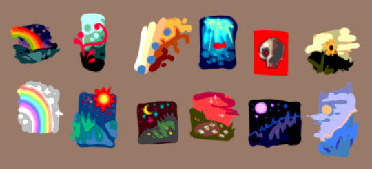
#Color Schemes
Photo
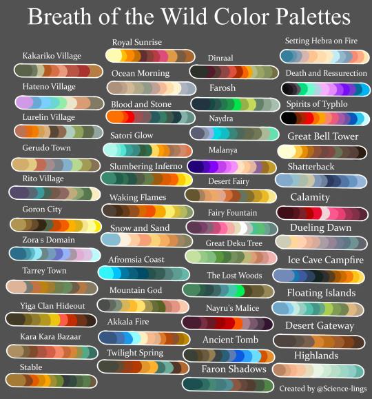
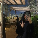
After a stupidly arduous journey of taking about a hundred screenshots, I have completed it. Please send me characters you’d like to see and the color scheme I should use! If you use it yourself please give me credit for the palettes.
my favorite screenshots used for this under the cut!
I would recommend everyone spend a blood moon on top of Mount Lanayru, the colors are so good

For Hateno I used a lot of the dye colors, otherwise it would’ve just been the red stone roof tiles and the same color wood that every place uses and the pale stucco. The dye shop is the most unique thing about the place lol.
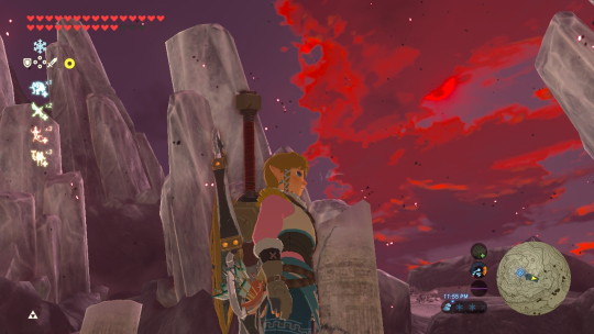
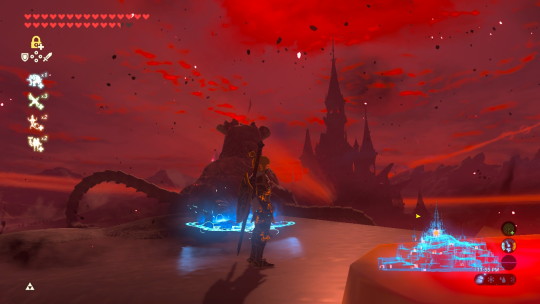
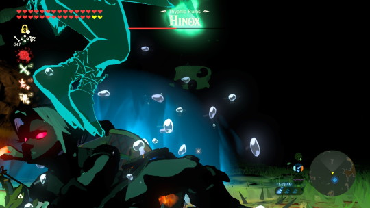
I just thought it was cool to catch Dinraal in the distance, this one was used for ‘Waking Flames’

It’s unfair how pretty the world gets when you’re on top of the castle, I also love the framing that the archways provide.

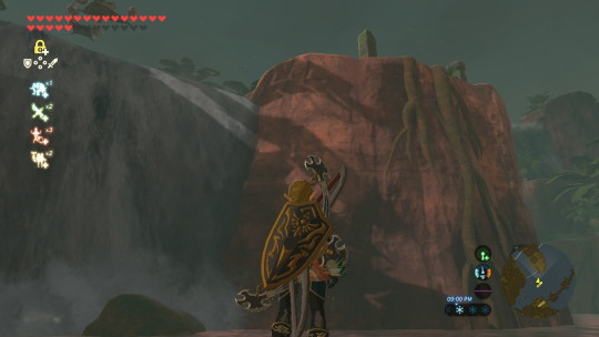
rocks are pretty, thats my whole thought process with this one
the big pillars surrounding the castle have the best views, it sucks that they’re so hard to get to.

i love the blue rocks

just going to any super high up place is worth it. btw I was being attacked in this image. that bow belonged to a stal bokoblin. he was an asshole
I died on purpose to get mipha feet pics

this is the magic tent thing, when you’re under it the whole screen gets a little pinker. it’s kinda trippy

the fire glowy effect in the snow is one of my favorite visual parts of the game. I love glowy things so much
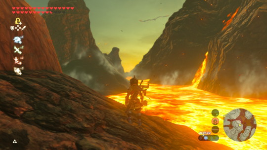
idk the color contrast of the gray water and the red rock is so cool to me

For all the village palettes I wanted to focus on the buildings and decorations rather than the environment itself, I loved the burnt orange flags in lurelin and the stalls in Gerudo Town


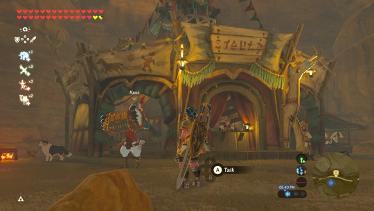
all the places that are populated are just so colorful that it was hard to choose what colors to include in the color schemes. Many times, different shops are color coded and it makes it difficult to limit the colors to just the ones I chose, this world is just so colorful!
#they can be any loz character or lu or for extra points they can be from my own AUs#I haven't done a color palette challenge in a while and Ive never made my own ever so I thought this would be fun#color palette#color palette challenge#botw color palette#color palettes#art challenge#color scheme#color schemes#botw color schemes#color scheme requests#linked universe#loz#legend of zelda#botw#breath of the wild
2K notes
·
View notes
Text

some free to use color schemes i've made, two variations
277 notes
·
View notes
Text
I genuinely feel there is something to color scheme between the older Pines' men in terms of wardrobe at the very least.
Very much through the episodes where backstory is provided for Ford, yellow, blue, or gold hues of shirts are worn. Gold, or yellow are typically variations that are associated with royalty, and I feel it shows he was "the golden child"...Which also correlated later when Bill made him the only statue that was gold. He was considered special at certain points.
The blue, from what I gathered, symbolized peace, and innocence, which he did wear in college, and while working with Bill in the mind scape. And, you see, after the betrayal, he stops wearing blue. His innocence was lost, and his peace was taken.
Stan, on the other hand, had a touch of gold to his wardrobe, but I always associate him with maroon, which is associated with being steadfast. And quite frequently in the show, that maroon does show up for both men(Ford's signature sweater and Stan's fez). They both at the end of the show wear maroon as sea grunks, showing they both are steadfast, and parallel.
He also does wear the blue Hawaiian shirt, and tries to pose like he's a frail old man when he wanted on Cash Shower(innocence once again), then the gold and maroon suit in The Stanchurian Candidate (I see as power and determined).
I could be reading into this far too much, but either man's wardrobes fascinate me in the different eras of their lives. I'm sure I could keep digging, but I probably as sound loony 😂
EDIT: I also thought about Stan wearing white at points, where it's a color of purity and clean. When he's younger, he wears a white shirt through high school. Then, as he becomes a drop out, at various points, and up to the portal fight with Ford, it's dirty and worn, so tainted and weathered.
He returns to the white with his suit, and then, is typically portrayed as a sea grunk in cream, to me, personally translates to a "grey" area: he isn't pure like he was as a high school kid, but he's not a criminal anymore; the color is mixed now, a blend of old and new.
And Ford's return from the portal clothes, total black, is absolutely a reflection of his travels and where his mind probably sat for 30 years: In the dismal and hopeless hellscape, both literally and mentally.
#stan pines#stanley pines#post about stan#grunkle stan#gravity falls#ford pines#stanford pines#color schemes#i'm done rambling
85 notes
·
View notes
Text
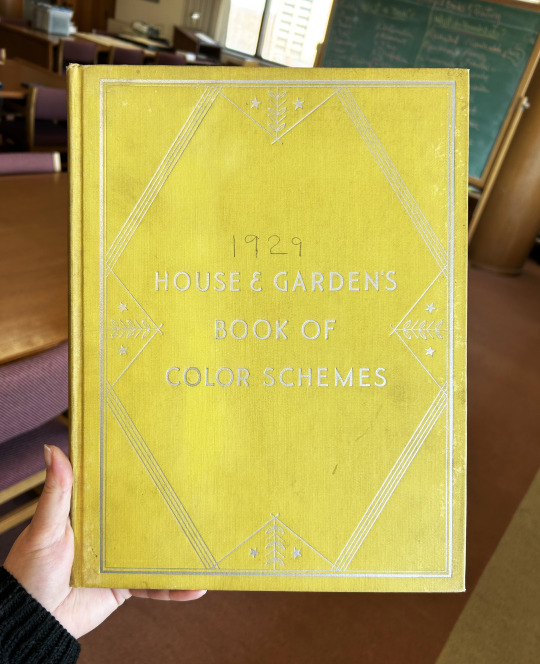


Decorative Plates
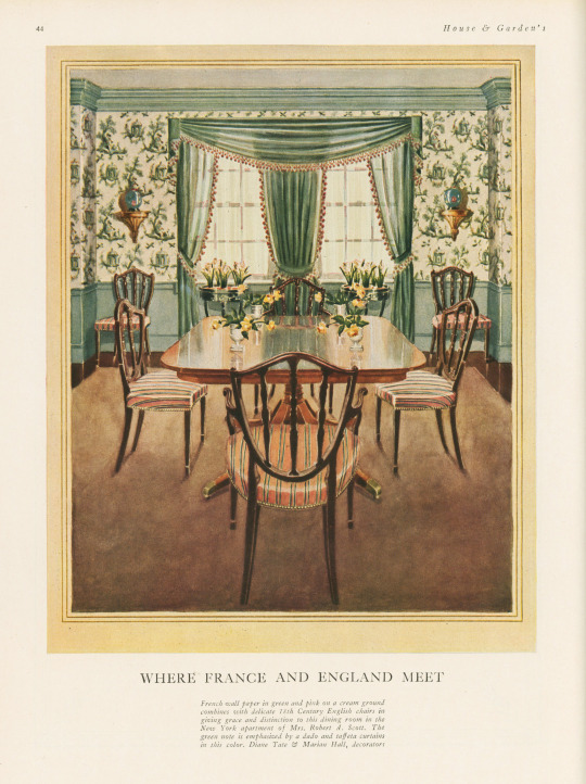
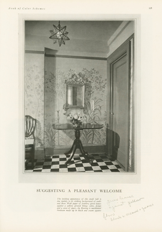
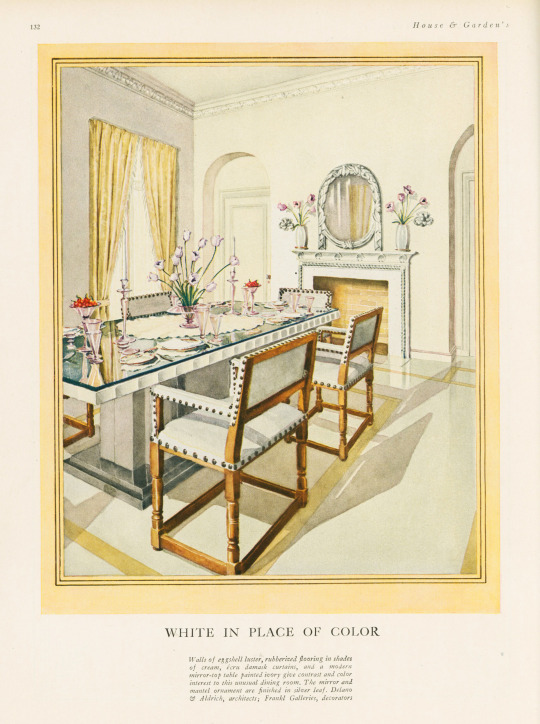
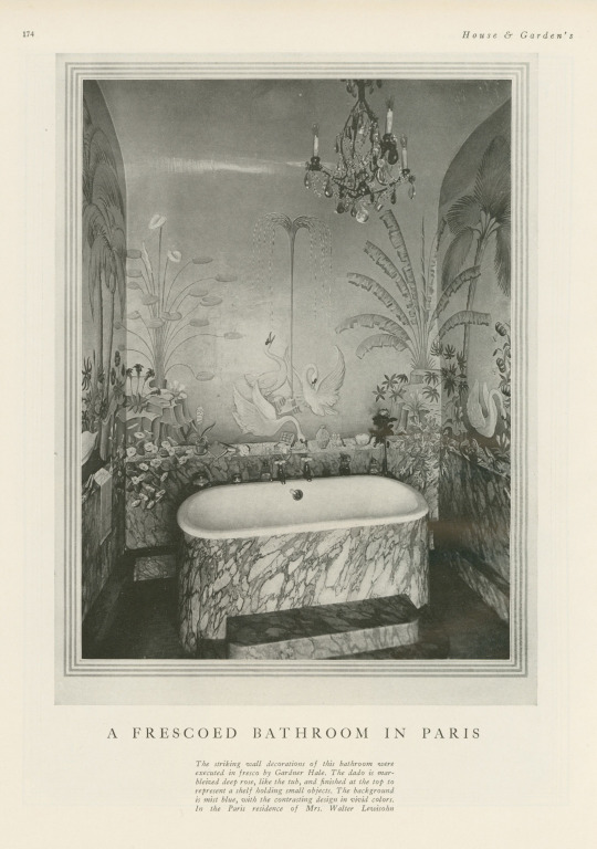
It's been awhile since we last posted something on the theme of the decorative arts, so I'm happy to have found this book—especially because it was mis-shelved in the stacks! This book is House and Garden's Book of Color Schemes, which contains "over two hundred color schemes and three hundred illustrations of halls, living rooms, dining rooms, bed chambers, sun rooms, roofs, garden rooms, kitchens and baths; the characteristic colors of each decorative period; how to select a color scheme, with unusual treatments for painted furniture and floors; a portfolio of crystal rooms and eight pages of unusual interiors in color." It was edited by long-time editor of House & Garden Richardson Wright (1887-1961) and Margaret McElroy, associate editor, and published by Condé Nast Publications, Inc. in 1929.
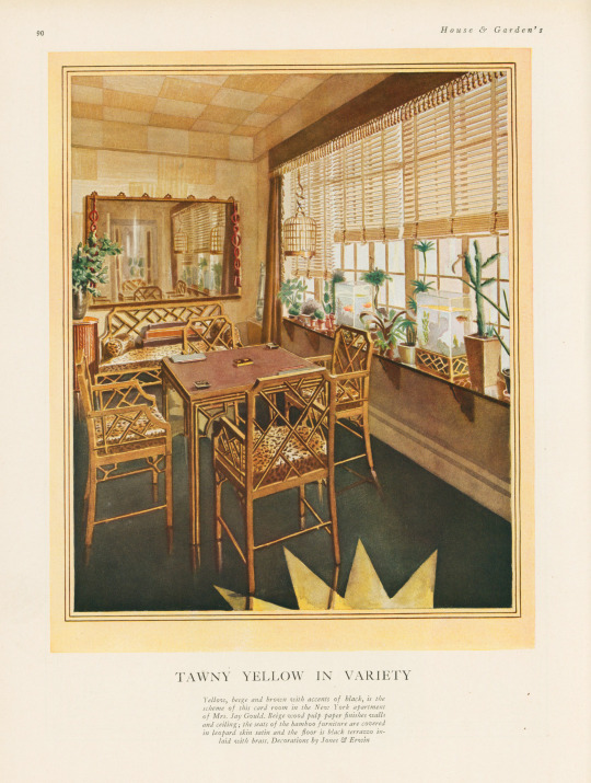
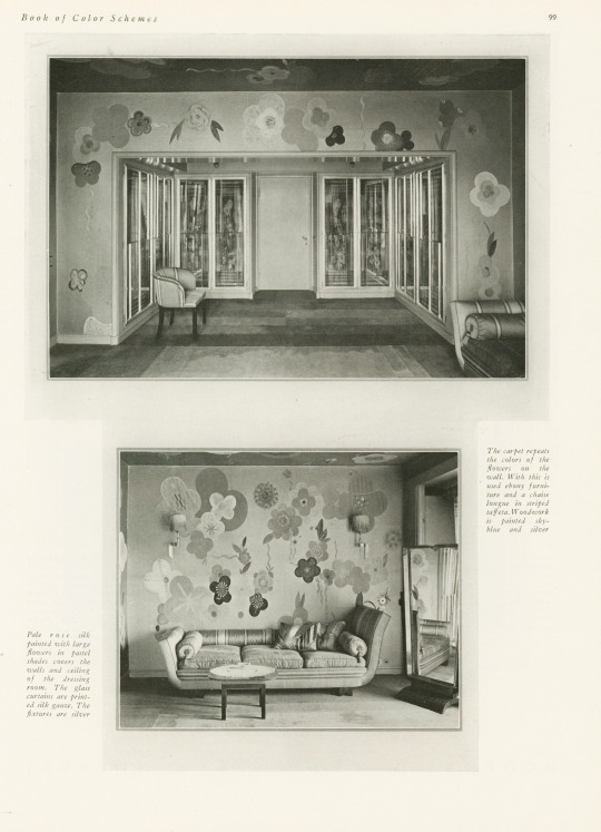
The book includes a large number of photographs of rooms, however, they are mostly in black and white—an unfortunate thing for a book about color! The promised eight color illustrations of rooms are not all present in our copy, but the five that are still in the book are shown here, alongside some of their black and white compatriots. I especially love the one titled "Tawny Yellow in Variety" that features a shocking amount of leopard print.
If you've read any of the posts I usually write, you know that I love a good binding—this one is a publisher's binding in a chartreuse-y yellow book cloth with art deco-style silver tooling featuring stars and leaves. Somebody took it upon themselves to write the publication date on the cover above the title—how thoughtful!
View more posts featuring Decorative Plates.
-- Alice, Special Collections Department Manager
#Decorative Sunday#Decorative Plates#decorative arts#House and Garden's Book of Color Schemes#color schemes#color#decoration#home decor#interior decorating#Richardson Wright#Margaret McElroy#Conde Nast#Conde Nast Publications#art deco#chartreuse#Publishers' bindings
78 notes
·
View notes
Text

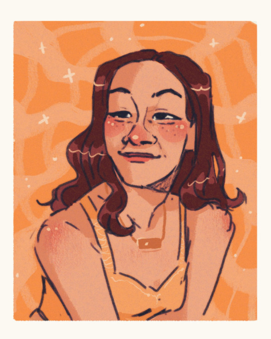


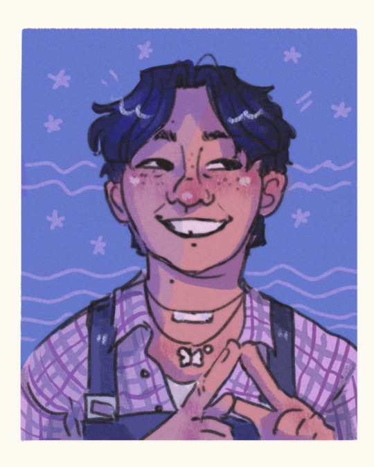
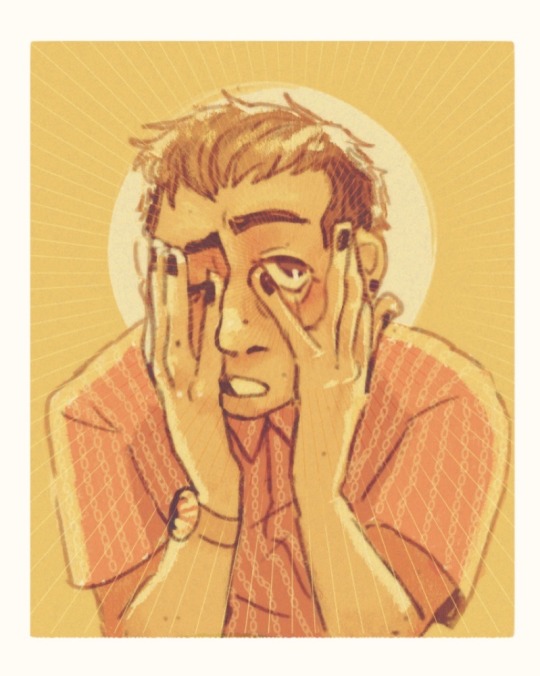
Color studies part 2 I am !!! so normal !
#purple is my gf I love her <3333#artists on tumblr#digital art#portrait#digital portrait#portrait study#color study#color palettes#color schemes#starry eyed
185 notes
·
View notes
Text

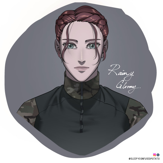
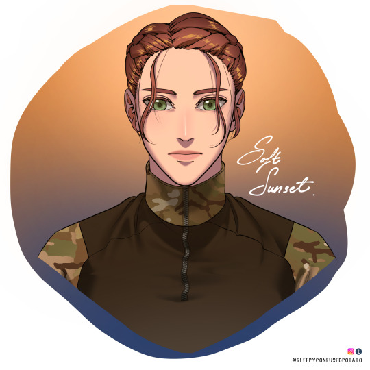

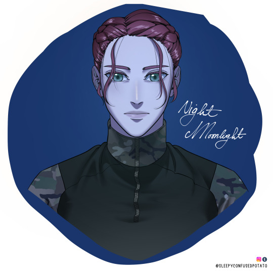
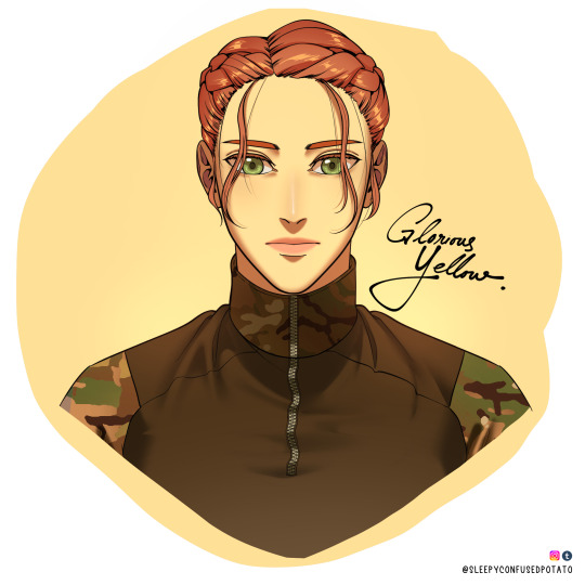

🌹🎨 Colour Scheme Notes Because Why Not🌹🎨
I had some free time today and felt like playing with colours inspired by my favourite Webtoons and animes!. Plus I wanted to finalize Jade's design a little bit, especially on the braids.
Jade's braids had been a big trouble of mine as it's not good ~(>_<。) It's very hard to draw and difficult to get right for some angles, It takes too much time/wastes so much time to draw, and it's overbearing - too much line art happening on the head while the rest of the face/body is just simple which creates an imbalance.
So yep I simplified the way I draw her hair! Much tidier now isn't it? ( •̀ .̫ •́ )✧
Anyway, this is just a note post for me, and could be a colour guide/palette for my future projects! (❁´◡`❁)
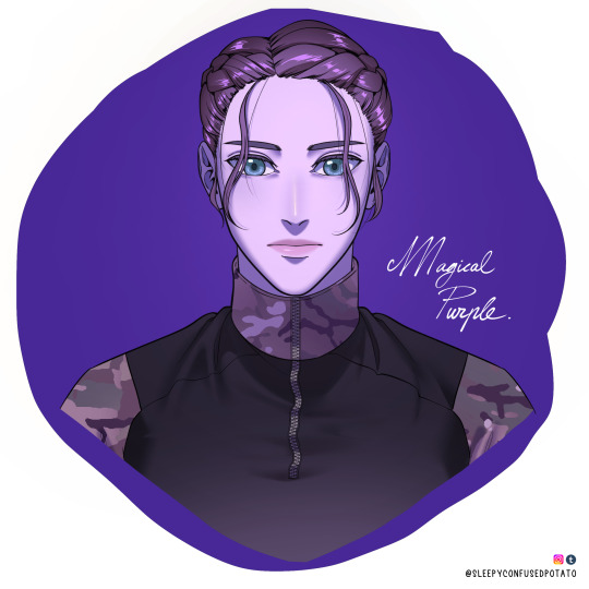
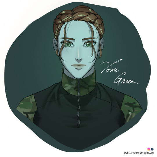
#call of duty#call of duty modern warfare#cod mw#cod#call of duty oc#cod oc#original character#colors#color guide#color schemes#art tips#art guides#art problems#cod mw22#charlotte jade le jardin#art#sleepyconfusedpotato art
318 notes
·
View notes
Text
youtube
42 notes
·
View notes
Text
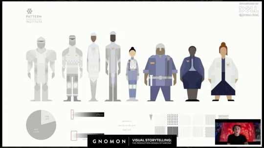
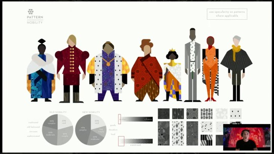
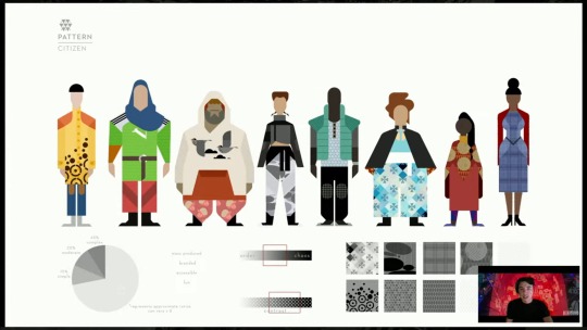
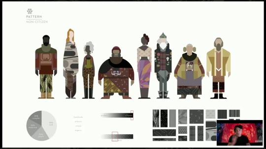
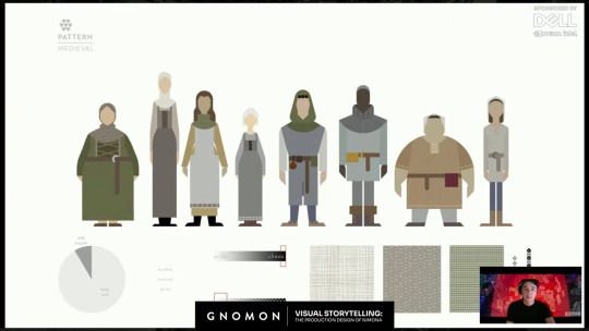
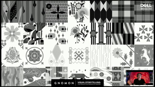
Maybe this was in the online digital Nimona artbook before it went offline, but I didn't pay attention to the costume design rules for all the people in the Kingdom, until this video "Visual Storytelling: The Production Design of 'Nimona'" by Gnomon (from which I screencapped all these pics).
It's interesting to consider how these clothing design rules symbolized Ballister's and Ambrosius's positions in society, but also might have reflected bits of their personalities.
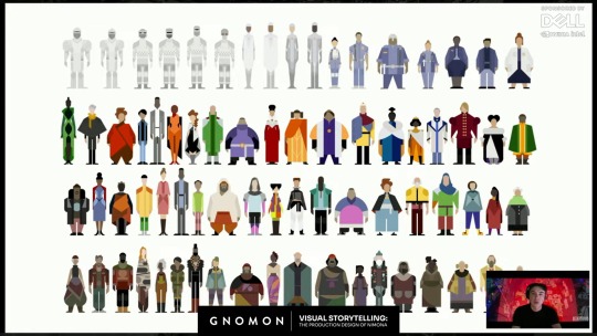
"So we first approached it by a very anthropological approach, where we sat down and said, "if this world was to actually evolve in a closed setting, behind these walls, from the medieval, in this kind of fear-based world, how would society evolve from the medieval rules? And how would that work?" So we researched the medieval rules and found that there was the distinction between, you know, nobility and citizenry, and then non-citizens. And so that was a good place to start for us, to say of "How do we organize this massive pool and system of crowd characters? but in a---in a getable way, that also relates to our story and expresses this world that we're doing?""
The Institute:
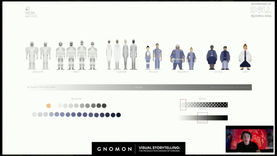
Nobility:
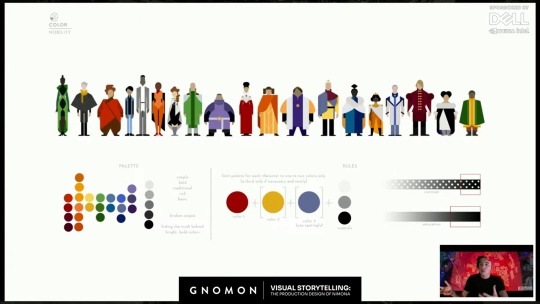
"So we broke we broke it down into contemporary, um, a contemporary ideology, where our main---our nobility was much more based on, um you know, haute couture rules, where we were---they were simple. They were bold. They were evolution of the kind of royal colors and sumptuary laws that the medieval had, but in a modern, in a modern take."
Citizens:
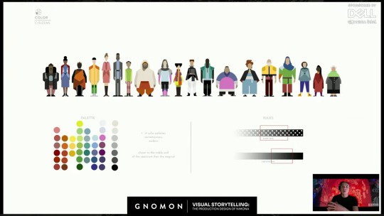
"Same with the citizens, where we leaned more into broader scope, where we needed to have the ability to have business wear, and athleisure, and, um you know, the color palettes that would be associated. …The range of body types that you would need, and…the range of races and ethnicities."
The Magicals:
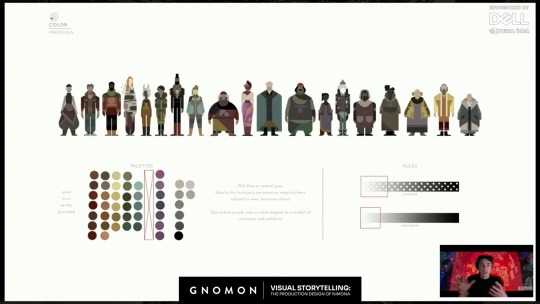
Interesting thing about The Magicals, is this note "NO blue or neutral grey (due to the Institute's persecution, magicals have refused to wear Institute colors)."
Ballister's regular clothes seem to be the same color palette as The Magicals. Given the order of these slides, The Magicals seem to be the lowest rank in the Kingdom's society. Previous concept art showed that the Nimona 2023 movie originally would have portrayed a secret society of people with magical powers like Nimona. I assume these costume design rules were for them, though they got cut from the final movie. It seems appropriate that though Ballister has no magical powers, he is dressed in the colors of the Kingdom's lowest societal rank. But as anyone who has drawn him has noticed, the pendant on his shirt is blue. The one color which The Magicals do not wear, because it is the color of The Institute. Ballister is a commoner trying to become a Knight of the Institute, so it makes sense for him. And though Ballister's clothes could maybe be considered shades of gray (as per The Institute), they have the same dark values of The Magicals and are actually more of the "earthy" tones, noted in The Magicals' palettes. Ballister does not wear the light, almost silver, grays of The Institute. But he does wear a blue pendant. And though his pants have a thin golden stripe running down the sides, which is another color emblematic of The Institute, on second look, it is less gold, and more of a light tan, another earthy color. Almost makes me think that after the end of the movie, maybe he should change his blue pendant to purple, since these design instructions for The Magicals also note "One subtle purple item on each magical as a symbol of resistance and solidarity". (It explains the shade of purple in Nimona's skirt.)
Interesting to look at Ambrosius's outfit, while considering these design instructions. Ambrosius does not wear the "bold" colors or high amount of patterns prescribed for Nobility. Instead, he wears white and a dark shade of blue, with mostly solid, non-patterned clothes, as prescribed for The Institute. He is their symbol, through and through. Except for one point: his hoodie's secondary color of tan. Not only is tan an earthy tone, like The Magicals, the lowest societal rank in the Kingdom, but is takes up a noticeable amount of space in his outfit. It is almost like his one little piece of rebellion against his birth position and the expectations of society for him to represent The Institute and Nobility. It may be his one expression of who he is as a person, rather than the expectations placed onto him. It's kind of interesting that they let him get away with that. Maybe he had to fight for it. Maybe it makes him feel closer to Bal. Maybe he likes the distance it puts between him and the Institute. Maybe he didn't get brave enough to start wearing such colors until after he met Bal. (Now I'm getting into headcanon territory.)
Medievals:
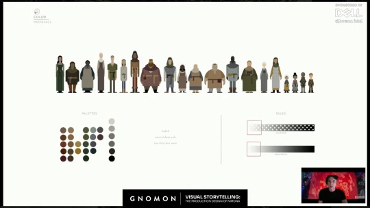
This was explained as the costume design instructions for the flashback characters from 1,000 years ago.
#drawing reference#costume design#nimona 2023#netflix nimona#official art#headcanons#character analysis#ballister boldheart#ambrosius goldenloin#pinkfluidnf#ambrbalnf#color schemes#color palettes#patterns#fabric patterns#food for thought
20 notes
·
View notes
Text


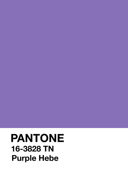
pantone inspiration
#6050A8 • #69448E • #8870B9
like my work? consider donating to my paypal!
✘ PLEASE DO NOT REMOVE CAPTION OR REPOST ✘
#colors#color palettes#color schemes#itsphotoshop#completeresources#pantone template#pantone#pantone palette#dailyresources
112 notes
·
View notes
Text
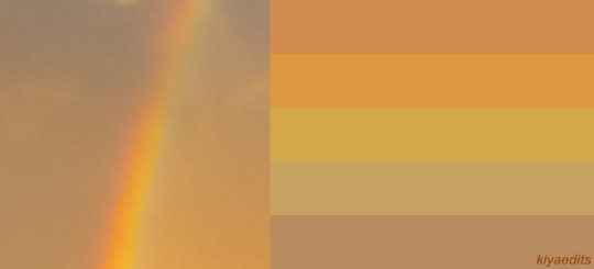
KIYA'S COLOR PALETTES! [SKY EDITION]
☁🌈☔
Color palettes based on some pictures I took of the sky, is all.


#kiyaedits#kiya's colors#color palettes#color scheme#aesthetic#sky#sky colors#color palette#color schemes#kiya's color palettes
56 notes
·
View notes
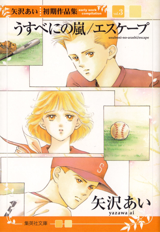
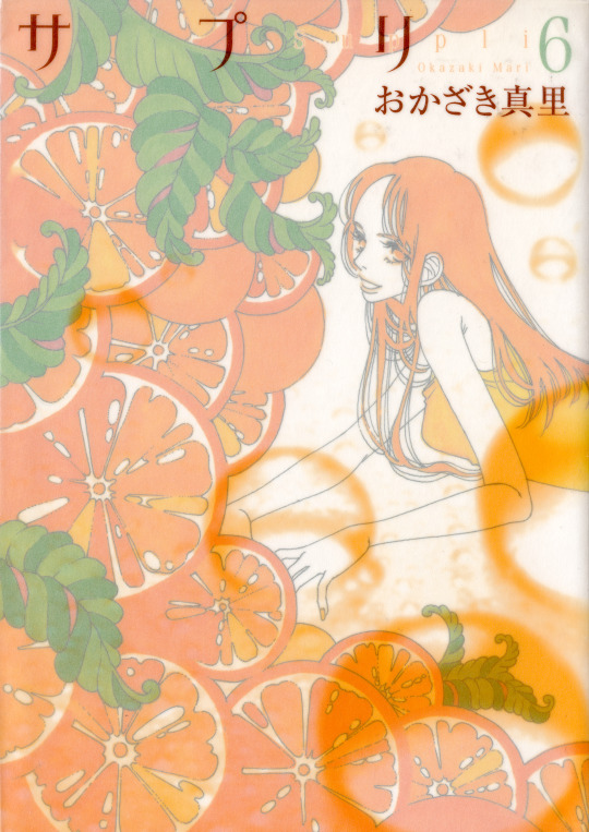
Photo


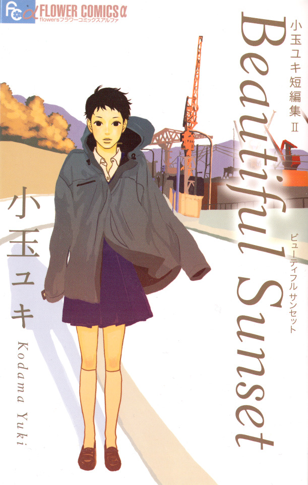

Sayonara Onna-tachi (さようなら女達), Yumiko Oshima
Usubeni no Arashi/Escape (うすべにの嵐/エスケープ), Ai Yazawa
Suppli (サプリ), Mari Okazaki
Sukoshi Mukashi no Koi no Ohanashi (すこし昔の恋のお話), Nami Sasou
Beautiful Sunset, Yuki Kodama
Yadori Ki (やどり木), Shio Sato
#yumiko oshima#shio sato#mari okazaki#nami sasou#yuki kodama#ai yazawa#colors#Color Schemes#my scans#photosets
66 notes
·
View notes
Text

free to use in your own art as you wish! Credit isn’t needed, but it would be very very appreciated :o) (You can even @ me if you want, I’d love to see what you make!)

#beeast-scribbles#color palettes#color pallet meme#color pallet#color schemes#Art meme#draw meme#color palette draw meme#color inspo#color inspiration#color ideas#color palette challenge#alt text#described
305 notes
·
View notes
Text
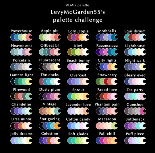
Send me a character + color palette and I’ll draw them!
Feel free to reblog & use the palettes. If you make anything with them, please tag it #LMG palette
#id in alt#You can send me requests for drawing my TH characters. link is in the comments#palette challenge#color palette#color palettes#color scheme#color schemes#Art challenge#LMG palette#artists on tumblr#digital art#Free to use#If this takes off then I’ll post more palettes
28 notes
·
View notes
Photo
some 20 year old Jet Set Radio & Sonic Adventure inspired characters / logos i made up as a kid in the early 2000s lmao. 🌀 Dreamcast was life.
here's a whole video full of art and music I made back at the turn of the millennium! >>
www.https://youtu.be/qtWCi-ZzTN8
#sonic#sonic adventure#hackers#jet set radio#dreamcast#90s#2000s#y2k#y2k aesthetic#jnco#color schemes#characters#logo#mascot#sega#kawaii#punk#cyberpunk
63 notes
·
View notes
Text


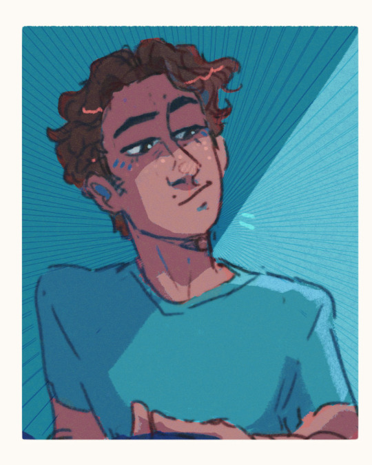
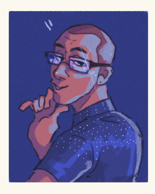
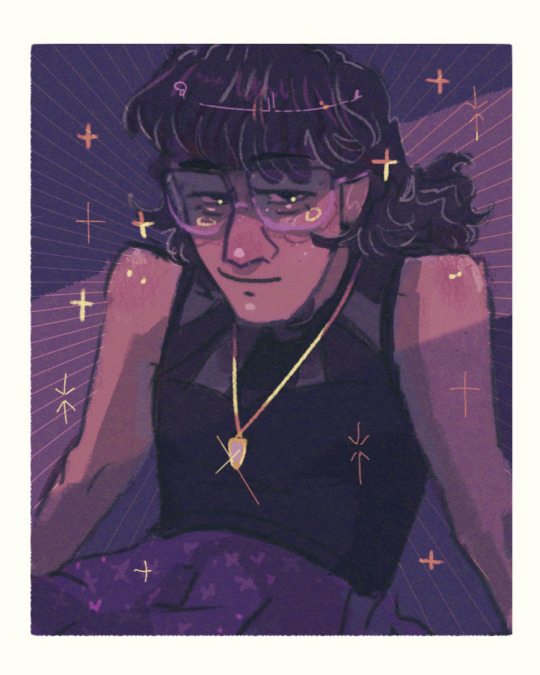
Portrait studies part 1 look at these freaks
#hehe it’s me I’m yellow !!!#artists on tumblr#digital art#digital portrait#portrait study#color study#light blue looks like steve minecraft lol#color schemes#color palettes#man idk just look with your eyebarls
172 notes
·
View notes
Text
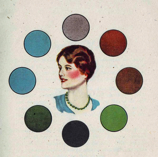
1930s era color harmony chart - Chart C.
#vintage illustration#color#color harmony#the 30s#color palettes#color schemes#infographics#interaction of color#color charts
25 notes
·
View notes
Last Seen Blogs

ventfessions
月が綺麗ですね。

tsukinoaodaisho
Bing Bong

abkslotonline
ABKSLOT SITUS GAME SLOT ONLINE TERBAIK 2023