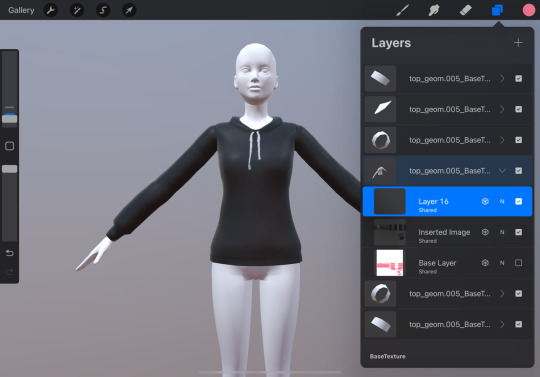
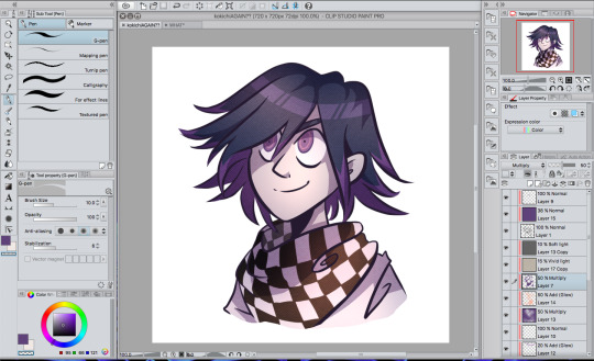
#a canvas this size I can only have like 15 layers or 10 if I used a canvas a little bigger
Text
Hey there 💫 [x]
#destiel#dean winchester#castiel#spnfanart#spn fanart#spncreatorsdaily#spn art#wiggleart#first drawing on my new iPad!I actually#started it on my old iPad yesterday but I wanted to finish it on this one lol#I redraw my first drawing on my first iPad! which is what is linked#y’all lemme tell you how happy I was because I didn’t feel the pressure of counting layers to make sure I wasn’t#getting close to the limit since on my iPad Air#a canvas this size I can only have like 15 layers or 10 if I used a canvas a little bigger#and if you look at the first art I did with the iPad Air that was fine because I wasn’t using that many layers#but now I use a lot like I can use up to 30 or 40 because everything is its own separate layer it’s all put together like a puzzle#hence the needed upgrade lol#I’m so excited to get started on ideas I wanted to do but couldn’t get to on my old hardware!
249 notes
·
View notes
Text
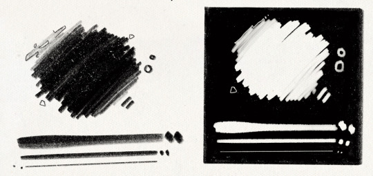
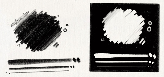
I got quite a few DMs over the weekend on twitter asking about my brushes, and as with anything, your mileage may vary, and digital art isn’t made or broken by brushes, but having them never hurt! Talking about how you use your tools is just as important as talking about what tools you use, so consider this a small breakdown of my process for digital sketching.
First thing’s first, I avoid sketching on an untextured canvas. If you like to have a flat, solid canvas, I recommend working at 50% grey, or adjusting your canvas to be slightly off-white. The harshness of black on pure-white can be a hang-up for many people, including myself.
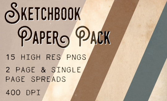
I sketch on paper textures sourced from my own old sketchbooks and papers. The one I use most frequently is available in my Sketchbook Paper Pack, and named Off White.

While a true-to-life pencil look is not what I’m actively going for with my sketches, these papers certainly help achieve it.
I do almost all of my work in Procreate, but learned digital art first in Photoshop. Anything I share here in regards to how I use brushes can be applied to any brush, I’m certain!
For my sketches, you’re seeing the work of one brush and one eraser.
For my brush, I use an altered version of Procreate’s native HB Pencil brush that I’ve named HB Pencil Beefy. It’s available in my 2021 Brush Pack.
For my eraser, I use Alexa Sharpe’s Soft Eraser. It’s available in their Eraser Brush Pack.
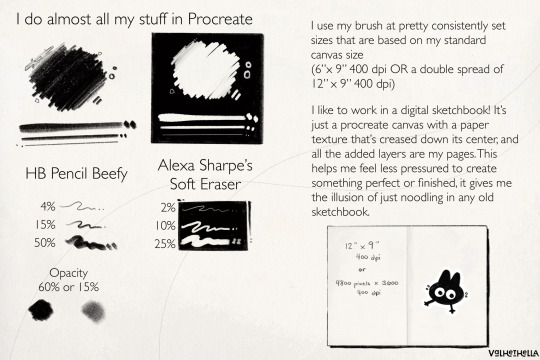
I use my brush at pretty consistently set sizes that are based on my standard canvas size, which is 6″ x 9″ 400 dpi or I use a double spread of 12″ x 9″ 400 dpi.
(If you work in pixels that’s 2400x3600 at 400 dpi and 4800x3600 at 400 dpi)
HB Pencil Beefy I use at 4%, 15%, and 50% size, with the brush’s opacity set to either 60% or 15%.
I set the brush to 15% opacity when I want to go in very softly with lots of that pencil texture. I use this when I need to scale back and really rough something out, or if I’m trying to get a sense of volume with some shadows or contours.
With Alexa Sharpe’s Soft Eraser, I use the eraser set at 2%, 10%, and 25% size. I only scale back the opacity on the eraser if I want to take something back to nearly gone, but still want those lines, faint, there as a guideline.
Jumping back to my file setup really quick, I like to work in a digital sketchbook! It’s just a procreate canvas with a paper texture that’s creased down its center, and all the added layers are my pages. This helps me feel less pressured to create something perfect or finished; It gives me the illusion of just noodling in any old sketchbook.
Okay. Back to the pencil. Below, I have a small idea of my process in sketching and drawing. This is not a how-to-draw demo, and it’s definitely not an anatomy demo – it’s just how I approach drawing using this brush. The page below, and the one above, were both done on a 9″x 6″ canvas at 400 dpi.
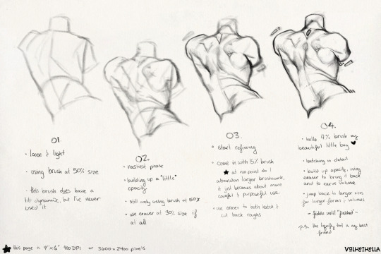
01.
Loose and light
using brush at 50% size
this brush does have a tilt dynamic, but I’ve never used it
02.
Nastiest phase
building up a little opacity
still only using brush at 50% size
use eraser at 25% size, if at all
03.
start refining
come in with 15% sized brush
at no point do I abandon larger brushwork, it just becomes about more careful and purposeful use
use eraser to hatch and cut back roughs
04.
hello 4% brush my beautiful little boy ♡
hatching in detail
build up opacity, using eraser to bring it back and to carve volume
jump back to larger sizes for larger forms and volumes
fiddle until “finished”
P.S. the liquify tool is my best friend
148 notes
·
View notes
Text
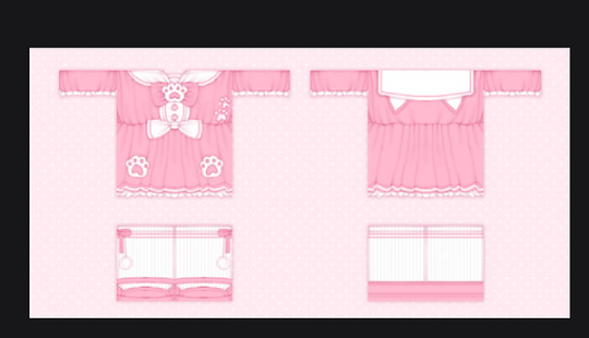
clothing showcase tutorial
halo, today i will be teaching how to make a showcase! the style will be something like below:

☆
step 1: go to pixlr, and click open image
step 2: open your showcase
step 3: this is optional but you can also include a backside of your design!

step 4: resize your canvas! go to the top left corner, click page, then click page size, and enter the new dimensions! the ones i use are:
1 showcase : 300 x 300
2 showcases : 600 x 300

step 5: rearrange your showcases.
step 6: add a background, i usually go for a polka dot pattern, but you can use whatever u want.
step 7: now i duplicate the showcase layer, and change the whole thing into a shading color (for shadows).

step 8: then drag that layer under the showcase, set the layer to multiply, and blur it!
to blur: filter > details > blur
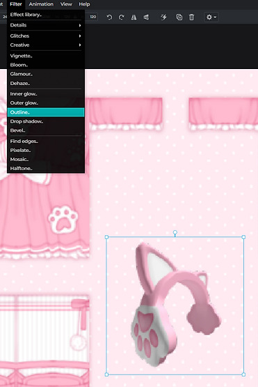
step 9: this is optional and only applies if you want to add an ugc item to your showcase!
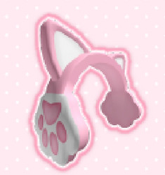
a. load the image of the ugc in, then i add an outline to it, sometimes if i’m feeling quirky i’ll do a double outline
b. to outline: filter > outline
c. the same as before, i duplicate the layer and change the color to make the shadow

step 10: it's time to add text! my favorite fonts can be found below, these are the ones I normally use! click the text to be redirected to the download page (‾◡◝)

a. black bubble
b. candy beans
c. cookies
d. fredoka one
e. hey comic
f. milky nice clean
i usually add my roblox/twitter handle in one corner, then where it's available at in the opposite corner.

step 11: again, i add the shadow so it pops more
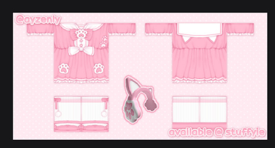
step 12: add ur watermark (i forgor)
step 13: at this point, you’re basically finished, but i like to add some small fun little pngs to make it look cuter. since this outfit is cat themed, i added some little paws as details.

step 14: i also like to add a double border so it looks more decorative!
to add a border: go to your background layer > filter > inner glow

step 15: if you think everything looks blurry, merge everything into 1 layer.
then go to: filters > details > sharpen
and sharpen your showcase, it makers everything less blurry!
anddd, you're all done, now you can be a certified 'pro showcase maker' like me!!!!
☆
you made it to the end!! lmk if u have any questions, suggestions to making this tutorial better, etc.
credits: ayzen#1111 or @ayzenly on roblox
contact me: ayzen#1111
7 notes
·
View notes
Photo
I got quite a few DMs over the weekend on twitter asking about my brushes, and as with anything, your mileage may vary, and digital art isn’t made or broken by brushes, but having them never hurt! Talking about how you use your tools is just as important as talking about what tools you use, so consider this a small breakdown of my process for digital sketching.
First thing’s first, I avoid sketching on an untextured canvas. If you like to have a flat, solid canvas, I recommend working at 50% grey, or adjusting your canvas to be slightly off-white. The harshness of black on pure-white can be a hang-up for many people, including myself.
I sketch on paper textures sourced from my own old sketchbooks and papers. The one I use most frequently is available in my Sketchbook Paper Pack, and named Off White.
While a true-to-life pencil look is not what I’m actively going for with my sketches, these papers certainly help achieve it.
I do almost all of my work in Procreate, but learned digital art first in Photoshop. Anything I share here in regards to how I use brushes can be applied to any brush, I’m certain!

For my sketches, you’re seeing the work of one brush and one eraser.
For my brush, I use an altered version of Procreate’s native HB Pencil brush that I’ve named HB Pencil Beefy. It’s available in my 2021 Brush Pack.
For my eraser, I use Alexa Sharpe’s Soft Eraser. It’s available in their Eraser Brush Pack.
I use my brush at pretty consistently set sizes that are based on my standard canvas size, which is 6″ x 9″ 400 dpi or I use a double spread of 12″ x 9″ 400 dpi.
(If you work in pixels that’s 2400x3600 at 400 dpi and 4800x3600 at 400 dpi)
HB Pencil Beefy I use at 4%, 15%, and 50% size, with the brush’s opacity set to either 60% or 15%.
I set the brush to 15% opacity when I want to go in very softly with lots of that pencil texture. I use this when I need to scale back and really rough something out, or if I’m trying to get a sense of volume with some shadows or contours.
With Alexa Sharpe’s Soft Eraser, I use the eraser set at 2%, 10%, and 25% size. I only scale back the opacity on the eraser if I want to take something back to nearly gone, but still want those lines, faint, there as a guideline.
Jumping back to my file setup really quick, I like to work in a digital sketchbook! It’s just a procreate canvas with a paper texture that’s creased down its center, and all the added layers are my pages. This helps me feel less pressured to create something perfect or finished; It gives me the illusion of just noodling in any old sketchbook.
Okay. Back to the pencil. Below, I have a small idea of my process in sketching and drawing. This is not a how-to-draw demo, and it’s definitely not an anatomy demo – it’s just how I approach drawing using this brush. The page below, and the one above, were both done on a 9″x 6″ canvas at 400 dpi.

01.
Loose and light
using brush at 50% size
this brush does have a tilt dynamic, but I’ve never used it
02.
Nastiest phase
building up a little opacity
still only using brush at 50% size
use eraser at 25% size, if at all
03.
start refining
come in with 15% sized brush
at no point do I abandon larger brushwork, it just becomes about more careful and purposeful use
use eraser to hatch and cut back roughs
04.
hello 4% brush my beautiful little boy ♡
hatching in detail
build up opacity, using eraser to bring it back and to carve volume
jump back to larger sizes for larger forms and volumes
fiddle until “finished”
P.S. the liquify tool is my best friend
727 notes
·
View notes
Note
I would love a tutorial from the procreate update please whenever you have time ❤
Procreate update for sims 4 meshes tutorial!!
Just a disclaimer that I’m still figuring out the update too so this may not be the best way to do it but it’s the way I got it to work lol. The procreate update seems a little wonky at this point so hopefully in the future they’ll add support for importing textures and non-square uvs :)
Tutorial under the cut because it’s long akfskh
1. Open whatever mesh you want in Blender as per usual.
2. Go into File>export>Wavefront(.obj) and export it as an obj
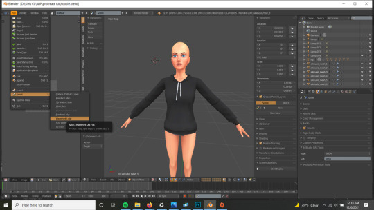
3. Transfer the obj and the image texture to your Ipad. You can do this any way you want (dropbox, email, etc.), my computer was automatically set up with a synched onedrive folder so that’s what I use
4. Import the obj into procreate. You can either do this from whatever program you used to transfer the file (in Onedrive you click on the options and select “open in another app” and then you can select procreate) or you can click on “import” from the top right of the procreate gallery and navigate to the file in your files app from there. Either method will automatically add the mesh as a new artwork that you can find in the gallery
This is where it gets a little screwy lol. Since procreate only seems to support square uvs that are 2048x2048 and Sims textures are 1024x2048, we have to stretch the texture to fit, edit it, then squish it back (this will kill the quality a little, but I honestly can’t figure out a different to do it, please tell me if you know)
5. Color fill the main mesh you are working on (drag the color from the top right corner onto your mesh and drop)
6. Go under Actions (wrench icon)>3D>Show 2D texture
7. Go under Actions>add>insert photo and pick your imported texture and position it up against one side of the canvas
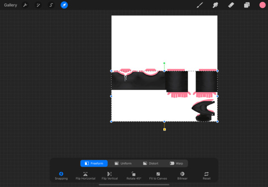
8. Start a transform, then turn on snapping/magnetics. Then, with freeform transform, stretch the texture so it reaches the other side of the canvas, making sure it snaps to each side. You can then position the texture over the colorfilled texture to make sure it lines up
9. Uncheck the show 2D texture option and check that the texture looks right. You can turn off the colorfilled texture too
10. Paint/edit texture normally! I like to work on a separate layer so I can move it around and edit it separately
11. You can also insert photos, select areas and move them around, and basically do everything you can in normal procreate, it’s pretty cool :)
12. Once you’re happy with your texture, go into layers and merge your drawing layer with the texture layer (you could try just exporting the drawing layer and adding that onto the original texture in photoshop, might save some quality but you might not be able to get it in the exact same spot)
13. Go under actions>add>copy canvas
14. Go back into the gallery, add a new artwork, choose clipboard when it asks for a size, this should put the image texture you copied into that new artwork.
15. Save the image from there and transfer it back to your computer
16. In photoshop, select the white background and delete it. Then, copy the texture onto a sims texture template. Then you can free transform one side and squish it back to the right size, and place it so it fits correctly over the template

17. Hide the template and save the image, then import it as a texture into s4s. Tada!

It’s not perfect, like I said you lose some quality, but you can do some cleanup in photoshop and it’s a lot easier to draw directly on the mesh this way if you don’t have a drawing tablet/cintiq to hook up to your computer.
When I tried it the first time, I was working on a new mesh so the UVs were square. When I finished painting, I took that texture and scaled it down to fit on the sims texture, then I adjusted the UVs to fit, which definitely worked better. Hopefully Procreate will fix some things so we can import textures and have non-square uvs. Hope this helped, let me know if you have questions!! :)
#procreate#sims 4#sims 4 cc#sims 4 cc tutorial#sims 4 tutorial#procreate update#procreate 3d#procreate tutorial#ts4#ts4 cc#s4#s4cc
168 notes
·
View notes
Note
Good evening, could you possibly make a gif making process tutorial if you don't mind? I have tried to find tutorials but most of them are sadly outdated and I tried to make a gif going by them but it didn't work out well... I hope I'm not asking too much
Hey dear anon, I'm sorry I'm late with answering but have been a bit busy with some stuff and haven't been feeling well. Thanks for coming to me asking for a gif tutorial, even tho I'm not the best person at making gifs but it made me smile when you asked me. The way I do mine isn't that much of a process, I just do the basis if you want a more accurate and pro at gifing you should ask @yyh @mafuyuh @tanchirou @makiema @vyctornikiforov @invmaki @megumints @rubydragon16 and @hanae-ichihara they are very good at making gifs.
So here is what I do:
GIF TUTORIAL!
1. You open Photoshop
2. You go to File option and click on "Import" then "Video Frames to Layers"

3. Then it should open you a window to your folders (these are mine lol don't mind)

4. Then you open the video you want to gif, but attention, the way I do gifs in this option, it only has to be a video file like avi or mp4, mkv doesn't work. For mkv's you need a software for you to make the videos turn into frames, like I said you should ask some of my mutuals, that make gifs through that software and then import to Photoshop).
5. This is what appears when you select the video, now what I usually do is click on the "Select Range Only" and under it, it asks how many frames you want, I normally choose 2 like it's on there, and there's sometimes that I don't click it, I leave as it is. If you select the 2 frames he will decrease the number of frames, the more you choose the less frames will appear so I suggest you choosing only 2 or none.

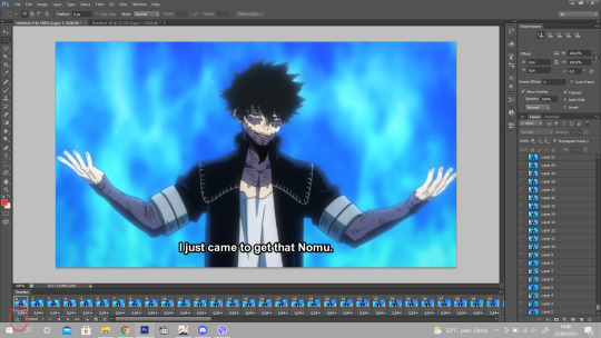
6. Then, when you want to gif a scene, you need to choose which scene you want, like I have on the picture above, see the red circule? The lil black triangle is what helps you to select the part you wan to gif, when you find the scene and push the lil triangles between the scene you want, you click ok! (Photoshop will ask you something about how big the scene frames are but you click continue nonetheless)

7. So here it is all the frames of the scene I want, now you will only choose the particular part to gif, be careful not choosing too many frames or it will be too heavy and will not upload on tumblr. On the timeline under Dabi you select and then delete the parts you don’t want. You then select the time you want, it’s on each frame, you select all and add the time. Then you click on here:
8. where the red circle is, so that you can make the animation.

9. On the right section, you have all the layer frames, the ones who doesn’t have the little eye, are to be deleted cause they were the ones you deleted earlier on the timeline, so those are to discard, like this:

10. Now you have to select all the layer frames on the right section,click on tight click of the mouse and choose the option “Convert to Smart Object”

11. Then you have your animation done

12. Now to do the frame so that it can be the right size to post in tumblr and to cut the subs lol XD You go to image, and choose the “Canvas Size” and it appear this

13. You go to the height and try to make it shorter on the height size so that you won’t let the subs be seen on the gifs. And you can do on the width too so that the gif frame won’t look too long. Like this, it has 25,4 on height and 45,16 on width, so I will add 22,5 on height and 38 on width and you click on the arrow like I have bellow

14. And with that it cuts a lil on the width and the height and it cuts the subs :D You then go to the Image option and select the “Image Size” you then put 540px on the size. the sizes of tumblr.

15. Now it’s the time we play a bit with colors haha XD I already have a psd so, I just add and play a bit with the colors and see how the quality looks
16. If it looks with some bad quality you just go to “Filter” then choose the option “Blur” and then “Surface Blur”
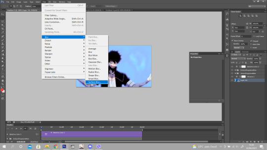
17. It opens this window and add the same option as I have, it’s sufficient for the bad quality ^^

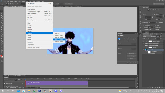
18. And finally you go to filter again, go to “Sharpen” option and click on “Smart Sharpen” so the gif lines look more sharpen and gives a more quality and see more the details on the gif.
19. Add the same as I have and it’s finished! :)

20. To save you go to File and click on “Save for Web”
Done! ^^ Hope this helps you babe and that I was able to explain well since I’m bad at it lol! Anything you need just ask <3 Thank you again.
269 notes
·
View notes
Text

COMPREHENSIVE GIFFING TUTORIAL (vapoursynth + ps cc 2018)
+ some tips and tricks on color correction, blending and subtitles
You guys asked for it, so here we are! This is by no means the gold standard to giffing. Rather, this is simply my process and my own preferences. Take it as you will. Additionally since I use a mac some of my controls/panels may look different than what you would see for windows users.
DOWNLOADING YOUR SOURCE
This step is extremely important to the quality of your gifset. If you want high-quality gifs I would recommend giffing sources in 1080p whenever possible (especially if you’re going for larger dimensions). You may get away with 720p for smaller gifs. For kdramas, your go-to source would be dr*maday or torrents. (you can search my faq tag if you’d like to know specifics on finding and downloading torrents).
IMPORTING + PROCESSING YOUR FILES WITH VAPOURSYNTH (VS)
Please note that this tutorial does not cover basic installation and set-up of vs. If you would like to know how to download and set-up vapoursynth (it works for both mac and pc) along with some of it’s basics you can find more information at: https://hackmd.io/@nibreon/vapoursynth-book/%2F%40nibreon%2Fvapoursynth-book
Once you’ve identified what portion of your video you’d like to gif, simply drag your video file into VS. Specify the start time and duration of the clip you’d like to import. Typically you’ll be aiming for ~3-8 second clip depending on how big your gifs will be. I am very lazy when it comes to importing. The less of it I have to do, the better. Therefore, I often import clips that are 10-15 seconds long, sometimes even up to 20 seconds. I wouldn’t recommend going over 15 seconds most of the time though, because this will usually bring you over the 500 frames photoshop allows you to import at once. (when I do go over, I will sometimes import the processed VS file into PS in segments). You can also choose to import the VS output as segments if you want all your gifs on separate canvases. (I'll go into more detail on this later)
Once you’ve imported the clip into VS your screen should roughly look like this once the resizer pops up:
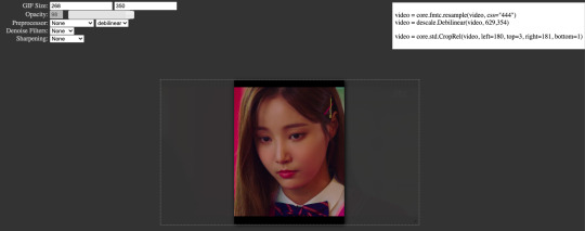
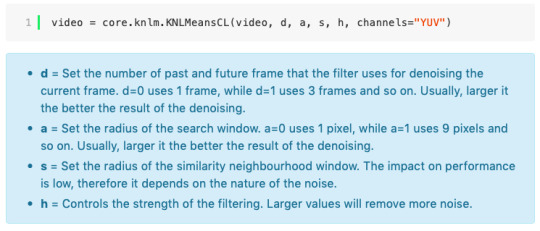
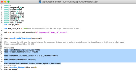
In the top left is where you will be applying your cropping, sharpening and denoising filters. Cropping: Keep in mind the Tumblr dimensions: 540px for full-width gifs and 268px for half size gifs, 177/178/177px for 3 gifs across. The height is completely up to your own preference. Usually I work in 540x300px. Once you edit those parameters you can drag/resize your video file to fit your new canvas. Sharpening + Denoising: You can choose to skip this if you would rather sharpen in ps. I personally do all my cropping, denoising and sharpening in vs. I use finesharp and KNML for sharpening and denoising respectively. Once you select those two filters from their drop down menus, be sure the select the checkbox as well. You should now notice 2 additional lines of code in the top right box. The line that reads: video = core.knlm.KNLMeansCL(video, 0, 6, 4, 1.2, channels="YUV") is where you will adjust your denoising parameters. You will only be adjusting those 4 numbers. I usually use: 0, 1, 0, 1.2. Now find the line that reads: video = hnw.FineSharp(video, sstr=0.22). These are your sharpening parameters. once again we’re only adjusting the number at the end. I typically use somewhere between 0.33-0.55. Depending on the quality of your source and preferences these parameters may change.
Here is a breakdown of the KNML parameters (source: @/nibreon HackMD):
Once you have finalized your parameters, copy all the code in that top right box and paste it into your vapoursynth editor. Note: you can ‘inactivate’ certain lines of code by adding the # symbol at the start the line. That line of code will then be greyed-out. This is what your code should now look like (the highlighted section is the part I just copy and pasted):
If you would like to preview your filters and see if you need to make any adjustments, simply navigate to the top bar and select script > preview. If you like what you see, great! If not, you can adjust the parameters directly in the editor until you see a result you’re happy with. Once you’re happy you can move onto the final step in vs: processing.
Processing: Once again, navigate to the top bar and select script > encode video. Another window should pop up. Make sure you set ‘header’ to ‘Y4M’ then click ‘start’. Patiently wait for that to finish processing. The longer your clip is and the more filters you add, the longer it will take.
IMPORTING YOUR CLIP INTO PHOTOSHOP (PS)
Now you’re done with the vapoursynth section! Not too hard, right? I use the timeline method when I gif. To import your video file into ps navigate to file > import > video frames to layers. Here you can use the sliders to further specify what range you would like to import. Make sure the ‘make frame animation’ box is checked. To optimize smoothness of your gif, avoid checking the ‘limit to every _ frames’ box. Hit ‘OK’ and wait for the frames to import. Depending on the size of your clip, ps may notify you that you are importing a large file and it may take a long time to process, simply say ‘ok’ to this. UNLESS you get a message saying it will limit to 500 frames. This means your clips contained more than 500 frames and you should select a smaller section to avoid cutting out any critical parts. (Note: you can always go back and repeat this process to select a smaller range of frames from the same video clip until you’ve imported all the frames you need).
Timing: You can adjust the timing of your gifs before converting to timeline. Select all the frames (Navigate to the icon with the 4 bars at the bottom right of you screen. Select “select all frames”). Click the drop down next to the timing of any of the frames. Select ‘other’ and input a your preferred timing. I personally use ‘0.04′ but I've seen people use anywhere from 0.4-0.8ms. Also as a note: when you convert your gif to timeline it has a tendency to mess up your timing so even if you input 0.04 or 0.05 it won’t actually be that timing later. If you want the true frame rate you can set your timing right before saving. You can also adjust timing at the end. (see export/saving gif section for more info)
Now the next part can be tedious and for that reason I’ve created numerous actions to speed up this process. But for the sake of this tutorial I will walk you through the steps. At the bottom of your screen is your timeline. As you can see, it defaults to frames, but we want to convert this into a smart object so that all your coloring/edits are made to all of the layers. To do this: 1) Navigate to the icon with the 4 bars at the bottom right of you screen. Select “select all frames” 2) Now select all your layers in your layer panel. On mac you can use cmd + option + A as a shortcut. 3) Back to the icon with the 4 bars, select “convert to video timeline” 4) Right click on all layers (which should still all be selected) and find “convert to smart object”
(Aside: Actions) actions are SUPER helpful to streamlining your giffing process. you can find actions people have made available on resource blogs like itsphotoshop OR you can choose to make your own custom actions. To do this, all you need to do is locate your action panel. Then from the controls at the bottom of the panel select the one that looks like a sheet of paper to “create a new action” Once you’ve named it and hit ‘ok’ the record icon should now be red. PS will now basically ‘record’ whatever you do. To stop recording hit the square icon. Now whenever you want ps to execute the same set of steps you just did, you can locate the action you just made and ‘play’ it by selecting the triangle icon. I highly recommend making an action for the steps I just outlined above to convert your gif into a smart object timeline. It will make your process much faster and more painless.
COLORING
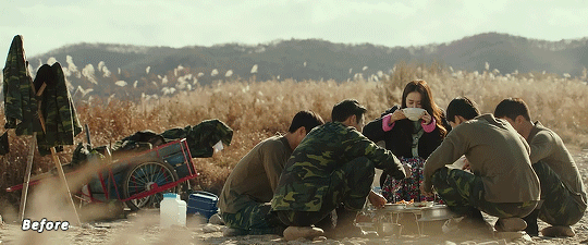
Now the fun part! I focus on emphasizing the colors already present in the video source or getting rid of some less-than desirable overtones when I color. It gives the gif a natural look, but makes everything pop a little more. We will be working with selective color, curves, levels, and brightness/contrast mostly. This is the original gif I will be using to demonstrate coloring:
Curves: I always start with curves. The first curve layer I use to set a desirable black point. To do this, locate the top dropper icon from the curves panel and select the darkest point of your image. This will set that section to “true black” Feel free to play around with this until you find a desirable outcome. Now add another curves layer. This one we will be using to adjust the brightness/contrast. First, I always start off with ‘auto’ and see where that takes me. If you like the outcome, great! If you don’t play around with the different curve points until you get an outcome you like.

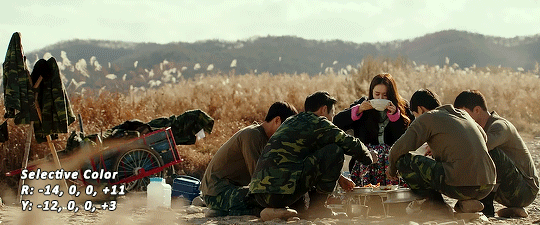
Selective Color: This adjustment layer will be your best friend. For me, I will typically work with reds, yellows, and black. If the source has a lot of blue/cyan I will use those too. Basically look at your source and determine which base colors you’d like to emphasize/alter. For blacks I usually up the black by +1-5 depending on the source. For reds, it also depends on the source. But I will typically either decrease cyan (to make red stand out more) or increase cyan (to make the red not look so overexposed). You want to be careful here. Overexposing the red can make your skin tones look like red tomatoes! And for my content base, where most of the actors are of asian descent, we should be emphasizing the yellows and NOT the reds (see aside on color correction + skin tones for more info). After altering the reds to my liking, I do the same process for the yellows. To bring back natural skin tones and color, you will likely want to darken the yellows, expose them a bit more and maybe even up the yellow slider. A common rule of thumb: if you want to make any of the colors less exposed, increase the cyan. If you want to increase exposure on any of the colors, decrease the cyan. If you want a color to appear more strongly or prominently, increase the black. The magentas and yellows I use more to adjust hues. You can add multiple selective color layers to further emphasize your changes.
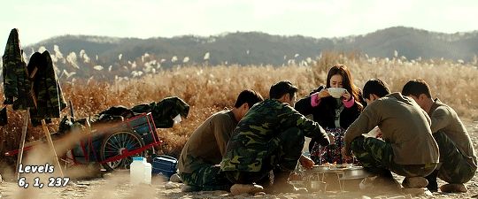
Levels: Now we will work on the lighting some more. This creates more contrast and depth to your gif, often making them look ‘crisper’ To emphasize the bright parts, move the right-hand slider to the left. The emphasize the dark parts, move the left-hand slider to the right. You may also choose to move the middle slider to adjust more neutral lighting. Do so until you find a setting to your liking.
Miscellaneous: Depending on your gif you may need to play with other adjustment layers. Some other ones I often use are the brightness/contrast and exposure to adjust lighting and add more dimension to the gif. For additional color correction I use color balance and to a lesser extent hue/saturation and vibrance.
(Aside: Color correction + skin tones): We are anti-whitewashing and anti-redwashing when it comes to asian media. Like I mentioned earlier, natural asian skin tones have yellow undertones, not red/pink. Therefore when you’re bringing in color you should be mindful of this delicate balance. Adding more red does NOT equal un-whiteashing. Be VERY careful how you balance the yellows with selective color/hues/color balance.
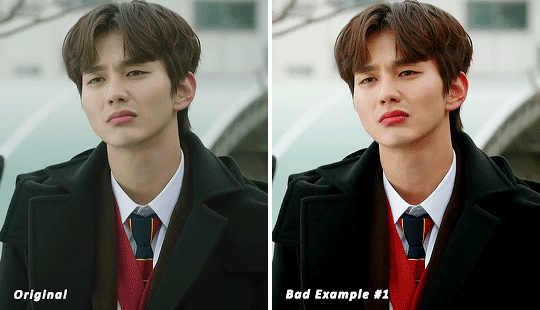
^^ Here is an example of what I mean by overexposing the reds. Poor seungho is looking as sunburnt as a cherry tomato. Note: if your original source is already overexposed with red, fix it! You can do this by applying the same basic principles I explained earlier. Try upping the cyan on the reds in selective color, or shifting the color balance to favor cyan over red with the color balance adjustment layer. You may also choose to favor the yellow over blue.
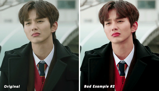
^^ Now this is straight-up whitewashing. This is what happens when you are not careful with your correction of yellow. I’m not saying you can’t touch the yellow slider or get rid of some yellow form the overall image (because sometimes it is very much needed), but you should be very mindful how your corrections can affect skin tones. If you decide to decrease saturation of yellows, or decrease yellow in the selective color section of the reds, do so with caution. If your reds are looking too pink, add some yellow in the red selective color, up the yellow and black of the yellow selective color.
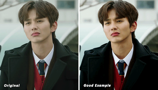
^^ If you hit that happy medium, you can emphasize the natural skin tones without overexposure. Here the underlying tones are very much still in the yellow range.
(Aside: Blending): I will very briefly talk about how to blend two gifs together. First make sure you’ve imported both your gifs into ps and converted them into the timeline format. On one of the gifs, right click the gif layer in the layer panel > duplicate layer > select the canvas of the gif you’d like to blend the gif with. On the canvas you just copied your second gif to, you can now drag the two layers around the on the canvas to get your desired positioning. On the top gif apply a layer mask. This can be found in your layers panel at the bottom, and is indicated by the white rectangle with the circle. Next, make sure you select the mask in the layer panel (it will show up as a white rectangle on the layer you applied the mask). Grab your paintbrush tool and make sure your color is set to black. Now you can effectively ‘erase’ the part of the top gif you don’t want to show anymore. I recommend setting your brush hardness to 0% to get a smoother transition. You can also play with the opacity settings. If you want to add back in a part you erased, just switch to a white paintbrush and you will be able to undo what you had just ‘erased’ with the black. When you merge the gifs, they will play the same number of frames. This means your blended gif length is limited by the gif with the fewer number of frames. You can move around your timeline layer and shorten the included portion by dragging either end of the timeline layer in until you get both gifs to play the parts you want.
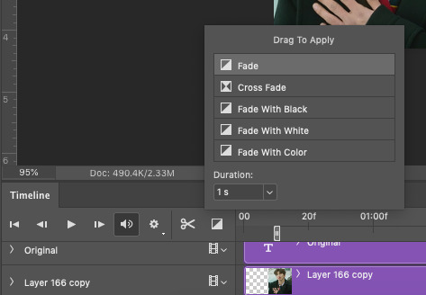
CAPTIONS/SUBTITLES
I often get asked about my subtitle font/styling settings. Personally I find the best fonts for subtitles are calibri and arial. I use calibri with the following settings: 12-14px, bold italic plus faux bold, 1px black stroke (optional: drop shadow set to ‘multiply’ at around 85% opacity), and tracking (VA) set to 75. If you would like your subtitles to fade-in or fade-out you can apply the ‘fade effect’. Locate the b/w square icon in your timeline panel. Select fade and drag it onto your text layer in your timeline. You can then right click on the wedge shape to adjust your fade duration. I usually use 0.35s. If you drag and drop the effect towards the beginning of your text you can get the fade-in effect. To get the fade-out, simply drag and drop your fade towards the end of your text layer.
SAVING/EXPORTING YOUR GIF
We’ve reached the final stretch! If you need to adjust your frame rate timing: you will need to revert your timeline to frames. To do this: 1) Navigate to the icon of 4 bars at the right of your timeline panel. Select convert frames > flatten frames into clips. 2) Navigate to the icon of 4 bars at the right of your timeline panel. Select convert frames > convert to frame animation > when promoted hit ’ok’. If at this point you see more than one frame in your timeline panel, delete the frames until only one is left. In the example below I would delete the first frame by hitting the trash icon from the timeline panel.

If there is only one frame, leave it as is. 3) Navigate to the icon of 4 bars at the right of your timeline panel. Select ‘make frames from layers’ You will most likely need to delete the first frame in your timeline panel (it won’t have your coloring). Sometimes ps adds in some ‘blank’ frames as well, delete those too. Now you can adjust your timing.
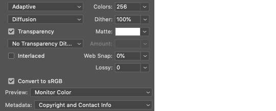
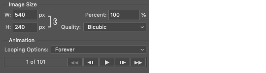
Once your timing is set: When you’re saving your gif, just keep in mind it must be under 10mb. Navigate to file > export > save for web. When it comes to your save settings I typically use either selective diffusion or adaptive diffusion. I also also occasionally use adaptive pattern (I find this is best for dark scenes without a lot of contrast). Set colors to 256, quality to bicubic and looping options to forever. If you want to preview your gif, hit the preview button in the bottom left. Otherwise, go ahead a hit ‘save’ and you’re DONE!
ADDITIONAL RESOURCES
Feel free to check out my ‘ps things’ tag for more photoshop stuff/mini tutorials. Additionally @/nibreon and the hackmd site I linked previously are your best resources for vs questions. If you would like to see my giffing process in motion feel free to check out this video. It’s sped up but you can slow down the playback. Additionally be sure to check out resource blogs like itsphotoshop for more helpful tutorials and resources.
If you reached the end of this beast, kudos to you! I hope this helps and never be afraid to reach out with any questions.
521 notes
·
View notes
Note
Your simplified Danganronpa drawings are so cool, I wish I could make stuff like that! How do you do it?
hello! so the funny thing about that is that I don’t really divert that much from my normal style–I just add a few things to it to make it more danganronpa-y. I, coincidentally, am weirdly good at style imitation, but I can show you how I did it!
I’m using kokichi as my victim because I can’t stop drawing this bastard:
these are the lines for my normal style, more or less. they’re usually a lot more connected, but y’know, it’s a tutorial and I’ll probably just fix them as I go along. also I didn’t use a sketch so that’s something.
flat colors and a couple lineart adjustments. cool, cool. danganronpa colors are like really desaturated and all the characters kind of look like ghosts (ironically). to add to the authenticity, make the colors look as much like the in-game colors as possible. kokichi’s character art makes him look like he has highlights, so I gave him those rather than just solid purple hair.
ugh okay first you have to shade it before you do anything else give me a second

THERE it’s kind of sloppy but it’ll have to do
you’re probably going to want to use a shadow with a cold color to go with the desaturated colors. I used that color you can see in the color palette in the corner because that’s more or less my default. since this is a stylistic imitation tutorial and not a coloring tutorial I won’t go into detail about how I shaded it and how I use clipping masks to color. just have a time, man.
the most important thing, naturally, is the eyes. danganronpa’s just got this eye thing going on. now let’s actually get down to business.
first, color the outline of the eye with a color somewhat darker than your eye color like so:
oh god I have to move his pupils
okay take a lighter color that you probably also stole from a ref and saturated somewhat and THROW that circle in there
congrats. you have danganronpa eyes.
you’re going to want to make sure that the eyes are pretty even. like, the circle inside is in line with the outline, and the pupil is in the dead center of that circle. otherwise the eyes are probably gonna look pretty wonky. I had to move his pupils for a reason. you’re gonna have to pay close attention to what direction the iris is facing.
next order of business, the ‘hair shiny’. see, this was a weird thing for me to incorporate because I hadn’t done this since I was like 14 and I have a knee jerk reaction to it, but anime be like that.

fwoop
this color is actually very close to the one I used for the circles in the eyes, just more blue-shifted. you’re not just going to leave it like that, though.
set it to add (glow) at 20% opacity and you’re good to go. (I don’t remember what the photoshop/sai equivalents are). I erased lines in it because I’m extra, but you don’t have to do that if you don’t want. you can mess with the effects on this part because I’m pretty sure I made it much less visible than the danganronpa style does.

now, the BIGGEST thing you can do besides the eyes is probably the texture, since we’re imitating the character art style.
you’re going to need a small checkered texture. like, this blinding abomination.
ow. fortunately, we’re changing the opacity REALLY low so it’s not going to hurt to look at. if you’re using clip studio paint like me, it comes with textures built into it. color a whole area and click the button with the checkers on it that you see on the top right.
it should cover your canvas with blinding chaos and your eyes will start screaming. before you go blind, make sure it’s set to a checkered style and navigate to the ‘layer’ tab at the top and hit rasterize to turn it into a normal layer. now that it’s a normal layer, changing the opacity will only make the colors lighter, rather than change the texture itself (that’s a thing that happens).
anyway, turn your opacity ALL the way down to 10% and set it to soft light, and your canvas will go from looking like this monstrosity…
… to this!
okay you actually can barely see that at all with this crappy screenshot without leaning super close to your screen. look, it’s THERE, I promise.
next you’re gonna wanna find a rugged texture of some kind. like, gritty paper or something. I have this one texture that I use a LOT and have been using it since before I even played danganronpa. put it below the first texture layer, turn the opacity down a whole bunch and just mess around with it, honestly. in that picture that I drew the other day, I have it set to vivid light at 15% opacity, but honestly, you can just see what works for you.

now it looks like this! again, this probably isn’t super visible because of the image size, but you’ll see.
now give me a second to add the rest of my shading that has nothing to do with the danganronpa style.
yeah!!! if you’re wondering what I did, I threw on what could be described as “cloudy shading” because you basically just toss on a whole bunch of airbrushing in the color of the shadow in one layer and a bunch of airbrushed lighting in another. it smooths out the drawing a lot and gives the coloring a lot more variety! it’s pretty serotonin-producing, honestly. (thank you tobin for teaching me basic color theory so my shading/lighting looks better)
oh yeah, I also added just a bit of a purple hue to the lineart to go with kokichi’s whole purple aesthetic. changing lineart color doesn’t always work, especially when drawing characters with different color themes, but it did work this time around, probably because it’s just kokichi.

here’s the close-up!
445 notes
·
View notes
Text
basic manga cap tutorial || ibis paint x

I got a request on how I color my manga caps (you can check them out in #morgan-colors-bnha and #morgan-colors-hq), so I thought I’d do this step by step tutorial that walks you through my process!
I color and draw on my phone (Samsung Galaxy Note10+) using the stylus provided with the phone, however you can use your finger. For manga cap coloring, I use Ibis Paint X, which you can find HERE for the Google Play Store, and HERE for the Apple App Store! It is a FREE app, and actually really helpful for a number of reasons, which I’ll show you down below! It does go without saying - there are a limited number of brushes that you get with the free section, but I haven’t found them to be too limiting, however I’ve only done basic manga cap coloring. You can watch short ads (I haven’t watched any, so I can’t vouch for the obscenity of them) to use the non-free brushes for a short period of time, though.
The first part of this tutorial is going to be showing you how I took THIS SUGAWARA manga cap and turned it into the one you see HERE (both as pictured on the header image). The second part of this tutorial, attached at the bottom, is a timelapse video where I show you how to turn THIS BOKUTO manga cap into the one you can find HERE.
Alright - without further ado, let’s get into the tutorial! As always, if you have any questions, please feel free to drop by my ASK BOX! Hopefully this is in depth enough without being too confusing. ❤
I’m doing this in steps so it can be in depth and informative enough, but I know that can become a little confusing, so I’m going to do my best to explain each step. I’ve also highlighted using little yellow boxes where I’m referencing, as pictured below.
To start, here are the ways I usually find manga caps:
1. Google searches, Pinterest searches, etc. Sometimes they’re already transparent, other times they’re not. I’ve found that I’m able to use the non-transparent ones because of the tools that are within Ibis Paint X.
2. Tumblr blogs - there are some blogs that are meant purely for transparent manga caps.
3. Manga scans. I, personally, haven’t used manga scans, but I know others that use them! They usually require some extra clean up, which can take extra expertise. Removing speech bubbles, backgrounds, etc.
Please remember to provide credit if it’s requested from the original poster!

Step #1: Open IP (Ibis Paint - I’m not going to say it every time because WOW that would get repetitive) and click on “My Gallery”.
Step #2: This is your gallery - as you can see, all of my prior caps are here, and this is where you will either open an old cap and keep coloring, or start a new one. In the bottom lefthand side, you see I’ve highlighted the “+” sign. This will bring you to the next screenshot.
Step #3: This is where you can choose if you want to create your own canvas, or create a canvas based off of the imported photo. Since I don’t do many “official” manga cap posts where I create a full image set from them, I usually just click on “Import Picture”, and go from there! However, if you want to create an image canvas, and import the picture once you’ve gotten the canvas open, please see Step #6 for how to import the image once you’ve already created a canvas!

Step #4: This is the screen that should pop up every time you import an image. When you’re doing manga caps especially, you’ll want to hit “Ok”.
Step #5: I believe these are the automatic settings, however if they’re not on your app, these are the settings I use when selecting how to extract the line drawing. Black at 0%, White at 100%, and Middle at 50%. This will remove the background from the manga cap, and only leave the dark line art remaining.
Step #6: This is what the layer should look like once you’ve extracted the line drawing. See highlighted the “+” button - this is how you will add new layers. I chose to add a new layer, which you can see in Step #7. However, if this is where you want to add an image, see the highlighted camera button. This will let you choose an image from your camera roll and import. The “Extract Line Drawing” option will appear each time that you import an image, so don’t worry about triggering it! It will trigger itself!
Step #7: Here is the new layer! I cut out the screenshot from before, but each new layer shows up on top, so I had to use the three little lines on the righthand side to drag it beneath the layer of the Sugawara manga cap layer.
Step #8: I used this new layer to import a photo of Sugawara in his uniform from a quick google search. I actually end up grabbing another one just to make sure I know what the bottom half of his uniform looks like, but I don’t show it just yet. Because the layer is behind, it shows up underneath Suga’s face. I end up erasing the parts that interfere with the cap here in a bit.
Step #9: When you click the brush button down at the bottom, this selection screen comes up. There are a ton of brushes to choose from, but for the base colors, I use “Dip Pen (Hard)” at 100% opacity. I’ve shown it highlighted here!

Step #10: Now we’re going to create our color palette. Sometimes I will find color palettes online And import them, but for the sake of simplicity, I’m going to use this photo of Suga along with another one that I nab later to create the palette. The way you use the “dropper” tool (if you’re familiar with Photoshop) to select the colors from another portion of the image is to press down rather hard, and then this circular selection tool will pop up. You can keep the pressure and drag it to the specific spot you want to pick up a certain color for. I’ve found that it’s best to do this with my finger instead of my stylus. I’m not sure if it’s because the heat of my finger and the change in pressure is easier to pick up, but that’s what works for me!
NOTE: It is important to note that if you have the eraser tool selected instead of the brush tool, you won’t be able to use the color selector. This might come as second nature to some of you, but it STILL makes me screw up from time to time, haha.
Step #11: Using the dropper/color selection tool from Step #10, I create a small color palette, as you can see in the upper lefthand corner of the image in this step. I grab both the lightest and darkest shades from the different things I’ll need to color in for the cap. I picked up the highlights and shadows of Sugawara’s skintone, eyes, hair, and jersey. I just draw in little overlapping circles so I can switch back and forth between the colors
Step #12: I added an additional layer in the very back of this image, and colored it in completely using a blue shade. This will allow me to make sure that I’ve filled in all of the space behind the manga cap. It’s important to note that in order to color the line art in later, you’ll actually need to “overdraw”. We’ll touch on that more later.
Step #13: As I show here, I have a layer where I use the singular skin tone shade and color in behind the manga cap, filling in all the spaces where Sugawara’s skin is showing. I usually use a different layer for each different shade/color just in the event I need to do a bunch of erasing, or if I need to change the layer style later.
Step #14: Here is where I show how I “overdraw”. I’m not sure if you can see it very well here in these screenshots, but the way that these manga caps are drawn, sometimes the line art isn’t “clean”, it looks more shaded/scratchy. So, in order to combat white space, I usually overdraw and then go back in with an eraser. You can see in Step #15 the size brush I usually use - somewhere between 2.0-4.0, but most of the time I use a 3.0 size brush. I’ll go back in with the eraser with a similar size on the easy parts, and then all the way down to the smallest size - 0.3 for really close quarter erasing.
NOTE: It’s important to realize that the smaller the eraser, sometimes the circumference of the eraser can be really light in opacity as well. You can help this with the intensity of the pressure that you use with your stylus/finger, but I’ve found that sometimes using a really small eraser can be counterproductive. There are times where I’d rather “over” erase in which I actually erase into the cap and then redraw using a small brush size. You’ll have to play around with eraser/brush size and such to see what works best for you!
Step #15: Here is the skin all colored in! You’ll notice I colored in his eyes and mouth, which are going to end up being white in the end. I do this because usually it’s easy to forget that you need to color things in white if you’re doing it against a white background. I oscillate between the colored background and the white/transparent one because sometimes it can be tough to look at that bright color all the time. I’ve found that this is more of a tip/trick for me to be able to remember to color in his teeth and eyes and even sometimes the brow or other features! In the end, this just works for me. You don’t have to do this step!
NOTE: As I stated in Step #14, using pressure can change things. The same goes for this specific pen type - the dip pen. I use about size 3.0 most of the time, but I can actually do really detailed work with this size pen (see Suga’s ears, the spaces between his hair, etc.) by using lighter pressure. I do have a stylus, so this is a lot easier for me. The pressure was a little tricky for me to get down in the beginning, but once you realize how soft/hard you need to press down, you can use bigger brushes for even smaller areas. I find that makes it a lot easier for me, since I don’t have to keep changing the brush tool - which you can do using the sliding bar at the bottom of the screen labeled “Thickness”. The thickness of a brush is the circumference it has when you are using the hardest version of pressure you can muster, so keep that in mind!

Step #16: Here is where I do the basic coloring for the skin, hair, and eyes. These colors will be relatively the same as the colors from the palette, because there is not a “gray cast” caused by the line art sketch from the manga cap. This means that the skin color that is showing in the manga cap that I’ve colored is pretty close to the original color from the screencap from the anime/the palette that I’ve got in the upper lefthand corner. I do FLAT coloring for this - aka NO SHADING YET. So I only use the LIGHTEST shade for the hair and skin - the ones farthest to the left on the palettes for each section. I do use the DARKEST shade for the eyes, but that’s because usually the lighter shade is the one you use most sparingly, where as with skin, the darker shades are used for shadows only and aren’t used in excess.
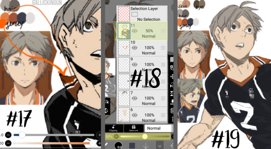
NOTE: As previously stated, I do a separate layer for each different color. At this point there should be six layers, as follows (from the bottom up):
Layer 1: Background Layer (Mine is blue, but for the sake of easy viewing, I made it white.)
Layer 2: “Notes” Layer - this is where I keep my notes, as in the reference photos, color palette, and any other things here and there.
Layers 3-5: These are the colored layers - skin, hair, and eyes.
Layer 6: Manga Cap Line Art
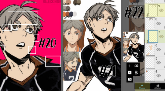
Step #17: Here’s where I’m showing the two different orange tones. This is what I meant in Step #16 - The original orange shade is the lower part of Suga’s collar - as you can see, the line art shading makes the color a lot more muted. I used the color wheel to find something brighter, just for a comparison shot. I still choose to use the traditional palette that I pulled from the anime screencap.
Step #18: Now that I’m ready to color the manga cap pieces that are skewed by shading (i.e. his jersey here), I usually turn the manga cap down in opacity, so I’m able to recognize where I need to fill in! This is where I fill in the blue of the jersey, the orange of the collar and other accents, as well as the off-white shade for the number and the line accents.
Step #19: Using the eraser and smaller brush sizes, I fill in all of the flat colors. No shading yet!
Here comes the time consuming, nuances...
Step #20: I’ve turned back on the colored background layer - sometime between when I started and now, I changed it from blue to pink. If you can zoom in on the image, you’ll see the boxes in white contain “errors”. This is areas where there are “holes” in the coloring, or where I’ve gone outside the lines. I’m going to go back in and clean this all up with the eraser and some more brush work.
NOTE: This is very important, especially if you’re trying to make this a transparent image, or if you’re going to do the extra steps and color in the line work. Any holes, overdrawn, or underdrawn areas will make the final drawing look a little funky.
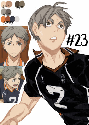
Step #21: Here is the shading! Honestly, this cap kind of shaded itself, haha. Some manga caps have “built in” shading, as you can see on Sugawara’s arms and neck. I added some shading to his hair and face, trying to use the anime caps as a reference. I’m not very good at shading yet, but I wanted to show it here so you guys could see!
I used the darker shades from the palettes on the eyes, hair, and skin. I didn’t do any shading to the jersey because the manga cap lines already skew it so much, that it didn’t really seem necessary. This can be a really hit-or-miss time, both with areas that you choose to shade, as well as the colors that you use. I would really suggest searching for skin tone palettes if you’re not using the anime screencaps for reference!
Step #22: For my shading, I actually use “clipping” effects. As you can see, the two layers that are highlighted are clipped to the layers beneath. This means that the coloring on the clipped layer will “attach” aka clip itself to the layer beneath and that layer only. So, for the shading of the skin, hair, and eyes, I chose to clip the shaded parts to the base coloring, that way even if I over drew, the colors wouldn’t bleed together.
I did more of what’s called “cell shading” for this manga cap, as well as the Bokuto one that I do in the timelapse video below. What is cell shading? This wiki page explains it pretty well, but basically it’s more “harsh” shading where there’s not necessarily an airbrushed quality to it, it’s more blocky. You can see I only chose to use one color of shading, which makes the contrast much more stark. IP does have several airbrush tools, I’ve used them in my Bakugou manga caps for his gauntlets, and they work really well!
I brought up earlier that it’s important to color your base colors all the way to the edges of the manga cap line art. This clipping effect is why. On Suga’s neck and ears, the darker shade that I used for his skintone goes to the edge and actually underneath the line art of the cap, because it is clipped to the base skintone layer beneath. Had I not made sure to go all the way to the edge of the line art, this would be much more choppy, and there would be white space between Suga’s ear and his hair!
Step #23: Here is the extra step - line art shading! This can be tricky, depending on the complexity of the line art, the shading, etc. Usually, in choosing a shade to color in the line art, I grab the darkest shade for that section, and then grab something even darker. As seen in Step #18, there is that drop down box that is currently listed to “Normal” - this will need to be set to “Screen” for the current line art coloring layer. You’ll also need to “clip” the layer you’re using for the line art color to the manga cap, meaning it will need to be on top of the manga cap layer - and therefore, should be the highest layer in the image.
For this image, I only did line art coloring on Suga’s face, hair, arms, and neck. I was really satisfied with leaving the jersey alone so far as coloring. I did this mostly because of the sketchy quality of the cap, the line art would be really involved and complicated, and it just wasn’t worth it to me (so sorry lol), and I liked how it looked with the darker color outlining it anyway.
Also, I added little details like making the sweat on Suga’s face outlined in white! And yes, I do know that missed Suga’s beauty mark, but we’re going to pretend I didn’t just do that. I love you, Koushi, please forgive me.
And that’s it! I’m sure there are easier ways to do things, or better ways, haha. But this is my beginner tutorial (as in I’m the beginner, lol). I hope that this helped anyone whose doing it for the first time! I stated this before, but if you have any questions, please feel free to hop into my ASK BOX and ask me! I’d love to help anyone out! And I’ll do my best!
See below an additional manga cap coloring - Bokuto Koutarou this time! I thought doing a timelapse video of me actually coloring in the cap would help you guys out!
PLEASE BE AWARE: This video is in 2x speed so it could not be forever long and really boring lol. With that being said, I do spin the screen around several times while coloring in the cap - this could make you nauseous, so please beware of that before you watch!
Here is a link to the time lapse video on YouTube!
A special thanks to @cutesuki--bakugou who helped me a lot while I was coloring my original caps, and also to @writeiolite who nudged me in the direction of finally starting to color manga caps! And a little thanks to @rouge-heichou since I bugged her about a couple of things as well. And then as always, a huge thanks to @candychronicles because she keeps me sane. Also a special mention to @pixxiesdust because she does really cool gifs and has done a wonderful job in the bookclub of trying to share her knowledge with everyone else.
Disclaimer: I’m no artist, this is just for fun! I’m sure my shading and line art can use some work.. but I’m not focusing on that! Instead I’m just going to keep playing around and having a good time ❤
#haikyuu!!#haikyuu manga#haikyuu manga cap#sugawara koushi#bokuto koutarou#manga cap color#manga cap coloring#manga cap tutorial#coloring tutorial#manga cap coloring tutorial#morgan colors hq#morgan colors bnha#morgan does tutorials
159 notes
·
View notes
Video
vimeo
a gif tutorial by blakehelps
Hello lovelies! Many months ago I was asked to make a gif tutorial, and not as many months ago, I went ahead and recorded that tutorial! A lack of time has kept me from publishing the tutorial until now, as I’ve finally finished and typed out a written version to go along with the video. So above is a detailed video tutorial of how I make gifs (and, specifically, how I made the gif underneath), and below is a less detailed companion tutorial to go along with it. I hope you guys find this useful, and if you have any questions at all, please do not hesitate to send me an ask/im!

What You’ll Need (1:10)
Photoshop (I’m using PS5)
A way to cap/extract your gifs (I’m using KMPlayer)
Here’s a tutorial on how to import videos into photoshop and extracting caps that way
TSC Footage (provided by me, to follow along!)
oliviaholt’s 2k18 action (give her post a like/reblog!)
Step 1: Capping (2:00)
Open up the KMPlayer, and click on the button in the top left corner of the screen. Click on “Open Files” & select the footage you’ll be using (in this case, open the TSC clip I’ve provided). Minimize the screen to a manageable size if it’s too large, then pause the video. Right click on the video and click on Capture >> Frame: Extract. If you don’t already have a folder in your library made for the caps we’re about to extract, go to your library and make one. Then, go to the box that popped up after clicking extract, and click on the little folder icon in the upper right hand corner next to Open. Select the folder you made for frame extraction. In the box again, make sure Continuously is selected under Numbers To Extract, Every Frame is selected under Frames To Extract, and Original Size is selected under Size To Extract. Now click on the video, play it, and pause it at Shelley’s face at the 17 second mark. Go back to the box and click Start. Then go back to the video and click play. Let the video play until the 22 second mark, or after Phoebe’s close up has finished, then click pause. Go back to the box and click Stop. You’ve now capped your clip! Go to the folder you made, and delete the excess frames we don’t need - we’re only looking for the close up on Phoebe’s face for this gif!
Pro Tip for the future: when capping this way, please make sure you follow what your screen is showing you > what the audio is telling you when extracting caps! For longer scenes, what’ll often happen is the audio will keep going scenes and scenes ahead while the visuals are still just showing you on the same 1 scene you’re trying to cap. That’s common, it happens often. Just make sure you do not stop extracting caps until you see the screen change to a scene you no longer what caps from. If you follow the audio and stop before the visuals have caught up to where you want, you’ll end up missing caps as the software did not extract all the caps from your scene. Follow the visuals, not the audio!
Step 2: Importing, Cropping, and Actions (6:45 / 8:15 / 12:20)
Now it’s time to open up Photoshop! Once open, you’re gonna wanna make sure you have the Animation box open at the bottom of your screen. If you don’t, go to Window >> Animation.
Next, we’re gonna go click on File >> Scripts >> Load Multiple DICOM Files, and select the folder that holds the Phoebe caps. Once it’s loaded, it’s time to crop! Click on the crop tool on the toolbar to the left (it’s the fifth icon down). At the top, there should be a place to insert your width and height for exact measurements. Go ahead and enter your dimensions. For me, because of an annoying transparent line issue I run into, I like to use the dimensions 278 px for width and 160 px for height - these are 10 pixels more than what I really want (268x150). But I crop it this way to get rid of my little transparent line issue.
For this gif, I want to really hone in on just Phoebe’s face, so I’m gonna Make Frames From Layers before I crop by going down to the timeline (aka the Animation box), and hitting the little drop down icon in the top right hand corner. After making frames from layers, I can see Phoebe’s face, so I’m gonna go ahead and crop my gif how I like so it’s more focused on her face/not as much of the excess background. After that, I’m gonna go up and click on Image >> Canvas Size, and change the dimensions from 278x160 to 268x150 then hit enter. Now my gif is sized the way I want.
Now to use actions! If you don’t already have Symphony’s (aka oliviaholt’s) action loaded into photoshop, then let’s do that now! You’re gonna wanna hit Windows >> Actions to open up actions, then hit the drop down icon on the right hand side in the Actions box that pops up. Go to Load Actions, then locate her action and load it in! Our frames our DICOM’s, so we’re gonna use her “for DICOM imports” action. Select it so all the actions are displayed underneath, and select the first “Select All Frames” (third down). Make sure the first frame in the timeline is selected, then hit the play button on the action. We’re starting the action on Select All Frames because we’ve already Made Frames From Layers, so starting the action off from the top won’t work for us. After the action has gone through our gif, we now have a colored, sharped gif that’s forever looped and timed to .06 seconds!
Step 3: Coloring (13:00)
Now let’s color this gif! We’re gonna make Symphony’s base layers invisible by clicking the eye emoji’s next to those two layers. If you really don’t want them there at all, you can delete those layers, but I’m not too fussy on a neat work space right now so I’ll just leave them at invisible.
Now for coloring, I usually follow a similar formula. Start with a Curves layer, then a Levels layer, then a Color Balance if it needs it before going on to Brightness layers and Selective Colors or Hue/Saturation if they need it. This is no different! For coloring we’ll be sticking strictly to the Layer >> New Adjustment Layer options, which is where we can find all the coloring options I just mentioned. Coloring isn’t an exact science. I tend to fiddle around with dragging the layers for each layer until I get something I like. Luckily for this gif, I didn’t have to do really any color correcting, so it’s an easier gif to color.
For this gif, I go my standard Curves layer first and do slight adjustments to make the gif brighter. Then go on to Levels, where I make the blacks darker, the whites brighter, and then shift the middle tab over to the left to make the gif overall brighter and lighter. At this point, the gif doesn’t look to be leaning one way or another in hues that I’ll need to color correct, so I’m gonna go on and add a Brightness/Contrast layer to, again, make the gif brighter and up the contrast a little. After that I decide to up the saturation to make the colors pop a bit more, so I add a Hue/Saturation layer. The gif could be brighter so I add another Brightness/Contrast layer on top. And it could be a bit warmer, so I go ahead an add a Vibrance layer on top of that. Now, I’m satisfied with how it looks!
Step 4: Saving (17:00)
With the gif now colored, it’s time to save the gif. Go to File >> Save For Web & Devices. Make sure the Colors are at 256, the Dither is at 100%, the gif size is under 8MB (though I like to make sure my gifs are no bigger than 4MB), the dimension sizes are right at 268x150, and that the Looping Options are at Forever. Click play and watch your gif play through to make sure everything’s how you like it/there aren’t any accidental errors you missed, then hit Save. And you’re done! You should now have a completely done Phoebe gif at your disposal!
And that’s how I make gifs! I’m sure there are a zillion different ways to make them, some much better and more efficient methods than mine, but this is just the way I do them. This method works for me and leaves me satisfied with my gifs, so I’m satisfied with it. If you have any questions about anything I’ve mentioned here - if you don’t understand something, or would like more detail on something - let me know! I’ll be more than happy to try my best to assist you in whatever it is you need help with.
#itsphotoshop#yeahps#completeresources#gif tutorial#tutorial#photoshop tutorial#mytutorial#resources#hope this is helpful#video tutorial#sorry i ramble my way through it lol#crawling back to queue
151 notes
·
View notes
Note
allow me to rant about the only thing that has been in my brain for the past two months and that is doll customizing babeyyyyy
i know there’s a 90% chance that you wont give a Shit about any of this but here we go anyways
SO first you gotta choose a doll. preferably one with a high range of motion to avoid creating new joints or having annoying limitations like not having elbow joints for some fucking reason. what the fuck mattel. give monster high dolls back their ball jointed shoulders and elbow joints. smh
the most common dolls ive seen used as bases are monster high and ever after high. most customs ive seen are highly stylized so the stylized face molds work well for those types of dolls but dolls like barbies are good for when you want a more realistic face-ups.
once you’ve got your base picked out you gotta wipe that bitch’s face off with like. acetone or nail polish remover or something strong like that. you can also use acetone to shrink doll heads which is cool as hell imo. n e way once the face is wiped you gotta chop off the hair and remove the hair plugs from the inside. ive seen this done several ways but the easiest and most common way ive seen is to dunk the head into boiling water for ~30 seconds until it gets squishy and malleable. once you’ve got the head back, you can use pliers (i think tweezers would work in a pinch) to pull out the hair plugs which are kinda icky because theyre covered in glue and other gross shit. ew
now you must decapitate the doll. dunk em back in the boiling water to soften them back up then just tug the head off. the neck pegs look funky and are usually a different color than the body so thats cool ig
once the head’s off, you can start the face-up which is basically just giving the doll a new face using stuff like watercolor pencils, acrylic paint, gouache, and a whole lot of other stuff. hell ive seen people use person makeup on these dolls.
next,,,,, hair. there’s about twenty million ways to do hair from gluing yarn wefts to sewing to rerooting with purchased nylon doll hair or yarn wefts but i’m gonna talk about the most common one ive seen which is rerooting and gluing.
before you can reroot, you need doll hair. which, as i mentioned, can be bought at stores like the doll planet or made at home with yarn in literally any color. have fun with it! make rainbow hair or something idk
to make homemade wefts, you take some acrylic yarn, cut it twice as long as you want the hair to be (keep in mind you can cut and style the hair once it’s been rerooted), fold them in half, and tie it to something sturdy like a wire coat hanger for the next step.
once you’ve got your yarn tied to your hanger, use a pet brush and brush the yarn until it’s wispy and looks like hair. then take a straightening iron and iron the weft flat. then remove from the hanger and boom. hair wefts. ta-da
to reroot the wefts onto the head, use a rerooting tool (which can be as simple as a needle with the eye cut at angle) (just google it please i’m shit at descriptions)) to poke small sections of the hair into the head. you can use the pre-existing rooting holes for your own reroot as they’re usually pretty reliable. to reroot, take a small length of you doll hair (about 10-15 strands), loop it in half, and put the middle of the loop into the reroot tool. poke the end of the tool with the hair on it into the pre-existing hole and remove the tool. the hair *should* stay in and fill up that plug!! also remember to plug thickly at the hairline and part of the hair where it's most noticeable. it doesnt matter as much in the center of the head as that’s not usually visible on the doll. once you’ve rerooted, squeeze in strong glue through the neck hole and squish around the head to make sure it covers all the plugs and secures them in place. then pour hot water onto the head to make the hair lay flat for styling later.
also, you can reroot yarn directly into the head to make thicker, more textured hairstyles. and since the yarn is thicker, you dont need to glue the inside of the head for the hair to stay in place!!
if youre not doing body modifications (which are also cool as hell) then it’s time for clothes but clothes are boring and i like body mods more so i’m gonna rant about them instead
the material ive seen most doll artists use is apoxie sculpt, which is like play doh on steroids. it comes in two parts which you gotta mix together for some reason. why dont they sell it pre-mixed. what was the reason. also once it’s dry it’s super super strong and you can sand it, drill into it, paint it, and all kinds of stuff. very nice and i want some for myself.
you can use hand saws and drills and shit to whack off doll limbs to make stuff like digitigrade legs or new joints. also dont be afraid to use other mismatching doll parts when customizing like heads and bodies and forearms and hands and shit. it literally does not matter if youre gonna recolor the doll anyways so have fun with it. make frankenstein’s doll if youre feeling spicy
accessories my beloved. stuff like tiny beads and clay baubles and shit will literally transform the entire doll plus they’re adorable and multi-purpose
i suppose i must talk about clothes now. ah well. you can find great clothing patterns if youre new to customizing on other customizer’s etsy shops and probably google although those will probably be lower quality than paid pattern pieces. and keep in mind that if it exists as clothing irl, you can likely make it doll-sized. there are literally no limits to your clothing options as long as you can execute your idea.
the once all your components have been made, you can assemble the doll again!! and finally see what all the parts look like together!! very cool 10/10 stars.
ight that wraps up my doll rant. i could really go into more detail on certain parts but thats a whole other rant for a whole other day smh. sorry for fucking flooding your inbox ender ahaha……………. you asked for this
little did you know that dolls have been one of my favorite things since like ever. if i can read a 25 chapter long fanfic i can read this B)
mattel definitely fucked up by completely ruining MH doll designs and just stopping EAH, alot of their profits most likely came from people who collect and customize dolls and by changing MH doll designs/Stopping EAH dolls they 1. most likely lost a small (or big if we're not jus talking people who customize dolls) part of their profit and 2. made it harder for doll customizers to make dolls/get commissions out rather quickly because they probably have to waste more time making joints or learning how to make joints.
EAH/MH dolls (specifically MH dolls) had AMAZING MODELS because there was so much variety with height, face shapes, etc (my favorite molds had to be the short/tall dolls and the cat molds because of the tails) and doll customizers really went all out with enhancing a molds unique features. The only "downside" abt MH dolls is that they (or atleast most)(from what i remember)) had slimmer faces but wider eyes while EAH dolls have wider faces with slimmer smaller which left a canvas for the face and not the eyes (and vice versa for MH dolls)
I've never seen any videos where a barbie is customized (maybe because i absolutely despised barbies at the time) so I'll definitely have to check those out but they seem to be good for realistic makeovers. I've seen like like semi realistic makeovers for EAH/MH dolls that were pretty good too tho (pretty sure mostly EAH dolls since yk MH dolls were used for creature makeovers while most EAH dolls weren't)
yeah i was always amazed by the head shrinking with acetone. honestly i still am?? idunno i have no idea how that chemical bullshit works. Ive seen a few of uh makeovers that just pain over the face (in multiple layers ofcourse) but that's usually when they're painting the entire body a different colour (again usually when they're turning a doll into a funky little baby man). I've also seen a few that just chop the hair off and take out the hair plugs yk without uuh like softening the head or just go straight for the hair plugs after taking off the head (i used to do that it was funny to me??). i always really liked when they used watercolour pencils or just colour pencils in general to draw/sketch on the face cause like wow ur drawing on ur doll without ruining it?? kinda epic maybe even poggers and pogchamp?? oh god my brain is failing wjshsmsj.
Watching them putting the hair back on the doll was, other than the face stuff, was the BEST part for me. Favorite type of hair was iuuuuuh was either thick yarn or brushed out yarn. Literally worship the people that would reroot the hair, theyre the most patience people on this earth!! it's literally insane but i guess that's what happens when you've been doing that for years? you guess kinda get used to it. when they put glue into the head does it just become stiff?? like it's just a clump of dried glue or does it like..hollow out again??
dude you literally cannot convince me most of the supplies used for doll makeovers. APOXIE CLAY LOOKS SO FECKING GOOD. its edible and i will die on that hill. The body mods are literally so amazing!!!!! it's so impressive how theyre able to imagine certain features THEN LIKE ACTUALLY MAKE IT LOOK ACCURATE TO WHAT THEY WANTED TO LOOK LIKE AFTER LIKE ON TRY (or many yk trial and error is very necessary for..everything). Absolutely loved when doll customizers would saw off a dolls legs and use different ones or just completely get rid of the torso to use a different one. it's like uuh that one big guy that's mismatched and sewn together. very cool. The accessories are so fun!! just small little details you seen really need but can add because it's your feckin doll!! I used to be absolutely obsessed over the doll clothes i would find on etsy, so much so that i started sewing shitty shirts and dresses for my uh "customized" dolls (they were absolute HORRORS idk WHY my mom let me feck up my dolls like that).
Thank you for this!! i haven't been able to talk about any of my interests for a while and this just really made me happy!!
Question fer u my fellow MH/EAH enthusiast: what was your favorite MH/EAH movie/episode and doll series. Mine was The fusion dolls (MH obvi) and that MH movie "Haunted" cause we got to know more about Spectra :D
#YOOOO LONG POST?!#long post#:) hehehe#this was very fun to read cant wait for ur next fanfic length ask#asks :D#theoreticallyjasper
2 notes
·
View notes
Text
A very basic Sims 4 object recolouring tutorial

Hey there everyone! I’m netsims, and I kind of know how to make cc. When I was starting out I remember not being able to find any proper tutorial on how to make cc (hell I was messing around with dds files to make tattoos), so as such I’ve decided to make a series of very basic tutorials covering how to make cc of various types.
Before we begin, I want to reiterate that this is a very basic tutorial, and won’t be much help if you’re already familiar with textures. Agreed? Let’s begin! (I’m bad at intros).
You will need both Sims4Studio and an image editor (I’m using photoshop), and we’ll be making a simple canvas print.

1. Open S4S. If its your first time, enter a creator name and set your S4 file path (under settings).
2. Check that the options under the Object button is set to Standalone Recolour, then click Object

3. You’ll get a massive amount of items shown to you. Search for “street art”, and you’ll find the item we’ll be recolouring. Click on it, then click Next

4. This should be the display you’re shown, but with far more swatches (colour options). Remove the extra swatches, click the Export button (make sure you’re in the Texture tab and not the Meshes tab) and enter an appropriate file name when prompted.

5. Open the texture file in your image editor
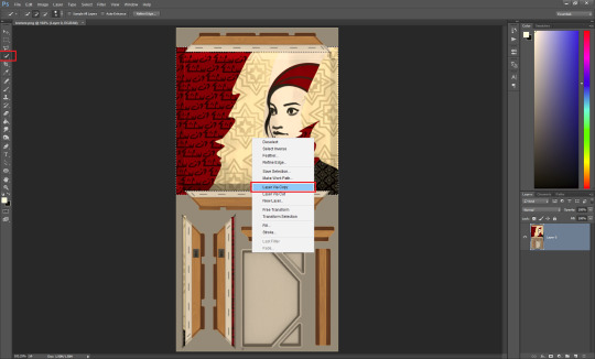
6. Use the Quick Selection tool (or equivalent) to select only the painting design, then right click the selection and choose “Layer via Copy”.
(Note: we won’t be changing the two slithers of design in the bottom right, as 99.99% of the time they won’t be seen in game)

7. Drag and drop your chosen design ontop of the texture and resize it so it covers the new layer we created. I’ll be using these 6 photos: 1, 2, 3, 4, 5 & 6.
8. Right click the image layer and select Rasterize Layer
9. Repeat steps 7 & 8 with as many designs as you’d like. (Note: if you want to upload your object to TSR, TSR limits object colour options to 6 per object).
10. Select the layer we copied from the texture earlier, and use the Quick Select tool (with the largest brush size) to select the entire layer.

11. Right click the selection and click Select Inverse, so that everything but the original design is selected.

12. Select the new design layer, and press CTRL + X to delete the excess image
13. Now ensure that both the texture layer (the original image we imported) and the design layer are visible, and use CTRL + SHIFT + S to save the texture. Make sure you save it as a png!
14. Repeat steps 10-13 with any extra designs.

15. Back in S4S, now click Import and choose the file we just saved.

16. Now we have our very own printed canvas! If you made extra designs, click Add Swatch and repeat step 15.

17. Go to the Catalog tab and give your creation an appropriate name & description
18. Import a thumbnail (using a 1:1 aspect ratio). I use this bright pink thumbnail while working on an item so I can easily find it when screenshotting.
19. Change the tags if you see fit.
20. Click save and you’re done! I hope you learnt something from my ramblings and excessive screenshots! If you have any questions, feel free to throw me an ask :)
40 notes
·
View notes
Photo
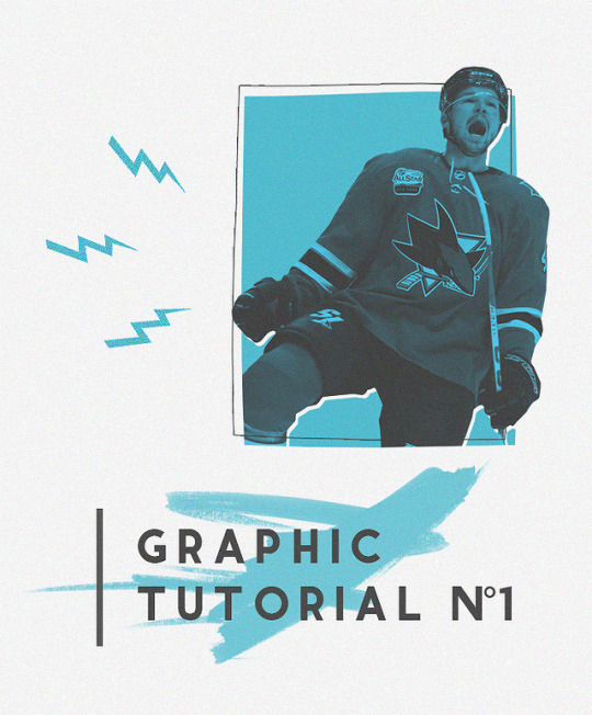
graphic tutorial #1: tomas hertl
i had an anon ask:
can you please make a tutorial on how you created the hertl graphic you posted a couple days ago?
hope you guys find this helpful! i’ve never done a tutorial before, so bear with me, please. let me know if you have any questions! (:
tutorial under the cut
1. start by opening up a new canvas. tumblr’s photo width is 540, so that’s the minimum size you should go with, but i usually like to go a little bigger for better quality. for some strange reason unknown to even myself, i went with a canvas size of 662 x 800 for this edit, but i usually keep my graphics around 800x800px.
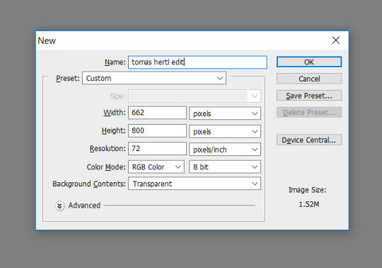
(keyboard shortcut for new canvas: ctrl + n)
2. set your background to whatever color you want it to be. (keyboard shortcut: ctrl + backspace or alt + backspace for the two colors on your swatch)

3. open up an image with whoever you want to “cut out” (in this case, tomas hertl). i usually go to google images and choose a photo that have dimensions either close to or larger than my canvas size.
then use the quick selection tool (keyboard shortcut: w) and select the general shape of what you want to cut out.

you don’t need to worry about it being perfectly cut out, when you use the quick selection tool, the edges will always be fuzzy. we’ll take care of that in a sec.
4. copy your selection (ctrl + c) and then paste it (ctrl + v) onto your blank canvas (make sure you haven’t accidentally missed anything in ur copy and paste).

5. use the eraser tool (keyboard shortcut: e) and start erasing the fuzzy edges around the image. you can zoom in on the image to make it easier to erase.

here’s a photoshop tip for you: erasing the edges can get tedious, but you can make it easier on yourself by 1. clicking one point, 2. holding the shift key down, 3. clicking on another point. the erase will erase a straight line from point a to point b, giving you a clean cut.
now you should have a nice cut out image of whoever/whatever your main subject of the edit is. you can then resize it to whatever size you want (by transforming, ctrl + t).
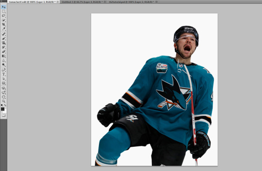
6. make a new layer, go to the shape tool (ctrl + u) and make a rectangle, color it whatever color you like (the color on the top of the swatch (left) is what color your rectangle will look like).

7. rearrange stuff to your liking.

8. gradient! time to make hertl dichromatic. click on the gradient map under adjustments. if the adjustments panel isn’t open for you, you can also click on image > adjustments > gradient map.
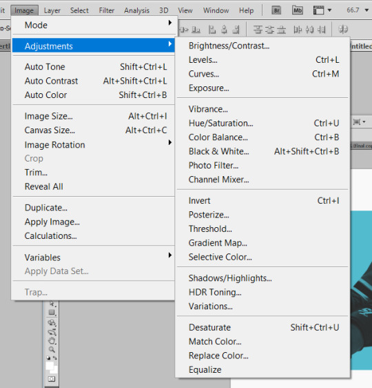
or

9. so you should have something that looks like this. click on the gradient color bar to change or adjust colors. the two colors that showed up are just the two colors that are currently in my swatch.

to just color hertl with the gradient map and not the entire canvas, press the alt key (and continue holding it down) and click in between the two layers (gradient map 1 and layer 3).

10. copy the rectangle layer (right click on the layer, duplicate layer or ctrl + j). then on the copied layer, use 0% fill, and then double click the layer to bring up properties. go to stroke, change the color to whatever color you want it to be (i used #2a2a2a), size: 1px.

11. optional: click ok once you’re done, then you can transform this layer by crtl + t, right click on the image (not the layer), warp, to kinda make it kinda wavy. (i also did this in the original edit to the blue rectangle itself).
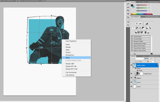
12. make a new layer for the brush stroke thing, i used a brush i downloaded to get the paint brush look.

13. put some text on it.

14. to make the border, copy the text layer(s). use 0% fill, go to stroke, size: 1px, and change the color to whatever you want it to be. (i forewent doing the same for the rest of the text this time when i recreated this edit, but you can easily do the same for the rest of the text!)

15. copy the text layer(s) again (i only copied the ‘higher’ text layer), change the color to the color of your background or whatever color you like, and then nest (or mask or whatever its actually called) under the brush stroke layer. move the text to the side and down a couple of pixels.
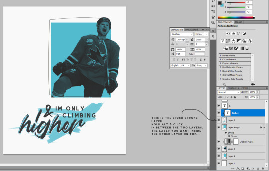
16. go to the shape tool (keyboard shortcut: u), click on the blobby shape, photoshop already has default preset shapes. click on the lightning bolt, and make the lightning shape on a new layer. to get all three, just copy the layers two other times and then rotate them and move them around to your liking.
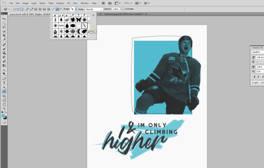
17. this is a little out of order haha but go back and copy the hertl layer, make it white. you can make the hertl image white by pressing ctrl + u, lightness +100 (or go to layer > adjustments > hue/saturation).

then nest/mask it under the original rectangle and move it around a bit until you like where it’s positioned.

so the edit is technically done here, but i like to add noise and sharpen my images to make them look better in overall quality and look.
18. optional: select all the layers (click on the first layer, hold the shift key, scroll to the top and click the top layer or ctrl + alt + a) > right click > duplicate layers > right click again > convert to smart object.
then go to filter > noise > add noise. i like to use 3%, uniform distribution.

go to filter > sharpen > smart sharpen. i like the use these settings (below)

19. then just file > save as, and save your image. i usually save my images as .jpg or .png
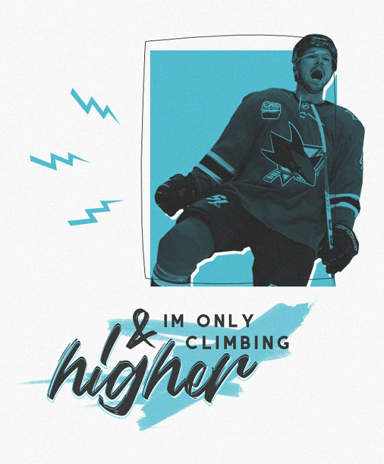
and that’s all i’ve got!
let me know if you found this tutorial helpful, or let me know if you want another tutorial, or you can request a graphic or whatever from me! (:
#tomas hertl#san jose sharks#sharks lb#original content#graphic tutorial#graphic#tutorial#i have exposed all my secrets so do with them what you will!#also lowkey i skipped a couple of steps bc they're too troublesome oops sorry
256 notes
·
View notes
Text
how to start doing commissions/get hired [guide]
Ok, so when I started designing, I didn't really understood the concept of being hired/commissioned by other people, because:
1. I was a bit dumb back then
2. I didn't think it would be that complicated
So, to save the hassle that I went through, I will be teaching you how to get hired at big groups and how to start doing commissions. Let's get it!!!!!
☆
step 1: make a portfolio
A portfolio is basically a collection of examples of your best work. Normally if you're applying to job/college, you will submit a portfolio.
This works the same when applying for designer positions, most owners look for examples of your work to see if you suit the job or not.
examples:
type a: include tos.prices, examples a together

type b: just your designs
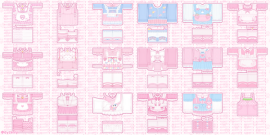
These are both made by me! I used pixlr E to made these and I will be showing you how! ^_^
☆
PORTFOLIO TUTORIAL
step 1: go to pixlr
step 2: Click open image, and open the image of one of your transparent showcases. When you're in the canvas, also open the images of your other showcases. Try to include as much as possible, but 15 is the best (3 rows of 5) !

step 3: Go to the top left corner, page > page size, and then change the sizing, you can reference the examples below:
3 rows of 5 (15) : 1500 x 900
3 rows of 4 (12) : 1200 x 900
3 rows of 3 (9) : 900 x 900
2 rows of 5 (10) : 1500 x 600
2 rows of 4 (8) : 1200 x 600
step 4: After you changed the page size, rearrange your showcases! It should look something like below:

step 5: Merge everything together if you haven't, then add a background (could be solid color/simple pattern)
step 6: Duplicate your showcases, change the color to a dark color, and set the layer to multiply, then blur it to create a shadow (it looks better trust me).
step 7: This is optional but you can add text, ex: your roblox handle and discord tag. and you’re done! :D

I know it may be complicated, but TRUSTTT me, making a portfolio makes you like 100x more professional and it looks more appealing anyways.
Try to include your designs that have a similar style (ex: kawaii, w kawaii, realism w realism, etc.) If you have multiple styles, make a portfolio for each separately.
☆
step 2: come up with your prices
Now, it's time to decide on what types of payments are you accepting!
I'm only doing this as a hobby and not relying my income on this, so for me, my prices are pretty flexible. I normally accept either robux, paypal (usd), and sometimes rh/mm2 items.For robux, it's kind of difficult to give insight on this since it's all relative and depends on the designer. But some factors to keep in mind:
1. time
Basically means the time taken to create the design, if you took a longer time making it, ofc it deserves to be priced higher.
more time = higher price
2. experience
How experienced are you at making designs? Have you been designing for a long time? Are you able to create advanced designs with high levels of detail and shading? These are all questions you should ask yourself.
more experience = higher price
3. complexity of the request
This once again depends on you, some designers ask for a higher price if the request is more complicated/includes more details (ex: armor, more accessories, realism).
high complexity = higher price
If you're having a hard time settling on a price, feel free to ask other people on their opinions!
Some prices to reference:
beginner: < 1000 robux
intermediate: < 2000 robux
advanced: 2000+
This is for robux only, but if you're charging something like USD (paypal/cashapp/venmo), the rate I go for is 1500 robux = $10. But once again, it all depends, feel free to go higher.
☆
step 3: advertise
When I'm looking for commissioners, I normally go to Icyella's server and post my designs + prices in the #hiring or #4-hire channel.
And since, Discord came out with a forum feature, the server now has a designer forum! You can post your designs there as well.
Example below:

**[name] 's clothing commissions**
**prices**
**>** [price] robux per outfit (must pay tax)
**>** i also take [other payment options]
**other info**
**>**payment [first/after]
**>**credit is [appreciated/required] ! (rblx [ur user])
**>** doing [include styles you doing, all, kawaii, y2k, realism, etc.]
**>** NOT doing [include styles you are not doing, armor, mecha, fursuits, etc.]
**dm to order/ask for more examples!!!**
I didn't include the text (to copy and paste) for the forum post because I thought it would be better if it was personalized to you. If you need help on writing an example, feel free to DM me, I can write you one for free (^人^).
You can post these in channels like #design-services, which most roblox clothing servers would have. And make sure that you have your DMs open so people can contact you.
Try to post once every 2-3 hours in each channel!
☆
step 4: apply at designer positions
Most servers also include channels where people are looking for designers. So, if you're looking for a long/short-term job at a group, you can apply!
Remember to check the #hiring channel every once in a while and apply when you see a job.
☆
SOME MISCELLANEOUS STUFF
1. Decrease your prices if you need to
I know this sucks, but if you're not getting any customers, just decrease your prices by like a bit (10-30%), then once you get orders again. You can raise the prices back up.
2. Don't take too much orders at a time
Try to have a limited amount of slots open, for example, have a maximum of 5 slots. Then once you finish all 5 slots, you can open your commissions open again.
3. Form the habit of making showcases
Always make showcases of your work so you can have a good amount of examples for others to see.
4. DON'T DO PAYMENT AFTER
Please, don't ever give your design templates before they send payment. Always take payment first or after you send a preview (unless it's something like personalized merch, then do payment first).
I can't think of any other things to add but I'll update this if I think of anything.
☆
you made it to the end!! lmk if u have any questions, suggestions to making this tutorial better, etc.
credits: ayzen#1111 or @ayzenly on roblox
contact me: ayzen#1111
1 note
·
View note
Text
15+ Figma Plugins to Help You Design Better
Figma, the second most-used tool for designing user interfaces (and the first most-used tool when counting only Windows OS), has really taken the digital design industry by storm lately, with even Adobe XD shipping their own version of Figma’s multiplayer feature (naming it “coediting”).
However, the hot topic at Figma right now is the release of plugins — extensions that Figma users can install on Figma to allow for extra functionality or to improve their design workflow.
Let’s take a look at some of the best Figma plugins so far.
1. Arrow Auto (create user flows)

Arrow Auto adds flowchart functionality to Figma, which is useful for creating user flow maps. Select any two objects on the canvas and Arrow Auto will enable you to draw a connector between them. You can also hide and show the flows on demand.
Autoflow is a decent (and maybe nicer looking) alternative, but Arrow Auto has more features, including the ability to switch connector directions and also move connected objects around while keeping connectors intact.
2. Angle (utilize device mockups)
Angle allows you to display your screens (i.e. artboards) from within a number of realistic or matte-effect device frames that each come with a variety of angle options and shadow styles.
Impressively, they’re 100% vector as well.
Artboard Studio isn’t quite the same thing, as it allows for inserting a whole bunch of random 3D objects onto the canvas (like a kiwi, for example). If you only care about device mockups, I’d install Angle. Vectory 3D is similar to Artboard Studio, but it outputs actual 3D assets.
3. Master (manage components more easily)
Master offers a better way to manage components, such as the ability to turn multiple identical objects into a component, duplicate components into other Figma files, and much more.
4. Clean Document (auto-clean documents)
Clean Document, well … cleans your document! It deletes hidden layers, sorts them intelligently, renames them according to your liking, ungroups single-layer groups, and even rounds dimensions to the nearest pixel. A terrific tool for obsessive neat freaks!
5. Similayer (select similar layers)
Quite simply, Similayer allows you to select layers based on their similarity to the layer that’s currently selected. Let’s say that you wanted to change a shadow style that’s being used on a number of different elements: Similayer could do that.
You could also use it to batch-reassign multiple components.
6. Viewports (change the viewport)
Find out the correct market share of all viewport dimensions, then apply them to frames. It’s insane how useful this is!
Viewport data is live-sourced from StatCounter.
7. Todo (create todo lists)

There are dozens of terrific todo lists, but this one exists within Figma. It’s not designed to replace your everyday todo list, but it’s a more convenient way of keeping track of your design-specific todos without needing to leave Figma. Have a list of changes to make? Need to establish priorities?
If so, install Todo.
8. Font Scale (establish a font scale)
Establish a visually consistent/hierarchical font scale by choosing a base size and scale factor, then save the results to your document for continuous reference (as either em or px).
9. Content Reel (insert better-than-lorem-ipsum content)
Content Reel inserts “real” content into your design. Need a quick address? Or an avatar? For some reason can’t think of a single name when you need one? Content Reel has your back.
Designing with real data ensures that the design doesn’t look odd once developed, and also helps us to design for edge cases.
10. Google Sheets Sync (sync data from Google Sheets)
Whether your app has an API or you just want to create a table of data manually, Google Sheets Sync will basically allow you to sync this data directly into Figma. It’s like Content Reel, but instead you define the data yourself. It’s useful for designers that want to build ultra-realistic mockups with data from their actual niche (or live application), and it’s especially useful for teams that want to design using the same library of data.
11. Chart (create “real data” charts)
Create stunning, customizable charts with data from Excel, Numbers, Google Sheets, or simply import a local CSV or JSON file. Datavizer is suitable alternative, but Chart can also sync with live JSON (i.e. you can connect Chart to a REST API).
12. Iconify (utilize icon fonts)
All icon fonts, right inside Figma. Material Design Icons, FontAwesome, Jam Icons, EmojiOne, Twitter Emoji — you name it.
Pretty iconic, really.
13. Figmotion (create animations)
If the thought of exploring animation scares you, or you dread switching tools to access advanced animation features, Figmotion makes animation a lot less anxiety-inducing. The animations are also easy to hand off, since they’re based on web technologies.
14. Split Shape (make columns … and stuff)
An interesting method of creating columns, Split Shape splits, say, a rectangle into multiple rectangles from which you can then create columns (or rows, or whatever). Split Shape can be used for various things if one thinks outside the box! 😁
15. Remove BG (create transparent bitmaps)
Remove BG is a web tool that removes the background of bitmap images, effectively turning them into transparent PNGs. Remove BG for Figma essentially does the same thing, but within Figma.
If you’ve been hoarding Adobe Photoshop only so that you can remove backgrounds, you can now delete it and probably free up approximately 80 thousand million GBs of space on your SSD 😌.
Popular Figma Plugins
There are a few Figma Plugins that I didn’t mention because they’re already super well-known to users of other UI design tools such as Sketch. You probably have these ones already:
Confetti (create dispersions)
Unsplash (insert stock images)
Rename It (rename layers more efficiently)
Humaaans (insert mix-n-match illustrations)
Stark or A11y – Color Contrast Checker (measure color contrast)
Bonus Figma Plugins
These Figma Plugins are awesome, but you might not need them often (if at all). It’s nice to know they’re there, though.
Arc (arch text)
Roto (rotate-extrude shapes)
Table Generator (create tables)
To Path (create text on a path)
Brandfetch (source brand assets)
Isometric (make objects isometric)
Mapsicle or Map Maker (create maps)
Skew (create simple isometric mockups)
Image Tracer (convert bitmaps to vectors)
Shadow Picker (intelligently create shadows)
Metaball/Blobs/Waves (create abstract shapes)
And finally, all Figma Plugins (in case you just can’t get enough of ’em! 😉).
Keen to learn the ins and outs of developing your own plugins, either to improve your workflow or the workflow of others? Check out Figma’s Plugin Docs.
14 notes
·
View notes
Note
How do you make the manga caps transparent?
oh, i have been waiting for this question.
before i start, i’d like to say that i make all of my transparents on my iPhone. my tool of choice? my finger, and the app ibispaint x. i’m sure there are quicker and better ways to make transparents (scratch that: i know there are quicker and better ways to make transparents), but this way is fun for me. feels a bit like i’m coloring a coloring book.
the tutorial is under the cut because i go into quite a bit of detail!
alright, here we go!!
(i blocked out everything in this image outside of the part that we actually care about, because this is a page from a recent chapter.)
STEP 1: alright, so we got a page from the manga with this adorable little shinsou, which we’re going to make transparent. ideally, get a page that has solid black lines, and that doesn’t have little stray fuzzy bits outside of the lines. otherwise your life just becomes a whole lot harder. the reason i prefer not to do earlier chapters is because the website that i use to get pages doesn’t have good quality images of the first hundred or so chapters, and i’m too lazy to find another website. so what we’re gonna wanna do is…

STEP 2: crop the manga page to the part you actually care about! you can also do this in the app that i’m going to use, but i just prefer to do with the photos app. nice and easy.

STEP 3: when you open ibispaint x, there’ll be three options, “my gallery”, “collection”, and “online gallery”. pick “my gallery”, and it’ll take you to a screen that looks something like what’s pictured above. click that fancy little plus button indicated in the image to start a new canvas!
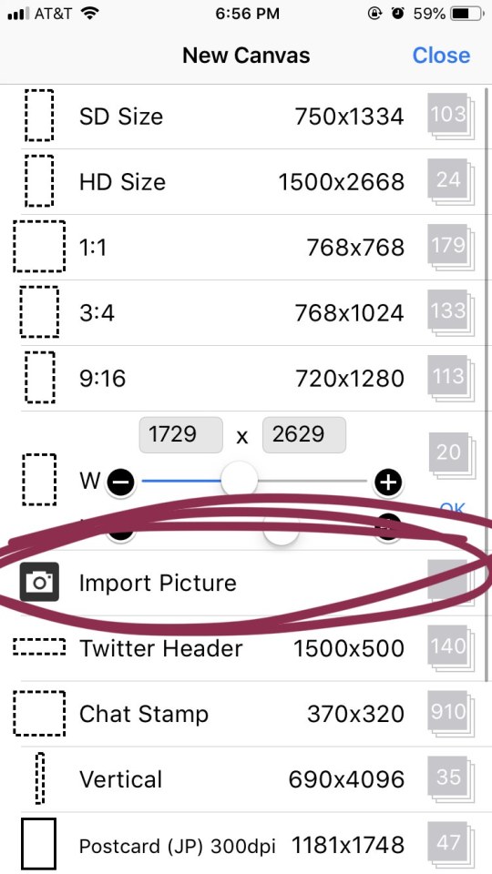
STEP 4: the option you want to pick is import picture.
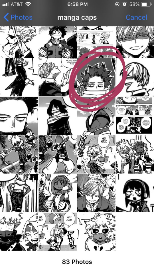
STEP 5: alright, there’s our shinsou! we’re just gonna click on him, pretty easy, right? also yes, i have an album on my phone dedicated solely to manga caps that i plan to make transparent.
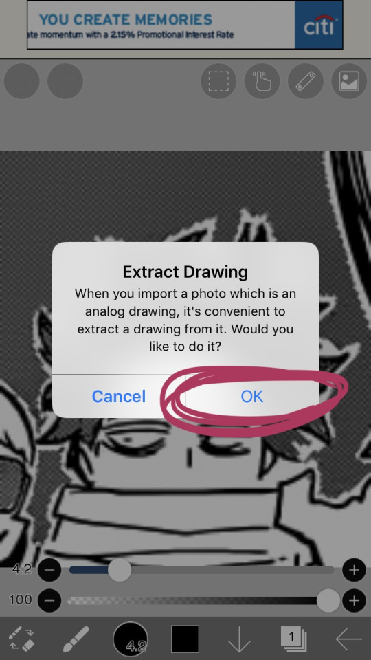
STEP 6: the moment you click the image, it’ll take you to a canvas and ask if you want to extract the drawing. you’re going to hit “OK”, because extracting the drawing makes it so that all the white areas in the image become transparent, leaving only the black and grey.
NOTE: this won’t quite work properly if the background isn’t pure #ffffff white! if you are making a transparent from someone else’s manga cap, make sure that the manga cap has pure white values. if it does not, there will be a very light, barely detectable film of nearly transparent grey values, but it isn’t full transparency. this means if someone uses your transparent over something like…say, a solid colored background, the colored background will appear darker in the final image. there’s a way to get rid of this film, but it’s hard to explain, so please ask me if you want to know how to do this. heroacacaps is a very popular blog that editors get their manga caps from, but their images do not have a pure white background. (it’s kind of funny, i can often spot when someone made their transparents using a manga cap from heroacacaps.)
OPTIONAL STEP: if you are using ibispaint x for importing anything that you don’t want to make transparent, then 99% of the time, you are going to want to hit “cancel”. also, this ONLY works well for black and white images, and trying it on a colored image with make the image turn monochrome. you can still use it on some colored images with white backgrounds, but it you need a few extra steps to make it work (hint: clipping layers, if you know how to use those. duplicate the extracted layer until it is completely black without creating black values outside of the lines, and merge the layers down into one layer. clip the original image over this layer. ask me if you ever want me to go further into detail!)
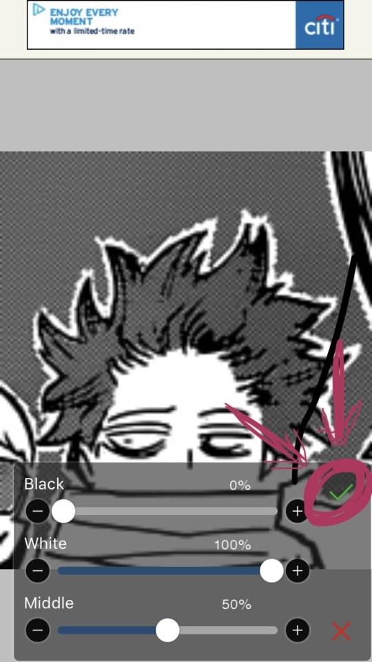
STEP 7: once you hit “OK”, this will pop up!! if you are using a good image where the lines are solid black values, the default option will be perfect for you.
click the green checkmark once you’re satisfied with the appearance of the image!
OPTIONAL STEP: you can manipulate these numbers if you need to. i find this useful for making the lines on sketches clearer. increasing the black percentage makes middle grey values appear darker, and decreasing the white percentage makes middle grey values appear lighter. the white percentage cannot be lower than the black percentage. i’m…not quite sure how to explain what the middle percentage manipulates, but you can mess around with it and see what happens.

STEP 8: so we’ve got the image on the canvas, but now we have a bunch of stuff in the background. to get rid of it, hit the little brush icon, and click the eraser icon. if you’re not sure what the eraser icon looks like, the next image has an image of it in the location where the brush icon was.
next, just…use your finger (or a stylus if you’re fancy) and erase away all of that outside stuff!
OPTIONAL STEP: some manga caps require the extra step of drawing any parts that were covered by things like text bubbles and other characters. it’s sometimes the most tiring part of the whole process, and i can’t really tell you how to do it. you just have to experiment with the available tools. there are lots of brush options you can try to imitate the way the lines look, if you click the button to the right of the brush icon, and there are also (painful and tedious) ways to replicate more complicated textures. i often have to do this step which is why i have an entire goddamn tag dedicated to transparents i needed to patch up.
if there was only one reason i had to pick for why you should respect the people who give you manga caps without backgrounds for you to use in their edits, it’s because a lot of times, they patch up manga caps without any comment. some replicate the actual style so well that you’ll have never realized that the person you got the manga cap from added in their own bits. here’s an example. this transparent? it took an hour. just look at the original, and consider how many different areas are covered by text. imagine how many different textures and lines that have to be replicated.
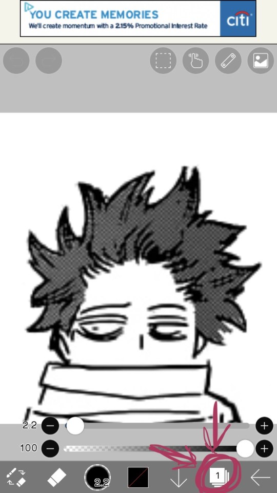
STEP 9: alright! now we’re ready to actually make this sucker a proper transparent image. this image is actually just lines, and if you stop here, you’ll only have the outline of the image! what we’re going to have to do is take parts that we don’t want to be transparent, and color them white. unfortunately, this is the bulk of the work, most of the time. to do this while still keeping the outline intact, we’ll have to use layers. hit the button with the rectangles stacked on top of each other to open the layers menu.
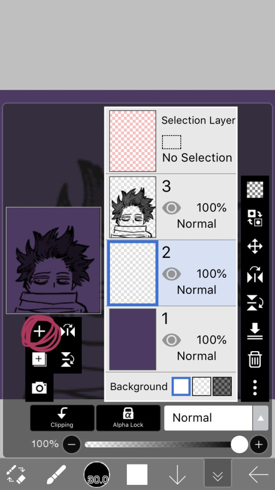
STEP 10: hit the plus button to create a new layer, and make sure to move it underneath the layer with the manga cap. i actually like to make two layers, with the lowest one having a color that’s dark, but not too dark. this added layer makes it easier for me to see what i’m coloring, and i really recommend it. if you don’t do this, you’ll have to hit one of the checkerboard patterns next to the word “Background” located underneath the layers. ideally the darker one, it’s easier to see the white on it.
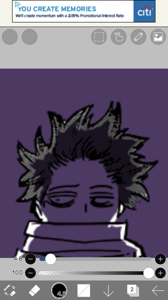
STEP 11: hit the eraser icon and click the brush icon again to be able to draw! and now, it’s just simple coloring. if you’ve ever used a coloring book, then this might evoke feelings of nostalgia within you, because this is basically just a glorified digital page of a coloring book.
i like to color the parts closest to the line first with a small brush size capable of getting in corners (use the little slider next to the text that says “4.8″ in the image to change the brush size). it’s not that helpful for a transparent as simple as this, but more complicated transparents with lots of corners to color make this step a blessing. or maybe that’s just me.
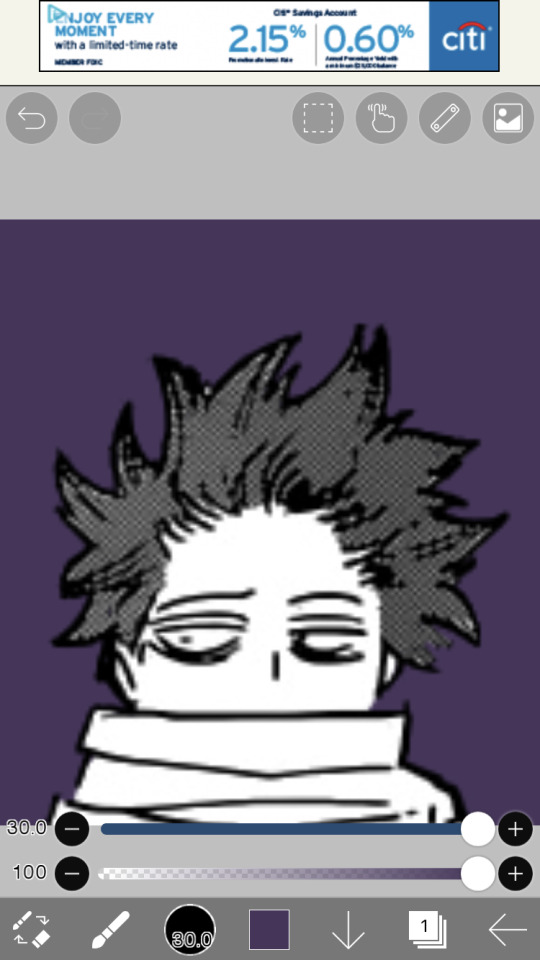
STEP 12: aaaaand finish coloring all of it, with a bigger brush size. if you colored near the lines first like i mentioned in the previous step, then this will feel a lot more like using a coloring book than the previous step.
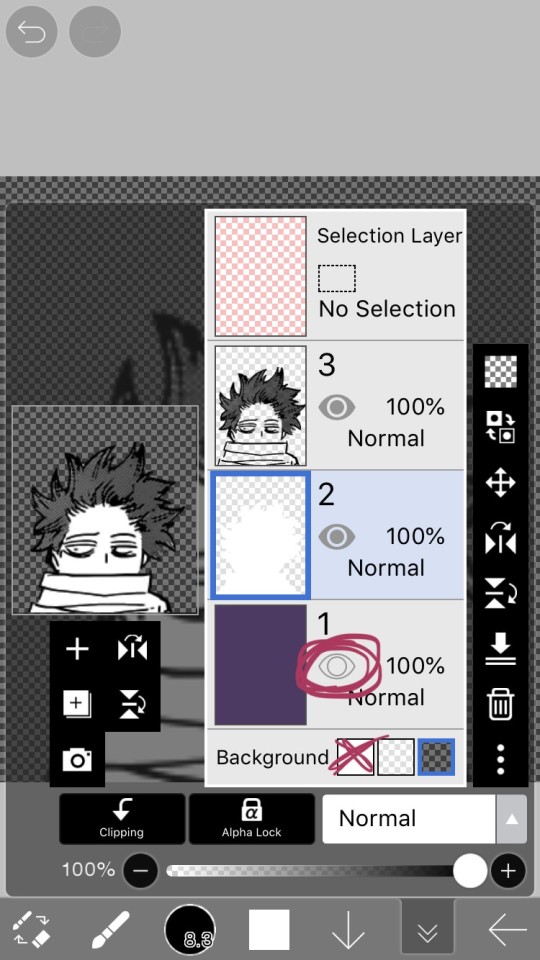
STEP 13: alright! if you used a colored layer underneath to help you see the white, then you’re going to want to hit the little eye button on the colored layer to make it invisible. after all, we do want the image to be transparent.
STEP 14: next, there are three background options underneath the list of layers, next to the word “Background”. if you want your image to actually be transparent, do not pick the solid white option. pick either of the checkerboard options, both will give you a transparent image.
STEP 15: you’re done! now just to save the image. click the little arrow pointing left on the bottom right of the screen. this will exit you out of the canvas, and back to your gallery.
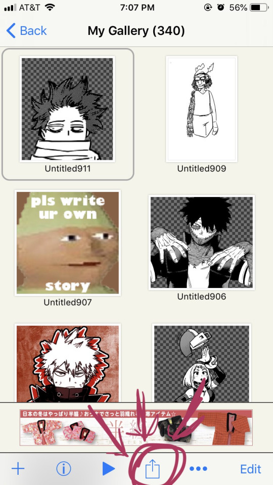
STEP 16: click the button indicated in the above image.
STEP 17: the above will pop up, click “photo (transparent png)” to save the image as a transparent image.
STEP 18: click save image!
and that’s it. you should have yourself one gorgeous transparent in your photos. i would probably suggest checking the image to make sure that it isn’t transparent in areas that you don’t want it to be.
208 notes
·
View notes
Last Seen Blogs
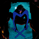
house-of-streams-and-dreams
The Comic Stream
greyymon
grey/cheri
fangsforiris
iris||ao3: cryingstars13
jinismymochi2
Stoned and Posting Pink
innerprofessorthingbagel-blog
subhlina the bookworm