#so here are my notes and drawing out of examples
Text
Vasily's Literacy
I’ve been asked a couple times about Vasily’s literacy, so here’s a quick overview of stats and pertinent information laid out regarding that idea. I’ll make my statement on my own opinion towards his literacy at the end, but for now I’ll focus on exact numbers and stats without interjecting opinion.
While this post primarily pulls specific stats from When Russia Learned to Read by Jeffery Brooks, I’ve read a couple papers and other books regarding these subjects I pull general statements from as well. Please note, though, that there were no large scale official census in Russia until 1897 so some of these stats from previous years could potentially be skewed.
Source Material
First and foremost: do we ever see Vasily read or write in the series?
No. However, this can be explained quickly away. Until running into Tsukishima, Vasily was likely (incorrectly) assuming that not only did none of the Japanese characters speak Russian, but they did not use the same writing system either. It would have been a waste of resources (paper) to attempt a conversation where a drawing could suffice. Additionally, there is no other scene in the series involving him and Tsukishima that would have warranted him writing to Tsukishima either. At least, none that we see. So, him never being seen writing does not necessarily prove he is illiterate.
Vasily’s Age
With that out of the way, there’s another important piece of information we need to pin about Vasily before we continue: Vasily’s age. While Noda specified he’s the same age as Ogata, Ogata is unfortunately given an age range of 25-30. But, unlike these two, Usami does have a canon age: 26. We can use Usami as a frame of reference because Noda stated Usami is, in fact, older than Ogata. Thus, this means Ogata is 25 and so Vasily is also 25.
Now, I personally tend to make these two actually on the older end of the spectrum Noda provided, but for a frame of reference we are going to pin Vasily at 25 years old. The reason this is significant is to pin down exactly when Vasily went to school. If in 1907 he was 25, then the age he was deemed ‘school age’ (8 - 11) would be around 1890 - 1893. Of course, he always could have attended school at an earlier or later age, but for conjecture’s sake, we will use the average age such as these.
As I said previously, an official census was not published in Russia until 1897, but any previous information before that typically begins around the 1870s. So it would benefit us to default to 1897 statistics, but keep in mind that the stats are skewed a tad higher than they would have been.
Rural Literacy
Literacy in the late 19th century was not nearly as bad as people make it out to be (at a rate of around 21% in 1897), but only because rural numbers brought it down. For example, in industrialized cities such as Moscow, 70% of men were regarded as being literate. There were also a plethora of schools dotting the country, from Zemstvo-funded schools, to church schools, to state schools. It was often not the lack of schooling availability that caused a decrease in rural literacy compared to urban children, but rather social aspects.
I am unable to find exact stats for rural literacy rates around the year 1890, but literacy rose from 6% in rural populations in the 1860s to 25% in 1910. It’s also best to keep in mind, however, men were far more likely to be literate than women, and the young more likely than older populations as well. So, if we were to take an increased decade raise (rounding up to about 4% every 10 years), and exclude the population numbers from including women which will be about half the population, we get around a 36%* base chance Vasily is literate when he is from a rural population (of which he is – he is from Yeleninka, a rural town in the Orenburg voisko), still not excluding elderly populations.
This is still not a very high chance, but there’s some other factors to discuss. Firstly, would have to be involving his background. The reason literacy was so low in rural areas was because, although parents did place value on literacy because it allowed for social movement and potentially higher wages, parents simply could not afford the lost labor of their children attending school. If a family had several children and could afford the loss of labor, then a child was much more likely to attend school. So, even if Vasily’s family had been described as being poor by Noda, this had no bearing on Vasily’s likeness to attend school. Given Vasily is almost entirely assured to be in the military through conscription, he very likely had brothers. And if he had brothers – he was very likely to attend school compared to single children families.
Another factor involves his family’s occupation. Families dependent on agricultural work were less likely to send their children to school because it was expected for them to work on that same farm when they were older, thus limiting their need for literacy. But, if Vasily’s family were artisans or practiced some kind of craft alongside agriculture, parents highly valued literacy in comparison, and were more willing to spare the labor loss for schooling.
Religion also plays a role. Specifically, those of the Old Believer faith tended to be more literate and push to educate their children regardless of their occupational status compared to regular Russian Orthodox peasants. Aside from a general cultural insistence on preferring literacy, there is no other reason why this occurred, as the only major difference between Old Believers and Russian Orthodox peasants was a matter of ceremony (excluding some fringe Old Believer cults). If Vasily came from an Old Believer family, they'd push for him to be literate regardless of the labor loss they'd experience.
Finally, some parents preferred to send their sons to school to lower their military conscription length. While university students conscripted only had to serve 1.5 years of the required 5 year length, those who completed at least 3 years of any schooling had that length lowered to 4 years. If a family had several sons, which meant their sons were eligible to be drafted by the lotto, they would be more partial to educating said sons.
For some stats: unfortunately I could only find the rate of attendance of boys in school for 1911. Please examine these stats with a critical eye that they should be lower. 88% of boys in rural areas attended school for at least 1 year, but by year 3 this percentage dropped to about 38.5%.
*My math numbers will be off because there were a decent amount of women who were literate, just at a noticeably lower rate compared to men. For ease of math’s sake, I removed them from the population entirely, though the original percentage statistic did include them. They originally were likely less than 1% of the literate population in the 1860s statistic I used as a base.
Soldier Literacy
While it is useful to look at literacy stats of Vasily’s background (being a rural resident), what’s more useful is the literacy rates of the army for when Vasily was serving.
By the 19th century, Russia realized the value in literate soldiers – but unfortunately for Vasily, schooling for soldiers that the government had originally created in 1855 was abolished across the 1890s. But this did not mean literacy still did not rise in the military, as certain soldier ‘uncles’ brought it upon themselves to educate other soldiers. In fact, literacy in the army rose from about 21% in 1874 to about 68% in 1913 – rounded up to about a 6% increase in literacy every 5 years. Vasily would’ve been conscripted into the army by 1902, and applying the rate of increase, there was about a 51% literacy of the army in 1899, and 57% literacy in 1904. A higher than half chance for Vasily, who we see actively still in the army by 1907.
There are other factors to consider as well: Vasily’s rank and station. While the illiterate often went to the infantry units, specialized units had much higher rates of literacy. As I’ve discussed in the past, technically Vasily was in a specialized unit – the Special Border Guard Corps. His literacy chance rises higher due to this factor, as literacy was especially preferred because of the ability to read topographic maps and telegrams.
It is not Vasily’s presence in the SBGC that also increased his likelihood of being literate – it was his rank as well. While Noda removed most telling marks from Vasily of his rank, such as shoulder straps, there’s two glaring tells. Firstly, are his and Ilya’s binoculars. Ilya appears to be to be a Feldwebel (equivalent to an American First-Sergeant, British Sergeant-Major) given his position of ordering the other soldiers, and that he has binoculars which were only used by officers. He is, like Tsukishima, a Non-Commissioned Officer (NCO). Vasily himself also has binoculars, though one could argue this does not inherently make him an NCO because Ilya has at least two traits marking him as an NCO. After all, Vasily could have stolen his binoculars and his overcoat is one that a private would wear (Ilya does wear a private’s coat as well. Though, I have addressed before that the uniforms of the border guards gang are completely incorrect regardless of rank, so I am unsure of how much weight this should be given).
That second tell is actually Vasily’s cockade. The cockade worn on the hats of soldiers denoted generally their rank and status. So, while Vasily lacks any other visual clothing tells, his cockade can give a general idea if he is of a lower or higher rank, which does indeed change his literacy statistics.
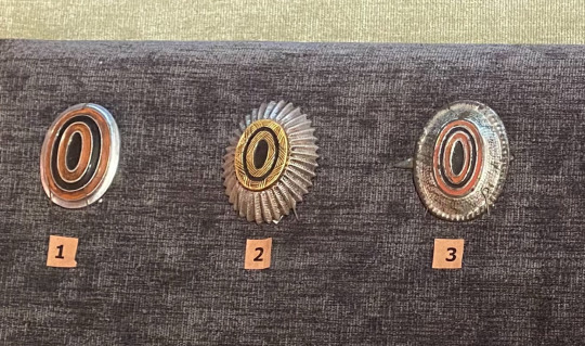
[Pictured are 3 cockades. The far left is the cockade of a lower rank soldier, while the cockades in the middle and far right are cockades of officers. Thank you to @rdstrpv for this image!]
This information is important because NCOs were almost demanded to be literate. It was essential for their occupation, as being able to read maps was one of the most important skills for an NCO to have. If Vasily was an NCO, which his cockade would indicate, he almost assuredly would be literate.
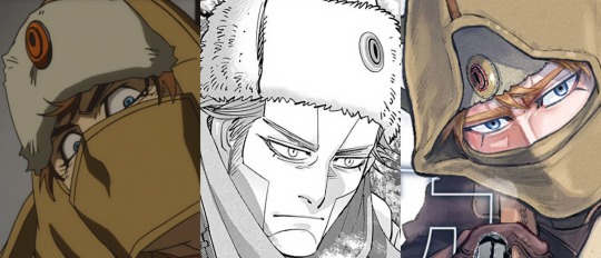
[Pictured are the 3 different ways Vasily’s cockade is drawn.]
While in the anime Vasily’s cockade is given the appearance of the average lower-rank soldier, and typically this is how people place him. However in the manga, Vasily’s cockade is more ambiguous. When referencing it to the cockades above, it could pass as both a lower-rank or an officer’s cockade. The final example is of Noda’s detailed Vasily illustration that was not outsourced by an animation studio, nor constrained by swift time spent on manga panels. In this, Vasily clearly has on the cockade of an officer.
Obviously, given the anime drawing Vasily with a lower-ranking cockade and the manga is ambiguous, you could still make the argument he’s a low ranking soldier. Nonetheless, one should also consider that the government likely would’ve preferred to send a group of officers to apprehend a Tsar’s killer over, perhaps, privates, giving more credence to him being an NCO. And thus, Vasily’s literacy likeness goes up to almost-guaranteed. There were occasional examples of NCOs not being literate, but there were few and far inbetween, making it unusual that a young NCO was illiterate by 1907.
Cossack Literacy
Of course, Vasily was not necessarily in the SBGC. He could have instead been a Cossack. While the idea of an NCO and cockade still apply to Cossacks, I will still discuss Cossack literacy in the case you find Vasily to be of a lower rank.
Unfortunately exact statistical information regarding Cossack literacy has almost never been tracked before the Soviet period. Still, by the 19th century the Imperial Russian government had a special vested interest in educating their Cossacks, more so than their peasantry. There were many Cossack schools that taught everything from literacy to combat that children were almost required to attend. In fact, once entering the military at 21, Cossacks were required by the military to be literate unlike other soldiers, and if they were not literate they were mandated to pursue education while they were deployed.
This is not to say there were not illiterate Cossacks – one could finish their entire service as a Cossack without properly pursuing their literacy if they were crafty about it, similar to illiterate NCOs. But, again, this was unlikely. In comparison, Cossacks were far more likely to be able to read than that of the ordinary peasant in the army.
Final Thoughts
I’m of the opinion Vasily actually is literate, regardless of him being in the SBGC as an NCO or a Cossack. He’s a very prideful character, and it slowly became a limiting stigma that one was illiterate in Russia, even in 1907. This is not to say Vasily can’t be illiterate – many of the stats I gave showed that there was a decent chance for illiteracy, especially if he was a first-born son to a farming family and only low-ranked. But in my opinion of all the facts culminating, I find I prefer the idea of him being literate. Have fun with this information regardless, and may it help you in whatever you intend to write or draw in the future!
A big thank you to @rdstrpv for her help in answering a couple of my questions to make sure I wasn’t misrepresenting information, and for her images. She's always a big help.
#not art#vasily pavlichenko#golden kamuy#my yapping disease strikes again#i might move to post these blogs on ao3 cuz i was told tumblr read more requires and account to open#if my math was wrong please god correct me. ive never taken a stats class in my life
31 notes
·
View notes
Note
Your art style is so satisfying!! I love the way you render faces!
When did you come up with the concept of Dawn?? Did you have different ideas of a charlastor fanchild before her?
sjlsdkfj thank you so much!!! ;A;
And I think I should give some insight about some of the meta context for Dawn to anyone who wasn't there for it before we go in-depth with my design choices lmfao
I received an ask about what I think a charlastor fankid would look like back in march and was basically all "yeahhh nooo I don't care about fankids so it's unlikely I'll dabble in that concept, at least I don't currently have plans for it" and it's true! I genuinely don't normally enjoy fankid stories (I have severe tokophobia and too many of these types of stories include pregnancy as a thoroughly explored topic)
However...
I ended up intrigued by the idea of the challenge that combining two characters into a completely new character presented anyways, so I ended up trying my hand at designing one after all.
This meant that when I sat down to design her, I had genuinely no prior ideas, since I didn't really think about the concept before!
I have however seen other people's fankids floating around in the past, so I had a bit of an idea of what other people designed theirs like.
And this is by no means an insult to any of them and their lovely work, but I just didn't really vibe with a lot of them, since many just kind of amount to looking like recolors of one or the other character with maybe bonus deer ears and antlers - and that works fine!!! It's a very servicable strategy!!! I just personally wanted to not fall into that same vein with my design since I personally don't vibe with that approach much, so I actually tried really hard to make Dawn look like her own character while also giving her a balanced mix of visual cues from both of her parents :'D
in-depth elaboration on my design choices under the cut! ⬇️
I for example looked at Alastor's and Charlie's ears (at least how I draw them in my art) and thus gave her ears that looked like a mix between both - more animalistic, like Alastor's, with similar coloring (except inverted), but placed on her head more like Charlie's. I also wanted it to vaguely look like goat ears when at a resting/lower position like this and more like deer ears when perked up.
Her hair is also cross between both - colors are from both, the fringe is a mix of both (in shape and how it sits on her head and around her face more like Alastor, in terms of texture and length more like Charlie).
She has a lot of Alastor's facial features in her, though her chin is a bit more rounded, her nose smaller and her mouth a bit more like Charlie's as well.
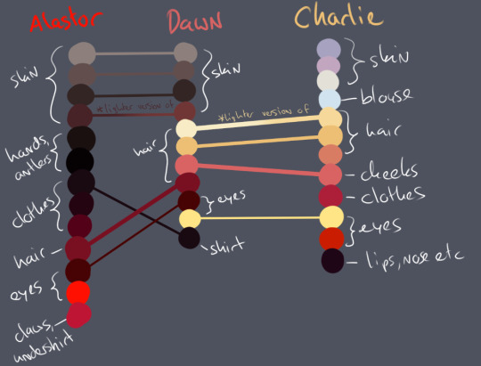
Even her colors are a more or less even combination of both characters! Here's my color palettes for all three of them and which colors I doubled from who:
I should also note that I had her adult design down first before I even started drawing her as a kid, though I think that actually added a lot to making her feel more realistic surprisingly enough?
Since I already had her key features down, that left me with a lot of room to toy around with other design aspects, and somehow kid-ifying an adult character is much more intuitive to me than designing an adult version of a kid character :o
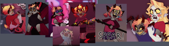
I don't have a linear timeline order or something to any of my posts about her, but from left to right in this array of drawings I've made of her as a child her age ranges from a few months old to like? 8-9-ish?
There's no fixed outfit for her as a kid, though her adult design does feature one more specific outfit:
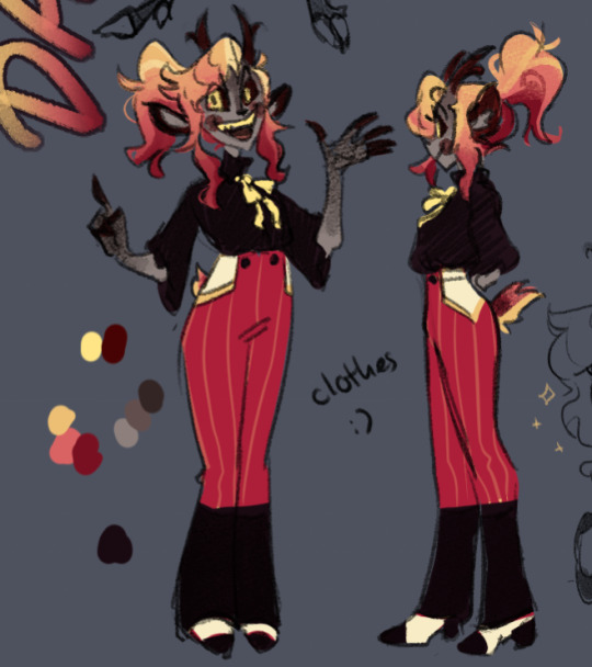
I wanted her clothes to reflect that she looks up to her parents quite a lot, so I gave her somewhat old fashioned looking pinstriped dress pants - the colors are taken from Alastor's pants, though inverted with added pinstripes for flavor - and once I sketched out the pockets I knew I wanted them to faintly remind of the inside of an apple, so I added white and yellow to it :D
Her blouse is meant to be a bit more flowy - less restricting than Charlie's blazer, but equally elegant.
And because her design is already red-heavy enough, I balanced it out with making the shirt dark, the shoes black/white and the bow around her neck yellow!
I think that's about everything I can say about my thought process behind her design haha
Thank you for giving me an excuse to talk about it, I hope it wasn't too rambly!!! If you read through the whole thing you get a cookie lmao
#charlastor fankid#charlastor fanchild#hazbin hotel oc#chubs ocs#dawn morningstar#character design#chubs answers#digital fanart#art#my art
38 notes
·
View notes
Text
Animation notes taken while reading The Animator’s Survival Kit by Richard Williams (1)
#Found a free pdf on animation so im going through it and trying to follow along and take notes on everything!#so here are my notes and drawing out of examples#animation studies#animation study#the animator’s survival kit#richard williams#animation#bouncing ball example#art#artists on tumblr#art study
2 notes
·
View notes
Text
My Favorite Cheap Art Trick: Gradient Maps and Blending Modes
i get questions on occasion regarding my coloring process, so i thought i would do a bit of a write up on my "secret technique." i don't think it really is that much of a secret, but i hope it can be helpful to someone. to that end:

this is one of my favorite tags ive ever gotten on my art. i think of it often. the pieces in question are all monochrome - sort of.

the left version is the final version, the right version is technically the original. in the final version, to me, the blues are pretty stark, while the greens and magentas are less so. there is some color theory thing going on here that i dont have a good cerebral understanding of and i wont pretend otherwise. i think i watched a youtube video on it once but it went in one ear and out the other. i just pick whatever colors look nicest based on whatever vibe im going for.

this one is more subtle, i think. can you tell the difference? there's nothing wrong with 100% greyscale art, but i like the depth that adding just a hint of color can bring.
i'll note that the examples i'll be using in this post all began as purely greyscale, but this is a process i use for just about every piece of art i make, including the full color ones. i'll use the recent mithrun art i made to demonstrate. additionally, i use clip studio paint, but the general concept should be transferable to other art programs.


for fun let's just start with Making The Picture. i've been thinking of making this writeup for a while and had it in mind while drawing this piece. beyond that, i didn't really have much of a plan for this outside of "mithrun looks down and hair goes woosh." i also really like all of the vertical lines in the canary uniform so i wanted to include those too but like. gone a little hog wild. that is the extent of my "concept." i do not remember why i had the thought of integrating a shattered mirror type of theme. i think i wanted to distract a bit from the awkward pose and cover it up some LOL but anyway. this lack of planning or thought will come into play later.
note 1: the textured marker brush i specifically use is the "bordered light marker" from daub. it is one of my favorite brushes in the history of forever and the daub mega brush pack is one of the best purchases ive ever made. highly recommend!!!
note 2: "what do you mean by exclusion and difference?" they are layer blending modes and not important to the overall lesson of this post but for transparency i wanted to say how i got these "effects." anyway!
with the background figured out, this is the point at which i generally merge all of my layers, duplicate said merged layer, and Then i begin experimenting with gradient maps. what are gradient maps?
the basic gist is that gradient maps replace the colors of an image based on their value.

so, with this particular gradient map, black will be replaced with that orangey red tone, white will be replaced with the seafoamy green tone, etc. this particular gradient map i'm using as an example is very bright and saturated, but the colors can be literally anything.

these two sets are the ones i use most. they can be downloaded for free here and here if you have csp. there are many gradient map sets out there. and you can make your own!
you can apply a gradient map directly onto a specific layer in csp by going to edit>tonal correction>gradient map. to apply one indirectly, you can use a correction layer through layer>new correction layer>gradient map. honestly, correction layers are probably the better way to go, because you can adjust your gradient map whenever you want after creating the layer, whereas if you directly apply a gradient map to a layer thats like. it. it's done. if you want to make changes to the applied gradient map, you have to undo it and then reapply it. i don't use correction layers because i am old and stuck in my ways, but it's good to know what your options are.

this is what a correction layer looks like. it sits on top and applies the gradient map to the layers underneath it, so you can also change the layers beneath however and whenever you want. you can adjust the gradient map by double clicking the layer. there are also correction layers for tone curves, brightness/contrast, etc. many such useful things in this program.
let's see how mithrun looks when we apply that first gradient map we looked at.

gadzooks. apologies for eyestrain. we have turned mithrun into a neon hellscape, which might work for some pieces, but not this one. we can fix that by changing the layer blending mode, aka this laundry list of words:

some of them are self explanatory, like darken and lighten, while some of them i genuinely don't understand how they are meant to work and couldn't explain them to you, even if i do use them. i'm sure someone out there has written out an explanation for each and every one of them, but i've learned primarily by clicking on them to see what they do.
for the topic of this post, the blending mode of interest is soft light. so let's take hotline miamithrun and change the layer blending mode to soft light.

here it is at 100% opacity. this is the point at which i'd like to explain why i like using textured brushes so much - it makes it very easy to get subtle color variation when i use this Secret Technique. look at the striation in the upper right background! so tasty. however, to me, these colors are still a bit "much." so let's lower the opacity.

i think thats a lot nicer to look at, personally, but i dont really like these colors together. how about we try some other ones?

i like both of these a lot more. the palettes give the piece different vibes, at which point i have to ask myself: What Are The Vibes, Actually? well, to be honest i didn't really have a great answer because again, i didn't plan this out very much at all. however. i knew in my heart that there was too much color contrast going on and it was detracting from the two other contrasts in here: the light and dark values and the sharp and soft shapes. i wanted mithrun's head to be the main focal point. for a different illustration, colors like this might work great, but this is not that hypothetical illustration, so let's bring the opacity down again.

yippee!! that's getting closer to what my heart wants. for fun, let's see what this looks like if we change the blending mode to color.

i do like how these look but in the end they do not align with my heart. oh well. fun to experiment with though! good to keep in mind for a different piece, maybe! i often change blending modes just to see what happens, and sometimes it works, sometimes it doesn't. i very much cannot stress enough that much of my artistic process is clicking buttons i only sort of understand. for fun.
i ended up choosing the gradient map on the right because i liked that it was close to the actual canary uniform colors (sorta). it's at an even lower opacity though because there was Still too much color for my dear heart.

the actual process for this looks like me setting my merged layer to soft light at around 20% opacity and then clicking every single gradient map in my collection and seeing which one Works. sometimes i will do this multiple times and have multiple soft light and/or color layers combined.
typically at this point i merge everything again and do minor contrast adjustments using tone curves, which is another tool i find very fun to play around with. then for this piece in particular i did some finishing touches and decided that the white border was distracting so i cropped it. and then it's done!!! yay!!!!!
this process is a very simple and "fast" way to add more depth and visual interest to a piece without being overbearing. well, it's fast if you aren't indecisive like me, or if you are better at planning.

let's do another comparison. personally i feel that the hint of color on the left version makes mithrun look just a bit more unwell (this is a positive thing) and it makes the contrast on his arm a lot more pleasing to look at. someone who understands color theory better than i do might have more to say on the specifics, but that's honestly all i got.

just dont look at my layers too hard. ok?
2K notes
·
View notes
Text
Non-offensive Historical terms for Black people in historical fiction
@pleasespellchimerical asked:
So writing historical fiction, with a white POV character. I'm not sure how to address race in the narration. I do have a Black main character, and I feel like it'd feel out of place to have the narrator refer to her as 'Black', that being a more modern term. Not sure how to do this without dipping into common historical terms that are considered racist today. Thoughts on how to handle this delicately, not pull readers out of the narrative? (fwiw, the POV character has a lot of respect for the Black character. The narration should show this)
There are non-offensive terms you can use, even in historical fiction. We can absolutely refer to Black people without slurs, and if slurs is all one can come up with, it’s time to go back to the drawing board. I cannot say which terms are best for your piece without knowing the time period, but hopefully the list below helps.
Historical terms to use for Black people (non-offensive)
African American documented as early as 1782 (documented in an ad in the Pennsylvania Journal). Note the identity isn’t accurate for non-American Black people.
African could refer to African people or “from 1722 as ‘of or pertaining to black Americans.’”
The place of origin could also be used. For example, “a Nigerian woman”
Africo-American documented as early as 1788.
People of Color documented as early as 1796 (with specific contexts, usually mixed people)
Afro American documented as early as 1817, 1831 (depending on source)
Black American documented as early as 1831
Black was used in Old English to refer to dark-skinned people. Black was not capitalized until recent years, so “She was a young black woman.” would make sense to say, though “She was a young Black woman.” is the better standard today, although not universally adopted. I personally prefer it capitalized.
Moor was used as early as the late 1400s for North African people, but had a somewhat flexible use where anyone visibly Black / Of African descent or the Afro Diaspora might be referred to or assumed as a Moor. Note, it has other meanings too, such as referring to Muslim people, but that doesn’t mean the person using it is going by the dictionary definition. Not really the way to go today, but okay in a historical setting (in my opinion).
Biracial (1860s), mixed race (1872), multiracial (1903) and multicultural (1940s) are also terms to refer to people of two or more races.
Occupation + description. Throughout history, many people have been referred to as their occupation. For example, the Carpenter, The Baker, the Blacksmith. Here’s an example of how you might go about using occupation and traits to identify a Black character in history. Here’s an example I came up with on the fly.
“You should go by Jerry’s. He’s the best blacksmith this town’s ever seen. Ya know, the real tall, dark-skinned, curly haired fellow. Family’s come here from Liberia.”
Offensive and less-sensitive terms for Black people
Blacks was used in plural more, but this is generally offensive today (Even writing it gives me **Thee ick*)
Colored was mostly used post-civil war until the mid 20th century, when it became unacceptable. This is not to be conflated with the South African Coloured ethnic group.
Negro/Negroes were also used as early as the 1550s. Capitalization became common in the early 20th century. I'm sure you know it is offensive today, though, admittedly, was not generally seen as such until around the 1960s, when Black replaced it. It does have its contexts, such as the trope “The Magical Negro” but going around using the term or calling someone that today is a lot different.
Mulatto referred to mixed people, generally Black and white, and is offensive today.
The N-word, in all its forms, is explicitly a slur, and there is absolutely no need to use it, especially in a casual manner, in your story. We’ve written about handling the N-word and alluding to it “if need be” but there are other ways to show racism and tension without dropping the word willy-nilly.
Deciding what to use, a modern perspective
I’m in favor of authors relying on the less offensive, more acceptable terms. Particularly, authors outside of the race. Seldom use the offensive terms except from actual direct quotes.
You do not have to use those offensive terms or could at least avoid using them in excess. I know quite famous stories do, but that doesn’t mean we have to so eagerly go that route today. Honestly, from teachers to school, and fellow non-Black students, it’s the modern day glee that people seem to get when they “get a chance to say it” that makes it worse and also makes me not want to give people the chance.
It goes back to historical accuracy only counting the most for an “authentic experience” when it means being able to use offensive terms or exclude BIPOC from stories. We’ve got to ask ourselves why we want to plaster certain words everywhere for the sake of accuracy when there are other just as accurate, acceptable words to use that hurt less people.
Disclaimer: Opinions may vary on these matters. But just because someone from the group cosigns something by stating they’re not offended by it, doesn’t mean a whole lot of others are okay with it and their perspectives are now invalid! Also, of course, how one handles the use of these words as a Black person has a different connotation and freedom on how they use them.
~Mod Colette
The colonial context
Since no country was mentioned, I’m going to add a bit about the vocabulary surrounding Black people during slavery, especially in the Caribbean. Although, Colette adds, if your Black characters are slaves, this begs the question why we always gotta be slaves.
At the time, there were words used to describe people based on the percentage of Black blood they had. Those are words you may find during your searches but I advise you not to use them. As you will realize if you dive a bit into this system, it looks like a classifying table. At the time, people were trying to lighten their descent and those words were used for some as a sort of rank. Louisiana being French for a time, those expressions were also seen there until the end of the 19th century.
The fractions I use were the number of Black ancestors someone had to have to be called accordingly.
Short-list here :
½ : mûlatre or mulatto
¼ or ⅛ : quarteron or métis (depending on the island, I’m thinking about Saint-Domingue, Martinique and Guadeloupe)
1/16 : mamelouk
¾ : griffe or capre
⅞ : sacatra
In Saint-Domingue, it could go down to 1/64, where people were considered sang-mêlé (mixed blood for literal translation, but “HP and the Half-Blood Prince” is translated “HP et le Prince de Sang-Mêlé” in French, so I guess this is another translation possibility).
-Lydie
Use the 3rd person narrative to your advantage
If you are intent on illustrating historical changes in terminology consider something as simple as showing the contrast between using “black” for first person character narration, but “Black” for 3rd person narrator omniscient.
-Marika
Add a disclaimer
I liked how this was addressed in the new American Girl books
it’s set in Harlem in the 1920’s and there’s a paragraph at the beginning that says “this book uses the common language of the time period and it’s not appropriate to use now”
-SK
More reading:
NYT: Use of ‘African-American’ Dates to Nation’s Early Days
The Etymology dictionary - great resource for historical fiction
Wikipedia: Person of Color
2K notes
·
View notes
Note
I saw your post about writing for Coriolanus Snow Andi was thinking classic enemies to lovers nsfw I’ll give you free liberty with everything else 💕
'I hate you' is new 'I love you'

Pairing: Coriolanus Snow x capitol!reader (gender neutral afab)
Summary: When your professor tells you to come to an agreement with your enemy, and you take 'come' too literally.
Words: 3.2k
Themes: smut, nsfw
Warnings: using of 'you' to reader, set before events of tbosas so no actual spoilers, more like academic rivals to lovers but they want to fight at some point so I guess it counts, NSFW | public sex (or more semi-public), unprotected sex (wrap it before tap it), p in v sex, kinda toxic but it's enemies to lovers, more like enemies who fuck, Coryo is pretty rough and possessive, marking, making out, idiots in love but they prefer fighting with each other
Author's note: I found some free time between studying, so I decided that I can no longer delay. English is not my first language so i hope that i didn't do too much mistakes. It is possible that a single "she" or "her" will appear here because I changed the concept during writing and I do not know if I got rid of everything. Let me know whether to stay with the use of 'you' or maybe replace it with personal pronouns or 'y/n'. I hope it's not written very awkwardly and you will like it!!
Coriolanus Snow is a peculiar person. Most people love him. Nice, classy, handsome and rich from a wealthy family. What more could one want? However, one of Coriolanus' traits that everyone seems to turn a blind eye to is his two-facedness. Some say this is merely a symptom of his cunning and wits. He knows when and how to behave to make his counterpart happy. You are not one of those people. Saying that you and Coriolanus Snow don't like each other is a huge understatement. You guys hate each other. From the very beginning when you both met at the academy it was known that you would cause a lot of problems. Too much of a character difference, or perhaps too much of a similarity between the two. However, this is not what is crucial. Whatever it is, it makes you two most likely to kill each other if you could. Every move you make you do to screw each other up. To prove who is better.
Professor Satyria's pleas for you to finally come to an agreement are of little use. The conflict must go on, and neither of you has any intention of giving up.
You like the way things are working out. At first, Snow was annoying and you didn't understand how people couldn't see him for what he really was. Fake. Now he is still annoying, but getting under his skin has become a sort of routine. Quite a pleasant one.
"You have to get along with each other and set a good example as rightful citizens of the Capitol, otherwise the Academy will draw out the consequences."
Professor Satyria's words continue to ring in your ears as you get ready to go home after finishing classes and doing punishment work. On the one hand, you don't want something as silly as arguing to weigh on your future, but on the other hand, reaching out to agree is like admitting you were wrong. Failure.
"Wherever I am you must also appear. Are you obsessed with me?" Behind your back, you heard a familiar, annoyingly kind voice, in which you could sense some arrogance. You groaned turning around to see no one else but Coriolanus.
"Don't you have anything better to do? People are finally getting tired of your idiocy?" Your words, however, did not budge the blond. His expression remained unchanged. One that might make most people think he is a nice person. You, however, have known him long enough to see right through it. Perfect. Too perfect.
"We need to talk. A positive outcome for both sides. It will interest you." Well, the threat of Satyria. He is the first one to extend his hand for agreement. Where is the trick? You look at him suspiciously without saying a word, and so Snow takes it as a sign that you are thinking about the proposition. "Do you have free time? Maybe we could go out somewhere together?"
The suggestion makes you burst into laughter. "With you? No thanks, I'll pass on this pleasure."
Coriolanus is not surprised by your answer. He knew it wouldn't be that easy. Accepting rejection, however, is not his strong point. He is annoyed by your behaviour, but he bites his tongue to avoid responding in the same spiteful way. Instead, he doesn't give up.
"I know we were never on good terms, but I want this war between us to end. I hope we can put behind us all the bad things that happened between us and start fresh. What do you think about this?" he says, sounding quite sincere.
"Let me think." You say and sigh, pondering the answer, which is obvious, but you can't let go of a little malice. "No."
The expression on Snow's face became more serious. It seems that your refusal offended his pride. But he doesn't show it in his tone of voice.
"Why not?" he asks and you notice how he clenches his jaw and his gaze becomes unpleasant.
You enjoy the view and it fills you with satisfaction. "Because you think that with a pretty face and fake politeness, you can get anything. Maybe it works with others, but I'm not that stupid. Additionally, you are damn annoying. That's why."
The expression on Snow's face becomes dark. Typical when he fails to get what he wants. His usual tone is completely gone. His face is twisted with anger. He still tries to maintain a polite voice. The attempt fails.
"Do you want to repeat it?" he asks through his teeth. It's obvious that you've hit one of his sensitive points. That was the plan.
"Exhausting, isn't it? Hiding behind the mask of a nice and put-together boy from a highly placed family who is a veritable ideal is tiring, isn't it?" A mockery can be heard in your voice. Coriolanus is very sensitive to it.
"What do you think you know about me?" He asks through clenched teeth, his tone no longer artificially polite, it is filled with rage. Your mockery has really gotten to him. He tries to calm down, but it's all in vain. Coriolanus has never had problems with self-control, but something about you makes him ready to abandon everything. You manage to get him off balance with ease. In his head, he has one plan. To destroy you.
"Do you think you pretend so well?" You burst out laughing and shake your head. You know you shouldn't say such things. The academy is practically empty, and Coriolanus's angry enough can be unpredictable. However, you can't help but point out everything that annoys you about him. "It's actually quite easy to see what kind of person you are. You look at people with disgust, but when they look in your direction, you suddenly change dramatically. how fake you are to everyone. I wonder how they don't see it. How empty and shallow you are."
"You don't know anything about me!" Snow shouts at you, his face twisted with rage. He is barely able to control himself. He doesn't even try to hide it anymore. He stares at you with hatred in his eyes.
"Don't you dare assume that you know everything about me. You don't know me one bit. You don't know what my life is like. Don't think so highly of yourself. You aren't better than me." He continues, his voice getting louder with every word he says. You really hit his sensitive spot.
"I don't know everything and I'm not going to pretend otherwise. For me, the most important thing is acts, and in your case, they are fake and two-faced. You despise people, and you yourself are at the bottom." Irritation takes over. You know that at any moment you can say one word too many if you haven't already. However, someone has to talk it all out for him. Adrenaline makes you take a step closer to the upset boy without considering the possible consequences.
Snow seems to be on the verge of a breakdown. His fists are clenched and his eyes are wide open with rage. He is breathing hard, trying to control himself. He's not used to being treated this way by anyone. He has come this far over the years, solely because of himself and what role he has taken in society. You really succeeded in hurting his pride. "I warn you right now. Don't mock me any further."
"Why? What will you do? hit me? do it, I dare you. Then everyone will see how "perfect" you really are." You know the situation is starting to get dangerous. However, you come closer. It's stupid, you know it, and yet you do it. Maybe it's the way his reactions give you satisfaction, or maybe it's the way he looks at you.
You can see the hatred oozing from his eyes when they are locked on yours. His face is full of rage, his breathing heavy and his muscles tense.
He takes a step toward you with a clenched fist. You can see his knuckles turning white. He grabs you and presses you against the wall, his body against yours.
A second later, you feel him pressing you against the wall tighter than before, and his hand grips your throat.
You feel the warmth of his breath on your lips. Your heart is pounding as if it wants to jump out of your chest. You feel a strange sensation in your lower abdomen. His eyes are cold, yet they make a pleasant shiver run through your body. His face is right next to yours, flesh pressing against yours. It was a matter of split seconds as you two pressed your lips to each other in an aggressive and hungry kiss.
He returns the kiss, wrapping his free hand around you. He seems to enjoy the kiss as much as you do.
You can feel his body trembling as he still tries to keep control of his overwhelming emotions, or maybe it's because of the situation you're in.
The two of you kiss aggressively. Snow's body shakes as he fights between his desire and how much you get on his nerves. You feel how rough but passionate his kiss is.
He draws you closer and your bodies press against each other. The friction of your bodies makes you uncontrollable over the muffled whimpers you make. You feel the bulge forming in his pants rubbing against your body.
The situation seems hazy, and only fragments register in your mind. How you both enter the bathroom without stopping your hungry and clumsy kisses, and your hands work to get rid of clothes that only makes it difficult. How Coriolanus presses your body against the wall slamming his hips against yours.
All this is to express yourself and give vent to all the negative emotions you have been holding for years.
Snow's body is now almost completely controlled by his emotions. His movements seem full of hatred and at the same time passion. He just wants to express himself using his flesh to claim you as his own.
You feel as if you are on fire, your body moves and reacts according to your desires. The tension that has built up between you for years is finally released, and it all comes out as raw passion.
His fast and aggressive movements make the place where your bodies meet burn in a pleasant way, and you think to yourself that it will be a miracle if you walk normally tomorrow. His dick stretches you nicely and his movements make your inside sting slightly. It's not a problem for now. Not now when your legs are wrapped around his waist and the only sounds you can make right now are moaning and repeating his name like a mantra.
Your body trembles at how rough his movements are, but you don't care now. The most important thing for you now is to show him how much you hate him. A broken moan leaves your lips when he reaches deeper.
Coriolanus feels your legs tighten around him. He moves slower now but is more passionate and rough. He holds your hips tightly, not caring if it is uncomfortable for you. His lips move to your neck, where he bites as if he is trying to unload all the emotions you are causing you this way.
His hips buck firmly against you. Each thrust makes your body more tired and aching but at the same time, it makes the whole experience even more pleasurable. If someone told you that you would end up having sex with your biggest rival in the academy bathroom, you would laugh in that person's face. There you are, panting, with your arms around his neck when Coriolanus Snow is abusing your cunt sensitive from too much friction.
Coriolanus brings his lips closer to your ear. His warm and irregular breathing makes a shiver go through your body. "Do you like it when I claim you as mine?" He purrs, his voice still filled with desire.
"I hate you, I hate you so much," You exhale in a trembling voice that takes a lot of trouble to keep from cracking. You bite and suck at the smooth skin of his neck, leaving there dark marks. "I hate you, Coriolanus Snow."
"I hate you too," Snow says with a low growl as he continues to hold you. He bites your shoulder, leaving marks on your skin. His moans are muffled by your skin, which he touches constantly, as if afraid that at any moment you might escape and leave behind only a faint memory.
You hate him, but you enjoy him. You are pleased when he takes you as his own. You are excited when he uses your body. You feel his passion and desire through his body. You feel his raw passion and it's hard to hate him now.
"oh go to hell" You hiss and bite your lower lip to stop your moans, feeling him moving faster.
He doesn't care if he hurts you or not. All he cares about is that you belong to him right now. His hips slam against yours in an aggressive peace. The bathroom is filled with sinful noises because you don't even think about the fact that someone might come in and hear them.
"you may have already fallen in love, but with me, it's not so easy" A trembling laugh leaves your lips. You feel your head getting foggier and foggier. It's hard for you to put together a meaningful sentence, "but you're doing a good job" a loud moan leaves your mouth. you close your eyes and throw your head back "mmm my sweet toy."
He hears your moans of pleasure, and his eyes close with a smile. He has won and he knows it. Snow always lands on top. He presses you against the wall with his body even tighter. His movements become more sloppy and deeper as if he wants to bury himself inside you. His body trembles as his lips leave broken moans and whimpers.
Passion is so strong that you can almost forget about hatred. You can almost fall in love with Coriolanus Snow. Almost. But you know that what you feel now is only lust, and you know that it's all temporary.
Not him. Not the arrogant boy whose whole life is based on lies. Not that boy who doesn't care about anyone. Not that boy with a beautiful face and mesmerizing blue eyes. Not him.
You press closer to his body, almost clinging to him as a wave of pleasure sweeps over your body.
Coriolanus lets out a raspy throaty moan feeling your walls pulsate around him. His voice is low and shaky. He doesn't seem to notice anything except the way you cling to his body. He moves faster and harder, making sure he satisfies you completely.
Snow is fully immersed in feelings. He can't think clearly or rationally. He only knows that he has to claim you, that he has to satisfy his needs. He wants to feel you and make the most of the situation. All his thoughts and desires are focused on you. His hip movements speed up as he reaches the climax. He hides his face in your neck to muffle his moans. His body stiffs as he comes inside you.
Your arms wrapped around his neck, while his wrapped around your waist. you cling to each other, still not making contact with the real world as your breathing slowly calms down.
What happened in that bathroom is over, they both return to reality. Snow steps back slightly and helps you stand on your own two feet. He looks at you with heavy eyes. All the emotions he had been hiding inside him had finally been released.
He has won and he knows it. He has succeeded. But what now? Was it really worth it? This is not a question for now. Coriolanus does not look far into that future with his thoughts.
You look at each other in silence. Slowly you begin to realize what you have done and now you look at each other awkwardly and somewhat panicked.
Coriolanus is the first to break the silence. His cheeks are flushed and his breathing is faster. The passion he felt a minute ago still lingers in his heart, something he tries to hide from you. He looks at you with a somewhat absent and uncertain gaze
"Do you think we should forget what just happened?" He tries to make his voice sound normal as if nothing had happened.
"Definitely." The words leave your lips before you have time to think. You stare at each other in silence for a few more moments and begin to quickly put on your clothes.
Snow is surprised at how quickly you agree with him. He needs to make sure this is the end of what just happened between the two of you, so he adds.
"If anyone asks, it never happened." He now looks at you with a somewhat panicked expression on his face.
"You don't have to tell me," you scoff, buttoning your shirt, "if you tell even one soul, I'll kill you, I swear."
Coriolanus looks at you with small amusement while fixing his jacket. "I hope you won't become obsessed with me after this."
"Maybe in your dreams," you say with a slight smile fixing the collar of his shirt. " you better be careful that you are the one who will be lost in memories of me." Before you leave the bathroom you stop in front of the mirror and fix your uniform and hair. Coriolanus smiles for a moment but then quickly clears his throat and tries to look cold.
You both come out of the bathroom, look at each other and part your lips, as if to say something to each other, but you look at each other in silence "Now everything is back to normal. We can still hate each other," you say, but this does not improve your mood at all.
"It never happened," Snow says trying to look you in the eyes, wondering if you're thinking about it too. He wonders if what he feels is real, or if it's just a moment of passion.
"Never" You agree by nodding your head. Your gaze goes down to his mouth. As you look into his eyes again without a moment's thought you move closer to him and press your lips to his in-hungry kiss. He kisses you back wrapping his arms around you to bring your body closer.
You parts away after some time and you both catch your breath for a moment after this passionate kiss. Coriolanus is completely consumed with passion and there is nothing in his mind but you.
You move away and nod to each other as if you have just made a deal and each is walking in your own direction in a much better mood.
Maybe that's not exactly what Professor Satyria meant when she said you two should come to an agreement, but it certainly worked.
#the ballad of songbirds and snakes#the hunger games#coriolanus snow#tbosas#coriolanus snow x reader#coriolanus x reader#coriolanus smut#coriolanus snow smut#coriolanus snow x you#character x reader#x reader#x you#smut#young coriolanus snow#thg#thg fanfiction#thg x reader#tbosas x reader#tbosas fic#tbosas smut
2K notes
·
View notes
Text
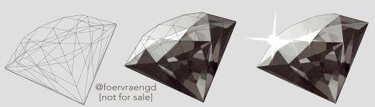
Mirre’s “How i render gemstones” tutorial!
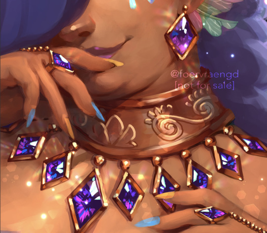
(note: image above is not what is shown in the walkthrough. It is an example piece)
Ingredients:
Art program that has layers and selection tools
Patience (hubris or stubbornness is fine too)
(recommended) photo references of gemstones and/or prisms
(Optional but very helpful) Knowledge on how to use Reference layers and anti-overflow in Clip studio Paint
For this tutorial i am going to use clip studio’s “anti-overflow” feature. This post is not going to explain how to use that specific setting but you should be able to find guides on how to use it on clip studio’s official website or on youtube.
Please Note: The result of this technique will not 100% represent real life gemstones. These are more simplified but should still make an impression of the brilliance and appeal of gems, crystals and diamonds.
If you don’t work in CSP: the best workaround is to use the polygonal lasso selection tool for the same purpose.
This ended up being a long post so I am putting it under the readmore:
First off; Basic idea on how the light refracts inside a solid transparent object:
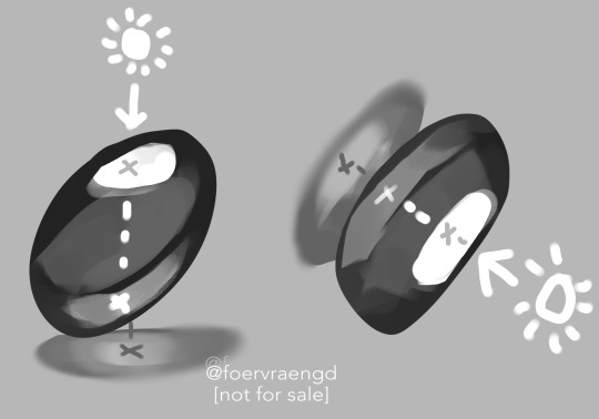
Wether it is acrylic, glass, water or crystal, the way light pass through more or less should behave the same as long as it is solid and not hollow inside. Pay attention to how the darkest parts of the stone goes along the inner edges, leaving a ”mid tone” sort of in the center. However, this might vary depending on the light setting. But it is a generally good rule-of-thumb to follow if you’re drawing something not based on a photo. Another thing to pay attention to here is how the placement of the highlight will lit up the inside of the gem in a parallel line. It also shows through on the cast shadow.
Light refraction on a cube:
I have already made two posts on this, so definitely go through them:
CUBE BREAKDOWN POST HERE
But a rough summary from those two links would be: Every side/facet of a gem or a cube etc refracts the light individually and not as one entity (that would make it look hollow and not solid). Think of it like how each piece in a broken mirror individually reflect your face back to you. Like a weird patchwork!
Putting this into practice:
For this tutorial I’m going to be nice to myself and not try to draw perfectly accurate gemstones. Instead I’m gonna draw them with a more ”natural” looking set of facets. Which actually isnt as common in real world as video games makes us think. Some crystals have geometric shapes naturally, but a lot of other stones are not as fancy. Anyway, im taking artistic liberty on these example stones because the technique I’m going to use will work for these just fine.
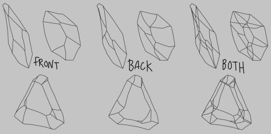
So, in clip studio paint, I first draw the stones on a vector layer. I give them facets for the front side. Then I duplicate the layer, remove the front facets and replace them with the facets on the back of the stone. The third image here shows both layers visible on top of each other. I now put these into a layer folder and mark the folder as ”reference”.
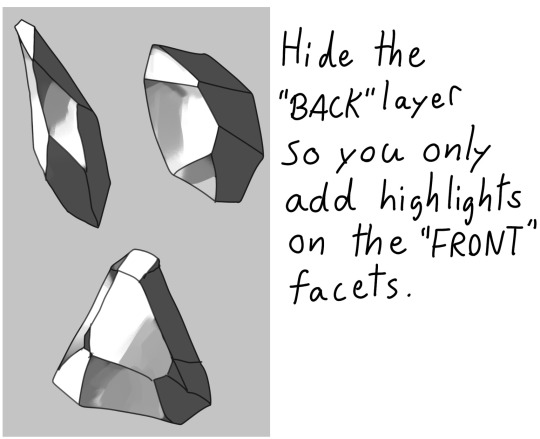
Now, on a layer below the lineart folder, fill with your base tone. Then make a layer on top (if you can clip it to the base tone, do that), this layer is where you decide where the highlight will be placed. In some cases the highlight is only lighting up one single facet - it really depends on the design of the stone. You can also blend and soften the highlight here if it looks good for you, just make sure not every facet is highlighted. The highlight layer should be on top of all the other layers clipped to the base tone layer.
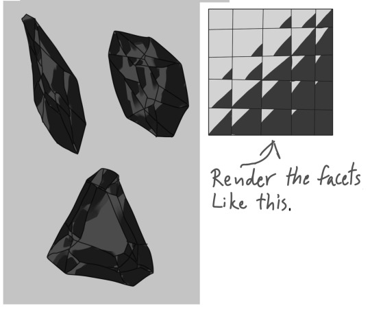
Now it is time for the juicy juicy stuff! Turn on both lineart layers so they’re both visible. I hid the hilight layer here because it was in the way, but might not be needed in your case. Make a layer clipped to the base tone and paint in the darkest tone. This is where anti-overflow helps me out, because when i run my brush over all these crossed lines it will make the stroke pop in and out for each facet. If you dont use CSP, this is where you can use the lasso tool and select every second facet. It will take a bit more time but it should work similarly.
After the darkest tones I then make a layer for the inside light that the highlight has lit up. Here i keep it inside the darkest tone but this might vary depending on the light setting. If it looks good to me, then that’s what i stick to.
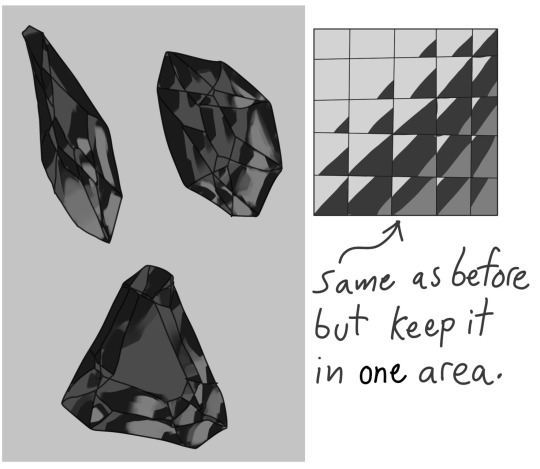
The way I approach rendering the facets here is like the grid in the example images above, every shade and tone appear more or less in each facet but the amount is relative to their position. So a gradient wouldnt have a smooth transition; it would be slightly scewed in each square on this example grid. Essentially like how some bathroom window glass panes look like.
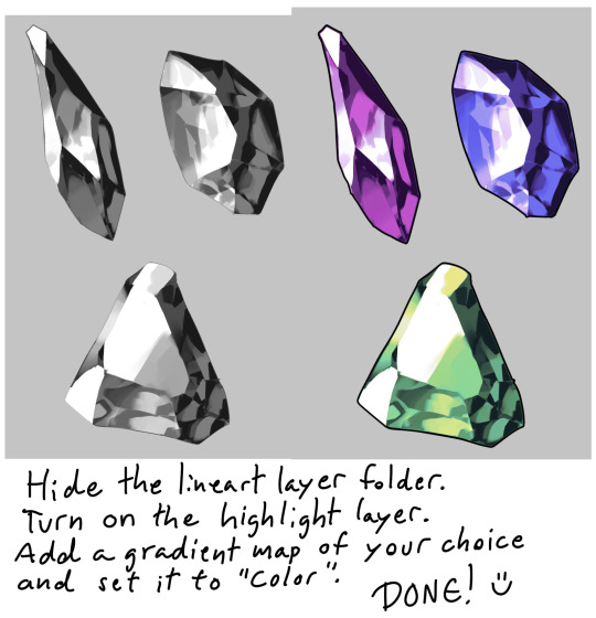
Now it’s time to hide the lineart layer folder and check if the gemstones look decent to you. If not, then you can look up some reference photos and analyze where the values group together the most; be careful not to focus too much on the photos 500 million sparkles. Squint your eyes or blur the reference and try to see how the overall values behae.
I, personally, am satisfied with these rocks so I slap on a gradient map (you can manually color in them too if that’s your thing) and call it a day. The lit up inside of a gemstone tend to have a brighter and more saturated color than the mid tone.
Other Examples with this technique:
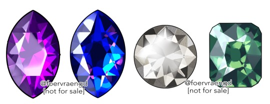
If you look up ”gemstone types” you can often find images displaying various facet types from more than just front view. These can serve as useful base templates for practicing this rendering technique. The backside of a gemstone is called the “pavillion” and is really useful to have at hand when it comes to painting the inner refractions. You can probably also use 3D models and convert the wireframe into lineart. But that is slightly out of my pool of knowledge.
Applying this knowledge without using a base lineart layer is of course possible. In this painting I followed a simplified summary of how the facets sparkle: Keep the highlight shape to match the front facet design, and all the inner refractions should be more scattered and split up but face a direction towards the center of the gem. Now don’t you think this sort of makes the gems look like eyes? That’s right! You can, and absolutely should, apply this on eyes to create the most sparkly anime eyes ever.
Now, refracted light that lands on the surface surrounding gemstones varies depending on the material - and if the gem is inside a metal frame it usually doesnt create this much refraction around it. But I want to have fun so i decided to break this rule in the name of pretty sparkles. :)
2K notes
·
View notes
Text
thinking about Eddie and Steve's lockers being next to each other in high school and whenever he gets the chance, Eddie slips an anonymous love letter in Steve's locker so that the pretty boy thinks he has a secret admirer.
This goes on for a couple weeks. Eddie will slip a letter in Steve's locker and Steve will pull it out so gently, a smile tugging at his lips when he turns to Eddie to ask, "Munson, did you see who put this here?" And Eddie will just slam his locker shut and shrug.
"No, Harrington. Move." He'd shove past Steve, their shoulders brushing together, and he'd go about his day, ignoring the little voice in his head that tells him he has a crush on Steve fucking Harrington. Which is ridiculous, he hates Steve.
But then he starts to spend more time writing the letters. He starts to doodle little pictures of Steve on the back of the letter and he can't help the smile that breaks out on his face when Steve pulls it out of his locker and sees the drawings. "Oh my God, that's me!"
"It looks just as awful as the real you." Eddie says while peering over Steve's shoulder.
Steve jumps about 5 feet in the air and clutches the note to his chest. "Jesus, Munson, you need a bell or something." He flips the note over to read the writing, the little cursive letters had taken Eddie so long to get right. He couldn't write the note in his usual handwriting, everyone knows what his god awful handwriting looks like because the teacher shows it to the class as an example of what not to do. "Go away, you're ruining the best part of my day."
Eddie just nods dumbly and shuffles down the hallway. The notes are the best part of his day? Eddie pulls a piece of his hair in front of his face to hide his huge smile. God, he's screwed.
He writes the letters the whole time they are in school together and on Steve's last day of high school, he slips one final letter into his locker with a sigh. He's surprised no one has seen him do this over the years, he stopped being careful about it last year.
Steve opened his locker and carefully pulled the final letter out, a sad smile appearing on his face as he opened it and started to read. "Hmm."
"Hmm what, Harrington?" Eddie mused while pulling shit out of his locker. He knows exactly what caught Steve's attention.
He had signed the letter 'Love, E.' Instead of 'From anonymous.'
"Who do you know that starts with the letter E?" Steve was staring at the letter with a little frown, he turned it over to the back where Eddie had drawn a little graduation cap.
Eddie slammed his locker shut and pretended to think for a second, his heart hammering against his chest so hard it hurt. "Hmm... My name starts with an E." He said with a smirk, hoping Steve couldn't see how terrified he was.
Steve lifted his gaze to Eddie and he seemed to consider it for a moment before laughing. "Ha ha very funny, Munson." He said sarcastically as he shoved the letter in his front pocket. He pulled the rest of his stuff out of his locker and dumped it all unceremoniously into his backpack. "Well, see ya, Munson." And then he was gone.
"See ya, Steve."
**
(i have posted the first chapter of the fic !! Here's the first chapter for anyone that wants to read it! )
#GOOD MORNING#steddie#eddie munson#steve harrington#stranger things#steveddie#this was a little long lmao#long post#steddielettersau
10K notes
·
View notes
Text
🌷 H.E.R


pairing :: neteyam x human! reader
summary :: Neteyam headcanons if he was dating a human reader 😋 he's a cutie patootie (James Cameron pls bring him back)
author's note :: I literally pulled this out of my ass

the type of guy to cup his hand under your chin when he feeds you something
PRINCESS TREATMENT ONLY!!
draws circles on your back when you do your lab work
brings you a fresh bouquet of flowers every week
"Aw Neteyam you didn't have to." You held the flowers in your hands as Neteyam smiled at you. "Pretty flowers for my pretty lady."
gives you random trinkets from when he was out hunting because it reminded him of you
since he's way taller he could reach your stomach while sitting down. You would be standing up with him sitting beside you, head leaning on your hip and an arm wrapped around your thigh
KING OF NICKNAMES 🤑🤑 example: my girl, mate, ma y/n, yawntutsyip, yawne
a shy guy but not afraid to show you off or to stick up for you
begs his dad to have his own camera so he can take pictures of you
has you sit on his lap while you two go for a ride on his ikran
does your hair for you. don't worry if he doesn't know a certain style you want he'll figure it out. (He begs norm or his dad for help)
this man ADORES spoiling you. If you mention something don't be surprised when Neteyam comes in your room with it in his arms
over all gentle person. he could never yell at you
"me and my gf don't argue she tells me to shut up and I do" type of guy
always plans a date at least every once a week for you guys. he loves quality time especially when he's busy with Olo'eyktan training
doesn't care about his mom's hatred towards humans, he loves you for you and her opinion won't change it
PIGGYBACK RIDES. we all know that man is tall so he's always carrying you around so you're not behind
the type of guy to sneak in your room at night so he could see you
he's very good at expressing his feelings with words
"Y/N" Neteyam whispered as you snuggled up in his chest. You hummed in response. "Mhm?"
"I love you."
he swore that he'd have a proper marriage ceremony with you one day. since you're unable to preform tsaheylu he'd go with marrying you like how "earth" people do
if you like doing your make-up he'd ask you to do his. his eyelashes were extra long after putting mascara on
he adores seeing you and Tuk bond. he wishes to have a family with you in the future when you're ready
your go to person when you're sad
"shh my love it's ok, cry it out." Neteyam rubbed his hand on your back as he felt your hot tears fall on his chest. You hiccuped and wrapped your arms around him. "talk to me once you're ready my love, I'm always here for you."
#atwow#avatar#avatar imagine#imagine#neteyam sully#neteyam#neteyam x human reader#neteyam x y/n#neteyam x reader#neteyam x you#neteyam imagine#avatar the way of water
2K notes
·
View notes
Text
why Aurora's art is genius
It's break for me, and I've been meaning to sit down and read the Aurora webcomic (https://comicaurora.com/, @comicaurora on Tumblr) for quite a bit. So I did that over the last few days.
And… y'know. I can't actually say "I should've read this earlier," because otherwise I would've been up at 2:30-3am when I had responsibilities in the morning and I couldn't have properly enjoyed it, but. Holy shit guys THIS COMIC.
I intended to just do a generalized "hello this is all the things I love about this story," and I wrote a paragraph or two about art style. …and then another. And another. And I realized I needed to actually reference things so I would stop being too vague. I was reading the comic on my tablet or phone, because I wanted to stay curled up in my chair, but I type at a big monitor and so I saw more details… aaaaaand it turned into its own giant-ass post.
SO. Enjoy a few thousand words of me nerding out about this insanely cool art style and how fucking gorgeous this comic is? (There are screenshots, I promise it isn't just a wall of text.) In my defense, I just spent two semesters in graphic design classes focusing on the Adobe Suite, so… I get to be a nerd about pretty things…???
All positive feedback btw! No downers here. <3
---
I cannot emphasize enough how much I love the beautiful, simple stylistic method of drawing characters and figures. It is absolutely stunning and effortless and utterly graceful—it is so hard to capture the sheer beauty and fluidity of the human form in such a fashion. Even a simple outline of a character feels dynamic! It's gorgeous!
Though I do have a love-hate relationship with this, because my artistic side looks at that lovely simplicity, goes "I CAN DO THAT!" and then I sit down and go to the paper and realize that no, in fact, I cannot do that yet, because that simplicity is born of a hell of a lot of practice and understanding of bodies and actually is really hard to do. It's a very developed style that only looks simple because the artist knows what they're doing. The human body is hard to pull off, and this comic does so beautifully and makes it look effortless.
Also: line weight line weight line weight. It's especially important in simplified shapes and figures like this, and hoo boy is it used excellently. It's especially apparent the newer the pages get—I love watching that improvement over time—but with simpler figures and lines, you get nice light lines to emphasize both smaller details, like in the draping of clothing and the curls of hair—which, hello, yes—and thicker lines to emphasize bigger and more important details and silhouettes. It's the sort of thing that's essential to most illustrations, but I wanted to make a note of it because it's so vital to this art style.
THE USE OF LAYER BLENDING MODES OH MY GODS. (...uhhh, apologies to the people who don't know what that means, it's a digital art program thing? This article explains it for beginners.)
Bear with me, I just finished my second Photoshop course, I spent months and months working on projects with this shit so I see the genius use of Screen and/or its siblings (of which there are many—if I say "Screen" here, assume I mean the entire umbrella of Screen blending modes and possibly Overlay) and go nuts, but seriously it's so clever and also fucking gorgeous:
Firstly: the use of screened-on sound effect words over an action? A "CRACK" written over a branch and then put on Screen in glowy green so that it's subtle enough that it doesn't disrupt the visual flow, but still sticks out enough to make itself heard? Little "scritches" that are transparent where they're laid on without outlines to emphasize the sound without disrupting the underlying image? FUCK YES. I haven't seen this done literally anywhere else—granted, I haven't read a massive amount of comics, but I've read enough—and it is so clever and I adore it. Examples:


Secondly: The beautiful lighting effects. The curling leaves, all the magic, the various glowing eyes, the fog, the way it's all so vividly colored but doesn't burn your eyeballs out—a balance that's way harder to achieve than you'd think—and the soft glows around them, eeeee it's so pretty so pretty SO PRETTY. Not sure if some of these are Outer/Inner Glow/Shadow layer effects or if it's entirely hand-drawn, but major kudos either way; I can see the beautiful use of blending modes and I SALUTE YOUR GENIUS.
I keep looking at some of this stuff and go "is that a layer effect or is it done by hand?" Because you can make some similar things with the Satin layer effect in Photoshop (I don't know if other programs have this? I'm gonna have to find out since I won't have access to PS for much longer ;-;) that resembles some of the swirly inner bits on some of the lit effects, but I'm not sure if it is that or not. Or you could mask over textures? There's... many ways to do it.
If done by hand: oh my gods the patience, how. If done with layer effects: really clever work that knows how to stop said effects from looking wonky, because ugh those things get temperamental. If done with a layer of texture that's been masked over: very, very good masking work. No matter the method, pretty shimmers and swirly bits inside the bigger pretty swirls!
Next: The way color contrast is used! I will never be over the glowy green-on-black Primordial Life vibes when Alinua gets dropped into that… unconscious space?? with Life, for example, and the sharp contrast of vines and crack and branches and leaves against pitch black is just visually stunning. The way the roots sink into the ground and the three-dimensional sensation of it is particularly badass here:

Friggin. How does this imply depth like that. HOW. IT'S SO FREAKING COOL.
A huge point here is also color language and use! Everybody has their own particular shade, generally matching their eyes, magic, and personality, and I adore how this is used to make it clear who's talking or who's doing an action. That was especially apparent to me with Dainix and Falst in the caves—their colors are both fairly warm, but quite distinct, and I love how this clarifies who's doing what in panels with a lot of action from both of them. There is a particular bit that stuck out to me, so I dug up the panels (see this page and the following one https://comicaurora.com/aurora/1-20-30/):

(Gods it looks even prettier now that I put it against a plain background. Also, appreciation to Falst for managing a bridal-carry midair, damn.)
The way that their colors MERGE here! And the immense attention to detail in doing so—Dainix is higher up than Falst is in the first panel, so Dainix's orange fades into Falst's orange at the base. The next panel has gold up top and orange on bottom; we can't really tell in that panel where each of them are, but that's carried over to the next panel—

—where we now see that Falst's position is raised above Dainix's due to the way he's carrying him. (Points for continuity!) And, of course, we see the little "huffs" flowing from orange to yellow over their heads (where Dainix's head is higher than Falst's) to merge the sound of their breathing, which is absurdly clever because it emphasizes to the viewer how we hear two sets of huffing overlaying each other, not one. Absolutely brilliant.
(A few other notes of appreciation to that panel: beautiful glows around them, the sparks, the jagged silhouette of the spider legs, the lovely colors that have no right to make the area around a spider corpse that pretty, the excellent texturing on the cave walls plus perspective, the way Falst's movements imply Dainix's hefty weight, the natural posing of the characters, their on-point expressions that convey exactly how fuckin terrifying everything is right now, the slight glows to their eyes, and also they're just handsome boys <3)
Next up: Rain!!!! So well done! It's subtle enough that it never ever disrupts the impact of the focal point, but evident enough you can tell! And more importantly: THE MIST OFF THE CHARACTERS. Rain does this irl, it has that little vapor that comes off you and makes that little misty effect that plays with lighting, it's so cool-looking and here it's used to such pretty effect!
One of the panel captions says something about it blurring out all the injuries on the characters but like THAT AIN'T TOO BIG OF A PROBLEM when it gets across the environmental vibes, and also that'd be how it would look in real life too so like… outside viewer's angle is the same as the characters', mostly? my point is: that's the environment!!! that's the vibes, that's the feel! It gets it across and it does so in the most pretty way possible!
And another thing re: rain, the use of it to establish perspective, particularly in panels like this—

—where we can tell we're looking down at Tynan due to the perspective on the rain and where it's pointing. Excellent. (Also, kudos for looking down and emphasizing how Tynan's losing his advantage—lovely use of visual storytelling.)
Additionally, the misting here:

We see it most heavily in the leftmost panel, where it's quite foggy as you would expect in a rainstorm, especially in an environment with a lot of heat, but it's also lightly powdered on in the following two panels and tends to follow light sources, which makes complete sense given how light bounces off particles in the air.
A major point of strength in these too is a thorough understanding of lighting, like rim lighting, the various hues and shades, and an intricate understanding of how light bounces off surfaces even when they're in shadow (we'll see a faint glow in spots where characters are half in shadow, but that's how it would work in real life, because of how light bounces around).
Bringing some of these points together: the fluidity of the lines in magic, and the way simple glowing lines are used to emphasize motion and the magic itself, is deeply clever. I'm basically pulling at random from panels and there's definitely even better examples, but here's one (see this page https://comicaurora.com/aurora/1-16-33/):

First panel, listed in numbers because these build on each other:
The tension of the lines in Tess's magic here. This works on a couple levels: first, the way she's holding her fists, as if she's pulling a rope taut.
The way there's one primary line, emphasizing the rope feeling, accompanied by smaller ones.
The additional lines starbursting around her hands, to indicate the energy crackling in her hands and how she's doing a good bit more than just holding it. (That combined with the fists suggests some tension to the magic, too.) Also the variations in brightness, a feature you'll find in actual lightning. :D Additional kudos for how the lightning sparks and breaks off the metal of the sword.
A handful of miscellaneous notes on the second panel:
The reflection of the flames in Erin's typically dark blue eyes (which bears a remarkable resemblance to Dainix, incidentally—almost a thematic sort of parallel given Erin's using the same magic Dainix specializes in?)
The flowing of fabric in the wind and associated variation in the lineart
The way Erin's tattoos interact with the fire he's pulling to his hand
The way the rain overlays some of the fainter areas of fire (attention! to! detail! hell yeah!)
I could go on. I won't because this is a lot of writing already.
Third panel gets paragraphs, not bullets:
Erin's giant-ass "FWOOM" of fire there, and the way the outline of the word is puffy-edged and gradated to feel almost three-dimensional, plus once again using Screen or a variation on it so that the stars show up in the background. All this against that stunning plume of fire, which ripples and sparks so gorgeously, and the ending "om" of the onomatopoeia is emphasized incredibly brightly against that, adding to the punch of it and making the plume feel even brighter.
Also, once again, rain helping establish perspective, especially in how it's very angular in the left side of the panel and then slowly becomes more like a point to the right to indicate it's falling directly down on the viewer. Add in the bright, beautiful glow effects, fainter but no less important black lines beneath them to emphasize the sky and smoke and the like, and the stunningly beautiful lighting and gradated glows surrounding Erin plus the lightning jagging up at him from below, and you get one hell of an impactful panel right there. (And there is definitely more in there I could break down, this is just a lot already.)
And in general: The colors in this? Incredible. The blues and purples and oranges and golds compliment so well, and it's all so rich.
Like, seriously, just throughout the whole comic, the use of gradients, blending modes, color balance and hues, all the things, all the things, it makes for the most beautiful effects and glows and such a rich environment. There's a very distinct style to this comic in its simplified backgrounds (which I recognize are done partly because it's way easier and also backgrounds are so time-consuming dear gods but lemme say this) and vivid, smoothly drawn characters; the simplicity lets them come to the front and gives room for those beautiful, richly saturated focal points, letting the stylized designs of the magic and characters shine. The use of distinct silhouettes is insanely good. Honestly, complex backgrounds might run the risk of making everything too visually busy in this case. It's just, augh, so GORGEOUS.
Another bit, take a look at this page (https://comicaurora.com/aurora/1-15-28/):

It's not quite as evident here as it is in the next page, but this one does some other fun things so I'm grabbing it. Points:
Once again, using different colors to represent different character actions. The "WHAM" of Kendal hitting the ground is caused by Dainix's force, so it's orange (and kudos for doubling the word over to add a shake effect). But we see blue layered underneath, which could be an environmental choice, but might also be because it's Kendal, whose color is blue.
And speaking off, take a look at the right-most panel on top, where Kendal grabs the spear: his motion is, again, illustrated in bright blue, versus the atmospheric screened-on orange lines that point toward him around the whole panel (I'm sure these have a name, I think they might be more of a manga thing though and the only experience I have in manga is reading a bit of Fullmetal Alchemist). Those lines emphasize the weight of the spear being shoved at him, and their color tells us Dainix is responsible for it.
One of my all-time favorite effects in this comic is the way cracks manifest across Dainix's body to represent when he starts to lose control; it is utterly gorgeous and wonderfully thematic. These are more evident in the page before and after this one, but you get a decent idea here. I love the way they glow softly, the way the fire juuuust flickers through at the start and then becomes more evident over time, and the cracks feel so realistic, like his skin is made of pottery. Additional points for how fire begins to creep into his hair.
A small detail that's generally consistent across the comic, but which I want to make note of here because you can see it pretty well: Kendal's eyes glow about the same as the jewel in his sword, mirroring his connection to said sword and calling back to how the jewel became Vash's eye temporarily and thus was once Kendal's eye. You can always see this connection (though there might be some spots where this also changes in a symbolic manner; I went through it quickly on the first time around, so I'll pay more attention when I inevitably reread this), where Kendal's always got that little shine of blue in his eyes the same as the jewel. It's a beautiful visual parallel that encourages the reader to subconsciously link them together, especially since the lines used to illustrate character movements typically mirror their eye color. It's an extension of Kendal.
Did I mention how ABSOLUTELY BEAUTIFUL the colors in this are?
Also, the mythological/legend-type scenes are illustrated in familiar style often used for that type of story, a simple and heavily symbolic two-dimensional cave-painting-like look. They are absolutely beautiful on many levels, employing simple, lovely gradients, slightly rougher and thicker lineart that is nonetheless smoothly beautiful, and working with clear silhouettes (a major strength of this art style, but also a strength in the comic overall). But in particular, I wanted to call attention to a particular thing (see this page https://comicaurora.com/aurora/1-12-4/):

The flowing symbolic lineart surrounding each character. This is actually quite consistent across characters—see also Life's typical lines and how they curl:

What's particularly interesting here is how these symbols are often similar, but not the same. Vash's lines are always smooth, clean curls, often playing off each other and echoing one another like ripples in a pond. You'd think they'd look too similar to Life's—but they don't. Life's curl like vines, and they remain connected; where one curve might echo another but exist entirely detached from each other in Vash's, Life's lines still remain wound together, because vines are continuous and don't float around. :P
Tahraim's are less continuous, often breaking up with significantly smaller bits and pieces floating around like—of course—sparks, and come to sharper points. These are also constants: we see the vines repeated over and over in Alinua's dreams of Life, and the echoing ripples of Vash are consistent wherever we encounter him. Kendal's dream of the ghost citizens of the city of Vash in the last few chapters is filled with these rippling, echoing patterns, to beautiful effect (https://comicaurora.com/aurora/1-20-14/):

They ripple and spiral, often in long, sinuous curves, with smooth elegance. It reminds me a great deal of images of space and sine waves and the like. This establishes a definite feel to these different characters and their magic. And the thing is, that's not something that had to be done—the colors are good at emphasizing who's who. But it was done, and it adds a whole other dimension to the story. Whenever you're in a deity's domain, you know whose it is no matter the color.
Regarding that shape language, I wanted to make another note, too—Vash is sometimes described as chaotic and doing what he likes, which is interesting to me, because smooth, elegant curves and the color blue aren't generally associated with chaos. So while Vash might behave like that on the surface, I'm guessing he's got a lot more going on underneath; he's probably much more intentional in his actions than you'd think at a glance, and he is certainly quite caring with his city. The other thing is that this suits Kendal perfectly. He's a paragon character; he is kind, virtuous, and self-sacrificing, and often we see him aiming to calm others and keep them safe. Blue is such a good color for him. There is… probably more to this, but I'm not deep enough in yet to say.
And here's the thing: I'm only scratching the surface. There is so much more here I'm not covering (color palettes! outfits! character design! environment! the deities! so much more!) and a lot more I can't cover, because I don't have the experience; this is me as a hobbyist artist who happened to take a couple design classes because I wanted to. The art style to this comic is so clever and creative and beautiful, though, I just had to go off about it. <3
...brownie points for getting all the way down here? Have a cookie.
#aurora comic#aurora webcomic#comicaurora#art analysis#...I hope those are the right tags???#new fandom new tagging practices to learn ig#much thanks for something to read while I try to rest my wrists. carpal tunnel BAD. (ignore that I wrote this I've got braces ok it's fine)#anyway! I HAVE. MANY MORE THOUGHTS. ON THE STORY ITSELF. THIS LOVELY STORY#also a collection of reactions to a chunk of the comic before I hit the point where I was too busy reading to write anything down#idk how to format those tho#...yeet them into one post...???#eh I usually don't go off this much these days but this seems like a smaller tight-knit fandom so... might as well help build it?#and I have a little more time thanks to break so#oh yes also shoutout to my insanely awesome professor for teaching me all the technical stuff from this he is LOVELY#made an incredibly complex program into something comprehensible <3#synapse talks
744 notes
·
View notes
Text
More Activities Activity Table

Eat, Play, Learn! Family Fun for Everyone!
2-Sep Update: Thank you @jeebeehey for the French translation. Please redownload if you'd like them.
Updated for redownload (27 July):
Fixed an issue where the interaction cancels out if a toddler doesn't like the food. Thanks to @zemyna for catching!
Added the non-English stbls. Sorry, I swear I'm not one of those Anglophones that thinks English is the only language (I actually speak 3!), it's just a small step in the upload process that's easy to forget.
This is the final part of my little Kids and Toddlers mod series. It's meant to complement the Coloring Book and the Toddler foods mods so you will need those for this.
When I started this, I didn't think through how many new animations or custom details it would entail and I as continued, I kept having to add more and more. There are like 60 animations and 40 image assets 😭 hence why the two main files are so large for a mod.
What I've done is added more activities to the Activity Table after years of being annoyed that the Activity Table we have in TS3, despite being the EXACT SAME table from TS2, does not in fact allow your Sims to draw on it. EA, so lazy!
Anyway, what this does is add 4 new interactions to the Activity Table: Coloring, Arts & Crafts, Puzzles and the ability to serve toddlers food so they can eat there.
The activities are for toddlers and kids only but Teens+ can join in the puzzles if it's already been started by a toddler or child.
Note this will work with any of the Activity Tables in the game or Store but the puzzle will look weird as it's placed in the same spot as where the blocks are. You can use it with custom/cc activity tables provided only the mesh has been edited (for example, if slots are changed or removed, it may not work).
Credits/Thanks: The glue bottle, crayon, CAS paint items and one of the arts and crafts image assets are from @aroundthesims. Thanks as always to Sandy for her generosity and creativity in making Sims content! I originally only wanted to add the option to color/draw but this set of hers inspired me to add in more features. (hmm, maybe I shouldn't be thanking you then considering what a pain that was 🤔😅) All other objects and images are from TS4. Custom animations are by me using TS4 and TS3 as bases.
All buyable objects (table, crayons, puzzles) can be found in Kids Room/Toys.
Check out my other mods in the Kids and Toddlers series: Coloring Book for Kids, Toddler Bed, Toddler Foods and Snacks.
If you run into any issues (and YOU'VE READ THROUGH THE INSTRUCTIONS) please let me know!
Please read below the cut for all the details on features and how to play.
Download here | Alternate Link: SFS
Coloring: Toddlers and Kids can color if there is a crayon box on the lot. Just like using a coloring book, coloring a picture will take up one crayon. Coloring increases painting skill for both. When completed, the final project will be in their inventory.
Arts & Crafts: Toddlers and Kids can do an arts and craft project. Not additional object is needed. They go pretty crazy with the glitter and glue so it can be dirty stuff if they don't have the neat trait. This activity decreases their hygiene and they will get covered in glitter paint when done. Similar to coloring, when completed, the final project will go in their inventory and they get painting skill while playing.
Puzzles: You need to buy a puzzle box and have it on your lot to do puzzles. There are two puzzle boxes but they do the same thing. And they stack! (I love stackable things) There are 3 puzzle types: Easy, medium and Hard. Toddlers can only do Easy puzzles. Children can do either easy, medium or Hard puzzles depending on their Logic skill (for Hard, logic needs to be 3 or higher). The puzzle difficulty will also determine how long it takes to complete the puzzle. Teens+ can help with puzzles but they can't start a puzzle on their own. Toddlers can kids can start a puzzle on their own or help another Sim with a puzzle. Puzzles increase Logic skill for all those playing it but will increase faster for whoever starts the puzzle. If a puzzle is completed, everyone who helped put it together will get bonus skill points. If there is already a puzzle on the table, there is no option to start another, you can only help with the current puzzle. There are different puzzle images (15 in total) but there's no difference between them. The only thing that matters is puzzle difficulty. If the Sim who started the puzzle stops for whatever reason (you or the game cancels the interaction), everyone else helping will stop as well.
Eating: Children+ can serve toddlers meals or snacks. It works the same as my Toddler Foods and Snacks mod. They will place the tray/bowl on the activity table and then call the toddler to eat. If the toddler is hungry, they will go over and start eating. Otherwise, they can always eat it later.
Known Issues:
Animations aren't perfect (but what in life is?) so there's some clipping, especially on the toddlers when they kneel.
The comically large puzzle piece accessory jumps around a little and sits kind of weird in the toddler's hand. I suspect this is because the game is using the adult version of the object animation. I've noted it for fixing whenever I do a second pass on the mod.
The food tray is upside down. Setting object rotation in-game messes up the routing for the table so I'm leaving it as is as it doesn't really bother me.
If there is a food tray or bowl on the table, you shouldn't be able to do anything else there because that slot/part is being used but I had this happen once where my tester child started coloring there. It didn't happen again but if it does happen in your game, simply cancel out the interaction and route them to another part of the table.
The puzzle leaves a shadow even when it's pile form because the shadow mesh is there but you only see it until the geostate changes.
This is not an issue but the alternate material states for objects are only available in high so if you play with graphic settings for objects on medium or low, you're going to see the default image for the puzzles or pictures.
Tagging for reblogs: @kpccfinds @katsujiiccfinds @pis3update
1K notes
·
View notes
Text
Is it Possible for an Idea to be Beyond Your Skill Level?
I think writing as a skill is often underappreciated. In that, I mean I think even writers hold ourselves to a standard that no other creator does. Out of all the skills or hobbies, it’s probably one of the least physical ones, which is often seen as the “benchmark” for skill, or the limiting factor in someone improving something.
For example, musicians get more nimble and can reach their notes quicker and more accurately, allowing them to play more difficult pieces. Athletes get stronger and gain in endurance, allowing them to score more goals or otherwise go farther in the season with their team.
I see writers all the time who believe they should be able to do anything because they don’t have that physical benchmark to limit how far they can go, and then the draft doesn’t come out how they wanted it to, and they get discouraged.
Here’s my take, writing as a skill is just like any other. It needs practice. It’s not something you’re either born with or not, it needs to be developed and strengthened.
With that in mind—I promise your idea isn’t beyond you. No one is ever going to finish a perfect draft on their first try—that’s never how anything works, and it has nothing to do with how “talented” you are.
Rewrite the scene until it’s capturing what you want it to. Rework that character until they are who you need them to be. Edit until your motifs are coming through. It’s all practice, every draft is another practice towards nailing the end product. Do you think artists nail drawing hands on their first try? What about on their tenth try?
So why are you holding yourself to this idea that it’s taking too many drafts to perfect?
It’s okay to keep trying. If you’re really struggling with realizing a concept, take it out of its context. Write the character you want to see in different situations separate from your project. Read how others have done something similar, take notes. Gather sources and inspiration for what you want to do. Reach out to other writer friends for advice.
Overall, don’t not write because you think it’s beyond you. With a little bit of work and practice, there’s no story you can’t finish.
Good luck!
#writing#writers#writing tips#writing advice#writing inspiration#creative writing#writing community#books#film#filmmaking#screenwriting#novel writing#fanfiction#writeblr#is it possible for an idea to be beyond your skill level?#writing skills#writing talent
3K notes
·
View notes
Text
I'm not here to grind a political or social axe. I'm just here to tell a short story, about a normal person trying to navigate the American medical establishment. Here is some evidence. You may draw your own conclusions.
So I've had a migraine for a month.
That's not hyperbole, mind. It has been a month since this started. A month of the entire side of my head pulsing with pain, worse whenever I look at light which is always because I do digital art and all that.
Now, I've had migraines all my damn life. I know the drill. I have a preventative medicine that keeps me from having more than one a month or so, and I have a "rescue" medicine meant to stop the ones that do start. I have a nice dark room to rest in when it starts, I have blindfolds, I have ice packs -- I know how to handle these, is the point. So, for about the first two weeks, I did just that. I hit this sucker with everything that worked before and did my best to wait it out. Yes, I delayed getting care, because it was a problem I was already familiar with and assumed was normal for me.
Then, a week ago, it stopped responding to my rescue medication. Entirely stopped. Alarmed, I went to the ER. They hit me with a fairly standard migraine cocktail (so they said anyway -- don't ask me what it was because I honestly do not remember). Killed the pain almost right away and they give me some advice about what to do next and sent me home.
It was back in sixteen hours.
ER again. Same cocktail, same result. I'm freaked out now, so I call my PCP and schedule an appointment. She fits me into her schedule because she's alarmed too. She gives me a shot of Toradol and that helps, but she notices my blood pressure is reading a little elevated for me and we decide to try a blood pressure medication. Okay, cool, I'm down, high blood pressure runs in the family and it can definitely give you migraines if untreated. We start this medicine and she prescribes me a new rescue medication, giving me one pill to try while waiting for insurance to okay the prescription. This rescue medicine works, putting me back in control of the pain. Cool, thinks I, I just have to get through a couple weeks while the blood pressure medicine settles in, and if we're right, the migraine will finally let go.
Today, I discover that insurance would only okay ten pills of this medicine, because I have had the other rescue medication refilled recently for... obvious reasons. Ten pills, and if I want more, I have to wait like forty days or something.
Do you know how many of these pills I have to take a day to keep the migraine at bay? Two.
I have five days of relief -- four, now -- before I go right back to the same ER level pain, unless I am exceedingly lucky with this blood pressure medicine.
The ER did no imaging. I'm not sure if they even could. My PCP put in an order for an MRI when I saw her, which was a week ago, and that request has not yet left the insurance company.
A migraine is not just a headache, like you get after overindulging or staying up too late. A migraine alters your mental state. It can come with physical symptoms beyond head pain -- mine likes to manifest itself with dark spots in my vision, for example, which can ruin a day real fast -- and sometimes they even come with nasty mental symptoms.
So... what part of all that upsets you the most? Because, for me, it's knowing I have about four days before I go right back to screaming misery.
Oh, and I have to note, I am considered fairly lucky because the state covers my ass when Medicare won't. Yet here we are all the same.
326 notes
·
View notes
Text
Why Blitzø Likes Stolas
I've made jokes about Blitzø liking Stolas bcuz his type is tall, rich, powerful demons with musical talent, and that's probably kinda true, but I wanna talk about the real reasons Blitzø likes Stolas. Tldr at the end.
I think one of the major reasons Blitzø likes Stolas is how kind, sincere, and affectionate he is. Stolas is always making sure he is okay and is very passionate about litterally everything he does (dramatic little bitch, lol). And while he's ignorant ("my impish little plaything"???), he does mean well. Taking Octavia to Looloo Land to make her feel better, Going full demon mode to save IMP, his attentiveness to Blitzø during his mental breakdown in Seeing Stars, him absolutely adoring Octavia, him helping Ozzie when he gained no real benefit, etc, etc.
Also, expanding more on the affectionate part, Blitzø is shown to not get much affection or love in his life at all. His family situation was a giant mess (his dad literally sold him for 5 bucks and a condom Jesus Christ-), and Stolas is a very loving and affectionate person. Obviously, this is shown with Blitzø, but also with Octavia ('my precious little starfire', always staying patient with Via, even if he can be a bit dismissive, going full demon mode when Blitzø said he lost Via), and even his plants (he raised the flesh-eating plant since he was a kid, he pets the plant, on his insta he called a puprle rose "a handsome little rose"). And yeah, he's going to be affectione with Via, that's his daughter, but in Hell, (or maybe just from Blitzø's perspective, it'a hard to tell honestly) that's shown to be a rarity. So obviously, he's going to admire that about him.
And also, compare that to Blitzø's life. His dad saw him as less than, something happened that made his sister hate him, his mom seemed to be a good parent, but she's dead, his best friend and former crush hated his guts for 15 years, his daughter does care about him but she also mostly just shows anger and annoyance with him, and even Moxxie, who'd I'd argue is his best friend, gets annoyed with him constantly (I would too tbh but this isn't about that). Stolas just being his loving and affectionate self and being so happy to see him and always being so sweet to Blitzø is like a breath of fresh air to him.
Another thing is that Stolas shows clear interest in the things he likes. Take horses as example, bcuz we all know Blitzø is obsessed with them. Most of the time, his friends are pretty passive about it, but Stolas actually indulges him. Some of this is from their instas, but Stolas got him a horse Hoodie, he draws horses with him, and Stolas even got inspired to draw because of Blitzø.
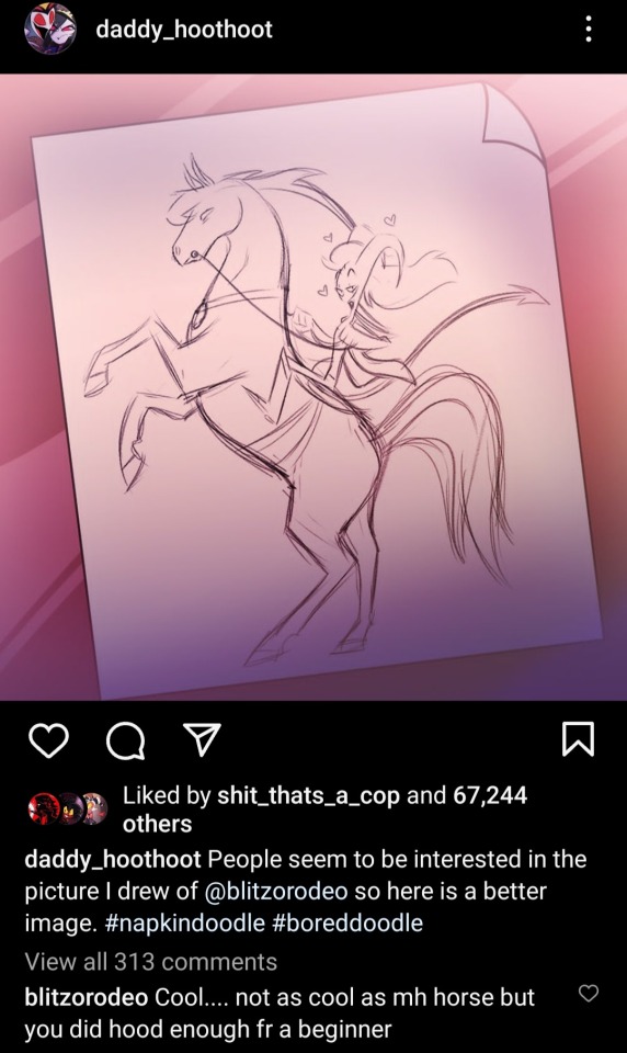
(Also, plz note that in another post he commented that it smells like Stolas, and I want everyone to appreciate how happy he looks in this photo while smelling it again)
Blitzø probably admires Stolas's theatrics as well because despite growing up in a Circus where you were supposed to be dramatic and showy, he was still always taught to ignore or hide his true emotions (Cash ignoring that he didn't want to go to the Goetia Palace because "MONEY"). And while Stolas was raised the same way, he still wears his heart and emotions on his sleeve and is always showing them, whether it be positive or negative
And we all know thst Blitzø has major self hatred issues, but Stolas was genuinely interested in Blitzø as a person. Laughing at his jokes, asking how his day went, and with all of this, you can't help but wonder if Blitzø was figuring out that he did too. I think that's why he was so heartbroken about Ozzie's. Because to him, Stolas hiding his face was just proof that Stolas didn't care. That he was just a little plaything. But, Blitzø liked that Stolas liked him for who he was, and that he didn't have to pretend to be someone different.
Yes, ik Blitzø wasn't here for some of them, and he thinks that Stolas is just faking all of this. BUT, Blitzø can notice things subconsciously, and the stuff that Blitzø wasn't there for was to talk about Stolas's character as well. That's why I wanted to talk about this, to talk about what Blitzø sees in Stolas and his character.
Feel free to add anything if you want! I'd love to hear your guy's opinions, takes, and thoughts on the ship. I'm probably gonna a make a post on why Stolas likes Blitzø at some point, lol
Tldr; Blitzø likes Stolas because he's kind, sincere, loving, affectionate, passionate, caring, dramatic, and likes Blitzø for who he is.
#stolitz#blitzo#blitz#helluva boss blitz#helluva boss blitzo#helluva boss blitzø#blitz helluva boss#blitzo helluva boss#blitzø#blitzø helluva boss#stolas goetia#helluva boss stolas#stolas helluva boss#helluva boss#helluva boss analysis#anaylsis#media analysis#helluva boss notes
360 notes
·
View notes
Text
culture tips for writing asian settings: calligraphy (pt ii)
in my last post i talked about calligraphy more generally, but here i want to talk about the calligraphy from atla. all of the calligraphy from the show is written by dr siu-leung lee and i'll be using the artbook as my reference.
if you're a writer or artist approaching written chinese, you can think about how script and handwriting might tell us something about a character. dr lee certainly did, and he even tailored writing styles to who he thought might've been writing that text: "If it were a highly cultured royal attendant, he would use a refined, elegant style, but if it were a low-level clerk, he would use a more pedestrian handwriting style."
first thing: modern standard chinese coming out of mainland china uses simplified chinese. this system was developed in the mid-20th century, so it's pretty anachronistic to use this for atla. instead, you should be using traditional chinese as dr lee does (which is still used in hong kong, taiwan, and many diasporic communities). i usually use google translate to switch between the systems.
note the use of simplified 门 (door) instead of the traditional 門 from the aang's unfreezing day comic.
next i'm going to take aang's wanted poster as an example of three different chinese scripts we see in the show. the "title" is in clerical script, the body of the text is in regular script, and the seal is in seal script.

regular script is the standard way you'd learn how to write chinese nowadays. you can see (as i mentioned in part i) how the text is meant to be read up -> down, then right -> left.
clerical script is characterised by fairly compact shapes and a kind of "roundness", and was developed in the late warring states period. this is the script used for the chinese title of the show! in the context of atla, it implies to me that the writer has more specialised calligraphic training than the average person (who, if they can write, would be using regular script). you can compare the difference in styles for the same words between clerical (L) and regular (R):

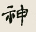

seal script is the most archaic form of chinese on display; this one wouldn't have been written by the calligrapher, but carved into a seal by a craftsperson and then stamped onto the page.
what's also really interesting is dr lee implies a difference in script between the nations. some of the characters used to write water tribe-related concepts:
this is an adapted form of oracle bone script, the one of the earliest forms of chinese writing. this fascinated me because this script was—as the name suggests—written on bone, and perhaps reflects something about the material of what the water tribes were using to write. (you can input modern characters into this website to see examples of their older forms.)
finally, some cool differences in handwriting! this is from the fire day festival poster:
this uses regular script, but in contrast to the excerpt we saw before, the formation of the characters is more haphazard (excitable?). it's also written left -> right! this suggests to us the writer is a commoner, as opposed to a royal scribe.
these are some things you can keep in mind when you're writing or drawing in this universe—while you're probably writing in english, the characters would be steeped in the writing systems we've been talking about. if a character's sending a letter, what might the recipient notice about the handwriting? what does it tell them about their social status or education? could the shape of the letters signal something about where they come from, i.e. water tribe characters write a more curvy script?
disclaimer | more tips
586 notes
·
View notes
Text
I should've made this in the first place to go as a reference to my post about Kabru rarely being shown eating (and when he does it, it isn't pleasurable) and linked it somewhere. I didn't feel like I needed to go through every example and based on people's tags I do think everyone gets it ... but I'm compiling this anyway because I find it really interesting from an artistic/writerly standpoint.
Like, Kabru obviously is eating in the abstract sense. But as I said, Kui almost never actually draws him putting food in his mouth. At first I assumed that she was avoiding it to save on space because he needs to be shown talking instead, but as I've looked back, I've noted that she doesn't usually shy away from giving characters speech bubbles even when they're chewing or they have utensils in their mouths. Unless they're Kabru.
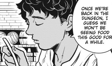
This would realistically be the best time to actually show him eating, since it's a normal meat at a normal restaurant, but no. He doesn't actually put food in his mouth in this entire scene. Again: I'm sure he does eat this meal. My point is that I think it's a deliberate choice to keep that off-page, to contrast all the other characters who get to both visibly eat food and enjoy it.
As mentioned, Kabru is only shown drinking wine while his party eats the snacks in chapter 32. I think it's possible to infer that he doesn't actually eat any food here at all.
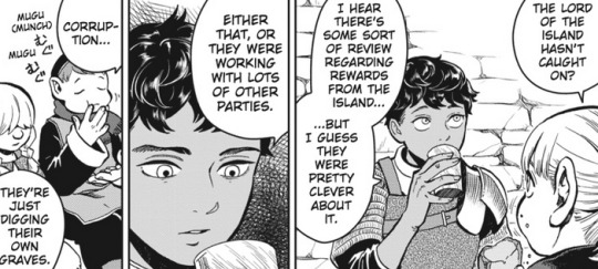
The harpy egg omelette bit barely counts as eating lmao we all saw him struggling to even swallow a bite down. Let's move on.
Quick sidebar:
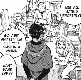
Are we all going insane over this panel or is it just me? Okay continue.

Like with the omelette, it gets a checkmark for actually going into his mouth but no checkmark for enjoyment. He hates this. He's being spoon fed bad cake and patronized.
Next:
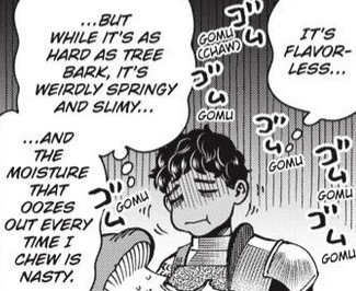
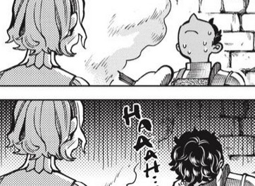
Literally the worst meal in Dungeon Meshi lmao.
Barometz:
He does actually eat this. Rare Kabru mastication panel, not clickbait. But it's kind of a sad moment when you remember that he was looking forward to a cultural dish of his mother's- literal comfort food from his childhood- and instead got the weird godless crab-meat-plant that is the barometz. This may be the only time Kabru goes looking for comfort, and he's pointedly denied it.
Next:
Yeah he isn't drawn eating during this entire scene either. Only drawn holding the food and his utensil.
As stated: still never shown eating. Deliberately shown getting Mithrun to eat instead. Kabru, the call is coming from inside the goddamn house.
Bavarois is next, and once again it gets a checkmark for actual on-page chewing but as we see, he still hates it and has to concentrate very hard and block out all thoughts of what he's doing in order to swallow it down without making a scene.
Okay. Faligon feast. Kabru does spend days eating for the sake of Laios and Falin! Yay! Caloric fucking intake! Clean plate club!
And yet.
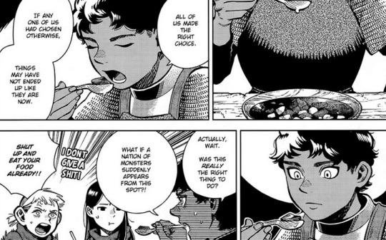
Literally shown stopping before he can put the food in his mouth.
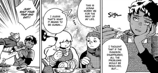
Mickbell is so real for this. No one needed to hear a lecture from Senshi more than Kabru.
Anyway. Given how surgically precise Kui is with everything else in this story, I just feel the choice to constantly show Kabru focusing on his worries during mealtimes, instead of drawing him just enjoying food, was purposeful.
#dungeonposting#Dungeon Meshi meta#Kabru#'Are you eating properly?' he literally isn't lmfao everything about Kabru is so bleak#musings with Dea#no one has doubted me or anything I just felt the need to have a visual reference#like it isn't just a few instances it's every single time
232 notes
·
View notes
Last Seen Blogs