#this one is not like my usual stuff
Text

i thought i felt your shape, but i was wrong. really all i felt was falsely strong,
i held on tight and closed my eyes. it was dumb, i had no sense of your size.
it was dumb to hold so tight.
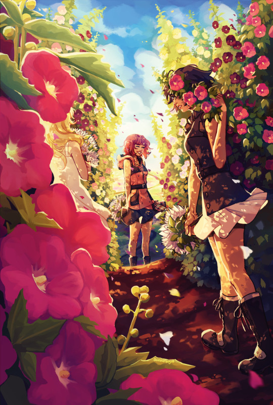
#tumblr murked my quality so bad MY GODDDD please click on this i promise i have somewhat of an idea of wht im doing. kinda#anyway i once again have no idea what i was doing here but i did have fun. they make me miserable in the best way possible#im trying to be a bit more experimental both in style and colour... well. half on tht last one (guy who really likes reds and blues)#but im trying out line weight a bit more. hooty hoo. going to try drawing some more practice portraits n stuff soon#link#zelda#loz#botw#zelink#(a smidge bcus im insane. as usual)#princess zelda#zelda botw#link botw#loz fanart#tloz#i add new tags each time. i just like to get silly with it sometimes tbh :]#my art
2K notes
·
View notes
Text

stillness in these waking hours
instagram | shop | commission info
#artists on tumblr#animated illustration#2d animation#backgrounds#digital art#animated gif#environment illustration#myillust#cozy#office#workspace#rain#gifs#this was inspired by how i've been having to stay up all night to get some stuff done and one day#i was just looking out the window and watched the sunrise through the grey rainy clouds c':#everything felt so quiet and still - it took a lot out of me to not animate more things in this one heh#i love how it turned out - the serene-ness and stillness of it all really captured the feeling i wanted to recreate :')#(also this isn't my irl workspace lol maybe the blinds and as usual this is just my character not me)#but i nonetheless hope you'll like this! <3 wishing you a lovely day or night ahead!
6K notes
·
View notes
Text
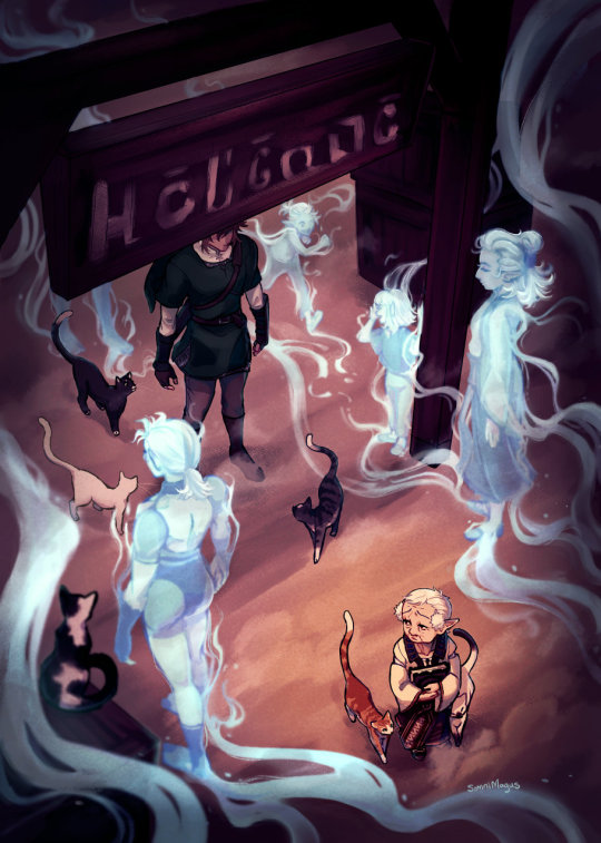
My page for @sheikahzine; about Impaz's duty to her village, empty of people and full of memories.
[id in alt text]
#legend of zelda#loz#twilight princess#loz tp#i'm still reeling that someone sent me an ask about this one.. that they took the time to find my tumblr and tell me they liked it#it really meant a lot; thank you to anyone that stops to leave comments like that. they make me happy#but yeah! here's the usual symbolism ramble:#i thought it'd be cool to have the 'spirits' flowing one way and the cats walking through them the other way#to kinda show the difference in life inhabiting the village in the past and present#link's face is covered because impaz was just waiting for 'the hero' so his clothes are what matters; not his face#and it (hopefully) gives a surreal and intangible sense to 'the hero' she could only hope would actually show up#you can feel free to interpret the glowy blue sheikah as ghosts or just as memories of the past! i couldn't decide either way#the one on the bottom left is oot impa since she's implied to be the village founder. so i guess she would be a ghost actually?#fan art#my art#project stuff#and ahhh the book-- everyone's stuff is so beautiful!!#especially the writing. some of the fics made me really tear up and some were so fun and clever. i really love them#a lot of them captured the sheer burden of the role of the sheikah; all of the time and grief and doubt#i know i always say this stuff about every project but. the people i get to work with in these are truly so skilled every time
4K notes
·
View notes
Text
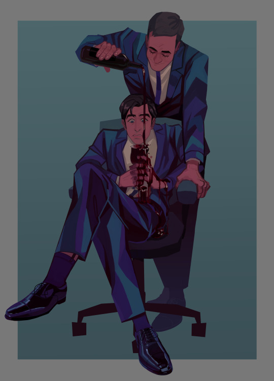
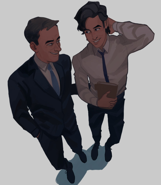
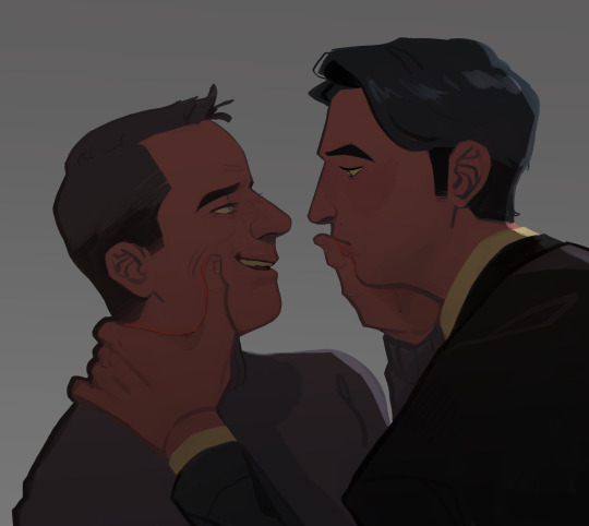
Uploading all my Tomgreg art at once from the past few week before season 4 hits, who knows in what kind of mental state i'm gonna be once it does :')
#tomgreg#succession#dont even talk to me i started watching this show when i had nothing to do at work and now i watch it with averiel my good friend averiel#and we are going to watch s4 together and i feel physically ill from bein so excited#so ya thats what ive been up to... anyway. i love these idiots they desever nothing but the worst (affectionate)#im also a tomshiv lover btw. im the one who yells 'THIS IS HOW TOMSHIV CAN STILL WIN' while they are actively losing on screen#thats the kind of person i am#dont look at me (lying on the floor)#okay i was not going to say stuff in the tags and let the art speak for itself but i NEED to point out details in the wine Painting..#i put a lot of work into that one. thinly veiled metaphors and symbolism yknow..#greg is gripping the stem of the wine glass with his full fist. tom and greg are dressed in the same outfit (sock garters included)#greg look appalled but he is not doing anything about the spill. tom is fondly pouring greg more and more wine. he is doing him a favor#i colored the red wine the same way i would color blood :) oh and tom is not really touching greg#only holding the chair in place. greg is making himself look smaller than he is like usual#oh and @ the person who said that it's the inverse of the tom and nate scene i love the way you think. i did not think of that before#but god. yeah. i actually thought about the scene change from when roman uhh.. christens his office in s1. the one with the coffee machine#i always go insane at that cut. this is not exactly the same since it's more.. about emotions but yknow.. it can be.. the same...
4K notes
·
View notes
Text

So does he, Gallagher.
#honkai star rail#hsr blade#gallagher#i based this off of how many times i used funny soda man to help be a healer with his poppin soda pop in SU#and then blade constantly just being blade as usual#its normally him saying unnecessary to my actual healer but#i kept forgetting gallagher heals and i kept healing when i didnt even need to so TECHNICALLY yeah it was unnecessary#but the amount of times blade was the recipient......#i cant use like most of my newer units in story bc i cant ascend or i run out of leveling mats so i just#get them and toss them into simulated universe for funsies cause i can match their levels better#so thats where i tossed gallagher and he is genuinely fun to play as ? like i love his punches and kicks to start the battle#funny soda man is funny (to me) and im really behind in plot still#but last time i tried to play it on my laptop and got a kickass cutscene my laptop lagged and i couldnt even see it RIP to me#so now that its like ... me trying to play it on desktop ?#i mostly get on desktop for comms and if i do much else i feel like im slacking off even if i would take a break anyway#one day i can play more story plot stuff and actually meet the funny guys#also in case you know me for Not Having Boys in HSR i need to point out#i did pull Gallagher however same 10 pull got a 4 star girl copy for someone i never use and she is at e4 now cool#and i didnt even think of the irony as i started this i just like drawing blade and i wanted to draw gallagher#so when i already had the dialogue planned and am drawing i was like OH WAIT haha im funnier than i thought#(no i am not but we can pretend)
676 notes
·
View notes
Text
Me: I'm color-coding it! [Explains system]
My sister: [chokes on a laugh]
Me: What?
My sister: Nothing, I was gonna say something but it's really mean.
Me: What is it? Like the suspected autism, or--?
My sister: No it's just, dude you're color-coding a cookbook. Get a job.
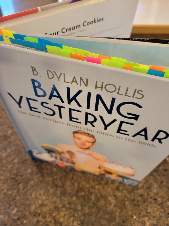
#b dylan hollis#baking yesteryear#job hunting#personal#autism#i showed her this post and she asked 'are you flexing that you don't have a job'#my response was 'no I'm flexing that I have this cookbook'#anyway the color coding is mostly by vibe. green for the extra-desserty. blue for the heavier less sugary stuff (usually with fruits)#orange for bread and yellow for 'I really dislike one of the ingredients but my family would like it'#pink is for Buckwild stuff and so far that only has the pork cake#Edit: just hit another Pink it's the chocolate sauerkraut cake
2K notes
·
View notes
Text
An Unsexy Post About Censorship
Sooo...gumroad is shutting down NSFW content sales because of Stripe and Paypal. This is also why Wishtender has been down as well, if you weren't aware. And why Patreon is also cracking down on anything remotely kinky.
(If you're wondering why your favorite FICTIONAL sexual content isn't allowed on most platforms, it's payment processors.)
Please be extra kind to anyone who works with NSFW content right now, whether it be art, writing, audio, photos or video. Whether it be tasteful erotica, or the kinkiest BDSM porn you can think of, we're all in the crosshairs right now.
And, judging by trends from these past few years, this is only going to get worse.
Support NSFW creators where you can, whether by tipping or buying our content (where you still can) or just helping boost content on sites where algorithms want to drown us out.
Call representatives where you can and complain about payment processors acting as arbiters of what YOU are and aren't allowed to pay for and enjoy.
This may be about porn right now, but censorship of this caliber doesn't just stop with porn. Any transgressive (read: non-conservative) media is fair game.
Fight against it where you can. Support creators where you can.
Art is important. Reflections of our sexuality are important. We don't want a world where people aren't free to make or see the things they love and enjoy.
#nyxrambles#Warning: I'm going to get kind of grim in the tags so peace out of you have to.#This bums me out so fucking hard!#I have artist friends who are struggling because their content suddenly goes against these stupid fucking guidelines!#I'm going to have to take my stuff off of Gumroad even though it was previously allowed!#It's hard to not feel like everything is just spiraling toward fascism sometimes yanno?#I am usually opposed to slippery slope arguments but the goal of moral conservativism is to destroy everything that isn't in line with it.#They will not stop until the world reflects their narrow ideals. Like...that's the whole point of it!#Sorry guys I'm just having a rough one.#Between this and being sick for months I'm getting pretty fucking Done.#I'll be okay but I'm not going to pretend it isn't hard and scary.
503 notes
·
View notes
Text
thinking about saiura
#my art#saiki k#tdlosk#saiki no psi nan#the disastrous life of saiki k#saiki kusuo#aiura mikoto#mikosai#saiura#i like them as friends more often but...an impulse came over me idk what happened . ..#i got an anon a couple days ago saying they liked my mikosai arts even tho i . didnt mean for those 2 be ship arts#so this one goes out to you#usually i dont like it when ppl tag my stuff as ship but i had a change of heart#(btw those other arts are still intended as platonic/ friendship stuff but i'm making an exception just this once)#anyway. no one probably wanted to listen 2 all that but yeagh#more recent art but not really. i really tried to do like have a bunch of arts on queue type deal but it didnt work . like at all.#anyway peace and love
421 notes
·
View notes
Text
youtube
I might’ve spoiled the plot of Natlan | Genshin Impact THEORY
In which I read so much lore that I gained the power to see the future (maybe)
This ended up being a real challenge to make - but it was also really fun! Please do lemme know what you reckon of these ideas, and whether y’all wanna see me pattern-recognition my way into several corkboards worth of theories about any other topics sometime down the line! (^^)/
(also: HAPPY NEW YEAR! 🥳🎉 Here's wishing y'all every good thing for 2024)
#artists on tumblr#abd illustrates#genshin impact#natlan#game theory#idek how to tag this one i've never made a vid like this before uhm-- sgdfksdf#anyway oh my GOD i have had so many brain bees about this topic for the longest time#ik making a half hour video about it is unhinged enough but the fact that nobody else seemed to be talking about some of the patterns#was drivin me BONKERS#im so normal about this lore y'all mhm#but also silly tho the energy of this one is#im really proud of it! it was wierdly scary to branch out from my usual content like this#so i do sincerely hope it's a fun watch (^^)/#i'd love to make more off-the-wall and like deep-dive type stuff like this sometime if it goes over well 💖#it also took-- sO LONG TO MAKE#full time video essayists are to be feared i have learned#Youtube
900 notes
·
View notes
Text
why Aurora's art is genius
It's break for me, and I've been meaning to sit down and read the Aurora webcomic (https://comicaurora.com/, @comicaurora on Tumblr) for quite a bit. So I did that over the last few days.
And… y'know. I can't actually say "I should've read this earlier," because otherwise I would've been up at 2:30-3am when I had responsibilities in the morning and I couldn't have properly enjoyed it, but. Holy shit guys THIS COMIC.
I intended to just do a generalized "hello this is all the things I love about this story," and I wrote a paragraph or two about art style. …and then another. And another. And I realized I needed to actually reference things so I would stop being too vague. I was reading the comic on my tablet or phone, because I wanted to stay curled up in my chair, but I type at a big monitor and so I saw more details… aaaaaand it turned into its own giant-ass post.
SO. Enjoy a few thousand words of me nerding out about this insanely cool art style and how fucking gorgeous this comic is? (There are screenshots, I promise it isn't just a wall of text.) In my defense, I just spent two semesters in graphic design classes focusing on the Adobe Suite, so… I get to be a nerd about pretty things…???
All positive feedback btw! No downers here. <3
---
I cannot emphasize enough how much I love the beautiful, simple stylistic method of drawing characters and figures. It is absolutely stunning and effortless and utterly graceful—it is so hard to capture the sheer beauty and fluidity of the human form in such a fashion. Even a simple outline of a character feels dynamic! It's gorgeous!
Though I do have a love-hate relationship with this, because my artistic side looks at that lovely simplicity, goes "I CAN DO THAT!" and then I sit down and go to the paper and realize that no, in fact, I cannot do that yet, because that simplicity is born of a hell of a lot of practice and understanding of bodies and actually is really hard to do. It's a very developed style that only looks simple because the artist knows what they're doing. The human body is hard to pull off, and this comic does so beautifully and makes it look effortless.
Also: line weight line weight line weight. It's especially important in simplified shapes and figures like this, and hoo boy is it used excellently. It's especially apparent the newer the pages get—I love watching that improvement over time—but with simpler figures and lines, you get nice light lines to emphasize both smaller details, like in the draping of clothing and the curls of hair—which, hello, yes—and thicker lines to emphasize bigger and more important details and silhouettes. It's the sort of thing that's essential to most illustrations, but I wanted to make a note of it because it's so vital to this art style.
THE USE OF LAYER BLENDING MODES OH MY GODS. (...uhhh, apologies to the people who don't know what that means, it's a digital art program thing? This article explains it for beginners.)
Bear with me, I just finished my second Photoshop course, I spent months and months working on projects with this shit so I see the genius use of Screen and/or its siblings (of which there are many—if I say "Screen" here, assume I mean the entire umbrella of Screen blending modes and possibly Overlay) and go nuts, but seriously it's so clever and also fucking gorgeous:
Firstly: the use of screened-on sound effect words over an action? A "CRACK" written over a branch and then put on Screen in glowy green so that it's subtle enough that it doesn't disrupt the visual flow, but still sticks out enough to make itself heard? Little "scritches" that are transparent where they're laid on without outlines to emphasize the sound without disrupting the underlying image? FUCK YES. I haven't seen this done literally anywhere else—granted, I haven't read a massive amount of comics, but I've read enough—and it is so clever and I adore it. Examples:


Secondly: The beautiful lighting effects. The curling leaves, all the magic, the various glowing eyes, the fog, the way it's all so vividly colored but doesn't burn your eyeballs out—a balance that's way harder to achieve than you'd think—and the soft glows around them, eeeee it's so pretty so pretty SO PRETTY. Not sure if some of these are Outer/Inner Glow/Shadow layer effects or if it's entirely hand-drawn, but major kudos either way; I can see the beautiful use of blending modes and I SALUTE YOUR GENIUS.
I keep looking at some of this stuff and go "is that a layer effect or is it done by hand?" Because you can make some similar things with the Satin layer effect in Photoshop (I don't know if other programs have this? I'm gonna have to find out since I won't have access to PS for much longer ;-;) that resembles some of the swirly inner bits on some of the lit effects, but I'm not sure if it is that or not. Or you could mask over textures? There's... many ways to do it.
If done by hand: oh my gods the patience, how. If done with layer effects: really clever work that knows how to stop said effects from looking wonky, because ugh those things get temperamental. If done with a layer of texture that's been masked over: very, very good masking work. No matter the method, pretty shimmers and swirly bits inside the bigger pretty swirls!
Next: The way color contrast is used! I will never be over the glowy green-on-black Primordial Life vibes when Alinua gets dropped into that… unconscious space?? with Life, for example, and the sharp contrast of vines and crack and branches and leaves against pitch black is just visually stunning. The way the roots sink into the ground and the three-dimensional sensation of it is particularly badass here:

Friggin. How does this imply depth like that. HOW. IT'S SO FREAKING COOL.
A huge point here is also color language and use! Everybody has their own particular shade, generally matching their eyes, magic, and personality, and I adore how this is used to make it clear who's talking or who's doing an action. That was especially apparent to me with Dainix and Falst in the caves—their colors are both fairly warm, but quite distinct, and I love how this clarifies who's doing what in panels with a lot of action from both of them. There is a particular bit that stuck out to me, so I dug up the panels (see this page and the following one https://comicaurora.com/aurora/1-20-30/):

(Gods it looks even prettier now that I put it against a plain background. Also, appreciation to Falst for managing a bridal-carry midair, damn.)
The way that their colors MERGE here! And the immense attention to detail in doing so—Dainix is higher up than Falst is in the first panel, so Dainix's orange fades into Falst's orange at the base. The next panel has gold up top and orange on bottom; we can't really tell in that panel where each of them are, but that's carried over to the next panel—

—where we now see that Falst's position is raised above Dainix's due to the way he's carrying him. (Points for continuity!) And, of course, we see the little "huffs" flowing from orange to yellow over their heads (where Dainix's head is higher than Falst's) to merge the sound of their breathing, which is absurdly clever because it emphasizes to the viewer how we hear two sets of huffing overlaying each other, not one. Absolutely brilliant.
(A few other notes of appreciation to that panel: beautiful glows around them, the sparks, the jagged silhouette of the spider legs, the lovely colors that have no right to make the area around a spider corpse that pretty, the excellent texturing on the cave walls plus perspective, the way Falst's movements imply Dainix's hefty weight, the natural posing of the characters, their on-point expressions that convey exactly how fuckin terrifying everything is right now, the slight glows to their eyes, and also they're just handsome boys <3)
Next up: Rain!!!! So well done! It's subtle enough that it never ever disrupts the impact of the focal point, but evident enough you can tell! And more importantly: THE MIST OFF THE CHARACTERS. Rain does this irl, it has that little vapor that comes off you and makes that little misty effect that plays with lighting, it's so cool-looking and here it's used to such pretty effect!
One of the panel captions says something about it blurring out all the injuries on the characters but like THAT AIN'T TOO BIG OF A PROBLEM when it gets across the environmental vibes, and also that'd be how it would look in real life too so like… outside viewer's angle is the same as the characters', mostly? my point is: that's the environment!!! that's the vibes, that's the feel! It gets it across and it does so in the most pretty way possible!
And another thing re: rain, the use of it to establish perspective, particularly in panels like this—

—where we can tell we're looking down at Tynan due to the perspective on the rain and where it's pointing. Excellent. (Also, kudos for looking down and emphasizing how Tynan's losing his advantage—lovely use of visual storytelling.)
Additionally, the misting here:

We see it most heavily in the leftmost panel, where it's quite foggy as you would expect in a rainstorm, especially in an environment with a lot of heat, but it's also lightly powdered on in the following two panels and tends to follow light sources, which makes complete sense given how light bounces off particles in the air.
A major point of strength in these too is a thorough understanding of lighting, like rim lighting, the various hues and shades, and an intricate understanding of how light bounces off surfaces even when they're in shadow (we'll see a faint glow in spots where characters are half in shadow, but that's how it would work in real life, because of how light bounces around).
Bringing some of these points together: the fluidity of the lines in magic, and the way simple glowing lines are used to emphasize motion and the magic itself, is deeply clever. I'm basically pulling at random from panels and there's definitely even better examples, but here's one (see this page https://comicaurora.com/aurora/1-16-33/):

First panel, listed in numbers because these build on each other:
The tension of the lines in Tess's magic here. This works on a couple levels: first, the way she's holding her fists, as if she's pulling a rope taut.
The way there's one primary line, emphasizing the rope feeling, accompanied by smaller ones.
The additional lines starbursting around her hands, to indicate the energy crackling in her hands and how she's doing a good bit more than just holding it. (That combined with the fists suggests some tension to the magic, too.) Also the variations in brightness, a feature you'll find in actual lightning. :D Additional kudos for how the lightning sparks and breaks off the metal of the sword.
A handful of miscellaneous notes on the second panel:
The reflection of the flames in Erin's typically dark blue eyes (which bears a remarkable resemblance to Dainix, incidentally—almost a thematic sort of parallel given Erin's using the same magic Dainix specializes in?)
The flowing of fabric in the wind and associated variation in the lineart
The way Erin's tattoos interact with the fire he's pulling to his hand
The way the rain overlays some of the fainter areas of fire (attention! to! detail! hell yeah!)
I could go on. I won't because this is a lot of writing already.
Third panel gets paragraphs, not bullets:
Erin's giant-ass "FWOOM" of fire there, and the way the outline of the word is puffy-edged and gradated to feel almost three-dimensional, plus once again using Screen or a variation on it so that the stars show up in the background. All this against that stunning plume of fire, which ripples and sparks so gorgeously, and the ending "om" of the onomatopoeia is emphasized incredibly brightly against that, adding to the punch of it and making the plume feel even brighter.
Also, once again, rain helping establish perspective, especially in how it's very angular in the left side of the panel and then slowly becomes more like a point to the right to indicate it's falling directly down on the viewer. Add in the bright, beautiful glow effects, fainter but no less important black lines beneath them to emphasize the sky and smoke and the like, and the stunningly beautiful lighting and gradated glows surrounding Erin plus the lightning jagging up at him from below, and you get one hell of an impactful panel right there. (And there is definitely more in there I could break down, this is just a lot already.)
And in general: The colors in this? Incredible. The blues and purples and oranges and golds compliment so well, and it's all so rich.
Like, seriously, just throughout the whole comic, the use of gradients, blending modes, color balance and hues, all the things, all the things, it makes for the most beautiful effects and glows and such a rich environment. There's a very distinct style to this comic in its simplified backgrounds (which I recognize are done partly because it's way easier and also backgrounds are so time-consuming dear gods but lemme say this) and vivid, smoothly drawn characters; the simplicity lets them come to the front and gives room for those beautiful, richly saturated focal points, letting the stylized designs of the magic and characters shine. The use of distinct silhouettes is insanely good. Honestly, complex backgrounds might run the risk of making everything too visually busy in this case. It's just, augh, so GORGEOUS.
Another bit, take a look at this page (https://comicaurora.com/aurora/1-15-28/):

It's not quite as evident here as it is in the next page, but this one does some other fun things so I'm grabbing it. Points:
Once again, using different colors to represent different character actions. The "WHAM" of Kendal hitting the ground is caused by Dainix's force, so it's orange (and kudos for doubling the word over to add a shake effect). But we see blue layered underneath, which could be an environmental choice, but might also be because it's Kendal, whose color is blue.
And speaking off, take a look at the right-most panel on top, where Kendal grabs the spear: his motion is, again, illustrated in bright blue, versus the atmospheric screened-on orange lines that point toward him around the whole panel (I'm sure these have a name, I think they might be more of a manga thing though and the only experience I have in manga is reading a bit of Fullmetal Alchemist). Those lines emphasize the weight of the spear being shoved at him, and their color tells us Dainix is responsible for it.
One of my all-time favorite effects in this comic is the way cracks manifest across Dainix's body to represent when he starts to lose control; it is utterly gorgeous and wonderfully thematic. These are more evident in the page before and after this one, but you get a decent idea here. I love the way they glow softly, the way the fire juuuust flickers through at the start and then becomes more evident over time, and the cracks feel so realistic, like his skin is made of pottery. Additional points for how fire begins to creep into his hair.
A small detail that's generally consistent across the comic, but which I want to make note of here because you can see it pretty well: Kendal's eyes glow about the same as the jewel in his sword, mirroring his connection to said sword and calling back to how the jewel became Vash's eye temporarily and thus was once Kendal's eye. You can always see this connection (though there might be some spots where this also changes in a symbolic manner; I went through it quickly on the first time around, so I'll pay more attention when I inevitably reread this), where Kendal's always got that little shine of blue in his eyes the same as the jewel. It's a beautiful visual parallel that encourages the reader to subconsciously link them together, especially since the lines used to illustrate character movements typically mirror their eye color. It's an extension of Kendal.
Did I mention how ABSOLUTELY BEAUTIFUL the colors in this are?
Also, the mythological/legend-type scenes are illustrated in familiar style often used for that type of story, a simple and heavily symbolic two-dimensional cave-painting-like look. They are absolutely beautiful on many levels, employing simple, lovely gradients, slightly rougher and thicker lineart that is nonetheless smoothly beautiful, and working with clear silhouettes (a major strength of this art style, but also a strength in the comic overall). But in particular, I wanted to call attention to a particular thing (see this page https://comicaurora.com/aurora/1-12-4/):

The flowing symbolic lineart surrounding each character. This is actually quite consistent across characters—see also Life's typical lines and how they curl:

What's particularly interesting here is how these symbols are often similar, but not the same. Vash's lines are always smooth, clean curls, often playing off each other and echoing one another like ripples in a pond. You'd think they'd look too similar to Life's—but they don't. Life's curl like vines, and they remain connected; where one curve might echo another but exist entirely detached from each other in Vash's, Life's lines still remain wound together, because vines are continuous and don't float around. :P
Tahraim's are less continuous, often breaking up with significantly smaller bits and pieces floating around like—of course—sparks, and come to sharper points. These are also constants: we see the vines repeated over and over in Alinua's dreams of Life, and the echoing ripples of Vash are consistent wherever we encounter him. Kendal's dream of the ghost citizens of the city of Vash in the last few chapters is filled with these rippling, echoing patterns, to beautiful effect (https://comicaurora.com/aurora/1-20-14/):

They ripple and spiral, often in long, sinuous curves, with smooth elegance. It reminds me a great deal of images of space and sine waves and the like. This establishes a definite feel to these different characters and their magic. And the thing is, that's not something that had to be done—the colors are good at emphasizing who's who. But it was done, and it adds a whole other dimension to the story. Whenever you're in a deity's domain, you know whose it is no matter the color.
Regarding that shape language, I wanted to make another note, too—Vash is sometimes described as chaotic and doing what he likes, which is interesting to me, because smooth, elegant curves and the color blue aren't generally associated with chaos. So while Vash might behave like that on the surface, I'm guessing he's got a lot more going on underneath; he's probably much more intentional in his actions than you'd think at a glance, and he is certainly quite caring with his city. The other thing is that this suits Kendal perfectly. He's a paragon character; he is kind, virtuous, and self-sacrificing, and often we see him aiming to calm others and keep them safe. Blue is such a good color for him. There is… probably more to this, but I'm not deep enough in yet to say.
And here's the thing: I'm only scratching the surface. There is so much more here I'm not covering (color palettes! outfits! character design! environment! the deities! so much more!) and a lot more I can't cover, because I don't have the experience; this is me as a hobbyist artist who happened to take a couple design classes because I wanted to. The art style to this comic is so clever and creative and beautiful, though, I just had to go off about it. <3
...brownie points for getting all the way down here? Have a cookie.
#aurora comic#aurora webcomic#comicaurora#art analysis#...I hope those are the right tags???#new fandom new tagging practices to learn ig#much thanks for something to read while I try to rest my wrists. carpal tunnel BAD. (ignore that I wrote this I've got braces ok it's fine)#anyway! I HAVE. MANY MORE THOUGHTS. ON THE STORY ITSELF. THIS LOVELY STORY#also a collection of reactions to a chunk of the comic before I hit the point where I was too busy reading to write anything down#idk how to format those tho#...yeet them into one post...???#eh I usually don't go off this much these days but this seems like a smaller tight-knit fandom so... might as well help build it?#and I have a little more time thanks to break so#oh yes also shoutout to my insanely awesome professor for teaching me all the technical stuff from this he is LOVELY#made an incredibly complex program into something comprehensible <3#synapse talks
744 notes
·
View notes
Text
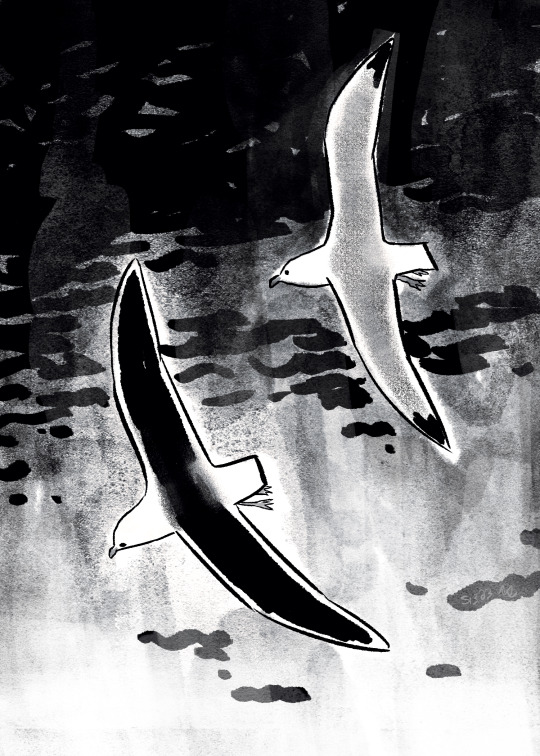
saw a seagull that looked different
#sketchbook stuff#artists on tumblr#usually the ones that look like the right don't think I've seen the left one before#not a bird expert at all but maybe a great black backed gull?#the wings looked like it plus they can be found where I live but idk gfhf#little break doodle#also guess who was like ehh I'll buy totk at some point but then ordered digital the day after it came out lmao#also there's a tiny rainbow in the clouds#edit: oh my god I'm dumbass I mixed up my left and right AJGS#the left one's the one I haven't seen before
3K notes
·
View notes
Photo
braided his hair 👍
#loz#totk#link zelda#link legend of zelda#tears of the kingdom#legend of zelda tears of the kingdom#link totk#link botw#legend of zelda#my art#i am so bad at drawing necklaces JSDFJLSD#also#usually i draw like. mostly in one single layer#i do the flats and then i merge EVERYTHING and work like that#today i have decided. to challenge myself. by doing what literally everyone else does#which is unusual for me#use layers for god's sake JKSDFKL#i still merged at the end so i could draw over some mistakes and render some stuff more neatly BUT STILL#twas a challenge SDJSD cause my main instinct was to Merge instantly
1K notes
·
View notes
Text
My page for @kairizine. It was such a huge honor to be part of this wonderful book with everyone, I had so much fun!
[id in alt!]
#kingdom hearts#kh#kh kairi#kh xion#kh namine#i don't really feel proud of my own stuff usually but#i really think this is the drawing i'm most proud of from this past year!! it made me think 'oh maybe i can draw' haha#i'm still kinda bad with colors but something clicked with this one. and i feel like i got the sentimental feeling i wanted!#ooh but this project's about flower symbolism so ramble incoming:#protea symbolizes resilience transformation and diversity; hollyhock means 'please remember me.'#so my general theme was finding a sense of self.#these 3 have struggled with finding their own identity; they tend to get left behind both in-universe and in general plotwise#and naminé and xion both resemble kairi and were overshadowed by her memory. but i feel like all 3 have transformed into their own people#xion and naminé have their faces covered partially by hollyhock to show their wish to be remembered for who they are-#instead of the parts that they share with someone else#and the protea bouquets show how they each held on and resiliently grew into their own person despite it all#i put a little swervy path on the hill behind kairi to give that hopeful sense of growth and moving forward. it's a little hard to see#hopefully that makes sense! i really love symbolism but i think in visuals so i'm really bad with words#but gosh working with everyone on this project was so fun. it was like impossible not to get swept up by the team's hype for this zine#i need to hunt down everybody's work and rb it#ohh and everybody's flowers are so crisply drawn it's insane!! i think if i lined all these flowers and leaves i'd die haha#fan art#my art#project stuff
2K notes
·
View notes
Text


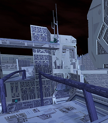
Kingdom Hearts Dream Drop Distance - The World That Never Was
#kingdom hearts dream drop distance#khddd#the world that never was#scenery#my gif#i really love how sora's side of this world is dark and eerie and fully leans into how dreams can distort and twist reality#the city looks mostly normal at first aside from the ghostly fog that seeps down from buildings and drifts along the floor and rises up#but as you keep going the ground beneath you is no longer a street but rather the faces of more buildings that stretch over an abyss#it's no longer the sprawling city you first arrived in but instead an uncanny one way path towards your destination#the buildings now twist and contort and are crooked and grow out of the ground in all kinds of ways that make no logical sense#it's the first time that a sleeping world looks easily distinguishable from the real world. it looks wrong. like a nightmare#meanwhile riku's half contrasts heavily by appearing to be fairly normal#the interior of the real castle never made any practical sense so nothing here feels too out of place compared to how it usually looks#it shows how much more in control riku is in comparison to how sora is losing his grip on reality as he descends further into their trap#cool stuff! love me some environmental storytelling#also i finished giffing every world in this game yippee i'm done (is covered head to toe in blood)
531 notes
·
View notes
Text

what remnant does to a mf
#fnaf#michael afton#me doods#look away people! this one's just for me and myself only#(despite maintagging yes i know but its for organization purposes) anyways#i am a big fan of remnant mutating the shit out of a person#pair that w michael's unique death and continued exposure to the spirits it ends up doing pretty fucked up stuff lol#post scoop michael looks like a purple titan 💀#i'm literally just making fun of my own design atp lmaooo#whatever's the opposite of same face syndrome i have that w michael#just recently added the bolts to the jaw and i love it sm i'm keeping it#post scoop michael is 6'7 so i just want yall to imagine this absolute unit of a cryptid losing his mind managing the pizzeria#he's out there sobbing shitting rolling on the floor trying to mute the fucking ads absolutely flooding his monitors#i drew what his neck looks like but its usually covered in bandages or a turtleneck#you do not want to see what's under his shirt btw. its a whole circus in there AHAHAHAHAHA
692 notes
·
View notes
Photo

POWER!!
#chainsaw man#csm#power#csm power#chainsaw man fanart#my art#her!! super happy with how it came out#felt really detailed compared to usual#i wanna simplify my style again but detailed is nice too...#like im in love with one of my moots super simple stylized stuff#im having a crisis
3K notes
·
View notes
Last Seen Blogs