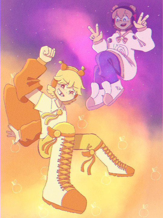
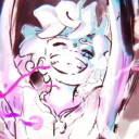
#I got a coloured version too but I really like the lineart!
Text
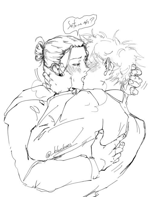
#drawing my pookies at work making out sloppy style so I don’t go insane#I got a coloured version too but I really like the lineart!#big fan of the virgin!gojo agenda lmao but I bet he’s an enthusiastic student#jujutsu kaisen#satosugu#jjk#fanart#gego#satoru gojo#geto suguru#my art#bluebeesart#wip#sketch
5K notes
·
View notes
Text

"Aren't you glad there's a frontline medic around ?
I spent the last five hours on colouring this lineart I did yesterday, and it was fun! I had forgotten how much fun I got out of drawing before...
Fanart ireally is the best way to get out of art blocks.
Becoming an adult is when you stop hating Sakura, realize she's been done dirty by canon all along, and just decide to stick to whatever you think the best fanon adaptation is. Mine is slightly unhinged and uses senbon.
I feel like I used to be more original in the clothing departement, but I guess for now I'll have to go with a slightly modified version of a mixture of her uniforms. Don't think too hard on how the fabric of her dress works, I have no idea myself. I spent way to much time on her tattoo, haha.
Pose was very very much inspired by an @adorkastock low angle pose which I felt really strongly about.
#digital painting#digital art#fanart#naruto#naruto uzumaki#ninja#sakura#sakura haruno#next gen#i guess#oyukiria#somecallmegin
328 notes
·
View notes
Note
Just wanted to ask, please forgive me if you've already answred this, what program do you use? Your art fucks HARD and like. I was looking at your art of the two moths over the city they die in and I was hit with the wave of "oh that looks really fucking fun actually." Like i know my art program can't do some of those effects and like, I'd love to try fucking about with them.
hi there, thank you! all my art is done in procreate and paint tool sai
because you mentioned that drawing in particular i thought it would be fun to break it down and show ppl what exactly went into each part of it so check this out
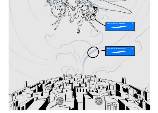
sketch & lineart - the brushes come from georgbrush.club and the urban sketcher is my most commonly used lineart brush, it has a nice irregular shape. the square brush is nice for big blocky sketches.
the cityscape was REALLY hard but basically I got a photo of the skyline of florence, traced some basic building shapes, then bullshitted the rest using the vertical symmetry/mirror tool to cut down on the amount of work (so i only had to sketch one half of the city). then for lineart I turned off vertical symmetry, turned on the two-point perspective tool, and got this:
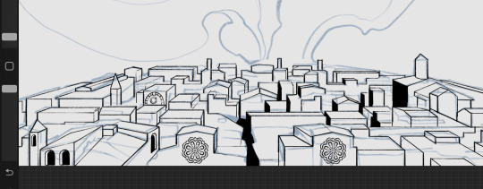
the rose windows were made using the radial symmetry tool.
I didn't like it being so flat, so I used the liquify tool to make a kind of fish-eye effect (limited success tbh). I liked how it looked but the buildings in front needed something to cover them up to make the liquification less obvious...
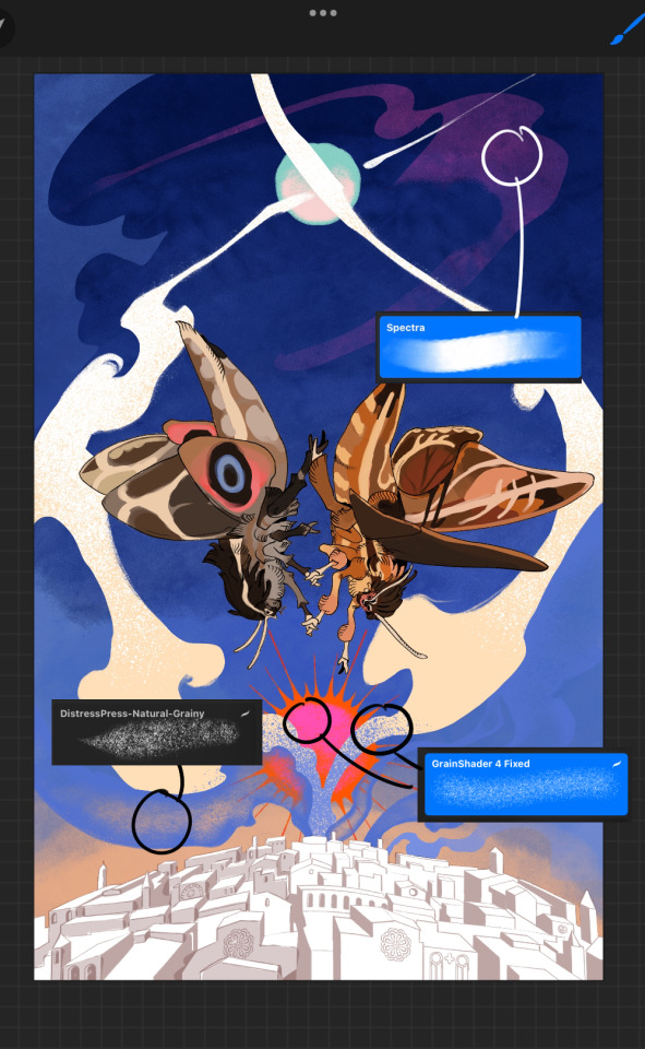
first pass colours. I felt they were very washed out, aside from the sun which i loved. I use the spectra brush (default procreate) for skyscapes a lot, I love the texture. Although the clouds were filled in using the lasso selection tool, I softened the edges using the square pencil again and added texture using true grit sampler grainy brushes. The translucency effect comes from my setting the brush as an eraser. The sun rays come from the radial symmetry tool.
Blocking in the moths' colours was done with the urban sketcher again.
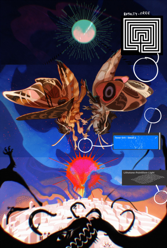
Something people may not have noticed is the labyrinth hidden in the sky! yeah I had a bunch of versions where it was more obvious but I found that it clashed a bit and was too busy, so I made it subtle. But yes. I searched for "royalty free labyrinth" and picked one.
The toner grit brush is one you've seen before if you've looked at any art on tumblr lately (this is such a popular brush) and it's from the true grit fast grit set. The pointillism brush is from the true grit free sampler pack, like my grain brushes.
I added shadows to the moths, increased saturation overall, and changed the clouds to a translucent blue (you can even see in the sun where I forgot to block in the sun itself because the clouds over it used to be opaque lol). Moon rays were drawn using the radial symmetry tool but this time with rotational symmetry off. I also moved the moon down closer to the moths because I felt that it was a bit far away, and this served to visually divide the drawing into three equal parts, so I chose to lean into that and divide the sky colours too, to show passing time, or an endless moment - morning, evening, night, etc.
And then the oroborous, I tried a few different effects on it because I wanted it to be very clearly separate from the main scene - I settled on a dot matrix newsprint texture, using procreate's onboard tool, and some heavy chromatic aberration. This is because the oroborous isn't real, it's purely symbolic and the moths' demise started when they became photographers so I liked the print media aspect there as well. The story itself is about grief without closure, cyclical violence, and sunk cost fallacy, while everyone explores an endless labyrinth, so an oroborous fits I think
what makes art fun to me is thinking up ways I can tell a story using just a single image. and sure a lot of it will be lost to an audience who isn't familiar with the characters or backstory but i want to leave enough in there that even complete strangers to my work will be able to construct a narrative about what's happening here, rather than it just being a cool image. that's my goal.
Finally I exported it to sai on my pc to give it a once-over. this is really important because the retina display on an ipad is oversaturated on purpose, to make everything look amazing and vibrant. but what this means is that on other screens, your work might look washed out. it's especially bad at displaying yellows! so i look at it in sai on my pc and i make minor adjustments, in this case I actually added another multiply layer on the moths and an overlay on their non-shadowed parts to increase the contrast there.
finally if you've read this far, I played a little trick with the caption of the drawing. yeah, THEY die... but only one of those moths is a theythem pronoun haver... the other has to survive. he isn't given a choice in the matter.
#fr you will never catch me trying to mystify my process i will explain literally everything#brushes
454 notes
·
View notes
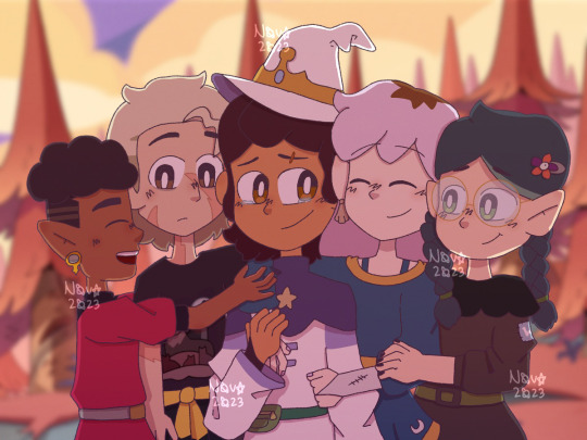
Text
The full lineup is almost done!! (just needs some touch ups and a Chunsik design👍) FEEDBACK IS GREATLY APRECIATED!!
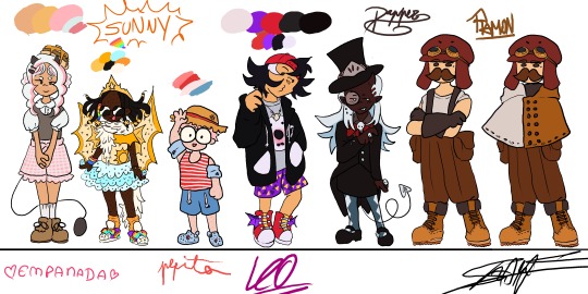
Design process under here (whole lot of yapping)
General thoughts: Ive given them in my previous design sheet (you can find it in my blog)(tldr: designs match characters but still childish, 8-12 years old). Only thing different here, is that these eggs were eggs who I had less of a clear idea of what I wanted to do with them (though I still really liked where I ended up!!)
Empanada: Didnt want to go for the full sweet lolita route, mostly because I thought it'd take away the "little kidness" of it all, but something that still resembles the aesthetic. She's wearing "carneirinhos" (idk the name in english) which is very cute little girl to me, and shes also a demon! Her tail resembles a frying pan!! Though I might change her fringe (it was supposed to be baby hairs but now that I think about it, her type of hair probably wouldnt have them) and put some argyle pattern in her sweater vest. I just forgor💀 to do that...I also wish I had made her shorter, but unfortunetely I drew this before the eggs did the height check (YES ITS BEEN THAT LONG).
Sunny: My beautiful baby girl. She means the world to me. I love this minecraft egg with all my heart. Shes wearing Light up sketchers and some fairy wings like Pomme, and shes actually wearing a swimsuit, she just put a tutu over it. The diamonds they're always holding are rings, they have a "terere" in their hair (idk name in english😭😭) and the beads were inspired by an artist on twt (@\BLUETOMATOSODA). Also if you are wondering why her hair looks like tentacles, its because I had originally made it puffy, but changed my mind after doing the lineart, so i had to get creative with me covering it up. Just pretend she has a fan, shes a star after all!
Pepito: Basically, he is very smoll. Chiquito even. He has strawberry hair and MASSIVE glasses that take up his entire face. Hes wearing a swimsuit aswell (dont ask how it works idk either), and has floaties since he cant swim. Hes got crocs, since flip flops hurt his toes, with a spider man charm on them! Also hes got a sunhat, mostly cause I wanted some other accessorie but didnt want to go with gas mask since it'd kinda kill the whole swimming vibe (since his model is wearing a swimsuit). sorry if its not too accurate to his character. Side note: Him, Em and Sunny all have freckles! Him and Sunny all over their bodies while Em just has on her cheeks.
Leo: Cute sporty vibe, love her shorty spiky hair. Wanted to try to make her face spiky aswell, for the whole shark dad thing. Shes got a necklace with a shark tooth (I guess she got it from Foolish??). He changes tshirts randomly, and opens and closes his attack on titan hoodie depending on the tshirt's expression (basically my version of Leo changing her player heads constantly). His trainers have dragon wings and also: whealies!!
Dapper: Im gonna be honest: did not expect to like his design THIS much. The colouring really elevated, with the long blue hair (the same colour as the ghosties!). Wanted to make them, y'know, dapper, so I had to sacrifice some of the "little kid vibes" unfortunetely, but I think it fits her still. The hat has part of the helmet that they used to wear a lot, demon horn to match Pomme, and a suit that is VERY inspired by Death the Kid from Soul Eater (very fitting for a reaper in training imo). Might be my favourite design!
Ramon: Jesus fuck you'd think designing your fav egg would be easy BUT NO. I struggled long and hard. Again, he doesnt have that much "little kid" vibe whatever man😭😭 Im just happy that I even managed to make SOMETHING. Hes got Create googles, his meathead is a massive hat that completely hides his hair. Very simple, very Ramon, though I will probably end up making a version with an ugly sweater just like he likes instead😔. I still like it but. man...
ANYWAYS IF YOU READ ALL THAT MWAH, YOURE A REAL ONE, THANKS FOR ENTERTAINING MY THOUGHTS🫶🫶🫶
#qsmp#qsmp fanart#qsmp eggs#qsmp empanada#qsmp sunny#qsmp ramón#qsmp ramon#qsmp pepito#qsmp leonarda#qsmp leo fanart#qsmp dapper#qsmp sunnysideup#ramon the egg#ramon qsmp#leonarda#leonarda the egg#leonarda fanart#leonarda qsmp#pepito#empanada#sunnysideup#sunny the egg#empanada the egg#empanada fanart#sunny fanart#dapper the egg#dapper fanart#breakfast trio
52 notes
·
View notes
Note
omg can you review the mighty poogle 🥺

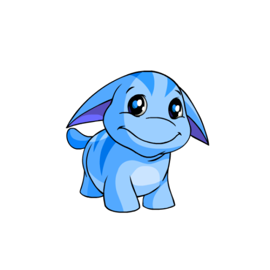

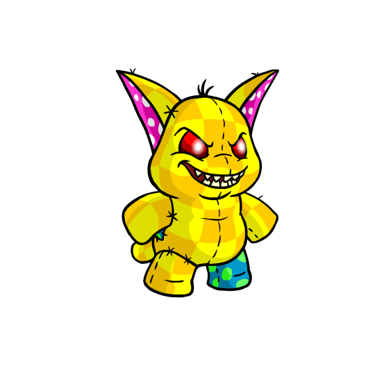
The Poogle is one of those really abstract Neopets wherein it's just a Creature(TM). What kind of creature? Who knows. I guess they're meant to be vaguely dog-like (seeing as Poogle racing is a thing, and it does sound vaguely like "poodle"), but they really don't lean towards any one specific animal, which is always something I enjoy.
What makes Poogles appealing is undeniably how chubby they are; it makes them look extra cuddly and is part of what gives them their distinctive noses (or lack thereof) and double chins. It also comes with a bit of lore about them living primarily in cold-weather regions, kind of like how seals have blubber to keep them warm.
Beyond that, I also like their stripes; they break up the design just enough without feeling too distracting, similar to their underbellies. The shape of the stripes is also mimicked by their distinctive ears.

I will fully admit though: Poogles got the raw end of the deal when it comes to customization. Not the absolute worst conversion job, mind you, as for the most part they look pretty dang similar—same pose, same proportions, same markings, etc.
However, what got completely messed up is their faces. Originally, Poogles had a soft, fleshy snoot that had two sets of lines to indicate that it was mostly fat and that it went back in space a bit. Removing this upper line makes their snouts look hard, and also has the side effect of making their snout and even their entire head look too wide.
Likewise, the chin got messed up. The Poogle originally had a pretty distinct double chin/fat neck that, once again, showed how chubby they were. More importantly, their chin lines weren't closed off, so their heads bled directly into their bodies. On converted Poogles, they now just look like they have one weird normal chin instead of a chin and neck. The end result is actually kind of uncanny if you stare at them for too long. It's a shame, because like I said, everything else about the conversion works, and there was no reason to change the elements they did. They're still cute, mind you, just slightly less so.
Favorite colours:

MSP: Species-specific colors always tend to be iconic and a delight, and MSP Poogles certainly are no exception. They're basically the same thing as a regular plushie Poogle, except Evil(TM), with red eyes and a nasty set of sharp teeth (side note: canonically, all Poogles actually have sharp teeth; you just rarely see them). The unconverted version also is bipedal, unlike the regular unconverted plushie, which was quadrupedal.
Both converted and unconverted MSPs have a super fun chaotic gremlin energy to them, and both designs are good depending on which stance you prefer (I kind of like the converted quadrupedal, though granted, the loss of some stitching and extra softness is a bit of a shame.)
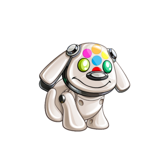
Toy: This color literally just released last month, but a toy Poogle based off of the good old iDog is just delightful. Even if you don't know anything about iDogs, the design is still good, with the eyes serving to complete a multi-colored hexagon that draws attention to the head, and the rest of the body considering of just a smooth off-white and black.
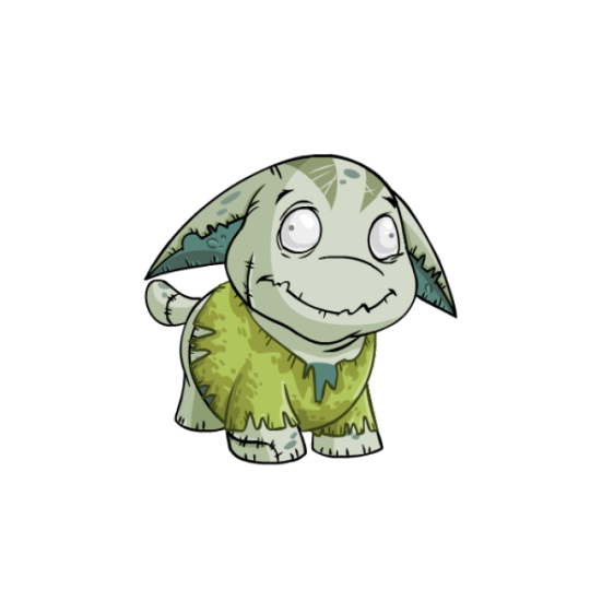
Zombie: The mindless eyes on this one are just absolutely delightful and give it a ton of personality. I also like the details, such as a few stitches here and there, a scraggly mouth, scratch lines against the usual stripes, and liver spots. As a bonus, it looks good both with PB clothing and without.
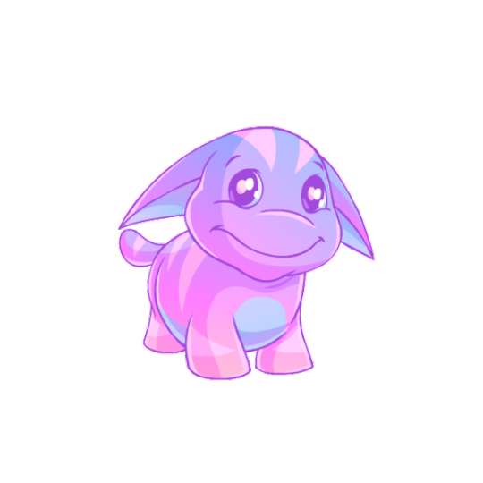
BONUS: I don't normally mention "recolor" Neopets as much on these reviews just because they tend to be mostly by-the-numbers, but the pastle Poogle is honestly gorgeous, with subtle gradients and a low-contrast blue and pink color scheme, helped by colored lineart. It's nothing fancy, but it's definitely one of the all-time best pastels out there.
80 notes
·
View notes
Note
yo what procreate brush do you use for lineart it looks really cool :o
hi there -- i use a variety of brushes depending on the mood, so i'll make a nice lil compilation of my brushes to cover whichever one you're curious about!! thanks for ur interest 🥰
first off, the very recent BIC pen mimic i got from here:
and it looks like this:

it benefits from a lighter colour (can be used with grey/unsaturated colours), it's worth trying out a few for fun. its grain blend mode (brush -> brush studio -> grain) is set to multiply, so i think that's where it gets its light-to-dark gradient from.
then, there's this one:

which is an edited version of the default Tamar brush. i added jitter settings, which are the reason for its wiggles, and pen sensitivity. i love to use this one to give more simple drawings some extra flare.
and its sibling:
this one is basically the same, but with NO jitter and added stabilisation. :-)
the last one on this list:
i call her 'derwent highpressure 2 2 2', aka this is the culmination of me repeatedly editing & refining the default Derwent brush. the pressure sensitivity is super high because i wanted to get a range of pen thickness without affecting my sore hand too much. it's got a small amount of texture & jitter to it, and i'll be honest, i don't remember what the original one looks like.
to absolutely Anyone: i really encourage playing around with procreate brush settings because, although they're a bit difficult to comprehend at first, they're pretty open in terms of how you can mould them. plus, you can employ personally made textures & shapes (or free ones) to add subtle effects. it's fun! i have a whole dock of speech bubbles, decals, a watermark brush, body hair & feathers, etc. :-)
#procreate#procreate brush#brush settings#artist#sketch#sketching#doodles#original art#art tutorial#AMA
235 notes
·
View notes
Note
For the artist ask thingy. 1, 2, 8, 9, 14
Hello!! Sorry for the wait, I wanted to get home to access my pc for an old pic I wanted to share.
1.) What canon character(s) do you love to draw the most? (And why?)
Tech (isn't it obvious? 🤓). I cannot articulate why though. I just get a good feeling when I draw him. I think it has to do with the fact that he's my current fictional crush.
However, I do enjoy drawing modern au version of him the most. Why? Even when I don't want to, I have a tendency to comply to canon sources as much as possible. In a modern au, that is not an issue and I have a lot more creative freedom, so that's why I like it. And also he's totally not maybe dead there so 🤷♀️😅
also why is he such a good looking model?
2.) What do you think makes your art iconic?
Last time I was active on tumblr, I think I was known for my use of very vibrant and saturated choice of colours. Also I used to highlight the lineart with fully saturated CMY colours. I’ve never seen anyone else do that at the time, so I think it was very recognisable. And since I really like you, I wanna share an old piece of art made in 2016 (looking through old art is embarrassing, but this was probably the peak of my fanart career tbh haha) ❤.

As of right now though, I don’t feel like my art is iconic in any way. I don’t think I’ve drawn enough to have something recognisable going for me.
8. Are there artists that inspire you (and maybe shaped the way you draw your art)?
This is a hard one 😅 I completely stepped away from art during 2018, and when I returned I sort of just continued on with what I knew from before. But since it had been such a long time, I don’t remember what artists influenced me or shaped my art to make it like it is today.
Rather than specific artists, I think I was more inspired by art styles, if that makes sense?
I started with anime and manga, and then I tried to transition to a more semi-realistic style as I grew up. I was really into the art of my favourite games at the time, which were Overwatch and World of Warcraft. Also I think the art style of Arcane is so very lovely, I think I’d like to emulate it more in my current paintings.
9. How many drafts you have right now, be honest-
I am HONEST I don’t think I have too many drafts
The Band Batch x 2
Greasy mechanic!Tech
A special something about modern au Tech featuring a certain automobile 👀
Another Tech portrait in funky lighting.
Band au Crosshair (concept: he is smoking (hot))
A little self-indulgent Tech something to comfort my soul
I have a lot more ideas, but those have not made it to the canvas just yet.
14. Funniest thing that happened to you during the drawing process?
In recent time, maybe…that time I posted a sketch of Tech with an exposed neck and shoulders and the absolutely feral responses I got from the denizens of this site 😂 It happened on the art blog, and unfortunately I've deleted the post when I cleaned it up 😢
Thank you so much for sending these! They're good distractions on bad art days, you have no idea how much I appreciate it!!
In case anyone else reads and is interested: Weird questions to ask your local Tumblr artist
5 notes
·
View notes
Text
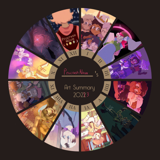
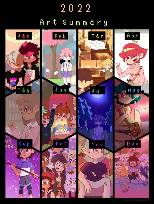
art summary 2022 vs art summary 2023
individual 2023 artworks below (plus some thoughts on them because why not. Said thoughts will include me critiquing some of the pieces, especially the ones from earlier in the year.)
also here's a link to all the artworks from my 2022 one if anyone wants to see them
JANUARY - Art piece i did right before For the Future aired of Luz and the rest of the hexsquad having a much-needed group hug. I didn't really look at any references for this one (apart from for the character's designs) so the poses look really awkward and stiff tbh 😭. That being said, I'm still glad I gave it a shot, and it looks a lot better than the one I did before Thanks to Them's release, since I was more used to drawing the characters.
I'm not going to go too much into some of the... questionable... anatomy choices I made, since they aren't exclusive to this artwork in particular, nor is this the worst example of them (*cough cough* my old King's Tide screenshot redraw).
Overall I think this is an okay art piece. Definitely could have been improved by actually using references for the pose though.

FEBRUARY - This one is actually another redraw of a REALLY old piece I drew in 2021. With my finger. Not a good combination to say the least. This one is miles better especially in terms of anatomy, facial expressions and composition.
That's not to say that it's without it's flaws. I do think that lining up Betty and Amber's poses better would have improved the overall look of the piece. Another thing that I did end up changing a little while after I drew this was removing the shine from the black parts of the mirror to make it look like it was actually cracked, which I didn't do in the original version (that one's on my scratch account if you want to see it). It's a subtle difference, but I think it makes the piece look a lot better.
Again, I think this is an okay piece overall. Looks like the mona lisa compared to the 2021 version, but honestly I think anything would.
MARCH - Yet another Owl House artwork (bet u guys cant guess what my favourite tv show is). This one I created for a zine which I was working on for my multimedia class (this artwork in particular was supposed to be an advertisement for the finale). You can kinda tell I still wasn't that confident in drawing King, since his pose is pretty stiff (I don't think I ever really got used to drawing him tbh).
I do think this piece would have benefited from some more shading and lighting that wasn't the singular multiply layer I placed over the characters then erased some parts of. (There is some other shading but there's no other lighting).
Most of the other issues I have with this pieces are just issues I have with my old art in general so I'll leave it there.

APRIL - This is the last Owl House artwork I promise. I made this one for Zeez Vov Gee 2's watching and dreaming art contest. I actually do still quite like this one, which might partly be to do with the fact that I really like all of the character's timeskip designs, but whatever.
Some of the proportions on the hands are a bit weird, and I REALLY wish I put the shading on the lineart as well, considering how light of a colour it is.
One thing I do really like which I didn't notice while I was drawing it, is the pose Luz and Amity are in forms a sort of heart shape, which is really adorable akdjfhskhdf ;w;
Anyway, overall a pretty good piece, might remake it later. Who knows 👀

MAY - as you may immediately be able to tell, I did not make that much art in May (I might've had a few tests on at the time. Or I was just lazy). This one is actually OC art for once (wow shocking never seen before).
It's kinda just a doodle/a more doodley art piece, but it's pretty alright. I actually really like the pose that Robyn (the OC in the drawing) is in. This is also kinda the first time I drew their design, so yeah. The background isn't great, but I can't really expect that much from a doodle -v-
overall, pretty decent doodle. (for anyone wondering if I'll ever post more about Robyn... maybe? I'm mainly using their story for writing practice, but I think I posted something from it on here)

JUNE - June was literally the polar opposite of May. I'm not kidding, there were like 3 artworks that I was debating putting for June (this one, some deltarune fanart and a TOH screenshot redraw). I eventually went with this one because HOLY CRAP am I proud of that background.
This one was really heavily influenced by cartoon backgrounds (in particular ones from Gravity Falls and Hilda), and while I do think there are a few things that could be improved (like some of the trees), this was the first time in a while that i'd tried drawing a background that wasn't grass and a couple of trees (and i think the first time ever that i'd done something this complex).
I think another reason that this one turned out so good is that it was a birthday card for a friend. And if there is anything that I am constantly trying to do better at every time I redraw it, it's birthday cards (probably bc they're for my friends, love you guys sm /p).
anyways, overall a really good piece, 11/10 background.
JULY - behold... the first artwork I posted on Tumblr! I drew this shortly after seeing Across the Spiderverse in cinemas (which I have to say was one of the greatest experiences of my life).
I wanted to mess around with lineless art a bit on this one, as well as sort of try to give it a watercolour feel like earth-65. And I gotta say, I think it turned out pretty good. Though I did spend a good 15 minutes looking for references because ATSV wasn't out digitally yet ;w;
overall, I like this piece, I tried something new and I made fanart for the greatest movie of all time (in my opinion)
AUGUST - I don't think I drew nearly enough Omori fanart when I was super into the game, so I'm making up for it now. I wanted to redraw one of my favourite photos from the photo album for this one.
I probably could have put a bit more detail into the background for this one, but I really like the warm lighting, and the dappled light effect that I used for the characters. The lineart is also a bit sketchy, but I was (and sort of still am) in the process of figuring out how I actually want my lineart to look.
overall, I really like this one, nice colours, nice lighting, has the omori characters being happy in it :]

SEPTEMBER - like in May, I didn't get as much Art Stuff TM done, so it's just a doodle of some of my OCS (except this time it's Copper, Lapis and Peg, who I have posted about before).
I kinda just wanted to draw something cozy, so I didn't put too much effort into the background and stuff. One thing I will say, is that I wish I drew them looking a bit older, since they are all 16-17 lol.
overall, this one's ok. Could be better, but it's just a doodle.
OCTOBER - ohohohohoho we are SO back. Yet another birthday card. I love the perspective and poses on this one (because, you guessed it, I used references for them). Everything about this artwork was really fun to draw (especially the characters).
Overall, really good artwork, 11/10
NOVEMBER - redraw of an artwork from 2021 part 2: electric boogaloo. I remember being so proud of the original artwork, so I wanted to make this one an artwork I was proud of too (which was a success).
One of the main things I wanted to do for this one was to actually draw a background, instead of getting one off google. The one I drew was simple, but I think it really works, because I wanted the focus to be on the character, not the background. I also added some slight perspective to the drawing to make it look a bit more interesting.
Overall, amazing, especially compared to the original
DECEMBER - and finally... December's artwork! Aka my banner. I wanted to do something kinda simple for this, because I'm probably going to redraw it or make a new one later. I really like the contrast between the colours in the foreground (which is supposed to be inside a train, but it's kinda hard to tell), and the background.
Also something I've started doing for a few artworks is making a duplicate of the artwork, blurring it slightly and lowering the opacity, which makes it look a lot more visually interesting :0
overall, love this one, good artwork to end the year off with :] (i'll prolly still draw more stuff tho)
(fun fact - I was going to put the redraw I did of the 'get in loser we're going shopping' scene with the characters from TMC for December because it's the highest quality meme i've ever made but it looked weird next to the other ones bc it was in black and white 😭)
#art evolution#art improvement#my art#nova.txt#long post#like seriously long post i should not be allowed to ramble about this much stuff sorry guys
2 notes
·
View notes
Text
This Week In "Time & Again" #8: Achievement (Almost) Unlocked! And A Pre-New Year's Mess
Does it ever happen to you that you're so energetic, and hyper, and full of determination and all - and then you take a deep breath, sit down happily on your comfy couch, and you're ready to start writing a new and lovely blog post!..
... but then you realize you have absolutely nothing to write about. Or - perhaps, to be more precise - you feel like there's nothing worth mentioning that would make an interesting, succulent, and informative post.
That happens to me once in a while - which is odd, considering how much of a babbler I tend to be when it comes down to self-expression in written form (it must be, Lothar affects me in a certain way and alters my usual behaviour, because normally in my life outside any artistic activities I am fairly quiet).
The aforementioned little hiccup on my way of the "ultra-completionist of the Pre-2024 To-Do List", unfortunately, hindered my progress, and the final number of the blog posts ended up a tad smaller. I don't think there are any complaints from the readers though 😎 I'll try to keep up next year.
On a side note, one of the goals on the list has been removed and deliberately postponed until January. I have reasons, trust me 😁
But most importantly, Christmas season of "Time & Again" turned out to be pretty good! Just as planned, at this point of time, just a couple days short of 2024 (because I started writing this post yesterday), The Lineart is 98% done - it only needs a sparkle of perfection and and a short session of filling up the gaps and missing spots here and there on different pages.
AND DONE. Moving on to The Colouring Stage right after all of that has been properly handled. (oops, unintentionally, I lied: I already started to partially colour some peculiar things... too excited; can't hold back, LOL!)
I would say, this is truly a great achievement. Well... almost got an achievement anyway. Working on your grand project every day, little by little, and watching it growing, evolving, and getting fleshed out a little more day by day is hard to describe in a verbal form. I wonder about this sometimes... Perhaps, those who have never been in a similar situation will not understand this emotion very easily. But I'm telling you with 100% honesty, as usual - this emotion is priceless and really makes you feel that you're doing something important in life.
So, in short, everything goes steadily and as planned. Plans change sometimes - but that is totally fine. Currently, everything is indeed as planned - and I can't help but rejoice 🥳
As a treat for reading yet another one of my excessively talky talky longreads, I'll tease you with some rather unpredictable snippets now ;)

Just who are those guys???.. And what's the situation??? They sure look feral!
You will definitely find answers to all of these questions after Chapter 5 is released sometime in 2024 ;)
... In the meantime, as I've been working on a peculiar troublesome background, I have discovered a handy option in Krita's Assistant Tool that I believe has a possibility to make my life easier in the future. I used Assistant Tool before, and quite profusely. But thanks to a certain video I came across, I happened to find out that there's more to that incredible tool. I'm excited to cover this topic in the next blog post, so stay tuned!
I also made a horrible mess on one of the pages that currently looks this way:

How do you like the funny lettering???!!! 😁
Those are not stickers, by the way (although that's certainly a good idea to turn those into stickers!.. That'd be a story for another day tho). Why those are needed - that I'll keep a secret for now. But I wanted to show you what they look like - especially when cluttered altogether, hehe.
Also, obviously, this is not the final version of each one of those sound effects bubbles. There's more work to do eventually 😉
For now... let there be silence. In a bit over 24 hours, the calendar will show 2024 on this side of the globe. So I'll stop typing right now and I'll save more stories for later.
... I'm also wrapping it up for today with my ridiculous habit to scatter vaguely related song references across the text, so, yup - time for a small break 😅
(And I should also take a break from listening to Ultravox on repeat, otherwise my non-existent vinyls are gonna get non-existent holes in them... wait... how does that work exactly, again?..)
So, for a bye-bye, I'll say show this:

Bah-bye, my friends! And see you next year! 👋🥳😁
0 notes
Text
weird flex but ok i guess pt.23
22
War… Hold up, do we really need a warning for this one? Dunno, but however, watch out for slightly disturbing and kinda…disgusting imagery, trypophobic patterns, as well as ‘necrotic’ (and dark themed) designs I made while having funky fever bc o h m y g o d do I get a little crazier every new quarantine day (and at this point it’s coming to be an usual thing for me, big sad). However, most are made no other than for the sole sake of satire, so y’know, no need to get your underwear in a twist

Friday Night Funkin’ BoyFriend’s Hood – AU fanconcept sketches [XX]
EDIT 16/11/2023: Updated the drawing with a rescanned, more clean version
1.- Miss Luzbell
Daddy Dearest’s ex-wife in BF’sH, as well as Stephano and Bruce’s biological mother
If y’all couldn’t tell my burning passion for making strange, very detailed character designs, this shall b enough to convince you about it
She’s supposed to be a goth gospel singer by the way…and she’s a gargoyle
Her design, however, was real fun to make, especially her moon scythe (just noticed afterwards that I snuck a low-key Zardy reference, woo)
2.- Bruce
Stephano’s brother, and GF’s half-brother
And when I say ‘obscure’, I’m not saying he’s the edgiest of all characters (after his mom of course), but that he’s the least lore-wise appearing character; technically I just did his design out of spite lol
However, unlike his mild brother, he has no ill feelings against GF; heck, he himself knows their mother was the one that peaced out with no care and just left them at their luck with their dad…he still messes around with GF every so and then though.
3.- Shape!BoyFriend/Major B (BlueFriend) and Shape!Lil B/Minor B (Light BlueFriend)
Funny rhythm game mashup go bzzz
Beyond this point all I did was filler stuff…just for fun c:
Used the symbol on BF’s jacket for this one, both for the big and the small boi
Light BluF do be looking cute tho
4.- Shape!Stephano (Octephano)
Close to me but the Godfather walked in
Way to say Stephano’s design was indirectly/slightly inspired in my AU fandesign of Cube, don’tcha think-
5.- Shape!GirlFriend/High G (PinkFriend) and Shape!Miss G/Low G (Light PinkFriend)
Demon hoe and demon child
Before you ask, I went with my fancanon for this one (pink shapes can be with paradise shapes as long as they’re ‘purified’ with any light-source magic –aka triangles), hence why she’s wearing a triangle –BluF also has one by the way, basically it’s his mic
6.- Shape!Pico (HexaPico)
go pico ye ye
Idk what colour he’d be exactly, maybe a mix between orange and green (orange being the predominant color since y’know)
Also his hands can shapeshift into guns as long as he has the weapons’ config stored in his database (in this case, his right arm being the assault rifle, and the left one being his uzi)
7.- Nostalgic BoyFriend
Sad boi
Basically happening after the GF-got-stolen event
8.- Simplified Style! Stephano
This is a FNF ‘artstyle’ concept I though of not too long that’s basically like combining but bad with Minus and taking away all color paletes, having the lineart to be the only colorful part of the sprite (mostly being the color of the icon the character has)
Also, finally got to draw his revolver thing, even if it was low-key
9.- Heart thing…?
Was meant to be Stephano’s signature symbol or something, but I don’t know at this point
10.- Simplified Style! BoyFriend
Back at it again with the simplifications
And yeah in my interpretation, simplify!BF has a transparent cap, don’t ask
11.- Blood Moon
Random sketch
Looks like a fusion between Whore of Babylon and Spirit of the Night (TBOI) but that might be just me
12.- Shape!Arzeus (TriArzeus)
Inverted triangle bad
I can’t help but think that, in order to possess Broddy, he would have had to do it blixer style (headstab)
24
#fnfau#alternate universe#au#alternative timeline#alt universe#friday night funkin'#bfsh#jsab#jpsab#jsab au#zzzzzzzzzzzzzz#go pico ye ye
1 note
·
View note
Text
Draal - Bular - Gunmar Design Path
Today we're taking a look at the very funky design path that Draal, Bular and Gunmar went on during Trollhunters pieced together as best as possible through the power of file names, matching things and the artbook. The order of events is as accurate as I can guess as for understandable reasons I cannot see an exact timeline.
First up from one of Headless Studios' posts we can see what is very definitely a purple Draal as I've been affectionately dubbing him looking a big brutal boy with Caveman Spongebob is also a frequent comparison.
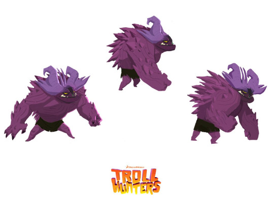
Source
He appears again on Juan Solis' Artstation (The model is miscreditted as Headless Studios in the artbook) having gained a new fancy arm blade. The file name for this? TROLLHUNTERS_bular!
vimeo
Source and of note there is also a Ms. Janeth on his vimeo account.
On the official Tales of Arcadia instagram he pops up again looking a lot more familiar in his blue though lacking a nose ring. It's very possible this stage was when he was still tied to Steve as a changeling's troll form which would account for the gruffer look.
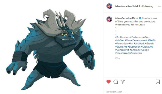
Source
By the time we get to Alfonso Blaas's paint over on the 3D ambient occlusion model and Headless lineart Draal is looking much more like the troll we know and love!

Source
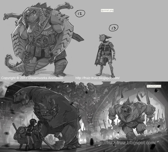
So what was going on with Bular if he was purple Draal? The short answer is at one point he was Gunmar's design which had a funky journey too. He sure went places before the finalised banger we got. This art is by Headless Studios.

Source 1 / Source 2
On Francisco Ruiz Velasco's blogspot account there are few bits of Trollhunters art from back when it's a film and the filenames in the url are very interesting, the first confirms that IS Gunmar while the second suggests it is the Battle of Killahead... The other thing? He only has one eye!
Source 1 / Source 2
This suggests that at some point during this design process he lost it.The following headshot is by Headless Studios is clearly a Bular design with the glowing eye that is a defining Gunmar trait becoming more evident
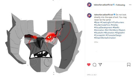
Source
"Gunmar" is getting closer to the Bular we know and love at this point and now in colour. Francisco Ruiz Velasco still has the filename whereas Headless Studios is really rolling with the funky glow.

Source 1 / Source 2
After the thread was posted (And on here) I managed to track down the Annie Awards slide which has an alternate expression on the right and the front view of the above image as well. This is being added for completion and because it’s neat!

Source
Headless Studios’ version was adapted over Francisco Ruiz Velasco's design as can be seen in this image collab between him, Sergio Casas and Alfonso Blaas. Is this the point of Bular and Gunmar officially split into separate characters? Could be!
Source
Along with the extra Bular art Gunmar art was found belatedly online! Some of these are in the artbook while others are unique to this.
Unknown artist/seeking confirmation - Top left
Rustam Hasanov - All middle images, top right and possibly top left
Headless Studios - Bottom left
Unknown artist/seeking confirmation - Bottom right

Source
[Additional edit] The top right image source was discovered confirming it is indeed Rustam’s work! Given his description this is either before “Gunmar” hit his Bular stage or after their split.

Source
You sure went through a dramatic phase finding your voice Gunmar.
[/edit] He appeared to cement with no design wiggle compared to Angor Rot’s more last minute change too. With the benefit of a close up of this chunk of Killahead by Anthony Romero we can even see his carvings.

Source
Thus Bular settles into his new found role of "the son of Gunmar" as shown in this Character Development by Leo Sanchez Studio & Visual Development/Shading n Lighting by Jonatan Catalan Navarrete and paint over the 3D ambient occlusion model by Alfonso Blaas his journey now completed.


Source 1 / Source 2
[/edit] As some people might be using this thread as troll reference in general , we now have a clear shot of the skulls on Bular’s belt courtesy of Anthony Romero!
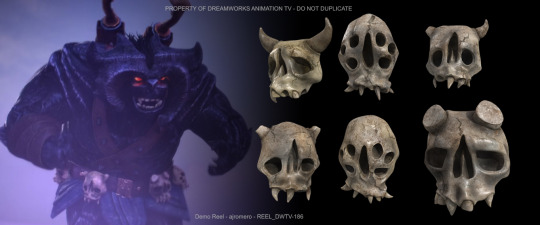
Source
#Trollhunters#Tales of Arcadia#Vis dev: Headless studios#Modelling: Juan Solis#Vis dev: Alfonso Blaas#Vis dev: Francisco Ruiz Velasco#Vis dev: Sergio Casas#Vis dev: Rustam Hasanov#Modelling: Leo Sanchez#Vis dev: Jonatan Catalan Navarrete#Modelling: Anthony Romero
140 notes
·
View notes
Text
Character design stuff, kind of. 😂😂😂
DO NOT repost my art.
I've been playing a game called Sky: Children of the Light. It's just I didn't get the time to draw some fanart of the game. I suppose the game's whole world, settings, designs and the art style are very remarkable and I honestly like the darker parts of the game's concepts.
This little creature is the character I play. This kind of little people are called "Children of the Light", "Sky Children", "Sky Kids" (I call them Brats of the Light), and they glow, and have wing-like things! They fly with their capes.
I only had the default clothes and default mask when I drew these pictures, and I really like how I design the character. It took me some time to draw. (couldn't draw fast enough anyway, LIKE ALWAYS) 😂 (I got a freaking new cape then) My character looks like Danny Phantom, because of the way I drew the hairstyle.
I used different amounts of drawing(?) (not sure how to say the word😂) elements to draw the same picture and I got three versions of a cool character design. One with lines and abstract textures, one with lines, base colours and abstract textures, and one with more elements. Each version has its own characteristics.

I always love my lineart. I like to keep things simple and detailed enough at the same time and having interesting shapes.
You don't always have to colour your lineart, unless your lineart is a part of a coloured drawing, you know. It really depends on the things and effect you are looking for.

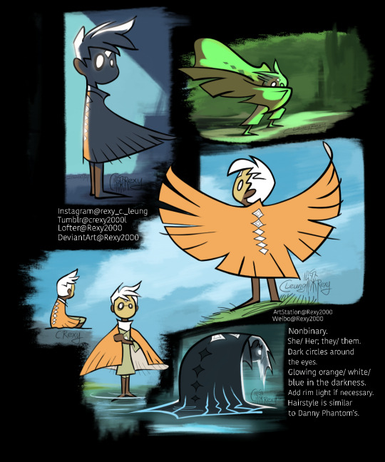
My character is a kind of hybrid creature, I guess. Sky Children seems to be the descendants of Light Creatures and Dark Creatures. I don't know if the creators still keep this concept though. I have seen some concept art of the game mentions about that.
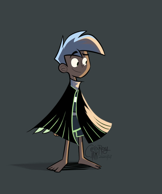
Danny wearing Sky Children's clothes. 😂
It actually feels like roleplaying Danny when I play the game! 😂😂😂The Ancestors/ Elders/ Spirits are some really mean but also caring ghosts who adore the little white-haired ghostly brats and use freaking high-tech equipments and even weapons! Creatures are very playful ghosts and some of them are really cool guides, and nice companions!
(Actually, I have been working on those answers and didn't want to post things here) (I drew too many Dannys, and I still want to draw more… ) (Even a game like this reminds me of Danny, why)😂
Btw, can someone tell me the English names of the places and the Creatures in Sky world, please? (the places' names were different from that of early concepts) I now know 暮土, which is that wasteland (reminds me of the Ghost Zone), is called Golden Wasteland. 🤔🤔🤔 I play the Chinese version, and know the Chinese names. I want to know the English names of "遥鲲" and "冥龙". And why are people calling those crabs "Krabs"??? Is there a story or sth?
Edit: Something is wrong with my character's cape (in fact I only had 7 wings), I realized this on 16th August. I was surprised that nobody told me about it when I posted these images to a few platforms. Perhaps it's not too obvious… And I'm not going to edit these pictures. 😂😂😂 2020年8月16号。
Rexy Leung's 67th original post.
发布于2020年8月13号。
#sky: children of the light#sky: cotl#danny phantom#fanart#dp au#danny phantom au#character#character design#illustration#sky children#sky children of the light#sky cotl#sky kid#concept art#concept#alternate universe
522 notes
·
View notes
Photo
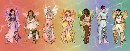


Harmonix!!!
What a monster project at such a low res. I fought Procreate very hard to make this happen, layer limits are... sure something.
Design notes below!
I originally intended to make Harmonix something pure and natural with bare faces and bare feet, but then the wedding petch- vibes of the original hit me (also I was almost done with it all when I realised they have strings on both legs???) so I ended up going for something pastel and full glam. I loved painting make up as well, it was a great exercise!
I tried out a new technique for the wings as well, idk if you can notice, but I ditched the lineart this time to make it more translucent looking. its the kind of feel I see other fandom artist pull off so effortlessly, and I wanted to see if I could do it as well. I’m not quite there yet and adding effects layer by layer to different segments of the wings was a pain, but I def see the overall appeal in the optics, so I will tinker around with it in the future as well.
The colours were sooo hard to chose, I actually have two other colour versions I might post later. In the end I settled for gentle colours that we rarely see the girls wear - so their secondary or even tertiary colours. For Roxy i just had to make up my own colour scheme, since we only see her in green accented with purple. I really love seeing ochre/ sepia colours on her so I went with that autumn feel here too. Also since this is a very natural look, I got rid of the hair-dye she has. Keeping the girls’ natural hair colour makes the colourful highlights pop! (Techna and Flora got the same treatment, with Techna’s hair darkened and Flora’s highlights gone)
Braids are so underrated!! I gave everyone braids! It’s an excellent way to keep your hair out of your face while diving and still look very regal and elegant.
The outfits themselves are sort of diving-gear inspired with some heavy texturing that made me feel of underwater game level design - a lot of swirls and false eyes. I of course had to conserve the iconic trains, but I just hated how they worked with the skirts of the original. They looked like cupcakes with odd butt capes, not so elegant, not so gucci. These I hope, also look less like they would drag wen wet. (I originally planned to do a lot more with transparency effects, making the fabric seem more sheer in a gradiented way, but alas technical limitations. I might release an updated version at some point.)
Well anyway, *dabs* this is it folks!
#winx club#winx redesign#harmonix#winx harmonix#winx bloom#winx stella#winx layla#winx aisha#winx flora#winx musa#winx techna#winx roxy#locally sourced art
277 notes
·
View notes
Note
Hello!! You don’t have to answer if you don’t want to, but I’m kind of struggling with finding my own art style. whenever I try to draw my own style, it ends up looking like yours to a certain extent and I don’t want to copy you or anything. I just rlly love how you draw your faces and all! Do you have any suggestions? Also I loVEEEE your content sMM AHHH you’re literally my main inspiration and the one that got me into digital art ily🥺🥺🧡🧡
awwww thankyou!!!! I think it's normal that your style style has evolved to look like the artist you're fixated on, I've gone thru those phases too!! it helps when you broaden your horizons and keep an open mind to create a larger pool of artists to look up to and which part of their styles you wanna adopt into your own one.
all our own personal styles are really hybrids and new versions of the various styles and artists we take inspiration from, be it their colouring, lineart, anatomical or composition skills. you just gotta admire more people, in a nutshell!
#ask ally#my stule is always changing bc i would#find this new arttisr and be like#oooo i like how they drsw their eyes#and try to incorporate that into mine#then find another and be like#oooo i like how they colour this way#and repeat#keeo evolving!!
112 notes
·
View notes
Note
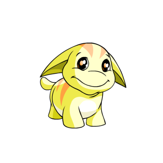
I was reading your review on Shoyru and realized something I'm sure someone's already pointed out. In your list of dragon-like Neopets, Scorchio wasn't on there! Hopefully you'll tackle that one in a future review?


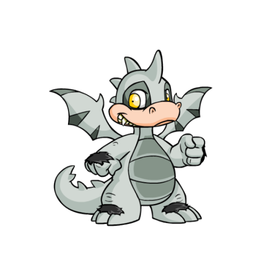
Scorchios are kind of your quintessential dragon Neopet. Compared to Shoyrus, Skeiths or Draiks, Scorchios don't have a super strong visual direction beyond just "bipedal dragon", which is a trait that also applies to the other three. I feel like if we're going to have four dragon pets they could've managed to vary them more, considering how many different types of dragons there are out there, but oh well.
From a visual standpoint, Scorchios have a pretty well-balanced design, detailed but not busy. They have a lined underbelly, some stripes on their wings that match the spikes on their backs and wings, and markings around their eyes.
My only visual complaint, outside of them being a bit generic, is that the peachy muzzle feels weird because it's too close to the yellow accent color to justify being a different color, and the yellow color itself is kind of a gross low-contrast mustard color instead of a nice cream or tan (the yellow Scorchio also has this color on its entire body instead of the more pure hue most yellow pets sport). Thankfully most colours fix this issue.

Scorchios also benefited from customization, even if they were saddled with a fist. The old art was incredibly dated, with little to no shading (look at those wings) and wobbly lineart. Outside of just improving the art, the customization version also fixes some of the wonkier aspects of the design, such as the weird leg anatomy, extremely tiny and dense tail spikes, and tiny eyes.
Favorite Colours:

Robot: Robot gets a spot here for not only being a good-looking colour in general, but also because you get a two-for-one deal due to the casings being removable. The cased version a perpetually pissed expression and a striking black and white Tron look, with a few dark grey and red accents. The lightbulb spikes are particularly delightful. The uncased version shows off the dark grey in full and also places more emphasis on the red accents (along with being less pissed).

Woodland: The woodland Scorchio is based off the rainbow eucalyptus, a plant that 100% looks fake but is very much real.
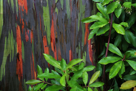
Not only does the dark base with green and red accents look particularly beautiful, but it also is a fun nod to the actual trees conceptually and makes for a memorable pet compared to the more generic wood-based ones. My only nitpick is that the leaf-wings don't really read as wings at all, and the random twig above the eye feels out of place and doesn't help with the wing issue. Still, it's very nice overall.
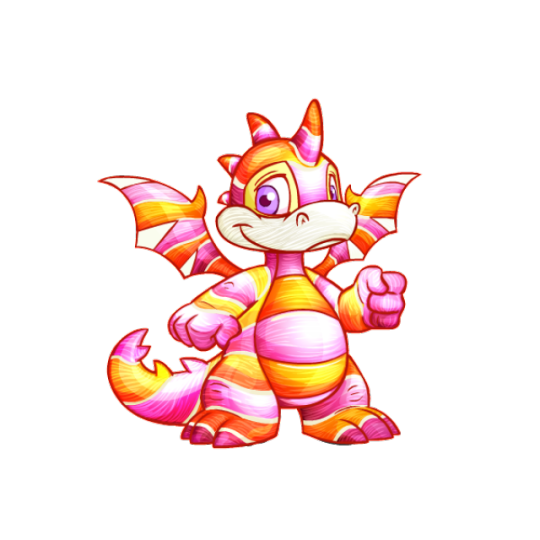
Candy: This one's relatively straightforward, but the pink and yellow palette is lovely, and the stripes really work well with the Scorchio's underbelly lines and pre-existing wing stripes. What I particularly like is that it actually has that very distinct lined texture that a lot of hard sweets have, which is detail they didn't have to add but I appreciate.
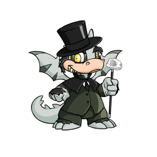
BONUS: Halloween got very close to being on the actual list, and I do really like its fun Jekyll and Hyde look, complete with skull cane (a nice way to use the fist) and formal attire. However, I had to knock it back a peg due to some weird details, like the hat absolutely not fitting the Scorchio's head correctly. The hands and feet also have fur, which not only feels random but really screws up the base color, which could've otherwise been a good option for customization in and of itself. The pink snout is also a little distracting, and probably would've worked better as a white to match the skull cane.
17 notes
·
View notes
Note
Sorry to ask because I remember someone else asking but I was wondering what drawing apps or of the like do you use? I love the way your art looks and I just got my first drawing tablet so I want to try different type to see what I like. ❤
Never apologise for asking questions! I absolutely don’t mind helping where I can and I love getting messages (though I’m notoriously bad at replying and hoard them like a dragon! Lol)
I shuffle between 3 programs - photoshop CS6, SAI and clipstudio paint, all for different reasons. I tend to do lineart and colours in SAI or CSPaint and save CS6 for things that need really crisp lines/angles with the pen tool. CS6 also has far more options for layer styles and brushes imo. Though admittedly I haven’t ventured too far into custom brushes for SAI or CS6.
If you’re just starting out I’d suggest trying to get a version of SAI or CSPaint on sale. They seem more intuitive and geared towards artwork. PS is a massive program with a lot of things you’ll likely never use. Plus it’s a monthly subscription now, which isn’t an exorbitant amount but I like being able to pay once and have my program. The downfall with my CS6 is that I no longer have PS support/updates.
There are also free programs you can download like Painter, Krita and Sketchbook which are excellent user friendly programs for someone just starting out who is not maybe not sure about digital mediums and not ready to commit a chunk of money to purchasing software without knowing if they like it ☺️
I hope that helps! Happy arting 😆
22 notes
·
View notes
Last Seen Blogs
tekitothemagpie
Tekito the magpie
deathcar
untitled
c0konk
(づ ̄ ³ ̄)づ
elsear
cardioidQualia

khryptid
Kyra