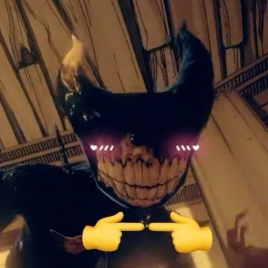
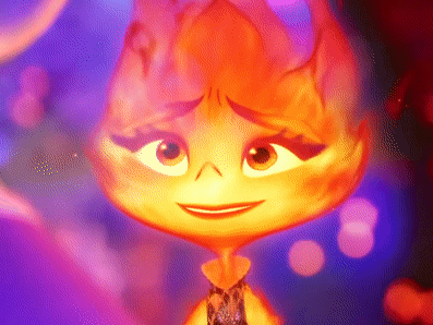
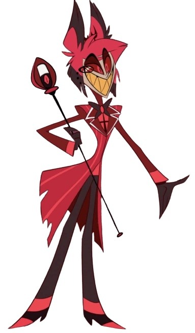
#I just wanted to draw her and design her to be a little more.. animal ig
Text
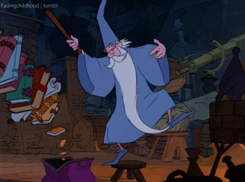
@eebie DANCE!!!!!!!!!!!!!!!!!!!!!!!!!!!!!!!!!!!!!!!!!!!!!!!!!!!!!!!!!!!!!!!!!!!! the dance is from this video ♪(^∇^*)
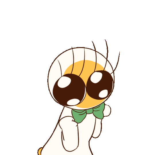
#HI EEBIE !!!!!!!!!!!!!!!!!!!LOL#i made this beccause i was listening to that penis song i sent you and i thought it sounded like a song gobou would use#also i wanted a dancing eeber gif ^___^#keep in mind i ummm. have only animated once before and that was years ago and very very very short#and also it was totally sketchy and stuff. as in it was just a sketch there was no lineart or colors or anything#and also csp apparently dosent let you export transparent animations!?!?!?!? and also it doesnt let you use more than 25 frames!?!?!?!?#its stupid. so i just made a gif on EZGIF.COM instead<333#which is why the edges look kinda. um. wack. sorry about that but maybe itll go away when this posts? i dunno but i doubt it#btw i think i have eeber poisoning or something. because i draw her all the time everywhere........#ive drawn her so many times in some stupid little sketchbook we have in our kitchen when i wait for stuff in tha microwave#her design is just sooooo. Yeah!!!!!!!!#anyway this took Ummm significantly longer than id hoped and my back hurts sooooobad#so im going to bed!!!!!!!! but anyways here u go babygirkl <333333#my art#oh and btw i only listened to the penis (eek!) song while drawing this and nothing else#just. the same penis song for hours on end#and i said i was gonna take abreak when i was done with the lines before i started coloring but 😀👍 i forfot#OH WAIY ONE LAST YBING. i got cery noticably lazy like halfway through so dontt look too close at the frames or youu might get scared 😨
148 notes
·
View notes
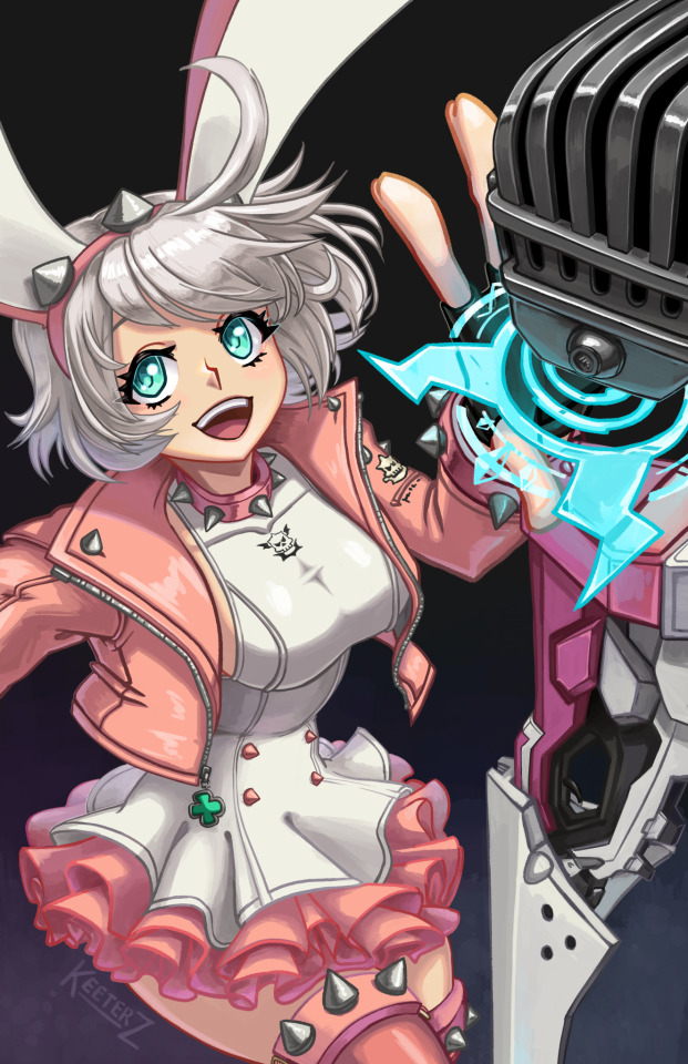
Photo

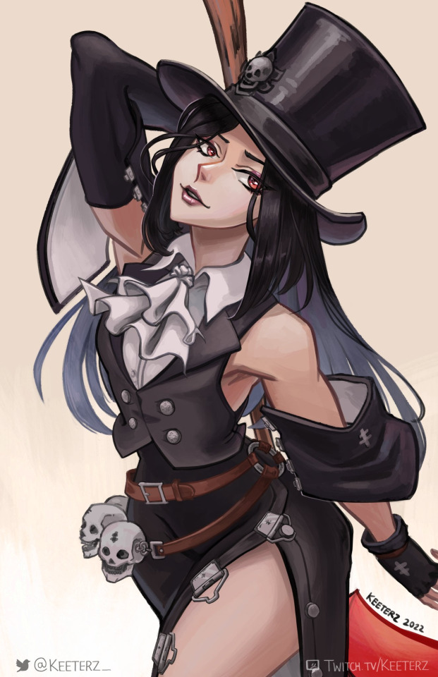
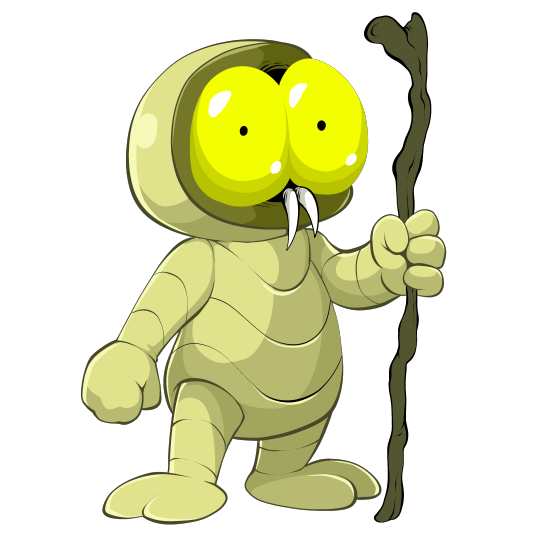
Ok Kira art !! Sorry the quality kinda sucks, anyway I love her so much. One of my top three riptide npcs fs
(do not repost!!)
Without shading and lighting layers under the cut v
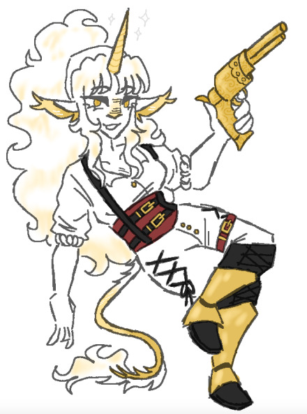
#my art#please do not repost/trace/edit/copy/or claim#jrwi#jrwi riptide#jrwi kira#not gonna tag as spoilers cos i don't feel like it really is? but i can if y'all want me to#yes i know the gun is too big#and yes i know the pose is weird#I just wanted to draw her and design her to be a little more.. animal ig#i love her so much I really hope we get to see more of her#less of a hc or anything more of a wish but like;#since kenta is dead I'm kinda hoping she gets promoted to vice admiral#cos i think that would be cool#i dont think its gonna happen though since im pretty sure the other navy leaders are all ferins and will probably use this opportunity to#place another ferin in the highest rank#it'd be a big win for the pirates if someone like kira became a vice admiral though#anyway im rambling in tags ill shut up now
124 notes
·
View notes
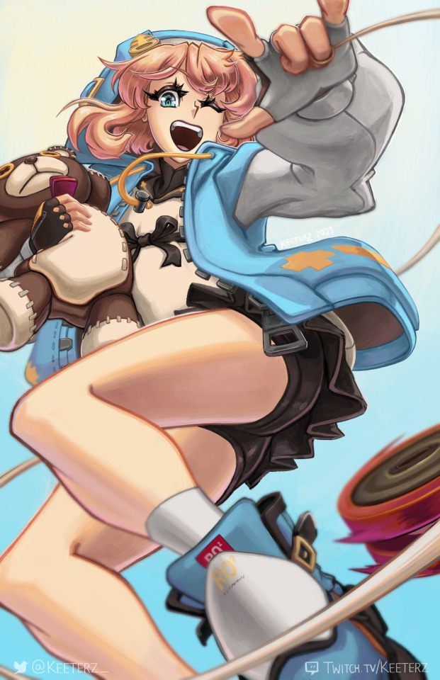
Text
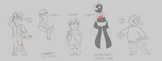
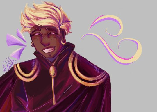
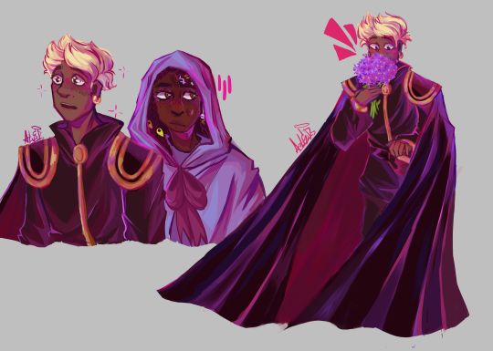
You know when I said I was redesigning my Self Inserts and going in Age Order? Yeah I lied.
Here's a bunch more Redesigned Self Inserts, no longer in any particular order, just who I had the ideas for at the time.
#Emile's Arts#Self insert#Proselfship#Proship Selfship#Feel free to ask me about them#I said I'd get around to drawing my other xxxholic S/I so here he is#I've never actually drawn my Ruby Gloom S/I before she use to be just a dark version of Ruby#Based on the Blue Moon episode she was the Luna whatever I haven't watched the show recently#Then for a while she was a vampire like Scardy Bat's cousin or smthin#but recently I was thinking about the little Mummy design from the Scooby Doo Ghoul School special#And she really set a very spesific gender for me and I just stole her and Lucky Animal Crossing for myself fdkgjkdf#Sometimes you're uncreative and that's Okay#My Undertale S/I is also new kind of I've actually never talked about them as they are in my brain#Usually when talking about my Self Ship with Papyrus I talk about a Post Pacifist Timeline me who was a human living on the surface he met#Buuuuuuut that's not how the self ship is in my head I just never wanted to bring it up I guess kfgjfkdg#It's just an I'm Frisk sort of Self Insert nothing actually interesting#I think I got the idea from the Crybaby Frisk comic that was running around for a while because#Yeah that'd be me#fgfdkgjkdf#Okay enough tag rambling again ask me if you wanna know more about them#Thankyou very much for reading!
7 notes
·
View notes
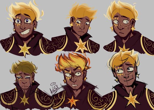
Text
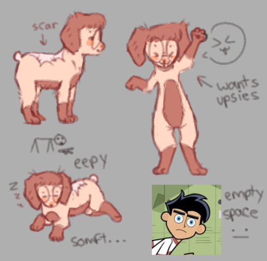
mini glitterhoof redesign - or as i like 2 call it, the el wiwi era . she gawt the scar when dan katsup blasted her in amity park ( b4 they became partners in evil crime of course >:3c )
#pawesome art#pale pink on her tail bc it was unnaturally cut off and therefore is scarred#i was upset she didn’t look very much like a dog and more like a weird anime face on a disproportionate body#i want her 2 look a little more doggy so that way I can draw her in doggy situations better#It was weird trying 2 draw something so juman looking in a dog pose#of course she does end up looking more ‘human’ but this is the vision for me at least. dog on two legs#of course i will draw her in her legacy outfit she still wears clothes I just wanted to show off her coat pattern#this is her toddlehoof era btw. Glitterhoof has multiple eras okay.#The el wiwi era was a joke it’s more of a design era than her actual in verse era#she goes from PR-OM3GA era to toddlehoof era to tweenhoof era .#toddlehoof is when she’s still more doggy in actions and posture and body as well#and very young mind wise although high intelligence LAWL Valerie takes care of ber#I have got to draw Valerie in my style again hehe :3c#danny phantom oc
7 notes
·
View notes
Text

I know I don't UUUUUUSSSUAALLLYY post doodles twice but like. Itty bitty Willow redesign. A as well as an obvious hint at what song I'm looping rn for her
#I need to make a Heaven Says animation for her so badly#As much of a simp as I am for her and love drawing her all cute...#declawing her just feels wrong. because she's so incredibly fucked up her source-wheatley has SO many issues with him#removing her scarier aspects is just disingenuous</3 she's allowed to be absolutely horrific and unforgivable again as a treat#i also like her full colour design but like#the minimal palette is just so iconic i love wearing my inspirations on my sleeve so more Blue/White/Black+ Willow <3#ive never mentioned it but hey since we're rambling in here I actually have a separate set of voice claims for her since uh.#estrogen and voice training out of sounding like stephen merchant is probably in her best interest as silly as that'd be.#unfortunately one voice claim is literally just my own voice (Hi i have an accent have I mentioned that?) and another is uh. Reol. oops.#cw scopophobia#scopophobia#just a little bit but still#anyway if you want a song that perfectly fits her (and her original counterpart) uhm uh Make U Mine - Blood Orchid#the vibes are just. Them. The instruments also just scratch my brain sooooooooo nicely.#c1nn4bunny.jpg
4 notes
·
View notes
Note
Hi! I hope you're doing great!
So I saw the headcannons of reader as Catnap and Dogday and I fell in love with the way you write! So I was wondering if you could do a headcannon about the reader being bendy from bendy and the ink machine?
Like the reader can draw and bring ink creatures to help around the hotel, maybe draw some decorations for the hotel? Sometimes going full on ink demon form to protect it or just pick up their friends on their back to make them feel taller
And the reader was actually an animator at joey drew studios and died, I think that would be pretty cool!
P.s I would love if the reader was wearing the same suit bendy wore in bendy and the dark revival
HAZBIN HOTEL X BENDY!READER
Prompt: a cute “little” demon becomes a resident who helps with the designs around the hotel!

Starting off. You definitely appeared as baby bendy 😘 with ya cute ass red bow or white bow. What ever you want the bow color as you showed up to the door trying to seem professional as Charlie gushes at your cuteness and lets you in.
The picture of baby bendy in the car, yeah you have that as you literally fuckin' zoom in the hallways drinking apple juice like a bad ass kid….bendy!Reader and chibi!Reader both doing races to make sinners poor😭 lil evil asses….
I imagine Angel dust and Alastor ganging up on you as a team to insult you by your height until you grow up to ink demon from with a roar.
“HOLY SHIT-” “Oh my.” They both said as you they were blew off by the power of your roar. So you felt happy seeing them shocked to see that part of you as Charlie didn’t see it and had commented how adorable you are with your suit.
Shit you are a devil in an angel’s suit‼️
You still wore the suit you had in when you met Audrey…man you miss her. But you are getting taken care of by Charlie and her friends here. Plus her father.
You help design the banners around the place! And even your small ink minions help as well.
I can imagine bendy! Reader being like “fuck it.” Because they can’t reach for the cereal and turn into normal height looking bendy and just starts to act as if it’s normal. While in the background, the crew has pure confusion on their face. Like, “what the fuck? You can be taller?”
“Yeah! Pretty neat right?” “..Im out of here…” husk says walking away as niffty goes up to you excited to talk to you about your height.
You ran over alastor’s foot once….you never speeded over 120 mph in your whole life seeing Alastor chase after you.
I imagine you going to normal height as you are just chilling with your small or long tail swinging and husk gets curious as he picks it up with his paw. “So…this ya tail right here?” You nodded reading the new paper. “So you’re a sinner demon?” “I ain’t nothin'” you said with a smirk as you disappeared in ink.
No one knows what exactly what you are. You don’t have the basic looks to look like a sinner or a hell born. So it’s kinda confusing to other.
You’re obviously a human who died to the ink as you use to animate bendy…so you’re bendy?? Does that make since because whatever you died by is your demon form….hopefully that made sense..
You once went full ink demon mode because a sinner tried to attack at you and husk while just running errands for the hotel. You transformed getting taller with the ink covering your face as you growl and slashes at them with a giant gloved hand covered in ink. And after that husk respected you more.
“Bendy/reader, can you help me make a cute star design?” Vaggie asked as Charlie was trying to make a star gazing banner. You nodded with your cartoony smile and pulls out a marker and started to draw on the air. The star in the air becomes to life as vaggie’s eyes widen.
“Uhm…oh wow. Thanks?” Vaggie says as she walks away with question marks visible while you just smile.
Y’know those dubbed comics where bendy has an accent? I feel like that’s cannon because you and Angel would be babbling about which part of city you guys were from.
I can see sir Pentious and you doing crafts as you made him an ink cartoon flower as he made you a bracelet bead with your name on it.
Lucifer will definitely play violin as you tap dance. Just a wholesome ass moment fr 💗🦆
You one time had fat nuggets in your doom buggy as you guys had shades just chilling around the hotel like bad asses✨
You miss your original family when you were alive and working. But everytime you open your eyes, you are greeted by the sweet comfort of your new family in the hazbin hotel.
You one time made an ink sculpture of your family and you tried to hold your smile but it faltered as you cry at how you missed your family as the ink sculpture melted due to your emotions.
Alastor appeared in your room seeing you sad little state as he comforted you. He had taken a liking to you ever since you joined the crew.
I can see you being childish because of your shortness so you use it to your advantage. YOU AND ALASTOR MAKE YOUR INK DEMONS FIGHT LIKE POKÉMON 😭😭
lol imagine bendy!reader making a whole like of fake ass tarrot cards to fuck with people as you have that smirk on your face.
“You’re gonna get run over toots…watch your back..” “what. The. Fuck-”
They got ran over by a mysterious person and a car….who knew who it was…it was you, you little bastard.
When the hotel has a talent and show day or night, you remembered how you animated bendy to do ballet and tap dancing. So with your information, that’s what you did. Yeah some sinners laughed..but some aplaude as they found it cute and so did your friends
You making ink blob bracelets for your friends as you can make them solid is a goal for real.
Headcannon on how you would try to make ink sculptures, but failing as you huff in anger and smash it with a full ink demon hand as the rest of your body is fine.
Headcannon of you just accidentally leaving ink footprints as you took off your shoes once 😭 niffty doesn’t complain as she likes to clean tho
I can see Lucifer picking your small body up happy for you to be so small as he has started in his eyes. And you are like annoyed at how the cast picks you up like a baby.
LMAO THAT WALMART MEME STOPPP😭😭 LUCIFER PUTS YOU UP TO THE DAMN WALMART CAMERA HAVING ALASTOR ALSO PICK LUCI UP 😭😭
I imagine you and Alastor having either a “bad ass son x calm father” troupe or a “non-biological sibling” troupe as you two get quite along
Your little ass doom buggy is such a weapon when needing to take a troubled guest in the hotel….YOU RAN THEM OVER?! 😨 ALL PEOPLE SEE IS A SMALL ASS INK DEMON HAVING A GUEST SCREAMING AS THEY GET RUNNED OVER TO THE DOOR-
So when the angels came for the battle, you were sure damn ready as you suffocated them in ink and control them into killing their own.
After seeing your full demon form, you definitely had been seen in a different light. They don’t see you as the cute baby bendy they seen you before.
Nah nah. They see you as a grown ass person as you are not in the baby bendy phase but more like the fanart type shit looks. With your charm, you definitely bring in some customers. 
HOPED YOU GUYS LIKED THIS AS THIS IS ALL I COULD COME UP WITH 🦆💗 MWAH
#bendy and the ink machine#batim bendy#bendy and the dark revival#bendy x reader#hazbin hotel x bendy! reader#x bendy!reader#bendy!reader#baby bendy#ink demon#hazbin#hazbin hotel x reader#hazbin hotel x platonic!reader#hazbin hotel lucifer x reader#hazbin hotel x male reader#hazbin hotel#hazbin vaggie#hazbin husk#hazbin charlie#hazbin lucifer#hazbin pentious#hazbin niffty#hazbin angel dust#hazbin alastor#hazbin hotel x you#hazbin x reader#hazbin x you
1K notes
·
View notes
Text

Time to make an updated post on the Guilty Gear artwork I've made up to this point!
First things, gotta include Bridget and Elphelt since these were made this year in 2023. Baiken, Testement, and Giovanna were done back in 2022. I think I'd like to do a Jack-O illustration at some point, and a friend of mine wants to help fund a Ramlethal print, so those might be coming up in the future at some point.
I've made some updates to the chibis as well to include a handful of the male cast! A few noteworthy mentions include an Axl that was inspired by an animation that my friend DoovadHohdan made, a Potemkin that works as a Pot Buster when you use it as a sticker on another sticker, as well as the husbandos in general being paired with plushies of their partners (well, missing Nago and Elphelt because that wasn't a thing at the time)

A little after the Elphelt illustration I also made an Elphelt chibi as well! This one will be double-sided once I convert it to a charm~

Finally, a sneak peak at something that isn't Strive related...well, not yet, at least (maybe). Here's a value comp for an ABA illustration I'm working on based on her Accent Core design! Hoping she makes it into Strive at some point.
I might want to explore doing some Accent Core related artwork in the future. Accent Core is a lot closer to the point of when I first got into the series in my middle school/highschool days, and there are some designs from the older games that are still hecking rad. Plus the music is awesome :D
It's kind of funny; I have to confess that I actually don't play Strive. Truth be told, the GGST movement and limited combo structure never clicked with me when the game first came out (and I was always more of a 3D fighter guy for gameplay with games like Tekken and Soul Calibur). And even though I am pretty sure I would actually thoroughly enjoy playing I-No and Elphelt with the season 3 changes, I just don't really do as much gaming these days since I'm more enamored with making art (and a few other things like biking). Plus I'm kind of just waiting for Tekken 8 at this point (dear god I hope the online is good just this one time god).
But as an artist? You bet your butt I hecking love coming back to Guilty Gear. I've been a fan of the series since the early 2000s (back when I stumbled across an abandonware PC version of Guilty Gear X and became sold on the series). The characters from this series check a lot of boxes for things I love to draw, from the way they are designed and all of their classic rock references all the way down to their zany personalities and backstories. And I feel like Guilty Gear is really special in this regard for me. Even though I'd rather play other fighting games (like Tekken or maybe even SF6), Guilty Gear is probably the one fighting game fandom I want to do art of the most.
If you are a Guilty Gear fan stumbling across this art collection post, hope you are enjoying the art! I will enjoy the series vicariously through you as I get back to working on some Tekken 8 artwork for Frosty Faustings, lmao. And if you're someone who is new to the series, give Strive a try! It's neat and the characters are great.
#guilty gear#ggst#elpheltnation#elphelt valentine#Elphelt#Bridget#Baiken#Testament#giovanna#giovanna guilty gear#elphelt ggst#elphelt guilty gear#testament guilty gear#bridget ggst#bridget guilty gear#sol badguy#ky kiske#ramlethal valentine#axl low#potemkin#i no guilty gear#i no#may guilty gear#millia rage#nagoriyuki#johnny guilty gear#goldlewis dickinson#aba guilty gear#fighting game fanart#fighting games
780 notes
·
View notes
Text
My COTL References
(you can use them as inspo if you want)


A little more:
Wow, I didn't think this would take so long, but I think it was worth it in the end.
I have had to look for all kinds of references to be able to draw the bishops in a satisfactory way (references from the game itself, from animals, body types, eyes, and even how to draw cat paws). I think I have done them justice.
Although I don't plan to draw a comic or write a fic, I did want to define my own reference when drawing them. That way my little doodles would have some coherence.
A couple of details from the designer (just me commenting):
• I had to look for references of many body types and choose the one I thought was most suitable for each character. It was a long road!! The most difficult to draw was Narinder.
• Heket's outfit is inspired by a dress I recently saw in a store, it looked like a tunic so I decided to use it as a model. I added the veil because I wanted to cover her head (it's difficult to draw), plus I think it gives her a distinctive touch and personality. She accidentally ended up looking like a very flirtatious nun.
• Kallamar's design was particularly difficult because in the game itself he doesn't have a torso! but for reasons of ease and patience here he is going to have one. It's funny that he's super tall, but he keeps hunching over trying to hear what others are saying (you know, he doesn't listen very well for obvious reasons).
• Leshy was my favorite design! He has all the characteristics that I usually give to a protagonist!! He ended up looking like a young boy who surely likes soccer. I drew him thinking that he would surely like to walk around, so he should be comfortable... but he will surely end up crashing on more than one occasion. The green looks so fluffy!!! ah! but I also gave him a sting (I thought it would be fun)
• Shamura was interesting. I didn't want to give it too many legs, but I also didn't want it to look strange. In the end I ended up taking inspiration from different insect characters I know (like the red guy from Adventure Time). His clothes are all torn, I think he would have a hard time adjusting to them and would end up destroying them very often.
• Although I have drawn Narinder before it is not easy without him looking like an anime boy with a cat head! so it took quite a while to try to get out of there, that's why his proportions look more animalistic now!! I like to think that his body was vaguely more human when he was a god, but that when he transforms into a mortal he becomes more animal-like. It was difficult to design his clothes, but I like the change of coat he has...I hope I don't change it again soon or I'll have to make him a wardrobe.
• I have no special notes about the lamb, except that I forgot to put the leg warmers!! I realized it too late, but let's imagine they are there. I liked designing the second fleece, obviously based on Narinder's.
• As you can see, each of the coats are made from the remains of the tunics that the bishops previously wore. I want to imagine that after they were defeated, the lamb recovered them and turned them into new garments so that they would feel more comfortable in the cult (but also so that they would be distinguished from the common people).
• I have planned jobs and positions that each one would occupy in the cult, but I don't know how close they are to canon since I haven't taken the time to research. We'll see!!
And that's it, if you made it this far, have a candy 🍬 , thanks for reading my ramblings.
#cult of the lamb#cotl#cotl reference#cotl the lamb#cotl the one who waits#cotl narinder#cotl heket#cotl leshy#cotl kallamar#cotl shamura#ane doodles yay!#character design#Chain for a promise AU#CFP au
494 notes
·
View notes
Text
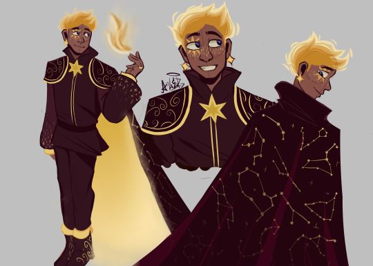
THE MOMENT WE WERE ALL WAITING FOR, FINALLY FINISHED THE DESIGN OF ASTER YESSSSSS ✨✨✨✨✨✨❤❤
This design belongs to the Wish rewrite called "The kingdom of wishes" (Written by @annymation and soon illustrated by @emillyverse and me)
Sorry for the delay, but this guy had so many things to draw and I also had a thousand ideas that it took me a while to capture them all (4 drawings wow, even I'm surprised lol)
Now after this introduction I will tell you the procedure of its design :]
2D MODEL:
-Maybe some don't notice it, but for the 2D drawing of Aster I didn't add many shadows, because in the classic Disney movies the animation doesn't have many shadows if we look closely, this is for several reasons (at that time they had to inking FRAME BY FRAME, can you imagine how much longer it would have taken to add detailed shadows? I really have respect for the animators)

(Here are some examples of what I'm trying to explain)
-As I said before, I didn't detach myself much from the concept art of the movie, I just added some other details that occurred to me, Anny and Emy.
-We decided that his cape would have the constellations of the signs of the zodiac (It was Emy's idea), which in the final result are on the cape, the constellations are noticeable more or less depending on Aster's mood.
-In the Wish rewrite it is mentioned that Aster's hair is like a candle (Reference to Hades) so I decided not to add the lineart in that part
His hair changes depending on his emotions, but not only that, but also his lineart, the calmer he is, the cleaner his animation will be, however with strong emotions (anger, sadness, nervousness) his details will be more neglected, especially when He is REALLY angry, by the way I made his hair look like a flame to give more drama to his design and also make a reference to Ember from Elemental
And as a final detail, the star-shaped gem that she has as a brooch changes color, just like her earrings.
3D MODEL:
-When Aster disguises himself as a human, his details on his clothes would disappear and the shape of his accessories would change to ones without a star shape, also the tone of yellow would look duller, you know so as not to draw attention (although he is dressed like a prince with a giant cape, the boy doesn't know how to hide the truth very well lmao)
-In general, it's just that the design becomes simpler, the only thing that changes is her hair that is no longer a flame, her freckles that are no longer little stars, her clothes no longer have so many details and her mark on her eye disappears( ̄▽ ̄) .
By the way, I wanted to thank @the-autistic-idiot for giving us the great idea of Aster having a star-shaped mark on his eye :D.
-Also, I think that those who have seen my other Wish redesigns are wondering why it seems like I had spit a rainbow at Aster's 3D drawings, what happened is that when I was painting my neurons said ✨Change your coloring✨ and well, The drawing in the end came out like this, although I honestly like it better, it better represents how I draw in a traditional way
Yes, basically the coloring of my drawings is as if a unicorn had spit on them lol
FINAL COMMENTS:
-It was very fun to draw Aster! The boy really has a lot of changes, but thanks to him I already discovered my digital drawing style so I am satisfied.
-Again sorry for the delay, I know that for many Aster must be their favorite character so I hope your wait was worth it :]
See you next time!✨✨
#disney wish#wish 2023#disney#wish movie#sketch#wish#art#artists on tumblr#artwork#drawing#star wish#starboy#human star#wish star#starsha#star redesing#the kingdom of wishes#the kingdom of wishes fandom#the kingdom of wishes au#starboy wish#starboy x asha#asha and starboy#wish concept art#asha x star#wish asha#wish disney#disney fanart#disney movies#disney animation#walt disney animation studios
351 notes
·
View notes
Note
i keep wanting to draw anthro maggots but they end up looking like beetle larvae instead- any ideas on how one might stylize a maggot person to make it a little more distinctly A Maggot? it's especially hard to me bc maggots are like THE MOST featureless insect larvae.... which i suppose counts as a defining feature in and of itself- but i dunno. im mostly just curious to hear your approach!!!
Yeah beetle grubs, caterpillars and a lot of other insect larvae have armored heads with complete jaws structures as well as six little legs, plus they often have a defined looking "top" and "bottom" with ridged and wrinkles almost like they got soft armored down their back
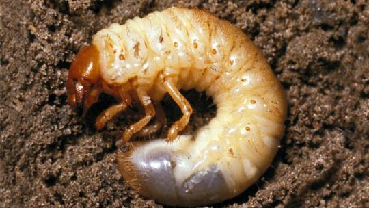
But maggots are weird! They streamlined EVERYTHING down to where they have no legs at all, not even vestigial ones, and their body segments almost evolved towards something like radial symmetry by being the same all the way around!
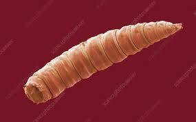
Then there's the fact that they sort of lost most of a "head." Not only is there no exoskeletal cranial case (bug skull) to protect it but there are no jaws and never any eyes; there's just a little hole for drinking liquefied food, a pair of tusk-like hooks for gripping surfaces, and a pair of eye-like knobs that are actually chemosensory (noses)
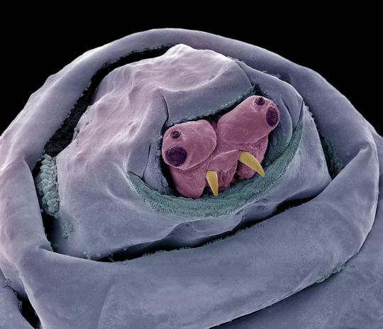
The weird, tiny walrus-face is totally unique! They don't have any chewing mouthparts because they only need to "drink" the particles of rotting matter they live on, and like adult flies, they help this along by secreting digestive enzymes!
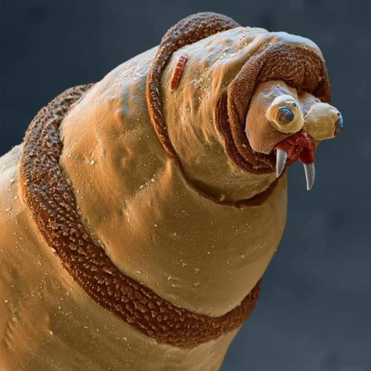
Maggots also have these very distinct, furry looking bands at every segment, which help them grip surfaces like a tire tread or the sole of a shoe.
If you compare this photo with the one above you'll also notice how the segments can retract in and out like a telescope!
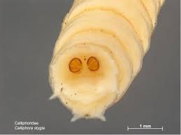
The last special thing about common maggot anatomy is that they are technically semi-aquatic animals, because maggots evolved to be buried head-first completely in their own food as much as possible and rotten corpses are WET. In order to breathe, maggots have a pair of breathing spiracles on their rear ends, which they try to keep exposed to the air!
There are exceptions to all of this, though; there are species that can be fully aquatic, fully terrestrial, herbivorous, parasitic or predatory, and some ancient fly groups (including mosquitoes!) whose larvae still have fully armored heads and even eyes. Everything above is universal to the maggots you find in rotten stuff though, so what most people think of when they hear the term :)
When I designed a hybrid human and blowfly maggot for the Mortasheen setting I deliberately made it look like a doofy cartoon Walrus, and I gave its segments large spines that can be seen in some parasitic maggots, including botflies:
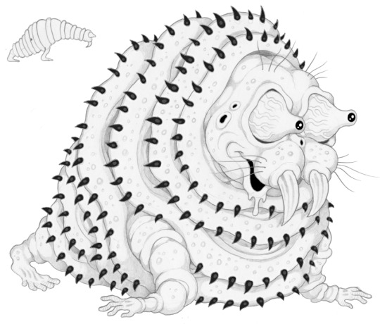
And when I made a maggot character for my webcomic Awful Hospital I designed her like a little spacesuit or a parka (the resemblance to Kenny was an accident)
Actually I don't think I ever shared this most recent "main artwork" of Maggie. I don't know what idea inspiration any of this might provide but basically a maggot is a prickly living sock with fangs.
Or I guess from a design and engineering perspective, a maggot is a biological drill. The tiny end starts a hole, the rest of the body is just a flaring cone perfectly equipped to keep making the hole deeper.
385 notes
·
View notes
Note
Howdy!
I am here to talk about Viv's horrible character designs.
From an animator perspective, they suck.
Here's why
1. The characters have way too much detail
For animation, more lines equal more work. You're going to be drawing them over and over, and it just creates more stress and work for the animators.
For example, I took one of the most egregious designs in HB (Beelzebub) and simplified it to be animation friendly.
(Can't send it here but I'll probably make a post about it or something.)
2. There's too much of 1 color
WHY IS THERE SO MUCH RED??
Especially since they're in a primarily red background, they don't stand out AT ALL.
Like how am I supposed to see them if they blend in to the background??
3. I have no idea what half of them are supposed to be
Charlie is based off a doll?
Alastor is based off of a deer?
Katie Killjoy is based off of a praying mantis?
Angel Dust is based off of a spider?
Beelzebub is supposed to be well... Beelzebub?
When designing characters, they need to be clear on what they're supposed to be! And no, explaining it on Twitter does not count.
4. The animation reference sheets are garbage
No wonder there's so much animation errors. There's no facial expression sheets, lip sync guide, nothing. It's just a 4 angle turnaround sheet where the character is in complex poses all the time.
If you Google Lackadaisy's animation reference sheets and then look at HB's, it's like night and day.
I'm more than willing to send some examples (along with the edit I did) if you want
So yeah, what are your thoughts?
These are all great points! I think you summed up the main problems very well, but I'll elaborate on each of them. I'm no expert at character design or animation by any means, but I'll do my best to explain my points!
First of all, like you said, the character designs are way too complicated. Anyone who knows even the slightest amount about animation knows you want to simplify and streamline your designs as much as possible to make it easier on the animators. Vivzie is way too obsessed with her Deviantart OC lookin'-ass character designs to actually do this, even though it would seriously help to make the animation process way faster and easier. Beelzebub is seriously the best (or worst?) example of this.
I feel so bad for the poor souls who had to animate this. There are just way too many moving parts here, from her multiple arms, her wings, her markings, to her freaking lava lamp hair and tail?? It's just awful. And so many of Viv's designs suffer this problem, I could go on and on.
Like, I think it actually is a nice looking design, as a still image. Maybe not for the demon Beelzebub, but as a general furry OC, I think she's cute. But that's beside the point. I would love to see your redesign of her!
Next, the RED. So, most of the characters we see in Helluva Boss are red-skinned imps, which has been a common depiction of demons for centuries. One big problem I have is that there's little contrast in these designs. Let's look at our three main imps.
Aside from some white and yellow highlights, they're all mostly red and black. Their color palettes aren't distinct in the slightest! And, I mean, come on. Red accessories against what's almost the exact same shade of red skin? Really? It just doesn't look good. A little contrast here and there goes a long way, like... maybe make Moxxie's bowtie blue? Or Blitz's pendant green? I don't know, anything to help each character stand out, and help give them more visual intrigue.
It doesn't help that most of the backgrounds are primarily shades of red, too. Here's a few screenshots I found that really show this problem.
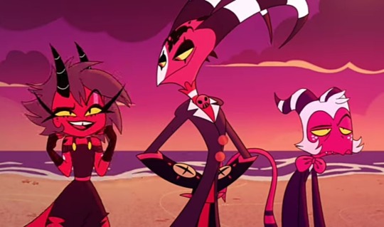
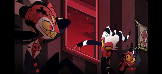
Look at all that fucking red. Like you said, there's such little color variation that the characters blend into the background. Now, to be fair, I did specifically choose these screenshots because I think they really highlight the problem, but this really is what so much of the show looks like. Granted, we do have a bit more variety in the different rings of Hell, each with their own main color, but this is still too much red, considering how much the color comprises the main characters' designs.
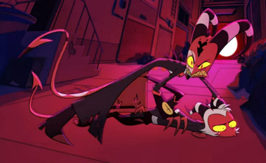
Next, like you said, Vivzie is really bad at making characters actually look like the things they're supposed to look like. Let's take Alastor as an example!
Oh boy! More red and black. So, Alastor here is supposed to be a deer. What's the first physical characteristic that comes to mind when you think of a deer?
Yeah, those big, impressive antlers! So... where are his? Oh, they're those tiny little forks on his head that are almost entirely obscured by his stupid emo hair. Like, come on! Giving him bigger antlers would have made him look so much cooler and more intimidating, and it would have been a great focal point for his design! It's such a missed opportunity. (I know he has bigger antlers in his scarier "demon" form, but you still could have made these a little more impressive.) And don't even get me started on those ears... they look more like fox ears or something. Like you said, a good design shouldn't need to be explained through supplementary material. We should be able to tell what a character is supposed to be just from looking at them!
Another great example is Angel Dust, who, despite being a spider, lacks so many distinct features we associate with spiders! He only has six legs instead of eight, he doesn't have pedipalps or chelicerae, and he also lacks that big old spider booty, which I think is such a missed opportunity, considering he is supposed to be in the sex industry. He isn't even remotely shaped like a spider, he looks more like a fuzzy stick bug or something.
Part of me feels like Viv is too afraid to make her characters look unique, so she just goes with the same, skinny humanoid design for just about everything. It's such a shame, because I really do think she is a talented artist who can make some really interesting designs. But then again, she also gave us Beelzebub, so... maybe not.
As for the reference sheets, maybe I wasn't looking hard enough but I couldn't find any official ones for the main characters, so if you could send those my way I would appreciate it! Though it honestly wouldn't surprise me if they were bad. I did look up Lackadaisy's and found them pretty easily and...
This is so freaking comprehensive and detailed, it's incredible! Look at all those poses and facial expressions!
Comparing Vivzie's works to Tracy's feels kind of unfair, since Tracy has been working on Lackadaisy for 17 years, and it really shows. This is leaps and bounds above Helluva Boss and Hazbin Hotel in quality. Rocky's design is tight; it's detailed, but not overly complicated. There isn't an obnoxious overuse of highly saturated colors, and there's such nice contrast between his fur, his eyes, suit, and tie, making his design very nice to look at. You can also tell so much about his personality and the world he lives in just from his appearance. It's such a good design, and Rocky is just one example from Lackadaisy! All of Tracy's designs are memorable and stand out from one another, unlike so many of Vivzie's characters, whose designs honestly feel interchangable.
So much thought and care has gone into Lackadaisy, and I seriously cannot wait for the full series, as well as all the other amazing indie animated series that have been coming out recently. It's sad that Helluva Boss is seen as the pinnacle of indie animation, when there are so many other series out there that are just.. better! Lackadaisy, obviously, but we've also got Digital Circus, Murder Drones, Monkey Wrench, and so many others that deserve way more appreciation than what Helluva Boss receives. And that's just from an art direction standpoint, we aren't even talking about writing. That's a whole other can of worms.
All of that being said, it's obvious that a ton of love and hard work went into Helluva Boss, and I hold absolutely nothing against the animators and artists at Spindlehorse. These poor design choices are a hallmark of Vivzie's art style, and they're simply working with what they've got. There is such wasted potential here because it feels like Vivzie is too afraid to step outside her comfort zone and design something that isn't a brightly colored, sharp-toothed twink, or skinny anthro wolf girl.
Anyways, that about wraps up my thoughts. Thanks for the ask, this was fun to delve into! And again, I'd be very interested in seeing you post your redesigns! 👀
163 notes
·
View notes
Text
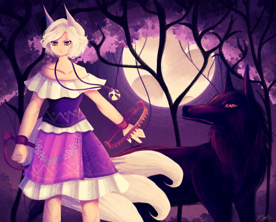
Ok the WIP I posted a little while ago is no loner a WIP yipeeeeeee I am so tired of looking at this drawing.
Artist's Notes:
THIS DRAWING IS FINALLY DONE YAAAAAAAAAAAAAAAAAAY!
Ok so this drawing was a WIP that I had had sitting around for a while, and so because I wanted to do a test run with the new face style I'm trying out, I decided to pick it back up again. Now you may notice that compared to the other version of the WIP, the shading is different, and that's because I had to change all of it to match the light source of the moon, which was.... not exactly fun (especially cuz I stayed up late at night to finish this which was tiring), but it was worth it because I am a lot happier with the shading now. Also, when I initially redid the shading on the white trim of her outfit, I ended up making them look like indiscreet white blobs that just looked... bad, so I had to fix that and I think it looks a lot better.
My favourite parts of this drawing have to be the face and the hair, though I'm not surprised about how much I like the hair since hair is my favourite thing to draw. Also the wolf, I really like how the wolf turned out, since I also love drawing animals from time to time. I also like how the background turned out.
Also, Enoko's design was a hit hard to get right, and I decided to add the white trim separating her shirt and skirt mainly because I didn't like how abruptly it changed in the original design. Also, for some reason her dress makes me think of 1800s-y southern/western clothes, which has given me the headcanon that Saki gave her these clothes when they first met. Makes me wanna draw the two of them together in very western styled clothes, I think it would be cute. I also changed up some of the colours on her original design to fit in more with the palette that I was going for with this piece. Also, I like how her tails turned out, mainly because when I was working on some of the sketch for this I tried to make them smaller, but they didn't look right so I just went "fuck it" and made them big and poofy. Also drawing her wolf ears was fun, I like drawing simplified wolf ears like that. Overall, I'd say I did a good job incorporating elements (like the bear trap hands, the tails, the gem) in a way that didn't feel like they were out of place in the piece (something I was concerned about with Enoko's design).
All in all, I wouldn't call this my best work, but I do like a lot of aspects of it. I've also noticed that I'm kinda getting a bit frustrated with certain parts of my style like the lighting (mainly the lighting), so I think I wanna try and branch back into that more painterly style that I started out with when I first started posting here while still mixing in some elements of my lineless style. Also, I need to get better with my colour values, mainly just for clarity since I kinda think that's where this drawing falls flat a little.
99 notes
·
View notes
Text
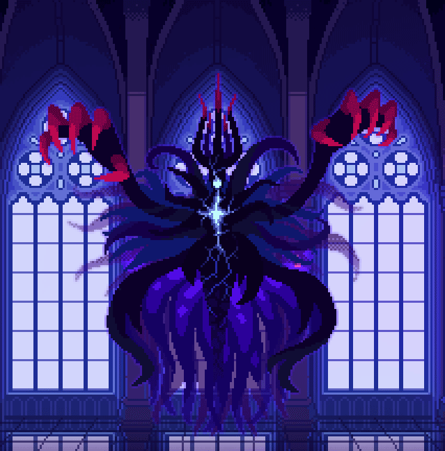
Update on The Dark Queen of Mortholme!
Phase one is now essentially completed for art, code and dialogue. Onwards to phase two; because every good boss fight needs that part where the boss gets unhinged and gains a whole new set of attacks.
I too have chosen to be unhinged and made a design for the Queen's final form that gobbles up animation work hours like nothing I've done before with pixel art.
Concept sketches under the cut:
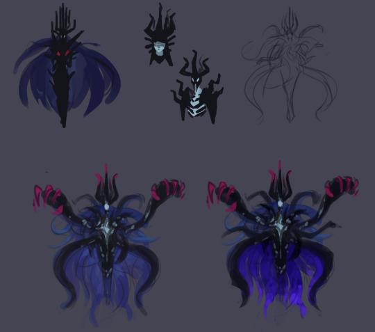
Initially I didn't have any ideas beyond doing a more monstrous design that amps up the Queen's features and takes cues from the shapes and colours of her original spell animations. However after writing the dialogue leading up to the transformation I immediately landed on a specific concept.
The transformation is an outburst. It's a manifestation of the Queen's terror and defiance towards her approaching death. She's unraveling, and in doing so she's channeling more of her innate violent power that she doesn't usually let out. She's essentially been having a long argument with the Hero about who they believe they are. Thus far she's gotten by being all smug and detached, but now she's losing and forced to reveal more of her true self to continue.
So her final form's design should convey 1. an outburst, and 2. the unraveling of a false front. Her base design's spikes, hair and skirt all erupt out into the wilder shape language of her shadowy spell-tendrils. They can handily be used to draw the eye from all directions towards the center of her chest, where I wanted to have this cracking pattern, like something hidden inside her is coming out. It's bright as if blindingly powerful, yet the cracks make her seem more damaged and vulnerable than her base form.
Continuing with the theme of an inner self showing through, the skirt's interior is also more visible than before. The flared jellyfish-esque shape connects with the deep sea vibe of the tentacles and contributes to the drama of a nonhuman silhouette.
A big thing for the silhouette is of course the massive hands. What's the thematic explanation for those? Absolutely nothing, I just think they look cool and dangerous.
Finally, lot of asymmetry was also introduced, both to increase the visual interest of such a large sprite, and to make her look like she's really losing it.
---
A note on animating this monstrosity: I've been trying to come up with a whole lot of cheats to keep a complex sprite like this as animated as possible without spending the rest of my life making this game. Early on I decided she should float, just so her idle animation can also be a moving one.
Secondly, the sprite is cut up to pieces so that I can keep reusing the loop of the writhing tentacles while moving her hands, for example. This is not something I like doing because in believable animation, motion in one part of the body always affects the other parts of the body. Treating a character as one entire whole when animating will make them feel more tangible, but alas, it's a compromise to avoid spending a hundred years in pixel-pushing jail. Like, I would love to see those tendrils flutter around behind her as she swoops across the room for her attacks, but... it'll be a lot more reasonable to move her as little as possible and instead add oomph to her attacks with some effects animations.
Anyways thank you for reading about monstrosity, she might be a pain in the butt to move but she brings me joy
#I have not been very good at making this dev blogging a regular thing#busy enough making the game and whatnot else#but if you enjoy reading this then I'm glad!#pixel art#animation#character design#game development#the dark queen of mortholme
87 notes
·
View notes
Text
On the ADHD demigods' stim habits (headcanon list)
Percy
He talks and mutters to himself a lot and he also paces around his cabin
Restless Leg(TM)
He used to chew on things a lot but adults told him that he was Not Allowed to bite pencils or shirt sleeves or paper or anything so his outlet is mostly snacks, chewy candy is the best for this
Someone get him a seashell chewy necklace please
Oh you know what they should have stim toys at the CHB gift shop for all the ADHD kiddos
He also probably cracks his knuckles and joints a lot
He hums when there's a song stuck in his head and it's really annoying but he can't really stop it cause he doesn't notice until someone gets mad at him and then hes like ??
Annabeth
Annabeth tends to chew up her pencils a lot
She also compulsively daydreams and builds designs of buildings in her head and reviews lists of stuff she wants to remember
She finds herself doing random math while she's supposed to be paying attention. Like if someone is telling her something and her brain drifts off more often than not she's looking at something around and being like "let me just calculate how many bricks are probably in that stack over there" or "hmm i wonder how many gallons of water are in the canoe lake"
She also gets distracted if there's any other social interactions of people around her and she just people watches and makes inferences about what people are feeling and whats going on in their lives
Also she chews her hair and sometimes puts little braids in it
She picks at her skin too a lot and sometimes pulls out strands of hair
Piper
Piper flaps her hands a lot especially when she's excited
She flips and braids her hair too
If she has feathers on her she will sometimes take it out if she's bored and either preen it with her fingers or use it to tickle someone to annoy them
She sings a lot but mostly to herself and sometimes she can be heard humming or softly singing without noticing
If she has any kind of paper available, like notebook paper or napkins or maybe candy or gum wrappers, sometimes she'll make little origami things
She also picks at her nails quite a bit
Leo
Leo has the most stims that he's unable to mask, as we know already.
He taps on surfaces and messes with his clothing a lot
He also whistles sometimes which can get annoying to people around him so he tries not to do that but if he's alone or really concentrating on something he will
He will also play with pretty much anything he finds on the ground like paper clips and those office clamp things and he'll take apart mechanical pencils and pens and put them back together and if he finds a tack or a safety pin or something there's a 90 percent chance he'll stab it through the skin of his finger(s)
If he's outside he'll pick up leaves and flowers and shred them or pick up sticks and break them
He was also probably one of those kids who would put glue on his hands so he could peel it off
Jason
i wasnt sure if Jason had ADHD but I looked it up and it said he did so oh well lol
Hes like. Freakily good at masking stims and it kinda creeps everyone out especially the CHB demigods
BUT he still has them
He have the restless leg
He also does like random stretching sometimes
When he's standing in one place for a while he kinda stands on one leg or bounces his heels
Sometimes he'll pick up objects from the ground or something and play with it like Leo does, especially if he's outside and there's like rocks or something
He does a similar thing to Annabeth too but instead of math he'll try to identify any animal noises or animals he sees like birds in the sky or like if he hears a dog bark he'll try to figure out what kind of dog
Hazel
Hazel's stims are the least obvious but they are definitely there.
If she has a view of outside she will gaze out of the window or look around her and figure out how many types of trees or whatever that she can see
She will also mess with the seams or edges of her clothing
If she has paper around she'll draw horses or other animals or sometimes people or she'll practice her cursive letters and make them fancy
She picks at her skin and her hair as well
Frank
Frank does not have ADHD. He sits there quietly and everyone thinks hes weird. Sometimes he gets wiggly if he's nervous but otherwise nah
102 notes
·
View notes
Text
Long hair Macaque, my beloved-
No but srsly, one of my favourite designs is just long hair mac and in this au Mammy's figure is just mostly hair.
I was trying to recreate this screenshot:

Obviously there's some difference like I tend to draw a bit chibi (big heads) and I didn't want to make Mac's hair THAT voluminous-
I wanted to achieve sort of a gypsy vibe with these little skrimblos
AND THEN I FOUND THESE:
And I could NOT pass it up.
So yeah...
Oh! And I also gave the sparkly drip to their ears
(Sh!t I just realised, I forgot the shadow creatures... I'll see if I can add them in later)
I COULDN'T for the life of me figure out the hundred yard stare to match with Mac's sharp eyes (how I draw him) and not make it look goofy so I made them spoopy and glowing instead
I sadly don't have much to say about Bai He here since her black hair didn't leave that much room for shading in a darkened environment (I'm so sorry) And this piece was to show off Mac's design more anyway (I promise Bai He will get her spotlight)
(Also Bai He, nor Mk nor Macaque wears shoes. Wukong is the only one in the family who does and I find that funny)
But oh! The hair? Here comes the fun part
(No his hair isn't purple, I just used purple to shade here)
You see I WAS going to use black hair for this photo but i soon realised how much of a pain it was just to shade it (cause i couldn't) and I was just WISHING I could use his white fur instead
And then I realised....
The white fur could be his winter coat.
Some animal's shed their fur in the winter (I think some rabbits do) and grow a new coat, occasionally with a different colour.
Therefore I could make the white fur the winter coat and during the story, his fur could be black to show how much time has passed since Bai He last saw her Baba...
Mwuahahahahahhahahahaha I'm so evil
(I was very proud of myself)
(Also I know macaques don't grow winter coats but just let me have this one ok?)
And why doesn't Bai He have white fur as well then? Well maybe she's just a different kind of monkey or perhaps it's just an age thing.
Funnily enough, when I showed this to my friend, she said he looked heavenly which is funny cause. As much as I love him, Macaque is a smug bastard and he knows it.
Like I know a lot of it was due to trauma BUT STILL
I just personally dislike how the fandom sometimes makes him seem like he could do no wrong and he is "uwu delicate babygirl that needs to be protected at all costs" when this boi is fockin FERAL man.
So despite taking a bit of a back seat in the main plot for this au, Macaque is still a smug bastard behind the scenes as much as he is a good dad
(Gosh sorry for the rant, I just had that pent up for a while now and needed to get it off my chest)
I wanted to post this yesterday on Friday 13th but oh well,
I hope I achieved the mysterious spoopy vibes as the original lol
(Click photo for less sh!tty quality)
(Also pls reblog, as much as I really appreciate feedback in general, I really like this piece and want to show it to more people...)
Gosh we are on a roll with this Shadowalkers au huh?
#art#lmk#my beloved#pog champ#py's_art#lego monkie kid#lmk au#liu er mihou#lmk bai he#lmk macaque#lmk six eared macaque#Shadowalkers au#monkey bai he#bai he will steal your kneecaps#macaque is bai he's dad#dad macaque#wolfwalkers#wolfwalkers au
228 notes
·
View notes
Text
Helluva Rewrite (and some of my personal doodles)
Alrighty, so I finally found the motivation to draw up the entire I.M.P crew and finalize their designs! Introducing my version of the new and improved Immediate Murder Professionals!

I'm so freaking lazy so I didn't add shading or anything extra like that because ughhh. I also decided on some defining traits for imps depending on their ring, but only for the gang and the rings we've seen in the show so far
Wrath imps are larger, stronger, and spikier than other imps. Lust imps have varied bodies, but all have heart shaped barbs on their tails and leathery wings on their lower back. Greed imps are more slender than other imps and often wear jewelry. Gluttony imps are small and fast, high metabolisms so they can gorge. Sloth imps are easy to identify because they usually are just lying there doing fuck all and lack barbs on their tails.
Also, the scarring for imps is the same. White markings indicate scars. In the show I feel like it’s hard to tell what’s a scar (like Blitzo’s facial marks) and what’s a birth mark (like Moxxie’s freckles) so for my own sake, white marks are scars, black marks are birth marks or tattoos, end of story. Millie got her scars from fighting in the wrath ring, Blitzo got his scars from the explosion, and Moxxie’s freckle-like scars are cigarette burns. Should also note that imps are immune to hellfire, but not normal fire because... uhhh idk honestly it just seems more logical.
~ Helluva cutoff starts here ~
I kinda wanna show off my own imp designs for my little demon thing because helluva boss posts get traction and I just wanted someone to see them, so if you only came here for helluva content, feel free to stop reading lol
Okay, so I wanted the imps to all look like the same species but at the same time not at all. Essentially the imps in my series are based more on folklore surrounding them. In christian folklore imps are straight up evil, but I want all of my imps to just be little guys. Look at em, they’re just little guys. Imps were sometimes thought of as the familiars of witches, taking forms of different animals, so I wanted some of the imps to look animalistic, but it’s their behavior that reflects it more (which is hard to show in a still doodle). Also the imps are just color coded here so I know which is which, imps aren’t actually these specific colors in my world.
Greed imps tend to bind themselves to objects that they particularly adore – in some tellings imps were bound to objects like crystals and could be summoned by their masters. So Greed imps often have a specific item bound to them that they guard with their lives.
Sloth imps are the most harmless when they’re tired, it’s when they’re awake that they become the full on imps of folklore. They’re often paid in sugar cubes and used as servants in the sloth ring.
Gluttony imps are alluding to the fae origin of imps in Germanic folklore, having wings and being generally bug like and little shits. I wanted them to look like pixies almost.
Envy imps are the more attention seeking type who play tricks on humans to garner a reaction. Tricks such as attempting to drown people and such – harmless fun, you know? They’re actually a little based on Kappa I'll admit.
Lust imps have the habit of snatching babies, as in a lot of demons associated with lust (such as Lilith) tend to be obsessed with babies/pregnancy. The lust imps are nearly infertile, so they love taking babies to raise, then discard them once they’re annoyed.
Pride imps are based on the Lincoln imp (in short an Imp threw a rock at an angel and got turned into stone). They’re fluffy and covered in shiny fur since they live in the frozen layer of hell. Their horns are the largest of all imps, and their biggest source of pride – like if they break their horns, they’d rather die than live with the shame because their horns don’t grow back.
Wrath imps are based on the old art of imps you can find – bald little creatures with horns and tails. They’re the more feral animalistic imps, often acting on pure instinct and lacking much social structure. They do tend to exercise in their own way, as strength is their greatest feature.
Anywho if you read all that omg thank you for feeding my ego teehee. But for real, as much as I hate digital, I did enjoy drawing out the imp gang, I might (keyword MIGHT) draw out some rewritten scenes in comic format the most daunting part is actually doing it lmao.
I probably won't shove my own stuff into posts too often, I mostly did it because I wanted to compare my ideas for Imps to Viv's because I think mine are better sorry not sorry lmao. I like to actually research what I'm doing and incorporate it into my art and creations because i think of it like little easter eggs for people who like the things I like. Viv's version of Hell is my least favorite mostly because everything she does feels like bible fanfiction written by a middle schooler who thinks shouting penis in class is the peak of comedy.
#anti vivziepop#anti helluva boss#helluva boss redesign#helluva boss rewrite#helluva rewrite#oc art#minor demonology discussion#my art
261 notes
·
View notes
Last Seen Blogs
remaede
moved to youthgone.
necromancy-enthusiast
Murder Most Foul and Unnatural
mskenway97
You gotta venture life go get it burn your dread

oceantornadoo
welcome to the tornado zone🌪️

londonoadams
LondonoAdams