#I’ve found some brushes on clip studio paint that I’m
Text

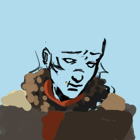
Flower crown Steven!
#anon I have seen your ask request for a flower crown shane to go along with Ryan and I promise I’ll do that next!!#shane is just the hardest to draw out of all of them abhsbsjw#god I love Stevens smile so much#I’ve found some brushes on clip studio paint that I’m#just absolutely loving#it’s making art so much funnn#my art
331 notes
·
View notes
Note
What app do you draw on? And what brushes?
The app I use to draw is Clip Paint Studio EX!
As for brushes, it depends! When doodling I use a few of brushes!
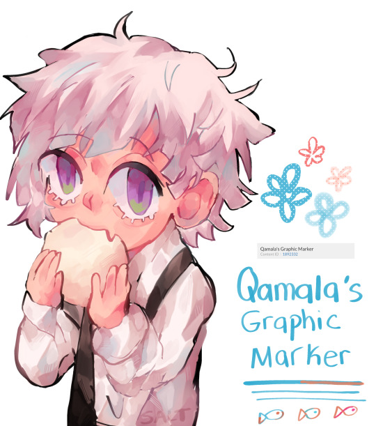
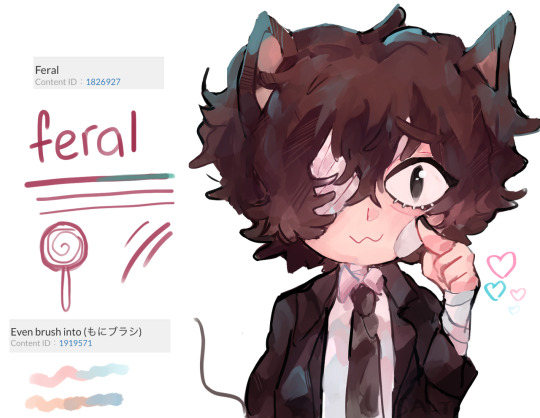
I mainly used the Astro Fluffy Brush for most of my posts(almost all of the latest ones) + Feral brush for some of them! Qamala’s Graphic Marker I’ve been using a bit more often but I was mainly using it for the initial sketches(sometimes).
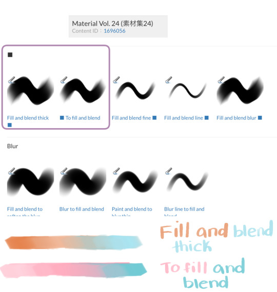
As for painting, I use the first two in the Material Vol.24 brush set!(for all of these at least). For my other posts, I think I randomly used all 9 brushes at random lol.

I’m on mobile currently and not sure if I can link multiple brushes so I included the Content IDs just in case!
All brushes can be found on the clip studio assets website!
#bungou stray dogs#bungo stray dogs#bsd art#bsd dazai#bsd atsushi#bsd akutagawa#ask#I almost never draw Aku or Atsu wow#my art#I had the edit the dazai one quickly
42 notes
·
View notes
Text
Artist of the Week!
So last weekend, I announced that I'd like to feature an artist every weekend for both new fandom joinees who might not have seen some of this art and older fans who like the nostalgia. This week's artist is Ash @aha-my-villainous-thoughts 💖 who also, wonderful that they are, agreed to answer a few questions for me!
Which App Do You Use To Draw
When I’m at my big set up I use Clip Studio Paint, I love it so much. It’s very straight forward to dip straight in, has all of the bells and whistles you need from an elite drawing program, and the community elements where you can see assets and brushes is a lot of fun - although I still to this day have no idea how to earn coins to buy assets?!
I use a XPPen Artist 15.6 Pro Graphics Tablet to draw into the program, although my best tip with graphics tablets is to get a screen protector, mine got covered in marks before I noticed.
Recently I also got an iPad 10.9 to use as a digital sketchbook I can carry around, and while I am enjoying Procreate, I think CSP is a better art program overall.
Fave Brushes?
On iPad I stick to the technical pen, studio pen and the soft airbrush, along with the textures and the light pen. I don’t think Procreate has great ‘painting’ brushes, whereas on CSP I would marry the Gouache brushes, I love how they blend and texture as you work.
Your favourite piece you’ve drawn?
I’m a super self indulgent artist, I try to draw the kind of stuff I like to look at, so it’s a lot of colour, a lot of fabric and details. My fave piece for detail is the one I did for the OFMD RBB last year - Crescente Devotione, there’s a blushing sentient stool in it!
For colour I’m in love with this sleepy time Ed in a lil negligee and a Holly Golightly eyemask, he's my lock screen because I'm trash.
Who harder to draw: Ed or Stede?
Oh for sure Stede. I love Rhys Darby, but the man has like no lips. I stand by this meltdown.
One essential tip for beginner artists?
Comparison is the thief of joy, don’t measure yourself against others - particularly when you’re finding your groove. Be self indulgent af. Also get a screen protector for whatever digital screen you draw on, and BACK. THINGS. UP. Whether in an online account, or on an external harddrive - or both?! BACK THAT SHIT UP.
Why OFMD?
I’ve been in a few fandoms in the past, always as a pretty passive enjoyer, little fanart here or there, little fanfic sprinkled around, but there’s just something about the way this fandom feels? It feels like a group of friends who’ve got their own lives and their goals, but they still exist in each other's orbit, it’s like this feeling of returning home to somewhere you’re always welcome. There’s so many good moments in the show for both comedy and some gut wrenching pathos. Sign up for the hot guy in leather and get got by this beautiful delicate little love story. It’s something about queer joy of thriving, not just surviving. Something about finding love and romance no matter your age or what’s past before. Something about found family, and unlikely friendships, and community and silliness. I was already a goner when Taika put on the wig, but then when he teared up in a blanket fort while trying not to die? Excuse me sir, I did not need feelings that powerful. It was literally waking me up at night thinking about his last shot weeping in the nook - like are you kidding me?! I’m supposed to finish watching and be normal after that??
#artist of the week#everyone go follow ash and gear up for all the amazing art that would now be posted heheh
36 notes
·
View notes
Note
if youre comfortable sharing, whats your rendering process? what are some ways you learned? your art is very yummy
HSHSHHSHS hello!!!!!!!!!! first off omg,,,, thank you so much,,,,🤭🤭
secondly!!!! heres my attempt at a rendering process explanation. uhm. warning ive never really been asked to explain it before please bare with me
BUT. here goes. this'll probably be ungodly long apologies
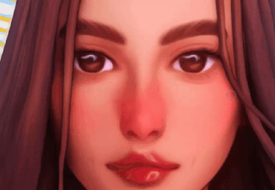
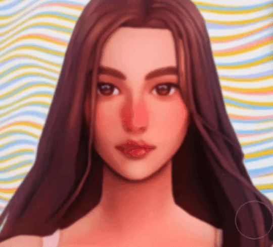
so when i render my biggest rule is basically Do Not Blend Ever. what i do is do my sketch, then flats, then basic placement of blush/shadows+darkest parts/etc and then i go in and just colourpick the inbetweens+place them between colours in small strokes until the changes in colour don't look too sharp/jarring
here's some examples of the process;;;
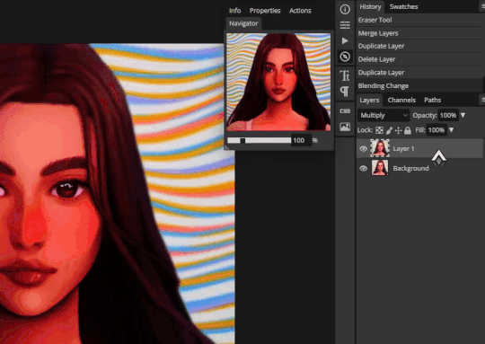
(still a wip but HSHSHHS) so i work on 3 layers primarily (sometimes i do the hair+items that cover the face on another layer, too, though they might end up getting merged):
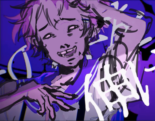
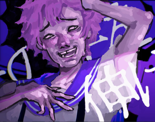
^ with just the sketch layer n flats / and then with the render layer added
i go in with a bigger brush to block in colour variation on the face on the flats layer and then paint over that, as well as over the sketch, with smaller strokes on a render layer- i never do lineart lol, and any "lineart" thats visible is just the sketch peeking through. I try to rely on colour and shadow to create shapes and boundaries instead of lines though this isn’t a hard and fast rule.
i also try to stick to the same pallette the entire drawing- once the flats and shadows are first roughly blocked in all the other tones/midshades/colours are basically just inbetweens picked directly from the drawing. Just me zooming in real close till I can see the pixels and colour picking where they sort of mix. (any smaller shifts in hue/tones are just colours with saturation slightly turned up or down, usually) im also not sure if this helps but i use the Sol brush from the clip studio assets store for literally everything from sketch to render, which is basically just a slightly soft opacity brush which ive deluded myself into thinking helps give my art a softer look. idfk if it does or not.:)
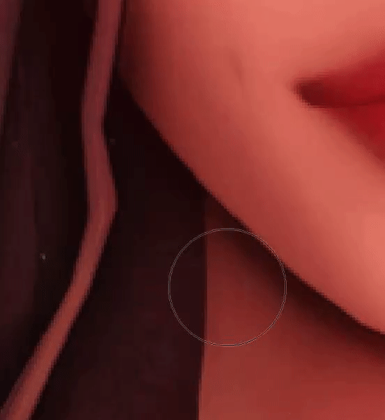
I like to use really saturated blush and for shadows I usually use two base colours; a warmer one and a colder one- a warmer one for smaller shadows and shadows near light and then colder ones for planes more in darkness. Also, usually, at the very end of the drawing I’ll add a layer that’s just fully yellow with colour burn or linear burn or multiply turned on and the opacity turned low just to make everything warmer.
(a little thing I like doing for shadows sometimes is never making them reach the edge of the plane; the actual edge is usually a slightly lighter shade and it sort of looks like stylised bounce light that would probably not be there but anyhoo)
but yeah,,,, Never Blend But Make It Look Almost Blended. I’ve been doing it forever,,,,,, and I really like the almost shiny feeling it gives things:)))
And where did I learn. Ough. A lot of what I do I figured out through trial and error and just drawing a bunch (IM SORRY THATS REALLY NOT HELPFUL) but some sources I looked towards were sinix design and bluebiscuits on YouTube!!!!! Sinix has a really good video on rendering skin which is where I sort of took my principles from and ran. And bluebiscuits was a huge inspiration for me when I started trying to render things beyond flats!!!!!!! They’re also where I found the sol brush, lol. Also just,,, the impressionist movement as a whole is a massive inspiration. The use of light and shapes to create form is just,,, omg. Especially Claude Monet in particular. (and for the basics of drawing I learnt from my aunt!)
and honestly, just observing people. A lot of the time when I’m watching a movie or on a walk or even just talking with someone I tend to start looking at their face, and the different planes, how light hits it and how shadow interacts with it, where the shadows are harsher/softer……….people are wild man
I really hope that made sense!!!!!! I’ve never tried explaining it before and honestly, I’m not even really sure how I do it. I just sorta. Switch off and start drawing, yk? BUT I HOPE IT HELPED!!!!🫶🫶💞💖
in case that was all utter nonsense here’s a speedpaint that’ll hopefully demonstrate my process;;
I also have straight up screen recordings of me drawing but. I don’t think anyone wants to sit though that
thank you for the ask!!!!!have a nice day/night and SORRY THAT ENDED UP THAT LONG
7 notes
·
View notes
Text
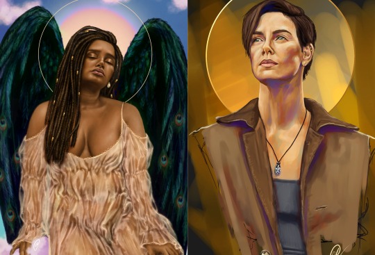
Lynn Hsu.
Lynn tells us about her methods for making her wonderful cartoons featured in The New Yorker and many other publications this week!
Bio: I worked as an architect for many years before changing paths to become a cartoonist and writer. While working as an architect, I dabbled in printmaking, painting, and humor writing, often collaborating with sketch comedy groups at ImprovBoston. When the theater shut down during the pandemic, I started cartooning, which I found therapeutic and fun, as it combined my love of drawing with humor writing. Online classes taught by Emily Flake, Amy Kurzweil, and other talented people, were incredibly helpful and inspiring. In 2022, I sold my first cartoon (below) to The New Yorker and soon after, my first Daily Shouts piece.
Find this print here!
My work has also appeared in publications such as Alta Journal, Air Mail, Weekly Humorist, Magazine of Fantasy & Science Fiction, WSJ, and The American Bystander (cartoon below).
Find this print here!
While I mostly focus on humor, I occasionally write darker stories for horror and sci-fi magazines like Space & Time. Currently, I reside in Boston with my husband, twin boys, and dog, Mochi, who provides emotional support when my work is rejected
Once I have a list of ideas and rough sketches, I draw the cartoon on my Samsung Galaxy Book 2-in-1 convertible laptop. It has a small built-in pen that comes with it. My preferred app is Clip Studio Paint, which is a less expensive alternative to Photoshop. I’m still experimenting with different brushes and washes in my work. For my posture, I use an adjustable stand by Lpoake. For my sanity, I often work on the porch so I can get some fresh air and vitamin D. Mochi keeps me company and nudges me periodically for attention.
Tool I wish I could use better: Watercolor. I love painting with oil and acrylics, but I struggle with washes and hope to improve.
Tool I wish I existed: A magic chair that heals back and shoulder pain (and also teleports you to any location in the world).
Tricks: Not a fancy trick, but I’ve been using Google Keep to jot ideas down in an organized way when I don’t have my sketchbook with me. I can access this list via phone, tablet, or computer.
Misc: Getting feedback on your work is invaluable. Sometimes, I’ll draw a cartoon and think it’s hilarious, but then I show it to my husband, who doesn’t understand the caption or the sketch. I’m fortunate to have found a group of supportive cartoonists with whom I can share my work and exchange comments on a regular basis. Online classes and workshops are also great ways to learn a new craft and meet other amazing artists, writers, and humorists.
Links:
Here’s my website: lynnihsu.com
I post cartoons on Instagram:@loopyline
For New Yorker cartoon prints: Conde Nast Store
---
If you enjoy this blog, and would like to contribute to labor and maintenance costs, there is a Patreon, and if you’d like to buy me a cup of coffee, there is a Ko-Fi account as well! I do this blog for free because accessible arts education is important to me, and your support helps a lot! You can also find more posts about art supplies on Case’s Instagram and Twitter! Thank you!
24 notes
·
View notes
Text
how I edit my sims screenshots without a tablet and downloading a program
So, I’m lazy. I own Clip Studio Paint and I own a tablet, but when I’m playing the sims I’m 90% of the time too lazy to paint over my pictures. But I’m still a sucker for ✨aesthetic✨ and I’ve been asked how I do it, so here’s a guide on how to! It might seem long but trust me, it’s super easy, especially when you get used to it.
First things to consider (but not essential)
○ Reshade makes all the difference! You can follow this tutorial without one and I will show you how you can work around it, but it really helps a lot because it acts like a lovely filter in-game. I recommend Gshade because it’s easy to disable so you can just turn it on when you need screenshots. It also has a lot of pre-made presets and supports reshade presets.
How to install Reshade on the Sims 4 || How to install Gshade on the Sims 4 || my fave reshade presets: daisies & rose colored lenses
note: Gshade also has this really cool function that allows you to cut out the background immediately in-game, which works if you have a flat CAS background (either default or custom). You can disable this when you’re finished taking screencaps as it turns the ‘transparent’ bits bright green in game, but saves as transparent.
○ Don’t want to / can’t install reshade/gshade? No worries, they are basically in-game photoshop. All you need is some psd (you don’t need photoshop to follow follow this step, trust!). I really reccomend intramoon’s psd/actions, so download the ones you like! You can also search for ‘psd download’ on tumblr and there will be plenty you can choose from.
Now to the actual editing! (aka the less boring bits)
1. Go to photopea.com and open your screenshot there by clicking “Open From Computer”. Photopea is entirely free and supports psd files too!
2. (Skip this if you want to keep your background) Assuming you didn’t activate ChromaKey with Gshade (skip this step if you did) - long press the eraser tool and pick “Background Eraser”. Do your magic.

note: you might want to fiddle with the brush size and “mode” depending on what results you get.
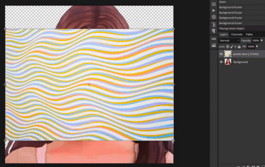
3. (Skip this if you kept your background) If you want to put a new background in, I recommend Pexels.com and search for “abstract background” or whatever you’d like. Once you’ve found one you like, download it.

Open your background in PhotoPea. However, do it through Open > Open & Place

Then resize the image that got imported and put it behind your sim. Bam, there’s your background!
If you’re happy with how it’s looking, merge the layers by right clicking your sim layer and click “Merge Down”
4. (skip this step if you don’t want to use any psds) Open your .psd by clicking “Open”

Then select all the layers and press Ctrl+C

Switch tab and go to the file you were working with, you can find your tabs underneath the top menu

Then once you’re there, press Ctrl+V and your .psd layers will import to that file. Now adjust it accordingly, it might require experimenting since all psd files are different. I typically just collapse the folder (if they have it) and lower the opacity.
Then once you’re finished, select all your layers and select “Flatten Image”

5. (Skip this if you used reshade) To add a soft glow, duplicate the layer by right clicking on it, select “Duplicate Layer” and then change the layer to “Overlay”. It will look extremely bright but don’t worry about that for now!

Go to Filter and press Blur > Gaussian Blur, then press OK.

Then lower the opacity to make it less bright. I usually have it very low, around 15 - 30%
6. Now it’s time to fix the jagged edges. Duplicate Layer by right clicking or press Ctrl+J

Go to Filter > Liquify
Now zoom in on the areas that stick out to you, that you’d like smoothed. Using the liquify brush, carefully manipulate the image until it looks how you’d like. You might have to play around with the settings, but I usually just change the brush size.
When you’re finished, press OK.

6. Now to polish your piece! Press Ctrl+J to duplicate your layer and then go to Filter > Stylize > Oil Paint
Untick “lighting” to get rid of the squiggly lines. t should now just look smooth, press OK.
Now go to eraser tool (you might have to hold it to get out of the “background eraser”. go to the brush settings and pick a soft brush, you can also adjust the size there.
Use the eraser to get back any detail that was lost when you used the oil paint effect. Usually this is around the eyes, but do it anywhere you feel like you want the detail restored. Click Ctrl+E to merge the layers once you’re finished, or use the flatten image method.
7. Duplicating the layer again (Ctrl+J), to get a more illustrated effect go to Filter > Blur > Surface Blur, then click OK. Repeat the Same process as you did at step 6 where you use the eraser brush to restore any detail lost (usually the hair), and then press Ctrl+E once you’re finished to merge your layer once more.

8. To add depth to the layer, duplicate the layer (Ctrl+J) and press Filter > Blur > Gaussian Blur. Change the radius to something low-ish and press OK.
Then using a bigger eraser brush, focus on the middle of the face/body, leaving the edges of the body/hair and background blurry. Then flatten the image once you’re finished (Ctrl+E)
9. To make ambient light, duplicate layer (Ctrl+J) and set the layer to Multiply. It will look very dark.

Click Ctrl+U and you will get a window that says “Hue Saturation”. Change it to a bit unnatural colour, I usually like pinkish tones but feel free to experiment. Don’t worry if it doesn’t look good right now. Lower the opacity a little bit, but not a lot. You still wand it to look a little odd.
Click on the black and white squares to make your colours black and white. Press the two arrows beneath it so that the white colour in top, then press on the Gradient Tool. Then go to the Menu and select the second option.

Use the gradient tool from one of the corners (select only one corner, feel free to experiment which one! All gives a different vibe), and drag it so that half is light and half still looks dark. Once you’re satisfied, flatten the image. (Ctrl+E)
10. For the last (and easiest step), sharpen your image. This time you don’t have to mess with the layers, just go to Filter > Sharpen and pick any of the sharpen options, I personally like Sharpen More. This maks the facial features pop.
That’s it! Simple, and trust me, the more times you do this, the easier it gets. ♥ I hope this was of any help!

263 notes
·
View notes
Note
Bruh how are u so good at putting ur ocs into wakfu screenshot?! Cause dang that is good
(yooo congrats on being my first question )
I get asked this lot, and i’m never quite sure what to say lol. The way I learned how to draw in the first place was by copying the wakfu art style, so the influence is inseparable from my art. I guess 11 year old me set myself on the right path, because i’m still going at it with wakfu art and (apparently) doing great.
Anything other than that is just looking for specific traits of the art style then trying to replicate it in screenshots. The first one i ever did, I used an edited copy of Yugo’s figure as a base. Taking screenshots and just drawing your characters over is a totally valid way to do it (and honestly much quicker), as long as everything is credited properly.
Best i can do is some tips before i get the motivation to drop a real tutorial
Big, stompy feet! Chunky forearms! Wide hands! (s3 looks much slimmer, though)
Faces have huge eyesAlso, most characters don’t have long chins
very subtle airbrush over shadowed areas, and for light (try to make it blend as much as possible, it should barely even be visible. like 5%-9% opacity)
Colored lineart! make a clipping layer then add your colors overtop (try to make it look like there’s no difference between lines and colors), then lower the opacity to around 10-15%
When adding shadows, use the base color on multiply
to get it to blend better with the environment, color pick prominent background colors and cover your character with them. lower opacity to the 0%-10% range (whatever suits the scene), and mess around with layer settings
Something I like to do to make it go better with the image quality is to merge my character into a single layer, then duplicate it twice. take 1 layer, then sharpen it to hell and back. take the other, and blur it until you can barely see the lineart. set both of the layers to around 0%-5% opacity, and it’ll look a bit more low-quality!
If you happen to use clip studio paint, i’ve found that a 3px brush on an average screenshot from fancaps.net is the same size as the show’s lineart
i hope that makes sense!! Other than that, the only thing else I can say is 1. use TONs of references using characters that are built similarly to yours, or have a feature that’s similar enough to yours, and 2. practice! It gets MUCH easier with time.
(VERY sorry for how long this is, i got a bit excited oTL)
#wakfu#wakfu season 3#wakfu season 4#wakfu oc#wakfu eliatrope#fanart#tutorial#wakfu tutorial#screenshot edit
13 notes
·
View notes
Note
Ik you've answered this/similar questions before but I've looked through some of ur tags and can't find it. I want to buy my sister a drawing tablet but really have no idea which ones are the best. Like I did look some things up, but I thought I'd ask for some people (who like draw on tablets) too.
no worries, for whatever reason my art advice tag is like 90% nonfunctional and it’s like, the only tag of mine that does that ☹️ i will say, i have only owned a couple different tablets (so obviously i’m not gonna be able to tell you if there are better models out there) but i’ve liked all of them!
i think this is the first tablet i ever used? it’s hard for me to be sure, because it was really long ago. basic wacom tablet with a black screen. it takes more effort to pick up the skill of putting your hand on a blank black surface while creating an image on the screen, but something cheap like this is nice if you’re not able to commit to something more expensive and aren’t sure how far you want to take the hobby.
(to be clear, it’s not like this kind of tablet necessarily limits you—ikimaru, who’s been a super popular digital artist for years, makes gorgeous art on a bamboo CTH-460 which is a model you can buy on ebay for $18. it’s just that it takes a little more getting used to.)
also, wacom is the brand i used for a basic tablet, and I didn’t mind mine, but i have heard wacom sometimes is a little sketchy with planned obsolescence type stuff 😵💫 like the pen nibs supposedly wear out way quicker than, for example, the huion brand, so you might want to check out what huion’s got. i will say: i used that wacom tablet for 1-6 hrs/day for several years and had no problems, BUT many people on the internet seem to prefer huion over wacom. up to you.
still, i honestly think you can do well with any tablet that has a stylus and pen pressure lol (which is basically all of them). like there are lots of different tablets with lots of different features out there, but the only feature that i found made a real difference to me was touchscreen vs. non-touchscreen.
non-touchscreen tablets are totally usable and usually way less expensive, but the touchscreen is really nice to have if it’s in your budget. it feels closer to traditional art and is easier to pick up.
I personally have never used a touchscreen tablet that was just a drawing tablet—i’ve used a surface pro 4 (a touchscreen computer) and an ipad pro. both were very nice. honestly, I didn’t notice a huge difference in the feeling of drawing on the screens of the surface pro vs the ipad—the biggest thing for me was the art programs. some programs are only compatible with computers and some programs are only compatible with ipads. here’s what I personally noticed:
krita (nice for painting) and ms paint (fun for dicking around in) are both NOT available on ipad, at least as far as i know
rebelle 5 pro (supposedly a very cool program for emulating real painting), which is currently on a huge sale rn (it’s $20, normally costs $150) and is also NOT available on ipad
paint tool sai, as far as i know, is not available on ipad
clip studio paint is available on BOTH ipad and computer, but is more expensive on ipad (it’s a monthly subscription instead of a one-time purchase).
procreate is ONLY compatible with ipad, and is, personally, my favorite art program i’ve ever used. there’s a brush or two from krita that i miss, but for the most part, procreate is solidly better than any other art program i’ve used.
most of the nicest animation programs seem to be incompatible with ipad; the ones that work on ipad are quite basic. this is the only major sticking point for me lol
one thing about ipad that you might’ve read about in your research is this feature that lets you tilt the pencil and draw as if you’re using the “flat” side of it:
this is sometimes cool and sometimes inconvenient, so it kinda balances out to neutral. if you’re torn between ipad and a different touchscreen tablet then don’t decide off this feature lol.
if your sister already has an ipad (or if you’ve got a family one that she has decent access to), it might be a nice thing to just get her a compatible apple pencil, so you can save money on the tablet.
but yeah! those are the models i’ve used and i’ve liked them all. even if you get her a relatively cheap non-touchscreen tablet she can still make really cool art with it and have a lot of fun. good luck!
13 notes
·
View notes
Text
OH ALSO as a fun little side project. ive been making a big google doc full of different artistic techniques by tearing apart clip studio paint’s settings to find niche opportunities and going on an odyssey through Youtube Search “Art Tutorial/Coloring Tutorial/How to Draw People/How to Draw Hair/How t”
It’s a passion project of mine, to make a collection of different methods of drawing because I realize a big plateau for artists is when they keep thinking “what do I want to draw” instead of “how do i want to draw.”
Honestly, it’s been pretty interesting so far! A couple tips that I’ve learned so far:
For watercolor (in clip studio paint), don’t rely on the brush’s watercolor edge. Seriously, you’ll get the edge every single time you make a brush stroke. INSTEAD go to layer settings -> border -> watercolor border so you can make a block of watercolor color and then adjust the border from there. You get much more control and can adjust blurriness, opacity, darkness, etc.
Holographic textures. I’m still looking into different ways of doing this, but gradient maps seem to be very popular. For those who dont know, gradient maps take a set greyscale tone and assign it a color (this color’s tone does not need to be equal to the grey tone).
Actually, on the topic of gradient maps. I only learned a few months ago that people color greyscale paintings using gradient maps, and that’s one of the methods used to make it not look god awfully muddy.
So I found this tutorial on Youtube about someone who shades by progressively making the shading change to a contrasting color and I. Am fascinated by that. Will get back to yall when I experiment with that. (For credit’s sake, the tutorial was made by @bluebescuits and can be found here, set to the beginning of that part of the video https://youtu.be/zZEF7SEh2S4?t=428)
COLOR JITTER. there are so many possibilities with this one. One thing I was doing back around artfight was selecting areas of light and using a HEAVILY color jittered brush to color it in. Then, select the shaded areas and do the same. Afterwards, I’d turn off the color jitter and just start rendering using whatever color I wanted. Usually, indigo/blue/purple colors would be used moreso for the darkest spots because they have a darker tone by default, and yellow/pink would be used for the lightest colors.
Because I’ve talked about color tone a few times, I feel like I need to include this Youtube tutorial, “HOW TO HYPERPOP (draw with saturated colors)”: https://youtu.be/NKV2VWWleBk It’s what originally inspired me to make this google doc, and absolutely exploits the tone-color relationship do make some REAL interesting art. I’d tag the creator, but I don’t think they have tumblr, but they’re badjaune on ig/twitter
ill get back to yall when i figure out how to do those parallel scribble/hatching painting look. i will crack the code on that one i want it so badly
ALSO this was the one i meant to add first and then almost forgot to add it. It’s fairly popular on tumblr but i don’t care it’s a very rad tutorial by @ratpunksdraw (found here https://www.tumblr.com/ratpunksdraw/689762046030577664/tutorial-under-cut-paper-textures-brushes?source=share ) which details how they make a quick frankly very good looking paper texture on their artwork + has image resources and i’ve tried this before for an artfight attack and it was fun as hell and not hard at all i would recommend this
#sketchmre tutorial#i GUESS#thats the tag now#for the 20 of my followers who draw#enjoy#i am investing way too much time into this#dwarfed only by the quite frankly embarrassing amount of time i spent researching stays and corsets so i could design undergarments for my d#nd party
8 notes
·
View notes
Text
So I did some more practice painting with a different brush and holy shit I fucking love this brush. In fact, it is very similar to my clip studio brushes if not better and I think I have finally found my groove again. So here’s the first rough tiny painting that I did.
Then I wanted to try and doodle the setting of one of my stories that I’ve had in my mind for ages and it came out beautifully.
The best part is possibly that it looks like pixel art, but it’s not fully pixel art. I think I may have just developed a new style.
Both of these have definitely helped me a lot with learning to not worry about details and in fact be able to more clearly get the images in my head out. So this was very rewarding and I’m insanely happy with this direction. I think I may do more things like these for a while.
3 notes
·
View notes
Text
Weekly Recap Jan 27 2023:
This week my social life has dominated my schedule, so I do not have much to share in the way of pet projects. That isn’t to say I did nothing this week.
My main goal this week was finishing up the TRG Animated models, to which I have effectively completed. Emile has been rerig fed and a number of his pieces have been swapped out for ones that fit the overall art style better (and some are even a bit more mobile). Tim has been completed entirely. Jon has been fine for a while, but I want to tweak a few internal details of the model around his neck and shoulders, as Jon, quite characteristically, has a clipping problem. That shouldn’t take more than ten minutes to fix though, and I will post turnarounds of all three of the boys once I have them done, tomorrow (homework permitting). Also hope to storyboard a test for Tim and Emile with a new timing system I have devised (so hopefully the movements feel more natural).
I am still participating in Inktober 52, though due to my life being particularly busy this week, I was unable to complete the prompt by yesterday’s deadline. I have the sketch complete, and plan to ink it tonight, as well as post it. I will also begin the sketch for next week’s prompt early, in hopes to subvert this problem.
I have downloaded and organized a number of clip studio paint brushes and tools, and hope to utilize some of them soon. I may need to tweak a few settings on some to help linework, but overall I should be in good shape.
Music has not really progressed, tonight I may try a strategy I have devised in attempts to piece together melodies for compositions, given I stay awake long enough. Otherwise will be pushed back to Sunday if I am lucky, or later if not. Should be fun to work on and improve as I do it more. Do not have strategies for other channels, though I hope those will follow naturally, and if not I can learn.
As for work related to OCs, all I have is more outline work, for the primary and secondary story. I have spent time ‘researching’ by consuming other media, particularly ones similar in tone and content to what I am trying to create. The main issue that has prevented proper progress for years has been a lack of desire to consume media. I am forcing myself to enjoy more. In particular, since the secondary story I am working on has a stage play/musical theming, I have been forcing myself to watch musicals, a rather difficult task due to the fact that musicals have a bad habit of having *terrible music*. That bearing in mind, I am attempting to avoid one’s of this nature, and if worst comes to worst I can just skip songs. Any recommendations for musicals with soundtracks that are **distinct from other musicals** and has songs that are **distinct from one another**, are welcome. Plot is optional, I’m more looking for that good musical *feel* than actually good musicals (for example, Cats fucking sucks but has been a great example. Only bad song I’ve heard from it so far is Memory, one of the most popular oddly enough)
Apart from that, more specific outline work for the primary story is chugging along. Mostly focused on the more episodic parts of the story, helping them contribute to the earlier character arcs. I’ve found a good art discord I think I’ve mentioned before, and I’m so glad it’s clicked with me, as it’s helped my motivation so much. Even when I disagree with someone’s advice, it helps me want to show them my alternative, and they can make their own story. I do hope I can find some people with similar tastes to my own to run the story past at some point though, since I wouldn’t want to make someone critique an entirely different type of genre of story to what they’re accustomed to.
Last big thing I did this week was DnD. The setting is very cool, and I am looking forward to building up motivation to draw stuff for it. Most likely minis, which I can hopefully post.
Not much overall this week, but hopefully next week should be better, especially if I can get all the things I’m hoping to done tomorrow.
1 note
·
View note
Photo
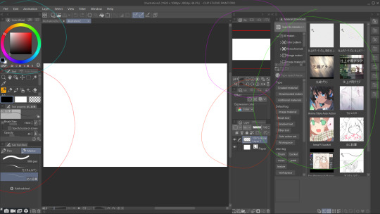
This is the Clip Studio Paint user interface. I have colour coded each section so it’ll be easier to organise. I have been using Clip Studio Paint for nearly 2 years now after switching from Paint Tool Sai because of the quality of life aspects and use it nearly everyday for digital illustration.
Red Circle: I’ll start with the essential, the tools section. This is where I basically do everything, all the pens, buckets, brushes, liquify, etc tools are all located in this area. I have organised my tools in a way to have everything I located in the same directory. I haven’t found a way to create a sub folder so all of my pens, pencils, erasers and buckets go into the Marker directory because very little was in their for me to replace anyways. Below the marker directory are a bunch of previewed brush textured, these are pens I have downloaded from the asset store, one is a pencil textured tool mainly used for sketching and the next is a textured G pen mainly for line art. Above the pen tool names are the tool settings where I can change the colour of the pen, opacity, texture setting and more. The 3 colour bars are primary, secondary and transparent colour settings, they’re helpful for helping me switch colours with one colour bar and reserve another colour is very helpful.
Cyan Circle: This is simply the colour wheel, it is helpful in quickly selecting a shade or colour, there are multiple colour wheel modes, the is a circle, square and even a triangle mode so it’s really down to preference. But to me it feels like I’m getting more access to shades with the square setting than the other two.
Orange Circle: This the layers window, it mostly works the same as Photoshops layer window except for the fact that the icons are a lot easier to understand than Photoshop, like for example to create a clipping mask, or lock transparent pixels are a lot easier in Clip Studio. Also there are blending modes that work differently in Clip Studio than Photoshop. Not much but a little bit better, for example, what in Photoshop is called Linear Dodge (Add) is called Add (Glow) in Clip Studio, and though they work the same, to me Clip Studio enhances the quality of the glow better.
Purple Circle: This is the canvas window, it is like a pop up window which keeps the canvas in a fixed position for me to look at whilst I’m zoomed in on the live canvas. It’s very helpful looking at because it allows me to see if what I’m doing looks good in full view.
Green Circle: This is a tab I don’t have open when I’m drawing but I thought to showcase it here. This is where all the assets I’ve downloaded from Clip Studio Assets are located. They range from Auto Actions to Workspaces to Pens etc. These are tools made by other people but I can use freely because when posted to the assets page, it is public domain. Fun fact, if you look at the image fifth row down to the left, that is the workspace I use currently. I can download other peoples uploaded Workspaces, and by dragging and dropping them, it will automatically switch to that workspace. Speaks for all Assets as a matter of fact, to apply them into my own Clip Studio, I just have to drag and drop them into their sub category and it is now mine to use.
I think I’ve put in over 1,000 hours into Clip Studio during this F.M.P alone and I still learn new things about it, I believe it is the only drawing software able of competing with Photoshop and with it’s one time purchase instead of subscription based service, in some ways it can even exceed Photoshop.
0 notes
Text
Now, I’m sure you’re all wondering what all that fuss was about, with the times and the numbers and all.
Well, I am here with wonderful news. Your questions will finally be answered!
I now present to you one of the biggest mistakes in my art career!
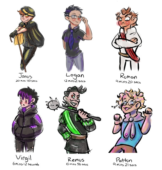
Aka, an artist tries to speedrun learning Clip Studio Paint and also cannot draw under time constraints!
Huge thanks to everyone who gave me times! I know I could have probably found a random time generator online, but I like interacting with you guys! You’re all so cool!
Some closeups and progress bts below!

I mistakenly believed that 20 minutes was a lot of time
Did find a brush I liked real quick!
You’ll quickly deduce that I have a soft spot for textured brushes. Because I use them a LOT.
I quickly gave up on coloring in the lines
Also never figured out how to clip a layer…
But did figure out how to multiply!
Oh his gloves are the wrong color huh…
Forgot Janus’ sleeves but the sleeveless look worked more than I thought it would so it stayed
Things only go downhill from here
Lost the brush I liked for Janus so had to improvise on the spot
Tried different shading with… mixed results
The cutest out of all the pictures imo
Look at him! He’s gonna teach you about stars and psychology!
Rushed a bit more because of the sudden time drop but not as bad as it could have been!
This is basically as bad as it could have been
I started drawing on the wrong layer and immediately panicked
Didn’t actually start drawing until, like, a minute in.
This pose and expression was planned. Not executed very well though lol
Roman skipped leg day
Did not have time to shade :(
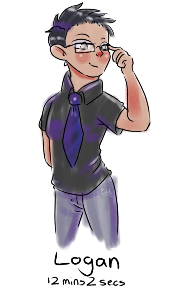
“HOW DARE I HAVE THE LEAST AMOUNT OF TIME!? HOW COME SNAKE FACE AND CAIN-IN-THE-BUTT GET MORE TIME!?”
Poor Roman you deserved better bby

FINALLY! MY SIMPING HAS PAID OFF!
I whipped out this Virgil way too fast lol
Had literally 4 mins to color, that’s how fast I was
Another fun brush! And I liked the shading more than I thought I would!
I have no idea why I fully spelled “seconds” for Virgil and not the others
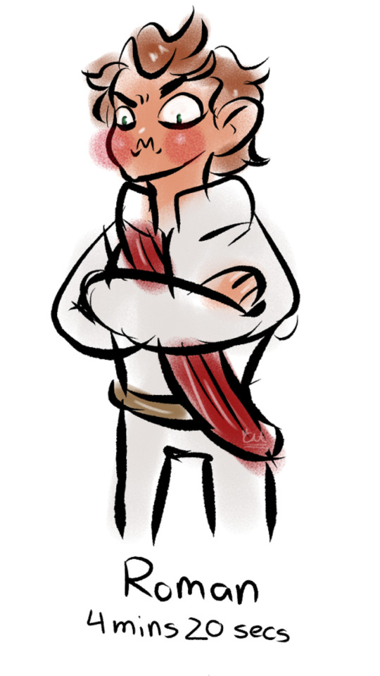
Remus be loomin’
He got Roman and Virgil’s next
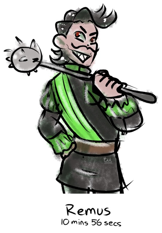
The rat man! I need to draw him more
Really like this pose! Might do a more finished piece inspired by this!
Again, kinda mixed feelings about the shading.
Forgot the most about Remus’ design so it’s prob the most inaccurate
I FORGOT THE HAIR STREAK NOOOOOOO
Probably the most fun I had during this session aside from Virgil!

Oh god…
I had another expression before this one that I erased. It was somehow worse.
I was laughing my ass off the entire time I drew this
But hey! Another fun textured brush!
The shading was fun! I’ve been having fun shading with solid colors with no effects or blending.
He looks REALLY shiny lol
Still cute! Patton literally can’t NOT be cute imo
So the takeaway from this is that you should probably dedicate more than a few minutes to learning new art programs lmao
#myart#fanart#sanders sides#janus sanders#sanders sides janus#logan sanders#sanders sides logan#roman sanders#sanders sides roman#virgil sanders#sanders sides virgil#remus sanders#sanders sides remus#patton sanders#sanders sides patton#art challenge#csp is HARD#still couldn’t find clipping mask ;;#tw cursing#tw caps
109 notes
·
View notes
Text
Art Advice #4 - A Beginner’s Guide to Digital Art
Hi all!
This weeks entry into my Art Advice tag, where I offer various advice for artists of any skill level, is about digital art! Now, I am by no means an expert at digital (I’ve been doing it for nearly 8 years at this point and that is almost entirely self taught), but I have picked up a few pointers in that time which will hopefully help anyone just starting out!
(this blogpost is a little over 2000 words long btw)
A Beginner’s Guide to Digital Art
I know that the world of digital art has changed drastically in the 8 odd years since I started, but I’d still say that some of the options I started out with will be just as good for anyone who’s starting out now!
As always, I’ll be splitting this into sections to make it easier for you to navigate this post!
Part 1 - Equipment/Hardware
There are a lot of drawing tablet options on the market at the moment, and I’m not going to pretend that I know anything about half of them lol. But I think for a beginner, don’t worry about going for the most expensive option, even if the reviews are really good or your favourite artist uses it, especially if it is way above your budget!
An important thing to know is that there are two types of tablet. One is the plug-in kind. These are essentially a pad which you plug into your laptop or computer and draw on that whilst looking at the screen (they basically work the same way as a plug in mouse works). The other kind is the screen variety, which is a lot more like what most of us know as ‘tablets’ nowadays. And you draw directly onto the screen.
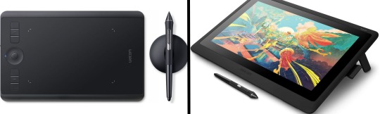
(a plug-in vs on screen tablet, both from Wacom)
Now, as for choosing between these, it is honestly a personal choice. But I’d say if you’re just wanting to try digital and you’re on a budget, a plug-in tablet can be really useful since it gets you used to the mechanics of what digital is like, and they are often significantly cheaper than the screen alternatives. I would say that plug-in tablets are a big learning curve, especially if you’re used to doing traditional stuff, but I do know a lot of professional artists who still use this kind of tablet when doing their work, so if it’s something you can get used to I would definitely consider it! Also, they’re often a lot more portable than some screen tablets! The first one I had was a Huion (a model so old that I can’t even find a link to it now lol), and I also know that Wacom are a well known brand that do some decent plug-in tablet. I’d recommend you do your own research on other brands and options, though!
Screen tablets are often a lot more expensive, but if you’re used to traditional art, they are a lot easier to get a handle of! But I know if you already have something like an iPad, or other general use tablets, then they offer apps that you can use to draw on (as well as things like the Apple pen, or other stylus’). The big difference between using these general tablets and ones specifically designed for drawing is pretty much purely a personal choice. I personally prefer the bigger screen of my XP-Pen tablet, along with a special screen protector that removes the shininess of the tablet screen and makes it feel more like ‘paper’ over when I used a general use tablet it draw. But if you already have an iPad, or something similar, then it’s honestly a really great starting point!
I think it’s important for me to mention that you don’t need fancy equipment to be an artist. The incredible Elicia Donze has revealed countless times how she has very basic equipment but still manages to produce the most stunning artworks! All you really need is some kind of drawing apparatus and a lot of patience lol! Getting good at any kind of art takes a lot of time and effort, but I would definitely say it’s worth it when you’re able to look back at your progress!
Part 2 - Software/Drawing Programs
Much like with the hardware discussion, choosing which program to use is entirely down to personal preference. I personally have never really liked Photoshop purely because it’s really complicated, but I know so many artists swear by it.
I think the main aspect to consider when you’re starting out is whether you want to pay for a program. Software like Photoshop, Clip Studio Paint and Procreate are some of the popular ones I hear about a lot of people using, but all require you to purchase or subscribe to them. So if you’re young or on a very tight budget, I’d honestly recommend the free alternative versions of these, such as Krita (Krita is quite a large program, but it has a lot of really awesome features and is very similar to Photoshop!), Gimp (this one is similar to Krita, but has slightly less options, I’d honestly recommend Gimp for anyone who does photo editing though!) or FireAlpaca (this is the one I use, by the way and it’s a pretty simple program, but has a lot of fantastic features and is perfect for how I work!). These don’t have as many features as some of the paid alternatives, but I honestly think all you really need to start digital art is some kind of ‘canvas’ and set of brushes!
Another great free program for beginners I’d recommend is MyPaint, which is great for doodling and just getting used to how digital art feels in comparison to traditional! It also has a bunch of ‘traditional style’ brushes, to make it look like charcoal or watercolour (which I’m sure the paid alternatives have too, but it’s always better when it’s free, I find lol...)

(this is an example of a drawing I did on MyPaint using the ‘charcoal’ effect brush!)
Most of the sites are pretty self explanatory, with sections dedicated to different brushes (I’ll go into the types of brushes later on in this post btw!), adjusting brush size, shape and opacity, a colour wheel, etc. You also have a section dedicated to ‘layers’ (another thing I’ll go into more detail later), and various ‘filters’ and editing options and effects you can add to your work to make it more interesting!
I’d really just recommend playing around with programs until you find your one!
Part 3 - The Pros of Digital Art!
I realise this section should probably earlier in this blog post lol, but I kinda wanted to go into what digital art can achieve in comparison to traditional art, and how beginner artists can utilise this!
I definitely didn’t take advantage of certain aspects of digital art when I first got into it, and they’re things that would have definitely made my life a whole lot easier lol!
Digital art allows you to tweak drawings as you do them. So if you accidentally drew the eye too far to the right, then you can easily move it to the right place. (I usually do this by selecting whichever area is wrong, cutting it out and then pasting it into a new area... And yes, there is probably a better and quick way of doing this but...I haven’t found that way yet lol...). And I honestly think that this has allowed me to look a lot more at a reference image in order to figure out where I’ve gone wrong with a drawing! Whereas with traditional art, I usually spend so long trying to get an eye right, that even if it’s slightly in the wrong place, I don’t want to completely redo that section. Digital allows you to completely rub out sections without leaving indents, which is honestly such a saving grace!
Another pro of digital is the Undo/Ctrl Z function! This means you can easily go back to before you made a major mistake with just a click of Ctrl Z... Though I have to say that this function has honestly ruined traditional art for me... Oh what wouldn’t I give for a real life Ctrl Z... But yeah, this is a great part of digital art and definitely something you will grow to love lol!
Another great thing about digital is that it allows you to flip and turn a canvas as you’re drawing on it. I spent a lot of time trying to turn my tablet around in order to draw certain parts of a piece before I realised you can turn the canvas itself without having to move yourself or your tablet!
Layers are another part of digital that can be super useful, and I have to be honest but I don’t really use them a lot. I know a lot of artists create layers for every section of their artworks (so, one for the linework, one for colouring, a separate one for the background, etc etc...). And there’s something really great about being able to paint without worrying about smudging into a previous section of the painting. This works well for my work since I do a lot of bright backgrounds. I also often create a lot of ‘versions’ of my works, so it’s useful to be able to change the background without affecting the main figure of the piece! (I have to say that I often work in one big layer when I’m doing paintings, just because I like how it feels more like ‘traditional’ art that way, but layers are such a brilliant tool, and definitely something you should play around with!)
The eyedropper tool is another one that is really useful! Although I never colour pick from my reference photos, I know some artists find this useful when they were just starting out (especially if you’re not sure what colour to make shadows or how to mix skin tones, etc etc). The eyedropper basically means you don’t need to mix your colours every time
Part 4 - Just some other things I wish I had known about when I was starting out lol...
This last section is just dedicated to a few things that I would have liked to have known when I was just starting out all those years ago.
First one is fluffy/textured brushes!
I spent most of my art life from 2013 until 2016 using ‘round’ brushes which are notoriously hard to blend with, so I’d recommend either downloading some fluffy/textured brushes (DeviantArt was where I got mine from a few years back, but there are probably other places you can get them for free too!) to your program of choice, since most of the programs I’ve used haven’t had fluffy/textured brushes as pre-set.
I may make another post about how I blend in my artworks if that’s something people would be interested in?
(this is an example of textured brush blending vs round brush blending... I usually opt for round brushes for rougher blending styles and the textured brushes for more smooth and ‘realistic’ blending... for a lot of pieces, though, I use both brushes (the round brushes are good for details!) in the same way that you use different sized brushes for real paintings!)
The next thing I wish I’d discovered earlier is the Brush Stabiliser option. Some programs may do this automatically, but the one I use (FireAlpaca) requires you to manually change the amount of stabilising you have on your brush. This is particularly useful if you want to draw neat lines or straight lines (the stabiliser essentially slows down the ‘ink’ as you’re drawing). I only recently started using the stabiliser, and although I still like having it mostly turned ‘off’ for doing sketchy work, it does make doing line work a lot easier, and also gives pieces a more polished look!
Next advice is to explore all the options you can in whatever program you use!
I feel like with certain programs, you can get overwhelmed by choice and you end up just using a few of the functions. But I’d really recommend just playing around with these programs, trying all the filters and editing options to get used to how the program works. You can often find interesting ways to adjust your artworks this way! In a way I’d recommend this way of working more than finding tutorials made by other people... Unless there’s a specific function you want to learn how to do, just having fun with digital art is a major part of it’s appeal to me!
~
There are probably a lot of other options I could go into, but this is already over 2000 words long, so I’ll leave it here for now lol! (I may do a part 2 though so... keep a look out for that!)
As always, if you have any questions to things I’ve said here, or are just looking for more advice, don’t hesitate to message me!
And if you like my work on here (art & blog posts) feel free to support me on my Ko-Fi! <3
#art advice#digital art#art advice for beginners#digital art for beginners#artist advice#digital art tips#artists on tumblr#just want to say again that i am not an expert at this at ALL lol#i just want to offer some really basic advice to anyone interested in starting out with digital!
92 notes
·
View notes
Note
Art question: your colors and lighting are always so gorgeous - what’s your process look like for colors in terms of layering/combining colors?

Ok, time for the end boss, this is probably gonna be a long one so I hope this is still gonna be understandable and not too much as a text post.
First up I’m just gonna put a quick and very basic break down of how I often approach coloring before I go more into detail.
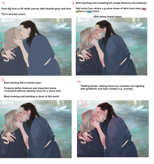
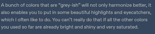
I’d definitely recommend to not leave your canvas white while painting, I either rough in my background first or give the canvas a grey-ish blue color if it doesn’t have one. The bright white of the canvas will make it harder for you to judge colors, having a nice midtone will help you make better color decisions and get more accurate colors!

Here’s a little snippet from a previous post about how I pick color! (check out full post for some useful links)
Here is one of the brushes I really like using in paint tool sai2! Other than that I might use the standard marker tool with a square shape. In clipstudio i try to use similar textured brushes.
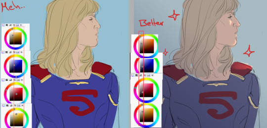
To blend or to create soft edges, which really helps you to sculpt your drawiing/painting, I often just start painting on a new layer above the one with the base color and then use a soft eraser! I might also use paint tool sai’s water tool, which I find really useful and pretty unique, I sadly haven’t really been able to replicate it in programs like clip studio.
In the two pictures above I already did a lot of defining and painting before I moved to a layer ontop of the lines because the lines were fairly clean already. Sometimes my “underpainting” looks way rougher though and I just put in some blobs of color for hue variation, especially the more red-ish areas and then do most of the painting above the lineart layer!
Not sure if there’s much to say to the overpainting stage, as mentioned before this is just where I clean up the whole drawing and define the features more, especially the eyes, eyebrows and lips.

NOW, the real fun begins....
After I’m mostly done with painting, I start to properly establish the lighting, some people find it easier to do it the other way around, and sometimes I do so too. But often I push for the strong lighting at the end so I can focus more on painting.
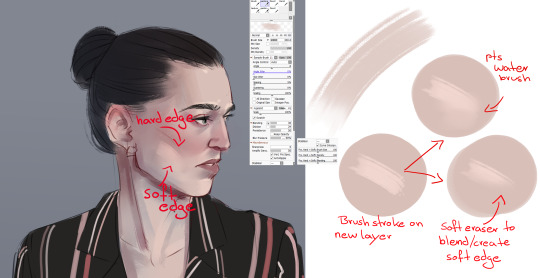
This is where I play around a lot with layer modes, usually I use a combination of overlay and shine to put in some bright warm light from one direction!

The way I do it is I usually put all the layers of the person/object into a folder so it’s separated from the background, then I make a new layer on top of that folder and use clipping group. It works similar to a layer mask, whatever i do in those clipped layers will only affect the layers that are in the folder! Since only my character is in that folder, my background will be left alone.

As mentioned before, I now use gradients to give the entire picture more hue variation and to properly give it strong lighting. Make sure the gradient tool is set to “color to transparency”. I use a warm orange/red color for the top right side where I want the light to hit and put it in overlay mode. And then use a colder purple/blue color on multiply mode and pull it up from the bottom to the middle.
At the end I often adjust the colors a bit, I like to use cool colors in the background to make the warm colors of the skin etc pop! So often I push those reds of the characters a little more! In paint tool sai I just adjust the hue and saturation a bit. In more complex programs like CSP I do it in the color balance option.

You can see how I pushed it a bit more towards red here, to make it stand out more against the blue-ish background. I also pushed the blue’s in the hair color. Giving dark hair blue-ish undertones can make for a really good contrast compared to the warm colors in the skin!
I think this last part is really the most important to me,lighting can REALLY change your entire picture, and I think gradients are a super easy and fast way to do it! If I pull up the picture from the beginning again, you can see just HOW MUCH the picture changed again after I was pretty much done painting by adding strong lighting! It’s a good way to pull the attention to a certain spot, in this case the faces/the kiss, where all the strong saturated colors are!
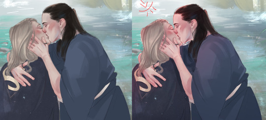
I also think that a good contrast between warm and cool colors is really important! As you can see I often use that to make my characters stand out from the background. If you put everything in cool colors or everything in warm colors it’s easy to make your object get lost in the background.
I recently found this guys YT channel, he talks alot about warm vs cold colors, which I think is so helpful! I’ve hardly seen any other artists talk about it that much.
If any parts were unclear or I left something out/ someone wants to know more about a certain topic just let me know! Thanks to everyone who’s sent me asks
940 notes
·
View notes
Note
hello friend 🌻💛 ur art is crazy good!! do u have any tips for someone starting out in digital art? maybe yt tutorials that u’v found useful? i’ve just started practicing in procreate and omg *tears* xo
hello there! first of all, thanks for asking!! much appreciated! I really like it when people submit asks :D secondly, thanks for the compliment :'' I'm flattered <3
I only started taking digital art seriously last year, I still struggle a lot so I don't think I'm the right person to answer this shsjdjdjkdkdk but here are some tips that might help!
find the best drawing app you are comfortable with but don't limit yourself, try some of them and choose which one that fits you the best. it takes some time to be used to a new app, and it's totally ok! I just downloaded procreate and I still have no idea on how to use it til now cuz it's so different from any of the apps I've used ;-; I use medibang btw! it's relatively easy and simple to use, but procreate brushes are insanely good. another recommendation : clip studio paint because the features are *chefs kiss
I personally don't really watch yt tutorials, I prefer tutorial posts and speed painting from instagram/twitter because it's easier for me to follow. there are several art tips account on instagram that I found useful, they credit and ask permission from the artist to repost their works so I think that's ok. just search for #arttutorials and a bunch of em will appear! some artists that I follow on instagram also post tutorials from time to time so that's that. and if you need any specific tutorials maybe I can help! just hmu hehe
keep on exploring and be inspired from others! I regularly spent hours scrolling thru instagram and pinterest to cleanse my eyes with some good, gorgeous artworks. and try to make out and analyze on how they done their works! also don't be scared to use references! it helps a lot.
I'm sorry if all of these are too general and basic ;-; hope this helps tho- best of luck for you!!!
#whoops I didn't mean to write this long#ask#art stuff#good luck sender!#pls ask me!!!#'m bored#or maybe sum drawing request? cuz I'm out of my creative juice rn#yet I'm on my 2 weeks break yay
10 notes
·
View notes
Last Seen Blogs

oscarfozzi
Oscar Fozzi

offersenbooker72
The Journey of Broe 688

hufflebirdthunderpuff0919
HuffleBirdThunderPuff

5gb-of-data
alright chat lets get this bread