#Marker Pen drawing tutorial
Text
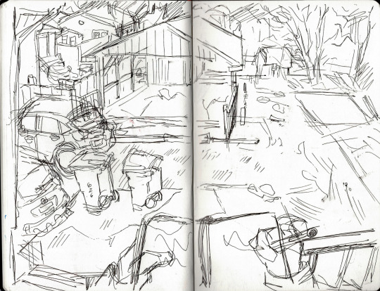
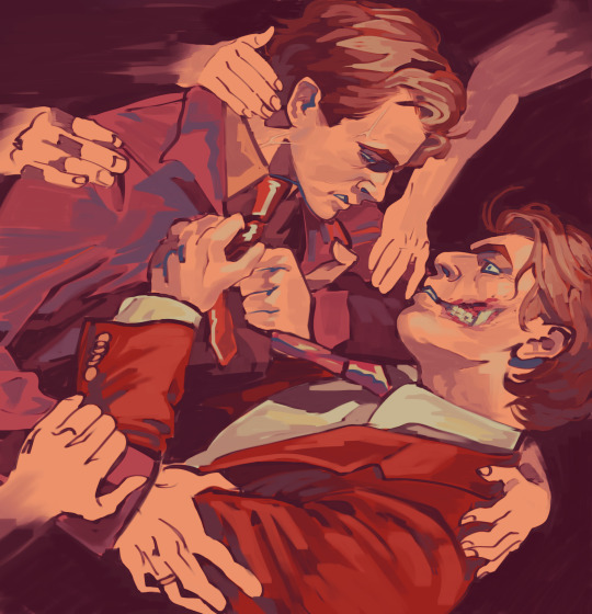
One of my favorite art exercises is just drawing your surroundings
#artist#art#artists on tumblr#patreon artist#artist on tumblr#cute#queer artist#pencil#sketchbook#pencil art#pencil sketch#colored pencil#pen drawing#aesthetic#traditional art#markers#sketch#sketches#drawing tutorial
15 notes
·
View notes
Text
#sketchbook#drawing#alcoholmarkers#sketchbook drawing#sketchbook drawing anime#sketchbook drawing tutorial#sketchbook drawing ideas#sketchbook drawing easy#copic markes#alcohol markers#prismacolor markers#prismacolour markers#markers#fine-liners#fine liners#fineliners#prismacolor markers art#fineliner pen art#copic markers drawing#posca markers#fineliner sketching#copic markers for beginners#copic markers#drawing ideas#drawing easy#drawing tutorial#drawing anime#markers drawing
3 notes
·
View notes
Note
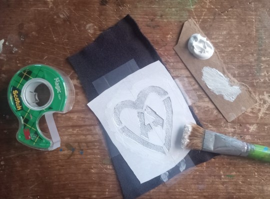
Patch making tutorials?
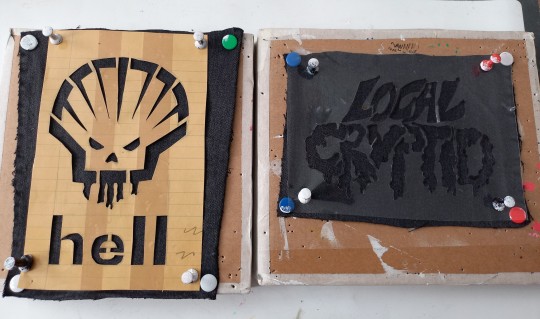
and here i am once again, with a patch making tutorial
how to make stenciled patches:
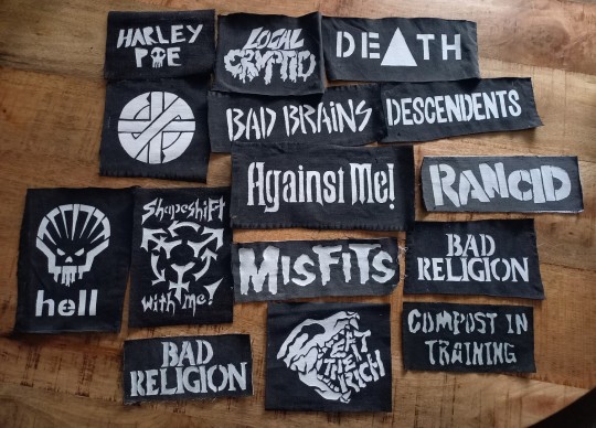
i'll post a part two in the future which will cover freehanding and stamping ur patches
-
first some general info that might be useful:
i get my patch design inspo from pinterest, etsy, and tumblr. if sell your patches make sure you arent ripping off another artists patch design when using etsy for inspo. anarchostencilism also has tons of stencils both on deviantart and reddit which are free to use.
i use acrylic paint for my patches, but if you can afford it id advise fabric paint. to seal paint into the fabric iron the patches, it helps em last longer. some acrylic paint survives very well in the washing machine, but wash your stuff by hand the first time to see how well it holds up.
if you make your patches multiple colors, dont first make the whole patch one color and then paint over it with the other colors. if the paint starts cracking the base color will show through. (if you like that however then dont mind this)
i paint my patches on jean fabric, cause it makes the patches sturdy yet flexible. but shirt fabric or canvas both work very well too. anything except really plasticy/slippery or textured fabric can be used
i pin my patches down with pins onto multiple layers of taped together cartboard, to prevent the fabric from moving around and distorting the print
-
there's two ways in which i make my stencils
1. with paper covered in tape
2. with the plastic folder you put in your binders
-
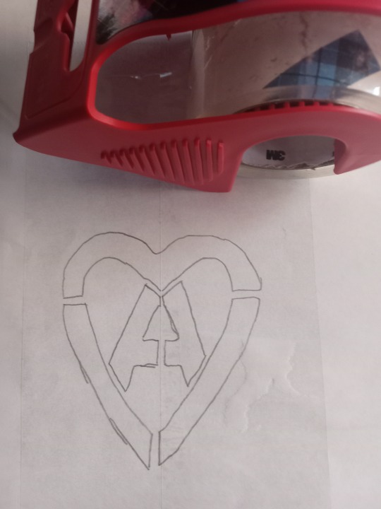
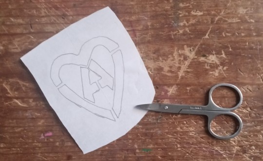
option 1:
draw out your design onto some paper, make sure there arent any "loose" parts in the design that will get lost when cutting out the stencil

cover the paper in tape front and back, make sure you can still see your design through the tape
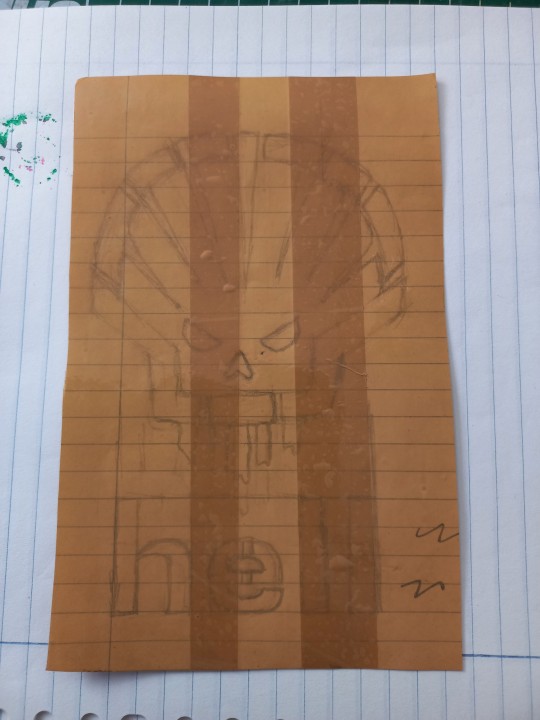
cut out your design, i use scissors and an exacto knife
-
option 2:
draw out your design (you can also draw the design directly onto the plastic folder)
cut a piece of plastic out of the folder big enough to cover your drawing and tape it down.
trace the design onto the plastic with pen or marker (any mistakes can be wiped out)
cut out your stencil
-
continuation from both option 1 and 2
after finishing your stencil you can pin them down on some fabric
dap on your paint with the point of a big brush or a sponge, depending on the paint it'll take 2-3 layers.
make sure your previous layer dried completely before adding the next one
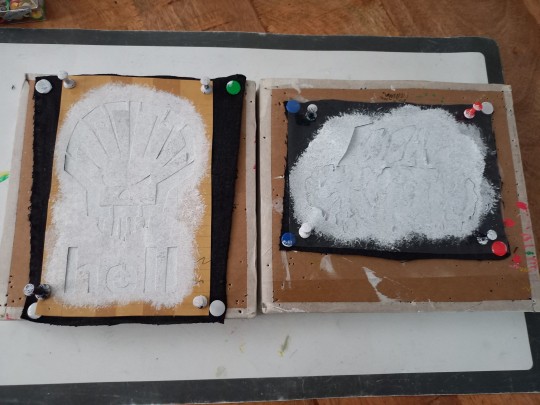
after the paint has fully dried you can carefully take off your stencil.
!!dont unpin the patch before it fully dried, or the drying paint may cause the fabric to warp!!

thats it, questions are always welcome, now go and make stuff!!
#punk diy#diy fashion#punk#queer punk#diy punk#punk clothes#punk style#punk patches#patches#tutorial#my stuff
2K notes
·
View notes
Text
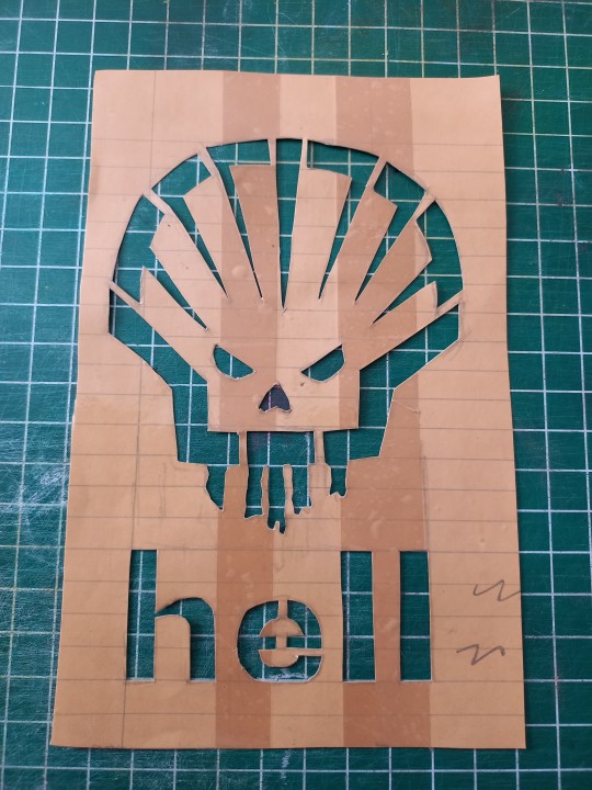
Easy Paper and Tape Stencil Tutorial
made one for reddit so I might as well post it here as well
Materials
writing utensil (pen, pencil, marker, etc)
paper (i usually use plain printer paper but most other scrap paper works fine as well, just be aware that thicker paper makes it harder to trace existing designs/logos)
clear packing tape
scissors and/or exacto knife (those little scissors you can get in cheap nail care kits work great
Optional Materials: Device w/ screen of your choice, printer

Step 1:
Draw out your design, trace from device, or print out design
(in example image I am tracing from a screen)
r/AnarchoStencilism (Deviantart link if you prefer) is great for free stencil designs

Step 2:
Cover both sides (front and back) of the design in packing tape
Step 3:
Cut it out
Step 4:
Use your exacto knife/scissors to cut out the design

Step 4:
Apply to whatever you want!
Happy DIYing!

#kahvi draws#patches#stencil#diy stencils#diy tutorial#punk diy tutorial#stencil tutorial#punk diy#folk punk#diy patches#pat the bunny
240 notes
·
View notes
Text
Tutorial for @mimssides
How I draw with alcohol markers. Beginner edition
First off all I want to specify: this is based on my experience only, so take it with caution. This is also my first tutorial ever.
1) Have an underpaper.
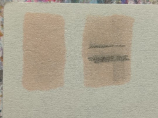
Unless you use some really thick paper, markers will bleed on your next page or table ( depending if you're drawing in a sketchbook or not). I recommend to have one list of some decent paper under the page you're drawing on. Decent means thicker than office paper, can be watercolor paper, it usually perfect for it. It's reusable and over the years mine two look like this:
( you can see there's a lot of stuff going on there)
2) Always, and I mean ALWAYS erase your sketch.
If you're doing a quick try out of color combinations you can skip this step, because you don't need the aesthetic or anything. I'm not sure how useful this tip is for colored pencils ( cuz I never sketch with those), but with regular graphite pencil it's very much important. Graphite smudges your markers, and not only that. It also gets trapped if you go over it with a marker, meaning you wouldn't be able to erase it and it's going to leave you with gray smudges all over. Truly awful.
3) Have your pallets on the same paper you draw on. Or simply - have pallets!
Colors can show differently on different paper, that's why it's important to do color swatches once you buy your markers. They are designed for specific paper, and on your paper they can look a lot darker or really pale. I recommend testing colors before you buy them, it's usually an option in the most craft stores. If you're buying a set just take 30 minutes to do all the swatches and naming them. It also helps visually to see what colors you have.
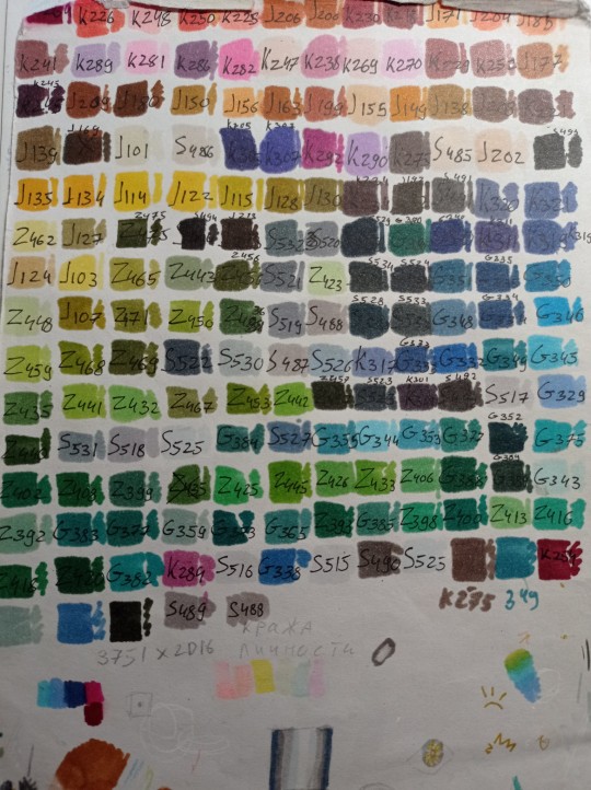
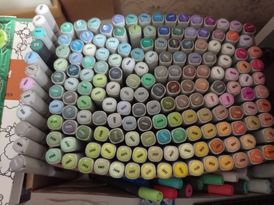
(I have a lot, but you don't need as much, there's like 60 colors I use usually and the rest are on rare occasions. Build a set you're comfortable with)
4) Make sure your materials all work together.
We already talked about graphite swatches, not the worst thing that can happen to you. Mainly you need to make sure how your materials work together, how they lay on top of each other. Make sure your lineart won't react to your markers, there's special waterproof liners and those are the best for markers ( mine are Pigma Micron from Sakura). See how your pens and liners act before and after you apply markers.
Decide which is better to use before and which after markers
5) No black.
I don't use black in any of my drawings. All you see is different shades of gray. It looks much more pleasant with the rest of the colors and it allows for my lineart to be visible underneath. Sometimes even those grays are too dark and I need to add more shades or white lineart to fix it

6) How to shade.
This is a very subjective thing to talk about. You can shade how you want. I will talk about two ways I shade.
1. Same marker. Markers dry. And when they do you can go over them another time. Usually that makes a darker shade of the same color and it's a pretty safe way to do the shading if you don't know which colors can go together. It doesn't work as well on the light colors and difference can be barely noticeable. It's a nice way to get soft shading
2. The pure chaos. Just kidding... Different color marker. It's hard to explain, and yo always need to test what works for you. If you want sharper shade you need to grab a different color, can be from the same hue ( for yellow - orange, for red - burgundy) or something a little more spicy. You can add different hues to your colors with different shades ( your black with red shades is suddenly looks burgundy, or purple, or blue). Experiment! Fail! Find out which combinations work and which don't!
If color seems a little darker than you expect you can go over it with original color, which might lighten it up. This tip doesn't always work

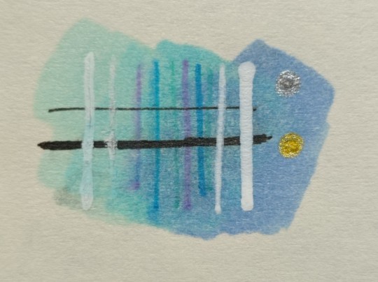
7) How to do gradients.
1. Choose your colors beforehand, see how well they work together. It's easy to do a gradient from red to pink, but not so much from orange to blue. You might need to choose lighter colors, because if you want smooth transition from one color to another you will need to go over them a couple of times and that will darken them.
2. Add a middle color. Not every gradient needs a middle color, but with it you can make your gradient much smoother, it will be more noticeable the bigger aria you cover. The more middle colors you have the more harder gradients you can do

( without and with a middle color)
3. Act quickly. Markers dry relatively quickly so you need to add colors one after the other, you can't go away before you're done.
4. Blend with the lighter color. You can also start with this color as a base but that doesn't work for all color combinations. Lighter color will go in top a darker and flow into it making it lighter and transition smoother. ( example: you go from red to purple to cyan, you will need to start with red, then purple going over red to soften it, and finally the lightest cyan going over purple and maybe even a little red). You always put darkest first and go over it.
There's other methods of doing the gradients. They are very similar actually, but for second one you will need a blender. For the first one grab two markers you want to use ( more if you're feeling risky) turn one of the markers upside down and touch their tips. Now use your understanding of gravity. Color from the top marker will go into the bottom one. The longer you wait the longer the gradient will be. Usually I don't need to wait longer than 3 seconds.
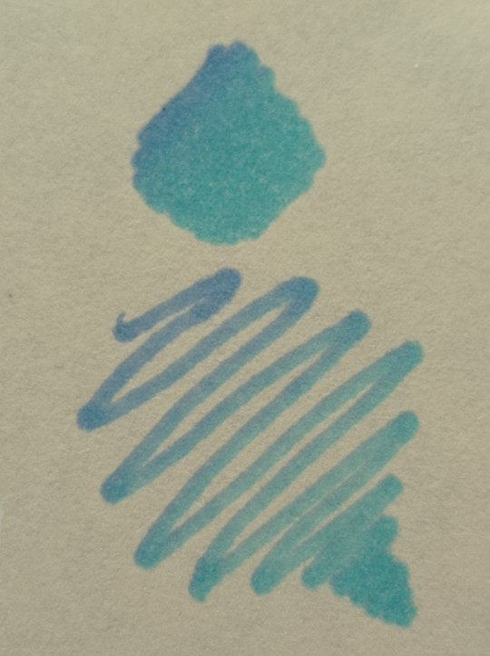
And you can do the same with a blender
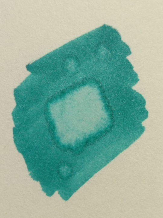
8) How to use a blender.
Blender is a marker with no color. Usually it's named B000 (I recommend buying a blender with brush tip). There are many ways to use it.
Gradients: you can use two markers technique with a blender making gradient fade on one end, or you can mix colors inside the blender.
Fixing mistakes: blender will make a white show through your color, you can use it to get rid of the wrong color. But it doesn't work without some problems. Of course darker colors will likely stay, even if much lighter, and your previous color will try to flee ( likely to other sides, if you're lucky it will go on your underpaper)
That's all I have for you today. Experiment and learn something new. Hope that helps
99 notes
·
View notes
Text
a little zine tutorial!
some quick notes: this can work for a lot of paper sizes, i used both 8.5x11 and 11x17 but it can work for a lot more sizes. i also did my art digitally and had it printed because i made a lot of these but my first one, i did with some pen and marker you can and should draw right on paper. if you are, though, i recommend folding first so you can see the orientation for each page! like, at least sketch that way. it'll make things easier in the long run!
art only blog - insta - inprnt - redbubble
#zine#zines#zine tutorial#hand folded zine#my art#art tutorial#tutorial#idk what to tag this as idk here's this asdfghj#one of my favorite professors taught me how to do this#next time i'll do an accordion book
53 notes
·
View notes
Photo

Saturn’s Free CSP Brush Recommendations, CS Asset Store Edition
I may sell brushes now, but I still love me some free brushes & love to share them with people. These are a bunch of cool brushes made by other people that you can use to build up a nice library of tools without having to spend any cash on, perfect if you’re new to CSP or are on a budget. If you do download these, be sure to like them & give some love to the artist if you enjoy them. :D
How to find: type in the Content ID or Ctrl/Command + C & P (copy and paste shortcuts) into the Clip Studio asset store on the Clip Studio application. I’ll add a link as a preview but copying & pasting the content ID is easiest. I have automatic translation ON, so sorry if you read some weird names.
Feel free to reblog this with your own suggestions, there’s many brushes out there I missed. :D Check defsiarte’s suggestions too, and if you want to see my recommendations for stuff on Gumroad/DA & other places, check this tag.
Large Packs

“An analogue art supply" - 1813808
Huge pack of everything, including acrylic, oil, watercolor, marker, pen, & pencil. I like the markers and sometimes use the acrylics too.
Crm's Toolbox, Watercolors, Markers, & other treasures
Fantastic use of texture and some cute effects pens. The artist has posted everything from quality painting & drawing pens to quality glitter pens for writing.
The Old Default Assets - 1842027 & 1841759
These aren’t pictured, but if you ever see an older tutorial or video showcasing some default brushes you never had, it’s because CSP reworked its default tools around version 1.9. Fortunately they rerelased them so anyone can redownload them. The old ones are still good to use, they’re just not included.
Painters - With Texture
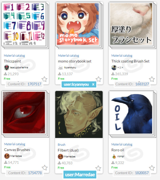
Thiccpaint - 1707517
Never leave home without it. I riot if I don’t have them on my computer.. They have the right combination of texture, shape, & blend with great handling and great variety.
Icyannyou's Momo Sets - user:Icyannyou
Super cute packs that give a lovely painterly look. The Storybook pack is fantastic, and even if you don't draw cute you can still use these painters & blenders to give your artwork character. :)
Thick Coating Brush Set - 1683127
I like these for background work, but it's a big pack of thick textured painters with good handling & neat effects.
Marredae's Brushes - user:Marredae
This artist has a knack for textured brushes. Very high rec, fantastic library of wet & dry painting/rendering tools.
Roro Oil - 1820057
Rompi is another user I enjoy the stuff of, and I'll recommend a few more brushes from them in other categories by the time this post is done. Check 'em out!
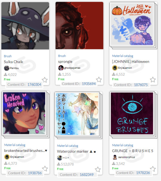
Suika chalk - 1760304
Very useful rough chalk. Sometimes, that’s all you need!
Sprongle - 1935694
A simple round brush with a nice rough tip. Slightly rough without being too rough, great for quick paintings.
Johnnie halloween pack & Brokenhearted brushes... - 1876075 & 1938786, user:EnjieLemon
EnjieLemon has some nice brushes in general, but some are paid for. Still worth checking out due to their cheap clippy price (and clippy can be obtained for free). The Brokenhearted brushes have a nice texture. The Halloween pack includes a cute pumpkin stamp along with some easy to use chalk, oil, & watercolor brushes. Compact and easy to use!
“Watercolor marker and texture set” - 1682349
There's a reason this set is one of the most downloaded on the asset store. It's one of the best looking watercolor replicas out there, and even if you don't use the brushes, you can likely still find a use for the textures. Great for soft coloring.
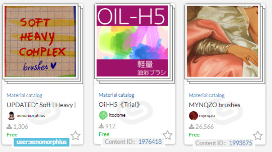
Grunge Brushes, Soft | Heavy | Complex Brushes & Xenomorphius' stuff in general - user:xenomorphius
Xeno drops some cool natural looking brushes out every so often for painting, inking, and dry media. Please check 'em out! The grunge brushes create a fun, grungy look like it says on the pack, & the soft/heavy/complex set can be used for painting as well as lining.
Oil-h5 trial - 1976418
These brushes are hard to explain. They work with the dual brush setting, & push around a layer of paint on top of your regular paint, creating a cool, streaky look. They're a hidden gem.
MYNQZO brushes - 1993875
A pretty darn good set for painting. I really love rough brush 2, it's great for sketching & rendering.
Painting, non-textured
(basic rounds & other shapes for smooth rendering)
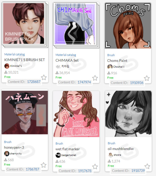
Kiminie71's Brush Set - 1728687
4 simple rounds that are great for rendering!
https://assets.clip-studio.com/en-us/detail?id=1728687
CHIMAKA Set - 1747974
Heavy drag paint that highlights well & applies thickly. Great for bold shading.
Choms Paint - 1910936
It just gets me. No further elaboration.
Honeypen<3 - 1786787
Fits great in my paint hand. Very slidey & blends like intended!
Wet flat marker - 1917678
Super blending brush, gives super soft edges to paint. Blends great.
oil mushblendiw - 1918739
Another simple & easy to use roundbrush.

Paint - 1760641
This plainly named brush is a triangle brush that goes between heavy & light with pressure. The creator, Puppsicle, also sells some neat brushes on Ko-Fi if you enjoy this brush.
"The Scarlet Knot Brush Set 2" - 1916125
I use the watercolor of thought out of this set, but they're all pretty good & easy to use.
https://assets.clip-studio.com/en-us/detail?id=1916125
Sunday - 1825825
A round brush with a watercolor border that gives a nice, sketchy feeling.
https://assets.clip-studio.com/en-us/detail?id=1825825
Marker Brushes
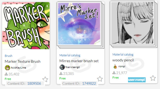
Marker Texture Brush -1809506
A very nice subtly textured brush. Has a nice instructional guide on how to get the best results with it. :D
Mirre's Marker set - 1749822
Another good brush with a subtle texture. Comes with its own blender!
Woody Marker & Pencil set - 1772987
I also love the pencil in this pack. Nice woody feel, feel free to turn off multiply.
Pencils & Sketchers
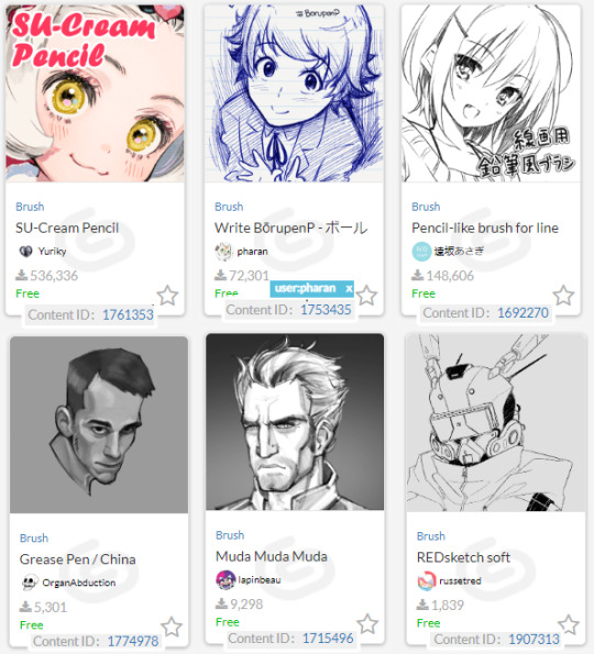
SU-Cream Pencil - 1761353
no wonder its popular. Can be used for lineart, sketching, and coloring, this versatile brush delivers a great smooth look with a gentle textured end finish on pressure.
Write BoruPenP - 1753435
Probably the best ballpoint pen on Clip. Please check out Pharan's things, I love them.😊
“Pencil-like Brush for Lineart” - 1692270
Ok this is kind of a weird way to recommend something. It's SUPPOSED to be a pencil but I use it like a paintbrush with the opacity & density on pressure control, & another copy with blending turned on. Whatever you use it for, you're sure to get a good result!
Grease pencil/china marker - 1774978
Chunky brush for chunky sketching needs.
Muda muda muda - 1715496
A pretty darn good dark pencil.
REDSketch soft - 1907313
just a nice sketcher! Good for shading too.
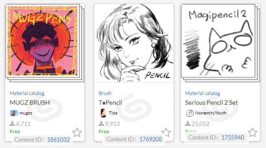
MUGZ BRUSH - 1861032
A set of dry chalk & brushes. Gives a fun messy look when used!
T Spade Pencil - 1769208
A pencil that looks great for lineart as well as sketches. Good taper.
Magipencil 2 - 1755940
Utterly good for textured and smooth lineart. These pens get me. Can’t recommend them enough. :)
Pens & Inkers
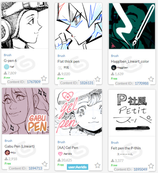
G-pen 6 - 1767809
A generic name but a good Gpen with character. Organic without sacrificing too much smoothness.
"Flat thick pen" - 1826131
I call it the card games pen. I think you can see why. Solid at high pressure, a little bit of texture at low pressure, and pretty great for sharp angles.
Haggiben_Lineart_Color - 1770988
A nice triangle liner.
Gabu Pen - 1894713
Very slightly rough pen on one side, another nice triangle-like liner.
Aeridus - user:Aeridis
All 3 of their pens give a nice result.
Pilot Pen - 1895049
A great IRL brush now a digital one!
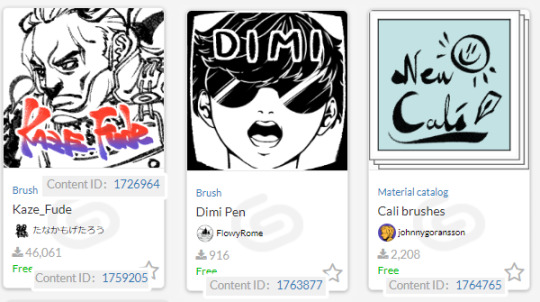
Fude set - 1726964 & 1759205
Heavy, beautiful ink! The creator has some more good ink pens too, take a look. :D
Dimi - 1763877
It's a ga,l with a knife and a nice calligraphy pen. Can't ask for more. Turn on >particles "change with brush size" in settings to keep the shape without chaning.
New Cali
A nice set of Calligraphy brushes. They have smooth transitions between big and small.
Blend, Fill, & Erase

Noise and texture blur - 1842730
If you want a more painterly look to your blur, get these! They said they're supposed to be turned from free to paid, but the artist hasn't come back and done it yet. Will they do it? I'm not sure. :0
Textured Blending & Blurs - 1904941 & 1971444
They're actually made by me, my apologies, but it's hard to find textured blenders by themselves. Most are included in a set or are something you have to pay for, so I released a few free stand alone ones due to it. Normal solid round blenders & blurs are easier to find & even easier to create yourself!
https://assets.clip-studio.com/en-us/detail?id=1904941
https://assets.clip-studio.com/en-us/detail?id=1971444
Unhelpful Eraser - 1798605
The terrible hard eraser that you had in school becomes digital. Download it as a tribute.
Quick Lasso Fill - 1978471
Fills up a lasso'ed area.
Random Color Fill - 1707873
Picks random spaces to fill. The picture in the demonstration shows it better than I can describe.
Scratchy Coloring - 1845677
A fun scratchy brush that can fill areas up.

Quick Lasso Eraser - 1875033
This and the next brush are both @pharan ‘s again. This does the same as the lasso fill, but erases as you can tell.
Erase along Edge - 1800143
An eraser that takes advantage of reference layers. The description explains it in detail.
"Create Solid-irregularity set" aka adding texture to black solid ink patches - 1768052
These distress the paper, making it look more textured. Easier to look at than to explain, click the link for more!
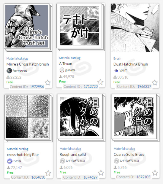
Mirre Cross Hatch Brush Set - 1972956
I love the look the spaced lines give. Fantastic set.
Overlap Hatching (…"a texan"???) - 1712720
One of the most popular Clip Studio Hatchers for a reason, easy to apply hatchers that you can just keep adding to for a sparse or dense look.
Dust hatching brush - 1966237
Simple light hatcher with dust particles around it for a dusty feeling.
Cross-hatching Blur - 1684830
I actually recommend all of user:もの区 ‘s stuff they have posted for crosshatching. There’s a whole bunch of great free brushes there for anyone who enjoy hatching!
“Rough and Solid” - 1874629
A ribbon brush that makes good borders.
“Coarse Solid Erase” - 1872105
For those who like to fill an area, then erase the light parts away.
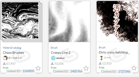
chaos brushes - 1569895
A great marbler.
"Dirty cross hatching_monochrome" - 1727346
A nice, thick, analogue hatch. SB has some great material in general, but most needs clippy.
Creepy Lines 1 & 2 - 1405766 & 1707236
Get some spooky lines into your art!

Simple Retro Halftone - 1802041
A small set that's easy to use to add some halftone texture.
retro halftone brushes - 1852027
A larger yet still easy to use set with more specific brushes to use for each color.
Mar's Halftones - 1949506
A set with a lot of fun patterns! Check out SpiralPuzzle's stuff in general, they post some unique brushes.
Pixel Art
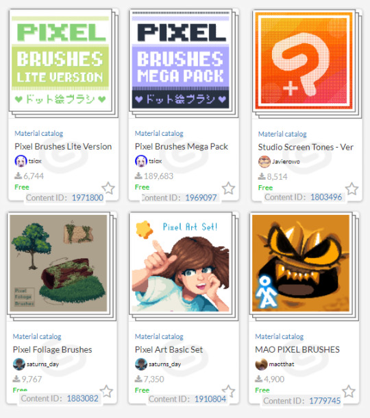
Pixel Brushes by tsiox - (small) 1971800 & (large) 1969097
THE Clip Studio pixel set. Has a ton of tools & textures to use. The small set is better for slower internet connections & if you don't want all the patterns.
Studio Screen Tones - 1803496
If you like Flipnote studios or need more dithers, get this!
Pixel Foliage Brushes - 1883082
I apologize for promoting my own assets again, but I promise they're useful if you're doing anything with grass, trees, or bushes! ;w;
My basic set - 1910804
Another lighter set with a few noise brushes that are useful at tiny size. Did my best not to overlap with tsiox’s set while covering the basics.
Bonus: two blending pixel brush sets.
Mao Pixel (1779745) & Scummy Pixel(1782455). They’re not for exact pixel art, they’re more for playing around with & painting. :)
#clip studio paint#csp#clip studio#clip studio paint brushes#clip studio paint brush#recommended brushes for csp
104 notes
·
View notes
Text


A request for something a little different than usual 🍑👑
Progress stuff below:
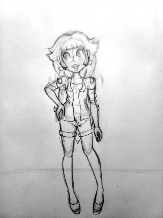
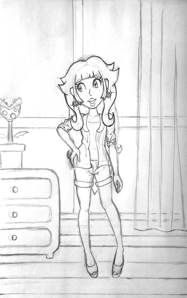

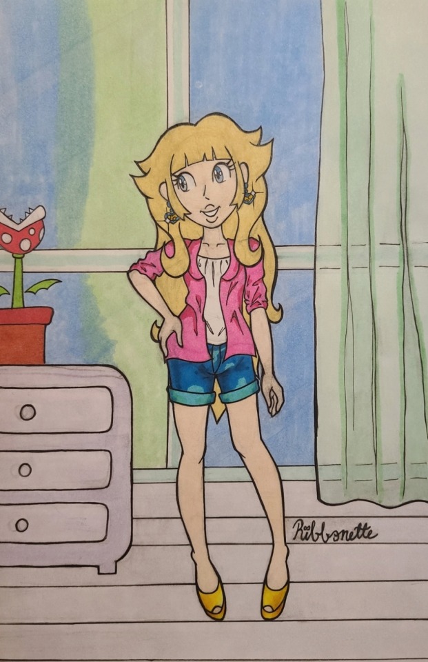
I haven't done progress shots in a bit and I think it's something I want to do more often because I like talking and blogging I guess haha.
Now that I have more experience illustrating digitally, this kind of direct reference drawing is MUCH easier to do digitally 😫honestly this felt like a self imposed challenge lol. BUT I did want to do some more traditional stuff because I feel that I had been doing a little too much digital, if that makes sense. It's nice to play with my markers and color pencils once in a while too!!
Doing the line art on this piece ESPECIALLY felt easier to do traditionally than digitally. For some reason, trying to do line art on a tablet screen feels too smooth or slippery or something. Lining traditionally feels easier, probably because I put so much pressure on the paper in the sketch phase that when the lining phase comes next, it feels like I'm just following the lines on the page like a train on a track ^_^
despite uploading a couple of illustrations colored with marker now, I still feel a bit like a novice when it comes to marker. I got a new pack of markers that I wanted to play with, which was even more motivation to return to paper for a bit. But honestly, I feel like I fudged the window color blending. I watched tutorials and stuff on blending with markers but I guess I still need more practice ^^;;; at least it looks a bit messy to me. This is how this piece came to be a mixed media illustration, since I tried using color pencils to make that transition from blue to green on the windows a little smoother.
I think the pot holding the piranha plant came out a tad too saturated and it's calling too much attention compared to the very light floor and dresser. I was trying to follow the colors on the reference closely as an easy re-intro to traditional art, but next time I do something like this, I think I'll take more liberties with color and see what happens.
Overall, I'm quite happy with how Peach turned out. I don't draw humans too often since I typically draw Sonic characters lol. Sometimes it feels like I have to re-teach myself to draw people as a result. I really liked using the gelly roll for the highlights on her face and the polka dots on her shirt :3 I highly recommend using that pen as my previous experiences with other white gel pens don't compare to this one (not to sound like a commercial I'm just really happy it worked as well as it did!).
And finally, although redrawing a creation from a dress up game screenshot is probably not the most imaginative exercise I could be doing with illustration, I think it's fun and it's pushing me to do things outside of my comfort zone. I'm using new art tools (I'll get better with marker I prommy) and I drew a background! I'd like to do more backgrounds like this as a practice to encourage more original stuff. Maybe. One day. Probably.
If you read all of this until the end, thank you! Have a wonderful day, and thank you for following me and supporting my art :3c 💝
#princess peach#super mario bros#the dress up game is called 'pink cutie' in case anyone wanted to know
30 notes
·
View notes
Note
ur art is so, so amazing, is there anyway u could do a tutorial bc I wanna draw like u so badly
i can try but idrk how to explain myself or make tutorials lol
i think my style is just a product of my brush and what im trying to get out of my art, which is trying to portray the characters as accurately as possible. i rly just want it to look like it could be a stylized redraw of a deleted scene or something
my process is kinda everywhere bc i just move on to whatever step will probably make me hate the piece less when im done with it. i draw with a more square brush (blurring marker 1 on ibis) which i def recommend. its great for focusing on shapes in ur art and it helps me not overblend/forces me to think of more interesting lines/shapes. my sketch is a thicker size of the same pen, focusing on the major shapes and proportions and i just make as many additional layers overtop of it, lowering the size of the pen and adding details as i go
once im at the lineart i usually use a site that creates color palettes based off images (usually just steal some from old catholic art) and i steal my base colors from that. it doesnt matter how terrible ur base colors look as long as they make sense and r what ur generally going for.

these were my original base, i use colored line art and shade the basic shadows using the line art mixed with the base color, highlights r whatever is the lightest color in the palette. after that i duplicate and throw it through this filter
i play w the colors and use it as a color/hue/luminosity layer on top of the original version, lower opacity and render now that theres more colors on the canvas (the filter creates more contrast between the lame base colors i mix, then i can add bounce shadows and shit).
i use a shit ton of digital cheats. single color overlay layers at the end of a piece, pizza face overlay glow, using vignettes around the border to draw the eye towards the subjects at the center, filters, color palette generators, etc. they make things sm easier so u can worry abt experimenting with other things.
i dont rly know how to explain how i do clothes or hair other than focusing on the shadows and worrying abt lights later. this is honestly the best tutorial i can think of bc in my head im just drawing what i see as best as i can with the pen i use. use a fuck ton of reference, do actor face studies, and try to experiment with ur style everytime u draw. ur never gonna learn how to use ur programs or expand if ur bogged down by trying to achieve a specific look. sometimes that thing u were nervous abt bc thats not how ur style usually works is the best thing on the piece at the end.
actually draw only what u want to draw in that very moment and use that as an opportunity to experiment however u can. i just draw chainshipping and find ways to trick myself into learning 👍🏻 sorry this is so bad if u have any specific questions i can try to answer those better
edit: this is what i mean when i say just draw with whatever base colors and use the lineart to add value. i thoroughly hated this piece at this stage but once i adjusted the pallet it felt much more cohesive and i could continue on with the drawing. the best thing i can say is to have absolutely no process past the same few first steps and resign urself to a cycle of self hatred and throwing random bs at the wall to see what sticks
#sorry this is so bad these dubious ass shroom carts beating my god damn ass HOURS later#i deadass woke up saw this and said Fuck bc i knew id want to answer it but i deadass cant think#sorry this didnt make sense. my style id just however i personally fail at achieving complete realism#also merge ur colors and lineart after the base idk makes it less stiff#ive always thought painting is much more forgiving than lineart and cell shading#theyre scary#most of my art is just how i compensate for being unable to rly fully stylize#i havent been able to since high school so i just stick w realism while i unlearn my old bad habits from having an exaggerated style#GOD ANYWAYS#rambling#larry.txt
20 notes
·
View notes
Text
When I was 13 I found out about Copic Markers on deviantart, which, according to the numerous tutorials on how to use them, were a magic medium that made everything look very pro. However, I couldn't afford them. Hammering the belief in my head that "A marker is a marker, how different could they be? There has to be a cheap brand out there that is just as good", I started buying all of the cheap felt tip pens that I could get my hands on to test the different brands. I also asked for pens and markers for every birthday and holiday with no regards on how cheap the brand, and then proceeded to murder the hell out of my sketchbooks by trying to blend with them like you would with a Copic.
I stopped using markers around age 16, much more enticed by coloring pencils and oil pastels, but because I do not throw away things that still work, yet they were too worn down to be donated, the sharpie collection stayed in a box to be sparsingly used over the years. I have carried them through the 7 different houses I lived in since then, checking before each time moving out if any of them had gone dry then packing them up.
Recently while doing a big autumn cleaning in my flat I got angry at those. How long was I going to have this box taking space in my room despite only being used once a year? I grabbed my sketcbook and decided that since I can't throw them out until they're dry, I'd draw with them until they did. So I spent a whole night just drawing random shit with them.
Turns out they have more in their belly than I excpected them too. Some of them have been half-dry for, at this point, almost 15 years, and they are somehow still kicking (or at least, kicking enough so I can shade with them). One night was definitely not enough to finish all of these bad boys. I managed to finish and throw out less than 10% of the collection, but in the process I rediscovered ways to have fun with sharpie and re-cement them as a medium that I can sometime use in my sketchbooks.
17 notes
·
View notes
Note
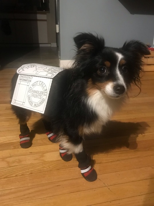
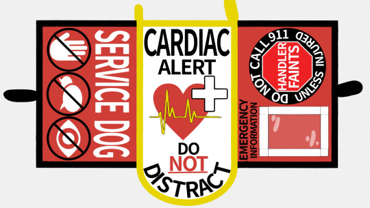
hi!! where do you get yoshi’s vests from?? or do you make them yourself? and if so, literally how? is there a particular pattern you use? they’re honestly gorgeous, and i’ve been looking for something similar for my girl
😭 literally the nicest compliment ever I made it myself!!

I was disappointed with a vest I had purchased from a maker, quickly realized that most makers don't specialize in little dogs and as a result the gear isn't legible/ there's a lot of wasted space which is a big deal when you have limited space to work with on a little dog already! So I made my own to maximize usable space instead.
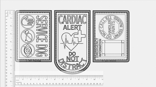
I'm sure there's patterns you could buy out there but I made mine from scratch (and it's not too complicated to figure out!). What I opted to do was measure her first, get an idea for how large the side panels and centre panel can be. I used a free art program (medibang) and dragged some rulers in there and drew things out to scale relative to the rulers. This way you have an accurate scale to work with to decide what can actually fit in the space. Print out the design (I put each panel in to a word file and printed that way) and check the size on your dog, make adjustments as needed until the paper printout sits how you'd like it to and your designs are legible! Word programs should have a ruler on the top of the page which allow you to see the exact measurement of each of your panels so it's easy to align them/ change the size as needed accurately.
There's lots of ways to make a vest, with or without webbing, multiple panels, one piece of fabric. Take a look at vests online and see what aspects you like and what you don't! I opted for webbing to stiffen the edges to prevent wear but it's not necessary! You can just stick two pieces of fabric together and call it done!
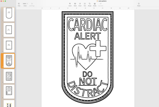
I colourized it on the computer first so I could ensure that the scheme would work and that all the fonts would be legible at their smaller size/ contrast well.
Embroidery will be the first thing you do once you're set on your design and it takes the most time. You CAN do it by hand! but it takes a long time and if you use a thick fabric it'll hurt! If you have a standard sewing machine you can embroider with that as well (which is what I did!). I literally bought my first personal sewing machine for this project, I used machines in middle school and to make a couple plushies like 7 years ago but that's it for my experience. You can absolutely do it if you're limited on experience! It's often referred to as 'free motion embroidery' which there's tutorials online for!
The basics of embroidery are to print out your design, you can sew right over the paper and follow it like tracing but paper will be stuck under the embroidery so if the set gets wet soggy paper will happen eventually! The better alternative is to get 'soluble embroidery stabilizer' which is a see through material that washes away with warm water! You can trace your design on to it with a pen, pin the stabilizer to your fabric, then simply trace the design with your thread!
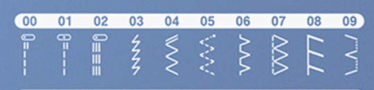
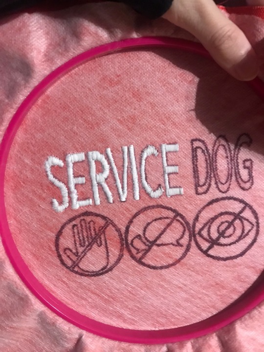
I used a zigzag stitch (#4 on my machine), think of it like drawing with a thick marker, you want the stitch to be wide enough to fill in the whole shape if possible. your machine will have two settings you can change, the width of your zig zag (thickness of your marker) and the amount of space between each stitch (opacity), so you want the zig zag to be as wide as the shape and the space between stitches to be as small as your machine will go without getting tangled ( I sit at 0.2)
Freemotion embroidery tutorials will tell you to drop the feed dogs down, don't do that. You'll break a lot of needles. Letters are just straight lines so you can leave them up, let the machine help guide the straight line, it'll be a LOT easier for you! Curvy letters like C and S will be hard the first few times but it gets easier, it's helpful to take it as a bunch of short straight lines instead of trying to turn with it. Fills in the shape better.
You'll end up tracing each letter 2-3 times at minimum to ensure it's nicely filled in and the fabric underneath doesn't show through. Don't forget to sew back over your ends to keep them locked in place otherwise it'll just unravel!
Once that's done the rest is EASY in comparison! 😂
When you're happy with your embroidery you can cut out each of your panels, be sure to leave a minimum 1/4 inch gap around the edge for the seam, you can leave more space if you want! if you think you'll be a bit wavy/ struggle to keep the needle near the edge then more seam allowance is better!
Attach the panels together (lay them together with the 'nice sides' together and sew along the edge)
You'll want a second fabric piece to be your underside, this makes the vest more sturdy, protects the embroidery, and makes a soft smooth surface for your dog! Once the top panels are all attached to each other you can cut out one big piece for the underside, a mirror copy of the shape of your top panels all sewn together!
The "best looking" way to leave a seam I would say is by folding the edges in and sewing around the outside, keeps the edges crisp and compressed. I would do it this way if I was leaving the edges of the vest panels exposed.
If you're going to put webbing along the edges anyways then you can do it a quicker way, just lay the two pieces (your top panels and your underside) together with the nice sides facing in and just sew quickly around the edge. Be sure to leave a space unsewn so you can flip it inside out again. This will be easier to do but leaves the piece looking a bit more bubbly and the corners will be a bit puffy/ not as crisp
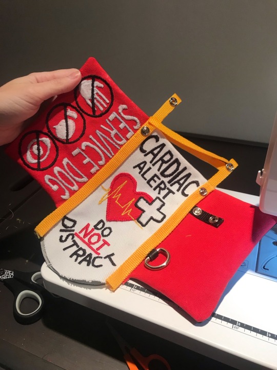
You can opt to put your buckles/ attachment points in now while you're sewing the top and bottom together or you can wait and attach it with the webbing. If you do it now you'll have to do the webbing as two separate pieces, if you do it later you can fold the webbing over the edge instead. I found two separate pieces (top and underside) to be cleaner and easier to work with on this tiny scale
From there you can seal up the little gap you left to flip it rightside out by hand stitching a 'invisible stitch' and attach your webbing to the edges. I learned the hard way that you should do the side panels first (the outer edges) and the centre panel last. You want the edge webbing to go underneath your centre panel's webbing so that it's a smooth transition when it flops down and bends at that joint! Otherwise the fabric ends up visible underneath when it bends there. So side panels first, centre panel last.
And that's it I think. it's a lot of trial and error as you gradually realize what order to do things in, what works and what doesn't.
If you do try it keep in mind that it's just thread! if you make a mistake it CAN be undone! cutting the threads is tiresome and redoing stuff sucks but it's nice to know that mistakes aren't permanent. If you're really happy with a panel and screw up an icon at the end it can be saved and you can try again without having to redo the whole thing!
Last note is that large fonts are easier than small ones. tiny font showcases every waver in your pathing, making shaky wonky letters: exhibit A my first try vs a few days later

So to avoid frustration I would stick to larger fonts at first. To go along with that try to allow the machine to go quickly, if you move really slow on a straight line it'll show every time you moved and turned it, letting it move fast on straights keeps them smoother and straighter!
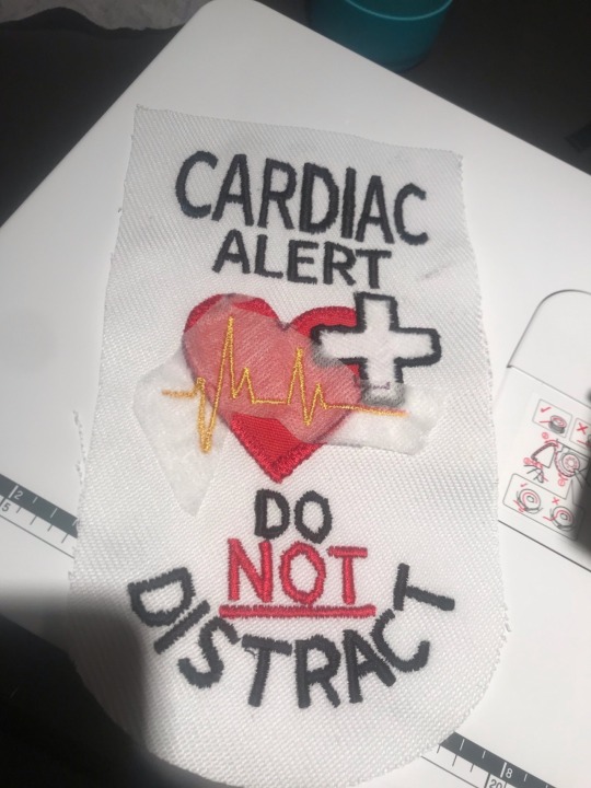
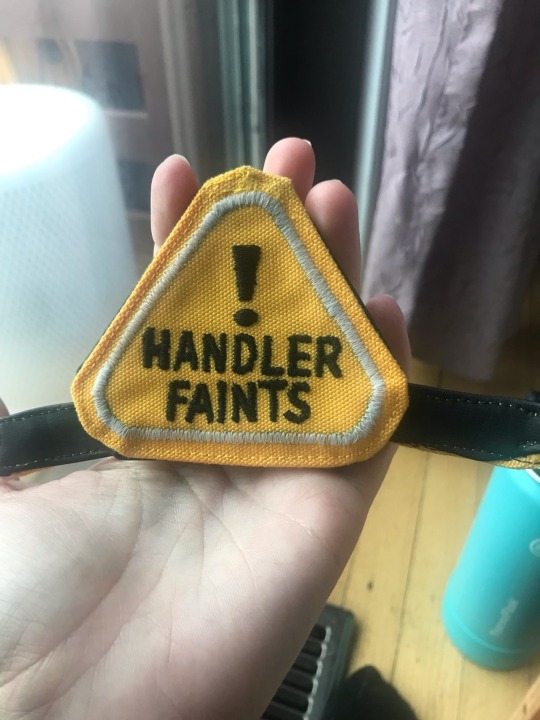
For small fonts to limit frustration I would design your vest so they can be detached and you can work on them without having to change the whole panel while you work on your skill. You can make patches!
Same scrap fabric, do your design, and then cut it out right close to the shape and just do that exact same zig zag stitch around the edge. it'll be lined up so that the left of the zig hits the fabric (at whatever thickness you want your outline to be) and the right side of the zag is not hitting the fabric at all. this will cause the thread to wrap around the edge and give a clean look! the more passes you do the cleaner it'll be (above is just two or three quick passes, if I tried harder it could be way smoother). Then you have a patch you can tack on with thread, stick heat n bond on the back for iron-on, or secure velcro or make a little hanger. dealers choice really on that one.
Anyways this is a bit of a mess of information but I hope it gives you somewhere to start. If you want me to demo anything let me know I'm more than happy to help!

oh and feel free to take my pattern up there if you need somewhere to start! I just ask that you change the design up a bit so it's not a carbon copy
13 notes
·
View notes
Text

so i may have gone a little crazy with this one. but this is one 18x24” piece of black paper! closeups and a short tutorial under the cut!
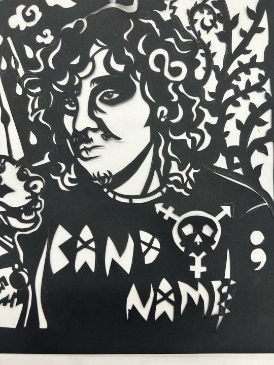
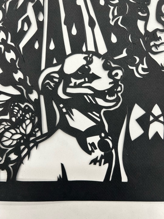
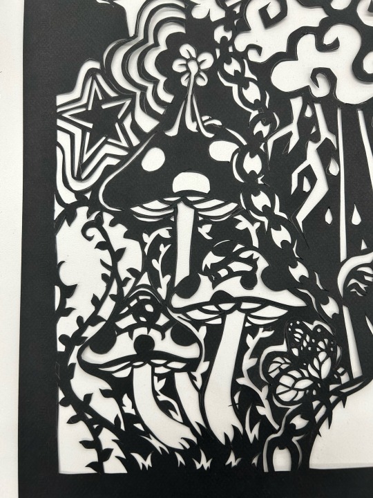
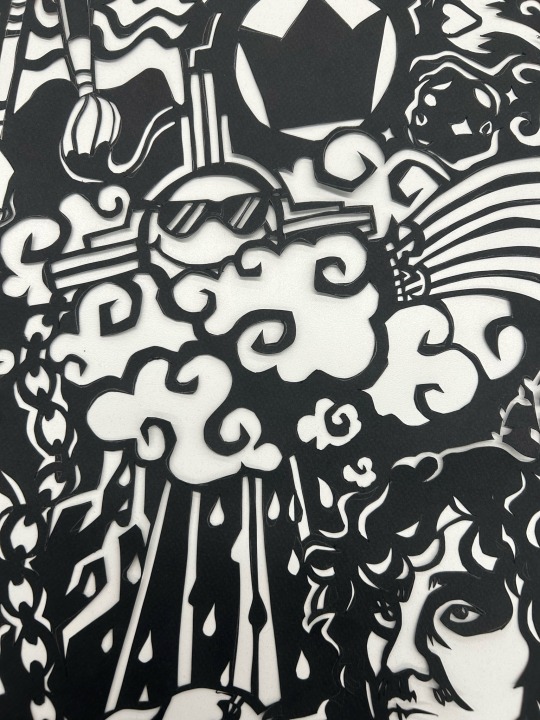
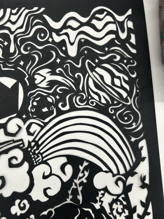
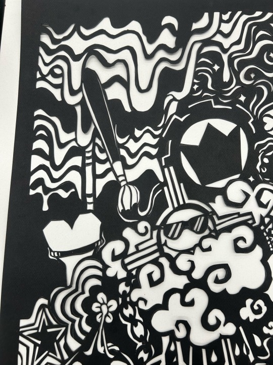
every line was made by cutting out the white parts! the portraits were made by tracing the dark areas of a photograph onto tracing paper. if you’d like to try something similar, i’ll line out a quick summary of how this was made :)
1. choose a photograph (optional, you can also just make a drawing!)
1.5. (if using a photo) using a light box or a window, trace dark areas of the photograph onto some tracing paper with a black marker. be sure that all of the black areas are touching at least 2 others!! this is so your design doesn’t fall out of the paper. leaving a border around the design helps.
2. place the tracing paper or drawing on some carbon paper on top of the paper you’re going to cut, or you can take a regular pencil or graphite stick and cover the back of the image so it’ll transfer.
3. trace all of the white/empty areas of your design with a ballpoint pen so the lines will be sharp. a pencil can also work, but the tip wears down if your design is large, making your lines thicker. use your best judgement!
4. when all of the white shapes are transferred, you can start cutting it out! be sure to use a cutting mat and sharp exacto knife. it’s a lot harder with a dull blade. you may need to change blades a few times, i sure did.
5. and then you’re done! i’m sure you can use this method for other projects too! this is just what we did in class.
as for the thought process behind my design, that could be a whole separate post. the short answer is that it’s an identity portrait, so i have elements of all of my long standing interests. the vines, mushrooms, clouds and rainbow are all symbolic of my love of nature. the lightning and sunshower are meant to represent my emotional landscape and how turbulent it can be, but also my love of weather. the sun is wearing sunglasses because i think it’s ok to get goofy sometimes, but also it is the shape of my state’s symbol. the flower guy sitting on top of the mushroom is just a little mascot dude i’ve included in other art of mine, he deserved to be included here :) there’s more but use your imagination!
7 notes
·
View notes
Text
Someone tell me if this was a dream of Sam and Max lost media
I could have swore that there was one episode with ninjas that concluded with a "how to draw a ninja" tutorial for any kids who were upset that the fight took place in a cliche cartoon cloud of smoke, and that the staff would cordially invite you to animate the fight scene yourself.
Step One of Drawing a Ninja: Draw an anatomically accurate human skull. (Max's voice actor helpfully suggests using pencil since it may take a couple of tries to get it right.
Step Two: Detail the musculature of the human face (the video shows a sped up drawing of the muscles in the face done in colored pencil)
Step Three: Bring our ninja to life (a paintbrush comes into the frame and quickly paints a full face over the muscled skull)
Step Four: Give it some character with unique flourishes (The pen comes back into frame and draws some scars on the face.
Step Five: Finally we're ready to give our little man her Ninja Style! (big chisel tip marker covers all of the face except for the eyes in black ink)
7 notes
·
View notes
Text
Commonly Asked Questions.
I get asked the same 3-5 questions all the time, so I thought I might make this new lil pinned post to help everyone out! But first, I want to thank you all for visiting my blog!
Do you take requests?
No, I do not.
Are your commission open?
Yes currently! Honestly now a days they’re almost always open. You can check them out on my website HERE!
Are you okay with gift art?
Of course! I would be flattered! If you’d like, you can find most of my characters here on toyhouse (I promise to update it soon!)!
How do you get the retro/vhs effects on your art?
I actually made a tutorial on that here! But honestly at the end of the day it’s a lot of “I plug this picture into several different apps and video editing software.” I wish I could give you a simple answer, but there is no easy way to do it that’s the same every time. I rarely if ever do it the same way back to back. Some colors look better when edited in Photoshop, some in Photomosh Pro. I pay almost $100 a month to have access to all of the software I use to make these effects because it’s part of my job. But luckily you can find so many free tutorials and apps out there, you just need to be curious and try new things!
What do you use to draw?
Another vague answer whoo! Sorry, but I use so many things to draw! But usually it’s sketch/ink/color/shade in Paint Tool Sai, and then move it to Photoshop to add the background, effects and details. I also use Procreate and Clip Studio from time to time. When it comes to traditional, it’s usually standard cardstock or a mixed media sketchbook. Then I draw and color with microns, copic pens, jelly rollers/gel pens, prisma colored markers and copic markers.
Did you draw the backgrounds in your art? And if you use screenshots, where do you get them?
In the majority of my pictures, I use screenshots from old cartoons. I get these screenshots from the shows themselves. My friend is kind enough to set up a program that takes snapshots hundreds of times during the show. Then when the episode is over, they send them to me. I then spend HOURS, going through thousands of images and delete all but the good pieces. A majority of the time they take a lot of editing to be usable. I have to clean them up, remove character and scale the images.
This isn’t always the case however! I do often draw my own backgrounds! If you ever want to know, feel free to ask!
As for the more aesthetic/abstract backgrounds, I make those myself! I spent far too much money buying licenses and rights to use tons of different patterns and vectors. With those, I love recreating authentic backgrounds in the style of those seen in the 80s and 90s!
I see you draw a lot of Transformation/Chubby/(insert common movie trope here). Are you a fetish artist?
No, I am not a fetish artist. Do I draw art that might be someone’s fetish? Do I take commissions from people with a fetish for this subject matter? Yes, of course. But people need to realize, furry characters alone are a kink to some people. For me the difference is in how it’s drawn. And I personally do not draw my art in a way that sexualizes the piece.
I love drawing transformation scenes, people being swallowed by a monster, extra big tummies, but not because it’s something that I find hot. I just like drawing fun scenes. I get bored of just drawing a character standing in place all the time. I like drawing wacky scenes!
A lot of my love for these come from cartoons. Edmund getting turned into a cat in Rock a Doodle. Hercules getting swallowed by the hydra. Kaa hypnotizing... everyone xD It’s just a story telling tool and sometimes it’s fun to draw! I’m not into hypno but I do like drawing big, colorful eyes. I’m just whatever about tf but I love drawing the swirling magic effects and the character changing from human to animal. It’s just cool to me!
In short, when I draw these things, it’s like I get to draw scenes from cartoons and movies in my style. It’s so wonderful to attempt to emulate some of the effects and details they used in movies from my childhood. It’s not about the hand changing into a paw for me, it’s the magical sparkles and how it’s so bright and vibrant compared to everything else. Where you see it go from hand to paw, that’s what I love drawing about tf art! Or being able to exaggerate the body and make a character look weighty by making them really round. Getting to draw a comically big mouth, giving a fun and interesting perspective shot. I think that stuff is so neat! Because it’s art!
I don’t care if it is someone’s fetish. I’m not drawing it in a way that’s sexual. Heck, it even says I wont in my TOS! Everything is G-PG here in Sunday’s Playzone! I’m not here to make that kind of content. It’s okay if adults have fetishes, and so long as you and others aren’t sexualizing my art, all is well!
37 notes
·
View notes
Text
KnB draw-along
Last year @daffyduckyaccent sent me a video of Tadatoshi Fujimaki drawing an action shot of Kuroko.
youtube
I love KnB and I love watching artists at work, and decided to take it as a tutorial and try to draw along!
Fujimaki-sensei's:

Mine:
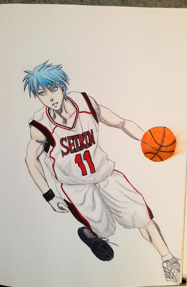
It was a first try at trying to draw in a manga style, but I was pretty excited at how it turned out! I used a fine ballpoint pen for the outline, and a mix of marker and pencil crayon to colour (I didn't have markers light enough for some of it).
Anyway, I love seeing people's art, especially KnB art, so I'd be delighted to ooh and aah if anyone wants to share theirs!!
#knb#kuroko no basket#kuroko's basketball#kuroko tetsuya#kuroko no basuke#art#my art#manga art#anime and manga#Youtube
5 notes
·
View notes
Text
DIY Boba Tea Plushie
originally posted to www.onlyfunthings.org on June 16, 2017
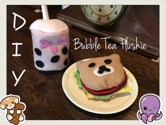
Ciao lovelies! Today I'm showing you how to sew a boba (or bubble) tea plushie!
For this plushie, you'll need scissors, needle and thread, stuffing (I used recycled plastic bags), felt in your desired color, white, and black, foam in your desired colors of straw and face, a round object, pen/marker and hot glue.
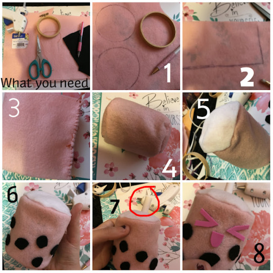
Below is the pic showing the steps (numbered 1-8). I will explain each step below this picture:
HOW TO:
Step 1- Trace circles from a circular object (I'm using a mini embroidery hoop!) Cut them out.
Step 2- Draw a rectangle that's long enough to go around your circle, and as wide as you want it. Cut it out.
Step 3- Sew the width sides of the rectangle together to make a tunnel.
Step 4- Sew the round ends onto each end (leave a gap in one!) and turn inside out. Stuff with your desired stuffing (I used plastic bags). Sew up the gap to make this marshmallow looking thing.
Step 5- Cut a circle of white felt and hot glue on top.
Step 6- Cut small black circles of felt and glue around the bottom to be the boba.
Step 7- Roll up and glue a piece of foam. Glue to the top as a straw.
Step 8- Cut a face out of foam and glue on!
And you're done!
This was based off a Yumi King video-
youtube
Do you want to see more plushie tutorials? Let me know!
You can find more kawaii tutorials HERE (school supplies) and HERE (accessories)!
You can also follow us on our official Instagram, or use hashtag #OFTreaders to be featured and share your crafts with us!
Thanks for reading! See you in our next post!
Stay awesome and remember to love yourself!

#agere class#agere classroom#agere daycare#agere school#agere#age regression#sfw agere#sfw littlespace#age regressor#sfw age regression#agereg#age dreaming#sfw little blog#agere blog#Ciao lovelies#Agere diys#Agere diy#Agere craft#Agere crafts#Youtube
5 notes
·
View notes
Last Seen Blogs
lazaro-produtos
Sem título

carpetonlinethings
Online carpet
superstarpower2000
SuperStarPower2000 Goes For 100%

uibiofest2018
UI BIOFEST 2018
theoneandonlyquirkymomo
Say Hello Momo