#and there’s the negative logo
Text
I rewatched “Jedi Knight” the other day, since my brother is watching Rebels and I thought, may as well, and.
Ya know.
If there’s an episode of The Bad Batch that’s an inverse of “Jedi Knight,” “Plan 99” is it.
I love both episodes. I do. They’re painful, but they’re both very, very good. In fact, right now, sitting very solidly in my ‘Tech lives’ mindset, if you pushed me and asked which one I thought was better, I’d probably say “Plan 99,” just by a hair—though that changes on a day to day basis.
They’re both successful at doing what they set out to do, but they’re doing very different things. The way it’s structured, the way the beats play out, the emotions that hit, “Jedi Knight” is 5000% a character farewell episode from beginning to end.
“Plan 99” isn’t. At all.
And unless it turns out I’m really wrong, that’s a good thing.
#not tagging as either show because I don’t really want this in the main tags#tech lives#hey I forgot that there’s no sound or music#in the credits of ‘Jedi Knight’#and there’s the negative logo#with the falling ash#they really hammer home that Kanan’s dead#the plan 99 credits by contrast are quiet for a second#as the stinger for the last cue fades#but then immediately starts into that somber version of the sacrifice theme#which is what typically happens for all of the heavier episodes
24 notes
·
View notes
Text

Choose your favorite one!💬👇
#logo#illustration#artists on tumblr#graphic design#creative#bear#polar bear#negative space#artwork#canada#toronto#ontario#usa#process#wordmark
360 notes
·
View notes
Text
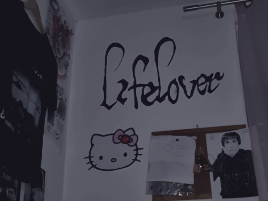
#fvckinnefor#yes those are dead bugs in a bag#yes that's an adam lanza darts thingy#yes that's a type o negative shirt#also i messed up the logo in a few places and had to go over with white but it wasn't the same like the wall:'(
49 notes
·
View notes
Text

#type o negative#artwork#graphic#metal#heavy metal#green#vert#arte#art#graphic design#goth metal#logo design#band logo#logo
31 notes
·
View notes
Photo

76 notes
·
View notes
Text


A few designs, part of my ready-made collection of designs found on Logoground.
11 notes
·
View notes
Note
Fav NFL or NBA logo
this might be a controversial onion but my fav nba logo... is the okc thunder one 😭 ... oh and my fav nfl logo is the dolphins !!!
#I AM WEAK TO COMPLIMENTARY COLORS OK IMPRISON ME 😭😭#they might not even be complimentary i got like a negative in the color theory tumblr test#LISTEN I L I K E THE BLUE OKC JERSEYS!!!!#and the white ones but specifically when they have the heart on them#some of my fav jerseys are the hornets and Vancouver grizzlies tho so i might just be weak to blue in general#but I DIGRESS!!!#other logos like pistons sixers nets raptors etc ARE nice#just a lil simple tho#like the spurs are clean but a lil too clean... that is how the spurs operated back then tho#the pop regime#heat hornets bulls bucks cavs etc like those with an animal or symbol are cool but more dif color would be nice#like complimentary to make them stand out more#but like the bulls cant rlly do that so i understand#the gsw is cool cus i like the gold/yellow on the blue but what okc has over it is the noncircle shape#so basically i like okc cus it's nice on the eyes but still stands out some (unique shape and colors#but still simple enough not to be too distracting#i like the mavs animal art but overall it looks a little much#as for football HELMETS tho i love the rams one#miami wouldve won that as well if the dolphin still had the little dolphin helmet but it doesnt#so now it will be concussed and die#thank u for asking!!!! this was cute <3!!! sorry for being wrong if u think i am except i never am <3#im buzzbeeutiful ted awesome jrues hips#ted tumbunity things
16 notes
·
View notes
Text

Why is the new Tumblr Logo a way-too-happy-to-not-be-evil looking T, with a fastfood color scheme?
Warning: Pointless rant about things I can’t change just beneath this warning
—— Rant ——
I mean, I won’t say I can’t see a few possible reasons for this change. It is really eye-catching and the more cartoonish look could be argued to be more on brand.
The thing is: it’s too loud and too different.
The brand image that tumblr already had was very alike some of the other more well known social media apps, like Twitter, Discord and Facebook (blue-ish as main color, simple image/figure). The cost of looking similar to other apps might have been that it was more likely to be overlooked, but even if that’s the case, I don’t know if such a drastic theme change is the best solution. “Might” is also a keyword here, as I have no data on whether or not the app icon and logo was being overlooked. This is all pure speculation.
Also the smile is just creepy to me. It comes off as less welcoming and more souless. I’m also conflicted about the eyebrows. A part of me thinks it might have looked better without them, another part of me says it would make the smile completely unreadable, which could make it worse.
I may just be too attached to the old app icon and maybe it’ll look better in a month, but… It just feels like the icon is TOO attention grabbing, to a point where it does grab my attention, but I’m not happy to be looking at it and I’m honestly slightly less willing to click on it. Does anyone else feel like that? Or am I just afraid of change?
—— Rant over ——
No hate the the designers btw. I’m sure they have their reasons for these changes, I just wish I knew said reasons, and what they were going for with this new design. Might make it easier to understand the changes.
#truely no hate to the designers#for all we know they could have been under really strict constraints#tumblr#tumblr icon#new tumblr#new tumblr icon#rant#tw: negativity#design#logo design#critique#not sure if the negativity TW is needed but better safe than sorry#tumblr logo
38 notes
·
View notes
Text
I don't have any horses left in the assassin's creed race but there's this small peeve I've had for years now and I may as well air it out. It's about how flippant they are with throwing their musical leitmotifs around. I'm an insufferable score geek and I love audio/visual storytelling cues, and it just pains me how intrinsic ezio's family as a track was to that story of that character, and how tenderly crafted it felt, and how weirdly it's been treated since.
Working theory's that because it simply keeps being the most melodically digestible piece of music from their ongoing landscape, they have decided to retroactively retool it into The Brand Jingle. Incessant in marketing (used at least four times in the livestream I am watching right now), and even expressed as rescored mood tracks in some of the later games (schachner did a variation in her otherwise excellent origins album I think). And it's just weird based on initial context, that's it. Badly handled.
Again, it's a stupidly inconsequential gripe which really only feels like a small, sad insight into the universe-building compass steering their ship. I'm possibly overreacting, but I can't deny that it's something that has gently grated me for the better part of a decade. Divorced of all original intent and deployed as a customer brand recall trigger. Eugh
#nevermind me just ranting about unimportant things#it IS funny how they had nothing but one CG trailer and twenty logos and decided to build an entire show around it though#(I know I know. I'm sorry. please dont cut my throat)#text#negativity
25 notes
·
View notes
Text
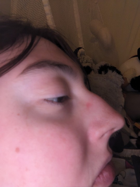
I was trying to find art references for characters with noses like mine and I could only find some masculine characters or elderly/ugly characters (idk why they always give elderly people bigger noses?? Also whenever they want to signal an ugly evil character they have a big nose. Not saying elderly people are ugly). There are maybe 2 anime girls that have a big nose, and neither of them are hooked/roman like mine.
This is why I never take pictures from this angle. Society has taught me my nose is ugly. My nose isn't cute or feminine, and is only attractive if I present masculine. I used to get made fun of when I was younger as my nose looked even larger on my little kid head. I'll admit I've considered getting a nose job, which I know is looked down upon here but there's so much pressure especially with Instagram and TikTok and face filters and editing and all the makeup tutorials show tiny cute noses or it's all about hiding your big nose before you get work done. It makes it so hard to see myself as cute and causes a lot of dysphoria when I want to present feminine.
I wish I could like my nose and believe people when they tell me it suits my face. Even all the positivity posts I see for big noses never have one that looks like mine.
I get excited when I see triangle noses on characters and I love the animal crossing nose! But with new horizons everyone uses the rounded nose now cause it's "cuter".
Idk what the point of this post is and I might delete it later. I'm just sad after looking through so many images of femboy aesthetic pictures and TikTok makeup tutorials and drawing references.
#big nose#roman nose#body negativity cw#i originally took this to use for my drawing#but i wanted to find inspiration for a stylized look instead of super realistic#i eventually drew something i think looks good but i dont know if anyone would like it#its my sona that i want to stream with but literally i havent seen any vtubers/pngtubers with big noses#at least no successful ones#i also realized my nose looks like the taco bell logo
6 notes
·
View notes
Text

Darth Vader typography design ☆☆☆
Get your unique typography/logo design now!!
PM us for details! 💌
#darth vader#star wars#luke skywalker#jedi#sith#obi wan kenobi#dark side#typography#logo design#negative space#lineart#monoline#creative#artists on tumblr#graphic design#digital art#ui ux design#social media
137 notes
·
View notes
Text
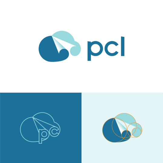
PCL logo - Cloud and paper plane by DAINOGO
Let's connect: [email protected]
#logo#logo inspiration#company logo#logo design#business logo#logomark#modern logo#creative logo#branding#visual identity#brand identity#cloud logo#paper plane#plane logo#negative space#dainogo
18 notes
·
View notes
Text

#type o negative#artwork#graphic#metal#heavy metal#arte#art#graphic design#goth metal#logo design#band logo#logo#orange#90s metal#90s music#90s bands#90s nostalgia#1990s#nineties
5 notes
·
View notes
Photo

Next level logo design
2 notes
·
View notes
Photo

genuine Question, wtf is this symbol meant to be.
(me being a little hater under cut)
bring back the merch designs that looked like this im begging you wilbur.

bc girl this is not it. 50 whole dollar for. black sweatshirt with a thingy on it

OOOH ITS A WHALE??? if it took me that long it is not a fucking whale holy shit.
shoulda made it blue or smth... and not as angular, i would have never clocked that as a whale tail
#wilbur soot#it look like sylized ovaries and uterus im gonna b real.#bring back overdesigned cringe looking wilbur merch enough of this#stealth merch#if im paying 40 dollar or more for merch i wnt it to look cool and fun. not be a shirt with a small ass logo you feel#wilbur soot crit#I GUESS lmao#WAIT is itmeant ot be like??? wireelectricity tower line thing???#also wtf does that ahve to do with wilbur lmao??#<- my tags bfri saw it was a whale tail#wilbur soot neg#also i guess lol idk
1 note
·
View note
Text
double vision so bad arm night that I thought the samsung logo said “abortions”
#tom.txt#we haven’t had our glasses for days#and I’m starting to think there may have been negative side effects to not wearing them often#but yeah I did genuinely think the logo said abortions#I nearly shit myself
3 notes
·
View notes
Last Seen Blogs
infibonn
Infibonn
illyhillyu
arkive
gotta-go-eh
Unironic Sonic Underground Fan
littlegirl-bigfantasies
I do it for the 'good girl'

whatwasoncewas
Untitled