#how many points do you have?
Text
People going "Tumblr is shutting down!" kind of made me laugh cause I was like "What is going on they made an announcement?" and then I found out that they're basically saying less staff which means fewer updates and removing features that didn't go as planned and I'm like-
ok, where did y'all get this idea then-why is everyone going into mass hysteria and making something that's a 2 at worst into a 10? Then I had to remember I'm Tumblr and this is just normal Tumblr behavior.
#do you know HOW MANY TIMES people have panic about this site closing going back like 13+ years ago#at this point it's a tradition
4K notes
·
View notes
Text
neurotypical people will be like "yeah loud noises bother me too" and meanwhile i once had to sit in a closet clutching a pillow sob-rocking for 2.5 hours because a fire alarm went off for a few seconds
#this is an extreme example but it says something i think#actuallyautistic#yes many of the sensory issues that bother me are also mildly annoying to other people#the issue is that's what a mild annoyance to you is a cause of pain and extreme distress to me#it's a medical issue that can disrupt my entire day and ability to function--at which point i get told i'm 'overreacting'#and listen that is not how sensory processing disorder works#it's not ME overreacting it's my sympathetic and parasympathetic nervous systems malfunctioning on a biological level#and buddy you are WELCOME to try arguing with them but i personally have spent years not getting results from that#they are Stubborn and they do not give a Damn what you have to say
10K notes
·
View notes
Text
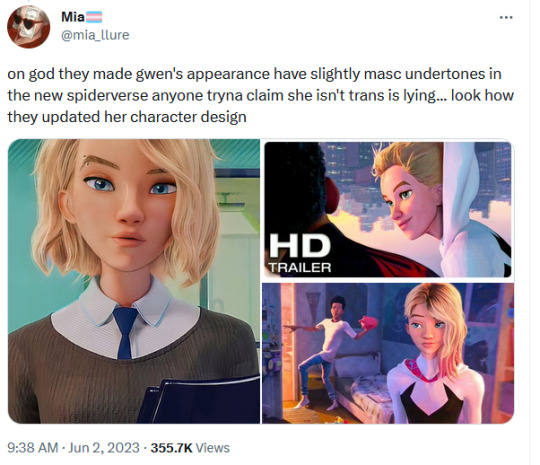

#gwen stacy#across the spiderverse#across the spiderverse spoilers#people pointing out she has a trans flag in her bedroom#and others going 'she's an ally!' like hm. how many allies do you know have trans flags in their bedrooms? quick
4K notes
·
View notes
Text
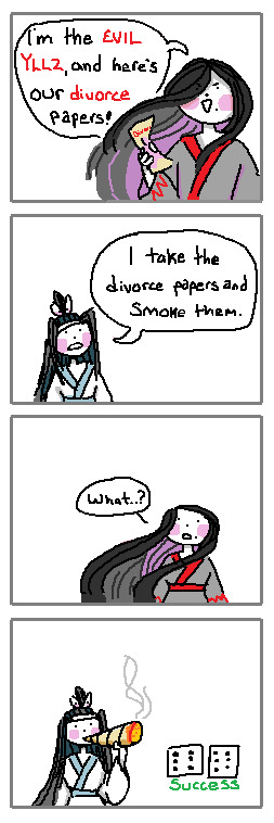
If I was in a lucid dream with a ghost, I would simply impress them with my blunt rolling skills
#poorly drawn mdzs#mdzs#wei wuxian#lan wangji#mdzs au#MDZS disco elysium au#This is brought to you by my Scrambled Egg brain - slowly burning up as I try to finish a long comic for this AU.#I hoped it would be done several days ago but I've changed things so many times....It is now Very Close to being done!#I probably should have just posted each page daily but at this point I'm just being stubborn. I want it complete and together.#Ruining the surprise a bit to say 'yeah its a digital art comic'#But its been tricky figuring out the style I want to use for it!#hence the swaths of MSpain(t) doodles that boil down to 'how would this look if I did X?'#I wanted to do a fully Black & White Ink style. But I scrapped it. Then I did small bits of colour. And scrapped it. Sigh.#This comic started out as just the first panel and then my brain went 'hold on. Its time to make a dumb joke'#Any disco elysium fans who finished the game probably know the scene I'm doing for the *actual* comic after seeing this <3#Anyways I know in my heart LWJ would roll the worst blunts ever his first time. And then dedicate himself to the rolling craft-#-until he has finally mastered it. He would roll blunts so good that people would hire him and pay him a monthly salary for it.#But he declines. His master blunts are for his beloved and his beloved alone.#wwx would roll above average but after having lwj do it for him he can ever go back.
2K notes
·
View notes
Text
ultimately when it comes to shipping and fandom space treatment of aspec characters i just don't accept "aro/ace people can still date/have sex" as an answer from nonaspecs. like yeah. mhm. okay. now i think we both know that you're not saying that out of real interest in the diversity of aspec experiences. so you can turn in your seventeen-page essay on why and how you plan to examine this character's aspec identity within the context of a romantic or sexual relationship complete with evidence from canon and peer reviews from multiple aspec people within the next week or i'm putting you in the pit from the edgar allen poe story
#you know. the one with the pendulum#'hey. why are you as an allo person shipping this aspec character like this'#'oh aspec people can still date/have sex!'#'yeah. now can you answer the question that i actually asked you'#like goddamn just say you don't care they're aspec and you want to fulfill a sexual/romantic fantasy with them. that's Fine#it like. sucks. for sure. lotta aspec people will be unhappy with you. but everyone is entitled to their own wants and experiences.#but i'd prefer you just be honest with it rather than using our community's conversation points as retroactive justification#and ONCE AGAIN. you guys are real fucking cavalier with this shit and it shows a real fundamental lack of respect for aspecs#when most of you would NEVER ship a canonically gay character with the 'other' gender. cause again. it would suck.#you can do it. nobody's Stopping you. but it would suck.#and we understand that putting a queer character in situations that erase that queerness is shitty! until it comes to aspec characters!#and whoa... there it is again... people don't consider aspec identities to be queer... crazy how it always comes back to that#anyway. you all know what i'm talking about. have seen many posts about this lately#it is [ long sigh ] unfortunately a very hot button issue with the advent lately of alastor hazbinhotel#which. again. god i wish there were other canon aspec characters to be having this conversation about.#but we'll have to do our best with what we have#aromantic#aromanticism#arospec#aroace#talking#aspec#asexual#asexuality
982 notes
·
View notes
Text

So does he, Gallagher.
#honkai star rail#hsr blade#gallagher#i based this off of how many times i used funny soda man to help be a healer with his poppin soda pop in SU#and then blade constantly just being blade as usual#its normally him saying unnecessary to my actual healer but#i kept forgetting gallagher heals and i kept healing when i didnt even need to so TECHNICALLY yeah it was unnecessary#but the amount of times blade was the recipient......#i cant use like most of my newer units in story bc i cant ascend or i run out of leveling mats so i just#get them and toss them into simulated universe for funsies cause i can match their levels better#so thats where i tossed gallagher and he is genuinely fun to play as ? like i love his punches and kicks to start the battle#funny soda man is funny (to me) and im really behind in plot still#but last time i tried to play it on my laptop and got a kickass cutscene my laptop lagged and i couldnt even see it RIP to me#so now that its like ... me trying to play it on desktop ?#i mostly get on desktop for comms and if i do much else i feel like im slacking off even if i would take a break anyway#one day i can play more story plot stuff and actually meet the funny guys#also in case you know me for Not Having Boys in HSR i need to point out#i did pull Gallagher however same 10 pull got a 4 star girl copy for someone i never use and she is at e4 now cool#and i didnt even think of the irony as i started this i just like drawing blade and i wanted to draw gallagher#so when i already had the dialogue planned and am drawing i was like OH WAIT haha im funnier than i thought#(no i am not but we can pretend)
601 notes
·
View notes
Text
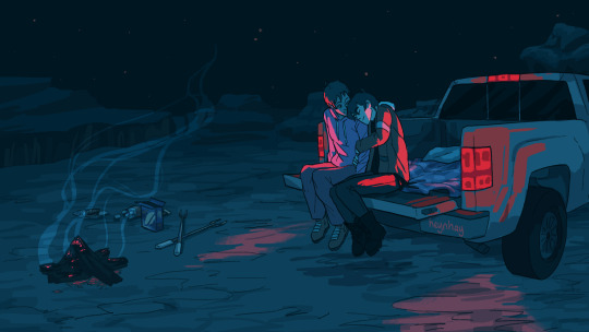
let's drive out
#klance#voltron#vld#this came to my brain via Valentine Texas by mitski but im not offficially linking it bc i have something dif in mind fpr later#and this one is a faithful visual recreation of the lyrics but not an emotionally faithful one so. i can do better#anyway being taken out to camp in the bed of a pickup truck is like. haha. one of my dark twisted evil romantic fantasies#my country bumpkin upbringing showing through#now you guys know how horrible and wild my unhigned crazy thoughts are...... how unspeakably deranged.....#art#my art#bro im such a fucking faker i will fr get on my soapbox about how often klance fight (even romantically) and then draw the tenderist shit#like 40 times over#so let me amend and clarify by saying this was somehow some stupid shit.#like lance set this up but its because theyve been competing for best date (theres a physical scoreboard on the fridge)#and keith was probably trying to act aloof so that lance wouldnt score as many points#but got so comfy he fell asleep (+15 for lance its going on the scoreboard)#+ lance is abt to sharpie a moustache on his face#mitski
1K notes
·
View notes
Text
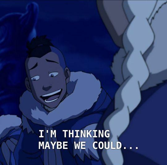


okay be honest. if someone as hot as sokka (is constantly established to be by other characters within the text) said these exact words to you, you would also fall in love with them on the spot and/or be overwhelmed with uncontrollable horniness. yue is valid
#id in alt text#sokka#yue#sokkaxyue#i am once again thinking about Them#they are sooo cute its unreal#and i will not apologize for that!!!!#also yes. i know im gay but i have many straight friends okay#or well. i have one straight friend but she's REALLY straight she is the heterosexualest woman in the world#so i know how their minds work#and besides. man or woman there is nothing hotter than an attractive person who is also an awkward dorkass nerd#it's like catnip to us (girls who probably have something wrong with them but are really good at masking it)#frankly it's the kind of thing everyone i've ever dated or ever considered dating has said to me#yes i would like to do an activity with you!! at a place!!! for some time!!!!!#anyway. my point is#people clown on sokka for this (namely; katara)#but it would work on most if not all of you#i guarantee it
765 notes
·
View notes
Text
last night i got home kind of tipsy and very much in tears and my mother told me the force you exert to keep someone in your life is proportional to the force with which they will leave your life. if you have to fight tooth and claw to keep them, their leaving will be just as hard, just as harsh, and just as definite.
#she said it like a law. its just momentum.#also she told me to get a therapist and start archery ASAP bc i need to get it together#and also she said even granting that this person u were in love w was So Special . as in hot motorcycle-riding iranian masc lesbian in ldn#they arent the only one on earth and that once i start my proper adult life outside of studies etc etc i will probably no longer live in th#UK. she said most non straight iranians u would like have left the country anyway . where do you think they went? theyre out there#and also she asked me to imagine how many hot gay iranians there may be in italy or amsterdam or smth and i was like ok points 😭 maybe#ur right. anyway i was having a feeling of dread bc crying into the arms of ur strict asian mother while buzzed usually results in#death chaos destruction etc in the next few days but actually i think maybe she has genuinely changed as a person and the fear is#unwarranted#anyway i need to eat breakfast and study w the date person i met yesterday#they are so nice ??? genuinely so so sweet i dont feel attracted to them at all omg i genuinely think i have a thing for hot evil ppl 😭#but we could b besties . theyre a lot more romantic than the ex situationship person too like generally . ugh they should be perfect but#alas it appears i am shallow as fuck or potentially a lesbian actually#OH THEY MIGHT ALSO BE POTENTIALLY A LESBIAN BTW#i think i just tend to not date cis ppl entirely by accident#....feel free to rb if u want btw sorry for the rant
229 notes
·
View notes
Text
if we keep doing uwu soft little vampire and big strong dumb werewolf how are we going to ever break out of gender binary
if i see 1 more artist make the masculine/larger/stronger human partner into the werewolf im going to freak out
lycanthropy is about losing yourself. please i am begging you to make someone random, someone unequipped, into a werewolf. please. small scrawny werewolves who are weak and scared, feminine werewolves, werewolves who struggle with the idea of taking something's life (even another animal for food) werewolves who refuse to get dirty because they're averse. werewolves need more than 1 mental illness yall
its kind of a joke at the beginning but not really. make an insane jacked vampire and her petite femme werewife with braided patterned fur or something; make the vampire a seamstress who wont quit until her werewife has the perfect fitting dress for her new furry body. stop with the "oh this character is butch/masc, CLEARLY they would make a good werewolf" shut uuuuupp be a LITTLE more creative. come on!!! do you really think every single werewolf has a premium gym membership? quit drawing them like it !!!
#this post has been brought to u in part by cinnamon#have none of u considered that if u give a werewolf a Different set of problems they will be way more interesting#how many times have i seen the 'lycanthropy is a good metaphor for everything' post and agreed#but still im only seeing jacked violent huge strong animalistic werewolves. whyyy#how can you say this is basically a universal experience and then only assign 1 body shape and traits to a character Forever.#like yeah thats very 'diverse experiences' of you........ to only portray the everyman in the form of a werewolf...... sooo representative..#like genuinely who are werewolves supposed to represent because allegedly its me and i have yet to truly relate to a werewolf in media#i do not relate to wanting to mercilessly slaughter or being powerful or striking fear in others or being ripped and violent#maybe im missing the point or something but.. i AM a werewolf :0/#just 1 nonmasc werewolf. please. that is all im asking for. idc if theyre androgyne or a void. idc. just NOT a gymbro as a werewolf.#idec if they fill the stereotypical traits of a werewolf just NOT A GYMBRO!!#werewolf posting#woof
339 notes
·
View notes
Text
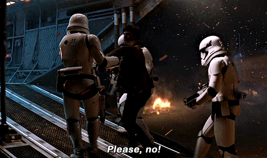
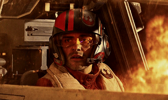
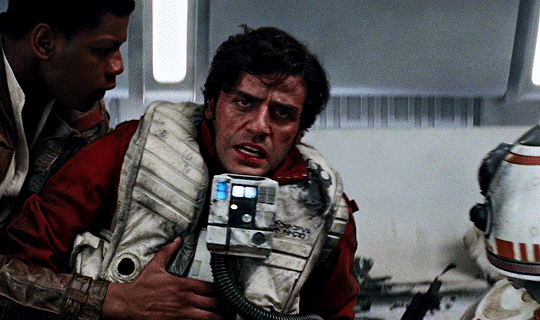


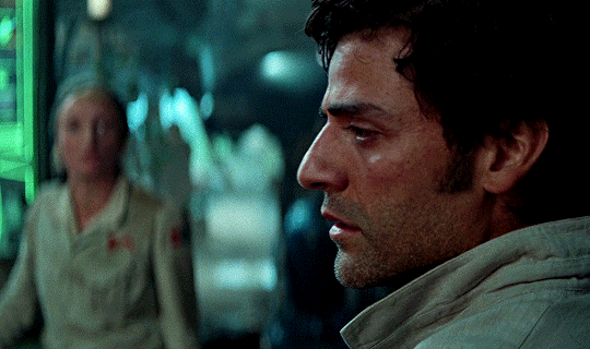

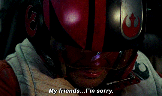
Still not used to this life or death situation stuff. That's good, 'cause I'm not either. You never get used to it.
#swedit#starwarsedit#starwarsblr#star wars#poe dameron#flashing gif#nym.gifs#thinking about how in the stuff pre tfa he just. he wants to be a /pilot/ he wants to be a /soldier/ because he doesn't want to have to#carry the burden of the moral calls and the weight of so many people's lives in his hands#especially when strategies go /wrong/#'point me at the bad guys and let me do my thing'#he works alone SO often.#and there's something so genuinely tragic that poe's just. /so/ good at what he does that he ends up catapulting himself into the position#that. he didn't want.#and the thing that /pushed/ him into joining the resistance to prevent from happening again (losing someone he cares about under his#command /keeps/ happening). and worse he ends up in these positions where he /could/ blame himself for things that /aren't/ his call.#like u know he's got to feel responsible for the village on some level not to mention fuckin /kijimi/#it was /his/ idea to go there#the world should've protected you. instead you've been chosen to protect it.#what an honor. what an injustice.#not all of these fit this theme but mostly i just wanted to focus on his reaction/responses to some of the bigger tragedies in the trilogy#and tbh there's also. plenty more shots.
391 notes
·
View notes
Note
I was wanting to try doing an art piece in the style of the signature spell poster art pieces you create. But I’m not really the best at coming up with a composition for such a thing.
Do you have a process for how you come up with the compositions for them?
oh, awesome! it is an INCREDIBLY enjoyable style to work in; I hope you have fun with it! :D
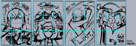
I'm not great at putting my thought/art process into words, so my apologies if this doesn't make a lot of sense, but I'll try! my first step is always to do a LOT of thumbnails to figure out both the idea and how I want to show it; not trying to do a real sketch or anything, just little doodles to figure out what exactly I'm trying to portray. (I also call these "garbage passes" because they're not meant to be any good, they're just there to throw things out. aha. ha. ...anyway.) I think it's important during that first stage to really focus on the idea and the layout and not to get too bogged down in the actual drawing yet!
I tend to save my final thumbnails, so I'll use 'em as examples (I posted the ones up through episode 5 here if you're interested!) (and, uhhh, spoilers through episode 5 also in this post, hopefully that won't be an issue!)
the main thing I try to think about in composition is balance -- not necessarily in terms of symmetry, but in where each element is placed and how much space it's taking up. remember, empty space is still space! it's also really important to think about the parts that don't have anything in them, as much as the parts that do!
personally, I like to divide things up roughly by both halves and by thirds -- there's a lot more in-depth info out there on why the "rule of thirds" in particular works well visually, but in short, our brains tend to focus on things that are placed closer to imaginary division lines, instead of in the exact center of an image. so even when I'm doing something that is very centered and symmetrical, I try to keep that in mind and generally aim around those for landmarks like faces/eyes (or...where they would be, anyway) and other focal points.
it's not a formula of "the character's face should be in this division of this grid" or anything, more like "our minds like to focus on these areas, let's think about how to use that", if that makes sense! and of course rules are made to be broken, art is lawless anarchy, and so on. but it can be a good starting place for deciding where you want to put things!
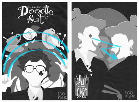
(blue - thirds, red - half)
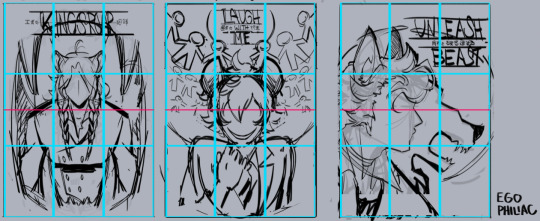
and against the finished versions, because they do usually end up changing a lot (including the empty space of the border):
(...these actually lined up a lot better than I thought they would. :') it makes me look like I do things way more intentionally than I do.)
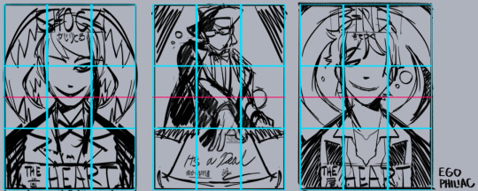
other stuff I just try to keep in mind is that our eyes like following arcs and paths, which can be a good way to guide the eye:
and frame and control the focus:

honestly, composition is one of those things I feel like I struggle with a lot, so I'm not sure how much of this is helpful or actually makes sense outside of my head. but hopefully it helps a little! it's all just stuff to think about while drawing and not anything hard-and-fast, so don't, like, stress out about making sure things are lining up exactly on the thirds or anything. again, it's more "our brains think these are the dopest parts of the rectangle" than anything else! take advantage of the cool parts of the rectangle!
NOW GO HAVE FUN DRAWING seriously though, it is always super cool that other people like this idea and style enough to want to do it themselves and for other/their own characters! thank you! ❤️❤️❤️
#art#sketch#twisted wonderland#...technically i guess? it's not about twst but there is twst art present anyway#i did have a few more examples but then i wasn't sure if you were cool with episode 7 spoilers. whoops. 🫠#many other people have explained the rule of thirds and directional flow way better than me and i apologize#it is so hard to put things into words i am so sorry#me: the...you know...the lines...they sort of converge? like a triangle?#the internet: mm-hmm. yes. go on.#me: (sweating) the...the triangle points here...because it...it has a point.#the internet: it's doing better than you are then#genuinely shocked at how well some of these line up though#uh. i mean. actually it was all totally intentional and i put actual thought into it! NOT an accident at all!#my eyes darting back and forth shiftily are just ✨following the paths✨
410 notes
·
View notes
Text
putting my prediction on record now that the coming decade is going to see the rise of viral-marketed fancy at-home water filtration systems, driving and driven by a drastic reduction in the quality of U.S. tap water (given that we are in a 'replacement era' where our current infrastructure is reaching the end of its lifespan--but isn't being replaced). also guessing that by the 2030s access to drinkable tap water will be a mainstream class issue, with low-income & unstably housed people increasingly forced to rely on expensive bottled water when they can't afford the up-front cost of at-home filtration--and with this being portrayed in media as a "moral failing" and short-sighted "choice," rather than a basic failure of our political & economic systems. really hope i'm just being alarmist, but plenty of this already happens in other countries, and the U.S. is in a state of decline, so. here's praying this post ages into irrelevance. timestamped April 2023
#apollo don't fucking touch this one#serious post#not a shitpost#hope i forget about this post and have no reason to ever look back on it one day#fyi i'm aware that access to potable water is already a major issue in parts of the U.S. yes i know flint michigan exists#i'm saying that this issue is going to GROW unless local & federal governments work together to fix it.#so it's a matter of if we trust them to fix it. And well--do you?#what are the chances the government just denies there's a problem until the water actually turns brown#at which point it's already been common knowledge for years and people have just become resigned and that's our new normal#i'm mean come on. how many of us already believe that we're being exposed to dangerous pollutants we don't know about and can't avoid#like that's pretty much just part of being a modern consumer. accepting that companies will happily endanger your life for a few pennies#and the most you'll get is like a $50 gift card as part of a class action rebate 20 years down the line#probably the history books will look back on Flint as a warning and a harbinger that went ignored#luxury condos will advertise their built-in top-of-the-line filtration systems--live here and you can drink water straight from your tap!#watch the elite professional class putting $700 dyson water filtration systems on their wedding registry#while the rest of us figure out how to fit water delivery into our grocery budget while putting 90% of our paycheck towards rent#also eggs are $15
5K notes
·
View notes
Text
eowyn should have been a lesbian. Eowyn/faramir is like, fine, but it misses the point of eowyn for all baby dyke eowyn stans which is not that she longs for glory in battle and doesn't realize war is ugly and brutal, but that she's caught between two awful options and she doesn't want to be given one based on her gender. She's not in love with aragorn, she envies him because she finds the tasks he has in life more preferable and she hero worships him. Is this the point Tolkien was trying to make? Well, no,
#look it is LESS objectionable than other similar fantasy storylines because tolkien is making a point about the brutality of war#but i do think he correctly observes a particular impulse in some women without fully understanding the underlying tensions#he's like. for reasons unknown some women would prefer to face horrible dangerous circumstances than stay at home & tend the family castle#don't you see the castle is the important thing!#the castle is more important yes that's not the POINT#anyway. it will not be until many years later that some of those baby dykes will be able to articulate the vague feeling of betrayal#guy jobs are horrible and exploitative too on this we agree. but you see some of us will die if we have to figure out how to be nurturing
268 notes
·
View notes
Text
I'm amused at how confused some people are at the idea of Puss being shipped with Death when Shrek is a series of movies that had a DONKEY canonically get together with a freaking DRAGON
#like if you don't like the ship that's valid#but the logistics should not be the sticking point here#if a dragon and a donkey can get freaky with it#and have babies?????? they have babiessssss??????#wolf and a cat? that's NOTHING#oof i make myself laugh#i think i'm personally just vibing about this ship#i will like or reblog cute ship fanart but at the same time#i am also 100% good with how it is in canon#i like the idea of puss happily going to greet death at the end of a long life#like meeting an old friend#lobo puss in boots#puss in boots#death in boots#pussdeath#deathpuss#puss x death#death x puss#no but why do y'all have so many ship names though my god#shrek#nah they're cute though#it sparks joy#puss in boots death
1K notes
·
View notes
Text
I have a question for people who fervently argue that Arya has no potential for politics but think that Sansa will be one of the main political characters, and I'm asking this seriously.
If Arya learning multiple languages, how to tell + detect lies, how to rule her face so she doesn't reveal her emotions, being able to blend into different situations, thinking quick on her feet, knowing the importance of gathering information, being someone who makes friends wherever she goes, convincing a FM to help free Northern prisoners and participating in a coup, etc. don't make Arya capable of participating in politics...what exactly is it that you think Sansa will be doing as a political figure?
#arya stark#sansa stark#asoiaf#cause I would genuinely like someone to explain to me why people argue so passionately against Arya being a political character#to the point that they pretend there's zero overlap between what she's learning and what a 'political' character should know#I always see people reduce her to being a fighter and ignoring her other skills so it's obvious you think they could be useful so?#/politics/ is such a broad term too...there are so many different ways for a character to be political and I just don't understand#why people are so restrictive when thinking about how characters can occupy that space#this isn't a dig at Sansa this is me genuinely wondering what you guys think being political means and what she'll be doing#if you don't think Arya having any of these skills qualify her 😭#Arya and Sansa can both be political characters it isn't an either or scenario#this isn't the show where only one person can be the poorly written so-called /smart one/#I don't need any /no one says this!/ comments either...if you aren't someone who thinks like this then feel free to move on
175 notes
·
View notes
Last Seen Blogs

tellingmona
MONA
bylerficrecweek
your underrated fic rec needs
iamjcpower
Untitled

creativemorningstrois-rivieres
CreativeMorningsTrois-Rivieres

bangtandream-makers-blog
Hello