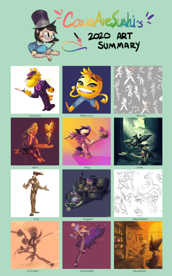
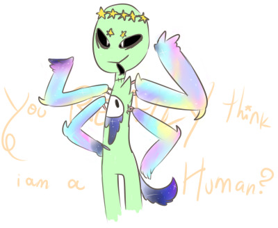
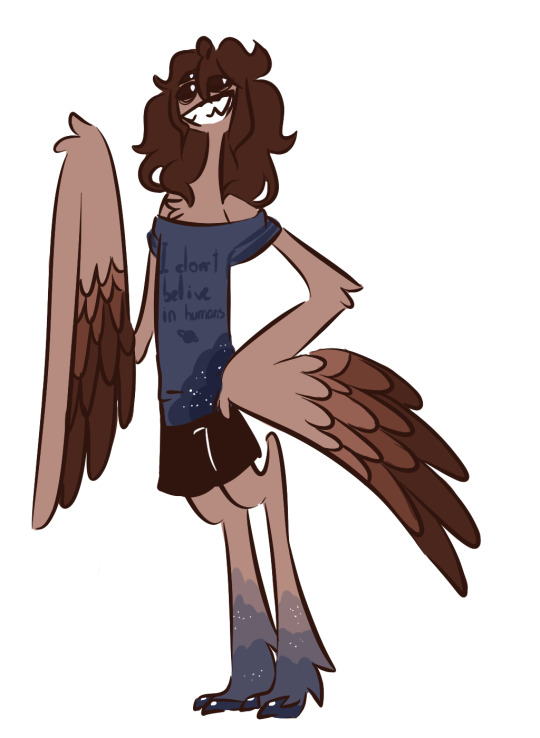
#lineless painting is hard but it looks nice
Note
I'd like to know if you could share some of your favorite art that you drew? since you have fantastic drawings 😊
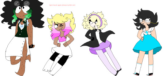
you're very sweet, thank you! favorite pieces Of All Time would be too hard to pick i think so i'll share some of my (somewhat recent) favorite pieces ive done.
(DISCLAIMER: apparently there's quite a few i wanted to share so. sorry about the fact that there's 14 down below. lol)

^one of my first attempts with my new toned sketch style. and the first thing i drew this year! getting expressions/posing just the way i imagined is always a rare treat for me LOL so im also really happy with that still

^probably my favorite ive done with one of my Other new styles (semi-lineless painting) (along with the first i did with my favorite oc lol) kind of funny to have this as one of my favorites. like of course one of these answers would be pinocchio. but i really like this style because i try not to use any effects like glow or multiply. all the shading, highlights, and stuff like that here is just regular paint
^more disney... sigh. well these ones are sentimental because i love these guys and drew the first one on my bday which was also when this parade debuted at disneyland again. ive been called insane to have done that one entirely in one day but honestly that just makes me happy because i think ive really developed a good process for sketches like this to make them look nice AND to enjoy making them. the other was made after the last show of said parade and it was just fun to draw a bunch of characters interacting while trying to keep them in character

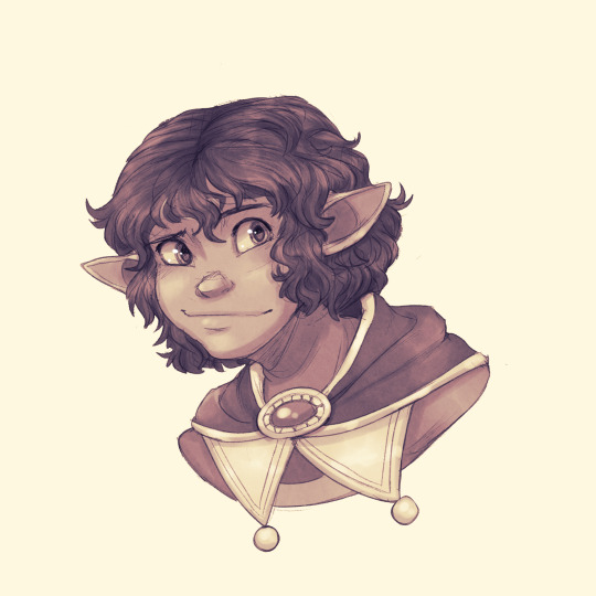
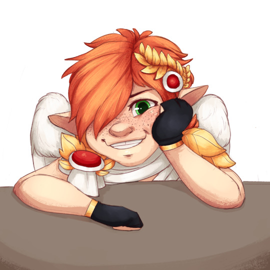
^too embarrassed to say what this is other than it's insane oc/canon art BUT i really love this new toned sketch style i do as i said above. and the left one came out nice i think! particularly fond of the wings and facial expressions! and the second one... well i really think it's just one of the best ive done of this character. his hair and proportions on his features just came out so well... ok im gay moving on

^dont even remember if this was this year or not but let's pretend it is. this one is self-explanatory i think. BIG lineup (for me anyway) and it's of the party from my first ever dnd campaign! very special

^these ones look simple but they both show things that became SO much more. the first one... it's a catalyst. the start of making what was originally just a COMPLETE joke character into one of my favorite ocs. a treasure. isnt he cute :3c and then the second one is my character i made for a custom ttrpg which ended up being one of the best EVER!!!!!!!! augh. a brilliant campaign made by my very talented friend that ive shared a bit of here
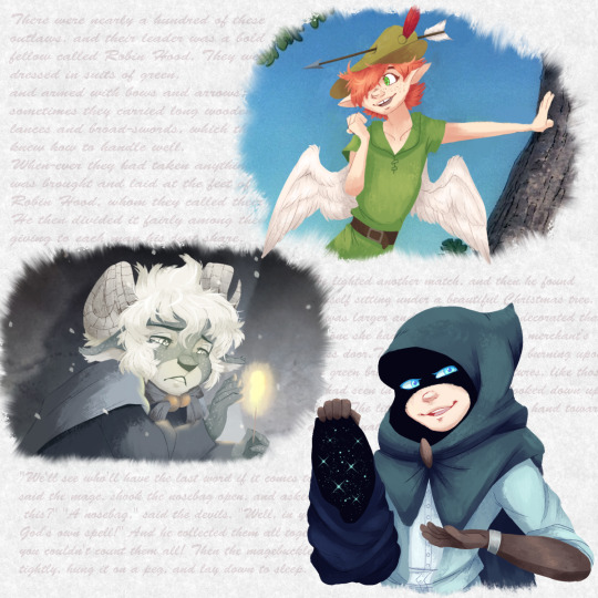

^idk this is just a cool prompt im proud of. "draw your ocs in fairytales/folktales" and i went mad (i love fairytales/folktales) and just did a bunch of them. in my painting style. can u guess which story is which (little hooded cloak man has the most niche one)
^pinocchio madness has done a few positive things for me. one, this oc my friend and i made for pinocchio is so precious, i really love their relationship and they bring me so much joy. but ive also developed my skills with expressiveness by studying and drawing disney's pinocchio. these are good examples of posing and expressions im really happy with (can u tell im really focused on expressions LOL). also pinocchio helped me get back to animation work??? wild
^i am pretty much always happy with how my "screenshot" styled pieces turn out, but this is the most recent one! glad to share this one too since it is literally fanart of the efteling which is that themepark im not normal about
OK IM STOPPING NOW. THANK U
2 notes
·
View notes
Text

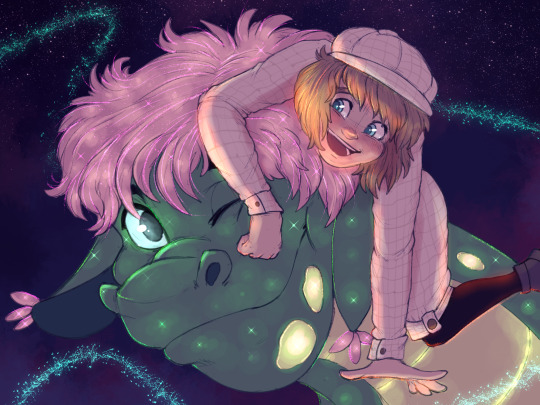
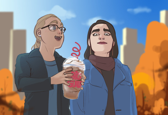
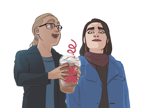
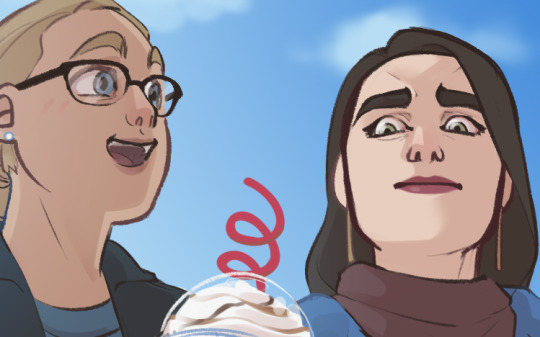
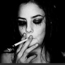
Yo that new pokemon snap looks cool, and i’m happy this dino plant is getting more love for being glowy.
#pokemon#new pokemon snap#meganium#drawing in full color? now thats rare#lineless painting is hard but it looks nice#mine#my art
43 notes
·
View notes
Note
Do you have any tips for coloring/shading? I always love how your colors look cause they're really nicely saturated but still well balanced
oh boy do I have some very strong opinions about color lmao
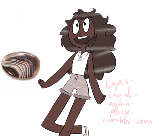
First, I’m morally obligated to mention that there are 8 million ways to approach digital color, so these are really just the Thots going through my head when I’m working on a given thing. For the sake of this rant, I’m gonna use this scribble of Kara and Lena from last fall, because it’s simple enough that I can easily illustrate some key points.
Most of the ideas I’ve outlined are about shorthand techniques that can easily and quickly use color to your advantage when you’re trying to sell the environment your characters are in. I’m not a painter, and painting is absurdly difficult, but we can use digital software to our advantage and consider how a painter would approach when lighting a figure/object/environment. Too many shortcuts are >:( but a few quick and simple habits can go a long way in finishing and posting a quick drawing you don’t want to spend hours rendering.
1. Pure black almost never exists in nature, and similarly, you will almost never need it.

Most illustration aims to “sell” a perceivable, believable space. While this is not everyone’s goal, most of what I draw is finished with an at least semiconscious goal of appearing touchable. Pure black is a guaranteed way to take away from that, because we almost never see it in nature. The darkest point in this particular drawing is Lena’s (terrified, dead) eyes, and it is only about 80% black and has some red/orange in it to help unify with the rest of the darks in the piece.
Here, locking my drawing layer and scribbling in some browns, blues, and even whites goes a long way to mesh the figures with their environment, especially because the background is lineless.

Here’s what this same drawing looks like with pure black lines. I would argue that this version does a disservice to the steps I’ve taken to light the figures, and it’s flattening the brightly lit outdoor space I’m trying to imply. There’s a whole additional essay about how lines play into this as well, so that’s a pretentious argument for another day.
2. Local color will rarely reach above 50% saturation.

Here’s the drawing with all the lighting work I’ve done removed (barring a few highlights I’m too lazy to turn off). In illustration, “local color” is referring to the color of a given object at the most neutral lighting possible.
The most heavily saturated element here is the artificial red on Kara’s cup, which makes sense! Printed logos, light up colored signs, things that are generally hard-sided and man-made will be more saturated. The next most saturated object here, and the only other local color exceeding 50% is Lena’s coat.
The rest of the clothing, skin, and hair falls between 10% and 35%. A neutral base gives you a lot of room to work with when you start lighting. It’s easier to go richer in digital than it is to accurately reel your colors in. Like any other kind of contrast, saturation can be used to pop points of interest, and if your entire canvas is TURBO SATURATED, none of it actually is. Also you’re hurting my eyes.
3. Natural light is cool, artificial is warm.
As humans, we spend 99% of our time either seeing the world lit by the sun, or by a lightbulb. Light from the sun is cool and generally diffused because it has passed through our atmosphere. Interior lighting tends to be warm and direct, casting clear shadows that come from a very specific light source.
Even if we remove the background, you would probably assume that Kara and Lena are outside based on the light temperature. Blue and orange are opposites on the color wheel, so an orange-tinted shadow (warm) will by effect make all the lighter colors look blue-ish (cool)! Pretty much all the shadows on these figures are just a faint orange Multiply layer. You’ll also notice a faint blue gradient over Kara’s shoulder to emphasize the approximate point where the sun is in the sky.
In short, cooler light and warmer shadow will imply that the setting is outdoors. Warmer light and cooler shadow will imply that the setting is indoors. It’s a fast and easy way to communicate character location.
4. Skin is weird.
If I’m just slapping some flat colors down and don’t plan to do much painting, facial features and skin have a lot of complex undertones, so if I don’t want to get into too much detail, a splash of red on the nose and around the eyes, a bit of color on the lips, translucent ears, can all go a long way to making flesh look more like flesh and less like barbie plastic.
5. Atmospheric perspective is much more important than grid (1/2/3 point) perspective.
This is relevant to color because color is the best way to easily portray atmosphere and the passage of space. Especially when your setting is outdoors, objects’ colors should become cooler and less saturated as they recede in space. The closer an object is to the camera, the more contrast you’re going to see in hue (position on the rainbow), saturation (richness of the color), and value (light vs dark).
#don't invite me to talk about art because I will wax poetic like an asshole for thousands of words#and there will be nothing you can do to stop me#mine#Anonymous
399 notes
·
View notes
Photo

Have I introduced you to my son, Karol Capel?
I’m actually a big fan of Tales of Vesperia, and Karol’s best boy, no questions asked. Here’s an art dump of him. Image descriptions below the cut.
Top Row
Left: It’s just Karol waving, with simple lineart and shading with an ink brush. He’s mostly in the shade, with light coming from his left side.
Middle: A lineless style similar to how I do the illustrations in my fanfiction, starting with the darkest colour and then using layer modes to add lighting.
Right: Stimmy boy. Smooth lineart, with coloured lineart to show where light is hitting him. I don’t draw motion very often, so that was an experience in itself. The shading is a little more subtle than I usually do, with the most showy being the hair highlights.
Middle Row
Left: Karol with his hair down, sticking his tongue out because its in his eyes. Just flat colours, all texture is provided by line and crosshatching. Don’t use this style very often, so I probably need more practice with it.
Second to the left: Karol with his hair up in a tail. With his costumes, it can be hard to tell what the length actually is, so I may have taken some liberties here. Simple black lineart with simple shading. Blushing because he’s getting a compliment.
Middle: A bit of an abstract style that I generally only use for physical painting. Uses shapes of colour to create the image, with colours pulled from a wider spectrum than before. This gives it a unique, three-dimensional feeling. The boy is crying. :(
Second to the right: Angry Boy. Lineless with plains of colour. Shading is more pronounced, using colours from the middle piece to inform.
Right: The hair that goes with Karol’s ‘girly’ costume. Lineless art created with one of the more sketchy brushes, uses colour to define facial features like the nose, and make the hair shiny. He’s smiling. :)
Bottom Row:
Left: Karol’s ‘girly’ costume, with a few modifications made for ease of life. Dark, sparse shadows added with very bright highlights. I don’t remember what the inspiration for this one was, but I think I took it from a Legend of Zelda game? I don’t really remember.
Second to the left: Karol holding up his bag. This one’s probably my least favourite, it looks rigid and stiff. Coloured lineart with shading added. I think I just coloured in his weapon with random colours instead of taking from the game. At least the metal axe looks like metal.
Second to the right: A design for an older Karol, using watercolour brushes. Kept to his core colour scheme, except for ditching his red neckerchief for a blue scarf and darkening his pants. His hair is kind of an evolution of his current hairstyle, with longer hair in a tail and the swoosh kind of brushed to the side. Added a scar because scars are cool. Gave him a new bag, which he made himself, obviously. Maybe still needs work, but I like it as a first attempt.
Right: Karol garbed in his best armour from the game (As far as I’m aware, anyways), the Brave Helm and the Star Mail, with boots and grieves designed to go with them. Added the final symbol as his accessory, because why not? Also, he has his best bag, too. Used a thick black outline, with thinner interior lineart, and used the in-game sprites of the armour as inspiration for the shading style. Turned out quite nice.
#Tales of Vesperia#ToV#Karol Capel#Karol#Knightmare Art#I've doing this slowly in between other stuff
33 notes
·
View notes
Photo
Well ain’t that a year! Let’s never talk it about it, lmao.
Well, so a recap:
-Fandoms: Got into “A Hat in Time” and “The Property of Hate”
-Started my own webcomic “Spirit’s World” and posted the prologue and ep.1.
-Worked really hard on poses via pose sheets, and practiced lineless painting some more. I think my colors are coming out nicer!
-Went into OC hell thanks to comic bs.
-In my private time, got super into shoes, and actually acquiring nice clothes.
-Bought a trenchcoat.
Ain’t that a busy busy year! Onto the next, 2021! Things to look forwards to~
-I can drink.
“REAL” 2021 Goals below:
-Spirit’s World Ep. 2 and hopefully 3.
-MOREEEEE FANDOOMMSSSS or a return to the old. Who knows! Not me.
-Thinking of making an animated short. I have 2 planned, but only 1 I can feasibly finish this year.
10 notes
·
View notes
Note
I wish I could do lineless art bc yours looks so nice and I want to do nice lineless art too but it 99% of the time when I attempt digital art on my phone it looks so bad and I've switched to trad completely for now bc my computer can't handle anything better than ms paint and Idk how to use my graphic tablet anyway lmao ok ill shut up i just really like the way ur art looks, i keep returning to look at it, u also lowkey started my kamukura hair obsession, so thank u for being so amazing 💕
GRLSJD ;; Aw. Thank you so much.
Honestly, digital art is just like any other art medium. It takes time to get use to, both in the muscle movements you use (Because it is a lil different then the regular paper movements) and if you don’t have a screen tablet getting use to the hand/eye change takes just as much time. On top of like, computers just sucking when it comes to processing power sometimes. So even when you’re a good artist, sometimes your art doesn’t transfer as well digitally.
It’s just a hard transition :flush:
Regardless, keep up ur art! I think your style is really unique and expressive, and I’m actually very i love with it myself. I’m always impressed when people can make traditional coloring meathods look.. good, because I Cannot. I am a strictly Digital Artist.
Also, I’ve tranferred you to my religion... Cult of Kamukura’s hair.
Very good. We’ve needed more members for a while now.
17 notes
·
View notes
Photo
The Dream Crosser
Surprise! NaPoWriMo didn't kill me (and I'm not abandoning dA because of the incoming Eclipse update either, more on that situation here), I just needed a week off to recuperate...and obsessively play Animal Crossing: New Horizons...
Admittedly, I actually drew this well over a month ago (and wrote up the majority of the description!), not just before NaPoWriMo but before I actually had New Horizons in my grasp. The plan was to post it the day I got the game. Which was supposed to be much closer to the game's launch (March 20th). That ended up not happening and the day I got the game was the first day of NaPoWriMo, but 1. I messed up with the non-uniform prompts and spent all of the day trying to catch up so I couldn't even play the game yet, and 2. As a side effect, I ended up having two posts that day and a lot of work to do to catch up the second, and I hardly had time to think about posting this. And even if I had posted it, it would've been drowned in the incoming NaPoWriMo posts.
And so, here we are.
Really, really, I do have to mention that I truly feel for anyone else still waiting on the game for whatever reason. You have my deepest sympathy and I'm so sorry I can't just give you the game right now and make it better. I know the wait was hard enough for me, being this is the one game I highly anticipated in over a year and I essentially had the rug yanked out from under me. But I'll save that story for after I talk about the art itself since I'm sure that's what most people are here for and not my pre-order frustrations.
So in case you don't know or couldn't tell, this is the lovely Luna from AC: New Leaf's Dream Suite. From what we've seen of New Horizons since it's release, the Dream Suite's functions and purpose have been mostly absolved into the Airport and Dodo Codes, and so I'm very doubtful Luna will actually be in the game in any capacity, which makes me sad. A typical player (including me) wouldn't even necessarily interact with Luna that much in New Leaf unless you really enjoy visiting other towns using Dream Codes, so I'm not sure what it is, but for some reason I just really like her.
That's why I picked her to draw to celebrate. I very nearly drew her a long time ago when I was on an Animal Crossing kick in 2018, but at the time I didn't like the idea of pressuring myself into drawing all and/or multiple AC characters just because I wanted to be "fair" to them all (much the same reason I don't draw Pokemon very often), so I ended up drawing One Little Spark, a crossover of the Disney character Figment drawn in the New Leaf style, instead. So in a way, she's had this coming for quite a while.
At the time I started working on her, (way back in early March, because I was hoping beyond hope my pre-order would arrive to me actually on launch day, but ha ha ha look who's got egg on her face for that ) I was running a bit dry on artistic motivation, and so while I tried to draw her in my usual manner: Making a sketch, transferring the sketch onto different paper with finalized lines, then picking whichever coloring method I was most into at the time), I was struggling with the sketch. I've had days where I have to work on a sketch for a really long time before I can get something I'm happy with, but this day I was just so not into the whole sketching process. I wanted to create, but I wanted it to be quick and easy and simple. I didn't want to have to poke at it for hours and hours and then still maybe not be happy when I was done. So when I got discouraged enough, I broke away from trying to draw Luna and just drew mandalas instead. (As had become my art-block crutch for a little while.)
Somewhere in me, as I worked on other things, I kept going back and forth on what to do about Luna, though. I did still want to draw her, but my usual formula just wasn't working for me. Not for her. I even tried briefly to draw her linelessly, digitally, as what was supposed to be a quick and simple experiment, but that went downhill even faster than sketching did. Although, for some reason, the lineless idea wouldn't leave me alone after that.
Finally, I decided to try something completely different. I was going to try and free-handedly draw her, without lines, traditionally. With, primarily, alcohol markers.
Honestly, the thought minorly horrifies me now just as much as it did before I started. And yet, here we are and I actually like how it turned out. Allow me to explain how this came together:
So, since I wasn't sure how this was going to turn out once I decided to try it, I opted to use my not-so-great mixed media paper so I wouldn't feel guilty about wasting better paper if I ended up hating it. Naturally, this did lead to some notable limitations, but not enough to discourage me from trying.
I dove right in with the dark brown for her head and body, focusing on getting the general shapes down. I'd noticed some glaring mistakes in my mostly unproductive sketching when it came to Luna's body proportions, so I tried to keep those things in mind and adjust accordingly as I went. It was scary because there is no erasing this way short of using white paint and because this paper feathers pretty noticeably with markers.
Then once I got to a certain point, I had to switch and bring in some pink and off-white markers to draw in parts of her dress so I knew where to put her other arm and her legs. And here is where I technically cheated; I did use my "clear" Stardust Gelly Roll pen to do most of the outlines for her dress. I needed some kind of guideline, but pencil tends to get yucky when you put markers on top and at the time I couldn't really think of a better option. (The joke was kind of on me because somehow I still got a nasty gray line that looked like pencil under her bust that I had to gently edit out later in Photoshop, but I digress.)
As I went with the markers, I was also doing some light shading. Not too much, because this paper is really fussy with layers and blending, but enough that I felt like it didn't look completely flat and I could tell where one shape ended and another started. Though, for her nose (trunk? I believe Luna is supposed to be a Tapir) and her raised arm, I had to get a little creative and I used a white brush pen meant for glass/ceramics to put in the lines so you could actually see them. And later I would use the same pen in 3-4 layers to add the white back in for her eyes.
With the base for her body, dress, and the bun part of her hair done though, then I had the task of figuring out what to do for her shoes and the details of her face. (Without having to mix and use specific paint for those tiny details.)
In the end, I opted to mostly use my classic red Gelly Roll pen for her shoes, and a little bit of a dark red alcohol marker for shading. And then I got to experiment with mixing the classic red and one of the Moonlight Gelly Rolls for her lips so that the color would be visible and not just a dark lip-shaped "what is this." This was because the classic Gelly Rolls don't show up super well on dark surfaces and the Moonlight ones do, but I didn't have the right color straight out of a Moonlight pen. It did take 2-3 careful layers, but I think I managed well enough in the end.
I used just one black pen, a Prismacolor brush-tip fine liner, for her eyes, though in-person the white base underneath makes her pupils look about a shade or two lighter from certain angles, which was a very unintentional nice touch.
My answer to everything else ended up being gouache, although I did try to come up with pen colors for her eye shadow and the blue dots on her cheeks before admitting defeat that I just didn't have the colors I needed.
Originally, I had actually been thinking of trying a lineless art piece with gouache, as I think it would work particularly well for that look, but I wasn't ready to fully commit to the idea, mostly because I seem to be even worse at mixing a non-excessive amount of a specific color with gouache than I am with acrylics, and that sounds like a fantastic way to waste a bunch of palette space because I mixed too much but it's gouache so it can be re-wet and re-use it and I don't want to just throw it away... (Although I suppose this could be half-way solved by getting a bigger palette specifically for mixing gouache, but I also don't want to have to buy yet another palette when I have some perfectly good ones...If I could just use up all the paint in them already...)
Anyway. Point: This is kind of a step between a full lineless gouache piece and not doing one at all. Baby steps, yes?
I knew from fairly early on that I was probably going to have to use gouache for the front part of her hair/bangs, since I did not thoroughly plan ahead enough and didn't leave a gap there to do it with markers. Fortunately, I didn't have to do much mixing since my gouache already has a nice yellow ochre color included, and I could use a bit of the other two browns and one I had some leftover mixed already from Roses in Your Eyes for shading. (White for the flowers, too, thank goodness.) And I actually ended up going over most of her bun with gouache too since, by comparison, the marker didn't look like it had much shading and it was bothering me.
I did have to mix my own blue and pinky-purple for her makeup, and I ended up with a lot of leftover pinky-purple. But it's kind of okay because by itself it's such a pretty color I'm sure I'll find an excuse to use that one.
After that, I just had to do some minor tweaks where the gouache had gotten a bit away from me and then I went ham on the shading for the dress based on my reference photo.
Then I realized I wanted some kind of background because this seemed awfully boring without one. And, naturally, I hadn't really planned ahead for that, me being me and being in habit of doing the background last...
At first, I wanted to do something hot pink, since her official Amiibo card has a hot pink background, but then I thought that might be a little too loud and I wasn't really sure the best way to apply one without potentially messing her up. And also, this isn't watercolor or paper thicker than 140 lb, which immediately threw watercolor out the window unless I wanted a very uneven paper when I was finished. I'd already pushed my luck with the gouache and been very careful about not using much water with it; I decided it was best not to push my luck any farther.
Also, I couldn't use my pink PanPastel, despite that being maybe my best option, because it is still perpetually screwed onto the little Pan Pastel stack with no hope of getting unstuck anytime soon. (One of these days I swear, I will order either another set like the one I have or an individual Pink one to solve this problem, but until then, I am going to bring it up every single time as a caution to others to please be very careful when screwing and unscrewing your own Pan Pastels if you store them screwed together.) And I didn't feel like dragging out some of my drawing pastels and/or makeup that's too expired to use on my face and very slowly building up color and hoping it'll do what the Pan Pastels do.
With no better ideas coming to me, I decided I'd leave the drawing for the night and come back to it the next day.
After yet more brainstorming the next day, I finally settled on doing a glittery rounded rectangle and filling it with washi tape stripes. This plan did change a little as I figured out which tapes I wanted to use (a purple-y, champagne gold, and light pink ones, the latter two of which look more different in-person than they do on the scan) and as I actually started applying the lines. Partially because this tape is a bit thin and partially because I'm not used to cutting tape around very specific shapes, it took a very long time to both place strips of the tape and then get them cut to fit right up to Luna without looking strange.
Once I got to a certain point going in one direction, I realized my next couple of cuts were just going to be too hard for me to stand. I had a choice: Ditch the tape, or figure something else out.
Taking a risk, I decided to try and salvage it by doing an almost-plaid/checkerboard with the tape, specifically leaving out certain areas where I knew it would be too tricky to cut the tape. This also turned out to be a good way to use up some of the pieces of tape I'd already cut off that were too small to be used the other way. It's still not the greatest background solution I've ever come up with, but it does the job of making it look less empty, and that's really all I wanted anyway.
And you know, compared to official images her proportions look wonky, but by herself (meaning, without comparing the two) I think Luna looks pretty good, actually. (Though, I admit I did have to tweak her right ear in Photoshop because it came out entirely too long and there wasn't really a good way for me to fix it by hand.)
To think, this piece started out as such a mess. Or rather, I was such a mess when I started. And yet, here we are, and it looks kinda okay. Okay enough that I finished it and am posting it, at least.
I have no idea if I'll be returning to this style/method for art-making in the future, but even if I don't it was a nice experiment to try, and that's what art is really all about isn't it? Experimenting, trying new things?
Speaking of experimenting though, about those pre-order frustrations I mentioned now that I've covered everything about the art itself...(in small text for those that don't care to easily skip over)
Back in February I tried twice to pre-order New Horizons from Target, since they were running an ad where if you pre-ordered the game you'd also get an AC themed journal with it, and that combined with my family member's employee discount made it the cheapest/best value way for us to buy the game. As I said, I tried to order it twice. Both times, it was sold out. My family member had even tried to go to the store and have them order it before then, to no avail.
After the second time, which was the day after Target sent out the sale paper with the new ad in it, while I was still frustratedly wondering how on earth do you sell out of a pre-order?? I kept refreshing the page every so often just to see if by some fluke it would miraculously not be sold out. I got very lucky around 3 in the afternoon and we managed to get the order in before it sold out again.
Now, we're a relatively cheap family, so we didn't pay for the "express shipping" or whatever. Although, this was a $60 game and we were ordering it three whole weeks (on March 2nd) before release. If you ask me, the least they could do is have it shipped out either on launch day (March 20th) or the day after. Especially if I can pre-order a book on Amazon with three days' notice and they can still get it to me on release day. But, okay, I could live with waiting an extra day or up to maybe three if I had to. (And, to be fair, this was all before a certain virus exploded into chaos here in the US.)
Much to my dismay, a week before NH release day, I checked the order status with Target only to be told I wouldn't get it until the 26th. A week later. That was pretty disappointing at the time, but it didn't really bother me until the day before and the day of launch when some people were getting their pre-orders early from places like Amazon and Best Buy (and some of them didn't even pay for the express shipping option from their selected source). If those two companies could plan around virus constraints to do that, why in the heck couldn't Target?
But, okay, fine. Maybe the virus had something to do with it and they were really doing the best they could. Whatever. A week. Fine. I'll wait a week.
A few days later though, we got an email saying: Surprise! Don't expect your dumb video game until April 3rd because we couldn't get our act together! (Okay, that's not what it really said, but that's what it felt like.)
And I know, I promise I so know there are much more serious issues going on in the world right now and a video game about talking animals isn't exactly a priority shipment. I know. But it was still massively upsetting after I'd already waited so long. And, honestly, I feel like they had plenty of time and notice to take care of the game before everything else exploded and messed it all up. Again, especially if other companies already had time to even ship orders early and/or get the games to people on launch day. Or the day after. TWO WEEKS after launch, and you don't tell me about the secondary delay until the week I started expecting the game to already be in the mail on it's way to me?
The only tiny silver lining is that as I was checking the order to make sure it didn't miraculously get pushed back to sometime in 2021 (because I really had no faith in Target's time estimates at this point) is that it did get bumped back up to April 1st. Although, I did think that it would be the absolute least funny April Fools' Day Joke ever if the day came and it was late because screw me. But it did arrive to me on April 1st as promised; I just had a million other things to do before I could play it. )
And I will say, I know I could've just canceled the pre-order and bought the game digitally, but it was enough of a hassle to order it in the first place, and if I did that I'd also lose my pre-order bonus. And all that aside, I specifically wanted a physical copy to begin with. I always prefer that when it's possible. So people on the internet that want to eat me alive for not canceling when the shipping got screwed up, there are my reasons. Take 'em or leave 'em. (Seriously, I've seen some people be really rude about this just because they didn't like hearing people upset that they didn't have the game yet...when they already had it themselves or didn't care about AC in the first place...)
Moral of the story: Don't pre-order from Target. Or, at least, don't expect the item to actually get to you right around release day. Account for at least two additional weeks of not having the thing.
...Seriously though, how do you sell out of a pre-order?? At least, when it's a highly anticipated game and you're a big company and not some small indie company with limited resources! Sheesh!
Anyway. I have the game now, I've been playing it as much as possible and enjoying it. I still have a ways to go before my island is "complete" per se, but it's coming along nicely and I feel more comfortable now taking some more time away from it to get back into the swing of making art and things like that. So hopefully I'll be getting back into a regular posting schedule and you'll have that to look forward to.
____
Artwork © me, MysticSparkleWings
____
Where to find me & my artwork:
My Website | Commission Info + Prices | Ko-Fi | dA Print Shop | RedBubble | Twitter | Tumblr | Instagram
2 notes
·
View notes
Photo

This is a post about the evolution of my art from 2011(or 2012?) to today, 14/7/19. I made this post purely for me, but if you want to reblog it, i won’t mind.
Around 2012, i started drawing on paint with the mouse. I admit, i am not happy with how these look, the body is to thin and the head is too big, they have no face, i can’t see the drawing cleary, and more. But, for a 7-8 years old drawing on mouse, they aren’t bad.
I started posting on tumblr instead of Facebook around this time. I started growing up, i knew what i liked and what i wanted to be, so the way i started drawing myself reflected on that. I like the marks and the way i used the spray, i actually really like this drawing and the colors i choose, even if they weren’t put on with thought.
I started trying to paint and make different skin colors, different body shapes and different designs. I started paying more attention to the modern fashion and take influences, but still didn’t gave up completely on my own style. I also started playing with gradients the way i could with the pixel tool in paint.
I started drawing on paint tool sai and it was really hard on the start, i didn’t understood how painting worked and most of my drawings ended up uncolored, but i tried anyways. I tried to paint and make nice colors, and honestly drawing gems really helped me with that because i had a palette but i still had to pick the colors myself.
I went back to drawing on paint from time to time, i was more used to that and knew how to use it, but i still tried to play with paletes. I used to trace a lot and my art had so much influence from my tracing, but here i’m trying to change that, i’m trying to change my artstyle and have something unique, not because i was unhappy with my artstyle, but because i wanted to try new things.
Around this time i was starting to try lineless art on pts like i did on paint and started understanding layers more. I don’t like this drawing as much as the previous one, but it was a start for me.
I tried to make special drawings for my ace interview, so i tried doing my best and ended up making a new thing that i never did again for some reason, pastel space. I mixed the colors well and was starting to put details and pay attention to the body itself instead of the clothes.
My designs were more distinguished from each other around this time, i tried to make piercings, cuts, freckles, things that i didn’t wanted to have but knew would give personality for my character, and that mattered more then my personal taste. I also tried to give my characters different fashion instead of whatever outfit i liked.

These two are from last year and probably my favorite pieces. At one i used the fact that it was lineless to make it simpler and make the composition also simpler but easy to understand and interpretate. On the second one, i tried giving as much details i could to show their culture and distinguish both of them even if they are from the same species, like humans! And i’m so pround of this one, it might be the drawing i like the most- and it isn’t even colored!
And for last, two from this year! I mixed everything i learned so far-how to make colors work together in harmony(from palettes),i gave the characters their own fashion (Callisto prefer more confortable clothes and doesn’t care that much as, let’s say, Ganimede, about what he’s wearing. Melissa(holy fuck i remembered her name) needs shorter clothes since she’s always in water and needs to move fast, but also cares about her appearence, so there’s more details on her shorts and she has a belt she doesn’t need. Also, she has vines because of her culture.),i also made the designs simpler enough to remember from head but complicated enough to catch your eye, made different artstyles from both of them, and in Melissa there’s even a lineless touch in her design(her vines)! And even putted a new trick- i don’t need to always make the distance clear by making it darker, i can also make it transparent, it will actually call more attention and give more charm!
Conclusion, my art grew a lot and became way better and prettier and i needed this post to prove this to myself, so i’m glad i did it, i’m glad with how far i’ve come, i’m happy with my current art and i look foward to improve more in the future!
#my art#fave#fav#talk#compilation#artists on tumblr#callisto#melissa#alec#me#homestuck#old art#save#insp(to myself lol)#original#original art#original character#original characters#oc#ocs#long post
14 notes
·
View notes
Photo
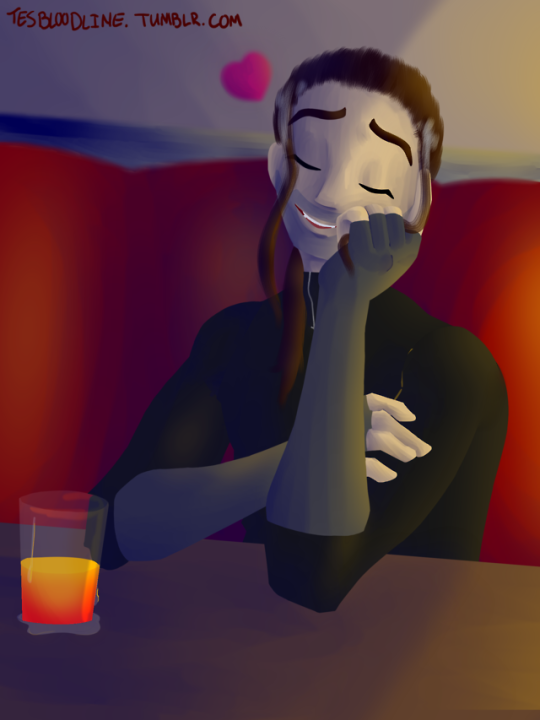
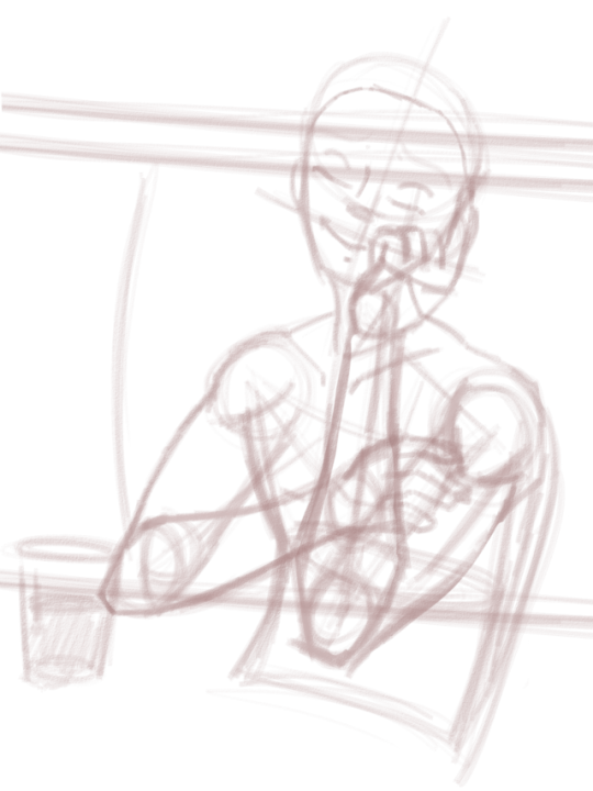
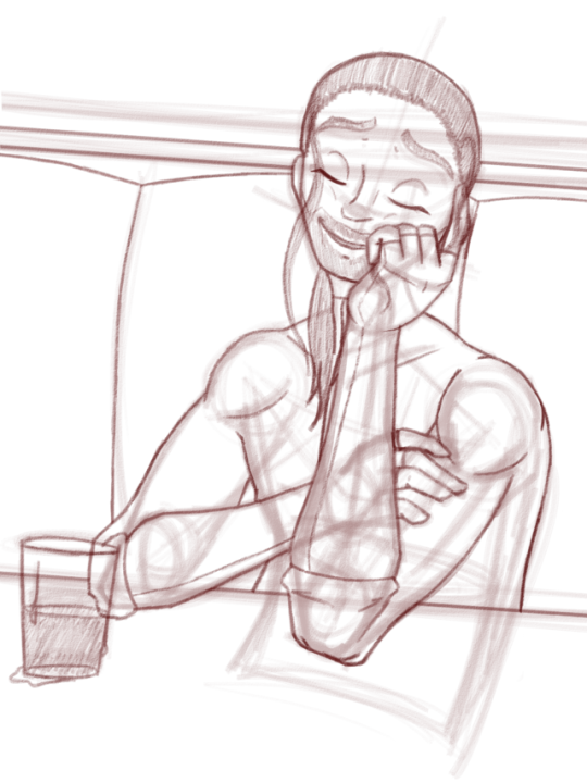
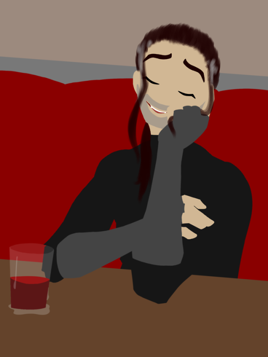
So I thought I’d give you guys a little overview of my painting process! You may have noticed that this is a very different style than my other art - it’s been a long time since I’ve painted something completely lineless like this, and the last time I did was in Photoshop 5, not Paint Tool Sai. But I thought it was time. Designing Lucien for this style was a lot of fun - and I’ve never drawn him in work clothes before!
EDIT: The original picture, minus the early stages and the long process description, is here. I forgot that link, sorry.
Anyway, my lineless paintings go through four stages. First, the rough sketch. This is heavily based on my reference image (credited at the bottom), but not traced. I’m working hard to develop the skills needed to design my own realistic poses, but I’m not there yet, so references it is. The background wasn’t referenced, though, so if it looks terrible that’s why. Anyway, as you can see, at this stage there’s no real indication of who I’m painting. There are no details to suggest that this is Lucien as opposed to any other guy with the same rough body shape. It’s pretty much just there to make sure my placement and proportions are right.
Next is the tight sketch - this is where I really flesh out the subject and add in all those details - not that this particular piece has all that many details to add. But this is where he becomes Lucien - hair and clothes come in this step. It looks stupid if you hide the rough sketch, though, so that gets to stay.
Then the flat colors! This takes way too long - usually about as much as the two sketches together, since I have to make sure I get the shapes of the color blobs absolutely right, or the finished piece will look idiotic. It’s also where I decide on color schemes and finalize my palette. I didn’t realize this Lucien was graying at the temples until this stage, where I sketched it in on a whim and decided it looked pretty nice, actually.
Finally, the shading stage. This one takes the absolute longest, easily two or more times the length the rest of the stages took all together. It takes forever to get the volume of the figure right, and then trying to accurately capture the planes of the background takes even longer. This stage also includes the placement of highlights, any glow/sparkle effects, any text (including watermarks and signatures), and any other details I decide to add in.
And as you can see, things change from step to step. The design of Lucien’s nose changed between the rough and tight sketches, because I realized he was looking more down than up and the original shape wouldn’t work. The contents of Lucien’s cup changed from the flats to the final piece, since I originally couldn’t decide what he was drinking. And I completely added the little heart after I finished literally everything else, because I thought it was cute. The earlier steps are there to help me, but that doesn’t mean I’m chained to them.
Anyway, this was a pretty simple piece all in all - maybe six or seven hours of work? I didn’t exactly count, since I always forget to track what time I started or stopped, but it couldn’t have been much longer than that, at least.
Technical Details
Program: Paint Tool Sai
Tablet: Wacom Bamboo CTL-470
Time: ~6-7 hours
Reference: Love reference sheets by Kibbitzer on DeviantArt
9 notes
·
View notes
Note
17 20 1 2 hi julesy
Ok I already did 17 so
20: a piece from this year you're really proud of
Uhh prolly the drawing painting I did of Simon and Athena for psychduo week but I'm gonna say this drawing of Tessa gray cos no one looked at it
I assume u mean 1 and 2 and not 12 so
1: how would you describe your style
Uh. Fuck uh. Oh god I always wanna hear other people describe my style because I have no idea but uh it's lineless and I like painting stuff... I usually use chunky brushes over thin ones.. I work really hard to make the shapes look like you can grab them and I tend to use very bright rich colors... I think most of the influence of it comes from like artists that were super popular on deviantart and Instagram for fanart like tamykta and loish and that one person with the Percy Jackson fanart oh yeah! Viria 18 or something... I'm also told my style is very angular which I don't usually go for but it does happen. Thinking of it I should go find a new artist to try and get inspiration from it's been so long since I've done that to the extent I did when I was younger send me ur favorite artists
2: what's your favorite thing about your style
My shapes :). I think they're something that I've worked on very hard for a while/am constantly working on and from what ppl have told me I generally succeed so it's really nice to see something I work hard on work out :D
0 notes
Text
Feeling insecure about my art skills so i’m gonna inspire myself and keep going!! Gonna make a list of artist i admire and what i love about them!
@captain-eurobeat is a dear friend of mine, and i love her style alot! it’s nice and cartoony! she uses alot of straight lines, but nothing looks stiff. her colours are fantastic too!
@outonalark is an artist i’ve been following for YEARS and they never cease to amaze me! they keep progressing and i’m so happy to see them go! i love their linework and their general style SO much. their character designs are fantastic.
@hkasof i’ve been following them for many years too! they draw with such confidence and i love their lineless work! everything they draw feels sweet and natural
@geniusbee is an AMAZING artist that i saw evolve SO MUCH over the years. she works hard and she gets the results! i love that she can capture someone’s appearance super well at the same time as translating it to her style. her comics are also fantastic, she’s not afraid to draw multiple poses and environment!
@pengosolvent has a profoundly unique style and i’ve admired them for many years now. their character designs are super creative and completely original. unlike everything i’ve seen
@fozzie has an amazingly flowy style. nothing is stiff, everything looks energetic and dynamic! his animations are great! all the characters he draws are unique and have a distinct silhouette, which i love
@elemei has amazing comics and uses colours in such a beautiful way! i adore their linework and their background. they can draw anything!!
@earth-dad has a fantastic style. i love how they draw characters so much. their comics are super touching and their paintings are phenomenal
@faiyx has a super distinctive style! their knowledge of anatomy is amazing and their style is beautiful! the watercolours are super impressive
@politelyscribblingaway has such a fun and colourful art style! her style is great and she improved so much is such little time! her art is a joy to see
7 notes
·
View notes
Text
star wars creator meme
tagged by the always wonderful @coffeeandtin ! thanks so much :D
You’ve been tagged in the Star Wars Creator meme! Pick 1 - 10 works you’ve created (fic, art, gifsets, aesthetics, videos, playlists, etc) & tell us why you’re proud of them! Then tag your friends!
This will mostly be artwork, haha
Nik Walker as Aaron Burr - Recently I got to see Hamilton, and Nik Walker really impressed me, so I did some artwork. Not only am I happy with how it turned out (especially since I don’t do lineless paintings very often), but HOLY CRAP when I posted it on twitter and tagged Nik Walker, he was so sweet about it. He said “HOLY HELL THAT’S AWESOME”, retweeted it, then asked me if I had an instagram so he could give me a shout-out on there. I sent him a PM that said, “Thank you so much! You made my week.” He replied, “You made MINE!” Anyway, I just about died. :P
Faraday and Vasquez - My second Mag7 drawing! I’m happy with all my artwork for Mag7, but this one just stands out to me. Drawing more than one person is always intimidating for me, particularly when I’m doing a detailed drawing, so this was an accomplishment.
Moana - The second (shared) piece that I drew with a tablet. Before that, I literally did all my digital art with a mouse pad, and my hands probably wanted to murder me. It was so much fun learning to draw with different tools, and I really love how this one turned out.
Star-Lord - An earlier example of my work with digital painting. It’s more detailed than a lot of the stuff I did back then, and even knowing I could do better now, I still look back on it with pride.
Claire and the T-Rex - Sneaking an 11th one in here by giving two links, because I did fanart of two different shots from the same scene in Jurassic World. Proud of both because of the amount of time and effort I put in. The first one has more vibrant, contrasting colors than I ever attempted back then, and they both have a more extreme approach to shadow and light than a lot of my work normally does.
Witch - A rare example of original art, haha. I love how it turned out, and though I generally prefer making fanart, it’s a nice feeling to do original stuff from time to time.
Disney!Style Peter Quill - Haha, I basically just mashed up Peter and Prince Eric, ending up with a couple of stylized drawings that I’m really happy with. Like, I think I did pretty well getting that Disney vibe, as well as showing Peter’s personality.
Time Traveler AU - Just went ahead and linked to the whole tag on my blog, since I’ve only posted a few things for it. This is an AU I will probably never write, but feel free to read my long, rambly post about it, haha. Honestly, I’m more proud of the artwork and moodboard thing I made for it, since those are a bit more put together.
Borrower AU - Again, linking to the tag. It’s hard for me to choose anything in particular, but I’m proud of myself for not remaining shy about this random idea. One day I just decided I would jump into it and not worry about anyone finding it weird, haha. And now I’m tweaking some of the fics and posting them on AO3, so that’s been fun. ^_^
One Heart Beats, One Heart Breaks - The other day I realized I haven’t updated this story in half a year, so... there’s that. :P But I’m still really proud of it! It’s the first thing I posted to AO3, and I’m determined to finish it. With the first chapter, I was surprised at how happy I was with it, and that’s part of why it’s taking so long to write the second chapter. No matter how slowly, it’s gonna happen!
@oddly-drawn-thoughtss @yersifanel @cambetaut @zexeos-gx @consultingzoologist
6 notes
·
View notes
Photo

Versus Steam: Game of the Year Award: #1
As 2017 is already putting out some interesting games, I’m a little wistful for all those games I received in 2017. While I can look forward to everything from Resident Evil VII to Persona 5, there’s always some magic to be had in those things we’ve shared with others, all those individual moments that made gaming special for the year past. While Inside was the best game I played in terms of both narrative and mechanics and Overwatch was the most engrossing fun, I ultimately decided our number one game based on a simple fact: if I had to recommend a game to people, had to tell them how special it is and how excited I am by its existence, it would have to be this one. Our Versus Steam #1 Game of the Year is…
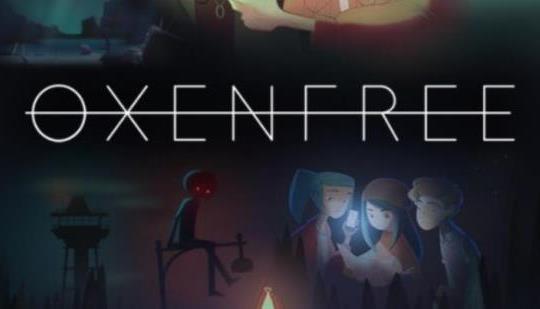
Developed and Published by: Night School Studio (PC, PS4, XBox One)
Oxenfree is such a potent reminder of my days long past, those last washes of youth lapping at the shores of my life. In 2016 I turned 30 years old, which is such an oddly daunting thing to have happen and it amazes me that I’ve been playing games since I 3. That is twenty seven years of my life and I’ve yet to see my love of the hobby flag even a little. And Oxenfree is both a reminder of this and how my life evolved through these lines and into the one it became. Our main characters, Alex, Ren, Jonas, Nona and Clarissa are in the throes of their own youths, a complex weave of friendships and rivalries that so perfectly encapsulates youth. Alex and Clarissa are natural enemies, the pair strained over the death of Alex’s brother who was also Clarissa’s boyfriend, making them feel more apart from their grief rather than being brought closer together. Complicating this is the arrival of Jonas, the new step brother of Alex who is still feeling her out before immediately being trust into her social circle. And of course, Ren, who feels a lot like a much younger version of myself, who wants to make all their friendships stronger while also hooking up with Nona. It only took a few minutes of playing Oxenfree for me to immediately feel as if I knew all these people, feeling the echoes of my own lost youth in the complicated lives they’ve made for themselves that have so much in the way of stakes and yet so little in the grand scheme. I remember those feelings of longing to be accepted, to understand why vitriol is directed my way and how the curiosity of love could make you completely crazy and throughout the game we get to see this play out, see how their closeness is marred or brightened by the attempts at maturity. And really, that’s one of the best selling points i can give: these people come to be your friends and you come to care for them and want what is best for them, even if its hard for them to put it rationally. The dialogue and acting makes each character feel so natural and vibrant and while they at first play to stereotype, they broaden out immensely, making their story arcs sharply defined in the face of the odd situation they’re thrust into.
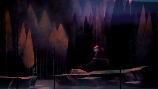
And while Inside was probably the most genuinely creepy game I played this year, Oxenfree does not disappoint in this department. While I spent the whole first paragraph rambling about how I loved the characters and how natural they felt, the situation they’re in is so far from natural it's amazing the team behind the game could pull this all off. I won’t completely spoil the game’s story, but let’s say the Scooby Gang’s trip to Edwards Island soon features mysterious radio static, alternate dimensions, ghosts and even some light time travel. I have a very natural appreciation for the story of this game because of how the larger story arc does eventually mirror the character arc of Alex, both seeming to center on grief and regret. Alex’s loss of her brother has left her a lot more hollow and withdrawn than she readily admits to and it becomes apparent that the forces keeping the group on the island are malicious for their own regrets, forcing them to suffer as they do. This leads to a lot of rather… disturbing moments, when times seems to fluctuate in and out of possibility. At one point Alex is sent rushing to a nearby fort to rescue Clarissa, only to save her and have the ghosts loop time back, so Alex ends up too late and finds Clarissa hanged. This is just such a potent element of the story, the idea that every triumph can be ripped away and replaced with a grizzly reality, or that failure can be reset to disorient and leave them in emotional distress. Only Alex ever really sees these effects and though resolved, it plays to her grief so much, the inability to actually save people when it matters, making the climax of the game especially potent. I definitely can’t spoil that but lets say its both very sad and very uplifting at the same time.

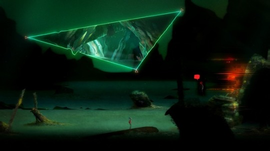
And naturally if you’re going to have a neat little narrative bow, the game itself must be presented strongly as well. More or less, Oxenfree acts as a point n click adventure in a very traditional sense, tasking players to travel to different locations and use different objects to solve puzzles. While none of this is groundbreaking, Oxenfree does add an interesting twist of including a radio whose frequencies are able to do various things in the world, such as unlock doors or commune with the ghosts around you, making a need to pay attention to details in the background necessary. This also adds a very nice way of adding ephemera to the world, as the radio seems to find strange snippets of things from time to time that we get hear remnants of the island’s past. There is also dialogue choice to be had, allowing players to really get into the head of Alex and respond to her friends and her enemies. Do you really want to confront Clarissa or get closer to Jonas or do you want to be aloof? More caring? And I would also mention the visual design as one of the game’s key elements, as the aesthetic is very well done and contributed mightily to the atmosphere. I would describe the art style as being a kind of lineless comic art painted in washed out flats, but I’m not even sure if that’s correct, as the characters really stand out from the backgrounds, Edwards Island coming to feel rather massive from the amount of hiking you have to do in it. Edwards Island reminds me at times of Silent Hill (the radio stuff isn’t helping with that comparison), feeling ominous and dangerous without really being dangerous in and of itself, like the mouth of some greater entity. It all kind of pulls together to make a narrative experience we inhabit wholly and become enraptured in by the same way the characters interact with the world through our use of the mechanics. The end result is a game that left me so happy and haunted when I finished it, so wistful to see these characters go and so happy I got to spend time with them.
And that is it for this year’s list. Oxenfree is my game of the year. And yet when I look to the horizon, I’m excited to know what else can excite me like this, what else can delight and amaze me like this. Games surprise me with what ends up being special to me, as I’m never going into a game and guessing “yes, I will like this game because I will relate and like the characters and the atmosphere will be that weird creepy kind I love,” but instead word of mouth tells me that I have the possibility to enjoy it. Perhaps nothing I’ve said about Oxenfree has lit your brain on fire to play it, but you will be missing out on a game that is overwhelmingly engaging and so rich in story and character development, so tense and disorienting and so wonderful and uplifting.
#versus steam#versus steam game of the year awards#versus steam game of the year awards 2016#game of the year#game of the year award 2016#game of the year award#night school studio#ps4#xbox one#oxenfree
8 notes
·
View notes
Last Seen Blogs
regxblack
carol :)
xvideo
𝘳𝘦𝘢𝘥𝘺 𝘮𝘦𝘢𝘭

zeldafbsenthralling
zeldafbsenthralling
bez-nichoho
Без нічого

rust-ram
My Life Hasn't Gone According to Keikaku