#Tom Scioli
Text

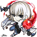
Action Comics #1 recreation with Batman and Robin by Tom Scioli
#tom scioli#action comics#superman#batman#robin#batman and robin#the dynamic duo#batmobile#dc#DO NOT tag as ship#batc*st shippers DO NOT INTERACT#kink/fetish blogs DO NIT INTERACT
178 notes
·
View notes
Text


Witch Man by Tom Scioli
8 notes
·
View notes
Photo
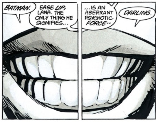
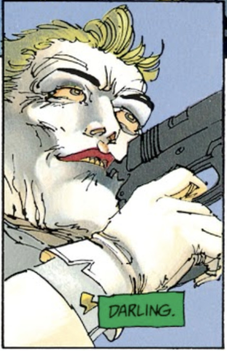
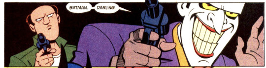
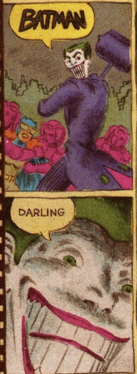
The Dark Knight Returns (Miller/Varley/Janson/Costanza)
The Batman Adventures # 3 (Puckett/Templeton/Burchett/Taylor/Harkins)
Super Powers (Scioli)
#Joker#Batman#Frank Miller#Lynn Varley#Klaus Janson#The Batman Adventures#Kelley Puckett#Ty Templeton#Rick Burchett#Tom Scioli#The Dark Knight Returns#etc etc etc
96 notes
·
View notes
Text
youtube
Fear, Loathing, and Comics, at the Basement Sale (2012)
Dir. Julie Sokolow
Watching Ed, Jim, and Tom together here, diving in the dollar bins and talking comics, is so bittersweet.
Ed's impact on me will last through my days. What he and Jim built created a community of kind, like-minded people where, whatever our differences, our love of comics was shared.
Cartoonist Kayfabe had a culture of creation.
The mob/activists/cancel culture, whatever you want to call it, this sickness in our society. It is a culture of destruction.
They snuff out the bright lights.
They diminish all of us.
Ed, you have left a huge positive impression on so many people, and that is something that will live on in those of us you inspired forever.
#ed piskor#jim rugg#Tom scioli#julie sokolow#Pittsburgh comics gang#cartoonist kayfabe#the new dimension comics#comics#Youtube#cancel culture#mob mentality#rip eddie p#comic books
7 notes
·
View notes
Text

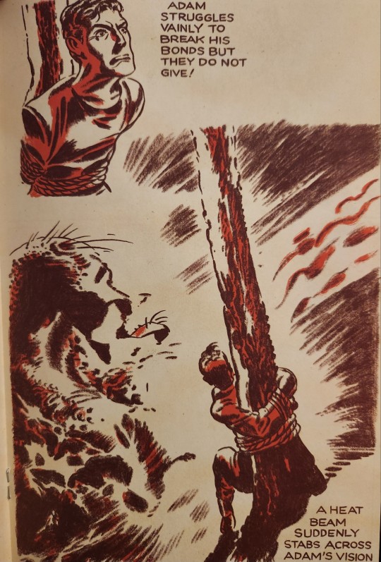
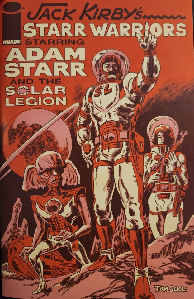
This is the Buddy for April 26th.
You know, Tom Scioli's obsessed with the art of Jack Kirby. I mean, nowadays he's been changing it up a bit more, like in his Stan Lee biography, but at first he wanted to creat really close Kirby pastiches.
And his latest work was Jack Kirby's Starr Warriors - that's a remake (or, as he puts it, a remix) of one of Kirby's earliest comic work, Starr Warriors on Crash Comics. He basically redrew the panels straight from the inked finished product (the originals are lost for good), changed sizes and pacing so the 12 or so pages would fit comfortably in a 36-page one-shot, and colored it in reds and pinks.
Red and pink, just like I do! That's really more of a manga thing. Even back in the forties, using only reds and black for color wasn't a common thing in comics. Some of the other strips in Crash Comics had really simple coloring, but Starr Warriors' was very traditional.
But I love the single-color look, it's really distinctive and gives the book a weird pulpy quality that contrasts wonderfully with the bland photoshop coloring we see in modern comics.
That said, the story itself wasn't really fun. It's a really old comic, and Kirby was still very much a beginner when he was making it. In one of the stories, the title character doesn't really do anything other than get trapped and be rescued by someone else by sheer luck. In another, the bad guy ambushes the hero and goes "hahaha what will you do now?", and the hero just shoots everyone. Not exactly high drama.
Speaking of remixing 40ies comics, I had an idea like that of my own. A few years ago, I read about the Frank Frazetta-inked golden age comic Snowman, and checked it out. It s pretty Frazetta-ish, for a comic about a cute talking snowman. Check it out:

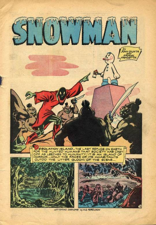
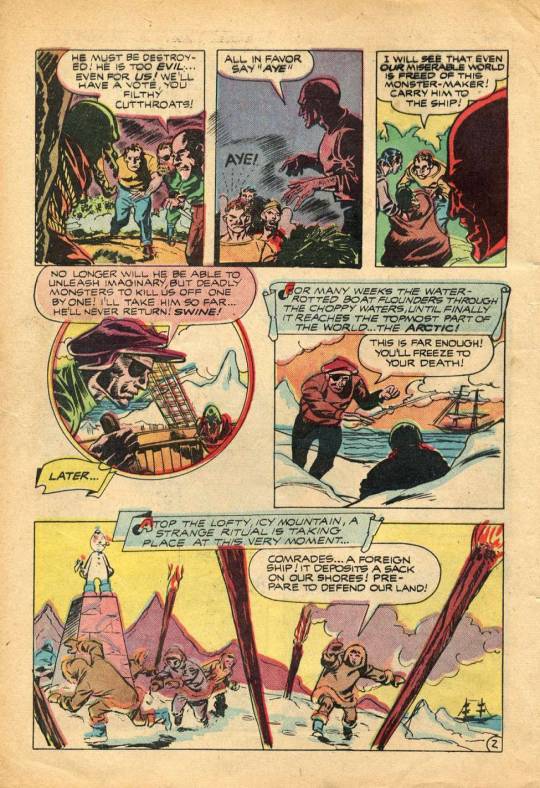


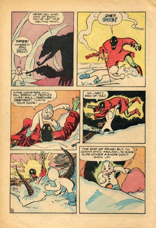
Eaten by crocs. What a way to go.
#Tom Scioli#Jack Kirby#Jack Kirby's Starr Warriors#Frank Frazetta#Snowman#Golden Age#golden age comics#comics#superheroes#public domain comics#public domain#public domain superheroes#public domain superhero
4 notes
·
View notes
Video
youtube
Highly Controversial! Our Assessment of Dark Knight Strikes Again by Fra...
#cartoonist kayfabe#Ed Piskor#Jim Rugg#Tom Scioli#dc comics#batman#the dark knight strikes again#Frank Miller#Lynn Varley
2 notes
·
View notes
Text
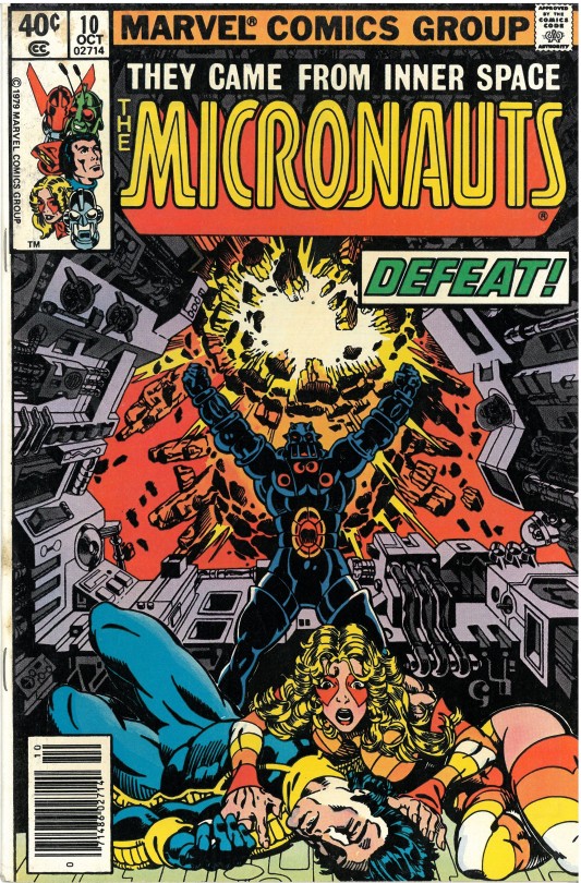
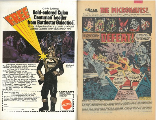
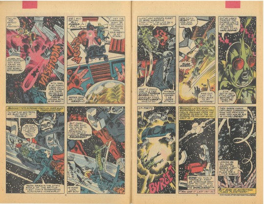


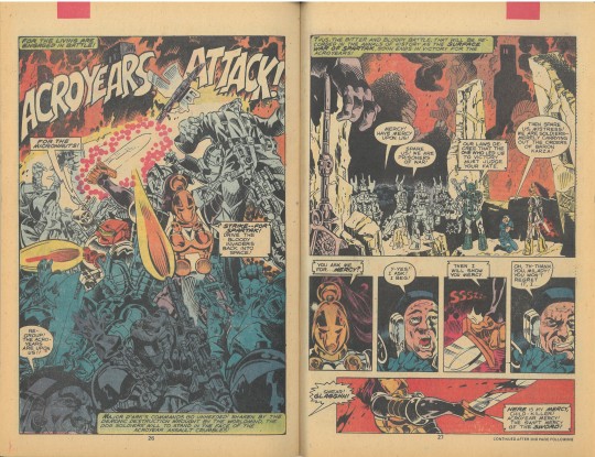

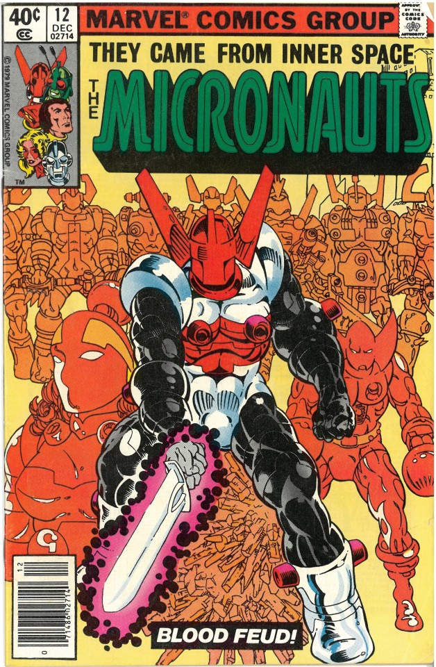
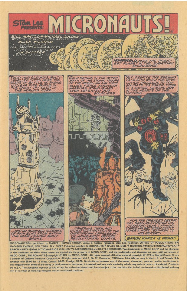
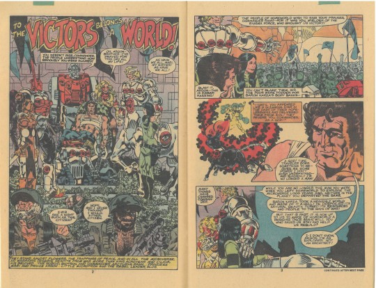

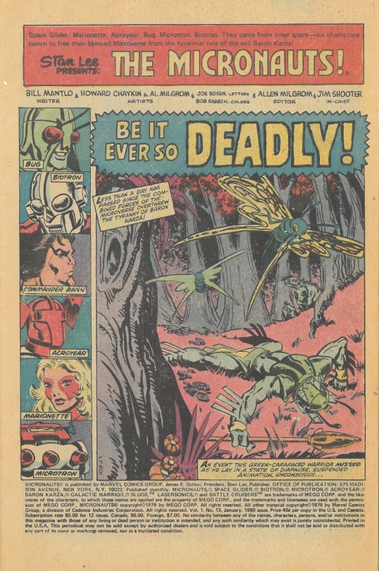
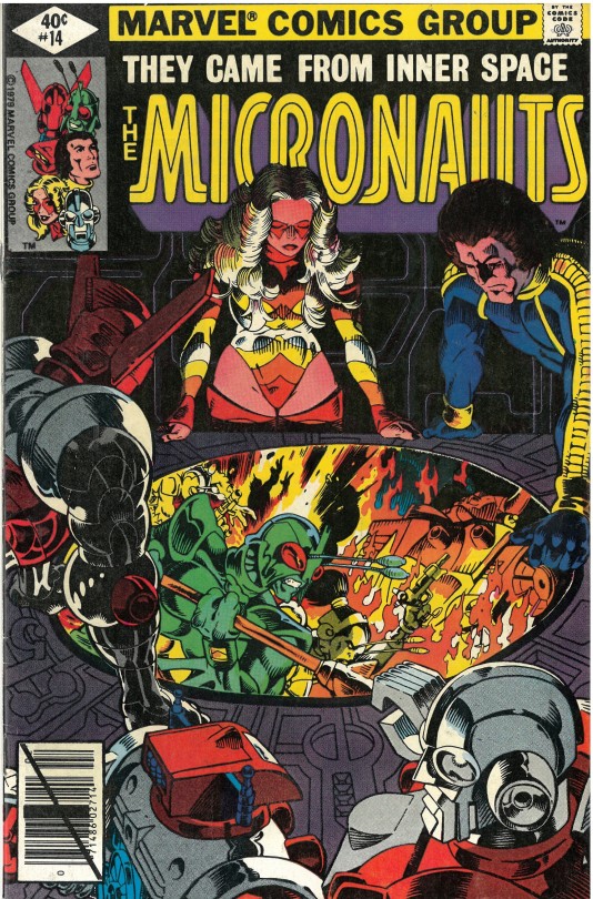

I love Marvel’s Micronauts! I’m talking about the comic written by Bill Mantlo with art by Michael Golden that started in 1979. I had one of the toys (Pharoid) and I followed the comic for all of its original run, but it’s really issues 1-12, drawn by Golden, that remain dear to my nostalgic heart. I recently picked up a few of those old issues – some of the last of Golden’s run on the series - and a couple after he left. I was reminded how much I love his artwork. And how disappointed I was with the artwork on the series after he left.
I’m one of those comic collectors who lost his old presumably now valuable comic collection under unfortunate/careless circumstances. Every once in a while I find a random old issue of Micronauts at a comic shop for a reasonable price and pick it up hoping to relive the excitement of my first collection. I recently bought issues 10, 12, 13, and 14 - specifically because they all feature Michael Golden covers.
Golden co-created the Micronauts world with writer Bill Mantlo, who came up with many of the ideas when his son got some of the Mego Micronauts toys as Christmas presents. I think Mantlo’s writing on Micronauts is top-notch for its time in comic history. Mantlo was always creative and weird in a particularly Mavel way and I was an appreciator of some of his other oddball creations and writing while ignorant they were created by the same guy. I’m talking about Rom: Space Knight which I also collected in its entirety, and Rocket Raccoon, who eventually became part of that little movie series Guardians of the Galaxy.
It was the art of Micronauts that excited me the most, though, and after picking up this series I would always remember Golden’s style and name. I’d seek him out believing his work always elevated the stories. He designed the Micronauts world with Mantlo and while it’s clearly influenced by Star Wars, as are the toys, Golden’s art is so gorgeous, detailed, and dynamic that it really pulls one into the story. And so when I saw these Golden covers a couple of weeks ago I held them fondly in my hands excited to relive the thrill of Golden’s art.
I share these covers and some of the pages to show that the art really holds up! Issue 10 is part one of the climax of the big conflict between the Micronauts and the evil Baron Karza. Golden and Mantlo pack the issue with several plot threads that tie the main story together. Look at how Mantlo and Golden switch threads sometimes from one panel to the next (pages 22-23), building the tension to its bloody conclusion. The action is relentless and they don’t romanticize or shy away from the brutality of revolution and war (pages 11 and 22 -27). An exciting precursor to Golden’s work on The Nam, a great war comic.
The issues I picked up were in sealed bags so I didn’t know they included issues Golden didn’t draw. When I opened issue 13 I was reminded of my long ago aesthetic disappointment discovering it wasn’t Golden’s art inside. Golden drew many of the covers even after he stopped being the artist for the series. I include the first pages of issues 13 and 14 to show the contrast with Golden’s artwork. The art becomes simple, cursory, and, frankly, unexciting. It’s surprising to me that the lay outs are actually done by Howard Chaykin who is still another of my favorite comic artists. The art became so stylistically bland after Golden left and Chaykin’s lay-outs don’t hint at his own greatness.
If you enjoy looking at this art as much as me you will be happy to know Marvel is putting out a reprint collection of the series in 2024. You may also be interested in the Comic Kayfabe podcast about the Micronauts issue #1 and Micronauts Artist Edition. Ed Piskor and Jim Rugg and guest Tom Scioli really appreciate the Golden’s art but Piskor and Rugg often scoff at the Micronauts concept and story. Scioli defends the story as well as I could, though.
A story about the upcoming reprint is at this link:
The ComicsKayfabe Micronauts #1 episode is at this link:
youtube
And the Comics Kayfabe of the Micronauts Artist Edition at this link:
youtube
#micronauts#michael golden#bill mantlo#howard chaykin#marvel comics#tom scioli#ed piskor#jim rugg#rom spaceknight#rocket raccoon#Youtube#the nam
2 notes
·
View notes
Text
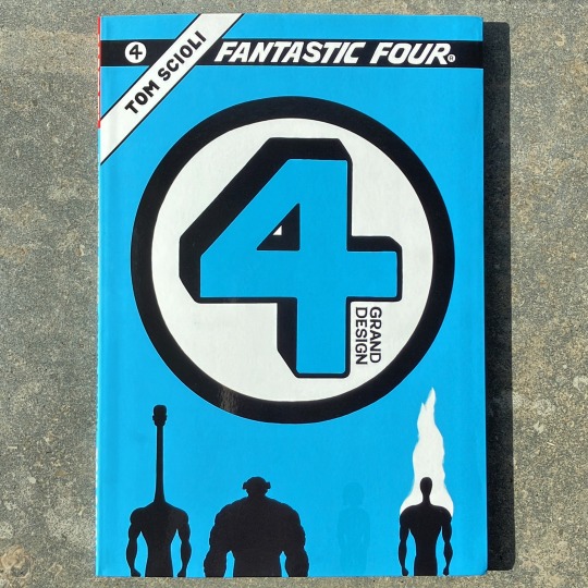
Tom Scioli: Fantastic Four: Grand Design (2019)
3 notes
·
View notes
Text
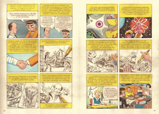
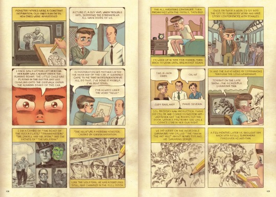
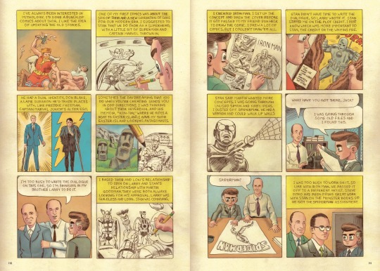
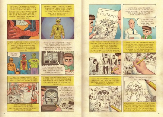
Excerpt from Jack Kirby: The Epic Life of the King of Comics by Tom Scioli
#Comics#Jack Kirby#Stan Lee#Marvel#Fantastic Four#Spider Man#Thor#X Men#Hulk#Steve Ditko#Marie Severin#Larry Lieber#Tom Scioli
35 notes
·
View notes
Photo

Ten Speed Press has revealed the final cover for their Free Comic Book Day offering for 2023, I Am Stan by Tom Scioli.
Read more
#tom scioli#i am stan#free comic book day#ten speed press#comics#comic books#comic covers#fcbd#fcbd 2023
7 notes
·
View notes
Text
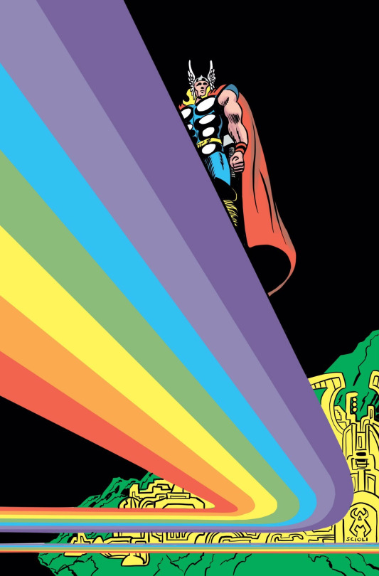
Thor by Tom Scioli
#bifrost#Thor#thor god of thunder#pride#rainbow road#art#artwork#marvel#marvel art#Asgard#tom scioli#marvel comics#marvel superheroes#marvel heroes#marvel universe#thor odinson#thor of asgard#the mighty thor
39 notes
·
View notes
Text

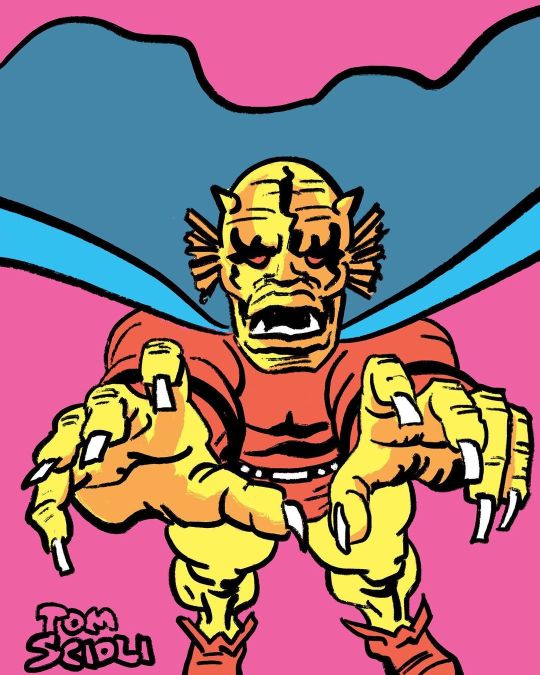
The Demon Etrigan by Tom Scioli
#tom scioli#etrigan#the demon etrigan#dc#jacktober#teeth tw#tw teeth#teeth cw#cw teeth#odontophobia tw#tw odontophobia#odontophobia cw#cw odontophobia#odontophobia#nails tw#tw nails#nails cw#cw nails
32 notes
·
View notes
Text
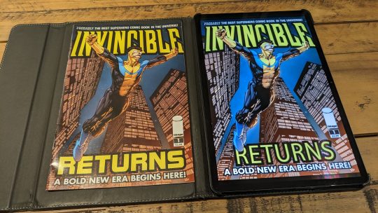
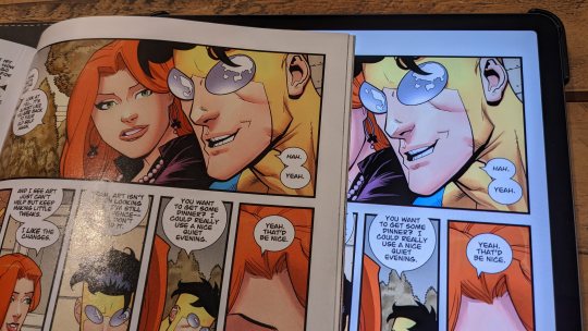
Since I'm all the time posting comic panels on here I wanted to share how I read my comics. I bought a Galaxy Tab S7+ when it was on sale for $450 which felt like a crazy amount to spend on anything, but it was perfect for comics. The 16:10 1600x2560 screen is just the right size for comics and very sharp. (though 266 ppi screen is still half or a quarter as sharp as a printed page)
If you've been following me for a while you'll see that all my old comic pages have a distinct look.
I hate how flat and saturated digital versions of comics look (until mid 90s when digital coloring took over) so I put together a photoshop action that adds paper and pink textures and messes with the colors. It's designed to reproduce the reprints in the back of Tom Scioli's X-Men Grand Design TPBs.
He recolored those fully so he's got more control than my filter, but I love my results. It's how I feel old comics should presented.
6 notes
·
View notes
Text
youtube
#american psycho#bret easton ellis#mary harron#guinevere turner#benjamin marra#raymond pettibon#cartoonist kayfabe#outlaw comics#ed piskor#jim rugg#tom scioli#floating world
0 notes
Text
0 notes
Text
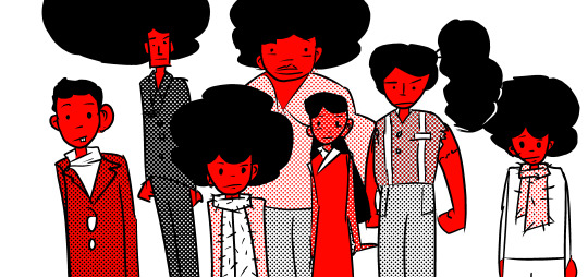
This is the Buddy for for April 13th. He's surrounded by family this time.
Here we have him, his twin brother, his older brother Billy Lynch, his oldest brother Tommy Lynch, his sister Sissy Lynch, his dad Elias Lynch (also known was Wally), and his mother, Dolly Lynch (or María de las Dolores).
There's also a younger brother, Baby Lynch, not in the picture (babies are hard to draw).
I was reading an interview with Tom Scioli (the comic book artist) and he talked about his book Godland being a book about a family, with not a lot of room for romance. I haven't finished that series yet, but that's an interesting way to put it, and he says that it was writer Joe Casey's idea - it was an artistic choice that made the book less popular. Although I'm not part of the audience that has any interest in romance, I know some fans are all about it.
So, he moved on to American Barbarian. It's pretty awesome. After that, he started working on Transformers vs GI Joe, and that's really not the type of stuff I'm into. I'm not that into He-Man, either, or Thundarr the Barbarian, but American Barbarian was fun. I still haven't read Transformers vs. GI Joe, maybe it's be good.
The thing is, it seems like some authors, be them comic creators or even movie directors, are creative in their early work, then get stuck making IP adaptations that reduce them to guns for hire, taking orders from the studio, and trying not to offend the fans.
The tyranny of fandom.
I know a lot of people complain about Marvel doing that to creators. You've got horror guys like James Gunn and Sam Raimi, and they're stuck making superhero movies with no gore. What gives? But I kind of think in the case of superhero comics, it's a bit more forgiveable because a lot of pop director nowadays are fans of superhero comics.
Still, I can't really resent people who complain about that.
Just like there's the Oscar carrousel that makes it so people who deserve the Oscar never get it, there's the adaptation carrousel that makes is so adaptations are never any good. In Scioli's case, for instance, you have American Barbarian, which is a great He-Man adaptation - but the actual licensed comics he made aren't as much fun because they're constraining that creative artist to using characters he didn't design, so, what's the point?
And of course, he was free to add a few twists to American Barbarian he wouldn't have been allowed to if it was a licensed comic. Make the main character a bit of a moron, add some gross jokes and postmodern elements...
A clichè example is the Fantastic Four movies. Terrible. But Brad Bird made The Incredibles - the perfect Fantastic Four movie, with different names for the characters. Why did they choose Josh Trank to make that creepy, dark, dull movie in 2015, then? Because he had made a great Akira adaptation a few years earlier, called Chronicle.
There are a lot of other examples. Supreme? Into the Spider-Verse. Kick-Ass? Super. Turok, Son of Stone? Prey.
And that happens with a lot of movies, because directors are fans, but the unpleasant realities of copyright law keep them from making the movies they want. So, you've got stuff that's inspired by other stuff, written around the trademakrs, parodies that are better than the original, character interactions that could never happen...
But, the real money's in adaptations. Even if they're not very good. It's a pity, really. And of course, a really big movie has to follow the demands of executives and the audience, more than being a faithful adaptation or a personal vision.
So, if we ever had a movie adaptation of Godland (which is very unlikely anyhow, since it's a cult comic), there'll probably be a romance subplot shoehorned in.
#ab4es#drawing#comics#family#multiple characters#Godland#Tom Scioli#Joe Casey#American Barbarian#Transformers#GI Joe#Transformers Versus GI Joe#He Man#Thundarr the Barbarian#James Gunn#Sam Raimi#Oscars#Academy Awards#Fantastic Four#Brad Bird#The Incredibles#Josh Trank#Akira#Chronicle#Supreme#into the spider verse#Kick-Ass#Super#Prey#Turok
5 notes
·
View notes
Last Seen Blogs