#i am rambling...
Text
pro-AI in the sense of "they taught a bread scanning computer to recognize cancer cells" etc etc
against AI in the sense of "we stole artwork from hundreds to thousands of artists, didn't credit them and didn't financially compensate them"
#rambles '24#ok to reblog btw#all my posts are ok to reblog#if not i would make them unrebloggable lmao#edit: i am a fool#i said that thinking this would maybe get 5 notes or something#and now we're here lol
136K notes
·
View notes
Text
can't believe we're all adults being forced into the club penguin level of censorship in 2024
#ramble#if you say unalive in front of me i will personally kill you with my hands#you just can't muffle and censor and hold someone's hand through some things#some things are horrible. and they should be spoken aloud and they should upset you. because they are horrible#the second we started kidzbopifying the world was the end of taking anything seriously i think#i'm not even joking i've spoken to people older than me who won't even say the world sex#this isn't the playground you're not going to get in trouble just let us say the word!!!!!!#how am i supposed to listen to you when you won't even say the thing you're supposed to be talking about#yes this is the fault of the platforms with their censorship rules but the fact that we all just go along with it like it's not dystopian#you do know it doesn't stop with cursing right. people are already having to censor queer terms because they get flagged as inappropriate
43K notes
·
View notes
Text

No single line has ever wrecked me as hard as this one from the Good Place and I think about it constantly
#the good place#i'm binge watching it again and it just takes me out so hard#i get lost in the sauce thinking about this quote#the idea that those who hurt you are capable of being better people and then seeing them change and grow just hits me right between the rib#who am i kidding it stabs me like the senators stabbed Caesar#anyway#icy does a tag ramble
61K notes
·
View notes
Text
fucking hate how cats think they can mrrp their way out of anything because yeah, they fucking can.
#how am i supposed to make rational decisions when they go mrrp#not arguing with a lil guy that goes mrrp. whatever you say goes beautiful#cats#niko rambles
48K notes
·
View notes
Text
Height gap romance except the shorter one is frequently depicted in situations where they are contextually taller. The taller one sitting while the shorter one looms over them. Both of them lying in bed with the taller one’s head pressed to the shorter one’s chest. The shorter one straddling the taller one’s lap and leaning down for a kiss. The taller one on their knees as the shorter one tilts their head up. Please, it makes me go feral
#yes i am writing this#my rambles#this post really popped off#ironically this is about my original characters#but if I had to make it Teen Wolf…#scisaac#scott mccall#isaac lahey
13K notes
·
View notes
Text
a concerning amount of witchblr will be like "um actually new years was stolen by europeans from the ancient god scroobus mcdoobus" and then you actually try to research scroobus mcdoobus and it turns out he was invented in the 1940s by a conspiracy theorist who powdered every meal with ketamine and thinks that queer people are reincarnated fish
#brightts ramblings#BEFORE I GET ATTACKED: THIS IS NOT AN ANTI-WITCH OR ANTI-PAGAN POST#im just literally begging witchblr and paganblr(?) to study history from proper sources#so you don't accidentally end up repeating misinfo or even outright bigoted info without realizing#you are not immune to propaganda!#this post is specifically ab new agey stuff like starseeds#but a lot of other stuff fits into this as well ie 'blessed be'#for further context i am not a witch or pagan myself but i DO study the occult/occult history#religion#spirituality#history
27K notes
·
View notes
Text
for anyone too young to know this: watching The Truman Show is a vastly different experience now, compared to how it was before youtube and social media influencers became normal
before it was like, "what a horrifying thing to do to a human being! to take away their autonomy and privacy, all for the sake of profits! to create fake scenarios for them to react to, just to retain viewership! to ruin their happiness just so some corporate entity could harvest money from their very humanity! how could anyone do something so evil?"
and now it's like, "ah, yeah. this is still deeply fucked up, but it's pretty much what every influencer has been doing to their kids for a decade now. probably bad that we've normalized this experience"
#the truman show#sbs rambles#I keep thinking about how children on popular youtube channels should probably have laws to protect them#social workers assigned to them maybe#I dunno#they did not sign up to have their lives sold for profit#but here we are#tho#I guess none of us signed up for it#and our data is harvested more than ever#god#high-tech capitalism sucks turns out#OH WAIT because tumblr is bad at getting context sometimes#let me specify:#I am not saying that the movie The Truman Show is bad or that it normalizes this#like all good sci-fi (because it is kind of sci-fi) it's there to warn us of what the future could hold#and it did that in a very good way - it's a beautiful movie#I could see someone with a bad faith take assuming I meant that it was part of the problem#it absolutely wasn't. it didn't normalize this; we did#youtube did and social media#it's us that's the problem#or more specifically: big corporations and a lack of regulation#that's the origin of most modern problems
77K notes
·
View notes
Text
as a child I wondered why adults were so stupid (doing things out of habit/routine/heuristics rather than reasoning explicitly about what to do based on their goals) and the answer is that adults are unimaginably fucking tired all the time
#rambl#child me would be so contemptuous of present me#look. you have NO idea how sleepy I am. if I have to think more than I need to I'll cry#more notes than usual
67K notes
·
View notes
Text
there's something so intimate about mutuals being on here at the same time. like oh you reblogged that from me just seconds after i posted/reblogged that, so in essence we have touched the same thing. did you feel me.
#ryan rambles#mutuals#idk if this properly expresses what im thinking but its the best i could do#also i am much sleepy rn#text post
17K notes
·
View notes
Text
Imagine if the GIW started gunning for Jason without the Batfam ever meeting Phantom. Like, Bruce has to figure out on his own that the guys in white suits with Lazarus guns are 1. a legitimate government agency, and 2. are perfectly within their rights to hunt Jason like an animal, because 3. there's secret government legislation that says that since Jason's body processes ectaplasm, he's classified as non-sapient and has no legal protections.
Bruce calling up Clark like
Bruce: I am currently in the process of breaking into a government facility in order to dismantle their operations.
Clark: Okay? Do you need... help?
Bruce: Yes.
Clark: Sure, I'll be right there.
Bruce: Not that kind of help. Oracle is sending you the files now. I'd like you and Ms. Lane to make these people wish they were never born.
Clark: [speed-reading the documents] Oh yeah, can do. This is truly disgusting. If the public is half as outraged as I am, we'll get this sorted as fast as the courts can manage.
So Clark Kent acts as a whistle-blower, the Justice League publicly condems the Anti-Ecto Acts as inhumane, the GIW is disbanded, and Batman gets pardoned for all of those crimes that he technically did by assaulting federal agents. And after all that gets sorted, some white haired kid pops up in the Watchtower like "haha thanks for that I really didn't want a war between Earth and the Infinite Realms" and the League are like "wait what"
#dp x dc#dpxdc#danny phantom#dc#batman#batfam#and jason and danny become best friends obviously#yes i am implying danny is the ghost king here#i just think that bruce being like 'what do you mean my son is non-sapient and has no legal rights. ill kill you.' is good and fun#my rambles
5K notes
·
View notes
Text


14K notes
·
View notes
Text
i can't wait to be 30+ and still in fandom and i can't wait to be 40+ and still in fandom and i can't wait to be 50+ and still in fandom and i can't wait to be 60+ and still in fandom and i can't wait to be 70+ and still in fandom and i can't wait to be 80+ and still in fandom and i can't wait to be 90+ and still in fandom and i can't wait to look back on my life and know that i loved things deeply and passionately and was inspired to create and was part of communities with incredible people from all over the world brought together by the stories that touched us
#and still be mad at shithead executives for unfairly cancelling my pirate show#also imagine what my ao3 word count will be like. gonna be writing my little fics in the nursing home#sometimes when i get frustrated over my writing i have to remember that i've only been doing it for a little over a year#and not in my native language#there is still so much time and so much to learn and try and discover and explore and i am EXCITED#there is something so ancient and beautiful about humans being brought together by stories#storytelling is what humans have always done and will always do and what will always connect us#to our past to the future to each other#sorry for the 1 am ramblings#fandom#🐭📓
5K notes
·
View notes
Text

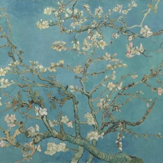
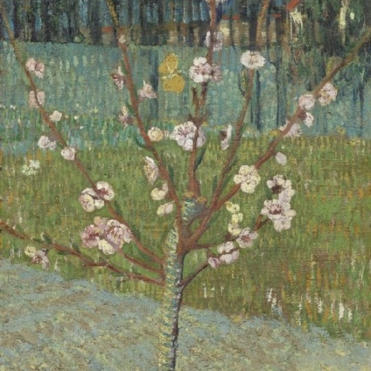
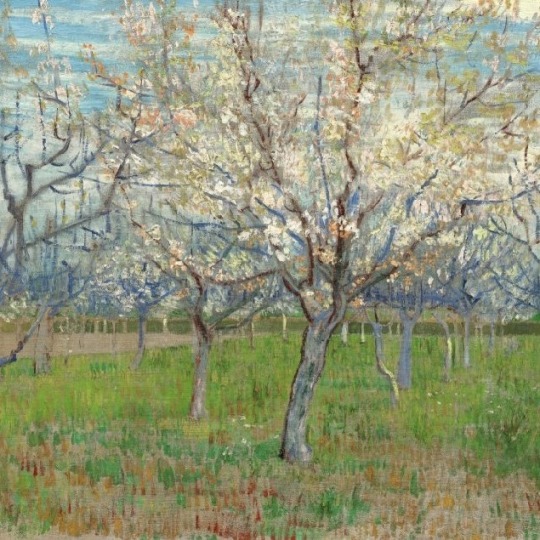
𝖵𝗂𝗇𝖼𝖾𝗇𝗍 𝗏𝖺𝗇 𝖦𝗈𝗀𝗁'𝗌 𝖻𝗅𝗈𝗌𝗌𝗈𝗆𝗌
1- 𝘚𝘱𝘳𝘪𝘨 𝘰𝘧 𝘍𝘭𝘰𝘸𝘦𝘳𝘪𝘯𝘨 𝘈𝘭𝘮𝘰𝘯𝘥 𝘪𝘯 𝘢 𝘎𝘭𝘢𝘴𝘴. 𝘝𝘪𝘯𝘤𝘦𝘯𝘵 𝘷𝘢𝘯 𝘎𝘰𝘨𝘩, 𝘈𝘳𝘭𝘦𝘴, 𝘔𝘢𝘳𝘤𝘩 1888 2- 𝘈𝘭𝘮𝘰𝘯𝘥 𝘉𝘭𝘰𝘴𝘴𝘰𝘮. 𝘝𝘪𝘯𝘤𝘦𝘯𝘵 𝘷𝘢𝘯 𝘎𝘰𝘨𝘩, 𝘚𝘢𝘪𝘯𝘵-𝘙𝘦́𝘮𝘺-𝘥𝘦-𝘗𝘳𝘰𝘷𝘦𝘯𝘤𝘦, 𝘍𝘦𝘣𝘳𝘶𝘢𝘳𝘺 1890 3- 𝘗𝘦𝘢𝘤𝘩 𝘛𝘳𝘦𝘦 𝘪𝘯 𝘉𝘭𝘰𝘴𝘴𝘰𝘮. 𝘝𝘪𝘯𝘤𝘦𝘯𝘵 𝘷𝘢𝘯 𝘎𝘰𝘨𝘩, 𝘈𝘳𝘭𝘦𝘴, 𝘈𝘱𝘳𝘪𝘭 1888 4- 𝘛𝘩𝘦 𝘗𝘪𝘯𝘬 𝘖𝘳𝘤𝘩𝘢𝘳𝘥. 𝘝𝘪𝘯𝘤𝘦𝘯𝘵 𝘷𝘢𝘯 𝘎𝘰𝘨𝘩, 𝘈𝘳𝘭𝘦𝘴, 𝘈𝘱𝘳𝘪𝘭 1888
#look at his love for spring#how flowers grow - that they grow in the first place…#I feel like he showed them how much he appreciated and loved them by painting them#immortalizing them - even if just for himself#I’m rambling…#I just love his art am#cottagecore#vincent van gogh#nature#naturecore#flowers#flowercore#art#artwork#paintings#spring aesthetic#light academia aesthetic#classic academia
4K notes
·
View notes
Text
Created a hot lesbian tiefling sorceress for fun and
#ramble#i am down bad#keusiglgmflnm#since I cannot play bg3 I just pretend to 😭💔#like with dolls but in me mind 😔
10K notes
·
View notes
Text
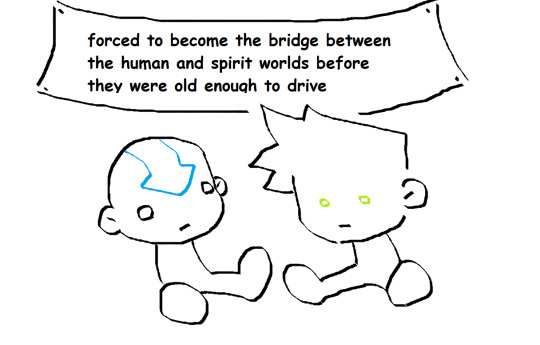
has someone done this already?
#just a thought#idk i couldnt think of anything that would be a good example for their age except for driving#potatoe rambles#danny phantom#dp#atla#aang#the last airbender#dannys head is too damn big but i am not bothered enough to draw it again#art#for aang that’s kinda a secondary thing#but for phantom that’s kinda his whole thing
7K notes
·
View notes
Text
as a bi person, the bisexual flag brings me infinite joy and always puts a smile on my face, however as a person who has a Passion for Graphic Design, that undersaturated shade of purple infuriates me when it's used digitally
like, on an actual flag - which was its original purpose - it looks great!

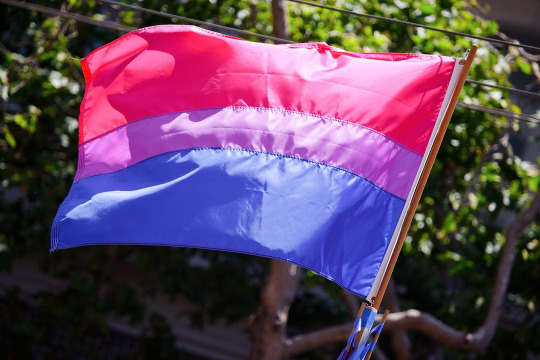
those look fine! lovely, even! with the semi-transparent fabric, the way it catches the sunlight, it looks beautiful!
but now look at how it looks digitally

the pink and blue are so vibrant compared to the sad, lonely lavender!
and let's look at this statement from Michael Page, the creator of the bi flag:

(sidenote: he created this flag in 1998, so if his takes on bisexuality is different from yours, it's okay to notice that! a lot has changed since the 90s when it comes to lived experiences and the way we describe them. but, it's also important to respect his thoughts about this and the way he presented them, even if today, we'd probably not say that bi people "blend unnoticeably into both the gay/lesbian and straight communities.")
so in pantone colors, the pink is 226 C, the blue is 286 C, and the purple of the flag is 258 C.
but...here's the deal
Michael talks here about how the key to understanding the symbolism is to know that the purple blends into both the pink and blue. and on a physical flag, I think you can see that!
but digitally, it absolutely does not blend. it clashes badly, and looks oddly separate from the other two colors.
which got me wondering...what purple do you get if you actually blend 226 C and 286 C?
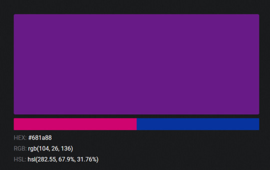
oh! oh, my god.

look at that! look at how nicely it fits between those colors!

look at it next to the original color scheme! look at how much more vibrant the purple is!
and friends. this is just blending through rgb! you get even more purple variations when you use other color spaces!
let's compare all of them:


(top: original, lab. middle: lrgb, lch. bottom: rgb, hsl)
look at all of the different purple options you can get just by combining these two colors!
if you want almost too-vibrant saturation, you can go hsl, if you want something more relaxed that's closer to the original, you can go lab or lrgb. and if you want to split the difference, lch is bright and violet, while rgb is there with its saturated but darker purple.
anyway, I guess I don't really have a point here? this isn't so much an informational post as it is Me Getting Weird About Colors, but I think it is a useful lesson about how colors look very different on screens compared to how they look on objects in real life.
and sometimes, I think it's okay to compensate for that.
out of all of these, this is my favorite bi flag:

it's the one where the colors were blended in lab color space. for me, the lighter, softer purple is close enough to the original bi flag purple, while also feeling like a smoother blend of the blue and pink
but that's just me! and it might not even look the same to you, since every screen is different, because technology is a nightmare!
anyway, thank you for coming with me on this colorful journey! I will now retreat back to inkscape and make pained sounds about inkstitch gradients until something tangible pulls me back into reality
#bi#bisexual#bisexuality#bi flag#bisexual flag#sbs rambles#graphic design is my passion#id in alt text#but#the ids are probably deeply unhelpful for the different variations of flags#in the alt text of the six flags all grouped together#I just put what method the purples were blended with#and then tried to describe them more in the paragraph below#but this is an inherently visual post#so if you're reading it with a screen reader I am sorry :(
19K notes
·
View notes
Last Seen Blogs

blackcough
No Cure (?)

onlineseo1
Onlinedelivery.in

andromeder
hyped for andromeda!

posterdrops
PosterDrops.com

gaal-dornick
THROUPLES, LESBIANS, AND GODZILLA