#it is until i get used to it
Text
This is a subject that really interests me because I (28 years old) had computer classes in grade school where learning how to efficiently type was a big focus. As a result I have a very high WPM (words per minute) count and am an excellent touch typer.
However, I've heard that they started phasing out computer classes in a lot of schools because it's assumed that kids/teenagers already know how to use a computer in this day and age. But smartphones are more popular than computers now, and as result a lot of Gen Z/Gen Alpha kids are able to text very quickly but their typing skills aren't as good.
#I'm terrible at texting because I grew up with computers and didn't get a smartphone until I was like 15#plus I prefer to be on my laptop when I'm at home#if the message is too long I literally text people through my computer instead of using my phone#because it would take FOREVER for me to text it#poll#my polls#technology#typing#computers#tumblr polls#1k#5k#10k#most popular
16K notes
·
View notes
Text

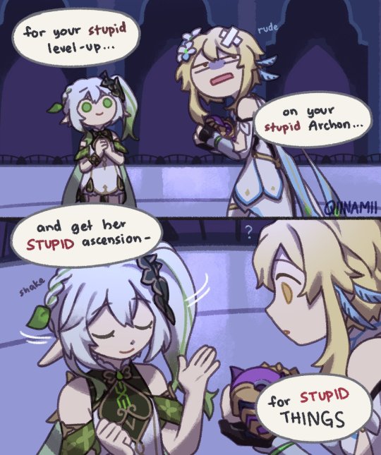
The Allegiance of the Ascended Vampire and the New God of Magic
#bloodweave#baldur's gate 3#bg3#gale x astarion#astarion x gale#gale dekarios#astarion ancunin#yes this is about astarion helping gale defeat mystra and take her place with the crown in exchange for gale helping him with the ritual#the ‘they can make each other worse’ part of their relationship turned to the max#I enjoy them being reluctantly soft for each other more but from time to time I just think about how powerful they could get together#toxic evil boyfriends. take love and twist it up until it’s unrecognisable#I like to think that astarion approached gale with that offer after realising no one else in camp is gonna help him#and that he can use gales own hunger for power which backfired when astarion actually became emotionally invested in gale#and after gale kept his word despite everyone’s concerns astarion changed his plan from not fullfilling his end of the bargain to actually#helping gale kill mystra (mostly so that gale could belong to him and him alone. and letting him take the place as a god bc having a god#at you beck and call is definitely appealing. especially one as eager to please as gale)#anyway what I want to say with this is please please please let me kill mystra i don’t even care if the weave gets destroyed again
14K notes
·
View notes
Text

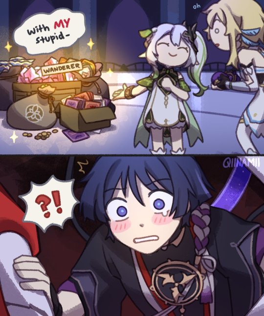
wanderer day <3
#my most surprisingly satisfying art that i managed to finish in time by the day of his release#based on true events i did have to delay nahida a bit for him HAHA#just to bench him after friendship lvl 10 but still using nahida until now#youll get your moment buddy I DONT HAVE HIS SIGNATURE WEAPON#qiiarts#lumine#traveler#nahida#wanderer#scaramouche
20K notes
·
View notes
Text
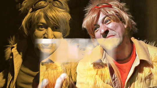

@pscentral event 20: antagonists
↳ THE LORDS IN BLACK in NERDY PRUDES MUST DIE
#nerdy prudes must die#npmd#starkid#npmdedit#team starkid#the lords in black#hatchetfield#hatchetverse#npmd spoilers#userisiah#userfaiths#userbaz#usercats#userhallie#noooo fucking clue what to tag in this fandom lmao#musicaledit#? sure#anyway yeah i watched npmd and immediately had to make this i was up until 1 am last night#wouldve been earlier but i had to take a break for dnd lol#i was gonna do a tua set for the event but this is easier and better so like. slay#i just wish they had more screen time. pokey and tinky have less than 20 seconds each </3#oh and the titles and stuff are from the fan wiki. hope i didn't get anything wrong#i've been getting a lot of use out of this motion blur text transition its so funky fresh#*edits
8K notes
·
View notes
Text
steddie fake dating au that starts because robin’s mom keeps pushing for her and steve to get together and robin gets so fed up that she yells, “it’s not gonna happen because some people are gay, mom!”
and upon seeing the utter horror and fear on her face, steve swoops in and says he’s the one who’s gay. cue mr. and mrs. buckley, local hippies, attempting to show how supportive they are, and all the while steve gets eddie to agree to fake date to get the buckleys to prove they’re safe, so that robin will feel comfortable enough to come out to her parents.
#steve using his puppy dog eyes to get eddie to agree bc “it would mean so much to robin to know that her parents would accept her”#eddie agreeing because. it’s STEVE.#robin not knowing about ANY of this until steve and eddie show up to her house holding hands#mr. and mrs. buckley just want their daughter to see that they’re totally cool with her gay friends#they aspire to be the cool parents#bonus points if steve is aware of his own sexuality the whole time#bonus bonus points if nobody else had been#stranger things#eddie munson#steve harrington#steddie#steve x eddie#robin buckley#steddie fake dating#prompt !#feel free to use it tbh i’d love to see it#i might also use it. actually yeah i’ll also use it at some point
4K notes
·
View notes
Text


heartbreaking:the worst people you know just started an emo band
#the worst TWO people you know.beel got dragged into tjis#their band iscalled fatal attraction.asmo came up w it#&they give beel lollipops on stage so he can use both his hands but stillhas something 2munch on......#someone said asmo wld be problematic like 2000s jeffree star and i yhinkthey were on to somethinng#i think his interpersonal conduct with fans would be really distasteful in a way that bands cld only get away with during the 2000s#he wld be well liked. but he wouldhave an effect on them that permanently dmgs their taste in partner and psyche#like his ego wld be just kind of annoying until fans start getting his signature tattooed onthem and stuff and it would immediately go to#asmos head so badd to the point where being arnd him is like an impossible task unless ur the worldsbiggest pushover& soo patient#mine#obey me#asmo#beel#belphie
4K notes
·
View notes
Text
I think 90% of my gripes with how modern anime looks comes down to flat color design/palettes.
Non-cohesive, washed-out color palettes can destroy lineart quality. I see this all the time when comparing an anime's lineart/layout to its colored/post-processed final product and it's heartbreaking. Compare this pre-color vs. final frame from Dungeon Meshi's OP.


So much sharpness and detail and weight gets washed out and flattened by 'meh' color design. I LOVE the flow and thickness and shadows in the fabrics on the left. The white against pastel really brings it out. Check out all the detail in their hair, the highlights in Rin's, the different hues to denote hair color, the blue tint in the clothes' shadows, and how all of that just gets... lost. It works, but it's not particularly good and does a disservice to the line-artist.
I'm using Dungeon Meshi as an example not because it's bad, I'm just especially disappointed because this is Studio Trigger we're talking about. The character animation is fantastic, but the color design is usually much more exciting. We're not seeing Trigger at their full potential, so I'm focusing on them.
Here's a very quick and messy color correct. Not meant to be taken seriously, just to provide comparison to see why colors can feel "washed out." Top is edit, bottom is original.
You can really see how desaturated and "white fluorescent lighting" the original color palettes are.
[Remember: the easiest way to make your colors more lively is to choose a warm or cool tint. From there, you can play around with bringing out complementary colors for a cohesive palette (I warmed Marcille's skintone and hair but made sure to bring out her deep blue clothes). Avoid using too many blend mode layers; hand-picking colors will really help you build your innate color sense and find a color style. Try using saturated colors in unexpected places! If you're coloring a night scene, try using deep blues or greens or magentas. You see these deep colors used all the time in older anime because they couldn't rely on a lightness scale to make colors darker, they had to use darker paints with specific hues. Don't overthink it, simpler is better!]
#not art#dungeon meshi#rant#i'm someone who can get obsessive over colors in my own art#will stare at the screen adjusting hues/saturation for hours#luckily i've gotten faster at color picking#but yeah modern anime's color design is saddening to me. the general trend leans towards white/grey desaturated palettes#simply because they're easier to pick digitally#this is not the colorists fault mind you. the anime industry's problems are also labor problems. artists are severely underpaid#and overworked. colorists literally aren't paid enough to do their best#there isn't a “creative drought” in the anime industry. this trend is widespread across studios purely BECAUSE it's not up to individuals#until work conditions improve anime will unfortunately continue to miss its fullest potential visually#don't even GET ME STARTED ON THE USE OF POST-PROCESSING FILTERS AND LIGHTING IN ANIME THOUGH#SOMEONE HOLD ME BACK. I HATE LENS FLARES I HATE GRADIENT SHADING I HATE CHROMATIC ABBERATION AND BLUR
2K notes
·
View notes
Text
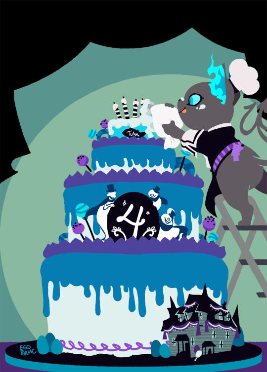
(almost) four years in, and I finally had time to draw something for the anniversary! woo! 🎉🎉🎉
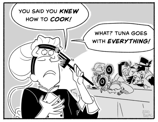
#art#twisted wonderland#twisted wonderland spoilers#because i need to talk for a minute about how the plot of the anniversary story so far is literally just#crowley jumpscares us in our living room to demand we make him lunch and yuu is just like 'i need to start locking the door'#oh twst you always know just how to get me#the qol updates though! CONVERTING SINGLE KEYS INTO 10-SETS YES THANK YOU OH MY GOD#SKIP LESSON TICKETS!!!!#3X BATTLE SPEED!!!!!!!!!!!!#SAVE TEAM BUILDS AND SUPPORT CARDS FINALLY AHHHHH#oh and some other stuff too but look i NEEDED these things#also master chef grim! he's so precious!#though he's not going to get a little sporty uniform after all?#grim canonically flies in the nude i guess#no it's okay chef grim is ADORABLE#if you zoom in on his card you can see little smoodges from his inexpert cake decoration 😭#which on the one hand is cute but on the other hand i'd been convinced he'd just slapped some frosting and candles on an actual can of tuna#anyway happy (a few days until the) fourth anniversary everybody!#i've been here since the beginning (preregistered during the dorm reveals babyyyy) and it REALLY doesn't feel like it's been four years#you know what they say: time flies when you're watching anime characters have emotional problems
3K notes
·
View notes
Text
i feel like social media has warped people’s perception of conflict in relationships by making you think that any minor fuck up is the end of the world and everyone is secretly a narcissist manipulator with sinister motives, because actually in real life you just say “i’m sorry, that was a bad thing, i shouldn’t have done that” and the other person says “thank you for apologising” and then that’s the end of it
#ramble#i hate that it took until my 20s to realise that i can’t go through my life just trying not to hurt people. because it will happen#it just does happen sometimes#and you have to drop out of the tiktok school of ‘i’m incapable of doing anything wrong ever and everyone else is the problem’#and get comfortable with making mistakes and learning from them#you’re fine. it’s fine#disclaimer obviously this doesn’t mean you don’t have to try to be kind or considerate anymore as long as you apologise. use your brain
2K notes
·
View notes
Text
meg baby, I promise we’ll all look the other way if you decide to strangle that chimera ant built bitch. I promise we won’t say nothing.
#nicki got to be one of the nastiest bitches I’ve ever seen in my life#you ain’t had a fucking hit in 10 yrs good enough to act the way you do#it’s crazy it took her being so vile to meg for ppl to get it#it’s always ‘protect blk women’ w/her until it’s somebody she don’t like lmao#and her only beef with her is that she collabed with cardi#the only one who stuck by her side mind you so ofc she#she’s been terrible and I remember back in 2017 when ppl jumped me for ‘defending a Latina woman’ over her#the same bitch that co opted a hashtag meant for missing and murdered blk women for her own bullshit#while cardi was using her platform to speak up for breonna Taylor and police brutality? oh okay#she’s a nasty witch and her karma will come#rap beef aside#‘how you got 3 Grammys and can’t stay on beat?’#how are you the supposed queen and been rapping since Jesus was in Jerusalem but have zero?#bringing up her dead mother..you deserve to rot#cherry chats 🍒#I’m so happy cardi no longer feeds into her bullshit and lets her stupid ass talk to the wall#all the new girls are outshining her and I’m so glad they don’t have to grovel to her#the fact that these girls just came out and are her competition says more abt nicki than it does Meg cardi latto or anybody else#her peers should be missy kim queen latifah etc#and yet she’s linking up with 23 year olds and beefing with girls 20 years her junior#guess that predator spirit run in the family huh
1K notes
·
View notes
Text
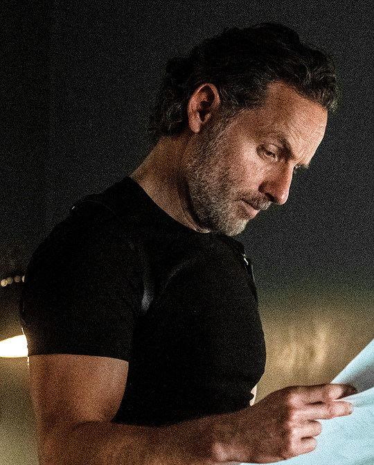
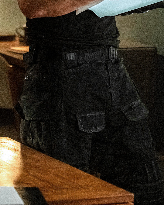
The Ones Who Live - 1x01 - Years
#i need to.....#Rick Grimes#*#rg#The Ones Who Live#EXCUSE ME#if i said you had a beautiful body would you hold it against me#i love arm#anyone remember those sticky hand things you'd get from grocery store quarter machines#that'd be my existence#just rest your head on a tiddy and have a think ya know#S O L I D#nice rack rick#so well proportioned and fit without being bulky i hate bulky#the mold broke#no it didn't you could make a mold#gonna invest in those kneeling pads people who garden a lot use#and stock in Halls or Ricola#until i can't walk tomorrow#until the neighbors call the cops
1K notes
·
View notes
Text
putting my prediction on record now that the coming decade is going to see the rise of viral-marketed fancy at-home water filtration systems, driving and driven by a drastic reduction in the quality of U.S. tap water (given that we are in a 'replacement era' where our current infrastructure is reaching the end of its lifespan--but isn't being replaced). also guessing that by the 2030s access to drinkable tap water will be a mainstream class issue, with low-income & unstably housed people increasingly forced to rely on expensive bottled water when they can't afford the up-front cost of at-home filtration--and with this being portrayed in media as a "moral failing" and short-sighted "choice," rather than a basic failure of our political & economic systems. really hope i'm just being alarmist, but plenty of this already happens in other countries, and the U.S. is in a state of decline, so. here's praying this post ages into irrelevance. timestamped April 2023
#apollo don't fucking touch this one#serious post#not a shitpost#hope i forget about this post and have no reason to ever look back on it one day#fyi i'm aware that access to potable water is already a major issue in parts of the U.S. yes i know flint michigan exists#i'm saying that this issue is going to GROW unless local & federal governments work together to fix it.#so it's a matter of if we trust them to fix it. And well--do you?#what are the chances the government just denies there's a problem until the water actually turns brown#at which point it's already been common knowledge for years and people have just become resigned and that's our new normal#i'm mean come on. how many of us already believe that we're being exposed to dangerous pollutants we don't know about and can't avoid#like that's pretty much just part of being a modern consumer. accepting that companies will happily endanger your life for a few pennies#and the most you'll get is like a $50 gift card as part of a class action rebate 20 years down the line#probably the history books will look back on Flint as a warning and a harbinger that went ignored#luxury condos will advertise their built-in top-of-the-line filtration systems--live here and you can drink water straight from your tap!#watch the elite professional class putting $700 dyson water filtration systems on their wedding registry#while the rest of us figure out how to fit water delivery into our grocery budget while putting 90% of our paycheck towards rent#also eggs are $15
5K notes
·
View notes
Text


inspired by a convo with @miggylol, some Peko loving ❤ I wouldn't call it a xmas present but maybe ... a stocking stuffer?
#peko pekoyama#hajime hinata#Fuyuhiko kuzuryu#Chiaki nanami#Kuzuhinapekonami#Jfc I dont know#Kuzupekohinanami#Whatever you get it. The most stable love square!#Kuzupeko#Pekohina#Pekonami#an art#Thanks again for the goodies miggy (physical and fics) I'm saving them for xmas ❤❤❤ I didnt know what to draw but! Peko love#Things are gonna get more busy for me now until xmas so I'm using my chance before I forget lol
2K notes
·
View notes
Text
to me, the most fascinating (and utterly unintentional) feature of TAZ Balance's narrative structure is the way that on the first listen, Tres Horny Boys are the audience surrogates because they, much like us, have no idea what the fuck is going on, but on all subsequent relistens, then Lucretia, and sometimes Barry, and arguably especially Lup in the umbrella become the new audience stand-ins, because just like us, they are, in fact, painfully aware of what the fuck is going on :)
#taz#taz balance#taz balance spoilers#lup taaco#barry bluejeans#lucretia taz#and i really cannot say *especially* lup enough times#like lucretia and barry have their own meta roles in the story within the story#the meta-narrator and the meta-narrator's chosen meta-villain#but lup is the meta-audience#whenever thb wear red or joke about bringing barry back and we as the savvy audience get incredibly sad about it#lup is right there with us#she knows the twists and she knows the backstory and she is an observer who cannot tell anyone or save anyone#until she finally *can*#i love stories about stories and i love lup!
7K notes
·
View notes
Text
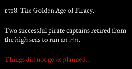
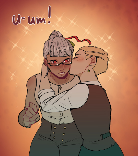
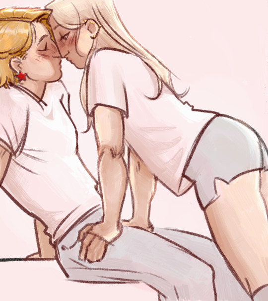
calling it right now that season 3 starts like this
#so confused about people saying the season finale feels like the end because to me it didn't at all#there's like 5-10 issues immediately set up for another season#they're in a happy place at this point because they've both realized their love is bigger than anything else#and makes it worth working on their problems together#the problems are still very much there#both of them have deep self esteem/self loathing issues that haven't been resolved in the week since ed woke up#ed doesn't know about stede's trauma#they haven't talked through anything#and they'll be shit at starting/running an inn lmao it's not gonna go well#and those are just some of the internal issues#then there's prince ricky and all the authorities that would very much like to get their hands on both blackbeard and stede bonnet#because stede just full-on kept using his government name after faking his death. nice one#the crew are not “gone” they're more like off to college for a bit but will probably run into trouble immediately#again because while they escaped to the ship they didn't eliminate the threat (the british empire)#it's not a forever goodbye#ok this got super long already anyway i have a whole fic marinading in my brain until i've finished these 4 wips i'm in the middle of ✌️#hope we get a renewal soon because i want to see the rest of their story!!#ofmd s2 spoilers#ofmd s2#ofmd#our flag means death
2K notes
·
View notes
Text
butch entrapment
#on a mission to create the most tender soft lesbian art full of. palpable yearning ILL KEEP TRYING until i get it right o7#cissiecassie#cassie sandsmark#cissie king jones#wonder girl#arrowette#young justice 1998#young just us#yj98#dc#comics#fanart#art tag#lesbian#<- just because the tag looks pretty :]
2K notes
·
View notes
Last Seen Blogs

briefsbyday
Untitled

ehessler82
Untitled

rethinkhealth-online
Untitled

wibblingwords
✈心会把方向找到

rare-girl-almighty29
Wanderlust