#les dorscheid
Text
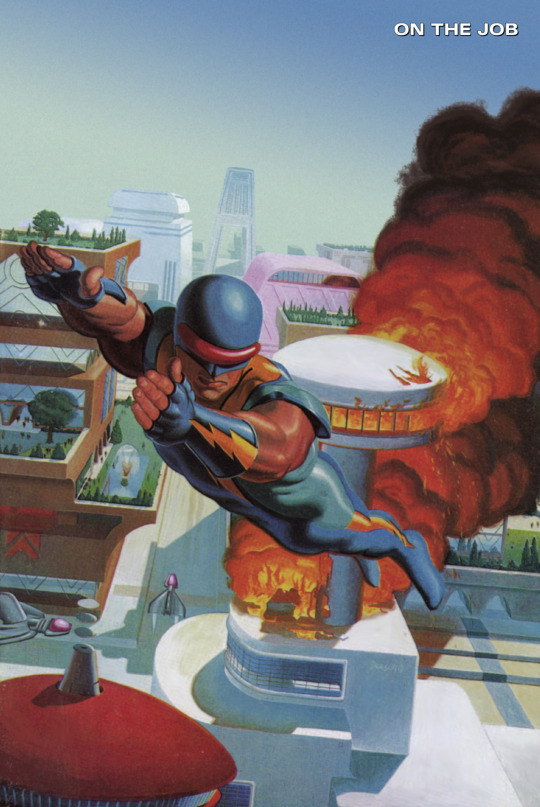
Nexus #69
#nexus#stan korivitsky#the future#space opera#fire#les dorscheid#first comics#dark horse comics#comics#80s comics
12 notes
·
View notes
Photo

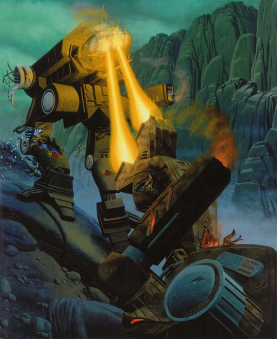
The Atlas -- 100 tons of walking destruction (Battletech ad in Dragon 132, April 1988, reproducing Les Dorscheid’s cover art for Battletech Manual: The Rules of Warfare, FASA, 1987)
288 notes
·
View notes
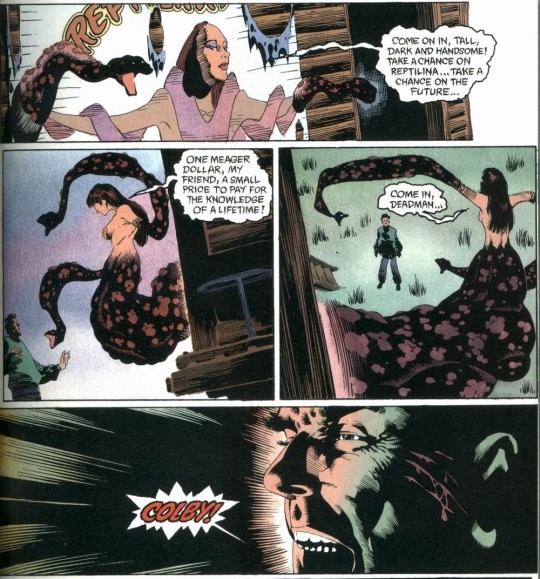
Photo
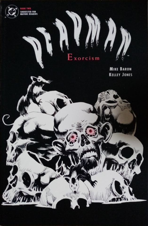

Deadman: Exorcism #2 (1992)
0 notes
Photo
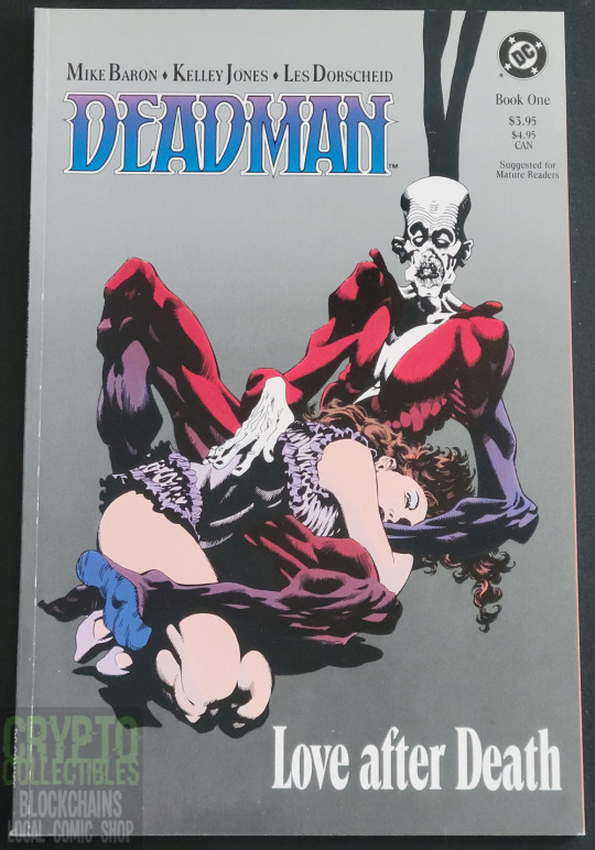

Deadman Love After Death #1 (December 1989) by DC Comics
Written by Mike Baron, drawn by Kelley Jones.
#Deadman#Love After Death#DC Comics#1989#Comic Books#Comics#Etsy#Vintage Comics#Kelley Jones#Les Dorscheid#Mike Baron#Boston Brand#Deadman Love After Death
1 note
·
View note
Text
To all the amazing Battletech & Mechwarrior fans and creators, who deserve to always feel welcome, appreciated, and safe in these otherwise trying times: I'm thankful to be part of such loving & inclusive fandoms, artists, and creators. Here's to many more years together! <3 AI upscale of Falcon & The Wolf cover artwork by Les Dorscheid, published in 1995, link to full resolution. https://lensdump.com/i/jbMfg0
#battletech#mechwarrior 2#mechwarrior#science fiction#mecha#mech#science fiction art#scifi#scifi art#mechs#robot
81 notes
·
View notes
Text

Deadman: Love after Death: Come to the Colby Circus
by Mike Baron (W.); Kelley Jones (P./I.); Les Dorscheid (C.) and Todd Klein (L.)
DC
4 notes
·
View notes
Text
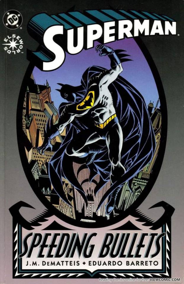
📖: Superman: Speeding Bullets
🖊️: J.M. DeMatteis
🎨: Eduardo Barreto and Les Dorscheid
📅: November 1993 • Published by DC
5 notes
·
View notes
Photo

Batman And Dracula Red Rain
Writer-Doug Moench
Penciler-Kelley Jones
Inker-Malcom Jones III
Colorist-Les Dorscheid
7 notes
·
View notes
Video
youtube
Ed Piskor and Jim Rugg looking at Kelley Jones’ Batman art in black and white. I have my problems with the Cartoonist Kayfabe approach -- the desire for viewers leads to talking about work that doesn’t really merit discussion, and they frequently discuss work they don’t have much in the way of insight about -- but talking about a mainstream artist whose work as cartoonists is built around interesting choices, like Kelley Jones or Klaus Janson, they really shine. (They are also frequently very strong interviewers, as the amount of content they’ve produced has led extremely talented people, who work alone in studios, to treat them as friends.)
Anyway, this Gallery Edition also includes a few pages of color guides by Gregory Wright, which look great. (The initial four comics represented in this gallery edition were colored by Adrienne Roy, but the process then switched to computer-separated color, which Wright handled by doing up pages with Doc Martin’s Dyes.) Rugg and Piskor say they would be interested in going through issues of the printed comics, but let me give a spoiler -- the actual printed comics look pretty bad, far inferior to Jones’ work as colored by Danny Vozzo or Les Dorscheid you can find elsewhere. Looking at the color guides one realizes this isn’t really Wright’s fault. My understanding is, the computer separation process scanned the art and then broke down the choices in color on the board into CMYK percentages. This evaluation would then assign a K value to the color choices, which previously would have not been included, being reserved for the line art. As a result, the pages as printed are muddy in their color, and you can’t make out the line art nearly as well as you could with comics where color separations would be done in the traditional way.
The reason I’m posting this is because I just now realized that this finds a funny parallel in movies, like 2022′s The Batman, that you watch and can’t make out what the hell is happening, because the digital cinematography is too dark. Everyone talks about how these comic book movies are washed out and grey and not colorful and therefore don’t look like comic books, but I would like them to start saying (and attributing to me as the originator of this take) that they do look like comic books, specifically comic books from the nineties that look like shit because the production teams hadn’t worked out the nuances of the digital color process.
The point of this video is that Kelley Jones’ line art is phenomenal, really amazing stuff; that’s a thesis I agree with.
1 note
·
View note
Photo
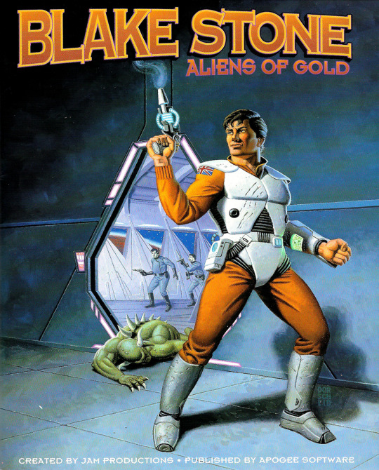

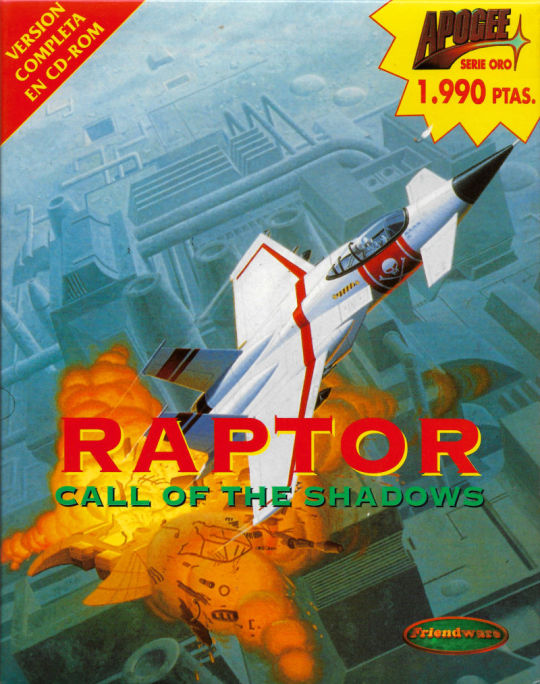

Les Dorscheid’s covers for Apogee Software
Blake Stone: Aliens of Gold (1993)
Rise of the Triad (1994)
Raptor: Call of the Shadows (1995)
Realms of Chaos (1995)
#art#Illustration#painting#Les Dorscheid#1990s#1993#1994#1995#video games#cover art#Apogee software#3d realms#Blake Stone#Rise of the Triad#Raptor call of the shadows#Realms of Chaos#fps games#platform games#shmups#PC games#pictures#just a machine
89 notes
·
View notes
Photo

Aliens: Hive #2 (Dark Horse Comics - March 1992)
Writer: Jerry Prosser
Illustrator: Kelley Jones
Production: Les Dorscheid (Colors) & Clem Robins (Letters)
#comics#Aliens: Hive#Alien#Aliens#Jerry Prosser#Kelley Jones#Clem Robins#Les Dorscheid#Dark Horse Comics#1992
76 notes
·
View notes
Text

Nexus #65
#nexus#brother lathe#elvonics#mean#uh oh#the future#space opera#les dorscheid#first comics#dark horse comics#comics#80s comics
0 notes
Photo
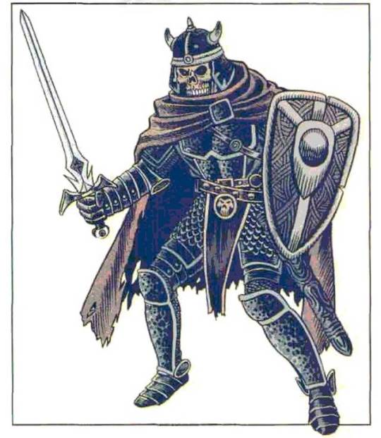
"A death knight’s deep, chilling voice seems to echo from the depths of a bottomless cavern.” (Jeff Butler pencil and ink, probably colored by Les Dorscheid, AD&D 2nd ed Monstrous Manual, 1993)
#D&D#Dungeons & Dragons#Jeff Butler#Death Knight#undead#2nd ed D&D#D&D 2nd ed#Les Dorscheid#dnd#Dungeons and Dragons#TSR#Monstrous Manual#1990s
663 notes
·
View notes
Photo

Vintage Comic - Badger #01
Pencils: Steve Rude
Inks: Jeffrey Butler
Colors: Les Dorscheid
Capital Comics (Sept1983)
#Vintage#Art#Illustration#Design#Comics#Capital Comics#Badger#Steve Rude#Jeffrey Butler#Les Dorscheid#1983#1980s#80s
22 notes
·
View notes
Photo
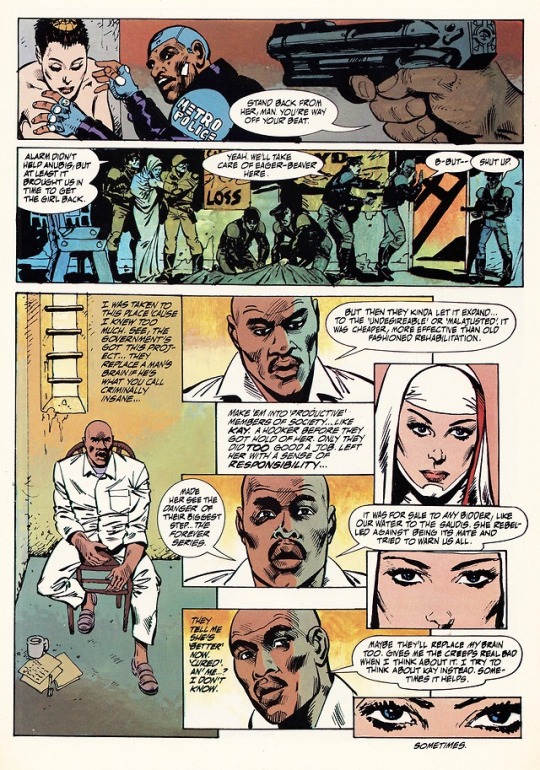
“Sometimes It Helps”
Metro
Mike Saenz, Mike Vosburg and Les Dorscheid
Six From Sirius 2 #4 (March 1986)
Epic / Marvel Comics
#Metro#Six From Sirius 2#Mike Saenz#Mike Vosburg#Les Dorscheid#Epic Comics#Marvel Comics#Great Comics#Great Comic Art#Sometimes It Helps
5 notes
·
View notes
Text
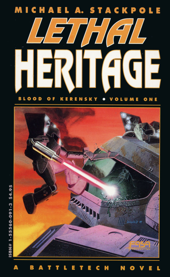

Cover artwork of @MikeStackpole's seminal Blood of Kerensky: Lethal Heritage across 3 decades: Les Dorscheid (1st print in 1989); Roger Loveless (2nd print in 1995), and Alex Iglesias (3rd print, 2020)
87 notes
·
View notes
Last Seen Blogs

fanwit
Fanwit

kylesvariouslistsandstuff
Kyle's Various Stuff

kaibatart
KaiBatArt

15fishes
View/Vee

itsmccurdy
awkward.