#skywrites
Text
Intro
Once I start writing the masterlist will be linked!
Current Obsessions:
Top Gun/Top Gun Mav, Generation Kill, Band of Brothers, The Pacific, Obx, Star Wars, Marvel, Teen Wolf, Supernatural, Percy Jackson, etc.
~Me~
Pronouns: She/Her
Currently Watching: Gilmore Girls
Currently ReWatching: The Pacific
Currently Reading: Johnny Got His Gun
Currently ReReading: Percy Jackson Series and Spin-offs
I will write for any era of the Star Wars Franchise and I will write for most characters male or female!
Things I WILL NOT write:
-Age Gaps
-Smut
-Non-Canon typical Graphic Topics
-Cl*ncest
I'm currently taking requests for Headcanons, One Shots, blurbs, and ships!
Please feel free to send in an ask!
#skywrites#skyrants#clone wars#clone wars fanfic#clone wars imagines#clone wars x reader#clone wars imagine#star wars imagines
3 notes
·
View notes
Text

95K notes
·
View notes
Text
Redhead lesbian anal fucks busty blonde
These hot girls love to take up with the tongue each drop of warm cum
Fingered granny fucked and facialized
Love and psyche second part (Full Movies)
Two sexy shemales fucking a horny dude
Interracial MMA Intergender Fight
Free elderly having gay sex videos Mark And Justin Get Some Ass
Gay blowing a dong in a car
Carol fernandez eu dando para negao gotoso no mato
Deutsche Milf
#accommodately#gristliest#perchlor-#Daumier#skywrites#NZ#summarizer#eighth#uncultured#Akas-mukhi#Cantrall#Scyros#outblunder#mutilate#dianakko#newsvendor#Delmore#SAMTO#gripless#thermostated
0 notes
Text
I am a butter of my word
NAME THIS FUCKER!
(it is too fucking late for me to make this digital so here is sketch design-)
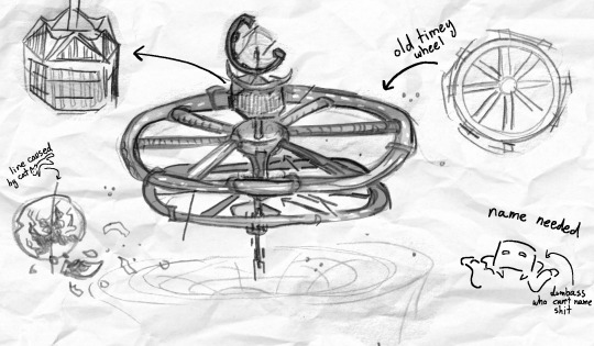
I will gather up all the names and make one giant ass poll
(though if you all get too silly during the poll I will have to put you in the corner and pull a name outta my ass)
you can be as silly as you like with submissions though I love a good giggle
submit via asks, replies, reblogs- hell skywrite it if you want
#B.E.N.T#bad end ninja turtles#ITS SPACESHIP TIME SPACESHIP TIME#soon I must go to bed under court mandate just hit the am and failed typing “skywrite” about 30 times#can't WAIT to see what you guys come up with <3#spammed ones or ones I just really do not like will not be added
137 notes
·
View notes
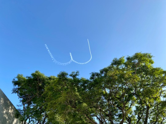
Text
Airplane said :)
They drew many many :) :) :)s that afternoon x3
53 notes
·
View notes
Text
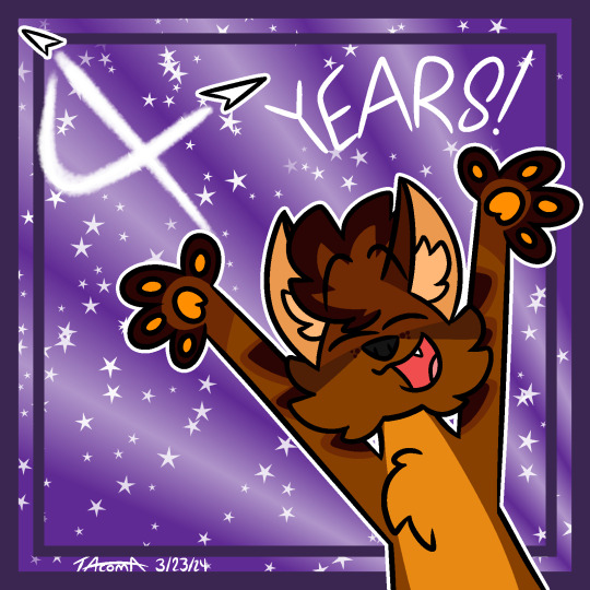
4 Year Shepiversary!!
Today, March 24th 2024, marks four years since I first made Shep!!
In that time, he really has evolved so much both as a character in his own right and as my main sona. It’s kind of ridiculous for me to look back at some of the first pieces I made of him and see how far both he and I have come since then <33
More ramblies abt what/how much he means to me below the cut :]
Shep was my first ever furry character and that was a big milestone for me, especially looking back on it now lol. I remember being nervous about taking that first step into having an anthro character because I had been in a lot of online spaces that had really negative views of the furry community (I would not wish being on iFunny upon anyone). Plus just branching away from WoF at the time, which my online presence had basically been built upon up to that point, also felt daunting.
But opening myself up to the furry community is something I’m so glad that I did and I wouldn’t trade it for anything. Without taking that first step with making Shep, who knows, I might’ve never made things like Let’s Get Back! or gotten/made characters I so adore like PB, Starburst or Luau. I've met so many amazing people through this community and that's something I am so incredibly grateful for.
And then of course, Shep himself has really helped me in ways that no other OC of mine has. Given how I made him in March of 2020, that was right before the hardest stretch of my life so far, from early/mid 2020 through 2021. Having Shep as a way to express myself and channel the things I was feeling into a character really did help so much. I know I said this in my Shep post last year but it bears repeating, it really does feel like Shep and I have grown up together in the last four years. I don’t know how else to put it.
But 4 years and 232 toyhouse gallery images later, he’s still here with me. Despite everything, he's still me <33
#I also kinda wanted to revisit the planes/skywriting idea I used for my bday piece a few months ago hehe#art#my art#TacDraws#oc: Shep#furry#furry art#fursona#fursona art#anthro#anthro furry#anthro art#sfw furry#clean furry#furry character#furry oc#oc#original character#sona#digital art#cartoony art#furry artist#artists on tumblr#digital artist
25 notes
·
View notes
Text
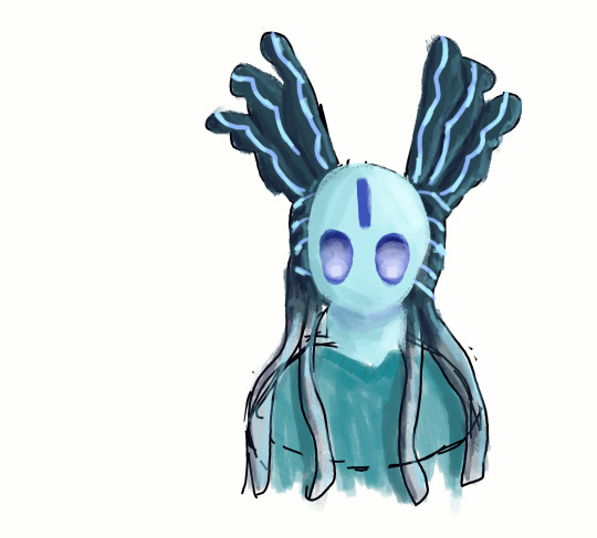
redesigned one of my oldest ittys! I think I've greatly improved sear
27 notes
·
View notes
Text
name a more iconic duo than an autistic person and their first d&d campaign
#actually autistic#actuallyautistic#d&d#dungeons & dragons#dungeons and dragons#ttrpg#ttrpgs#ttrpg community#skywrite#brought to you by the fact that lux aeterna came back last month after the entirety of alkupera (3 years)#and im having an absolute blast <3333333#lux aeterna
35 notes
·
View notes
Text
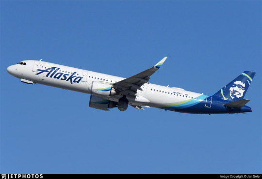
No. 51 - Alaska Airlines

This is one of my most requested posts. Apparently, a very significant portion of my readers fly Alaska Airlines!
That tracks. Alaska Airlines is the fifth largest airline in the US. A sort of anti-Flair, they are supposedly the least complained-about full-service carrier in the US. They are also one of five remaining US legacy carriers, along with American Airlines, Delta Air Lines, Hawaiian Airlines, and United Airlines. They operate a massive network primarily on the US West Coast, with bits branching out into nearby slices of the Americas. As one might surmise from prior knowledge of the size and population of Alaska, they're actually mostly based in Seattle.
Now, when it comes to their livery, there's one thing that stands out. At least, it stood out to me, and I'm sure at least some of you have had this thought too.
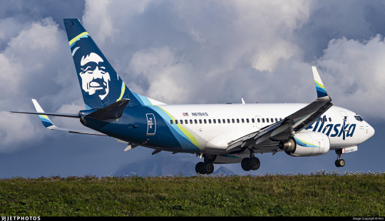
That is a human person's face on the tailfin. But who does that face belong to, and why is it on the Alaska Airlines fleet? This is precisely the sort of trivia I think anyone who knows me would expect me to be able to just rattle off, but actually...I don't know, and neither, as far as I can tell, does anyone else. Isn't that weird?
(By the way, it is indeed Alaska Airlines. I have always found that somewhat unintuitive. It's just not how you're used to hearing things phrased, right? It's Possessive Noun Airlines, Air Noun. America Airlines would sound weird. Alaska Airlines sounds weird. I am never surprised when people mistakenly say Alaskan Airlines, but it's Alaska Airlines. Just so we're all on the same page.)
Alaska's a bit of a hard place to navigate. Big empty place, lots of ice, lots of mountains, islands, trees...not very much asphalt. That's even true now, but it used to be way truer, and even back then people did still live there. And there's a lot of things those people might maybe like to have, like medical care, or food, or just the hypothetical possibility of getting somewhere without having to get the snowshoes out. In that sense, Alaska is a really perfect place for aviation to flourish.
More or less as early as physically possible, when there were planes available that weren't requisitioned for the first World War or owned by the ultra-rich, people were flying in Alaska. In a lot of ways the basic landscape hasn't changed that much. With its surplus of difficult environments and paucity of actual tarmac Alaska's harsh wilderness is an environment only suited for "bush" flying, using smaller, more rugged airplanes specialized for the environment. Some of the most popular models of bush plane are very old, not that dissimilar to what you'd see in the 50s and 60s - apparently, they just don't make them the same anymore, and as long as you don't get your de Havilland Beaver crunched horribly into the side of a mountain there's just nothing that can replace it. Alaska is full of planes on floats, planes on skis, and taildraggers on tundra tires, most of them high-wing and piston-engined. Bush pilots are a unique sort, often doing work that's neither glamorous nor lucrative (nor safe, with Alaska having two to five times the accident rate of the lower 48) but undeniably necessary.
That's not as true of Alaska Airlines. They have a modern fleet, a good safety record except for that one time, and as a category III carrier they make over a billion dollars in revenue each fiscal year, meaning their finances aren't too strained (except for that one time). Unlike the local carriers that connect remote parts of Alaska to resources and to major cities, Alaska Airlines connects Alaska to the rest of the nearby world. (Though it also does short, multi-stop milk run flights.) It's a necessary part of the ecosystem, helping to keep Alaska's beautiful but hostile terrain from getting in the way of daily life. Before they became Alaska Airlines, though, they were far more similar to what you might expect of...Alaska airlines.
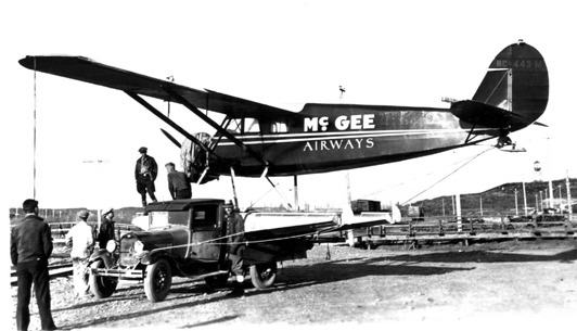
Image: Roy S. Dickson
In 1932, a man with the fantastic name 'Linious McGee' started his very own airline. You could just do that back then. In 1934 it was merged into Star Air Service, another tiny airline. Star Air Service had also been founded in 1932, born from the flight-school-starting dreams of a wealthy miner with the similarly wonderful name 'Wesley Earl Dunkle'. Apparently Star had its first ever aircraft, a Fleet B-5 biplane, brought to Alaska by steamship, which I just find fairly interesting. I guess this was before you could even ferry an airplane directly to Alaska by air. They ate up a few other small airlines (and their routes), and in 1943 they won a small scuffle against another pretender to formerly rebrand themselves as Alaska Airlines. So it's been 80 years of that now!
They've gone from flying Curtiss Robins, Ford Trimotors, and Lockheed Vegas to flying basically only 737s, save a few vestigial A320 family aircraft acquired when merging with Virgin America which they plan to phase out by the end of 2024. Their livery is also on E175 regional jets operated by Horizon Air and SkyWest. The airplanes flying for them number around 300. That's incredibly large even by the standards of major airlines (not even counting the SkyWest planes that have the livery).

The Alaska Airlines livery is not breaking any molds and I need to say that upfront. This is a very straightforward pattern I've taken to calling the Lufthansa Declined, or the Lufthansa Line SAS Variation. (Because the push and pull of trend cycles in brand identity is basically comparable to chess, right? Maybe? No? Not really?) I've recently codified the concept of the Lufthansa Line, the straight line continuing where the tailfin left off to carve through the fuselage. This is a very common and very disappointing fuselage trope. The Declined, or SAS Variation, is named for an airline I specifically contrasted with Lufthansa from my very first post on this blog, SAS.
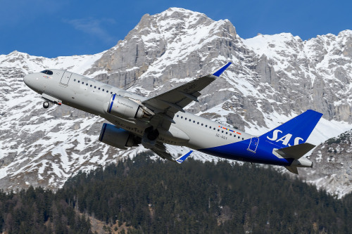
The SAS Variation simply curves this line outwards towards the front of the plane, stopping the cutoff from being quite so blunt and hopefully undoing the unbalancing effect somewhat. This can solve some of the nastier effects of Lufthansa Lines, particularly on shorter planes, but can also look very wonky if implemented without enough care. It's not always a big improvement, but it's definitely not the exact same thing, either, and it's this shape which Alaska Airlines attempts. Being introduced in 2016, this livery actually pre-dates SAS, but Delta and Lufthansa weren't starting their own namesake patterns either. The names aren't attributed based on innovation, but on formative status in my own specific understanding of airline liveries. SAS as contrasted to Lufthansa is the holotype for my creation of the taxon, and thus earlier liveries are retroactively SASlikes. Birds are dinosaurs and whales are ungulates. Taxonomy is imperfect and has to accommodate new discoveries within a sometimes unintuitive framework. That's just how it is.
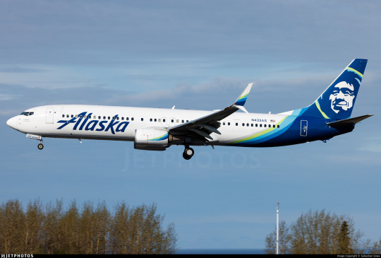
I think they do better than many. The fact that they use so many colors, layered over each other, is crucial to the effect. It accomplishes similar things as a gradient might, transitioning from dark to light with minimal pain in the process.

Image taken from Alaska Airlines's very useful branding style guide.

The shades of blue and green used resemble the Aurora Borealis. I can't find anything confirming that this is intentional but I can't imagine it isn't. I think they're very nicely chosen. Different lightings can make the blue (Alaska's material calls it midnight blue, but it's technically Prussian blue) look anywhere from true vivid blue to more of a deep ocean color, which is one of my favorite shades. In particular, the very washed out yellowish green is an absolutely gorgeous choice for a highlight color. I like that the colors aren't given equal purchase, though, and that the green is used sparingly for highlight, and to create that lovely subtle 'halo' around the face on the tail. Sometimes less is more, and this is one of those cases. In fact, their own website states:
Midnight is our primary brand color, and should be used sparingly to avoid overuse—giving more prominence to the Alaska Airlines brand.
(They also note that they took specific efforts in the design process to make sure these colors had significant contrast between them to meet accessibility standards, which I really appreciate and want to see more of.)
For example, if the 'intermediate' blue colors took up more of the plane, or were separate from the green, I would probably not feel any real way about them. I definitely wouldn't think they were nice if they just did a standard Lufthansa Line block with each color individually expressed. But using them as a trim to a nice clear deep blue, overlapping each other in a way that's very carefully mapped out but seems at a glance essentially random, halfway to mixing, like the dark tail is melting slowly into the fuselage...that's nice. That adds something.

The partially-overlapping, brushlike curves are further expressed as swashes on the winglets and engines. What's interesting to me is that if you look closer you can see that the little curves are on both the inboard and outboard sides of each engine and winglet, so you get that consistent curve, hypothetically, no matter what angle you see it from. I do think I appreciate that. The curves are just never going to all line up, because airplanes are inconveniently three-dimensional and there are as many angles to view them from as there are Planck lengths at a distance where you can tell what it is you're seeing. This is a weakness in all liveries more detailed than a Braniff jellybean and adding the curves to even the side of the engine that you're usually not going to see is definitely an appreciated attempt to mitigate this. Does it work? Maybe not totally, but I see the effort.

While there's never a perfect syzygy into one continuous line, the curves seem like they're part of the same nebulous body from most angles. I appreciate this approach. I think making things look pretty good from most angles is worth more than making things look really good from one angle and awkward from all others. As they say, the perfect is the enemy of the good. I absolutely love the use on just the inside middle of the scimitar winglet, which I already think is a gorgeous feature that just elevates the MAX and retrofitted 737NGs compared to the vanilla model. It's distinctive and stylish, and the limiting of the color to just the lower half of the upper blade has a real restrained elegance to it - these slashes of color are all the more effective for the way they interact with the space around them.

Just look at these winglets. They're such a tiny feature. It's absolutely wild that I can be this in love with winglets, but there's just something about split scimitar wingtips that make me go completely wild. The amount of space and the interesting shape leaves so much more room for creativity than just about any other wingtip device. Alaska Airlines does have planes with other wingtip styles, and it uses those effectively too - covering the lower half of canted/blended winglets and fully encompassing the interior of less pronounced split winglets - but this is where they look their best.
Back to bad angles, though...


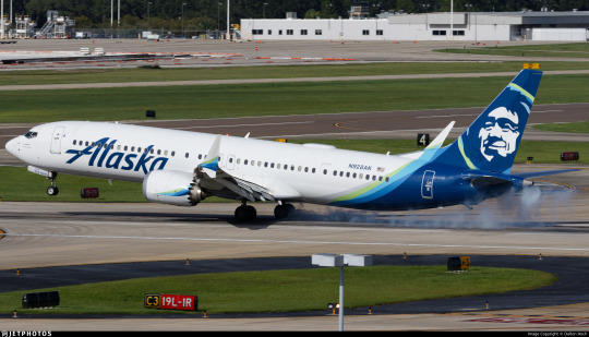
Alaska Airlines has a weird weak spot, and it's from the front and slightly above. All those gorgeous swoops on the winglets and nacelles are basically impossible to see due to their two-dimensional nature, and you can see how the colors don't fully cover the back of the fuselage. My normal policy is to judge liveries by their weakest link, but I honestly almost want to be lenient on this because of how unlikely it is that you're ever going to see an airplane from this angle. The only situations you're ever above an airplane in are ones you're basically never going to encounter as a regular passenger. Don't get me wrong, I still think this could have been designed in a way which eliminates this weak point, but as far as weak points go this is quite excusable. Is that what Thetis thought when she dipped her son in the Styx? Sure, probably, but I stand by my take. For a lot of liveries their worst angle is close to side-on, which is just fully experience-ruining. This? I'm okay with this, relatively speaking.

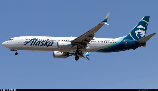
On the other hand, one of the better angles is one a lot more people will see - below and to one side. The taper of the different bands of color really prevents the awful jarring cutoff that Lufthansa Line and SAS Variation liveries often have, and I feel like they trick the eye into thinking up more of the fuselage is occupied than it really is. Also worth noting is that the grey underside, which resembles a shadow, is actually intentionally painted on, which is lovely. This is a feature common to the Deltalike livery trend that I outline at the start of my Southwest post, which I do think is one of the things that makes me honestly a bit sympathetic to Deltalikes when looking at them next to Lufthansalikes - at least there's an attempt to distribute visual detail evenly. Deltalikes were already a bit dated by 2016 (it was not the longest-lived trend, though it came at a time in my life perfectly positioned to make me think it was more prominent than it was) while SASlikes were on the rise, and this livery has aspects of each, but it feels less like a conflicted result of an intermediate period in dominant trends and more like something which intentionally pulled features from both where it thought they might work best. It's rare that I get this sense from a livery. That's the right way to use trends - as inspiration, not a template.

Alaska Airlines is definitely not a true Deltalike, and I would argue it's not a true SAS Variation either. (For the record, I would consider the 1998 SAS livery a Deltalike, funnily enough!) It incorporates features of both, which makes me feel uncomfortable classifying it definitively as either, though it's definitely more of a SASlike than not. For example, from the side it just is a SASlike, because the grey doesn't go high enough and isn't contrasting enough to be visible except from below. This is in contrast to actual Deltalikes, which have a thin but clearly visible line on the lower side where the underside's block of color bleeds out.
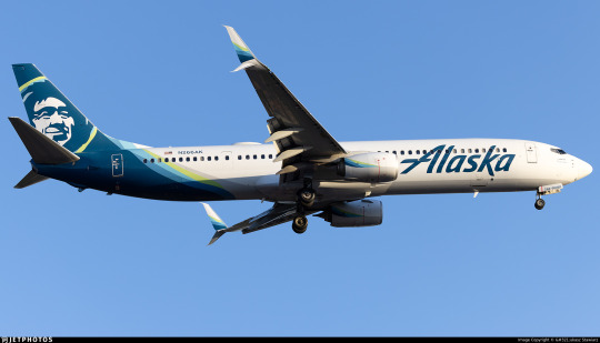

This grey color is also on the engine nacelles, although it is very subtle. This does bring up a minor gripe of mine, which is that the design on the pods cuts off at a bit of an awkwardly sharp angle, usually not worth remarking on but possible to notice from some angles if you are, say, a livery reviewer and you look at these things very closely. What I do like, though, is that the grey on the belly actively connects to the color on the tail, feeling like an extension of it instead of an awkward choice made to mitigate it.
The final specific feature of the livery I think I want to comment on is the wordmark. I really like the wordmark. It's not in their custom typeface, AS Circular, a Roboto-ish sans serif I'm not a gigantic fan of, although I really like their custom web icons. They also use Highest Praise by Adam Ladd, a fairly cheap commercially available font.

As for the wordmark itself, though, I can't seem to find what font it's based on! I have to say the original 1966 logo would be great if another airline were to use it, the 1972 is somehow giving supermarket chain, and the 1990 logo would be great if not for the weird way the K overlaps the A, which just feels sloppy and unprofessional. The 2014 and 2016 incarnations, though, are great. The 2016 one (designed by the firm Hornall Anderson) feels like a great update, just cleaning up the earlier version, though I somewhat miss the lightning-bolt S.


The placement is what I want to talk about, though. Placing a wordmark is more of an art than you might think - I'll show a couple examples of Alaska itself doing a slightly wonky job later - but when Alaska's placement is good it's great. It's one of the least cramped-looking wordmarks I've ever seen, feeling free and airy, spreading upwards above the window line. The descending line on the K and the trailing like on the A both create a feeling of freedom, like it could just keep going but doesn't want to, yet is tastefully restrained and doesn't actually overstep its bounds. I like the solid single color, and I like that it reaches almost to the engines, preventing that empty-forward-half feeling. The one thing I'll comment on for this set of images is that the left-to-right reading direction of English does mean that it looks distinctly worse seen from one side than the other. I much prefer the forward slant, which feels aerodynamic fitting with the motion of the plane, vs the alternative, in which it feels like the wordmark is trying to catch up with the aircraft's nose.
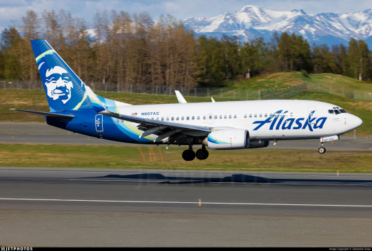
On shorter planes, though, Alaska fumbles a little. They choose to line up the wordmark with the engines instead of with the nose, creating an awkward look when it overlaps the door and nearly reaches the cockpit window. I would have leaned in the other direction were I them. This picture also demonstrates a strange feature which rears its head in certain lightings where the shading on the tailfin image makes it look almost wrinkled. I don't have anything to add to that or know how to solve it, but I need to point it out.
On a very long plane, conversely, the back half of Alaska's planes begins to feel that Lufthansa Line emptiness. The vast, vast majority of their planes are of a moderate enough length that neither issue is too overpowering, but I'm taking a wide view here! Also, the wordmark here seems to not be aligned with the engines, so...what's the idea?

Alaska Airlines is an interesting livery. More interesting than I thought I'd find it for sure. It's not just a SASlike with pleasing colors and a nice wordmark, it's a SASlike with thought put into features that can mitigate the inherent weaknesses of the SASlike. It doesn't always fully succeed, nor does it comprehensively fail, but it definitely tries.
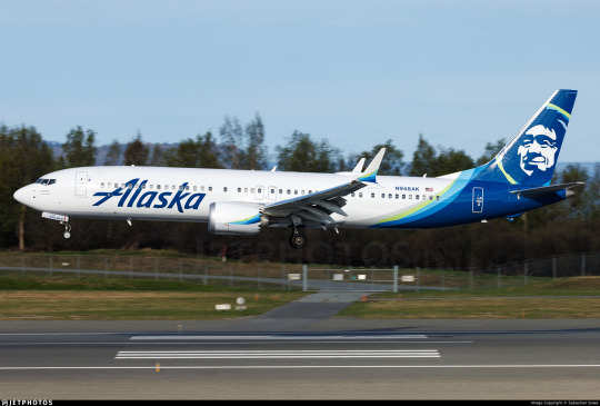
At the end of the day, as usual, I wish there was less white. I'm sure it could have been done. I don't have an obvious solution in mind like I do for some hypothetical redesigns, so it's something I would have to think over and really dig into, but, like, Alaska Airlines makes more than a billion in revenue every year so I think that's reasonable to expect from them.
I initially started using the grading system as a way to categorize liveries without limiting myself to a very specific scale that I'll dither about for years and then change my mind about later, but it's started to end up in that role. I just don't know what better solution there is, so I'm going to continue trying to make it work. Alaska Airlines is a livery that I ultimately think I like, that I think is designed decently, but that is limited by the fact that a really good SASlike is still a SASlike - mostly white and rear-heavy. It's getting the most possible out of a flawed paradigm, and I've been inconsistent so far on how I rate a good SASlike or Lufthansalike because it causes me some legitimate cognitive dissonance.
I'm giving Alaska Airlines a provisional B-.
I think I might downgrade it to C+ later, which is why I say it's provisional. A good execution of something really limited - how do I even rate that? It's somewhere between tepidly good and better-than-average, which is a really awkward place to be. But that's probably a conversation for another day, because this post is long enough and I'm still not done.
Okay, I teased this earlier.

Him. Who is he?

The short answer: nobody knows. Not me, and not Alaska Airlines.
The long answer: deserves its own post. Both because it's long, and because I've hit image limit. And there will be images. Join me in tomorrow's bonus, where we climb our way through the rugged terrain of seemingly-lost history to attempt to put a name to this ubiquitous face.

#tarmac fashion week#grade: b-#era: 2010s#era: 2020s#region: north america#region: united states#alaska airlines#legacy carriers#lufthansa declined#deltalike#skywriting
51 notes
·
View notes
Text
Seasons Meetings
By Skyler10
Summary: Daisy brings her new girlfriend home to meet her parents, and Phil and Melinda are thrilled.
A/N: Wrote this on the plane home alone to a less accepting family and edited on the flight back, so I hope this helps all of us who have parents who wouldn't react in this welcoming of a way. *hugs
Read on Ao3
-----------------
Melinda May was in awe looking back at her past holiday family photos. She’d aged, despite her husband’s protests to the contrary. He had too, but gracefully, carrying the wisdom and laugh lines of experience, complimenting his gentle kindness. Their tiny baby transformed through each photo—first into a delightful and hyperactive little girl, then to an adorkable preteen, then to a depressed teenager with long hair dyed even blacker than her natural dark brown and with matching nails and thick eyeliner. She smiled, but it barely covered the truth. Those were rough years for them all.
But the photo tradition had continued. The longer Daisy was in college, the more she bloomed. She matured into a radiant young adult, if self-deprecating and with still a bit of that old insecurity when she ran into old classmates when home for the holidays. Former teachers and senseis and parents of friends asked every time when she was going to bring home a boyfriend, how she could possibly still be single, and didn’t she want to give her parents grandchildren?
Melinda always redirected the conversation, with a protective arm around her daughter’s shoulders. Both Melinda and Phil were quick to reassure Daisy that they were proud of her regardless of her relationship status or whether she ever had children. Daisy was grateful but said no more on the subject. She mentioned boyfriends here and there, and a girl or two, but none made it to Christmas or to meeting her parents. Melinda and Phil worried that Daisy's teen years were still haunting her all these years later.
In Daisy’s senior year of high school, she came out as bi to her parents in a tearful outpouring of secrets at the lowest point of her depression, but it proved to be a turning point. To Phil and Melinda, it was also a relief as it answered so many questions. It wasn’t just her ADHD, the high expectations on her as a tech genius, and the stress of moving away to college soon. She’d had her heart broken a year earlier by a girl who wasn’t ready to be out and denied they had ever had anything between them. The girl's friends shamed and bullied Daisy for months, but eased up over the summer and the fall semester. But as pressure mounted in the spring before graduation, Phil and Melinda found Daisy in her room crying so hard that dark streaks of mascara stained Phil’s shirt as he pulled her close. She’d been photographed flirting with another girl, and the photo had made its way around social media with meme text about sin and “confusion” in “our schools,” with the cyberbullying perpetuated by the girl from the previous year who had now joined an evangelical youth group.
No one could blame Daisy for staying away after high school graduation. She spent her summer breaks in impressive internships until one of those internships turned into a job at the end of those four years. But through university and now as a working professional, she always came home for Christmas.
This year, however, she wouldn’t be coming alone. She said she had a special guest, but she wanted it to be a surprise.
Melinda and Phil lit up when they saw their precious girl appear from the airport terminal. But the bombshell blonde with her made their smiles even bigger. The blonde caught Daisy’s scarf as it fell off and they stopped so she could wrap it back around Daisy’s neck. Daisy pecked a kiss to the blonde’s cheek and took her hand.
“Mystery solved then,” Phil quipped to Melinda. Melinda sent him an amused look of agreement before they waved to catch Daisy's attention.
After reunion hugs were exchanged, Daisy introduced them to the blonde who was politely waiting behind her.
“Okay, don't be weird,” Daisy warned, “but this is my girlfriend, Carol Danvers. Surprise! Carol, this is my mom and dad.”
Daisy's nervous smile told Melinda all she needed to know. Daisy was in love. This was no mere holiday invite because Carol didn't have plans. This was an official Meeting of the Parents.
“Wow, girlfriend, huh?” Phil stuck out his hand to shake Carol's. “I'm Phil.”
“We're so glad to meet you.” Melinda shook her hand next. “I'm Melinda.”
With this warm welcome, they walked together to the baggage claim.
“So this is the mysterious Carol,” Melinda began. “We've heard you've been spending time together…”
“… But we didn't know about the girlfriend part,” Phil finished.
Carol turned to Daisy in hesitation, “Wait, did they know before now that you're—”
“Oh! Yes.” “Old news.” “Yes!” The three hurried to answer.
“Just not that you two specifically were together in that way,” Phil explained his comment. “Carol, we can't wait to get to know you. We're really excited you're here.” Phil tried to rein in his enthusiasm to not embarrass Daisy, but Daisy and Melinda laughed at how obvious it was. Carol didn't, though. She seemed to relax.
“Thank you,” she said simply. Carol didn't hide it as well as Melinda did herself, but this girl clearly had some armor up. Melinda made it her mission to help Carol see her defenses were unnecessary here and that she was genuinely welcome.
“We weren't sure who this surprise guest would be so we made up the guest room,” Melinda explained. “But if you'd both be more comfortable staying in Daisy's room, that's fine too. Her bed is big enough for two.”
There, that was obviously supportive.
“Mom!!” Daisy groaned and blushed.
Phil shrugged. “This is our first time doing this. We don't know what you want.”
“Okayyyy,” Daisy turned to Carol, “now you see why I wanted it to be a surprise.”
Carol smiled at Daisy's childish embarrassment. “I think that's very kind. I'm okay with sharing if Daisy is.”
Daisy nodded and relaxed at how well this was going so far despite her anxieties, and Carol continued.
“Daisy told me it's the first time she's brought anyone home to meet you two. And she told me about all your Christmas traditions.”
Phil offered, “Do you have any of your family's that you would want to do while you're here, Carol? And are they okay with you being with us instead of with them this year?”
Carol exhaled heavily and looked to the still-quiet baggage carousel. “Yeah, they … will be fine.”
Daisy filled in, “Carol and her parents don't really get along.”
Ah.
Phil and Melinda nodded in understanding, and Phil offered, “Well, you're always welcome with us.”
He wanted to hug Carol, Melinda could tell, but the bags started to arrive. He was always finding young people in need of a mentor or father figure and helping them believe in themselves, whatever path lay ahead of them.
With their luggage acquired, they were ready to start their holiday. The four ventured out of the airport for a first Christmas together that they would each treasure for the rest of their lives, despite all of the awkward moments and hard conversations—and the heartbreaking realization that Carol had been worried about Phil and Melinda’s reaction to Daisy bringing home a woman. But Carol's courage and love had shown through, even in that misplaced fear, by being willing to come home with Daisy anyway. Which, of course, only endeared her to them more.
Even that same Christmas, after dropping the two young lovebirds back at the airport, Phil and Melinda mentioned it as soon as they were alone in the SUV. There was mutual agreement that this was The One for Daisy, but also that Carol clearly felt the same. She was the only person who could be worthy of their daughter, from the way Carol adored Daisy to the way she always looked out for Daisy's best, from that scarf in the first moment they saw her to handling Daisy's luggage with care when unloading at the dropoff on the way back.
“That girl’s going to be our daughter-in-law someday,” Melinda had remarked as they watched Carol disappear with Daisy through the airport sliding doors.
“You okay with that?” Phil asked just to be sure.
“Definitely. And you know I wouldn't say that about anybody else.” Melinda raised an eyebrow pointedly. “You?”
“Me too.” Phil smiled and pulled the SUV away from the curb and into an opening in the airport traffic. “One week and we already feel like a family of four.”
“People always asked me if we'd regret not having more kids,” Melinda confessed. “But I think this was the one we were waiting for. Not a sister for Daisy but a wife.”
Phil recounted this story as the father of the bride a year and a half later, in their wedding toast.
#daisy johnson#carol danvers#aos#agents of shield#captain marvel#daisy x carol#carol x daisy#wlw#sapphic fic#femslash#lesbian carol danvers#bisexual daisy johnson#skywriting#melinda may#phil coulson#melinda x phil#philinda#philindaisy#melinda may POV#holidays#Christmas fic#meet the parents#home for the holidays au
14 notes
·
View notes
Text
I treat Skywriting by Word of Mouth like a theologian that lives in the mountains and spends 20 hours a day studying religious texts in a cave, carving their epiphanies into the walls, but instead of revelations about the nature of existence it’s just gay innuendo and goofy wordplay
#he gripped her by the pound and headed for the wrong bank#is essentially Corinthians to me <3#skywriting by word of mouth
25 notes
·
View notes
Text

I’ve only ever seen the last paragraph posted on Tumblr so here’s the whole passage for those who care about gay John Lennon moments
168 notes
·
View notes
Photo
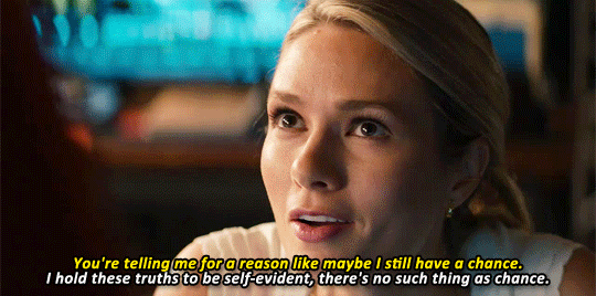
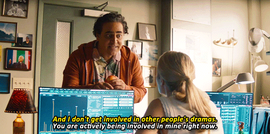
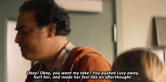
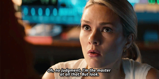
NCIS: Hawai’i - 1x22
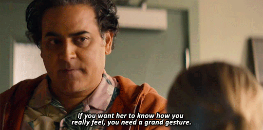
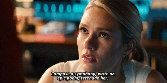
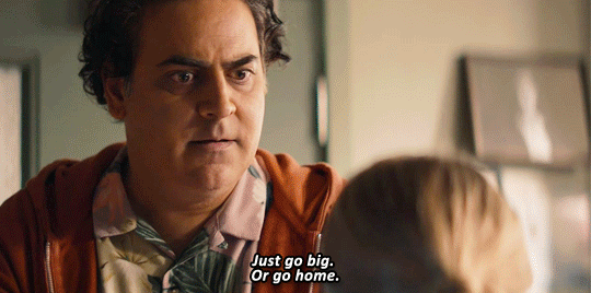
#ncishawaiiedit#ncis hawai'i#kate whistler#ernie malik#tori anderson#jason antoon#ncis hawai'i spoilers#ncis hawai'i 1x22#kate x lucy#kacy#femslash related stuff#okay HOW is she going to NOT take this literally!!!#which part of this indicates that she should do something big but not anything like she said#what is kate supposed to do paint or skywrite something#what is ''go big'' but not actually anything like I listed#she looks so worried like this isn't HER CHOICE#she can't trust her own instincts with lucy so she's gotta trust someone's#why not her close friend who is pushing them together#I am a kate defender#and an ernie blamer#I suppose her possible mistake was doing it in public#but one of the issues earlier on in their relationship HAD been how she wasn't willing to show anything in public#or in front of lucy's people#so like...I really can't blame her
307 notes
·
View notes
Text
So uh...been reading a bit of that Skywriting I've been hearing about around here. *glares in the direction of a fox*
Well, OK, this part is technically from the Two Virgins part. A couple of curious sentences:
"i. theylooked into each others eyeballs their tongue clenched minds grasping at each others whatsits."
This...this ain't just about Yoko, is it?
#skywriting by word of mouth#mclennon#they totally tossed each other off while staring into each other's eyes#then rationalized to themselves it wasn't queer#tumblr what have you done#you've made a fool of everyone#the beatles#only on page 40 over here lol
44 notes
·
View notes
Text
x
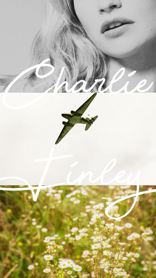
#i'm sorry but literally WHAT is this#the only thing i like is the font it reminds me of skywriting#anyway HAPPY BIRTHDAY BABE#flipfloplogic#loveduringthewar#oc: charlie finley
16 notes
·
View notes
Text
Sometimes when I’m birdwatching
13 notes
·
View notes
Last Seen Blogs

thatenofucker
yo back again
x-poprocks-x
roxas

mizahlr
Mizahlr

coloringcuda
cuda is tired

karen-mulder
Karen Mulder