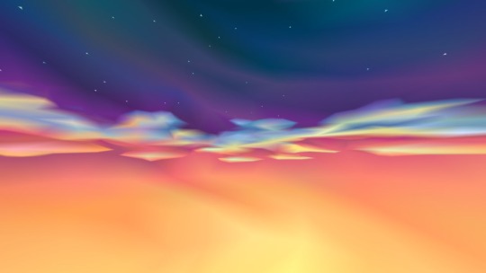
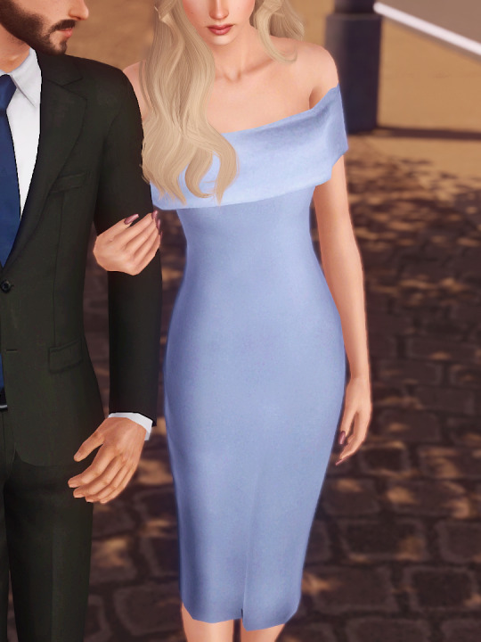
#vertical gradient
Text

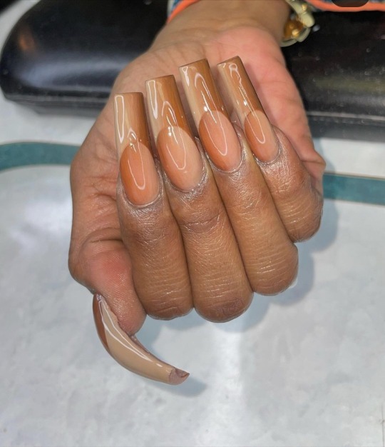
#xl nails#xl#long nails#gorgeous nails#gorgeous colors#gorgeous#beauty#manicure#pretty nails#mani#nails#nail blog#nail pics#cute nails#nail art#art#gradient nails#vertical gradient#art nails#nail faves#nail pro#pretty colors#pretty#beautiful nails#beautiful#@hollywiththegoodnails
56 notes
·
View notes
Text

@lenoircanvasnails
26 notes
·
View notes
Text
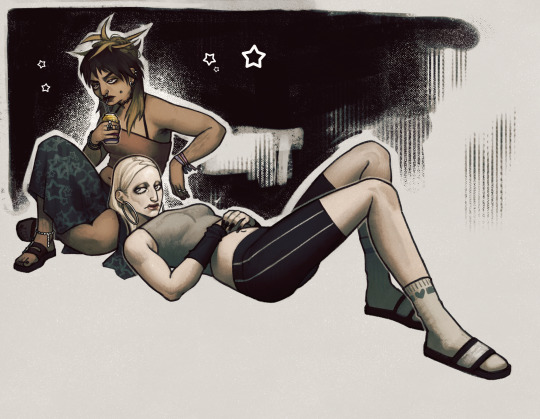
style + brush experiment
#my art#my ocs#uriyah (oc)#ashley (oc)#spending ages painting a soft gradient: boring. tedious.#hiding messy brushstrokes with Strategically Placed Vertical Lines or screentone: riveting. exciting.
29 notes
·
View notes
Text
Lourdes Sanchez, entonces
70 notes
·
View notes
Text
I may have to change the way I draw vanessa's hair I'm afraid
#the way i do it makes it hard to keep it consistent lol#i might just make it so the rainbow dye vertical instead of horizontal#and theyre solid instead of gradients#*sighs* *opens up pinterest* time to look for inspo#i should just make a character sheet for her huh#not hair#no wait i mean#not art#snsmmfjekemfmm???*÷*÷**÷*÷??
8 notes
·
View notes
Text
36 notes
·
View notes
Text
Man I miss classic Minecraft
#And I mean *classic* classic minecraft#someone make a beta 1.7.3 modpack server full of Aether and Ars Magika 2 and Tinkers' Construct and FoodCraft or whatever hungerbar mod#Back to a time where worldgen waa so beautiful and vertical yet had flat surfaces that weren't awful altitude gradients#zia goes on
8 notes
·
View notes
Text
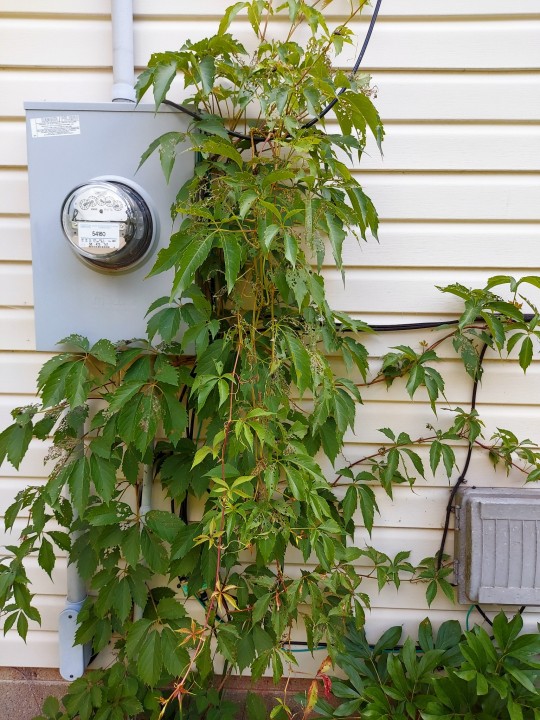
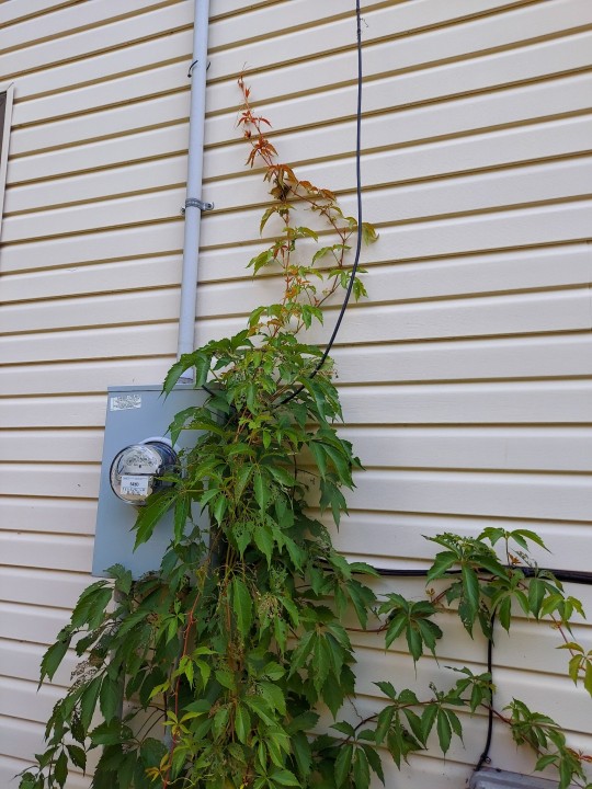
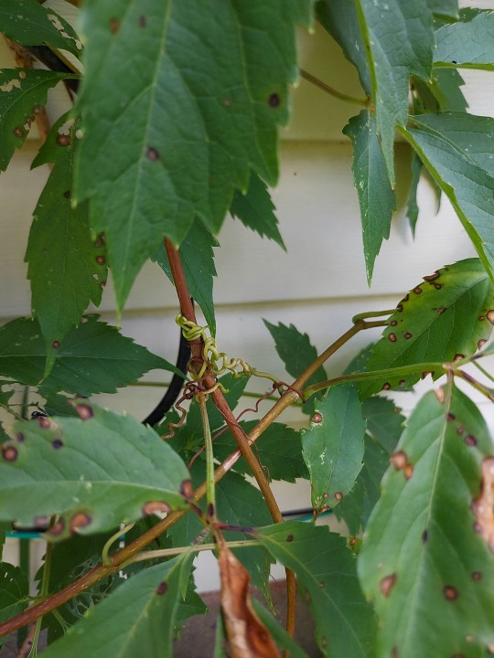

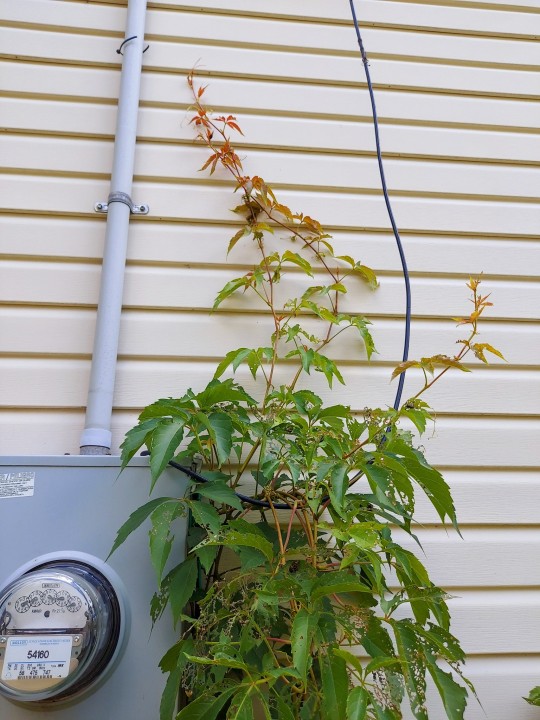


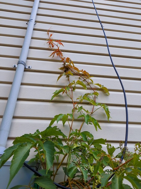
#my photography#aes#aesthetic#no date#my garden#overgrown#vines#exterior#walls#vertical#orange#green#gradient#virginia creeper#foliage#cottagecore#details
2 notes
·
View notes
Text
My Favorite Cheap Art Trick: Gradient Maps and Blending Modes
i get questions on occasion regarding my coloring process, so i thought i would do a bit of a write up on my "secret technique." i don't think it really is that much of a secret, but i hope it can be helpful to someone. to that end:

this is one of my favorite tags ive ever gotten on my art. i think of it often. the pieces in question are all monochrome - sort of.

the left version is the final version, the right version is technically the original. in the final version, to me, the blues are pretty stark, while the greens and magentas are less so. there is some color theory thing going on here that i dont have a good cerebral understanding of and i wont pretend otherwise. i think i watched a youtube video on it once but it went in one ear and out the other. i just pick whatever colors look nicest based on whatever vibe im going for.

this one is more subtle, i think. can you tell the difference? there's nothing wrong with 100% greyscale art, but i like the depth that adding just a hint of color can bring.
i'll note that the examples i'll be using in this post all began as purely greyscale, but this is a process i use for just about every piece of art i make, including the full color ones. i'll use the recent mithrun art i made to demonstrate. additionally, i use clip studio paint, but the general concept should be transferable to other art programs.


for fun let's just start with Making The Picture. i've been thinking of making this writeup for a while and had it in mind while drawing this piece. beyond that, i didn't really have much of a plan for this outside of "mithrun looks down and hair goes woosh." i also really like all of the vertical lines in the canary uniform so i wanted to include those too but like. gone a little hog wild. that is the extent of my "concept." i do not remember why i had the thought of integrating a shattered mirror type of theme. i think i wanted to distract a bit from the awkward pose and cover it up some LOL but anyway. this lack of planning or thought will come into play later.
note 1: the textured marker brush i specifically use is the "bordered light marker" from daub. it is one of my favorite brushes in the history of forever and the daub mega brush pack is one of the best purchases ive ever made. highly recommend!!!
note 2: "what do you mean by exclusion and difference?" they are layer blending modes and not important to the overall lesson of this post but for transparency i wanted to say how i got these "effects." anyway!
with the background figured out, this is the point at which i generally merge all of my layers, duplicate said merged layer, and Then i begin experimenting with gradient maps. what are gradient maps?
the basic gist is that gradient maps replace the colors of an image based on their value.

so, with this particular gradient map, black will be replaced with that orangey red tone, white will be replaced with the seafoamy green tone, etc. this particular gradient map i'm using as an example is very bright and saturated, but the colors can be literally anything.

these two sets are the ones i use most. they can be downloaded for free here and here if you have csp. there are many gradient map sets out there. and you can make your own!
you can apply a gradient map directly onto a specific layer in csp by going to edit>tonal correction>gradient map. to apply one indirectly, you can use a correction layer through layer>new correction layer>gradient map. honestly, correction layers are probably the better way to go, because you can adjust your gradient map whenever you want after creating the layer, whereas if you directly apply a gradient map to a layer thats like. it. it's done. if you want to make changes to the applied gradient map, you have to undo it and then reapply it. i don't use correction layers because i am old and stuck in my ways, but it's good to know what your options are.

this is what a correction layer looks like. it sits on top and applies the gradient map to the layers underneath it, so you can also change the layers beneath however and whenever you want. you can adjust the gradient map by double clicking the layer. there are also correction layers for tone curves, brightness/contrast, etc. many such useful things in this program.
let's see how mithrun looks when we apply that first gradient map we looked at.

gadzooks. apologies for eyestrain. we have turned mithrun into a neon hellscape, which might work for some pieces, but not this one. we can fix that by changing the layer blending mode, aka this laundry list of words:

some of them are self explanatory, like darken and lighten, while some of them i genuinely don't understand how they are meant to work and couldn't explain them to you, even if i do use them. i'm sure someone out there has written out an explanation for each and every one of them, but i've learned primarily by clicking on them to see what they do.
for the topic of this post, the blending mode of interest is soft light. so let's take hotline miamithrun and change the layer blending mode to soft light.

here it is at 100% opacity. this is the point at which i'd like to explain why i like using textured brushes so much - it makes it very easy to get subtle color variation when i use this Secret Technique. look at the striation in the upper right background! so tasty. however, to me, these colors are still a bit "much." so let's lower the opacity.

i think thats a lot nicer to look at, personally, but i dont really like these colors together. how about we try some other ones?

i like both of these a lot more. the palettes give the piece different vibes, at which point i have to ask myself: What Are The Vibes, Actually? well, to be honest i didn't really have a great answer because again, i didn't plan this out very much at all. however. i knew in my heart that there was too much color contrast going on and it was detracting from the two other contrasts in here: the light and dark values and the sharp and soft shapes. i wanted mithrun's head to be the main focal point. for a different illustration, colors like this might work great, but this is not that hypothetical illustration, so let's bring the opacity down again.

yippee!! that's getting closer to what my heart wants. for fun, let's see what this looks like if we change the blending mode to color.

i do like how these look but in the end they do not align with my heart. oh well. fun to experiment with though! good to keep in mind for a different piece, maybe! i often change blending modes just to see what happens, and sometimes it works, sometimes it doesn't. i very much cannot stress enough that much of my artistic process is clicking buttons i only sort of understand. for fun.
i ended up choosing the gradient map on the right because i liked that it was close to the actual canary uniform colors (sorta). it's at an even lower opacity though because there was Still too much color for my dear heart.

the actual process for this looks like me setting my merged layer to soft light at around 20% opacity and then clicking every single gradient map in my collection and seeing which one Works. sometimes i will do this multiple times and have multiple soft light and/or color layers combined.
typically at this point i merge everything again and do minor contrast adjustments using tone curves, which is another tool i find very fun to play around with. then for this piece in particular i did some finishing touches and decided that the white border was distracting so i cropped it. and then it's done!!! yay!!!!!
this process is a very simple and "fast" way to add more depth and visual interest to a piece without being overbearing. well, it's fast if you aren't indecisive like me, or if you are better at planning.

let's do another comparison. personally i feel that the hint of color on the left version makes mithrun look just a bit more unwell (this is a positive thing) and it makes the contrast on his arm a lot more pleasing to look at. someone who understands color theory better than i do might have more to say on the specifics, but that's honestly all i got.

just dont look at my layers too hard. ok?
2K notes
·
View notes
Text
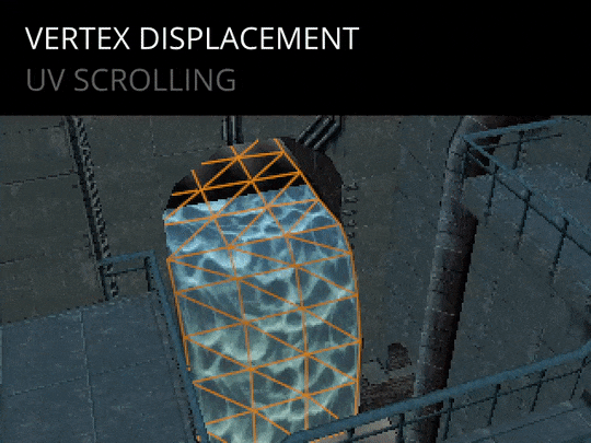
Alright! Let's actually talk about this waterfall thing. It is an amazing showcase of many things that I adore from late 90s graphics. I am replicating this in Blender, through mere observation of the final game, so some things might not be exactly accurate to what the PS1 does.
First off, this is what I started off with, straight from the Noesis exporter into Blender.
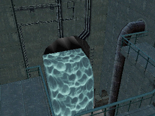
"Looks boring!" "What are those weird gradient quads?!" Oh we'll talk about those too, don't worry.
Let's start simple, figuring out the Layers.

We've got the base level geometry, then two layers of water, each with a different texture.
Let's focus on the bottom Water layer first. A waterfall's water falls, and the age old trick to replicate that behaviour is to scroll the texture along the mesh by offsetting the texture coordinates every frame.
Simple enough. Not too convincing yet.
Let's do the same with the other layer.

Look at it goooo!
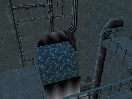
An often-used trick to enhance the waterfall effect is to increase the distance between vertices (or squash texture coordinates) as the geometry goes down.
This affects the scrolling velocity for the texture in each section, making it look like gravity is accelerating the water.
MGS pulls yet another trick on top of that:
Vertices are subtly animated to oscillate, making the water flow seem more irregular.
It seems to be something similar to what is done to geometry when the camera goes underwater in the docks or vents area.
One opaque layer of water on top of another is no good.
Alpha Blending is an expensive technique and it'd not give the desired effect.
Additive Blending is used instead. The lower layer is rendered first, the second layer is then rendered on top, adding the color values together.

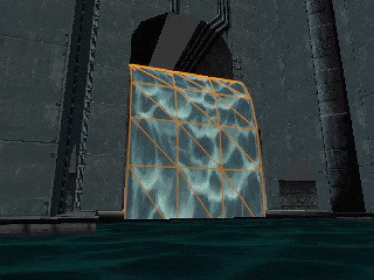
Now we get to talk about those weird quads.
They are darkening gradients! Instead of using Additive Blending, they do the opposite, the color value from the texture is subtracted from the scene that was rendered below, effectively creating shadowed areas.

Who needs HBAO+ anyway?
Lighting pass!
I just threw a few point lights to try and replicate the original vibes of the scene.
MGS, instead, uses lighting information baked into the vertices of the scene to create this mood. And what a mood it is!

Here's an additional example of the same techniques used in the bottom part of the same scene. Although the game seems to be rendering that water mesh as (almost?) completely opaque, there is an actual floor mesh under it.

There, I fixed this post.
If you enjoy my posts, shit or not, consider supporting me on Ko-fi, I will appreciate it a lot 💞:
https://ko-fi.com/parametricpalta
#ps1#playstation#metal gear solid#retro graphics#retro#vfx#blender#mgs#breakdown#waterfall#rex's lair#noesis#ripped#low poly#I fixed it!
6K notes
·
View notes
Text

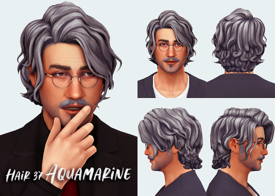
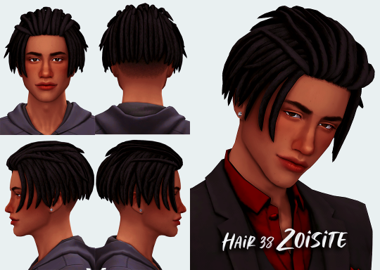

Hair 37 Aquamarine, 38 Zoisite, 39 Jasper
Both frames
Base Game Compatible
24 EA Swatches
Hat Compatible
All LODs
Hair 37 Aquamarine
Vertices:5534 Polygons:7977
Hair 38 Zoisite
Vertices:5938 Polygons:9189
Hair 39 Jasper
Vertices:5827 Polygons:8204
credits: MMActions and Gradients by @simandy
Thank you so much!
Download (blogspot, no ads)
日本語版はこちらからどうぞ
2K notes
·
View notes
Note


idk if this counts but the skyboxes from the PS1 Spyro games
that like, triangular multicolor gradient thing going on
ok wow this turned out super interesting!!
i assumed that this was just prerendered somewhere and then brought into the game on a sphere or something like a lot of games. but i wanted to see just in case so i found a model rip and UH?
ACTUALLY IT TURNS OUT THEY JUST PAINTED THEM DIRECTLY ONTO A SPHERE USING THE VERTEX COLORS?
this absolutely saves a Ton of space back in the era of early 3d games not needing a giant skybox texture & saves a ton on rendering too it just caught me sooo off guard. but that explains why theyre triangular, and gradient!! when you paint vertex colors, two vertices next to eachother will blend into eachother from one's color to the next. essentially every point on this sphere's color bleeds into all the surrounding points. someone sure had fun with this
2K notes
·
View notes
Text


@envymynailsllc
79 notes
·
View notes
Text
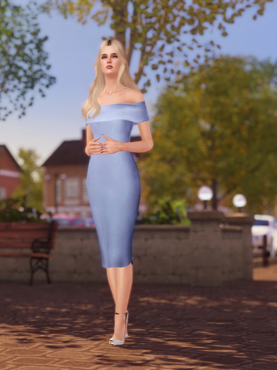
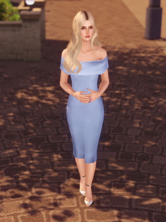


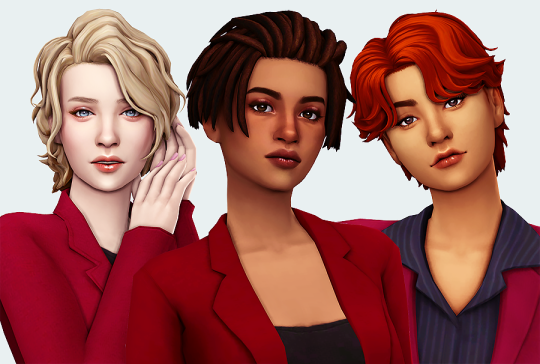
Cold Shoulder Dress - 2 Versions
I made an off-the-shoulder midi dress in two variations. One is a classic formal dress, and one is a more casual knitted version with long sleeves.
Details:
Everyday, Formal, Career, Maternity (has prego morphs!)
3 recolourable channels: the shoulder area, and a gradient for the top and bottom of the dress.
Poly count: around 4000 poly.
UV mapping is not great so I suggest solid colors and vertical patterns only. Pattern stretching is really bad on the knitted version... sorry.
The shoulder area will look weird with poses and animations where the arms are raised up high or moving a lot. Also the chest area can look bulky on sims with larger busts.
Credits:
The top half of the mesh is from the Love Paradise dress by Anubis, and the lower half of the dress is from that Showtime EP dress, you know the one. Frankenmeshed together by me.
The texture on the formal dress was actually from this dress by Rusty Nail just chopped up and repurposed, and the texture on the knitted version was made by me using Anubis and EA textures and a stock fabric image I found on Google.
Download: simfileshare / mega
914 notes
·
View notes
Text
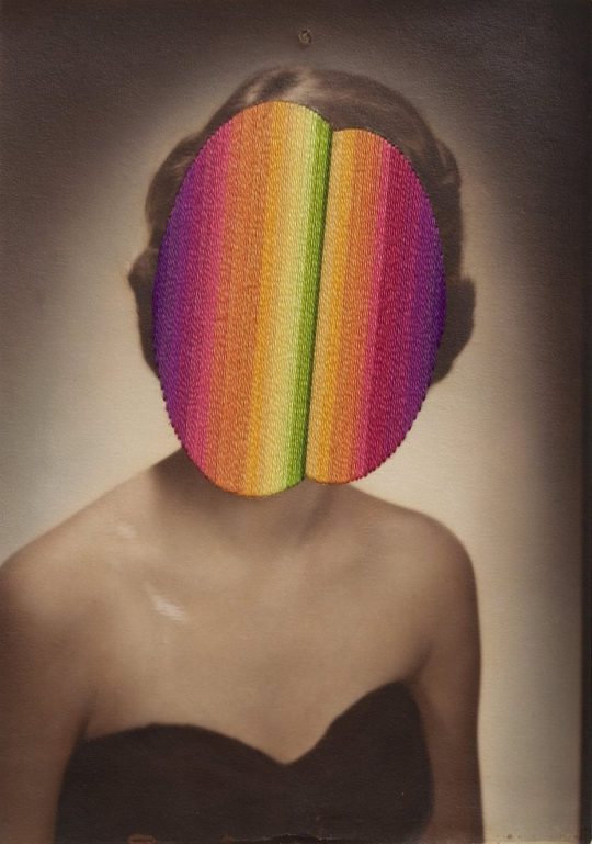
Julie Cockburn
#Julie Cockburn#art#digital art#women#portrait#glitch#gradient#lines#stripes#vertical#pink#colors#colorful
6 notes
·
View notes
Text
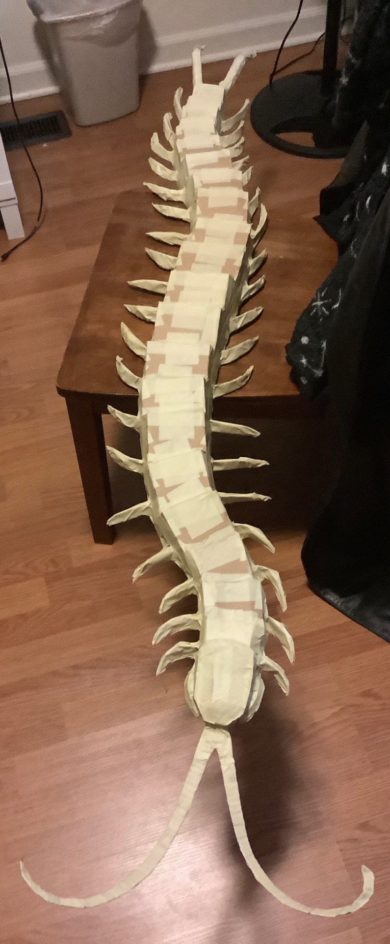
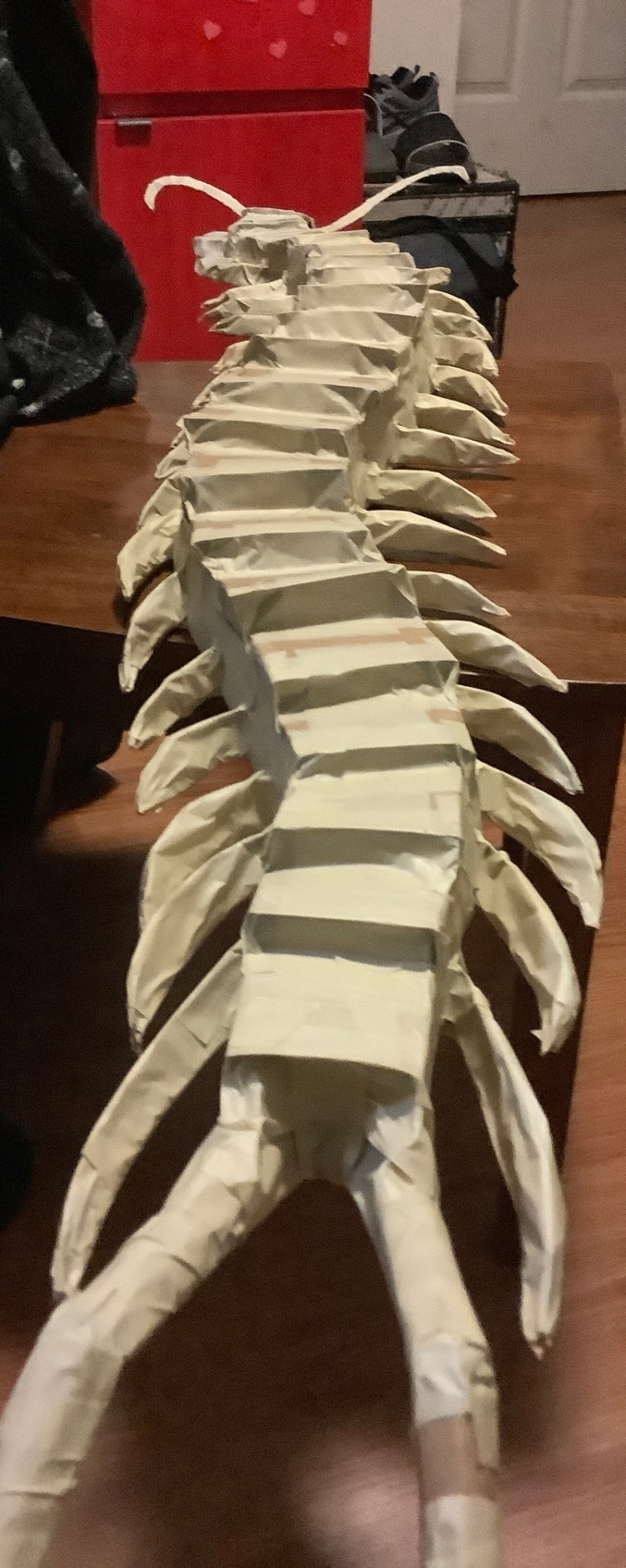
Guess what time it is…….
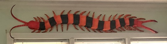
CENTIPEDE TIME !!! she’s finally real,,,,,,,, based off Scolopendra hardwickei or the Indian tiger centipede
Before I go about the process I just want to say you guys have been soooo incredible and I love reading your reblogs and I love the idea knowing I’ve inspired a lot of people,,, the project, although it was a lot of work and I’m feeling not so great as of posting this, still motivates me to want to make another.
(Art process below)
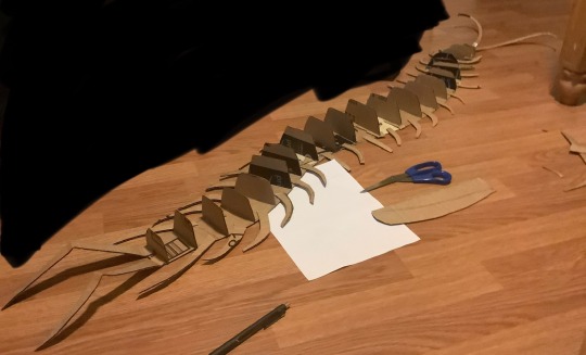
This was entirely freehanded! I have a lot of experience working in 3D art settings that this part came easy to me but I started with a flat base shaped in the pose I’d like the creature in. I used one whole piece cut from a shipping box and filled in the gaps with tape; you don’t need a single piece for the base but for structural integrity it helps a lot. As you can see here I also cut the legs separate and glued them on using hot glue. The vertical cross sections are to give an early support for the structure of the creature, think about the frames of aircraft or boats. During this part I used a pen to mark the width and height of the previous section to get a gradual flow of shapes.
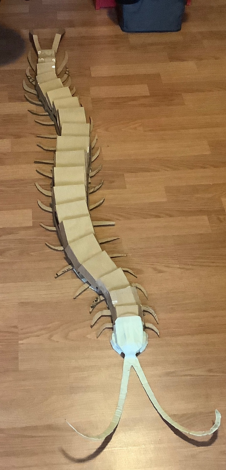
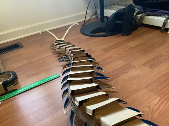
This next part I wish I got more documentation on but after the vertical cross sections I used soda boxes for the thinner and flexible cardboard to add contour lines along the length of the creature, gluing them on the cross sections. I did about 2 strips of this on either side to fill in the space and then I continued to use soda boxes to fold and shape the top of the creature, gluing onto the strips rather than the cross sections (this part was a mistake but I quickly adapted, no issues happened but it did make it slightly less secure). I also gave the legs vertical cross sections as well to shape them for the masking tape.
The worst part, taping everything. I used tape to further shape it how I wanted but that meant going over parts several times. I used 2 different widths of tape for this for efficiency but it doesn’t matter. The legs were very loosely taped and if squeezed then they’d lose their shape; I didn’t bother filling them in because I don’t have materials for that and I let the paper mache help support them instead. Tape was also used to fill any holes and gaps left by the cardboard skeleton.
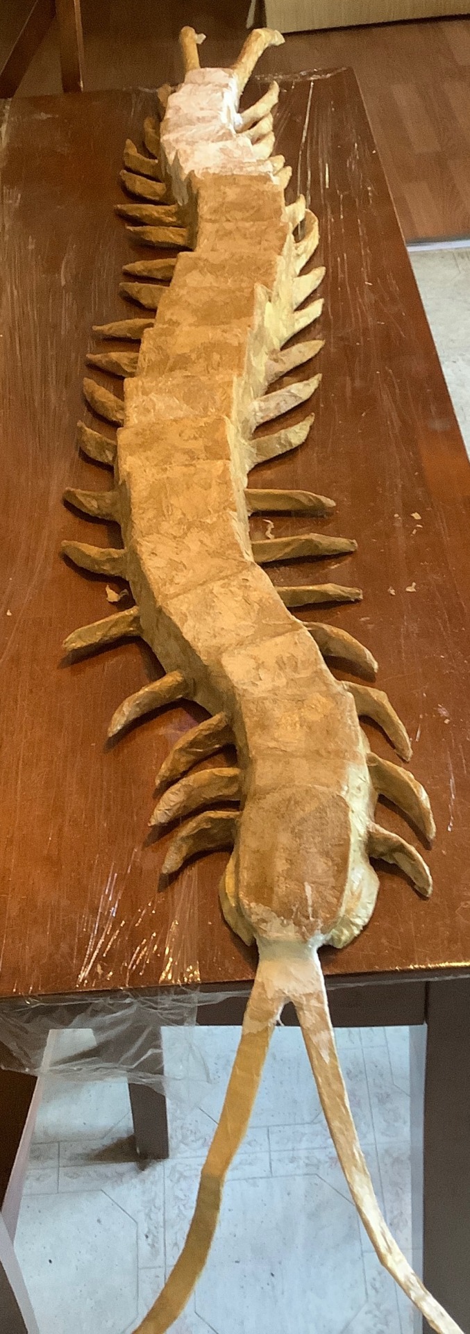
The next phase is paper mache of which I haven’t done since 5th grade… I was not confident in this step. I used mod podge and a brush to smooth down the paper. Because I lacked materials I used fast food napkins instead of newspaper which worked totally fine, it just tended to tear a bit easier. Some areas required me to get hands on and I don’t really like the texture during this stage so that was fun (lie). I didn’t do too many layers, one for the body and 3 for the back and legs but some projects might demand more. I used half of a 16oz bottle of mod podge btw so please get more than you think you need.
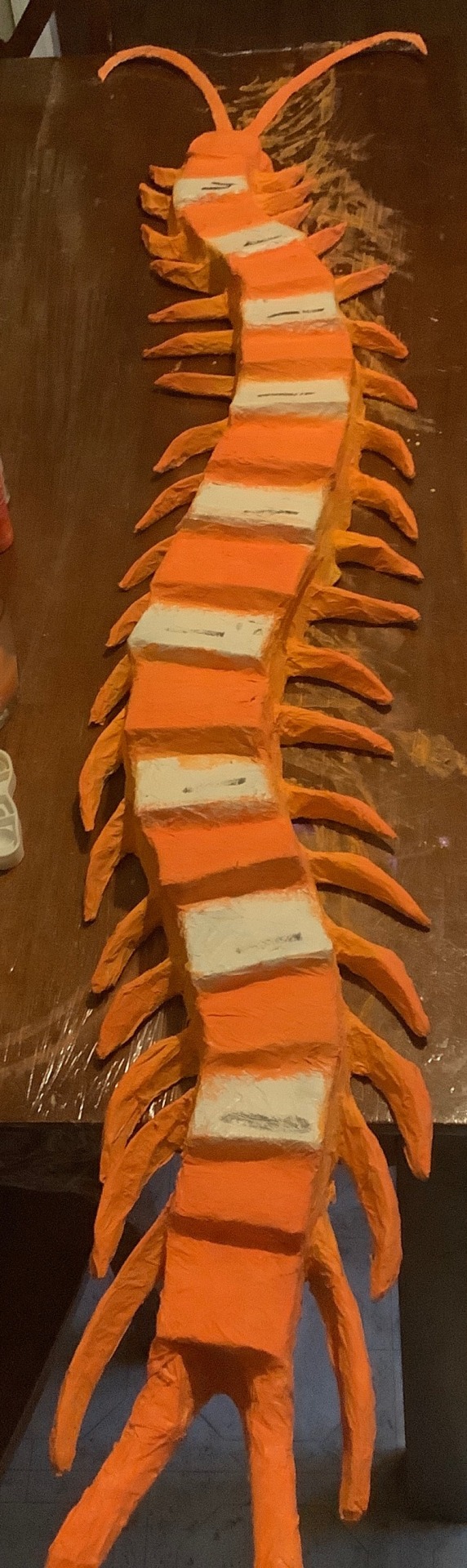
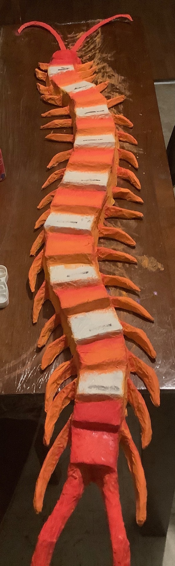
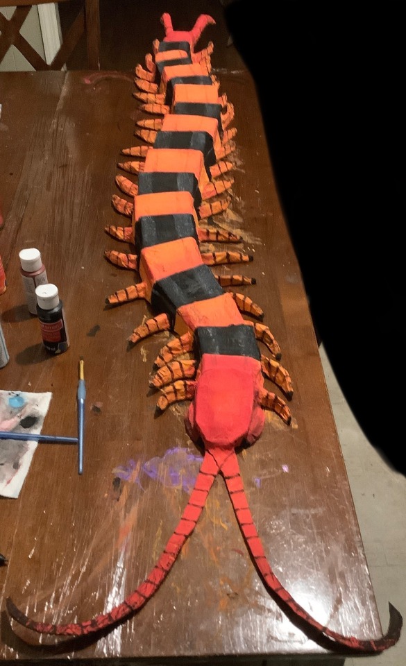
Finally, texture hell!!! I did a base coat of white spray paint and painted everything else with acrylic. Start with your lighter colors first before doing darker ones! I originally mixed some yellow and orange for the body and realized it was too bright and so covered it with orange instead. It also wasn’t until later I realized I could’ve been smarter with my paint so I skipped over the segments that were going to be fully black, saving the orange for the rest of the body. I wanted my centipede to stand out and not look 2D color-wise so I also used the red for the head and tail to give gradients and edges to the orange segments and legs, later going back with burgundy to further darken them but not too much. For the black segments I also used a very watered down layer of sky blue to give a fake shine and show the intended structure of the segments. Do not be afraid to use your hands! I used mine to smudge my detail paints like the black fade on the legs and the back shading. To top it all off I sprayed a clear coat and punched two holes in the underside to hang it up, using thumbtacks angled upwards.
615 notes
·
View notes
Last Seen Blogs

hqhaikyuu
Bros before Dinos
quartz-rott
Rotting Quartz
a-s-s-7
ASS7
mqsi
m
tomarryarchive
fanfiction blog dedicated to Harry/Tom and Harry/Voldemort.