
uon1011yanakaneva
Work In Progress
Yana's Work Diary for Projects in 1011
21 posts
Don't wanna be here? Send us removal request.
Last Seen Blogs
japanny12
Japanny Online Store - 100% Made in Japan Crafts
abaheotz
Little Story

dieu-de-la-nuit
The God of Night.
hellish-hyperfixation
various writings + drawings
Photo


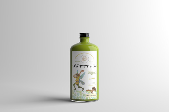
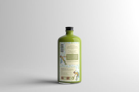

WEEK 13
Final Label and Mock-up Images
2 notes
·
View notes
Photo
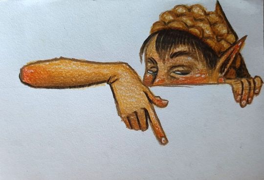
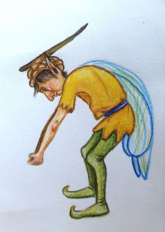
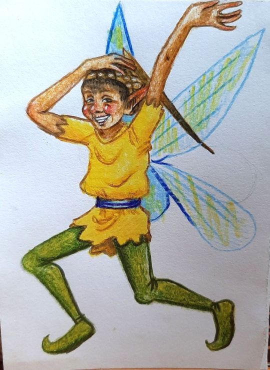
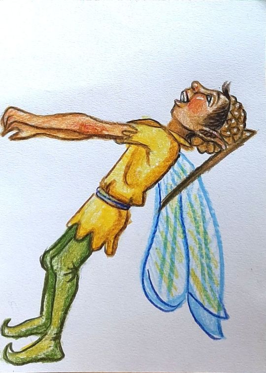
WEEK 13
Final Fairy Drawings
I decided that the best material for this would be pencil as it reinforces my old-fashioned motif. The mad hatter fairy with an acorn hat that will be pulling on my drink label ^^.
2 notes
·
View notes
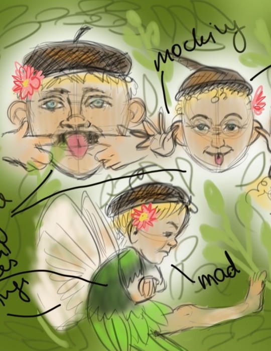
Photo
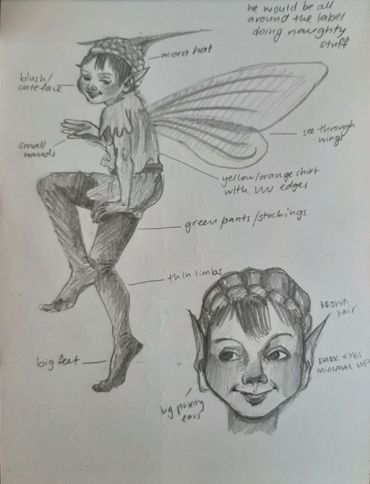
WEEK 12
Fairy Character Design
I have created my character so he looks mischievous and naughty, like a little boy. To emphasise his character I have given him small eyes, pointy angular ears and a thin upper lip. These features make him appear devilish without overwhelming the design. To counter this and make him look cute and likeable I have given him a round face, dark round eyes, a round nose, and lifted round eyebrows.
I have planned for him to appear 5 times throughout my label:
1. pulling on the label
2. peeking from behind the label
3. saying hello super enthusiastically
4. dragging warning logos
5. moving letters around
My preferred medium is watercolour, so I will be attempting mixing my digitally created logo with my traditionally generated character.
2 notes
·
View notes
Photo

WEEK 11
Studio-Brief
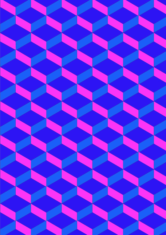
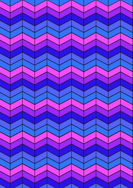
Pattern I came up with that I thought might be suitable for my design, since its colourful and tea related. I’ve decided to create leaves to symbolise tea and summery, natural and organic shapes to create a happy atmosphere and a visually pleasing design.
1 note
·
View note
Photo
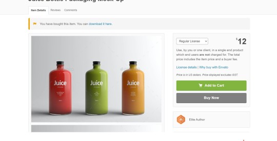
WEEK 11
Self-Directed Brief
Bottle mockups found online. (https://graphicriver.net/item/juice-bottle-packaging-mockup/15336098)
Paid $15
1 note
·
View note
Photo
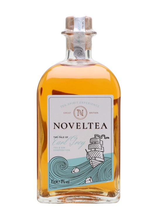
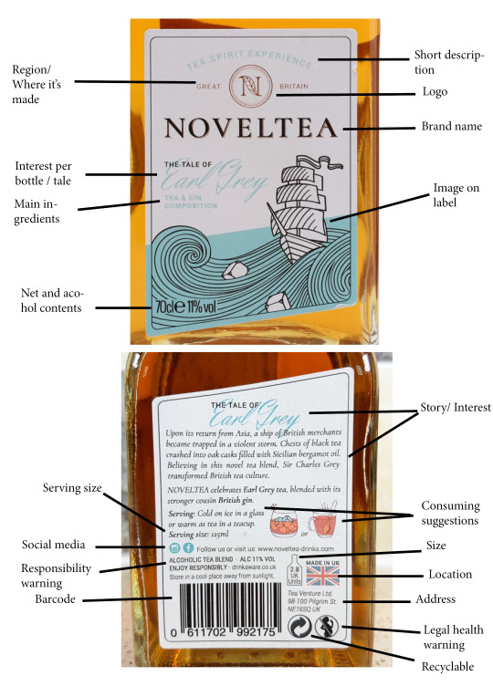
WEEK 10
Self-Directed Brief
Label Anatomy Diagram and a bottle shape of my liking.
https://www.noveltea-drinks.com
1 note
·
View note
Photo
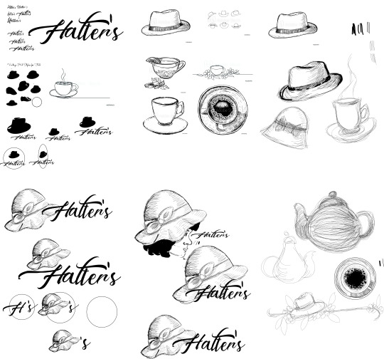
WEEK 09
Logo and Typeface For Hatter’s
Some experimentation in Adobe Illustrator. Tried for a gentler more fragile vintage look with a hat as well as tea objects. Will most likely stick with the hat. A more feminine appearance allows me to target younger drinkers/buyers.
Calligraphy typefaces caught my eye. I am going to create interest and a link to madness by including two different t’s in my title.
#design#bottle#logo#typeface#hat#vintage#calligraphy#madness#craziness#crazy#feminine#younger#contemporary vintage
0 notes
Photo
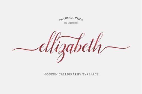

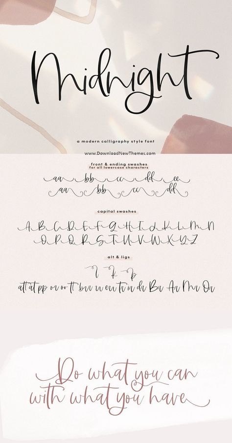
WEEK 08
Typefaces
I have decided that a calligraphy type of font would be appropriate for the label as it is fragile and elegant, which is directly symbolic of tea and a magical world of fairies. It gives off a sense of femininity too, which is desirable considering my targeted audience.
#design#drink#bottle#hatter's#hatter#fairy#type#font#typeface#label#inspiration#beauty#fragility#magic#feminine#femininity
1 note
·
View note
Photo

WEEK 08
Self-Directed Brief
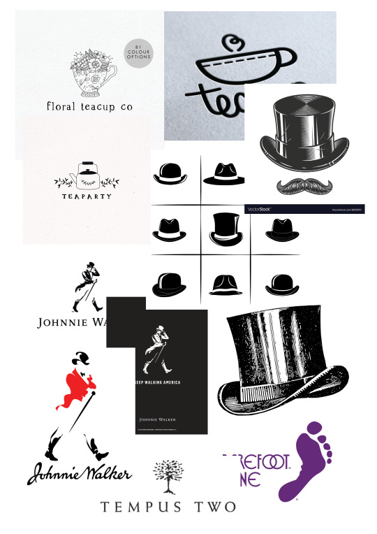
After today’s tutorial and student votes the “Vintage Fairy” Style got an overwhelmingly large number of the likes which leaves me with that direction to work with for my label and logo.
I found some logos of already existing alcoholic beverages (eg Johnnie Walker, Barefoot, Tempus Two), and some top hat and teacup logos on Pinterest. I have decided that the hat symbol could be directly symbolic of the name of my drink, “Hatter’s”, a simple logo of a silhouette could be a very good design as it would be easy to read on a smaller scale and it would be easy to convert into black and white as well as reverse it. A teacup may be an appropriate symbol to represent my drink as well.
-Some sketches I quickly drew to gather some ideas and have a look at some of the imagery that was floating in my head.
2 notes
·
View notes
Photo
WEEK 07
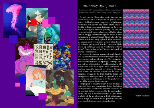
Final Beverage Concepts
A3 concepts include:
• final mood boards (approximately A4 size)
• final design rationales (150–300 words)
• final keywords (up to ten for each concept)
• concept name/title
• my full name
• additional visual material
#concept#design#1951DisneyStyle#VintageFairyStyle#style#VisualCues#Moodboards#Titles#Rationales#keywords#name#additionalvisualmaterial
0 notes
Video
Complete presentation of my visual directions.
0 notes
Photo

WEEK 07
Complete Presentation Slides
Finally! :D
0 notes
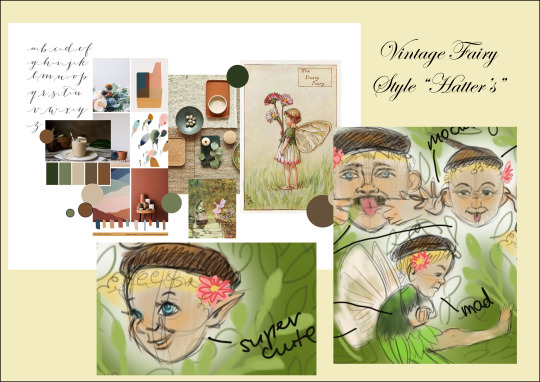
Photo

Supporting Imagery and Design
Some sketches of mocking fairies and cute boy’s faces for the Fairy idea and a couple of pattern-like designs for the Disney idea. These help me get my ideas across in a visual rather than written manner (which is super useful for designers and visual thinkers!!!)
Made using Sketchbook Pro and Adobe Illustrate
1 note
·
View note
Photo


WEEK 06
Presentation Slides Progress
This is one of my slides in the four slide presentation. It took me four tries per slide to get it just right.
First try- the background color and the overall layout was not working. The background was clashing with my colourful content.
Second try- I fixed the background colour but I still couldn’t figure out how to change the layout of my content to make it cohesive.
Third try- I thought that I’d like to have the moodboard bigger but the layout was still slightly off leaving a huge negative space in the bottom left corner.
Final try- I finally got the layout just right- a bigger moodboard, a messy/busy but intentional layout and less negative space that balances out the entire slide.
1 note
·
View note
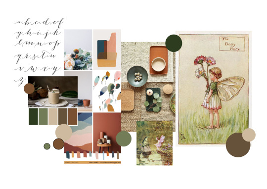
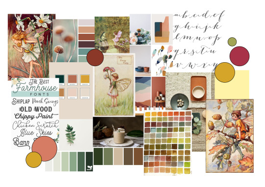
Photo
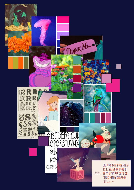
WEEK 05
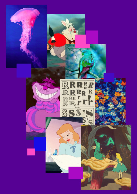
Final 1956 Disney Moodboard
I wasn’t quite happy with the tidy moodboard considering the idea is busy and crazy. So I decided to create a board that directly represents my idea through all its aspects and features, including its layout. I am finally happy with this one!
1 note
·
View note
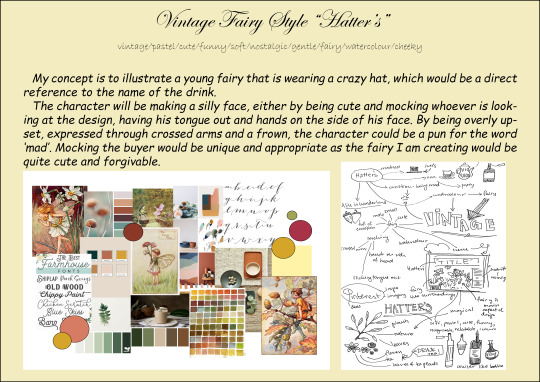
Photo
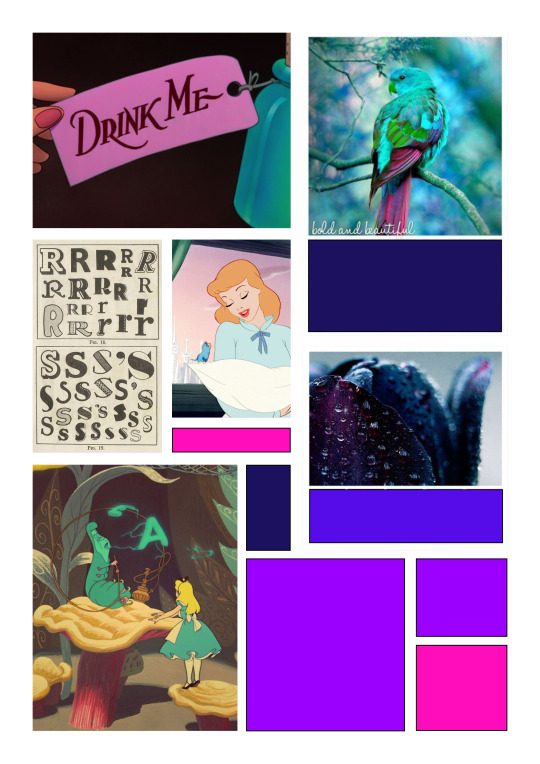
WEEK 05
Second Moodboards
After last week’s feedback I have redesigned my moodboards and tried to take into consideration all suggestions from tutors and students that I thought would help me create a more cohesive and succinct visual representation of my chosen directions and would benefit my ideas.
Feedback from last week:
“Nice work Yana! The two distinct styles are really shining through in your mood boards. I'd like to see you refine them by using only half the number of images you currently have. Challenge yourself to express the style in as few images as possible. I try to use 6-9 images + colour paletteSame goes for the colour palettes. See if you can just lock in just one distinct colour palette for each one.”
“This is really good! But the inclusion of different colour palettes makes it a little confusing.”
“These mood boards look great! you have really developed them since we saw them as just images in our last feedback class! Were you still doing Alcoholic Tea as your beverage? If so, I think perhaps the trippier Mad Hatter might be more appropriate - alternatively you could go a little more of the 'green fairy' absinthe style in your lovely nostalgic directions?”
“YESSSS! I think that would work – I think that idea of a twist and adding something a little naughty could transform the first one. If you can communicate that aspect in your presentation pitch, that would be great!”
SUMMARY OF FEEDBACK:
1. Use less images
2. Limit colour palette
3. Try to communicate the madness aspect better
This feedback has helped me generate moodboards that consist of more specific visual directions and create a limited palette for each. This allows me to pinpoint a more indepth understanding of my ideas and present it in an efficient and aesthetically pleasing manner.
#feedback#secondtry#moodboards#simple#limited colour palette#imagery#visualdirections#design#progress
0 notes
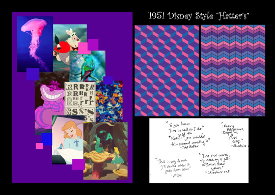
Photo
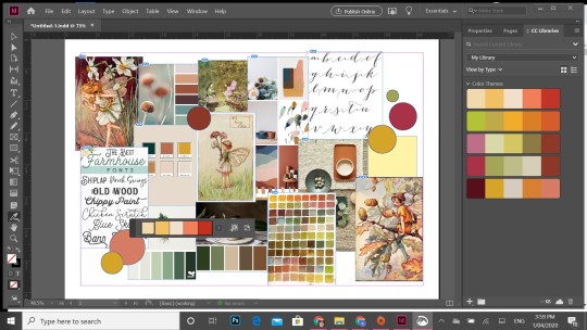
WEEK 04
First Mood-Boards
First mood-boards created for each visual direction:
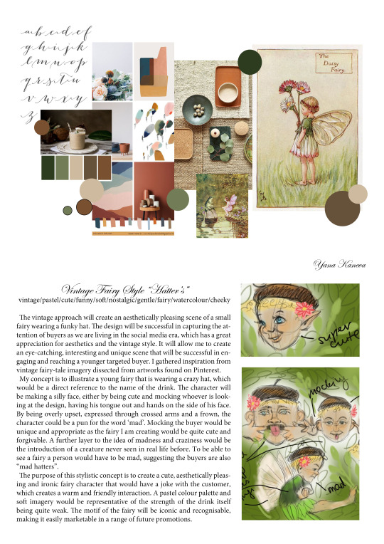
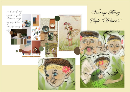
1. Vintage Fairy Style “Hatter’s”
2. 1951 Disney Style “Hatter’s”
I have included a screenshot of myself working on these mood-boards as well as the results I achieved.
#mood#boards#moodboards#aesthetic#atmosphere#meaning#depth#progess#indesign#colour#palette#font#colourpalette#hatter#madhatter#design
0 notes