
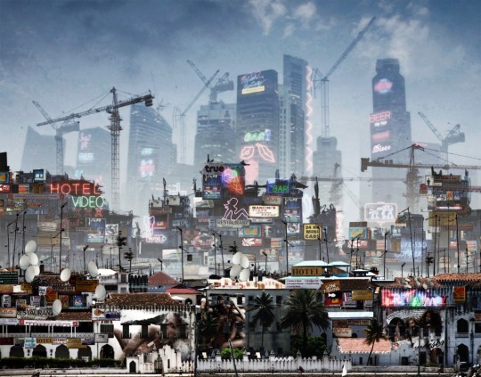
writingaboutarchitecture
Design Diorama
Words by Laura Chan: a lover of
Dorica, Ionica & Corinthia
255 posts
Don't wanna be here? Send us removal request.
Last Seen Blogs

jaythelay
Roy's Spunkbox

repackagededitions
Limited

bakersgrief
Art and Ikemen

ghostlypest
' Ghostface '

Text
Hollyhock House

Frank Lloyd Wright’s Hollyhock House (1921) in Los Angeles is the epitome of the architect’s method of ‘compression’ and ‘release.’ The ceilings in secondary, threshold spaces are intentionally low, designed in this way to make you feel uncomfortable, or compressed.

The entranceway and corridors act as a funnel, aiming to swiftly guide, and then release, you into the more open spaces for dwelling and relaxation.
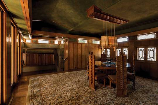
This sense of continuous movement, circulation and fluidity is found throughout the house, with its long corridors and lines of sight. Upon entering the house and turning left, a few steps lead you up to a raised dining area. The dark and sombre room contrasts the poking fun dining chairs within the space, their backrests decorated with a spine-like or vertebrae motif.
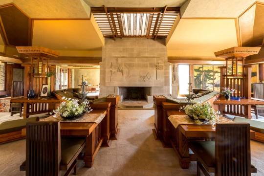
When you reach the main living area, all light-filled with its high ceilings, large windows and intricate skylight, you feel a sense of relief. Here, you’re encouraged to rest, dwell and take in the fine details of the woodwork, the monumental cast concrete fireplace (with a pool of water at its base!) and geometric patterns that are repeated throughout the interior and exterior, inspired by the hollyhock flower.

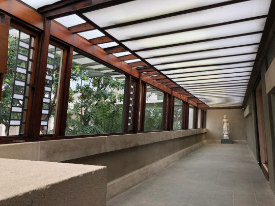

Taking inspiration from Japanese architecture, where boundaries between the inside and outside are dissolved, this house is an exquisite feat of imagination, craft and detail – where the inside becomes the outside, and vice versa.
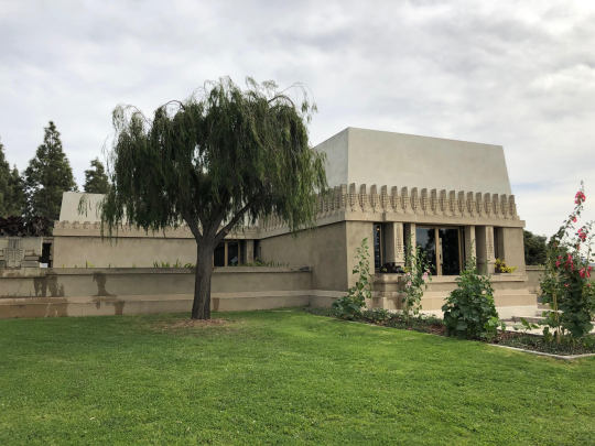
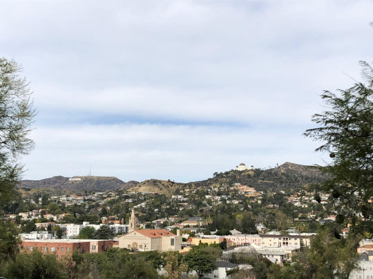
Looking out from the garden towards the Hollywood Hills, you can see the infamous Hollywood sign; Griffith Observatory, and if you squint; Ennis House – the monolithic FLW-designed beauty, otherwise known as ‘the Blade Runner House’, standing broad and brutal in the distance.
#hollyhockhouse#hollyhock#flower#architecture#modernism#brutalism#franklloydwright#losangeles#LA#architectureofLA#bladerunner#hollywood#buildings#brutal#concrete#decorative#compression and release#dwelling#dwell#craft#woodwork#detail#cast concrete
4 notes
·
View notes
Text
The Dance of the Everyday
Throughout the 1950s to 1970s, modern architecture spawned Brutalism, a raw concrete and polemical aesthetic that was adopted by East London’s Poplar – home to two brutalist heroes, Balfron Tower (1967) and its neighbouring Robin Hood Gardens (1972). Both were built to promote a sense of neighbourliness and inhabitant movement through communal walkways, playgrounds and interconnectivity between inside and out.

Robin Hood Gardens, Tower Hamlets, London: the garden facade of the ten-storey slab block, © Janet Hall / RIBA Collections, 1972.
Designed by Ernő Goldfinger, the 27-storey Balfron Tower is commonly dubbed the “younger sister” of Trellick Tower, its 31-storey, West London counterpart. Balfron gained Grade II listing in 1996, protecting it from the demolition that is likely to befall Alison and Peter Smithson’s less fortunate Robin Hood Gardens, which has very recently been given immunity from listing for the second time.
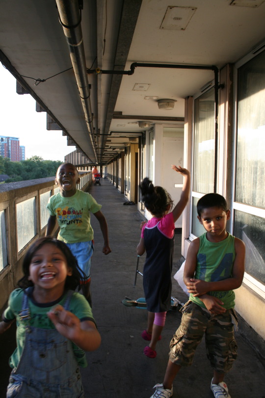
Children playing in the ‘street in the sky’ at Robin Hood Gardens, © Laura Chan, 2010.
Having lived in Balfron Tower for two years from 2009, I felt a poignant sadness when its flats were privately sold, resulting in my former neighbours being vacated, in preparation for its transformation into luxury flats. The eviction of Balfron’s residents mirrors the “decanting” of Robin Hood’s tenants due to its imminent razing. As with the demise of many brutalist icons, the fates of both buildings are paragons for the much-maligned architectural style.

Robin Hood Gardens: close-up of the fenestration, © David Borland / RIBA Collections, 2008.
From my experience of living in the high-rise that imparts what architect James Dunnett called, “a delicate sense of terror,” I know all too well the downsides of living in a 1960s concrete high-rise: cockroaches live behind the concrete panels and the complex water system means you never quite know where leaks are coming from. Maintenance issues aside, it was an absolute joy to live on the twenty-first floor. From this height, London was in the palm of my hands; and my eye-line, at the level of the horizon.

View of Canary Wharf from Balfron Tower, Flat 115, © Laura Chan, 2010.
A strong sense of movement is felt in Goldfinger’s sculptural design. He intended to underscore fluid passage in both towers by separating the services shaft from the main residential block and connecting them with suspended walkways or ‘streets in the sky’. With these ‘bridge’-like enclosures, Goldfinger sought to construct a romantic image of moving relationships, chance encounters and neighbourliness; a core ambition of Brutalism, further demonstrated by its structural honesty in the continuation of materials from interior to exterior.
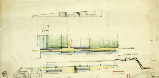
Plan and elevation sketch of bridge access to Balfron Tower, RIBA Collections, 1965.
Designed as an “ordered shell”, Goldfinger’s towers play a vital role in what he called, “the human drama.” Like dancers, Goldfinger saw people as “time and space bound,” always enclosed by space, even if this sense of enclosure was conveyed by the sky. Writing extensively on the emotional effect of architecture, Goldfinger suggested that we are aware at some level of the way space encloses, that: “you are in the street even if you are out of doors”.
First version design for Balfron Tower: north-west corner perspective of Block A's service tower, RIBA Collections, 1965.

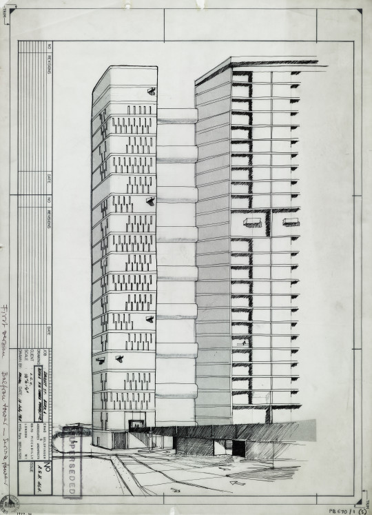
Design for Balfron Tower: west elevation, RIBA Collections, 1965.
Within Balfron Tower, human movement pauses while waiting for the lift, and as the high-rise only has two, people are often subjected to long delays. Once inside the lift, the building takes over the dance. The tower’s vertical ribbon windows indicate the movement inside the services tower, of the up and downward motion of the lifts. When the desired floor is reached, the horizontal glazing corresponds with the direction of travel across the walkways leading to the dwellings. In this way, the building can be seen as more than a passive receptor for circulation, as it echoes the movement of the body.

Glenkerry House, Carradale House and Balfron Tower, Rowlett Street, © Christopher Hope-Fitch / RIBA Collections. 2010.
In 1968 Goldfinger moved into flat 130 on the top floor, where he and his wife hosted champagne-fuelled parties. Residents were invited to discuss their flats and how they could be improved. Equipped with this knowledge, Goldfinger went onto design the taller and better-known, Trellick Tower. As a result, the spatial design of Trellick is a further continuation of its inhabitants’ movements. Doors slide into walls, rooms partition into different spaces and windows rotate for cleaning – an appropriation of space is acquired by both body and architecture in a dynamic display; the dance of the everyday.
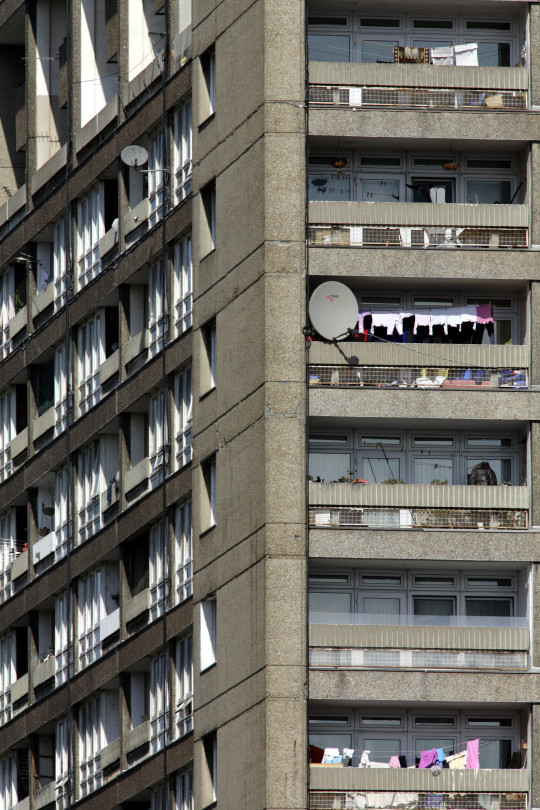
Balfron Tower, Rowlett Street, Poplar, London, © David Borland / RIBA Collections, 2008.
In 2010, I took part in Simon Terrill’s grand photographic project of Balfron Tower and its residents (above: squint and you can see me on the balcony at the furthest right side, six floors from the top). Using a large-format camera, the artist-in-residence flooded the tower with stage lighting, signalling when each shot was being taken with sound cues. He explains, “Each exposure lasted for 10 seconds and so with the opening of the lens, a strange stillness came over the building as movement would result in blurred erasure and those present needed to be stationary in order to remain visible.”

Balfron Tower at night with its residents, © Simon Terrill, 2010.
Terrill captured Balfron Tower in a glorious, eerie hue. Looking at this image, I hark back to the days before the dance had begun; when I waited for the lift… For it to take me up – for my journey’s end was only reached when I’d crossed the twenty-first street in the sky.
By Laura Chan
#architecture#urbanism#city#balfron tower#balfron#alison and peter smithson#the smithsons#robin hood gardens#brutalism#brutalist#concrete#high rise#tower#residential#housing#east london#poplar#drawings#elevation#perspective#sketch#canary wharf#skyline#the everyday#new brutalist
50 notes
·
View notes
Text
De Rebus Natura

De Rebus Natura provides an overview of the work of furniture designer, Nacho Carbonell. The book consists of visually stunning images of Carbonell’s oeuvre, a new story being told with each project and turn of the page.
Photographs by Tatiana Uzlova punctuate the monograph between texts by authors Li Edelkoort, Rossana Orlandi, Thomas Jellis, Veerle Devos and myself, Laura Chan.

My article, A World of Follies explores the notion of the architectural folly as a blip on the landscape - temporary and permanent structures that sing a whimsical song that often drown out the backdrop of everyday buildings, all humdrum in their brick and mortar.
Much like Carbonell’s idea that objects can be seen as living organisms, the transient nature of follies paints a picture of built structures coming to life, of existing in one place at one moment and another in the next.
Published by Lecturis, the combination of inks used, its 200 recycled pages and sewn binding gives off that intoxicating ‘new book’ smell. Stroking the olfactory and visual senses in tandem, the book presents the designer’s ideas beautifully and encourages the reader to think:
“Can this design be born without us? Or did it grow by itself?”
Read more about the book and buy your copy here.
#designer#design#furniture#furniture design#organic#architecture#follies#folly#architectural folly#de rebus natura#nacho carbonell#lecturis#dutch#spanish designer#book#author#monograph#carbonell
0 notes
Text
Architecture is Only a Movie
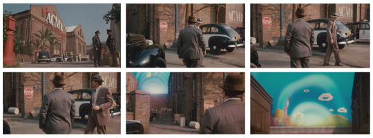
Scene from Who Framed Roger Rabit, 1988 (c) Touchstone Pictures
I. – THE STORY BEYOND MAKE-BELIEVE
EXT. ACME FACTORY - DAY
An L.A. police car turns into the yard of the Acme Factory and pulls up in front of the old factory building. There's all kinds of official activity in the yard... cop cars, a Coroner's truck, etcetera.
Valiant and Santino get out of the police car. Santino starts into the factory. But he realizes Valiant's not following him. He turns to see Valiant looking over the wall behind the factory, transfixed.
LT. SANTINO
Now what?
VALIANT
I just haven't been this close to
Toontown for a while.
In this scene from Who Framed Roger Rabbit (1988), private investigator Eddie Valiant stops dead in his tracks, fixated on the Acme Factory and the gateway to ‘Toontown’. Filmed in White City’s historic, Grade II listed Dimco Buildings (1898), the factory setting provides a real, West London context – albeit far from its Hollywood backdrop.
Who Framed Roger Rabbit has the power to put an audience through the emotional wringer. A breakthrough in cinematic craftsmanship, it was the first film to convincingly combine real actors and animated characters in the same space at the same time. Despite distancing itself from the ‘real’ with its cartoon characters (Jessica Rabbit self-reflexively refers to her being drawn), the toons seemingly cast actual shadows. They change dimension and perspective as they move through a scene, and the camera isn’t locked down to make rotoscoping the live action sequences simpler. The animated characters feel 3D and seem to be occupying real space.
Valiant’s emotional connection to the factory building and what it stands for – the cartoon city from whence came the toon that killed his brother, by dropping a piano on his head, no less – mirrors the emotional attachment viewers often make upon seeing recognisable architecture on screen.
When architecture is the focal point of a film, the audience is drawn into that building’s history. The famous Bradbury Building (1893) in Los Angeles is one of the biggest architectural stars of the silver screen. Starring heavily in Ridley Scott’s Blade Runner (1982) its distinguishing filigree ironwork interior is depicted as a dark and gloomy ruin. The architectural landmark enriches the sci-fi thriller’s narrative depth. Its unique structure sparks a familiarity and is a key part of the film’s iconic aesthetic. It engenders our cyber-punk fantasies while grounding the fantasy dystopia in the real and the present – giving the story meaning beyond make-believe.
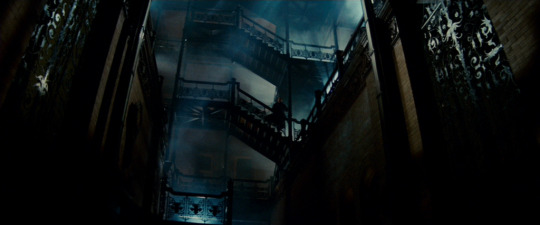
Bradbury Building, Blade Runner, 1982 (c) Warner Bros.
Filmmakers often play with time, space and light to create a cinematic architecture that conjures and sustains certain emotions from the audience. Director Andrei Tarkovsky captured the city in motion, using architecture in his films to lyrical effect. Believing “there is only one way of thinking in cinema: poetically,” he would create this poetry on screen with streams of associations. When poetic images are stitched together in film and in architecture, our existential sense is sharpened. Both cinema and architecture beget imaginative parables. Their kinship is often explored as our built environments create and preserve images of culture and a way of living. Cinema sheds light on the cultural archaeology of its own time, as well as the epoch it depicts.
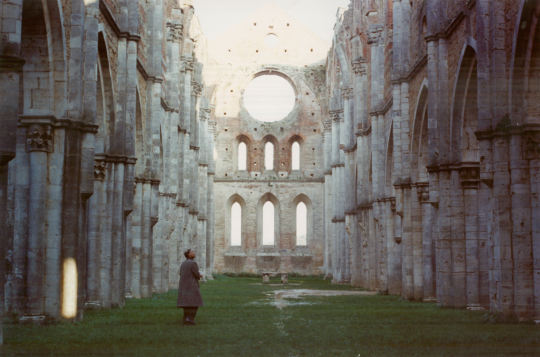
Andrei Tarkovsky’s Nostalghia, 1983 (c) Rai 2
II. – ARCHITECTURE IS ONLY A MOVIE
The work of filmmaking collective Factory Fifteen oscillates between the realms of building and performance, the real and imaginary. Founded by Jonathan Gales, Paul Nicholls and Kibwe Tavares; the trio have been dubbed ‘radical visionaries’ since graduating from Unit 15 at the Bartlett School of Architecture. Synthesising filmmaking, architecture and 3D visualisation, they design wildly imaginative future cities. But, they don’t just draw heavily from architecture in their films – often, the film is the architectural project itself.
vimeo
In Cocoon (2015), moving architectural forms were projection mapped onto the inside of a dome at the SAT Immersion Experience Symposium in Montreal. The spherical video installation immersed visitors within its cinematic architecture. Creating an environment that was at once open and enclosed, moving structures rose up and around its inhabitants, only to fracture and then fall away. Nicholls explains: “Cocoon was about the feeling of being wrapped inside a 360°-projected, animated space. It achieves something static representation simply couldn't. It puts you on a journey through spaces, through archetypes and gives you a real sense of scale.”
The recent exhibition Five Years of Factory Fifteen, opened with a quote from urban theorist Paul Virilio: “After the age of architecture-sculpture we are now in the time of cinematographic factitiousness; literally as well as figuratively, from now on architecture is only a movie.”
The show was a celebration of Factory Fifteen’s films, which were played simultaneously on suspended screens in their new gallery and collaborative workspace, The Factory.
This collection of narratives had architecture at its core and was a “kind of lyrical wall of stories,” says Tavares. The installation brought together the kindred spirits of architecture and film in a cross-translation of 2D and 3D space. It revealed that only when architecture plays a leading role in film, building environments up (whether real or imagined) to be the story, can we begin to critique architecture in a new way.

Megalomania (2011, above) is one such critique, portraying a dystopian future London as a broken, unfinished labyrinth. Long camera takes engender a sense of spatial fluidity and unity, while the dark re-appropriation of space signifies a product of careless construction born of the desire to build more, build big and build now. Megalomania is a project that can only truly be represented through film, as the moving image most effectively critiques our ever-changing world. Gales cites Blade Runner as inspiration and “one of the first science fiction films that uses a layering technique that builds upon what we already have, to kind of envisage a near future that’s more tangible than something very distant.” In this way, Factory Fifteen’s films represent a future that is firmly rooted in the present.
Jonah (2014, below) is a visceral short film about two best friends with big dreams. Set in Zanzibar’s Stone Town, the story reveals the city’s dramatic transformation into a tourist hot-spot after the pair unwittingly photograph a colossal fish surging out of the sea. Humourously and dramatically told, the story illustrates the damaging effects of tourism and globalisation on developing countries. Directed by Tavares and with captivating computer generated visuals by Factory Fifteen, the short mixes live action and photoreal animation to stunning effect.

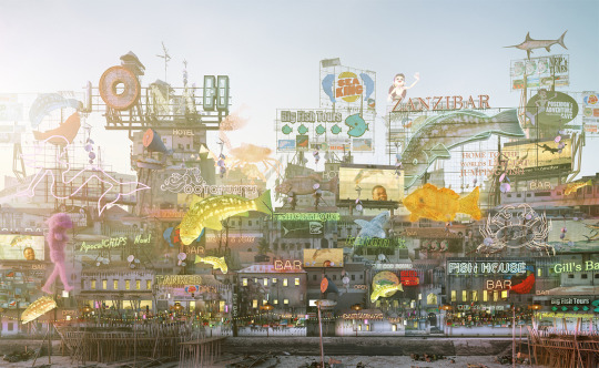
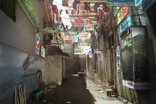

Despite moving into film from architecture, the Factory Fifteen team remain connected to their roots. Tavares notes that in Jonah, “the architecture is folded into the narrative as well as the production design. The image of the fish is what becomes famous, this becomes replicated in billboards, posters, physical signs and buildings – it’s all very Learning from Las Vegas.”
vimeo
III. – MOVING ALL THE TIME
“If all I see is dialogue, dialogue, dialogue, I won’t even read it. I don’t care how good the dialogue is – it’s a moving picture. It has to move all the time”
The self-proclaimed ‘half-assed actor’ turned Hollywood producer Bobby Evans’, view on scriptwriting. It echoes the architectural desire to create poetic movement in a building by guiding a person’s pathway and gradually exposing certain views, vistas and experiences along the way. Modernist maestro Le Corbusier called this journey and experience of space the architectural promenade.
Alejandro González Iñárritu’s Birdman (2014), which follows the decline of fading actor Riggan Thomson (Michael Keaton) is a tour de force of cinematic promenade. Set within New York’s St. James Theatre on Broadway, the camera slinks seamlessly through its spaces; down corridors, up staircases and bounding into the sky. Continuous long takes follow the protagonist in an uninterrupted motion through the theatre’s floorplan. There’s a constant sense of urgency and drama, accompanied by the driving beat of a drum. The rhythmic beat and the camera’s dynamism recalls that of our everyday modern lives, thanks to the seminal rise of the (aptly-named) Walkman. Life became instantly cinematic; a personal soundtrack to our lives, linking our movements through space.
(c) Interiors, 2014
Fluidity, transition and momentum are central to the architecture of Jean Nouvel. His work reflects Virilio’s statement that, “architecture is only a movie.” He designs knowing that architecture exists, like cinema, in the dimension of time and movement. “Film,” he says, has taught architects “to think in sequence.” Nouvel’s architecture plays with the notion of spatial transparency, seen clearly in his Cartier Foundation (1994). Visible from the street, the expanse of glass is bathed in a radiant glow, reflecting and refracting light. The building’s envelope invites an ambiguous perception in the observer. One can see the reflections of the surrounding trees on its façade and straight through the building to the other side at the same time. This effect mimics filmic superimposition, blurring the boundary between inside and outside, reality and illusion. The transparent volumes cinematically present the structure’s depth in the same way a long shot frames a space.
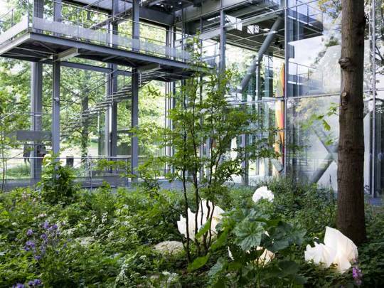

Jean Nouvel’s Fondation Cartier, 1994
Located in a park and surrounded by trees, the building plays a game of reflections in which it appears to blend with the surrounding greenery. The overlaying of exterior reflections on the façade with views within the building is analogous to the cinematic dissolve – its continual transitions from one image to another occurring on and beyond its surface.
OMA founder, Rem Koolhaas is another contemporary architect whose work can be read as a plot waiting to happen. Starting his career as a screenwriter, co-writing the Dutch film noir, The White Slave (1969), he sets up spatial sequences in his buildings through montage and suspense. His son, director Tomas Koolhaas, says: “If you listen to how my father talks about his architecture, he uses the word ‘scenario’ a lot, which means script in Dutch.”
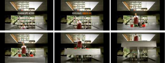
Despite its title, Koolhaas junior’s latest film, REM (2016) places his father in a peripheral role. The film follows the architect jet-setting between continents, documenting life inside his buildings. Instead of depicting The Seattle Library (2004) as a sculptural icon devoid of human interaction – unlike how it’s often photographed – the film explores the connection between the library and its community of homeless inhabitants.
Interview with man residing in Seattle Library. Scene from REM, 2016
REM also sees filmmaker Louise Lemoine of Living Architectures give a personal account of living in Maison Bordeaux (1998); the focal point of her film, Koolhaas Houselife (2008, below). Although it’s about “one of the masterpieces of contemporary architecture,” the documentary exposes the house in all its defective glory, following the housekeeper as she begrudgingly goes about her daily chores.
REM brings the human back into architectural representation by exposing what architecture means to those who inhabit it, uncovering an architecture that’s infinitely more meaningful than its iconicity. Once again, it’s the art form of film that unearths meaning within spatial experience.
Both filmmaker and architect are the auteur, defining space and influencing the way in which we understand the cinematic qualities of architecture. Here, a boundless number of things are expressed – all the infinite things that can never be expressed with words.
Rem Koolhaas, REM, 2016
#architecture#film#storytelling#cinema#cinematic#story#auteur#filmmaker#spatial#experience#OMA#rem koolhaas#factory fifteen#Jonah#short film#jean nouvel#plan drawing#movement through space#Andrei Tarkovsky#film director#blade runner#who framed roger rabbit
2 notes
·
View notes
Video
Venice Biennale, 2016.
3 notes
·
View notes
Photo


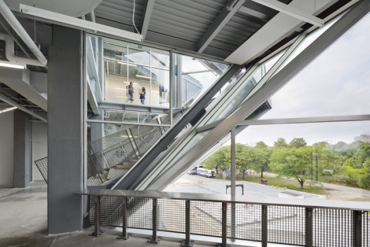
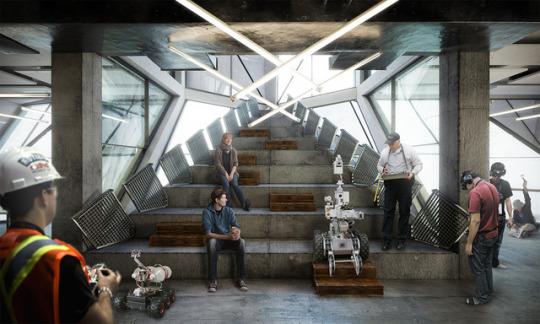

Pennovation Centre, Philadelphia USA.
Spot the difference!
Architecture by Hollwich Kushner, KSS Architects.
Visualisation by Factory 15.
Project built in 2016.
3 notes
·
View notes
Photo
( Three years in the making) our awesome new short is here!

Check out our new #RobotAndScarecrow poster ft. Holliday Grainger & Jack O'Connell /// WATCH THE TRAILER HERE.
Coming to @verotruesocial on 31st May!
1 note
·
View note
Text
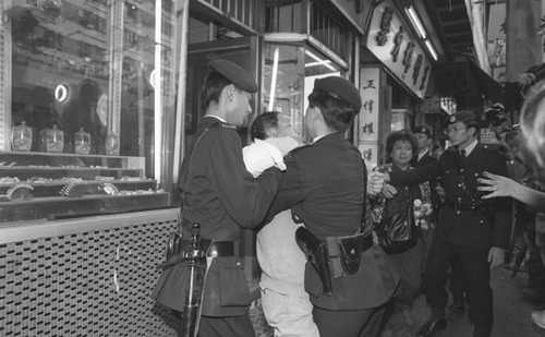
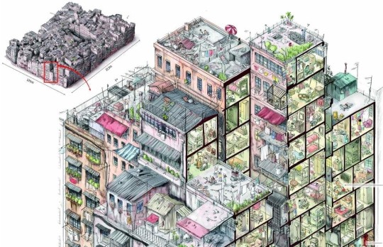
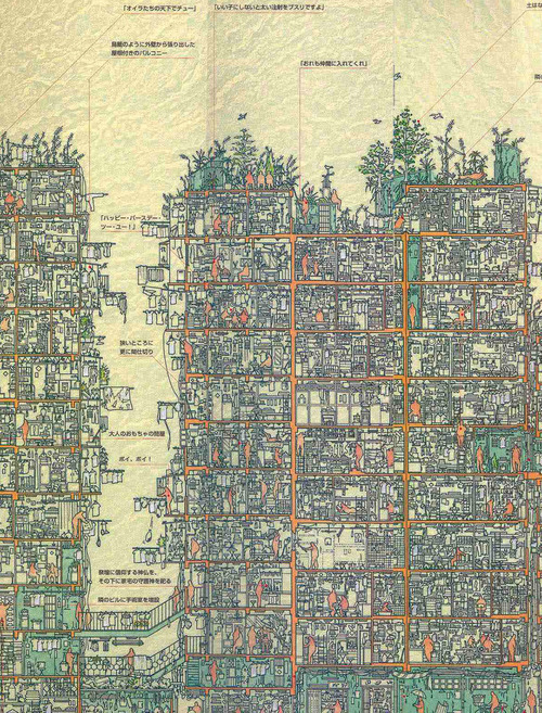
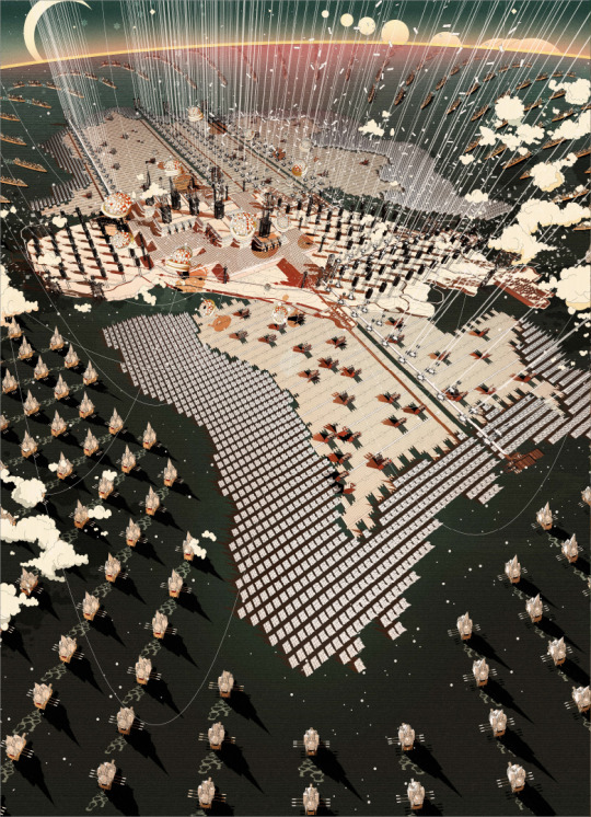
Kowloon Walled City

The infamous Kowloon Walled City in Hong Kong was a mega structure of densely stacked proportions.

With no single architect, the colossal concrete jungle was built gradually, frenetically growing up and out with each crammed in shack.
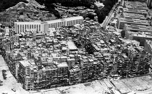
Like a series of slipshod beehives, all chaos and lawlessness, every corner of the encased city was riddled with crime. Opium den upon opium den; brothel upon unlicensed dentists, the Walled City was fated to collapse.
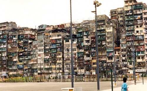
Legend has it that the Walled City's children would go to the roof and fly kites that could almost scrape the bellies of airplanes as they descended to nearby Kai Tak airport.

A rancorous eviction saw its 33,000 residents evacuated and it was demolished in 1993.
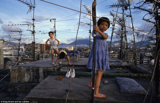

Drugs, sex and unlawful tooth extractions aside, little is known about what it was like to live within this fascinating urban enclave, but these drawings by Japanese researchers who studied the abandoned site before it was razed offer an incredibly intricate impression.

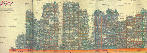
#architecture#kowloon#kowloon walled city#walled city#colossal architecture#hong kong architecture#hong kong
7K notes
·
View notes
Video
Text by Laura Chan.
vimeo
“Most people never think about how a building ‘grows up’ and ages,” says Matthias Hollwich, architect and narrator of our new animation, ‘Skyler’. As the number of people above 65 will double in the next 35 years, architects need to reconsider how amenities, services and spatial configurations are designed for our aging population.

Designed by Hollwich Kushner, Skyler depicts a ‘new aging tower’; a prototype that enables users to age in one place, while shaping their own future.
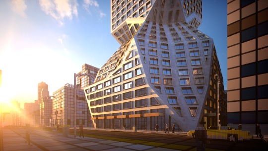
A hybrid of the classic 1930s New York City skyscraper, the tower’s sculptural and faceted form appears different from every viewpoint.
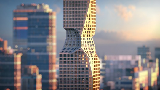
Skyler showcases a truly inter-generational tower that offers smarter and more integrated ways to live. The proposal coincides with the launch of Matthias Hollwich and Bruce Mau Design’s new book, ‘New Aging ‐ Live smarter now to live better forever’, published by Penguin Random House. Both the book and the building reveal how reconfigured living spaces can accommodate the needs of people as they age, so that the aging process will be, “less of a disruption and more of an adventure”.

Consisting of over 600 residential units, the tower encapsulates a cross section of society and serves its 1,000 inhabitants throughout the course of their lives - from birth to old age.
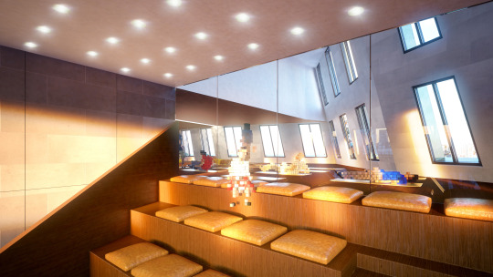
Tailored amenities are located throughout the prototype, including a mix of micro studios to maximise economy, grouped apartments that minimise isolation, and duplexes that act as single family homes. The self-contained skyscraper also incorporates special conveniences, such as shared transportation to extend mobility and services to help facilitate laundry, shopping and the school run.

The entire community’s needs are catered for their whole lives, as the building offers nurseries for small children, an infirmary for those in need of extra care, a health centre and activity hubs, which enable a heightened sense of neighbourliness.

In designing according to this new, smarter model, an enhanced experience of living is created; as our buildings better respond to the natural course of aging, and as a result, better respond to life.
Watch our animation for Skyler here.
5 notes
·
View notes
Text
The Sumptuous Drawings of Eric Wong
Cohesion is a series of poetical illustrations by Eric Wong. The ‘quad elephant’ size drawings depict Britain's new capital on the Isle of Man, which portrays an allegorical masterplan representing a truly United Kingdom.
Amid the uncertainty that lies in the wake of Brexit, Wong poses a radical architectural solution in re-imagining the role London plays within the world. He creates a narrative that suggests an alternative typology for urban settlements and states that ‘Cohesion projects a forward-looking attitude, duty and responsibility to reunite a broken Britain.’
His drawings can be viewed at The Factory | 120 London Road | SE1 6LF
1 March - 7 April 2017 (weekdays from 10:00-17:30)
Book your place to attend the private view on 1 March at 19:00 here.


#illustration#drawings#quad elephant#architecture#architect#student#UCL#bartlett#the bartlett#brexit#isle of man#speculation#future city#London#UK#Brtain
2 notes
·
View notes
Photo
I call this: 'Brutalist advertising.' #brutalism #urban #marketing #shoreditch
217 notes
·
View notes
Photo
Light at the end of the tunnel #Barbican #lauderdaletower (at Barbican Centre)
0 notes
Photo
Check out my article for White Noise via Factory Fifteen!
Jonah artwork © Factory Fifteen
“Synthesising filmmaking, architecture and 3D visualisation, Factory Fifteen designs wildly imaginative future cities. But, they don’t just draw heavily from architecture in their films – often, the film is the architectural project itself.” Read about the colliding disciplines of architecture and film on White Noise.
4 notes
·
View notes
Photo
Check out my article for animation studio, Factory 15.

The Cinematography of Architecture
When one of the most public of all art forms - Architecture; meets one of the most popular - Cinema; something quite magical happens. Not a mere cross-translation of 2D and 3D space, architecture and film share the intention of giving people their rightful place in our constructed world.
Can you think of a film that doesn’t feature at least one building?
No, me neither.
What about a building that really makes a film?
Le Vele di Scampia in Gomorrah?
Villa Malaparte in Contempt?
The Brunswick in The Passenger?
Filmmakers often use cinematographic techniques that focus the audience’s attention on specific spatial qualities.
This article by Mike Lindenmayer for Post Magazine sheds light on how the moving image enables us to move through spaces in our minds while remaining static. Like Architecture, Cinema is a product of “industry, artistry and technology;” a cooperative process that goes one step further in its representation by adding the dimension of time.
Drawing heavily on Factory Fifteen’s work, Lindenmayer notes that only when a film’s narrative centres around architecture, setting built environments up (whether real or imaginary) to be the story, can we really begin to critique architecture.
Citing Jonathan Gales’ project, Megalomania (2011) as an example of such critique, he notes that this vision of a future London depicts the city as a labyrinth of architecture that is unbroken and unfinished. The dystopian re-appropriation of space here is a product of careless construction and the desire to build more, build big and build now.
Read the article in full here.
13 notes
·
View notes
Video
youtube
I had the pleasure of introducing Neave Brown and Peter Barber at RIBA London’s seminar, Flexible Living & The London Terraced House at RIBA HQ on 22 March, 2016.

Neave described his iconic housing projects in London, including the great Alexandra and Ainsworth Estate in Swiss Cottage (first 6 images).

A fascinating slideshow of Neave’s projects rolled in the background as he explored ideas on housing, including a mixed-use proposal, his experience at the Architectural Association and the rules and regulations imposed upon his designs in the 1960s-1970s.

Neave commented on aspects of neighbourliness, openness, spatial configuration/connections and community in his work.

Photographs from the early days of the building’s existence were shown to complement Neave’s talk.

“The profile [of Alexandra Estate] took hours and hours and hours of time... I drew it I don’t know how many times,” said Neave. “It was a struggle... when people look at it what you hope is that it looks inevitable, not the product of a struggle.”
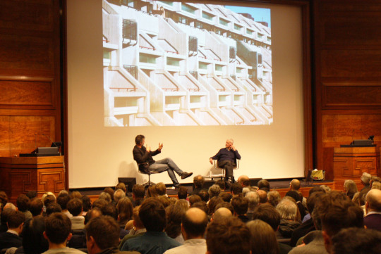
Peter Barber offered examples of his work as quality housing design that celebrates the street - a contemporary comparison to Neave’s schemes from the 1960s.
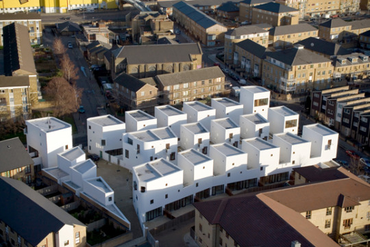
Donnybrook Quarter (above) was showcased as a modern version of ‘flexible living’. Heralded as a model for the future of British Housing, Donnybrook is a low rise, high density street based city quarter in East London.

Much like Alexandra Road, the scheme enhances a connection between inside and out, as it creates strong spatial connections as the streets intersect at the heart of the scheme with a tree-lined square.
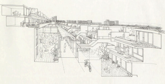
Much like the stepped back terraces at Alexandra Road, this perspective section of Neave’s Zwolsestraat in Scheveningen (1987-1989) reveals the stacked, stepped flats - a successful transition between bustling Vestdijk and the less expansive pedestrian area.
Watch the video of the lecture here.
#architecture#architects#neave brown#peter barber#peter barber architects#1960s architecture#alexandra road#alexandra road estate#alexandra and ainsworth estate#modernism#contemporary housing#housing#housing projects#london housing#terraced housing#flexible living#society#community#the street#riba london#riba#architectural drawing#section drawings#design
4 notes
·
View notes
Photo
Organised by RIBA London.

Event
Flexible Living & The London Terraced House: Neave Brown in Conversation with Peter Barber
22 March 2016
Riba, 66 Portland Place London W1
6pm–8pm
Keep reading
92 notes
·
View notes
Audio
Last night I introduced Professor Sir Peter Cook and Professor Marcos Cruz at RIBA London’s Drawing on the Motive Force of Architecture - a lecture on the possibilities of hybrid drawing.
For architects, drawing is a thinking process. Sketching by hand onto paper without having any predetermined built form in mind is often the springboard for new hypotheses. With the rise of digital representation in architecture, has the computer superseded the hand in the exploration of ideas?
Listen to find out...
#Architecture#architect#sir peter cook#peter cook#professor sir peter cook#ucl#the bartlett#bartlett school of architecture#drawing#hand drawing#sketching#computer drawing#digital imaging#watercolour#gouache#veg house#marcos cruz#cpd#professional education#riba#ribalondon#lecture#architectural representation#seminar#archigram
1 note
·
View note