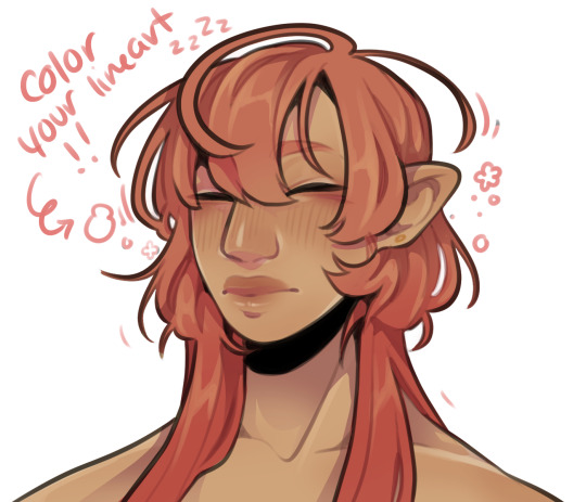
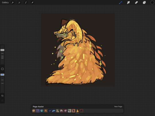
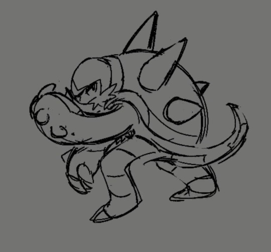
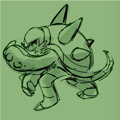
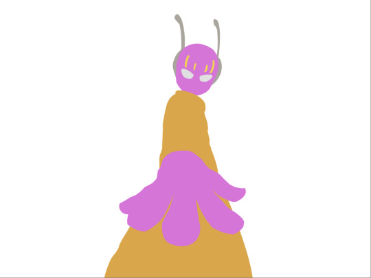
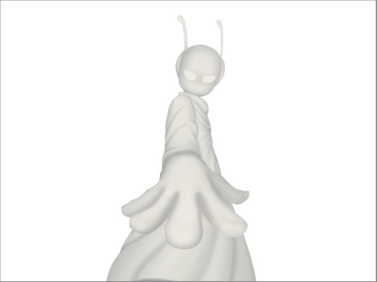
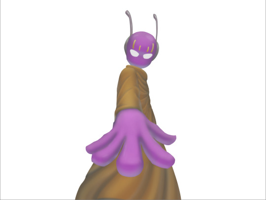
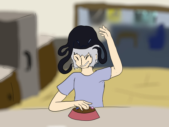
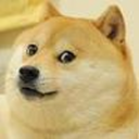
#AND NO I DONT KNOW HOW TO LINE ART AND COLOR SO HERE IT IS
Text
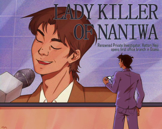
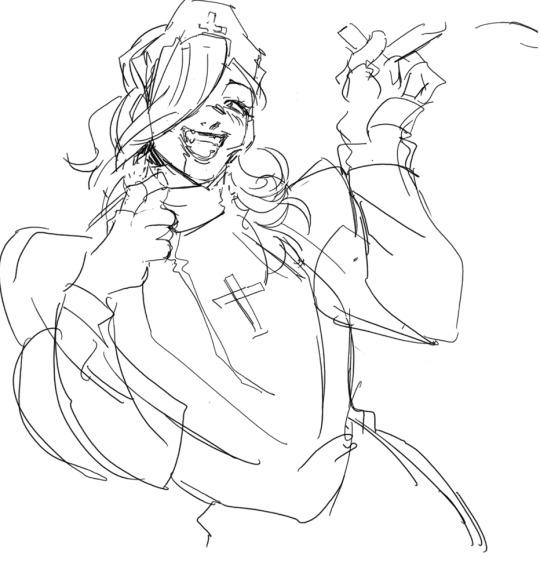
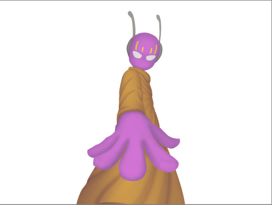
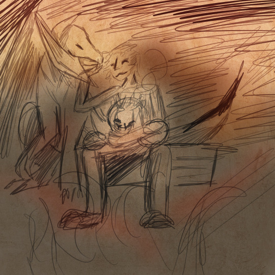
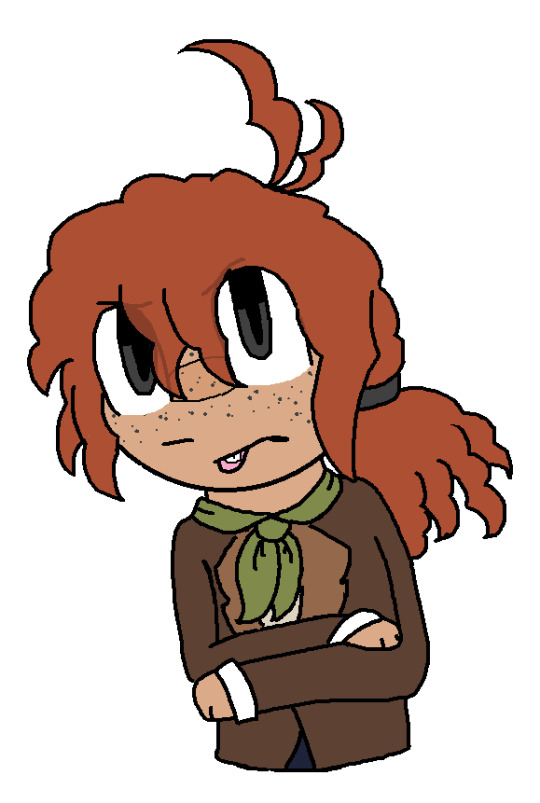
OVA 9
inspired from "Veil" (@_k0tterl_) on twitter !!
#dkyb-art#screaming into my pillow#you guys dont know. how bad ova 9 was for me. come on#i watched it for the first time 3 years ago and 3 years later im here#that one frame where shinichi/conan is watching heiji on the screen and is so far away from him#from his rival his best friend his west counterpart#also i made it so that shinichi's uniform is the same color as heiji's background because he's been left behind#and heiji is older now#longer hair he can tuck behind his ears#smile lines and bags under his eyes#he's grown and yet shinichi hasn't#dcmk#detco#heishin#hattori heiji#kudo shinichi#heiji hattori#shinichi kudo#edogawa conan#conan edogawa#detective conan#detective conan fanart#fanart#anime fanart#dcmk art#dcmk fanart#detective conan ova 9#detective conan ova 9: Stranger in 10 Years#dcmk ova 9
141 notes
·
View notes
Text
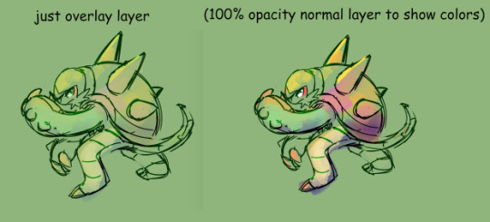
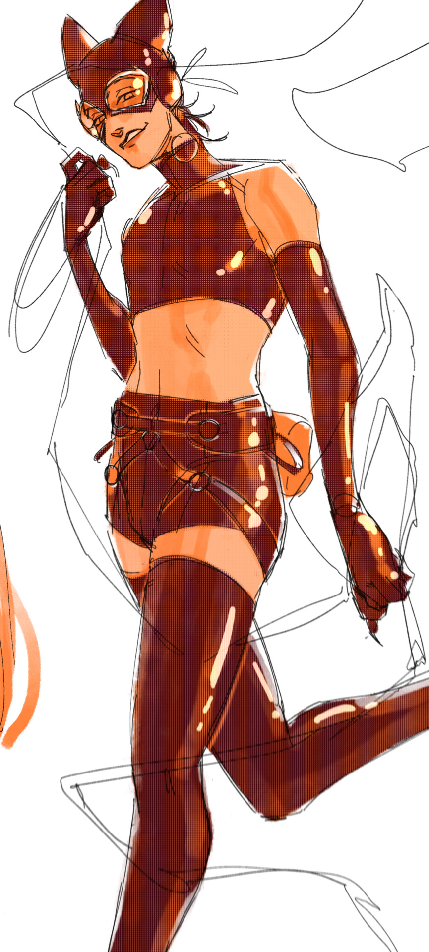
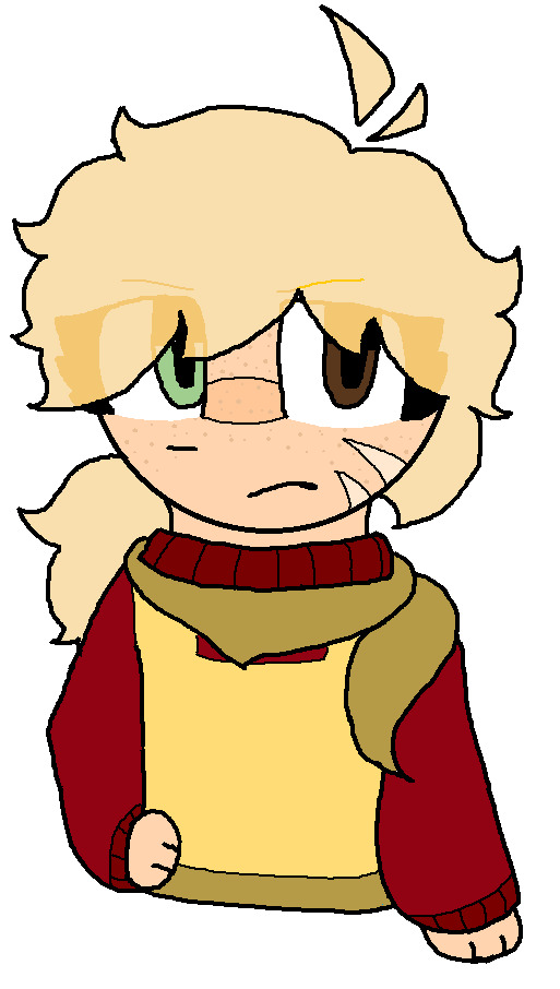
My Favorite Cheap Art Trick: Gradient Maps and Blending Modes
i get questions on occasion regarding my coloring process, so i thought i would do a bit of a write up on my "secret technique." i don't think it really is that much of a secret, but i hope it can be helpful to someone. to that end:

this is one of my favorite tags ive ever gotten on my art. i think of it often. the pieces in question are all monochrome - sort of.

the left version is the final version, the right version is technically the original. in the final version, to me, the blues are pretty stark, while the greens and magentas are less so. there is some color theory thing going on here that i dont have a good cerebral understanding of and i wont pretend otherwise. i think i watched a youtube video on it once but it went in one ear and out the other. i just pick whatever colors look nicest based on whatever vibe im going for.

this one is more subtle, i think. can you tell the difference? there's nothing wrong with 100% greyscale art, but i like the depth that adding just a hint of color can bring.
i'll note that the examples i'll be using in this post all began as purely greyscale, but this is a process i use for just about every piece of art i make, including the full color ones. i'll use the recent mithrun art i made to demonstrate. additionally, i use clip studio paint, but the general concept should be transferable to other art programs.


for fun let's just start with Making The Picture. i've been thinking of making this writeup for a while and had it in mind while drawing this piece. beyond that, i didn't really have much of a plan for this outside of "mithrun looks down and hair goes woosh." i also really like all of the vertical lines in the canary uniform so i wanted to include those too but like. gone a little hog wild. that is the extent of my "concept." i do not remember why i had the thought of integrating a shattered mirror type of theme. i think i wanted to distract a bit from the awkward pose and cover it up some LOL but anyway. this lack of planning or thought will come into play later.
note 1: the textured marker brush i specifically use is the "bordered light marker" from daub. it is one of my favorite brushes in the history of forever and the daub mega brush pack is one of the best purchases ive ever made. highly recommend!!!
note 2: "what do you mean by exclusion and difference?" they are layer blending modes and not important to the overall lesson of this post but for transparency i wanted to say how i got these "effects." anyway!
with the background figured out, this is the point at which i generally merge all of my layers, duplicate said merged layer, and Then i begin experimenting with gradient maps. what are gradient maps?
the basic gist is that gradient maps replace the colors of an image based on their value.

so, with this particular gradient map, black will be replaced with that orangey red tone, white will be replaced with the seafoamy green tone, etc. this particular gradient map i'm using as an example is very bright and saturated, but the colors can be literally anything.

these two sets are the ones i use most. they can be downloaded for free here and here if you have csp. there are many gradient map sets out there. and you can make your own!
you can apply a gradient map directly onto a specific layer in csp by going to edit>tonal correction>gradient map. to apply one indirectly, you can use a correction layer through layer>new correction layer>gradient map. honestly, correction layers are probably the better way to go, because you can adjust your gradient map whenever you want after creating the layer, whereas if you directly apply a gradient map to a layer thats like. it. it's done. if you want to make changes to the applied gradient map, you have to undo it and then reapply it. i don't use correction layers because i am old and stuck in my ways, but it's good to know what your options are.

this is what a correction layer looks like. it sits on top and applies the gradient map to the layers underneath it, so you can also change the layers beneath however and whenever you want. you can adjust the gradient map by double clicking the layer. there are also correction layers for tone curves, brightness/contrast, etc. many such useful things in this program.
let's see how mithrun looks when we apply that first gradient map we looked at.

gadzooks. apologies for eyestrain. we have turned mithrun into a neon hellscape, which might work for some pieces, but not this one. we can fix that by changing the layer blending mode, aka this laundry list of words:

some of them are self explanatory, like darken and lighten, while some of them i genuinely don't understand how they are meant to work and couldn't explain them to you, even if i do use them. i'm sure someone out there has written out an explanation for each and every one of them, but i've learned primarily by clicking on them to see what they do.
for the topic of this post, the blending mode of interest is soft light. so let's take hotline miamithrun and change the layer blending mode to soft light.

here it is at 100% opacity. this is the point at which i'd like to explain why i like using textured brushes so much - it makes it very easy to get subtle color variation when i use this Secret Technique. look at the striation in the upper right background! so tasty. however, to me, these colors are still a bit "much." so let's lower the opacity.

i think thats a lot nicer to look at, personally, but i dont really like these colors together. how about we try some other ones?

i like both of these a lot more. the palettes give the piece different vibes, at which point i have to ask myself: What Are The Vibes, Actually? well, to be honest i didn't really have a great answer because again, i didn't plan this out very much at all. however. i knew in my heart that there was too much color contrast going on and it was detracting from the two other contrasts in here: the light and dark values and the sharp and soft shapes. i wanted mithrun's head to be the main focal point. for a different illustration, colors like this might work great, but this is not that hypothetical illustration, so let's bring the opacity down again.

yippee!! that's getting closer to what my heart wants. for fun, let's see what this looks like if we change the blending mode to color.

i do like how these look but in the end they do not align with my heart. oh well. fun to experiment with though! good to keep in mind for a different piece, maybe! i often change blending modes just to see what happens, and sometimes it works, sometimes it doesn't. i very much cannot stress enough that much of my artistic process is clicking buttons i only sort of understand. for fun.
i ended up choosing the gradient map on the right because i liked that it was close to the actual canary uniform colors (sorta). it's at an even lower opacity though because there was Still too much color for my dear heart.

the actual process for this looks like me setting my merged layer to soft light at around 20% opacity and then clicking every single gradient map in my collection and seeing which one Works. sometimes i will do this multiple times and have multiple soft light and/or color layers combined.
typically at this point i merge everything again and do minor contrast adjustments using tone curves, which is another tool i find very fun to play around with. then for this piece in particular i did some finishing touches and decided that the white border was distracting so i cropped it. and then it's done!!! yay!!!!!
this process is a very simple and "fast" way to add more depth and visual interest to a piece without being overbearing. well, it's fast if you aren't indecisive like me, or if you are better at planning.

let's do another comparison. personally i feel that the hint of color on the left version makes mithrun look just a bit more unwell (this is a positive thing) and it makes the contrast on his arm a lot more pleasing to look at. someone who understands color theory better than i do might have more to say on the specifics, but that's honestly all i got.

just dont look at my layers too hard. ok?
2K notes
·
View notes
Note
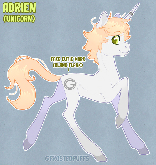
I have a really specific request but can you draw Adrien and Marinette as MLP Ponies please :)
listen i dont normally take requests but anon...you have no idea how much i absolutely live and breathe cringe. i got so excited when i saw this in my inbox. OF COURSE i made a whole au
(i have to thank my friends for helping me flesh this au out with their amazing ideas. i was stuck on what to do with adrien's cutie mark for the longest time!)
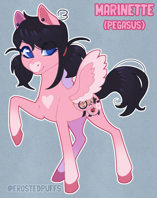
marinette is a pegasus and adrien is a unicorn! marinette has a lot of energy and would be buzzing around all over the place all the time. she is almost always flying! her wings are small, so she has to flap them really fast to stay afloat (like a bug's wings!) her special talent is designing, so i based her cutie mark off of the plum blossoms on her shirt and added a ladybug and sewing needle. though she doesn't have the aid of telekinesis like a unicorn would, she doesn't let that stop her from creating amazing art and clothing!
adrien comes from a long line of regal unicorns and is tall and lanky. he is unfortunately a blank flank even as a teenager due to the fact that he has not had the chance to explore many interests yet from his strict upbringing. he is a little insecure about it but he tries not to let it get to him, especially since his makeup team does a pretty good job of applying a fake one because it would be "unfortunate for the brand" if gabriel agreste's son still had not received his cutie mark as such a late age! not even his friends know he is a blank flank...not yet, at least. he does not like the fake cutie mark.
his father does put him into a lot of studies, including magic studies. adrien is a pretty skilled magic user but it's not his passion. he doesn't discover his true passion until after he meets marinette and his other friends.
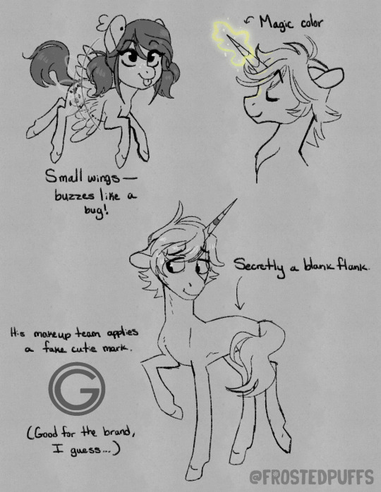

the miraculous are still a thing in this au. adrien/chat noir wears his ring on his horn! when they're transformed, they become temporary alicorns, gaining a magic-based horn for ladybug and wings for chat noir.
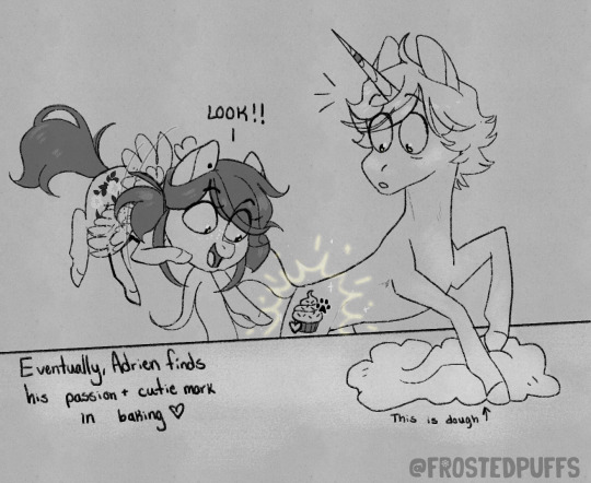
one of my favorite headcanons for adrien's future career is that he finds a love for baking, so i used that here!!! when baking with marinette one day he discovers that baking is his special talent and he really, really loves it, earning his cutie mark (a cupcake in chat noir colors) a moment later :') they are both VERY excited! adrien would come clean about the fake cutie mark to the public and would become an advocate for blank flanks everywhere, reminding ponies that it's okay to take their time to figure themselves out and to not try and pressure themselves into finding their special talent when it's not the right time, because it will come eventually.
#please reblog my cringe au i spent too much time on this lmao#miraculous ladybug#miraculous fanart#miraculous fandom#adrinette#adrienette#ladynoir#miraculous#miraculous tales of ladybug and chat noir#marinette dupain cheng#adrien agreste#mlp#mlp fim#ml fanart#chat noir#ladybug#my little pony#ash art#ash answers#cringe culture is dead
7K notes
·
View notes
Note
would u ever consider posting a time lapse vid of a drawing ? its totally chill if not, i just think its neat to see different artists processes
either way i hope u have a lovely day ur art is so so cool :]
ehhhh tbh i dont know.... my process is very simple and boring fdnvbhf but i know how you feel im also so nosy when it comes to other artist's processes like baby what do u do...... i might try that once i have enough storage lol (csp crashes on me all the time i need an sd card...)
in the mean time, here some step by step if that helps you! I do my line art first, fill it in with this base color, then i shad eit very roughly in a color i like, rn its this teal? then i do the colors and as u can see i keep them very simple and limited, then i add a pinkish overlay + grain texture and thats basically it for most pieces! also i use the same brush at each step i am not an experimental artist vjckdvn


262 notes
·
View notes
Note
Yo! Do you have any notes/tips for your coloring process? I've always had trouble with that part of drawings looking good lmao and I really like yours! If not for your specific style, do you have any tips with that in general?
Iv gotten a few asks about how I color but iv always avoided answering because
A) I am absolutely awful at explaining things, and
B) I am a very Very lazy artist you should probably Not do the things that I do
BUT i feel bad gatekeeping(?) my horrible technique if it helps anybody ig ill try and explain so
✨✨✨Welcome to Reegis’ Probably Not Reputable (But Very Long Winded) Art Advice✨✨✨✨


line art of a random character for the example, just pic whatever colors you have in mind for your base colors, you can try using palette generators or basing it off of existing palettes/characters/whatever I have absolutely no idea how color theory works (& this is why you shouldnt listen to me) so im solely going off of vibes. but it is Rough so onto step 2 & 3
(edit to add i usually start off with the skin hair & clothes on separate clipping layers and merge them together towards the end.. i think i forgot to say that at all here oops)

I abuse the hellll out of layer blending modes. overlay, saturation & multiply mainly, but also difference, brightness & screen. (just doodle something & try all of em out to get a feel for them honestly ik theres a Lot and they can be intimidating) for this i just wanted a more cohesive warmer tone to start with so i added a peachy overlay & a slight ombré to the hair to add a bit more interest to the character.
then just the most basic of rendering, some blush & highlights just wherever i think theyd go.


Another thing they tell you Not to do, my next step is to block out all my shading in a vaguely purpleish multiply layer!!! i cant be assed to do it any other way im sorry…. once i have the basic shading down, i lock the layer & go in with air brush eraser & also airbrush in other colors wherever I think the purple is maybe too harsh/clashing
still wasnt 100% happy with the colors so messed around with some more layer filter/modes/whatever you call them then colored in my line art! i think this is honestly the saving grace for all of my art shshsdhhf color your lines people. doesnt have to be all (i dont, i like the contrast) but it usually helps to make some at least a little less harsh
then with a little more color tweaking im done! one random sleepy dude, fully colored (by my standards)
and then if a piece needs more dramatic lighting you justttt
im so serious play around with layer settings! these are just basic multiply & add(glow), there as so many others you can abuse the shit out of & nobody will know or care in your finished piece.
was this?? in any way helpful???? I hope so.
#THIS IS A BELATED ANSWER FOR ALL OF U MY B#scrolled back to find the earliest one i could bc i mean… you asked first#if this was in Any way helpful…. im glad#and also sorry. probably dont do these things#hmu if youd like me to clarify anything ill… do my best#asks#my art
105 notes
·
View notes
Note
I wanna know about your art style. How you draw like that??
i tried putting down considerations as well as a (very) general step by step of what i do; if there's anything more specific you want me to explain lmk i guess?
first off, general (self imposed) constraints / purpose of project -- this informs what i draw & how i draw it
i.e. "kuradex" is pretty different from my normal art (my 5 latest rough illustrations):
or my monster hunter charms:
or my pokemon tcg contest illustrations that im not allowed to show until june (😉):
although i've said its for merch purposes, ive started drawing these because i wanted to practice conveying "liveliness" and noticing key features / nuances of a given design, but i didn't want to spend a large amount of time on each one.
so what i came up with is
i want to draw things on-model in terms of proportions ( + take note of weight / tapering of shapes / etc )
no backgrounds & minimal "props"
experiment with / practice line/texture/color/flow/rhythm/etc
spend <1 hr on each pokemon on average (this is a bit more difficult for me to track, but for example, the cyndaquil line took me less than 42min to color, combined, and means at some point in time instead of focusing on cleaning up the art as much as i can, i stop after cleaning up most of it)
that said, the pose & the rhythm/flow of lines are key in conveying liveliness, and if i have a concept in mind i usually end up going with it, but i may go thru a few if i dont.
i consider pokemon origin / lore or a key point in its design, and if i'm particularly stuck, i try looking up pokemon card illustrations for inspiration. (i noticed the research i do is essentially a truncated version of how Atsushi Furusawa does research before doing an illustration.
(& even despite all this i do get stuck sometimes and don't exactly understand a pokemon and just opt for "as cute or cool as i can make it i guess?", but i think it's part of the process...?) (theoretically things that are A Shape should be really easy to draw but with what i want to practice in perspective i find them difficult...)
this is from my latest paid req but these are my first sketches of chesnaught -- i was thinking of how one of its inspirations is a warrior / tanker from RPGs, so i drew a pose where it's shielding its face.

i do another pass and take note of details.
in general i draw overlapping shapes and erase (it's a bit visible on one of the spikes)
because i opt for quickness i start coloring at this point -- i actually just use a colored "color burn" layer & i actually colorpick official art & lay down messy flats & set the color layer to 60%
60% multiply layer for shadows. i tend to use both hard and soft brushes
for bigger projects i would use 2-3 shadow layers to create more "layered" shadows
here i use overlay layer (60%). this is just throwing colors at it and seeing what works and doesn't work. i personally prefer to throw red under the eye and a yellow or blue near the top of the head. this is mostly done with a soft brush

before this point, everything is under the rough lines, but now i actually start drawing/painting over it, color picking the colors that have been laid down from the previous steps and cleaning up / rendering textures (making the green on its arms look fuzzy) / fixing anything that i forgot or looks too off (i.e. the spike on its shoulder and the way the tail curves)

I could potentially keep cleaning this up, but this is where i usually stop 🫡
111 notes
·
View notes
Text
more art talk
buds have been asking some questions in comments about separating art from artist so i will answer a few. first i will start with this very good post from a buckaroo who sums up everything i have said VERY VERY WELL. was reading along nodding but then got to end and they seem to think chuck disagrees which is confusing. i do not disagree with any of this it is just very good summary of my post so i will put here for context and to say 'good job bud yes'

anyway this is great summary of what chucks post was talkin on. knowing everything or nothing about an artist will color your interaction with them (even learning something and then pretending you never heard it will color your interaction whether you like it or not). personally chuck thinks the 'ignoring path' will be less vivid and complex but all ways are VALID. there is no correct what to experience art just personal preference that we all make for our own trot.
now i will get to the questions of a different bud.
no of course not why would it be incomplete without knowing every member of crew. chuck does not even really understand what this buckaroo is trying to say. your artistic experience is just as colored by how much you know about someone as it is how much you DONT KNOW about someone (i wear a heckin mask chuck is a perfect example). all of these ways are valid and all are part of the artistic experience. so no you do not need to know whole crew to enjoy art what the heck

no of course not. where are buds getting this idea? if you bought painting from local art fair with this big story behind it about daughter selling to you and all this THAT IS ALL PART OF THE GREAT ART EXPERIENCE. what you have for lunch that day is part of it and the way you got to the swap meet and what the weather was is all part of the art. this story is very vivid and exciting. of course that is not 'leaving the play at intermission' just because you do not know who made the painting. not knowing who made the painting is PART OF THE ART BUD

of course your experience of art changes if you experience it multiple times. this one seems VERY ovbious so i am extra confused. your experience of a dang movie changed based on where your seats are and whether or not you order a popcorn and chocolate milk, of course it changed second and third and forth time you see it. not sure what is part about doing legwork first means.

what about it? i am confused. deliberately separating yourself from your work in some way (like wear a dang pink bag over your head and being mysterious WHAT THE HECK) would IN ITSELF still be part of the art. something not being known is just as relevant as something being known and these are all perfectly valid parts of artistic trot
having a complete picture of context might make experiencing art more complex or vivid, might not, neither is 'more valid'. you do not need to know EVERYTHING about a work of art. in fact you do not need to know ANYTHING to enjoy art. not sure where this is coming from.

that is true if you learn something bad about an artist and then ignore it you are STILL altering your experience of their work, which means you are STILL not actually separating art from artist because to IGNORE something is an active choice.
seems like buds are hung up on this line from chucks previous post:
'separating artist from art is like walking out of a play during intermission youre missing half the show bud, for better or worse. gotta accept theres a whole second half and grapple with that because its all one big performance'
buckaroos seem to think this is SCOLDING those who walk out but that is not what i am saying. i am not saying 'shame on you for walking out' i am saying YOU LITERALLY CANT STOP THE EXPERIENCE IT IS IMPOSSIBLE. because walking out does not end the experience it just dulls your perception of whats happening in the theater. intermission walkout means you just have a new and different experience where youre witnessing the show from the lobby or across the street (which is to say having artistic experience of NOT witnessing the show). and personally chuck thinks sticking around and really wrestling with these ideas brings vivid results (despite all experiences being 'valid' in technical way. there is no 'correct' way to ART AROUND this is just chucks personal choice)
anyway those are some comments i thought were interesting. many of them are confusing to chuck but wanted to answer all for way of clarity of buds and just to DIG A LITTLE DEEPER. thank you to buckaroos who took time to write all this you are proving love and i appreciate your input very much EVEN QUESTIONS I DO NOT UNDERSTAND ARE VERY GOOD AND THOUGHTFUL so thank you buckaroos. LOVE IS REAL
436 notes
·
View notes
Note
do you have any tips for drawing dynamic poses? i always love the way you draw bodies!!
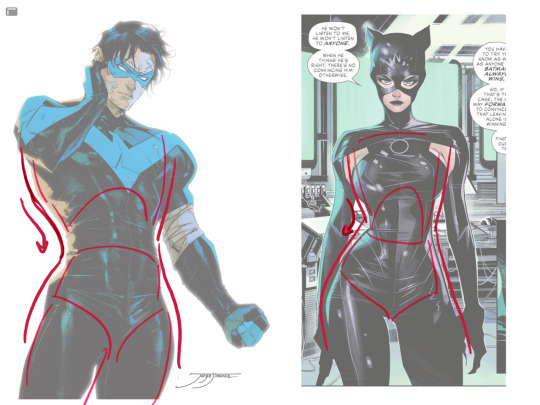
i know this has been said a million times but the way i draw bodies significantly improved after i started drawing more frequently from reference. if i cant find a reference for a pose on the internet, i'll just use myself or a friend. i spend an unfortunate amount of time just standing in front of my mirror looking at my own joints. pay attention to where your body curves!!
other than that though—honestly my anatomy/pose knowledge is a whack amalgamation of art tips i've accumulated over the years (i miss old school deviantart/tumblr style art tutorials). i also like to look at how artists i admire draw bodies—what details to they include, what anatomical short-hands etc
i think i'm still figuring out how to draw dynamic poses, but here are some cheats i've picked up (under the cut coz this got long again):
gonna use this stray!tim as a base
the easiest way for make up a pose is to start roughly with the head, collarbones, ribcage, and pelvis — you can build everything from there
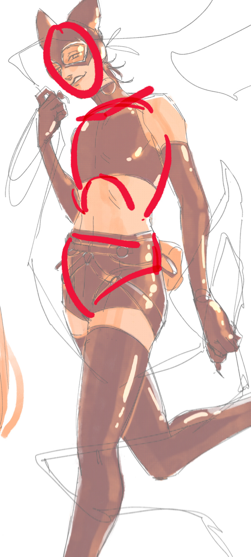
here's a couple more of what i mean by the ribcage-pelvis deconstruction:
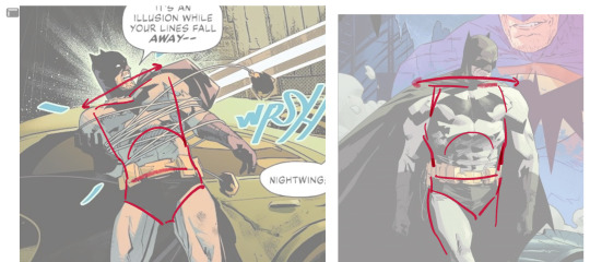
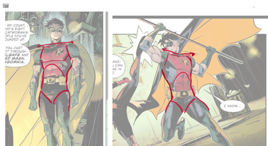
2. push your perspective a little!! imo things look more dynamic if you move your sight-line up or down—the horizontal orange line here. if you look at the panels above, the sight lines tend to be a little low, at around the character's torso or waist. i did the same below with stray!tim
to do this i usually try to get a sense of the space im working in by putting in some sloppy perspective grids
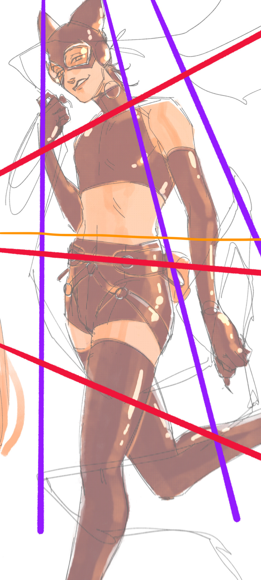
3. S curves!!! exaggerate the lines of the body. the body naturally has parallel horizontal lines—an easy way to get a body to look less rigid is to tilt those horizontal lines which in turn curves the vertical line of the body
this is what a mean by horizontal lines—usually i use the eyes, shoulders, and hips:
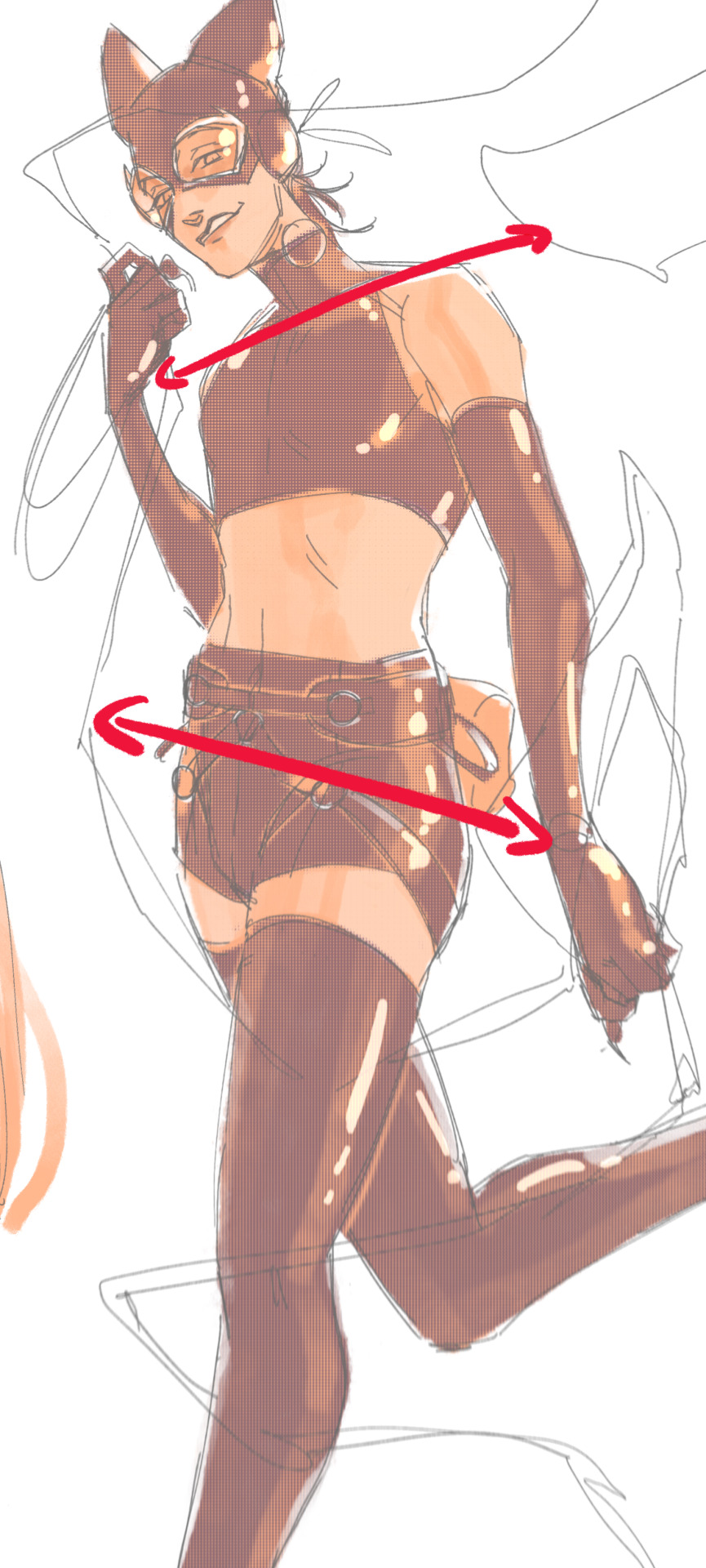
i'm gonna use caterina as a better example—usually you want the horizontal lines to sort of zigzag:
i've also picked up a couple visual tricks that don't exactly add dynamism to a pose? but they do give a static pose a little more oomph. a lot of this is done by visually highlighting one specific point of the body
for our purposes, i'm gonna make the focal point tim's face
motion blur! there are a couple ways to do this. i actually dont like working with traditional motion blur because you have to mess around with selections, so i usually fake motion blur using postional perspective blur:


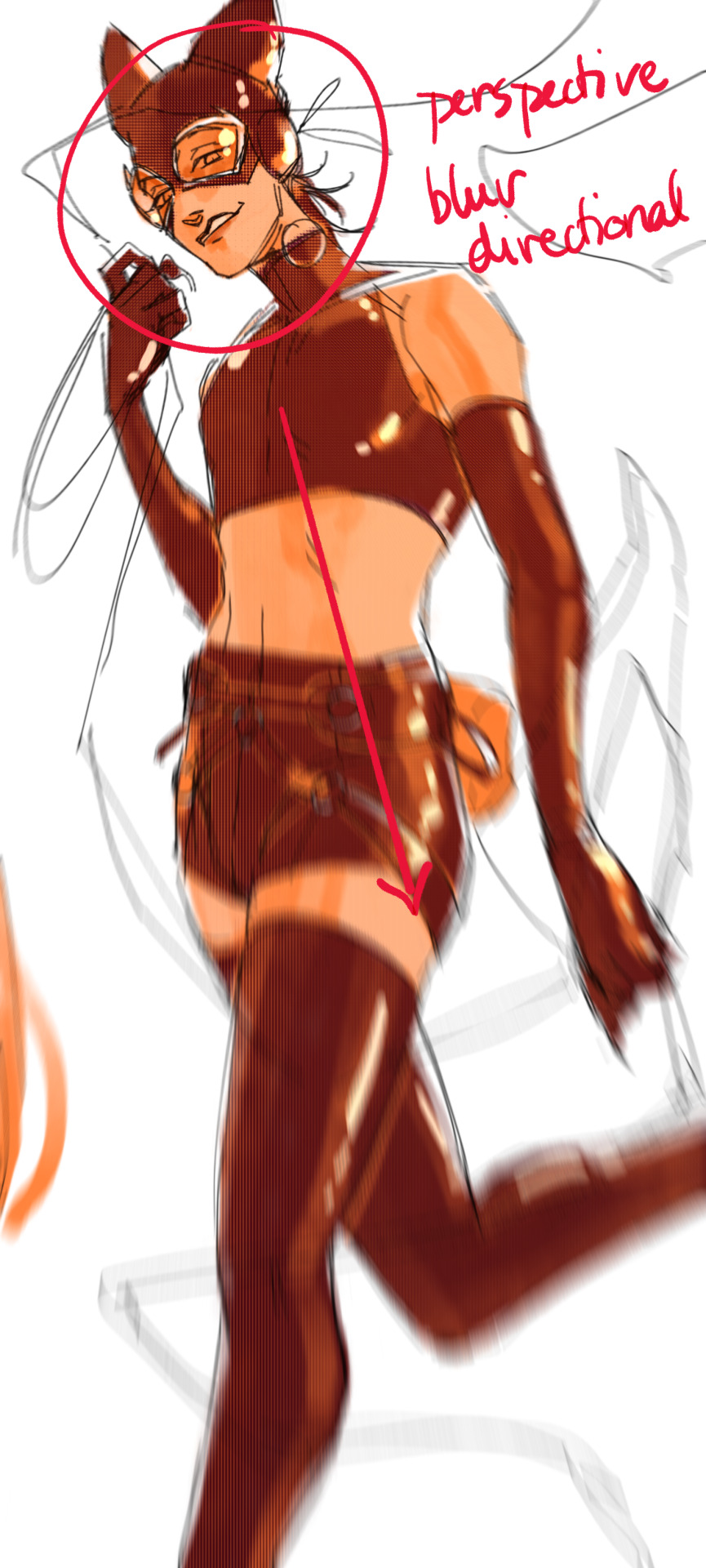
2. gradient lighting—you can add a lot of depth this way. usually i like setting the gradient in the direction of the focal point, e.g. tim's face
below, i added a layer above the base drawing, used an airbrush to get this gradient, and then set the layer to color burn and lowered the opacity. you can also clip the lighting layer to the base drawing and set it to multiply

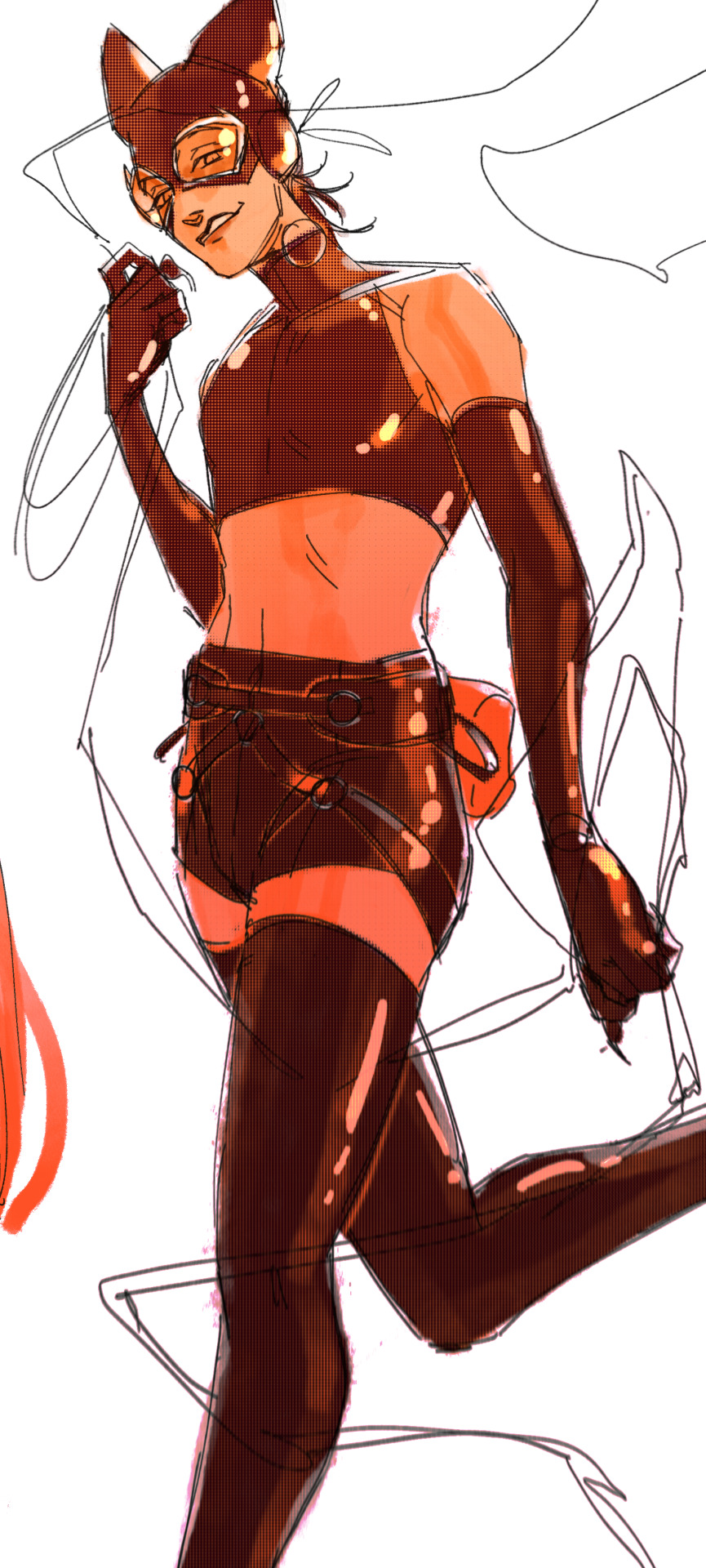
below, i did the opposite—instead of adding a gradient shadow, i added gradient light. i set the layer to add this time (instead of color burn) and then lowered the opacity again.
this kinda serves to desaturate the parts of the piece that are less important (ish i was kinda sloppy here), driving the eye to face—the most saturated. the motion blur does a similar thing, where the only thing "in focus" is tim's face
the gradient also sort of adds a directionality to the piece—it starts at the bottom right corner and goes up towards the upper left, causing your eye to follow that same path, which drags your gaze up tim's body
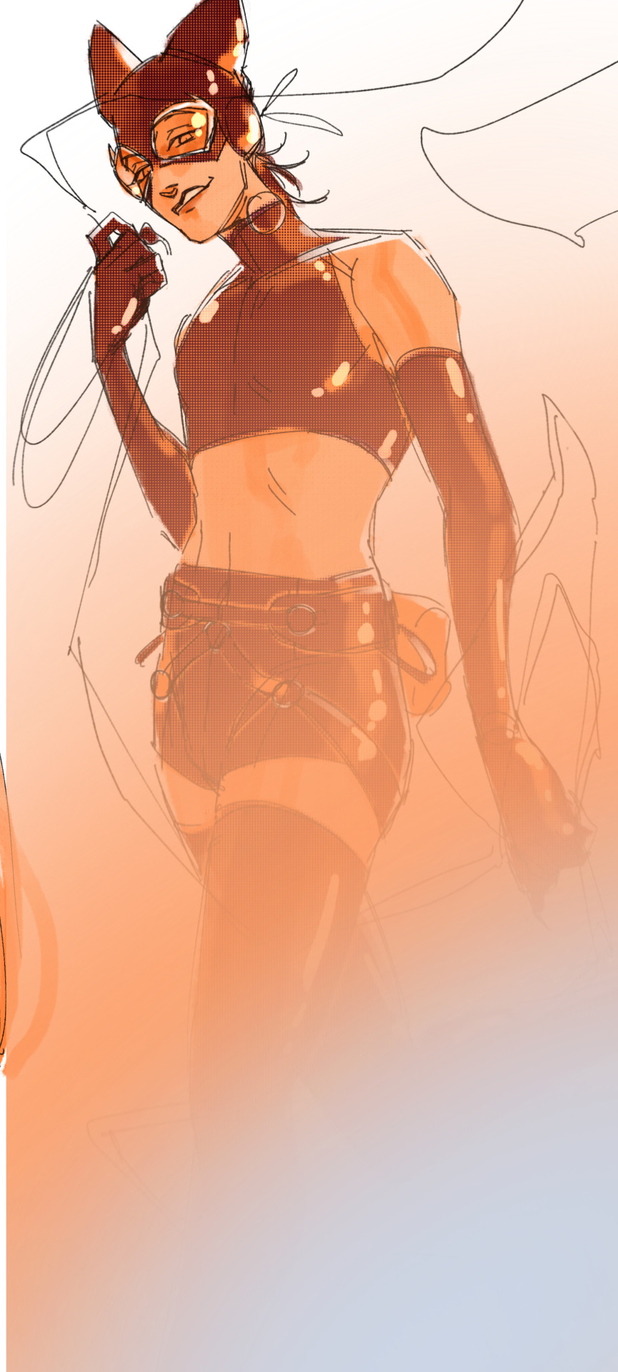
here's what it looks like when i combine 1 and 2:

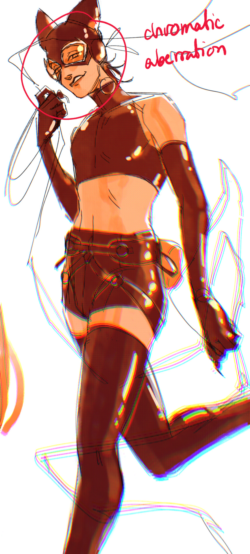
3. chromatic aberration's been pretty popular recently. it does a similar thing as perspective blur but with more eyestrain (although i went with a really exaggerated version below just to show you what it does) but it looks cool!
bonus cryptid tim as a reward for getting to the end :-)
#red talks#sart#art tutorial#YeAH UH this got long lmaooo i was on the bus for a Sec plotting this out so#also i am neck deep in a reincarnation/regression manhwa stress hyperfixation so i havent had the brain space to draw#so you get this instead!#if anyone wants recs lemme know lol#thank you anon :)))
51 notes
·
View notes
Note
hi i was wondering if you had any terminal velocity hcs (also I **love** your art, the way you colour is just [unintelligible noise] /vpos)

Blam triple threat TY FOR THE KIND COMPLIMENT!!! I really love the coloring part the best so im so glad you took to that alot!!
I have a couple scattered around my terminal velocity tag. Here’s some more!
- Oliver doesn’t sleep sometimes (his sleeping schedule is less a schedule and more some online wheel spinner) and likes to lay his hand on Mike’’s chest as he falls asleep so Oliver can watch and feel his pulse get ever slower and slower and he revels in both the undeniable pulse and the thin line he equates sleep to.
- Mike likes to travel. In fact he will actually go ballistic if in one place too long. Sometimes he says he just doesn’t know how to sit still. Oliver is content to follow 5am travel whims. Mike senses coming storms and chases them. His nighttime melts to his patron too, and when a storm approaches, the rumbles enter the background of his dreams. His eyes snap open in the middle of the night and shakes Oliver awake, who nods as they both dress quickly and pack for a drive.
- Mike fucking loves his car. Its kind of embarrassing how much money has gone into the old vintage machine but it’s a nice clean design minus the rainbow led lights under the rims. He didnt name the car but he commonly calls it “her” and “my baby”
- Oliver is veeerrrry very patient which leads to Mike naturally losing alot of their bits that dont end and become about endurance. Mike has switchups between instant gratification and the ability to pursue one thing uninterrupted.
- Mike has poor circulation which is a shame since Oliver is very much not making body heat. They sleep with several blankets and sometimes a heating pad.
- Oliver is on friendly terms with Simon, who knows Oliver as “my basically-kid’s VERY polite and vast aligned boyfriend” and Oliver picks up some painting from him, much to Mike’s chagrin.
- Mikes favorite music genres are rock, house, and sappy songs. Oliver likes psychedelic, edm, and anything that sounds like a halloween song.
- Mike likes any competitive or open-world game and dislikes games that time cap you daily in progression or get too grind-y. Oliver likes all things horror (he can still spook easy) and dislikes games that have over complicated lore and bad lighting
- Mike got a place with a balcony for easy smoke access, which ends up also being where he leaves and comes back often. He only ever caught Oliver there a handful of times smoking, was scandalized to know Oliver had smoked when he was younger. Then realized his lungs don’t work anymore so free immunity. His Balcony was different in all the places he stayed. Sometimes a backyard. Sometimes a front yard. Often a car. Having someone else there was one of the large invisible steps into intimacy he’d have to wrestle with.
- Oliver is an avid spender of Fairchild money. He was incredibly reluctant to at first but eventually the silks and threadcounts got to him
#fave headcanons… hmm mostly i rlly love interactions that r small#tma hcs#tma hc#tma#interrogation#terminal velocity#Oliver banks#mike crew
80 notes
·
View notes
Note
Okay I cant -- I need to say it out loud.
I am 100% sure, at this point, you are my favourite artist so far.
And I have to honestly thank you for a lot of stuff so let me get to the point before my anxiety takes me back --
I came across you less than a month ago. I don't remember if I saw your art before reading your fictions (Mon Horrible Cherì was my first) or the other way around, but both inspired me so much I can't describe it properly.
Art itself is my absolute weak spot. In my past years I always struggled working on that, I was never happy with my results, and mostly had drawn to pay bills than for my own happyness. In the end I hated it at the point that every line I drew was a cut on my hand instead of a moment of joy. And that was horrendous.
But then I came across your art, at some point - and I was amazed. Your style is something I wished to achieve years ago, or very similar to that at least, so I was totally into looking for more, and more, and more. I can't produce art of that quality, but for the first time I wasn't envious of another artist's ability and talent, I was just... Amazed.
I felt very happy, can't say why, but your style totally fascinated me. It still do. Anytime you post something new it gives me a shot of serotonine, it makes me feel happy and inspires me to get back on my Huion and draw something too.
I started to push it through everyday, and in less than a month I grew a lot. You don't know that, but you pushed me into art with a passion I didn't had since I was 16, and I turned 30 couple months ago. Now it gives me joy everytime I draw. It doesn't matter if the art I produce is no good, or if I change my style everytime (I'm trying a lot of styles right now), the only thing that matter is the way I feel when I sit here and just let my inspiration go. And I feel happy.
Happy to draw. Happy to experiment. Happy to share. Somehow I don't feel ashamed of my art anymore, and I was for a long time. I improved so much in these weeks. I watched carefully almost all of your timelapses (I am in love with all of them btw) and followed your tutorials more than once. Your examples, the way you work, is just inspirational for me. I've seen someone was thankful to you for the way you use references and says people out there to do it too: I want to thank you for that too. References was a taboo until last month for me, and I was SO wrong! Those helps so much!
So, well. I am not sure I wrote this all correctly, english is not my native language (I'm italian) and I may have done some mistakes, well, I do not care. I just hope I was able to express you my gratitude for all you did for me - I had to let you know how much this means to me everyday.
Oh also: I love every part of your art, but I could stare at your linearts for days and never get bored by that. And the way you color! Don't make me start on that. I could speak for hours. Not sure you'll want that, believe me.
So, thank you. Thank you from the bottom of my heart.
Thank you for making me believe in myself again. Thank you for giving me back my passion. Thank you for reminding me everyday I can draw for myself, for my own happyness. And thank you for making me happy.
You are a great artist.
Thank you! <3
i put off replying to this because i wanted to draw you something, but i just haven't had the energy after work and dont want u to think im ignoring you 😭
but i dont have WORDS. i'm so fucking proud of you. i'm so happy for you. browsing your blog and seeing the sheer amount of art and AUs you're making is so inspiring. your happiness is contagious and i hope you only continue to grow, and continue to foster all that joy for art.
thank you <3
43 notes
·
View notes
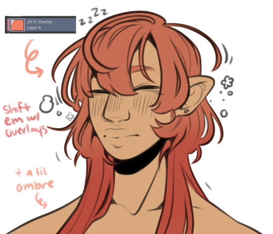
Note
what's your process for coloring like? the look of that elendira is so textured and interesting, i can't figure out how you do it
AA THANK YOUU ^__^ !! textures & brushwork are my favorite things abt my art, so im happy you find it interesting hehe . its SOO cool to look at & so much fun to draw imo
i prefer to color by building in layers , if that makes sense 🤔!! hundreds of them !! such that i'm always drawing on Top of previous layers, working from big & messy blocks of color to, eventually, small and refined blocks of color until it feels processed enough. as a result, i rarely ever erase (!!) and i rarely ever draw lineart aside from the initial sketch
a rough, patchy textured brush is key here, as it'll give you dimension and variability w/ your colors. i recommend "Brush and various sets of fountain pen style (万年筆風ブラシと色々セット)" on Clip Studio (ID: 1679706) !! :3

im terrible with explanations though, so i'm going to show a step by step of that elendira drawing if you dont mind :3
sketch layer !! because i mostly render through color alone, i try to make this as close to the finished thing as possible . ^__^ i hateee drawing the same thing over and over and like the expressivity and movement of my sketches anyways , so the more i can preserve at this step, the better. if u were to look at a side by side of my sketches and finished pieces, youd notice a lot of those og lines are present in the final drawing :3

2. flats !! pretty self explanatory, but the solid background gives me an idea of where the figure begins & ends while the colors themselves help distinguish whats what . i stick to ambient lighting @ this point because im usually not sure what i want to do with the overall palette or lighting yet . having two tones (ex, dark and light in her hair or dark and light on her skin) can also help in identifying key features early on that u wanna preserve. as you build layer by layer, sometimes these areas will remain untouched and i think it makes for a rly lovely feel at the end

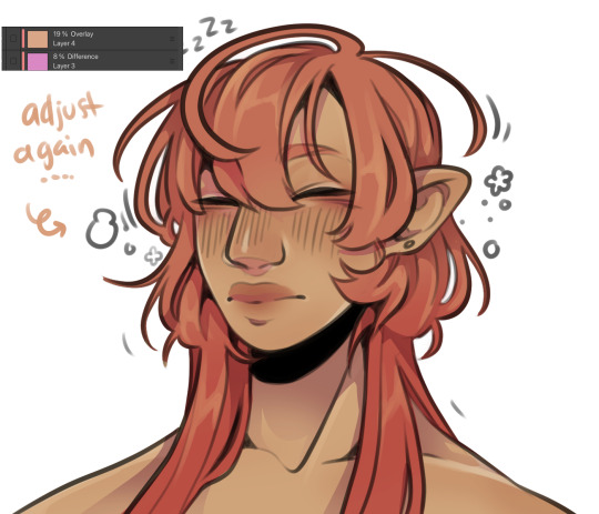
3. start blocking !!! to be totally honest with you, i dont really know what i do here HAHAHA. like i just scribble the shit out of it, usually focusing on what i might want to do with lighting (ex: grey areas to accentuate folds in her costume). i think i like to start "erasing" the sketch where possible by coloring on top of it .. like if you look at her hat or her arm , you can tell i'm starting to get a sense of the shapes i like vs the ones i dont. it's at this point that the final image starts to emerge in my mind , like im gradually pulling her from a tarpit of scribbles until shes recognizable lol. chipping away at the marble until i can free her. tbh.

4. keep blockingg...when u think u are done , block some more . as you can probably see, the brushwork becomes more intentional as i add more shape, with specific focus on line weight. this is also where the patchiness of that textured brush comes in - notice how none of the colors seem totally uniform (ex: the red cross or the original sketchlines for her waist). you can see bits and pieces of the layers underneath pushing through and i really like that !! ^__^ its very fun and sketchy to me, so i try to keep them around. those areas are also great to colorpick from, because it'll give you "new" colors to work w/ that are already part of your palette.

5. GRADIENTS & GRADIENT MAPS !! TONE CURVE !! COLOR PICKER !! this is the best stage tbh. flatten your image so its all on one layer and just go crazy with all the color settings in ur program. add gradient layers and set them to darken, or overlay, or subtract, orrr. lighten or dodge glow or divide or soft/hard light.! OR!! edit the hue, saturation, luminosity and contrast.and then color pick from these edits, block even more on top of ur image, flatten, color edit again, etc. etc. until u feel satisfied.
ANYWAYSS . i hope that makes sense @__@ sry i wrote this out and deleted it like 23 times trying to make it make More sense but thats what ive got HAHA i hope its useful though :3 !
#SRY I STRUGGLED 2 EXPLAIN THIS#dude its like my brain bcomes stuffed w/ cotton anytime i try 2 write#i hope it makes sense tho..#it also probably sounds so redundant to make new layer one after the other for just a few brushstrokes#but those brushes i linked have a multiply property so if you draw on top of prev lines they'll create dark patches#and so if im working over a large area ill generally need like . 5 layers each with one brushstroke :sob: if that makes sense#this one had . 84 i think. total. layers i mean. the merylvash one had 300+ HAHAH so it rly depends#like YEAAH i could just use a normal brush but i really like the way this looks#andd sometimes the multiply function works really well or will give me the proper shadow tone im looking for#anywas.wanywaysn anyways#asktag#anonymous#long post
58 notes
·
View notes
Note
Brutally honest thoughts on each character?
...*Each* character???? bruh thats so many, okay ill keep this short cuz im waiting for a haircut rn
well start with the vks cuz thats easy
Mal-started off strong and then just became...THE WORST, love hate relationship for her. shes my art block fix but also i hate her
Jay-i dont have strong opinions on him, he actually never stuck out to me other than 'obligatory jock dude of the friend group.' i wish i liked him more but im more attached to his fandom self over canon Jay
Evie-got boring after D1, i wish they let her keep her chemistry stuff, love her vibe but shes kinda boring to me. SHOULD'VE BEEN THE MC OVER MAL!!
Carlos- lots of lost potential with his tech stuff from the first book and movie. easily could've been an engineer or inventor but they just made him an animal lover and i got bored of that real quick.
Uma-my queen, my idol, can do no wrong i love her so much i WILL kill for her.
Harry-i love his dumbass so much YALL DONY EVEN KNOW I WANNA BITE HIM SO BAD
Gil-one of the few characters i felt actually...grew up? idk but hes one of the few characters were it actually feels like time passed for.
Dizzy-oooooooh honey, honey honey, sunshine baby, please, put the glue gun down.
Celia- they should've gone with her trailer persona. Her outfits are so bad and i wish she got better writing and designs, so much lost potential, also she should've been Jays pick.
Smee twins- why the fuck are they even here they had one line and no significance. also they should've had a Harry scene.
Aks
Ben-puppy boy, deserved to have doberman energy. got turned into a doormat by the writers and is unfairly hated.
Audrey-bitch queen, shes not a nice person and thats okay~ girlboss.
Chad- should've been the D3 villan they had that all set up in D2 with his weird ass attitude over Ben getting kidnapped on the isle.
Doug -....honestly gives me the ick, especially in D3, i HATE the long hair his actor had/has. gold is NOT his color and neither is pastel purple or green. he looked good in D1 but ICK for 2 and 3.
Jane- bby gurl, blue bird sweetheart. yeah she did some fucked up shit in D1 but she was an insecure 14 year old girl who got manipulated by Mal and other aks!!!
Lonnie- deserved so much better, shes Chinese why is she getting Japanese style stuff?!?! her plot in D2 didnt even do anything it just happened and no one cared and Jay just shoved his problems of girls playing roar onto her.
Beast- *inhale* i wanna kick his ass, and i could, lemme at him. how dare he force an entire kingdom on Ben at 16 when he didnt become king when he was 28(when he married Belle)
Belle- they took away her backbone, shes not Disney princess book worm and independent Belle. she just, lost the spark
FG- they turned her into a preschool teacher, GIVE ME MY OL COOKY FAIRY LADY BACK
Leah- *seething rage*
vk parents
Maleficent- fuckin love her, shes such a manipulative bitch and feels like a gone crazy version of a Maleficent made for kids. def not the mistress of all Evil but i love her nonetheless
EQ- shouldve been the head villain, SHE WAS THE FIRST DISNEY VILLAIN CMON! def not the same character from the animated movie but shes dramatic and sassy and i adore her.
Jafar- haha funny characature~ i wish he was more menacing like he had been. Jafar is not one of my fav villains so descendants jafar didnt exactly translate for me well.
Cruella- yeah they nailed her, no complaints about her. good design, good dialogue, good acting.
Hades- LEMME KICK HIS DEAD BEAT ASS, fucking 'daddy issues made you stronger' my butt. i hate his hair and honestly he doesnt fit the washed up punk design, he didnt deserve the speech at the end and didnt deserve to be forgiven by Mal.
Ursula- we only saw her tentacle and one line but she seemed spot on so yeah
Lady Tremaine- why the fuck was she nice in D3??? bitch is the EVIL stepmother.
Smee- spot on, i have words for his sons designs becuaee hes old not naturally white haired but hes chill, makes sense hed be a good parent, he never felt evil to me, just compliant
Facilier- such a vibe, his actor got him spot on, would've changed up his suit design but hes chill and i can see him being a family man(ignoring wicked world).
42 notes
·
View notes
Note
I just found this blog and I noticed that a lot of your stuff seems, well, oddly 3D. I don't mean like in a bad way but it feels like rendered but untextured 3D models? I kinda want to ask what your art process is (sorry for mini-rant)
thanks for checking out my blog! and no need to apologize for anything.
hmm, my art process. honestly i have no idea what to say, i dont know how people normally answer this question so i cant base it off anything either. i'm still kinda new to this whole art thing but i'll try and answer, super sorry if i get this completely wrong and this was all a waste of time.
i guess i'll just talk about how i draw things step by step? for the high effort pieces at least.
ok, so for starters like step 0. when it's a high effort piece, i can already see the image in my mind. i see the pose, i see the general lighting, the layout of stuff, but it's a bit blurry. if i cant see this mental image, the drawing usually comes out extremely poorly.
this is kind of an example of what i see in my head? this might be all useless info idk, but this is i guess where i start.
well step 1 is just the sketch and line. i start with just sketching the general shapes, then slowly refining it until it fits close enough to the image in my head. then in the line layer i'll fix any mistakes the sketch had and add more details to it. oh and for brush, it's just a round brush, like default. i dont know how much of a difference using a drawing tablet does, but i dont use one so... yeah.
i should've put more effort into the sketch for this drawing, but i did not.
next i do flat colors. pretty simple, i just select the smart select the outside of the line layer, invert the selection and now i can't paint outside the lines. i dont really think about what colors i use, i just use whatever the characters normal colors are.
next i do the shading, but first. i duplicate flat layer and recolor it to like a cream color
like so. for high effort pieces, i was told online to shade in pretty much black and white. now actually onto shading. there's 2 kinda shading i do, 1 from the proper light source, and 1 that's kinda just a shadow because things are close together (like corners and stuff). and i'll shade them on separate layers so i can adjust them individually however i want. oh right, i'll either use a very dark color, pretty much black and the the layer blending mode set to multiply. or i'll use a light kind of gray, tinted slightly yellow or something and set the layer blend mode to difference. then i just use a soft air brush and shade in the ways i described above. shading from regular light source, and the corner stuff thing.
normal lightsource - - - - - corner thing
then toggle both layers on and mess with the opacity of each layer until you get what you want.
then you can toggle the normal flats layer, the one that has color and it should apply the shading decently. you can mess with the opacity again on the shadows.
next i do lighting. i just grab a very light color, usually pretty close to white and set the layer blend mode to overlay. then i use a soft airbrush and "light" it? idk i just do like the opposite of the normal shadows, lighter the closer it is to the light source
mess around with the opacity as usual. then i do pretty much the same thing if there's another light source. in this case there was a blue light kinda coming from underneath, so i did that.
now from here i would go back to the flats layer, make a copy, and mess around with different layer styles and properties and settings. sometimes just messing around is useful. in this case, i felt it was too bright and colorful, so i decreased the brightness and saturation of it.

i think it helped a little bit but who knows.
now i do some kinda highlights and details. i grabbed the colors that were in the background and used those. it was a weird pale blue. i had 2 layers for this, 1 of them was specifically for his antenna things at the top, and one was just for his "skin". anyway, the antenna layer was normal, just kinda gave it an outline with the random reflective circles you see normally in pictures, no thoughts behind them. the skin tho had the layer blend mode set to soft light, i thought it looked best this way. it was just more random things to imply it was slightly reflective.
together the layers looked like this. i think it makes him look glossier which is what i was aiming for.
next, and it pretty much the end for pebbles, i got someone to look at it and let me know if they think anything was missing. they said it looked a little unsaturated. which it does. so i made a new layer, set the blend mode to saturation, grabbed the airbrush and made it pretty inline with the lighting layer.
that's kinda it. the background i didnt really care about, just drew and colored it. blurred it a bunch and added a bunch of shadows. i did add some like, "overshadows" is what i call it, i just draw some big shadows down the screen as the top layer.

but yeah thats literally everything i did to draw this. i would like to apologize if this was not at all what you wanted to know, i'm certain i've screwed this up bigtime. super sorry for wasting your time. if there's anything i can do to help, please ask. i owe you a proper answer to your question, i'm just really dumb. sorry for rambling. sorry. and sorry if the drawing i used for example didnt showcase what you wanted to know.
also, i really like your art! please keep up the great work!
#i think i did this all wrong#i'm so sorry#i feel incredibly stupid#:I#rambling :I#now everyone get's to see how little i know about drawing
26 notes
·
View notes
Text
heavy spoilers for chapter 23 of Always by your side by @ingo-ingoing-ingone!!
this chapter was so fantastic i. didnt have words for it. ended up doing 6 (nearly 7) drawings for it instead. i think this is my record- it took me roughly 7 hours.
a fair warning! this is both art and a comment to the fic in one. so its rather long!
ok i had an Unreasonable amount of fun doing the background on this one. ended up looking up a lot of the celestial bodies mentioned in the fic, man are they cool! it was implied that Emmet didn't really have a body so! stars instead. the colors were fun- i dont often let myself just. color like this haha!
this one was... reall amazing. a fantastic opener! i immediately latched onto the visuals and painted a picture in my mind. it was just so... astronomical?
i actually struggled with how i was going to position these two for a while. at first it was just them coloring in a clearing- then i made them watching pokemon, and then. this! idk- there just something sweet in how Ingo turns around to look at Emmet and...
lighting was funky for this one- how a forest shades the things beneath it will always hold a special place in my heart.
these two interacting is always so wonderful to read. the gentle ribbing and teasing and... just them chilling and talking was so nice. the fact that it was dragons was even better! dragons are the best. i felt a very sweet and gentle moment needed an equally sweet and gentle drawing. if i could, i might have gone for line less on Ingo and Emmet here as well.

right- this was the last one i did. i think its the only one that i didn't get specifically from what was written. i just... wanted to give Emmet cuddles alright? /lh i had another sketch exploring exactly what Emmet might look, but i think ill revisit that when i... haven't been drawing for 7 hours straight hgfireohgope. the one in this is more simplified.
the horror of having your face show one emotion- not even the one your most known for... your voice is toneless and the only was you can show even a fraction of what you feel is by copying what you (supposedly) dead brother used to do. there is a quiet horror in that- and yet Emmet still goes on. he cant feel texture and yet... he deserves many nice things.
this one!!! was originally going to be an Entire piece with a more "realistic" drawing of Ingo sitting behind a fire just like this. when i sketched this out (in the middle of reading it) that was the plan. Jedi saved me by making Emmet draw it like this. you saved me probably an hour ghirepoghpeirh. i... still might draw it how i wanted at some point. also the lighting was added last minute! i thought it would look... more messy with the light of the fire shining on it. i think it looks nice.
the scene was sweet and, like Emmet mentioned he did, i put emphasis (or uh... thicker more defined lines) around peoples faces to better define their happiness. it made me happy to read them being happy and then draw them being happy <3
them!!!!!! i do not think it is a secret at All how much i love this au. i was More than happy to draw them again. and!!! being happy!!! perfect. i remembered this was a dream, and decided to blur the background quite a bit of this one- lopsided like its not really being thought about.
adored this one. them!! teasing each other!! just!! going through a day!! perfect. amazing. it was really fun the way the small details of their routine was captured. from Ingo just. turning to goop so he doesn't have to pick up his clothes to Emmet just. accepting everything that happened from the mental connection to the shared feelings.

DRAMATIC FORESHORTENING!!!! i almost wanted to play it up More but then i might lose Ingo's expression. the background for this was fun to do- emphasis! strong colors!! looks like something broke. like something was torn away.
this whole bit is just. exactly what Emmet fears and its just. ough. Ingo would never do this- we know this, Emmet knows this two- he knows how ridiculous Ingo was being here. and then the climax with Emmet just... falling off... amazing. Ingo's horrified expression is what caught my attention here, though i had a few more ideas depicting Ingo leaning over Emmet. i figured a dramatic drawing here would fit.
so! there ya go. i had. so much fun doing this and! thank you so much for writing this and sharing with us Jedi. if you keep this up, ill just have to keep making more drawings!! i don't think words are enough- not even sure if these can properly express how i felt reading it all (i actual had to get up and pace around bc i got so excited) but! i think that your art inspired my own art is a very beautiful thing.
lets all keep making art with one another forever.
#submas#submas au#ray's art#ingo#emmet#ray rambles#man.#sometimes#you encounter something that strikes you hard enough to let you work for 7 hours straight#and its freaking amazing#ah- apologizes for any misspellings#i am rather tired haha- im not checking as thoroughly as usual#thak you jedi <3
24 notes
·
View notes
Text
ℍ𝕠𝕨 𝕔𝕒𝕟 𝕪𝕠𝕦 𝕘𝕚𝕧𝕖 𝕝𝕠𝕧𝕖 𝕓𝕒𝕔𝕜 𝕥𝕠 𝕪𝕠𝕦𝕣𝕤𝕖𝕝𝕗?
hi everyone! welcome back :)
i hope you're having a wonderful day wherever you are. it's raining and snowing where i am and i'm hoping it just turns to snow at some point. i started working out today for the first time in a few months and wow, i was humbled. lol. i am a little out of shape but that's okay. i'm taking baby steps to get back into it and it feels good right now. i'm back to give you all a reading and without further ado, here are your piles. please take a moment to meditate on the question and pick the pile that draws you in the most. i hope you enjoy the reading :)
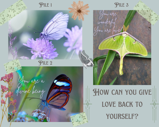
𝓟𝓲𝓵𝓮 1
Overall energy is the king of cups and your spread: 4 of swords, queen of swords, page of cups
immediately, i am getting a creative energy from this pile. the first thing that comes to mind is something with fashion and texture. i think you might enjoy thrifting/shopping and putting outfits together. or putting outfits together like in a mood board arrangement with color coordination. you might also have an eye for thrifting and seeing something in clothes that others might now. for example, you might be the type to see an outdated shirt that doesn't really follow the trends pattern and cut wise but you play around with it and make it fit. you make it fit for you and make it look good. you bring it back to life. it feels very detailed and tailored but very beautiful as well. also very venusian. like it has to be aesthetically pleasing. there's something different about the way you do things creatively that stands out but i'm getting you might not see it that way. you might be hard on yourself for the way you do things because it doesn't follow the way of everyone else. it doesn't fit in with the trends. i'm getting that you're quirks are unique to you. just as you might not do things the way someone else does it, they won't be able to do things the way you do it. we're all born different and come ingrained with our own set of experiences, skills, and strengths. don't be afraid of letting yours shine.
i think the way you can give yourself love might be to embrace your individuality within your creations more. there is nothing wrong with the way you make your art and you'll attract the people that appreciate it just as you do when you embrace it as well. i'm also seeing something about the outdoors as well? perhaps your body and soul loves the outdoors more than you think it does and would love to go out in the sun, play in the water, or go out for hikes and walks. something along those lines. i think the earth and outdoors can provide more healing and replenishment for us more than we think and even just a 15 minute walk a day would be healthy and loving <3
𝓟𝓲𝓵𝓮 2
overall energy is the 10 of wands and your spread: king of wands, 5 of swords, 2 of pentacles
are you being totally honest with yourself about something? i'm getting that you're not. the energy here is that you're very off balance and tired i would say. overburdened with work and the responsibilities of life and i dont think you know when to say enough. i see deep down that you're harboring a lot of resentment towards whatever the source of this is but you're good at keeping your cool. you keep it reserved and don't let it out which, yes, in some cases might be a good thing but, in the long run won't be so good for you lovey.
i understand that it's difficult to press pause on our responsibilities such as work and bills. but i think the way you can give back to yourself is to start constructing some more boundaries for yourself between work and your personal life. you need more personal time for yourself. time to relax and rejuvenate. if that's not possible, i see writing is also on the table as well. i think you should try this regardless and discuss how you're feeling each day, describe what your day was like, describe how you would like your day to go etc. i enjoy writing and just letting my entire thoughts write themselves on the paper without too much thought. it helps me to see everything clearly and understand how i am feeling. i also find that i will feel better after writing like this too and it might benefit you as well. i also think you need to be honest with yourself about what you can and cannot handle. don't take on projects and extra work because you're worried about what people might think if you say no. screw that. you matter more. your self preservation matters more. prioritize yourself. there is nothing wrong with that at the end of the day and if all you can do is the bare minimum. do that. you're doing your best and that's all that matters <3
𝓟𝓲𝓵𝓮 3
overall energy is the 10 of wands and the spread: the sun, king of cups, 6 of pentacles, 9 of wands
pile 3, i'm getting similar energy from pile 2 here. your energy is overburdened and heavy but i think for different reasons. i feel that you might not celebrate your individuality and kindness enough. you might be the kind of person that is more than willing to give kindness and love to others. you're always celebrating other people but perhaps don't match that energy with yourself. and i think the way you can give back love to yourself is shower yourself with love and let yourself shine more! i'm getting some venusian energy here for you and i think you may need to embody that more. i think you could do well with romanticizing your routine. some things that i am seeing for you is giving yourself more baths and perhaps adorning them with flowers such as roses, oils, salts etc. maybe lighting some warm scented candels while you're in the bath as well would be nice. i think you could also benefit from some loving affirmations to yourself and mirror work. saying affirmations to yourself before bed or saying them to yourself in the mirror. i don't know if you're the type to do your makeup at all but if that's something you enjoy, i think you should use that to your advantage and play with it more everyday. it's fun to be expressive through makeup and maybe this is something that would help bring you out of your shell.
i will be honest pile 3, your energy is difficult to read. it's reminding me of the hermit energy a little bit so i am surprised that this card didn't come out in your spread. but i do see you hiding yourself quite a bit and you're on guard with your personality. but you have a vibrant one lovey. you're not meant to hide. its hard to constantly hide who you truly are and i have to emphasize that it will hurt you in the long run. don't be hard on yourself and know that you're loved and will continue to find people who love you wherever you may go. you bring unique things to the group that others may not possess.
#tarot#tarot cards#tarot deck#tarot spread#pick#a#card#pick a card reading#pick a card#pick a pile#pile a card#pickacard#pac#tarotblr#tarot reading#tarotcommunity#astrology#astrology signs#leo#gemini#taurus#sun#moon#rising#how can you give love back to yourself#self love#self care
155 notes
·
View notes
Text
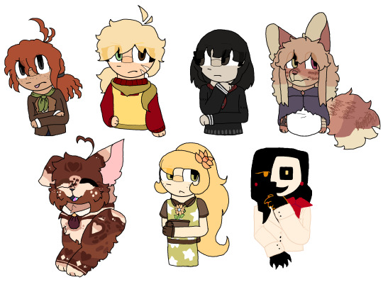
HAII!!! SURPRISE GIFT JUMPSCARE!!! MERRY CHRISTMAS!!!!! luv u all!!!
lampwick for @castlingvanias , sophia carter for @springbonnie-fanclub , amaya izumi for @valleyfthdolls , heath for @frindoka, ocha for @toothlesstdm , satoshi for @cobrajacky and GLaDoS for @bearionette
tried to get every detail on these guys sorry if i missed something </3 ALSO IM SORRY FOR ANY SHAKEY LINES THE MOUSE I USUALLY USED DECIDED TO STOP WORKING THE MOMENT I STARTED TO WORK ON THIS AND I HAD TO USE MY SISTERS GAMER MOUSE RIP
seperate versions under cut + extra words <3


andrew - HI ANDREW SORRY IK UR IN UR PKMN BRAINROT MOMENT RN BUT I ALWAYS LOVE TO DRAW LAMPWICK EVEN THOUGH I DONT KNOW HER AWHOLE ALOT <333 thank you for making pinnochio yuri real in ur adapation and i did not expect you to follow me after i found ur andrew art that one time and im still so happy i mananged to name one of ur aus AKJDKJ ALSO YOU JUST ALWAYS HAVE THE BEST OPINIONS EVER . EVERYTIME YOU GO INTO MY ASKBOX TO TYPE AN ESSAY UR THAT ONE GUY WRITING ON FIRE GIF... COOLEST PERSON IVE EVER SEEN
bonnie - THANK U FOR HAVING SUCH BASED OPINIONS I LOVE THE IDEA OF TRANSFEM JULIUS... estrogen probably saved her... GRAHH I LOVE UR PIXEL-ISH ART STYLE AND YOU ALSO JUST GET IT.. YOU GET EVERYTHING AND I ALWAYS TRUST U W FAZ FRIGHTS OPINIONS..... yes rouge thank you for listening to my insane ramblings about peeing in a hot topic /ref (how faz frights yuri should be more popular)
onyx - GRAHH I LOVE UR IDEAS SO MUCH UR SO GOOD W WORDS i love ur au as well AND I LOVE UR IDEA OF VANNY / VALENTINE....that one time you made a comment about how ur impressed w the fact i can draw in ms paint has stayed in my mind i dont know why ..... ONE HUNDRED BILLION TRILLION SMILES AND HUGS... UR SO COOL AND EPIC WORDS CANNOT DESCRIBE IT
fret - HII FRET .. NOT ALOT OF WORDS CUZ WE ARENT SUPER CLOSE SORRY </3 ur art is so epic and awesome and i love how you draw tufts so much ... i did not expect you to refind me again after i dissapeared from twt LOL but so cool and epic... i tried to get heath as accurate as possible but i couldnt find a ref that wasnt from september and i wasnt sure if it was updated so im sorry if i got anything wrong </33 i LOVEDD doing the stripes so much sorry the ones on the tail look so rushed
lillie - WE DONT TALK ALOT EITHER!!! I LOVE HOW COMPLICATED YOU CAN DO ANY DESIGN!!!!!!!! i tried to challange myself to get it fully accurate to the ref i found.. yeah that anon was me sorry....GRAHH UR ART IS SO PRETTY IM GRABBING YOU LIKE A SOPPY WET CAT.. PEACE AND LOVE ON THE PLANET EARTH you are the most joyus person on the planet i have ever seen i swear if i walk into your room it would be straight up the sun you are SO HAPPY AND POSITIVE I LOVE IT
charolette - HIII ... KEEPING THE RUNNING THEME OF ALWAYS MISPELLING UR NAME CUZ I CANT FIGURE OUT HOW TO SPELL IT.. YOUVE BEEN HERE THE LONGEST ... EVER SINCE MY DA DAYS AND MY DRTWT SHINANIGANS... i will forever mourn the fact the 'WHAT THE FUCK IS POISON GENDER' video where we dunked on some random romanian dudebro guy for making fun of my pkmn headcanons and we used danganronpa sprites is gone... ur the type of person to read the bible as if its some random every day novel and i think thats rad and cool.... this florust guy looks so cool i hope atleast he survives abit in ur fangan.. holding a cake that says IM SORRY THAT YOU KNEW ME WHEN I WAS 11
atlas - HI ATLAS... UR ART IS THE SHIT I LOVE IT... THE COLORS R SOSOSOSO BEAUTIFUL.. ONE BILLION SMILES FOR YOU AND I LOVE UR CASSIE DESIGN... IF I EAT UR ART IT WOULD PROBABLY TASTE LIKE MANGO... GRAHHH i cant believe we started to talk after you drew my cookie run oc that one time... ITS SO COOL TO SEE HOW FAR YOUVE GONE W UR ART.. i tried to keep the blocky shape of ur GLaDoS design AND IT WAS SO FUN TO EXPIRIMENT WITH..... yipee
#calico.exe#SORRY FOR ANY MISPELLINGS... PEACE AND LOVE ON THE PLANET EARTH#hope u all like it <3333 i speedran this in 2 days and i did not expect it either#ms paint#mspaint#artists on tumblr#my art#gift#gift art#SORRY FOR ANY OTHER MUTUAL WHO SEES THIS I PICKED THE FIRST 7 PEOPLE THAT CAME TO MIND#ALSO MERRY CHRISTMAS IF YOU DO CELEBRATE IT* IF YOU DONT SORRY#also special shout out to my slowed glass animals and the worst playlist i could have conjured up cuz i listened to them like 30 times#while making this
28 notes
·
View notes
Last Seen Blogs
ichii-1
ichii-1
christmas-goblin
Depression 24/7
passionateseadruid
Sea Druid
koivostopos
Let's find κοινος τοπος

kirusbian
Took The Name From A Previous Blogger. Fuck Them