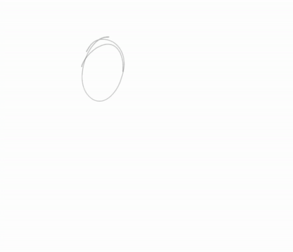
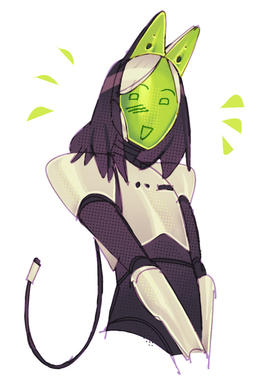
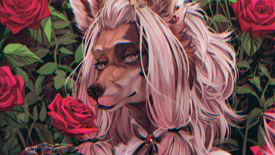
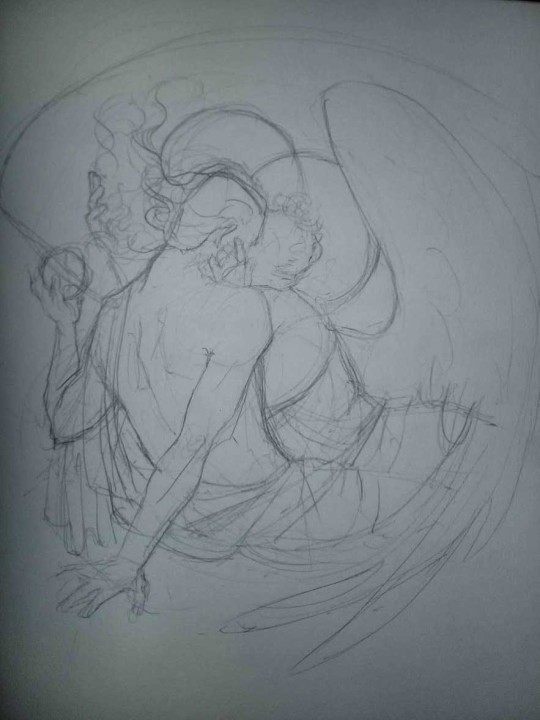
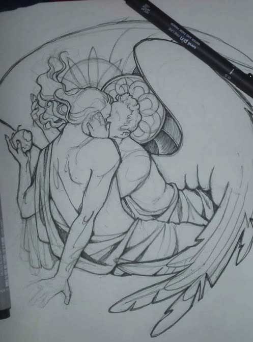
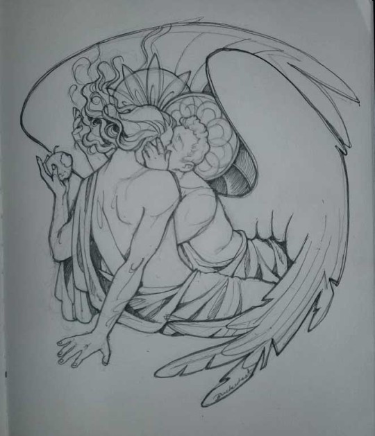
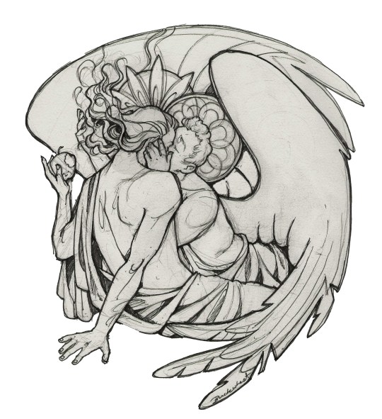
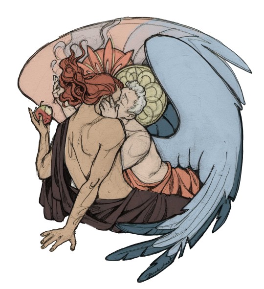
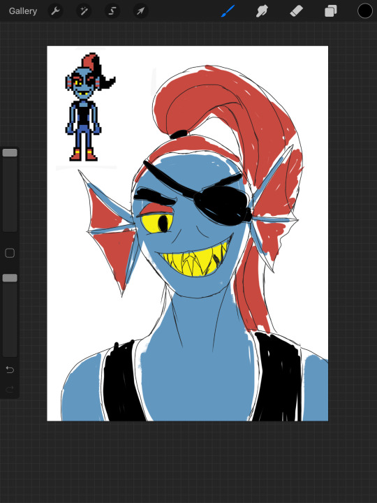
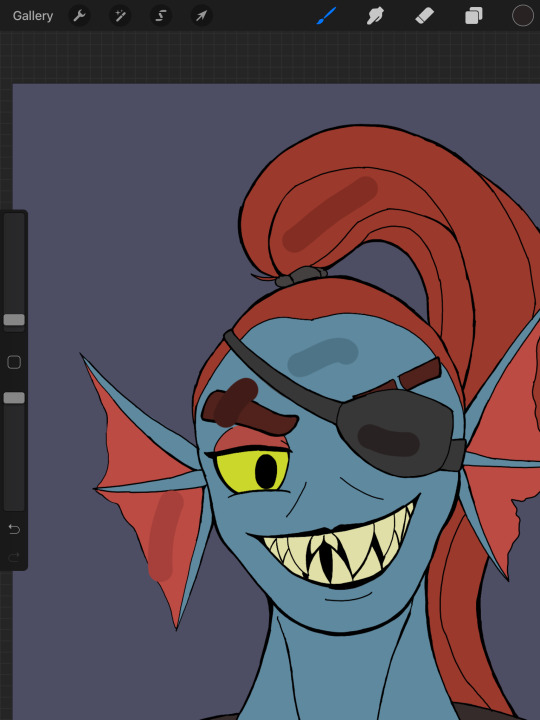
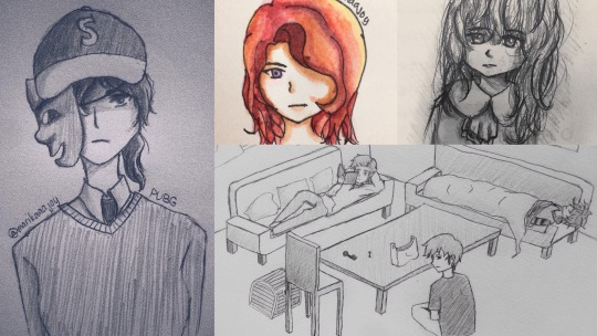
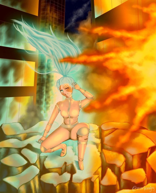
#I was messing around with this sketch trying to decide if I like lineart or painting better
Note
hii!! i was wondering if I could ask what is your usual colouring process? how much time one fully coloured piece and doodle take! I adore your ocs so much they inspire me to draw more myself:3 they feel so alive!
hi anon! thank you vey much, i'm very happy to hear that you feel inspired!
i wrote up a little something for your questions under the cut:
so, first of all, the way i color things ranges from drawing to drawing, especially if i feel like playing around in the process. sometimes i decide to try something out (palette, filter, technique, brush etc) and if i really like how it looks i may recolor the entire drawing lol. point is, there's a lot of sidetracks to my process (especially now, since i'm trying to get used to a different art program than the one i used previously) but the very basics of it are as follows:
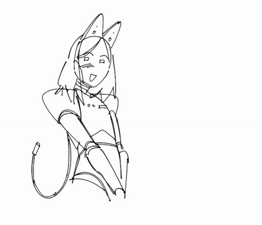
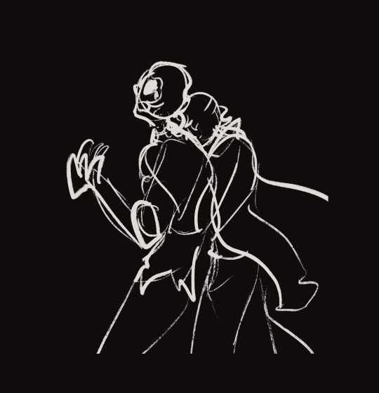
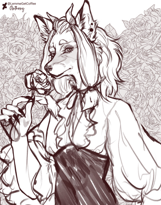
1. i sketch and line whatever it is that i want to draw (this might take a while depending on whether i have a solid idea right away or not; in the latter case i might do some thumbnails first to figure out how i want the drawing to look. you can't really see here, but when i line things i usually draw on the same layer as the sketch, and after i'm done i adjust the brightness/contrast settings of the layer to get rid of the sketch underneath. it might seem like i'm just making my life harder this way, especially since this method only works if you sketch with a lighter color (or make it lighter in settings before starting lineart) and your lineart is drawn with a solid opaque brush (which is how i always draw), but it helps me to not get caught up on trying to make the lineart precisely follow the sketch. it also makes changing things on the go much easier, since i only have to erase on one layer.
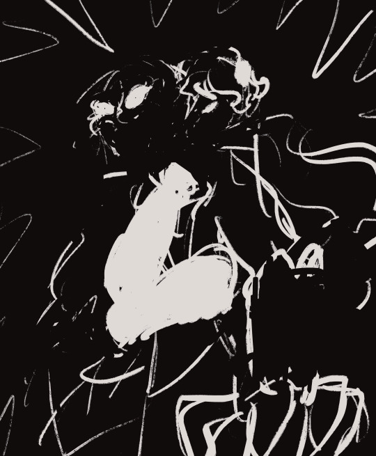
2. after i'm done lining, i underpaint with a solid color (usually the skin color, but sometimes something random), then block the alpha channel and color over it with flats;
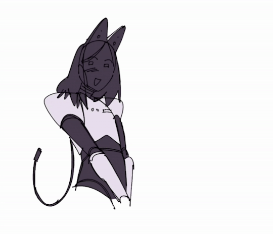
3. i don't color everything at once, instead going piece by piece, which helps to keep the drawing balanced color and contrast wise. i pick a desired area with magic wand and then go about rendering it properly (which usually involves adding some value variance with an airbrush and then laying down shadows/highlights/etc). you can't see this here either, because for some reason i forgot to do it this once, but i also usually lower the opacity of the lineart layer halfway when i color. it helps me concentrate on colors and how they look together better;
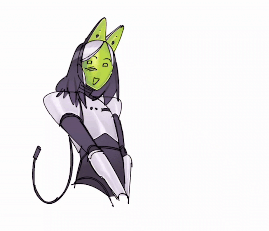
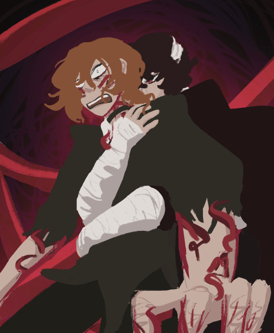
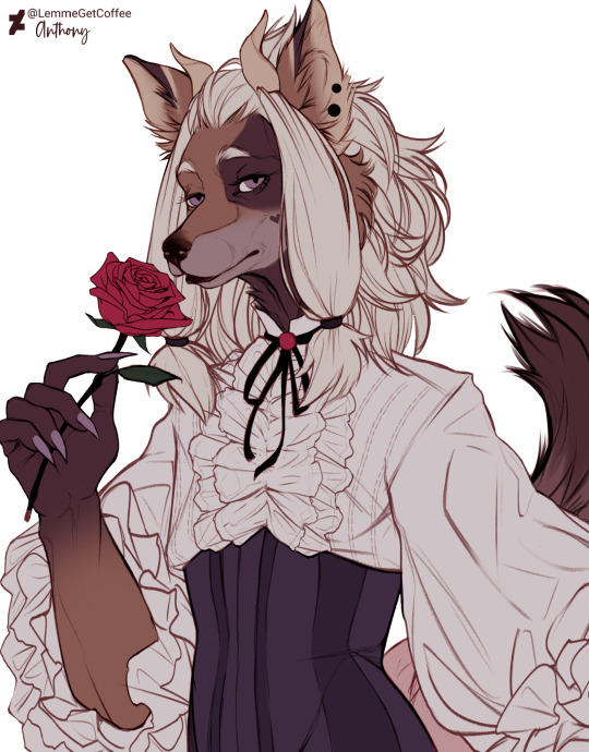
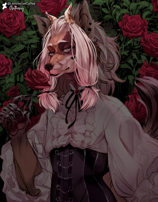
4. when i'm satisfied with color, i recolor the lineart to be whatever color i think fits the piece better and change lineart layer settings to either multiply, color burn, or linear burn. after that i just play around with filters, add decorative details, and clean everything up. it's also worth noting that sometimes i starts trying out filters/effects directly while coloring because i want to explore some alternative colors or palettes; i also have a tendency to pick very pale & unsaturated colors so messing around with HSB (hue/saturation/brightness) & depth/contrast settings while coloring helps a lot.
5. cropping it & there you go!
this one took me 1,2 hours. depending on how complex the drawing is it might take me much longer (especially if im working on a commission) so i'd say my average time drawing is somewhere between 2-6 hours. if a drawing takes longer than that i break it apart into several days of work. don't draw for too long! it's bad for your health.
as for sketches, as i mentioned previously, it all depends on whether i know what i want to draw or not, and if i do, i usually just go straight at it:

this one took me 20 minutes. on average, a doodle can take anywhere from 10 to 40 minutes, more if i want to make it look fancy, but at that point it enters the vast limbo between sketch and finished piece.

that's it! sorry the gif quality is really bad, it's the best i could do. here's a video of the same stuff, hopefully in somewhat better resolution
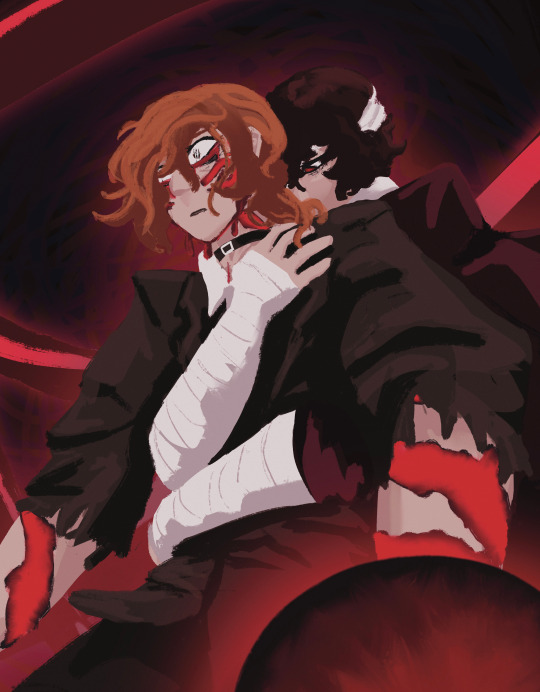
#character: kotya#character: shurik#setting: robot#artist: cbge#askbox#had to cut out footage of me playing with filters bc it was flashing rly bad
27 notes
·
View notes
Note
Uh hi! I wanted to say that I really love your designs. I’ve been burnt out for a long time and I haven’t drawn anything but I feel like looking at your art is building up the inspiration!
I have some questions, if that’s alright-
(The basic cliche question) What art program do you use and what brushes??
What shapes do you use most in basic sketches?
What inspired the designs for the WOF dragons??
Any tips on shading and colouring the scales?
I know it’s a lot, but you are an amazing artist and I look up to you- your art is so amazing and beautiful. Thanks and have a nice day!
I'm glad you like my art!
answers to questions below cut
I use Clip Studio Paint Ex, for my brushes I mainly use these two:

But I do make use the basic airbrush tool too, usually for coloring and shading.
I use a lot of triangles and squares/rectangles when drawing in general, I rarely use any circles.
For my WOF designs I usually use an animal for reference. If a character's name is that of an animal, I'll use that animal for their design. For others I try and finding an animal that I think fits their personality and such. I do derive some of my designs by their character description, but I don't do it often.
As for the last question, I don't really have a 'set' way to draw scales. For the most part I draw in the scales when I'm sketching/lining and my coloring depends on the scale detail that I draw. For the most part I use a bunch of gradients and airbrushes, then go in with another brush to start rendering.
When I start rendering I typically split one line of scales into two parts, from this point I'm going to decide which part is going to be shaded and which part is going to have light reflected onto it.
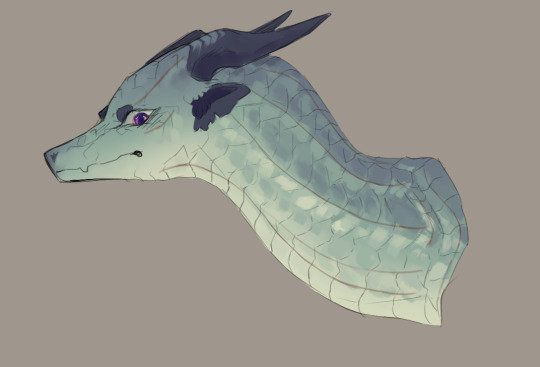
using actual lines here just to better represent it. I use a crap ton of gradients because I color pick from the image in order to render. But I will go into the color wheel and pick new colors if I want something to be darker/more saturated. I don't tend to use actual multiply layers if I'm just doing a basic drawing. But for the purposes of answers the question I will go and show I shade.
I don't have a good way of describing my process. It's a lot like my rendering. I follow the flow and curvature of the scales/the lineart and cut out parts if I believe there's too much shadow there.

I'd then go and lower the opacity. Obviously. I don't have a set opacity that I go to. For the most part I go and mess around with it until it looks nice. And then we go into the final step. Coloring the shadows.

When it comes to coloring the shadows, I'll use a color close to the color of the scales. So in this case a green. I'd go back to the airbrush and start coloring the sides, mainly so it'll start blending into the base color. After that I try and lightening up the shadow, usually using a brighter color, I tend to find myself using a lot of blues and purples. When I'm done with that, I'd go into a soft eraser to soften the hard edges of the shadows.

That's pretty much it. If you made it down this far. Thank you for liking my content :)
40 notes
·
View notes
Note
I do hope to see more of crystal moon art and please take your time to draw them, good luck ^^
Hello and thank you for the ask! I’m still not quite sure how I feel regarding crystal moon, but if I did have a story revolving a healthy romance between them, this is what I think it would look like!
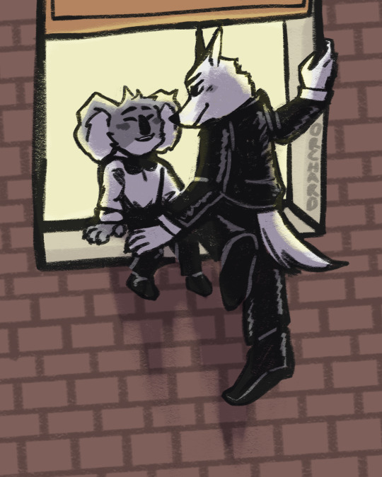
What could have been. 1/2
A few things,
1. This is actually a part 1 of a duality drawing I wanna do! This is the good side of the coin, and the second draw will be similar posing but like. Not happy? Aka them from my story I’m writing. Aka a lotta angst. But this ain’t that! This the cute stuff
2. I had a broad sketch of the basic pose, then one with more detail with a less chunky but still chunky pen, but I couldn’t for the life of me do a lineart with a thin pen that I felt satisfied with. So I just went to the chunky pen layer and kept messing with it and cleaning it up and I like how it turned out :)
3. About the au!!! Idk if I’ll ever like, actually write this? I prefer angst to just solid fluff, but if any of y’all wanna do something with it (or any of my stuff actually) go ahead! Wether that be writing, art, edits, I really don’t care, I just would like to be tagged so I can see it :)
4. Lastly, a bunch of rambling about what this au entails!
A. Following the sing movies, this au happens after Jimmy Crystal is jailed for assault and attempted murder against Buster Moon. Buster Moon decides to visit him in jail. To talk to him.
B. They actually get along pretty well. Buster apologizes. He realizes what he had done, yknow, lying to get his own goals, wasn’t exactly the most righteous thing either. They talk for a while. Buster visits multiple times a week. Communication is a good thing, yknow?
C. Jimmy gets bail, and is freed on parole. He was originally going to have an ankle bracelet, but Buster shows to the hearing and insists that he doesn’t need to. Buster had the option to get a restraining order against Jimmy to further protect him, but he denies that as well.
D. Even with Jimmy apologizing himself and slowly making the steps for being a better person, Busters friends still don’t like him. So Buster and Jimmy decide to be a little mischievous and keep their meet ups a secret
E. Sneaking around is actually a lotta fun, they realize. Night time is the perfect cover, as each are supposed to be asleep in their respective home. They visit local parks, diners opened past midnight, anywhere where they could find peace and quiet to talk in. The rebelliousness made them each feel young again, like a teen sneaking around with a forbidden lover.
F. That said, a few months into this secret friendship, Buster realizes he’s found feelings for the once cruel wolf. He is the one to confess, and while Jimmy requited said feelings, he said he preferred friendship to romance. Buster is upset but decides it must be for the best.
G. Jimmy then realizes it must be his internalized homophobia talking, so a few days after the confession he sneaks off to Buster’s apartment, opening the window and apologizing to the koala. He apologizes and confesses that he also feels the same, but that feelings of that caliber are difficult for him, especially after the death of his wife a decade prior.
H. Buster listens and accepts his apology, moving to sit on the window sill which Jimmy is still hanging awkwardly off of. They talk quietly with each other, and Buster is daring enough to press a kiss to Jimmy’s snout, flustering the wolf who almost falls in return. They laugh once Jimmy regains composure, and are happy together.
I. Will this be an easy relationship? Hell to the no. Will they try? Yeah. And really, that’s what matters when trying to heal such wounds.
#orchard draws#orchard writes#buster moon#jimmy crystal#crystal moon#sing 2#sing2#sing 2 spoilers#sing buster moon#sing jimmy crystal#no content warnings??? on an orchard post???#wild I know but I needed to try my hand at fluff for once
54 notes
·
View notes
Note
Where do you get all your ideas for these drawings and how do you actually find the strength to do them? Also what happens if you finish a piece and aren't satisfied with it?
Oof, oh man let's see...where I get my ideas from is a tough one, because I get bits of ideas from a lot of different places, and then they just ping around in the circus of my brain until they combine into something I want to make. And with soukoku specifically, there's something about them that appeals very strongly to my sense of humor (not just my sense of humor of course, but it was that aspect which drew me to skk initially), and that makes it easier for me to go "oooh, I want to draw them doing this", or "wouldn't it be funny if they—", etc.
Basically, because I think about them a lot, that leads to things like, say, me listening to the Little Mermaid soundtrack one day while cooking and thinking "Hey, wouldn't it be funny if Chuuya was Sebastian and Dazai was the french Chef" and then running with it and writing a very very weird oneshot. Or, me taking a walk in the snow and thinking "hey what if soukoku were walking in the snow and then Dazai flopped over and started being dramatic about being Snow White" and then my Snow Day comic happened.
As for how I find the strength to do them (and unfortunately I feel like this isn't going to be a very inspirational answer): for me, drawing is a way that I process, calm myself down, and just...express myself. Ah, for example, that recent "Operation Quiet Heart" comic I made recently! I binge-drew that in about two days, because several things had happened to make me Very Stressed and Upset, and so I drew something silly but also comforting because I knew it would make me feel better. And it did! By the time I had sketched it out I had gone from a state of "I am about to either start biting people, or burst into tears" to "Okay I can manage this actually, it's not that big of a deal".
At this point, honestly, it's worse for me when I don't draw. A while ago I hurt my drawing hand while gardening and had to rest it, and in less than a day I started trying to teach myself how to draw with my non dominant hand, just so that I could make something. That's how feral I was going, not being able to draw anything. (I'm actually slowly getting better at left-hand drawing! Can't really do lineart very well yet, but I've occasionally used it for very loose coloring/non-precision stuff when my right hand needs a break.)
It's probably not the healthiest, but...I figure there are worse things I could rely on. Drawing daily has helped me get through some of the worst parts of my life so far—even at times when I couldn't express what I was feeling in words, I could still draw. I think that's just how my brain is wired, sometimes visuals are easier than words. (I like writing a lot, but it's definitely harder for me.)
Aaaand as for what I do when I don't feel satisfied with a piece—I'm gonna put the art ramblings under the cut, since this is already getting long—but the tl:dr is that it depends on how stubborn I'm feeling at the time :D
For example! Sometimes I finish a piece and go "eh", and then I just leave it!

Like this one! I don't hate it or anything, but after a while of messing around with it, it still wasn't quite what I wanted. Close, but not quite. Didn't quite like how Chuuya's hair turned out and such—so, I decided it was a learning experience and left it at that. Maybe I'll come back to the idea at a later point, but honestly I had no plan when I started this one and was just vibing, so I didn't take it as much of a loss.
And then sometimes I get really, really stubborn about a piece, and keep working at it until I get it to look how I want. For example, this one!
This one took me a WHILE, even just to figure out how I wanted the poses to work. I kept drawing sketches, turning off the layer and then trying again on a new layer. So first we had this:

But I felt like adding Dazai to this pose would be awkward, because he would be so eclipsed by Chuuya, so I tried again.
And nope, still didn't like it. having the profiles like this felt too stiff somehow, even though I liked how Dazai was holding on to him. (Also here's an example of me coming back to an idea later, because I recently made a side-profile-facing-corruption-piece that I ended up actually vibing with)
So, I tried again.
I don't have the full undersketch for this one, because I mangled it while drawing, but here—you can vaguely see what I was going for, mostly with where Dazai's arms are positioned. So I had the pose, but then of course there was the process of actually coloring it, and that was a whole other thing. Oh also Chuuya's face took a WHILE for me to get to a place where I didn't hate it.
Here I was mostly just trying to figure out base colors(and the background), and I ended up redoing almost all of it because I was being really sloppy—especially with Dazai's bandages and the curse marks on Chuuya's arms. Also Chuuya's head was a bit too large in proportion to his body, so I ended up selecting all those layers and shrinking it.

Getting closer, I fixed the curse marks and messed around with Chuuya's expression more (but I still didn't like it). Only now I felt like Dazai and Chuuya's heads were too zoomed out and small in this composition (also I tipped them too far back and now it looked like they were falling in a weird way), and also I wanted to add something else because I felt like Chuuya's hands were drawing a bit too much attention (plus it was a messy hand and I didn't feel like fixing it), so I decided to add a graviton to cover the hand and make that lower corner dark. I really wanted the focus to be Dazai's arms holding on to Chuuya.
So I changed Chuuya's expression again, adjusted the angle, zoomed it in, added the graviton, and then messed around with filters to get the colors more how I wanted them to look. And THEN I decided I was done, because I didn't want to overwork it, but yeah! That was one of the times where me being very persistent with a piece actually wound up with something I really liked.
Long answer short: sometimes when I don't like a piece I keep trying until I do, and sometimes I just let it be a learning experience, and try a different approach the next time.
#ask box#these were really interesting questions#thank you anon!#I hope this wasn't too much information aksdfjskdfjks#so much of me doing art is just throwing stuff at the page/canvas until something sticks#ESPECIALLY when it comes to painting#I'm getting better at doing quick and simple comics in my style but paintings take a lot more effort and time for me#*draws back curtain on my process* behold: a parade of clowns#...side note but#honestly I have really lucked out by finding people who appreciate me being weird#like#I was not expecting people on here to enjoy my stuff when I first started posting#but then people were really nice!#if i can make literally anyone laugh with my comics I'm absurdly happy#I really appreciate how kind people have been about the shenanigans I draw
17 notes
·
View notes
Text
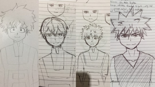
Aspen - Character Portrait (in steps)
Everyone's process is different. Here's mine with a bit of shitty commentary.
1. thumbnail/concept/rough sketch
Call it what you will. I usually make 2-3 rough sketches of different poses or angles but for Aspen I had managed only one after a tiring day. Of course, if the client does not like it, I'd be more than happy to try sketching a different pose/scene til they are satisfied.
2. Lineart
3. Flat colors
Once the rough sketch is approved. I draw over it with some cleaner lineart. I don't draw the lineart for every single detail for example the silver on the corset or the water drops on the rose.
I usually finish both the lineart and flat colors at the same time so I didn't save a screenshot of just the lineart. For the flat colors I either color pick from the reference sheet or come up with them on my own. If the colors are too irritating to the eye I usually add a purple multiply layer on top to tone it down.

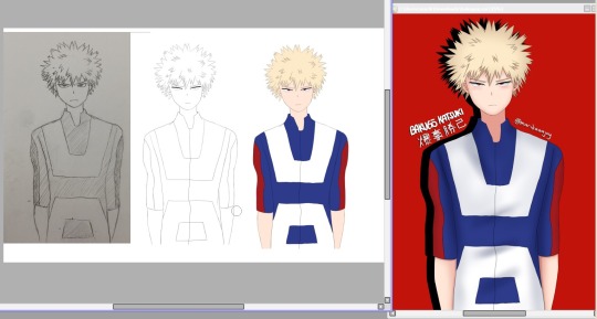
5. Lighting
added silver nail guards and beans. Defining the proper color palette, shading and light source. Plus decided to add the rose bush background from the concept sketch.
Painting
Now we move on to the fun part. The struggle is real. My personal go-to method for painting is cutting up the shapes into small pieces and working on each piece one by one without merging my dozens and dozens of clipped layers. If the amount of layers bloats the CSP file too much don't even bother merging them down because that doesn't decrease the size. I find it far more efficient to copy and paste all the layers onto a new canvas and save. You can turn 11GB into a mere 10MB.


Final renders
To finish off the piece. I either send it to my phone and use the app Photoshop Express to experiment with the filters OR I mess around with the color balance/tone curve/hue/contrast/gradient map and other correction layers in Clip Studio Paint til I'm satisfied with the output.
Then I add the 3D glitch auto-action in Clip Studio Paint. (You can find it and more on assets.clip-studio.com) Then I go set the grain effect in Photoshop Express to 20%. I know you can make a grain/noise effect on Clip Studio as well but I haven't figured it out yet. Photoshop Express makes it easier and did I mention it's free
Anyway I hope you found my rambling entertaining. Thank you for reading!
#digital art#art#step by step#digital art process#art process#furry artist#furry#furry art#wip#work in progress#art wip#commission#clip studio paint#artists on tumblr#portrait#process
12 notes
·
View notes
Photo
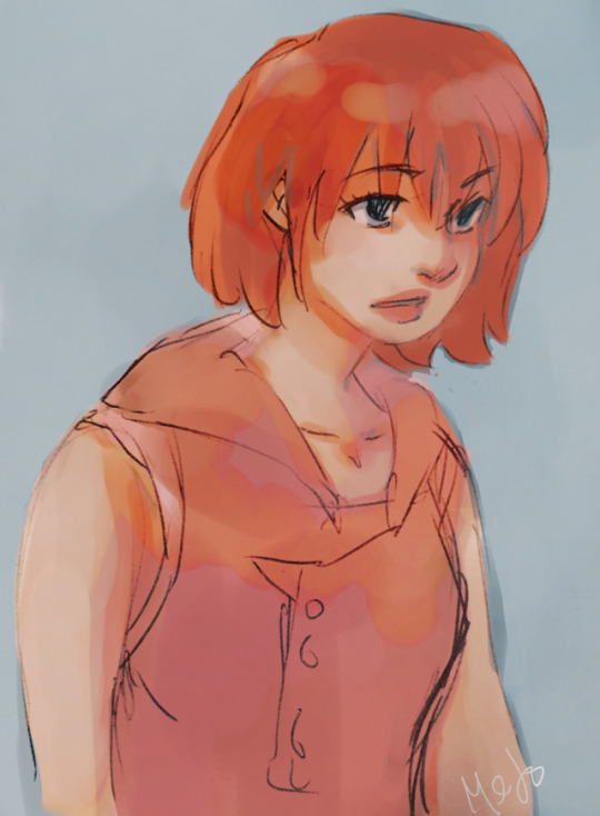
more kh sketches. kairi <3
#kh#kairi#kingdom hearts#fanart#digital#just wait til u see my xion/namine aaa#i really like how i colored this though#i really like the watercolory look#im trying to mess around with digital to decide what kind of coloring style i like doing the most...#so all the lineart is just the pen sketches...
13 notes
·
View notes
Note
First off- Love your art. Big, hard yet somehow soft and warm. I can't really explain but I feel like all your characters smell great and give serotonine-filled hugs.
I would just love to know your drawing process. All your lines and colors are so clean, so straight, so nice. How do sketches look? Whats the walkthrough. Tell me your secrets. I beg of you.
Thank you! It’s a running joke among my D&D group that my characters give the best hugs, so I’d say your feeling is right ^^
Secrets can be found below 👀
The tools I use are as follows
a small Wacom Intuos tablet
Clip Studio Paint (sketch, lineart, flat colours, shading)
Photoshop (textures, backgrounds and lighting effects, colour correction, abusing the Liquify tool to try to fix anatomy mistakes)
Sketches
My sketches usually look something like this and involve a lot of scribbling and experimentation and use of the Transform tool until I end up with something I like. I kinda just feel out the shapes as I go and am constantly redoing and adjusting things.
The different colours are just so I can differentiate between the different elements and it doesn't all just become a giant scribbly mess when I'm trying to line it after.
Lines

As for my lineart, half of it is just a result of practice. I've been doing lineart + cell shading as my main style for over ten years now so I like to think I've managed to acquire some decent line control in that time.
The other half is a good stabilizer and pen pressure settings on the brushes I use.
Before Clip Studio Paint, I used Paint Tool SAI for my lineart because I could never get line results I was happy with in Photoshop, but not only does CSP have phenomenal stabilizer settings, its vector layers feature (which automatically turns your lines into vector shapes regardless of the brush you use!) has also made the process way easier by allowing me to edit and adjust my lines after the fact.
The one tip I can share when it comes to lineart is to take advantage of momentum. I never draw directly on my lineart layer; I make a new layer above it, draw on that one, and then merge it down every few minutes. This lets me use momentum to carry my brush strokes and then erase the parts that overlap without worrying about messing up the stuff I already have, resulting in smoother lines than if I had tried to precisely draw a straight line the entire time.
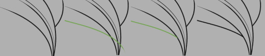
In the example above, the green line is on its own layer and can be easily erased without damaging the black lines around it.
I also tend to use a smaller brush for interior/detail lines and thicker ones for the outer edges of a shape just because I think it looks nice.
Process in General
Honestly, my process is just a lot of trial and error. I draw a line, undo it, draw a line, undo it. I sketch several hairstyles or outfits on different layers and then swap between them like some weird dress up game until I decide which to keep. I experiment with adjusting the hue and saturation of flat colours until I find something I like. I’m a very “make it up as I go” kind of artist, and really, creator in general; and rarely is the finished piece the result of any sort of plan.
That being said, I do have a general order in which I do things:
Sketch a bunch of random things until I find something I like
Merge all sketch layers and reduce the layer opacity until it’s very faint
Make a lineart layer above, then a layer to actually draw on above that
Draw the lineart using the techniques mentioned above (I often jump around and line different sections randomly), fixing any wonky parts of the sketch as I go
Make a separate layer below the finished lineart for each differently-coloured element (eg: hair layer, skin layer, pants layer, etc.) and fill with fill bucket*
Tweak each layer’s colour until vaguely happy with it
Make a layer below all other layers, select the entire interior of the lineart, fill it with black to fill any tiny gaps left by the fill bucket
Make a layer above all other layers, set it to multiply, draw shadows with a light grey-blue-purple colour (I shade one element at a time by selecting the area and then drawing within that selection on the shading layer)
Repeat step 7 with a layer set to Overlay and a light-medium grey for highlights
Open the image in Photoshop and apply gradients, patterns, lighting etc.
Notice all the mistakes it’s too late to fix and start second guessing the entire piece, say “screw it”, save it as a .png, and post anyway!
And I think that’s about it.
Sorry if that was confusing, I’m not sure how much previous knowledge of these programs you have or how much detail I should go into, but I hope maybe some of it was interesting and/or educational lol
I also have a short process video here that shows the steps one at a time that might help you visualise it better
- - - - - - -
*In case anyone’s brave enough to try using this as a tutorial and isn’t sure what I mean here:
CSP lets you set the lineart layer as a reference layer and still fill the colour on a different layer as though the lines were present on that layer. In other programs you may have to select the area you want to colour on the lineart layer manually with the magic wand tool and then move to the corresponding colour layer before filling it in.
If you use a program where you have to select the area manually, you may want to keep all your tiny detailed lines on a separate lineart layer just so you don’t have to spend time selecting all the small gaps between them. Alternatively, you could just fill it by hand with a brush.
28 notes
·
View notes
Text

Happy Saiou Day!! 💙💜
So if anyone remembers last summer I said I'd post the complete portraits of my talentswap designs and a climactic scene from the AU with a full summary when they're finished? Well, I didn't forget!
So, below are my headcanons for Ultimate Supreme Leader Shuichi and Ultimate Detective Kokichi~!
(I'm really passionate about this AU, I hope you read it ':3)
(Tho no climactic scene unfortunately)
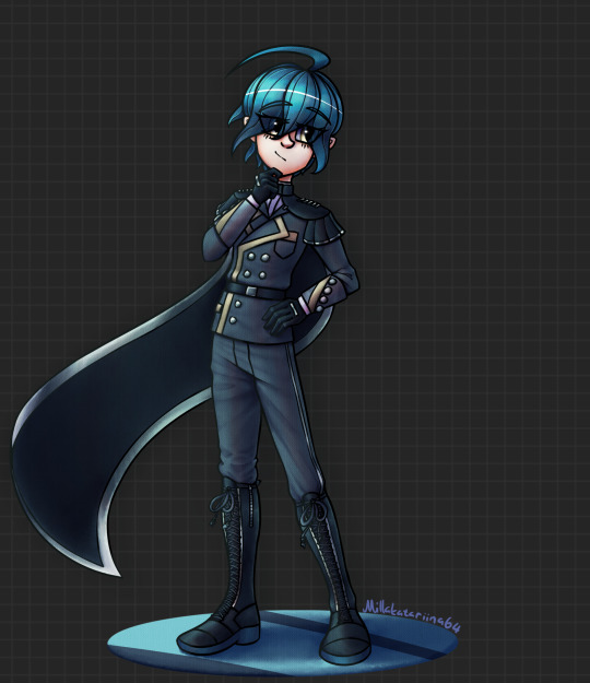

Ultimate Supreme Leader Shuichi
So first of all Shuichi's parents are still celebrities, move overseas and leave him with his uncle. However in this AU Shuichi's uncle is a politician who actually has a really good reputation. Problem is, his uncle is incredibly busy and is almost never home because of that. Still, he wants to be like his uncle (though the wish is fueled more with wanting to be good enough and accepted). Shuichi's personality is basically the same.
So then one day I Alligator girl's (Gonna call her Wani) alligator gets stolen by some group who're going to sell it and they threatened Wani to not call the police or tell anyone. So she asks Shuichi to help. Somehow they manage to retrieve the alligator together secretly (idk) and right afterwards one of Wani's friends is in trouble with some shady local business. So Wani suggests they make a group to stop these sorts of people and that Shuichi would be the leader. He agrees, he still wants to do something to make this world a better place like his uncle.
After that Wani starts asking her most trusted friends at school if they'd like to join (Shuichi would never have the social courage to ask someone that). When they get to 10 members (all girls) they stop growing for some time and decide to get themselves uniforms. When they're finally considering getting more people into the team since Shuichi doesn't really know these people, he decides to start wearing a mask to be safe. He also starts using the code name "Crow". The other 10 members go by flower names.
The group then grows a lot. And by the time Shuichi's officially scouted to be an Ultimate, it has around 1500 members. And it's making him very worried as Shuichi's not even sure anymore if he's skilled enough to lead it. The group started out stopping or changing corrupt businessmen, unethical businesses and other evil groups. And although that still is what they do, he's realized that the way they go about things is pretty illegal. (When he first realized this, he started wearing a hat.) Obviously he forbids violence, but they still use blackmail and steal information. Also they need money for the group to function at this point so they've had to get it through illegal means that Shuichi's not sure of anymore. So Shuichi is immensely scared of being revealed as the organization's leader because it would completely destroy his organization and it would also annihilate his uncle's as well as his parents' careers on the spot. Basically everything would get ruined and it would be a nation-wide scandal. Perhaps even an international scandal.
He gets even more worried when the police finally start realizing there's some sort of group that's blackmailing big businesses and start investigating.
When he gets scouted to Hope's Peak, the letter comes to his base and even HPA doesn't know his identity, just that he's a high school student. He doesn't think like he deserves the title at all since it's really his organization that does the hard stuff and Wani's the one that's made it grow and he shouldn't be panicking like this if he really was a "great leader". But he still decides to go due to "If you manage to graduate from Hope's Peak, you will be set for life!". But as his family can't know of him being scouted there as the Ultimate Supreme Leader, he forges a letter claiming he's the Ultimate Lucky Student which he shows to them. And at HPA he requests he be referred to by that title.
Problem is, now his year group has 2 Ultimate Lucky Students and a certain Ultimate Detective gets suspicious.
Miscellaneous: Shuichi really wants to use make-up but he's really afraid to at home since he feels his uncle would think it's really weird. So at the organization's base Wani heard about it and got him some makeup and now Shuichi wears makeup when on missions and at the base. Also the organization has a helicopter. (It's a central part of that climactic scene I talk so much about.) Shuichi thinks about becoming a detective perhaps, but he's not sure how he'd be able to leave his group anymore so...
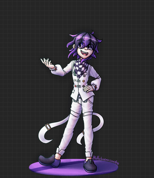

Ultimate Detective Kokichi
For Kokichi I still have my pretty elaborate origin story. His early years are great until at some point his real father finds out that Kokichi's mother had actually had the Kokichi and his older twin brother with him and not her husband leaving him alone. And thus he murders Kokichi's mother out of spite. Kokichi and Tamotsu (my headcanon name for his twin) see the murder take place and flee. However, they were never actually able to make out who the murderer was and they knew even less of why their mother was murdered.
The murder never gets solved and this mystery stays in Kokichi's mind. Who ruined his life, who killed his mother?
(I feel they'd have like an uncle and their mother's husband lived with them obviously. There'd also be other factors like disposed evidence and the suspects vanishing making the murder so much harder to figure out afterwards.)
So Kokichi and Tamotsu end up at an orphanage, one related to the one Maki's at. It's kind of a terrible place, but it's where Kokichi meets (most of) Dice. They become inseparable friends (tho don't form a group with the name Dice. I'll still call them that here for clarity's sake though). However Tamotsu who had always been supporting Kokichi and being there for him at his side starts becoming bitter (jealous?) against Kokichi due to dice and starts turning against them. This is the time when Kokichi starts developing his lying to protect himself from Tamotsu as well as the borderline abusive authority at the orphanage. He's also started to figure out the dark secret of the orphanage training children to become assassins.
I feel like during this time a detective was investigating the orphanage. So when things get too dire and Kokichi and Dice escape the orphanage the detective ends up taking them in after finding them on the streets afterwards since he can't just send them to an orphanage at that point. So Kokichi and Dice end up staying with the detective and start helping him out. Kokichi's especially interested in the orphanage now and he and the detective with the help of the other Dice members figure out a lot of stuff. (This is also the time the rest of the Dice members "join".) Until one day the detective gets assassinated by someone from the orphanage sending them a message to stop the investigation.
So Kokichi takes over the Detective's office and to get by he starts working on all kinds of small cases with the help of Dice. And that's what they mostly do. Among those small cases are often cases that have something to do with saving children. However Kokichi occasionally also takes on homicides and investigates organizations. He wants to be prepared for when he finally investigates his mother's murder as well as the organization behind the orphanage. He wants those people locked up in jail forever.
Personality wise Kokichi's pretty much the same. He still loves pranks, lies all the time and would have elaborate stories (lies) about like for example how he was the one who managed to put the previous Queen of Novoselic's assassin behind bars. (The previous Queen was not even assassinated). He'd also jokingly blackmail people by claiming he knows something about them or could figure out something incriminating about them. He never really means it, though he would like try to find out harmless embarrassing secrets to mess with people.
Around the time he gets scouted to Hope's Peak he's specifically requested to assist in the investigation of a mysterious organization that steals information and sends blackmail and other such things. It's a huge flashy case, so of course he picks it up.
At Hope's Peak he then meets an (surprisingly mysterious?) Ultimate lucky student who seems really interested about his Ultimate detective talent and his lying.
Bonus
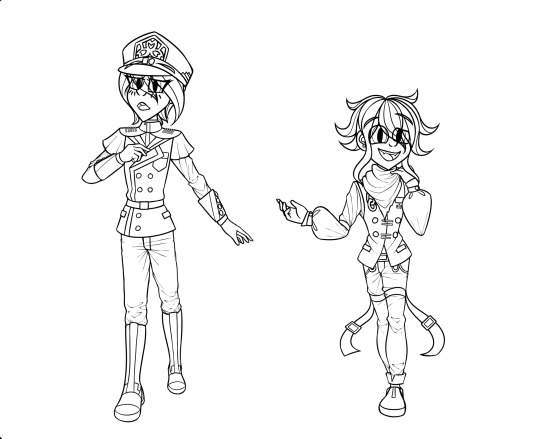
The original portraits from summer 2020. My laptop just broke when I finished the lineart and then I couldn't really edit them on my new tablet anymore and they were getting really old so I just decided to completely redo them. Also lmk if you want the sketch of the climactic scene since I'm not sure if I'll finish it even though I really like it. It looks pretty okay even if it's unfinished.
Also hope this is coherent and that I haven't forgotten anything aah. And damn if you actually made it this far gezus. This took like 4+ hours?? oops.
#saiouma#oumasai#shuichi saihara#kokichi ouma#danganronpa v3#saihara shuichi#ouma kokichi#saiou#danganronpa#ndrv3#ndrv3 killing harmony#saihara x ouma#ouma x saihara
108 notes
·
View notes
Note
damn your art style is so pleasing to the eye :0
do you use any particular art software, brushes or technique? I'm a beginner at digital art, so I'll take all the advice I can. thank you for your time!
Hi anon!! Thank you so much, it really means the world to me <3
There’s so many tangents I can go on to give different advice for you, I think because we often think there’s a concrete formula to improve. I hope the advice I give here will help down the road, and that I don’t sound too all over the place here! (lol)
As for programs and such, I use Clip Studio Paint EX. I used to be a PRO user for quite some time but upgraded for the extra features (mostly for webtoon creators/animators), it isn’t a necessary switch at all if you only want to focus on illustration.
Paint tool SAI is also a good lightweight alternative! Before I got a better laptop, my old HP couldn’t really handle CSP; it lagged a whole bunch.
---
I tend to jump around a LOT between brushes to toy around with effects and stuff, so it’s hard to give a specific set, however I use these the most:
https://assets.clip-studio.com/en-us/detail?id=1697201
https://graphixly.com/products/theonewithbear-sumi-brush-pack-for-clip-studio-paint
Along with the darker pencil (default brush in CSP)
and a few brushes from the DAUB brush pack.
I don’t use every single brush in every set all the time either though! Usually when it comes to picking brushes for yourself, it 100% relies on how comfortable you are with using them. You'll definitely know what feels good for you, and what doesn't when you try them out!
Some people (like me) enjoy more textured brushes, and others are comfy with clean brushes for lineart, and others like soft watercolor brushes or oil brushes.
Don’t be afraid to tweak brushes either! It takes some time to learn how to do this, but there are lots of tutorials out there.
---
I think the most important thing is to first find something that you enjoy drawing/painting a lot, and experimenting a bunch on that. Don’t be afraid to try new things!! You don’t always have to follow the basic workflow of sketch > lineart > color > shading. Mix it up a bit! Include colors in your sketches, paint over your sketches if you don’t like doing lineart! If you do like making super clean lineart, work on different types of lines to make it more fun! Art is like a form of play and messing around, it shouldn’t feel stressful. Be willing to make lots of bad art (even though that can be hard sometimes), so that in the future there’ll be less bad art and tons of good art! Don’t worry too much on developing a style, since this will come naturally the more you draw.
---
(also, a word to those who post art on social media!) -
Don’t ever forget to draw what YOU enjoy, rather than focusing on what you think others would like to see!
For a long time before this year I felt like I was constantly hitting a brick wall, and I didn’t know why I didn’t like drawing as much as I used to, and why my character art felt so boring to me. When the covid pandemic hit, I was forced to take a loooong look at my art, and decide ‘I still have a long way to go..’
Something clicked when I sat down to work on some acrylic paintings on canvas for my uni portfolio: I wasn’t allowed to include fanart, since the university didn’t accept that. I also didn’t want to only include digital art either, so that I could add some variety! So, I painted.
I was forced to think more about colors (something I was neglecting, since it’s much easier to color digitally and hit the undo button 10000000 times when I wasn’t happy with something)
During that time, I found that I really REALLY liked painting landscapes and working with bright colors, so I also started to incorporate that into my digital art. Turns out other people enjoyed that as much as I loved creating it, so from there on out, I’ve just been toying around and experimenting on new things ever since!
---
Anyway I hope this doesn’t sound too abstract. This is my first time giving formal advice so my brain is going into overdrive mode.
#asks#I decided to include the last bit for new and veteran artists :) I hope it helps those feeling stumped and art blocked#We're all learning after all!
9 notes
·
View notes
Text
Jewel of the Sea: Chapter 18: A Long Overdue Talk
Chapter 17
Word Count: 1,594
Virgil woke the next morning curled around Elliott, who was trying to get out of bed. Virgil gave a soft groan before untangling their tails and rolling over. “Five more minutes.”
Elliott laughed. “Looks like someone got used to sleeping in.”
Virgil sat up, rubbing the sleep from his eyes and floating slightly before sinking back down into the natural bed. “What time is it?”
“Just past nine.”
Virgil nodded, and moved to grab a fresh covering from the closet. He opened his jewelry box for the first time in a few moons and decided to go all out. He was home, he was royalty, and he wanted to show it. Before he slid the first armband on, his eyes caught on the bracelet Roman had given him. His smile was tinged with sadness at the edges but he kept it on, brushing his thumb over it. “Thank you.” He whispered.
“What was that?” Elliott asked as they turned back around.
Virgil shrugged. “Nothing. Nothing, let’s get to breakfast.”
They headed down to the dining room and took their places. Virgil’s mother commented on him being gone longer than normal but the family was used to him disappearing for moons at a time so no one made too big of a deal out of it.
Toby and Ember were talking about Ember’s crush and how she thought a Necklace was in her future. Nate and Jasper were discussing plans for the crops. Andy, as usual, was just sitting off to the side. Virgil bumped their shoulders together as he sat. “How are you doing?”
Andy just leaned his head on Virgil’s shoulder. “I should be asking you that.”
Virgil chuckled. “I’ll be fine. How have you been holding up?”
Andy closed his eyes, looking exhausted. Virgil knew his twin like his own mind and there was something they needed to talk about. “I’ve been taking it one day at a time, Virgie. Don’t worry about me.”
Virgil laughed. “It’s my job to worry about you, silly.” He squeezed his twin’s hand as they began the meal. “We’ll talk about that later, okay?”
After the meal, Andy said he was going to be in his room so Virgil went to the garden to try to sketch out the Necklace design. He picked up the slate and writing utensils, bemoaning the loss of paper and pencil. Just as he was getting somewhere with the drawing, a knock sounded at the arch.
He looked up, hair floating in the midmorning current. “Yes?”
One of the royal guards was there, looking slightly annoyed. “Someone found a royal-finned out by the edge of town. He says he wants to talk to you.”
Virgil nodded, putting his drawings and thoughts aside. “Send him in, won’t you?” He tried to put on the princely mask he’d always worn for affairs of state like this but he found that it was eerily similar to the polite mask he’d worn at the party. An event he would rather not think of at the moment.
He had no idea who he was expecting to see but it certainly wasn’t the very person, the very human, he was trying to forget. Logan swam in, his hair a mess the current had used as a toy, his shirt rumpled and barely coming far enough down, and his legs in the form of an indigo tail that, despite Virgil’s best efforts, his brain categorized as complementary to his own and a color that looked very nice on the human prince. Logan smiled at him, his hand coming up for a tentative wave. It was the meekest Virgil had ever seen him and, despite all that had happened in the past day, it hurt.
Part of him was elated to see him again, to know that he was here with him instead of with the-. He couldn’t bear to finish that sentence. Instead, he waved the guard away and rose to stand. “What are you doing here? Better question, how did you get here?”
Logan didn’t respond, his eyes scanning Virgil. The mer crossed his arms, acutely aware of just how many bands he had and how few rings. When Logan’s eyes met his again, the human took a deep breath with a wince, clearly not used to breathing water.
“It started at the cliff. I talked with the . . . entity that you gave the stone to. They gave me a tail for three days and I set off to find you. So, I swam for what must have been three hours before time and exhaustion caught up with me and I fell asleep. I woke to a . . .” His voice trailed off as he searched for the right word before eventually just gesturing to Virgil’s tail.
“Mer. We’re called ‘mer’.” Virgil supplied in a tone that conveyed more anger than the hurt he truly felt at seeing Logan here.
“Right, a mer. She asked me which blessing I came from and where my contingent was, claiming she’d never seen me in town before. I have no idea what she meant by blessing so I just asked for you and they brought me here.”
Virgil held up a hand. “What name did you ask for specifically?”
“Virgil. I asked to see a Virgil. I described the purple tail and the side fins,” he gestured to the ones that lined his own sides, “and they brought me here.”
Virgil nodded. “And why are you here?”
Logan frowned, awkwardly moving forward until he was as close as Virgil normally allowed. “Why wouldn’t I be here?” His tone made him sound as if he had no idea what he’d done wrong.
Virgil scoffed, throwing his arms wide. “Maybe because you played with my feelings for a few moons before asking to kiss someone else?”
Logan huffed out a breath, turning to the side slightly before turning back. “How about the lying? How about the consorting with that entity, leading me on all summer, the fake amnesia? How much of that was the truth?” He paused, hurt in his eyes. “Do you even truly care for me?”
That made Virgil snap, his heart shattering. “Out of all the questions to ask!” He had to take a second to run a hand down his face, batting at his floating hair. “Do you even know what I’ve been through in the past day, let alone the past four moons?” He paused for breath, sending a glare toward Logan when the human opened his mouth to speak. “I’ve been captured by pirates who wanted to sell me for profit, made a deal for my life with Remy, faked amnesia just to get that trinket of a necklace, fallen in love with a human and I might as well have betrayed my entire blessing in the process!” Only at the end did Virgil realize he’d been raising his volume the whole time and was now shouting at someone he’d once thought he’d never hurt.
Logan opened his mouth to give a rebuttal but paused. “Fallen in love? How would you be betraying your entire blessing by doing so?” His voice was softer and at a lower volume.
Virgil shook his head, feeling the headache that comes with tears. His voice was shaky but he managed. “No. You don’t get to hear all of my secrets and pain while I know you’re in love with someone else.”
“But I’m not!” Logan ran a hand through his hair uselessly. “I thought he was you!” This was quiet, barely drifting to him.
It was Virgil’s turn to pause, hand reaching to rub his aching eyes. “What?”
“It’s a story that most people would question the sanity of but suffice it to say that the person you saw, or think you saw, was a shapeshifter using your likeness.”
The space was silent for a time before Virgil sniffled. “Does that mean . . .?”
Logan nodded, coming just shy of Virgil’s personal space. “I had wanted to ask if I could kiss you before I professed undying love.”
Virgil smiled, feeling heat rise in his cheeks. “Is it too late to accept the kiss?”
Logan shook his head as his hands came up to cradle Virgil’s cheeks. Virgil’s head dipped down and their lips connected. In that moment, Virgil could have sworn time had stopped. The kiss was sweet and short but it was also everything Virgil had dreamed it would be even before he’d known he wanted it.
“Now,” Logan said when they broke the kiss, “what was that about you betraying your blessing? And, what is a blessing?”
Virgil settled back down in his seat on the sea moss, turning the slate over and hiding the picture that now served a new purpose. “A blessing is a group of mer.” He waited as Logan settled by his side, tails intertwining. “The reason I might have betrayed my blessing by falling for you is that I was willing to give up my life here and live with you on the land. Typically, once a mer chooses to leave their blessing, they aren’t allowed back in.”
Logan took his hand and gently rubbed his thumb over the back of it. “I’m grateful that you are willing to do that.”
Virgil leaned into him, his free hand sliding through the water to hover over Logan’s cheek. The human leaned into his palm and Virgil could have melted. “May I kiss you?” Virgil’s voice was a whisper that was almost a purr.
Logan smiled and leaned in.
Chapter 19
Main Taglist: (Send an ask to be added or removed!) @antisocial-xxxpert, @lizluvscupcakes, @more-fandon-than-friends, @i-cant-find-a-good-username, @vindicatedvirgil, @star-crossed-shipper, @justaqueercactus, @gayboopnoodle, @the-sympathetic-villain, @8-writes, @lizzy-lineart, @lila-lupus, @battlebunnyteardropsinthesun, @punk-academian-witch, @princedarkandstormv, @sirprplsnail, @sarcasmremovedsoul, @private-snippers, @mygenderisidiot, @mistythegirlfluxmess,
JotS Taglist (Send an ask to be added or removed!): @5-falsehoods-phonated, @vindicatedvirgil, @viva-la-pluto-dam-you, @acetatertot, @silvarraven, @logan-positivity, @virgil-positivity, @luella-the-homosexual, @positivitykitty, @akatsuki-no-katira, @ironwoman359, @winterwynd, @lookingforaplacetosleep, @lonelyanxiousbean, @modsnow, @pansexualpuppet,
#jots#analogical#virgil sanders#logan sanders#ct elliott#sanders shorts characters#adhd!virgil#mer!virgil#the little mermaid au#ace writes
68 notes
·
View notes
Note
Hello! May I ask how you draw? I'm currently learning how to myself and would be highly interested into a step to step process by you! Like from sketch to the done thing (no color necessary)
Hello there!
I dunno how I feel about showing how I work/giving advice to someone who’s learning (and I say it as a pro artist who went through years of traditional art education) because when I do the illustrations you see here on my tumblr I BREAK THE RULES you’d learn though life drawing routine, and give in to bad habits, and my methods are rather unplanned and chaotic which makes it difficult to pinpoint significant stages. But I used my portable potato to take some photos during working on my last piece, so I’ll throw it here with a bit of an explanation of what’s going on.
Before I begin - and because you’re about to look at a mess of a WIP - I’d like to give you some general advice that generally makes life easier when you draw (again, things that I learned in traditional arts education - another artist might advise you the complete opposite, dunno!)
Work holistically. Forget them satisfying-to-look-at clips on instagram showing someone produce a hyperrealistic portrait starting from an eye, with each and every element emerging being finished before they proceed to another part. It takes a lot of talent, yes, but these are ppl redrawing a photo in a kind of a mechanical manner. Most artists don’t work this way. Especially if you’re working without a reference, or if you’re doing a life drawing - your process will be layering and changing and finding what works best to give an impression of what you’re drawing rather than reproduce the exact image, and your artwork is likely to look messy most of the time.That said: don’t start with the details. Don’t spend too much time on a particular part while neglecting others. Your goal is to keep the whole piece at the same level of ‘finished’ (even though it’s unfinished - do I make sense?) before you’re confident that everything is where it should be and proceed to the details. So sketch out the composition first. See how things fit, what’s the dynamics. You’ll save yourself from limbs sticking out from the frame, odd proportions etc etc.
Because it’s a game of relationships between different parts of the picture/scene. I ask you not to worry about finishing a single element before laying out the rest because you’ll find that said element will look different once the other part appears! For instance - you might think that the colour you picked for a character’s hair is already very dark. But once you’re done with the night sky background, you’ll find that it’s in fact too light, and doesn’t work well with the cold palette. You’ll have to revisit different parts of the image as you go to balance these relationships and make the picture work as a whole.
Give an impression of something being there without actually drawing it ‘properly’- because details are hard, mate. You’ll see that my lineart usually has hardly any, and my colouring is large unrefined stains, but the finished thing looks convincing. Like, fuck, I can never focus on how Crowley’s eyes are really shaped. So I just turn them into large glowing yellow ellipses crossed by a line, and heard no protests so far.
Don’t panic if you messed up (you probably didn’t anyway). It might turn out to be a completely unnoticeable mistake - because, remember, things work together to balance each other, so another finished off prominent element will probably drown that badly placed line that looked so visible and out of place a second ago.
It might not look good before it’s finished. I’m mostly immune to it after years of drawing, and my recent illustrations all follow a specific method (ykno, my sunset glow effects and all that) so I can kinda predict the next stage. But I do my linearts on a specially picked crap paper, I don’t bother erasing the smudged graphite, and it looks messy af until I make the background white in Photoshop. Conclusion: you might have a moment of doubt as you work through a piece, but try to break through it - I often suddenly start to like what I cursed a minute before! - and try to finish it even if it’s meant to be bad. This way, looking through your past pieces, you’ll see the progress. And trust me, I can’t even look at my art from literally three months ago. It’s normal.
Now, pics! The sketches are paler in real life, but I increased the contrast a little so you can see something.
1. Laying out the composition!
I wanted to just show them kissing, but I got carried away due to some Art Nouveau inspiration. As you might have noticed, most of my illustrations are quite self-contained (ykno - they look like a sticker on a plain background). So I wanted a tight swirl bordered by Aziraphale’s wings creating a sort of rounded, yin-yang like bubble around them. Consequently I made the whole composition revolve around their heads.

2. Adding more details to the sketch. It’s messy af. It will be messy until I’m done. It’s fine.
3. These are the fineliners I use for the linearts! They are made by Uni-ball and come in light and dark grey. I also sometimes use the guy on the left - ‘Touch’ sign pen by Pentel, when I want more brush-like, wider strokes. I work in grey because when I scan it and do my usual boring trick with sunlight highlights - which is an Overlay mode layer in Photoshop - the highlights ‘burn out’ the lines too and make them vanish a little, and the lighting effect gets more striking. I also like to use the light grey ones to make something look pencil-y without actually using pencil, because pencil fucking smudges.
4. It smudges! So because I am right handed, I start inking from the right hand side, no matter how tempted I am to do their faces first.
5. You can see the composition directions here. I made it intuitively, but ofc some ppl actually use grids etc to lay out their drawings.
6. See how pale ans thin the lineart was at first? I kept adjusting it as new inked parts were appearing. It starts to look nice and consistent now!
7. Finished lineart? There are some mistakes which I later corrected in PS. Notice that Aziraphale’s face has hardly any details on it - I tried to make the drawing suggest his expression rather than risk overdoing it.
8. Photoshop time!! You can totally do what I did here even if you don’t have a graphic tablet. I used Curves tool to enhance the lineart, then Quick Selection Tool to select the background around around my sticker-like piece and filled it white (on a new layer ofc). I keep this white layer on top of the layer order so it works as a mask as I colour. I decided I did not like the hatching shading underneath Aziraphale’s halo, so I erased it with a Stamp tool (because I wanna keep the textured grey fill my crap paper naturally gives me!). It’s done roughly but won’t be visible once the thing is coloured.
9. And the reason why I keep the grey shade instead of easily getting rid of it by using Curves/Levels is because when I set this layer to Multiply mode and colour underneath, it gives me this nice desaturated look like from an old cheap paper comic page. It works as a natural filter! But of course I can’t do bright colours this way, so all my glowing highlights happen ABOVE the lineart layer - on a separate layer in Overlay mode!
Finished thing here!
_____
Commission infoBuy Me a Coffee - help me with my transitioning expenses!Prints and stickers and things on my Redbubble!
#ask the buckwheat#long post#tutorial#drawing advice#drawing tutorial#good omens#ineffable husbands#good omens fanart#good omens art#my illustrations#doodles#toastedbuckwheat
1K notes
·
View notes
Text
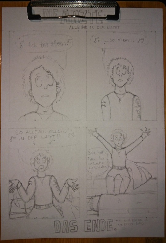
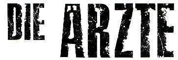
Madness draws: Behind the Scenes of the “Alleine in der Nacht” die ärzte fan comic.
A few weeks ago I posted this comic:

This post is yet again just another drawing behind-the-scenes post but You can go and reblog the original post here.
And as always, all my ramblings are under the cut!
This one was relatively easy to do because I just woke up one morning and internally died from laughter because this idea just happened like a random pop up window in my brain. I wrote it down to my phone notes and later on also into my sketchbook:
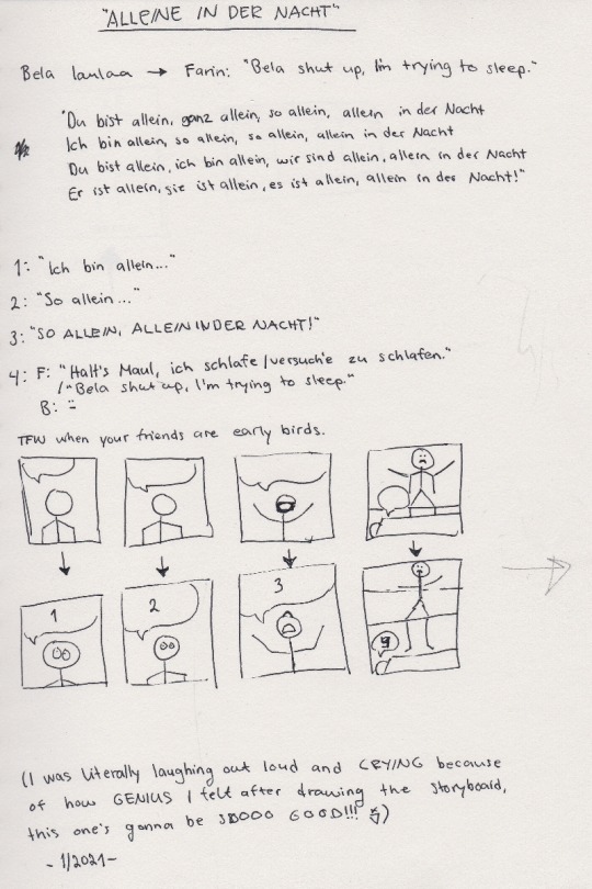
I was laughing out loud when I was drawing those images, Bela’s face still is cracking me up :D And because I’m yet again trilingual with my comics, there’s only one word in my mother tongue and it’s: Bela laulaa = Bela sings.
And other fans might recognize the lyrics of the song, I needed to write them down in order to decide which ones would fit the comic the best.
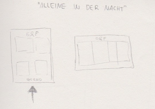
This one is then again me trying to see how it will fit on a A4 paper. Originally I saw it in my head more like a short, regular comic strip with 3 panels but somehow I couldn’t get it to fit into 3 panels. And 4 panels was too many in a row so I decided to go for a full page then. That caused bits of trouble to me because I normally don’t draw the comic book faces THAT big and it’s surprisingly hard to draw them in bigger scale. (With pencil drawings it’s the opposite, the bigger the better. It’s much easier to draw an eye the size of a finger instead of a size of a tip of a needle.)
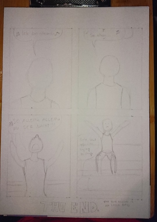
Here’s the first sketch! Just the shapes to see how and what I need to draw. Sorry for the awful photo quality again, my phone’s camera has really gotten really bad after these 3 years of use...
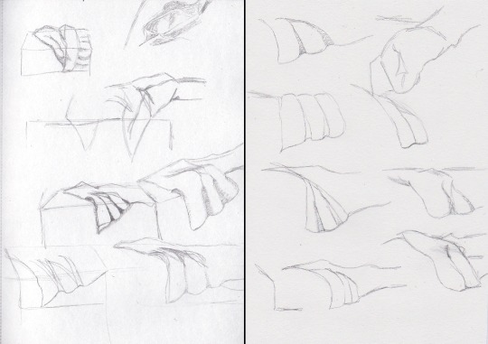
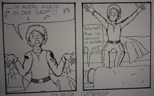
Anyhow, the third panel caused me some troubles because I knew how I wanted Bela’s arms and hands to be but I didn’t see them that good in my head so what I did next was to try different postures into my sketchbook:

I also tried this foreshortening technique I saw in a video of after a Tumblr post, even tho I don’t find that too hard to do myself anymore but it was still interesting and can really help making the eye and brain to see the image in 3D. So here I finally figured that I wanted Bela to have is arms like he was singing something very theatrically. I think it turned out pretty good.
Next I struggled with the bedsheets and I figured that I am a bit too good at blocking out information when I draw because I tried to draw unmade beds from reference photos and I’m able to follow a line but also able to completely not see any other lines around the line I’m following. Like I’d often follow a line to somewhere and suddenly notice that wtf there’s SO MUCH MORE lines all over the place in the photo but I just did not see them.
^Here’s two pages in my other sketchbook that I got for the comic stuff especially because the paper is actually white. The bigger sketchbook has light yellow tint to the paper so it can mess up with the colors when I need to try out and look for perfect colors from the colored pencils. (This sketchbook is also smaller aka A5 because Derwent sketchbooks are expensive but this was the only A5 one with a bit grainy paper in white. The A4 one is cheaper and from Mont Marte.)
After a while I was done with the besheet and the rest of the second sketch. I don’t have a photo of the comic with just the lineart, only a photo where the first panel is already colored and now I actually need to talk about the coloring.
That caused me lots of trouble because I really love playing with lights and shadows in everything (drawing, photographing... everything) and I do know how to do the night effect in black and white, but I have only once before done that with colors and it’s never that easy. Plus that one was my first comic when I started drawing again in 2018 and it was not that good to begin with.
I run some tests with the pencils, as well as some shading tests:

Käsi = hand, iho = skin. I use Derwent Flesh Pink (I have a 72 set of Derwent Watercolour pencils) for the skin color and was then trying out other colors to see which one would look the best for shading. It was actually really difficult to do and my sister suggested that I’d use only cold colors but like... how do you use cold colors on a skin without making the character look dead? :D
I imagined that there’s a moon shining in from a window that would be behind the “camera”. I almost ruined the first panel because I wasn’t exactly sure what was I even doing and what did I want from the colors:
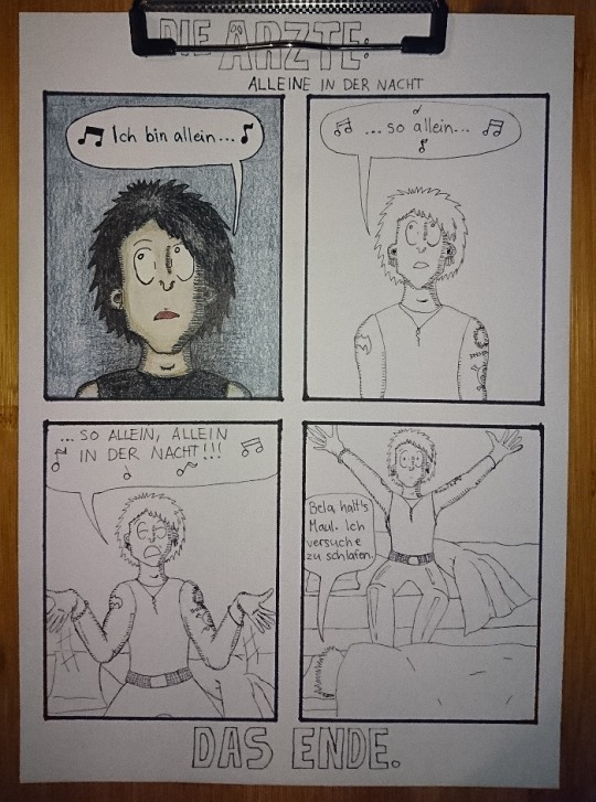
Here’s the lineart and almost finished first panel in colors. I really liked the lineart and this would have looked so nice in black and white too, maybe even better. But I just saw that blue background so strongly in my mind that I just had to go for it.
The first panel was really difficult to do like I said and I almost ruined it at some point. But it also taught me something because with the rest of the panels I knew to start with the skincolors and end with the black (I started the first panel with black, I think... kids, never do that, always start with the light colors! :D) and I think the last panel is the best what comes to the colors in the final comic. I also added light blue here and there to make it look more like the colors of a moon at night:
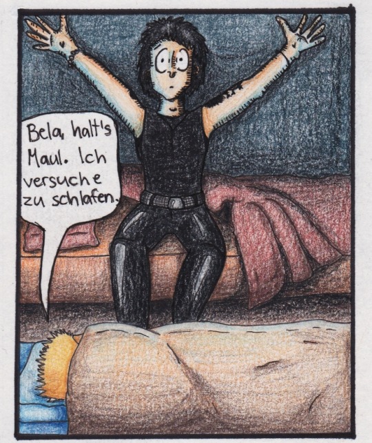
I’m actually very happy with all of the other colors in this panel! It also reminds me of a book I had and used to read as a child. It was about this girl that went to an appendix surgery and all the images were drawn with either colored pencils, pastels or crayons and it looked grainy the exact same way as this one too. It also had lots of red and orange and brown colors in it. (I wonder if I still have the book here...)
Then there’s also the title and “Das Ende”. Originally I was going to do the late 80s logo they have e.g. on the 80s live vhs/dvd but then I just saw another post in my dä blog’s queue and I just needed to do this logo instead!
I had just a couple of weeks prior ordered a pack of white Sakura Gelly Roll pens and needed to test what would make the best compination and with which black!
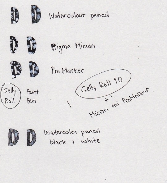
I also had bought a white paint pen but it’s useless. As you see, it just looks grey after it dries and it just... doesn’t look nice. Plus it takes so much time to dry AND it’s extremely messy and I have paint more in my hands and a puddle on the paper but barely none where it should be. So my choice for the logo was to use either Pigma Microns or Promarkers (I think I chose the latter) and the thickest Gelly Roll aka 10. This was the result:
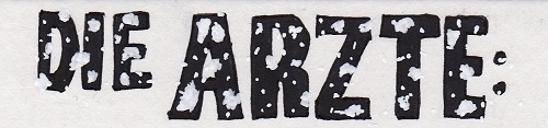
And I’m actually super happy about how it came out! Couldn’t do that good looking spots on the letters because can’t make splashes with a gel pen so I did a few bigger ones here and there and then just poked everywhere with the pen to make it look more random. You can actually see how it’s slightly whiter than the paper if you look closely, but it’s not too strongly whiter so it looks pretty nice like this.
So, this was less work than the “Widumihei” one but it was also an interesting piece to draw. And I think I have now this comic drawing more freshly in mind so that drawing the next ones (there’s three waiting for sketching already) will be much easier as well :)
#here take the last behind the scenes post then#I mean next ones are going to be actual new drawings because now I'm done with these I had in mind#mcrmadness draws#mcrmadness draws: behind the scenes#my comics#dä fanart#die ärzte
7 notes
·
View notes
Note
Hella jealous of how you color your art. It always looks so nice!
I’m very flattered but a little confused :-)
But uh hey I know this isn’t part of your ask, but if it would be useful, here’s a look at how I do colors!
I start with my sketch. Once I have a sketch close to lineart, I make a layer just for messing around with color. I take a ref of whatever character I’m drawing, and sample and drop colors directly from it. I map the colors on the sketch, but just basic shape.
Then I decide how I want the colors to change. I sample each color I want to mess with, adjust it in the pen color, and then color in that part of the sketch again to compare it. Here’s how the color wheel looks on Procreate:

You can see I started to adjust the hair color in this pic. I wanted Undyne’s hair to look a little more natural, and I thought the best way to do that would be to make it darker and less saturated. To make it darker, I moved down on the palette, to make it less saturated I moved left. I just did little adjustments until I found a color I liked.
I did this with every “item” in the drawing until I got these colors:
She started with four colors and ended with nine! I dulled and darkened her skin, lightened up the eyepatch and shirt, made the teeth a normal color, and made the eyebrows more of a dark red/brown!
I have two considerations when deciding colors: How can I make each piece look unique? How can I limit the colors?
I made her eyeshadow, fins, and hair all different colors of red, since skin, makeup, and hair will have a different appearance. But I didn’t alter these too much so that they contrast with each other. The eyepatch and shirt were the same color, but to make the eyepatch look better on the face, I lightened it. I try to make it clear that each “piece” is something different, but the colors stay similar enough to each other that it doesn’t look like lots of things going on.
Then I make my lineart and make new layers for color. I make each color its own layer in case I decide to change it.
After I’ve got everything colored, I do background. Background colors depend on what kind of background I want. If I’m doing a scene, I start with the basic colors, then I adjust those colors and the ones on the character until they look like they fit together. I try to make the character stand out from the background, but not so much the background is jarring.
For simple backgrounds I do a solid color or gradient.
I git this one by starting with Undyne’s skin color, moving it towards the purple segment on the wheel, making it darker and less saturated. I changed this several times before I settled on a color.
Then I adjust all the colors again if I think I need to.
I lightened the eyepatch and darkened the eye and hair here.
A note on shading: I take the base color and make it lighter+less saturated for highlights, or darker+more saturated for shadows. I do highlights and shadows on separate layers too, so I can adjust them individually. I wait until I’ve got the base shape of them filled out and the colors decided on before I merge the shading and base together and blend.
In some of my drawings, I don’t want obvious lineart. In this case, I do one of two things. 1. I have no lines. 2. I do think lineart where the line is a different color depending on what color/”item” it is outlining. I choose these line colors by taking the base colors and making them darker.
Here are the colors I would use for that type of lineart for this drawing, against the base colors.
It’s a quick look but I hope that’s helpful, or at least interesting to somebody!
Jealousy is not the way bro, I’m sure your own color choices are good. Some people like pastels, or neons, or grayscale, they like dark or vibrant, and it’s all good! It’s just about what you like and what style you’re going for!
3 notes
·
View notes
Text
my relationship with digital art and how BNHA salvaged it
I just wanted to let out my thoughts but I can only do it here :>
This might be a downer for some people but I’d like to share it with people here. BNHA means the world to me and this is why.
I first started drawing when I was 7 years old in 2006
I think it’s ugly now, but 7 year old me remembered being so proud of this because this is a drawing of my stepfather. This is the only drawing I have that was from my childhood. I think the aim here is to draw in anime style BUT I didn’t even watch anime back then. I had a classmate who loves anime and she taught me to draw in school. Drawing became a favorite hobby immediately after that.
Then it was 2013 and I was 14 years old. Drawing is still my favorite thing to do besides being on the computer. I love anime at this point too. My parents bought an iPad for the whole family, but I was almost always the one using it. I discovered an app called ArtStudio and thought “Wow, I can draw without making a mess and with only my fingers” because I was always too lazy to take out my drawing materials and clean up afterwards.
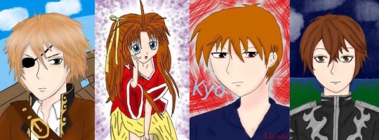
These were my first digital drawings. The pirate one was the very first. I got obsessed real fast. I can color so easily, undo any mistake, layers are a blessing too. There was just so much more freedom. I always sucked at coloring in traditional art and I didn’t like the mess (idk my hands get so messy traditionally)
The next year, it was 2014, I was 15. My birthday is in a couple of months and I knew my parents were planning to buy me something pricey (I think it was a laptop) so I approached them and asked if they could just buy the Wacom Bamboo as a present which was cheaper anyway and I even explained how it works to them and how it would allow me to draw on the computer instead of the iPad. I tried really hard to be convincing. I would have prepared a powerpoint presentation if I had to.
They did give me the wacom as a present. They even gave it to me months before my birthday so I could use it already. I thought I was the luckiest teen in the world with my parents.
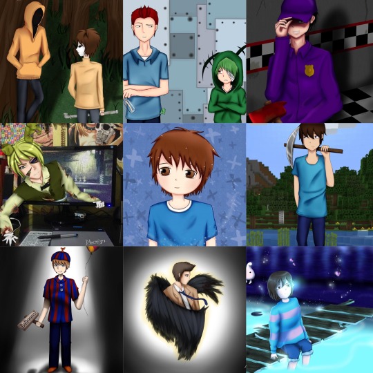
These are a collection of my favorite works from 2014 to 2016. The middle one was my second drawing using wacom and Paint Tool SAI. I was a part of a lot of fandoms in those years lol
It gets downhill from there :/
April 2016, my mom and I moved to Japan, while my stepfather and siblings stay in my country. It was tough. For someone who is obsessed with anime, you’d think I’d be thrilled to live in Japan.
I was. Though only at the first few months. It’s not the same as it’s portrayed in anime (I should’ve known but I used to be blinded by anime). It was just lonely. The language barrier sucked and then lots of financial and family issues until my parents split. I got my first boyfriend too and I thought I was blessed by the nicest boy, but the relationship became extremely toxic but I didn’t have it in me to walk away.
All the shit that happened affected me mentally and emotionally. My biggest outlet which was digital drawing, was also out of the question because I did not have a computer/laptop when we moved to Japan. We left it in our home for my stepfather and siblings, even the iPad. I have my wacom with me, but no computer/laptop to use it with. I couldn’t draw.
I tried though. I used my phone to draw, but it wasn’t the same. Then the life problems got piled up, things got worse, and I just lost motivation in anything. Literally anything. From 2016 to 2019, I stopped watching anime, I dropped out of all the fandoms I’m in, I stopped watching my favorite TV series or movies, and I stopped drawing. I even got a bit disconnected with my friends who lived in my country (we talk regularly online). My family was broken so I gave all my attention to my toxic relationship as well which made everything worse too lol
I didn’t draw besides from a few scribbles and the drawings above. I did try digital art on my phone a couple of times again and even posted them on my IG, but they weren’t any good. Eventually, I got mentally and emotionally drained and dropped out of senior high school. I just stayed home for almost a year, leeching off of my mom. I felt even more worthless and my life had no direction at this point. Nothing mattered anymore.
April 2019 or so I think, my (ex)bf bought me a laptop. He says it’s a gift, but I think the real reason was to make up for something horrible that he did (which is stupid because money /gifts won’t resolve anything). I have a laptop. I can draw again, but I didn’t. I didn’t care, I wasn’t interested in drawing anymore anyway.
Welp. June 2019, I went back to my country. My (ex) bf stayed in Japan. The distance helped me end the relationship and my friends were there (they always were) to help put me back together along with two trips to therapy. I went back to finish my senior high school in my own country this time. That said, I have to stay in my country for school (but I was happy because I didn’t wanna go back to Japan yet when the breakup was still fresh and with going back to school, my life has a direction again.)
It was weird. I remember just being sorta lost and confused because I used to put my time, effort and everything into my previous toxic relationship, which was now gone. I was free and I had so much free time that I didn’t know what to do with it. I got so used to doing nothing and being nothing.
This is where BNHA enters.
Dunno when it started, but I started seeing Bakugou frequently online. It’s usually just Bakugou. I knew who he was because my friend suggested BNHA to me back in late 2018 I think but I didn’t watch it since I’ve lost interest in everything at that point in my life.
But ye I thought he hot af but I still didn’t watch BNHA.
But then for some reason he REALLY kept appearing in my social medias and it was really frequent. The last straw was when I saw a pic of him in UA’s gym uniform and thought “damn boi aight imma watch bnha for u” (y’all gotta admit he looks good in those colors with his combat boots XD )
I watched BNHA. Fell in love with Iida along the way. Then I switched to Tokoyami (but Shoji was hot too so aaaaa), but then angry emotionally-constipated sea urchin head caught my heart again. But oof. BakuDeku moments really made me feel some type of way I haven’t felt since I moved to Japan. It felt new but nostalgic. I fell hard in that ship.
I started obsessing. From memes to posts to fanfictions to buying merch to filling my room with BNHA posters. I realized I was reverting to my old self from the time I was still happy and it was thanks to BNHA (and the good people who helped me through the worst too)
Shit I wanted to draw BNHA, I thought.
I mean, I have a laptop, I still have my wacom and drawing softwares. I could totally draw digitally again if I wanted to.
But guess what
I can’t :c
My hand physically cannot draw. My drawings don’t look the way I want them too. 3 years of not drawing really destroyed any skill I had. I was back to square one.
September (yeah they’re ugly, I laughed at it). If you’re wondering why I drew on paper, it’s because, for some reason, I really CANNOT draw digitally. I mean it. I can barely sketch digitally at this point. The lines and shapes just doesn’t come to life. They’re just scribbles. But somehow, I can kinda draw on paper with a ballpoint pen. But yeah, that was the best I could do at this point in my life
After that, I still tried to draw, to regain my old art style, but it didn’t happen... It just doesn’t look or feel the same. Drawing used to be fun. But during this phase, it felt like my ugly drawings were just mocking me (probably was just too emo that time lol)
Weirdly, around a week or two I think, after my half-assed attempts at drawing, I managed to draw digitally somehow o.o
I did a Midoriya and Todoroki drawing like this too. It was my first post here on Tumblr I think. The annoying part here is that I cannot draw digitally unless I draw on paper first, take a pic, and then trace the lineart. I couldn’t draw directly on the computer. Granted, drawing on paper and drawing on digital is very different for me in the first place anyway. But it was still a pain. And it still looked like shit. I can only draw stiff poses :/ it seems like my brain decided to delete all data about anatomy and posture and backgrounds. My lineart here is even messy af. It still really not the same as my old style.
By 2020, I think I got my old art style back. On March, I made this. This took me 27 total of hrs to make.
Right now, I think it’s not bad, but back in March, I was disappointed with the result. This is when I finally broke down crying because it didn’t look good enough and I hated that it took me 27 hrs to draw “bullshit.” I was angry at myself for losing interest in drawing for 3 years when I could’ve used that time to improve. I had to start all over again and it still didn’t look good. (Current me thinks that the drawing above is alright. I was just a lot harsher to myself back then. Used to have a lot of issues but I’m doing great now)
I cried myself to sleep that night. Woke up wanting to cry again. I wallowed in sadness for a couple of days. Eventually told my friends what’s up. Got some pep talk. Even talked to my sister (she’s great, she always hypes me up with my stuff and sometimes I think she’s my biggest fan with how she appreciates my drawings and I’m really grateful for that).
My world turned a 180 and I was weirdly positive after all that crying because brain chemicals and shit. I had a revelation. If I hate how my art style looked so much, then I should have been putting effort in changing my art style, not trying to regain my old art style (that I don’t like anymore)
I researched a lot. I analyzed different art styles and anatomy again. I did everything I could think of to find a style that works for me. I might have even neglected school for a bit to focus on digital art lmao
After all that work, I posted a fanart of middle school BakuDeku in their classroom. I love that fanart so much even if I probably have better ones by now because that was the first fanart I made that I felt like I could be proud of and it was the first one I made in my new art style. It was a milestone for me.
March 2020, I moved back to Japan and without the toxic relationship, I’m a lot positive now. Happy. I’m myself again after the previous bad years. I’m still continuously learning though, trying to improve, but at least, now, I found my own art style :) I really suck at interacting with people online, but I’m always grateful for the support everyone has been giving my fanarts. I’m happy when my content makes people happy.
This is why BNHA is important to me. The series is great alone, but it’s not just that to me. BNHA is so much more. It’s what made me find the passion to create again, only this time, it’s focused on drawing (I used to write, but now I just draw, but maybe I’ll write again for BNHA).
My family is supportive with my love for BNHA, but I think they don’t know the deeper reason why I love it. Sure, I was fine living on with nothing much going on in my life. I’ll finish school, get a job, work until I die or something. It was okay. It was the way of life. But BNHA gave my life color again. I wasn’t just blindly going through life anymore. I have something to look forward to everyday now. BNHA even became a bridge to other things. Ever since then, I’m a lot more open to people, to try new things, to explore and not just live through life and waste away. I got better at leaving my comfort zone. I’ve never been happier in my life :D
Thank you for supporting my fanarts. Thank you so much for giving me a chance to express myself through BNHA. I hope to make more content in the future and improve even more :)
30 notes
·
View notes
Photo
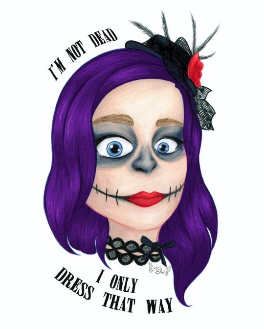
I’m Not Dead
I'm not laughin', You're not jokin'
I'm not dead I only dress that way
Out nowhere take me out there
Far away and save me from my
Self-destruction, hopeless for you
Sing a song for California
--My Chemical Romance, "Boy Division"
____
Have you heard?? Have you heard the news?? Well if not, I'm gonna tell ya: MY CHEMICAL ROMANCE IS BACK, BABY!!! :D
On Halloween, we got the announcement that they will be playing a show in Los Angeles, California on December 20th. And just a few days ago we got the news that they're also going to New Zealand, Australia, and Japan which basically confirms to me they're doing so sort of tour, whether they actually call it that or not.
There's still a lot we don't know for sure; whether this is just a one-time reunion tour or their official comeback tour, if we'll be getting new original music both at the shows and available for download/purchase or if they're just going to redo their existing music and covers, if it's only going to be the main four that were there at the end or if there will be some of the other members that were in and out over the years rejoining them...Where all they're going to go on this tour...the list goes on. But! The important thing, at least to me, is that they came back at all.
Six years. Six years we've waited and hoped and prayed, been let down by false rumors and speculation...And now it's actually happening. I just...
Hence why I had to make an art piece celebrating the occasion and as an excuse to talk about it. (I figure if I'm going to dump my opinions on the internet I might as well make some art to go with them. Sue me. )
Originally, I was planning on making something more along the lines of true fan art, as this is more pseudo fan art here, but I just couldn't settle on one good idea that I felt really comfortable pursuing. Although I am still considering doing an updated (or at least colored in) version of my Killjoys, Make Some Noise! (lineart) I did a couple of years ago...we'll see.
Anyway. Since we did get the news on Halloween, it's worth noting that originally I'd been debating if I wanted to do any makeup this year at all or just slide on a mask since my only plans were going to Krispy Kreme, who was offering a free donut if you showed up in costume. But after the news broke, my decision was made for me. I had to. MCR isn't strictly associated with skeletons/skulls, as has become my preferred Halloween costume, but The Black Parade, their second album, does have a little skeleton as the leader of the marching band, and the band members did wear skeleton/skull inspired makeup during that time.
Admittedly this year's makeup wasn't nearly as involved or elaborate as what I've done in years' past, but it beats last year's absolutely nothing.
I ended up taking a few pictures to preserve the look, as I always do even though I rarely take photos of myself, and I would decide to draw one of them where I was trying to do this face that Gerard (the frontman and lead singer of the band) has made on a several occasions; this wide-eyed intense stare. Partly because this, I'm sure, is very close to my actual face when I heard the news that they're back, the makeup was inspired by them anyway, and also because it pairs very well with one of my favorite lines from my favorite song by them.
Said line being, obviously, "I'm not dead I only dress that way," from Boy Division, as cited at the top of the description.
If I'm being completely truthful, I can't even really put my finger on what it is about Boy Division specifically that makes it my favorite, as I've yet to hear an MCR song I truly do not like, but I think there's something in the lyrics of the full song that just sells it for me in combination with the high-energy music. But whatever the case, it is my favorite nonetheless. Beyond that though, it's really hard to place the rest of them in any coherent order because, at least to my ears, they're all really great.
Anyway. So I went about drawing my face, erring slightly more on the realistic side than usually (but obviously not too much) in hopes of capturing the facial expression. Which, it's pretty good, but I do think it could've been a little better. I think my biggest problem was getting the eyebrows a mouth right, and I'm still not sure they're quite there since my real eyebrows are pretty translucent and the mouth was hard to balance between looking logical and more neutral than sad/angry. And I think maybe the proper expression was a little more apparent in the sketch, but it's pretty normal to lose some feeling between the sketch and the final product so that I won't discount too much.
After that, I had to take a break from the drawing to think about how to color it in any style it and everything. I ended up transferring the sketch to Mixed Media paper after deciding I wanted to use alcohol markers as a base but not knowing if I'd need to adjust it with colored pencil and/or other mediums on top or not, and I did the lines with my Faber Castell Polychromos once I felt like just black lines would be too harsh and thinking colored lines would be better. Plus, the Polychromos are very non-reactive to water, so if I really wanted to I could add watercolor or something water-activated without having to worry about the lines getting messed up.
I did not consider how the Polychromos would react to the alcohol markers, but other than one or two spots where the top layer of pencil kinda dissolved after some heavy layering (which was easily fixed by just going back over the lines in that area again really quickly), fortunately, it worked out okay. Although sweet sparkles I swear it took at least twice as long to actually do the lines as opposed to normal between having to apply enough pressure to get the right amount of color down and working on the differences inline weight.
Anyway. I was a little worried about some of the shading/effects I'd be doing with the markers, but I think I did alright with it. This mixed media paper (Strathmore 400 series for anyone who cares) is nice and thick, so I had plenty of room to layer up and blend as I needed to get the look I was going for. This came in especially handy around the eyes and on the nose when I told myself to at least try and get the colors like the photo before cheesing it and just using straight (or nearly) black. The only area that I think came out a little rough is really the skin, mainly the forehead. But that has more to do with 1. There isn't much contrast on the face in the photo so I didn't want to take it too far in the drawing and 2. I think I may have started slightly too dark for skin this pale. I realize that's a weird thing to say, but when you're pale as a ghost like I am, you'd be surprised how easy that is to do. And to be fair, I probably could've tried to adjust that with colored pencils, and my original plan was to add some white pencil on top in the areas of the face where a highlight would naturally hit (forehead, bridge of the nose, cheekbones, etc.) But by the time I got done with the markers, I honestly felt like it was nice enough without any additional pencil that I thought it might be best to just leave it alone.
Since I still have the original drawing, my thoughts may change on that and I could update this eventually, but for now, my decision stands.
On the other hand, I was actually pretty pleased with how the hair turned out once it was colored.
That is until I scanned it in.
I don't know why, but the darkest shadows in the hair were too dark and too bluish on the scan, despite everything else looking fairly color-accurate. I fiddled with the scanner settings for a few minutes to try and fix it, but it became quickly apparent there wasn't much to be done about it at the level. Which meant I had to try making the adjustments in Photoshop.
Now, I've done my fair share of scan-fixing, photo editing, and just color adjustments on digital art, but for the life of me I could not get things to work the way I wanted them to here. It became to the point I'm starting to suspect if the actual true-to-life shades of purple of the drawing are just really hard or even impossible for computers to capture and/or create accurately. Fluorescent colors fall in that category, surely they're not the only ones.
In the end, after more time than I bothered to document messing around with settings and adjustments, and firmly decided I was not going to essentially manually re-color/shade the hair digitally, I tried the only other thing I could think to do.
I took the hair, as I had been for all my adjustments since the rest of the colors were fine, on a separate layer and took all the saturation out so I was left with just the gray values. And I noted while I was at that point that it didn't seem to be an issue of the contrast between the shadows and the rest of the hair. The transition looked perfectly acceptable in grayscale. Then, I added a color layer on top of that one, clipped it to only show up on the hair, and changed it to an "overlay" layer so that I would get the values from the gray layer, but colored purple.
It did take a couple of tries to get the right shade of purple for the color layer, and I'm sure it's still not 100% accurate to the IRL drawing, but it's a heck of a lot closer than it was.
And this gets even weirder when you consider that just a few days before I made this drawing, I made a different one for a friend where I used the exact same marker colors for the hair, blended in almost exactly the same manner, on the same paper, and it didn't have this problem when I scanned that one in. I have never in my life.
Anyway. The accessories actually didn't give me much trouble in drawing or coloring. Admittedly, I did tone down how many feathers and stuff are actually on the tiny hat for my own sanity's sake, and while I did my best with the lace on the choker, I don't have a ton of practice with drawing lace like this so I'm sure it could be improved.
Although I did decide to color both of those areas (what I didn't draw/fill in with the pencils at the line stage) with a super dark blue-violet instead of a gray or straight black for the purpose of not totally hiding the linework I'd put in and to make it just slightly more dynamic. Which I think was a good call as it seems to tie in pretty nicely with the grayish tones on the face.
Other than that though, I did try to stay fairly accurate with my color choices, and I think I did pretty well with that, all things considered. (Despite having a much larger selection than I did just a few months ago, I do still need a wider selection of alcohol markers in some areas just for the sake of color accuracy and smooth transitions.)
Once my face was done, then came the text.
I searched for a while, hoping to find an MCR appropriate font that I could hopefully add by hand, but my search came up empty. I did find one I really liked the look of though, called "Miserable."
So I scanned the drawing in and after the aforementioned hair struggles, I got to play with the placement and structure of the words. I knew I kinda wanted something that just has that "I'm a logo/t-shirt emblem" kind of feel, and in the end, I think I got that. But I do think I could've planned out the drawing itself a little bit better in terms of the space left to fit the words into. I really didn't do myself a lot of favors on that one.
It has its problems, but I'm still really actually kind of proud of how this turned out...and that's really all I have to say about it.
Eh, maybe I'm just really happy because I know why I made it in the first place.
Now if MCR can just come within 1-2 hours of my location so I can actually go see them...please...
____
Artwork © me, MysticSparkleWings
____
Where to find me & my artwork:
My Website | Commission Info + Prices | Ko-Fi | dA Print Shop | RedBubble | Twitter | Tumblr | Instagram
#my chemical romance#mcr#boy division#dead#conventional weapons#return#the black parade#skullmakeup#art#fan art#self portrait#i’m not okay#killjoys make some noise
2 notes
·
View notes
Note
Hi ! Your art is AMAZING, even your draft are beautiful, it’s insane ! I’ve started digital art a few months ago but I don’t progress at all... Would you have some advises you could give me please ? Thanks for sharing your art with us
First of all, thank you so fluffing much for kind words, you beautiful kind creature!! And second, well.. I wanted to ask did you get the right person, just in case x)
Pff.. now for the tricks.. there is a lot I can share, so if you come off anon, you can dm me and I would be able to help you a lot more than just this, but if you don’t feel comfortable, then sure.. I’ll try to sum up as much as I can :)
So, the tips for you and everyone wants to read are under the cut.
1. You said digital art, that means that you are workingin a program. The best way to get better is to learn how to use it and what canyou do with it. Program is a tool, you can be creative with it, so my best tipis to search on YouTube some tips that you maybe didn’t know about and how canyou use shot keys. I personally use Paint Tool Sai (for almost 10 years) andI’ve learn how to make up for the stuff it’s missing so I wouldn’t have to useadobe CS or other expensive hard drive clogging programs.
2. Composition. When you dodigital art you can mess and fix this part. Choose a canvas shape and size, Iusually use the classic A5 sheet size and decide what I want where. You wouldwant to put a cross on the sheet and move it around to see where you wantpeople to look, for ex the face of the character. Make it a bit off center. Ifyou finish the whole illustration and some random thing draws the attentionmore than the characters face, use circular fade (light center, dark edges) andset it overlayer and lower the opacity, it should help. Also, try flipping thecanvas often cause you may see the mistake before it’s to late, maybe evenfinish the lineart one day and look it tomorrow with fresh eyes before coloringit.
3. Sketch. I’ll put mydrawing skill in this category. Something that artist generally don’t talkabout much as if it’s some taboo, is referencing stuff. Sure, tracing is badbut finding a stock image isn’t! my illustration folder looks like this

I can’t draw it all, I would google everything! I google the torso so I would see how to draw those abs, I google the men squatting so I could draw the thigh and knee, and I googled the horses so I wouldn’t have to load my brain and maybe get something wrong. Referencing is ok, that’s how we see how things are supposed to look like and lean. I can draw curly hair and most of the anatomy by now cause I’ve been doing it for years. It takes time but eventually you wouldn’t require the reference. I use to be traditional artist before I was digital, and I draw for over 15 years, Istill think I should be better considering my age.
4. Coloring. Right now, I just color in 3 layers (base color, multiply layer shadeand overlayer highlight) but I use to be much thorough and had gazillion layersfor everything, to the point my PSD files would be as large as over 1GB. This is one of my old tutorials if you want to look.
5. Time.This is the most important one. Practice needs time, but more importantly, you need to reduce the time in what you start and finish one illustration. It use to take me a week or even two to do one illustration, and now I don’t allow it to take me over 2 days, one for the lineart and other for the coloring, no more than 4h total. Less time you spent, more will you draw, that means that you will have less vips and more finished illustrations that you can judge and see what you did wrong and how to get better, what you need to fix. My best advice is to look at your work after you are done, look hard and find one thing you are proud off and one thing you can fix, and next time you draw, try to fix that one thing and so on. That way it will be furling and educational and not‘wasted time’
I rly hope this helps, it’s all I could think at the moment, but feel free to ask me for whatever you need, ok? :)
3 notes
·
View notes
Last Seen Blogs

unadulterated6440reviewkitten
Sans titre

twixitativi
chuuya is a top
killthemallsblog
charizard
thelastconfessor
te voy a escribir la canción más bonita del mundo ✌