#Princeton Architectural Press
Photo


A Staff Pick Decorative Sunday
I recently came across a video a farmer took of one of their pigs gently tearing out a bunch of flowers. The video then cut to the interior of a barn, where the pig lay sleeping in its nest, bunches of dried yellow wild flowers surrounding her. None of the farmers other pigs did this. Human animals are driven to adorn their spaces. But some humans are driven to elevate that endeavor from decoration to high art.
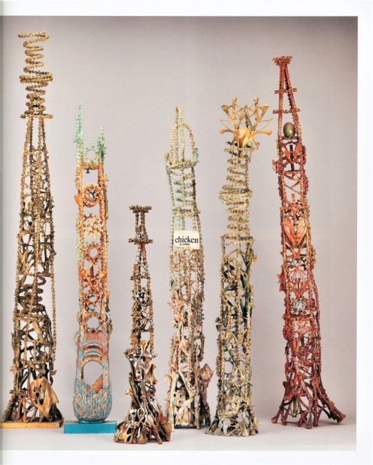
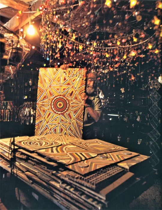
There are many potential challenges when it comes to collecting, preserving, and exhibiting artist-built environments, that is, environments that “involve an individual significantly transforming their surroundings into an exceptional, multifaceted work of art.” For over fifty years, the John Michael Kohler Arts Center in Sheboygan, WI has been dedicated to preserving these unique spaces. The ultimate goal is to preserve these works in their original contexts/sites, but issues ranging from changes in property ownership to exposure to the elements sometimes requires alternative preservation strategies.
Sublime Spaces & Visionary Worlds: Built Environments of Vernacular Artists, published in 2007 by the Princeton Architectural Press (New York, New York) with the Kohler Arts Center (Sheboygan, WI) seeks to “provide a lasting record of the art these men and women have created and situate the environments within historical and cultural continuums.” The publication was in conjunction with an exhibition presented June 2007-January 2008. Curator Leslie Umberger authored the book, with contributions by Erika Doss, Ruth DeYoung Kohler, Lisa Stone, and Jane Bianco. While viewing images of these spectacular constructed worlds can’t replicate the experience of being immersed within them, this kind of documentation can help carry the spirit of these artists forward in time, even if their work ends up being ephemeral.
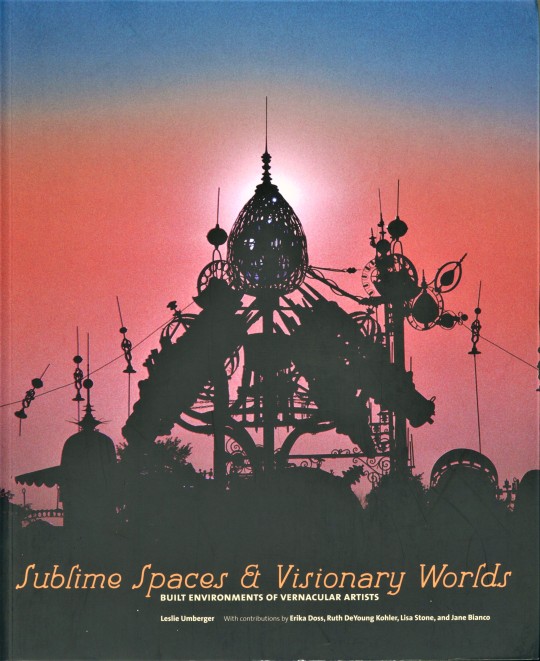
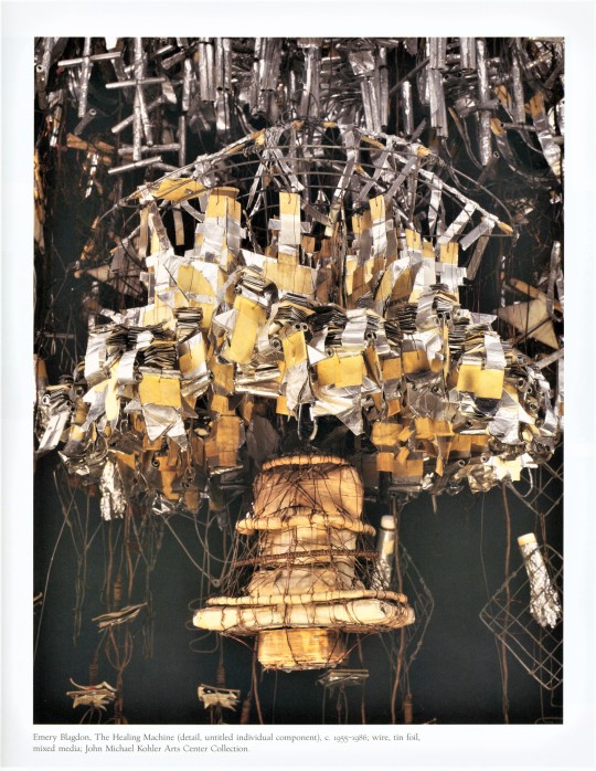
The cover image features The Forevertron, by Dr. Evermore (Tom Every, 1938-2020) located at the Evermore Sculpture Park in North Freedom, Wisconsin. It is the largest scrap metal structure in the world and weighs 300 tons. See image descriptions to learn more about the artworks.
Find more of our Staff Picks here.
Find more Decorative Sunday posts here.
-Olivia, Special Collections Graduate Intern
#Staff Pick of the Week#Decorative Sunday#Sublime Spaces & Visionary Worlds#Built Environments of Vernacular Artists#Artist Environments#Vernacular Art#Outsider Art#decorative arts#John Michael Kohler Art Center#Kohler Art Center#Princeton Architectural Press#Leslie Umberger#Sam Rodia#watts towers#Nek Chand#Rock Garden of Chandigarh#Eugene Von Bruenchenhein#Stella Waitzkin#Mary Nohl#Mary Nohl Lake Cottage Environment#Loy Bowlin#Beautiful Holy Jewel Home#Emery Blagdon#The Healing Machine#David Butler#James Tellen Woodland Sculpture Garden#James Tellen#The Forevertron#Dr. Evermore#olivia
79 notes
·
View notes
Text


Book 475
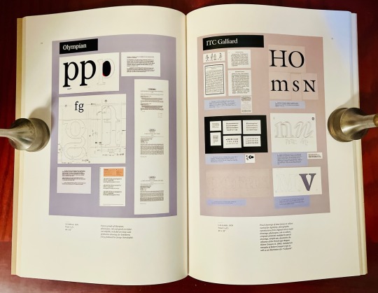
Typographically Speaking: The Art of Matthew Carter
Margaret Re
Princeton Architectural Press 2002
Matthew Carter (b. 1937) is a legendary typographer whose name should be better known. The New Yorker once described Carter as “the most widely read man in the world,” owing to the ubiquitousness of some of his best-known fonts and type designs. Basically, everyone knows Carter’s work even if you don’t realize it. Verdana, Georgia, Tahoma, Galliard, along with scores of others—these were all created by Carter. But my favorite might be Bell Centennial, created in the 70s for use in phone books. On the occasion of their centennial, AT&T tasked Carter with creating a type that would use substantially less space than the then-current Bell Gothic without loss of legibility at the small sizes and poor printing process used for phone books. And even though I haven’t seen an actual phone book in years, I still have a clear memory of Bell Centennial and its clarity and functionality. Truth is, I think I kinda miss it. Phone books, too.
#bookshelf#library#personal collection#personal library#books#bibliophile#book lover#illustrated book#booklr#typography#typographically speaking#matthew carter#margaret re#Princeton Architectural press
11 notes
·
View notes
Text
#this country: searching for home in (very) rural america#this country#navied mahdavian#princeton architectural press#graphic novel#graphic novels#poll
4 notes
·
View notes
Text

PZ432 - Classic Paperbacks
1000 pieces; 20 x 25 inches
This puzzle features an illustration of forty classic paperback books. Each image is rendered in three dimensions to illustrate how thick the book is. Some of the authors include Mark Twain, William Faulkner, Dylan Thomas, George Orwell, Ernest Hemmingway, Emily Dickinson, and Willa Cather, among others.
Artist: Richard Baker
Company: Princeton Architectural Press
#: 9781648960000
0 notes
Text
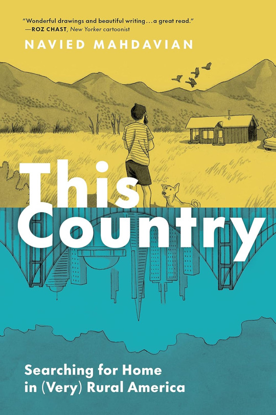
This Country is an interesting fish out of water story about searching for a home in rural America
This Country is an interesting fish out of water story about searching for a home in rural America #comics #comicbooks #graphicnovel
Before Navied Mahdavian moved with his wife and dog in November of 2016 from San Francisco to an off-the-grid cabin in rural Idaho, he had never fished, gardened, hiked, hunted, or lived in a snowy place. But there, he could own land, realize his dream of being an artist, and start a family—the Millennial dream. Over the next three years, Mahdavian leaned into the wonders of the natural Idaho…

View On WordPress
#featured#graphic novel#graphic novels#navied mahdavian#princeton architectural press#this country: searching for home in very rural america#video
1 note
·
View note
Text
1 note
·
View note
Photo


1065. Alvar Aalto /// Villa Skeppet (Göran Schildt House) /// Ekenäs/Tammisaari, Finland /// 1969-70
OfHouses presents Heroes, part X: Alvar Aalto.
(Photos: © Jari Jetsonen, Kari Hakli, Christine Schildts. Source: Alvar Aalto Museum; ‘a+u 606: Alvar Aalto Houses - Materials and Details’, 2021/03; Jari Jetsonen, Sirkkaliisa Jetsonen, ‘Alvar Aalto Houses’, New York: Princeton Architectural Press, 2011.)
#Heroes#Alvar Aalto#alvaraalto#finland#70s#OfHouses#oldforgottenhouses#www.ofhouses.com#thecollectionofhouses
1K notes
·
View notes
Text


From Button Box: 100 Postcards, published by Princeton Architectural Press
152 notes
·
View notes
Text
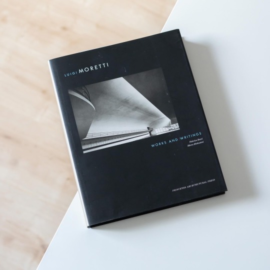

One lucky 1€ eBay find: the monograph "Luigi Moretti - Works and Writings", edited by Federico Bucci and Marco Mulazzani and published 2002 by Princeton Architectural Press. Moretti's (1907-73) career was as magnificent as it was controversial due to his deep involvement with Italy's fascist regime during the 1930s and 1940s for which he designed e.g. the regulatory plan of the Foro Mussolini in Rome, the forum's Fencing Academy and Commemoration Cell. Although he largely disappeared from the public during 1942. At the end of the war he was, if only shortly, imprisoned for his support of fascism and for trying to establish a new political party. After being released Moretti in November 1945 set up the company Cofimprese together with Adolfo Fossataro, a company that developed housing-hotel complexes like the famous ship-like one in Milan. Of particular interest is his late work of the 1960s and early 1970s which also brought him international success as he designed the infamous Watergate complex in Washington or the Tour de Bourse in Montreal.
Bucci and Mulazzani shed light on a influential yet charged figure of Italian modern architecture whose works nonetheless deserve critical evaluation. In a long essay Mulazzani analyzes Moretti's designs as well as his career and personality, a very interesting read that again brings up many questions regarding the connection of politics and architecture. Of course the book also includes a considerable amount of period photos that show Moretti as an innovative and imaginative architect. The final part of the book collects the architect's writings on various topics including Giotto, Michelangelo and Baroque architecture or the meaning of structure in architecture.
All in all it is an important publication on a colorful Italian architect whose buildings still fascinate today.
25 notes
·
View notes
Text
2023 Reading Log pt. 14
Where the hell did November go?

66. New World Monkeys: The Evolutionary Odyssey by Alfred L. Rosenberger. In the introduction, the author laments that there aren’t any good books outlining the evolution and ecology of the New World Monkeys. If that's the case, there still aren’t. This book does alright by the ecology part—it has good summaries of the anatomy, behavior and feeding interactions of the covered monkeys. But the evolution is a mess. Rosenberger’s take on the evolutionary relationships between the animals covered here is iconoclastic, to say the least. He distrusts molecular phylogeny, uses synapomorphic characters that are basically just vibes, and has an entire chapter dedicated to lambasting the idea that any mammals could disperse across the Atlantic Ocean from Africa to South America (the consensus explanation) in favor of a hypothesized trek through Greenland and North America that has no evidence and still requires open ocean crossings. This was an incredibly frustrating experience to read, because there’s enough good content among the dross that I didn’t want to just abandon it.
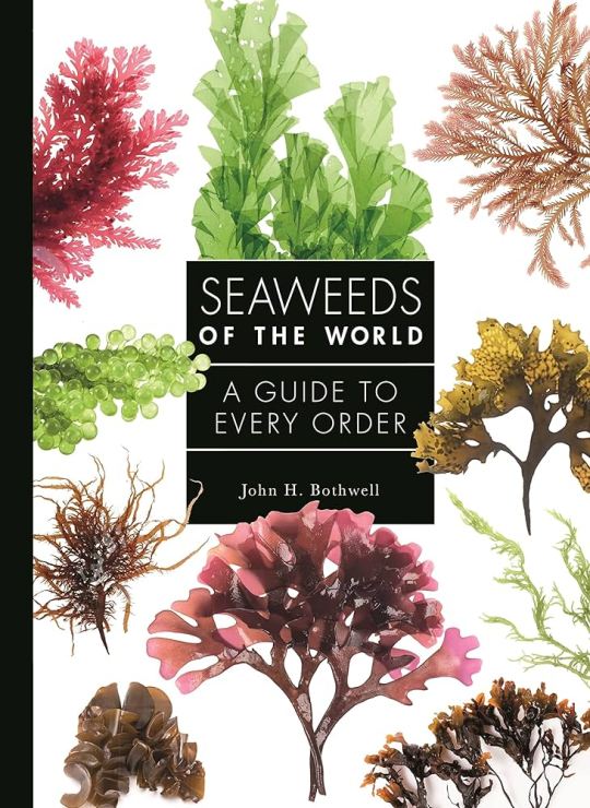
67. Seaweeds of the World by John H. Bothwell. The weakest of Princeton University Press’ “X of the World” series. For one thing, the subtitle is usually “A Guide to Every Family”, whereas here it’s “A Guide to Every Order”. The book’s general coverage of seaweeds is pretty good—it explains why “seaweed” is a polyphyletic category but still useful in common English, explains the anatomy and the complex life histories of seaweeds. But the actual coverage of groups is lacking. Again, it doesn’t cover every family. And it’s more interested in seaweeds of economic importance than it is in their actual ecologies. Plus the writing is just kinda boring. This is the first entry in this series I do not recommend.

68. Lapidarium: The Secret Lives of Stones by Hettie Judah. Now this is more like it! This book is a series of short essays about stones and their cultural impact. I’m a sucker for cultural histories in general, and this is a very good one. I especially liked that it doesn’t just cover gemstones, as I originally expected, but also stones used in art and architecture, resources like coal, and the use of earthworks in religion. The focus is much more on the culture than the geology, but the book does discuss things like deposition of sediments and how metamorphic rocks yield gemstones in explaining why certain places have certain rocks. The book is also lovely to look at, with minimalist bands of color along the sides of the pages in the hues of the stones covered in that chapter.

69. Monsters and Monarchs: Serial Killers in Classical Myth and History by Debbie Felton. I was excited for this one. I had read Felton’s chapter in Monster Anthropology, which suggested that Greek traveler’s tales about werewolves and the murderous robbers encountered by Theseus in myth were both expressions of cultural fears about serial killers. Unfortunately, that article already covered the bulk of Felton’s actual argument and evidence, and this book is those 20 pages fluffed to 200. The only other really good material is some coverage of the distinction between Greek and Roman attitudes towards law and order, and what “counted” as murder in each society. The rest of it is handwaving and extrapolation from very little data, with just about every instance of mass killing that we have records of, from political uprisings to court intrigue, being taken as the work of a possible serial killer. Plus, the author is a Freudian, so we have to hear about coded references to rape and sexual violence in stories where there really aren’t any. Sometimes a bed where you get your legs cut off is just a bed.
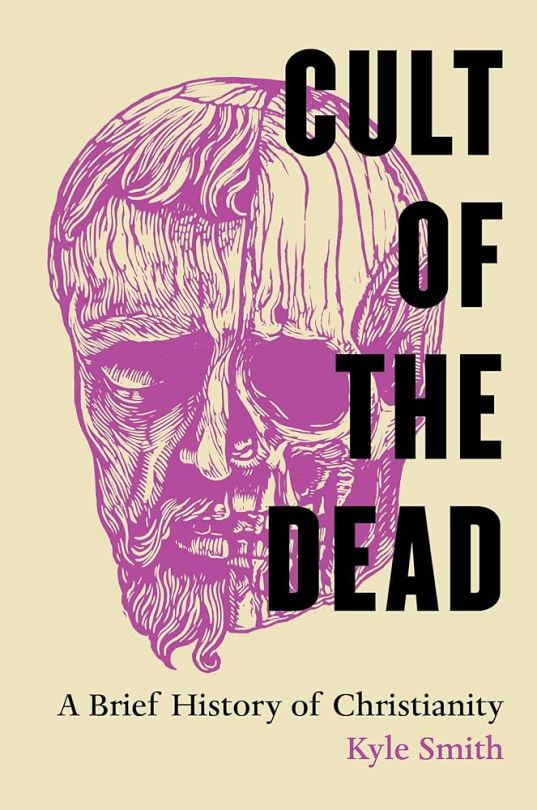
70. Cult of the Dead: A Brief History of Christianity by Kyle Smith. They say you can’t judge a book by its cover, of course, but that title and that cover made an instant sale for me. I’m glad it did, too, because this is a good one. An explanation of the importance of martyrdom to Christianity, it does an excellent job of explaining why, exactly, so many people were willing and eager to die for their faith, and how this persisted in building a persecution complex among the dominant European religion for centuries. The book avers from discussing the present day for the most part, tapering off with the work of reformist Catholics poring over the many, many legends about saints and trying to determine which, if any of them, represent actual historical events rather than religious fictions. Other topics covered include the trade in relics, the role in martyrologies in shaping the modern calendar, and how women could most easily play a role in the Church through the mortification of the flesh. The book is eminently readable and very well illustrated.
#reading log#christianity#comparative religion#seaweed#classical mythology#classical greece#classical rome#new world monkeys#evolution#ecology#geology#cultural history
8 notes
·
View notes
Text
The History of Fonts: Early Examples
The first typeface widely used and produced was created by Johannes Gutenberg and was used in the first printing press in 1440. The Black Letter typeface was created to mimic the font used in handwritten manuscripts. Today we can see examples of Black letter in many Newspaper Publications, and in brands like Corona and Steinlager.
Shortly after Gutenberg In 1470 Nicholas Jenson created a more simple typeface that could be replicated easier and didn’t take up as much space as the first one. This was the creation of the first Roman typefaces. Many after Nicholas would adapt their own
versions of the roman style typeface. Many of these typefaces are still very common such as Baskerville, Times New Roman, and Caslon.
-Brenna

Works Cited
Chapman, Cameron. “A Typeface History (with Infographic): Toptal®.” Toptal Design Blog, Toptal, 13 May 2020, www.toptal.com/designers/ui/typeface-history.
“Roman Type.” Wikipedia, Wikimedia Foundation, 13 Nov. 2023, en.wikipedia.org/wiki/Roman_type.
Lupton, Ellen. Thinking with Type: A Critical Guide for Designers, Writers, Editors, & Students. Princeton Architectural Press, 2010
2 notes
·
View notes
Photo
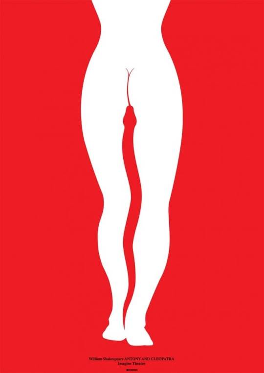
Lex Drewinski (born 1951) Poland
"Antony and Cleopatra" 1996
This simple, daring design from Germany's Imagine Theatre plays on the most famous scene in Antony and Cleopatra.
The Egyptian queen, resigned to death, kills herself by allowing an asp to bite her breast.
The poster's use of shock, violent imagery and bawdy humour is quite faithful to the scene: before her tragic death, Cleopatra has to convince a leering Clown to hand over the "pretty worm".
via:
IMAGINE THEATRE, DE, 2013. D: LEX DREWINSKI/PRINCETON ARCHITECTURAL PRESS
31 notes
·
View notes
Text


Book 210
Shadow Type: Classic Three-Dimensional Lettering
Steven Heller and Louise Fili
Princeton Architectural Press 2013
More loveliness from Steven Heller and Louise Fili. I’m also a big fan of this format: 7”x10”, paper-over-boards, large enough for effective display, yet small enough to be comfortable.
#bookshelf#illustrated book#library#collection#personal library#personal collection#books#book lover#bibliophile#booklr#shadow type#Steven heller#Louise Fili#Princeton Architectural Press#typography#graphic design
5 notes
·
View notes
Photo

“To have a feeling for landscape, you have to lose your feeling of place.”
— Jean-François Lyotard, from Recovering Landscape: Essays in Contemporary Landscape Architecture, ed. James Corner (Princeton Architectural Press, 1999)✨
#xplr#explore#xplore#adventure#wild#wilderness#sea#ripple#mountain#landscape#travel#greece#greek#mount#athos#photography#soul#spirit#love
10 notes
·
View notes
Text

“Of all the preposterous assumptions of humanity over humanity, nothing exceeds most of the criticisms made on the habits of the poor by the well-housed, well- warmed, and well-fed.” ― Herman Melville
Image : The Arrival of the Jarrow Marchers in London, Viewed from an Interior - Thomas Cantrell Dugdale, 1936
Oil on canvas, 76.5 x 64 cm
The Museum of the Home, London
As featured in The Book of Change (September Publishing & Princeton Architectural Press, October 2021)
11 notes
·
View notes
Text
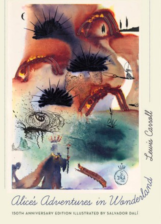
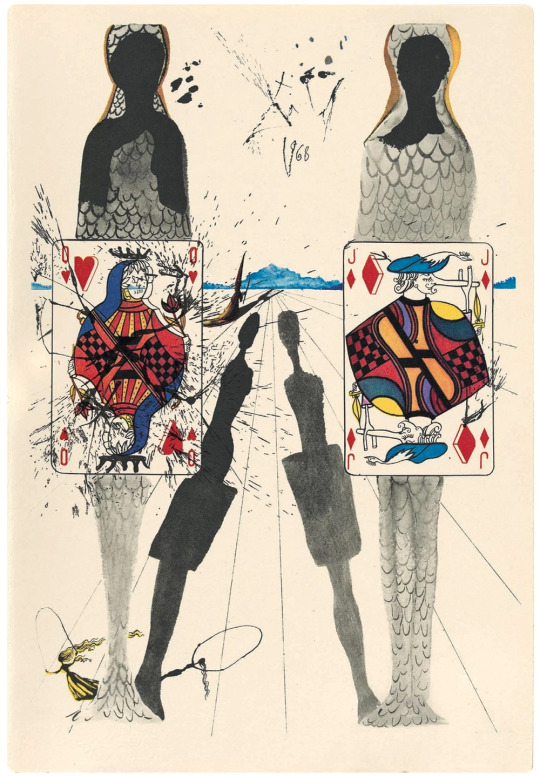
Artists in Wonderland - Number 9
Welcome to Artists in Wonderland! Running till the 4th of July, I’m counting down My Top 10 Favorite Illustrators for “Alice’s Adventures in Wonderland!” The Lewis Carroll stories of Alice are as immortal as they are odd, and many great artists have handled them in different ways. This countdown will pay homage to just a few of them.
Our 9th Place illustrator creates a truly surreal experience. Today’s artist is Salvador Dali!
For anyone reading this who is REALLY into art, or else REALLY into the “Alice” books (or both), placing Dali so low in the Top 10 is probably tantamount to the most sacrilegious blasphemy any heretic could utter. I ask you to please note that this is all opinion based, and everyone is entitled to their own opinion. Having said that, let’s start off this explanation positively, because as you might expect, there is PLENTY positivity to be had.
For those of you who don’t know (and I hope that will not be many of you), Salvador Dali was one of the most influential artists of all time. He was effectively the leader of the Surrealist movement in art, and was the creative mastermind who most allowed that particular style to enter the public eye. In his time, Dali was something of a controversial figure: his artwork blended elements of pure surrealism with more representational techniques, including the Pop Art movement and Expressionist artwork. This, and his flamboyant personality, mixed with his limelight appeal, made him loved by general audiences to his craft…but amongst more serious critics and his contemporaries, there was a bit of a conflict between whether he should be considered a madcap genius, or a traitor to the movement’s ideals. Whatever the case, he is still recognized as the most important Surrealist artist who ever lived. His paintings, drawings, and cinematic endeavors are the stuff of legend, with work that ranged from the whimsical to the utterly disturbed.
Surrealism is an art form that focuses far less on realistic representation and logical construction as it does on a fantastical, intentionally absurd and strange expression of one’s inner emotions. Dali’s artwork certainly fits the bill there, but interestingly, Dali himself was a man with a more practical sense of the world than one might at first expect: most famously, he had a vested interest in mathematics and architecture. His artwork reflects this: at first, his creations seem like abstract splashes of color and shapes, but the more you look at them, the more cleverly composed you will realize they are. It was only fitting that this man and his art style would eventually be coupled with a story that matched this paradox of logic and chaos perfectly: “Alice’s Adventures in Wonderland.”
In 1969, Random House (of all companies) commissioned Dali to create a series of paintings based on the first of Carroll’s books. These paintings were then used as the illustrations for a special edition of the story published that same year. Dali’s illustrations were long after celebrated as not only some of the most fabulous art to be connected to the book, but also as perhaps some of his personal finest works. Ironically, despite this, the book - and the artwork - became EXTREMELY hard to come by in the coming decades: finding a print of Dali’s Alice pictures, or a copy of the 1969 Random House edition, was next to impossible, and prices were appalling.
That all changed in 2015, when Princeton University Press re-published the book in celebration of the 150th Anniversary of the “Alice” stories, at the reasonable price of about $25. This special edition was a Godsend to lovers of Carroll, as well as lovers of Dali’s art, who had long wanted to see how the master surrealist and the wildness of Wonderland would match up. For most serious Carrollian scholars, this is one of the definitive illustrated copies of the Alice stories.
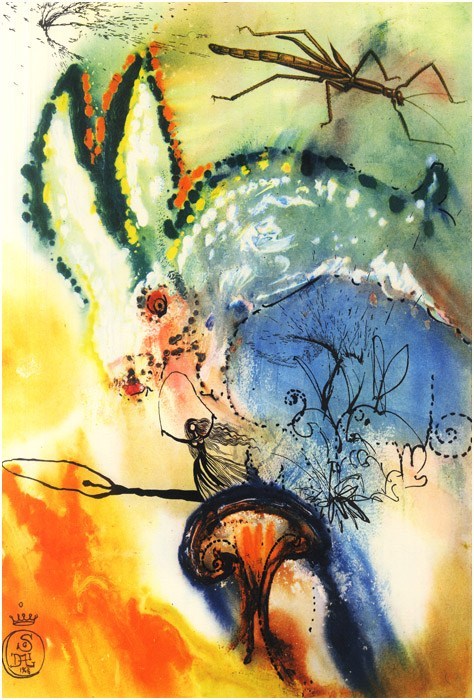
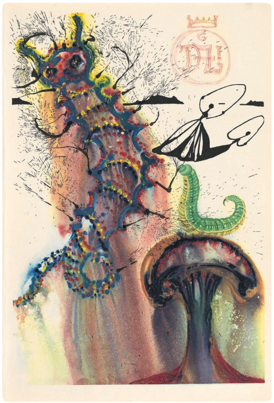
I, however, am not “most serious Carrollian scholars.” As far as Dali’s artwork goes, it does not disappoint in the slightest. It truly is some of his finest work. Much like the previous edition I talked about in the countdown, illustrated by Alice Von Gotha, Dali does not illustrate the scenes and characters of the book, but rather creates a series of frontispiece pictures to accompany each separate chapter. And much like Von Gotha, the images are less representational of the characters or events, and more inspired by them. Dali does not depict most of the Alice characters in his stories. Instead, he mostly focuses on landscape work, depicting trees, mushrooms, oceans, and so on. He incorporates visual elements that are found in each chapter, and then lets his watercolors and wild imagination do the talking without the majority of characters being properly present. The only constant character in each image is Alice, consistently depicted as a faceless girl skipping rope (a recurring image throughout Dali’s work). Dali does not capture the personalities and forms of the characters, but instead focuses on the feeling of Wonderland itself: it’s disorganized, insane, a madhouse of color and exotic, imperceivable, dreamlike sensations. Indeed, nowhere has the dreamlike quality of Wonderland been so beautifully captured as here. Sometimes it is scary, sometimes it is beautiful, and sometimes you seriously don’t know WHAT it is, but it’s still doing SOMETHING to your heart and mind.
HOWEVER, much like Von Gotha’s artwork, the problem is these gorgeous, sumptuous paintings also have to act as illustrations. And, again, sometimes they do not service the writing itself. Again, it’s problematic when the book outright says “look at the picture” and there’s nothing there to help guide the reader. I suppose I just prefer more representational art when it comes to stories like Alice: as much as I adore Dali’s painting for the Mad Tea Party (seriously, I want a print of that to frame on my wall), I much prefer to actually see what artists do with the characters and sets in a more “physical” than “metaphysical” manner. This is all just a matter of personal taste of course.
TL, DR: absolutely BEAUTIFUL paintings, brilliant works by Salvador Dali…but far from a “definitive” illustrated copy for me, personally.

Come back down the rabbit hole tomorrow as I present Number Eight! Don’t be late! ;) (Heh. That rhymed. I like rhymes. Sometimes.)
#countdown#list#favorites#best#top 10#4th of july specials#alice in wonderland#alice's adventures in wonderland#lewis carroll#literature#art#illustration#illustrators#artists#salvador dali#dali#number 9#artists in wonderland
12 notes
·
View notes
Last Seen Blogs

artsbyleigh
Art by Leigh

ummnataly
Stay rad

seskalite
WELİKX

gliagirlphd
so when do you graduate?

staycalm-atthedisco
Fat Sass To Match My Fat Ass