#and LUCKILY
Text
Sorry no I am too scared of radiation to willingly buy glowing glass dishware thank you
#mine#uranium#i know they're mostly safe#for display#but like#i scared#one time i panicked#bc i realized the vintage clock I had been using#as an alarm#was glow in the dark#and i had the thought#oh no#what if this is uranium paint#I googled the brand#AND THEY USED URANIUM PAINT#now very irrationally alarmed#i looked up the exact model i had#and luckily#it was made shortly after#the company stopped using uranium#twas very spooked#even though i know logically nothing would have happened#i didn't like it
9 notes
·
View notes
Text
markiplier saves the day once again
#i was watching a nexpo video#and decided to scroll thru the recommended videos#which on mobile you can just swipe up and it’ll show all the thumbnails and they’ll cover the video#so u don’t miss what’s happening#well#i was doing that#and then the video started talking abt jeff the killer#and it showed that one image (u know the one and if u don’t don’t look it up)#and LUCKILY#a markiplier video was covering most of it so i didn’t see it#which is good! bc that image gives me nightmares every time i see it#i also think it was the scarier version of the original#which i hate even more#idk but the way his eyes look. and his mouth.#even think abt it puts me on edge#i hate it so fucking much#anyways#i was enjoying the nexpo video but decided to switch to markiplier to save my sanity and the sleep i’ll get tonight#that was fun#k.txt
2 notes
·
View notes
Text
Meanwhile...
A BFA student is doing a show called "Transcendence" and the flyer is top surgery scars (it isn't entirely obvious tho... which makes it great!!
I'd like to see it... but idk if I'll have time... and that makes me mad ngl
#i was thinking about my transphobic classmate after seeing a post#people like her are the reason I dont think Ill come out#and luckily#i can live that way#but also
0 notes
Text
Bruce Wayne is so much stronger than me, because if I was him I would walk straight up to Lex Luthor at a fundraiser, lean down, and whisper you want to fuck Superman so bad it makes you look stupid in his ear before flitting away with zero context.
#bonus points for superbat here#then it’s personal#like lex you wish you could fuck superman#luckily I can whenever I like#bruce wayne#batman#dc#lex luthor#thoughts
12K notes
·
View notes
Text
I am dropping my silly TQ(Typing Quirk) for this because I feel like shit
I genuinely hate missing parts of me that were bad, and it's so??? heugqejadfs
And, regardless of how much I love other-me (Nikola), it's multiple things put into one alter, and one of those things is The Web (Smirke's fourteen), not a specific person, but The Web itself, and that just?? It makes me uncomfortable, I'm going to be honest, having source/canon memories that I am not comfortable even talking about to myself, much less the internet people, that make both love Mother(Web) but uncomfortable at its existence
-Nikki
#(fictionkin and fictive thing)#I am the fictionkin#ofc#Nikola is of course seeing this regardless#but it understands why I'm upset#and luckily#takes no real offense to my discomfort#fictionkin rant#fictionkin#memories issue#almost all of the system use it/its#except uhh#two people I think
0 notes
Text
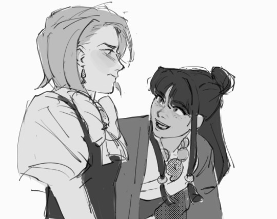
#franmaya#franziska von karma#maya fey#ace attorney#.png#was drawing this pose andf i was like where have i seen this before. it's so familiar i see it so clearly#i sure do hope i'm not copying someone else's fanart unconsciously#luckily i remembered it was official art of maya LOL#anyway
4K notes
·
View notes
Text
This was honestly my favorite bit from the new Once upon a Studio short.
#luckily I had the close caption on since my fam was still asleep and couldn't turn the volume up too much#but give me a full on Disney hero/prince short /hj#we got a princess one in WiR2 so we can have one for those guys#Charming and Eric interacting would be pretty funny#once upon a studio#disney#prince charming#Cinderella#prince eric#disney 100
7K notes
·
View notes
Text

FNAF game Mike almost got attacked by Vanny
#myart#chloesimagination#comic#mike schmidt#fnaf vanny#fnaf vanessa#glitchtrap#security breach#fnaf#fnaf movie#fnaf help wanted#fnaf fanart#five nights at freddy's#Mike doesn’t realize how that phrasing sounded oops#he just wants to have legit nap time#Vanny almost came out but luckily it’s not another Luis situation 🙏🏾#Vanessa is embarrassed should of known mikes just a tired guy#sorry to glitchtrap you almost had him#can’t defeat the raw power Mike has (being the best boy)
5K notes
·
View notes
Text
This site's tolerance and acquiescence to incest is so fucking insane like "I don't support it but my mutual is cool so I'll allow it" "richard siken's artistic contributions to society absolve him" "ethel cain can ship whatever, she's earned it" I'm not going to lie to you it's kinda looking like you do support it...
#if blogging were a job this would be a career suicide#luckily i have experience on the field#incest ment
7K notes
·
View notes
Text
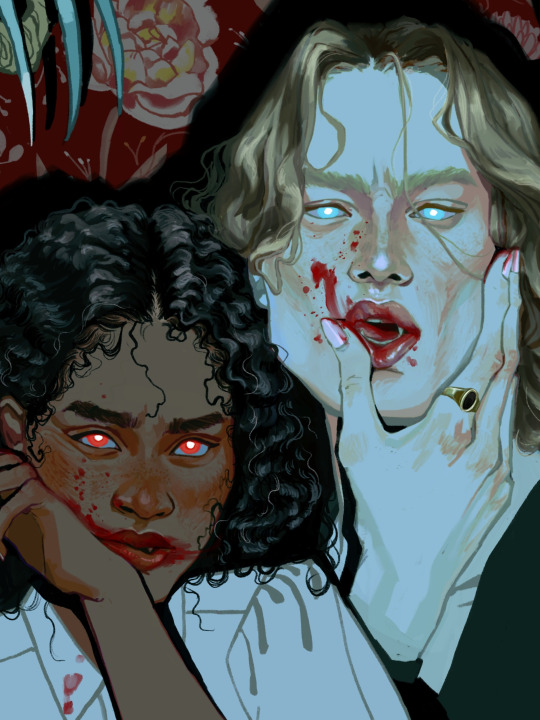
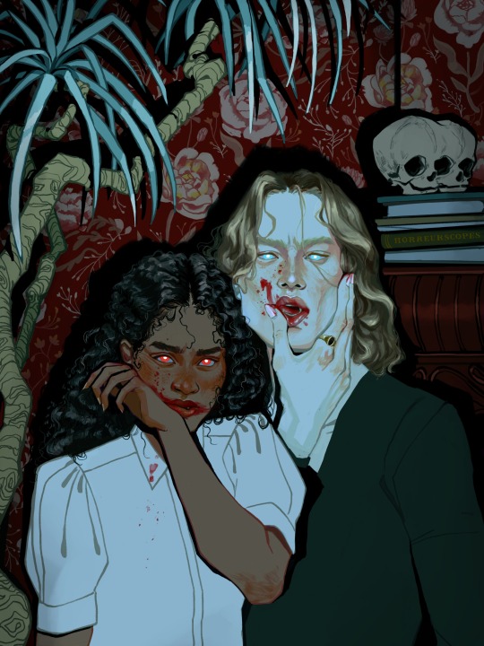
ELEKTRA: I am the shape you made me. Filth teaches filth.
(prints)(process video & high res)
#interview with the vampire#iwtv#the vampire chronicles#claudia iwtv#lestat de lioncourt#amc iwtv#iwtv fanart#ive been working on this between commissions since ep 5 came out two weeks ago but luckily for me ep 6 was even more thematically on point#anyway someone made that web weave about lestat being claudia's mother and i haven't been the same ever since#also this is an ode to my lovehate relationship with backgrounds#THIS TOOK SO MUCH WORK AND IT WASNT SUPPOSED TO. WHY CANT I JUST DO A QUICK DOODLE. A LITTLE FLAT COLOR FANART. I AM CURSED#horreurart#anyway this is going on ig and twitter tomorrow at the appropiate algorythmic-posting times but for you tumblrinas#you can have it at my organic unhinged hour#illustration#art#artists on tumblr
31K notes
·
View notes
Text
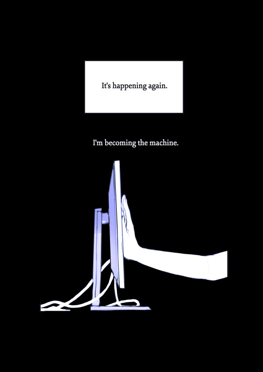
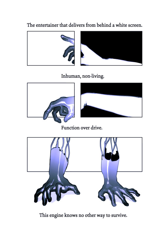
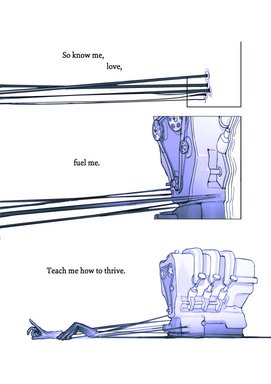
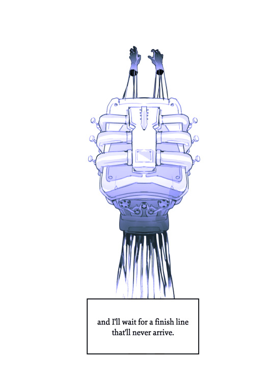
the machine.
a comic about being a 'creator' online.
creative notes:

#in light of recent online 'success' i feel like this may come off as ungrateful#just wanna say that all the comics i make in this series are written about experiences i felt in 2022#which was a rough year personally and creatively#and i very luckily don't feel this way anymore#and this also isnt to shame anyone who DOES feel this way#its easy to start to feel like all you are is a vending machine of art#and like thats all you are to people#theres nothing human to you#it can be a bit of a pit#and on some level this damage is self inflicted but social media really doesnt help that feeling#this wont work for everyone but having friends around you who you can talk to about stuff that ISNT art#going outside for dinner#maybe walking around#its good for when you need that feeling to go away even a bit temporarily#youre a human being#not a mindless content creation machine#and i hope anyone who feels like this now can get to a place where they have a healthier relationship with their own work#good luck to all of you#and thank you for reading#comic art#its 10pm#stillindigo art
13K notes
·
View notes
Text
People exist who actually want the Master to be written out of the show? Even temporarily? They’re like…the only other reoccurring character. The only other active character that can be recasted. Almost as central and iconic to the show as Cybermen or Daleks. Infamous for coming back from the dead. The Doctor’s person.
#I was so pissed when I found this out?#luckily it seems to be a minority and more just want a break from the character#the master#Missy#Doctor who#Thoschei#wow I didn’t expect this to be so popular lol#woooow#I agree that we need at least a season break from them#but if 15 doesn’t get to meet the Master I’ll be sad
2K notes
·
View notes
Text


My girlfriend and I had our first new year's eve together! She looked so beautiful in her suit and I think we made a handsome couple <3 both of us included a small lesbian detail to our outfits!!!
But as often we had a tendency to be mistaken for Just Some Guys - but that's just because the people around us weren't so used to seeing handsome butch women
#we were surrounded by painfully straight and normie people unfortunately#but luckily we had each other abd a really good time!#butch#butch4butch#musings#also for me it was both the venus symbol but also the tie wich has this really nice cool lavender colour! not visible is my really#nice black corduroy blazer my gf found for me when we first got to know each other!
3K notes
·
View notes
Text
hell on earth
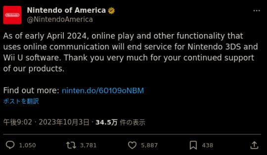
#luckily pokémon bank will still go on but#a true end of an era#god.......#bulbagarden#pokemon#gaming#nintendo 3ds
4K notes
·
View notes
Text
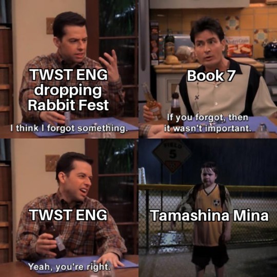
My apologies to Leona, Kalim, and Lilia fans everywhere.
1K notes
·
View notes
Text
I think 90% of my gripes with how modern anime looks comes down to flat color design/palettes.
Non-cohesive, washed-out color palettes can destroy lineart quality. I see this all the time when comparing an anime's lineart/layout to its colored/post-processed final product and it's heartbreaking. Compare this pre-color vs. final frame from Dungeon Meshi's OP.


So much sharpness and detail and weight gets washed out and flattened by 'meh' color design. I LOVE the flow and thickness and shadows in the fabrics on the left. The white against pastel really brings it out. Check out all the detail in their hair, the highlights in Rin's, the different hues to denote hair color, the blue tint in the clothes' shadows, and how all of that just gets... lost. It works, but it's not particularly good and does a disservice to the line-artist.
I'm using Dungeon Meshi as an example not because it's bad, I'm just especially disappointed because this is Studio Trigger we're talking about. The character animation is fantastic, but the color design is usually much more exciting. We're not seeing Trigger at their full potential, so I'm focusing on them.
Here's a very quick and messy color correct. Not meant to be taken seriously, just to provide comparison to see why colors can feel "washed out." Top is edit, bottom is original.
You can really see how desaturated and "white fluorescent lighting" the original color palettes are.
[Remember: the easiest way to make your colors more lively is to choose a warm or cool tint. From there, you can play around with bringing out complementary colors for a cohesive palette (I warmed Marcille's skintone and hair but made sure to bring out her deep blue clothes). Avoid using too many blend mode layers; hand-picking colors will really help you build your innate color sense and find a color style. Try using saturated colors in unexpected places! If you're coloring a night scene, try using deep blues or greens or magentas. You see these deep colors used all the time in older anime because they couldn't rely on a lightness scale to make colors darker, they had to use darker paints with specific hues. Don't overthink it, simpler is better!]
#not art#dungeon meshi#rant#i'm someone who can get obsessive over colors in my own art#will stare at the screen adjusting hues/saturation for hours#luckily i've gotten faster at color picking#but yeah modern anime's color design is saddening to me. the general trend leans towards white/grey desaturated palettes#simply because they're easier to pick digitally#this is not the colorists fault mind you. the anime industry's problems are also labor problems. artists are severely underpaid#and overworked. colorists literally aren't paid enough to do their best#there isn't a “creative drought” in the anime industry. this trend is widespread across studios purely BECAUSE it's not up to individuals#until work conditions improve anime will unfortunately continue to miss its fullest potential visually#don't even GET ME STARTED ON THE USE OF POST-PROCESSING FILTERS AND LIGHTING IN ANIME THOUGH#SOMEONE HOLD ME BACK. I HATE LENS FLARES I HATE GRADIENT SHADING I HATE CHROMATIC ABBERATION AND BLUR
2K notes
·
View notes
Last Seen Blogs
la-la-la-poneis
Welcome to Night Vale...
aky-04
Aky_04

chezcocoflower
Chez CocoFlower
notclark
dumberass
illdieskinnynomatterwhat
!TW!ED!