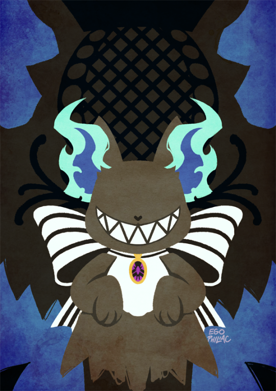
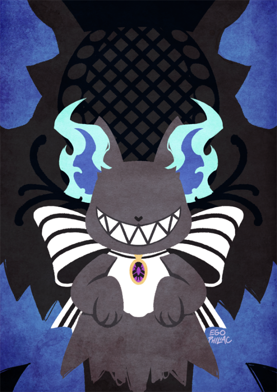
#but i wanted to color em in photoshop
Text
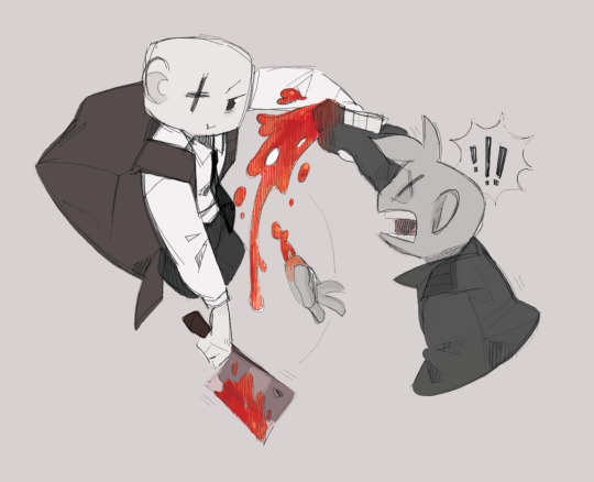
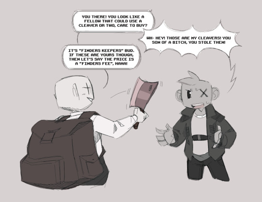

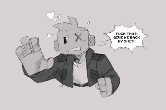
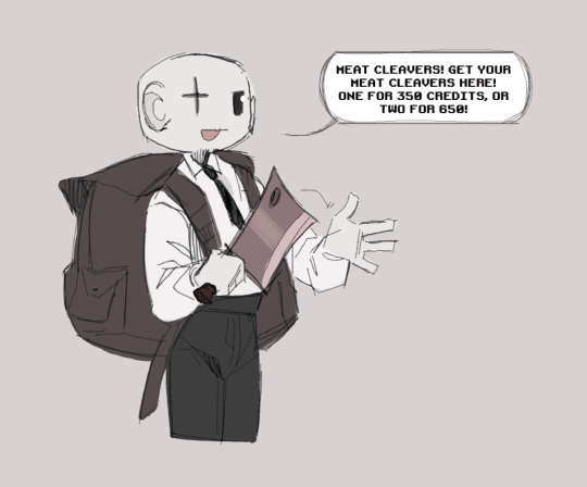
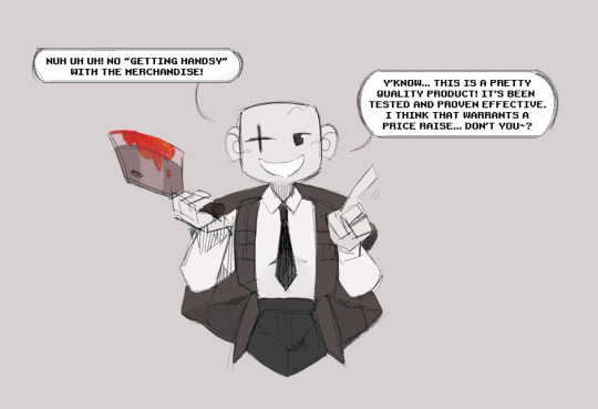
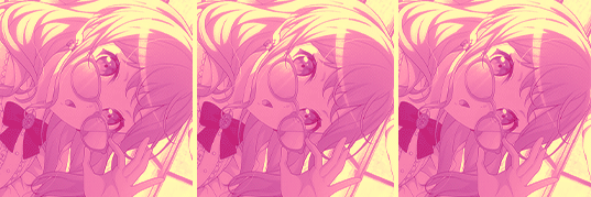
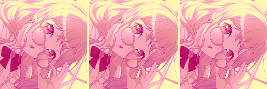
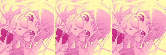
Comic of Bandit and a friend's fellow elsen with an X. Friend is Arc, who doesn't have a tumblr.
Their elsen boi's name is Michael. He dualweilds meat cleavers and is a bit of a bastard with em too. We joked it was karma Bandit took a hand, since in Michael's story, he lops off someone's jaw with the knives.
#sorry for any editing mistakes on these#they were also done on WB#but i wanted to color em in photoshop#layering error left some white spots#and im only seeing em not im making thos post#original art#oc#bandit (elsen)#bandit (unknown)#bandit (rise)#elsen off#elsen (off)#blood#tw blood#knife#tw knife#comic#fanart#off fanart
23 notes
·
View notes
Note
hi! this is Insomniac Anon here!!! I noticed on some of ur artworks (specifically the unique magic posters), that u have a textured look to em, like paper or grain ... i wanted to ask how u get that effect? is it a brush, a filter, or like an overlay/png u use ... ? pls tell me!! ;v; I really like how the texture looks, so i wanted to know how 2 do it since ure a very big inspo 2 me LAWL ... I've been doing art practices in diff styles i find, so, i wanted to know a bit more how you do it :^D
thank you! :D :D :D it's usually photos/textures of paper that I've messed around with; I have a bunch of free/paid/ones I took myself. anytime I see good photos of paper I add it to the collection...it is my weakness. 😔
I mostly use Photoshop, but this should work in any program that supports blending modes (also I did this in like an hour to use as an example, please forgive it :')
image by itself before texturing:
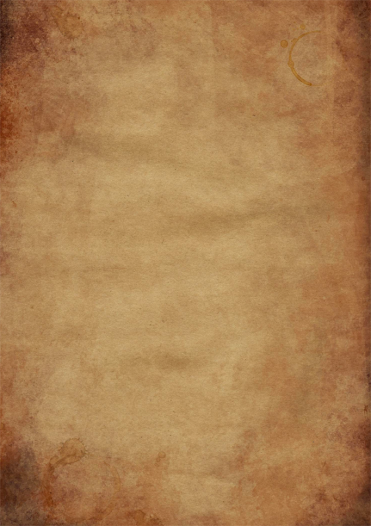
with the texture pasted in (for this one I'm using this public domain one from Pexels):
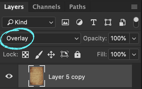
then mess around with the blending mode to see how it looks -- in this case I went with overlay, but soft light and hard light are usually good ones too, it really depends on the texture:
then with a bunch of messing around with opacity/colors/saturation/levels/adding in a bit more texture until I like how it looks:
et voilà, texture! (waves hands)
#art#twisted wonderland#it's a general tutorial i guess but just cause it's grim#usually i end up using a couple different papers on top of each other with bits masked out/levels super messed with and the like#it is super fun to just mess around with and throw things on and see how they look!#but it is also very easy to waaaay overdo so uhhhh exercise caution i guess. less is often more and all#once you start layering textures on there it's just difficult to stop#dangit art stop being so fun#(this also tends to screw with your colors and values a lot so always check and adjust as you go!)#(if you don't want any color influence at all you can just turn the saturation of the paper layer all the way down so it's pure grayscale)
362 notes
·
View notes
Text

Riliane Lucifen d'Autriche
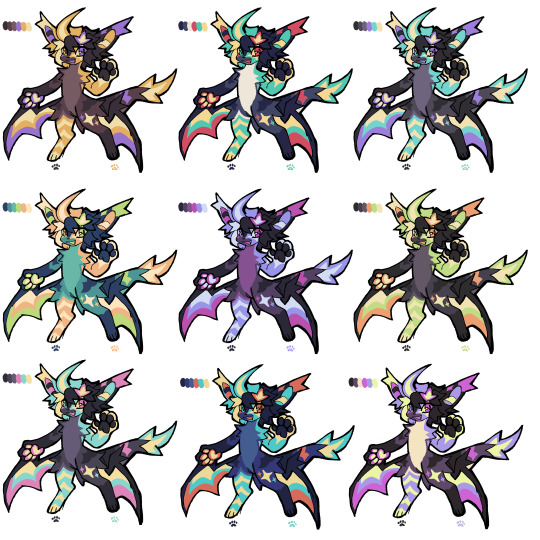
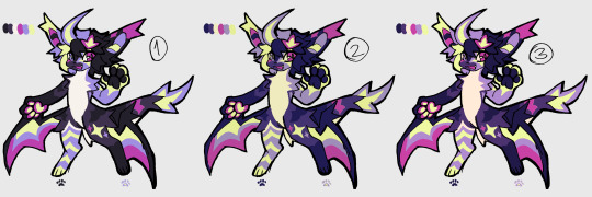
ive been wanting to make fanart for mothy's seven deadly sins series for a while and now i'm finally taking the dive. so the next few posts will be completing these series of illustrations of the characters :) started off with rin's character cuz i feel like the daughter/servant of evil is where a lot of us got introduced to evillious chronicles hehe
excited to see the little collection all come together and i hope you are too
~~
by the way!!!!
5 people have indicated on a poll that they would be interested in coloring pages of my art, and i thought i'd do just that! at least as a little test. so here are some lineart files of the piece~
psd file - should be compatible with photoshop and ibispaintx definitely. probably compatible with other programs like csp but i haven't checked 😅
procreate file - procreate throws a fit when you try to import psds so i had to make it separate just in case 🫠
this is the first time officially releasing these so im not sure how to go about it?? again it's sort of a test, i'll figure things out.
just be aware that the lineart is more gritty/textured so filling colors with a bucket tool might be a little wonky.. but i'm sure that's fine
some terms when using these coloring pages :)
don't remove or obscure the watermark. you can move it, but make sure it's visible in some way
when posting, make sure to credit me (mayordoi) for the lineart
if you post on tumblr or instagram, tag me or let me know somehow cuz i wanna see em!!
again not fully sure if there's a big audience for these but i like the idea of coloring pages so why not release my own!
and yes the rest of the sin characters will also have coloring pages released in a similar style :]
#mayor doidles#fanart#vocaloid#evillious chronicles#evillious fanart#akuno p#aku no musume#daughter of evil#kagamine rin#riliane lucifen d'autriche#digital art#regular style#<- again my tagging system for my 'styles' is kind of a mess i'll have to fix that soon#art#artists on tumblr#vocaloid fanart
383 notes
·
View notes
Text

Continuing to fire on all cylinders to make this Sky 🤝Mononoke collab a reality! 🐲⚖️🌊
Process GIFs and artist commentary below the cut. ⬇️
Left: Process GIF
Middle: Just the background, cos I really like how it looks!
Right: Illustration without the collab logo
And here are my notes on my inspirations and references. There's a lot of 'em, so instead of embedding relevant images one by one I put them in a callout sheet! For accessibility, I also included transcript (with bonus ramblings) below each sheet.

Ofuda circle modeled in Google Sketchup 2017, then lightly transformed in Photoshop to flare out. I tried my best to hand-draw these, but it the results came out really clunky and stiff. I figured if Mononoke shamelessly utilizes 3D in their show, I can too!
Krill and sky kid composition roughly inspired by the Ayakashi DVD cover illustration. On the surface level, the krill's black-and-red color scheme mirrored that of the bake-neko. Not to mention, in the world of Sky, the krill would be the best fit of a mononoke-like entity. The red background is also a nod to the red skies seen during a shard eruption in Sky.
Sky kid gesture based on the Festival Spin Dancer's Tier 3 poses and the Medicine Seller's iconic pose in the Zakishiwarahi episode as inspiration. This was the idea which springboarded this illustration into existence. I wanted to do my take of the Medicine Seller's pose, but in a more dynamic manner: rotate the pose to a profile position and set the ofuda in a diagonal, flared out arrangement.
Cape inspired by tenbin design featured in the 2024 Mononoke movie. This one's an interesting one - I wanted the cape to be a stiff material that doesn't "flap" when in flight - similar to the Aurora wing capes. It ended up looking like a kite of sorts, which I'm not entirely opposed to! I haven't had the opportunity to showcase the back view of this cape design, but I envision it having some mechanical aspects to it - the "wing" which are flared out in this illustration fold in like moth wings, and a little bell is attached to the "tail" part and it jingles a little whenever the sky kid flaps!
Bandana is based on the Scaredy Cadet's hairstyle from the Season of Assembly. Mask design utilizes the 2023 Days of Style mask and the Nintendo Pack mask as bases. Pretty self-explanatory. I basically went onto the Sky wiki and found the cosmetics that most closely matched what I was looking for. Then if necessary, I went to the Office space to do photoshoots to get the appropriate camera angles for them all.
Seasonal pendant inspired by the classic Medicine Seller's necklace and the eye motif featured in the 2024 Mononoke movie. Possibly the only one-to-one homage to the classic Medicine Seller design here, but his garnet necklace was too good of a match to the seasonal pendant. A side tangent: does the new Medicine Seller possess a necklace, let alone a mirror? So far all the shots of him don't feature it. Fascinating.

Dark dragon krill anatomy references a custom figurine crafted by @/escaflowne_n07 on Twitter. Until I found this, I was honestly at a loss finding reference for this - be it on the internet or during in-game photoshoots. The lighting on the krill in-game focused on its menacing silhouette rather than its structure. And not to mention, getting a close-up shot almost always set off the dark creature's aggro. I have no idea how this guy found the references to put this model together - well done!
Mantas, elder constellations, and sun dog references murals in the Cave of Prophecy. Krill aside, the overall illustration was leaning a little too much towards Mononoke so I tried finding opportunities to insert more Sky into it. Added bonus is that now there's storytelling in the background: during a shard eruption, a giant krill rises from the frothing waves of dark water to hunt down a flock of mantas.
Clouds behind the sun dog reference the ones featuring heavily in the Umibozu episode. This illustration has a lot of ocean theming, so I figured this would be appropriate.
Rendering style of the background is lightly inspired by the 2007 Mononoke illustration. Mainly having a 2D inked style to contrast with the more polished render of the sky kid. Funnily enough, this was a tertiary inspiration, which lead to the discovery in the next point!
Dark water waves and sun dog composition heavily references Hokusai's "The Great Wave". The waves were modified to be bottle-green of the Golden Wasteland's dark waters. The sun dog is in the spot where Mt. Fuji is in the original composition. these were all hand-drawn by the way! I merely emulated the style of the source material. As a side note, I also borrowed the spotted sea spray rendering for the krill's red spotlight.
Background pattern taken from the ofuda design featured in the 2024 Mononoke movie poster. Mainly to add some gritty texture to the sky. I worked pretty hard to replicate this ofuda design as a high-res asset so I wanted to use it more!
#モノノ怪#mononoke 2024#mononoke 2007#kusuriuri#medicine seller#thatskygame#sky cotl#sky children of the light#thatgamecompany#thatskygame fanart#sky cotl fanart#crossover#purplealmonds#2023
322 notes
·
View notes
Text
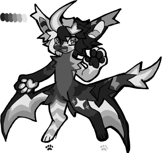
how i make color palettes of my ocs before i pick one, an art tutorial?
hello, whenever i made a new design for myself i found a way to make lots of color palettes and pick one! i see this method more in paintings and rendering but not much on character designs? here are some examples i used that on.
it helps me so much when i feel experimental with colors. here are what you need
a wip character design. sketchy or pixel art works better since the colors can have some anti aliasing issues
a program with gradient maps. i'm using clip studio paint but ik photoshop also has it. like i said this is used more on photos or paintings
and here's what you do!
draw your character. i'm making a new fursona for myself but anything should work.
2. decide on their markings/color placement in grayscale. i recommend doing grayscale so you can easily see the values. split your grays into however colors you want. i like doing 5-6 the most. i reccomend duplicating the color layer if you wanna try multiple palettes.
3. this part is program dependent but in csp's case go to edit > tonal correction > gradient map.
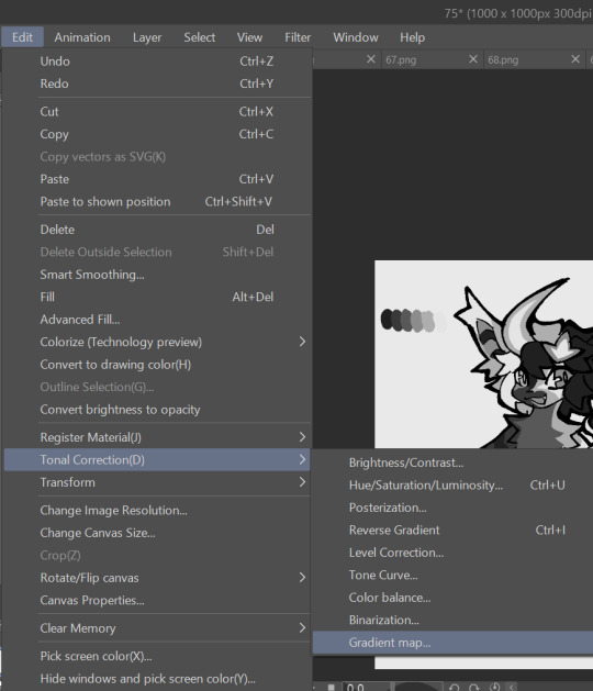
4. i made a few default 5 color gradient maps but if don't use gradients like me i reccomend making the graph like this so they become solid color. split the map into however many colors you used. i'll add a color to the red-orange one bc my character has 6 grays.
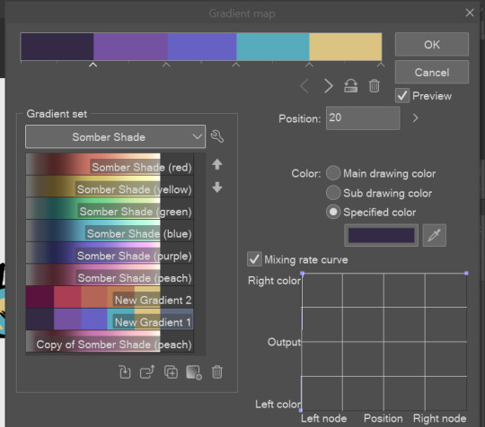
5. replace the colors by clicking below specified color. it all depends on your creativity and what you want. experiment til you like it.
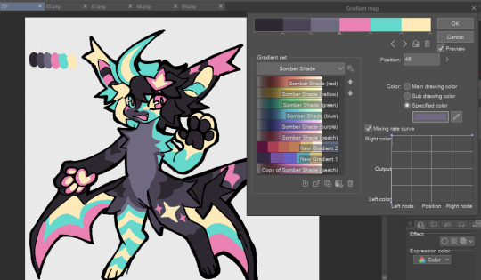
6. fuck around, try stuff, put them together to see if you like any of em. i made 9 to see if i can focus on one of them and i actually ended up loving the bottom right. it really makes them shiny
7. (optional) if you like a palette you can further and play with colors while keeping the palette. you can use color balance (in the same menu as gradient map in csp) or layers to mess around, have fun!
also a color tip because people seem to compliment that a lot in my art: digital art has millions of colors! don't be afraid of using wacky tones unless you're going pantone. if you want to get something physical i recommend being open to alternative colors as they tend to be more limited. i know whoever is doing it will try their best to keep the colors close.
color theory is something i don't...care much about mostly because this is something i'm doing for fun. i'll consider it in professional work.
#artists on tumblr#digital art#ika's showtime#ikarnival#art tutorial#art tips#drawing tips#art resources#clip studio paint
348 notes
·
View notes
Note
sorry if you've gotten this question before, but can i ask how you pick your colors? you color so well it makes me wanna take a bite of your art :bites: :bites: :bites:
eue im still figuring out colors myself buut!! I try not to use layer modes, unless, i like, photobash things or that i dont have a clear idea in my head of how i want a piece to look like and i wanna mess around! I also did a lot of studies in Heavypaint so maybe some of it is bleeding through? Overall im mostly experimenting and laying down colors and seeing what sticks and what doesnt,,,
I also noticed that brushes that have a slight color jitter on them look really cool,,,,,,,,,, im not sure in which programs have it but Photoshop and Heavypaint do for sure, Pts being the more customisable one, i think it gives a cool noise/texture effect to the overall piece and makes it more alive? I think you can do cool stuff with em!

also this thing!!! when you like!!! draw a hard light on something and you add a warmer outline around it it looks so much better! My 3d mind wants to call it Subsurface Scattering but im not actually sure what its called
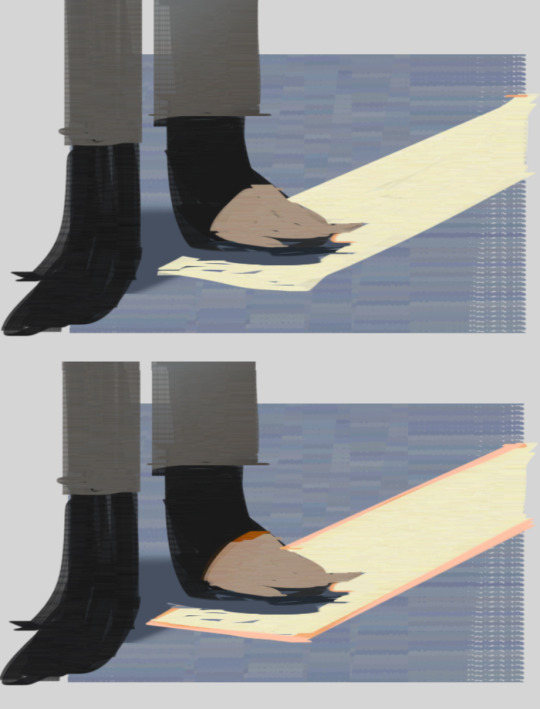
quick thing, scotties feet no outline and outline
other than that theres a lot of color theory involved, i dont think im equipped to explain it but nathan fowkes did some tutorials on color relations for example
https://youtu.be/Whr3E7iLxig?si=SZyTy5SJQKpdc4d8
also people such as
https://mortemergosum.tumblr.com/
https://chuwenjie.tumblr.com/
or Alariko are absolute pros at color imo, you can check them out
196 notes
·
View notes
Text
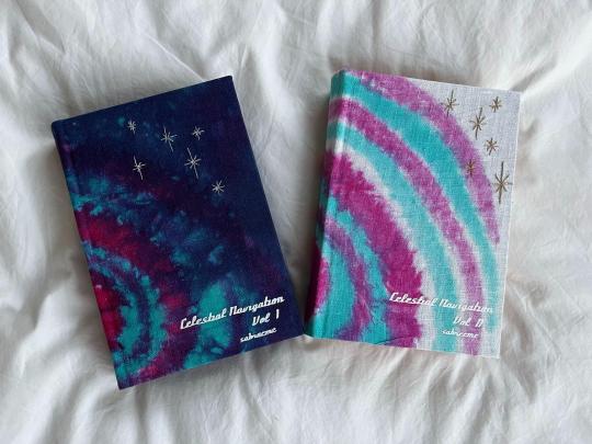
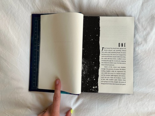
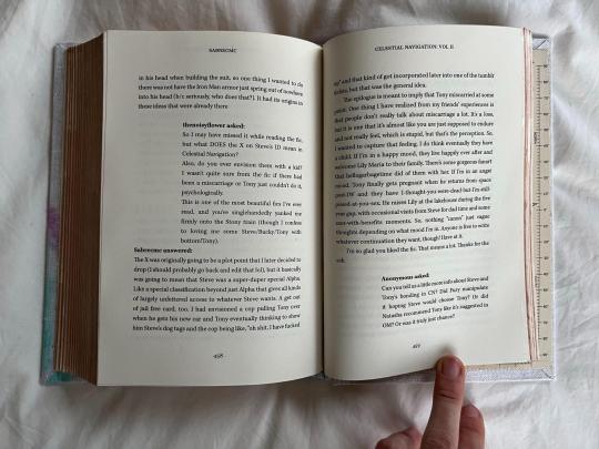
Celestial Navigation by @sabrecmc
18 year old Omega!Tony finds himself Bonded to Captain Steve Rogers. He isn't happy about it until he is.
An absolutely gorgeous story of learning to love yourself, even when you feel like you don't fit in & that you grew up wrong. I'm so happy to have gotten to bind this mammoth work for Sabre & as a gift exchange for @mourningmountainsbindery (who bound me this beautiful copy of Astolat's Let the River Run—JUST LOOK AT THAT COVER!).
Also to anyone who has @ed me lately (looking at u, em @powerful-owl & tacky @tackytigerfic particularly) & I've been derelict in responding, here is WHY.
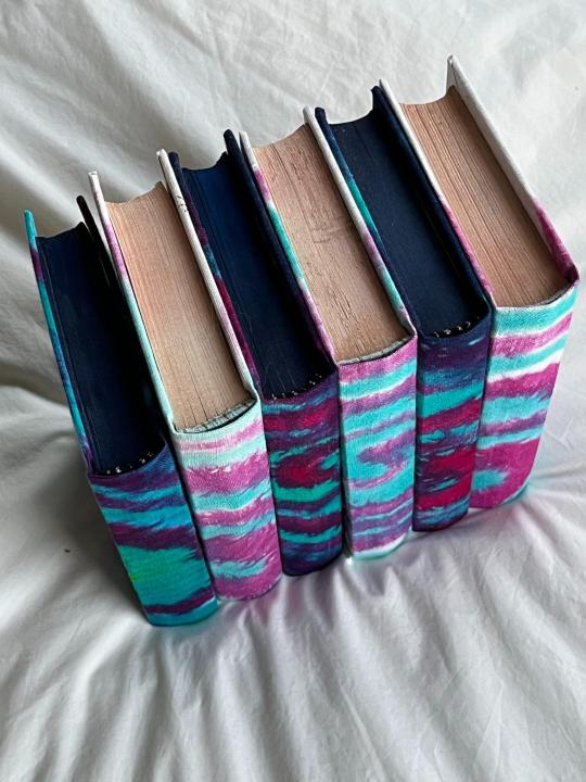
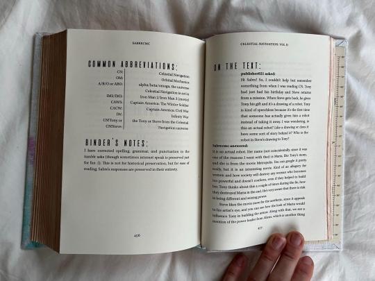
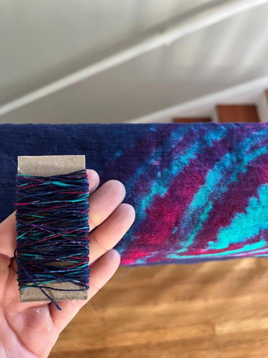
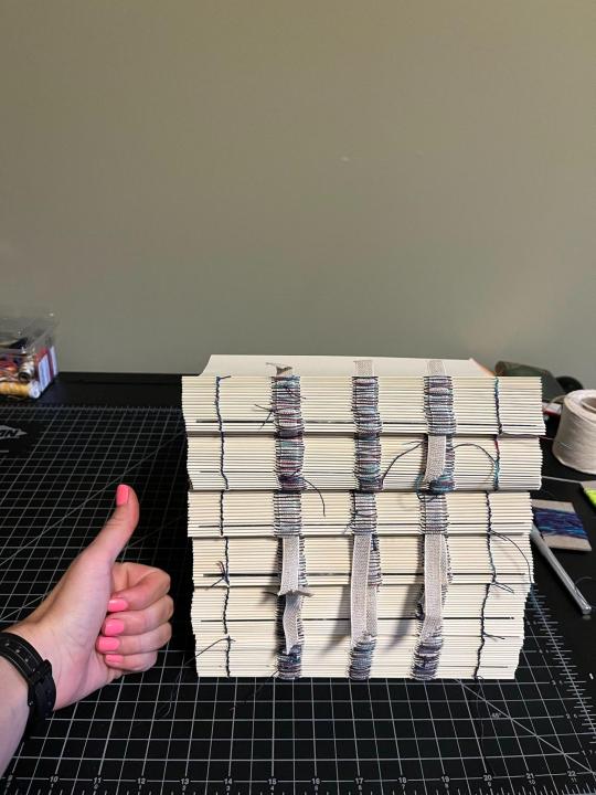
This has been the longest binding project I've undertaken, both in page count and in time. My original message to Sabre was on March 16th—can't decide if I want to use the laughing or crying emoji here—and the colophon says I made the book in April 2023 (which was when I started typesetting, maybe). I had been randomly perusing dying videos on Youtube in bed on a Saturday morning, as one does, and came across a video showing how to spiral tie-dye. I IMMEDIATELY had a design premonition of the full design for this fic as a two-volume set, planted into my brain wholesale by the binding gods. I learned many new techniques throughout the process (edge painting, edge trimming/sanding, tie-dying/dyepainting, embroidery, typesetting meta from tumblr which copy-pastes with the worst goddamn formatting in the world, kill me now). Overall, alternately extremely painful & wonderful, and I'm extremely proud of this set.
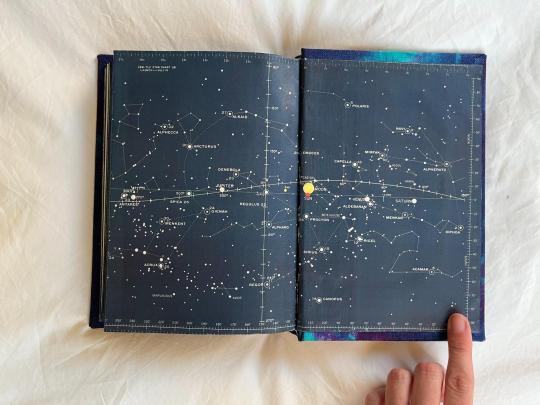
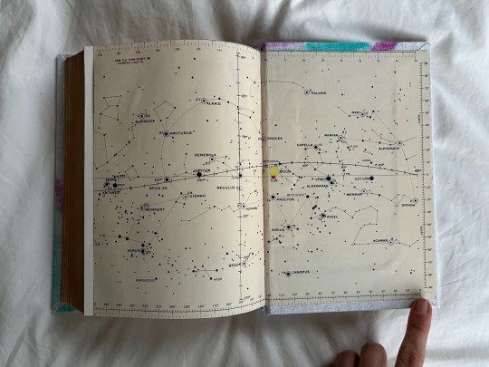
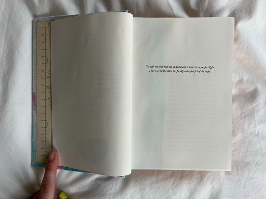
Design-wise, I went whole-hog with the scifi stars theme. Endpapers are recolored versions of the star charts from the Apollo 11 mission:
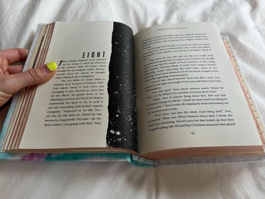
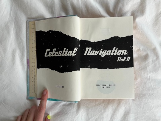
Title page & chapter titles are both rips in the galaxy:
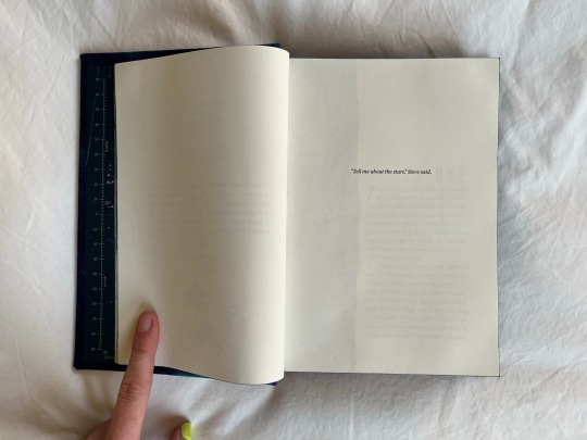
Epigraphs both star-themed:
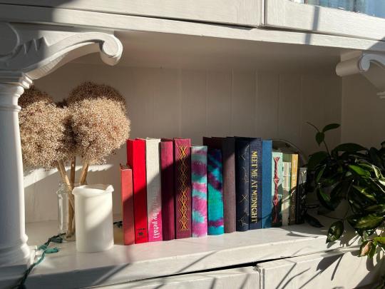
Some more glamor shots because I'm so proud 💕
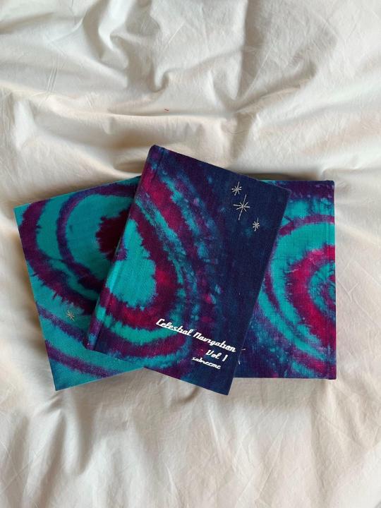
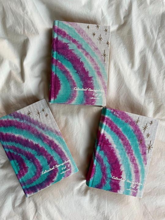
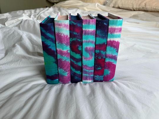
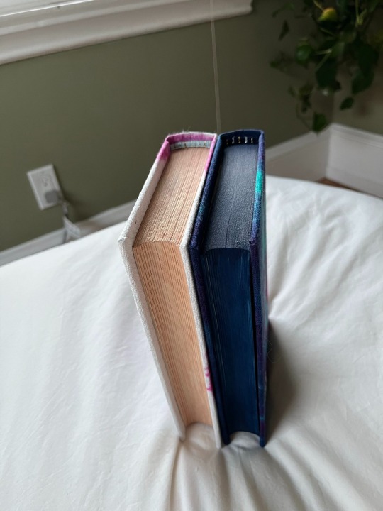
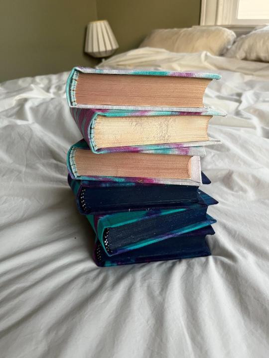
8.6 lbs // 3.8 kgs worth of books (~3000 total pages) 🥰
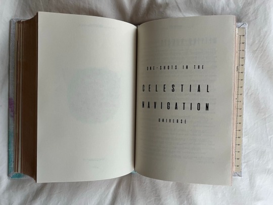
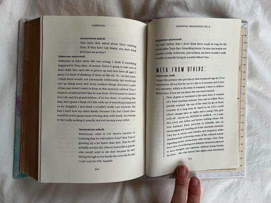
Celestial Navigation is also INCREDIBLY popular, and Sabre has been incredibly generous answering asks on her tumblr + writing additional one-shots in the universe. There is also a veritable volume of fanart. I was so inspired by seeing @robins-egg-bindery copy of ********, with its appendix of fanart & meta, that I promptly copied them.
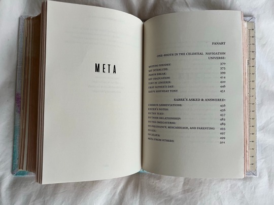
fanart redacted because lots of the artists are no longer active on tumblr but just know i am ECSTATIC about the amount of art in these books
Lastly, I love how @clovenhoofbindery includes their 'Illustrator mess' with their bind posts, as a behind-the-scenes look into the wild process of designing these books. I don't actually have an Illustrator mess for this book (the chapter titles & title page pretty much came in one take), but I do have a DYING MESS. It took me sososo many tries to figure out how to get the dye to look how I imagined in my head. I ended up 'dye painting' instead of tie-dying in the end, but my inbox is always open to chat hand-dying/tie-dying/dyepainting (or what I did differently between any of these attempts). Numbers are the dying attempt.

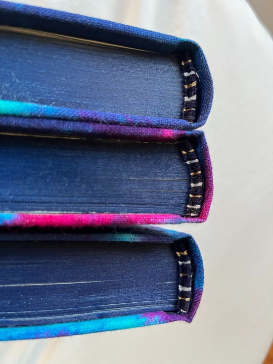
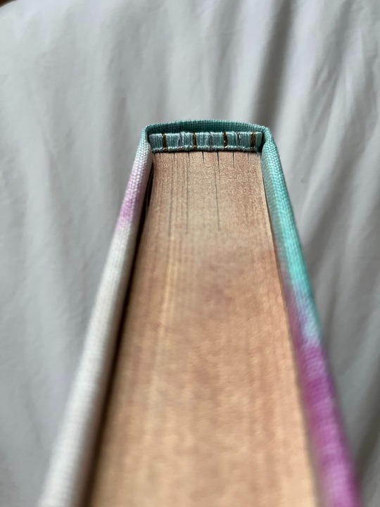
Last process shot: I hand-dyed variegated linen thread to match the colors of the bind, which ends up being incredibly difficult to see on the finished bind, but was super fun while I was sewing!
Materials:
Body font: Kepler
Title font: Compaq 1982
Chapter number font: aliens & cows
Endpapers: recolored versions of the star chart used by Michael Collins during the Apollo 11 mission (archived at The Smithsonian)
Bookcloth: dyed using Dharma Trading Procion Fiber-Reactive Dyes
Title page and chapter headers: designed in Photoshop using the Ultimate Space brush pack by jeffrettalyn on DeviantArt
Metallic embroidery thread: Cosmo Nishikiito thread
I would dye for this embroidery thread. It is LIGHT YEARS better than the classic metallic embroidery thread from DMC: much easier to work with & much more sparkly. Literally so eye-catching; it truly doesn't translate to photos.
Paint for edges: Daniel Smith watercolor tubes in Iridescent Sunstone and Prussian Blue
Note: these are GORGEOUS watercolors. The color is so saturated and strong and beautiful BUT I don't think I'd recommend watercolors for edge painting. They went on very differently depending on the grit of the sandpaper I used for the edges + they sometimes bled into the pages + they had to be set with fixative, which then stuck the pages together.
#blood sweat and TEARS into this bind#and now it is DONE my god#stony#stony fanart#celestial navigation#my fanbinding#posts i actually wrote
128 notes
·
View notes
Text

gradient maps - literally just my thoughts
if you've been on editblr at all you're bound to know em. in this post i aim to share my personal thoughts and critiques on gradient maps, as well as possible ways to utilize them in your works
disclaimer that this post is *not* targeted towards anyone in any way, shape, or form! i'm simply stating my opinion. if this is how you like to edit that's perfectly okay, and you don't have to change that
i'll begin by explaining some issues i personally see with them.
i find that a lot of edits seem to just use the gradient map itself without any other changes. this becomes an issue when people are creating gradient map edits that have very low contrast as it prevents people who are visually impaired from being able to see your edits.

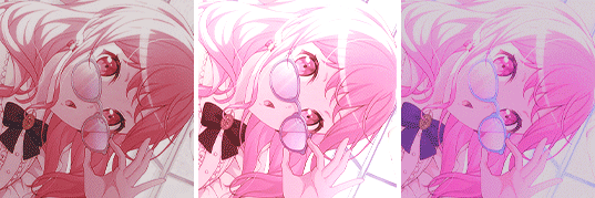
something as simple as changing the blending mode you use can easily help you use a gradient map much differently. in each blending mode variation i used only *one* layer and simply just changed the mode and level of opacity.
gradient maps can be *very* useful in edits, and using different blending modes with those gradient maps opens up opportunity to more interesting colorings. below i have examples of psd colorings ive made all using gradient maps in different ways
while it is undoubtedly true that not every editor uses photoshop or photopea or a program that has the kind of adjustment layers those programs use, most do have gradient maps. so it makes sense why a lot of editors would rely a lot on them.
some of the blending modes i personally find the most useful (and used myself in the above colorings) would be: divide, soft light, multiply, luminosity, and color.

with divide you have to make some... kind of ugly gradient maps. but when you switch the blending mode to divide and set down the opacity a bit it turns out looking really nice! with divide its important to note that your gradient map will be using the *inverted* colors of the color scheme you're going for. that is why the gradient maps will look strange
soft light is much more subtle in the way it colors your image, therefor the gradient map you use may want to be very dramatic in the colors it uses. the soft change in color is perfect for when you want a more subtle change to more closely bring the different colors of the edit together. if you want a more dramatic light, its sibling hard light can do that job for you.

i find multiply works better with darker colorings, i usually lower the opacity while using it as well. i tend to use a broader range of dark to light colors in the gradient map i'm using with multiply
luminosity can either have a very dramatic, or very subtle effect depending on the colors you use. i encourage you to play with this mode a lot! it can create some interesting effects that i don't really know how to describe
color does as it says it does! it changes the colors of the image to the colors on the layer. it doesn't change the saturation of the colors, however. it's essentially like if you hue-shifted them. you can use this to create very drastic changes in color, or to establish what colors you primarily want to be in your coloring
i don't really have much else to say other than to have fun with it! i just pointed out different ways to use gradient maps as a tool for your editing, if you decide to follow my advice or not is totally up to you. if you have any questions or comments feel free to shoot me an ask or throw it in the reblogs and i'll answer to the best of my ability. happy editing!
20 notes
·
View notes
Note
Hey, Marcia! I have to use Photoshop now for college, never used the app, and I am here to ask if you could pass your window config cuz the way you organize seems to really useful
Heyo, I was doing a pc migration not too long ago so luckily i have most things on hand :) Here's a link to my PS settings, shortcuts etc and brushes if you want 'em
Vis a vis shortcuts the most important thing is A - eraser, S - brush, Z - smaller brush/eraser, X -bigger brush/eraser. They're all next to each other so its real convenient.
I don't actually remember if those settings include how the app looks?? so here's a quick screengrab of my whole setup.
On the left we got:
- color tab (with character and paragraph tabs open behind it for comic making if i need them)
- brushes tab (set to show me brush stroke and brush tip - no brush name, you can do it in the 4-lines-hamburger-menu next to "Brushes")
- toolbar on the inner edge
On the right we got:
- navigator tab
- layers tab
- collapsed history tab on the inner edge
In preferences I set up the app to be the whitest it can be so I can see colours properly (I know the dark mode looks slick but it will mud up your perception of colours big time). The background (behind canvas) is set to light gray.
I dont use photoshop's built in smoothing, I use a separate app called LazyNezumi.
Thaaaat's about it I'd say! If there's something I missed lemme know :)
46 notes
·
View notes
Text
Lightswitches Recolored & Made Functional!

finally got this lightswitch recolor approved on ModTheSims!
More info + download below the cut!
Lightswitches. We've wanted 'em in The Sims 4, and we got them after just shy of nine years. Except they're just... wall decor, and only have two boring swatches. Boo...
Except not anymore! In a medication-induced burst of energy, I took it upon myself to pretty up two of the lightswitches we were given and even made them functional!
This set includes edited versions of the base-game "Unswitchable Switch", which is BGC, as well as the "Clickity Light Switch" from the Bathroom Clutter Kit. The latter (obviously) requires the Bathroom Clutter Kit in order for it to be seen in-game, and for this reason, I've put it in a separate download. The former has been given 18 swatches, some of which have colored bolts, and the latter has 13 swatches (sorry, didn't do the full array of colors since I had run into issues and burned out by then).
I first improved their textures using Upscale.media, a site that allows you to upscale images using an AI, and colored them as needed in Photoshop. Both items function like a light object in-game by allowing you to manipulate the lights in your Sim's house!
NOTE: Using "This Light" will not work, as the items themselves do not produce any light, I haven't figured out how to remove that option yet.
Download it here on ModTheSims!
#thesims4#sims 4#mycc#the sims 4#the sims 4 cc#sims 4 cc#bgc#base game compatible#bgc cc#sims 4 custom content#sims custom content#build buy cc
81 notes
·
View notes
Photo

I don’t think that this exists as a tutorial yet! Maybe it’s obvious to some, but it might not be obvious to you.
It’s easy - just follow the steps. All you will need is a photo editing program that allows layers.
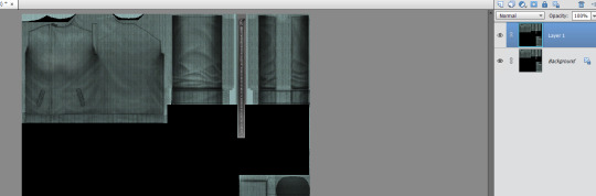
1. Get yourself a texture to work with. You will need it to appear as a layer.
(that’s Ctrl + J to copy a background as a new layer in Photoshop)
You could use in-game pics, but I just like to use the texture, as I already have it available.
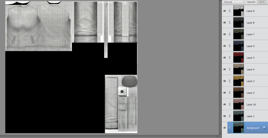
2. Make layers out of all of the recolors you have.
Use a base image where everything lines up exactly, so you have a nice and neat swatch at the end.
I have 10 recolors here, so that’s 10 layers.

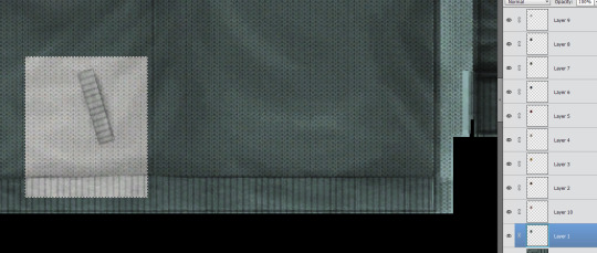
3. Find a chunk of the texture that you’d like to showcase in the swatch.
This little bit with the pocket is good. I am choosing that.

4. Choose your chunk, and then invert the selection.
(Ctrl + I is the hotkey for Photoshop)
You only want to have the square selected.
5. Do this for all of the layers.
You should have a square for each layer. The texture is all exactly the same, with only the color being different.
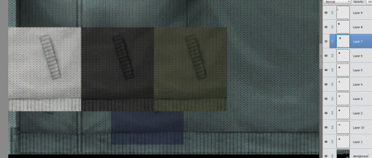
6. Line ‘em up!
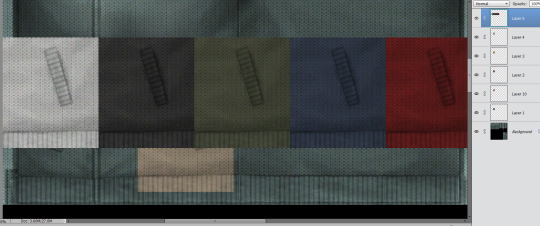
7. Decide how you want it to look.
I have 10 recolors, so I am doing 5 across, and 2 rows.

8. Like this!
Save all of those squares as one layer, and copy it so that you can paste it as a new project.

9. All done!
You can resize it if you need to, but that’s it!
Happy creating!
131 notes
·
View notes
Note
your lancer edits are absolutely AMAZING!!! i've done edits for non-lancer stuff, so i'm curious, what is your process usually like?
Thank you!
The process is, admittedly, VERY time consuming. (which is why i haven't done any recently, it's just a massive time investment)
My workflow exists entirely within Photoshop
I start off with an image of the base mech I rip off of Comp/Con, and I spend a few hours meticulously isolating every part of the mech by hand (polygon lasso tool my beloved). I found that the automatic solutions like magic wand tool & such just. aren't very effective when it comes to holding together detail. Too much or too little is lost in the process, and it usually requires manual touchup anyway, so I just decided to do the whole thing by hand to save the tedium.
This usually takes anywhere from 1-3 hours? It's hard to say. But, the catch is, once i've done it once for a mech, I don't have to do it ever again.
Once i'm done with separating the pieces i want to color/reuse individually, I move on to base coloring. I usually have some idea in mind, but sometimes I just freestyle it. I usually use pretty simple color palettes, and I work almost exclusively in Photoshops Blending Options panel to get those colors to work. Having a non-destructive workflow is..vital. Mixing types like Overlay, Hue, Color, and Multiply are my favorite toys during this process. I also make sure to give everything a 2px black stroke, usually internal, to better match with the base art & clean up any of my mistakes.
When i'm ready to go for the more advanced edits (where i need to add stuff instead of just change things), I spend a little while scrolling through C/C like i'm at a shopping mall looking for parts. Anything interesting, I play around with. I like to rip various greebles off of mechs like the Tortuga, Caliban, Kidd & Nelson the most, but every one of em gets time in the spotlight. At this point, I have most of the parts I could need memorized quite well, and if something calls for a certain shape, I'll know where to find it & take it from.
Trying to get each asset to fit the style of the base frame is quite easy, and adding a simple 2px internal stroke does miracles.
When i'm happy with most everything, i'll play around with gradients to highlight the most interesting parts, give it a flashy name stolen from some album i've listened to Twice, and send it on it's way.
I have an upload of all my raw .PSDs available for download if you're curious- do be warned though, my layer organization sucks and i didn't plan for anyone else to be looking over my work.
I hope that helped!
27 notes
·
View notes
Photo
Sims Tag
Got tagged by the fabulous @deedee-sims - thank you! 🤗 Throwing in a random in-game pic because I can.
1. What’s your favourite sims death?
Hum, tough one. I guess being struck by lighting is pretty cool, not that I get to see it that often. Also being hit by a satellite, but I’ve literally never seen it happen in my game unless I cheat.
2. Alpha CC or Maxis Match?
Alpha, obviously. Although I prefer to call my style ‘semi-realistic’.
3. Do you cheat when your sims gain weight?
I used to, but now I’m like, nah. Let those sims have some meat on their bones!
4. Do you use move objects?
All the time, bruh.
5. Favorite mod?
If I only had to pick one, then Gunmod’s radiance lighting. Picked based on the fact that it’s always the first mod I get whenever I have to reinstall.
6. First expansion/game/stuff pack you got?
I think it was Nightlife? But my PC from back then was so weak that I couldn’t get the EP to work at all, save for a couple outfits that were randomly showing up in CAS.
7. Do you pronounce “live mode” like aLIVE or LIVing?
Been pronouncing it ‘aLive mode’ ever since I started simming. I never even knew there was a debate about it until I saw a post on simblr some years ago.
8. Who’s your favorite sim that you’ve made?
What, just one? D: I have a bunch of faves, and you can probably tell who they are by the fact that they crop up in every new iteration of my game.
9. Have you made a simself?
Never, nor do I plan to! Having a sim version of myself in the game would just feel weird.
10. What sim traits do you give yourself?
I don’t know them all by heart and I’m too lazy to google 'em, so pass. xD
11. Which is your favorite EA hair color?
I wouldn’t say that I necessarily have a favorite, but I noticed a lot of my sims tend to have black hair.
12. Favorite EA hair?
Imma go with hairshortcombed solely based on the fact that I don’t have a burning urge to replace it the second I see it in my game.
13. Favorite life stage?
Adults, duh. And teens. They’re pretty fun too.
14. Are you a builder or are you in it for the gameplay?
I do a bit of everything, but I definitely lean more towards gameplay, especially since starting my BaCC.
15. Are you a CC creator?
Yep! Got my own cc tag and everything! 🙂
16. Do you have any simblr friends/a sim squad?
I want to think so! ^^
17. What’s your favorite game? (1, 2, 3, or 4)
Sims 2 all the way, babey!
18. Do you have any sims merch?
Nah
19. Do you have a YouTube for sims?
Nah
20. How has your “sim style” changed throughout your years of playing?
I think it’s gotten more consistent? I’ve been trying to find a balance between realistic and cartoony cc to maintain that elusive ‘semi-realistic’ look that I’m so fond of, and I like to think that I have a pretty good grasp on it now, after so many years of simming.
21. What’s your Origin ID?
Never had one, lol.
22. Who’s your favorite CC creator?
One favorite cc creator? BRUH. I have a 10GB downloads folder, and you better believe every creator whose cc is in there is my favorite! 🤣
23. How long have you had a simblr?
11 years! Golly, has it really been that long?
24. How do you edit your pictures?
By offering a blood sacrifice on a full moon. Nah, kidding. No blood is spilled during my editing process, though it does feel that way sometimes, considering how effin' long it takes me to iron out all the small kinks that annoy me about my screenshots. I kinda hoped having a dedicated photoshop action would help, but it only speeds up the process so much, unfortunately. :(
25. What expansion/game/stuff pack do you want next?
For Sims 2? Dunno man. Maybe a higher-res remake with all existing EPs/SPs and all known issues ironed out. Which is probably never gonna happen, but a girl can dream, right?
25. What expansion/game/stuff pack is your favorite so far?
I’m partial to Apartment Life because it introduced witches, one of my favorite supernatural life states!
I’m tagging: @blackswan-sims @eleysims @episims @rudhira @ho3sferatu @analog-mothman @nervosims @frauhupfner @mrs-mquve-cc and @gphoenixsims! But feel free to ignore! ^^
35 notes
·
View notes
Note
how do you pick colors so well ...
2 tips:
1) archive the art that inspires you. make sure you have like key words you can use to always go back to it reference. if I love the colours on a piece I want to go back to it one day to study / draw inspiration from. I personally use a discord server with other art friends! I use the search function a lot

2) if you have Clip Studio Paint / Photoshop, learn about tone curves
and gradient maps.

In any art program, learn what all the different filters do - or at least the common ones.

Don't use them in excess, either! Learn to hold back. Study how other artists use them sparingly rather than a crutch. Some artists don't use em at all! I like learning how to replicate filter effects manually to understand what they do and also be able to make them look more natural.
anyway colours are genuinely super hard for me but there are a lot of good tools and references to help you figure what colours you like to choose ^^ good luck
#asks#anonymous#tutorial#I have a few more tricks and stuff but IDK it's hard to make a comprehensive list
163 notes
·
View notes
Text
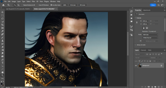
How to repair eyes generated by AI with Photoshop and PainTool SAI
....the tygerlyla way (complicated and tedious) 😅😅😅😅😅
Ai art is astounding! Still, it can't compare to the hard work and beauty of art created by the artist, not to mention the time, sweat, tears, and -maybe some- blood. And Ai art also requires human touch and patience- training the program to come up with the character you want it to replicate... and then it generates those weird eyes, misshapen hands, and speckles that have no right to be there.
So here are my procedures... Be warned: the post is lengthy!
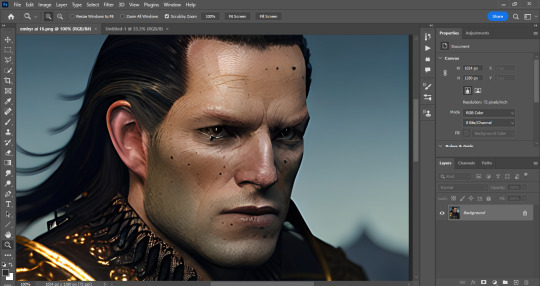
Choose the image and open with photoshop. Brace yourself for the task of fixing that (gorgeous) face.
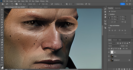
Fortunately the eye on the left has the correct shape, so lasso that baby, copy paste, and flip it. Then use the perspective warp and fit it to the other side.
Erase the stuff you don't need until the other eye is a close match and looks better size wise. Flatten the image and create a new save.
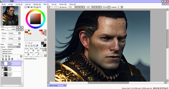
Now boot the new save with the new eye on PainTool SAI. This is where I do my main repairs.
Create layers for the sclera, iris and pupils. Then start painting over the weird eyes with dark flats first.
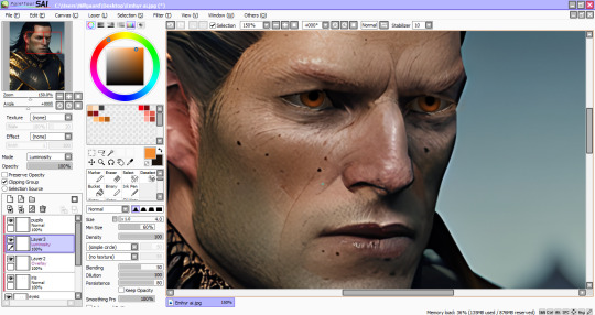
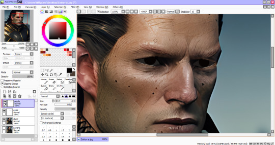
For his warm amber peepers, clip a new layer, change the layer mode to Overlay and airbrush the orange at low density (flow)- about 30-40, and do a crescent shape brush strokes on the pupils. Blur the ends and repeat. Then clip another layer (Luminosity or Linear Dodge on PS) use a yellow orange color and create a lighter crescent.
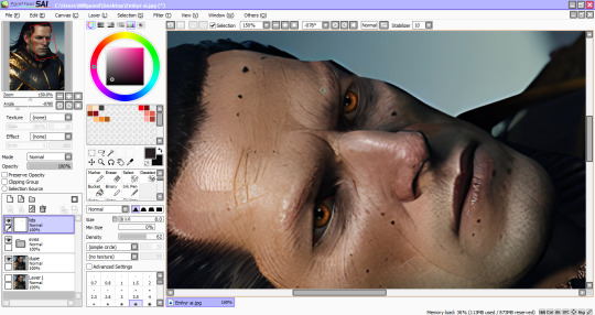
I actually work with my canvas at this angle, easier for me to add details. Create another layer for fixing around the eyes. Eye dropper tool helps matching the colors of the fixed eyes and the ai image. Lots of blurring and shadows going on here. Once satisfied with the repairs, save the image and return to PS.
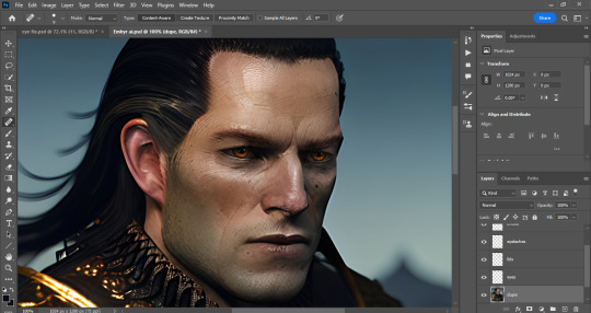
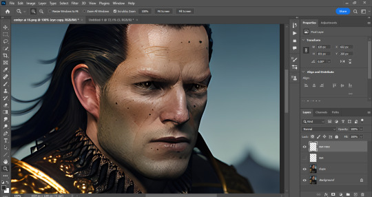
Now we fix the rest of him with a healing brush or spot brush tool, and zap those excessive moles. I also use a body hairbrush to create those thick eyebrows (after making em, change the layer to soft light to blend with the image's colors)
And this is where I use all available photo enhancement tricks at my disposal (skin smoothing plugins, 3LUTS, Liquify, etc.)
And it's done!
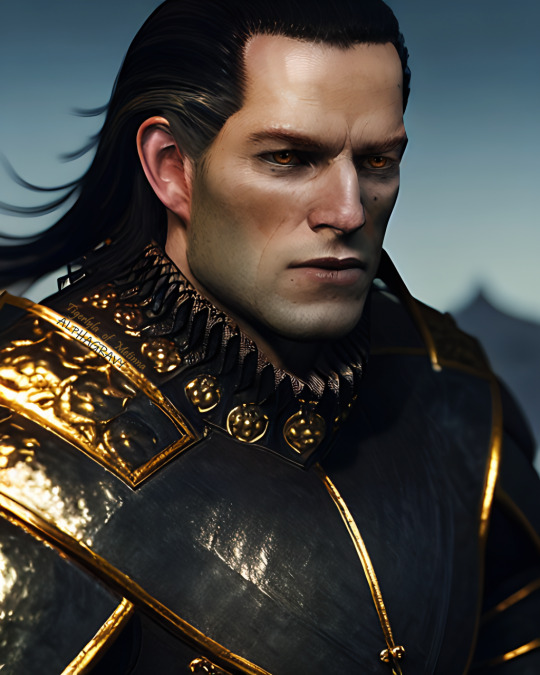
Thank you for making this far! Hope this helps fellow artist dabbling in ai programs.
#emhyr var emreis#ai art#stable diffusion#wip#witcher 3#photo edit#photoshop#paintool sai#artist on tumblr#art tutorial#art help#art tips#photoshop tutorial#paintool sai tutorial
36 notes
·
View notes
Text
Answer Transcript

That's the Picture you can save from the video. I'll mess with it in Photoshop latter to see what I can find
Edit, found this by clicking on the fly on the "What's Welcome Home?" page.
FRANK: [Excited, with pep] These sorts of flowers, though they appear blue, don’t actually have any blue pigmentation! They have to grow in soil that is basic as well, so the pine straw should be left for the other beds-
BARNABY: [Interrupting, distant] You’re telling me that those flowers are liars, Franky?
FRANK: [Exasperated sigh] I am not telling you that these flowers are liars, Barnaby. I’m talking about how these flowers are specially selected to look this way.
BARNABY: Eh, bein’ blue isn’t anything special, pal. Don’t ya know that blue is all the rage nowadays?
FRANK: [Annoyed] I don’t think that people are painting themselves blue, frankly. Are you saying your fur color isn’t natural?
BARNABY: [Feigning insult] I beg your PARDON! I am a natural beauty as far as you know!
FRANK: I doubt you’re any sort of beagle. I’ve never seen any blue dog before in my life! Now if you don’t mind, we’d like to continue tending to my flowers in peace!
BARNABY: You’re gonna have to do more than tend to ‘em if you want ‘em to grow up nice and big. You know what they say, you gotta entertain your plants to make em happy!
FRANK: That’s true… but I am not going to let your snappy patter poison my petunias! I’d hardly call your material entertaining, much less fertilizer!
BARNABY: Oh, don’t you worry, Frank! The last thing I’ll do is overwhelm your orchids. Your plants all seem clover it!
FRANK: [Annoyed, groaning] Not with these puns again! You’re going to make all of my hard work wilt! Your humor is too dry for my impatiens!
BARNABY: Hey, hey! Not a daisy goes by where you don’t get impatient… but hey, I’m just pollen your leg!
FRANK: Will you just get out of here! My plants don’t need your ridiculous jokes to grow, go find an audience for your silly gags somewhere else!
BARNABY: [Backing away] Alright, alright I’ll grow… But every dogwood has his day! I’ll still poppy in from time to time, even if you’re still rough around the hedges!
[Frank grumbles loudly.]
FRANK: [Aggravated] Honestly with him! I don’t know how you can stand to be around him, Wally!
5 notes
·
View notes
Last Seen Blogs

varnsoftwares-blog
Varn Softwares

bhuwank
Bhuwan from StarClinch
starsandeverythinginbetween
Untitled
magmacannon
Blows you a sweet kiss
mommieslittleboy
Mommies Little Boy