#i finished it in october
Text
It's been a few weeks since I had new books to share, but I finally got photos taken of the newest ones so today's the day. Here, have a book:
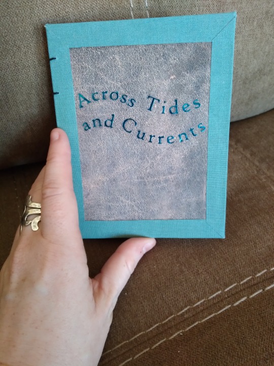
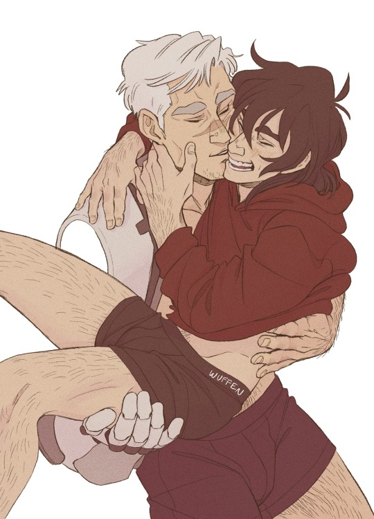
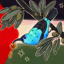
This is Across Tides and Currents, a Good Omens siren AU by Sodium_Azide and @doorwaytoparadise (hi. I hope I tagged you right). My favorite thing about this AU is that, at its heart, it's about learning to communicate with someone who is so different from you that you can't even physically speak each other's language, and yet you've still got so much common ground that you find a way. It's way lighter and more fun than that description makes it sound, though, so go read it if that's your thing.
The cover on this is Lineco book cloth, scrapbook paper printed to look like leather, and blue foil htv. The foil was actually a nightmare to do. The first time I applied it, it wouldn't stick no matter what I did, and the bits that did stick peeled off as soon as I touched them. I had to peel them up very carefully, cut a new image, and try again. Thankfully it worked the second time but I don't know that I'll be using the foil type again unless there's no other way to get the color I want. The non-foil metallic was so much easier to work with.
More book photos under the cut!
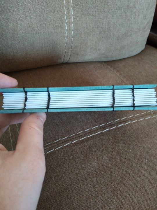
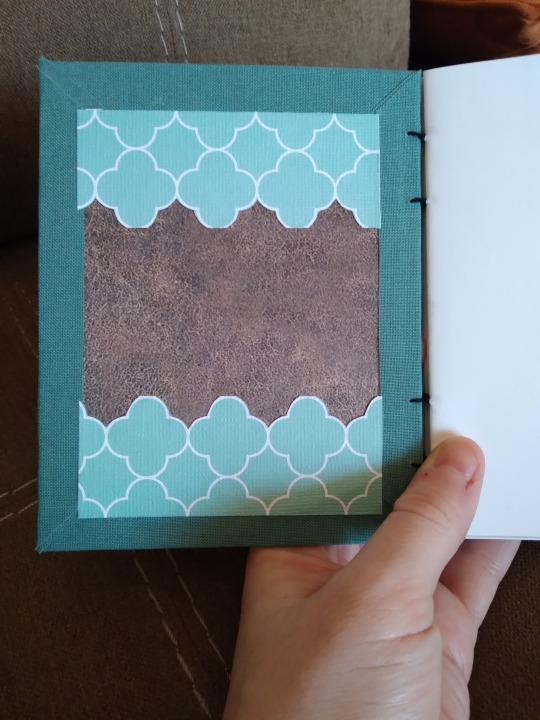
I went with a coptic bind for this one for a few reasons. The first was that I wanted to try one on a quarto-size book to see if I could. I also wanted to try the mitered corners thing I did when I bound Strange Moons, and see if I could have the same effect on the interior. (That bit didn't work out so well; the front is fine but I mismeasured the inside and the lines didn't match up, so I trimmed some pieces of cardstock to cover that up. I really like the layered look though, so that's fine. It's quirky.) The third reason is that not long before I decided to bind this one, the authors published a new chapter after two years of no updates. That's the best possible reason to have to change plans, and the glueless bind means that if they ever do that again I can just redo the stitching to add more pages. Win-win.
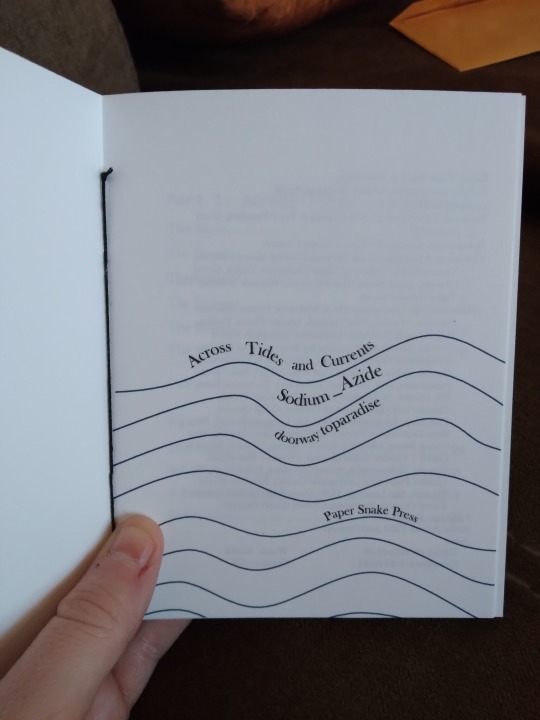
Getting whimsical with title pages here. This took way longer than I thought it would, probably because I don't like graphic design and I did it in Word where I do the rest of my typesetting. Usually what I do is grab an image and put text around it or on top of it and then just play with fonts and sizes, but this time I drew the lines and then made the text follow them. This is the first time I've used the word art feature since...probably 2009? I'd forgotten how. I have no doubt there are better ways to do this but if I'd had to learn a new program at that point I'd have quit. And I do think it was worth it--it's cute and fun and looks about how I imagined it.


Couple of photos of the inside. Sorry the first one's blurry, I had someone trying to get my attention when I took these. The section break image came from rawpixel, I just made it gray instead of black so it's more subtle. The fic has very nice illustrations that I specifically got the artist's permission to print and then I failed to get any photos of them when I did my little photo shoot. They look very nice, though. I swear.
The last image is something I've started including in my latest books. I'm calling them "A Note from the Bookbinder" and it's basically just me talking about why I chose that story, the experience of reading it for the first time, stuff that's going on in the fandom, stuff about the process like the new chapter coming out as I was preparing to print. It's kind of...like marginalia? Part of fanbinding is preservation and that's linked to archival work, and something I know archivists love is marginalia and diaries. I don't like writing in my books and I've never found any fun in journaling, but sometimes that kind of context is important so I'm trying to add it. Someday, decades from now, I may not remember all the details, so I'm trying to preserve them. IDK, this got philosophical on me. Go read about mermaids now. Promise it's a good time.
#bookbinding#fanbinding#snek makes books#good omens#fic rec#i wanted to do this as a mermay project#that did not happen#i finished it in october#happy mertober
46 notes
·
View notes
Text
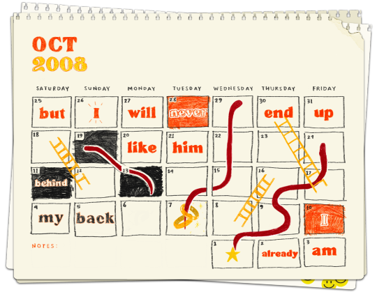
keep a calendar, this way you will always know.
#fall out boy#fall out boy edit#fall out boy lyrics#fob lyrics#fobedit#folie a deux#joe trohman#patrick stump#andy hurley#pete wentz#headfirst slide into cooperstown on a bad bet#sye did something#WAAAUGHH I FINALLY made a decent looking headfirst slide edit#the calendar starts with saturday because I fucked up the year and just realized after I finished itkjdhjd very fitting in fob world I gues#I know october is like a week something away but I have to upload this now because It's starting to look ugly#fun fact headfirst slide is my all time fav song if anyone cares#q
5K notes
·
View notes
Photo
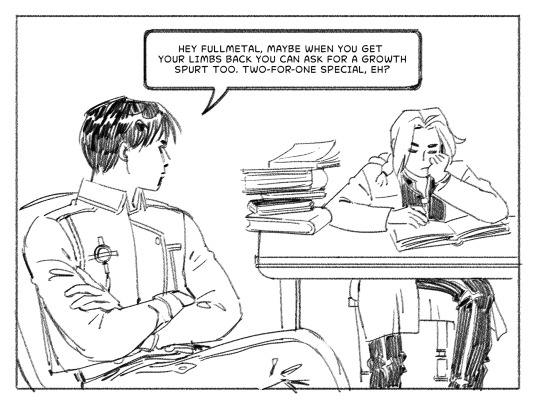
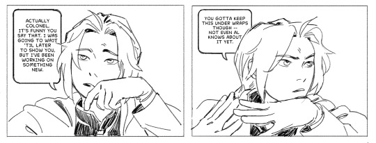
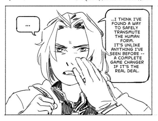
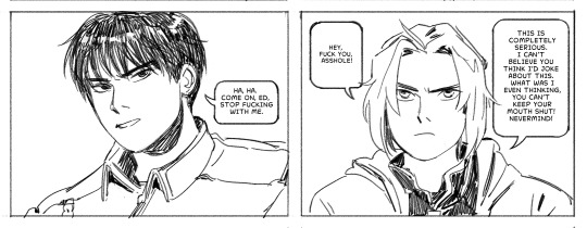

happy october third!
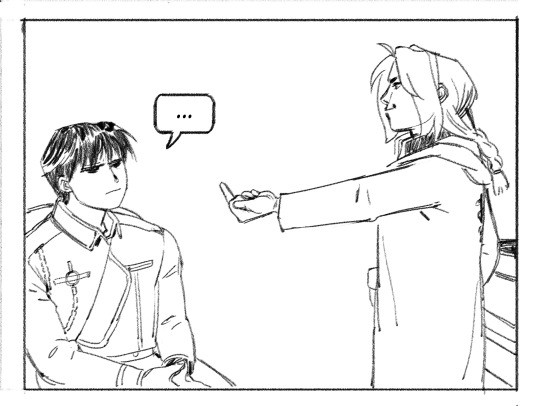
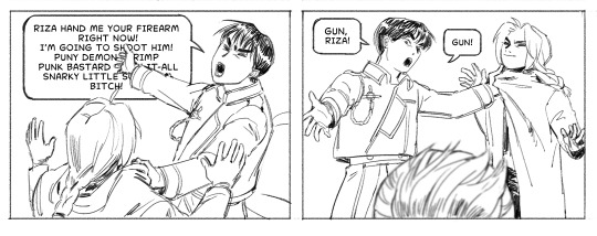
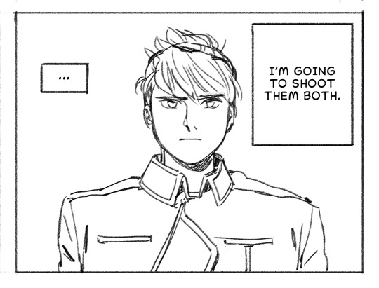
#asfhadlgajda#AU: ed has an iota of self-control#fullmetal alchemist#roy mustang#riza hawkeye#edward elric#art#fan comic#it's october third y'all#I really picked the best time of the year to fixate on this show#this was so fun I hope it's as funny as I intended although I fear it is not#oh welllll#I have many more sketches and things to finish later but I work tonight so this is it for now#love!!!!!#shout out to the person who pointed out in the hashtags that this just couldn't happen bc ed wouldn't be able to stop himself from reacting#you are correct lmao#I stand by it tho for comedic purposes
27K notes
·
View notes
Text


I'm back and worse than ever!
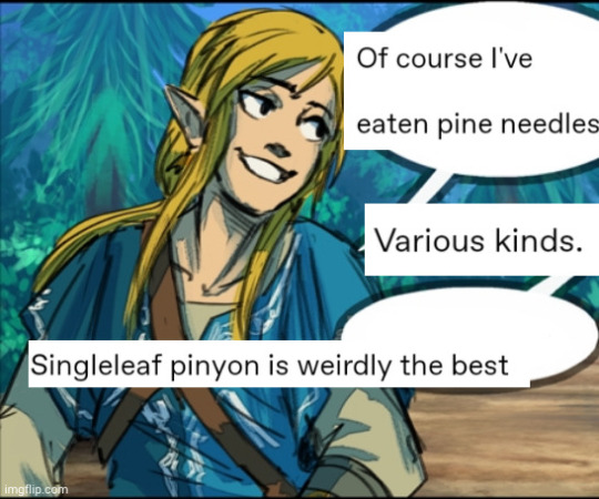
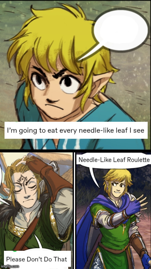
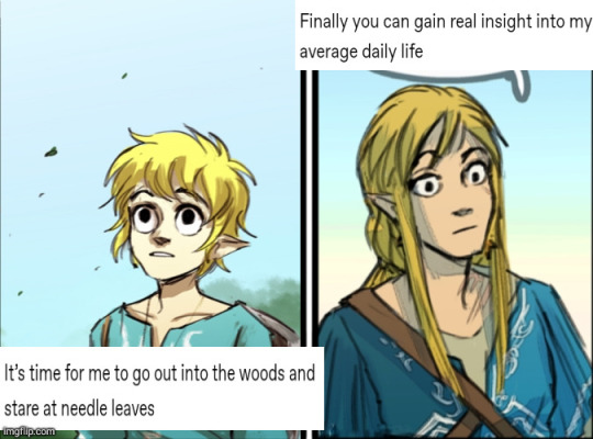
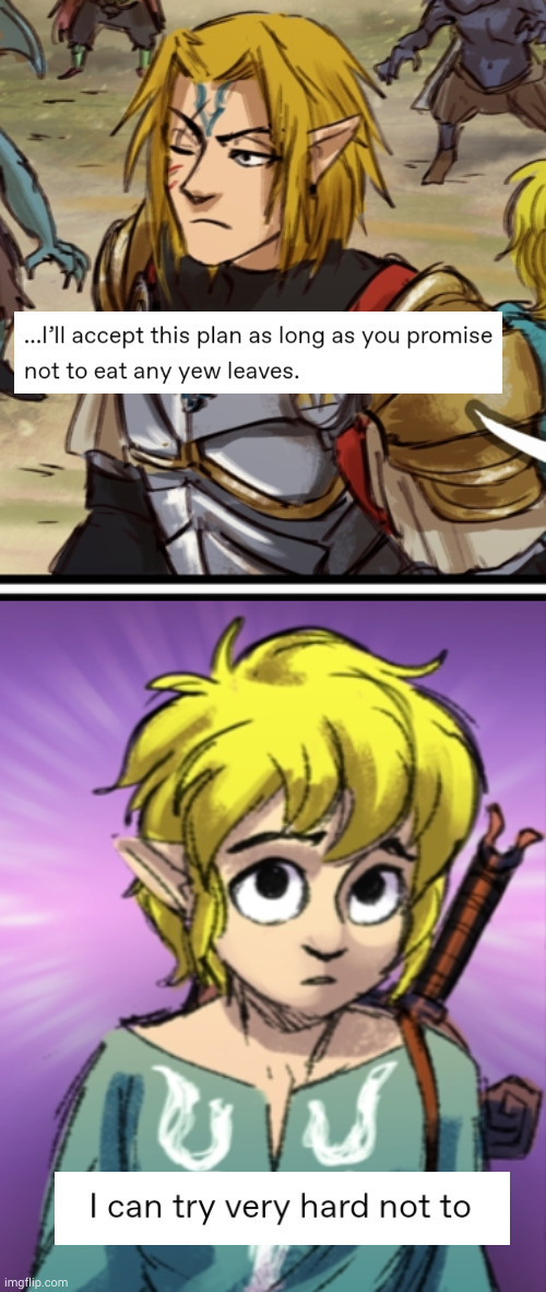
#Linked Universe#lu incorrect quotes#lu Hyrule#lu Legend#lu Wild#lu Twilight#lu Warriors#lu Sky#lu Wind#lu Four#lu Time#Jabberings#I started this in October last year#took a three month break#and finished it at 4pm this afternoon while having the Worst caffeine jitters I've ever had#I'm still vibrating like a Chihuahua it's awful#anyway enjoy
2K notes
·
View notes
Text
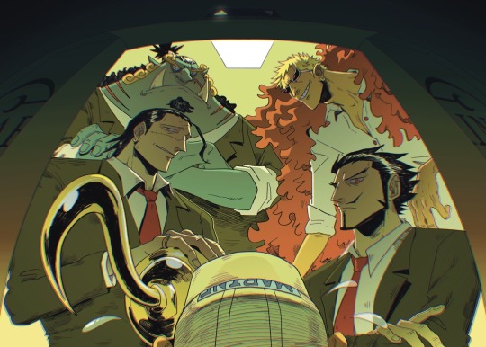
my spread for @opdilfzine
#sir crocodile#dracule mihawk#donquixote doflamingo#jinbei#jinbe#jimbei#shichibukai#one piece#opdilfzine#finally can post this. i finished this last OCTOBER..? i think. thankfully it didnt age too horribly#my art#this was my first fanzine which i applied to last year may...? june? i didnt even know fanzines were a thing till this lol#i think i had like 400 followers on twitter at the time#i felt so intimidated by the other artists who i felt were “famous” with thousands of followers#lol
4K notes
·
View notes
Text


#rise of the teenage mutant ninja turtles#rottmnt#rottmnt donnie#rottmnt mikey#rottmnt raph#villain pb&j duo#just noticed i forgor donnies hand scars lmao pretend theyre there#my friends told me i should post these#also whAT we're halfway through january???#its so weird its like my brain hasnt registered the last three months happened#my brain is stuck in october#i had so much planned for 2023 and barely finished a third of it#but i also grew in so many ways and had so much fun#lets hope this year will be even more awesome!!!
2K notes
·
View notes
Text

Week 3-1: Portal
Bro I have been having the most insane few months, but I am determined to finish this drawing challenge
#crivart#I literally had this 70% finished since October 16th and just lost all motivation and got crazy busy#this year has been a lot#inktober#cursedrelics2023#bg3#halsin#baldur's gate 3
2K notes
·
View notes
Text


ok logistically this makes no sense but: what if you put little charms on the chains. like a charm bracelet
#i started this in october but now it can be birthday doodle art lol#maybe in another six months i'll finish leorio's birthday art :')#hbd to the chain bastard 🎉#hunter x hunter#hxh#kurapika#gon freecss#don't ask how the chains are out when he's asleep it's kurapika he's just all chains all the time idk#also technically the charms should fall off when he... un-conjures(?) the chains#Unless#he deliberately decided to conjure the charms too? :')#(also sorry to izunavi and to anyone i forgot. i ran out of charm ideas TvT)
6K notes
·
View notes
Text

moonlight
#lineart has been sitting in my folders for months and then my exams came in and i decided It Is Time.#genshin impact#genshin impact fanart#venti#venti fanart#fanart#*boop* art#it's also kinda a redraw of a similar concept i did last year lmao#edit: i finished this back in october#it's just been in my drafts 🧍
1K notes
·
View notes
Text
feast (ID in alt)
#vashwood#vash the stampede#nicholas d wolfwood#trigun#trigun maximum#tw blood#im posting this so late because october escaped me Suddenly.. hello....#i wanted to make it a photoset with this other vampire vw wip but i don't think i'm finishing it any time soon and the mood of it is#completely different anyway. also i don't think i ever shared anything about my vampire au on here !!! it's all old art by now so im shy lo#but maybe i'll do a photodump of it. long story short vash is a vampire since birth and ww is a human vampire hunter that turns during thei#travels together due to EoM experiments + getting vash to drink from him at some point.#humans turn once they get bitten but bc ww has been experimented on#& got bitten by a bunch of human turned vampires thruout his hunts he thought it wouldn't be a problem for vash to drink from him but alas.#theyre both ok though theyre traveling together definitely not hating themselves for what theyve become and feeling guilty for what theyve#done to each other. theyre completely normal about it. the biting part is really appealing to me in vampire aus so i draw it a lot but#in reality vash only drank from ww once and ww mightve done it twice under the realization he might actually die otherwise#since he wont drink from humans after being turned.... he's combatting the 5 stages of grief at all times#if this is all nonsense im sorry DMGKSDF I'M NOT good at explaining and this au came from nowhere in the depths of my mind its a mess#ruporas art
1K notes
·
View notes
Text
#worufu draws#sheith#started this redraw of my 2017 keith bday drawing in october but didn’t finish it until now#so here it is for the new year i guess#god i miss 2017#such a simpler time
735 notes
·
View notes
Text

Alternative universe where Luke and Reggie share the best werewolf vampire solidarity 🤝
#julie and the phantoms#jatp#luke patterson#reggie peters#alex mercer#jatp willie#jatp art#jatp fanart#digital art#my art#this AU hasn't left me I love this so much already#telling by Luke's messy hair... werewolf!Luke was predestinied to be a big floof#and Reggie would absolutely LOVE IT#Alex is having none of it#he wouldn't know what answer he expected to hear from Reggie#last art post of this year! the past three months have been a lot so I'm mentally still stuck in october#but today I finally finished a big project and can now post some art I originally started with the halloween picture#can't believe it's the end of december#so instead of happy halloween have a happy new year!
617 notes
·
View notes
Text

The Family, all of the DC-comic-universe deserves!😤💗
(so beloved that bruce checks in on them now and then, without their knowing 😅)
#dick grayson#mari grayson#kori anders#jake grayson#dickkory#nightwing#starfire#nightstar#I FINALLY finished thisd#dont mind how different they look in each drawing#they are literally drawn 2 months apart#coloured one month apart#and drawn on two different devices#ipad vs. computer art#dcu#fanart#mud art#sorry i just HAD to finished these first#the first one has been a wip since OCTOBER
3K notes
·
View notes
Text
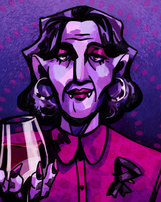

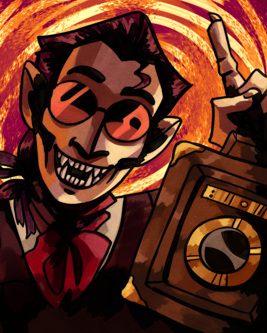

THE BLACK RIBBONERS!! 🎗🧛🏻
#discworld#lady margolotta#sally von humpeding#otto chriek#maladict#terry pratchett#vampire art#mine#YAYYY more portraits loosely inspired by disco elysium#i started these like a month ago and finally got around to finish them good lird#anyway happy october!!!!!
739 notes
·
View notes


Last Seen Blogs
sorcererrezan
X's sugar mama
captain-quizzical-beagle
Beautiful Ben, too good for this world, too pure.
paranoid-spotlight-everest
IT'S A GENOCIDE. SAY IT.
mystar-girl57
𝗩𝗔𝗠𝗣𝗬
i-love-southpark-milfs69
lil meow meow