#red light spectrum
Text
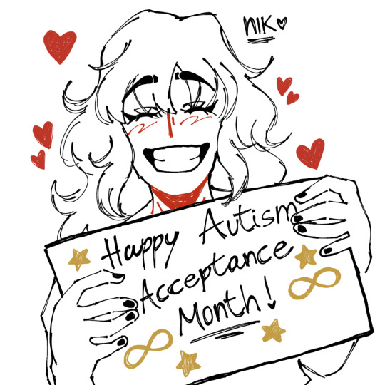
happy autism acceptance month!!
#art#artwork#digital art#drawing#autism#actually autistic#autism acceptance month#autism acceptance#anti autism speaks#light it up gold#red instead#autistic#autism spectrum#on the spectrum
146 notes
·
View notes
Photo
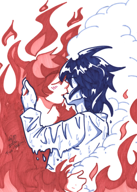
L sometimes can’t bear to put this flame out. He’d much rather let off some steam.
@lawlightweek2022
#drawn by me#my fanart#Death Note#lawlightweek2022#lawlight#Elemental Kitchen#Light Yagami#L#fire!Light#water!L#this WILL be given the digital treatment someday#my scanner really doesn't like colors on the red spectrum#Day 2: Sun - Passion or Fire#smooch#gotta get better#my au
545 notes
·
View notes
Text

Bad Sansuary Day 16: Fragile
Yeah bones sure are
Killer -> rahafwabas
#Star’s Scribbles#badsansuary#Killer Sans#UTMV#Saucer#UTMV Oc#QUEUE#the colors for this one made me want to fistfight the light spectrum#RED AND GREEN ARE LIKE. OPPOSITE#the compromise is the colors u see here#this is fine 👍#Wait oh my gah#happy birthday to my little sister when this posts!!!
39 notes
·
View notes
Text
My pet peeve is when I see a cover, a colour spread or an anime adaptation of a manga, and the characters' hair and eye colour don't match with I thought it would be, based on how they were represented in the manga
#this is a stupid pet peeve but 🤣🤣🤣#I don't mean specific colours btw but like on the darker or lighter spectrum of the colour palette#why would you “colour” the manga characters' hair and eyes with dark ink just for them to have a light hair/eye colour in the anime 😭#sorry I don't know the correct terminology#I thought Hiyori and Toki would have black or dark hair and dark eyes... and in the anime they're light mint green and blue#same thing with Boa Hancock and now Doll.. what do you mean they have blue eyes???? no fuck you they don't.. they have black eyes thank you#also with characters in naruto... jjk... etc..#like why does Karin have darker hair and eyes in the manga but has bright red hair and eyes in the anime...#while Gaara and Sasori have lighter hair in the manga and yet in the anime their hair is darker than Karin's!!!!#how does this work 😭😭😭😭#I know there were other examples but I cant think of them rn 😭#i hope I'm not the only one thinking this tho...#guya posts#one piece#naruto#jujutsu kaisen#anime#manga
22 notes
·
View notes
Text

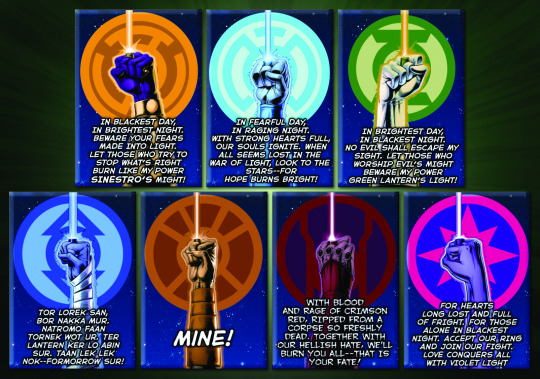
Lantern oaths. What’s your favorite?
I added the different version of the red lantern one that Razer says. I didn’t add Aya’s cause hers didn’t actually work :(
Sorry I also didn’t add the black or white lantern oath. Maybe I’ll do a separate post for those.
And here’s the English version (or a version so to speak) of the indigo lantern oath.
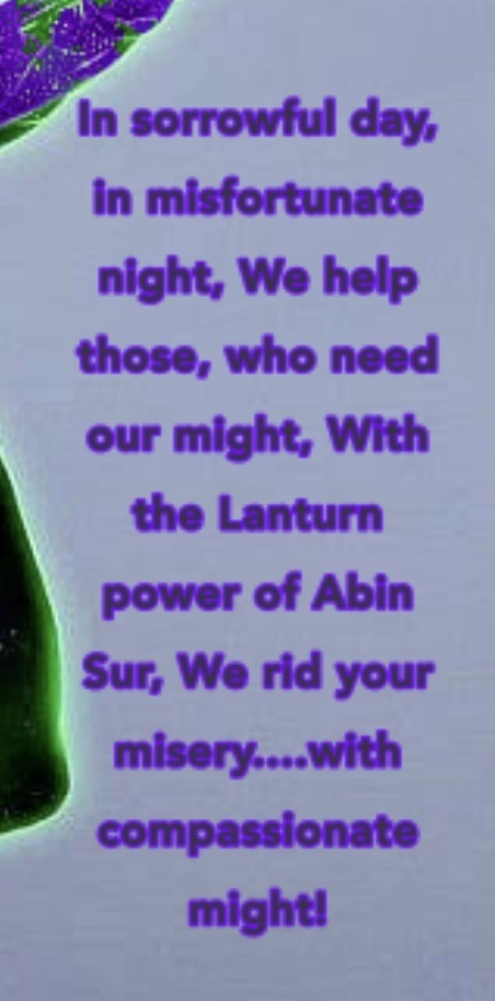
I think my favorites are the red and green lantern oaths. :D
#dc comics#dc#dc universe#razer gltas#lantern oaths#green lanterns#red lanterns#orange lanterns#blue lanterns#star sapphires#yellow lanterns#sinestro corps#indigo tribe#hal jordan#emotional spectrum#color spectrum#hope will fear love rage greed compassion#death and light too
28 notes
·
View notes
Text
I know this is probably nothing and just my bored mind going places, but thought it would be interesting. Recall how IMAGE_FRIEND, the eyes from the Spamton Sweepstakes, and Spamton's glasses themselves (which are implied to have been influenced by the previous two examples) all share connection to the colors yellow and pink. While thinking about this, something dawned on me. In Undertale, you can change YELLOW spare names to be PINK instead if you want (like I said this probably nothing, but it is interesting that there seems to be connection between the colors yellow and pink).
#deltarune theory#image friend#image_friend#spamton sweepstakes#spamton#deltarune#also yes I am using tumblr orange for yellow ignore that.#thinking about this connection further it is kind of weird to use pink as the alt spare name color#like#why not a different color?#....probably because other color text is already connected to something like the soul traits/chara's lines#the only thing special about pink is that it technically doesn't exist on the visible light spectrum#it is the result of the eye getting both blue and red light and the brain mushing them together into a form we can understand#and with this in mind..... IDK#light blue soul and red soul connection? IMAGE_FRIEND being a figment of kris?#like I said it's probably nothing but#you know
14 notes
·
View notes
Text
some of you took the idea of "social constructs" way too far lmao like. yeah this group of symptoms and this particular chemical imbalance don't mean anything in and of themselves until doctors and psychologists give them meaning by grouping them into a Disorder but you can say the same about every other medical issue. doctors just decided that having severe fatigue and a lack of vitamin d in your blood means you have a vitamin d deficiency and having a sore leg and an x-ray that shows a break in the bone means you have a broken bone, and if those things are adversely affecting your quality of life and there are ways to help you feel better you should probably do that instead of going Well It's Actually Just A Social Construct It's Just A Group of Attributes That Psychiatry Has Decided Is A Disorder. yeah they decided it's a disorder because it kills people please take your meds.
#putting 'social construct' and 'social model' up on a big high shelf where none of you can reach it#sorry for engaging in#discourse#but i see this all the time and it's so frustrating#especially when it comes to mental illness like you're essentially telling people it's all in their heads do you see how harmful that is lol#the light spectrum that makes up the colour red also doesn't have inherent meaning but it's still real
7 notes
·
View notes
Text
If we know what colour the solution appears, we can determine which colour is being absorbed using a colour wheel, like that shown in figure 13.37.
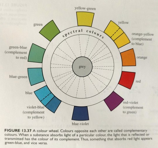
"Chemistry" 2e - Blackman, A., Bottle, S., Schmid, S., Mocerino, M., Wille, U.
#book quotes#chemistry#nonfiction#textbook#color wheel#light absorption#light#visible spectrum#gray#yellow green#yellow#orange yellow#orange#red#red violet#blue violet#violet blue#blue#blue green#green blue#green#complementary colors
4 notes
·
View notes
Text
Red: The longest wavelength on the spectrum of visible light, often identified first in the rainbow. Humans have cones in our eyes for reading it. Used as a primary colour in painting. Is a secondary colour in printing and can be achieved by mixing the primary colours magenta and yellow in equal amounts. Considered a “warm” colour. Often associated with fire or heat in general. A colour that stands out in nature as sign of edible fruit, a warning of poison, approaching autumn, sunrise and sunset, a wound, or inflammation owing to a burn or infection. Often the first colour named in a given society.
Vermillion: A long wavelength on the spectrum of visible light, rarely if ever identified in the rainbow. It is shorter than true red but longer than orange. Considered a tertiary colour in painting as “red-orange” by mixing 75% red with 25% yellow as primary colours*. It is a quaternary colour in printing made with colour values in ratio of 75% magenta to 100% yellow. Often referred to as a “brilliant red”. Rarely distinguished linguistically from red or orange except in fields of work dealing directly with colour. May otherwise be called a “reddish” orange or an “orangey” red.
Orange: A long wavelength on the spectrum of visible light, commonly identified in the rainbow. It is shorter than vermillion but longer than amber. Some humans have cones in their eyes for reading it, but this is very rare. Most human brains read it by making an approximation between red and what we see as yellow. Considered a secondary colour in painting by mixing the primary colours red and yellow in equal amounts. It is a tertiary colour in printing made with colour values in ratio of 50% magenta to 100% yellow. A relatively recently linguistically distinguished colour, previously simply subsumed under red or yellow. Most associated with the citrus fruit from which it gets its name.
Amber: A long wavelength on the spectrum of visible light, rarely if ever identified in the rainbow. It is shorter than orange but longer than yellow. Considered a tertiary colour in painting as “yellow-orange” by mixing 25% red with 75% yellow as primary colours. It is a quaternary colour in printing made with colour values in ratio of 25% magenta to 100% yellow. Sometimes considered a “golden yellow”. Most often associated with the fossilized tree sap from which it get its name, though this material can also be varying shades of white, red, or brown. It is also associated with honey.
Yellow: A long wavelength on the spectrum of visible light, commonly identified in the rainbow. It is shorter than amber but longer than lime. Used as a primary colour both in painting and in printing, but humans do not have cones for reading it, instead making an approximation between red and green. Considered a “warm” colour and the brightest, being indistinguishable from white when colour images are converted to a gray scale. Often associated with the sun. Considered “cheery”. One of the first colours to be distinguished after red, perhaps owing to its brightness, as another sign of autumn, infection, wilt, ripe fruit, or sunrise and sunset.
Lime: A wavelength on the spectrum of visible light, rarely if ever identified in the rainbow. It is shorter than yellow but longer than chartreuse. Considered a quaternary colour in painting as “yellow yellow-green” by mixing 87.5% yellow with 12.5% blue. It is also a quaternary colour in printing made with colour values in ratio of 25% cyan to 100% yellow. Though it takes its name from green citrus fruits its colour is more often seen in very young leaves or shoots in springtime. Rarely distinguished linguistically from yellow except perhaps to be identified as “greenish”.
Chartreuse: A wavelength on the spectrum of visible light, rarely if ever identified in the rainbow. It is shorter than lime but longer than harlequin. Considered a tertiary colour in painting as “yellow-green” by mixing 75% yellow with 25% blue. It is a tertiary colour in printing as well with colours values in ratio of 50% cyan to 100% yellow. It takes its name from a French liqueur whose shades vary between yellow and green. In nature the colour is observed in young plant growth in the springtime. Often simply subsumed under green.
Harlequin: A wavelength on the spectrum of visible light, rarely if ever identified in the rainbow. It is shorter than chartreuse but longer than true green. Considered a quaternary colour in painting as “green yellow-green” by mixing 62.5% yellow with 37.5% blue, and in printing with colour values in ratio of 75% cyan to 100% yellow. Rarely distinguished linguistically from true green except perhaps as “yellowish” or “bright”. A common colour in nature.
Green: A wavelength on the spectrum of visible light, commonly identified in the rainbow. It is shorter than harlequin but longer than erin. Humans have cones in our eyes for reading it and can distinguish more shades of it than our digital devices can. Despite this it is not the first colour named, likely because of its consistency as a background colour. Considered a secondary colour in painting by mixing yellow and blue in equal amounts, and in printing by mixing cyan and yellow in equal amounts. Most often associated with plants or with nature in general. It mostly has positive connotations, but can also be a sign of rotting food, infection, or a severe storm.
Erin: A wavelength on the spectrum of visible light, rarely if ever identified in the rainbow. It is shorter than green but longer than spring. Considered a quinary colour in painting by mixing 43.75% yellow with 56.25% blue. It is a quaternary colour in printing made with colour values in ratio of 100% cyan to 75% yellow. It takes its name from the country of Ireland, which is associated with lush green as a result of frequent rain. It is rarely distinguished linguistically from green except as “bluish”, “cool”, or “turquoise-ish”. Considered an attractive shade of green for gardens.
Spring: A wavelength on the spectrum of visible light, rarely if ever identified in the rainbow. It is shorter than erin but longer than aquamarine. Considered a quaternary colour in painting by mixing 37.5% yellow with 62.5% blue as “green blue-green”. It is a tertiary colour in printing with colour values in ratio of 100% cyan to 50% yellow. It likely gets its name from the colour of some healthy plants after the spring rains, such as tulip and hosta leaves, but can still be a confusing name due to shades of yellow-green being commonly associated with spring. May also be referred to as “seafoam”, “aqua-green” or even “turquoise”. Considered an attractive shade of green for clothing or jewelry.
Aquamarine: A wavelength on the spectrum of visible light, rarely if ever identified in the rainbow. It is shorter than spring but longer than cyan. Considered a quinary colour in painting by mixing 31.25% yellow with 68.75% blue. It is a quaternary colour in printing with colour values in ratio of 100% cyan to 25% yellow. It takes its name from a colour variety of the beryl gemstone that is most often a light cyan to azure, but sometimes the shade described here. Used much in the same way spring and cyan are in clothing and jewelry. A very uncommon colour in nature outside tropical regions where it is viewed in shallow seas.
Cyan: A wavelength on the spectrum of visible light, sometimes but not always identified in the rainbow. It is shorter than aquamarine but longer than capri. Considered a tertiary colour in painting by mixing 25% yellow with 75% blue as “blue-green” or “teal”. True cyan cannot be made with the RYB colour model+. It is therefore a primary colour in printing, but humans do not have cones for reading it, instead making an approximation between green and blue. The physical colour is considered “brilliant” or “neon”. As a secondary colour of light, its brightness is only succeeded by yellow. Often referred to as “aqua”, “turquoise”, or simply subsumed under blue. A very uncommon colour in nature outside tropical or polar seas.
Capri: A wavelength on the spectrum of visible light, rarely if ever identified in the rainbow. It is shorter than cyan but longer than azure. Considered a quinary colour in painting by mixing 18.75% yellow with 81.25% blue. It is a quaternary colour in printing with colour values in ratio of 100% cyan to 25% magenta. Often subsumed under blue or cyan. Rarely referred to as “aqua”, sometimes referred to as “sky-blue”.
Azure: A short wavelength on the spectrum of visible light, rarely if ever identified in the rainbow, but commonly seen in the sky. It is shorter than capri but longer than cerulean. Considered a quaternary colour in painting by mixing 12.5% yellow with 87.5% blue as “blue blue-green”. It is a tertiary colour in printing with colour values in ratio of 100% cyan to 50% magenta. Often subsumed under blue, most often as “sky-blue”. Considered a calm colour, as indicated by the sky on a clear day.
Cerulean: A short wavelength on the spectrum of visible light, rarely if ever identified in the rainbow. It is shorter than azure but longer than blue. Considered a quinary colour in painting by mixing 6.25% yellow with 93.75% blue. It is a quaternary colour in printing with colour values in ratio of 100% cyan to 75% magenta. Often subsumed under blue. May occasionally be referred to as “sky-blue”. Most often associated with large bodies of water.
Blue: A short wavelength on the spectrum of visible light, commonly identified in the rainbow. It is shorter than cerulean but longer than indigo. Humans have cones in our eyes for reading it and can distinguish countless shades of it. Used as a primary colour in painting. It is a secondary colour in printing, consisting of equal cyan and magenta colour values. It is a considered a “cool” colour, especially when contrasted with red. True print blue is sometimes seen as more on the “purple” side when compared to azure. Blue is often the last colour range to be named, likely due to the consistency of the sky and that it doesn’t signify warning, seasonal change, and only very rarely ripe fruit. It also doesn’t stand out on a landscape of green. However, it is a common favourite colour perhaps because of the positive connotations of water and a clear sky. In gardens it does stand out among red and yellow flowers and is a popular colour choice for clothing and jewelry.
Indigo: A short wavelength on the spectrum of visible light, commonly identified in the rainbow. It is shorter than blue, but longer than violet. Considered a tertiary colour in painting as “blue-violet” by mixing 25% red with 75% blue. It is a quaternary colour in printing with colour values in ratio of 75% cyan to 100% magenta. While often subsumed under blue or violet, it is still more frequently identified than other tertiary-quinary colours, perhaps owing to the availability of dyes that can produce the colour. It is associated with twilight and often confused with or synonymised with “navy blue”, “midnight blue”, or “aubergine”, owing to the relative darkness of its most saturated shade compared with that of other colours.
Violet: The shortest wavelength on the spectrum of visible light, commonly identified in the rainbow. Humans do not have cones for reading it but our brains make an approximation of blue and red, more on the blue side. Considered a secondary colour in painting by mixing equal amounts of red and blue. It is a tertiary colour in printing with colour values in ratio of 50% cyan to 100% magenta. Relatively recently distinguished due to at-the-time rare dyes giving it an association with royalty, it was often and sometimes still is subsumed under blue or rarely red. It is a well-liked colour associated with grapes and plums, twilight, or flowers, some of which it share its name with.
Purple: Beyond the spectrum of visible light, rarely if ever identified in the rainbow unless as a synonym of violet. It is an approximation made by our brains to go between what we see as violet and what we see as magenta. Considered a quaternary colour in painting as “violet red-violet” by mixing 62.5% red with 37.5% blue. It is also a quaternary colour in printing with colour values in ratio of 25% cyan to 100% magenta. Often considered synonymous with violet, though side by side the two are quite distinct, with violet being more “cool” and purple being more “warm” or “pinkish”. May at times be subsumed under magenta. In the past it was subsumed under red or rarely blue.
Magenta: Beyond the spectrum of visible light, yet often identified in the rainbow as the last colour or even sometimes the first before red. It is an approximation our brains make between red and blue that is opposite to green, since green light is absorbed by “magenta” objects. Considered a tertiary colour in painting as “red-violet” by mixing 75% red with 25% blue. True magenta cannot be made with the RYB colour model. It is therefore a primary colour in printing. Also called “fuchsia” or “shocking pink”. Though often associated with pink, pink is more accurately a pale red. It is considered an extremely feminine colour in modern times owing to branding targeting women and girls. Has been subsumed under red in the past. In sweets it is often associated with strawberries, cherries, or raspberries. But the fruits with a “true” magenta colour are some dragonfruits, some gooseberries, some currants, and others not commonly found as flavours in sweets.
Cerise: Beyond the spectrum of visible light, rarely if ever identified in the rainbow. It is an approximation our brains make between what we see as magenta and what we see as rose. Considered a quinary colour in painting by mixing 81.25% red with 18.75% blue. It is a quaternary colour in printing with colour values in ratio of 100% magenta to 25% yellow. It is almost always subsumed under magenta with the same associations with candy flavours. Also called “fuchsia” or “pigeon’s blood”.
Rose: Beyond the spectrum of visible light, rarely if ever identified in the rainbow. It is an approximation our brains make between red and what we see as magenta. Considered a quaternary colour in painting as “red red-violet” by mixing 87.5% red with 12.5% blue. It is a tertiary colour in printing with colour values in ratio of 100% magenta to 50% yellow. It is often subsumed under red or sometimes magenta. The flower from which it gets its name is most often associated with a red-pink-magenta-white colour range, though they can also be yellow, green, or even violet. It is sometimes called “fuchsia”, “pigeon’s blood”, “watermelon”, “ruby” or “pinkish red”. It is considered an attractive colour for clothing or gardens.
Crimson: Beyond the spectrum of visible light, rarely if ever identified in the rainbow. It is an approximation our brains make between red and what we see as rose. Considered a quinary colour in painting by mixing 93.75% red with 6.25% blue. It is a quaternary colour in printing with colour values in ratio of 100% magenta to 75% yellow. It is often subsumed under red or sometimes rose and rarely distinguished from either except as “pinkish red” or “rose red”. It is sometimes called “blue-red” or “ruby”, and confusingly its name “crimson” is often also given to dark red or “blood red”.
This is far from every hue of colour we can visibly distinguish and did not include dark versions or pale versions. And I could have left it at red, orange, yellow, chartreuse, green, spring, cyan, azure, blue, violet, magenta, and rose. But it didn’t feel right to leave out yellow-orange, red-orange, indigo, and purple, and if I had those I had to include the rest.
*This is a baseline, but painting in art rarely involves exact amounts, and in printing digital colour values often don’t reflect the amounts of inks being used.
+Though the RYB model is used in art for basic mixing, artists are not limited only to the shades that model can create. There are many pigments an artist can use directly, and even the CMYK model of printing has its limits in brightness, which is why six-colour printers exist and why press printers may apply PANTONE inks directly.
#colours#RGB#Red Green Blue#CMYK#Cyan Magenta Yellow blacK#RYB#Red Yellow Blue#light vs paint vs ink#visible spectrum#wavelengths of visible light#post no one asked for#except they kind of did#because so many of you assholes keep being like#define the colour red!#without using the word red in the definition!#I did#don't challenge me#colour is literally my job
48 notes
·
View notes
Text
there really is nothing funnier than comparin mine and akiyama to each other and i only do so because the fact rgg made a super-rich character who kills himself because he realized money alone couldn’t make him happy by jumping off a building only to IMMEDIATELY- i’m talking we meet the dude five minutes into Y4- make another super-rich character who’s charitable and owns a moneylending company called fucking sky finance whose life was saved by money is pure comedy
#snap chats#the best joke ever is akiyama's company being called /sky finance/#like alright. bit on the nose there huh LMAO#'fly high' or whatever LMAOOOO#like they also maybe have similarly colored suits?? if i wanna stretch it ??#mine's suit is like a deep mauve while akiyama- depending on the lighting- is more of a maroon#they're both on the red spectrum leave me alone but the way their suits are in contrast too: mine's is closed while akiyama's is open#black dress shirts as well#hell they even have a gold neck piece: mine's tie and akiyama's necklace#then everything after that is just. so different#akiyama willingly gives away money not for any other reason other than he knows people could use it#mine doesn't mind giving money away but only if it can help his own goals#akiyama has long hair and an unshaven face while mine has short hair and a clean face#the fact we get to see both of their secretaries too is funny and theyre Also absolute contrasts to each other#also pissing myself as i just realized the '4' key shares the '$' symbol. enough we get it#i feel like i could go on forever but i'll be here all day#just know i laugh at this thought at least once a day
41 notes
·
View notes
Text
Houston, we have grow lamp! (Currently being used to perk up my basil which needs a new pot but I haven't had a chance to get to the store for one yet)
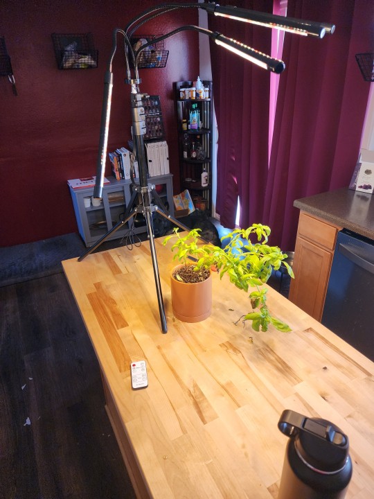
#fuckithomestead#plant#grow lamp#gonna be really helpful getting seeds to sprout#it's full spectrum so it has red light that helps speed germination and sprout hardiness
9 notes
·
View notes
Text
so since angels are multidimensional wavelengths of celestial intent i wonder what colors some of michael's wavelengths are. would they change if adam kissed him on the cheek perhaps. would that make him turn violet because his frequencies spiked
#started thinking about that line and then thought about the visible light spectrum. i think michael goes from being violet around adam all#the time to being red when adam's gone. red has the least amount of energy and he's so dead in 15x19#kate rambles#midam
19 notes
·
View notes
Text
@elitepoppy it helps that I'm also a huge sucker for color spectrum themed gimmicks. I do a LOT of color spectrum stuff with Wellspring's layout design so color spectrum Yveltal is SO SEXY
#all of the antagonistic forces in Wellspring are associated with a color that 'doesn't exist'#Gloom is the bright pink between violet and red#(I usually call it fusica but I don't believe it's actually technically fusica I think that's a different shade of pink)#daemons are stygian blue#and errants are hyperbolic orange#while the soul is represented by the full visible light spectrum#and arts are the three primary colors#(I mean technically ra is more Pink than Red but close enough. True pink is red w white.)#𝐚𝐛𝐛𝐲 𝐜𝐚𝐧'𝐭 𝐫𝐞𝐚𝐝 ☆ ooc.#oops this turned into a Wellspring ramble
3 notes
·
View notes
Text

Well played, Pokémon
#gaming#pokemon#semiotics win#Pokémon sv#professor toro#professor sada#light spectrum#infra red#ultra violet#gravitational lensing
9 notes
·
View notes
Text
Saw someone classifying the rainbow colors as ROYGIBV instead of RMYGCA again and I must restrain my rage.
#orange and purple BEGONE#it's#RED#MAGENTA#YELLOW#GREEN#CYAN#AND AQUA#this is the stupidest hill to die on#but I don't care#you can't mix the colors you want when you treat purple and orange as primary/secondary colors#they're in between on the spectrum#white + aqua will not make cyan / ''light blue''#etc. etc. etc.#the way we teach colors is just plain wrong#and I'm mad about it
2 notes
·
View notes
Text



rhododnite you have a quiet strength about you. you're the one that's there when your friends need that last push. your grounding energy is comforting and reliable. you have a gift for encouraging and strengthening those around you, helping them heal their wounds and find it in themselves to endure. you know how because you've been there before. when was the last time you opened up about your own struggles without it just being to help someone with theirs? when was the last time you let yourself think about your pain without using it as a comparison? you're allowed to let people help you heal too.
which color crystal are you?
tagged by: @darkestshadeofgrey !!!!
tagging: literally anyone who so wishes, and tag me please!!!
#headcanon. the jedi.#[the crystal itself is a very light red to a very deep magent easily on the red spectrum. that’s my kid.]#[molly Parker is an EXCELLENT older jedi Alana.]
2 notes
·
View notes