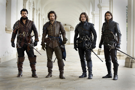
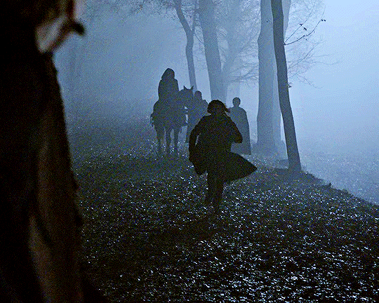
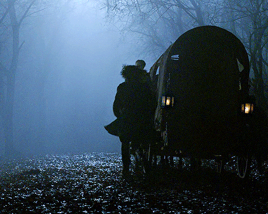
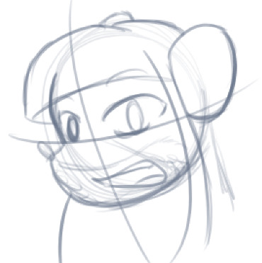
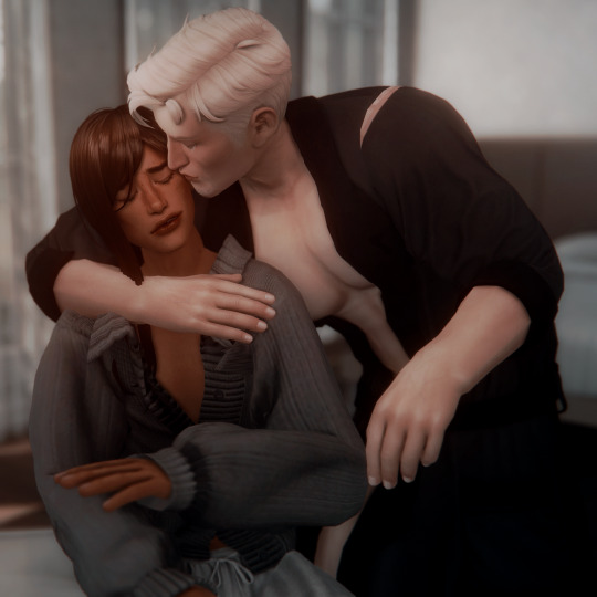
#they're so gorgeous <3
Text
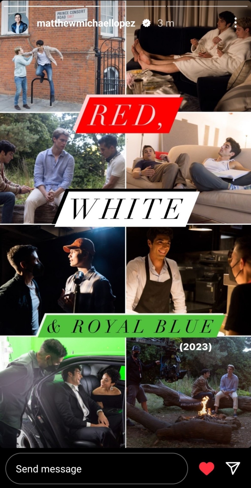
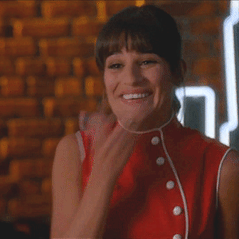
Matthew via his Instagram stories; 26.12.23.
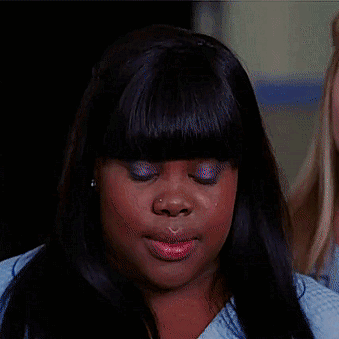
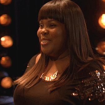
#MATTHEW???#MATTHEW I AM IN YOUR WALLS#oh my god????#THE PRINCE CONSORT ROAD PHOTO PLEASE?#this is my aesthetic#now. are they being henry and alex or nick and taylor here????#if it IS a deleted scene i need it like i need air#bts of the campfire scene 👀👀👀#taylor is SO smiley in his bts of the tiny restaurant scene skskskssksk#what a cutie :(#TAYLOR AND RACHEL#they're so gorgeous <3#also matthew???#why the green???#i have questions and theories lmao#ngl I was waiting for this ever since he said he was posting all the movies he's watched each month of the year#matthew lopez#taylor zakhar perez#nicholas galitzine#rachel hilson#red white and royal blue#rwrb#red white and royal blue movie#rwrb movie#Instagram
17 notes
·
View notes
Text
So I accidentally almost got into an argument on Twitter, and now I'm thinking about bad historical costuming tropes. Specifically, Action Hero Leather Pants.
See, I was light-heartedly pointing out the inaccuracies of the costumes in Black Sails, and someone came out of the woodwork to defend the show. The misunderstanding was that they thought I was dismissing the show just for its costumes, which I wasn't - I was simply pointing out that it can't entirely care about material history (meaning specifically physical objects/culture) if it treats its clothes like that.
But this person was slightly offended on behalf of their show - especially, quote, "And from a fan of OFMD, no less!" Which got me thinking - it's true! I can abide a lot more historical costuming inaccuracy from Our Flag than I can Black Sails or Vikings. And I don't think it's just because one has my blorbos in it. But really, when it comes down to it...
What is the difference between this and this?
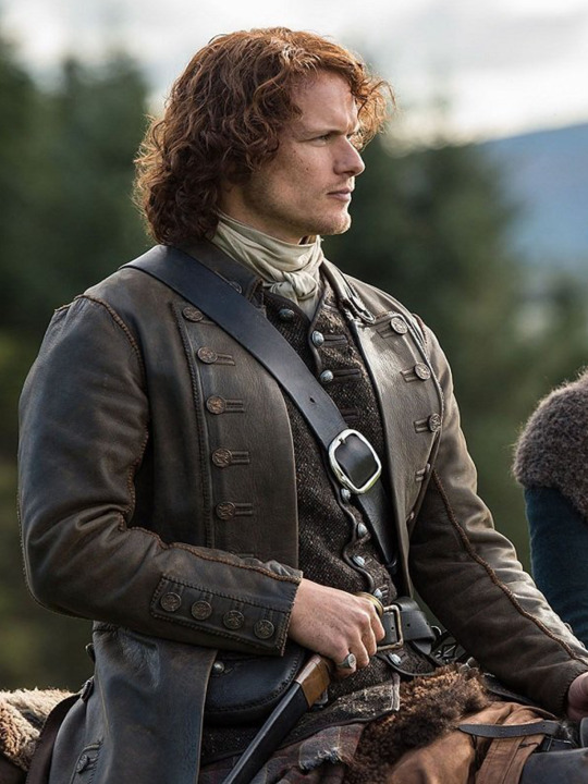
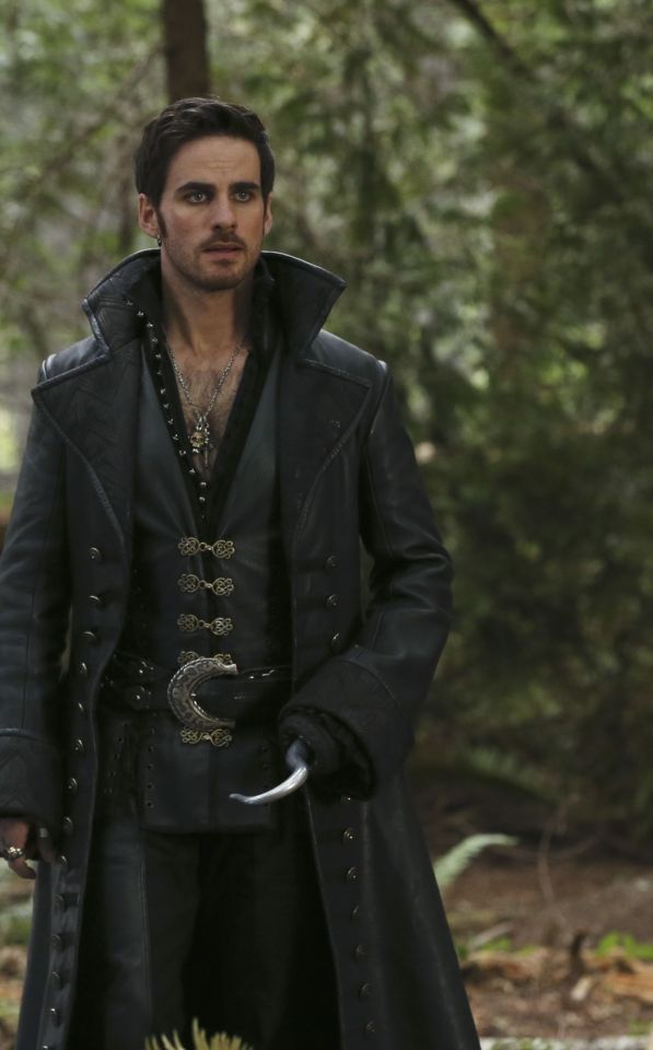
Here's the thing. Leather pants in period dramas isn't new. You've got your Vikings, Tudors, Outlander, Pirates of the Caribbean, Once Upon a Time, Will, The Musketeers, even Shakespeare in Love - they love to shove people in leather and call it a day. But where does this come from?

Obviously we have the modern connotations. Modern leather clothes developed in a few subcultures: cowboys drew on Native American clothing. (Allegedly. This is a little beyond my purview, I haven't seen any solid evidence, and it sounds like the kind of fact that people repeat a lot but is based on an assumption. I wouldn't know, though.) Leather was used in some WWI and II uniforms.
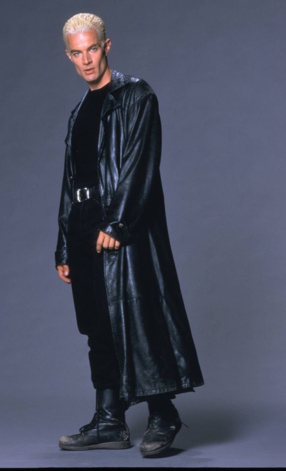
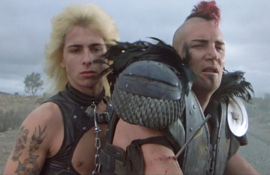
But the big boom came in the mid-C20th in motorcycle, punk/goth, and gay subcultures, all intertwined with each other and the above. Motorcyclists wear leather as practical protective gear, and it gets picked up by rock and punk artists as a symbol of counterculture, and transferred to movie designs. It gets wrapped up in gay and kink communities, with even more countercultural and taboo meanings. By the late C20th, leather has entered mainstream fashion, but it still carries those references to goths, punks, BDSM, and motorbike gangs, to James Dean, Marlon Brando, and Mick Jagger. This is whence we get our Spikes and Dave Listers in 1980s/90s media, bad boys and working-class punks.
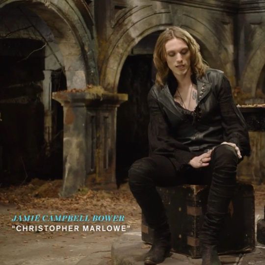
And some of the above "historical" design choices clearly build on these meanings. William Shakespeare is dressed in a black leather doublet to evoke the swaggering bad boy artist heartthrob, probably down on his luck. So is Kit Marlowe.
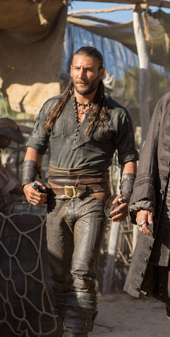
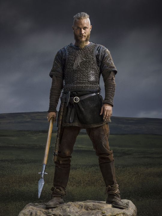
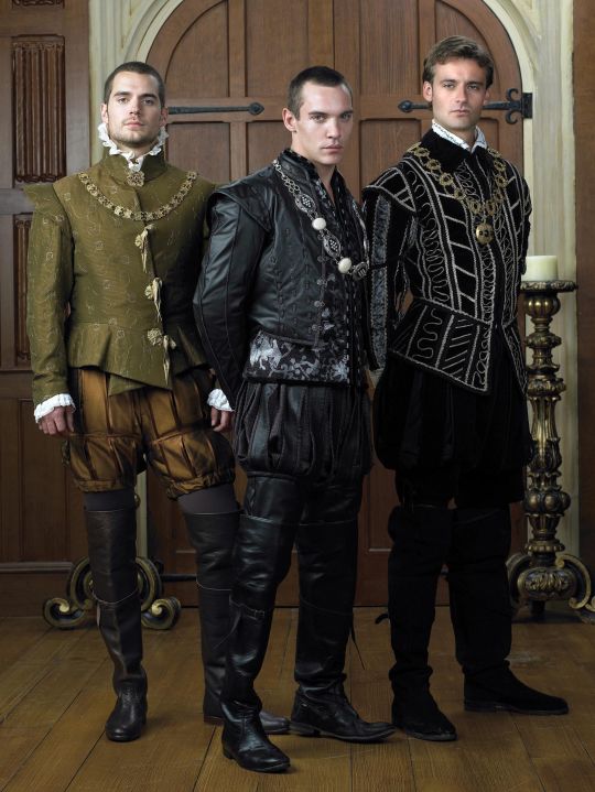
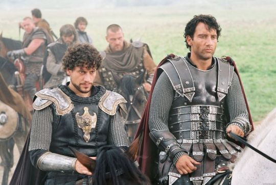
But the associations get a little fuzzier after that. Hook, with his eyeliner and jewellery, sure. King Henry, yeah, I see it. It's hideously ahistorical, but sure. But what about Jamie and Will and Ragnar, in their browns and shabby, battle-ready chic? Well, here we get the other strain of Bad Period Drama Leather.
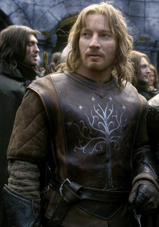
See, designers like to point to history, but it's just not true. Leather armour, especially in the western/European world, is very, very rare, and not just because it decays faster than metal. (Yes, even in ancient Greece/Rome, despite many articles claiming that as the start of the leather armour trend!) It simply wasn't used a lot, because it's frankly useless at defending the body compared to metal. Leather was used as a backing for some splint armour pieces, and for belts, sheathes, and buckles, but it simply wasn't worn like the costumes above. It's heavy, uncomfortable, and hard to repair - it's simply not practical for a garment when you have perfectly comfortable, insulating, and widely available linen, wool, and cotton!
As far as I can see, the real influence on leather in period dramas is fantasy. Fantasy media has proliferated the idea of leather armour as the lightweight choice for rangers, elves, and rogues, a natural, quiet, flexible material, less flashy or restrictive than metal. And it is cheaper for a costume department to make, and easier for an actor to wear on set. It's in Dungeons and Dragons and Lord of the Rings, King Arthur, Runescape, and World of Warcraft.
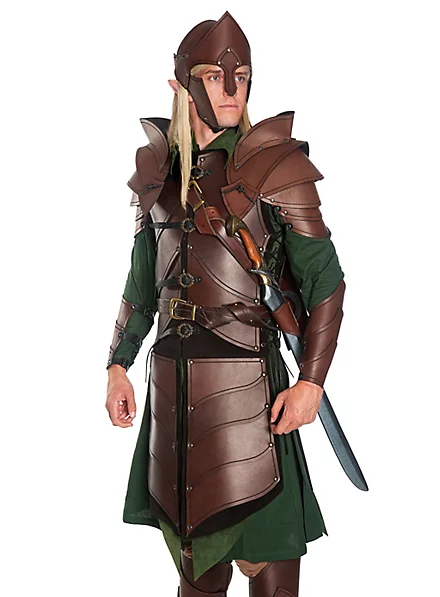
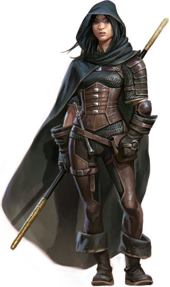

And I think this is how we get to characters like Ragnar and Vane. This idea of leather as practical gear and light armour, it's fantasy, but it has this lineage, behind which sits cowboy chaps and bomber/flight jackets. It's usually brown compared to the punk bad boy's black, less shiny, and more often piecemeal or decorated. In fact, there's a great distinction between the two Period Leather Modes within the same piece of media: Robin Hood (2006)! Compare the brooding, fascist-coded villain Guy of Gisborne with the shabby, bow-wielding, forest-dwelling Robin:
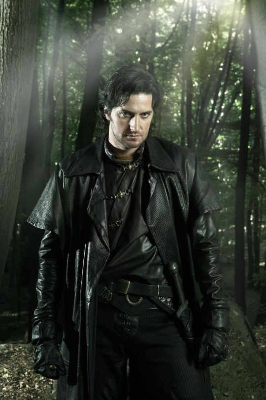
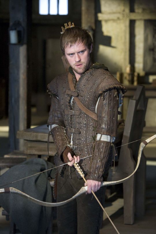
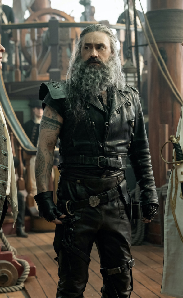
So, back to the original question: What's the difference between Charles Vane in Black Sails, and Edward Teach in Our Flag Means Death?
Simply put, it's intention. There is nothing intentional about Vane's leather in Black Sails. It's not the only leather in the show, and it only says what all shabby period leather says, relying on the same tropes as fantasy armour: he's a bad boy and a fighter in workaday leather, poor, flexible, and practical. None of these connotations are based in reality or history, and they've been done countless times before. It's boring design, neither historically accurate nor particularly creative, but much the same as all the other shabby chic fighters on our screens. He has a broad lineage in Lord of the Rings and Pirates of the Caribbean and such, but that's it.
In Our Flag, however, the lineage is much, much more intentional. Ed is a direct homage to Mad Max, the costuming in which is both practical (Max is an ex-cop and road warrior), and draws on punk and kink designs to evoke a counterculture gone mad to the point of social breakdown, exploiting the thrill of the taboo to frighten and titillate the audience.
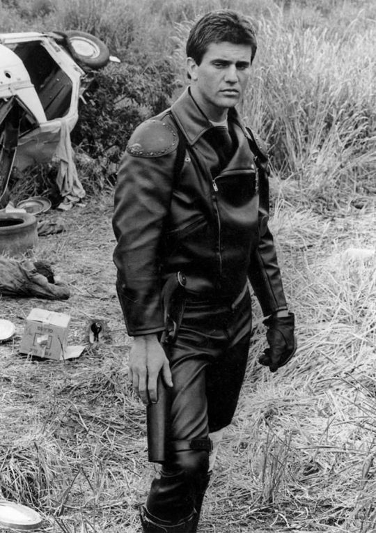
In particular, Ed is styled after Max in the second movie, having lost his family, been badly injured, and watched the world turn into an apocalypse. He's a broken man, withdrawn, violent, and deliberately cutting himself off from others to avoid getting hurt again. The plot of Mad Max 2 is him learning to open up and help others, making himself vulnerable to more loss, but more human in the process.
This ties directly into the themes of Our Flag - it's a deliberate intertext. Ed's emotional journey is also one from isolation and pain to vulnerability, community, and love. Mad Max (intentionally and unintentionally) explores themes of masculinity, violence, and power, while Max has become simplified in the popular imagination as a stoic, badass action hero rather than the more complex character he is, struggling with loss and humanity. Similarly, Our Flag explores masculinity, both textually (Stede is trying to build a less abusive pirate culture) and metatextually (the show champions complex, banal, and tender masculinities, especially when we're used to only seeing pirates in either gritty action movies or childish comedies).
Our Flag also draws on the specific countercultures of motorcycles, rockers, and gay/BDSM culture in its design and themes. Naturally, in such a queer show, one can't help but make the connection between leather pirates and leather daddies, and the design certainly nods at this, with its vests and studs. I always think about this guy, with his flat cap so reminiscient of gay leather fashions.
More overtly, though, Blackbeard and his crew are styled as both violent gangsters and countercultural rockstars. They rove the seas like a bikie gang, free and violent, and are seen as icons, bad boys and celebrities. Other pirates revere Blackbeard and wish they could be on his crew, while civilians are awed by his reputation, desperate for juicy, gory details.
This isn't all of why I like the costuming in Our Flag Means Death (especially season 1). Stede's outfits are by no means accurate, but they're a lot more accurate than most pirate media, and they're bright and colourful, with accurate and delightful silks, lace, velvets, and brocades, and lovely, puffy skirts on his jackets. Many of the Revenge crew wear recognisable sailor's trousers, and practical but bright, varied gear that easily conveys personality and flair. There is a surprising dedication to little details, like changing Ed's trousers to fall-fronts for a historical feel, Izzy's puffy sleeves, the handmade fringe on Lucius's red jacket, or the increasing absurdity of navy uniform cuffs between Nigel and Chauncey.
A really big one is the fact that they don't shy away from historical footwear! In almost every example above, we see the period drama's obsession with putting men in skinny jeans and bucket-top boots, but not only does Stede wear his little red-heeled shoes with stockings, but most of his crew, and the ordinary people of Barbados, wear low boots or pumps, and even rough, masculine characters like Pete wear knee breeches and bright colours. It's inaccurate, but at least it's a new kind of inaccuracy, that builds much more on actual historical fashions, and eschews the shortcuts of other, grittier period dramas in favour of colour and personality.
But also. At least it fucking says something with its leather.
#everyone say 'thank you togas' for not including a long tangent about evil rimmer in red dwarf 5x05#Our Flag Means Death#Togas does meta#and yes these principles DO fall apart slightly in s2 and i DON'T like those costumes as much#don't get me wrong they're fun and gorgeous - but generally a bit less deep and more inaccurate. so. :(#I'm not sure this really says anything new about Our Flag but I just needed to get my thoughts out#i hate hate hate Gritty Period Drama costumes they're so boring and so ugly and so wrong#god bless OFMD for using more than 3 muted colours and actually putting men in heels (and not as a shorthand for rich/foppish villainy) <3#looking at that Tudors still is insane like they really will go to any lengths to not make men feel like they've got bare legs XD#image descriptions in alt text#and yes i DID just sink about two hours into those so you'd better appreciate them
1K notes
·
View notes
Text


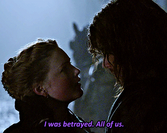


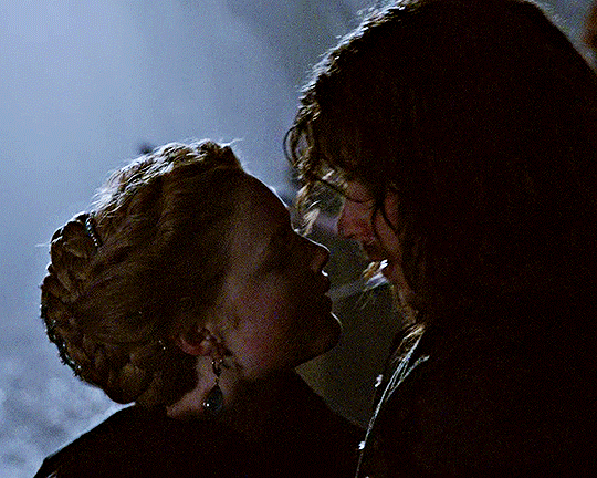

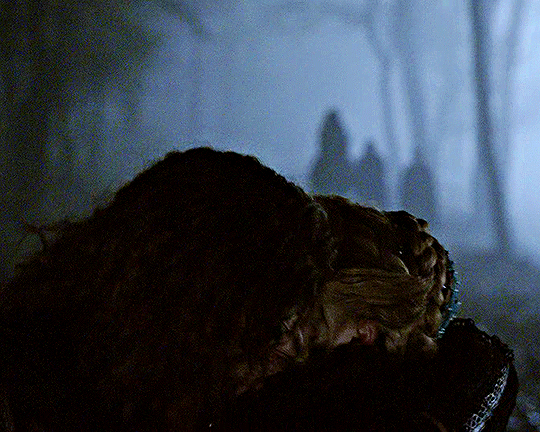

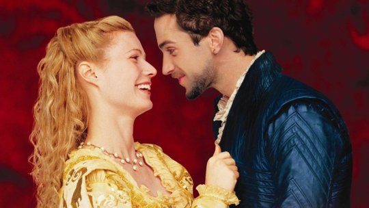
I don't want Naples yet.
I want my sister.
#here you go anon <3#cesare's sprint sent me into orbit! they love each other so much that they didn't gave a damn about her husband i'm yelling#they're also so gorgeous omg i wish cesare had that hair in s2 as well because he looked awful rip#cesare borgia#lucrezia borgia#cesare x lucrezia#the borgias#theborgiasedit#perioddramaedit#romancegifs#perioddramasource#smallscreensource#dailyworldcinema#cinemapix#tvedit#perioddramacentral#userlenna#tuseraixa#usercleveris#by jen
592 notes
·
View notes
Photo


a snack bringing snacks + pai looking at him like he’s a godsend
༄ requested by anonymous.
#asiandramanet#asianlgbtqdramas#asianlgbtqdrama#love in the air#prapaisky#prapai x sky#fortpeat#lita#mygifs#sky looking absolutely gorgeous and pai being a goner what else is new!!!!#they're both so in love with each other its driving me crazy i love love and i love THEIR love <3
1K notes
·
View notes
Text

Series: Shin Seiki Evangelion
Artist: Tanemura Arina
Publication: Meguro Teikoku’s ‘Asymmetry’ doujinshi (08/2013)
Source: Scanned from my personal collection
#shin seiki evangelion#neon genesis evangelion#evangelion#nge#eva#ayanami rei#soryu asuka langley#tanemura arina#arina tanemura#scan: hotwaterandmilk#doujinshi#90s anime#retro anime#mecha anime#classic anime#vintage anime#anime fashion#ok i'm about to get in my car but here's one last treat before i leave#<3 they're both so gorgeous here#enjoy!
532 notes
·
View notes
Text
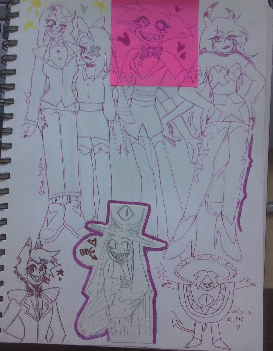
I know I said I wouldn't post traditional much buttt I'm going too feral over Hazbin Hotel not to X3
This was more of less just a test to make sure I could actually draw them but I think they look okay :) I've done some more work on Angel tho, and Alastor is a WIP :3 will probably post them more as I allow the hyperfixation to run its course <333
#Also ft. Verosika cos she's gorgeous and I'm not taking that back#And one of Striker's lil dudes cos they're so silly :D#hazbin hotel#hazbin hotel fanart#traditional art#sketch#sketchbook#artists on tumblr#traditional drawing#pencil drawing#charlie morningstar#vaggie#chaggie#alastor#radio demon#sir pentious#angel dust#helluva boss#helluva fanart#verosika mayday#kenny's art :3
72 notes
·
View notes
Text


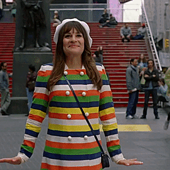
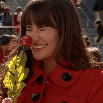


OG Glee Girls + sunshine and optimism
While the boys chose a selection of songs that casts an eye inward on the irresponsible life choices and sexual hunger of today's modern teens, we have chosen a selection of songs that speaks of the nation as a whole during these troubling times filled with economic uncertainty and unbridled social woes, because if there's two things America needs right now, that is sunshine and optimism! Also angels.
#glee#gleeedit#gleesource#tina cohen chang#quinntina#quinn fabray#quinncedes#mercedes jones#jonesberry#rachel berry#pezberry#santana lopez#brittana#brittany pierce#mine#i just wanted to post some appreciation for how adorable they are#some of these aren't necessarily smiley BUT it's them being funny and making us smile hence sunshine!#glee girls supremacy truly#they're all so gorgeous too <3
302 notes
·
View notes
Text
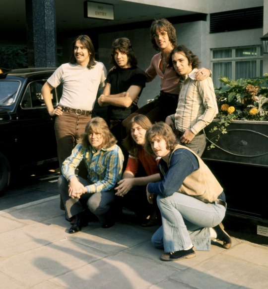
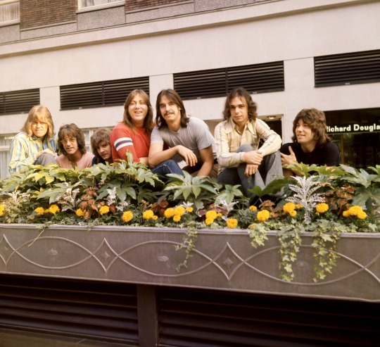
CHICAGO poses for some group portraits in London, England. (1970.)
#Chicago#Chicago band#Chicago the band#Terry Kath#Peter Cetera#Robert Lamm#Danny Seraphine#James Pankow#Lee Loughnane#Walter Parazaider#1970s#1970#They're so gorgeous!#I'm screaming!#This is my favorite Chicago era <3
90 notes
·
View notes
Text
transfem!sanji wearing a dress for the first time after time skip around the crew and luffy being the first one to break the silence by smiling widely and screaming "you look so pretty, sanji!!!" and it's such a simple thing,, but it makes sanji tear up a little bit.
#she's on my mind 24/7#everyone's so shocked bc they thought she'd just keep wearing suits#BUT SHE LOOKS GORGEOUS!!!!!#luffy the biggest transfem sanji supporter <3#also it's bc they're dating but that's for another day you can see this as platonic lusan#black leg sanji#transfem sanji#one piece#straw hat pirates
90 notes
·
View notes
Note
The art style of Cloud Castle is absolute ass bro why are their eyes so big
Idk man it just looks.... off
I wish they brought back the og art style like Blue Scarab Hunt because that was gorgeous
Well if you’re referring to the book's artstyle as a whole, then calm down buddy the illustrations as a whole are pretty good all things considered (believe me some of the illustrations in the later books are waaaaayyyyy iffier)
But if you are referring to Danilo Barozzi’s illustrations in the book then uhhhhh… yeah I don’t blame you, I didn’t like the big anime irises either, she didn’t cook with this one,,,
The interesting thing is Barozzi also did pieces for Secret of the Snow and those looked fine (she did well enough that I have to squint to determine which ones were done by her). My guess is either she did a lot of the illustrations for the latter half of SotS and we just got used to it, or it’s because the artstyle of special editions 2 and 3 were more… experimental? Books 4 onwards developed a very specific… look for the artstyle that adhered very closely to the main book illustrations of Spanish Dance Mission onwards, thus the illustrators had to follow suit, resulting in whatever looks off to look especially off.
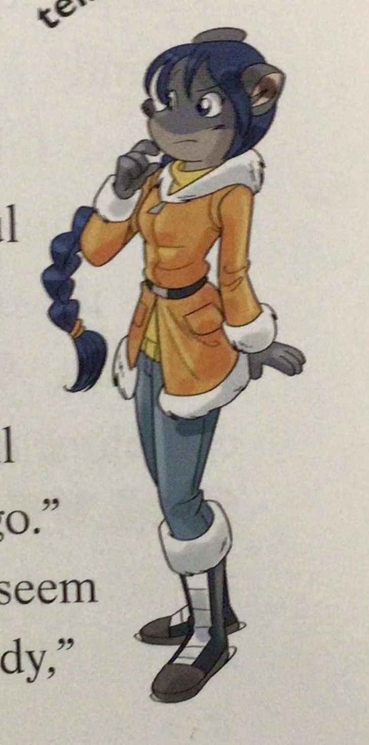
(Even with this set of pictures, I’m only about 70% sure these are Barozzi’s because of how alike yet different the styles are from each other in the book. The first one could be Barozzi’s, but it could also be Giuseppe Facciotto’s, since he also did illustrations for SotS and his stylization means he sometimes puts the eyes really close to each other in a way that’s weird but still makes sense somehow.)
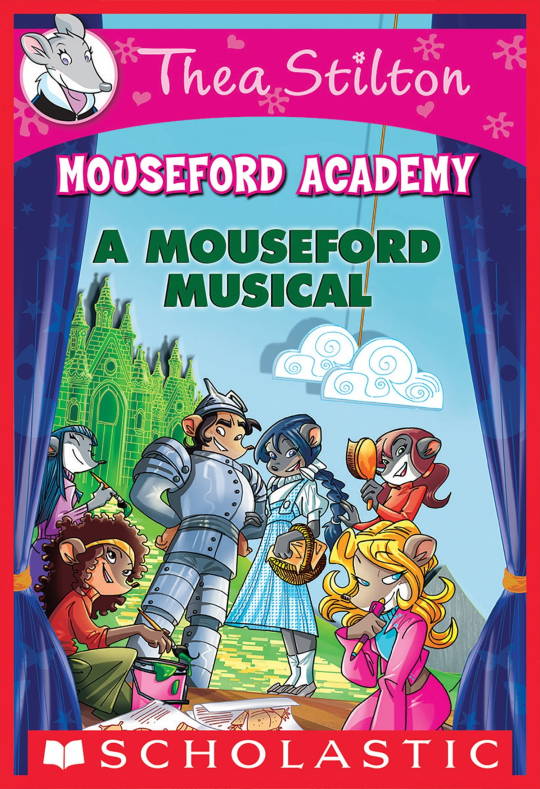
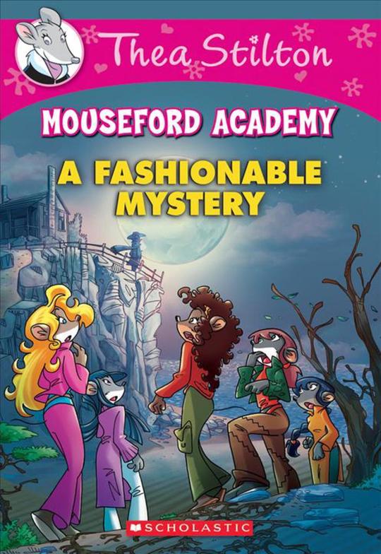
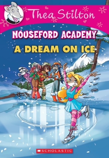
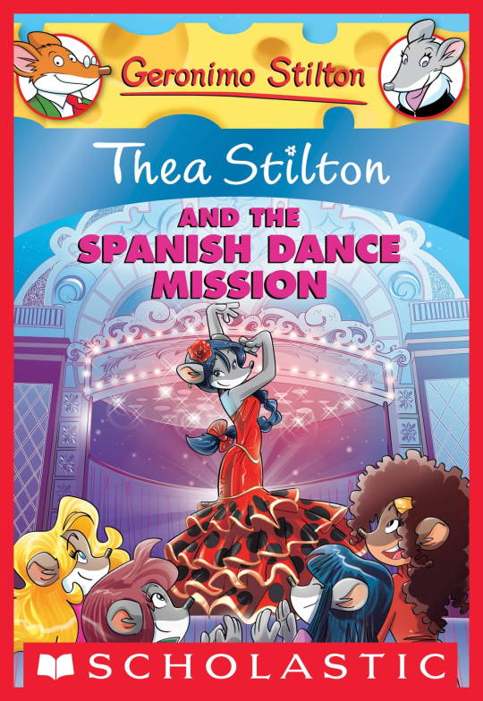
On the contrary, books 2 and 3 (and I would probably even include book 1 there) had a more experimental look to the illustrations, which seems to be based more on (and this is just a theory of mine) Giuseppe Facciotto’s iconic work for the covers of Mouseford Academy books 2-12, 14, 15 and 17 in the English books (he did waaayyy more covers for the Italian Mouseford books— he was basically the cover guy for the Mouseford books for a WHILE) as well as the books from Spanish Dance Mission to Lost Letters. If you’re wondering why those covers go as hard as they do, then now you know why.
(These aren’t all of Facciotto’s works for the covers we know in English but you can see that he popped off <3)
But yeah as you can see with special editions 2 and 3, the art direction seems to be heavily inspired by Facciotto’s artstyle.
However, when Barbara Pellizzari’s works became the aesthetic poster child of the books’ brand, that was reflected in the illustrations and how their aesthetic changed, as seen in the main books and how they look currently, special editions 4-9, and the Treasure Seekers trilogy.
This new profile thing of the girls? This was done by Pellizzari (coloring was done by Flavio Ferron), and thus it became the main reference for how the girls look in the book’s illustrations.
And it’s not just in the general direction to the artists for how to draw the Thea Sisters, but also in the direction given to the colorists. Alessandro Muscillo was the colorist for the special edition books since book 1 and the Treasure Seekers trilogy, and you can see that the direction for the style varied through books 1-3, like maybe direction was experimenting with the mood the illustrations were to convey, beginning with the cartoony and bright colors of book 1, easing into the more grounded and layered palettes of books 2 and 3
Then book 4 was when they transitioned to using digital art /j
I jest, but seriously book 4 was the debut of the coloring style we end up keeping for the rest of the special editions and for all of Treasure Seekers, which is very… bright :D
(I would show more picture examples but I manually took pictures of my physical copies for the Cloud Castle and SotS illustrations and gwuh I’m too lazy to grab my entire collection just to take pictures,,)
Bright as in like… the colors are very defined and saturated. I dunno how to describe it, but when you see it, you get what I mean. It’s very bright and pretty and colorful and it stands out. There are still variations that happen on occasion (Star Fairies in particular uses a good dose of airbrush for the lighting and shadow effects, and Crystal Fairies looks like someone had a bit of fun using sparkle brushes), but other than that, it’s very bright. I don’t hate it, but I do acknowledge that yeah, if I was introduced to the series when it had fully transitioned to the new style, I never would’ve gotten into the series in the first place, because the older books had something that didn’t make it feel specifically catered to girls. The colors were bright, but not too bright. Colorful, but unified. They weren’t that complicated, and they didn’t have to be because the colorists (plural, there were at least 3 per book once upon a time) were popping the hell off with the colors they were given. But y’know, the newer books’ consistent style did give me a good spot to practice drawing mouse furries so I’m not complaining too much about the newer style, haha.
(Tiny baby E’s (it’s literally from 2020 what’re you on about mate) her first mouse Violet drawing using Barbara Pellizzari’s artstyle in Treasure Seekers 1 as an anatomy guide!!)
With that said tho, yeah I miss the old books -m- dunno if it’d fit the aesthetic of the special editions but m a n we could’ve had it and it probably would’ve looked cool
Also the illustrations go way harder in the older books, like Prince's Emerald? I've talked about Prince's Emerald and how it goes hard before, and I still stand by it and say that it does in fact still go hard
Maybe it won't fit the uh splash of color they gave the hardcovers, but imagine they grabbed Giulia Basile's coloring work for the graphic novels and used that as sort've a basis for the coloring style of the hardcovers. Not exactly the same-- would probably still add a touch of whimsical watercolor and/or paint to the very cel-shaded style, but we could've had something pretty dope -m-
Anyway that's my ramble simultaneously defending the hardcovers' artstyle and reminiscing on what could've been haha
#geronimo stilton#thea stilton#thea sisters#questions with e#rambles#the style of the older books is gorgeous but the main thing I'm wondering is can it pull off fantastical whimsy#that's the main thing i dunno if it can do (i would love to be proven wrong tho)#the style is so grounded that i'm wondering if it can pull off what the hardcovers needed it to do#which is convey the otherworldly fantastical thrill of exploring the fantasy worlds (which uh the newer books were able to do but#my main gripe is that fantasy and reality are near indistinguishable in vibes coloring-wise#sure there are sparkles and stuff is more saturated but the girls' dorm in book 4 still has the same-ish feel of the land of clouds#i dunno what it is. the bright colors just feel mundane somehow and don't take a shift when returning to reality)#looked at my books again and i think it might be the fact that the later books have no grounding color?#compare book 3 to book 5 and you'll see it the most distinctly methinks#the newer coloring style doesn't have a color that grounds the illustrations' palettes and thus everything's always bright 100% of the time#the girls' colors are always at their most saturated#like they're always under broad daylight in terms of lighting#it's not eyebleeding or anything but they don't look affected by the lighting in the setting they're currently in#and the result is it looks.... meh?#we get so used to the bright colors that they end up looking meh somehow#i'm not an art expert by any means this is just my observations as someone with a little too much brainrot
33 notes
·
View notes
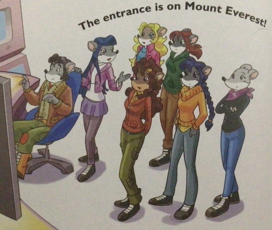
Text

the legend of sigma!!
ft. zelda!sigma and link!chuuya in archaic clothes, zelda!sigma with a silent princess flower in her hair, and gerudo girlie link!chuuya
#they're t4t#IM SO PROUD OF MYSELF FOR DRAWING THIS IM SO HAPPY WITH HOW IT TURNED OUT <3#I LOVE MY ART GUYS EVERYONE SHOULD LOVE THEIR ART#AAAAAAA LOOK HOW I DREW SIGMA HES SO PRETTY SHES GORGEOUS ITS STUNNING#im going to make more art of this so lemme preemptively make a tag#loz sigchuu au#sigchuu#sigma bsd#nakahara chuuya#bungou stray dogs#legend of zelda#totk#botw#bsd sigma#chuuya nakahara#trans chuuya#t4t#fvedyart
44 notes
·
View notes
Photo

༄ minho and jisung, mama red carpet / 221129
#dancerachasource#bystay#staysource#jypartists#stray kids#lee minho#lee know#minho#han jisung#jisung#mygifs#what kind of movie did they walk out of pls what is this they look like princes im sobbing#they're so so gorgeous <3
313 notes
·
View notes
Text
i haven't drawn this guy for a hot minute sooo
#tower of god#khun aa#khun aguero agnis#this one's for you asta enjoy#he's gorgeous beautiful breathtaking stunning the list goes on#last time i caught up on tower of god was like beginning of season 3 i think?? it's been a while though#i remember drawing a few things for the anime back in like 2021 or smth i forgot when it released#but they're like. reeeeeeaally old pieces and i probably won't drop them here#looked back at that old art and dang i've improved like so much#so yay!!!!!#drifting colors
25 notes
·
View notes
Text


have u guys seen the new paw borough cat creation demo because I've been having fun with all the new options + updated art. I love the venus prowler pose so much. the deviantart warrior cats oc reference stance <3
#can't say I'm a big fan of the approach they're taking with the semi-random white coverage generation but hashtag whatever#people have also been having Thoughts for like months now about how the breeding mechanic is going to work#but I don't really engage with breeding mechanics anyway bc they're not very fun for me so I can't say much about that.#anyways.. kimty <3#oh and if any of the paw borough artists see this bc I know some people from fr tumblr are working on the game:#holy shit? holy shit. gorgeous. perfect. immaculate. some of the best pet site art I've Ever seen. the person that did tigerface is my hero
29 notes
·
View notes
Text

...okay so the b&a of this edit looks a lot less impressive than i thought it would

#i sunk like five hours into this edit all together i think... how......... like where did all that time go.........#well. skdfjnhdkjfhksdgghdfjknghkjndfkhdfkjhdknjfgh#river dipping#ts4#theodore doe#matthias evanoff#a burning house to live in#echthroi#ykw is so funny..................... i already have three other screenshots i want to edit 🧍#i just really love the way their sims look when they're in their thirties and the lighting in this room is so gorgeous#BUT! i'm gonna save that for later. rn i'm just gonna scroll and post some drafted reblogs and then read#i seriously used like all of my free time yesterday messing around in photoshop......... today i'm just gonna do next to nothing#<- person who knows they're incapable of not looking at their ocs every few hours <- i am definitely going to end up in photoshop again#anyway............................ good morning!!!!!!!! <333 i'm so happy i finally answered that ask last night like!! i'm really trying#to be more timely with my responses to people!! that said... i'm definitely behind on my activity again#and i still have mentions i wanted to reply to from last month. eek.#listen........................... Avoidant personality disorder (AVPD) is a mental health condition that involves chronic feelings of#inadequacy and extreme sensitivity to criticism. People with AVPD would like to interact with others#but they tend to avoid social interactions due to their intense fear of rejection.#thank you cleveland clinic definition of avpd <3
26 notes
·
View notes
Photo

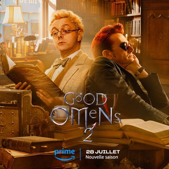
New artwork, along with what appears to be a release date for GO 2: July 28th!
(Source 1) (Source 2)
#good omens 2#good omens#aziraphale#crowley#ineffable husbands#michael sheen#welsh seduction machine#david tennant#soft scottish hipster gigolo#neil gaiman#this is gorgeous#they're so close together#love the beam of light radiating from Aziraphale onto Crowley#beautiful#can't wait for the second season#but this is happy news#can i get a 'wahoo'#<3
145 notes
·
View notes
Last Seen Blogs
dominicgriffinmusic
DOMINIC GRIFFIN - ramblings

alabaster-artss
multiply layer my beloved

bee-shrek-test-in-the-house
bee shrek test in the house
josmium
Just J.

arnavjain1998
buy weed shrooms acid mdma xans and more