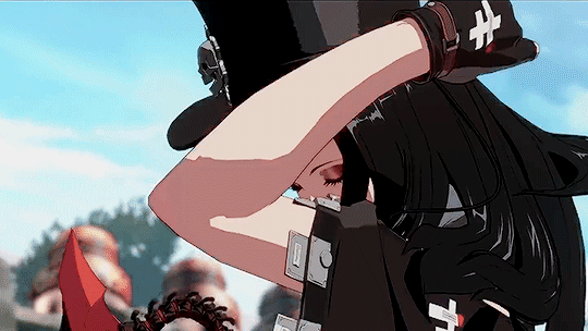
#varied the art style with each one just because
Text

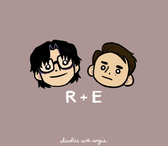
teen reddie doodles based on my '90s designs
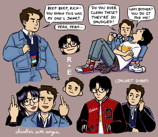
[Image description: A collection of fanart doodles featuring Richie Tozier and Eddie Kaspbrak from the "It" movies as teenagers in the '90s. Richie wears an oversized MTV t-shirt, ripped denim jeans, Converse, and plaid button up tied around his waist. Eddie wears a denim jacket, navy polo with colored stripes at the bottom, denim jeans held up with a belt, tube socks, and chunky sneakers.
Alt text provided for each image and copied below the cut. End ID]
Copied Alt Text:
Image one: A collection of fanart doodles featuring Richie Tozier and Eddie Kaspbrak from the "It" movies as '90s teenagers.
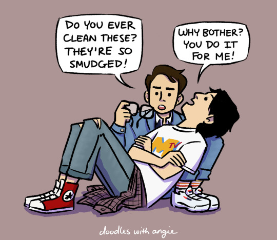
Image two: Both sat on the floor, Richie leans back against Eddie's folded legs. Holding Richie's glasses in his hand, Eddie says, "Do you ever clean these? They're so smudged!" Richie replies, "Why bother? You do it for me!"
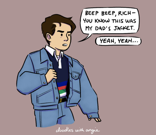
Image three: Eddie shrugs on a denim jean jacket. He says, "Beep beep, Rich- you know this was my dad's jacket." From off-screen, Richie responds, "Yeah, yeah…"
Image four: Richie and Eddie pose with their faces pressed cheek to cheek and tongues stuck out, flipping off the camera.
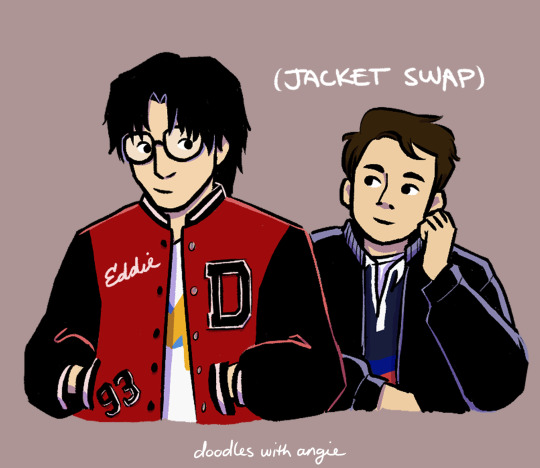
Image five: Richie wears a high school letterman jacket stitched with the name "Eddie." Eddie wears a leather jacket. They glance shyly at each other. It is captioned, (Jacket Swap).
Image six: Chibi heads of Richie and Eddie. It is captioned, "R + E."
End Copied Alt Text
#it#reddie#richie tozier#eddie kaspbrak#it 2017#it 2019#it chapter 2#it movie#artists on tumblr#digital art#doodleswithangie#varied the art style with each one just because#definitely want to go back and do more of the whole gang (and finish up this little minicomic)
516 notes
·
View notes
Text
Before I go to bed, who wants to see the first draft of my poster for The Mole: Shades of Nightfall (the fic for which I will begin posting tomorrow)?
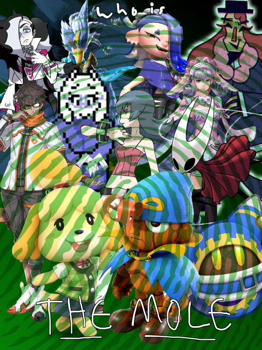
it's a sloppy collage and looks bad and non-cohesive as a result but it's a first draft meant primarily for layout planning so it's okay we all agree the final product looks much better yes indeed okay all right okay
#sfw#no image id#it's late and i'm lazy#aren't we all glad i took the time to draw series-specific character art#1) i can't claim this version of the poster as my own with all the grabbed assets#2) the widely varied artstyles of each property means they don't fit together like this#sabrina and piers go together because pokeymans#taion and melia go together because xenoblades#literally no one else goes together in their original art styles#also geno's Just Standing There like all the smrpg character models do lol#and the thumbprint on top of everything isn't subtle enough
2 notes
·
View notes
Note
I want you to know that I came across a random post of your Death Note art, went "Awww, oh my gosh, with the way this person draws Light I think Akechi would look fantastic in the same style!", clicked onto your profile, and then saw your newest artwork was Akechi. I'm still kind of cackling over it and thought maybe you'd find it funny too. Your art is SO cute, I'm very happy I found it <333
HAHA THAT’S AMAZING (<< was an akechi artist wayyyy before i fell head over heels for light)
but rlly… theyre so similar:
- brunet
- asshole
- pretty boy
- mass murderer
- black-haired homoerotic rival
at the end of the day, the key difference is one is a top and the other is a bottom.
ok but seriously, they’re vastly different characters on a fundamental level:
- light was handed everything him on a silver platter: family, friends, looks, intellect, a comfortable life… as a bastard child of a sex worker and now an orphan, goro had to fight his way to his current position and will always harbor a terrible sense of inferiority (light is completely confident in his absolute superiority, Always (that’s why the challenge of L sent him off the deep end of obsession lol))
- light genuinely sees himself as a hero, while goro would like to feel the same but is nonetheless depressingly aware of his villain’s journey (his undesirable position as the detective vs the underdog phantom thieves, his string of assassinations, his ultimate dirty bloody goal, etc.).
- light’s motive is about the world’s salvation, cleansing, the birth of his ideal reality (very messianic of him with the slightest loving tinge of mary cradling her lamb hahaha) while goro is laser-focused on ruining this one asshole’s life in particular, vengeance and revenge at once! one’s focused on rebirth, and the other gunning straight for death! they both use murder to get what they want but light probably floats around thinking himself so clean and divine as mother of the world (ignorance is bliss) while goro is constantly desperately trying to cover up his suspiciously red hands with his gloves hehehe… they’re both constantly striving for perfection, just with varying levels of self-awareness!!
- goro is a canonical loner; light has a horde of friends; this is probably due to a difference in public persona! goro is an untouchable idea of what he thinks a human should be and is completely out of the loop when it comes to normal social interactions (believes opening with hegel will instantly endear himself to the average person (luckily he inflicted that upon akira who is decidedly not average in the slightest)), light is implied to be more down-to-earth and even slightly goofy (he’s gaming decorum like an advanced speedrunner)! it’s probably good how distant goro is, because getting any closer to him will allow you to see how off-putting and uncanny he is, sorta like an AI-generated image—seams in the wrong places and far too much teeth LOL. meanwhile light has this whole shebang so thoroughly figured out that he’s BORED with it all! he’d like to move on to the next game (with L), thank you!! light definitely still exudes uncanny creepiness (it’s his natural state of being) especially when he zones out or starts hysterically cackling out of nowhere at his own thoughts, but he’s a hundred times better at masking compared to goro due to a better upbringing. goro is starved for the adoring friends he sees akira easily picking up one after another; light couldn’t give less of a shit because he’s always had those trivial luxuries! he’d much rather prefer an adoring WORLD!!
- then there’s the difference in how they die… one started out surrounded with company but ultimately died alone, while it’s the opposite for the other (if you count the de-realization of maruki’s reality as goro’s “death” (which i don’t)).
- in conclusion, light and goro are like funhouse mirror reflections of each other!!! one is a pampered lapdog getting a taste of rabies and letting loose, while the other is a starving wolf trying to domesticate itself for treats and headpats!! and i <3 them both!!!!!
anyways i may be wrong about light because im going purely off of fics, tumblr shitposts, and my own imagination :] feel free to school me in a way that won’t destroy my delusions!
#美迪 archive#💡princess posting⋆˚✿˖°#mailbox 💌#light yagami#death note#goro akechi#persona 5#persona 5 royal#art#artists on tumblr#digital art#doodle#rkgk#画画#涂鸦
411 notes
·
View notes
Note
What is the difference between fencing and actual sword fighting, exactly? If I were to throw an olympic fencer against a master swordsperson, what would the most likely outcome of such a fight be?
The first and most obvious answer is that only one of these individuals is trained for combat.
The second answer is that only one of them uses (and trains with intent to use) a real weapon.
I’m going to assume this question revolves around an Olympic fencer dueling with a master swordsman with a live weapon and not in accordance with Olympic fencing rules. An Olympic fencer’s best chance at winning is a bout with a modern epee/saber under Olympic fencing rules and it’s also the case where (probably) no one dies or is gravely injured.
Olympic fencing is a sport. As a result of its evolution, it’s pretty much unrecognizable as even a martial form today and, in pursuit of the new requirements for winning, has divested itself of the weapon aspect. While much of the terminology remains the same, the key difference to grasp about Olympic fencers is that they’re not trained to fence around the idea that the sword in their hand is a dangerous weapon (because it isn’t.) In fact, the ultimate goal of winning in their sport (score points) is hindered by that mentality. To the Olympic fencer, it doesn’t matter if they get hit so long as they score first and have right of way when they do. If those at the top of the sport were handed a real historical epee, told to fence, and changed nothing in their approach, the end result would be a double suicide. (Which is ironic because that’s one of the reasons why the epee was restricted historically. When it came to dueling, it was a little too efficient.)
There is no caution here because there doesn’t need to be. Tactics and techniques which will cause a fencer to commit suicide against an opponent with a live blade work exceptionally well once the risk of death is off the table.
This isn’t just restricted to Olympic fencing. If you take any martial art that has transitioned to a sport and put the practitioner up against someone who kills people for a living, even if they are one of the best in their field, they will be at an inherent disadvantage. The requirements for winning according to the sport’s rules are vastly different from the requirements for winning in a life or death situation.
And that’s just the first hurdle.
The next hurdle is the weapon itself.
Duels are specifically between weapons of the same type. This rule is meant to level the playing field and ensure the duel is decided on “skill” rather than weapon advantage. Depending on their point of origin (for the purpose of this question, I’m assuming European) a master swordsman would have been familiar with and likely trained in several different sword styles, depending on era would be a master of their own school or in the employ of a noble house. If you need a comparable profession for a master duelist, think of them like lawyers. Except, the victory was decided by skill with a blade rather than a compelling argument. (We could say that skill with a blade is a compelling argument, but I digress.) One doesn’t get to be a master swordsman until after many years of study with the blade and victories under their belt. Depending on the era of history, the duel requirements of the duel could be anywhere between armored or unarmored, to first blood or to the death, and cover a variety of different swords, each with their own developed styles (and that is styles plural.)
Our Olympic fencer will be fucked by varying degrees depending on the live blade in question but, make no mistake, they’ll be pretty much fucked by any option picked. Running counter to their ubiquitous nature in popular culture, swords are not one size fits all. Outside of common principles there’s almost no training crossover. Every sword handles differently. These variations include length of the blade, length of the hilt, location of the crossguard, the weapon’s weight, the weapon’s weight distribution, the location of its balance point, whether it is primarily used with one hand or two, whether it is primarily a weapon for thrusting (the rapier) or cutting (the saber,) etc. Their grip would be off, and probably wouldn’t be able to hold the sword properly.
The modern version of a fencing “sword” is not equivalent to any of these. Their closest stylistic match up in terms of inherited movement is the 19th century epee, but we’re still miles apart.
Then there’s the mentality issue.
The Olympic fencer hasn’t trained around the idea that death or major injury are accidental. Possible, yes, a risk, yes, but in the same way they are for any other sport. These are surprise, tragic occurrences and not part of regular bouts. For reference, in terms of the dangers of physical contact, a modern fencer faces less risk than a football player. For the master swordsman, the opposite is true. There is no variant of historical dueling which doesn’t risk death in some capacity, whether that’s a confirmed death on the dueling field itself or from an injury or infection later. Those historical circumstances where you see individuals dueling topless is (ironically) for practical reasons and not titillation. Many duelists, victorious or not, died from infection after cloth or other detritus got into their wounds. In this way, our modern Olympic fencer is less prepared than a duelist of average skill, much less a master.
Is the Olympic fencer ready to put their life and body on the line? To risk death, permanent injury, a potential blinding in one eye, in a bout that, at best, involves zero physical protection? I’m not sure. Probably not off the cuff. It requires a different mindset.
Are they ready to inflict damage on another person? Are they ready to kill another person? And even if they’re ready, are they willing to? Are they resolved to? Are they ready to risk their own life in pursuit of it?
The Olympic fencer is on the starting line with these questions.
The Master Swordsman has already answered them.
One of the difficult aspects about writing violence and characters who practice martial disciplines with intent to exercise those skills is internalizing the risks involved and ensuring their a natural part of your character’s mindset and their approach to combat.
Fiction is an illusion. Your narrative’s world is as real as you, the author, choose to make it. Characters are immortal, have infinite stamina, possess skill with every weapon, are unbeatable unless you choose otherwise. Regardless of reality, if you choose to make an Olympic fencer and a Master Swordsman fight exactly the same way with the same skill set, that’s how it is.
I’ve seen plenty of published authors treat swords as universal and modern Olympic fencing like it lends their character any real martial skills. (I mean, beyond excellent conditioning.) You can do it and get away with it if that’s what you want. Personally, I find it less interesting because it cheats the character out of their growth. Also, you don’t need to lean into that approach for “Girls Can Fight” or as a way for a female character to gain combat skills because there were female fencers who trained on the blade.
Ways for the Olympic fencer to win:
Dumb luck.
Yeah. That’s it.
The Master Swordsman should knock the blade out of their hand, take the Olympic fencer under their wing as their apprentice, and wander the world together solving crimes.
10/10.
-Michi
This blog is supported through Patreon. Patrons get access to new posts three days early, and direct access to us through Discord. If you’re already a Patron, thank you. If you’d like to support us, please consider becoming a Patron.
#michi answers#writing reference#writing advice#writing tips#how to fight write#fencing#writing fight scenes
657 notes
·
View notes
Note
Hi I just started embroidering two weeks ago but I’m also interested in cross stitching. Can you explain the difference between the two (if there is any)?
I can try! Bear in mind that I'm self-taught in a "keep stabbing it til it looks right and turn to books/YouTube only if I'm really stuck" way, so people who were actually trained could probably do this better, and I'm open to being corrected.
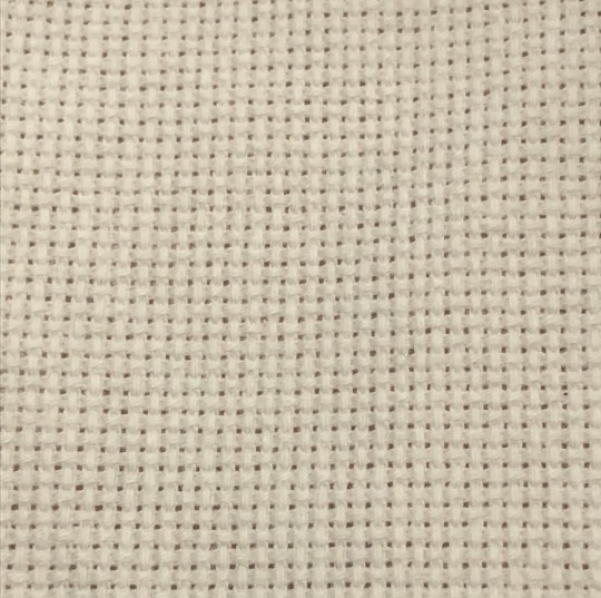
Cross stitch is a type of embroidery where each stitch forms an X. It's often, but not always, done on Aida cloth, which looks like this:
Each X covers a square of the cloth, so the result is a bit like pixel art:
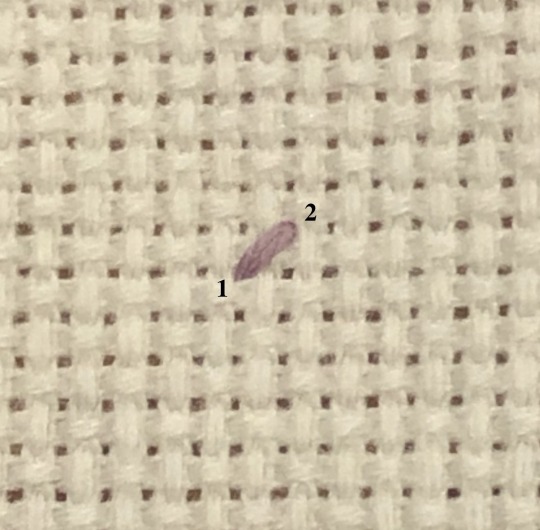

If you have a line of stitches of the same colour, a lot of people will do a line of half-stitches, then work their way back (called the Danish method):

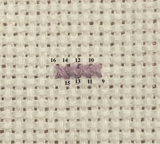
That's really down to preference. Personally I switch between Danish and English (where you complete each X before moving on to the next one) depending on the geometry of the pattern I'm working on. The main thing is that the top arm of each X should be facing the same way to keep the piece looking tidy.
That's the basic idea, and there are plenty of patterns out there that only use cross stitches. Some patterns will also use back-stitching for outlines or details. Generally you do the cross stitching first, then back-stitch over top.
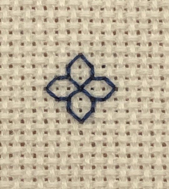
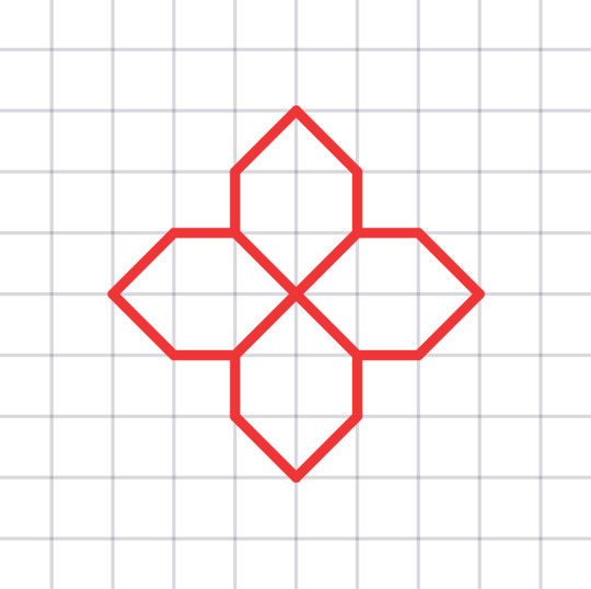
The majority of what I do is actually blackwork, which is related to cross stitch in that it's a type of counted work (each stitch covers a set number of threads of the fabric). I mostly use Aida cloth, but any evenweave fabric would work. There are a number of different styles of blackwork, but the one I do most often involves back-stitching geometric motifs to fill a section of a larger design. The pattern will show lines on a grid corresponding to the grid of the cloth:
A few things that might help if you're getting into cross stitch:
Aida cloth comes in different sizes. You'll see it labeled as 11-count, 14-count, 18-count, etc. That tells you how many squares/stitches there are per inch, so your stitches on 18-count will be much smaller than on 11-count.
If you buy 6-strand embroidery floss, you'll want to separate it into individual strands. If you're cross stitching, then usually the lower the count of your fabric, the more strands you'll need to make each X form a solid square and avoid having fabric show between your stitches. I use fewer strands with blackwork, because it keeps the lines sharp and makes the motifs stand out better. The pictures above are on 18-count. I used 2 strands for the cross stitch, and 1 strand for the blackwork (note that varying the number of strands can also be a method of shading in blackwork, but I haven't really used that technique before).
Some stitchers will tell you that the back of your work should look as neat as the front. If you want to aim for that, go for it. I'm really only careful about the back of my work if I know it's going to be visible in the finished piece; other than that, my backs are chaos and I'm fine with that.
This was at best a really basic overview of cross stitch. Some patterns use things like half-stitches and three-quarter-stitches to get different effects or smoother shapes. Some patterns will call for higher count cloth (like 28-count or more) and have each stitch cover two threads instead of one (called working "over 2"). There are all sorts of YouTube videos and tutorials that cover these things better than I can, but feel free to ask any questions you have, and I'll do my best.
Above all, have fun with it, and I hope it becomes something you enjoy!
236 notes
·
View notes
Text
What Dates With Them Would Be Like-Testament
-=-=-=-=-=-=-=-=-=-=-=-=-=-=-
Testament’s type of date can vary as widely as their long list of hobbies.
On one date the two of you could be making homely arts and crafts with your shoulders touching and on the next they could be info-dumping on the history of belly dancing to you in a haze powered by an unholy concoction of coffee and energy drinks.
Testament is someone who prefers dates that stay at home for their dates, mostly because they prefer the intimacy they can initiate with you in the comfort of home but also because Testament doesn’t really… jive with people they don’t know, they get stiff and act aloof and what could almost be described as standoffish for Testament, in fact that’s how they acted with you to begin with, to this day Testament wonders what possessed you to keep trying to worm your way into their heart until you actually did.
Testament’s favorite type of date is when you want to play with their hair, braiding it, styling it, or just simply twirling it around in your fingers, they love it more than anything because of the way it makes them feel…
Warm, and wanted, and loved, and cared for in a way that only a lover could make them feel.
Your fingers gliding through their silky hair, brush in hand alongside your breath on the back of their neck as they sat in front of you.
It made their skin crawl in the most pleasurable way.
All in all Testament is someone who prefers to have an intimate and close date with you which, if left up to them, would end with both of you holding each other as you both drifted off to sleep after a long night of talking about anything, whether it be the weather, the food either of you want to try one day, or a strange cloud that one of you saw in the sky.
-=-=-=-=-=-=-=-=-=-=-=-=-=-=-
Special shoutout to @frickingnerd for inspiring this (Hopefully) series with her Fuyumi Dating Headcannons a mutual of mine reblogged.
I'm hoping to make a series out of shorter and more simple posts like this so I don't just drop off the map while I'm working on asks or more complicated ideas which usually take awhile for me to get scraped together in a way that I feel content with. So I hope you guy's like this!
#testament guilty gear#testament gg#testament x reader#guilty gear x reader#testament guilty gear x reader#Testament x Reader#Testament Guilty Gear x Reader#guilty gear testament x reader
251 notes
·
View notes
Note
Howdy!
So lately I've been on a quest of artistic improvement, and on that quest I've been studying styles that have the tendency to just, take my breath away and leave me with the unshakable envy that drives me forward, and that includes your great stuff!
I hope you don't mind if I pick your brain, but there's one thing in your art that's present in almost all of the ones I'm studying that I cannot for the life of me understand. The lines, or lack there of I suppose. My brain is just psychically incapable of understanding what's going on with it, because it doesn't f e e l like normal linework, and in speedpaints it's hard to see exactly what's going on. Like, I'm amazed that you can do that.
i've only posted one speedpaint recently, so i'm guessing you're talking about the ousai one, right? how's this...?

i use one brush (ciro pen @ 80% opacity) for almost everything nowadays. sometimes i just clean up a sketch, sometimes i draw a lineart layer. as you can see, it's still pretty messy...! i don't bother closing lines, and drawing with a lower opacity helps me (try to) be less stiff / quickly draw in shadows or vary line impressions. i rough colors on one layer underneath, reduce lineart opacity, and then make one layer on top to paint over it. sometimes i redraw lines, paint over, or color lines, especially for details or elements that feel like they should be merging/touching/melting into each other...
good luck on your art quest!! hope that helps, even a little...!
#ASK EVER#im the npc you encounter on your quest who gives you like ten radishes and sends you along#maybe only a little bit helpful but trying to be encouraging LOL#if you have questions on specific pieces i can try to answer bc i am not super consistent but this is more or less my usual process
300 notes
·
View notes
Note
Hey, I was wondering if you have a brush recommendation for CSP brushes for Lineart with good line weight? I'm trying to improve the weight of my lines, but I'm having a hard time finding brushes with the flexibility I'm looking for
That's a good question. There are all sorts of ways line weight is used and the right brush is different for each genre and style of drawing, I'd say.
To start: A lot of my lineart brushes are adjusted with slightly LESS brush size dynamics because I always felt like the original default CSP brushes (like the Mapping Pen and G-Pen) gave an unrealistic and uncontrollable amount just based on the their pressure settings.
Some people do use them well for specific styles, so they're not inherently bad. But I definitely think they're not friendly to beginners or people who just wanna pick up a pen and go draw rather than obsess over the precise way they're pushing down on their pen.
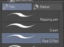
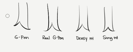
More recent versions of Clip Studio Paint actually came with some new default brushes, including "Real G-Pen", which had pressure settings that felt more right to me. But it's a little noisy so its uses are a bit more specific.
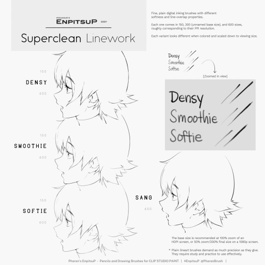
I have a brush set included with EnpitsuP called Superclean Linework. Those are the ones I designed as cleanup brushes for anime-ish looking art. They come in several flavors: Densy, Softie, Smoothy, Sang. I varied them based on how I saw different artists preferred their lines: a bit on the sharp side? Slightly blurry? With a little bit of opacity fade? A little more line variation? Among these, Sang has the largest amount of size response.
Ultimately, it may be a little bit of both a subjective experience and depend on what your hand/tablet/driver settings/style preferences are like. If you're having trouble finding a brush for this purpose, I think you should hone in on if you're not finding the right brush because every brush seemed too difficult to control, or you can't seem to get results you like, or you can't find one with a feel that matches the physical tool you're used to.
I think it's also worth noting that some artist's styles also rely a lot on them just changing their brush size setting depending on what part they're drawing. So you may end up needing a brush that has less pressure-size variation than you expect. My recommendation is always to look very closely when learning from someone else's linework example. Try to achieve it yourself side-by-side and see where it doesn't quite match up and ask yourself why. Or ask others why.
Of course, there are a bunch of other "lineweighty" brushes too outside of this genre of mostly-thin lineart.

#clip studio#clip studio paint#pharanbrush#clip studio brush#clipstudiopaint#clip studio paint brushes#EnpitsuP#KrupukP#csp brushes
67 notes
·
View notes
Text

Today we have the fourth part to our established relationship rec list for you! If you'd like to check out the previous parts, you can find part one here, part two here, and part three here. If you enjoy our rec lists, please show these fics love and be sure to like and reblog this post to help spread the word. Happy reading!
1) Heaven In These Sheets | Explicit | 3,557 words
Bunny Hybrid Louis has it out for his boyfriend’s phone.
2) Comfort Is Found When I'm the Only Thought on Your Mind | Mature | 5,087 words
Prompt 396: Established relationship - very domestic PWP. Louis complains about being out of his favorite moisturizer, and Harry suggests giving him a facial.
3) Stripper | Not Rated | 6,579 words
Harry is a bartender at the same strip club Louis works at. They're a power couple.
4) Call My Love In | Explicit | 6,601 words
And it’s cheeky and bold and so fucking Louis that Harry’s almost blindsided by it, takes it like a slap in the face to be reminded, yet again, that he is so eternally thankful to have found this boy. This boy who will bite at him with words, with teeth, will claw at him with hands, will destroy his heart by loving it fiercely, will put it back together again with a look, with a thought, and is never, ever, afraid to be so utterly himself around him; Harry’s so in love he can’t think straight.
5) Act Out | Explicit | 6,721 words
Harry leans forward so he's closer to Louis's ear, and murmurs, "If I was your husband, I'd never let you out of my sight."
It’s ridiculous. He is his husband. There’s hundreds of photos, and official papers, and rings, and two babies with the last name Tomlinson Styles that prove it. But it’s also possessive, and hot and Louis doesn’t know what he was expecting when Harry told him he wanted to try roleplaying a little, but so far he’s not complaining.
6) Alone Too Long | Explicit | 10,371 words
By the time The Temptress finally reached bay, the Captain only had one thing on his mind, and that one thing was Louis Darling.
7) Under the Same Sun | Explicit | 10,662 words
Louis and Harry live 400 miles away from each other. Sometimes it’s hard. (internet boyfriends, indie bands, and happy endings)
“I already miss you. I miss you all the damn time.” Louis says, because it’s late enough for honesty.
8) Out Of The Woods | Explicit | 15,560 words
The past and the future merge to meet us here. What luck. What a fucking curse.
9) Everything I Do | Explicit | 16,390 words
Harry’s ready, has been for a while now, and he’s fairly certain Louis is too, it just hasn’t been on the top of their priority list. There have been offhand mentions, a comment here and there, more in jest than anything, no serious discussion or consideration. Harry stands up straighter, a stomach-churning thought forming in his mind. Has Louis been waiting for him to ask?
10) Three's A Crowd, Four's A Party | Mature | 16,659 words
Harry and Louis tell their five year old they're pregnant.
11) Were We Ever This Young? | Explicit | 17,296 words
Hogwarts AU in which Harry and Louis both return to give talks to seventh years about the 'real world' with slightly varying results. Inspired by the Chilton scene between Rory and Paris in the new Gilmore Girls.
12) Under the Lights Tonight | Explicit | 20,905 words | Sequel
Note: There is a BH mention.
Harry’s an A-list supermodel, Louis’s his make-up artist boyfriend. They’re something of a dream team.
13) Suddenly They're Right | Explicit | 22,384 words
Louis is a painting professor with an art block the size of Texas and a global superstar for a non-boyfriend, who he wants to keep.
14) Wrote You a Love Letter | Not Rated | 23,092 words
Where Louis writes love letters to Harry through the good and bad times over their years together, until the very end.
15) The Devil’s In The Details | Explicit | 25,372 words | Sequel
He squeals when Harry smacks his bum as he bends over to pick up his bag, swinging it over his shoulder. Harry smiles smugly at him, bottom lip caught between his teeth. “When are you going to start calling me professor?” He asks.
“When you actually are one,” Louis says with his hand on the doorknob. He cocks his head to the side in curiosity. “Isn’t that how words work? You did study English, right?”
Louis’ quick to slip out the door before Harry can smack him again, his laugh echoing through the hallways as he makes his way to his next class with flushed cheeks and a bright smile.
16) Fetish For My Love | Explicit | 27,388 words
Louis has too many worries to even think about a moment of peace in the days that now exhaust him and become a complete rush for him. Fortunately, Harry doesn't take long to take care of the matter as he knows that he has wanted it so much, finding the solution in a particular sheet full of colored stickers.
17) Lovin' Online | Not Rated | 27,627 words
“Huh?” Harry asks, muffled by his forearm. He feels lips on his face and the tip of Louis’ nose against his ear when Louis repeats himself. Brain sluggish with sleep, it takes a moment for him to process the words, but his eyes snap open, and he’s met with darkness. He's got to be dreaming, there’s no way Louis just said what he thinks he said. “What did you say?”
He can see the vague shrug from Louis before he turns around to toss the towel with the pile of their discarded clothes. “Did you say…” he starts slowly, automatically slinging his arm around Louis as he gets back into bed and throws the blankets over them.
“That we should make a sex tape?” Louis asks rather nonchalantly for such a big proposition. He cuddles easily into the warm body and confirms, “Yes, I did.”
18) Like The Stars Above | Explicit | 33,759 words
Louis has a witchy little secret that is slowly ruining his relationship. When that secret comes out, it turns out that he has a lot more to worry about than just losing the love of his life. He might lose everything.
19) Beneath The Shining Stars | Explicit | 35,207 words
A Hamlet retelling/AU on steroids, where Harry is Hamlet, Louis is Horatio, and comedic chaos ensues (with a dash of tragedy). Featuring the rest of OT5 and the original characters of Shakespeare's "Hamlet".
20) These Hallowed Woods | Not Rated | 35,535 words
Louis becomes Luna of the Tomlinson Pack after the untimely death of his father, the Pack Alpha. Saddled with his newfound responsibility and an unpleasantly demanding pack council, he finds secret respite in the arms of a rogue wolf that camps out just outside his territory. The only problem? The rogue has no idea who Louis actually is, and as Louis falls harder and harder for the man he escapes to every night, the weight of his lies steers him along a path of certain misery.
21) This Glass House | Mature | 42,072 words
While deployed, Alpha Harry gets injured by an IED explosion, leaving him to deal with severe injuries in its devastating aftermath. During his road to acceptance and recovery he learns with the help of Louis and their children just how important family can be for the mind, body, and soul.
22) Show Me Life Like I've Never Seen | Mature | 42,948 words
Louis never expected to leave the small art studio three blocks down from his job with anything besides the painting he caught a glimpse of and simply couldn't forget.
23) Til' The Darkness Softly Clears | Explicit | 45,430 words
Something thuds nearby, and Callie sits up in bed, eyes still fuzzy from sleep. She yawns and rubs her eyes, looking around the room for the source of the noise. When she doesn’t see anything, she huffs quietly. Sliding to the floor, her feet take her towards the door. At the doorway, something disturbs the silence again: the distant sound of footsteps. Callie holds her breath and creeps out of the room. On the landing, she stands on her toes to peer over the railing. She can see the front door, and, outside, through the windows on either side of the door, she sees a shadow pass by.
It walks one way, then disappears from sight for a second before it turns and walks back in front of the door. Callie’s eyes widen, and she backs up from view when the figure pauses its pacing directly in front of a window. Slowly, it turns, and it seems to stare right through the window, directly at her.
24) Flash Back To Me | Explicit | 73,068 words
Louis narrows his eyes, wanting more than anything to tell Liam to go fuck himself, but he can’t be sure, is the thing. As much as he knows for a fact that he would never date someone like Harry Styles, he has months missing from his memory. And it’s scary to think that, in that time, everything he’s come to know about himself could have changed so drastically.
Check out our other fic rec lists by category here and by title here.
132 notes
·
View notes
Note
The art style of Cloud Castle is absolute ass bro why are their eyes so big
Idk man it just looks.... off
I wish they brought back the og art style like Blue Scarab Hunt because that was gorgeous
Well if you’re referring to the book's artstyle as a whole, then calm down buddy the illustrations as a whole are pretty good all things considered (believe me some of the illustrations in the later books are waaaaayyyyy iffier)
But if you are referring to Danilo Barozzi’s illustrations in the book then uhhhhh… yeah I don’t blame you, I didn’t like the big anime irises either, she didn’t cook with this one,,,
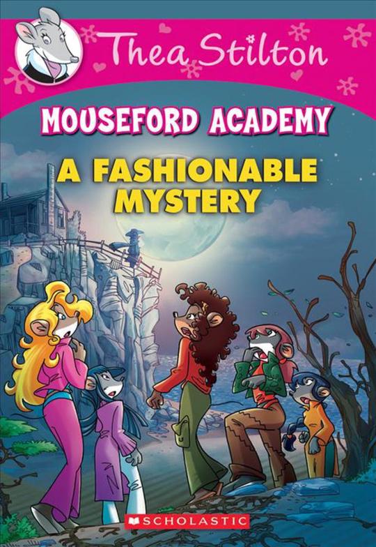
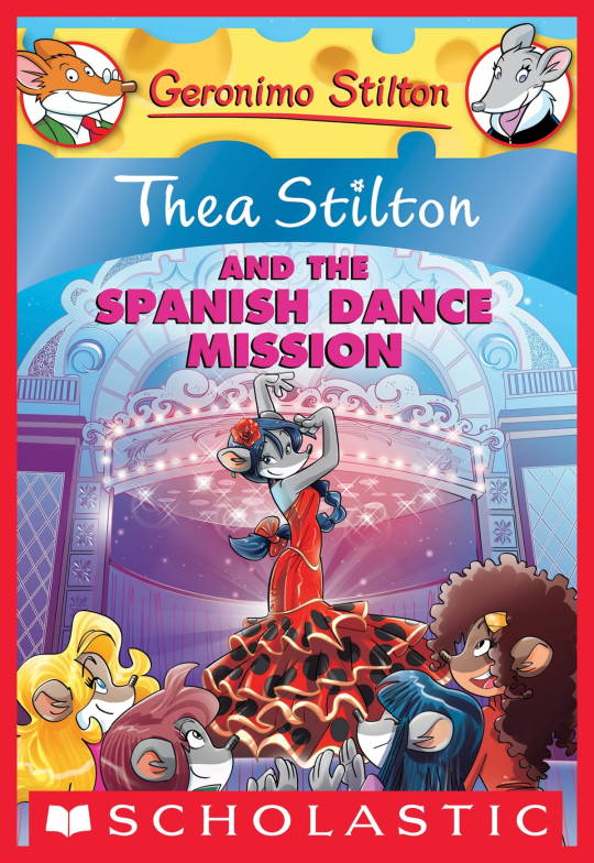
The interesting thing is Barozzi also did pieces for Secret of the Snow and those looked fine (she did well enough that I have to squint to determine which ones were done by her). My guess is either she did a lot of the illustrations for the latter half of SotS and we just got used to it, or it’s because the artstyle of special editions 2 and 3 were more… experimental? Books 4 onwards developed a very specific… look for the artstyle that adhered very closely to the main book illustrations of Spanish Dance Mission onwards, thus the illustrators had to follow suit, resulting in whatever looks off to look especially off.
(Even with this set of pictures, I’m only about 70% sure these are Barozzi’s because of how alike yet different the styles are from each other in the book. The first one could be Barozzi’s, but it could also be Giuseppe Facciotto’s, since he also did illustrations for SotS and his stylization means he sometimes puts the eyes really close to each other in a way that’s weird but still makes sense somehow.)
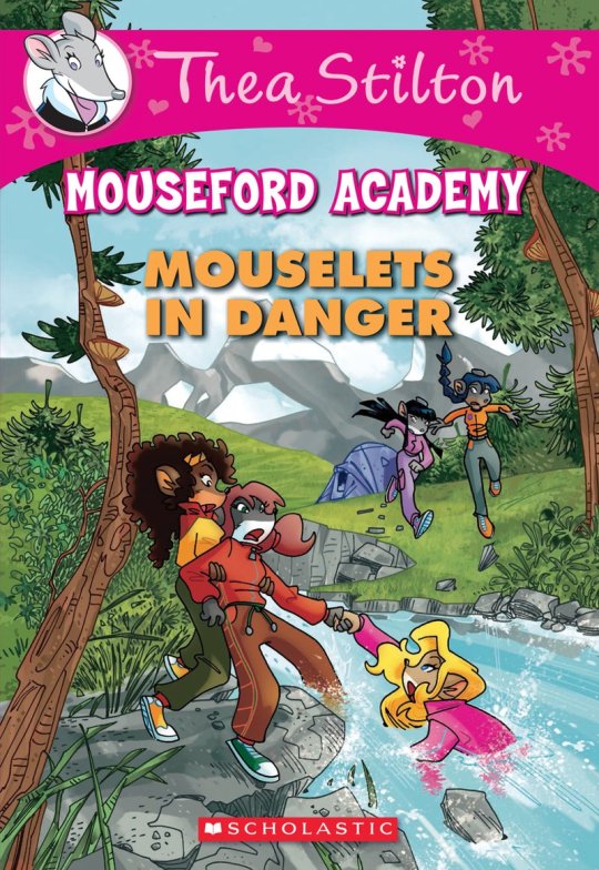
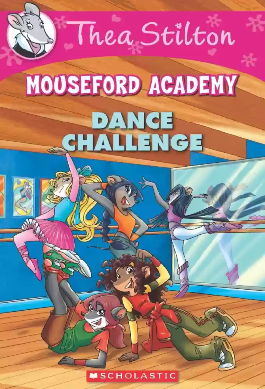
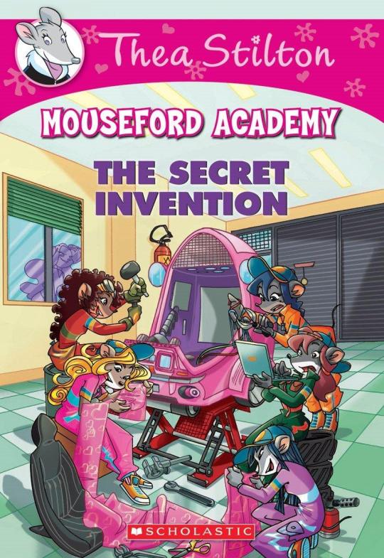
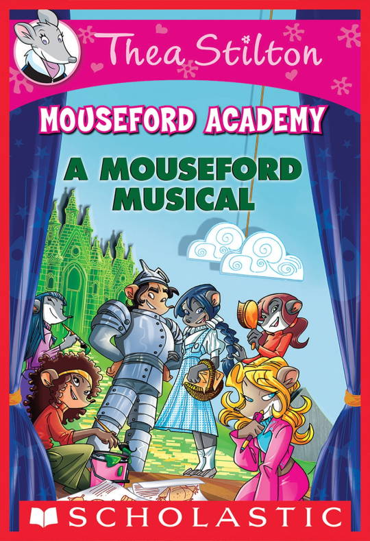
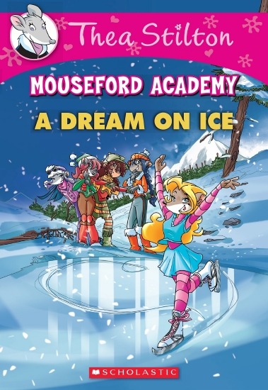
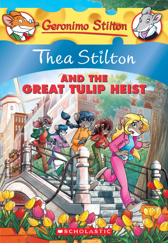
On the contrary, books 2 and 3 (and I would probably even include book 1 there) had a more experimental look to the illustrations, which seems to be based more on (and this is just a theory of mine) Giuseppe Facciotto’s iconic work for the covers of Mouseford Academy books 2-12, 14, 15 and 17 in the English books (he did waaayyy more covers for the Italian Mouseford books— he was basically the cover guy for the Mouseford books for a WHILE) as well as the books from Spanish Dance Mission to Lost Letters. If you’re wondering why those covers go as hard as they do, then now you know why.
(These aren’t all of Facciotto’s works for the covers we know in English but you can see that he popped off <3)
But yeah as you can see with special editions 2 and 3, the art direction seems to be heavily inspired by Facciotto’s artstyle.
However, when Barbara Pellizzari’s works became the aesthetic poster child of the books’ brand, that was reflected in the illustrations and how their aesthetic changed, as seen in the main books and how they look currently, special editions 4-9, and the Treasure Seekers trilogy.
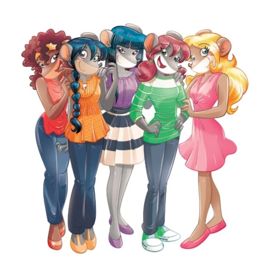
This new profile thing of the girls? This was done by Pellizzari (coloring was done by Flavio Ferron), and thus it became the main reference for how the girls look in the book’s illustrations.
And it’s not just in the general direction to the artists for how to draw the Thea Sisters, but also in the direction given to the colorists. Alessandro Muscillo was the colorist for the special edition books since book 1 and the Treasure Seekers trilogy, and you can see that the direction for the style varied through books 1-3, like maybe direction was experimenting with the mood the illustrations were to convey, beginning with the cartoony and bright colors of book 1, easing into the more grounded and layered palettes of books 2 and 3
Then book 4 was when they transitioned to using digital art /j
I jest, but seriously book 4 was the debut of the coloring style we end up keeping for the rest of the special editions and for all of Treasure Seekers, which is very… bright :D
(I would show more picture examples but I manually took pictures of my physical copies for the Cloud Castle and SotS illustrations and gwuh I’m too lazy to grab my entire collection just to take pictures,,)
Bright as in like… the colors are very defined and saturated. I dunno how to describe it, but when you see it, you get what I mean. It’s very bright and pretty and colorful and it stands out. There are still variations that happen on occasion (Star Fairies in particular uses a good dose of airbrush for the lighting and shadow effects, and Crystal Fairies looks like someone had a bit of fun using sparkle brushes), but other than that, it’s very bright. I don’t hate it, but I do acknowledge that yeah, if I was introduced to the series when it had fully transitioned to the new style, I never would’ve gotten into the series in the first place, because the older books had something that didn’t make it feel specifically catered to girls. The colors were bright, but not too bright. Colorful, but unified. They weren’t that complicated, and they didn’t have to be because the colorists (plural, there were at least 3 per book once upon a time) were popping the hell off with the colors they were given. But y’know, the newer books’ consistent style did give me a good spot to practice drawing mouse furries so I’m not complaining too much about the newer style, haha.
(Tiny baby E’s (it’s literally from 2020 what’re you on about mate) her first mouse Violet drawing using Barbara Pellizzari’s artstyle in Treasure Seekers 1 as an anatomy guide!!)
With that said tho, yeah I miss the old books -m- dunno if it’d fit the aesthetic of the special editions but m a n we could’ve had it and it probably would’ve looked cool
Also the illustrations go way harder in the older books, like Prince's Emerald? I've talked about Prince's Emerald and how it goes hard before, and I still stand by it and say that it does in fact still go hard
Maybe it won't fit the uh splash of color they gave the hardcovers, but imagine they grabbed Giulia Basile's coloring work for the graphic novels and used that as sort've a basis for the coloring style of the hardcovers. Not exactly the same-- would probably still add a touch of whimsical watercolor and/or paint to the very cel-shaded style, but we could've had something pretty dope -m-
Anyway that's my ramble simultaneously defending the hardcovers' artstyle and reminiscing on what could've been haha
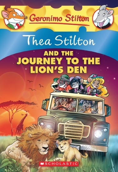
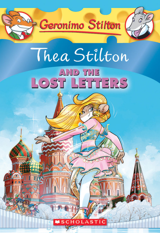
#geronimo stilton#thea stilton#thea sisters#questions with e#rambles#the style of the older books is gorgeous but the main thing I'm wondering is can it pull off fantastical whimsy#that's the main thing i dunno if it can do (i would love to be proven wrong tho)#the style is so grounded that i'm wondering if it can pull off what the hardcovers needed it to do#which is convey the otherworldly fantastical thrill of exploring the fantasy worlds (which uh the newer books were able to do but#my main gripe is that fantasy and reality are near indistinguishable in vibes coloring-wise#sure there are sparkles and stuff is more saturated but the girls' dorm in book 4 still has the same-ish feel of the land of clouds#i dunno what it is. the bright colors just feel mundane somehow and don't take a shift when returning to reality)#looked at my books again and i think it might be the fact that the later books have no grounding color?#compare book 3 to book 5 and you'll see it the most distinctly methinks#the newer coloring style doesn't have a color that grounds the illustrations' palettes and thus everything's always bright 100% of the time#the girls' colors are always at their most saturated#like they're always under broad daylight in terms of lighting#it's not eyebleeding or anything but they don't look affected by the lighting in the setting they're currently in#and the result is it looks.... meh?#we get so used to the bright colors that they end up looking meh somehow#i'm not an art expert by any means this is just my observations as someone with a little too much brainrot
33 notes
·
View notes
Note
Hiii, greetings from southeast asia! ❤️
i like your blog btw
And i wanna ask you as new fans of Dir, what do you think about all member? Please describe each member and tell me who is ur favorite?
Hello, sorry for the delay! I knew that this question required a thoughtful answer.
Welcome to Dir en grey! They're frickin' awesome.
Hm I'm terrible at describing people. Essentially, none of them are mean or offensive. They are all very considerate individuals. What's special about Dir en grey is that they are not social and they do not profusely share with fans, so whenever they do or that they interact among themselves, we all go gaga because by that point, we're craving for it hahah.
In terms of them individually, hm, I can't say that Toshiya imposes himself, but he is definitely not a passive bassist. He moves very emotionally to the songs and it's super heartwarming to see him smile on stage. Recently, he opened his online fan site and he seems very generous and, again, very thoughtful with what he gives to fans, after all those years of drought.
Die has a kind of mysterious air to him, but he is rather communicative and energetic. For years, apparently he has been sharing daily updates/pictures on his online fan club.
When it comes to Shinya, he's a stoic angel hahah. He really has his signature look and his facial expression remains neutral whenever he plays the drums, but he beats them like a beast. I love his compositions because they're so atypical and varied, you can never get bored of the melodies. I also love his style of humor, which you can see on his YouTube channel.
Kaoru gives the impression of really being serious, but he is quick to kind of fool around too. He is known as the leader but he is clearly super laidback. From what I know, he is rather generous and attentive with fans too, and his art is very cool and gloomy!
Over the years, I've come to love them all quickly enough, but Kyo was definitely my favourite member of Dir en grey from the start. At this point, it might be easier to find words that do not describe Kyo than limit myself to a few words that do describe him. His performance on stage is striking, his lyrics aren't necessarily genius but the way he delivers them, wow. I don't know any other singer who comes up with vocal melodies that are this diverse and so felt. And I've looked, I'm open to discoveries but nothing's a match for his creativity. What else to say without stretching this post on forever... Hm, I've definitely known him to be moody, but he just expects a raw and true response from people like what he gives us, and he can't be bothered to fake. As a last note, I'll make an honorable mention to every "smirky" thing he does, whether on stage or in his various other activities. He is not outright laughing while slapping his leg for example, but once in a while he does shenanigans and you can just imagine a smirk behind it. And if you love Kyo, please give his second band, sukekiyo, a chance! It's amazing and you can witness another side of Kyo!
Even though I gave myself some time to think of a reply, this is in no way perfect or eloquent... Please explore my posts from this year and the past ones and you should notice some traits from each member! Perhaps the compilations are a good starting point?
30 notes
·
View notes
Text
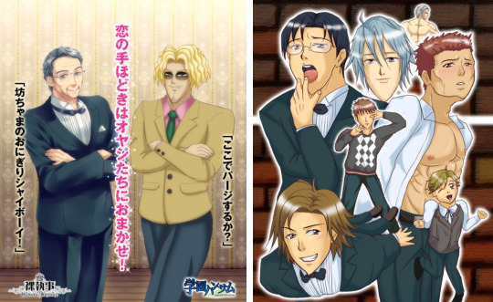
Revisiting Gakuen Handsome: Backstory + short review
I think every BL fan has seen something related to Gakuen Handsome at some point in their lives, it's a parody BL visual novel with quite the legacy. It was originally released in 2010 by Team YokkyuFuman and it also got its own OVA and anime adaptation in 2015 & 2016. The protagonist, who is an unnamed seventeen year old boy, moves back to the city after a seven year absence. He enrolls into Baramon High School, a prestigious all-boys school which takes pride in being the best of its prefecture. From now on, his life will be changed forever...

First of all, the developer team's backstory is probably one of the most unique ones. In 2008, eight film students from the Tohoku University of Art and Design formed Team YokkyuFuman (チーム欲求腐満). Their blog mentions that a year later, they attempted to submit the Gakuen Handsome opening movie to the 9th edition of the Niconico Film Festival (their submission was completely ignored). After that, the opening movie was uploaded on NicoNico Douga, where it was quite well received. The description of the video mentions “to be released in 20009”, as they originally probably had no intention to create a full game.
After it became a hot topic on NicoNico Douga, their university gave them permission to organize an official exhibition: Gakuen Handsome Matsuri (or just Gakuen Handsome Festival). Visitors could watch the opening movie, learn more about the characters and take pictures together with the life-sized cardboard cutouts. The exhibition also featured rare merch: A drama CD which would be released in "20009" and canned bread.
This exhibition was apparently not only held once, but many times according to their blog. The game was finally released in 2010 and many fans were happy to finally play it, supporting the team that created it. Togo Mito, who many of you know as the creator of (in)famous BL game Hadaka Shitsuji, also collaborated with them. These are some pictures I found on Togo Mito's old blog, Mizoguchi and Juro drawn by Togo Mito and the Hadaka Shitsuji cast drawn by Team YokkyuFuman.
Even after graduation, it seems like they would occasionally invite some of Gakuen Handsome's creators. In 2014, the university tweeted that they would not be able to host the exhibition that year due to renovations, but visitors could take pictures with the cardboard cutouts. There's also an interview from 2016 on the university's website, in which they talk about how things have been after graduation! I absolutely love how the university supported all of this.

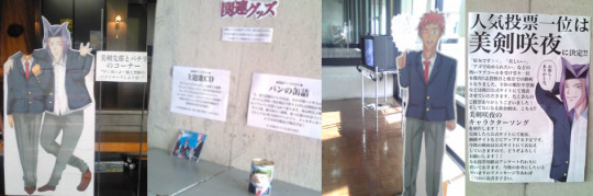
Now about the game itself... Where to even start? You'll have to trust me, but the game is actually good. Many parody games can be quite a hit or miss, but this visual novel is something I still catch myself laughing at years later. The inconsistent art, pointy chins and strange jokes really create an experience unlike anything else. I don't think any commercial company would be able to create something like this, even if they tried. One detail that the anime adaptation doesn't really show is that many different artists worked on this, whose styles widely vary from each other, making absolutely no attempt to create one consistent artstyle. Most characters have at least 2 ~ 3 sprites that often look completely different from each other. For example, sometimes Saionji sensei looks like a clean-shaven teenager/young adult, but in the CGs he suddenly turn into an older looking man with a stubble.

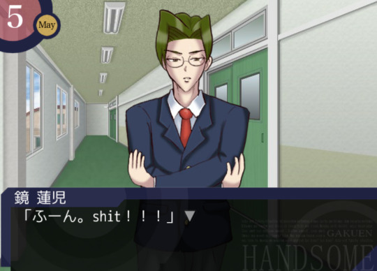
Yes he's talking about eating paint in the screenshot above, why not. Anyway... the voice acting in this game is something else I wanted to talk about, because it adds so much to the game. Of course it's not professional, but I think that's what makes it amazing. You can sometimes hear the voice actors trying really hard not to laugh, and they will occasionally completely mess up their lines. Of course all of those lines are kept in the game and they didn't re-record them. I also loved it when they started swearing in English for seemingly no reason. Also, instead of just avoiding the name of the protagonist (who you can give any name you want) they pronounce it... by improvision. Just imagine how one would try to pronounce a "adfgdf" keysmash and you'll get an idea what it sounds like.
There are 6 characters in this game who you can romance. The protagonist's childhood friend Takuya, who is a bit obsessed with the protein bar Calorie Mate (which is censored in the new version of the game, so you just hear a BLEEP sound), outlaw teacher Saionji, school principal Juro who basically only functions as a save point, student council president Kagami, chuunibyou transfer student Shiga, and last but not least, the captain of the soccer team Mitsurugi, who also murders people with his chin sometimes. The protagonist's sister also has a (non-romantic) ending, which you need to play in order to unlock the extra scenario (which... is a ridiculous murder mystery story for some reason). I also could not find the guide I used a long time ago, so I just looked at some videos on NicoNico to see what others were doing and that worked pretty well...!
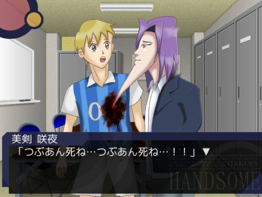
My favorite scene is probably still that one scene in Mitsurugi's route, in which he stabs people with his chin. It's also one of the scenes that gets referenced the most in fanart. The context makes it even more ridiculous, Mitsurugi gets really upset that some people like the chunky variant of red bean paste (tsubuan) and decides they should die. After stabbing his teammate and multiple other people he runs outside. The protagonist however, isn't safe either and also gets accused of being a "tsubuan supporter". If you survive though, you get a chance to marry Mitsurugi!
Honestly one of the reasons I wanted to write about this game is because many people only know the OVA and/or anime, but the game is so funny I think everyone should play it if they're interested. I also think the team behind it has such a funny backstory and I love seeing how supportive their university is. Right now the team is still active on their Twitter account and they sometimes create new content. Last year they released Gakuen Handsome Fighters, a short fighting game featuring the Gakuen Handsome characters.
If you are interested in purchasing it, I recommend getting the "Special" edition which can be purchased on DLsite! I couldn't find a working download link anymore of the older version, but I think the creators deserve the support, so I don't regret buying it (it was about 15 USD). It includes the original game and 5 shorter stories which were originally released as smartphone apps. While I think the original game is still the best one, it's fun to explore some of the extra scenarios as well. One of the shorter games takes place in an alternative universe in which the boys live in the Heian period, and for some reason some of the sprites are animated... yeah.

29 notes
·
View notes
Note
Hi! Do you happen to have basic/simple/easy tutorials for editing comic panels to recommend?
i do not actually have one to refer you to, but i’m happy to write some things up! i’m assuming this is just for removing backgrounds and creating icons; if you want a how-to on the way i animate panels, that lives here.
i use photoshop cs6, but the same general principles should work in other editors. also, there are probably easier or faster ways to do the things i do. i like my methods and i’m comfortable with them, but i’d recommend experimenting to find what works best for you.
and... yeah! let's get into it.
step one: finding a panel
i save panels as i’m reading comics. they all live in one PSD file named “panels,” and i make a new one for each run. anything that seems pretty or thematically resonant gets copied and pasted in there. this way, i don’t have to dig through endless comic issues to find a specific image that stuck with me. i usually save the full page just so the edges are clean and everything is included.
let’s go with this page from birds of prey:
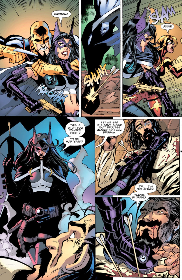
step two: cropping
the way i crop the image depends on two things: what i’m hoping to make, and what the image looks like. here, i’m just doing a basic portrait, and helena is taller than she is wide. that makes it easy; let’s crop it so she takes up most of the frame.

(my preferred ratios are 4x6 for smaller panel edits like this; for banners, i usually do 2x1, but if the framing works better as 3x2, I have done that, too. just feel it out. actual pixel sizes depend on the size of the original image.)
step three: removing the background
this part is, I think, the area with the most room for personal preference. we need to erase the background, and there are a LOT of tools to do this. each one varies depending on what the image itself looks like. there’s the magic selection tool, the eraser, or the lasso or magnetic selection tool.
(i don’t use the lasso or magnet because they’re evil, to me, but they work reasonably well when you have a character on a mostly solid background and art with thick, defined lines. i have no real advice other than that.)
here, we can mix and match some things. i’m going to start by using the magic selection tool to grab all the white or solid colors and remove them with the delete key, like so:

surprise! gone.
after that, for the more finicky areas, i am a perfectionist and i go in and erase pixels using the eraser tool at 4-5px width. i start by outlining the character, like so:

from there, you can use the lasso tool to select all of the remaining background and delete it. i usually hide the white background layer at this step, too. (i'm also going to color the smoke and the man in the foreground black and redraw the crossbow string with the paintbrush tool. this ain't about him.)
you should end up with something like this:

step four: cleaning the linework
this part is mostly using the layer style stroke and the tool refine edge.
so, because of how selection tools and erasers work, there are a bunch of hidden pixels throughout the image you can’t really see. this drives me absolutely bonkers. at this point, i combine all the layers of the paint i've done so far -- everything except for the transparent background. select the layer with the character — Helena — and apply the layer style stroke, set to “outside” at 3px.

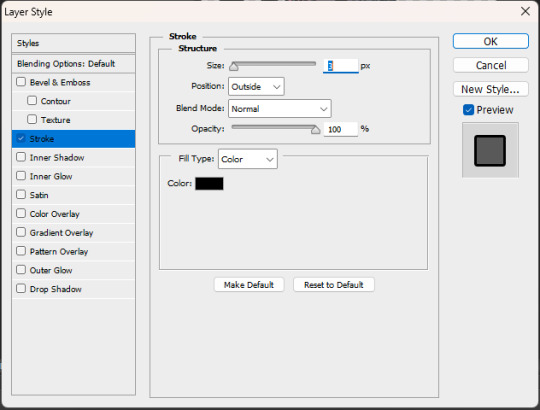
those little black dots are what we're after. there aren't too many right now, because this was a fairly clean edit; sometimes, it looks scary and messy, but that’s okay. the layer style has just outlined all those invisible pixels. i go through and erase them — especially in tight places like corners. for example, this pesky area between strands of hair:

(before vs. after)
once you’ve erased all of those pixels and cleaned up the image, you can go back into the stroke layer style.
you’ve done a lot of erasing and feathering and cleaning up, so chances are, the line work is not nearly as crisp as it looked in the original panel. that’s fine! shift the settings to “inside” and 1px, like so:
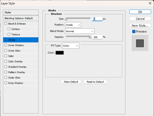
sometimes it’ll need to be 2-3 px, sometimes it’ll need to be center-aligned, and sometimes you might even decide it looks better outside or without the stroke style at all! this is all personal preference. do whatever you like.
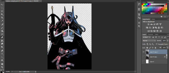
once it's where you want it to be, i like to duplicate the layer -- to save the one without the new outline in case anything goes wonky. then right click the copy of the layer and "rasterize style" to get a flat image with new linework.
your workspace should look something like this:
if it happens to feel like the edges are a little harsh — which happens sometimes! especially when using selection instead of eraser — you can select the whole image and use refine edge. this softens it. you don’t need to do much; i usually do 2-3px of feathering, a couple pixels of smoothing, and some contrast, depending on how it looks. see below:


you'll have three layers now. it gets confusing, so try to keep track of which one is your active layer. you can delete old ones, if you want; i generally don't, just in case.
there isn’t a hard and fast rule for this part. do what you think looks good. and if you want to refine the edge before you add the new linework, that can work! do another stroke layer style after the first round! test things out and find out what you like. most of the time, it depends on the image and your preference.
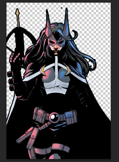
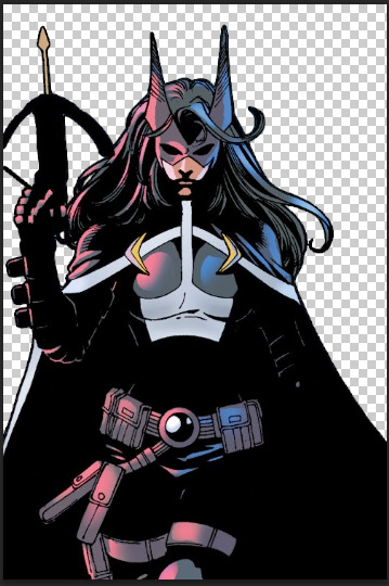
after all that, this is the helena we now have:
step five: creating a new background!
this part is easy. create a new layer, pick a color you like — i tend to pull from the actual background using an eye dropper tool, or if it’s for a multiple-part edit, I use the swatches i’ve decided on for the color scheme of the whole thing — and paint bucket that thing right on there. this is some of the blue that was behind her originally:

i don’t like flat colors, pretty much ever, because they feel harsh to me. so i go back and add artistic touches and mess around with the filters a lot. sometimes i pull text or accents from other panels and follow the same steps as above to incorporate them into the edit; sometimes, i don’t. no rules just vibes.
in this case, i want it to be pretty simple. so i’ll make a new layer, then fill it in with a gradient tool. i usually make a custom gradient; one side is the color of the background and the other side is either black or white, depending on the vibe I want.

i do an orbital gradient most of the time — circles are your friend — and focus the center on something that I want to draw the eye to. here, i’m going to do helena’s face.

then i mess around with the opacity until it looks the way i want it to. like this:
step six: final steps
congrats! you have an edited panel! you’re perfectly fine to post/share/use it at this point, but there are a couple other things i like to do to give it that final polish:
if you want to jazz up your edits, try messing around with outer glow, or drop shadow. both of those layer styles can add some emphasis to your focal point. (i prefer those be kept at a low opacity, when i use them, which isn’t often.)
i'd also recommend messing around with gradient maps if you want to superimpose a larger silhouette over the background. that would take more room than i have left in this already far too long guide, but it does add something to have it in there.
i dislike having text bubbles in my edits unless i specifically put them there, so i do have a process for removing them, much like the smoke or the man in the foreground. again, we are running long already, so i won't get into that here. my recommendation if you don't want to deal with entirely removing a bubble is to just paint over the text inside with white so you have an empty text box or speech bubble instead. it's simpler, quicker, and honestly the more common practice based on what i've seen.
that being said, if you want to know how i paint over them -- or how to do anything i didn't get into here -- feel free to ask. i don't mind writing these up.
i have a guide on how i size my images here, which walks through the exporting process. it’s not strictly necessary, but i like for my edits to remain consistent in size, so i do usually follow it.
and that’s it! you’re now ready to edit comic panels to your heart’s content. happy cropping and so on, and thanks for asking me. <3
#how to#ask.tb#anonymous#i hope this answered your question#and i especially hope it did so in a simple and easy to follow manner. despite how lengthy it got. i tried to stick to basics here.#but yeah! thank you for asking#best of luck!
31 notes
·
View notes
Text
disclaimer: this spawned off a twitter thread i made a while back, which itself came from something i’d noticed time and again within the xiv community: the idea that photography isn’t possible there. i’ve seen this a few times, and ultimately what i felt to be the truer statement is that digital photography as we know it in our phones, no. that is not a very accessible thing. most eorzeans aren’t getting a garland ironworks tomephone.
but that doesn’t mean they aren’t taking pictures.
A Case for Eorzean Photography
In the case of our modern world, the art of capturing an image onto paper directly from life dates back to the 1820s. It was called heliography. A wikipedia article on it can be found here. Heliography came about because its inventor wished for an efficient way to reproduce lithographs, engravings, and relief prints, three different illustration styles that had existed by now for varying lengths of time, but all still in use and being the choice method for adding images to text. I’m going to give a short bit of information on each style, because they are also very likely quite prevalent.
Woodcut (Relief)
Woodcut is as its name implies -- you carve your image into a block of wood, coat the raised portions with ink, and then use it in the press. Accessible to learn, accessible to do, if you want rp flavor there’s likely illustrators in every city-state employing this for the newspapers or illustrated editions of books.
Intaglio (Engraving)
Intaglio is my favorite printmaking method for illustrations, and probably also my favorite for FF14 because it involves playing with chemicals! Let’s get the alchemist roleplayers we know something cool to do. Anyway, with intaglio you’re using acid to burn an image into a metal plate, and the deeper the etchings the darker the shadows. Great for values, great for depth, and have I mentioned you’re just being a little scientist and an artist at the same time?
Lithography
Lithography is the one you’ve seen the most, even if you aren’t 100% sure how it works. It became very popular in the late 19th and early 20th century -- if you’ve ever gawked at vintage illustrations by Mucha or Leyendecker, those are lithographs! Some of the big plates used for them are just big rocks! Miners could 100% mine up limestone slabs for this.
Anyway, back to photographs. After heliographs cracked the capture nut suddenly everyone was getting in on it. People were mixing all kinds of chemicals to capture the world as it was at a moment onto a plate of glass (or others! they liked silver too).
Physautotypes used lavender oil as its photosensitive agent. Tree resin was also popular. Both things botanists would routinely be able to harvest and crafters able to distill. I can only imagine how it smelled to make photographs with this, I hope it was nice!
About 20 years after the earliest heliograph came daguerrotypes. Made on silver plates with a copper substrate, daguerrotypes were pricy but popular -- and they had their own special camera made rather than using a camera obscura.

Daguerrotypes were also when spirit photography came into prominence.
youtube
Ambrotypes came on the heels of daguerrotypes as a cheaper alternative made with less costly materials, and was followed by their even cheaper brethren the tintypes. Bit by bit, photographs were becoming more accessible -- not always the equipment (or the supplies), but in terms of a person or group of people having a portrait made you were starting to see that become more common.
Ambrotype above, tintype below
Let it be said also that less costly materials does not mean lower quality image -- each method had its own charm. Tintypes were sturdier than ambrotypes, but both developed quicker than daguerrotypes. Ambrotypes could also have spot colors added to them!
Albumen prints made it to paper, and until we went digital that’s where photographs stayed, on paper! And one of their key binding materials was made from eggs, beautifully common eggs.
So Where Does This Leave Eorzea?
So why did I go into this much detail, with visual examples and links to references that include their materials? Because all these materials exist already within FFXIV. Glass, plates, the types of metals used, the types of chemicals.
They’re part of crafting logs, and gathering leves, and dungeon drops. Alchemists can make these chemical components, goldsmith quests have you making lenses and other more delicate mechanisms, carpenters could easily build boxes for camera obscura (and cameras!).
Different styles of photography and different materials used for them reflect availability of the materials -- where does this character live, what are their cultural beliefs, do they travel much outside of their home region? How much money do they have?
What if using unaspected crystals creates a different effect on the plate? With the right kind of aetherial charge, don’t you think you could photograph ghosts in actuality rather than trickery? There’s a whole quest in 1.0 where an NPC sees the ghost of the city of Sil’dih -- a ghost city!
At any rate, I just think it’s neat to look at what materials exist in this game, and how things from this world may translate to that with the understanding it will not be 21st century. We have a lot of technology that’s existed longer than we sometimes recall or acknowledge -- and it’s good material! Use that stuff! Have fun with it!
#not really lore so much as half mad rambling#this and discussions about printing have been a pet peeve for me for years#god don't get me started on banri oda talking about copy books with glamour prisms don't do it
186 notes
·
View notes
Text
SET ME FREE REVIEW #1

I said I wasn't going to write a review so I'm not writing one. This is just a commentary. Take a deep breathe, unclench your jaw amd brace yourself for this ride.
I want to start off by saying, admiting, and testifying that Jimin is a genius point blank period. His creativity, his duality, his delivery and execution in every single art work is an attestation to this fact.
If ever his ingenuity was in question, Set me free sets the record straight. It is only Park Jimin that can dare to assemble such imposing sounds, competing talents, daunting expanse and fine rhythm in one room under the single gaze of an equally brilliant director and not get lost in all that magical mashups.
The song is huge. BTS level huge. And for him to attempt to take on a song that takes 7 brilliant minds of our generation, him included, with varying vocal skills and talent- I must say, Jimin has some big balls on him and I respect him for that.
When I tell you my mind is blown, it is.
The song reminds me so much of BTS and everyone seems to agree. However when they say it's a nod to the group I disagree. I'll explain in a minute.
He draws on familiar elements and artistic devices that's signature to BTS as a group thus infusing among other things, nostalgia and that feeling of excellence and excitement we associate with BTS.
But that was the plan all along wasn't it? To show you he is not afraid take on a big shark like BTS or even to be compared to the brilliance of the group? Namjoon told us in words, Jimin just walked the talk.
I don't think this is a nod to BTS however. Because then we have to ask ourselves, is Jimin celebrating the band or has the band been celebrating Jimin all along.
This is bringing to light the artistic inspiration behind the creation of almost all BTS' master pieces. It's jimin. It's always been Jimin, the choreography, the beat, the visuals- everything has been inspired or created around him and his capabilities. The group has always leaned into his strengths in that way. It's why he transitions so well into it even as Solo.
Blackswan comes to mind. The stunning visuals, the contemporary dance styles, the concepts- everything was woven around Jimin. There are pieces of him intricately woven into the fabrics of BTS.
You can't have BTS without Jimin.
He is the secret ingredient that spiced up the group and this master piece of an MV shows it.
It makes sense to say there are songs that were made for BTS with Jimin in mind, choreographies inspired by him and that played to his strengths and uniqueness too.
It's why people accused him of being Hybe's favorite or the director's pet. The writing was on the wall.
Does this mean the others suck?
Yes.
I'm kidding😆
If you want to look at the strength of BTS you only have to look at the strength of the individual parts that make up BTS. From Namjoon's lyrical intellect, Hobi's versatility, Suga's unmatched flow, to even Tae's radiance- you cannot dispute that these men rose not by luck but by substance.
I used to think their Solo phase was them moving apart and away from their shared identity but now I think its the phase for each of them to model and strut across the biggest runway to show the world what they each bring to the golden table that is BTS. It's not a competition among themselves. Not at all. It's a review and examination of the parts that make up the whole and they all have something to prove.
And by Odin's beard, THEY WILL PROVE THEMSELVES. EACH AND EVERY SINGLE ONE OF THEM. IT'S IN THEIR BLOOD. IT'S THE BANGTAN SPIRIT.
He killed it.
He delivered.
Part two will focus more on the themes, visuals and vocal delivery. Look forward to it.
Hashtag drinking Hennessy. I saw what you did there Jimin. And if you read my blogs closely you'll see what I'm getting at.
Cheers Jimin 🍻
YOU DID IT
138 notes
·
View notes
Text
Gracetopher Week: 2023 Event
Hello fellow gracetopher lovers! Welcome to Gracetopher Week where we celebrate gracetopher and ignore canon following Chain of Iron. We hosted Gracetopher Week last year and we're super excited to do it again this year! No pressure to participate but we'd love it if you would spread the word and support our wonderful TSC creators and fans this week 🤍. This is also a fun way to keep the fandom alive after TLH has been finished.
Day 1, August 1:
We're going to start simple. Reblog day!
Recommend or just reblog a few fics, art pieces, headcanons, or anything else Gracetopher that you've enjoyed and tag it: #gracetopher week.
Support each other and help people find more content for our underrated ship.
Day 2, August 2:
Because everyone usually has varying ideas about a ship/characters in a story: Headcanon day!
Tell us your thoughts/ideas and headcanons about gracetopher. Post a list or just one headcanon or submit a post/send an ask to a gracetopher creator/blog you know of. Don't forget to tag!
Headcanons are an excellent way to lead up to days 3 and 4 and 6!
Day 3, August 3:
Fic day! Today is for the writers!
Today is a short fic day and we recommend only one shots and drabbles because we'll be posting an AU/Canon Divergence day later, but long one shots are always welcome. Tag with #gracetopher week.
Support your fellow writers/fandom writers!
Day 4, August 4:
AU Day!! And it's a free for all!
Write/Draw/Headcanon/Explain any AU you can possibly thank up for Gracetopher. Don't forget to tag!
There's a lot of ways to create for this, and any AU is welcome!
Day 5, August 5:
A little break from writing anything, whether it be fics or headcanons. Edit Day!
Make an edit or post a picture or make something visual for gracetopher! Simple or complex.
We love to see the variations in edits and there's a lot of different ways to create them. Have fun with this one especially! Be sure to tag with #gracetopher week.
Day 6, August 6:
Fanart Day! Everyone has hopefully had enough time to prepare something special for later in the week.
Post fanart for our lovely couple. It can be one or both of them and any artists/art style amount of drawings are welcome.
Support your artists and fellow creators today!
Day 7, August 7:
We're going off with a bang since we're all still recovering from CoT. We have special instructions for today!
Tell us your headcanons and ideas or create something, anything, for Grace and Christopher in canon. They're happy healthy and living happily ever after today. Make sure to tag it as follows: #gracetopher week AND #christopher lightwood lives!
Canon isn't here today.
--------------------------
Thank you all so much for celebrating and we're so happy to host another gracetopher week. Feel free to @ us but we'll be browsing the tags for content to reblog here. You can find most posts and creations on this blog if you don't know where to look. Happy Gracetopher Week! 🤍
#gracetopher week#christopher lightwood#grace blackthorn#gracetopher#the last hours#tlh#the shadowhunter chronicles#shadowhunters#chain of gold#chain of iron#chain of thorns#grace x christopher#grace blackthorn x christopher lightwood#christopher x grace#tsc fandom#tlh fandom#grace cartwright#writing#fanart#cassandra clare#cog#coi#cot#cot spoilers#gracetopher week 2023#masterlist
52 notes
·
View notes
Last Seen Blogs
deanpegger70
i want to hit dean winchester with hammers

ibts
bts
ccaleb-widogast
“You were not born with venom in your veins.”
doll-idk
Doll
starbyworld
I Am Starby