#Italian Surrealist illustrator
Text
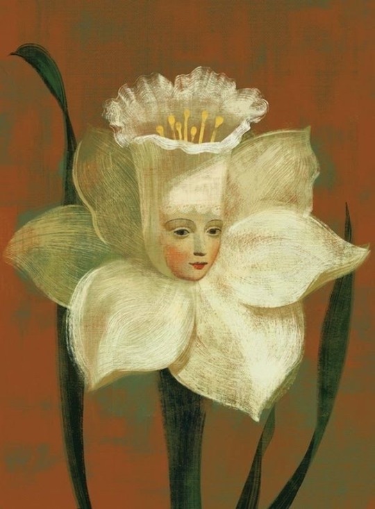
#Anna and Elena Balbusso#Italian Surrealist illustrator#art#illustration#surrealist#photography#love#hipster#vintage#photooftheday#nature#mine#personal#cute#indie#cottage#cottagecore#film#photo
264 notes
·
View notes
Text
Riccardo Nannini - Batman Winning at Poker (2022) ♣️
#surreal #surrealart #surrealism #surrealismartcommunity #popsurrealism #popsurrealist #popsurreal #surrealist #surrealista #surrealistic #lowbrowart #weirdart #lowbrowartist #surrealisme #surreal_art #surrealismo #surrealpainting #newcontemporary #lowbrowpopsurrealists
Soundtrack: La festa è finita by Salmo 🇮🇹

#Riccardo Nannini#Poker#7/2023#surrealist#surrealism#surrealistly#pop surrealism#pop surreal art#low brow art#batman#newcontemporary#new contemporary#new contemporary art#Italian#italian art#pop art#cartoons#Comics#illustration#x-heesy#music and art#contemporaryart
17 notes
·
View notes
Text
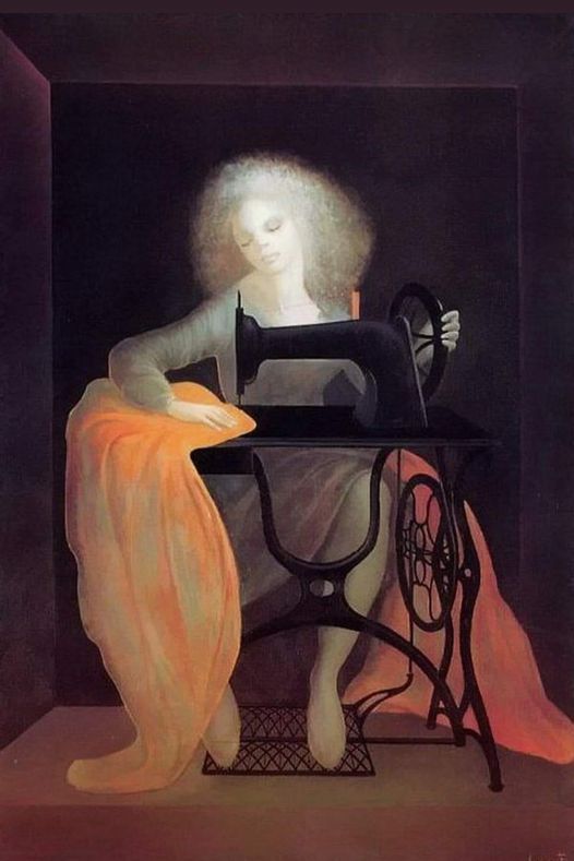
La Machine à Coudre, The Sewing Machine (1978) by Argentine-Italian surrealist painter, designer, illustrator, and author, Leonor Fini (1907-1996).
118 notes
·
View notes
Photo
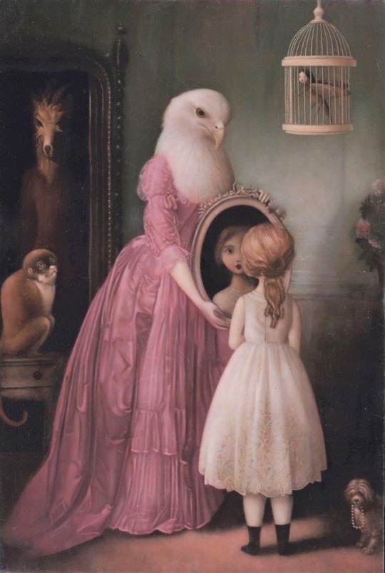
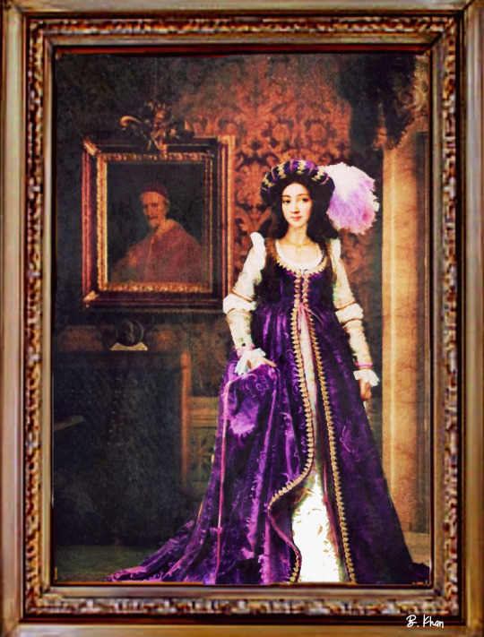
Anna and Elena Balbusso - Italian Surrealist illustrators
94 notes
·
View notes
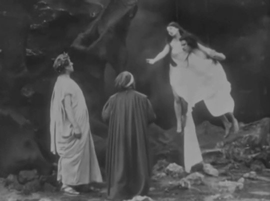
Text
Dread by the Decade: L'Inferno
👻 My Kofi ❤️
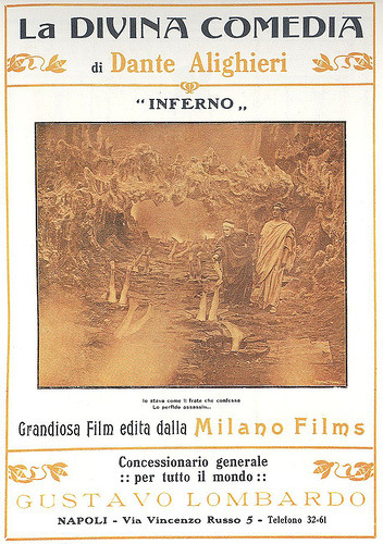
English Title: The Inferno
Source Material: Inferno by Dante Alighieri
Year: 1911
Genre: Occult, Dark Fantasy, Surrealist
Rating: Unrated (Suggested: PG-13 for nudity and violence)
Country of Origin: Italy
Language: Silent
Runtime: 1 hour 11 minutes

Directors: Francesco Bertolini, Adolfo Padovan, Giuseppe De Liguoro
Cinematographer: Emilio Roncarolo
Writer: Dante Alighieri
Composer: Raffaele Caravaglios; Tangerine Dream
Cast: Salvatore Papa, Arturo Pirovano, Giuseppe de Liguoro, Augusto Milla, Attilio Motta, Emilise Beretta

Plot: Dante is guided by the poet, Virgil, through Hell.
Review: The first feature length film in Italian history, this is a faithful adaptation rife with stunning technical feats and surrealism.
Overall Rating: 4/5

Story: 4/5 - Great adaptation that sometimes suffers from meandering.
Performances: 3/5 - Papa and Pirovano do little beyond mime speech, but the damned are wonderfully dramatic.
Cinematography: 4/5 - Just stunning.
Music: 4/5 - The original score was lost, but Tangerine Dream’s official re-score is haunting, if a little repetitive.
Effects: 5/5 - Amazing! Forced perspective, puppets, wire work, and more create nightmarish replicas of Antonio Manetti’s illustrations.
Sets: 5/5 - Beautiful mix of real locations, matte paintings, and sets.
Costumes and Make-Up: 3.5/5 - Most of the characters are nude, but the costumes that are present are quite decent.
youtube
Trigger Warnings:
Violence and mild gore
Offensive depiction of the Prophet Muhammad
Suicide
Torture
Extreme Catholic ideology (ex: suicide and sex are sinful)
#L'Inferno (1911)#L'Inferno#The Inferno (1911)#The Inferno#Francesco Bertolini#Giuseppe De Liguoro#Adolfo Padovan#occult#demons#Dread by the Decade#review#1910s
14 notes
·
View notes
Text

Self Portrait, 1938 by Leonor Fini (Argentine/FR 1908–1996)
to learn more visit: palianshow.wordpress.com/2019/02/04/leonor-fini
Leonor Fini was an Argentinian born Italian surrealist painter, designer, illustrator, and author, known for her depictions of powerful and erotic women. Wikipedia
Born: August 30, 1907, Buenos Aires, Argentina
Died: January 18, 1996, Paris, France
#LeonorFini #womensart #artbywomen #PalianShow #argentinian #surrealism
4 notes
·
View notes
Photo
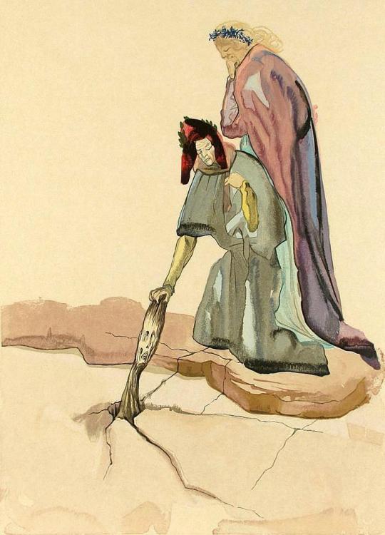
MWW Artwork of the Day (4/30/23)
Salvador Dali (Spanish, 1904-1989)
Inferno Canto XXXII - The Betrayers to their Homeland (1960)
Woodblock Engraving, 33 x 26.7 cm.
In the early 1950’s the Italian government decided to honor the upcoming septocentennial of their greatest poet's birth with a commemorative edition of his "Divina Commedia" illustrated by a major artist. Illustrating Dante had had a long and distinguished history, starting with Italy's own Sandro Botticelli in the 15th c. down through William Blake -- the only great poet to ever illustrate another great poet's work -- and Gustave Doré in the 19th c. For the 20th c. tribute the Italian leaders, clearly thinking outside the box, chose Salvador Dali. Inspired as the choice would prove to be, the Italian public was shocked and dismayed at the thought of a Spaniard and irreverent Surrealist having anything to do with the pride and joy of their literary history. The outrage was widespread and vocal enough to prompt the panicked politicos to withdraw the commission.
You can view the entire series of 101 engravings in this MWW gallery/album:
https://www.facebook.com/media/set/?set=a.745590702212968&type=3
7 notes
·
View notes
Text
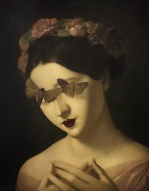
Artist Research: Stephen Mackey
Stephen Mackey is one of my favourite artists and has been on my radar and a source of inspiration for many years. He is more of a contemporary artist in comparison to Thomas Francis Dicksee but, in relation to my current interest in Victorian Portraiture, Mackey came straight to mind.
His paintings and Illustrations have a vintage aura, burnt colour palette and often ethereal female figures as also seen in Dicksee’s work.
Mackey however, takes a more surrealist approach including bees, moths, spiders and other insects in his portraits. I think they are quite creepy but that is what I like about his work specifically.
He is inspired by the great French, Dutch and Italian masters of the renaissance but I can identify characteristics of Victorian portraiture in his paintings.
1 note
·
View note
Text


Marco Calvi- Dante Alighieri (Historiae Animae)
Watercolos and pencils on paper
Representations of characters that really existed between the fantastic and the surreal...🖤
#illustration#art#marco calvi art#marco calvi#illustrazione#watercolor#italian illustrator#artwork#arte#artist#artists on tumblr#illustratore#illustration art#illustrator#dante alighieri#divina commedia#divine comedy#surrealism#surreal#surrealist art#surrealart#charachter#original character#character art#fantasy#wings#writer#writers
17 notes
·
View notes
Photo
Noblesse
Oil Paint & Digital Art
2020
See More Like This
#art#digital art#artists on tumblr#italy#italian renaissance#renaissance art#portrait#illustration#digital illustration#dark art#dark fairytale#dark fantasy art#dark fairycore#Surreal Art#surreal illustration#surrealist art#surrealart#surreal#pop surrealist#pop surrealism#beenish khan
1 note
·
View note
Text


Anna and Elena Balbusso - Italian Surrealist illustrators
Italian twins Anna and Elena Balbusso are internationally recognized award winning illustrators live and work in Milan. Since 1998 they have been working as a team freelance in Italy, France, United Kingdom, USA, Canada, Republic of Korea. Their works have been published by major publishers and companies through out the world on various media types such as book jackets, magazines, newspapers, in house corporate, ads, children’s books and classic novels.
3 notes
·
View notes
Photo
Virginia Mori
#virginia mori#bic pen#surrealistic art#reading life#surreal#art illustration#ink#pencil art#back to the past#italian artist
3 notes
·
View notes
Photo
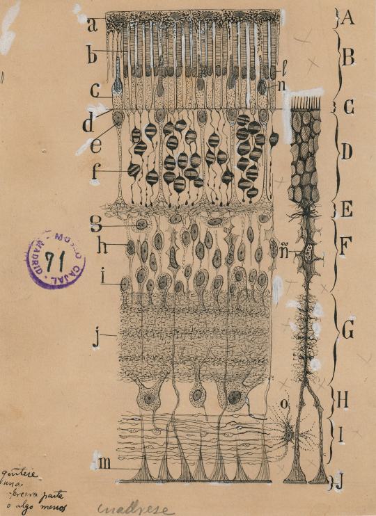
A Deep Dive Into the Brain, Hand-Drawn by the Father of Neuroscience
It’s not often that you look at an exhibition with the help of the very apparatus that is its subject. But so it is with “The Beautiful Brain: The Drawings of Santiago Ramón y Cajal” at the Grey Art Gallery at New York University, one of the most unusual, ravishing exhibitions of the season.
It presents 80 small notebook renderings in shifting combinations of ink and pencil by the Spanish neuroanatomist Santiago Ramón y Cajal (1852-1934) that are considered among the world’s greatest scientific illustrations. Together they describe a fantastic netherworld of floating forms, linear networks, bristling nodes and torrential energies. They posit the thing between your ears as an immense cosmic universe, or at least one of the most intricate of all of nature’s creations. That the images are also undeniable as art only adds to the complexity of the experience.
Cajal is considered the father of modern neuroscience, as important in his field as Charles Darwin or Louis Pasteur are in theirs (though relatively unknown outside of it). His discoveries, made during the last dozen years of the 19th-century, concern the way neurons, the building blocks of the brain, spinal cord and nervous system, communicate with one another. His theory — immediately accepted by most, but not strictly proven until the 1950s — was that neurons are in touch without touching. They communicate across infinitesimal gaps known as synaptic clefts. Through a chemical and electrical transmission, the single-stemmed axon of one neuron talks to the branched root-like dendrite of another.
This process of synaptic messaging between unconnected cells came to be called the Neuron Doctrine, and in 1906, it earned Cajal the Nobel Prize in Physiology or Medicine. He shared it with the Italian histologist Camillo Golgi, who had devised a new method of staining tissue that singled out individual cells under the microscope instead of presenting tangled illegible masses. An irony of the joint prize (for revealing the structure of the nervous system) is that Golgi remained unconvinced by the Neuron Doctrine and true to reticular theory, which saw neurons as physically connected.
In his research, Cajal’s two tools were the most powerful microscope he could find and one of the oldest art techniques known to mankind: drawing, for which he had great talent. Looking through the lens he saw with such acuity and drew so precisely (freehand) that some of his renderings still appear in text books. And yet he also drew with such delicacy and vivacity that his drawings stand on their own as wonders of graphic expression, both mysterious and familiar.
The drawings are at once fairly hard-nosed fact if you know your science. If you don’t they are deep pools of suggestive motifs into which the imagination can dive. Their lines, forms and various textures of stippling, dashes and faint pencil circles would be the envy of any modern artist. That they connect with Surrealist drawing, biomorphic abstraction and exquisite doodling is only the half of it.
These small works evoke enough things you already know — landscape, weather systems, trees, marine life — that they bring you back around to reality, implying the multiple purposes if not universality of certain natural structures. Root systems, functioning in different ways, are found in trees, turnips and the pyramidal neuron, which Cajal called “the noble and enigmatic cell of thought.”
Born in Navarra, the son of a doctor, Cajal was a rebellious artistic child, with an innate distrust of authority and an obsessive-compulsive proclivity. At 8, according to the catalog, he drew everything around him and then set out to collect everything pertaining to birds. He taught himself photography, making carefully posed self-portraits throughout his life. And he trained as an artist, but his father cajoled him toward medicine by enlisting him to make anatomical drawings as teaching aids. The son then went to medical school and eventually found his calling in researching the extremely refined, nearly invisible workings of the brain. It was an exciting area of study at that time and it perfectly fused his various interests and talents.
This show, the first exhibition of Cajal’s drawings in this country, originated at the University of Minnesota and continues in May to the MIT Museum in Cambridge, Mass. It was selected from the 2,900 or so drawings that Ramón y Cajal made in his lifetime; all come from the Cajal Institute in Madrid, which organized the show with the university’s Weisman Art Museum and three neuroscientists on its faculty — Eric A. Newman, Janet M. Dubinsky and Alfonso Araque. The catalog is an absolute treasure, jargon-free, with excellent reproductions and an illuminating biographical essay by Larry W. Swanson, a neurobiologist and author of “Brain Architecture” (2002). The outliers of the group are Lyndel King, director and chief curator of the Weisman and Eric Himmel, editor in chief at Abrams Books (the catalog’s publisher), who contribute a riveting essay detailing Cajal’s artistic sensibility and working processes.
The drawings will elicit stupefied awe from art enthusiasts, who use their brains without knowing how they work, and excited chatter from visiting neuroscience types. I asked one loquacious, evidently knowledgeable viewer if “gray matter” was a colloquialism or a term of science. I learned that it’s a term of science that became a colloquialism: the brain has gray matter, which contains cells, and also white matter, which is fibrous.
The 80 drawings here were made between 1890 and 1933, and are divided into four sections. “Cells of the Brain” presents some of the basics, beginning with pyramidal neurons, and including the pericellular nests that surround them like pointy hats, or Eva Hesse sculpture, and proceeding to the coral-like Purkinje neurons (from the human and pigeon cerebellum).
In “Sensory Systems,” you’ll find several of the show’s masterpieces: “Cells in the retina of the eye,” a vertical stack of textures and intersecting lines and shapes, suggests a wall hanging by a very ambitious fiber artist of the 1950s. Drawings for the retina of the lizard and sparrow evoke espaliered trees. Blue ink added to the peninsular forms of “The labyrinth of the inner ear,” renders them solid. And the Wagnerian “Ending of the vestibular nerve” is swept with diagonal streams of lines and rising neurons.
“Development and Pathology” is rife with strange aberrant forms and a sense of agitated circuitry; also several outstanding drawings in a purely visual sense. Cajal samples the brain cells of a drowned man and one suffering from paralysis and in “Tumor cells of the covering membranes of the brain,” he achieves tangled skeins that conjure William Blake and Louise Bourgeois. Things quiet down in “Neuronal Pathways,” which I recommend for the strange little landscape that is “Connections within the hippocampus.”
“Seeing the Beautiful Brain Today,” a section on contemporary renderings usually in jolting bright colors, presents animations as well as detailed microscopic photographs that are juxtaposed with reproductions of Cajal drawings of the same subject. Nothing here compares to Cajal artistically, but the animations have their own kind of wonder and should not be missed.
Photo above: “Cells in the retina of the eye” (1904), one of Santiago Ramón y Cajal’s most striking drawings.
Daily inspiration. Discover more photos at http://justforbooks.tumblr.com
6 notes
·
View notes
Text
Putting together some of my favourite fantasy/scifi book covers. Most of these won’t be in any particular order except for the first one
The Priory of the Orange Tree. I have this book at home but I still haven’t read it cause its really fucking big but this is literally the perfect book cover (by Ivan Belikov)

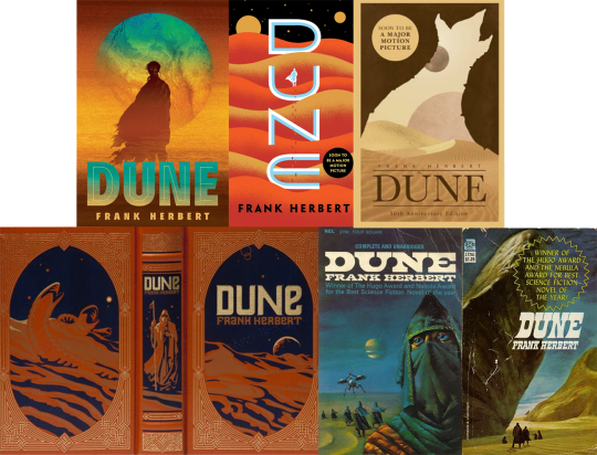
Literally every non italian Dune covers cause they are all amazing and the italian ones are atrocious (also the american 90s editions arent that good either tbh). Like putting aside the content of the book, all the graphic work is amazing
(here in order of how much i like them)
(Matt Griffin - Jim Tierney (all his serie for Dune is spectacular) - Sean O’Connel - Nancy Stahl - Bruce Pennington - John Schoenherr (second edition))
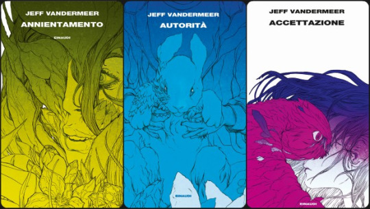
Then theres the italian edition of the Southern Reach Trilogy and Borne

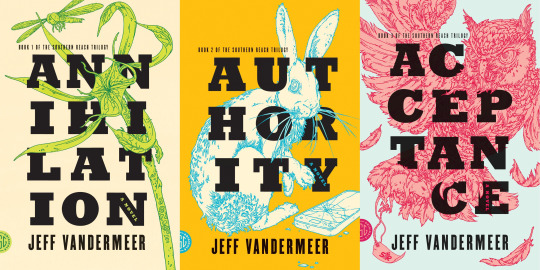
But I also love the original ones (+ dead astrounauts)

When it comes to Lord of the Rings its a little hard because it had so many editions and so many covers and so many different designs and there are very few i dont like actually, so I’ll just show some of my favourites
These that are redesign of Tolkien’s original work for the covers by Harper Collins
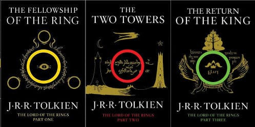
Atrocious, old and kitsch, i love these. Also this is an unauthorized edition and its so funny, they shouldve authorized it just because of the cover
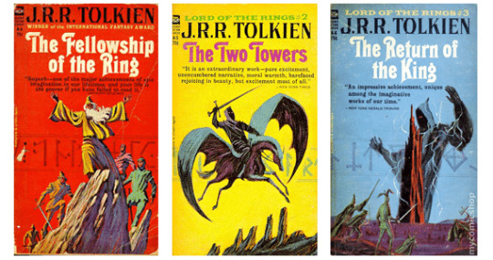
These by Barbara Remington
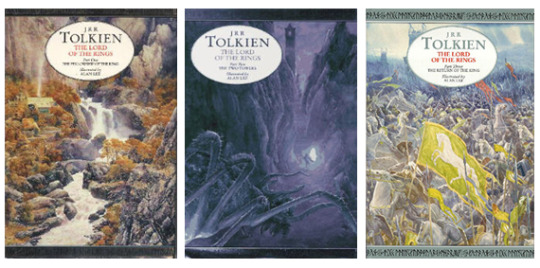
Harper and Collins again but illustrated by Alan Lee
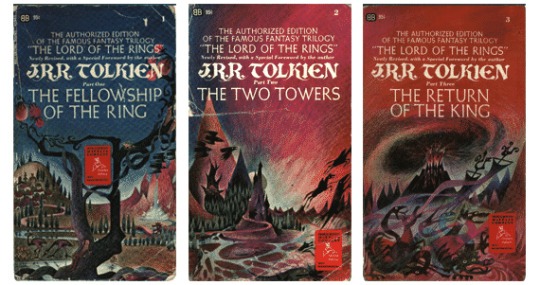
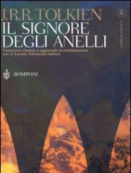
And the Bompiani cover for the entire trilogy. Maybe its not that great but its the one i grew up with
La Passe-miroir absolutely stunning covers by Laurent Gapaillard

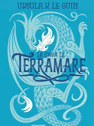
The Books of Earthsea which unfortunately I have a different, uuugly edition (by Charles Vess)

And this 2005 edition of a Wizard of Earthsea which like... i know it has static bitch on cover disease

But listen to me. This is iconic. This is fucking Gianni de Conno (RIP well miss u king) which is my favourite italian illustrator for children books (and a great surrealist artist). Here some of his other (of my favourite) covers

Also this new italian Earthsea edition *SMACK*
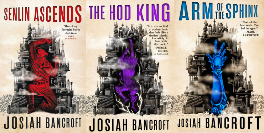
The Book of Babel is really good BUT if it had more a Russian Avant-garde style it would have been perfect (idk why it gives me russian avant garde vibes maybe its just me maybe my brain is broken maybe its just because the first cover is red) (illustrated by Ian Leino)
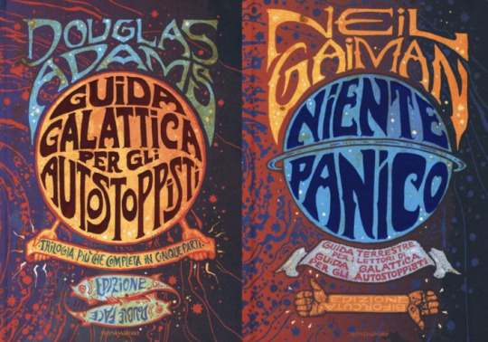
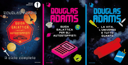
The job that mondadori did with The Hitchhiker’s Guide to the Galaxy is STUNNING. Too bad they didnt do it first cause i have the UGLY editions......
I dont know if these are inspired by the british/american/whatever edition I know them in italian so ill show those

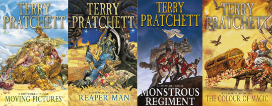
All the Discworld illustrated covers by Josh Kirby are iconic and funny
Descendant of the Crane, im not really interested in reading it but the cover art is AMAZING (cover by Feifei Ruan)

Now listen......... you don’t have to like Lindsay Ellis. I fucking hate that bitch. I bet her Noumena books are atrocious. But whoever designed the covers....... omg

these are so retrò, pop... i just love them so much. I can’t seem to find the artist or graphic who did the covers, but if i discover she did those im gonna KMS. If instead of filling the back of the book with people praising this idiot they would have put a fucking cover artist i would have been happier.
Going on, whatever the fuck Fazi is doing at any given time cause the graphic work is AMAZING

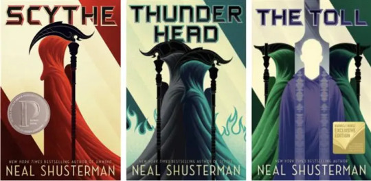
Another serie I have no interest in but that has amazing graphic work is the Scythe trilogy (covers by Kevin Tong)
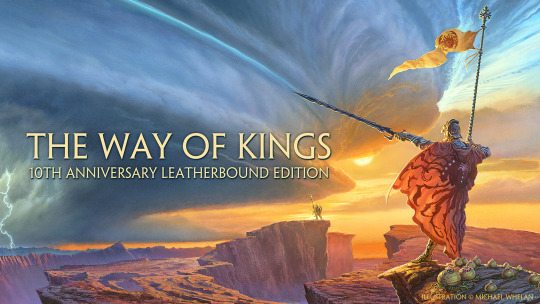
The Way of Kings, the other covers from the Stormlight Archive serie are fine but i really like this one (by Michael Whelan)
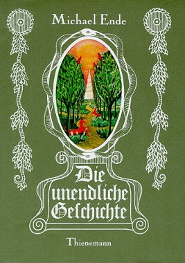
The super iconic (original?) Neverending Story edition (theres also in red but i prefer it in green) (by Roswitha Quadflieg)
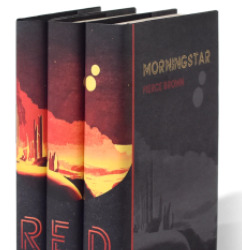
I dont know anything about Red Rising except that a youtuber has it, and the covers arent the most inspired
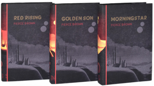
but they do this!
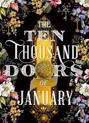
The thousand doors of January is one of the books I wanted to buy before reading the reviews on goodreads
Ok lets put the dykes in here, The Locked Tombs covers are my favourite static bitches <3 (by Tommy Arnold)
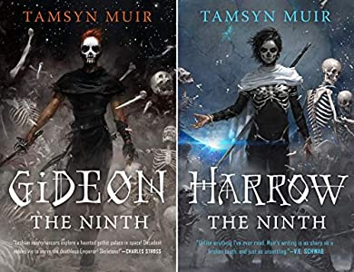
I had to go check out library catalogue cause I did not remember the title of this book (La chute du soleil de fer italian edition) but I only remembered the cover lol (i cant find the cover artist tho ill have to check the actual book)

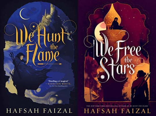
the Sands of Arawiya duology (?) original edition (by Simon Prades)
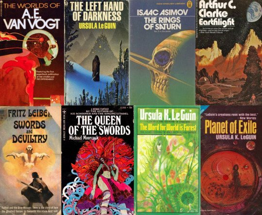
And in general I really just love vintage scifi and fantasy covers specifically from the 60s-80s and think this should make a comeback as a marketing strategy idk in the italian publishing world cause whatever the fuck they are doing with scifi books right now... is not working. its really not working. All of Le guin’s books look so fucking ugly. Idk resurrect Moebius and De Conno or something im so tired of ugly covers.
#ok this is one long list but i have fun doing lists lol#also i didnt accidentally see any d*ltarune spoiler all day cause i was busy doing this :)#if you want send me your favourite covers or lets discuss what makes a good cover#im having fun#books
21 notes
·
View notes
Text
Self Portrait, 1938 by Leonor Fini (Argentine/FR 1908–1996)
Leonor Fini was an Argentinian born Italian surrealist painter, designer, illustrator, and author, known for her depictions of powerful and erotic women. Wikipedia
Born: August 30, 1907, Buenos Aires, Argentina
Died: January 18, 1996, Paris, France
#LeonorFini #womensart #artbywomen #PalianShow #argentinian #surrealism
0 notes
Text
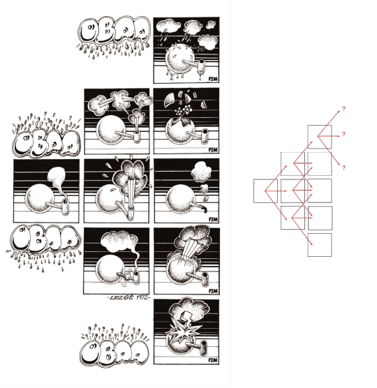
Project 4: Sequence
Luiz Gê
Luiz Geraldo Ferrari Martins, known as Luiz Gê, is a Brazilian illustrator, considered one of the greatest exponents of Brazilian comics in the 1980s.
He graduated in architecture at the University of São Paulo in 1977. In 1987 he went to do postgraduate studies at Royal College of Art, in London.
During the 1970s, Luiz Gê consolidated his career as a comic artist, creating the magazine Balão and collaborated with other magazines, Jornal do Brasil and the Pasquim.
The magazine Balão, was seminal for the Brazilian underground comic, a real watershed in which Laerte also participated.
It was in the magazine Balão, created in 1972, that Luiz Gê published an controversial story, but which according to him, records a series of thoughts about the language of the comics. The comic called “Oba Oba”, with only one page, proposed several reading possibilities, it was an open work.
Throughout the 1970s, he developed a series of stories that were popular with the alternative press at the time.
His artist style is loaded with an intense visual culture that makes his work unique.
The angles and perspective that he uses, as well his cinematographic expressionism, like the camera movements of Hitchcock, that he is inspired of, and even the perception and ideas of the Italian filmmaker Fellini.
For most of his life he was inspired by North American and European comics.
Tintin is said to be one of his sources of inspiration for working on the comics. Because of the framing and the feeling of living the adventures together with Tintin.
In addition to Jack Kirby himself, who has co-created several characters alongside Stan Lee. His visual narrative was unique, in addition to being able to create unimaginable characters for the time. Like the X men, and the New Gods of DC comics.
He is the author of the underground comic book; “Avenida Paulista”.
It’s a classic of the Brazilian comics, and over the years, it has become a cult and coveted object among collectors and marked the begging of a long period of departure from the comic books of one of the greatest Brazilian comic book artists.
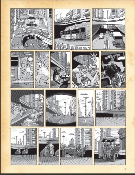
The comic narrates a hundred years of transformation that took place at the avenue that symbolizes São Paulo’s accelerated and chaotic development like no other.
Currently, Luiz Gê is a professor of comics in the Industrial Design Course at the College of Architecture and Urbanism at Mackenzie, São Paulo.
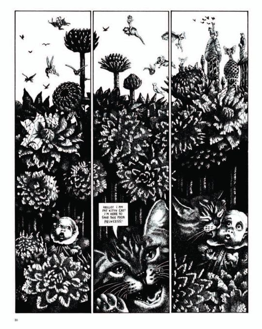
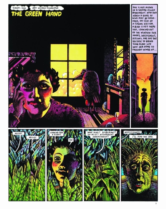
Nicole Claveloux
She is a French surrealist illustrator who has worked on several underground comic books. While there have been several surrealist women, throughout the 20th century, few are remembered on the same level as their famous males counterparts such as Salvador Dali for example.
Mixing the figurative with abstract, the everyday with the manifestations of the mind and psychoanalytic issues, she made her name among the greats of the French comic books in the 1970s, using the aesthetic of her biggest influence, the German painter Max Ernst.
In the 60s the comic artist had enormous influence from psychedelic art.
As well by the drawings of Czech German illustrator Heinz Edelmann, art director of the Beatles animation Yellow Submarine. In addition to the collages of former Monty Python member Terry Gilliam.
For few years, Claveloux contributed short comics to the French magazine Metal Hurlant ( an counterpart of the English marine Hevy Metal), which featured women features exclusively.
During this period working in Metal Hurlant, she made comics very focused on her personal interest. Having a very vivid color palette, besides in many of her comics, she doesn't use dialogue, often focusing on the characters' expressions.
And just like in Heavy Metal, many of his works were counter-cultural. Using violence, sex and drugs as the main theme. The experimentation and styling was something very present in the 70s comics as it was a time of change and revolution, trying to remove the censorship of the comics, and explore other themes.
Something that catches my attention in Nicole’s drawings is the exacerbation of eroticism. In her adorable, multicolored drawings, there is an exploration of erotic and fetishistic imagery. Nicole takes a chance and some times criticized in using a children’s imagination with genitalia, testing our sense of humor.
As the psychedelic movement, had come to an end. New references came to her field. Using the contrast between black and white is highlighted, as well as the presence of hachures and more naturalistic lighting.
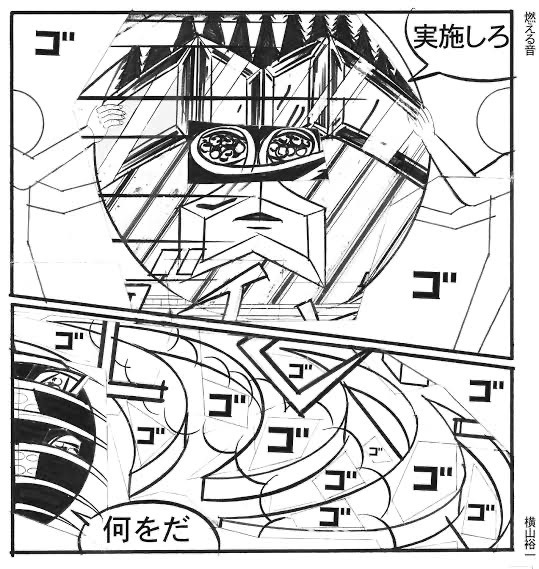
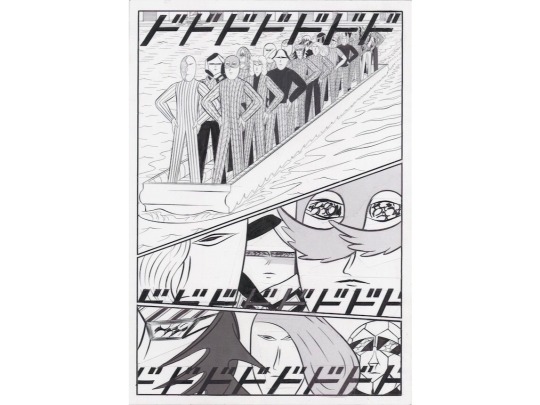
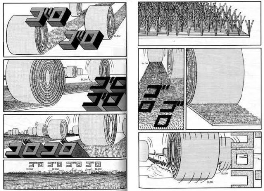
Yuichi Yokoyama
Yuichi Yokoyama was born in Miyagi, Japan in 1967.
Always interested in arts, he knew since an early age that he always wanted be a illustrator. He went to the university of fine arts in Nagasaki. But after studying oil painting and other techniques, he thought that drawing manga was the style that suited his form of expression the most.
According to him, he felt “ emptiness in drawing a single picture”. He wanted to draw what would happened after that, instead of just one expression including portraits and sculptures.
He produces works that do not have lines or clear stories, featuring lines and onomatopoeia with a sense of speed, and unique characters using the style called the “Neo Manga”.
It is highly evaluated not only in Japan but also overseas, and the manga is published in Europe and United States. He says he likes to record his conversations with friends and draw while listening to them.
Neo Manga, has been highly acclaimed as a work that redefines the stereotypes of manga, but it is said that if was completely different from the original aim.
He participated in several exhibitions around the world showing his monochromatic works, which showed a different approach to manga. Focusing much more on the movement of characters and their expressions to tell a story, than simply using text, which seems to boring the viewer in his opinion.
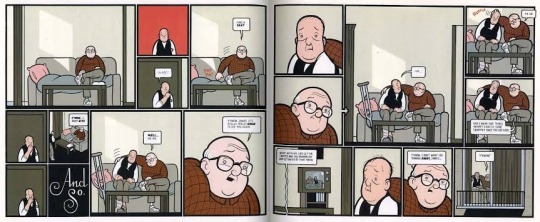
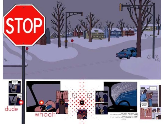
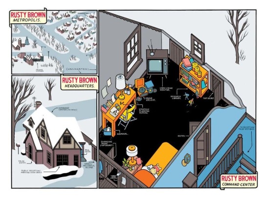
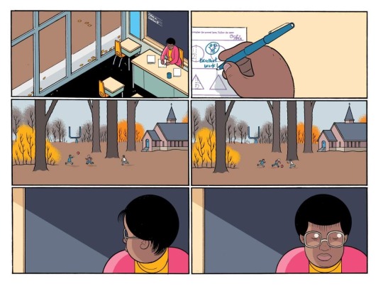
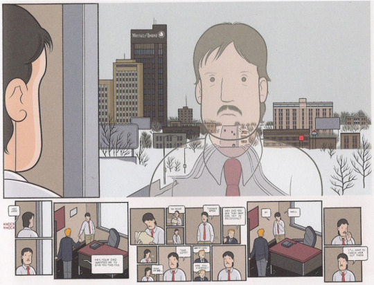
Chris Ware
Is a cartoonist and comic book artist, who is acclaimed for presenting narrative illustrations in a form and style very different from traditional comic book.
Franklin Christenson Ware was born in 1967, in Nebraska, USA.
He grows up with the absence of a father figure, his biological father left his family when Chris was one year old and until he had reached adulthood he would not have any contact with him again.
Because his mother worked as a reporter and editor at a newspaper and his grandfather also worked as a sportswriter, Ware was able to get in touch with the world of press. In fact, his grandfather was one of the pioneers in introducing Peanuts strips in newspaper and because of that, he introduced Chris to the comic strips and started reading as much as he could.
He is mainly recognized for his work Jimmy Corrigan: The Smartest Boy on Earth, with which he won the Guardian First Book Award and was selected as one of the 100 best books of the decade by the Times of London in 2009.
Ware’s unique perspective on the language of his works was seen early in his career. The author’s first independent publications, was during his years in the college of arts at the university of Texas, drew attention of Art Spielgelman, author of the classic Maus.
Chris Ware is undoubtedly a fascinating comic book author. It’s because we find ourselves with one of the few authors who managed to bring together comics, illustration and design within a style and a way of doing things that works for him to create his comics.
The influences of Ware, was Windsor McCay with his comic strip Little Nemo in Slumberland, Richard Outcault with his strip The Yellow Kid, and of course Charles Schulz, author of Peanuts.
It was these authors who left a strong imprint on Chris Ware and who showed him that on comic page the text and the image merge and that the composition of the vignettes on the page can be manipulated by the author at will. In order to achieve the desired effect.
Also the countercultural movements in the 1960s was also a big influence on him. Hippie movement, Vietnam war, student protests, experimentation with drugs, influence of oriental philosophy and music.
Most of his characters share similar characteristics, such as the lack of a father figure, discouragement, loneliness, lack of communication, insecurity, and lack of affectivity.
Towards the way that Ware works. He limit himself on only using the computer for coloring and discard it when it comes to the use of fonts. Ware prefers to make his own fonts by hand, thus becoming a great lettering artist.
He prefers to start by drawing with the first vignette and see what paths the process has taken him on when he reaches the last one.
The break with the conventions of the comics in that it is hierarchized by the logical sequence of the vignettes. Instead, Ware in many of its pages diversifies the timelines and events that a character and everyone around him can undergo.
Multiple frames of varying sizes and shapes are packed into each page; among the bold black contours are startling shifts in scale and points of view.
Chris Ware is someone who, despite sticking to traditional techniques when dealing with the blank page, dares to experiment with new technologies in order to find new ways of telling a story.
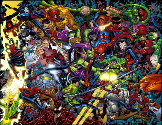
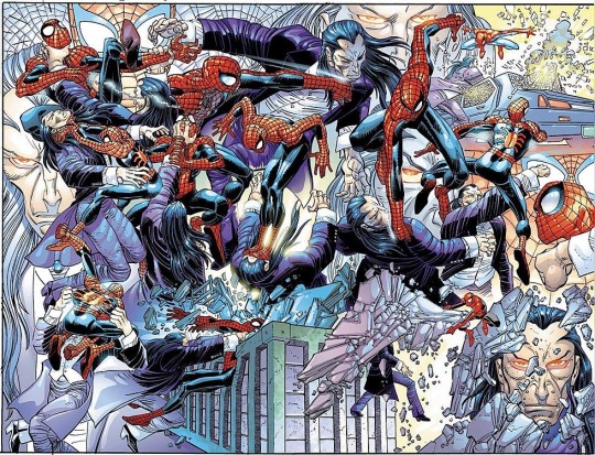
John Romita jr
John Romita jr. is an American comic book artist, known for his extensive career in Marvel Comics and DC Comics since the 70s to the present day. He is the winner of both the Inkpot Prize, like the Eisner award. He worked with many different characters, like; Spider man, Iron man, Daredevil, Batman, Superman, Kick Ass and many more.
Son of John Romita sr., one the most famous Spider-Man artists since the 1960s, John Romita Jr. he started his career early. At the age of 13, he proposed the creation of a character to Stan Lee, who later was introduced as Prowler in The Amazing Spider-Man #78.
He began drawing sketches for reprint covers, until debuting with six page story in the Amazing Spider-Man #11 in 1977.
During his run at Spider-Man, Romita’s art style resembled many other artists of that time, like his father for example, as well Jack Kirby, who inspired a whole generation of comic book artists.
Romita stayed on Amazing Spider-Man until 1987. Then he started working at a Daredevil run, and Romita’s style began to evolve from that more traditional Marvel style to something different. His style got squarish. It was more angular, more stylistic. He mentioned, that he got that style thanks to Frank Miller’s influence.
Romita Jr, brought that style back to Spider-Man in the mid-90s, where he had a run of 140 issues, becoming the artist who worked the most with the character.
John Romita Jr. was one of my biggest inspirations when I was younger. I've always liked Spider-Man a lot, and I've always collected many of his magazines. John Romita's drawing is very different from a traditional style, and I think that was what caught my attention. Because in the world of superhero comics, the artistic style ends up being repeated a lot. Always exaggeratedly strong and beautiful people. Romita's style seems to me to be more cartoony. And I say this in a good way, because I find his characters extremely expressive and unique. His style doesn't belong to a specific period, like many artists from the 90's who were forgotten because they didn't knew how to adapt themselves on the following decades.
He also knows how to build an action scene like no one else. Always investing in close ups, and showing the specific movement that the character is doing in a very natural way. He always knows what fits into the specific scene, making frame transitions very different.
John Romita has been working since the 70s, and he never stopped. He is always been in some different title in both Marvel and DC.
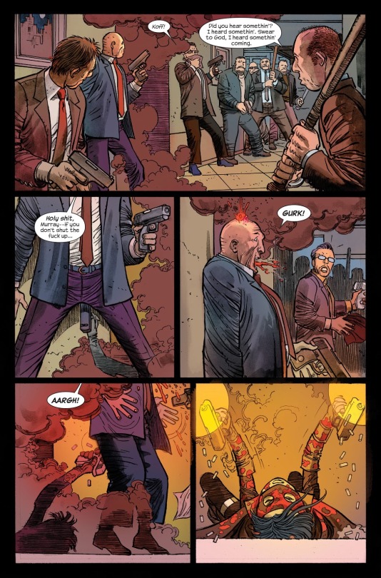
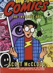
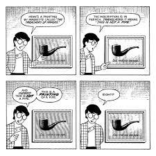
Scott McCloud
Scott McCloud is an American cartoonist and comic theorist. He is best known for his nonfiction comic books: Understanding Comics, Reinventing Comics and Making Comics, all of which also use the comic book medium. And also one of the first artists, to promote Webcomics as different variety of comic, with different possibilities than its the printed.
Born in 1960, in Boston, United States. In 1984 he published his first comic Zot !, And later another comic called Destroy !, a parody of fight scenes from superhero comics; The new adventures of Abraham Lincoln, a comic created with a mixture of digital graphics and traditional drawings; also working at some Superman comics, like: “Superman Adventures” and “Superman Strength”.
But he is best known as a comic theorist after the 1993 publication of his essay Understanding Comics: The Invisible Art.
Originally published in 1993, the theoretical study on the universe of comics in all its context provides a long historical journey (from the foundation that gave rise to comics) to establish and legitimize the means for art production.
McCloud goes back to the dawn of civilization when cavemen first began to develop what he defines as art. Not to mention the full range of what characterizes comic books- from the American ‘comics’ market to the Japanese ‘manga’ passed through the French- Belgian market (like Tintin, Asterix and Lucky Luke). And of course, it goes further, entering in concepts of iconography, structures and forms of visual communication.
I've had this book with me for a while. And he helped me a lot in terms of how to put together a comic.
Last semester I did a very amateur one, which was lacking in a traditional comic book structure.
So I ended up finding this book, and I started to have a theoretical notion, in terms of passing, the use of angles, and trying to make it clearer to the reader what is happening.
The author exposes a multitude of complex arguments with good humor and a fluid structure which is really hard to see as a theoretical book
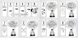
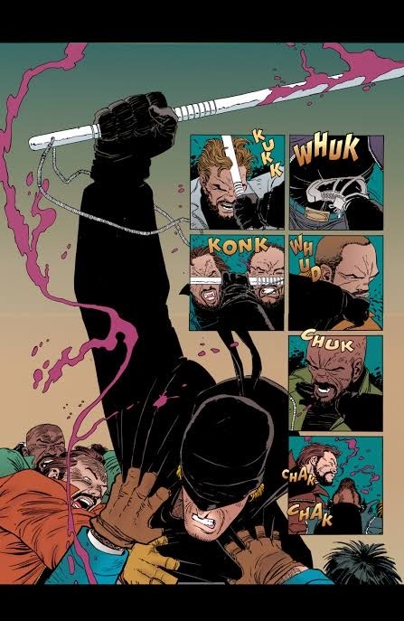
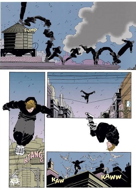
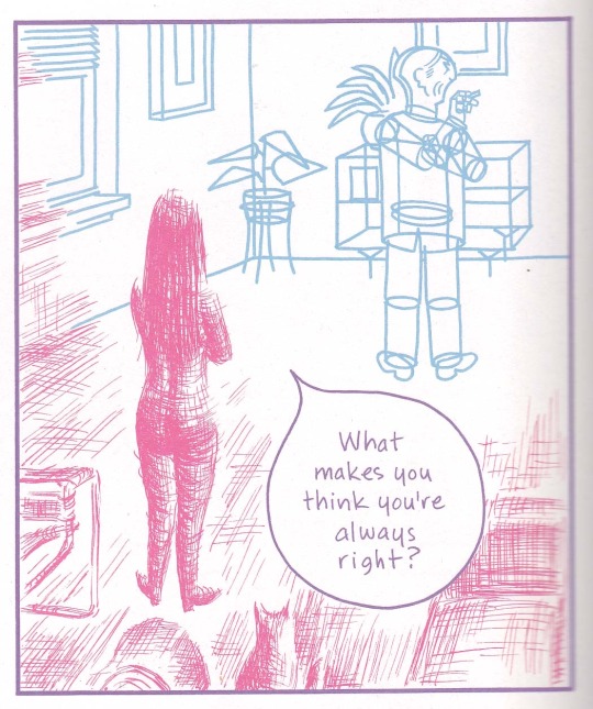
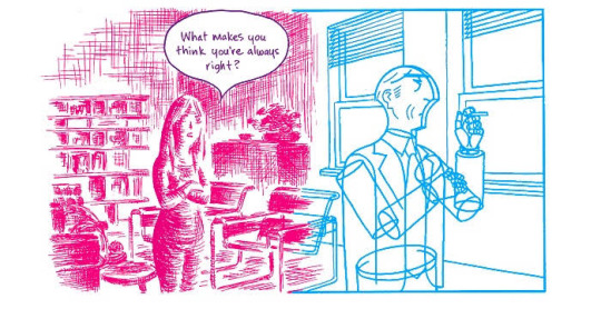
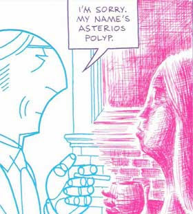
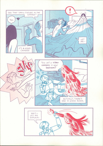
Asterios Polyp
David Mazzucchelli made his career as an illustrator, as is customary in the industry, for both Marvel and DC, working on Frank Miller’s iconic series Batman: Year 1 and Daredevil: Born Again. Later, he stopped working only in illustration and began to publish anthologies with stories of his own. However, it was only in 2009 that the comic artist fully demonstrated what he was capable of, when he published the graphic novel Asterios Polyp.
Asterios Polyp is also the name of the protagonist, a misogynist and acid architect. Asterios projects are highly awarded, but none of this projects were actually built. He lives in the universe of abstract ideas, protected from the reality of human experience behind his own arrogance. But after a Lightning causes a fire that devastates his apartment, Asterios finds himself homeless and aimless.
Asterios wanders around at dawn accompanied by the story’s narrator, his stillborn twin brother, Ignazio. Thus begins the journey of the protagonist who is forced to radically change his life.
Mazzucchelli manages to build a complete character in his aesthetic narrative, which is an interesting thing he did, in that he didn't have to rely entirely on the text.
Unit various types of “styles” of drawing and writing, forms to reveal the universe of the character without losing his style.
One of the biggest influneces for me in terms of style , is a specific moment when Asterios and his girlfriend Hana are having a discussion, and Asterios turns into a blue, perfect geometric character (implying his architectural nature) and Hana turns into a sketchy red character. this sketchy look is very descriptive in that it implies the looseness and passion of Hana's character.
The way it was made, using these hatches in red and even pinky in some moments of the story, was a style that I really liked when building the bottle. Trying to do a red shaded style just like Mazzucchelli did.
In addition to the drawing style itself, the framings themselves, which are made, often focusing the "camera" on important moments, as if it were really close ups from a movie, in addition to the open plans showing the entire environment, often depicting what is going .
A very personal work by Mazzucchelli, which has been planned for a decade, where each frame, each character with a different style has a specific meaning, is a purely visual work, but by no means is the text weak. It's just not Mazzucchelli's focus
2 notes
·
View notes
Last Seen Blogs

saytrrose
The Mineral Master

brattylittlepet
💖baby mimi💖

bibenspuntoit
Senza titolo

peachypop143
Kingdom Hearts TFLN
marouaghb
Maroua_ghb