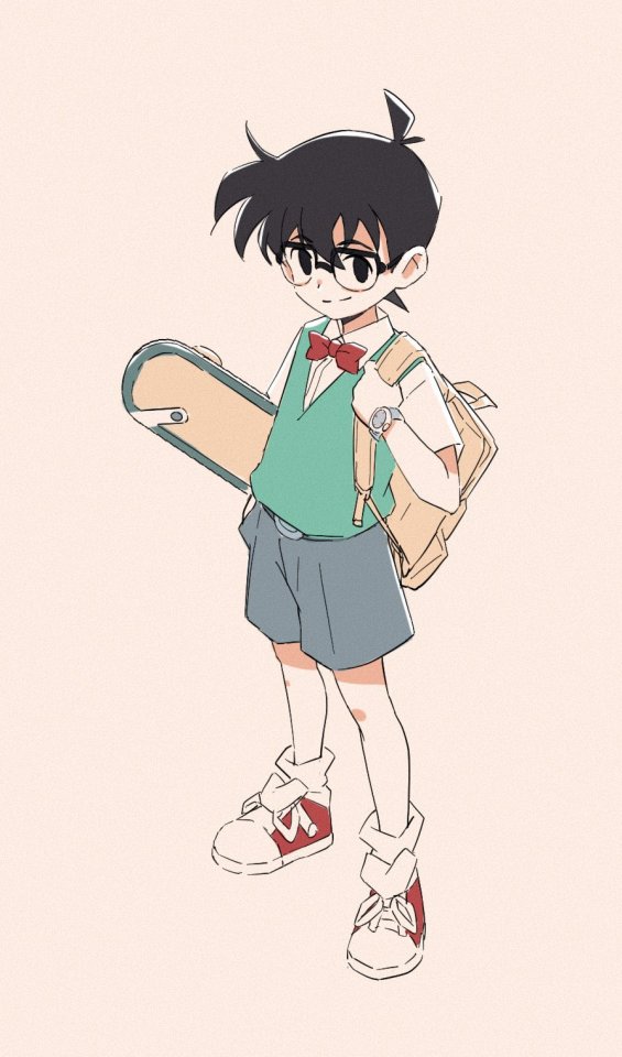
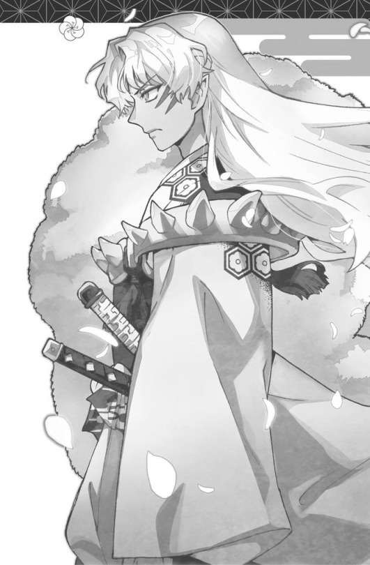
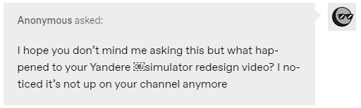
#i really enjoyed adapting their designs to my drawing style
Text

#over the garden wall#otgw#otgw greg#otgw wirt#otgw beatrice#art#i'm sure this has been done before but i had this idea and had to do it#calvin & hobbes#i'm also working on more art#i really enjoyed adapting their designs to my drawing style#haven't done that in a while
22 notes
·
View notes
Note
Artist question, what is something that you think beginner artists tend to over think?
I'd say "style", maybe ?
I see many beginner artists "searching for their own style" but i don't think there is such a need ? Just draw the way you're more comfortable with, the way you find the more fun/appealing. You can also switch, and try many things, i think there's nothing wrong with trying many ways of drawing that are very different, but that you enjoy nonetheless ! Also, a thing that i learnt when coming to japan (and that i was never really told when i was in france) is the importance of COPYING drawings of illustators/animators you like ! As an exercise of course. Try to draw exactly how they draw, and you'll find new tricks, new ways to synthesize shapes etc. that you might use afterwards ! In the end you'll draw naturally in a mix of all your influences/what you studied.
I think there's no need to draw something thinking "I NEED TO FIND MY STYLE". The more you'll draw and study other artists' works, the more you'll find different ways to draw things, and what are those that are the most comfortable/enjoyable for you. I think it's a natural process. Your "style" is and addition of all the things you love.
As an animator i have to adapt to each production's designs, which is great because i learn new ways to design things everytime, and then i can use them afterwards how i like in my personal drawings!
I really like trying out new things/ways to draw. I always learn new things that help me in DRAWING IN GENERAL ! (different cones i did these last few years ↑)
Hope this helps ! Just have fun and draw/study a lot what you like and it'll come naturally, i think !
403 notes
·
View notes
Text
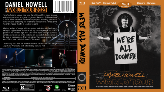
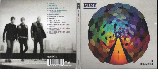
WAD: Cover Art
dan is still working on selling the distribution rights for We're All Doomed! so i decided to make some DVD/Blu-ray disc jacket art!
this is my attempt at a traditional jacket design! none of the images used are mine, but i did create the concept and design:
as i was making the first one for myself, i was struck by the fact that 'well, it's for me, so it doesn't have to look like a stereotypical jacket cover' which led me to be more artsy in my approach for the next one:
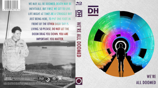
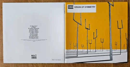
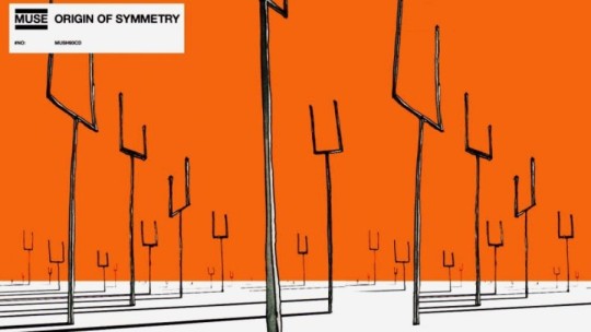
i was really enjoying the creativity and space to explore, so i went looking for more inspiration for a third design. this led me to dan's favourite Muse album: Origin of Symmetry, which i paid homage to:
after the first Muse album, i looked at their catalogue to see if there was more inspiration there. i was just thankful dan's favourite was easy stylistically to mimic, unlike say, 2009's The Resistance...
thank you @danielhowell for the inspiration!
nerdy stuff & reference pics below the cut!
General notes
i don't know how to use photoshop! i entirely brute-forced my way through the whole project, and the only tutorial i looked up was for the gradient text in the 4th cover
this wasn't even the original project i was working on! you'll eventually get to see that though
and this one also inspired art for the disc itself so stay tuned 👀
i will do anything for authenticity so these are Full of intentional details
matching fonts is a nightmare
the traditional cover
took the longest, as it was the first.
the barcode numbers are the date of the first video he uploaded on dinof, and the last tour show date (in m/d/y)
i changed 'iceland' to 'poland' on the front cover, as he never actually went to iceland, and poland wasn't ever on the list even though he did go there
the orange may look a little off-center in the front, but these designs need to include space for a spine between the front and back cover, i promise it's right 😂
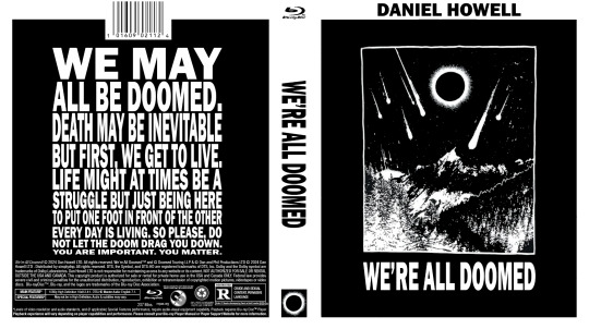
the black and white cover
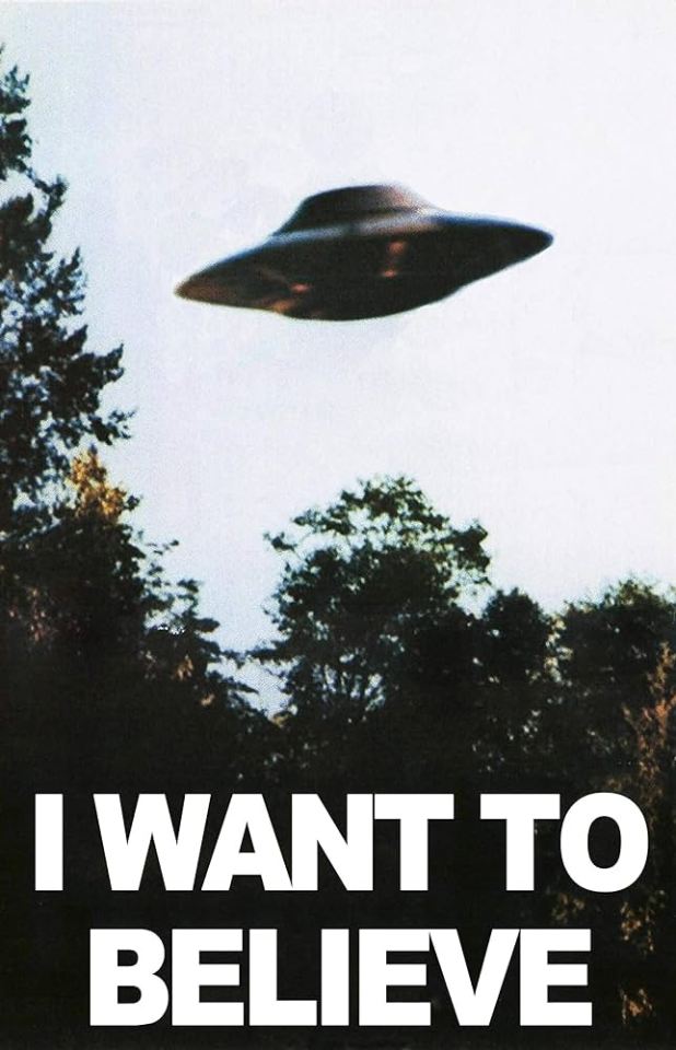
inspired by the 'i want to believe' aliens poster
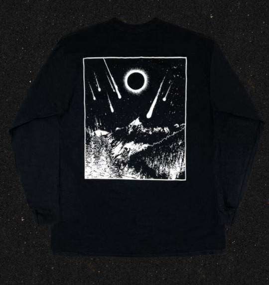
the cover art comes from his metal band merch shirt design
i had to manually shrink the text, line by line, and ensure it all lined up on the back!
i even made the logos on the back greyscale
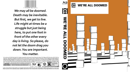
the Muse: Origin of Symmetry cover
a shockingly perfect style for a WAD cover. i'm so glad i used the cubes, even if they couldn't be orange.
there's some versions of the art online where the sky is even more orange and it baffles me how i haven't seen any parallels like this before
the Muse: The Resistance cover
this cover was never supposed to see the light of day! i meant it when i said i was grateful i didn't have to try to adapt this complex design... and yet, i tried anyway.
i did all the grid lines by hand, including the jagged/broken edge parts, shading each section, and then drawing every star.
the hardest part was getting the gradient on the back text to cooperate. photoshop's gradient settings are surprisingly limited
gotta shout out @amazingphil for being the reason i knew what this cover looked like--it's the only muse album i knew the art of before embarking on this quest!
obligatory sob story:
i've been extremely and suddenly ill for 6 months. it is difficult to function moment to moment, but especially in doing little things just for me. this is the first and only art project i've been able to feel inspired to not only work on, but to finish, and despite the pain and long hours, i enjoyed every minute of it. thank you, dan, for creating this space for me to explore, and thank you, everyone here, for being wonderful support during this time 💞
#it's finally here!! i hope you all love them as much as i do#dnp#c.text#dan and phil#daniel howell#phan art#hey phil look at this#we're all doomed#wad#c.art#word
325 notes
·
View notes
Text
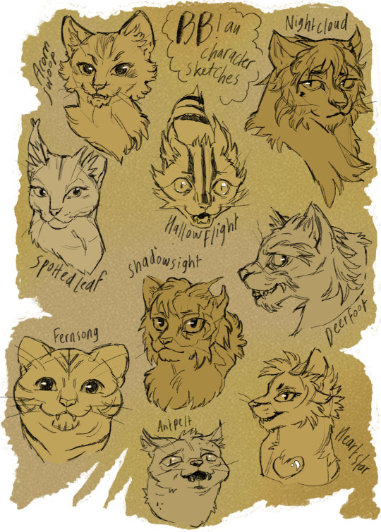
I’ve been sketching some of @bonefall ‘s BB!au character designs as warm ups recently.
It’s always fun drawing other people’s designs and compromising with style to adapt to suit them; I think it’s a good learning experience and these headshots are a lot more diverse in terms of features than my typical designs.
I really enjoy how these characters have changed in this au btw, recommend checking it out if you haven’t already.
#not adding character tags since these are just loose sketches#warriors#warrior cats#warriors au#better bones au#my art
150 notes
·
View notes
Note
I think SVSSS as a 2D cartoon would be the best moving medium for it imo.
I mean, personally, yeah, that's how I'd enjoy seeing it as well! My ideal slightly pretentiously artsy SVSSS screen adaptation would probably look only a little more detailed than linograph prints (2D or shaded 3D?) (someone hit me up in like two weeks to draw an example of what I mean, if I don't remember on my own, I don't have access to art stuff right now), very stylized and vibrantly colorful, because that's one of the art styles that I particularly enjoy.
I'm not a personally a fan of the 3D SVSSS show because I find the characters a little too doll-like and same-facey for my tastes? It's fine! It works! It's serviceable! It's just all, backgrounds included, a little... safe? I tend to like over-the-top bright colors and intricate details and impractically weird shapes and yet also coherent world production design in my fantasy, which is a lot to demand of any production, perhaps especially with animation productions, which are always squeezed for time and money.
(EDIT: I know the SVSSS show was under heavy constraints and the results are impressive considering their resources; it doesn't change the fact that I just don't like the art style and nevertheless find the results underwhelming. I don't like a lot of "realistic" modeling / rendering styles, not just "anime" ones, even if they are extremely technically impressive. Believe me when I say that I know the vast majority of the entertainment industry is overworked and underpaid and creatively restrained.)
Slightly tangential general note: I don't think 2D is inherently superior to 3D (EDIT: NOT trying to imply asker is saying this, just having some general thoughts), especially because, with the realities of production, each have their advantages. 2D has a lot of stylistic advantages still, but 3D shaders are catching up and doing some incredible things these days! More advanced puppet controls and particle effects and such are doing some beautiful things for 2D shows as well these days. A lot of stuff has been subtly mixed media as soon as 3D became possible. It is potentially possible (note: not saying any studio would actually greenlight this) to do an equally slightly weird and artistically stunning 3D SVSSS show, given the freedom to work. (Good boarding and writing is also sooooo important in both mediums, obviously, it's not just about the art design. You can get away with incredibly limited animation with good boarding, writing, and art design.)
Another slightly tangential ramble: both 2D and 3D have the potential for stiff animation and poor character acting, which also comes down to production limits and animator skills? (I often think of character animators as a type of actor!) There are a lot of 2D shows that I don't really like because I find the animation incredibly stiff, both puppet and handdrawn (there's great 2D puppet stuff out there these days), which pretty much always comes down to production limits (deadlines and budget and software, saving up their animation for the coolest scenes). One of my favorite things about Studio Ghibli films (which as features get a lot more space to focus on art compared to the demands and restraint of television) has always been the squash and stretch in otherwise relatively realistic action, making things like hugs look SO nice for example. But 3D stuff is getting better at that these days! The ways characters slumped into each other in "Nimona" for example was great. And it's just fascinating to look at the elasticity / stylized sculpt of expressions in "Puss in Boots: The Last Wish" compared to the technical limits of the models / rigs in "Shrek" or "Shrek 2".
Adding these side notes because I want to be clear about my respect for both 2D and 3D artistically! A lot of video games are doing cool stuff in 3D that looks very close to 2D with stylized shaders, which you can sometimes spot by the large or small rotations in character action / acting, which is difficult (and therefore often expensive) to do in 2D with all of those extra drawings / angle poses. Also, I think the current push towards funky shaders in 3D is so cool and it's hard not to gush about them!!!
69 notes
·
View notes
Text
raaaaaaaagh teaser image for the among us animated tv series dropped and I just have to scream about it and analyze it a little bit
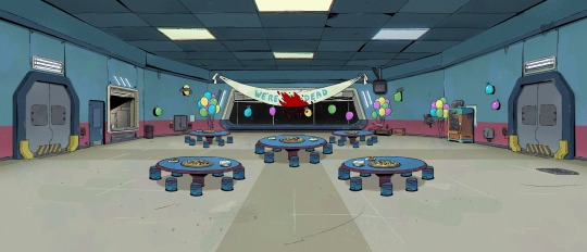
(Source)
My ramblings under the cut:
I like the art style! It’s a bit different, I was expecting something closer to the game style/style of images they post on social media and stuff where it’s very clean with sharp lines, but I think this works really well for what it seems like they’re trying to do here. I like the lineart and the kind of texture everything has? It adds a lot to some of the other stuff I’m going to talk about here.
First of all, the atmosphere. Again, really kinda different from what I was expecting, but in a nice way! I was expecting kinda like a clean, cool-toned, space-age look, but this gives me a lot more like run-down office vibes and I am HERE FOR IT.
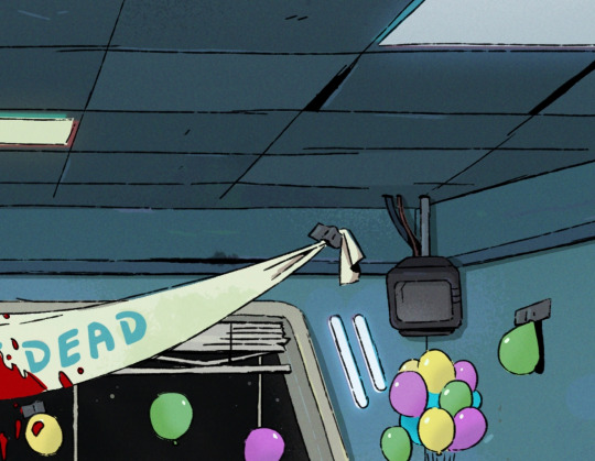

The warped ceiling tiles? The dirt and grime? The bent blinds over the window? The burnt out light by the window and different colored fluorescent lights like one of the bulbs was replaced? It feels like I’m in some old corporate building that hasn’t been properly maintained in years, which is so different and so fun from what you normally see in a spaceship and totally matches the vibes of (at least what I headcanon to be) a sketchy space corporation.
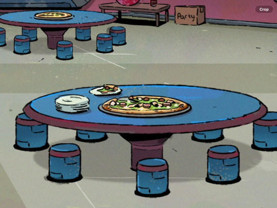
I also love all the little details here.
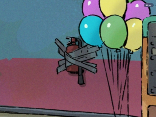
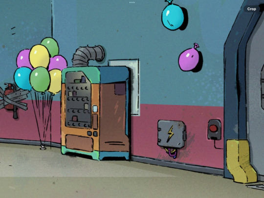
The little food window and vending machine so the cafeteria is actually a cafeteria, the pizza with who knows what kind of toppings on it (why is it green?? I’m so curious), and the fact that everything is held up with duct tape- even the fire extinguisher? It’s so fun I love all of it.

This is also actually a really faithful adaption of the map. Like, I know, of course it is, but I know things have to get changed a lot for animation sometimes and they did a good job of keeping it very similar.
I am going to be that guy and point out a few differences but just because I think they’re neat and interesting!! Not at all bad!
(At least between this and the classic game, I’ve never played Among Us VR)
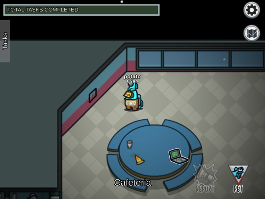
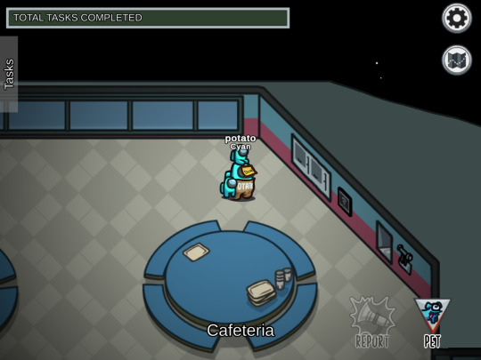
First of all, the trash task and wires task actually swapped sides, on the map, the wires are on the left and the trash is on the right, but here it’s flipped. I also can’t find the download data task, unless it’s supposed to be the tv? Probably all just aesthetic choices but kinda interesting!
There’s also the big food window and the door, but if you look at the orientation of the walls of the room, it actually checks out! The door and window would be against the left wall, where you wouldn’t actually see it looking from the angle in game.
The vending machine isn’t there in the game, at least on the Skeld map, but that’s ok the beans deserve their snacks! I did notice there’s kinda a panel behind it so I’m counting that as the panel that’s on the right wall next to the download task being there (even though it’s definitely too small to be that). That and the wires are actually on the slanted wall, but again, I don’t care, this is just me pointing out every difference like an I-spy challenge.
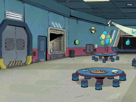
Also the cafeteria tables have stools now instead of benches, and I kinda like that! I also like the stripe of kinda a maroon-ish color added to the tables and stools, really kinda ties together well with the walls and such. And the floor, thank goodness they did something about that floor for the animators’ sake. I like the original floor design but I know firsthand just how hard that floor is to draw, especially at an angle.
I don’t know how to really speculate on the party stuff other than I’m intrigued haha. Maybe it’s like they’re celebrating taking off and surviving or being the only crew with no impostor attacks or something (of course that’s implying a lot about the non-existent lore) and then everything goes wrong? Maybe the red is pizza sauce or ketchup and we’re being misled for the funnies?
I’m kinda hopeful about the humor here, with the “we’re not dead” banner and stuff, I’m really hoping this will be something I’ll enjoy too as an adult and the vibes I’m getting from this are encouraging. Like maybe a kinda workplace dark comedy?
I’m also sososososo curious about what we’ll get in terms of characters (I WANNA SEE THE BEANS SHOW ME THE BEANS) and worldbuilding and lore here, eeeeeeeeeeeeee
Ok, I’ll stop for now, but you know I’ll be following this very closely lol.
tldr: not entirely what I was expecting but I like it and the direction it’s going a lot :))))))
Edit 2/3/24- just noticed there’s no emergency meeting button??? Is it under the pizza?? Has it not been installed yet?? WHERE IS IT 👁️👄👁️
41 notes
·
View notes
Photo

Again, I find out that I have drawn so many Ms England that I could arrange her in this kind of format, so here we go again
Don’t really believe in the historical dressing though, it definitely is not that accurate Lol some details are bound to be not right
More detail and my rant below:

Basically, those are puritan dresses, which imply simplicity and strictness. In my headcanon, Rose wore those kinds of cloth during the English civil war. Man I fully understand that those dresses is designed to have a strong “women should be chastity and obedient” undertone, since I fully know the historical context during that period. But Ms England could pull it so well that it doesn’t feel like that at all. I think she looks serious and intimidating when wearing it.
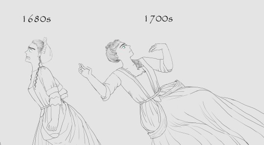
The end of the 17th century and the beginning of 18th-century cloth are so underrated, I rarely see them in historical drama and stuff, but I really think they have their own unique style and are worth displaying. The pull-the-edges-of-skirt-behind-the-back-and-tie-them-together style is one of its own kind, creating a lovely shape that I really enjoy drawing. I always like depicting this kind of big-piece-of-cloth-being-folded-then-droping-natrunally style.

18th-century cloth always gives me a princess-in-fluffy-fairy-tale vibe, thanks to all the modern adaptation of those dress in all sorts of “historical” romance movie Lol plus many of them look so extravagant that image Ms England wearing them almost give me a heart attack. I mean, I like to draw her in 18th-century dress, but only through careful selection first. The late 18th century cloth looks very suitable to her though, gotta trying to draw her in that style later.

Ah yeah, 1810s style! I mean, who doesn’t like the 1810s style? they just look so elegant and pretty. The reinterpretation of classic era dress during that period just looks so beautiful, hitting the right spot. And I think it suits the body type of Rose(in my headcanon) so well, which is a bit slim. The style drastically contrasts the condition she has to face during the 1810s though. The 1810s is a very intense period for her, so it’s almost always an angry and anxious woman in a super fluffy and romantic dress Lol
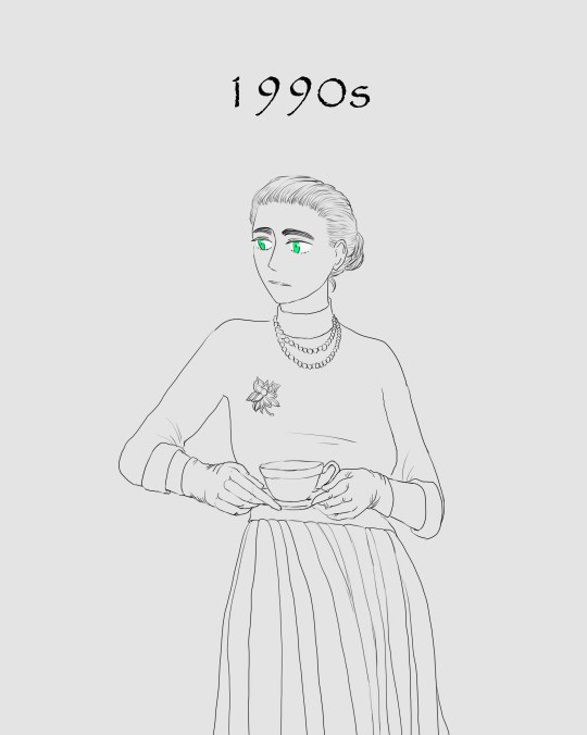
Modern time! As I said before, I think she gives boomer middle age woman vibe in the modern era, same as her dress. For some reason that I couldn’t even explain to myself, I just couldn’t imagine her following young people’s trends and wearing their fashionable clothes? Probably because she is tooooooo old(over two thousands years now) and old habits just stick to her? Or because at the core she is kind of a serious person, so she skips the fun-loving vibe trendy clothes?
49 notes
·
View notes
Note
How do you feel about the upcoming DCTL graphic novel?
Cautiously optimistic!
When I first heard the rumours, before Adrienne’s announcement, I had pretty mixed feelings. My background is in comics, like that’s what I went to school for and worked on semi-professionally for years, and I love it as a storytelling medium, so I’m really intrigued to see how they handle the adaptation…and I also really, really don’t envy whoever has to make decisions on how to depict these characters.
But the announcement is encouraging! I haven’t kept up with Chris Hastings’ more recent work, but I remember enjoying Dr. McNinja back in the day, so I have to admit there’s something exciting about seeing a name I recognise and can be hopeful about to do a good job with the adaptation. Checking out the artist’s work, I’m gonna put a lot of my poker chips on “Sammy will look really normal actually,” but I don’t think that’s a dealbreaker – like, Dober’s Sammy is a big fav as far as Sammy designs go, and I think he’s a good example of how you can still get great Sammy vibes in a more conventionally attractive face. (though i also think there’s a chance of “the artist will lean fully into his unhinged vibes and make Sammy look like a batman villain” so wE’LL SEE!!) Genuinely, the artist’s portfolio seems well-suited to this. I would’ve pictured DCTL with a rougher, more indie look if you asked me to pick a fitting style, but I think this artist's slick Western-Comic-Book style with its strong spot blacks could be a REAL good fit for the inky vibes this story demands, and they don’t have the level of “sameface” that I’d usually be concerned about with these kinds of styles; there’s enough solid variation in their character art that I believe they can handle all the characters needed, and also do a cool ink demon.
DCTL does have some design questions that are genuinely pretty fraught, in that there's no perfect way to handle it (Norman’s a great example; do you take someone that 80% of the fandom has been drawing as a black man for years and make him canonically white, or do you present the Weirdo Creeping Around In The Shadows Who Mysteriously Gives The Protags Supernatural Info And Then Dies At The End And Nobody Misses Him as canonically a person of colour??? ROUGH CHOICE I DO NOT ENVY), but I'm still so curious to see designs for these guys, and my big hope is that the fandom will be understanding of the huge task the creators have been given and that this won't be regarded with the pressure of getting “The Official Canon Design That I'll Be Mad If It Josses My Interpretation” – like, getting an official Henry & non-old-man Joey in BatDR just felt like, y’know, seeing anyone in the fandom make a new set of designs. It feels like drawing fanart of the BatDR AU; it doesn’t mean my henry and joey designs are Obsolete. And I hope these designs are enjoyed from that perspective, as a new DCTL Comic AU, and that the fandom takes whatever we get as less THIS HAS TO MATCH MY PERCEPTION OF SAMMY B/C ITS THE OFFICIAL REAL SAMMY and more just, a take on a design for Sammy Lawrence.
Though of course I can’t help but be a little more anxious about Sammy specifically, haha. He is my big fav after all, and as embarrassing as he is in DCTL it has become a part of his story I’m quite attached to. A lot of humanity could be added to him or taken away depending on how he’s drawn… I don’t want to get my hopes up, but it’s hard not to hope that he’ll have Good Sammy Vibes that Resonate With Me Specifically.
And in general, my expectations are still tempered – the comic could certainly turn out to be very mediocre, especially depending on how well the artist is paid and how much time the creators can afford to put into it – but tbh I’m super interested in how this turns out. I can’t wait to see Joey in this style and it’ll be SURREAL to see a comic of like……. BatIM humans…… I’ve wanted sincere visual content about the humans for a long time and I’m stunned we’re actually getting it, so I’m feeling kinda cautiously eager!! I’m also curious if the comic will make an effort to preserve Buddy’s “voice” from the original novel, and how that will be handled – like, the whole book is really strongly framed as being written by Buddy, and that’s not just an incidental detail; it fleshes out his feelings about Dot, ambiguously gives us info on Boris without directly revealing the ending, and shapes the way he presents some moments as unreliable and time jumping strangely – he even talks about the frustration of not being able to just draw these things and having to describe them! (RELATABLE) – but at the same time, just filling a whole comic with tons of narration boxes is not usually a great artistic choice. It’s a really interesting challenge for the adaptation, and I’m curious if they’ll shift away from the framing device altogether or look for a balance to keep it.
Anyway TL;DR I’m keeping my expectations low but I’m really intrigued!! I don’t know if I’ll, like, actually acquire it; I usually don’t buy JDS Inc. stuff, but I feel more wibbly about the books in general b/c of how strongly I appreciate Adrienne Kress specifically, so we’ll see how I’m feeling when it comes out, haha.
49 notes
·
View notes
Text
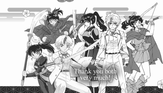
Yashahime Manga Volume 1 - Bonus Interview with Rumiko Takahashi and Takashi Shiina
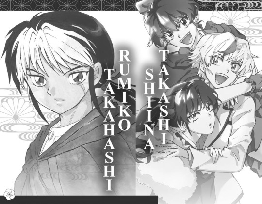
The long-awaited interview with Rumiko Takahashi, legendary creator of Inuyasha, and Takashi Shiina, who pens Yashahime!
You've mentioned before that when it was announced that the Yashahime anime would be adapted into a manga, you exclaimed, "I want to draw it!"
Shiina: One of the manga I drew before Psychic Squad was an adaptation of Ultraman Nexus. It was fairly popular, so I started getting offers to turn other anime into manga. Among them was Kidou Shinsengumi Moeyo Ken, which featured character designs by Rumiko Takahashi.
I see.
Shiina: I really wanted to do it, but I was about to start work on Psychic Squad, so I had to turn the project down. But the idea of working on something with Takahashi stuck with me. I kept thinking how much fun it would be to draw manga based on her characters, and I regretted the missed opportunity. Fortunately, I heard about the development of Yashahime just as Psychic Squad was ending. I thought to myself, "Well, if the timing is right, I'd love to do that!" So, 17 years later, my dream of drawing Takahashi's characters in a manga has come true.
Takahashi: When I first heard that [Shiina wanted the job] shortly after the anime started airing, I thought, "Are you kidding me? You must be pulling my leg!" When his name came up in conversation three more times, I realized the editors were serious. I thought it would be amazing to have Shiina work on Yashahime, so I gave them the go-ahead.
What were your thoughts after reading his first chapter of Yashahime?
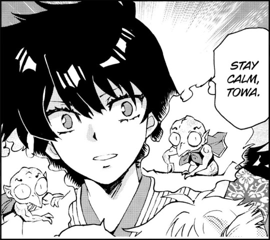
Takahashi: It was so much fun! He highlights the characters so well. He uses Towa's signature glare to define her personality. Setsuna's glare is even fiercer. And the fiercest of all is their father Sesshomaru's glare. What a great technique. Also, the slightly elongated way he draws Towa and Setsuna is just right. I thought to myself, "That's exactly what Sesshomaru's daughters would look like!" The reactions of the Higurashi family are well thought-out too. Of course, Shiina is a seasoned manga artist, so it's no surprise. It was really fun to read.
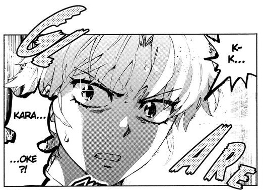
^ Towa's otherworldly glare
Shiina: I'm kind of like Takahashi's apprentice… though I've never studied under her. (laughs)
I'm sure there was discussion about the art.
Can you talk about how you view each other's approach to manga?
Shiina: Takahashi's art is impossible to reproduce.
You can come close, but it's still a copy and a fake. I was worried that readers would get distracted by the disconnect between our drawing styles and have trouble getting into the story. So I approached it as what would happen if a Takahashi character came into my world. For example, her version of Towa is cuter and feels younger. With my approach, Towa expresses emotion the most when her eyes are downcast. I added extra volume to her bangs so I could use them to hide her eyes. On the other hand, I want the characters to remain recognizable. I'm always trying to strike a balance.
Takahashi: I think it's better that Shiina is drawing it in his style. It enables me to come to it as a reader. The designs are similar but definitely not clones. The glimpses of Inuyasha and Kagome in the past are drawn very well. I really like the Kagome in the picture frame. She has a soft, grounded look.
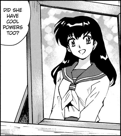
^ This image of Kagome is one of Takahashi's favorites.
Shiina: (laughs)
Takahashi: I enjoy following the manga as just a reader.
When this project was announced, Takahashi was quoted as saying, "I'm looking forward to the chilling beauty of Sesshomaru." Did you set any rules for Shiina when it came to drawing Inuyasha's brother?
Takahashi: I think the only note I sent him was, "Sesshomaru never gets nervous flop sweat." He's an aloof, solitary character. I knew Shiina would be able to capture that, but manga artists have a tendency to draw panic and flop sweat to create drama.
Shiina: Yes, yes. We do.
Takahashi: But that was about it. I knew Shiina's drawings would be great. I made the "chilling beauty" comment knowing he'd understand what I meant.
Shiina: (laughs)
What did you think after seeing
the finished art?
Takahashi: It was just as I expected Shiina's work to be. It was good.
Shiina: Thank you very much.
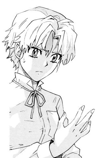
Shiina, how did you handle drawing Sesshomaru?
Shiina: I thought about how to direct the characters more than how to draw them. Sesshomaru doesn't open up much, but he has to share enough of himself for us to understand his perspective. He's facing his own challenges. His personal convictions and aesthetic are always in conflict with his reality. But would he talk about that with anyone? No. So the challenge is to find ways for him to express himself through his actions.
Compared to the characters you created in your original manga, like Ghost Sweeper Mikami and Psychic Squad, is it harder to figure out how they would behave and what they would say?
Shiina: Absolutely. I try to draw the three girls as if they're my own daughters and add a little bit of myself to them. Inuyasha and Kagome have open, lighthearted personalities, so it's easier to figure out what they'd say or do in a situation. With Sesshomaru, I can guess what he's feeling, but it's difficult to imagine how he would reveal that. He's a tough character to understand.
^ Sesshomaru's chilling beauty, as drawn by Shiina
What do you have to consider when adapting an anime into manga?
Shiina: I think it's fine for the adaptation to be different from the original. In fact, there are things that have to change. My intention is to keep the themes of the story in alignment with both the original work and my own perspective. I'm not trying to create a copy of Takahashi's work, but to build something new on the foundations she's created. I'm finding where her artistic sensibilities and mine intersect…or something like that. I look for points in the story where the manga and anime can connect so they don't diverge too much.
What do you mean by "artistic sensibilities"?
Shiina: For example, before Takahashi became a professional manga artist, she absorbed the works of creators like Kazumasa Hirai, Daijiro Moroboshi, and Yasutaka Tsutsui. I also love their work, so I think about how that commonality between us connects to Yashahime. When I'm reading her work, I try to imagine her intentions.
What do you focus on when you draw the monsters and demons?
Shiina: I'm a geeky guy, so I love to draw cool-looking
monsters. But reading Inuyasha and Takahashi's other manga, I realize it's not all about the battles. She puts focus and weight on the emotional impression of the monster and the reactions of the character fighting it. Instead of anime-style cool, her monsters have a raw feeling, like they've emerged from the shadows of folklore.
Takahashi: Except my drawings aren't as scary.
Shiina: They are!
Takahashi: I just hope they're scary enough. I'm careful not to make them look silly, I guess. I do use the human characters' reactions to sell the idea of how terrifying they are. I also use darkness and visceral effects to further build the scene. But I don't really think deeply about it as I'm drawing. It's just fun to draw monsters!
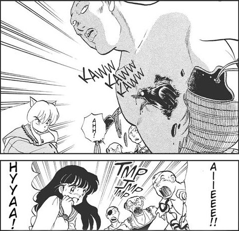
^ Takahashi's monsters and people reacting to them. These reactions are crucial to the tone.
Shiina: The other day, when I was drawing the un-mothers, I also
drew little kanashibari, demons said to cause sleep paralysis, which have appeared in Inuyasha. They're super fun to draw. I love the stippling on their bodies, their big eyes and squiggly eyebrows, the way it's impossible to tell what they're thinking. They wear odd cloaks over their shoulders. I kept thinking, "Why do these guys dress like that?" and, "I wonder what they're thinking right now." It was exciting.

Takahashi: I agree. I like the smaller, animal-like demons that look like they could be scuttling around in hell. They're creepy to look at. And I like their cute pot bellies.
Shina: Yes, exactly. Maybe it didn't make sense to put them with the un-mothers. But they added visual appeal and an otherworldly atmosphere, so I felt they needed to be there. In my imagination, Sesshomaru originally summoned them to defeat Inuyasha, but afterwards they continued to work for him, and they still take on special assignments. (laughs) And that's why I drew them into the scene.
Takahashi: That's so fun.
^ Some of Shiina's favorite demons
When it comes to character design, what's your approach?
Shiina: If I try to plan a character design in my head, I get confused. Like, I'll want a character to look flashy, but then start asking myself, "Why flashy? And will that relate to their personality or be confusing?" I approach character design from the inside out, developing an appearance that suits their personality. That's the only way I know how to do it so the characters are the right ones to tell the story I want to write.
Takahashi: First I think up the plot and setting. Then I think about what characters would fit into that world. That's when I start drawing, but I redraw them over and over before I'm satisfied.
Shiina: (laughs)
Takahashi: The smallest adjustments in a design, like how their hair curls, or their eyes, or their glasses, make a character look completely different. I feel like I just have to keep drawing until the character design settles into the story.
Takahashi, you designed the three main girls in Yashahime. How did you go about that?
Takahashi: Sumisawa, the writer of the anime, told me that
Towa was the "white Sesshomaru" and Setsuna was the "black Sesshomaru." Moroha is the daughter of Inuyasha and Kagome, so I didn't put much thought into her at all. I just drew her so that she unquestionably looked like their daughter.
#inuyasha#犬夜叉#inu yasha#yashahime#anime#manga#rumiko takahashi#hanyou no yashahime#takashi shiina#interview#takashi talks
21 notes
·
View notes
Text
TWST OC intro: Professor Yzmin
*Template by Piraticusdorm*


Yzmin is a new professor at NRC who specializes in potionology, alchemy, and biology. He was a former NRC student with Crewel as his upperclassman. He is incredibly vain, self obsessed, and refuses to compromise his sense of style, even in the classroom. His attentiveness to his looks also manifests in his teaching style, being rather strict and will not hesitate to correct his students’ mishaps. They also have a huge temper that's almost as explosive as Ace's lab accidents.
Miscellaneous facts:
He's not good with animals. He had to take supplementary classes for animal languages
In addition to supplementary classes, he once had a friend who tutored him in it as well as attend to him while he was housewarden of Pomefiore
Still sees Crewel as his senpai but likes to have some friendly competition over who's best dressed
Ace: you didn't hear this from me but he still likes playing double dutch! Isn't he like 30 or something???
Got traumatized at a birthday party when he got accidentally hit by a stick when the kid meant to hit the piñata. Don't ask how the first years figured this out
Hobby: paragliding and skin care
Keeps a hidden dagger somewhere on him. Jack swore he saw a knife holster on his leg
“Its like im talking to a monkey. A really really big stupid monkey named ACE!!”
Misc artist's notes
Guys, I spent so much time drawing this guy because I would just STARE at him and let him seduce me/j truly I hold too much power
And the funny part was that he was gonna be fairly modest, but my mom really pushed his design to be closer to Yzma's actual design (which I tried to skip around because I thought it wouldn't work having a lab teacher be in such revealing clothing) so the more I took her input, the more slutty he became... Like... What I'm saying is you can thank my mom for this hot science professor. She too is far more powerful than any mortal and so I had to reign in her ideas lest he be too sexy for children to see.
But I still love this design. I incorporated several design elements from Yzma's various outfits throughout the movie except for the puffy sleeves. That was carried over from a previous draft of Yzmin that leaned more into a generic victorian teacher aesthetic.
The bottom wrap was a combo of Yzma's lab coat and her iconic black dress with a slit down the side. The goggles and gloves were also from the lab coat. The top and the connecting black collar were adapted from her original black dress while the curly bang was taken from her one of her puffy hats she wore right after she successfully took over the empire.
I forget if there was a specific look I took for the earrings, but I'm sure they're from Yzma's "flapper" outfit when she and kronk were at the restaurant looking for Kuzco. And to top it off, cat eye makeup look for her transformation into a cat!
I hope this was interesting to y'all. I want to share more of my art here on Tumblr since it's been trending towards TWST. I do other stuff as well as original pieces, but for now, enjoy what I have to offer!
#artists on tumblr#twisted wonderland#twst#twst oc#twst original character#disney twisted wonderland#original character#disney yzma#emperor's new groove#yzma
334 notes
·
View notes
Note
I'm curious, you've said what you would like to be different about Sailor Moon's narrative, but, what would you change about their aesthetics? It could be color palette, uniform design, acessories, transformation even their power and element if you would like to go there
This is so hard for me because by and large I am such a story person over aesthetics. I would have watched Crystal with all the production values of Detective Pony if the story had been good. I would have loved it. I'm also not at all artistic, so thinking of these things is really hard for me. But I'll try!
Really, first and foremost desperately wish the girls didn't have the same outfit palette-swapped. I get that it makes producing merch insanely easy* but it really wants for something when it comes to representing each of the girls as her own person. I would probably go with something deeply different a la Madoka, instead of a Revue Starlight thing (Though I think Revue Starlight did an exceptional job of having outfits that were similar but different.)
When I was noodling about how you'd adapt Sailor Moon in America, one of the main fun things about the idea was that America has an insane level of diversity, and so the girls could be insanely diverse. My general idea was that when Serenity fucked them all over sent them to Earth, the shard of what made a girl a soldier waiting to awaken went everywhere, and not just Japan. So, in their uniform you'd have a reflection of where that shard fell. You could draw from potentially anywhere, Melting Pot Ahoy.
EVen in the universe I DO write, and not some spec one, I like to give them Actual Practical Weapons. I think it makes more sense and it makes fighting more interesting I thought pretty in depth about how I wanted it to work both as a question of fighting style and of whatever we might be able to glean from canon. So Mina has a big old sword**, because Mina has a big old sword, and I think it's fun that both she and Haruka have a sword. Specifically I like to give Mina a Montante because it's extremely showy in battle, it relies a lot on quickness and momentum the way many large swords do not, which I think she'd be used to from the chain, and also giving Haruka a roman-style short sword then is very very funny. Mako a giant motherfucking military spear--she was probably the most fun because we have somewhere between very little and no suggestion in canon otherwise so I just got to fuck around, and I love the idea of a weapon that draws so much on power and "strikes" in the same way as the storm element.
Oh speaking of which! Big element change, in that I want us all to stop lying to ourselves! HARUKA'S ELEMENT IS EARTH. Her fucking attack is World Shaking. She is very much an earth element type. Her element is earth. It is not wind. Stop that.***
I don't have a problem with the palette in general per se, thought if I were making Doc Holligay's Sailor Moon: An HBO Original Series, I would probably tone it down some. I guess if it were like, "There HAAAAVVVVEEEEE to be skirts", I guess we could go with some sort of Roman military flavored thing.
BOY WAS THIS A RAMBLE THAT BARELY ANSWERED THE QUESTION ENJOY.
*And yet, still, so many of them do not come in Neptune. What. How. Are you allergic to teal and/or my money.
**technically I give her a chain, Go Go style, until after the Talismans Incident, and then she gets her sword, but that is more detail about my long ass and scattered universe than anyone really wants.
**Putting a pin in this as I've just had the thought, but being as Ami's element is actually ice *Eyeroll* imagine her and Michiru fighting and Michiru smiling, and saying, "Oh my, but did not you not realize? The sea doesn't freeze."
15 notes
·
View notes
Text
2023 Art Summary

Okay, so this year has been... interesting. While I still have no home, no job and a long etc., I've been ridiculously productive. And not only in drawing but mostly writing. There's a lot coming on and I can't wait to share it with you!
January: I got some news at the beginning of the year: I'm autistic! While I was shocked at first, then everything started making sense. Like, everything. I started taking my time with two Gingaria illustrations and I think this one shows how much my art has improved. It's still one of my favorites.
February: I got on board on a behemoth of a project: doing my own magazine special for my next book. It has comics, character sheets and a lot of information. It was exhausting but I'm so happy about the final result and I'm going to do some prints.
March: My heart has been extremely soft this year and I've surprised myself drawing a lot of couples and writing a lot of fluff. One of them was our Jlaire, of course.
April: I finally watched Wednesday and drew a t-shirt design with the whole family.
May: Another big project! I made my own version of the Goose Game, called Dragon Game and with the characters of Zem. It was so funny having to create all those small drawings and the dragon character.
June: Hyped with Nimona, which ended up being quite good. I enjoyed drawing this version of the characters, even though there weren't many references back on those days (it reminded me of my HTTYD2 era).
July: More couple fluff! I can't share this one yet, but it's Zemry. Painting all those flowers took me days.
August: Another one I can't share yet. I also did a lot of concept art for my next books and this is one of them. I can't say much about this character yet, but they were such a delight to write.
September: Finally watched Over the Garden Wall and loved it. It had been a while since I had to adapt characters to my style but it was so fun! I made a comic too.
October: Back on the Jimtober bandwagon! I wasn't sure if I was going to do it or not but found some free time and here we are.
November: I find it interesting that I've been making new comics after all these years. I did two of Gingaria, this one about Kylkos.
December: And ending again with Gingaria. I wanted to do something with Vitha in her Winter Ball dress and I think it ended up looking great (does this means next year is Kylkos' turn?, huh...).
So overall, maybe it wasn't the best year (we've been having some really bad years in a row), we still don't know where we are going to live and now I have yet another problem to take care of, but... I've kept on creating. And that's enough for me.
Thanks for being there and keep on shining!
#art#tales of arcadia#trollhunters#jim lake jr#claire nuñez#gingaria#legends of gingaria#gotxinka#gertold#vitha#king aurus#aury#aurkandra#troll jim#wednesday series#wednesday addams#nimona#ballister blackheart#zem#zemry#over the garden wall#otgw wirt#otgw greg#otgw beatrice#kylkos#jimtober2023#christmas#me
16 notes
·
View notes
Text
Answering asks #1
I thought it'd be easier to answer asks in a batch! Also I am so sorry it took me so long to get to them! I've been all over the place aaa I'm sorry! Anyhow, I hope you enjoy my responses ;w;!!!
I'm embarrassed of that video honestly T_T I feel like I was being too mean in it? That's basically it! And in general I lowkey wanna remake it! So stay tuned for that :>

Of course! I would say credit isn't rly necessary for me! As long as you don't claim my art as yours, I'm chill with it! :D

Thank you so so much!!! AAA I'm always so happy when ppl tell me they enjoyed my Grelle animation ;w;!!! It's one of my fave recent creations hihi!
To answer your question- what I love most about Grelle is the concept behind her character. Like it has sm potential to be so interesting. I love fucked up women, I love fucked up LGBT characters, and she's both!! Though I would say the way her character is almost always reduced to a joke and a comic relief is annoying to me. Like I love that she's silly and goofy and flirty don't get me wrong, it's moreso the fact it feels like the show is laughing at her rather than with her :(!!
I don't rly have headcanons I dislike... well outside the man!Grelle headcanon. Like I'm sorry that removes everything i find interesting about her character! Her relationship with gender, femininity, theatrics and motherhood is some of my fave stuff about her, so making her a dude kinda makes me yawn.
Anyhow to stop myself from going off about Grelle I just wanna say thank you sm again for this sweet message!! ;W;
I own the DVD! The subtitles are only compatable with the DVD, so if you wanna watch the Stageplay you gotta get your own copy ;;!

I got annoyed with not having all my art in one place XD that's why I deleted the sketchblog! You can find some reposted sketches on here!
This is the sweetest anon omg thank you!! But I gotta ask, when you say I have your dream artstyle I wonder which one you mean? XD I feel like I change my artstyle slightly every week LOL. (I love experimenting hihi)

Thank you for the kind words tho ;w; it really means a lot!!!

Aww I'm so happy you enjoyed my modern AU designs for them!! Thank you so much :'D I'll be on the lookout for your fic btw! 👀
And I doodled a little modern AU Cielois for you, to apologize for how long it took me to answer this ;W;! Hope you enjoy the sillies!

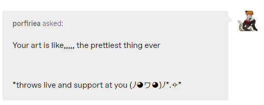
@porfiriea
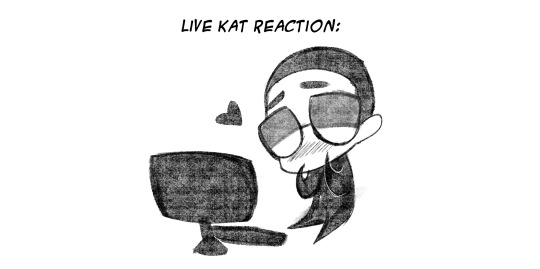
People in my puter saying nice things makes me happy :')
Srsly tho, thank you for this sweet ask, I'm always nervous when opening my inbox so I'm really happy I got such a kind message upon reopening!
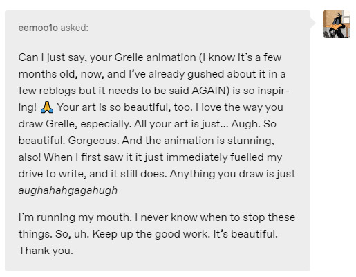
@eemoo1o That is so lovely to hear like?? The fact my animation (here it is if you haven't seen it!) inspired your drive to write more?? Omg... Thank you thank you thank you for this wondeful message!!! Even if it's been a month or so since I posted it, I love getting people's thoughts on my animations :'D!!! No matter how recent or old they are! I always appreciate it!!!
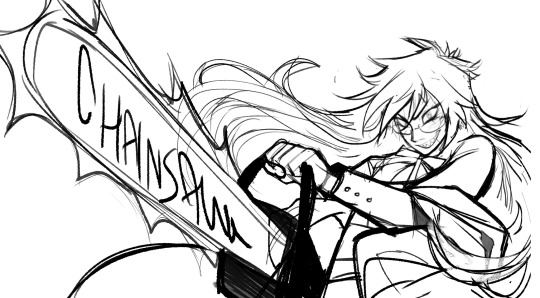
Thank you for liking my Grelle <3333 I love drawing her the most. I love drawing unhinged characters (especially unhinged women hehe), and Grelle is particularly fun because not only is she red (one of my favorite colors!!) she also has sharp teeth which are always fun to draw. In general, anime characters are fun to stylize because I have the freedom to adapt their features in my style!!! So I'm really really happy you like my Grelle :')
Here! Have a scrapped sketch frame from the animation as a thank you ;w;!
Also sorry for the slightly delayed response!!! I love doing these silly little doodles of my persona to show my appreciation for these kind messages which is why they sometimes take a little to get to! :')
(Also I really love your fanfic The Story of Grelle The Reaper!!! It's one of my favorites in the fandom!)
23 notes
·
View notes
Text
The new "Teenage Mutant Ninja Turtles: Mutant Mayhem" movie is VIBRANT! The unique and ambitious style with handdrawn textures and effects is fun and flashy and incredibly colorful - there have been comparisons to Spiderverse, yet TMNT:MM is very much doing its own thing (there is a fair bit of flashing in this movie too, so be warned, but not on the extreme scale of either SV movie). The animation is beautifully naturalistic in its acting and the action really pops. The character designs have great funky shapes, purposefully significantly uneven in a way that delights me with their lack of symmetry.
It's always fun seeing how the characters and backstories change with each iteration trying to do something different. (It's part of why I'm trying to watch my way through different Transformers shows. I think it's neat how the characterizations are always different.) I've only seen the "Rise of the Teenage Mutant Ninja Turtles" show and movie (and enjoyed them a lot), and the boys and the world are wildly different to that, and I still enjoyed this iteration of them very much too. The turtles are young and adorable and, while they did kick ass, they were also excitedly talking over each other and making stupid jokes and being a little... uncool? In a way that felt resonant to the experience of being a teenager just having a good time and finding stuff you like and trying to find other people like you. The banter was fun and silly and realistic and teasing. And occasionally heartfelt, though most of the characters are (as many people do) constantly disguising their vulnerability with self-aware jokes.
The story is straightforward (it's kind of simplistic and not very deep at all, honestly, but I enjoyed that just fine) and moves along quickly at a fun pace. It's very like Spiderverse in that I think it's accessible while expecting you to be familiar with basic superhero tropes, so it's a real blast if you're already fond of the Teenage Mutant Ninja Turtles like I am, and I find it so refreshing to watch things that are unapologetic about their basic concept being more than a little ridiculous. There are lots of references, but they felt like references that people naturally make, especially teenagers with relatively little exposure to other people. This is a really silly movie! And the movie is like, "Yeah! This is silly! Isn't it great?! Now look at what we're going to do with it!"
The humor runs towards being pretty gross (puke, ooze, other bodily fluids and body humor, and some pretty extreme body horror regarding mutants) at times, depicted pretty graphically on screen. Which I kind of enjoyed, it's neat sometimes to see a movie go there, but I need to underline the vomit warning because that stuff was excessive. The movie also gets quite violent at times. As with most superhero media, they do beat up a lot of generic goons without pausing to consider the broken bones that would definitely be happening. (Very vague spoilers:) There's a nonconsensual medical experimentation scene that's a little disturbing, with repeated electric shocks, and the drawing of bodily fluids, though they keep telling jokes through it to try to keep it light. The final battle is also pretty destructive and did make me go, "They're just babies! (They're like 15ish.) Leave them alone!" a few times.
So, if you're looking for something fun and silly to go see, something that looks totally unique and vibrant on the animated scene, something that made me nostalgic for just joking around with my geeky friends by ourselves when we were teenagers, then I recommend going to see this movie! Especially if you enjoyed any previous iterations of the Teenage Mutant Ninja Turtles even in passing. Though if you're a die-hard fan of a particular previous iteration, maybe you'll be annoyed by some of the adaptational differences, idk, and if you don't like any previous TMNT stuff, then this is maybe not for you. I'm looking forward to the TV show and the sequel that have been greenlit already!
42 notes
·
View notes
Text
I just finished ms. marvel the show for the first time. so short answer is: wowwww but long answer is: it has some positives and negatives.
Let’s start with negatives.
Changing Kamala’s powers. I know kamala isn’t as popular as some long time heroes but embegging is her whole gimmick! It’s like if someone took Peter Parker and gave him the powers of a snail and was called snail-man. And her powers are so cool too. I was so excited to see CGI stretching and polymorphic powers, you can do the hands part via literally iPhone camera, how could the whole marvel budget didn’t cut it?? No we got to have… light, for some reason. I’m just scared that other adaptation are going to do the same like in some new comics or games or something, I really, really hope not
Misrepresentation. This one is debatable, because as Muslim, the bar we have for American shows to represent us isn’t even on the floor, it’s lower, so I was pleasantly surprised to find that they didn’t 100% mess it up. But still there are so many minor technicalities, that might seem minor for someone outside of the religion/culture but for those are part of it, it’s a really big deal. Like some scenes, doing wudu with nail polish on, posting in the masjid, a dad telling his son to stop praying, so many words used in the wrong context, the whole djinn concept just shows that there was no Muslim opinion taken into consideration during filming.
the so many love interests. Like, 3, seriously, one wasn’t enough?? There shouldn’t even be one, but I digress. And just all the scenes involving the romantic subtext of each one literally made my blood boil. Literally this whole point could summarised to just the boys, they were so unnecessary.
And now let’s get to the positives, because despite the points made previously, I really enjoyed this show.
The representation. As I said before, it’s perfect, but it’s not bad. Then again, the only thing we share is us being Muslim. I’m Arab where kamala is Pakistani and these things heavily affect how people practice Islam, and also I live in a Muslim, Arab country where almost everyone is Muslim where kamala live the US, a place where she’s a minority. So of course there will be differences between our experiences. But I love how many arabic phrases were spoken during the show, the Eid scene, the masjid scene, the whole wedding episode. It was all so good and nice and representative.
My favourite thing about the show honestly is how artistic and stylised it is. They weren’t very consistent with it, but it was still good. All the different fonts and styles for the ms marvel intro was so amazing, I want to screenshot every frame. The credits are so well done too. When they want to show how daydreamy kamala is and there’s doodles around and different pieces of media incorporated in that. It was all so creative. The intro captain america scene was one of my top 5, to be honest
I love the costume design, especially kamala’s. They were all so modest, obviously. But they also showed Kamala’s personality, through her drawing and patches and just the colours and everything. They were so many stars and bolts, It’s just so similar to how I dress.
The progression of her relationship with her mom. I genuinely think that there’s no greater or stronger or closer bond between two people in this whole wide world than between a mother and her eldest daughter, and this show is only one of the many many examples of that. And it’s so relatable and realistic, like her mom being overprotective and hovering because that’s the result of generational trauma and how her mom was too distant, and she was just doing her best and just wants the best for her daughter and Kamala is such a sweet girl. So many of their scene together made my heart melt.
Centralising not just family, but the matriarchs in the family was such a smart move. because mothers truly are the ones who make families and heritage and everything is always tied back to them. Something something the souls of mothers residing in their daughters. The whole partition train episode had me bawling my eyes out.
The rest is just some things I love about kamala generally in every adaptation/timeline/universe
I just really love how unapologetically nerdy and dorky kamala is. She’s such a fangirl, she loves comics and superheros (usually women) and of course captain marvel. And she engages in that, she draws and make projects and her whole room is decorated in what interests like her. I just really love people like that, both fictional and in real life. (I may be projecting but I feel like it’s giving adhd, like it’s giving hyperfixation.)
Showing the brown girl experience of idolising older white women and wishing that we could do everything they do, but still believing that we can’t because of a variety of reasons but then overcoming that and doing the things you wanna do your way anyway
Just how good kamala is. She’s so polite but still speaks her mind respectfully. She helps people all the time even when she doesn’t have to. she’s always so nice and sympathetic to everyone. And even though she can become a giant, that is her greatest strength because people always want to repay her goodness and they always want to help her back. And it’s just so heartwarming.
#ms marvel#ms. marvel#ms marvel series#ms marvel tv#kamala khan#mcu#marvel#captain marvel#ms marvel 2022#review
9 notes
·
View notes
Note
What's your favourite artist?
Oh many!!! Buckle Up cos I'm going all in on this one
I'm gonna include SFW and NSFW artists haha. I'll mark what each of them do so you aren't blind sided. And of course there wont be NSFW images linked here. Their names will have links to either their main Twitter, or other primary site you can find their art. And I'll @ their tumblr if I know it below that
For sure Junji Ito for horror stuff. That almost goes without saying and I don't think I really need to link his stuff xD he's an absolute titan of horror art
MackleNG (SFW & Horror)

Absolutely amazing linework and generally incredible vibes. They are drawing a webcomic called CHOKEPOINT i have been meaning to check out but I adore their art just in general. I've been using a lot of their art as inspo lately and can't get enough of their cyberpunk designs, horror vibes, and use of pops of colour to emphasise and showcase their incredibly in depth line work and details!
QSY (SFW & NSFW)
@qsycomplainsalot

I continue to come back to their art and they are also a huge inspo for me. I'm generally trying to find a way to adapt their colouring into my own style because it's absolutely gorgeous! The way its simultaneously crisp and crunchy, while also soft and expertly blended! It's like candy for my eyes! Add into it their fantastic expressions, excellent pallette choices, incredible weaponry, and of course some excellent NSFW with really great curves, colour, and characters, and they're easily one of my top 3 artists
Tyto_Alba (SFW & NSFW)

Do you like Mecha? Do you like guns? Do you like cute girls and/or boys!?
Well, hot shit, me too!!! You NEED to check out Tyto_Alba! Straight up, another one of my top 3. He has legitimately changed the way I do my lineart, the way i draw soft shapes (like butts and stuff :3c) and my god the mechs as well! I legitimately had a hard time finding a good singular piece of their art to use here cos they are so fantastic at both sexy art AND mechs that i really had to find something that showed off a little of both!
Something that I personally have noticed with their art as well is just how fuckin incredible they are at drawing HANDS! I am obssessed with their skill with hands and I hope to match up to them some day in that regard! I feel like I'm getting there but I LOVE the way theyre always so Shaped and well posed. As well as how detailed they manage to be without being too attention grabbing unless intentionally in the focus!
What's more, they use simple colours so effectively! Much to be loved here!
And of course, their NSFW content is top tier! Really excellent soft shapes and squish and really fantastic context and intensity!
RizDraws (NSFW)
Listen... LISTEN OKAY!!! We're hitting the NSFW exclusive part of the list and you have to understand that NSFW artists are just as incredibly skilled as any other artist and that porn is FINE AND NORMAL!
Having sexual interest is not unusual. Having a desire to draw these things is a human and regular thing. I could talk for paragraphs about how puritanism is harmful and ultimately denying something natural and inherently human and anyone telling you otherwise has ulterior motives. But that's not what this post is about. I say this because an artist showcase tends beat around the bush with this stuff but I am unwilling to be vague about this. NSFW art is valid and, what's more, Important!
That being said, Riz is incredible!
The squish! The faces! The fluids! The Dicks! All so good! They somehow straddle the line between pinups and porn in such a brilliant way that I would be happy to have their art on my wall and I'm not kidding haha! The particular way they colour with the chalky texture is often sought after and I see why! Personally I don't look to emulate it myself but I most certainly enjoy looking at it! The way Riz uses their lines and their particular style of chalky colour to make the squish of clothes against flesh really look real! It's somethin else!
Andava (NSFW)

Now where Riz does the mid point between pinups and porn, Andava is definitively porn haha! xD That being said. Hot damn dude!
In particular the way they do bodies and have a variety in body types, shapes of boobs and faces. Especially faces. Their characters are really good too and it's very easy to develop a favourite (for me it's Erika and Alexis)
There's a reason people have cosplayed their characters and it shows! Absolutely love the variety, the situations/positions they draw! Theyre incredible as making stuff feel messy as well! Highly recommend browsing through their stuff and finding a favourite OC of theirs haha!
I was lucky enough to get a commission off them years ago when they were still fairly small in terms of following. So long ago that Tumblr still allowed porn at the time haha! I dont think Discord even existed yet! Still wanna grab a commission off Andava of the same character one day!
ALRIGHT
I think I will leave it there for now! I could absolutely go longer and talk about even more of my fave artists and why I like them, and how they've inspired me but I get the feeling I should hold off haha (unless of course people would like to see more)
I hope this has thoroughly answered your question. Though I know for a fact i will kick myself over not mentioning an artist i should of included later but forgot to lol
6 notes
·
View notes
Last Seen Blogs
moonpeachmoth
Quantumplated
tracking11-blog
Tong Li logistic Equipments Co., Ltd
cute-doodles-em-portugues
Cute Doodles
saftype
Lia Sa

brieftastemakerwizard
Untitled