#they usually have a red blue or purple color scheme
Text
STUPID MAN
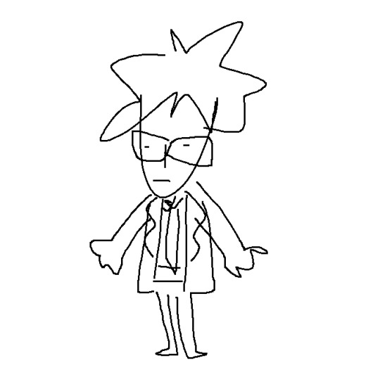
wuv him 😘🥰
#what one and a half week of no zaza does to me /j#rufusposting#he so silly he so stupid i love him :P#i noticed a trend in the fictional men i like#they usually have a red blue or purple color scheme#i want some zaza#its fun to be scared in target#i wish kmart was still around getting stoned there sounds like fun#i dont want to sleep but ik the moment i want to actually start boobing around imma get sleepy#fuck tumblrs new post system btw i actually have to save and upload now instead of just snipping tool my shit
0 notes
Note
I feel like if talon was a neopet he'd be a kyrii..!!
i saw this ask cut off in my activity tab and was thinking "oh please say kyrii" as i opened it
yes!
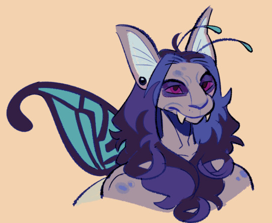
darigan kyrii, but wit faerie elements (wings and antennae) ^_^
#too lazy to fix the glaring tangent#skunk mail#Anonymous#a doodley#blue is my favorite color but its so hard to work with. true blue is TOO boring and swinging too far green or red breaks the pattern really#easily#anyway yeah. i wanted to add bright yellow greens here as contrast to the blue purple but he doesnt have any green themes at all#closer to blue looked too muted. so went with the teal even though he's not a teal guy either. close enough to blue#original darigan kyrii colors are fitting. talon loves royal and navy blue but its easy to represent him with red#he has purple scheme regularly because of dis (in his usual hair and eyes)#so making the beast blue purple and keeping the eyes leaning toward red fits !#the big ears and the teeth and nose...kyrii just looks like the bat monster version i wanna make for him
93 notes
·
View notes
Text
flurry of colours

synopsis: asking the genshin boyfriends what color they see you as
content: Alhaitham/Kazuha/Wriothesley x gender neutral reader. Fluff! Use of nickname darling/dove. Wrio is pretty short I wasn't entirely sure how to write him😭. English is not my first language so i'm sorry for any mistakes♡
D*rk content blogs do not interact (*a)

Alhaitham
"It's not your problem if Kaveh's struggling with his color schemes, darling" he replies quickly, not even bothering to look up from the page in his book.
"Archons, Haitham, it's not like that. Just look at me and imagine what color I radiate :)
he sighs a little, closing the book but keeping his fingers between the pages. Even if he thinks it's a bit of a silly question, he does take a moment to let his eyes trace over you, shamelessly letting them linger on your lips too. for a second you think he's actually going to answer your question but then you see him failing to suppress a smirk and his gaze meets yours with an expression you can only describe as Are you serious?
"Humor me Alhaitham"
Alright, let me think.. he completely closes his book this time, placing it in front of him on his desk and rests his head on his hand
"Colors can actually invoke a lot of thoughts and impressions. Most people associate red with warmth, and passion, but also with danger or fear depending on the context. A lot of people view black as a masking color be it clothes to hide certain parts of yourself or the shadows in your nightmares, but you can also see it as a protective color as it doesn't reflect. Blue is usually related to the sea, the lighter tones with sunny mornings walking along the shore, darker tones of blue can relate to the deep cold unknown depth that's hidden from prying eyes......if I had to describe you a color..it would be green. Not necessarily because of the associations with it, wisdom, calmness, and hope. which do apply to you don't get me wrong, but green is my favorite color, and you're my favorite person. Simple as that. Now, care to read with me for a bit?
*he's so annoying but he does it so well. Bites him*
Kazuha and wrio under the cut♡

Kazuha
kazuha has been a bit gloomy as of lately. His usual flowery words have lost their petals, His leatherbound notebook has not made an appearance in a while, neither have the little poems he writes for you to wake up to, and his fingers are clean, not covered with his usual, and at this point, you believed to be permanent, ink stains. It's clear he's been going through the infamous writers block. something that most artist go through and also get out of but it's nonetheless an infuriating part of being an creative individual. But since Kazuha has made you his muse as he told you many many times before, who are you to not try and help inspire your lovely boyfriend.
It takes you a while of bringing him to random locations for sunset walks or stargazing and asking him random questions until one finally hits the spot. His eyes immediately lighting up as he turns to you with such a warm expression of love and adoration you're pretty sure your heart skipped a beat
"That's a very beautiful question, dove"
He takes a moment to think about it, eyes lovingly tracing over every little detail of you, the backlight of the sun, the glimmer of the waves shining in your eyes
"I don't think describing you as one color does you justice. You shift hues as softly and gently as the day shifts into night, and the sun makes place for the moon in the sky. But if I do have to say just one, I see hints of purple in you, but that could also be because the color reminds me of my hometown and everytime I look at you, my soul feels at home" He answers with a new found excitement in his voice
"Actually, maybe I can use this for a poem-"
*i'm projecting can you tell?*

Wriothesley
You often come down into the fortress to spend some time with him on his break. With both of you living on different levels of Fontaine, you'll take any chance you can get to be around him and even when it's not officially his break time, he could never say no to you....or tea time
That's why you're here now sitting on the edge of his desk as he hastily discared the paperwork to make room for the teapot and biscuits. As quickly as the tea flows, the conversation passes from deep and meaningful, romantic ones, to terrible jokes and banter as both of you just talk about whatever comes to mind.
So he doesn't raise an eyebrow when you ask him what colors remind him of you. it's quite endearing how he just goes along with whatever silly questions or requests you throw at him without making you feel embarrassed about it
"Probably between a pearlescent white and a warm honey yellow."
"Interesting answer...why?"
"the colours remind me of the sun and the moon, and living at the bottom of the ocean here in the fortress we don't have either of those of course. You're the closest thing I have to feeling the warmth of the sun on my skin or experiencing calm atmosphere of the moonlight. And to be honest I prefer you over the real thing♡"
Hes so cute *cries*

Thank you for reading angels!♡
#genshin x reader#genshin impact x reader#wriothesely x reader#alhaitham fluff#alhaitham x reader#kazuha x reader#genshin impact x gn reader#wriothesley#wriothesley x reader#genshin x gender neutral reader#alhaitham x gender neutral reader#kazuha x gender neutral reader#genshin fluff
697 notes
·
View notes
Text
I recently finished reading all the Lockwood & Co books, and my god they were good, but it got me thinking. If the show continued, like it deserved too, would Holly and Kipps have gotten a signature color the same way the trio did? If so what would they be? Well I was looking at twitter and I saw that most people agree that Holly's color would be yellow, and Kipps' would be white, and I'll be honest I disagree so badly I'm about to write an essay. It's funny because I distinctly remember finishing the books and thinking, "ah watch everyone put their colors as yellow and white cause it's easy". LOUD INCORRECT BUZZER. Y'all just don't get color theory OR the characters the way I do so listen up.
Holly is many things. She's positive, and compassionate, and kind, but she is so much more than that. She's not just a "yellow", yes maybe she is the sunshine of the group, but honestly? Not really, and that's ok. She's fierce and sometimes she has a short temper, she pretends to let everything slide off her shoulder, when really she's just keeping it inside. That's why her and Lucy are constantly budding heads in the beginning of their friendship, they are so similar. I think her color should be red. She's constantly described as wearing it, and I think it really fits her. Red represents passion, energy, confidence, and excitement to name a few. Holly is always described as having a presence, and her energy and enthusiasm comes off her in waves. Red is usually described as the color of love, and I still think that fits. She has such love for the entire crew, and it's so clear she would go to the ends of the earth for them. I also think this would blend in with the others very well. Despite it not actually being blue's real opposite, blue and red are often seen as polar opposites, which really fits for Lucy and Holly's dynamic. It also works because red and orange are both warm colors and George and Holly have always gotten along. They are similar in their methodical and sometimes odd ways of life. I also think it's fun cause Skully's color is green, and green are red are direct color wheel opposites. I'm pretty sure he hates her the most, but Kipps is also competing hard for that title. And lastly black is kinda the color in between, now more on that in a second.
I see what twitter was going for, Lucy and George are blue and orange, direct color wheel opposites, because they are quite literally direct opposites. So it makes sense for Kipps to be white since he's the direct opposite of Lockwood? LOUD INCORRECT BUZZER AGAIN. Tell me y'all didn't understand their dynamic without telling me. Lockwood and Kipps didn't get along cause they were so different, they butted heads so hard because of how similar they are. It's exactly what happened with Lucy and Holly. Plus white represents a lot of things that are definitely not Kipps. My proposed color for him is purple, I know that's a little odd, but walk with me. Although it's never explicitly stated, one can assume that Kipps was an absolute prodigy when he had his talents. I only bring this up, because purple often represents royalty and luxury, and he practically became a fallen king when he lost the only thing he was ever good at it. But purple is much more than that, it also represents bravery, uniqueness. ambition, and justice. I think Kipps' original color is grey, and not just because of the uniform. Grey represents seriousness, sadness, and boredom. That's how Kipps was before, but when he remeets the crew during book 3 and 4, we begin to see the shift. The group helps him gain his ambition back, and with all of their love and support we even begin to see how brave he really is. He has a unique way of going through life, and even when all the odds are stacked against them, he still seeks justice. Purple fits with the general color scheme as well. It's very close to black, which represents how similar him and Lockwood are, and it's also a cooler color like blue. Kipps and Lucy certainly got along the easiest out of the crew.
Overall it just makes sense. George and Holly are the warmer colors, Lucy and Kipps the cooler, and Lockwood as the mediator between them. I feel like red might be a little hard to incorporate without being overpowering, and I know that purple isn't a super masculine color, but hell if those costume designer made full orange outfits look good they can literally do anything. Anyways I know this isn't that important, but ugh I love color theory so much, and I love how much thought the costume designers put in the first time. I feel like having Holly and Kipps color being yellow and white is just a cheap easy shot, and doesn't take into account the characters and their growth enough. I rest my case.
#lockwood and co#lockwood netflix#anthony lockwood#lucy carlyle#george karim#holly munro#quill kipps#SAVE ME COLOR THEORY SAVE ME#God I want another season of this show more than anything#THIS COSTUME DEPARTMENT DESERVED TO BE ABLE TO EAT LIKE THIS AGAIN SMH#it keeps me up that we'll never see holly and kipps' development
212 notes
·
View notes
Note
not sure about this one but who do you think would let me paint their nails and what color?
Paint the Nails with Color!
Not quite a fic!
ORTHO IS PLATONIC NO MATTER WHAT.

Cater
“Omg! You wanna do my nails?! Like /srs right??? Of course! Let me post the finished results on Magicam later!!!”
Would like colors that match together. Green and purple would be amazing for him!
Deuce
“Oh! You wanna paint…my nails? N-no! I don’t mind! I’m just surprised you want to do mine! Ok! Choose any color you’d like! I don’t mind!”
Would like red, blue, or black! But doesn’t mind any color!
Leona
“…Just don’t wake me up and I don’t give a damn about what you do to my nails. As long as I can still scratch too. Anyways, nothing too bright. That crap hurts my eyes.”
Black is your best color honestly but he won’t mind a darker color like maroon either
Floyd
“Ooh! Shrimpy wants to do my nails?! Of course! Can I choose the colors? Pretty please? Let me paint yours too!”
He likes any color tbh but he’ll adore bright yellow the most!
Jade
“Oh? You want to paint my nails? I suppose you can, as long as they don’t interfere with my work, I don’t mind at all.”
Jade would probably like magenta and cream to match with his mushrooms!
Kalim
“Ooh! You wanna paint my nails?! Of course you can! Want me to paint yours too? I don’t mind if you want me too! We can have a mini party together!”
He wouldn’t mind any color but would like orange and red with some gold in the mix!
Vil
“Hm you. Do my nails? Hmph, I guess I don’t mind. As long as you don’t mess up my carefully made shape or my cuticles, you can paint them. But at least let me choose my color so I don’t look like some barbarian with a crazy amount of color.”
Will absolutely choose his own colors, usually purple, gold, or black is his go to but if you can convince him to do others he can
Rook
“Oh mon! You’d like to do my nails my beau trickster? Why of course! I would love to!”
Doesn’t mind what color, but he would rather do more muted colors to hide his hands when he’s using his unique spell unknowingly against students. Or Vil’s colors
Ortho Shroud (does he have nails?)
“You wanna paint my nails? Let me search on how to do that…oh! You already know how to? Ok! You can paint my nails then! I don’t think it’ll mess up my coding or leak into any mech my body has so go ahead!”
Definitely a more fun color scheme liker but neon blue all the way!!!
Malleus
“Oh? Child of man, you want to paint my nails? Just a simple mundane thing…you surprise me every day with how fascinating you are…Why go ahead! I’d love to see. If you don’t mind, may I do it for you as well?”
Canonically, he has black nails but for you? I think he wouldn’t mind any color considering everytime he painted them it was black. A new color would be lovely!
Lilia
“Aw! You wanna paint my nails? I am so honored! Hmm…let me paint yours too! Have a little fun with the design!”
He would want bright, fun, colors! Definitely with designs of all sorts! Poisoned red apple with green poison? Sure! A red rose in a glass case? As long as it’s not that difficult! Super experimental in all!
Silver Vanrouge (I’ll die by this)
“Mmm…not too bright ok? I don’t mind if you paint my nails. I’ll…be asleep…wake me up when you’re done….”
A knight that would like to not be the spotlight, par of course he wants colors that aren’t bright. Surprisingly, pale pink or green is what he’d like most.
#minniemoots#mindlessclow#x reader#request#twisted wonderland x reader#Twst x reader#cater diamond x reader#deuce spade x reader#leona kingsholar x reader#floyd leech x reader#jade leech x reader#kalim al asim x reader#vil schoenheit x reader#rook hunt x reader#ortho shroud and reader#malleus draconia x reader#lilia vanrouge x reader#silver x reader#silver vanrouge x reader#i’ll die on this hill
615 notes
·
View notes
Text
A/N: A quick little one-shot for Valentine's!
Word count: 1.3k (1,394)
Warnings: implied sex at the end, that's about it I think.
Valentines Special [ Vox x Reader x Alastor ]
You woke up to the sounds of loud whispering and thumping inside of your dark room. You squint and reach for the remote for your lights. But it wasn’t shere it usually was so you blindly walked around your room with your hands out. After hitting yourself a couple of times on your furniture, you opened your door to let light in.
Your eyes adjusted to the light and as soon as they did there was a big sign on the wall in front of your door that said ‘HAPPY FUCKING VALENTINE’S DAY’ decorated with flowers.
“Oh fuck it’s—”
“HAPPY VALENTINE’S DAY, MY DEAREST.” Vox exclaimed excitedly.
You groaned in response, “Vox I just woke up.” You rubbed the sleepiness out of your eyes. He grabs your hand and leads you to your bathroom. To your surprise it was covered with petals. The bathtub was ready for you, steaming. “Aw. Vox…”
“Go go. Get ready.” He grinned, proudly gesturing to the tub with both arms out, “The day we have planned for you is amazing!”
You smiled and gave him a quick kiss, “Thanks, babe. I’ll be right out.”
“Take your time. Meet us in the lobby.” His screen lit up with hearts and left you to have a relaxing bath.
.
As soon as you walk out of the bathroom in your robe, you see Alastor waiting for you by your bed. Beside him were a set of clothes. He looked over to you with his signature grin. His ears flicked with delight upon seeing you, “Hello darling! Please please. Pick your poison.” He points to the three sets of outfits.
One was picked by Alastor, another picked by Vox. It was obvious from the color schemes. The third outfit caught your eye. It was a nice blend of both of their colors. A purple outfit adorned with hearts, the stitches were blue on one side and red on the other. It was the obvious choice for the two to not fight for “who you picked” for the day.
You picked it up and the others instantly disappeared as soon as Alastor snapped his fingers. “Wonderful choice! I’ll leave you to change, my doe.” Before leaving he gave you a sweet kiss on your cheek.
When he opened the door you saw Vox standing outside, basically shaking in excitement. “I can stay and watch you cha—” The door shut behind Alastor. “—nge if you want me to, dollface.” He finished. You heard a thunk soon after.
You laughed at their antics and proceeded to get into the outfit of choice. If your constant presence around the two overlords proved enough evidence of your relationship with them, this outfit definitely does. You managed your hair into a braid and went towards the lobby.
You see your two lovers arguing, as per usual, about something. They quickly, or rather Vox did, shut up as soon as they saw you approach from the corner of their eyes.
“Hello boys.” You smiled, “Thank you for the wonderful start to this day. Happy Valentine’s.”
They picked a side and wrapped their arms around yours with pride. A kiss placed on both sides of your face from them.
“We’re going to take you out for breakfast today.” Vox states.
“Where to?” You ask, a bit excited.
“Cannibal town!”
“Ozzie’s!”
They both spoke at the same time and immediately glared at each other. You cleared your throat, “Ozzie’s would be a nice start.”
Vox stood up straight while Alastor pinned his ears back against his head. You pulled him closer, “Don’t pout, little deer. We’ll go with your choice before we go to breakfast. A snack for the trip, okay?” You giggled.
"Hmm. I’ll settle for it.” He hummed, ears perking back up with pride.
“Alright babes, let’s try not to murder anybody and each other today, okay?”
“No promises.” They said in unison.
.
Walking around town with two overlords wrapped around your finger was definitely something that gained a lot of attention. Every single year. You decided to give them a break from your scolding every couple of years when it came to practically attacking any demon or sinner that dared to stare at you. They couldn’t care less about the looks they got but they drew the line when anybody even attempted to approach you.
While they were distracted, you sneak away to buy them gifts. You got them both cufflinks and jewelry that matched your necklace. Of course, in their own colors. You bought Alastor a shiny new pocket watch and Vox a locket. Both gifts contained a photo of you making a heart with your fingers within them. As soon as you left the store, a tall demon approached you with sinister intent.
“Hey there, sweet cheeks.” He grinned. You gave him a disgusted look. “What’s a pretty face like you doin’ alone today?” His eyebrows wiggled up and down to which you rolled your eyes.
“None of your business and I’m not alone. Now if you’ll excuse me. I have to get going now.” He blocked your way before you could step any further. His hand lifted your chin up and you growled at the audacity. “Get your filthy hands off of me.” Your eyes glowed red.
He laughed, “And whatcha goin’ to do about it, toots?” His goons popped up from behind him.
“I really don’t want to paint my lovely outfit today with weak blooded bitches.” You groaned as you slapped his hand off your face. “So I’ll let them do it.” You smiled sweetly.
“Who?”
You took a deep breath in, “HE TOUCHED ME.” You screamed and without a second’s notice, black tendrils stabbed a couple of the goons, catching the others. The one who dared to touch you was immediately burned to a crisp with electricity. You stood there with your arms crossed, watching the massacre unfold in front of you. You dodged every lose limb that flew towards you and reveled in the screams.
Soon after Vox and Alastor took your hands, “Are you alright?” Vox asks.
“We lost sight of you for a second there, my dear. You must avoid leaving our sight.” Alastor added.
“You’re right, my apologies. But! I got you both gifts.” You handed them their respective boxes. They opened it and were ecstatic. They both put their cufflinks on proudly, decorating their sleeves with your initial. Alastor had already placed the pocket watch in his pocket, a little keychain dangling off of the chains while Vox put the locket around his neck.
“Oh thank you, dearest! You did not have to!” Alastor exclaims.
You smiled and pinched both of their cheeks lovingly, “Anything for you boys.”
.
After a long day of Vox and Alastor dragging you around everywhere and ensuring nobody was favored over the other to avoid pouting, you arrived back home exhausted.
You dropped to your bed with a happy sigh, “Today was fun. Thank you both.”
Alastor works quickly to take your heels off, rubbing your feet to soothe the pain from walking around so much. Vox rubbed your scalp gently. You purred in delight at their acts of service.
“You two are certainly outdoing yourselves this year.” You laughed.
“Anything for you, my darling doe.” Alastor hummed,soft jazz faintly coming from him.
“That I can agree with. Today is an extra special day for you, babe.” Vox emitted soothing static white noise.
“You know…” You began, they both looked up at you, “The night isn’t quite over yet, my loves.”
With a swift move, the overlords were on their backs on your bed. Each of your hands trail up their chests, “I think you two deserve a little…treat for today, hm?” You whispered seductively into their ears.
Alastor’s ears twitched and Vox glitched. Both from excitement. They exchanged a look before they looked at you.
Pretty soon you were a mess under them, your body filled with pleasure. Safe to say they definitely got their fill at the end of the night. After a myriad of hickeys, bite marks, and love scratches, they were both knocked out cold and cuddled up in your hold. You sighed happily, enjoying their warmth and comfort. You snapped a quick picture of the three of you cuddled up under the blanket, saving it to your special folder titled “Valentine’s Night” before drifting off to sleep.
#hazbin hotel#vox x reader#hazbin hotel x reader#hazbin hotel alastor#alastor x reader x vox#theyre like ur bodyguards#ur their princess#no plot just vibes#fluff
190 notes
·
View notes
Text
two posts in one day omg?? kind of irrelevant but one of my friends was ranting ab terukane being associated w copper + lightening and i thought it was so interesting so i looked into it and jeez 😭
again, kind of an analysis, if you can even call it that
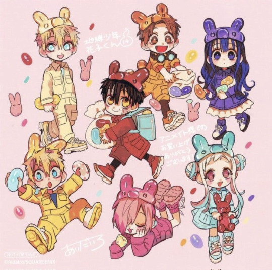
so all characters in jshk kind of have a color scheme, ex: nene’s is turquoise/teal, aoi’s is purple, hanako’s is red/sometimes amber etc etc.
(This picture helps show my point here)
And as you can see (kind of) akane’s colors consist of turquoise/teal and a rusty orange/sometimes straight up the color orange.

(Pls ignore shitty quality im doing this on iphone) Which if you look at it this has a striking resemblance to that of partly oxidized copper??
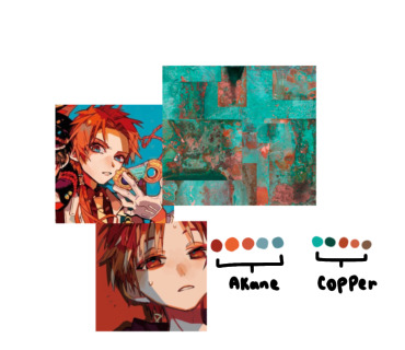
Moving on to teru’s color scheme, his consists of mostly stained glass blue’s and softer yellow’s (again, sorry for shitty quality 😭)
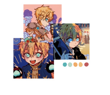
But if you look at it, his kind of looks like lightning?? (Or at least the colors lightning is usually depicted as, as it has no exact color)

And as we know, teru is associated with lightning, as he can literally wield it (sorry akane 💀)
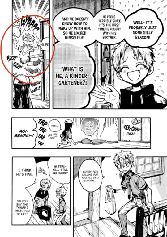
Quick chemical lesson coming from a science nerd, copper has a high conductivity rate and facilitates a rapid transmission of lightning energy, making it attractive to lightning, also making copper, lightnings best conductor (conductor meaning a material or device that conducts or transmits heat, electricity, or sound, especially when regarded in terms of its capacity to do this) meaning out of all the other chemicals + chemical compounds, copper attracts lightning the best.
and who in this case represents (and/or has the color scheme of) lightning and copper?

AIDAIRO SCIENCE NERD REAL???
Also tiara doing the same thing 😭 must just be like a minamoto thing LMAO

76 notes
·
View notes
Text
Papa's chasuble colours analysis.
It’s sad to see the fandom so sleepy, so what a better moment to be back with some ramblings…
So, we know each Papa got their own chasuble colour, but is it casually assigned?
In the Catholic church, vestments colours have specific meanings, usually they change based on the celebration or festivity period, so I thought it would be cool to find out if the meanings match in Ghost’s world too.
The colours used by our Papas are:
Papa IV - Blue: Advent. It is a period (usually 24 days) before Christmas. We witnessed his journey from Cardinal to Pope, with his ascension on stage; he basically reborn as Papa Emeritus IV. I think it would be a nice analogy to Christmas. Blue is also connected to the celebrations of the Holy Mary… I don’t think I have to say more.
Papa III - Purple: Lent. It is the 40 days period before Easter, when christians celebrate death and resurrection of Jesus… are you thinking what I’m thinking? Plus, purple is also the color of grief (death) in Catholic Church.
Papa II - Green: Epiphany/Pentecost. The Epiphany indicates many events in Catholicism, in particular the arrival of the Magis at Jesus’ birth, the event of his baptism and the Cana Wedding (that is also a badass painting of Paolo Veronese that the Louvre should give us back, btw. It is one of my life’s missions. They can keep the Mona Lisa.). So we have a birth (Year Zero), the moment Jesus becomes the “son of God” (Jigolo Har Megiddo, to say one) and a feast with wine (Body and Blood…?). The Pentecost is even more interesting; it is celebrated seven Sundays after Easter to celebrate the descent of the Holy Spirit on the Apostles, event that marks the start of the Catholic Church. Now, in 1966 Anton LaVey and Kenneth Anger founded the Church of Satan, declaring that year the Year One. Ghost did the Year Zero, which I always thought was a refer to both the christian Year Zero and the satanic Year One. In both cases, a birth/start is involved, so the birth of the Antichrist as main theme is on point.
Papa I - Red/White: red for Holy Week/Pentecost, white for Christmas/Easter/Marriage. It is often said that Primo represents everything that’s holy, so a refer to the holiest of Christian festivities would make sense to me.
I haven’t gotten into all the details because there would be too much to say and analyze. I don’t know if TF has ever planned all this, maybe not - even if in a last year interview he said he was planning the color scheme of the new era, so it shouldn’t be completely casual-, especially with the first Papas, but even if he didn’t his ass is lucky enough to catch some cool coincidences.
120 notes
·
View notes
Note
Good day to you Luna!
Ive always enjoyed how you deaign your characters from the use of shape language to the use of color.
I noticed that many of your designs have around 6-8 (and more on your latest) colors in use at a time. I was always told that you should work with a limited pallete when designing characters, but you somehow designs lovely characters "breaking" that rule.
How do you do it? I always get overwhelmed if i have more than 5 colors in a designs but usually it lacks the contrast and "pop" that your designs have.
Also when you design characters, do you start with a theme, their personality or their role in a story?
COLOR THEORY
This is a great question! So when it comes to color in designs; character/backgrounds/props, generally less is more. You pick 3 colors : 2 right next to each other ( analogous colors ) : 1 on the the otherside of the color wheel ( complementary colors ). From there you want to vary the value/saturation. So there's a dark color - mid tone - highlight (usually the complementary color).
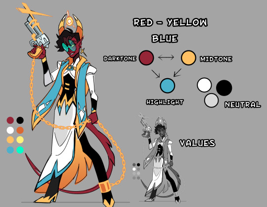
So It might seem like I have a lot of colors, but in actuality it's only 2-3 colors with varied saturation/values to create contrast.

You want a 2/3 ratio split of the analogous colors with the remaining 1/3 being the brighter complementary color to make little details POP. Now sometimes I will use 4 colors in a design, it still works because it's all about balance. I made a little crud pie chart for a general idea. Faye's main color scheme is blue -> green highlighted with red/purple/yellow. Her vibe is poisonous, and poisonous creatures tend to be colorful.
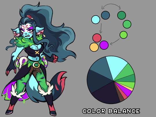
With the right balance you can make any color scheme work, you have to give each color their place, some are more dominate then others. If you make a design with every color 25/25/25/25 equal split, the design will come off as bland and nothing will stand out. But if you make it 40/40/20 suddenly that 20% stands out.

Thinking of palettes in terms of pie-charts will help out seeing the color balance in your design. Give it a shot if you're struggling with making your design pop!
#art reference#advice#coloring tutorial#character design#tips#ref#art#tutorial#coloring reference#color palette
605 notes
·
View notes
Text

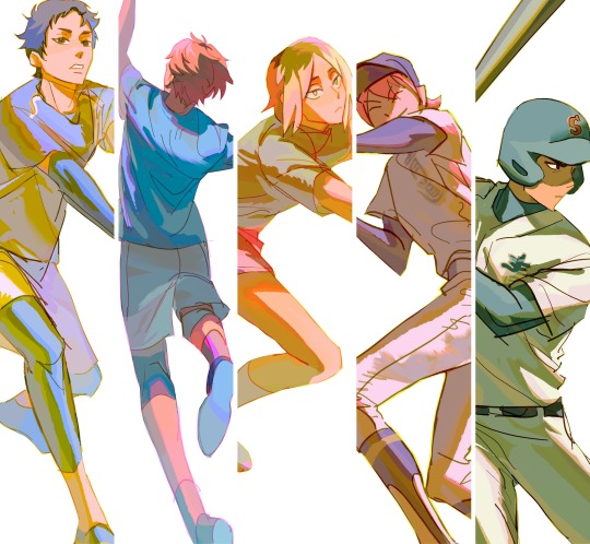
Explaining some of my color thoughts and process using this piece and my other recent figure drawings, hope it’s helpful to someone!
Setting up the drawing to color
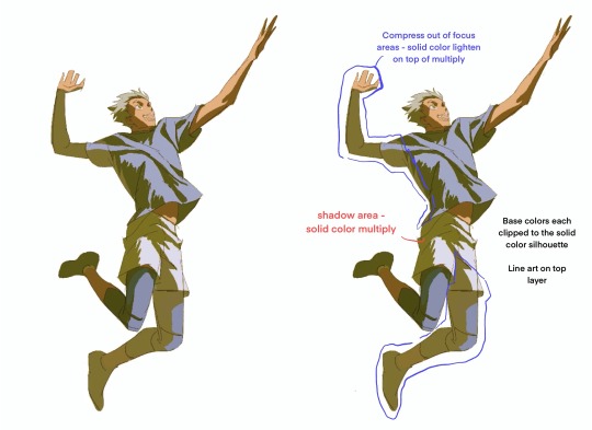
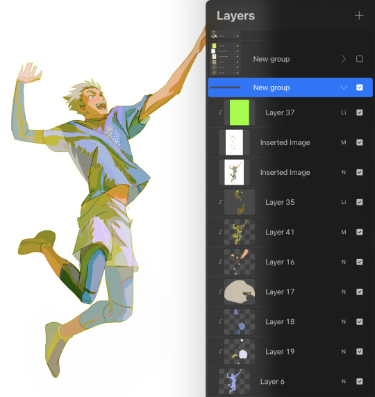
Final drawing layer breakdown from top:
Layer 37: lighten layer clipped to line art below
Inserted Image: line art set to multiply (because it’s non-transparent)
2nd Inserted Image: final drawing flattened (will explain why at last step)
Layer 35 : lighten layer to compress values for elements that receding and out of focus (back arm + leg for example) something like atmospheric perspective
Layer 41: solid color multiply for shadow
Layers 16-19: every element of the same color on it’s own layer clipped to the silhouette
Layer 6: solid fill silhouette
Color picking the base:
This is loosely what I think about rather than a hard and fast rule! This thinking helps me navigate when the colors don’t quite look right and applying a rule usually helps me work towards a direction I like.
When thinking of the light and shadow scheme:
Temperature: warm light & cool shadow or cool light & warm shadow?
Color schema: complimentary scheme? split compliment? analogous?
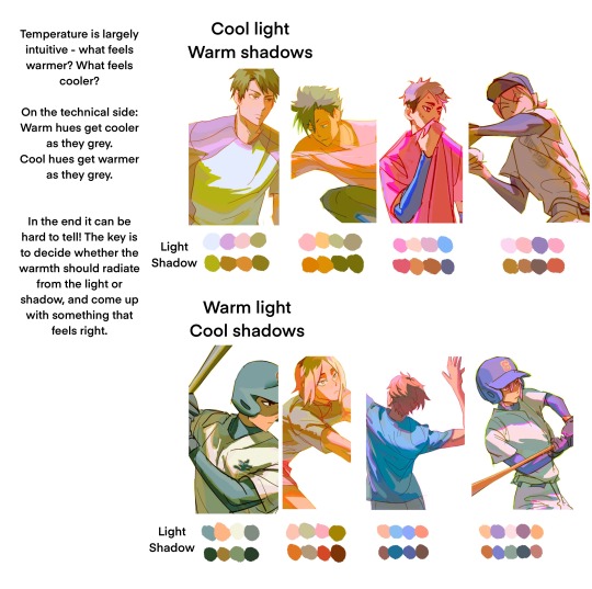

When picking the light color base:
Even in the light areas things have a light, medium, and dark local value
I pick colors that read as the right value of the local color at the right temperature for the light:

Coloring Shadow
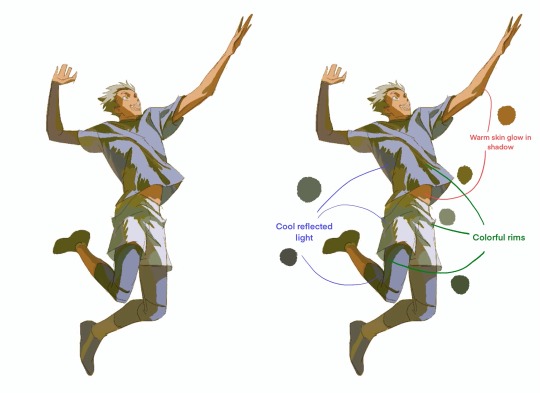
1) Reflected light into the shadow areas - typically I go for a colder and slightly lighter reflected light because in natural sunlight, the main reflected light is from the blue sky. Otherwise think about what the color of the surroundings are and reflect that into the shadow.
2) If the shadow color on the skin makes it look either gray or the wrong hue, true up the color of the shadow by making it warmer and more saturated and add warm reflected light to the shadows around it, such as on the shirt collar
3) Make the shadow colorful - add bright colors that are adjacent to the main shadow colors to make the shadow overall more colorful, and add colors that are closer to the local colors of what’s in shadow (such as blues to the “black” compression sleeves)
Keep value range within the shadow relatively close - as long as the value of the shadow is approximately uniform, the shadow area will read as a shadow
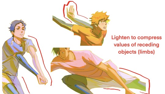
Lighten-layer areas for value compression/”atmospheric perspective”: I adjust the color of the lighten areas so that local colors show through or have a bright accent - it looks nice but doesn’t detract from the focus areas with higher contrast, and gives an opportunity to introduce bright colors.
Even in low value contrast areas, the colors are legible as light vs shadow because they generally conform to the temperature of the light and shadows

Glow - I like to add a bright rim to the edge of the multiply layer in a bright color that indicates the color of the light or local color if it was more saturated i.e. red, orange, pink, gold glow for warm lights, purple, blue, green-ish glow for cool lights
I don’t add this everywhere, just in the parts that I want to stand out more
Hue Variation
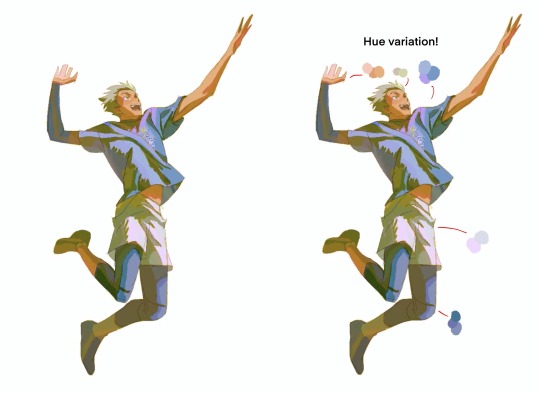
On the base color layers, I add hue variations to add color variety to the lights. Usually adjacent colors but sometimes something completely different to add interest. I can also add this on the lighten layer if I want the bright accent to read as more flat (like the hair accent).
I also add a lighten layer with warm red/orange on top of the line art areas that are in the light to add more glow.
In the end, if there are certain color areas that just don’t look right, I will just paint in the exact color I want on a new layer on top.
Finalizing
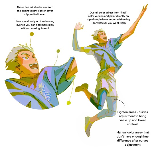
I export the whole image as a jpg when I’m generally happy with it, then mess around with it using color filters like the ones in the iOS photo app edit or whatever else. They end up showing you if you can push the colors brighter, which I like (I don’t always do this but it usually shows me something interesting I can try).

I import the image over the color but under the line art and apply general adjustments to it (curves, saturation, etc). This way you can mask out different versions of the full image to combine versions with different adjustments.
I also select certain areas by themselves and adjust them manually to fine tune aka paint over if some parts don’t look right.
I like to apply a lighten layer to the line art which is on multiply, and use a neon/bright color to give the whole picture a bright rim. It just looks cool but can add a slight bit of new bright color to the drawing along the line art, which is interesting and subtle.
And that’s it so far!
#my art#process#ask questions if you have i'm happy to answer!#i like having my processes written out in detail to look at later…workflow is like it’s own art I’m saving it and moving on to new ones!
1K notes
·
View notes
Text
Assorted FrUK/FACE Fam Headcanons
These are silly little thoughts I've had while drafting Migraines in Margaritaville, so these apply to the world of that AU (modern, human; FrUK parents raising NA bros in Massachusetts, US). Most of these involve food because I seem to think about them when I'm hungry???
• Francis and Arthur practice "one-parent-one-language" with the boys. Matthew took to French much easier than Alfred did, but both brothers managed to pick it up without much of a fuss. In elementary school the twins would use French to cheat on tests (they weren't allowed to sit next to each other after their schemes were discovered).
• Arthur set the grill on fire three times in one summer. Francis clearly doesn't learn from his mistakes and Arthur is too stubborn to let Francis do all of the work when it comes to preparing dinner.
• Follow up on the point above -- Arthur can prep vegetables and throw together food that doesn't require too much measuring or too many steps on the stovetop. He doesn't have the patience for most dishes and doesn't have a sense of what spices go well together/what is enough vs too much. Francis lets him help by chopping up vegetables and Arthur was usually the one to pack the boys' lunches. Sometimes they'd get leftover portions of whatever they had for dinner last night, but Arthur often defaulted to some sort of wrap with deli meat and assorted veggies/crackers for snack.
• Francis gives me similar vibes to those youtube moms who try to make homemade versions of popular American snacks. He may spend the weekdays at work in a kitchen, but on the weekends he's at home, still in the kitchen, trying to make homemade fruit leather and homemade cheese crackers for his sons.
• Arthur's the one more willing to let the boys get snacks from the store or take out. Francis is very much "we have McDonald's at home."
• Both Francis and Arthur would've been so excited to decorate the twins' nursery. They're both artistically inclined, be it in different ways. Arthur made blankets for both of them; Matthew is red and Alfred is blue. Francis paints floral designs on the furniture, in particular purple irises and both red and white roses.
• Because the twins were identical and because babies are kinda just blobs, they definitely accidentally mixed the twins up. The color coding might've come after the swap. They had a crisis about it. Francis "sacre bleu, we just gave two people permanent identity crises" Bonnefoy and Arthur "if we compare them to every picture we have of them we can figure it out" Kirkland. I'm imagining this happening before the twins have enough hair for their cowlicks to really form.
• It's tradition in the Kirkland-Bonnefoy household to have a box of Whitman's chocolates at every family party and Alfred is the reason why. One Christmas each twin got to pick out something special for the party and Alfred picked out the 22 piece Whitman sampler in the yellow box. They're not the best chocolates, but it became a tradition. Thankfully there's two layers in the box so Mattie and Al can have their own messenger boy pieces (the shaped chocolate that's the centerpiece of each layer).
• Neither Arthur or Francis have favor for one twin over the other. They both have their own activities they can do with Alfred and Matthew separately. Francis will cook and bake with Alfred and draw with Matthew. Arthur teaches Matthew to garden and watches old (by his son's standards) movies with Alfred.
• Francis is the parent the boys can come to no questions asked. Arthur isn't apathetic, but Francis is more inclined to give more thoughtful advice for relationships and general fuck-ups. He won't press on why or how something happened, but will help his sons figure out the best way to solve a problem.
• When Alfred and Mattie turned 10, Arthur wanted to teach them the importance of personal finance. He would give the boys $5 each week to spend on snacks at the grocery store (Arthur does the couponing and the shopping for the house). They were allowed to hold onto the money to use for later and could help with the couponing.
• Arthur drags the family out to Salem every Autumn. Sure, they live in Massachusetts and are well aware of how bad tourist season is, but he's fascinated with the city. Alfred initially went because he really liked this one New York style pizza shop in the Witch City Mall (how they got Francis to step foot in there, I don't know), but eventually grew interested in the witchy stuff Salem has to offer. Francis only puts up with it because the city has an art museum and weekly art fairs in the Fall. Matthew dreads their yearly trip. He loathes it. He'd rather tag along with Francis to the museum.
• Until the boys were old enough to start protesting, they had family Halloween costumes. Francis thought it was tacky, but saw the appeal when Arthur got the twins (still babies) all dressed up in lobster costumes.
#that second to last one is really self indulgent#hetalia#ヘタリア#hws#hetalia headcanons#migraines in margaritaville#fruk#na bros#face family#hws face family#hws france#francis bonnefoy#hws england#arthur kirkland#hws canada#matthew williams#hws america#alfred f jones#floralcrematorium writes
141 notes
·
View notes
Text
Ooooookay! Hazbin Hotle redesigns....but not really? Honestly, it's just me drawing them in my style, but they could be considered redesigns, I guess, specifically Charlie

Uhhhh I guess we start form left to right sooo, Emily!
Right, so, Emily is obviously a fallen angle. Thiguht this isn't her fallen look, since we already kneo what she looks liek with wings and a halo I didn't think about making a 2nd version of her without the demon disguise- but maybe I should
Either way, I kinda kept her original dress, with the symbols and what not, I feel liek blue and purple really suit her so, indigo
I tried to add red to her, but it just didn't look good. It gave me an eye strain.though her till and horns have a sort of dark magenta color going on
I wanted to add more 'freckles' cause, thier cute, and I have a bunch of freckles ove rmy arms and legs and face and stuff so, added them to em, I put a few on her ears and tail and horns to
Gave her gold buttons and fishnets on her arms, i forget what their called cause they are cute, and I like Athnek(?) Posts about Emily and uh, goth Emily, I think, is pretty cool and so boom, fishnet glive things- I gitta look up what there called
Lso ehr shoes look liek dolphins, which I didn't mean to do but it happened and I've accepted it
Next is Charlie!!
Um. Obviously, Charlie is the most changed from her canon design, I relaly like her hooves and others redesigns of her looking more liek a goat
Originally, I was just gonna add gaot ears and stuff, but the more I thought about it, the more I liked the idea of her having fur soooo tadaaaaa~
I gave her a little red stripe between her eyes and fade on her legs and ears to match Razzle and dazzle, and since lucifer was a high angle a seraphm/archangels hoenstly I dotn see a difference. I gave her some white freckles as well to sorta, show that connection
Also, toe beans! If she has claws, she can have beans, I think that Emily would have a normal human hand while vaggie would have little soft spikes on her like moths do, tho that's not shown
I also drew charlies wings cause it's cnaon she has them, and I wanted to play around with the demon/angle wing/s she could have, my irl friend K helped me decide which one to choose
I also drew her leg so you can see the fade in full. Side note that her belly has the same cherry red fur
I also added some chest fluff because why not?
As for her horns, I kept them the same color but added rings like Lilith has to show a connection between them. She also has her mom's eyes and heart tail point. I wanted her to have some demon stuff out just cause, she is a demon, she should......also realizing just how long I made her tail-
Uhhh, oh, right, side note, which I'll have to make a separate post about, Lucifer/eve/lilith are all dating each other, and Chalrie is all 3s kid. Eve is where she got the goat aspect from, inckuding horn shape, her scaly tail, snake fangs, red cheeks and color scheme over all are from dad, and Lilith is where she got her eyes and horn rings and heart point from, and beans to I guess
Maybe I should make a gene sheet one day; I gave her Jean shorts, like how I usually wear just cause I didn't want to add too much red or black
Okay, vaggie time!
Vaggie is the least changed. The most I really change about her is how her wings look. Her hand snow has soft spikes like moths do, and her hair
I do think when she fell, she got more demon aspects, but since her wings were torn off, she doesn't have to many physically other than fangs and the spikes
I also made her hair shorter because please, nobody has their hair that long!! or if they do, then I've never seen them!
I know it's a show, but it was driving me crazy! I'm not that skilled at draw front view bodies yet, so if vaggie looks off I'm sorry:(
Play that should be it!-
Oh wait, hold on, right. The reason they have gold rings/objects on them is because in term software demon courting their all technically married, okay bye-
#hazbin hotel#hazbin hotel au#hazbins fallen au#hazbin hotel vaggie#hazbin hotel emily#hazbin hotel charlie#chaggie#chaggiem#chaggily#charlies angels#pleas ask me abotu that last part#im MORE than happy to explain#i finshed this a while ago actually but kept changing it and adding things to make it better#Al in my style/redesign should be next. only cause K asked me to dra whim and wince i did i might as well digitize it first#hazbin hotel redesign#kinda#really its jsut in ym style + headcanons/au
42 notes
·
View notes
Text
The Color Language of Phantomarine
At just a cursory glance at this webcomic, it is very obvious that there are strong colors and that they will be tied to themes of the story. And the impulse to discuss and dissect them is.... far too great.
So! Let's start with something general, yes?
Saturation
There are two types of color schemes in the webcomic so far. Schemes with brighter colors and additional accents, and more muted colors with much more limited value differences. Practically speaking, more saturated colors and visual interest helps to draw the eye to what is important; like black thick lines around animated characters to distinguish them from the background. But.... we have a group of characters who has changed from a background scheme to a main character scheme. Such as....


...Our Favorite Princess.
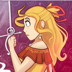
Three different color schemes for three different Phaedras. The first muted yellows and browns, almost boring against the intense lighting of the Candlelight Sea and its foreshadowing hues. The second an intense yellow and terracotta red that hold up against the maroons and deep reds of the Red Tide. The third, blues and white like the very sea she was looking down at but saturated and darkened with indigo and purple unlike any of the other sea ghosts we have seen before.
The transition from background color scheme to VIP color scheme coincide with the very critical moment of the Princess meeting Cheth, demonstrating that her death is a critical moment plot-wise. Her transition to a completely different but still VIP scheme is when she realizes exactly what has happened... and we see that it changes her outlook down to its core, all the warm colors replaced with cool tones.
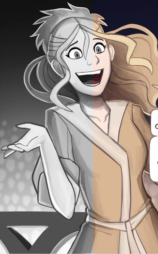

So, a characters' color scheme tells us both how important they are and can clue us in to their mental states and affiliations. Nothing new. Let's see those groups!
Cheth

As the Red Tide King, it isn't surprising that his color scheme is dominated by a bright red, mixing into warmer purples with highly contrasting white and black. This color scheme overtakes the muted blues of the sea ghost, as well as marking them with his tattoos. White is the secondary color closely associated with Cheth in-story, representing bones featured both in skeletons and his original divine body the Bonefish. This sort of color pallet usually infers more sinister intentions, with red commonly being associated with aggression, but I believe in this case it implies passion. Not necessarily romantic passion, mind, but a deep level of involvement and care.
The Plume Church

Black and bright turquoise and blue with touches of white and green, Cheline and the institution worshiping her are perfect foils to Cheth in color scheme; the cool colors of the Goddess of Life oppose the warm tones of the God of Death while still being unique against The Candlelight Sea. I imagine the black represents the ashes left in the wake of her fire and the greens and blue new life growing from it, though the predominantly black robes are not the usual choice for a Life Diety. The very liberal use of black also paints a more sinister color scheme, with it's traditional use to imply 'evil' in villains. As of writing this, I do actually think that is the intention.
The Mantaluna Crew
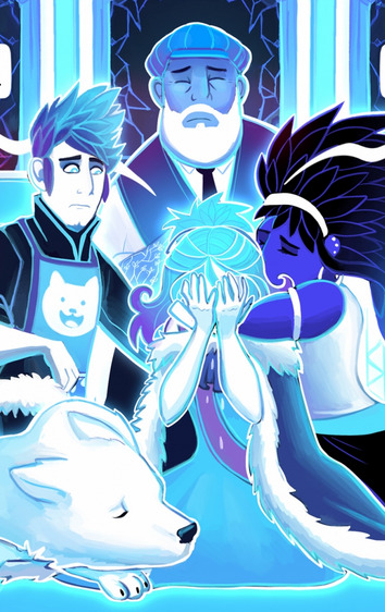
Being Seaghosts, the group's scheme is focused around a cool blue, but with more saturation and variation than other seaghosts to represent how they still have some life in them yet. Their cooler colors also allows them to contrast starkly with Cheth, but the purple gives it just a bit more warmth than the Plume Church, showing that while the crew may follow their Church's teachings.... they are fundamentally different on some level than those who have tied themselves closer to the Church.
Pavel, Vanna, and the Lodestars

Characterized by yellow with accents of white, red, and black, the Lodestars stand out. Being the third primary color, they easily stand apart from both Cheth and The Plume Church, showing they are not tied to either. Yellow appears to be the 'neutral' side in this diefic-level conflict, with Best Boy Pavel trying to be a mediator and Phaedra from Chapter 1 treating Cheth with more empathy than in the current chapters when her color scheme was strikingly similar. They do not have a side: they simply want what they think is best and try to stand as a beacon against the dark.
The Fata Morgana

Monochromatic with only lighting and their pale pink eyes for color, these enigmas stand apart as blank voids against the rich vibrancy of the rest of the Candlelight sea. The dominant white with bone-like designs implies a closer relation with Cheth than Cheline, though the exact nature is still up for debate.
Seaghosts

Another monochromatic and muted color scheme, the seaghosts of the Candlelight sea are a pale blue with some white to outline and to fill the eyes. A traditional scheme for spirits, hostile or otherwise, and it blends nicely with their home in the ocean, truly making them feel a part of it. Their cooler color scheme also allows the Red Tide to stand out beside them.
I have a few special mentions that are not fully flung schemes of their own, yet, but that I feel need mentioning.
Silas, though we have yet to see him in different lighting, has the Plume Church's signature blues and greens catching in his hair, with the rest of his pallet being a background tone with little detail. Almost like a certain bird's words have wormed right into the head of 'some nobody' and he all too eagerly listens for the boons she promises.

Daphnie and Euphamina also share a muted color scheme, tending towards the golds with purple to show their high status. Though this is their funeral dress, Daphnie having the black on top covering her own warm and regal colors while her mother instead covers the black with yellow and dons spectacles of a familiar red seem to hint at how the Plume Church interacts with them. Daphine is being covered and almost smothered, though her pure intentions still peek through; Euphamina cannot get away from the influences, but has found ways to assert her will.

Speaking of the funeral, we have a mystery bean with their very own VIP color scheme with cool, deep blues that we have yet to see used elsewhere.

Finally, we have Amos Ellery. We also do not know much of his color scheme sans funeral, but I believe his color scheme hits at his own motivations, similar to Silas. Whereas Silas's colors were seemingly very average for persons in Saperport, save the little highlighting of his hair, Amos is all black, white, and grey. His course is chosen not because of promises, nor because he agrees with the Church... they are driven by the Church being the only thing 'correct' to follow.

I hope you have enjoyed my ramblings, the pretty colors, and any snippets of a story you saw. Do please go read and give the author all the support!
#phantomarine#color language#the long anticipated sequel longpost!#some of these likely border on crack theories but it was fun#phantomarine theory#spoilers
88 notes
·
View notes
Text
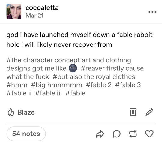
realizing i never elaborated on this. so basically i thought reavers color scheme and fable 3 was odd cause white and black is an odd combo for steampunky colors esp if there isn’t a lot of brown. but they’re also too drab to be flamboyant reaver colors and like, it’s just a weird color combo. anyways i fell into a rabbit hole about colors in the victorian era and their common usages and white, black, and purple are all common mourning colors. sure i guess you could argue that these colors on the characters represent wealth and prestige but if i was reaver and the bestie died, id be dramatic as fuck about it too. anyways there’s a lot more under the cut so fuck it
disclaimer I know fable 3 isn’t explicitly set in the Victorian era but it takes a LOT of inspiration from early Victorian/Industrial era Britain, enough so that I feel its fair to interpret through that lens.
Reaver
Men’s wardrobes were often fairly muted with some browns allowed, and colors would differ depending on the period of mourning you were in (black> black and grey> black and white> black/white and purple> normal colors again)
also important to note that the mourning period would change based off of how close you were with the deceased. Mourning could be anywhere from a few months to a few years.
Black silk top hat with a seven inch crepe (the band on the hat) that is either black, grey or beige.
His clothes are all white with black trimmings which would have been common half mourning attire
ALSO his undershirt under his brown vest is black. Which is also just uncommon in the Victorian era and also in fable 3 lmao, no one fucking dresses like him
his cravat is also black which you literally do not wear unless you are in mourning. Its weird
Like sure you can say he wears white cause he’s a factory owner and is able to stay clean cause he’s rich, but who shows off their wealth in the dullest, most drab colors. All the other nobles walk around in the brightest, most vivid, eye assaulting color combinations, why is he different. Here are some examples of black and white half mourning and quarter mourning attire.
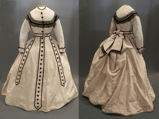
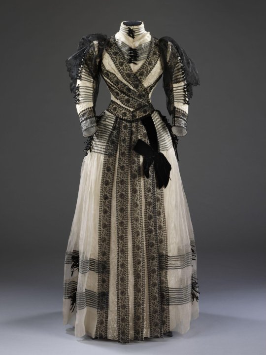
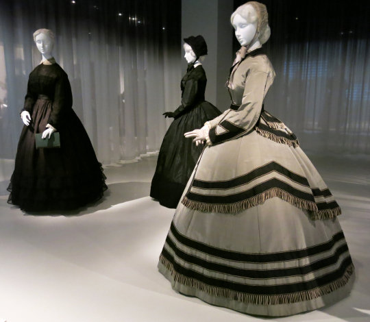
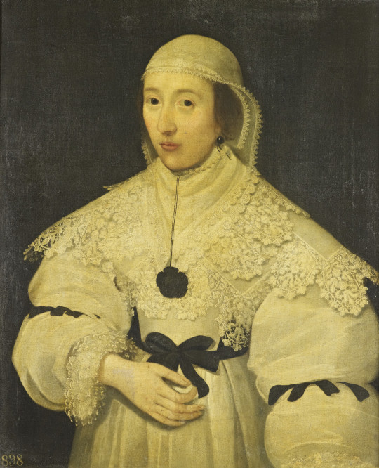
Most of the examples are women’s clothes because um, Victorian misogyny and women being expected to mourn longer while men were expected to be breadwinners and provide for their families. But if you read through old magazines and guides from the time you’ll find that men also wore similar clothes made with the same colors and materials, just usually for a shorter period of time.
In conclusion you can interpret this as however you like but personally I like this idea cause his clothes are just so ugly otherwise.
Little bonus to talk about the HOBW and Logan because they both wear purple and you could fairly interpret that as “oh those are royal colors” “purple is meant to be a neutral color opposed to blue or red”. But look.
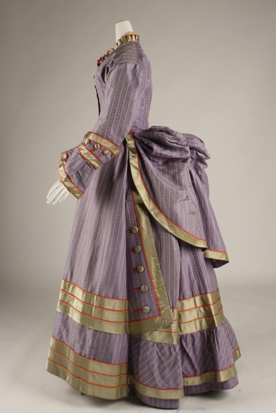
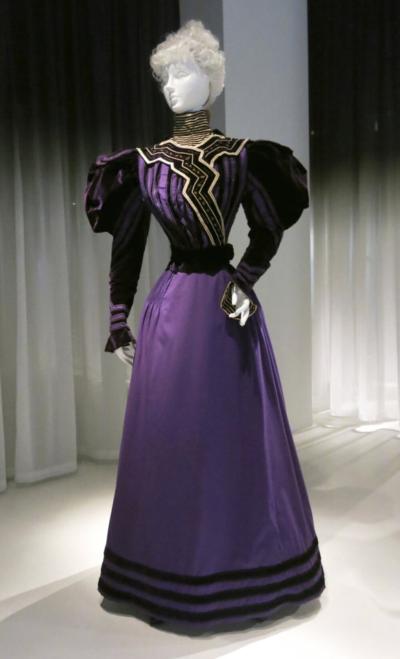
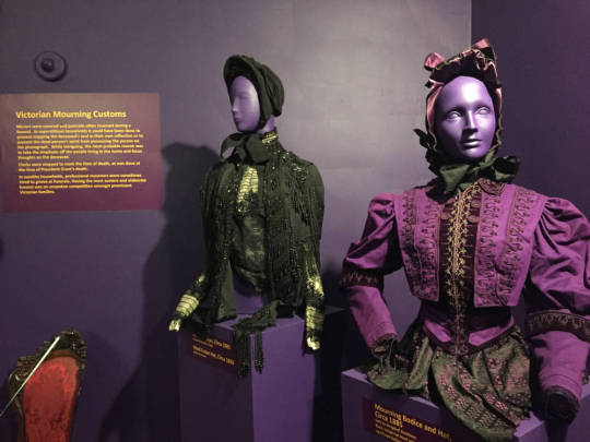
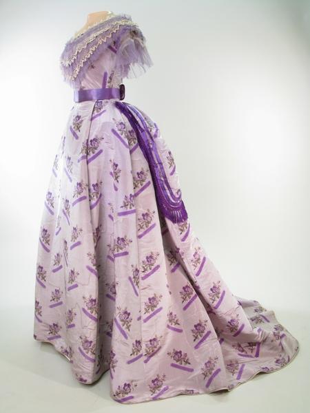
Purple, specifically purples with white were often worn by the children of the deceased while in mourning as drab colors would raise an ‘unpleasant child’.
115 notes
·
View notes
Text
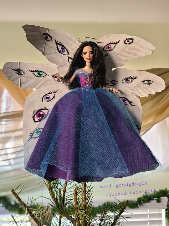
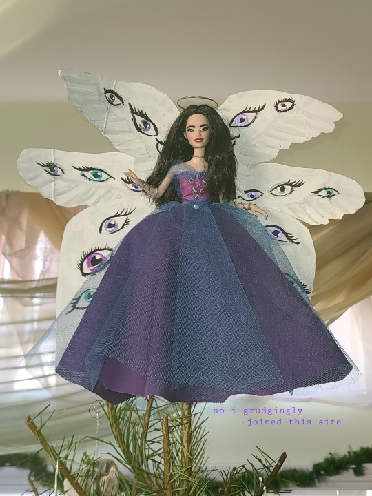
Here's an unusual custom doll project for me: a Christmas Angel!
Component parts and some fun facts about her under the cut:
Head: Tennis Player Barbie, makeup repainted
Body: 2015 Fairy Godmother Barbie, nails painted
Dress: scrap fabric and rhinestones
Jewelry, halo, and tree-attachment component: armature wire, with tissue paper to puff out the dress
Wings: recycled cereal box cardboard, cut and painted with acrylic paint. The eyes are metallic color-shift paint that changes color based on lighting and angle; this is difficult to capture in photos
Fun fact: her components are mostly the scraps left over from a VERY different doll that's been a few months in the making for me...
It was a challenge for me to make this doll, for a couple of reasons. One was that whoops, I had a time limit so that the family tree would have an angel this year (the old one, which is older than me, had reached the end of her service life this year). As a result I rushed to complete this doll in four days, when dolls usually take me weeks to prepare! I feel her level of detail is impressive for the time constraint.
The other challenge was that my mom insisted it be a CHRISTMAS angel, and not only is Christmas not my usual aesthetic, but I didn't have red, green, or faux fur to go for the easy Christmas aesthetic shortcuts! She approved the purple-blue color scheme as "appropriate enough", and I worked from there, using Disney Princesses and 90s glam Barbie looks as my references.
I really loved getting to paint all those eyes on the wings!
#custom doll#custom barbie#ooak doll#ooak barbie#art doll#christmas angel#christmas tree angel#christmas#christmas decoration#art#original art#my art#original post
56 notes
·
View notes
Note
uh hi can you give some shading tips? pls?
Sure! :DD
I think the easier way to give some tips is by showing my own process.
(I won't explain here the basics of shading, but if you want I linked a tutorial down at the end of this.)
First off, the program I use is Krita (but any program is ok 👍✨)
And here's the brushes I use:

I'd say use at least two brushes. A soft one and a harder one.
To show you I'll use this doodle I did of Murder!Sans (by @/ask-dusttale)
First, flat colors.
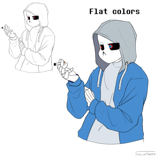
Then start shading on a new layer and put it in Multiply mode, then change the opacity at your liking.
Don't use black for the shadows! Use a dark color.
I usually use a purple or a brown.

Now with the same color, go on a new layer (Multiply mode), and add extra shadows where light has trouble reaching.
This gives more depth to the drawing.
(To make this process easier I use the Select Opaque option, by right clicking on the Base Shading layer, down in the menu, and then paint on the new layer)
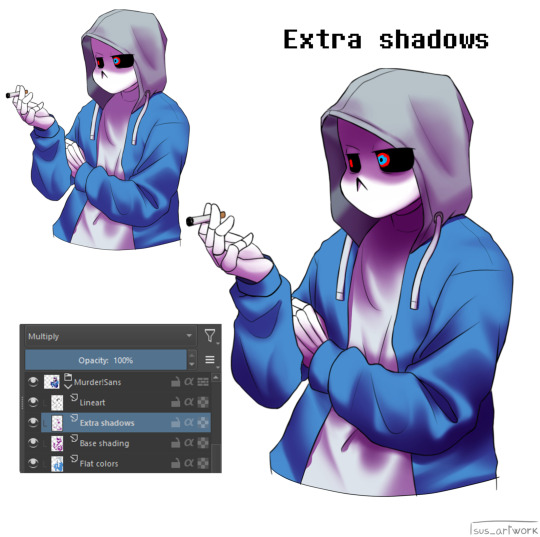
Now fill the canvas with the light's color (or do like me and duplicate the Flat Colors layer, and recolor it if you want the light to be only on the subject).
I'm using yellow since it makes a nice contrast with the purple.
Put it in Pin Light mode and change the opacity at your liking.

Aaaand
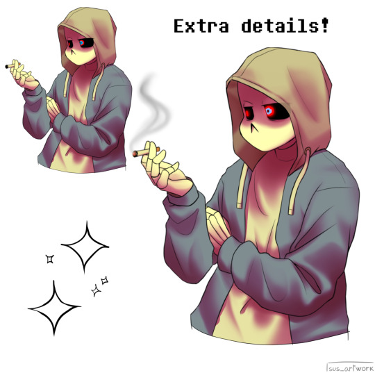
You could say finished!
We could stop here, but if you want some extras, go under the cut:
-EXTRA-
Now I-
I can't explain what "Bouncing Lights" and "Sub-Surface Scattering" are, so... go see on internet :''D
Basically slap some red and blue over the shadows layer in Overlay mode and voilà
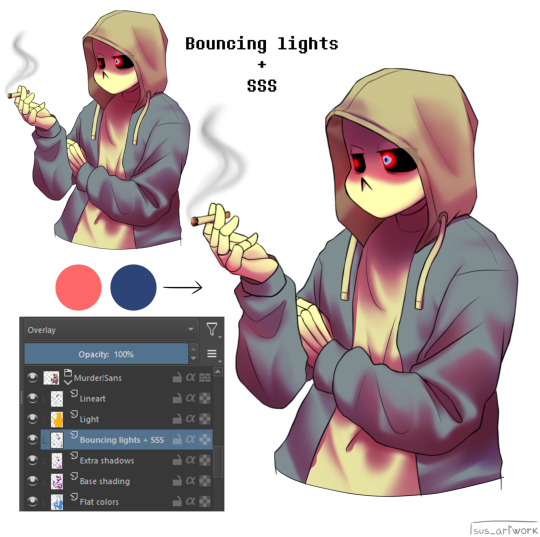
It'd be more noticeable with less light but trust me, it's good
Now let's talk about ambience.
We can create many different scenes just by playing with the light and shadow layers!
Change their colors, change the blending mode, play with 'em and see what you get:
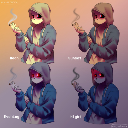

Also I suggest studying how color schemes work (I'll link you a video down below).
I uhh actually kinda suck at color schemes XD but having at least a basic understanding of them it's useful.
And, here's some tutorials that personally helped me a lot:
Shadows and lights tutorial/tips <- great for learning the basics of shading
Time saving shading solutions
This great rendering tutorial by @/licollisa
Different color schemes
For any questions don't hesitate to ask me (^w^)
#ask answered#miramoonli#undertale#undertale au#dusttale#sans#murder!sans#dust!sans#art tutorial#drawing tutorial#art tips#drawing tips#shading tutorial#coloring tutorial#rendering tutorial#This was oddly fun to do :D#maybe cause I LOVE shading. It's my fav part of drawing#Also Murder is fun to draw-#You know whose fault it is XD#This doodle was to practice drawing hoods tbh.
118 notes
·
View notes