Last Seen Blogs
hihereami
Ami's art corner
reyofblack
reyofblack
karenfordonte
Caring For Donte
cultts
feel it still

lifeskillsmed-blog
LifeSkills Medical Inc
Text
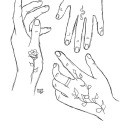
Photoshoot outtakes


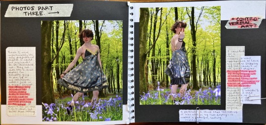
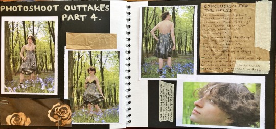
Photoshoot to follow —
These were either duplicates / some photos that I didn't include for the final exhibition. I had taken loads of pictures, so obviously had to narrow the choice down for the real thing. I still wanted to document these somewhere though — good photography practice!
#photography#portrait#fashion#fashion photography#portraitphotography#bluebellwoods#bluebells#bring back manly men#toxic masculinity#men in dresses#makeup#men in makeup#straight#lgbtq
4 notes
·
View notes
Text
Designing my own dress fabric
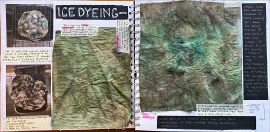
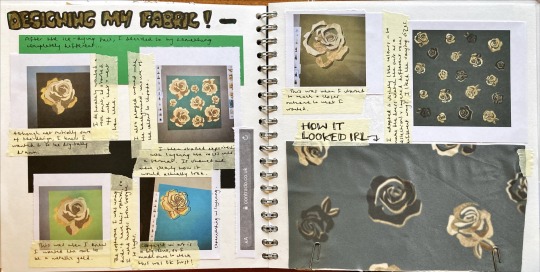

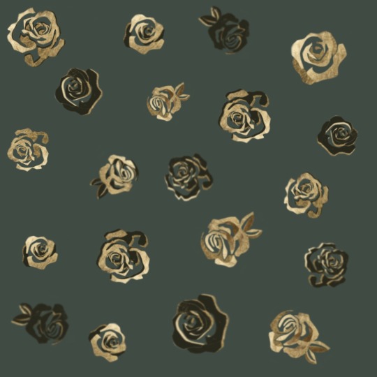
To show more of a diverse range of skills, I wanted to create my own design for the dress fabric. At first I wasn't sure if that going to be achieved through ice-dying or digital design, so I experimented with both. I ended up not liking the ice-dye samples, so went on to experiment with my drawing tablet. I knew I wanted the fabric to display roses and be of a green colour to match the jacket, so I just ran with that!
The fabric bought was from contrado, a delicate silk.
#textiles#contradouk#textilesdesign#roses#gold roses#green#fabricdesign#digital art#artfoundation#foundationartanddesign#art#long dress#drawing tablet#flowers#floral#nature#silkdress
4 notes
·
View notes
Text
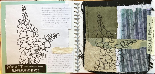
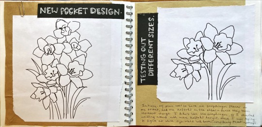

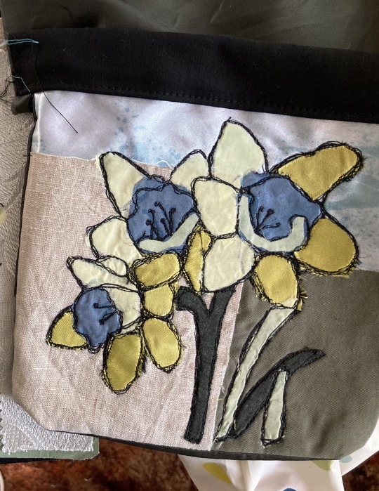
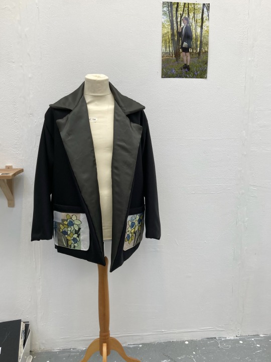
Pocket design for my suit jacket.
It was my first time trying free machine embroidery so there were a few trials that I didn't end up using / liking. Learning from these, I chose to put daffodils on the pockets as they symbolise change. I was heavily inspired by the work of Mandy Pattullo — reworking old, worn fabrics to create something new and beautiful. I gathered scraps of fabric from the textiles department and layered them together, using bondaweb and stitch to secure in place. (Second pocket is not properly shown but the process was the same).
The only bad thing about the pockets is that all of the fabric made them super heavy! This meant that they pulled the jacket down in a bit of a weird way, but an ironing helped.
#pocket#sewing#daffodils#foundationartanddesign#artfoundation#floral#flowers#suit#suit jacket#alexander mcqueen#snapdragon#bernina#sketchbook
11 notes
·
View notes
Text

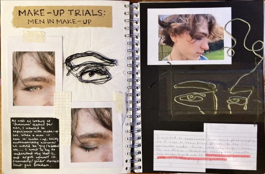

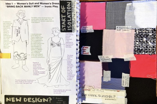
Topic change — I started looking at men's fashion, particularly "feminine" clothes. This led me to explore more of stereotypically unconventional gender / sexuality norms: straight men in make-up and dress...
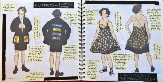
From here I started to design my own clothes! The last 3 photos show an evolution from casual to formal wear. I changed my initial ideas as I didn't feel they were interesting enough for an exhibition OR to convey my message. I felt more confident with the concluded designs of a suit and dress.
#men in dresses#bring back manly men#gender#gender norms#straight#lgbtq#we live in a society#artfoundation#foundationartanddesign#textiles#art#sewing#fashion#fashiondesigns#florals#roses#daffodils#embroidery#makeup#men in makeup#harry styles#history
6 notes
·
View notes
Text
Ethics and Moral values in art

Many people love art for the freedom it provides through expression — it is often said that “a picture can paint a thousand words.” With many mediums at an artist’s fingertips, the creative possibilities are endless. Art can be produced around any subject matter, but it is debatable whether some topics shouldn’t be permitted. With such liberty, should there also be moral responsibility?
“Myra” by Marcus Harvey is an interesting example of blurred lines within ethics. This large painting was created in 1995, resembling a greatly magnified version of a photographic image. The woman displayed on the canvas is Myra Hindley (the person held accountable, as well as her husband, for The Moors murders). The victims consisted of five children, which the painting boldly comments on through thousands of tiny handprints, layered to portray one big visual. These small handprints are reminiscent of an “innocent child”, which the artwork consciously juxtaposes through the large canvas portrayal of the “depraved world of adults”.
Understandably, this is a very controversial piece with much to be said about it. Some people support it, describing it as the single most important painting in the show: “a very, very cathartic picture… It is an incredibly serious and sober work of art that needs to be seen.” Others saw it as glorification and were angrily provoked, causing the press and public to comment before the opening of the exhibition: “Myra Hindley is to be hung in the Royal Academy. Sadly it is only a painting of her”.
This is of course only one example, but clearly demonstrates the diversity of thought. Morally dubious artworks have always been, and will always continue to be produced. Due to differing opinions, people will always have dissimilar views regarding what is and isn’t acceptable to be published. Personally, I do believe that it is appropriate for the artist to consider their audience and what they are publishing in the world. There is a fine line between art that handles a sensitive subject matter to spread awareness, or to just glorify and promote disturbing matters. Ultimately, an artist is still a human being and a part of the social, moral world. This would therefore suggest that actions as either an artist or ordinary human is not to be exempt from following the same guidelines or moral scrutiny.
[ Sources:
- https://en.wikipedia.org/wiki/Myra_(painting)
- https://en.wikipedia.org/wiki/Moors_murders ]
#myra hindley#art#controversial art#ethics#arthistory#painting#canvas#photography#children#artfoundation#foundationartanddesign#artanddesignfoundation#exhibition#sensitivity#society#creative#art analysis#analysis
7 notes
·
View notes
Text


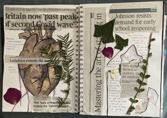
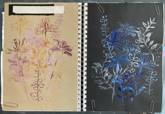
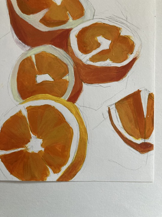
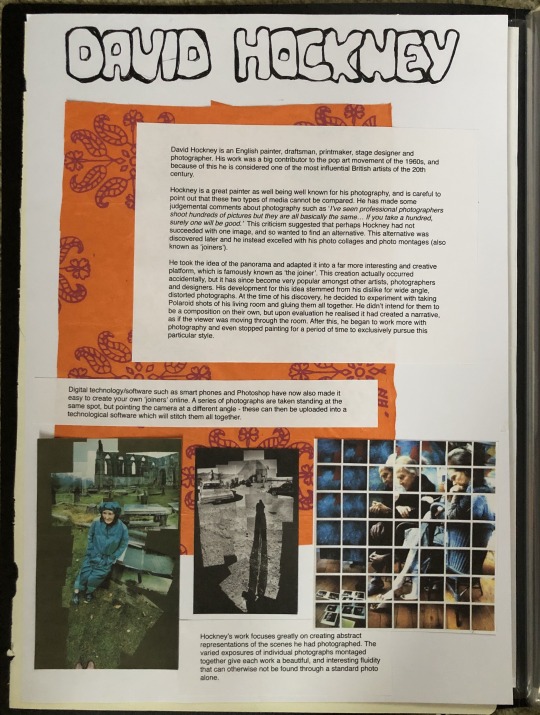
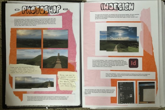
FAD Weeks 1 & 2 — Photo dump of some of my sketchbook pages (not all finished) for when I was looking at 'nature' as a theme.
It's not directly linked to my current topic, "Gender Equality within Fashion", but shows development and has inspired some ideas for floral clothing designs.
#nature#flowers#orange#photography#davidhockney#printmaking#linoprint#flowerprints#maps#urbanfashion#urbanstyle#heart shaped#covidart#coronavirus#boris johnson#church#art#art and design#painting#acrylic#sketches#birds nature#starlings#european starling
21 notes
·
View notes
Text


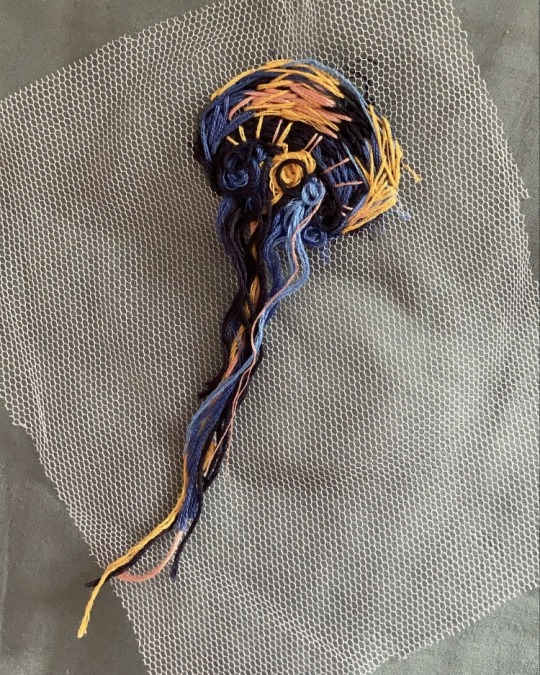
A close-up view of the jellyfish embroidery I was working on a few weeks ago when exploring 'nature' as a theme.
#jellyfish#embroidery#foundationartanddesign#art#artanddesign#artfoundation#thread#needle work#stitching#valerie tulle#fabric#sewing#textiles#weavingloom#nature#nature embroidery#colour#blue#orange#embroideryhoop
43 notes
·
View notes
Photo
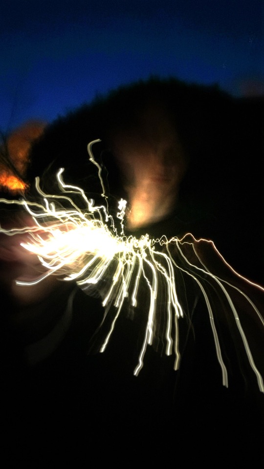

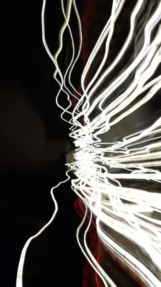
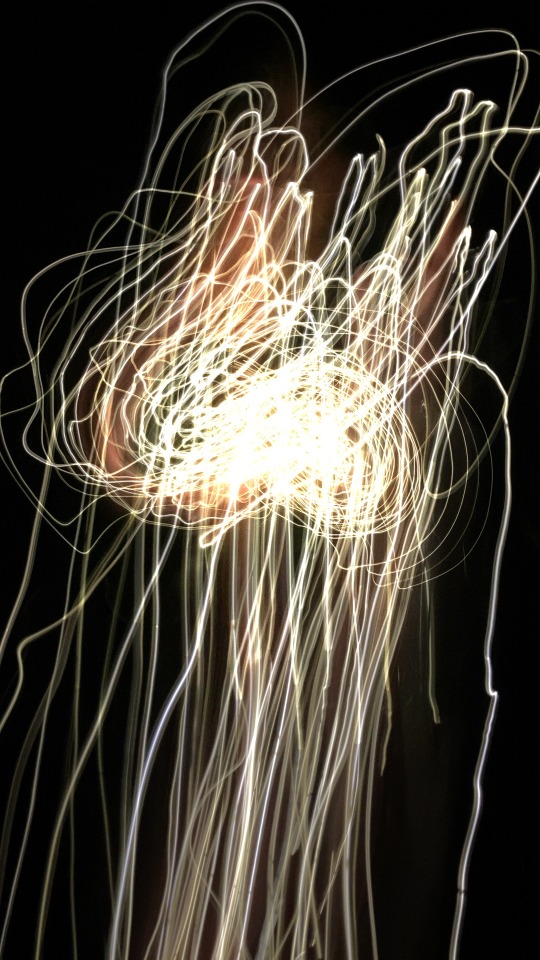

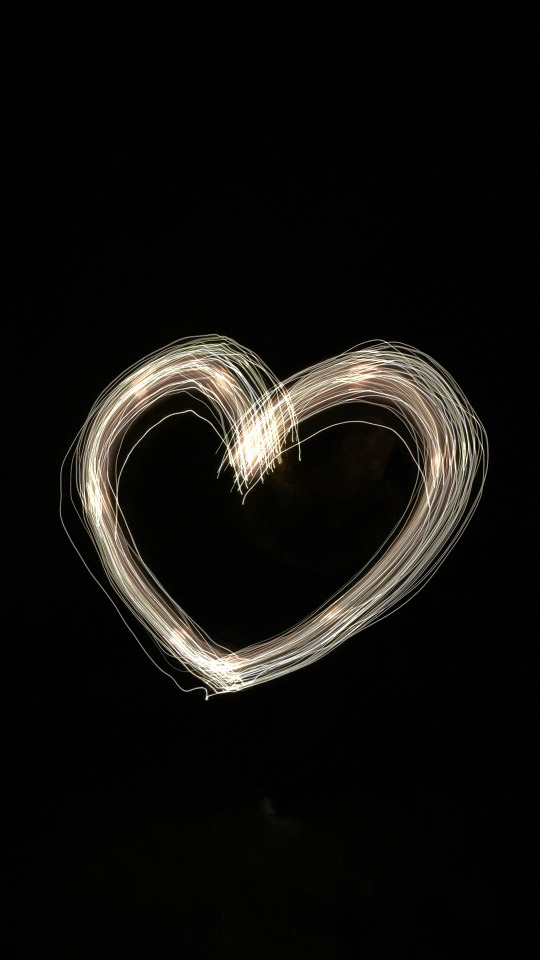

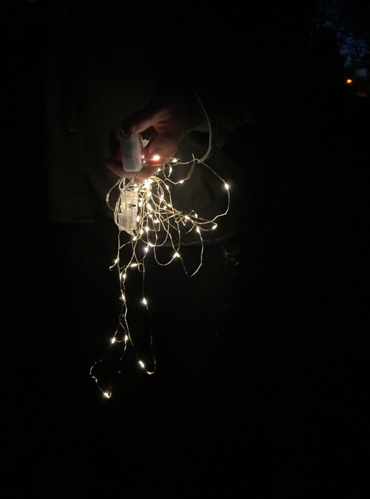
Drawing Week!
Here’s my attempt at experimenting with light graffiti in photography. The concept was fairly new to me so I tried to rely on creating more simple, sporadic shapes. It was pretty difficult to do successfully at home without any proper equipment, but was fun to try.
#photography#lightphotography#photographyworkshop#drawingweek#foundationartanddesign#strodecollege#light#fairylights#camera#longexposure#nature#natureart
5 notes
·
View notes
Photo
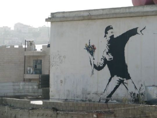
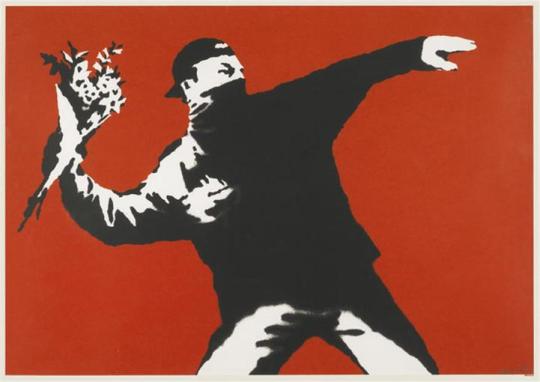
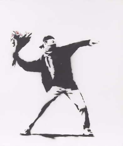
Art History #13 — War & Conflict // 17/01/21
Love is in the air, also known as the Flower Thrower, is an artwork by Banksy that was initially displayed in 2003. It appeared as a large graffiti art wall stencil in Jerusalem, not long after the development of the West Bank Wall. The imagery included is said to be reminiscent of protestors in the college riots during the Vietnam War.
The figure within the art work is shown to be learning backwards with one arm out, as if preparing to throw something forcefully. The bold, red colour utilised in the 2003 print likewise further emphasises this underlying suspicion, heightening the depiction of the image to a frozen, vicious moment. However, this notion of violence is immediately dismissed through the bouquet of flowers held in the man’s hand, which instead present an epitome of peace, harmony and beauty.
Concerning the powerful message to wage peace within the artwork, it is unsurprising that this is one of Banksy’s most popular artworks. Although the art focuses on the topic of conflict, it contradicts any portrayal of actual violence. It works as a social commentary, proposing that civil activism through love and harmony are the solitary weapons powerful enough to combat corruption and extremism. The art was not only recreated in enormous quantities of prints, but Banksy also proceeded to feature the figure again in his later paintings. Being displayed as street art, the work would already have reached an audience, but through this continuation of wide recognition and positive spreading, the symbol’s peace can further continue to influence society. The Flower Thrower is ultimately used as a metaphor to ardently promote an amiable resolution to conflicts going forward.
[ Source:
- https://hexagongallery.com/catalog/artist/banksy/love-is-in-the-air/ ]
#bansky#banskyart#streetart#loveisintheair#arthistory#history#art#grafitti#stencil#prints#artanddesignfoundation#foundationartanddesign#design#man#flowers
14 notes
·
View notes
Text
Art History #12 — Male Identity // 11/01/21
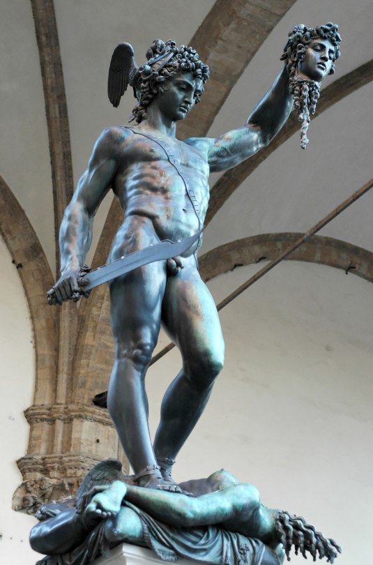
Within the period 1545 — 1554, Benvenuto Cellini produced the bronze sculpture of Perseus with the Head of Medusa. The work was commissioned by the second Florentine duke, and the sculpture is still located today in the Piazza della Signoria in Florence, Italy. The work displays the mythological story of Perseus beheading Medusa, a Gorgon who turned all those in her gaze to stone.
Within the sculpture, Perseus is demonstrated to be exceptionally strong and powerful, unsurprisingly due to his demi-god nature. This is evident through several elements, such as: Perseus being sculpted as very muscular, the use of bronze and marble, rich subtleties, the confident stance, the structure of the statue looking down on the person beneath etc. It is also notable that this depiction of a man would have been especially familiar in the unequivocally patriarchal society of the time. Since there was inherent pressure for men to perform to a particular standard, they had to maintain their reputation of being masculine and a confident provider. With all these variables considered, Cellini’s fundamental rationale for the statue was to not only convey the Greek tale of a strong hero, but also display the political intent: the decapitation of Medusa addressed the Republican experiment, while the snakes represented the contradictions in the city, threatening democracy. With regard to such a message being communicated and the patriarchal expectations of the era, this bold display of Perseus was exceptionally fitting.
Sources:
- Art History lesson notes.
- https://en.wikipedia.org/wiki/Perseus_with_the_Head_of_Medusa
- https://www.italianways.com/perseus-with-the-head-of-medusa-a-masterpiece-of-mannerism/
#perseus#perseus with the head of medusa#medusa#greekmythology#arthistory#foundation#foundationartanddesign#artanddesignfoundation#artanddesign#sculpture#cellini#benvenuto cellini#bronzesculpture#marble#snakes#maleidentity#patriarchy
9 notes
·
View notes
Text
Art History #11 — Female Identity // 22.12.20
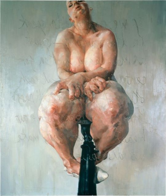
Propped is a superlative self-portrait by Jenny Saville, first displayed at her degree show in Edinburgh in May, 1992. The painting displays an exposed woman adjusted on a high stool in front of a mirror, with the words “If we continue to speak in this sameness — speak as men have spoken for centuries, we will fail each other” facing towards her. The combination of vulnerability, independence and message within this portrait demonstrates Saville’s intention to diminish several propositions: society’s toxic beauty standards, sexist ideals, and the relentless male convention of female nudity (with a specific focus on cultural aversion to corpulence).
In the artist’s words, “I’m interested in the power a large female body has – a body that occupies a lot of physical space, but also someone who’s acutely aware that our contemporary culture encourages her to disguise her bulk and look as small as possible”, her paintings present the viewer with a dichotomy; there is an intense sense of vulnerability that permeates Saville’s subjects, and yet their large size belies this impression of fragility. The portrait is ultimately painted in such a way to counteract these stubborn stereotypes and ideals — Saville is successfully able to promote inclusitivioty and interrogate prescribed notions of beauty. Additionally, for a young woman, at the time, to insert herself into the male canon of nude paintings was highly audacious. It was extremely rare for women to paint the female nude with such candour, and they instead simply painted their subjects clothes. Saville’s intentions of carving out a space for herself in a very male dominated field is clear, especially since the primary subject in early works is herself — there is significance to this choice. Her work, therefore, would not only have been influential through its inherent message of body acceptance, but also due to her bold denial of sexist rules. She reinvented society's expectations in several ways, and in doing so suggested a more feminist, fair viewpoint.
Sources:
- Art History lesson notes.
- https://www.sothebys.com/en/articles/the-groundbreaking-self-portrait-that-launched-jenny-savilles-career
#arthistory#propped#jennysaville#jennysavillepropped#toxic beauty standards#bodyacceptance#sexism#feminism#feministart#artfoundation#artanddesignfoundation#foundationartanddesign#proppedanalysis
6 notes
·
View notes
Text
“How I Dress Does Not Mean Yes”
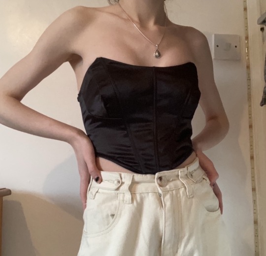
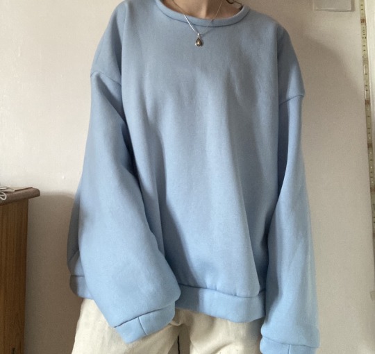
“HOW I DRESS DOES NOT MEAN YES”
A corset and jumper I made for my pathway project “Then And Now” — (Planning to later use photos for a poster).
Initially, I started looking at how fashion had changed through the ages, but the general history involved within this research inspired me to explore some more feminist movements. I then researched sexual assault cases and the artistic response to them, (one of which being very eye-opening to an often close-minded audience: https://www.boredpanda.com/what-were-you-wearing-sexual-assault-art-exhibition/?utm_source=google&utm_medium=organic&utm_campaign=organic)
This motivated me to make two items of clothing: a tighter fitting, modern corset, as well as a baggy, oversized jumper. Through my work I want to demonstrate how no matter what anyone wears— either gender, they are not asking for “it”.
#feminism#jumper#corset#textiles#notaskingforit#howidressdoesnotmeanyes#fashion#sexualassault#thenandnow#artfoundation#foundationartanddesign#moderncorset#sewing#oversized#oversizedjumper
13 notes
·
View notes
Photo


A few miscellaneous pages within my folder from (some) workshop outcomes I may not have posted.
In order:
Photography
Sculpture
Animation
Ceramics
Printmaking
Painting
#workshopfolders#folder#photography#sculpture#animation#ceramics#printmaking#painting#artfoundation#strodefad#foundationartanddesign
5 notes
·
View notes
Photo

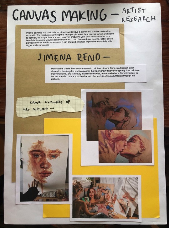
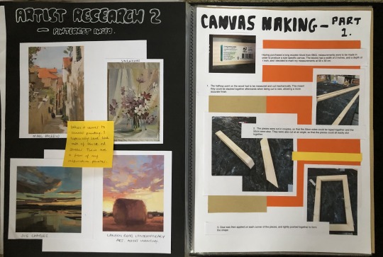
Painting workshop & artist inspiration —
In this workshop we were taught how to create our own canvas, which is of course extremely beneficial for many reasons: can be made in an eco-friendly way, better quality overall, can be cut to the exact size desired, and in some cases it can end up being less expensive (especially when working with a bigger scale). Although I am not amazing at DIY, I still enjoyed the making process and seeing it all come together.
Although my finished canvas is not yet painted on, the premise reminds me of other painters I am inspired by. I have always been a huge fan of Jimena Reno’s work — for both her artwork and work ethic. She is a successful freelance artist, and her overall style & layering of paint is very inspiring to me. This influence will probably later be incorporated into my work through what I choose to paint.
#canvas#painting#paintingworkshop#ethical#jimenareno#jimena#artist#artistresearch#foundationartanddesign#artanddesign#artanddesignfoundation#oil#gouache#acrylic#embroidery
13 notes
·
View notes
Text
Art History #10 — Social Commentary Art // 15.12.20
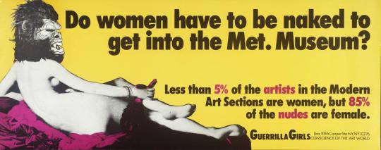
“Do Women Have To Be Naked To Get Into the Met. Museum?” is a poster created by the Guerrilla Girls in 1989. They are a group of anonymous, female artists who are known for their devotion to fighting sexism and racism within the art world. This particular poster is a feminist social commentary and critique that was provoked by the International Survey of Painting and Sculpture exhibition, held in 1984 at the Museum of Modern Art, New York. This exhibition included the work of 169 artists, less than 10% of whom were women. Although female artists had played a central role in experimental American art of the 1970s, their presence in museum and gallery exhibitions were diminished dramatically. This prejudice therefore inspired the Guerrilla Girls to speak out in an artistic way, that targeted everyone they felt actively responsible for the exclusion of women and non-white artists from mainstream exhibitions and publications.
The poster itself displays an image of a partially censored naked lady, commenting on the still prevalent patriarchal times of society. It comments largely on the woman’s worth, presenting her to be seen in a sexualised light by civilisation, but then also highlighting the stupidity of this through the witty and sarcastic title. Although displayed to be very bare, the woman is still able to keep her identity hidden through the Gorilla mask, reflecting also on the artists’ own anonymity. Combining bold block text with lists and statistics allowed for the Girls to appropriate the visual language of advertising and have it actually be recognised by the public in the streets. Through the means of displaying social commentary within art in a still very sexist world, the Guerrilla Girls were able to influence minds and fulfil their responsibility of reaching a wider audience. Their use of wit and irony to point a critical finger at double standards prevalent in the art world and elsewhere was, and still is, a very important motive to help make a change.
[ Source:
- https://www.tate.org.uk/art/artworks/guerrilla-girls-do-women-have-to-be-naked-to-get-into-the-met-museum-p78793 ]
#arthistory#art#history#guerrillagirls#commentary#artcommentary#commentaryart#socialcommentary#socialartcommentary#dowomenhavetobenakedtogetintothemetmuseum#foundation#artfoundation#foundationartanddesign#artanddesign#gorilla#feminism#feministart
5 notes
·
View notes
Text
Art History #9 — Multiculturalism. // 07/12/20

Kara Walker is an American artist who explores race, gender, sexuality, violence and identity in her work. She is best known for her large scale tableaux of black cut paper-silhouettes, which expose the viewer to the issues of prejudice. ‘Slavery! Slavery!’ is an example of this work, created in the year 2000. Through many displayed qualities such as colour contrast, the simple narrative, layout and exaggeration, Walker provides a strong critique of the plantation culture. What initially looks like a historical instillation is later dismissed upon closer scrutiny, as the shadow figures are shown to be revelling in all kinds of erotic, sadistic and masochistic acts. This portrayal of the design is executed in a way that emphasises Walker’s sharp sense of wit and humour, yet still addresses the history and identity with a powerful directness. Through the use of largely stereotypical and exaggerated designs, Walker is able to challenge this notion of prejudice and effectively display the horrors of it.
[ Sources:
- Art History lesson notes.
- https://www.tate.org.uk/art/artists/kara-walker-2674
- https://en.wikipedia.org/wiki/Kara_Walker
- https://walkerart.org/collections/artists/kara-walker ]
#art history#art#history#shadowart#kara#walker#karawalker#walkershadowart#plantation#slavery#artfoundation#foundationartanddesign#artanddesign#screenprint#screenprinting#blackandwhite
4 notes
·
View notes
Photo

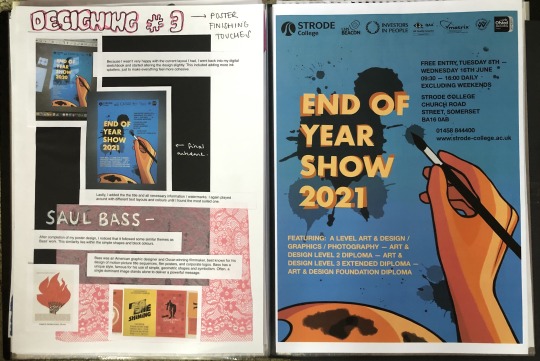
The process and thinking behind my ‘End of Year Show’ poster.
For this workshop I wanted to draw something digitally as I thought it would give me a more finalised outcome. I also wanted to use a bold, complimentary colour scheme to best catch the viewers attention. Once I had drawn the design and laid the colours down, it began to form a simple, block colour, geometric style.
Although I was pleased with the finished result, I did struggle with initial ideas for designing and knowing when to stop adding details towards the end. It was a thought provoking project for me and good for digital drawing practice!
#workshop#workshopfolders#foundation#artanddesignfoundation#foundationartanddesign#graphics#graphicsposter#poster#digitalsketch#digitalposter#digitaldrawing#wacom#wacomtablet#saulbass#eoys#endofyearshow#strodefad#strode
3 notes
·
View notes