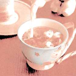
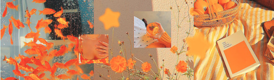
#<3 orange psd
Text


Pisces PSD #039 by Mila
psd
#psd#psdcoloring#colouring#psd photoshop#icons with psd#photoshop#psd coloring#artists on tumblr#coloring#pisces#blue psd#yellow psd#orange psd#<3 orange psd#<3 blue psd#<3 yellow psd#pisces moodboard#portgas d ace
16 notes
·
View notes
Text


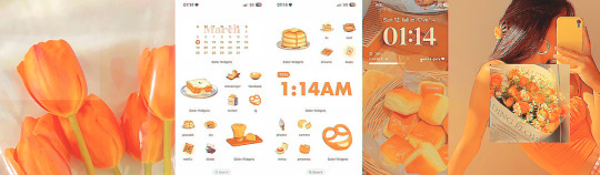
Say Hello in the SEKAI !! ♡ SAKI FEAT. POMPOMPURIN !!
╰┈➤ 🥞 | 🧇 | 🥞 - 🧇 | 🥞 | 🧇 - 🥞 | 🧇 | 🥞 ˚ 𝄞 ₊

#ට#update jiji got airi & my melo so expect a board of that card too <3#apolocheese for the psd jiji also doesnt know what happened here#yellow#orange#brown#beige#white#stimboard#sensory#visual stim#stimblr#pudding#flan#pouring#drinks#drink pouring#hot chocolate#cozy stim#mixing#baking#fluffy#texture#sanrio#pompompurin#pjsk#saki tenma#eyestrain#eye strain#eyestrain cw
41 notes
·
View notes
Text

sooooo... i finally got around to making a dark urge. 🫠🫠🫠
#type: screenshots#game: baldur's gate 3#oc: tranquility#i have 15gb of frames for gifs of ylva and yet........ here i am........#her skin is yellowy orange but my psd obliterated it in this scene lmao
15 notes
·
View notes
Text
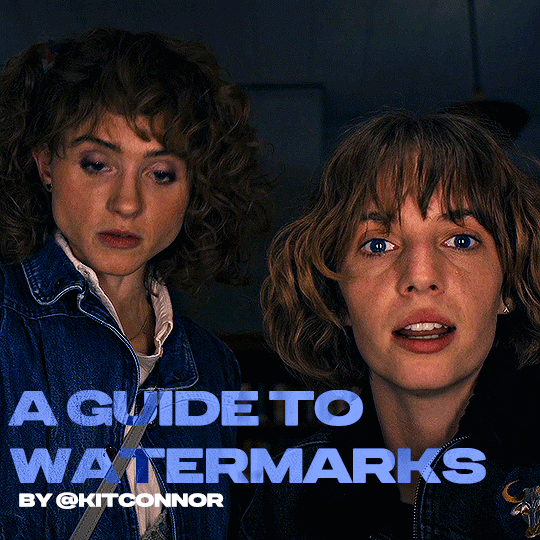
recently, a lot of people have been losing their gifs to reposters, whether that be a whole set stolen or just one gif taken for a textpost. which leads to a lot of us turning towards watermarks to not lose our work. it's not everyone's first choice, particularly because of aesthetics, but it's the best way to keep what you own.
of course, it might seem silly to do a whole "tutorial" on watermarks, but there's a lot of different ways to watermark in a subtle way that still protects your work. i've also seen a lot of people incredibly hesitant to move to watermarks because they believe it marrs their work, which may be true, but there are definitely ways around that. anyway, let's begin !
WATERMARK 1: URL/TRACKED TAG
the most common watermark for people is usually 'thisismyurl.tumblr.com', 'thisismyurl | tumblr', 'thisismyurl' - at least, this is assumed for most people as the best way to watermark.
but if you're like me and constantly want to change your url, you know that there's a good chance a watermark on a gif 3 months ago could be completely different to one now. this is why people are turning to tracking tags.
tracked tags change less frequently, if at all. it's smaller, which makes it more subtle. if you want to go the extra mile like me, you can create a blog under your tracked tag (eg. i track tuserlucie) which means you can reblog anything with your watermark to the blog, showing that it is yours.
placement is key though ! here's 3 different ways you can place it.


NOTE: opacity has not been altered on any of these. depending on how it looks with your gif, opacity looks best at 10-30%.
Font settings: Momcake, thin, 10pt, #ededed.
each of these placements have different advantages.
the first placement (top left) is the one i personally use. it's centered right on the middle but not too high up.
the second placement (top right) is probably the most popular. corners mean people can kind of tuck the watermark away where it doesn't seem obvious. the fourth (bottom right) effectively does the same.
the third placement (bottom left) is 100% the most effective. it sits in a point exactly where it's noticeable, making it less desirable for reposters. on the right opacity too, you hardly notice it.
WATERMARK 2: ICONS/SIGILS
this is an idea that i've seen used mostly by nik @cal-kestis , but is a great and creative way to do it !
an icon or sigil makes your gif totally unique to you. and it's something cute on there which is different to having to put text on there.

(i've put it in orange for the purpose of seeing it)
but you can see here, it doesn't need to be anything special. i've just used an oval shape plus the initials of my url and that's it !
but a sigil can be anything. it doesn't need to have text; it could just be an image. it could just be your icon. either way, it's a cute little alternative to using text.
here's the different options that i preference in action.
SIGIL - bottom right corner

URL - bottom middle

TRACKED TAG - face/body

RESOURCES
here's some resources to use if you want to start watermarking !
FONTS:
Momcake (this one was used throughout all the text watermarks !)
Cocogoose
Lemon milk
Bebas
Quicksand
PSD
you can access a psd of editable watermarks here.
#tutorials#ps tutorials#resources#**l.myeditss#mine: resources#photoshop tutorials#idk who to tag so sorry 😭#usersmia#usercats#usernorah#userrsun
219 notes
·
View notes
Note
pode fazer headers inspiradas na cor laranja? <3
espero que goste! ‹3
ㅤㅤㅤㅤㅤㅤㅤㅤ ˑ ֗ ִ ˑ ★ 💬 . . %


ㅤㅤㅤㅤㅤㅤㅤㅤㅤ ★ orange headers
cr. psd by coloursource
#spirit headers#random headers#aesthetic headers#orange headers#orange moodboard#psd headers#ask#winhynn icons#wingallery
44 notes
·
View notes
Text


BEFORE & AFTER CHALLENGE 🩵
thanks for tagging me @withyouth <3 i had a lot of fun doing these and i was super interested in seeing how my own colouring process (and gif making process) had changed since the last year and a half, i used to have a really strong aqua/orange hued psd i'd slap on everything and then i was really into blues/reds but now i'm gearing towards more natural colouring and not too strong/contrasty (at least when it comes to kpop but sharpening also plays a role in that) i also really love peachy tones in gifs but i've yet to figure out the perfect way to do that <3
TAGGING 🩵 @reginageorg @muldery @guinevere-pendragons @emilybluntt @fawad-khan @ajusnice @irlvernon @mingyuskim @yeonjune @wenjunhui @lesseraive @sunghanbin @eeunwoo @minzbins @seoksgyu @jeniferhuh @farascha @eddiediaaz @antoniosvivaldi @heybaetae @yenvengerberg @crazy-form @simleez @ahiz @twiceland @facethesuns
#z.psd#2605#this was fun omg but now i have so many files to delete on my laptop <3#tagging so i dont flop ->#userace#heyteo#uservince#heymax#usershreyu#danablr#usermery#usersemily#userzil
67 notes
·
View notes
Note
hi alie, please could you tell me how you made the lens flare and film grain effect on your recent rwrb fonts gifset? it looks so beautiful! i'm working on my very first gifset with blending and overlays and things, and i'd like to try my hand at learning some more new stuff 💛
hiiii! thank you!! <3
i've found these overlays on youtube over the years, i don't remember exactly which videos they were, but if you look up "film strip overlay", "kodak overlay", "film grain overlay", etc for the film one, you should find something that you like. same goes for the light streak one: if you search for something like "light streak overlay", you'll get a bunch of nice one. then i download them via a website (i often use y2mate) and make a gif with screencaps from the dowloaded video(s) like i would any other gif.
once you have your overlay(s) ready to go as a smart object, duplicate it onto your gif, on top of everything (or under the typography layers), but definitely on top of coloring and blending, etc. put the overlay layer in a group, and if you have more than one overlay, put each overlay in its own group.
if the overlay is mostly black with some white specs/other colors, set that group's blending mode to screen (or lighten if it looks better). this will make everything that is black in the overlay transparent. and if the overlay is mostly white with some black, you can use the multiply (or darken) blending mode (it will make everything that is white transparent).
the reason why i prefer putting the overlay in a group and change the group's blending mode, instead of the overlay itself, is because it's easier to change its color that way if you wish. to change its color, i use a gradient map layer. the colors should be black to whatever color you want, and this layer should go into the overlay group, and n top of the overlay layer.
for my gifs in this rwrb set, there was also actually an animated grainy overlay below these two overlays. i've uploaded it here as a psd if you want, since it's pretty light. i put that layer in its own group and changed the blending mode to hard light and the opacity to 10%. i only used a gradient map to change the color on the color steak one to make it more of a pastel orange color, the two other overlays are as is without any color correcting layers.
i hope that was clear enough :)
#alie replies#skatingthinandice#*ps help#photoshop#resource#tutorial#completeresources#resourcemarket#allresources
86 notes
·
View notes
Text
⠁ ⠀PSD COLORING ⠀———⠀ DYNASTIES
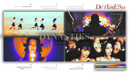
DYNASTIES is a bright orange, purple and green psd coloring, aiming to have a "termal signature" effect. It comes with a texture that does work on photopea.
Our today are LE SSERAFIM in the "UNFORGIVEN TRAILER - BURN THE BRIDGE" youtube video.
⠀⠀߸ ⠀⠀⠀⠀߸ ⠀⠀⠀⠀߸
𝟎𝟏⠁ ⠀ENGLISH ⠀———⠀IMPORTANT
1. don’t repost / reupload
2. don't reuse my layers
3. don't claim it as yours
4. personal use only
5. credits are MANDATORY
𝟎𝟐⠁ ⠀ PORTUGUÊS ⠀———⠀ IMPORTANTE
1. não reposte/repasse
2. não reuse meus recursos
3. não reivindique como seu
4. apenas para uso pessoal
5. créditos são OBRIGATÓRIOS
6. 𝗚𝗥𝗔𝗧𝗨𝗜𝗧𝗢 𝗣𝗔𝗥𝗔 𝗕𝗥𝗔𝗦𝗜𝗟𝗘𝗜𝗥𝗢𝗦 me mande uma dm no twitter
119REMIZ on twitter
DESTIMNESIA on deviantart
#le sserafim#sakura#yunjin#eunchae#kazuha#♱﹔coloring#rp psd#psd#rp resources#coloring#psd download#psd coloring#roleplay#coloring psd#photoshop resources#character psd#psd for icons#psd moodboard#psd template#psds#roleplay psd#soft psd#icons with psd#filter#aesthetic#rp#twitter#twitter rp#discord rp#discord
88 notes
·
View notes
Note
how do u edit an image of an irl guy to look like a troll? yknow, like troll will smith.
Gonna do this one quick and dirty, and with Photoshop in mind.
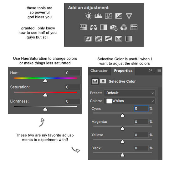
Step 1) Desaturate the image by adding a Hue/Saturation adjustment layer and dragging the saturation slider all the way down to -100.
Step 2) Add a Levels adjustment layer and darken the skin and hair by dragging the white output levels slider down a bit. This just adds pure black to the colors, so the same effect could be achieved if you paint black on a new layer over the image and decrease its opacity.
Step 3) To make the eyes yellow, add another Hue/Saturation adjustment layer and enable the "Colorize" option. Adjust the hue/saturation/lightness until the color is yellow-orange or whatever. Seems like Hussie painted black over the irises beforehand making them appear flatter, so do that too if you want.
To selectively adjust certain parts of the image using the adjustment layers, you can use the layer masks to do so. White areas are affected by the adjustments, while black areas are not. It's like going from 100% to 0% visible. If the program you're using doesn't have a feature like adjustment layers, then you can create a duplicate of the image and apply adjustments destructively as normal, and still create layer masks on those. If you don't have layer masks either then figure something out.
By default, the layer mask is entirely white, so for the Levels adjustment layer, click on the layer mask and go to Image>Adjustments>Invert. Then take your pencil tool, switch the primary color to white, and draw over the skin. Quickly outline the main parts and then use the bucket tool to fill it in. Faster than just drawing it in entirely by hand, but you do you.
Do the same thing for the Hue/Saturation colorize adjustment layer and draw over the eyes. Essentially, you're done. You can fill in the rest from here.


PSD here.
79 notes
·
View notes
Text
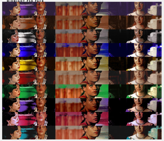
B221 // MIDNIGHT PSD PACK. a psd pack.
this pack contains 10 psds all part of the midnight series i just did. you can download them individually or the entire back. you must use the adjustment folder in order to get the desire coloring (specially leves + selective color + color balance.)
remember to reblog if you save/use. credit has to be visible on your carrd/doc if you use. (reblog, not like. please.)
consider donating through paypal or buy me a coffee through ko-fi.it truly helps me a lot. i am currently in the need of some cash so if you can spare a dollar, that would be great! if not, please just spread the art!
this psd pack is 13 DOLLARS VIA PAYHIP. each individual psd is 3 dollars so you would be saving 17 dollars.
THE PSD PACK CONTAINS:
midnight ruby (red based)
midnight jade (green based)
midnight eggplant (purple based)
midnight gum (pink based)
midnight red (cyan based)
midnight opal (yellow based)
midnight sapphire (blue based)
midnight diamond (white based)
midnight citrine (orange based)
midnight indigo (soft indigo based)
#icon psd#rp psd#psds#coloring psd#rp resources#roleplay resources#( cali psds. )#psds packs#i never did a pack ever so here we go#consider this a holiday pack? or just a fun pack
38 notes
·
View notes
Text
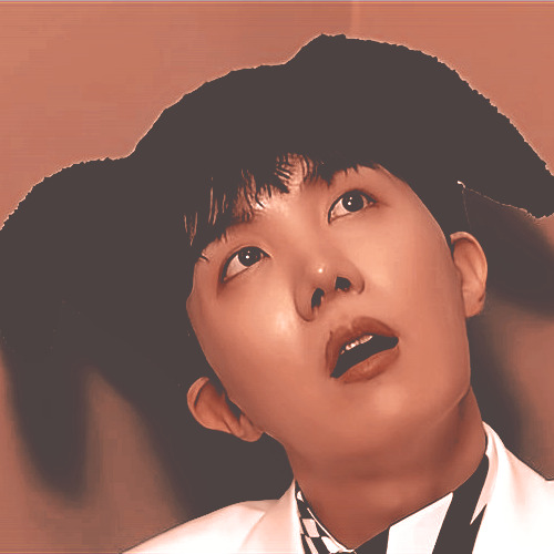

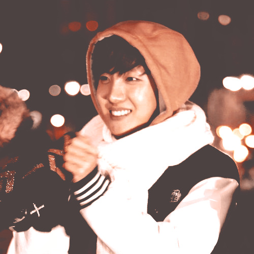
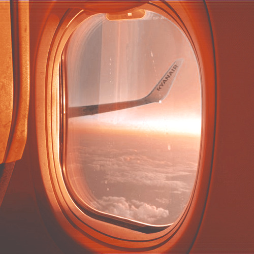
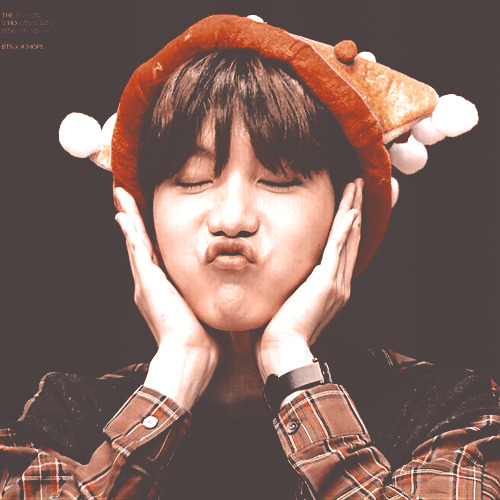

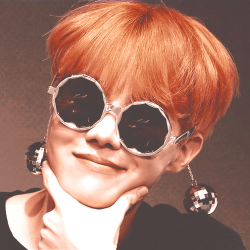
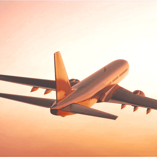
Airplane PSD #036 by Mila
psd
#bts icons#psd#coloring#psdcoloring#colouring#psd photoshop#icons with psd#photoshop#psd coloring#artists on tumblr#bangtan#bangtan jhope#bts jhope#jhope icons#hobi#hoseok#jhope#<3 orange psd#orange moodboard#jhope moodboard#bts moodboard
14 notes
·
View notes
Text
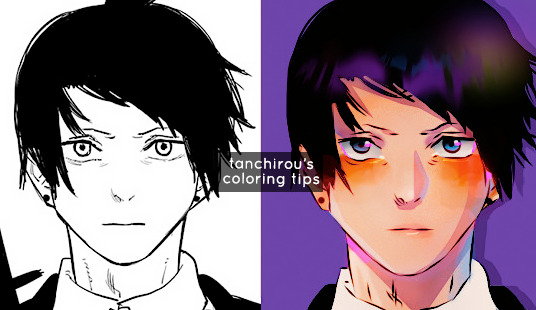
hello everyone (੭*ˊᵕˋ)੭* ̀ˋ i’m back with another coloring tutorial to share some tips on how i personally color mangas! you can check out my first tutorial here where i go over the basics of coloring. in here i’ll go a little more in depth about shading and lighting, and the areas that i like to focus!
so without further ado here we go !! ♡
before we start
all of my colorings are done in photoshop
i have a psd that i personally made for my colorings, so the tutorial will already have the psd on top. i personally like to color with a psd on and then make adjustments as i go along.
these are tips on how i personally like to color. the process is different for everyone, so take it with a grain of salt ^^
#1 - Base Colors
self explanatory, just fill in the base color of your character

ooo la la
#2 - Tips for Shading
my shading is broken up into two major parts
1. soft shading
2. hard shading
Soft shading
i like to do soft shading whenever i want my coloring to look slightly more realistic and for the base color to look less flat. other times i skip it altogether if i’m coloring something cute or chibi-like. If you’re like me who has difficulty sometimes imagining where the shadows/light should be, i highly suggest looking at references to get a general idea! here is just one example.

❗reminder that each step requires new layers! color everything on different layers so you can make changes in the future if you need to!! ❗
Hard shading
next, I like to add hard shadows to my colorings for more details. these are the shadows where i don’t blend into the skin. the areas where i almost always focus are
Under the hair
Neck
Ears
Under the eyebrows
but again, the hard shadows can also heavily depend on the angle that the character is in. like always, if you struggle with that, references will be your best friend!! i’ll show you a reference that i used for this coloring! :)

Tip: set your shading layer to multiply and then adjust the opacity to your liking. mine is set to 80% here
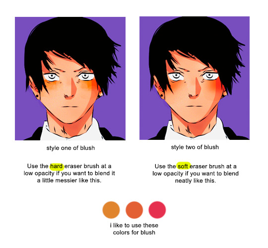
#3 - Tips for Blush
not everyone includes blushes in their colorings, but i personally like to add it because i feel like it adds a lot of life to the characters (and i find it cute 🥰)
#4 - Lighting/Color Details
another tip to make your coloring stand out is to add lighting! this is one of my favorite process as i really enjoy experimenting with different colors and seeing which one works best. you can use as much layers as you want until you get a result that you’re satisfied with.
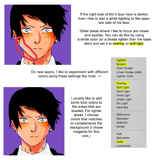
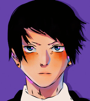
here is my result after i add more colors to the shadows and Aki’s face. i also colored in the eyes and added some pale colors to his lips because i know aki uses his chapstick 👑💅💁♀️
#5 - Brightening the Line Art
right now, the lines that we have are black, but i would prefer to brighten it up a little more. here, i will set a new layer above my manga cap, and choose a red or orange shade to add some colors to it
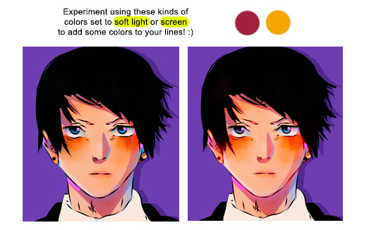
if you want a more vibrant effect, use a more vibrant version of those colors, or vice versa. you can also adjust the colors using your selective coloring tool
#6 - Finishing Touches
now that i’m nearing the finished product, i will begin to add some final details to it. are there areas that should be brighter or colors that should be less saturated? are there any areas where i should add highlights to? here is where i fix minor things until i’m satisfied with the outcome. i will also adjust my psd as well if i need to!
and finally, here is my result! :)

#mine#tutorial#tutorials#manga coloring tutorial#usergojoana#userokkotsus#usertorichi#usergokalp#usermica#hope it’s okay to tag some friends in this 🥹
206 notes
·
View notes
Note
if ur still doin the ask game: blue, gray n black !
gray: talk about the colors you tend to use in edits! do you like making bright or dark edits? are there colors you dislike editing?
i dont know if there are any colors i tend to lean towards in editing, really, but i generally prefer bright edits ^_^ i dont like editing orange... sighs... despite that one of my faaave layers to use is an orange photo filter it always makes things look so nice
black: what kind of programs do you use to edit? have you always used these or have you branched out before?
i use photopea currently! i find its a lot nicer to use for coloring and such. i moved over faiirly recently from ibis, i find both have their respective pros and cons :3
blue: do you have favorite editors? is there any specific reasoning for your choosing?
i have loooads of editors that i admire but here are a notable few! yapping under the cut sorry.
@ideallyadored - i looove vees editing style so much.... his use of colors is sooo lovely to look at (our psd collab was SO FUN it was real cool to see our coloring styles merge) + THEIR STIMBOARDS R SO COOL.... loving all the alnst stuff recently <- not biased.
@lavendergalactic - THE WAY THEY DO GRAPHICS?? insane. absolutely insane. HOW IS EVERY SINGLE ONE A HIT. how do you do everything on ibispaint too... even though ive moved to photopea editing now, back when i followed you and i learnt you used ibis i was so relieved because i was like "damn if they can make banger stuff with ibis so can i...."
@plecakism - lumis editing style is sooo tasty. she made my current layout and when i got it i was in a state of SHOCK it was sooo fucking cute 😭😭 also. object show edit blog. IMMEDIATE win for being a hfjone fan
@necroangelz - another person whos graphics i ADORE. i am so in awe of people who consistently make graphics. how do you do it. most impressive thing in the world to me. your itafushi graphics havent left my mind since you made them TBH + THE KEL GRAPHICS YOU MADE FOR MY BUNDLRSS R SO CUTE
@p1nk-sugar - YOUR PIXELS ARE SOOO CUTE ORIEL i love them sm. people who make (ADORABLE) pixels are the backbone of the rentry/sntry/bundlrs/website building in general community. xoxo
@otoripink - FEENIEEE YOUR LAYOUTS AND GRAPHICS ARE SOOO COOL i love them sm.... your pyroscout graphics are SOO CUTE as are your harunene layouts. ceo of harunene ❤️
@ghostflora-s - LITERALLY LIKE MY FIRST EDITBLR MUTUAL. your edits have got to be some of my favorite on this website i love the way you do replycons and icons and headers and wallpapers and like literalyl EVERYTHIGN oh my god. your coloring is top notch everything you do is just absolutely fire
13 notes
·
View notes
Note
hiii aurore! how are you doing? i'm sorry to bother you, but i was wondering if you could share a few psds of your own with us or maybe a tutorial with your coloring process (if it's not too much to ask). thanks in advance!! <3
Hi!
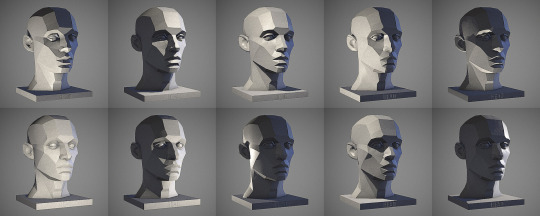
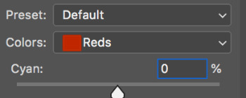
You're never bothering me! I color everything from scratch, I don't have any PSD saved. But i can probably make a tiny tutorial with my coloring process. It's a very simple process and if you have a good quality, it shouldn't take a lot of time. I'm going to show you how to color a basic scene. Then, I will show you how to handle dark skins because you don't want to make the actors orange. My photoshop is in french, I apologize.
First, you need to sharpen and resize your gif. Don't forget that your coloring will look different according to the size of your gif. Sometimes, you can't use the same coloring for 540px gifs and 268px ones.
Without coloring:

With coloring:
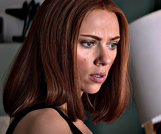
I always start by adding a curve layer. I try to find a white point and I click on it. In this case, i clicked on the white in her eyes. It can be a bit tricky to find. You can click a lot of time to find the right spot, don't be shy. I know find Natasha a little too red and I want to use more dark.
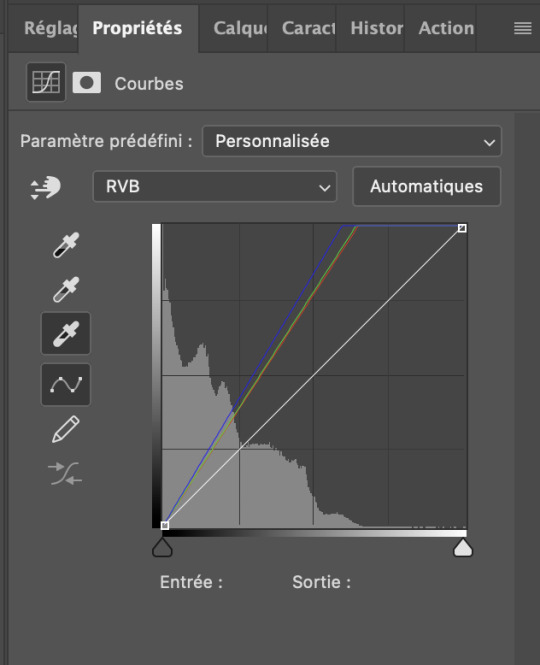

I'm gonna click on selective color and play with the colors until I find something I like. I always start with a bit of dark, it's probably useless but i like it. Most of the time, i increase the cyan to make the gifs less red. I also play with the yellow. You just need to play with the colors until you find something you like.


You can play with the blue for example if you see some blue in the background and want to see it more.
This is where I stop most of the time because I don't really want fancy stuff. You have to keep in mind that giffing with 4k is way easier than giffing with 1080p.
I could stop here but now I want to gif Sam Wilson. Sam isn't white and i really don't want to orange wash him. I recommend to always start with coloring non white character first. If i used Natasha's coloring on him, he would look like this:

I don't want this. I'm gonna increase the cyan:
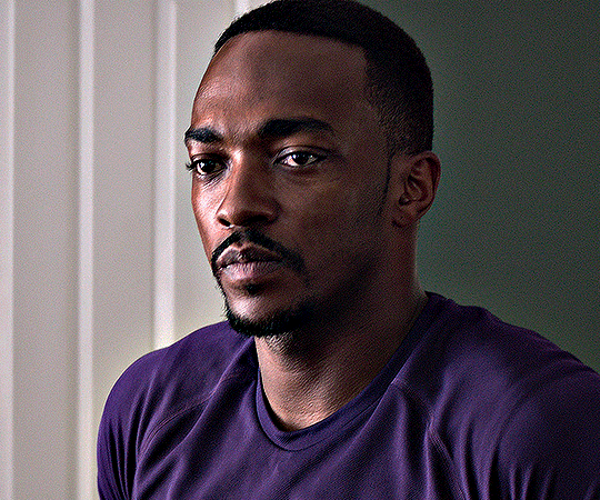
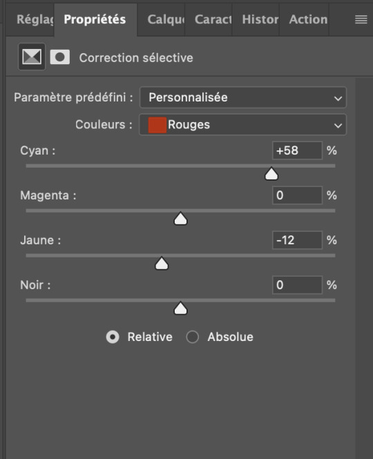
Then, I'm gonna play with the red in the hue/saturation:


I will adjust the vibrance:
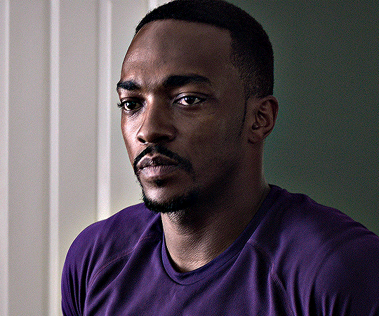
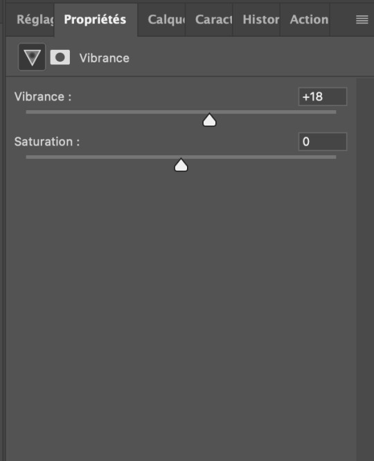
And I reduce a tiny bit the luminosity. It's probably not perfect but i think it already looks better and it took me probably 2 minutes to fix.


33 notes
·
View notes
Text
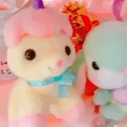


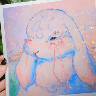
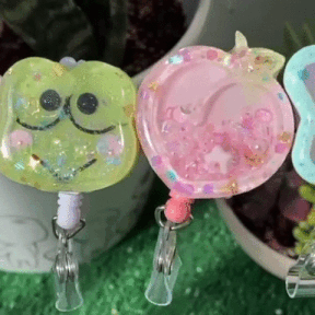
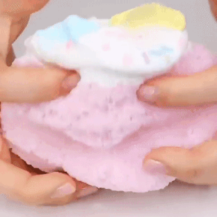

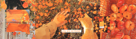
Stimboard request: @cute-bath-toy 's self insert & Iris stimboard (creds to all gif owners)
🍭🌸🍭
🎠✨🎠
🍭💕🍭
[GIF 1: A camera panning around to some pastel coloured plush bunnies (END ID)]
[GIF 2: A camera panning to show some dice which are pastel pink,blue & yellow coloured (END ID)]
[GIF 3: A person hitting some keys on a pastel coloured keyboard with light up keycaps (END ID)]
[GIF 4: A camera panning to show off a decoden phonecase themed to the Sanrio character Cinnamoroll (END ID)]
[CENTER IMAGE ID: A cutecore edit of @cute-bath-toy 's self insert oc & Iris from Megaman X4 that's made by me (psd colouring used)(END ID)]
[GIF 5: A person shaking a summer themed Hello Kitty decoden phonecase to show off that's its also somewhat a resin shaker (END ID)]
[GIF 6: A person holding a sparkly painting of a white rabbit (END ID)]
[GIF 7: A camera panning to show off various resin shakers, one of themed is green & themed to the Sanrio character Keroppi (END ID)]
[GIF 8: A person playing with white,pink,blue & yellow pastel coloured slime (END ID)]
[IMAGE: A DNI banner of the Pokémon Raichu on a light orange background with white text reading "RAICHU PROTECTS THIS BLOG!" in a very cartoony font, under it is white text reading "Please read my full DNI list before interacting!" in a handwritten-esque font & there's white text in a banner-like font reading "@RAICHU-STIMMY ON TUMBLR! (END ID)]
#mod raichu#stimblr#stim#stimboard#slime#pastel#pastelcore#cutecore#resin shaker#painting#decoden#phonecases#plushies#keyboard#dice#iris#megaman x#request fullfilled
18 notes
·
View notes
Text
GIF Tutorial
Someone asked me how I made my gifs so HD so I decided to write a full step-by-step uuuh babyyy 🎶 tutorial + useful tips on every part of the process.
It is explained in detail, so people with 0% experience can try it for the first time, and the more experienced gif makers can focus on the parts they are interested in 👍 (click on the images to see them bigger)
Disclaimers: I am not a professional, I have learned by trial and error and by watching other amazing creators. I use photoshop CC 2019 in Spanish so some of the names may vary but I tried to use the more accurate English names and used colors as references so even in other languages you can still follow this tutorial.
GIF TUTORIAL STEP BY STEP:
1.- Open photoshop and create a new project. Then go to “files” 🠲 “import” 🠲 “convert video to frames” 🠲 this will send you to your video folder, and from there select the one you want. TIP 1: try always to download it in the best quality possible (1080p or 720p) so you will end up with “cleaner” HD gifs.

2.- When you select your video, then you will have to choose the specific moment or scene you want (you do this by selecting and moving the arrows at the bottom of the image) TIP 2: I usually limit every 2 frames, but if your scene is too short (less than 20 - 25 frames) then I suggest not clicking the limit and leaving it at 0, likewise if your scene has too many frames (over 70) then limit every 3 frames 👍 to make it smaller.

3.- Sometimes when you select your scene, a few extra frames will show up in your timeline, it’s ok, you can delete them by selecting the frames and clicking the trashcan icon at the bottom. Next, don’t forget to change the speed, you do this by selecting all the frames (click the first one then press SHIFT and click the last one, this will select everything), and then click one of the numbers below the image and select “Other”. TIP 3: Usually I use between 0,07 - 0,08 (my fav) - 0,09 from faster to slower. The speed will depend on the gif you are making. TIP 4: If you have PSDs colorings, now it’s time to add them, just click and drag your PSD on top of the image, and remember to make sure it is on top of all the frames and layers ( the ones on the side). Personally, I do it now, because when I do it later in the process there is always a few frames that won't color.

4.- Now that we have our desired frames, speed, and PSD coloring (optional), we need to make it easier to keep editing. So we need to click on the little icon with stripes at the top right corner on top of the timeline (the orange square) 🠲 “Convert timeline into video” 🠲 and now you should have one long frame instead of many single ones.

Now let’s do the same with the layers that are on the right (purple circle), once again click the first layer then shift-click on the last one to select everything 🠲 right click on one of the layers 🠲 “convert into a smart object” 🠲 and now all the layers also become one.
5.- What I like to do next is to cut and then resize (you can do it the other way around if you’d like) select the cutting tool on the left side (light blue circle) and then it is up to you to choose which shape do you want (in the purple circle) there are some basic proportions but you can also make your own.
6.- Now is where all the fun begins. Let’s resize our image so we won’t end up with a giant gif. to do this go to the “Image” tab on top of the screen 🠲 “image size”
TIP 5: To choose a good size, please keep in mind the standard sizes on Tumblr or other social media. If you are using one gif per row then the size should range between 540px - 560px - or 580px / If you are using 2 gifs per row then the size should be around 268px / and if you have 3 per row then the size should be around 177px. Once you select the appropriate size… this is where it gets tricky. Depending on the gif you are making you will have to select a different option ex: if your gif is too blurry or has lots of movement or grains if they are too dark or too light if the colors are too different, all these factors will determine what you need to use. TIP 6: I usually use only 3: bilineal - bicubic reduction or keep details 2.0 (the names may change in English but look for something along those lines or in the same place as the ones in the image with the green ticks)

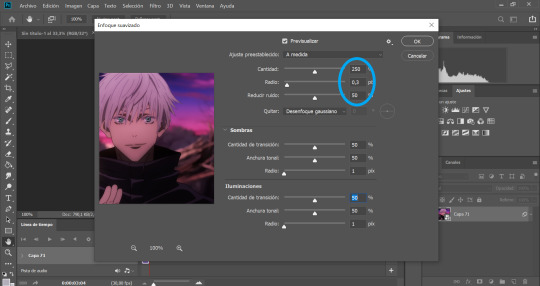
7.- SHARPENING TIME!: go to “Filter” 🠲 “sharpen” 🠲 “smart sharpen”

As I have mentioned before, the amount will depend on the gif you are making, there is no perfect formula for all the gifs, so you need to play around a bit to find the perfect setting for your specific gif. TIP 7: This is what I normally use: amount: between 250 and 300 / Radius: 0,3px - 0,4px or 0,5 (but never over 0,5) / noise: anything between 0 and 50, now if you have a very blurry scene you can go up to 100 👍 and finally select the option “Grussian blur”.
Tbh I never change the “shadows” and “lighting” settings (they are always 50 -50 -1) If you know how to use them or want to play around, then go for it…. I have no idea how to 🤣 oops.
8.- BLUR: sometimes the gifs look TOO sharp so we need to add a blur filter. so go to “filter” 🠲 “blur” 🠲 “surface blur”

then once again, depending on your needs, you can play around with the settings. TIP 8: I normally use 10-6 / 9-4 / 7-4 or 3 / etc. but I never go over 10.
Also if you are noticing that your gif is still looking a bit blurry or with imperfections, due to the quality of the video, the scene is too complicated, etc. then I recommend adding noise on purpose 🤣 hey! if you can’t fight against the noise then put it on purpose and make the gif with a bit of texture and colors, it will look nice too 👍 go to “filter” 🠲 “noise” and then add the amount you want.

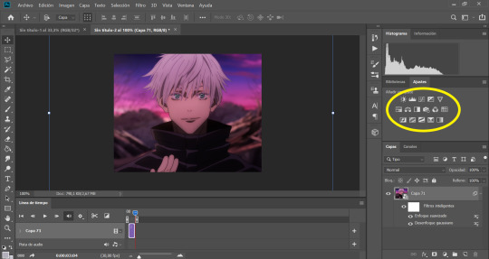
9.- Now we are almost done, you can leave it like that if you want or you can add some extra steps and play around with the brightness, exposure, color balance, gradients, filters, etc. you can find everything on your right (the yellow circle). Here is up to you to explore and experiment, I never use the same, it changes every gifset I make.
10.- You can add your watermark, images, texts, paint with the brushes, or do anything else with your gif. but this time I will skip these steps, but if you need extra information about something, please feel free to ask, and I will gladly help you 😊.
TIP 9: Before you save your gif, please make sure all the things you added are in line with your gif “video frame” 🠲 move the little arrow so it will end perfectly with your gif, if the others are longer, it doesn’t matter, you can move them or you can leave them there, the important thing is that the line is perfectly in line with your gif.

11.- Now there is nothing left to do, it’s finally time to save it for the web. Go to “files” 🠲 “export” 🠲 “save for the web”
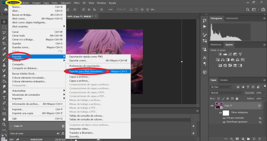
TIP 10: Now you have two options: you can view your gif in the “optimized version” tab where it will show you one option that you can edit. If you select this option then these are the settings I always use, the only option that changes is: using pattern (the gif will have a small invisible “net” that will make the gifs look more uniform, use this especially when the lights or shadows and colors look grainy) or you can use Diffusion (to make it smoother and move flowy) you can try both and see which one suits your gif best 👍

and then the easier second option is to click the “4 copies” tab on top of the gif, and it will show you 4 different options, then you just select the one you like the best and it’s ready!

12 .- THE LAST STEP!!! TIP 11: make sure your final gif is smaller than 10MB (Tumblr's limit) and hit SAVE! and you are ready!! ヾ(≧▽≦*)o
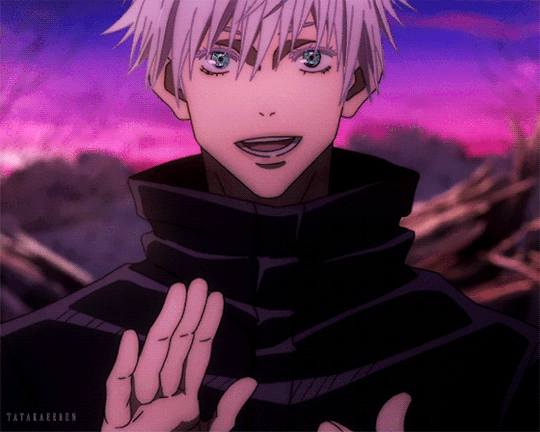
This is our final result: A sexy Gojo 💙
Thank you for reading, I hope this helped you, and I can wait to see all of your creations! ✨
Feel free to tag me in your gifsets or to ask me any other question in case you need extra information or need me to explain something better 💖
Also, if you are an expert and would like to comment, change or suggest better steps and/or settings, please let me know! so we can all learn and grow 👍
#gif tutorial#tutorial#mygiftutorial#i apoloogize in advanced for any mistake or bad explanation#I really hope this help you to learn how to make gifs or to learn new steps or settings 💖#allresources#completeresources#rresources#please let me know if im doing something wrong#or if you would like to recommend me better settings or steps#i would gladly accept them! 🥰🥰🥰
161 notes
·
View notes
Last Seen Blogs
piratequeenxlouie
Louie Wilson

zekeisawesome
The Pride of Hermosa Beach
lovesick-feelin
i AM impertinent.

sodetectivefestival
Untitled

cookeh-40k
41st Millenium Cookehs