#<3 yellow psd
Text


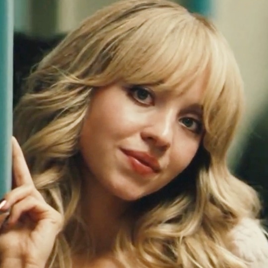

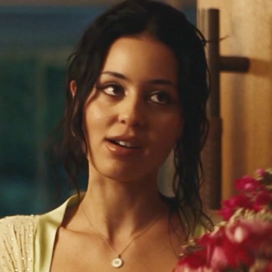
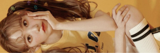
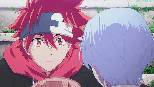
EUPHORIA ICONS | S2E3, CASSIE & MADDY
#icons#no psd icons#without psd#girls icons#packs#twitter icons#actresses#blue#yellow#pink#cassie howard#cassie#maddy#maddy perez#sydney sweeney#alexa demie#euphoria season 2#euphoria s2#euphoria#episode 3#ep 3
216 notes
·
View notes
Photo
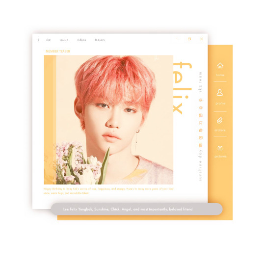

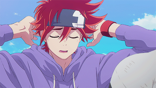
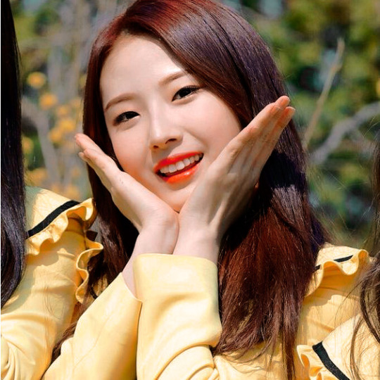
countdown to lixie’s bday
↳ d-0: happy birthday felix!
happy birthday to our sunshine, felix! it’s hard to put into words how much you mean to me and everyone else that loves and supports you. there’s a reason why your name means “happy” in latin, you truly are a ray of sunshine. your kind words and sweet actions bring color and happiness to everyone’s lives, from the way you stay up late baking for staff and members, to how you openly tell those around you that you love them, to how you readily give hugs. i look forward to following your continual growth as an artist and i hope you can feel just how much you are treasured today. thank you for always showing me there is good in the world, no matter how dark it may be. here’s to another year full of sweet giggles and yummy treats!
#stray kids#felix#lee felix#felixleenet#createskz#bystay#staysource#yongbok#lee yongbok#stray kids gifs#stray kids felix#skz#my.edits#felixbday2021#me: i'm gonna make it yellow theme#also me: *uses pics from one of the very few times he ISN'T blonde*#anyways i dearly love this boy happy birthday from your gay bestie <3#if you see any bin related things in the pics ... yeah <3 i used the same psd and i'm only 90% sure i changed everything accordingly
360 notes
·
View notes
Photo
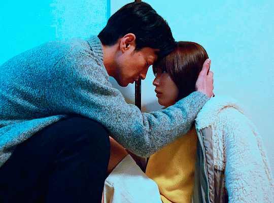

TAKEZAI TERUNOSUKE as Teiji Osamu and NAKAMURA YURIKA as Maruyama Mayumi in Buchou to Shachiku no Koi Modokashii (2022) episode six
#asiandramanet#jdramaedit#jdramasource#buchou to shachiku no koi modokashii#userstorge#dailyasiandramas#btsnkmedit#takezai terunosuke#nakamura yurika#mine | all#mine | gifs#teiyamaedit#teiyama#jdrama#what... did you really expect ME the forehead touch enthusiast™ to NOT gif this ?!?!?!#at this rate i should just make a forehead touch series lmfao#this colouring i'm screaming the scene was YELLOW#i have cm to thank for this because that's where the og psd is from#i didn't expect to enjoy this series as much as i do#glad about that <3
58 notes
·
View notes
Text
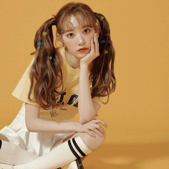
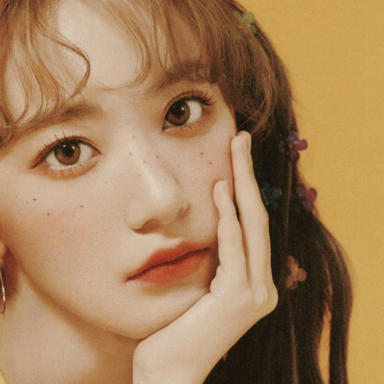
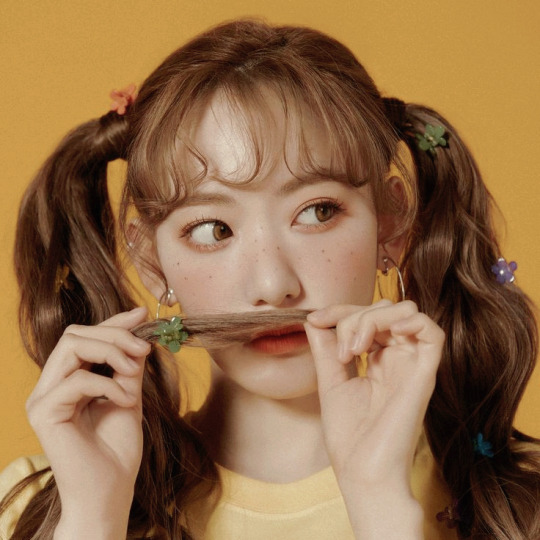

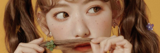

♡︎↷ sakura ex iz*one ᎒ layouts! 𓍯 ࣪ ៹
400 followers thanks to: @vg-k <3
꒰ don't repost/plagiarize. ꒱
꒰ like or reblog if you use. ꒱
꒰ psd: @kpop-locks. ꒱
#especial de 400 anjinhos#400 angels!#400 followers#kpop locks psd#daisyeji#kpop#korean#i love u#like or reblog#my girl <3#don't repost#kpop gg#soft psd#yellow psd#messy yellow#yellow headers#yellow icons#yellow layouts#messy layouts#sakura izone#sakura izone icons#izone#iz*one#iz*one layouts#izone layouts#izone sakura#sakura miyawaki#sakura miyawaki icons#ex izone#sakura izone layouts
66 notes
·
View notes
Photo
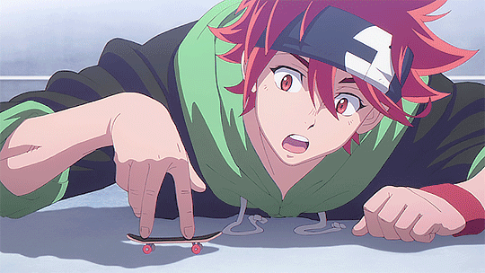
reki and his hoodies in ep2
#reki kyan#sk8edit#dailyanime#sportsanimedaily#sk8 the infinity#i love him.. that's my boy#also if you notice me reusing one of these gifs in my other photoset no you did not<3#when i become a sk8 blog.. mind ur business#sk8*#reki*#gif*#ani*#*#how its been two episodes and he's already injected so much serotonin into my brain#he's literally my bestfriend#why am i posting this at 1am who knows#i wanted to add the one of him in the yellow hoodie#but the scene is so dark >.<#and i literally messed around with psds for three hrs and couldn't decide on one i liked for it so#im sorry yellow sweater
465 notes
·
View notes
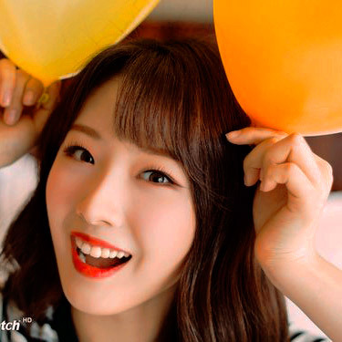
Photo


jeongin + yellow 💛
#jeongin#i.n#stray kids#createskz#bystay#kpopgfxnetwork#mine#*gif#*jeongin#bc he is sunshine#honestly my normal psd takes out yellows so this was a struggle <3#flash tw#*c
426 notes
·
View notes
Text
I've been up less than 20 minutes but what if I changed my formatting again ?
#if I did it wouldn't take effect quickly I still have like 3 weeks of stuff in my queue#idk what I'd change though#just feel like switching something up && since I don't use icons.......#( kinda unrelated but can someone point me in the direction of a poc friendly yellow / gold psd? )#out.#mobile
1 note
·
View note
Text


⠀ ⠀ ⠀⠀— on wednesdays we use yellow.
⠀ ⠀ ⠀ ⠀ ⠀ ⠀ ⠀heejin moodboard.
⠀ ⠀ ⠀ ⠀ ⠀ ⠀ ♥︎ or ↻ ⸝⸝ @/giangplz.
#loona moodboard#heejin moodboard#soft moodboard#yellow moodboard#yellow icons#yellow aesthetic#psd icons#heejin icons#jeon heejin icons#loona 1/3 heejin#loona pics#loona aesthetic#kpop icons#kpop moodboard#jeon heejin#loona#soft icons
156 notes
·
View notes
Text


Mina El Hammani icons
#mina el hammani#mina icons#mina el hammani icons#nadia#nadia shana icons#nadia shana headers#nadia shana#elite season 3#eliteedit#elite3#elite cast#elite#yellow icons#yellow#no psd icons#low quality#lq icon#lq
57 notes
·
View notes
Photo


it’s missing haseul hours;
psd by @peachcoloring
#haseul#loona#yellow#psd#icons#loona icons#haseul icons#jo haseul#icons with psd#yellow icons#twitter edits#twitter stuff#Twitter Icons#edits haseul#photoshoot#butterfly#1/3#1/3 icons#loona edits#edits#let me in
33 notes
·
View notes
Photo

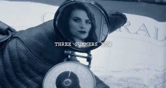
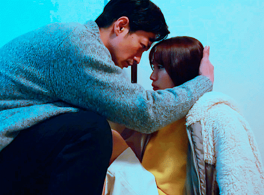
take me out, take me home, forever & ever♡
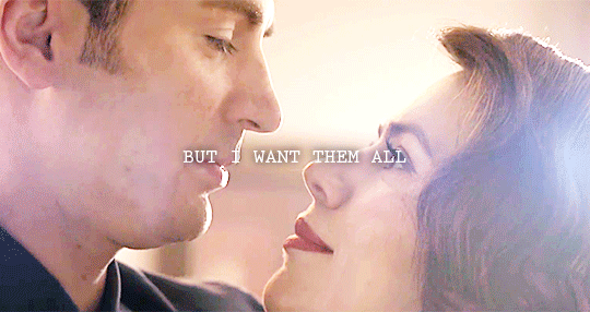
#AHHHH IDK WHAT THE LIMIT IS BUT ITS MORE THAN 3MB NOW!!!!!!#also like why the frick frack tic tac is every steggy scene hard af to color#first TFA was hard to color for one#then the AOU steggy scene#now this endgame one was just dipped in yellow paint#also i really wish i had the TFA kiss in a higher quality since i just nabbed it from a trailer#i love that angle so much more#ANYWAYS#MORE T SWIZZLE YALL#thanks to a special someone for some great PSDS <3#steggy#steve rogers#peggy carter#captain america#agent carter#the first avenger#the winter soldier#civil war#avengers#age of ultron#infinity war#endgame#steggy x taylor swift#taylor swift#lover#I COULD STEGGY THIS WHOLE SONG#WATCH ME ILL DO IT#my edit
26 notes
·
View notes
Photo

Their proper places.
ᴩʟᴇᴀꜱᴇ ᴛᴀɢ ᴀꜱ #ᴋʜ3 ꜱᴩᴏɪʟᴇʀꜱ
#kingdom hearts 3#kh3 prerelease#aqua#terra#ventus#birth by sleep#bbs#bbs trio#gifs#my posts#i saved a psd of ventus where he has yellow eyes and the mask (because the pre patch and patch only have one or the other)#and i'm so glad i did bless past melanie bless her#kh spoilers#kh3 spoilers#1k#3k#5k#7k#10k
12K notes
·
View notes
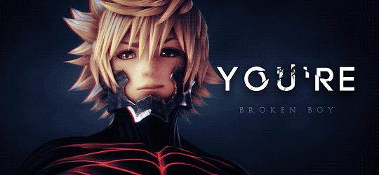
Photo

GIF MAKING START PACK BY HUPHILPUFFS
please like or reblog if you download
includes 6 colourings, 2 sharpening actions, and 1 captions psd
text file explaining how to use in downloaded zip
send me a message if you have any questions
#psd#gif psd#gif resource#itsphotoshop#my gifs#my edits#tutorial#long time plan finally shared because an anon asked <3#the colourings are made for specific categories of gifs btw#(old dinof) (old ap) (old dapg) (new dapg) (new ap) (new dinof)#anyway#the dinof and ap ones are both red or yellow & blue because it's me
449 notes
·
View notes
Note
Your gifs are so cool and vibrant. Please do a coloring tutorial??
Hi, thank you so much!
My coloring process is always the same, and very simple! Under the cut I will explain it:
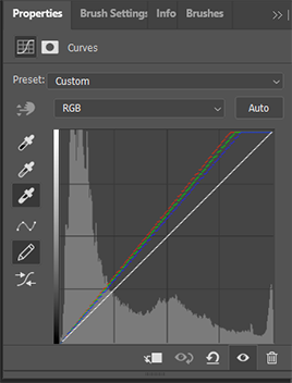
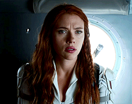
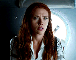
1. CURVES
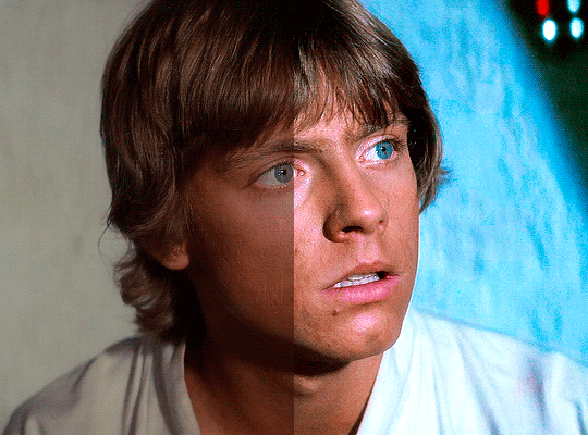
I always start with a curves layer and I use the first and third droppers. The first dropper adjusts the dark parts of your scene, so you'll click on the darkest spot of your gif (the closest that spot is to black the better.) The third dropper adjusts the light parts of your gif, but instead of clicking on the lightest spot of the gif, I prefer to click on the lightest spot in the character's face. This is how my layer looks like in that Luke gif:

This method doesn't work on all scenes, so sometimes I adjust it manually. Some scenes are hard to colour with the droppers (for example, scenes with neon lights) and in those cases I just click on ‘Auto’ to bring brightness to the scenes, without drastically changing the colours.
2. BASE PSD
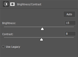
After I have my curves layer I always follow the same method: Brightness, Levels, Color Balance, Selective Color, Curves and Vibrance. You'll probably have to adjust them depending on your scene, but the truth is that my settings are always very similar:
1. Brightness: Between 15-30 / Contrast: Between 5-15 (this will depend on your scene, if it’s dark I usually go with 30/15, but if it isn’t then 15/5 should work just fine.)
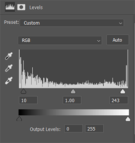
2. Levels: 10 / 1.00 / 245
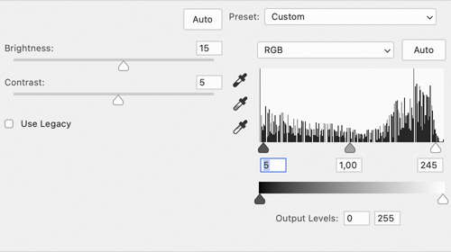
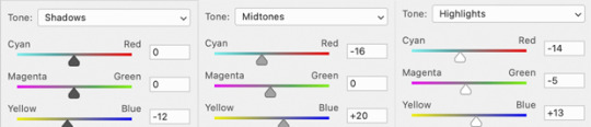
3. Color Balance: This is the layer which will need more adjustment depending on the scene. That Luke scene has a plain background, and since I wanted to make it blue I edited this layer like this (Shadows: -0, 0, -12 / Midtones: -16, 0, +20 / Highlights: -14 / -5 / +13).
4.1. Selective Colour (reds & yellows): This layer is so important to make the colours look natural. The Reds and Yellows which will affect your character's skin tone. In this scene as you can see Luke’s face is a little bit red, so I used this layer to fix that (x x). For most shows/movies I’ve found that the problem is actually the opposite and the character’s skin is way too pale (it’s just that this scene has great lightning lol). To fix that I edit only the Reds by increasing the Cyan, Magenta AND Yellow until I’m happy with the result.
4.2. Selective Colour: Magenta (x), cyan (x) and blue (x). Sometimes, I also edit the black (like this: Black: +5/+10), but in this case it wasn’t necessary.
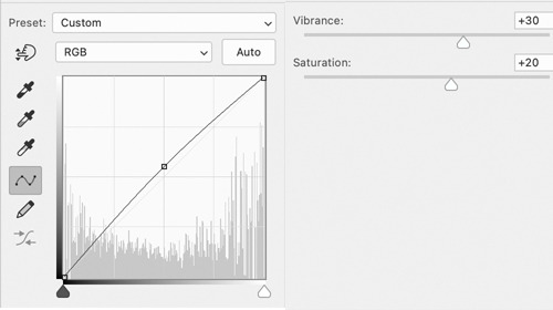
5. Curves: I just click 'Auto' to make the gif more bright. Sometimes, if the scene I'm working with is too dark instead of Curves I add another Brightness/Contrast layer or I use an Exposure layer.
6. Vibrance: Between 30-50 / Saturation: Between 5-20 (this depends on the scene too, because if you add too much saturation your character's face will most likely look yellow :/)
Obviously, these exact settings won't always work, so you'll have to play a little with them. My advise is that if your coloring doesn't look right, edit the Brightness/Contrast, Color Balance and Selective Colour (the red, mostly) layers.
3. BACKGROUND
As I said this Luke scene already had great lightning. After all the adjustments I made before the only thing I had to do to bring out the Cyan was adding another Selective Colour layer and edit the Cyan (x) and Blue (x).
But, let's be real, most of the time this isn't the case. I’m going to use this Han Solo gif as an example:

This is how it looks like after using the previous method. It looks pretty and bright, but I want the background to look more blue. I use different methods to make colourful gifs, but lately the one I've been using the most are Gradient Layers. So you’ll click on Layer > New Adjustment Layer > Gradient Map. I choose these colours (2776ec and 001dfa) and set the Gradient Map to ‘Overlay’ (depending on the scene I use overlay, soft light or colour.) Now my gif looks like this:

This is a scene with very little movement, so to fix Han I’m going to add a Layer Mask in the Gradient Map and paint with black all over him (if you’r not familiar with Layer Mask check this and this, they’re a life saver if you’re making colourful gifsets!) My Layer Mask now looks like this. And this is the final result:

Obviously with gifs with more movement this will be more complicated, but I usually don’t mind if the blending isn’t perfect.
And that's it, I hope this made sense!
1K notes
·
View notes
Photo

yellow blue difference 4.psd
The 3.psd didn’t quite pan out.
● follow me on insta and get prints of my art ●
#geometric art#geometrical art#moire#moire art#opart#optical art#ornament#ornament art#artists on tumblr#windydesertart
462 notes
·
View notes
Photo

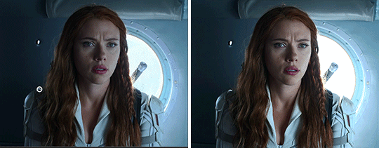
Simple Coloring Tutorial
— photoshop: cc 2020, but this should be compatible with most versions of PS
— level: beginner
— please like/reblog if you use/find this helpful
— tutorial under cut:
you will obviously first open your caps or import your clip, crop/resize your gifs, and add sharpening. here is my gif after sharpening and before any adjustment layers:

STEP 1: curves
add a new curves adjustment layer, choose the bottom dropper and choose one of the brightest points in the gif.
you can see the spot i chose circled below:
add a second curves adjustment layer and choose the top dropper, and choose one of the darkest points in the gif

you can see the spot i chose circled below:

STEP 2: basic coloring
next, i add a levels adjustment layer. on this one, i prefer to only adjust the middle and left arrow. the left arrow adjusts the dark points and the middle arrow adjusts the midtones (and the right arrow adjusts the bright points). i move the middle arrow left to add brightness and highlights and i move the left one right to add depth and contrast. here are my settings for this gif, but i suggest playing around with these two arrows to find what works right for your gif.


i then like to add a photo filter (warming filter (85)). i keep the density at 25% but change the opacity. i prefer 40% opacity but anywhere between 30-50% usually works well. this doesn’t add much adjustment to the color but it helps to balance out the colors, if that makes sense.


then add a brightness/contrast layer. again, brightness will depend on your specific gif and how bright you want it to be. for contrast, i would suggest not going higher than 15 (i prefer between 5 and 15), but again, it will all depend on the gif.
i then add a selective color layer and adjust the blacks. for most gif, below 10 will work will. it will help add some contrast without overdoing it. i know i sound like a broken record, but again, it all depends on the gif.

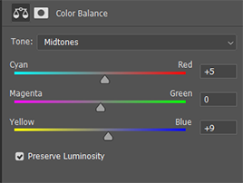
STEP 3: color balance/vibrance
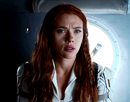
next, add a color balance layer. this will all depend the coloring of your gif, but i will try to give a quick explanation of how it works. for this gif, i slide the bottom arrow towards blue some, because i think nat’s skin is too yellow. i also added a bit of red to add some more depth and coloring to her skin.
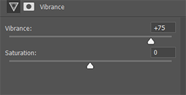
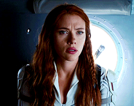
now add a vibrance layer. for this one, i added vibrance at 75%. however, most gifs don’t need this much. you can usually easily tell the right amount of vibrance by just paying attention as you move the arrow. i prefer not to mess with the saturation because i don’t like how it looks.

finally, add one more simple curves layer. most times, i use an auto curves layer. sometimes i don’t like how it looks, just add a simple curves layer by adjusting RBG just a little bit.

OPTIONAL COLORING
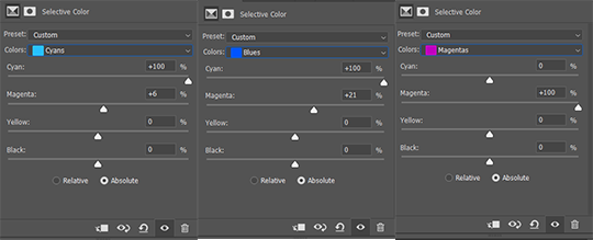
now if you want your gif to be brighter/more colorful, there’s a couple more steps i would suggest. first, you can add a selective color layer. for this gif, i adjusted the cyans and blues to make the background more vibrant and magenta to add more color to her lips.

if you want to make your gif brighter, you can add another levels adjustment layer. for this one, you will actually adjust the right most arrow (the one that adjusts the bright points) and the left most arrow again (the one that adjusts the dark points.) these are my adjustments, but you can find what works best for your gif.
MORE RESOURCES
(my preferred) sharpening settings by @anya-chalotra
font i use for subtitles: utsaah (bold) set to bold and italic
how to fix orange washed characters by @aubrey-plaza
anti-white washing psd by @evansyhelp
#completeresources#resouces#tutorial#coloring#usertana#userpavi#usermarcy#tusersan#useramina#usermorgan#userannalise#tusersammy#usershrimp#jaskierbatey#userholtz#userelm#tutorials#**#tutorial*
651 notes
·
View notes
Last Seen Blogs