#Arabic script
Text
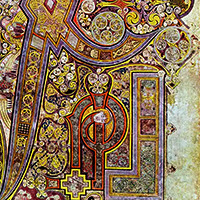
For centuries, scholars’ understanding of sub-Saharan Africa derived from the written records of European colonialists, who gave the impression that sub-Saharan Africans had no native written languages of their own. In fact, says Fallou Ngom, who grew up in Senegal, people in sub-Saharan Africa have used a written system derived from Arabic to record the details of their daily lives since at least the 10th century.
That script, Ajami, is still flourishing; people throughout Africa use it to write phonetic renderings of about a dozen languages, including Swahili, Wolof, and Hausa. But because texts written in Ajami are often passed down through families where they can be lost over generations, many are inaccessible to scholars, few of whom can read the script anyway. Those who know about Ajami texts often dismiss them as mundane, with little scholarly value. Ngom, director of Boston University’s African Studies Center, disagrees. He is digitizing more than 18,000 of these indigenous texts—including those in Ajami, Arabic, and Ajami-Arabic—and making them widely available to offer scholars new insight into African history, literature, culture, medicine, and everyday life.
The BU College of Arts & Sciences professor of anthropology partnered with the West African Research Center in Dakar, Senegal, on a 15-month project funded by the British Library’s Endangered Archives Programme. Ngom gained access to the documents through an elder in the Casamance region of Senegal who helped him compile a list of locals with Ajami manuscripts. The elder made introductions and facilitated approvals for the research team.
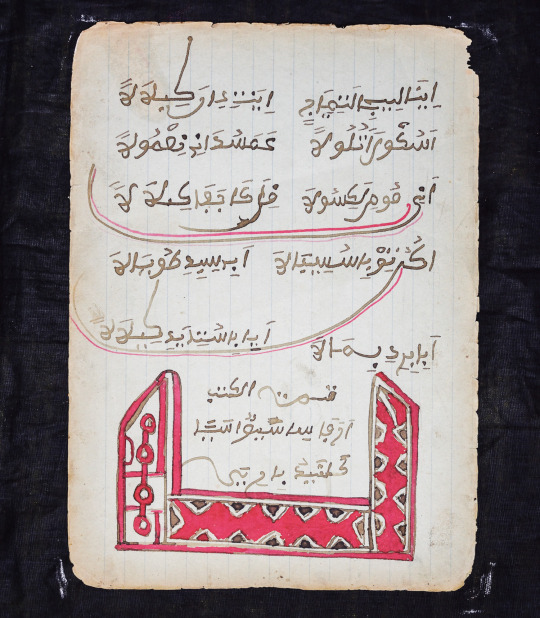
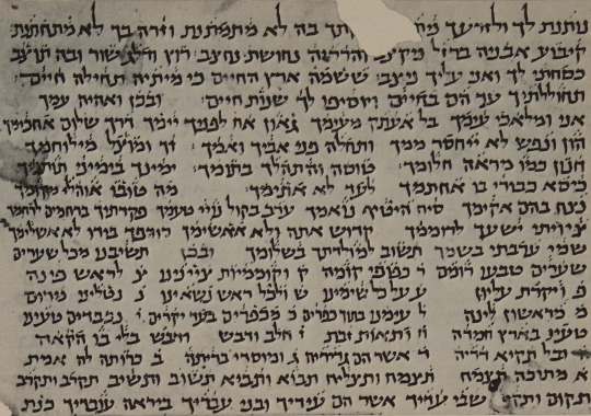
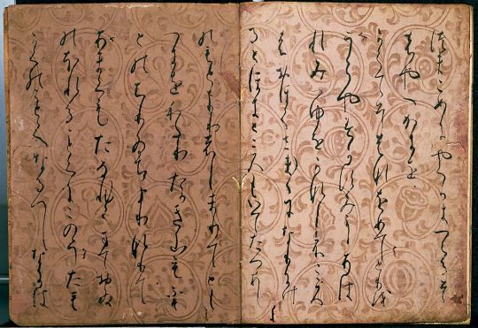
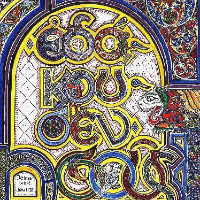
[ID: a page of Ajami handwritten text above a large red and black geometric decoration. The text, which is written with full diacritics, looks like classical Arabic script with several extra or different letterforms and diacritics. End ID]
“It’s human knowledge,” Ngom says. “It’s everything. And it’s a grassroots tradition. They’re handwriting these materials, making copies, and sharing them in the community. In many cases, this is the only form of literacy they have. So that’s what they use to document their lives.” The texts reveal “the interests of these people, their preoccupations.”
These everyday interests and writings expand scholars’ comprehension of the region’s people beyond the history and traditions emphasized in postcolonial literature, which Ngom says gave “the false impression that only oral traditions exist in sub-Saharan Africa.” In Senegal, the official language is French, in which only half of the population is literate; French literacy is restricted to a minority educated group in urban areas. The absence of Ajami in the history of sub-Saharan Africa “makes invisible centuries-old traditions of producing knowledge.”
Lara Ehrlich, "Digitizing Ajami, a Centuries-Old African Script." The Brink. 2020.
#I think the 'this is the only form of literacy they have' comment is potentially quite silly. but#also it should be stressed that 'Ajami' is a collective term for several different traditions in Africa#of writing local languages in Arabic-derived scripts#Ajami#Africa#linguistics#sociolinguistics#Arabic script
63 notes
·
View notes
Text
10.22.22 //
سلام!
I recently started learning Persian, so I added a new language page in my Notion language database, and it's been filling with words! Such an interesting and beautiful language! I've been working on the handwriting too, but I'll share that once it's a little better 🙃
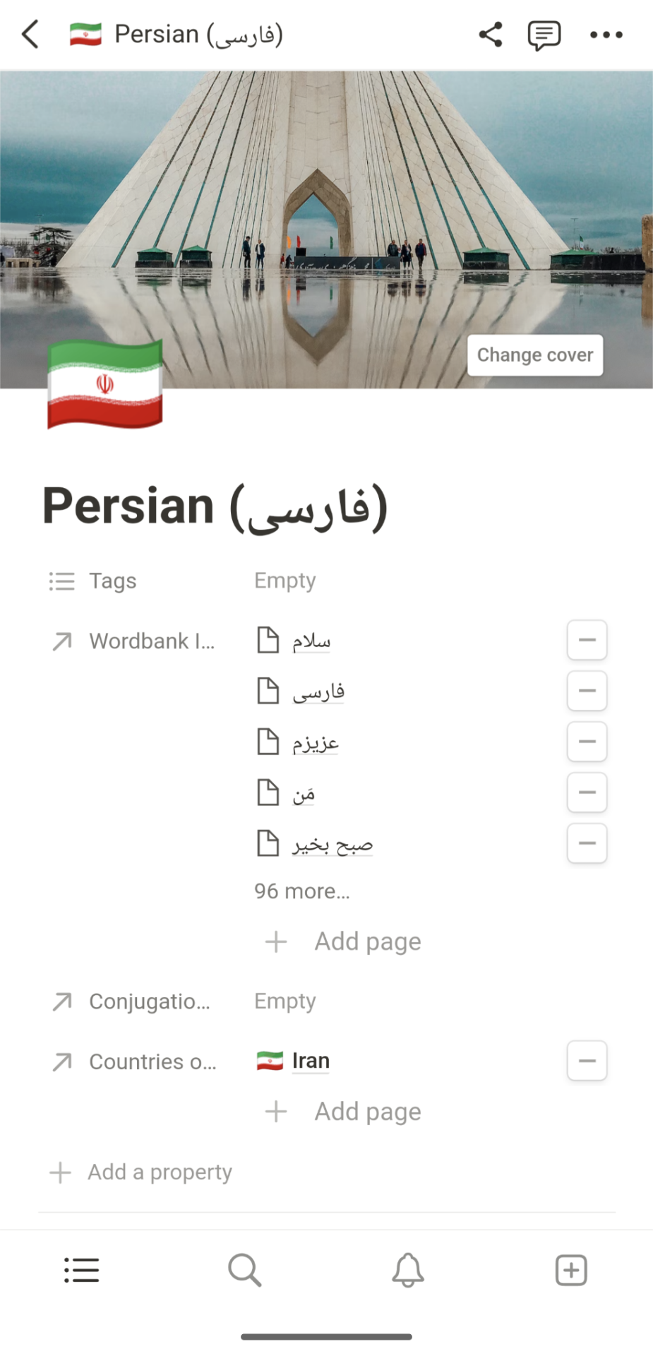

Eventually, I'm planning to make my wordbank resources available as templates to help others learn languages too, so if you're ever interested, drop me a message!
#op#notion#persian#farsi#فارسی#notion template#notion inspo#notion inspiration#notion aesthetic#notion theme#language#languages#langblr#language learning#language exchange#language immersion#learning languages#persian language#arabic#arabic script
82 notes
·
View notes
Text
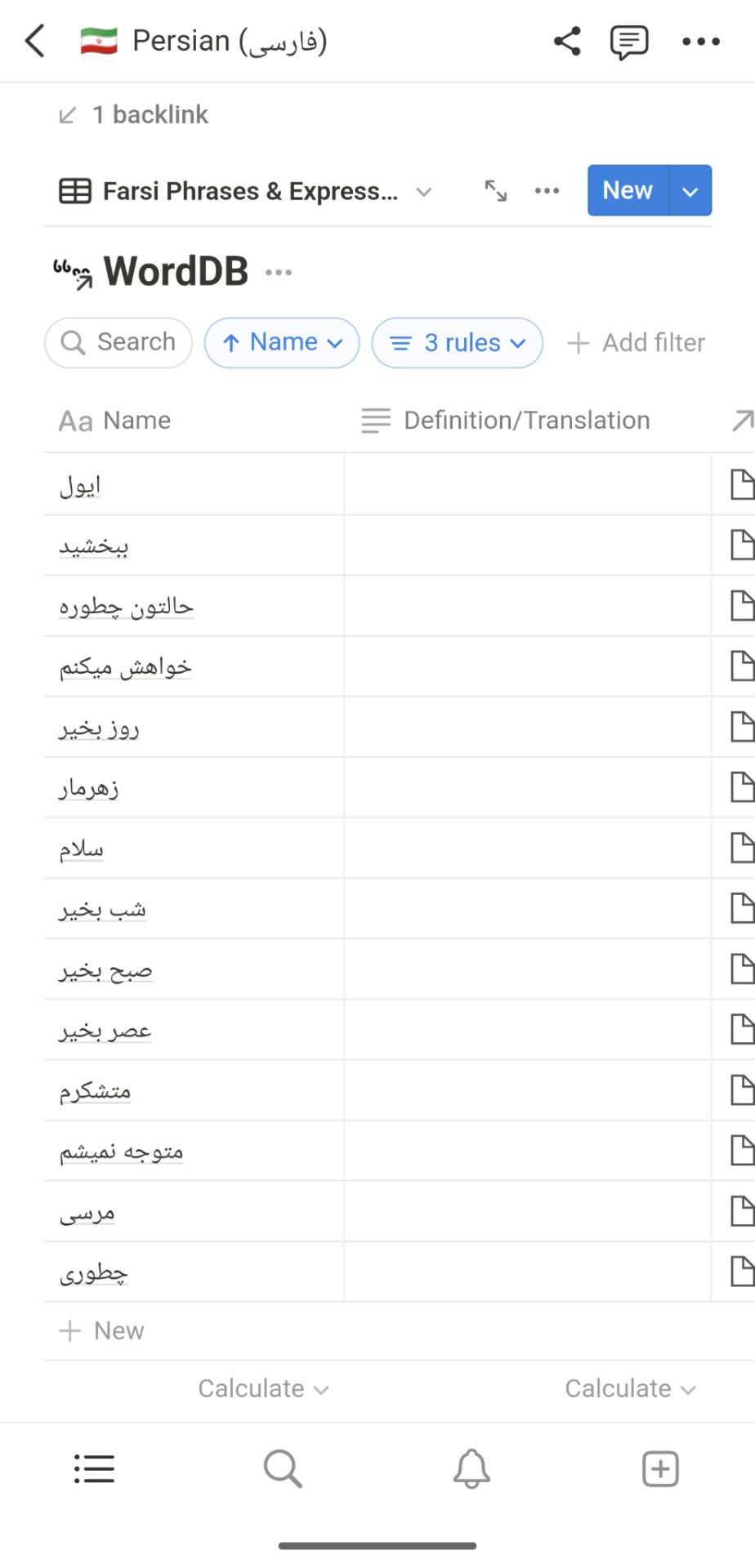
[Arabic→English] @falastin_lover3 Instagram Reel — Color Coded Translation
Link to original post
Definitions from arabicwords.site
—
قاطع عشان غزة
qatae eashan ghaza
Boycott because of Gaza
—
Please correct me if I made a mistake
#color coded translation#arabic langblr#beginner arabic#study arabic#arabic to english#learn arabic#arabic script#arabic#Levantine#Levantine Arabic#palestine#Palestinian#Palestinian Arabic
4 notes
·
View notes
Text
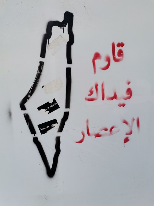
Ramallah, West Bank - Ocuppied Palastine, 2022
"Resist. You're worth the Hurricane."
Personal rambling about what this trip meant to me as a bosnian/bosniak below
In my daily life I struggle with the notion that I deserve and want to live. I still don't fully understand why I sit here in my privileged life thinking I don't deserve to breathe air, that I am inferior to every living creature on this earth, even those that want to hurt me maliciously. But the truth is from when I was a baby I've known that there are people who want to take away my heritage, ancestry, ethnicity, my existence, my life. If my parents had stayed in Sarajevo, if I had been born just a few months prior, I could've been killed upon days of my birth. I've been told to my face time and time again that my people, my family, my language don't exist, that we deserve to be erased. I guess I internalized that. And that's how I live, bosniak and making myself small, beating myself up, holding my breath.
I had the honor of visiting and staying with my friend in Palestine this summer. As her and her family live in Jerusalem, she got to show us around the Israeli territories as well as the West Bank, like Ramallah, Jericho and the Walled Off Museum featuring Banksy in Bethlehem right by the 8m wall separating the territories. Those were the cities were i felt most grounded, most real and alive and the above graffiti puts into words why.
I can't fully explain it but seeing and feeling their resistance, their spirit, it felt like l could finally breathe for a moment.
#occuppied palestine#palestine#west bank#being bosniak#bosnian#resist. you're worth the hurricane#arabic script
15 notes
·
View notes
Photo

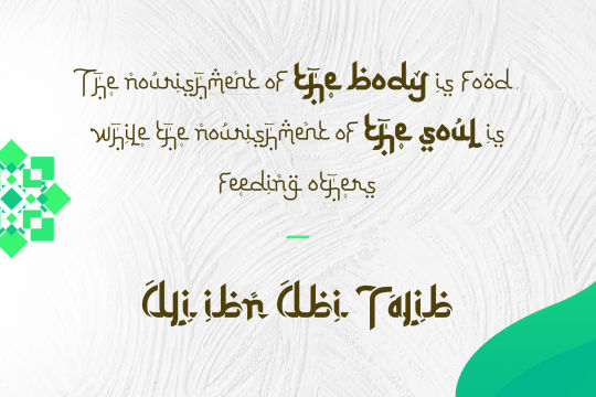
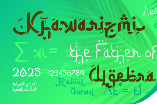

Ketupat font designed by endemiqLabs
#arabic#fonts#arabiccalligraphy#typography#design#web design#webdesign#font#lettering#arabic lettering#type#typeface#arabic font#arabic fonts#arabic script
9 notes
·
View notes
Text
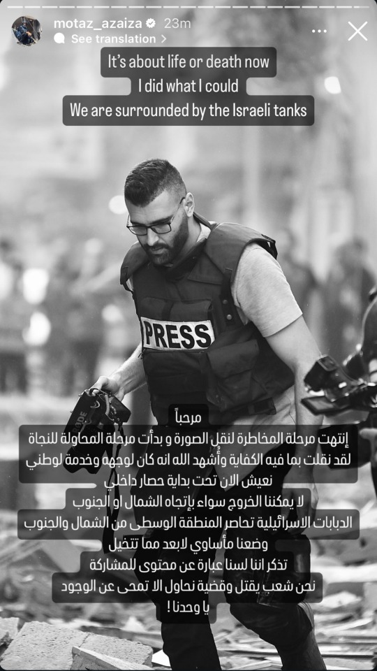
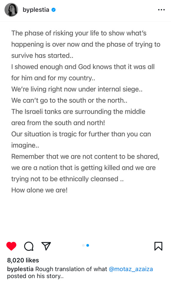
motaz azaiza | ceasefire now | ceasefire today
#ph#motaz azaiza#palestine#free palestine#arabic speakers please do let me know if i copied the arabic script incorrectly in the alt id for motaz's post
4K notes
·
View notes
Text
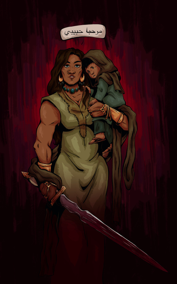
AU where Talia brought Damian to Bruce earlier
[w/o text + closeups below]


#really just an excuse to draw baby Dami#also Talia with a sword#dc give Talia big arms challenge#he’s just baby#she’s mommy#in every way#Talia also should be like six feet tall#no one say anything about my Arabic script#I don’t know how to write it#I tried#I based their clothes and jewlery off of Pakistani clothing#as a treat#talia al ghul#damian al ghul#damian wayne#dc comics#batman#ambrose art#Ambrose draws bats
463 notes
·
View notes
Text


Coming soon.
#hozier#hozier lyrics#hozier music#karen cowley#in a week#hozier album#free palestine#palestine#free gaza#gaza#art#creative writing#writing#script#story#short story#the hoziest#unreal unearth tour#andrew hozier byrne#unreal unearth#wasteland baby#arab#arab art#palestinian resistance#Palestinian
38 notes
·
View notes
Text
ORV transcends language | how ORV is kind to readers (1.1k words)
the difficulties in analyzing text are already numerous without a language barrier, the way one word can mean 5 things and when you put it in a sentence suddenly it can mean 50 things and put that sentence in a paragraph? go further and put that paragraph in a page? construct a whole world around it, weave it into the fabric, and suddenly you are painting with words.
ORV is a daunting text, it calls and references so many mythos world wide, greek, roman, indian, chinese, japanese, it plays with meaning and intent and uses gaps in our knowledge like weapons, making us extrapolate our own meaning between the sentences, it is a tome of knowledge when it comes to histories and philosophies it feels at times like I will never understand all these things inside it.
One of the difficulties of reading a translated text is that when we analyze a text the authorial intent weighs very heavily in our minds, sure we can immerse ourselves in the world but once we start picking apart at the threads we hit a wall pretty soon when we start asking ourselves "what did the author mean by this?" however in a translated text there is an obvious gap, a game of telephone, did the translator actually capture the authors intent? or are we just reading the translators perception?
sadly I don't know korean, and I cant say I have the drive to learn it, as such I know there will forever be a side of ORV that I will never be privy to - however I am bilingual and had the pleasure of reading two translated versions of ORV, an English translation and an Arabic translation, I didn't finish reading the said Arabic translation but a couple things stood out to me when I briefly did
ORV is very kind to readers, following along in other stories can seem confusing at times, the pacing might be too fast and you might miss some details in a characters actions, the wording might be too vague and ah damn 20 pages later you realize you don't actually know why the characters are doing what they are doing. A big writing adage that you will see a lot is "show dont tell" and it holds merit, but ORV doesn't subscribe to it, because ORV shows AND tells.
ORV built a world around readers and reading, and it makes sure that there is clarity every step of the way on what is happening, first by starting out as a homage to the isekai genre, and not deviating too much at the start, making the readers feel at home in a worldview they are familiar with, systems, leveling, videos games etc, and when it starts deviating it explains things with clarity that no matter how bad the translation is you understand the general intent, and secondly by being VERY blatant about the names of things and having a built in "story" system that is built on common story tropes and names the themes for you!
take for example "unbroken faith" and "Blade of faith" both of these are two translated versions of dokja's sword. I will never know which one is closer to the original authorial intent, but I can tell you something, dokja's sword is symbolism to the faith he is wielding.
(CH386 vague spoilers) or the entirety of "the great war of saints and demons" being about the concept of good and evil fighting and how kimcom aren't just above being good and evil, they are both. By using story tropes that we are familiar with to explain the complexity of situations in a simple forms you no longer have to worry about losing you readers understandings through language barriers. Every story in the world in every language knows what good vs evil is, every language has the words to explain them.
and therein lies the beauty of ORV.
But of course this isn't to say translations don't matter, it does speak to the strength of an original texts clarity when it accounts for the big things by making them simplified, but when we get down to the nitty gritty it starts to lose form
take for example
"Tell me, you fool. If I continue to regress, will I ever get to meet you again?"
this person here has a great write up explaining the translators thoughts behind this specific line
but it has spawned a lot of debate in the English speaking fandom, as to the strength of its translation, I remember when I first saw someone claiming that its a mistranslation and "you fool" isn't part of the original, my first thought was "and so?"
I do not mean to be dismissive to the original text, but I do not exist in a space where I can appreciate it in the original korean, I do not exist in a worldview where I can understand the historical implications of a lot of the characters, and even when I try to research it in English sadly the resources do not exist yet and its even more laughable to think of finding these things in Arabic. (Goryeos first sword doesn't have an English wikipedia page as a clear example)
a lot of people have issues with the most popular English fantranslation of ORV - and I can understand why, being bilingual I have a lot of opinions on how a lot of things SHOULD be translated most of the time, and have done my own translation work
but as I sit and think about this popular translation I cant help but just feel love for it, it might be lacking to some, it might be inaccurate at times to others, but its just enough for me to paint the gaps in the text with my perceptions, the words used are tied to my affections
the Arabic translation of ORV is clunky, it is messy, it doesn't have as much grace as the English translation of ORV does, the words barely string together cohesively, but it has enough clarity, enough intent, and enough love for its readers, to catch their hearts, their attention and their energy
and so I want this to be the first post on this blog because, the author is dead here, not because I buried them, but because the tower of babel fell down a long time ago, and all we have is rubble and each other.
a lot of the analysis on this blog will try to be respectful to the korean original wherever it can, however my words will be coming from an anglosphere perspective, and build on other English reader's perceptions of a text translation that a decent amount of people don't think is adequate, but just like ORV is kind to us, we can be kind back, I will quote the most popular version because its what connects us together, and while the authors intent might be lost, we can share our own meanings with each other, and build our own intent from the rubble.
#orv meta#orv#orv analysis#r1864#a big wall of text for me to go lol orv is queer and yjh is trans coded#but this is tumblr so everyone knows that already#also I still don't actually know what naming convention is correct I've seen many discussions about this#I just go with what is most popular for ease of understanding and ease of reading#also i find the naming thing very funny in english and latin letters because there isnt nearly this much drama about it in the arabic scrip#I just assume its like any other language that doesnt use latin and we are just trying to break english to sound out letters they dont have#i do like how dokjas name sounds like its splitting in the middle in the correct pronunciation 'dok-ja' adds to his duality#and i am sad that gets lost in the latin script sounding
94 notes
·
View notes
Text
Hey, guys! Want to vote on the best 6th-10th Century script (writing system) that I, Gecko, personally like?
Of course you do! Writing systems are SO COOL!
And here's a bit about each of the contenders:
Arabic (Naskh Script)
Derived from the Aramaic Script, which grew out of Phoenician, Arabic has a variety of forms. The Naskh script is the one I find the most beautiful, with it's extreme variation on character length and height. I also love the use of multiples colours for Ḥarakāt (vowel marks and other diacritics). Add in the elegant curves and solid lines, and Naskh Script becomes one of the most stylish scripts around.
Latin (Insular Script)
Derived from Greek, the Latin alphabet is usually a competent and pleasant mix of lines and curves, uprights and descenders. Insular script plays with these qualities, and the result is electric! many of the uprights (t, d, f) are gone. New descenders are added (r, s, f). Horizontal lines take a new prominence. Line weight is increased, and the curves become more angular. Something old to us becomes new again.

Chinese (Semi-Cursive Script)
There are many ways to write Hanzi (Chinese characters), and Semi-Cursive Script manages to combine the best qualities of most of them! The expressive curves and flow of a cursive script. The solid shapes and readability of Regular Script. One of the joys of Hanzi is the visual interest of so many unique characters; which share components, but use them differently. Semi-Cursive keeps much of that interest, while also providing a dynamic energy and movement.
Sogdian (Cursive Script)
Derived from the Syriac script, which grew out of the Aramaic Script, the Sogdian Alphabet was developed by traders who met most of the major cultures of the Old World, and let all of those cultures affect their language and writing. Sogdian can be written write to left, like most Aramaic scripts, but also top to bottom, like the Chinese Scripts of their main trade partner. Curvy cursive lines, and characters of wildly varying length, give this script a interesting sense of flow.
Hebrew (Ktav Ashuri Script with Palestinian Vocalization)
Another offshoot of the (Imperial) Aramaic Script, the Hebrew Alphabet has a really interesting, heavy, square, solid feel. In contrast, Palestinian Voicing (an extinct form of writing vowels where all of them were above the consonants) is really light, stacked on top their vowels in little floaty towers. It's a cool combination!
Maya (Classical Maya Script)
The most famous script of the Americas, Maya has one of the most unique reading orders of any script. Characters are written in blocks, which are then read in a zigzag (right, and then down-left) pattern. Full of heads (both animal and human), torches, seeds, and other half-identifiable shapes, Maya texts are works of art, and the more you study them, the more beautiful they become.
Nubian (Old Nubian Script)
Derived from Greek with additional letters from Coptic (Egyptian) and Meroitic (a previous Nubian culture). Lines above letters are used to skip parts of words deemed unnecessary. The mixture of rectangles and triangles, heavy and light line weights - it reminds me of telegrams, or early typewriter text. I love it!
Khmer (Angkorian Khmer Script)
Derived from the Pallava Script, which derived from the Brahmi Script, Khmer is probably my favourite script to write. The curves feel so good! The spirals so pleasing! You write consonant clusters by writing little letters below the main one! A joy to create, and a joy to look at.
Japanese (Cursive Script)
See these wiggles? They're Chinese characters. Elegant, looking like poetry no matter what they're saying, Cursive Japanese is art. It's also ridiculous. 3 different characters, each with multiple strokes, indicated by wiggling the brush as you draw a line! Most cursive scripts are like this, but the contrast between the square solidness of Regular Script and the flow of Cursive is one of the more extreme. What a delight!
Sanskrit (Siddham Script)
I had SO MANY options for Sanskrit (Brahmi) Scripts, you guys. SO MANY! But in north-west India, during the period I study, this version of Siddham is the prettiest. Look at the curves! Those aren't just decorative, each curvy line that goes above or below the text is a vowel. Consonant clusters are shown by combining the characters together in one spot. The lines at the top haven't yet started connecting, like they do in modern Devanagari, but there's already a sense of it's existence. Such a cool script!
#long post#gecko's polls#calligraphy#scripts#writing systems#arabic#hebrew#khmer#maya#latin#nubian#sanskrit#sogdian#chinese#japanese
227 notes
·
View notes
Text
I have finally watched The Creator yesterday. Watching that while the genocide in Palestine is currently unfolding was very, very painful.
Reviews on letterboxd I've seen focused so much on the what they perceived to be "boring sci-fi trope of wow robots have feelings/souls too" and neglected to point out how this film shows how US military DEHUMANIZE people.
It really grinds my gears how many people missed the totally not-subtle anti-military, anti-imperialism aspect at the very heart of the film.
#i do agree though the script is NOT good#the characters and the interactions and the emotional moments could've been written better#but as someone from Global South I absolutely adore the way they show how dehumanization works#i will probably say more about this film later. esp in regards to us war on terror and the on-going genocide of palestinian people. also th#whole 'A.I. must be stopped cus they will replace human' thing made me think about how people excusing israeli ethnonationalism#because 'Arab birth rate' would replace Israelis or whatever. that's why Palestinian children are considered to be massive threat to Israel#and this film a 'choosen child' is considered to be the highest threat to West military#The Creator#Gareth Edwards#John David Washington#The Creator 2023#/text mine
50 notes
·
View notes
Text
During the early stages of Arabic script, the shapes used for letters Feh and Qaf were often indistinguishable. Eventually, the two letters were rendered distinct through the use of dot marks. Also, in separate and final form, the Qaf tended to possess a deeper bowl than the Feh. These two visual features have remained in place to this day and continue to distinguish between Feh and Qaf. In most of the Arab realm, the Feh carried one dot above, while the Qaf carried two: ف ق
In Morocco, on the other hand, both letters carried a single dot. The Feh carried it below, while the Qaf carried it above: ڧ ڢ . This convention came to be the norm for the Moroccan (Maghribi) style of writing. The letter Feh in Morocco usually looked like ڢ in contrast to ف used elsewhere. The difference between these two glyphs is comparable to the difference between a [double-story lower-case 'a'] and ɑ [single-story lower-case 'a'] in the Roman alphabet.
In the following graphic showing traditional text written in Moroccan style, the Fehs are marked by green rectangles, while the Qafs are enclosed in orange rectangles.
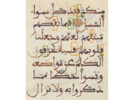
[ID: hand-written Arabic text in Maghrebi style with feh (with one dot below the rasm, or central letterform) and qaf (with one dot above) marked by rectangles as described. end ID]
In a more modern context, the following image shows a handpainted traffic sign advising drivers to stop at a checkpoint. The Arabic word for stop ( قف ) consists of two letters, Qaf followed by Feh. As in the previous image, the two letters (at the top of the sign) are marked by orange and green rectangles.

[ID: round sign reading فڢ halte / الدرك الملكي gendarmerie royale. end ID]
The hand-painted sign makes use of the Moroccan convention of the dot above for the Qaf and the dot below for the Feh. In contrast, a more recent typeset sign uses the standard Arabic convention of two dots above the Qaf and one for the Feh.

[ID: an octagonal stop sign reading قف / stop. end ID]
[...] The following image is particularly interesting because it presents a medley of signs from different periods and distinct styles. Both larger signs display the street (French rue) names in Arabic and French. Best translated as alley, the Arabic word ( زنقة ) happens to include a Qaf—highlighted in turquoise. In the sign on the right, the Qaf is carrying two dots, while the one on the left carries one: two visual conventions, side by side, for the same letter. The stylistic choices depicted by the more recent signage in Morocco demonstrate that it is aligning itself—at least, in the public sphere—with pan-Arabic orthographic practice. [...]
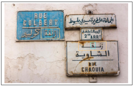
[ID: a group of signs on a wall giving street names. the blue sign on the left reads, in white text, "rue Colbert / زنڧة كولبير". a group of three white signs with blue text is on the right; the one at the bottom reads "زنقة الشاوية / rue chaouia". end ID]
Kamal Mansour, "On the Arabic Letters Feh & Qaf." Unicode document L2/21-051.
#linguistics#sociolinguistics#Arabic#Darija#(not really but I want it in that tag)#Morocco#Maghreb#Arabic script
61 notes
·
View notes
Text


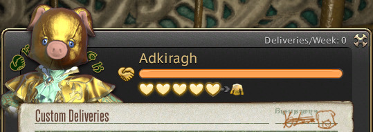

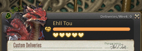


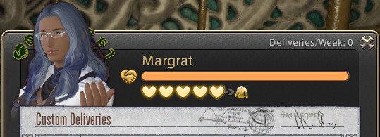
signature compilation because I love this world and evverything upon it or whatever. my faves are margrat's napkin calculations and adki drawing a little pig next to his
#ffxiv#i think the norvrandtian ones are interesting too#their script resembles arabic & cyrillic letters a little more?
26 notes
·
View notes
Text
Chag Pesach sameach! In celebration we present Genizah Fragment Halper 63, a Judeo-Arabic commentary on the Haftarot (Shabat Shuvah / Seventh day of Passover). This fragment was written in the 12th or 13th century.
Online:
#medieval#manuscript#passover#genizah#fragment#12th century#13th century#judeo-arabic#hebrew script#book history#rare books
69 notes
·
View notes
Text


Calligraphism
#calligraphy#illuminated manuscript#islamic calligraphy#persian#arabic#arabic calligraphy#chinese seal script#made-up aesthetic#nonsense aesthetic#aesthetic#aesthetics#aesthetic moodboard#moodboard aesthetic
7 notes
·
View notes
Text
will say that there were these two older men who were at the ceasefire ralley I was at today, one of whom passed out fliers about IL as an apartheid state and both who had much to say on the situation, who transpired not to know what either “salaam” or “shalom” meant and I had to explain at length that this meant hello and peace in Arabic and Hebrew, the languages spoken there
#……..#They didn’t seem to clock Arabic or hebrew as languages are all?#They didn’t recognize salaam or shalom said out loud but they also didn’t recognize Hebrew or Arabic script on a poster
11 notes
·
View notes
Last Seen Blogs

joseegirot
¡God is love!

health-secret
Untitled

riverdales-mantle-blog
Jughead Jones Wuz Here

massivecollectorgarden-fan-blog
Untitled
floodservicescentralcoast
Flood Services Central Coast