#I actually think a diamond shape would work a lot better!
Text
Minoan Heanos
The distinctive open-front dresses worn by Minoan women are probably even more iconic than the multi-layered kilts. Over time, there's dispute whether the garment is one piece or a separate bodice and skirt, but currently the one-piece theory is in ascendance.

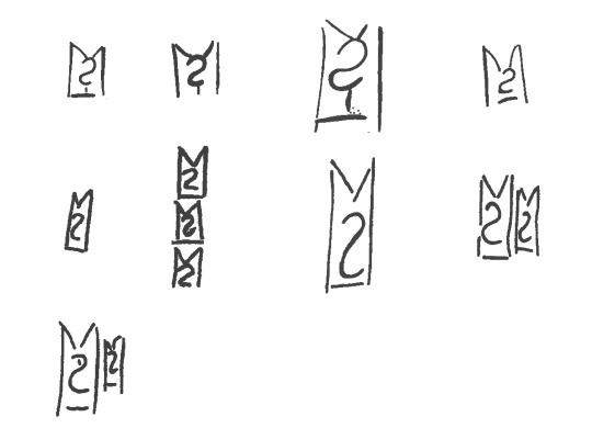
The word heanos is derived from the Linear B logogram *146, wehanos. The wes- prefix, which is the squiggle in the middle, indicates a garment. Bernice Jones believes that this logogram represents the garment worn by Minoan men and women.
Marie-Louise B. Nosch, The Textile Logograms in the Linear B Tablets, pp 133-138
More research and construction below the cut:
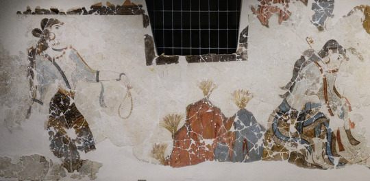
The theory that the garment is a full-length tunic is further supported from imagery from the time, like these figures from the c. 1400 BCE Hagia Triada Sarcophagus. This detail from the sarcophagus shows three figures in some kind of procession, 2 women and 1 man. The woman at left wears a tunic with some kind of pelt as a skirt, and the other 2 figures wear tunics without anything over them, showing that they are one continuous, ankle-length garment.

Some of the most important resources for interpreting how the heanos was constructed comes from the two women depicted in the House of the Ladies in Akrotiri, wherein the side seams of the tunic are clearly visible running along the side of the body and under the arm.
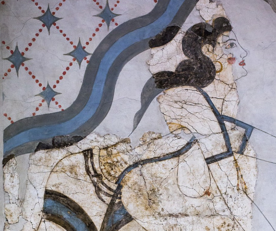
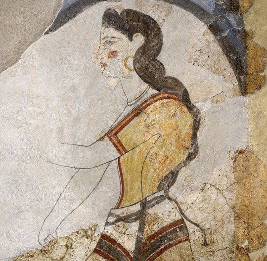
details of figures from the House of the Ladies, Akrotiri, via Wikimedia Commons
advadbsvasb


Diagrams from Bernice Jones' book Ariadne's Threads, p. 82, via Gorgeous Tangents
The heanos itself is made of 3 pieces of fabric: 1 back and 2 fronts. These diagrams show a concave hem like on the labrys-shaped kilt but I went with a straight hem, which is an equally valid option. The end of the sleeves are level with the edge of the hem at the widest point. This would probably be the width selvage-to-selvage on the fabric, being narrower than fabric widths commonly are today. There are 4 seams: the shoulder seam, the two side seams, and a front seam (optional, but recommended if you would prefer not being arrested.) It may be tempting to fold the fabric across the shoulder, so the only sewing is side seams and a neck hole, but this makes a weaker garment overall. I used this as a shortcut in my fitting muslin and it caused tears and weak points at the three points of the front opening.


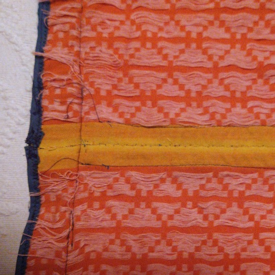
my fabric was a lightweight, moderately loose-woven cotton with a supplementary weave pattern in squares and diamonds. Linen or wool would have been more accurate but also? much harder to find from online quilting stores selling fabric for affordable prices. The main fabric is dark orange and the pattern is made out of pink/lilac threads. This weaving technique resulted in a LOT of long floats (unsecured expenses of thread) on the back--you can see how the wrong side of the fabric is much pinker than the right side. These floats could snag easily if I wasn't careful, so while it made a very effective visual for this tunic, I do not think that this fabric type would be viable for everyday wear. I'll leave it to people who actually know about weaving to ponder what more accurate weaving techniques would be.
Construction
The overall pattern is basically a T-shaped tunic, and the most important measurements are shoulder circumference, shoulder width, bust circumference, and the shoulder-waist length. In addition, you need measurements for the bicep, waist, shoulder-navel length, and hip circumference. After working out the fit with a muslin, I ended up with this pattern, 1 of 4 identical quarters.

Your first impulse may be to make the tunic very close-fitting, since the depictions in frescoes are skin-tight, but since the pattern has no added gusset this is a recipe for Cannot Move Arm. So I gave a very generous curve under the arm, which also made the dress look better when my arms were down, avoiding armpit wrinkles. I continued that ease into about an extra 2 inches added on to my waist measurement and plenty of extra space around my hips so that I could do exciting things like Sit Down.

I sewed the shoulder and side seams using the machine, and felled the raw edges on each side of the seam by hand with a whipstitch. I foided back the front edges of the v-neck instead of cutting them, which was a tip I got from the Gorgeous Tangents blog. This strengthens the neckline and keeps it from stretching, and also means that everything can be readjusted if you have size fluctuations or just want to modify the tunic into something more or less modest.
I whipstitched the front edges together by hand--the contrasting selvage didn't matter because it would be covered up by trim. I ended up cutting the tunic a liiiittle shorter than I wanted, so I finished it with some leftover bias binding instead of hemming it to conserve as much length as possible.
Trim

I custom-ordered the woven tape trim from Long Creek Mercantile. Both are made of wool--the "header band" and the hem trim are 1 1/4" wide and the center-front and cuff trim are 3/8" wide. I observed that most images of the Minoan heanos show trim with two colors at most, in a simple geometric or linear pattern, so I consciously restrained myself from ordering anything more elaborate. The clothing on Minoan frescoes is characterized by strongly contrasting colors, so blue trim was the most obvious, and best-looking option. Orange tunics with blue trim appear multiple time in art like the "Dancing Lady" fresco from Knossos:

Dr. Jones suggests that the band across the shoulder would historically have been a header band--a band of threads woven at the beginning of a project in order to properly space the warp bands (see her diagram at the beginning). That may be a reason why the shoulder trim often depicted under the front or sleeve trim, as shown above. Regardless, the trim almost always coordinates.
I sewed on the shoulder trim by hand, the sleeve and hem trim by machine, and the center-front trim with a combination of both.
Tassels
Many frescoes from Akrotiri and Hagia Triada show the ends of the supposed header band turned into tassels. This embellishment is not universal among heanoi, as you can see from the "Dancing Lady" above, but it does add a fun little something!

(yes, my Lounging Pants are very fashionable)
I turned the excess ends of the shoulder "header band" trim into fringes, knotting the yellow ones into a lattice and turning the blue yarns into tassels. The lattice-tassel appears on a fresco from Hagia Triada:

Reproduction of fragmentary fresco from Room 14 at Hagia Triada, Crete
The saffron gatherers from Akrotiri shown below have clearly displayed fringes at the ends of their sleeves. The one on the left has red fringes that appear knotted or ravelled/unravelled in an undulating pattern, and the one on the right has fringes that may be either beaded with papyrus-shaped leaves or cut into short tassels.

Another option is leaving the fringes loose, as seen in the Akrotiri frescoes from Xeste, room 3:
The final garment was super comfy, actually! It's much simpler to create than I thought it would be based on the frescoes, which made it all feel pretty magical when everything came together. I did think it was a little unusual how tailored this garment is, and the potential waste of fabric that comes from a shaped garment, especially compared to how later ancient greek clothing was mainly rectangles. I don't know enough about bronze-age and earlier clothing to have any idea how typical this was, since I'm extremely Not an expert on this subject, but am always open to learning more!
477 notes
·
View notes
Text
⤷ ✧ Christmas
Gender neutral
- order 66 | shorts | NRC students
Note: Merry Christmas!!

“Hey, Prefect, C’mere real quick I wanna give you something. Merry Christmas!~ Look what I got you. Huh? No, I picked this out all by myself. You underestimate me sometimes. Anyway, where’s my gift? You don’t have one? Seriously, you’re so unprepared… and rude. How about instead you do me a little favor.”
It’s a small pedant with a red gem and golden lining. It looks like it could be a keychain or a phone charm or some sort. When you look closer at the back of it , you could see the name Ace Trappola and your own engraved.
- Ace Trappola
“Um Prefect. Sorry to stop you so suddenly you see I… Merry Christmas! I wanted to show my appreciation for you since you’re been a reallygreatfriendandtobehonestIdidn’tknowwhattogetyousoIjustgotaring—. Ah… Sorry I’m just a bit nervous. Oh don’t worry about getting me a gift. A-are you sure? Well there’s one thing I want. Could you give me a kiss?”
It’s a silver ring with a blue gem in the shape of a small star illuminated light. Oddly enough, it fit your finger perfectly. How did he know your ring size?
- Deuce Spade
“Hi hi! I’ve brought a gift for my favorite freshman~. Open it! Here and right now! Heheh it’s cute right? I bought us a matching pair. When we click it together then it’s a heart. Super cute! I saw it on MagiCam and I’ve been dying to match with somebody. But I wanted it to be someone special like you! So, what about my gift? You don’t have a gift? Hm that’s alright, you know all I want for Christmas is you… Okay, okay sorry! But for real, let’s take some pics together. That’ll be my gift.”
It's a really cute Lego necklace! The one that connected with another to form a cute little heart. It’s popular on MagiCam for its simple yet adorable concept (way over priced too).
- Cater Diamond
“Wow it’s pretty cold, isn’t it? Okay I’ll quit with the small talk. Merry Christmas, enjoy! My younger siblings helped make it so sorry if it’s a lil messy. The toppers? Oh those were supposed to be us. Honestly I thought it was just some random clay blobs my sister put on top. Oh I don’t expect a gift back. I just wanted to repay you for helping Riddle. W-well, if there’s one thing I wanted it would be for you to come visit my family’s bakery.”
It’s a small cake. The colors seemed to be added at random making it colorful. The frosting job was done by experienced hands and the most noticeable thing was the two cake toppers. They stood close to each other, holding hands.
- Trey Clover
“Good day. I’ve got something for you for the holidays. Merry Christmas, enjoy. In truth I wasn’t sure what to get you. It’s nothing special but… Thank you. You’ve changed a lot in my day to day life and everything has only gotten better. …I hope to be someone w-who is worthy of you… Oh no, that was nothing.”
It was a fountain pen. You could tell it was well crafted and meant to be used professionally. It had a red ribbon around it and came with various inks in different colors.
- Riddle Rosehearts
“Good morning. Um… I got this for you for the holidays and such. I know it’s not a lot but I at the very least wanted to give you something. I thought you might want this since you seem so amused by my wolf form… W-what? You’re naming it after me? You’re honestly… Nevermind that, you don’t need to get me anything. Your time alone is enough.”
It was a cute little plushie of a wolf. It didn’t look like Jack at all, a bit disappointed. It was actually quite large and squishy. I wonder where he bought such a well made plush?
- Jack Howl
“Ah man… I can’t believe I’m doing this. You better be grateful or I’ll take it right back. Here, I’m supposed to say Merry Christmas or something I think. It’s actually really irritating to give anything of mine away, well technically Leona paid for this since I took some of his money— whatever. You seriously can’t tell? It’s a survival guide for all your teachers and the tricky students. I worked real hard on this. But it’s not for free, hand over the payment. You have no gift? I’m not leaving empty handed or on an empty stomach. You’re taking me out to a donut shop or something, okay?”
A simple guide of the staff at school. Mostly just your teachers and how to deal with them. There’s also tips for dealing with housewardens. Impressive…
- Ruggie Bucchi
“There you are. It was a pain to find you. I can never find you when I actually need you. Merry Christmas, I don’t really care to celebrate but still. Don’t act like I’m incapable of being a good person. I don’t see why I wouldn’t get you a present. Hm? I’m Leona Kingscholar, do you really think I’d get you something cheap? Appreciate it, herbivore. I don’t really care if you have something for me or not. H-hey, let go of me. You don’t need to hug me.”
It was real gold. Small hoop earrings with hearts engraved into it. Along with it was a thick jacket. You’ve seen the brand before, most of its products cost up to 400,000 madol and higher?!
- Leona Kingscholar
“Oi, I’m right here. Don’t try to just act like I don’t exist. You’re so cute when you give me the cold shoulder but this is serious talk… MERRY CHRISTMAS!! Hahahahah! Here, take it. It’s not like I planted a super lethal device in there that’ll hurt ya. It’s just a pair of shoes. Those ones you got now are awfully beat up. Honestly, I think you deserve some new laces too. Huh? You don’t got a gift for me? That’s unfortunate, and rude. Those shoes costed two fins and a gill. If you let me squeeze ya real tight I’ll consider it even.”
A nice pair of shoes. It even came with the receipt. It wasn’t wallet breaking but more than you could ever afford. But for the quality, it was an absolute steal. Floyd has always had good taste in shoes.
- Floyd Leech
“Ah, there you are. You could already guess why I was looking for you. I’ve brought a gift for the holidays. It’s only good manners to bring gifts to the ones I appreciate. Do you like it? I grew it myself. It looks an awful lot like the poisonous flower Mountain Laurel but worry not. It’s only a look alike I mistakenly planted. They do smell quite lovely, don’t they? Oh, you don’t have a gift in return. I supposed that is to only be expected. No matter, how about you do me a favor instead?”
A gorgeous bouquet of flowers. It was light pink with a very faint but lovely fragrance. They seemed to be healthy and growing well, before it was plucked.
- Jade Leech
“Oh, Prefect. I’ve been looking for you all across campus. Th-This may be a bit bold of me but would you like to have dinner with me? All expenses will be paid by me. It's my gift to you. What was that? Y-yes, call it a date if you want. Oh but I have one thing for you. I know it’s rather pathetic but it has its own charm. Thank you, I used to make these a lot as a kid. My mother loved them. B-but anyways it’s at Mostro Lounge at 8 PM tomorrow.”
(After saying his goodbyes and walking away, Azul proceeds to hop up and down and spin around out of pure happiness and joy.)
Besides the invitation to dinner, he gave you a small bottle full with sand and seashells. Each shell was a different color, he seemed to pick them out very meticulously.
- Azul Ashengrotto
“There you are. Happy holidays. I-I’m not awkward. Actions mean more than words, don’t they? Sorry if it’s not really what you wanted. I just figured you might need it. No need to thank me. I don’t really celebrate Christmas actually. I spend more time picking up Kalim’s wrapping paper than anything. Don’t laugh… You’ll do me a favor? I’ll save that for later I suppose. I’ll keep you to that.”
He got you a set of culinary tools. Forks, knives, spoons, pots, and pans. It was a bit heavy but you never realized how much you actually might need these.
- Jamil Viper
“Merry Christmas!~ Are you having a good time? I hope you get lots of presents and a lot of hugs. As for me, I got you something. I know I should’ve gotten you something better but Jamil insisted that you would like something less “extreme” in his words. Oh really? Well I was actually gonna give you a bunch of gold jewelry but if this makes you happier then okay!! I know you don’t have a gift. I know what you could give me though. Hehe! It doesn’t count if you don’t hug me back.”
It was a turban very similar to Kalim’s. It had more of a floral design. You’ve never seen anything like it. It was most likely a custom design he commissioned.
- Kalim Al-Asim
“Prefect, wait up! I can’t really hide it. Merry Christmas. Be careful, it’s a bit heavy. Actually, I’ll just hold it for you. Whaddya mean? I’m always nice. My bad if I get worked up bunch. I probably needs to work on my temper. I’m actually never mad at you. It’s okay, it’s not like it’s anything special. It’s just some apples from my family farm since I didn’t have anything nice to give. Heheh, thank you. I’m sure mah meemaw and peepaw will be happy ta hear!”
A small bin full of apples. There’s a container at the top of the mountain of apples with slices cut into the classic bunnies. How cute!
- Epel Felmier
“Oh, Trickster! Please spare a moment of your time. Merry Christmas, it would be my first Christmas with you and your first Christmas away from your home world. I give you my blessings and gifts. Please, take this. It’s a good luck charm. It’s quite the symbolic piece. I’ll always be with you, love.”
It’s a charm with words written in an unknown language. You could only guess where it came from and yet it gives a sense of familiarity. On the back, you noticed a piece of paper with writing. It seemed to be a poem written with great passion and endearment.
- Rook Hunt
“I found you, Potato. I can never send to find you when I actually need to. Yes, happy holidays to you too. This is what I’ve got for you. I’m always working towards a perfect serum and I believe I found just that. Your skin has been without a glow, almost as if you wash it with a plain bar of soap… I’m sure this will fix it. As well as the regular face wash and cream, it works on both dry and oily skin, What is it made of? You don’t need to know. Use it daily and you’ll start to see results. Now, what did you get me? Nothing. That just won’t do. I suppose the only thing you could offer to me is your service. Come with me Potato, you and I will spend lots of time together.”
The original Vil Schoenheit skin care set. Epel and Rook have the same set but you have the newest formula Vil has created.
- Vil Schoenheit
“Ah! There, I finally found you! Isn’t this exciting? Christmas is especially fun this year because of you! So I’ve got you a gift, here you go. What is it? Well it’s everything I suppose! Smoke detector, alarm clock, carbon monoxide detector, security camera, and a night light if you’re afraid of the dark. It runs on battery, if it runs out then just come to Ignihyde! Don’t feel bad, I don’t want a gift anyway. The best thing about Christmas is giving to others!”
An alarm for almost everything. Did Ortho make this or was it something used at STYX? Either way, you’re grateful.
- Ortho Shroud
“Oh my god… it’s almost like you were avoiding me on purpose. I looked all across campus like a maniac. Um, I have a Christmas gift for you. I know you probably won’t like it anyway but enjoy I guess… I bought you one since you seemed so interested in mine. I even bought a few games for you so we can co-op together. I’ve never spent so much money on a Christmas gift before. I kinda want it back so maybe it’s best I leave before I take it back— Eh?! Why are you hugging me?”
It was a console recently released. Idia brought it with him when he would attend classes in person which sparkled your interest. He played various games and bought you a copy of those along with the console. He just can’t keep his hands off those video games.
- Idia Shroud
“Hmph, Christmas already? I have a gift for you, of course. You are one of my closest friends. What is you ask? It’s a pastry well known in Briar Valley. They say this was the Thorn Fairy’s favorite food. It’s not too difficult to make. I used to make it with my family’s years ago. Now, what about me? Hm…? Have you no manners?! Oh, I apologise for the outburst. I understand your situation. No gift is necessary.”
It’s a medium sized pastry. You could see the filling gushing out with the fruit decorated at the sides, some fruit was cut into the shape of hearts, stars, and little lightning bolts.
— Sebek Zigvolt
“Good morning. I guess it’s not morning anymore but nonetheless— Merry Christmas. I got you something. It’s nothing special but I saw it at the store and I thought of you. It’s quite cute isn’t it? What’s that? I don’t need to get a gift back. It’s better to give than to receive in my opinion.”
It was a throw blanket with a pattern of stars and bells. It gave the vibe of a childhood fairytale story.
- Silver
“Merry Christmas! Sorry, it’s always fun to scare you like that. I’m actually quite the Santa believer. He’s a really nice guy for giving all those gifts to all the kids. I was friends with him years ago. That was a joke, of course. I’m not Santa but I’ve brought you a gift. Ta-da! I got Malleus one and he’s been all over it. It’s simple, just take care of it like a real pet. They die real easily but I believe in you. Huh? You don’t have a present for me. Waaahh… You’ve hurt my feelings. Heh, it doesn’t matter much to me. You still have time to make it up to me,
The cutest tamagotchi! It’s the same brand of Malleus’ with a different design for the shell. It really is adorable, you can see why Malleus is so charmed by it.
— Lilia Vanrouge
“December 25th, the holiday you would call Christmas. It’s customary to buy gifts for one another as a sign of care, as I've been told. I’ve brought something for you. Do you like it? You look quite beautiful with it on. It is a bit sharp so be careful. Human skin is so fragile. Oh… You don’t have a gift for me. No, that’s alright. Wait, you’ll take me out to dinner? That's a rather bold thing to ask. Human courtmanship, correct. Heh, I’ll take you up on that offer.”
(He teleports back to Diasomnia and buries his face into his pillow and kicks his feet causing the whole dorm to shake like an earthquake.)
A necklace with a dragon of some sort hanging off of the silver chain. It was well crafted. You could bet Malleus loves it because it looks like a gargoyle,
- Malleus Draconia

#twisted wonderland x reader#twisted wonderland#twst x reader#twst#ace trappola x reader#deuce spade x reader#cater diamond x reader#trey clover x reader#riddle rosehearts x reader#jack howl x reader#ruggie bucchi x reader#leona kingscholar x reader#floyd leech x reader#jade leech x reader#azul ashengrotto x reader#jamil viper x reader#kalim al asim x reader#epel felmier x reader#rook hunt x reader#vil schoenheit x reader#ortho shroud#idia shroud x reader#sebek zigvolt x reader#silver twst x reader#lilia vanrouge x reader#malleus draconia x reader
855 notes
·
View notes
Note
Cursed/turned into an animal Tanguish, make him actually a cat
"How do these things happen to you?" Helsknight asked, crouching down on the balls of his feet so he was closer to Tanguish's level. Closer, but not on his level, as Tanguish, by some clever, terrible miracle, had been transformed into a cat. He was a handsome enough little creature, all blue-black, with a handful of sparse white hairs that salted his back and shoulders. But there was a large difference between handsome little cat and the full helsmet he was supposed to be, and Tanguish was, understandably, he thought, upset about his current circumstances. Even more upset now, given Helsknight seemed incapable of taking it seriously. "No really, I'd like to know. If I make an offering to whatever god or saint you pissed off, they might pass me over."
Oh haha, very funny, Tanguish said. Or he tried to say. What actually came out of his cat-shaped mouth, which made itself unavailable to forming human words, was a string of yowls that conveyed vague allusions to indignation. His fur spiked up his back for good measure, and he flattened his ears, just in case Helsknight needed the extra hint.
"I don't speak cat," Helsknight informed him helpfully, crossing his arms on his knees and raising his eyebrows in an amused expression. "You know, I've always been more of a dog person. Matches my aesthetic better. Do you think you could shape shift into something a little more intimidating? Even a large cat would do. You're a bit too scrawny and gangled, if I'm being honest."
Tanguish rumbled back a growl that he hoped would sound fierce and insulted.
"I'm terrified, truly," Helsknight informed him patronizingly. "Would a sardine help soothe your temper, O Mighty Feline? Maybe some cream?"
Tanguish swatted at him, tiny, impotent claws raking across Helsknight's boot.
"Hey now, be grateful," Helsknight tsked disdainfully. "Cream and sardines are an expensive find in hels. Probably worth your tiny cat weight in diamonds."
Tanguish huffed a sigh out of his nose, and then sneezed when the sensation tickled his whiskers. He was still getting used to whiskers. A tail and claws he was used to. The eyes weren't so good as his sculk sight, but not so different that it took a lot of adjusting. No, it was the whiskers that made his body feel the most awkward, little strings attached to his face that made him feel like he was constantly in danger of getting stuck somewhere, only to realize no, he'd just walked a little too close to a wall. It was his whiskers that told him, while he pawed miserably at his nose, that Helsknight had reached for him. Before he could jump away, Helsknight had picked him up by the scruff and tossed him on a pauldroned shoulder like he was nothing.
"So I guess we'll start with a quick prayer to my Saint," Helsknight sighed, "and then we'll start visiting alters until some priest comes up with a solution. Have you tried respawning yet? No, don't hiss at me. I don't know what that means. Just meow once for yes and do that weird growl-thing for no. So have you tried-- no, didn't think so. Put the claws back Tanguish, I'm not going to kill you. Killing cats is bad luck."
Tanguish snorted indignantly again, and then sneezed again, and at least got some satisfaction at the disgusted look Helsknight flashed in his direction.
"Sneeze somewhere other than my ear next time please."
Tanguish growled.
"I'm sorry, was that a no?"
He meowed brightly.
"You know, you've got at least nine lives. I'm sure my Saint will forgive me if I wring one out of you."
Tanguish swatted him on the side of the face. If Helsknight was bothered, he didn't show it. Instead he walked off down the street, clearly intent on his plan that Tanguish was sure wouldn't work, but they might as well try. Under his breath Helsknight hummed:
"There's an old poem about cats and monks. Can't really remember the lyrics. Something like... Pangur, white Pangur."
Helsknight chuckled.
"Tanguish, O Tanguish, how happy we are. Alone together, warrior and cat."
Tanguish settled down on the knight's shoulder, tail held out stubbornly for balance as he strolled down the street. He had to dig his claws in to Helsknight's cape to keep from falling off, but at least if was warm place to sit.
"Each has his own work to do daily; For you it is hunting, for me, slaying. Your shining eye watches the wall; My fair eye is fixed on a blade. You rejoice when your claws entrap a mouse; I rejoice when my mind fathoms a problem. Pleased with his own art neither hinders the other; Thus we live ever without tedium and envy. Tanguish, O Tanguish, how happy we are, alone together, warrior and-- are you purring? That's hilarious."
Tanguish, who hadn't realized he was purring, stopped abruptly, feeling vaguely betrayed by his own contentment. He swatted Helsknight's face, careful to keep his claws sheathed.
"What? It's not my fault you can't keep your little cat noises to yourself -- stop swatting at me! That's rude. Do it again and you can run your little paws off through town all on your own."
125 notes
·
View notes
Text
archway stencils
i keep forgetting to post about this. I did my archway stencils this past week!

[image description: looking through an orange archway, stenciled with turquoise stars in an alternating pattern, to see the deep teal wall stenciled with larger gold stars I did earlier]
progress shots and discussion under cut!

[image: the stencil, with a central eight-pointed star, and then the partial alternating star in the corners; the stencil is mounted diagonally so that the main star is centered on the archway trim, and there's a corner above and below]
I futzed around a little and this was the direction that worked. I'd thought about just doing that central element and repeating it freehand, but this was easier to line up..... but then to finish it, i would have to do TWO additional passes with the stencil, one on each side.

[image description: the archway in the background with the central element alternating with just the middle of the second element, as left behind by one pass of the stencil; I'm going to have to go back and fill in the sides of the second element. But in the foreground, I am holding my cat, because she insisted.]
I had Help. she wanted me to do this instead of paint. The whole time. She was incredibly persistent.

[image: the archway with one of my secondary passes complete, and the stencil stuck on diagonally showing how I have to separately fill in the left and right of each of the edge elements.]
I had experimented with just plopping the central element over this corner thing, and using that to fill in all the rest at once, but you see how the central element has long diamond-shaped "petals", but the other one has the shorter inward-pointing "petals" in the middle, and then longer petals on the sides? Yeah the longer petals are not shaped like the central element's, even though they look similar-- they are wider throughout. So to blend them with the half-petal deposited by the first pass of the stencil, it looks wonky as hell. And it does look better having a fully different element for every other star, instead of a blended sort-of-weird half-different one. So the long hard way it is; I went all the way down doing the left half then went to the other doorway and did the left half and then came back and did the right half, in totally separate passes, because you can see you have to tape the stencil down over the existing element, and if it were at all damp you're ripping paint off when you do that.
This stencil company does make specific border stencils for some of their designs, and I sort of thought this one was intended for that kind of use, but clearly it's not. I mean it worked fine so I'm not actually annoyed, but I did have to think about it a lot.
Some process notes: I did not use specialty stencil creme for this, I used my sample pot of a slightly lighter shade of the paint I used for the walls. it was semi-gloss because that's what they had for sample pots, and that worked out fine. I put it into the same plastic half-a-cannoli-box tray as before, and used the smaller stencil brush, and I did not really have to add drops of water, as the paint was less thick, but I had almost zero problem with bleeding-- all my problems were that I had to overlap the stencil while still damp and would sometimes get paint on the back of the stencil that then smudged onto bits I didn't want paint on. Paint also built up on the stencil really horribly because I was using it more intensively-- doing the whole wall it was kind of spread out over the huge stencil, but this was a single element. Being able to see through the stencil helped in positioning, so what I eventually wound up doing was that I would position the stencil, tape it down, wipe it clean with a rag, adjust the position, use it, move it to the next location, wipe it clean with a rag, repeat.
It was so hard to get the second element lined up-- you see how the "petal" is done in two pieces? well it never quite lined up and there was always a gap-- that eventually I pulled a plastic milk jug out of the recycling, traced the stencil on it, and cut out a stencil that was *just* a full copy of that half-petal mirrored so I could see if the stencil wasn't going to line up cleanly, I could just focus on lining up one of the petals, and leave the other blank and come back and add it with the standalone whole-petal homemade stencil. Good thing I'm a dab hand with an exacto.
[image description: a star stencil 3/4 complete, but the diagonal petals have gaps in the middle of them] Here's a problem example, and I was getting this on about half of them.

[image description: a piece of flat white plastic, an exacto knife, a cutting board, and a stencil element cut out of the white plastic.]
So instead I would rotate the stencil so one of the petals was good, and leave the other one off entirely to come back and do later.

[image description: looking from the living room through the stenciled archway to the kitchen, and this face of the archway is painted purple, and the wall is repainted to a consistent sunny yellow.]
I know that the most hinged thing to do would have been to just do all the trim orange, and then the wall yellow, and let it be, but I could not resist being fussy and doing the living-room-facing trim back in the living-room-trim purple color. I fortunately was able to find the original pots of paint from when we painted the living room, and it was still good!!!! (mixed in august of '07! amazing) so I repainted the living room wall where it was primer-white after the reconstruction. Looks pretty seamless now! But I have one more light switch faceplate to paint, it looks like. Hmmmmm what color.
The last thing I have left to do is the corner above the front door, where this newly-repainted yellow wall intersects with the wall above the front door that I decided should be kitchen-teal.
I could just do the corner as a flat normal transition. But I want to try to do something fancy, some kind of like pixel-dissolve or like, the stencil bits sticking into the other color, or something.
For now I've painted a cereal box and stuck it up there and I am going to put stenciled attempts on cardboard up there to see what they look like before I commit.

[image description: the corner above the front door of the house. the wall below is the kitchen wall and is teal. the wall above the archway is yellow because it's the living room. the wall above the door is not fully painted but is mostly kitchen teal. the corner is a cardboard cereal box painted yellow on one side and teal on the other, cut to fit.] it is an awkward junction! The most hinged thing would be to keep it simple-- would have been to just do all the trim orange and then the upper wall yellow and just make sure the corner was sharp and clean.
But I'm not that hinged, so I might as well do something that calls attention to it, LOL.
55 notes
·
View notes
Text
:Ticci Toby:{A Rewrite}
WARNING:: This story contains EXTREMELY triggering topics such as Domestic/Child/Substance abuse, Death, harsh language, GORE and dissociation triggers.
This story mentions mental illnesses and disorders such as Depression, PTSD, ADHD, and Tourette's Syndrome.
!!TICS MAY BE TRIGGERING!!
Prologue
So it begins. The boy tugged on the skirt of a middle aged woman. She was his mom. Her hair was short, cut into a nice layered bob, though it had grown over time, it at one point was a pixie cut. She had diamond shaped ruby earrings on, in an attempt to look formal. Her name, it rolled off the tongue very smoothly, Connie Rogers.
"Why are there so many old people here?" The brunette boy asked. Connie's son, who's name also seemed pretty vague. Tobias Rogers.
The woman was quick to correct him, shushing him loudly while murmuring under her breath with a hint of embarrassment on her face. "Toby! Haha, I'm so sorry about him," she yearned off the stares she got from her son's odd choice of a question. And a rather rude one too. Toby had always been quite the weird kid. He said what was on his mind, whatever it was, and when he wanted to say it. Maybe the question would've been better at a funeral, or a grandma's birthday party. Do grandma's have birthday parties? Toby wouldn't know honestly. He never did meet his mom's mom. That's a funny way to put it.
The two were currently at a 'meet the teacher' day. Y'know, the day about a week before the first day of school. For Toby, he will be starting the 6th grade. To him, school has always been a joke. He barely passed 5th grade and was one point away from having to be stuck doing summer school. He had never been a people person either, especially with other kids his age.
"Are any of these people actually going to be important?" Toby asked, earning a glance from his mom. Her dark circles are more visible than ever.
"I'm sure they will be, look, that's your principal, you should probably go say hi, or....something. I have a lot of paperwork to fill out. Go have a look around, stretch your legs, we've been walking all day."
Toby made a spitting noise as if he thought that was one of the most boring things she could've said. He bared his braced teeth. Meet his principal? He didn't realize going to a different school would be so tiring. Toby eventually left her side, wandering out into the empty halls. Oh so that's why there was a big sign on the door that read 'staff only.' Not like that mattered to him, no one saw, no one had to know. Despite it being a day for his entire grade to be here, it was almost like the halls were abandoned. His mind was always a little trickster, it would make him believe something when that 'something' isn't in existence. Toby took some steps forward, then found himself walking further away from the chattering of the people from the room he was just in. His entire body felt cold, chills running up and down his broken nerves.
It was kind of eerie, not gonna lie. The only thing Toby could hear was the pitter patter on his own shoes, the same old shoes he's had for years. Honestly surprised the souls haven't torn off yet. The boy found himself turning multiple corners and met with endless hallways of lockers. He's never seen a locker before. There were thousands of them, atleast, that's what his mind was showing him. 'Did I take my medicine?' was the first thing he thought to himself as he continued down these narrow halls. He was over thinking the reason why his mom shooed him away, probably because he was a distraction, or knew he needed one. As uncanny as this felt, Toby found himself quite occupied. He had started counting the lockers, every one of them, and remembered the exact number of lockers on the 8th hallway.
That's suddenly when he saw that one part of the hallway's lights were off. It was right smack in the middle of the hallway, so why did those lights not work? Toby grew curious so he started to inch towards the area. That's when he noticed they weren't just off, but flickering a little.
He knew this feeling a little too well. That feeling of being watched, judged. He couldn't quite put his finger on it. He felt the air grow thick around him, as if gross, slimy water had just been poured onto him, soaking him to the heavy weight of being drenched. This of course actually didn't happen, but it felt like it did.
Toby turned around quickly, hearing something behind him, then again in front of him. He thought he was going to give himself whiplash from all of the darting of his head. Nothing was there though, nothing of sight, atleast. When Toby looked back to the hallway where the lights were supposedly off, he noticed they were working now. This caught him a little off guard, but as he looked closer, he could see that even further down than before, lights were off.
It was leading him further down the hallway?
Toby shook his head. "No that's not real." He whispered. "That's not r-real," he once again whispered with a little more voice. He felt that if the longer he looked, the more that feeling of tightness would increase.
Toby turned his back to the suffering lights, inching his way back to the room he was in not too long ago, with his mom. He turned the corner, only to nearly run into the frantic woman. "There you are, goodness, I thought you left this building." She spoke in a rather worried tone, taking his hand into hers, her rings were cold against his fingers. "You're really warm, are you okay? Are you sweating?"
Toby looked at her quickly, confusion sweeping him. "Am i?" He asked out while taking his free arm and wiping his forehead. Behold, bits of what felt like condensation rubbed off his skin. "Well we can forget meeting your teachers, I have your schedule here. I don't want you overheating again in all those layers, you know you can't feel temperatures to an extreme, you know this." She slightly scolded. Toby was just confused. He didn't feel too hot, he didn't know he was sweating. He does struggle with a certain disorder where he could technically place his hand on a lit stove and not feel a thing, despite his flesh melting off and severely damaging his hand. If anything it would just feel warm.
It was sad to be reminded he wasn't like the other normal kids in his grade, and certainly wasn't looking forward to another year of the constant reminders either. "I will be more aware next time." He stated, tone sounding a bit degraded.
It wasn't long before the two brunettes were on their way home. Toby was gazing out of the window, sitting in the backseat with his legs pulled up into a hug. The ride was silent, but his mom had never been too talkative after the last few months. Things weren't too good at home. Though he was going to go to a different school, they still lived in this dump of a house. Denver was a nice city, but in winters it was hard to stay warm, and in summers it was hard to stay cool. The house overall just about had it.
And the family knew that.
Toby finally broke the silence as the car hit a few road bumps. "There's exactly 286 lockers in the school." There was a moment of silence, but when he expected an answer there was nothing. "Mom?" He called out, not moving from his position but did lean his head over to try to peek into the rear view mirror that hung on the roof of the car.
He could see makeup running down her face, hands clenched onto the steering wheel tightly. If he listened closely, he could hear sniffling.
Toby knew better than to barge into questions but this time he knew the answer. He would have the same reason to cry, but lately he hadn't been able to feel much emotion at all. He, again, only saw life as a joke, nothing was real, no matter how hard he pushed away the reality. A 20 minute drive full of sniffles and awkward silence finally ended as the brown Subaru pulled into the cracked driveway to an old two story house.
The thing looked as if it was gonna fall in at any given moment. On the inside it was pretty big, still had carpet though it was old and stained, very stained.
A couple of whistles left Toby, followed by a few uncomfortable popping sounds from his neck. He had something called Tourette's Syndrome which caused the boy to jerk and tic uncontrollably. It was very uncomfortable for both him and those having to witness it. If he wasn't careful, he could accidentally hit someone, or himself. Which he does occasionally. Toby stepped out of the car to see the man standing on the porch, cigarette in hand. Seemed like he didn't see them pull into the driveway. Toby knew he did.
Toby noticed his mom left the folder of his school rules and other stuff in the car on the dashboard. He opened the door to reach in and grab it, his hand slipping with a slight tic, accidentally honking the horn, making the woman jump.
"Fuck- sorry, fuck! Sorry!" The boy jumped to coo out as he held the folder up. "Got it-"
Toby quickly closed the door to head inside, hearing the man spur something up. "Fuckin' boy." He muttered in a southern accent.
Toby paid no mind as it was something he was used to, rushing into the house and sitting the folder onto the counter, opening it and looking at all the papers. "Oh there were 287 lockers..I was off by one." He had his finger on where it stated the fact. He didn't understand why he was so fixated on the locker count. Gave him a distraction probably.
Toby moved the papers just enough to peer at his schedule, something he didn't have at his old school. "Wait mom? Why did you sign me up for public classes?"
The folder was snagged away from his hands, probably giving him a paper cut. "Stop complainin' and suck it up, it's about time you learn with other kids." The man scolded. Toby could see the vein popping from his forehead. The same shaggy blond buzz cut blanketed the man's head. His dad; he carried a name that would make anyone grimace just hearing it, Jacob Rogers. "Dad!" Toby tried to take the folder back but that only earned him a smack on the hand with the rather hard plastic outsides of the yellow folder.
Toby glared slightly as he took a deep breath.
The brunette woman strolled in, setting her bag down on the small island counter as she rubbed the bridge of her nose. "Look, Toby, I tried to suggest special education, but they said that it was time for you to get to know your grade better, plus wouldn't it be great to hang around people who...Actually respond when you talk to them?" She spoke out, slightly raising her voice.
"But they were nice to me," Toby added, narrowing his eyebrows, taking glances at the folder in his dad's hands. "Can i atleast see it closer? Again?" He eyed the man after asking.
"Your sister takes public classes, so can you. It's time we stop babying you, you're 13 years old for fucks sake. Act like it."
"Jacob!" Connie shouted with an offended tone. She knew the man was an asshole but she usually tried to defend her kid's opinions. Their marriage hadn't been the best lately, especially after her husband started to waste their money and abuse alcoholic substances. Speaking of which, the blonde man held a dark green bottle in his hand that wasn't clinging to Toby's school information.
The second Toby noticed that his mom saw the bottle, he knew they were about to bicker.
He just didn't want to be in the middle of that, excusing himself from where he took a seat.
Toby disappeared upstairs to one of the rooms he called his own. It wasn't much, just a carpeted floor, a dark blue rug with matching bed sheets. Completely unintentional. His shelves consisted of vintage toys he never touched, books, a lamp, and other nick nacks. He only ever kept one thing out, a stuffed cow. Why? He honestly grew an attachment to it. The poor thing was ripped up in many places, had patches on the stomach and left side of the head. It looked derpy as hell but he loved it to death.
Sometimes though when he holds it, he can't help but remember the time he 'played tug-o-war' with his dad who eventually ripped the head completely off while trying to take it from him. His only reason was because 'he was too old.' No one is too old for a comfort item.
Toby crawled onto the bed and took the cow plush into his hands and stared down at it. He gently gnawed at the inside of his cheek, a habit he developed a while ago. "Today isn't the best day, Mr. Cowbells, will you make it better? At least until Lyra gets home.." He hugged the stuffie to his chest and stared down at his sheets. It wasn't long before what he assumed would happen started up. He heard their loud voices downstairs. He knew it wasn't going to be too long until he heard thrashes and door slams.
It was like this all day, everyday.
All day, everyday.
••••••I
#creepypasta#slenderverse#foressfaction#ticci toby#toby rogers#ticci toby creepypasta#ticcitobyrewrite#creepypastarewrite#fanfiction
54 notes
·
View notes
Text
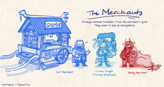
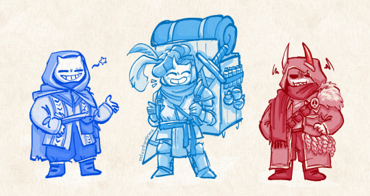
More character designs for Distilling Destiny! This time, they are side characters (the Masked Merchants!) You can find the lineup of main characters here!
[Design notes under the cut! Plus extra worldbuilding notes!]
First off! Design notes!
I feel like it's pretty obvious which skeletons these 3 are meant to parallel LMAO.
The overall designs are inspired by some of the NPC Merchants my cowriter and I discussed while planning out the fic (Beedle from LoZ, and Zacharie from OFF)
Zacharie was the inspiration for giving them masks, and Beedle is why the Knight-Shopkeep has his big backpack as well as why the masks have horns! (... Like a horned stag beetle? It's a stretch but shhh)
The Cart Merchant's cart is intended to look kind of like Sans' sentry station!
I was debating whether the cart would have parts that could fold out/be stuck in the ground to extend it, but then I thought... if he had them, he'd be too lazy to set them up anyway.
This way he can just ride around in it and not have to worry about lugging his stuff around like the others.
The Knight-Shopkeep's got two feathers in his hat like the Bard does ;]
I was going to give the Knight-Shopkeep a big hammer, but a sword looked cooler with the pose LMAO
The Knight-Shopkeep also has another horn hidden under his hat!
He sells potions and cooking ingredients! (In the fic, Blue is studying health + culinary science...)
The Shady Merchant has a golden horn instead of a gold tooth
The fur around the Shady Merchant's shoulder is a reference to what he trades, but it's also supposed to represent Red's fluffy jacket.
I gave him a sack because I thought it was funny. I almost made him the type to open up his jacket and try to sell you watches or something, but it didn't really work out, and this design fits a lot better.

That sigil is meant to be his own personal "signature", made up of aspects of his mask, as well as his kingdom, but The Cart Merchant is lazy and uses shorthand. The proper symbol would be something like an actual ❤️ shape. In universe, the larger heart shape made up by both parts is purely a coincidence. The G on the other banner is just a currency sign (like $, €, ¥, £).
AND NOW...
Here's some MORE lore tidbits that (probably) won't get mentioned in the fic, because they are just weird worldbuilding things that I've thought of but aren't really relevant in any of the discussions!!:
The Cart Merchant will try to scam you probably. (5G? i meant 50G.)
The furs and pelts the Shady Merchant procures are incredibly high quality- but he almost exclusively trades for other material supplies or information instead of gold.
I actually started trying to figure out a numeric system for this world, and it was at that point I realised I was getting lost in the sauce and thinking too much about worldbuilding.
HOWEVER, SAYING THAT... I was thinking that an upturned heart (spade) would be the symbol for 1, the v/shorthand heart shape would also double (haha) as the sign for 2. The clover (club) would be 3 and the diamond would be 4.
THAT came about because I was thinking about there being a myth/fable about the 4 (main) kingdoms having been created in that order (spade, heart, club, diamond).
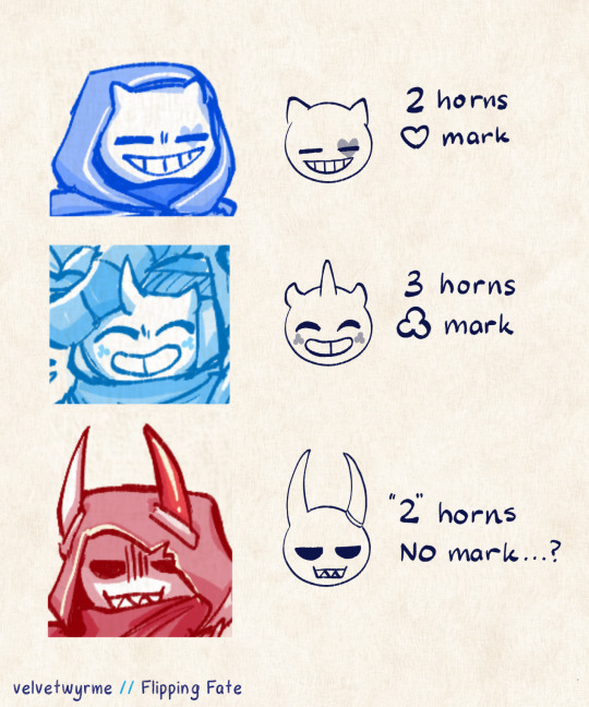
The merchant masks are kind of like clown faces, in the way that there is a record of every single mask to make sure that there are no two that are the same. (Two masks may have the same horns, but different markings, and vice versa.)
The number of horns on a mask depends on which kingdom they come from. Sometimes prongs are also used instead of separate horns. (e.g. a merchant from the "Diamond"/Fourth kingdom may have 4 seperate horns, or 2 horns with 2 points each.)
Markings vary, but generally they too will be themed around the kingdom they hail from.
This is part of why the Shady Merchant is so shady- he has no marking/s, and his horns are... well, he claims to be from the second kingdom.
#flippingfate#distillingdestiny#undertale au#kinda.#I GUESS?#vwyrme.png#perhaps i should put some of this worldbuilding juice into my own personal projects#or even a fantasy au where itll actually get used#BUT ALAS. THIS IS WHERE MY INSPIRATION IS.#honestly im very happy with this :3c#theyr just little GUYS#if you’re thinking… hey i dont remember hearing about these guys before#thats cos you havent! theyr in the upcoming chapter :]
121 notes
·
View notes
Text
@cosmicrain-draws @otherxagnela Remember that fusion idea? Im writing out the first chapter rn, and I'm making it a Steven Universe AU. I'm hopefully going to make it a 5 part thing, if I'm able to restrain myself. I'm planning for it to be separate from the shows plot. Here's the original AU idea below!
Scarab is called Painite in this AU. He was made by Pink Diamond as a War General during the Gem War in an attempt to keep up face. He's basically the same just with added loyalty to PD. I'm going to keep him on Earth, more on that later. He is very good at what he does, and I like to think his main power is that he's very very good at shifting his shape and becoming any gem as long as his own gem is covered. I'm saying he can change his red skin to yellow instead of it being red in the new form and can make a fake gem anywhere on his body. A kinda of spy ability, if you will. He doesn't use it often as shifting is exhausting outside of work (and he doesn't have a lot of practice with it as Amathyst does) so he mainly just sticks as a front-lines fighter (even though he's a general, he's fantastic at fighting, so he joins his fellow gems in the main fights instead of being on the sidelines). He has wings, absolutely he does. And his gem got cracked in the war, taking his ability to fly away, like Lapis. I like to think his weapon is like his canon Cyrstal device, as his gem weapon can change into anything he wants it to be. He mainly either keeps it as a spear, a scythe, or an axe. Mainly a scythe tho
Prismo is a bit of a mix for me, can't really decide what gem he should be. So far, I'm going to make him a sapphire. Specifically, a Star Saphire. He was a gift from Blue Diamond to Pink to help with her wartime planning and attacks as he is a lot better at seeing the outcomes of things than other sapphires. His power (other than the future vision thing which he doesn't use cuz it gives him a headache) would be similar to Time-Woods Sīdus. I like to think he can make things, like he can make anything using his gem as long as he either has the right raw materials (which can be anything) or enough energy. He can make everything, ranging from weapons, clothes, to anything you can think of. Even food, but he doesn't make that a lot cuz it grosses him out. At the start of his time with Pink, he acts exactly as he's made, scared that he'll be shattered since he's really the first of his kind. After some time, he and Pearl start talking about how great Pink is (Star wouldn't fawn over her, as he really has no loyalties to any of the Diamonds other than to himself) and he would eventually notices how unhappy she is. Cue them being attacked, and he learns that Pink is actually Rose Quartz. Instead of shattering him, she offers him freedom if he helps with the gem rebellion. He'd take it, hating the oppressing atmosphere of Homeworld, and become the Wishmaster amongst the gems. He'd get that title because he can make, as I said before, anything, and that includes a milder version of Rose's healing tears. Cracked gems would come to him to get healed, he'd help plan attacks on Homeworld forces, and he'd make anything they needed whenever things were going too fast for them. He earns his place in the Crystal Gems and becomes part of the main gang, always seen by Pearl and Rose. His gem weapon would be a similar thing in Seraphyllic, him making 2D versions of his hands and swinging them like a mad man. Painite would have one hell of a time trying to get a hit on Star.
After the war, Painite gets left behind and would survive the diamond blast by hiding deep under the crust of the earth. He would still get corrupted somewhat, which would give him his more buggy features. Star would survive because Rose would pull him under her shield as well and would start just wandering the Earth after all of it is said and done. They accidentally meet when Painite searches for a cure. Of course, Painite sees Star as a traitor and attacks, ending with Star poofing Painite, but not shattering him. Painite's crack wouldn't be healed by Star just yet, I want that to be an intimate moment. Painite would definitely glitch out because of the crack and turn more savage because of the corruption, temporarily losing his mind whenever he got too overwhelmed. Of course, Star is always there to calm him down.
I'm still finicky about the plot, but so far, I'm making Painite go around Earth during the peace and hunt down the other corrupted gems, think the diamonds would heal them once he'd get back to Homeworld. And Star would just be wandering around, exploring Earth and leaving his own little rsster eggs that Painite sees and is always confused about. Yes, Painite still thinks there are no other non corrupted gems on Earth.
Lemme know if you've got any of your own ideas and stuff. I went for a Steven Universe AU cuz I got absolutely stumped on how I could make their shadow versions fuse in a way we haven't seen already. Great work on that art btw, Rain!
#prohibitedwish#prismo the wishmaster#prohibited wish#prismo#scarab the god auditor#scarab fionna and cake#human scarab#the scarab#fionna and cake scarab#adventure time prismo#scarab x prismo#prismo x scarab#human prismo#kinda#they're not really human#steven universe au#imma call this au#Shifting Jewels AU
45 notes
·
View notes
Note
YOO trailer dropped! What do you think of those legends?

(This is a special edition review for the Scarlet and Violet trailer! After this, requests will go back to the usual oldest-first order.)
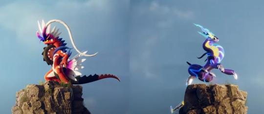
You know, I'll be honest, I didn't think I'd like these guys much based on what our leakers said. Dragon (and psychic) weren't types I wanted to see more legendaries of, and I couldn't imagine the vehicle aspect in any way that didn't look either ridiculous or too inorganic. Plus I'm just not usually big on legendary designs in general.
So I was pleasantly surprised to find that I actually really, really like these guys. I'll have to find out more about both of them and let them sit with me for a while, but right now I'd say they're in my top 5 or so for legendary designs.
First, conceptually, I really like how both represent the past vs future (or rather, tradition vs innovation, I would wager) theme from the games. Like, you could never guess that Palkia and Dialga are space and time themed from their appearances, but here you can tell at a glance what they're going for, and that's always a good thing in my book.
And secondly, the way the motorcycle idea is integrated into both designs is super slick. The wheels on the chests actually look very organic, similar to how lizards tend to have neck frills and other protrusions to scare off predators. The handles being frills and horns is perfect, and even the seat is integrated in a way that you wouldn't notice it immediately. Also, the curved body shape in general makes them look very distinct visually.
I'd also like to note how clever the idea of ridable legendaries might be, depending on how Gamefreak handles it. One problem legendaries have always has is that you don't get them until basically postgame, and they're so OP when you get them that you have no reason to use or bond with them. If you can ride on these guys somewhat early on but can't catch them until later, it would be the perfect way to let players grow attached without giving them an uber-powerful Pokemon early on.
My only note in this regard is that I've heard the idea of vehicle form(s) tossed around, and frankly, am I the only one who doesn't want that? They already look like motorcycles, and can be ridden on as-is (assuming they can run on all fours in Koraidon's case). Making them Transformers overcomplicates things and simply doesn't feel needed.

Between the two, Miraidon's probably the better designed, but Koraidon's probably my personal fav (mostly because I like the organic look more). Those huge feathers that serve as handlebars look really cool and compliment the flow of the design nicely, it's cool to see a dragon with feathers in general, and the design is pretty coherent as a whole.
Like a lot of legendaries, it's pretty busy visually. Thankfully, the repeated elements (like the feathers and the tire elements) make it read as a coherent whole despite this, which is also helped by the clear theme and unique design.
However, with that said, there are still a few details I think should've been scrapped:
That random white spot on the face
The white diamonds on the body. I get that they're meant to look race-like but it's a bit much
The black pads on the hands
The blue feathers coming off the elbows
That's really it though; the rest of it looks pretty amazing.

Miraidon has the better design as a whole, mostly because it's got less details on it. In fact, the only thing that I think should've been simplified is the cluster of lines on the lower underbelly; the rest of it looks solid.
I really like the chest again here, this time going for more of a futuristic one-wheeled motorcycle instead of the traditional Harley. The plasma-like insides both work to make it look organic and inorganic at the same time, as do the sweet pixelated eyes.
I also like the built-in functionality on display, namely how the legs can unfold to form rockets/levitation devices. Both futuristic but also shows how much thought went into everything.
Overall, I'm pleasantly surprised with both of these two, and excited to see what the story behind them is.
219 notes
·
View notes
Text
“Something that does storytelling on a more personal level.”
Allow me to talk about my own fan work of Genshin Impact that I liked, and my thought processes with regards to storytelling and style.


Snowy woods and a certain child.
One of my first proper pieces in 2023. This one was inspired by the visual style and pacing in @pascalcampion’s Kitty Cat and Manly Man comics. I wanted it to be minimal and quiet without lingering on each moment for too long. It was also an experimentation on using more muted colours and colder tones, breaking away from my usually vibrant and warm tones. This is so that Tartaglia would feel small in the panels, since his scarf and hair are the only sources of warm hues.
I also wanted Dainsleif’s quote from “Teyvat Chapter Storyline Storyline Preview: Travail” in Chinese to add more depth to the comic while keeping the distance between the scene and the narrator, so to speak. Here’s an unofficial translation of the line, from the wiki.
But oh, you who oversteps your bounds, do not stop walking here,
For none can watch the fire burn from the other side of the river.
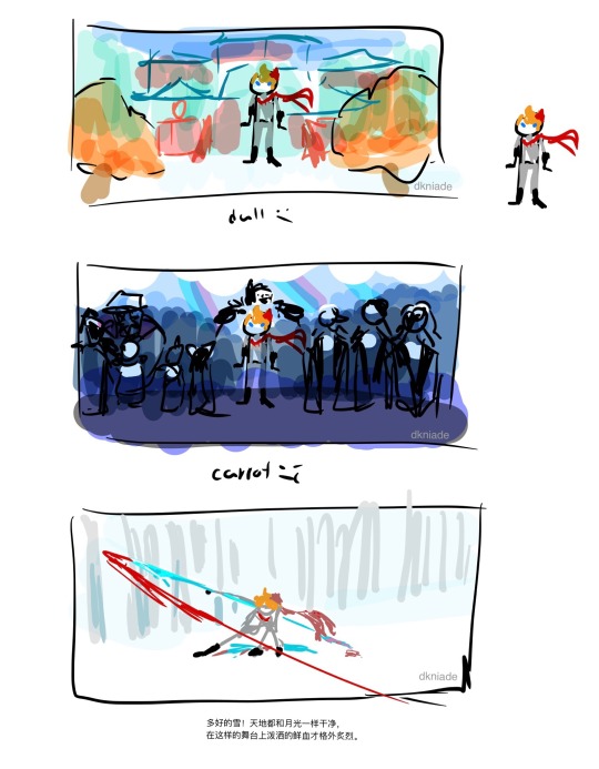
A colour test to understand Tartaglia’s colour scheme more. I had noticed that his colour scheme is very muted when compared to the rest of Liyue Harbour, but against the rest of the Fatui Harbingers as shown in “A Winter Night’s Lazzo”, he stands out. In that sense, he stands out as suspicious in Liyue, yet too direct in his methods within the Fatui.
He stands out better against white snow, an environment of his own.
I was inspired by his “When It Snows” voiceline, and thought the imagery was striking. In brackets is my translation, with the official translation beneath.
多好的雪!天地都和月光一样干净,在这样的舞台上泼洒的鲜血才格外炙烈。
(Such wonderful snow! The world’s as clean as moonlight. Only on this sort of stage would bloodshed be especially intense.)
The world looks glorious in the snow. Pure white, like the light of the moon. A perfect backdrop for bloodshed.
A sketch from late 2022 that I’m using for colouring practice and experiment. Like the first Tartaglia piece, I don’t usually use this much cool-toned blue, nor do I do overcast lighting. The overall atmosphere was meant to evoke rain, since back when I was sketching this, it was an exploration on the effects of rain on Kaeya, who had near-death experiences on rainy afternoons that changed his life dramatically.

Some notes on the shapes I used when simplifying Kaeya’s design. The idea is to reduce the clutter in his original design while still having the shapes register as Kaeya.
It uses a combination of circular shapes (which is found in his Elemental Burst) and diamond shapes (which is already prevalent in his original design to symbolize his ties with Khaenri’ah).
His hair is meant to look like a tragedy mask, similar to the half-masks Pierro and Dainsleif have. I’ve also discovered by accident that it looked like the profile of an Abyss Mage. Interesting…
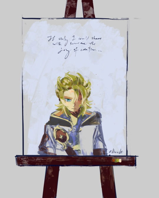
If only I could share with someone the joy of creation…
This one uses a painterly style, which is pretty different from the sketches I usually do. The roughness is intentional, as it is meant to be a painting on a canvas, while also evoking the feeling of looking into a bathroom mirror, hence the flipped position of the shoulder strap.
Since it’s meant to be a painting in a drawing, the rough quality and the fact that it’s unfinished might be indicative of what the painter feels…?
I didn’t finish painting the coat. Maybe even that can be symbolic of how people usually look at the face first…
I forgot to paint the star on his neck too, but thanks to Shadows Amidst Snowstorms, that could be significant too.
Since this feels unfinished in so many aspects, maybe this is actually Subject 2 contemplating on his existence?
I think it’s time to move on from this game. It’s been an interesting ride. I’ve learned a lot of stuff, I got to enjoy nice music, and I was able to make wonderful friends.
“Something that does storytelling on a more personal level.”
I’ll try to find that somewhere else.
#dusk personal writing#Genshin impact#Kaeya#albedo#Tartaglia#kaeya alberich#childe tartaglia ajax#Childe#albedo kreideprinz#long post
30 notes
·
View notes
Text
Ok ok ok I have to talk
I read The perks of being a Villainess when scanlation groups where calling it Isnt being a Villainess better and dropped the novel right around the turtle stuff happens and recently read the Manwha because why not? I was curious like absolutely CURIOUS to see what they did with the couple's outfit from the Flower of the Year part.
And man let me tell you they did a DESERVICE to MY favorite moment of the whole thing like man what is this atrocity???
I know I KNOW IT this is the style popular with the medium and everything, the art it self is quite nice and pretty. But bro what manwha is this?? Did we read the same novel?? Did the translation group I read everything from made a mistake with the description????
Im going to include screens from the translations I read at the time because I genuinly need to know if they are wrong.
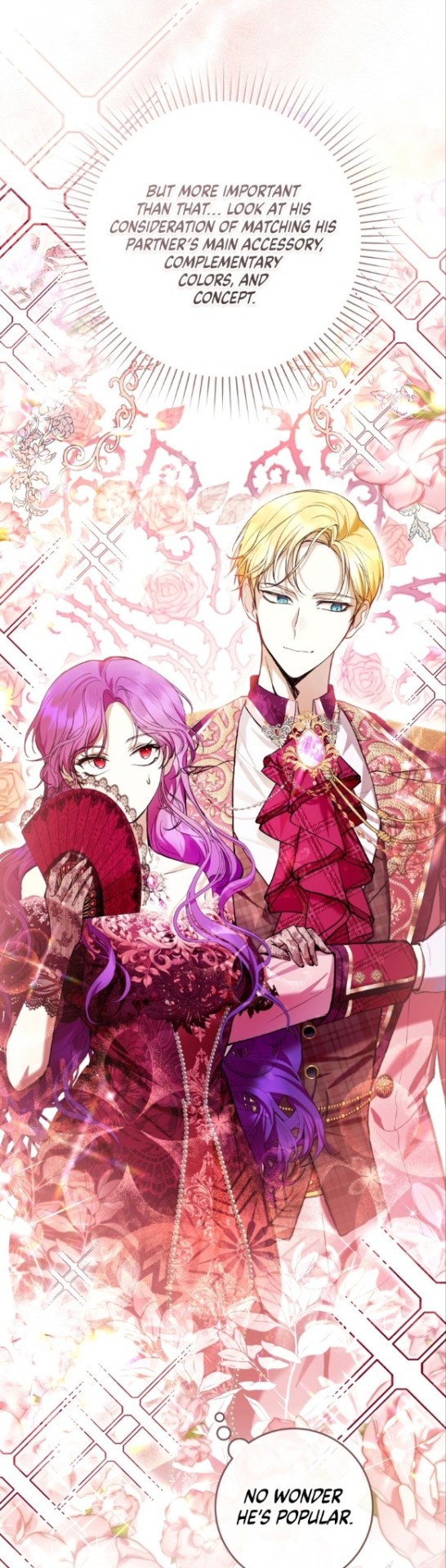
The first description used for the whole thing is already quite stricking and clearly defines the theme for the night. An angel and a Devil. And most importantly they let the woman in the relationship look something other than pure and innocent! Thats the main thing that got me hooked on this whole thing and it was the contrast and how would all of this work to make publicity for the statement piece of this look The pink diamond, the only one of its kind in the whole country.
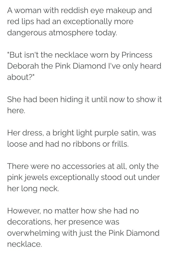
There are a lot of things to point out just here but let me start with the one that took me out of it the most and that's Debora's dress description.
Its quite simple, a bright light purple satin dress, loose and with no embelishments whatsoever on it. Right there the manwha already lost me there is an excesive, almost overwhelming, use of lace, textures and patterns in the design. I can feel my hearing failing me from how much noise there is in this design. The whole point of the dress is to bring out the pink diamond and make it the indisputable center of attention of the complete ensemble!!
This is already personal theory but if I had a necklace I wanted to show off my first instinct is to get my hair out of the way so I imagined that Debora here would go for a gathered hair style that keeps everything out of the way to show off the diamond and well the long neck must have been a lot of help here!
Talking about theories I dont remember if they mentioned this later but, the red makeup with the light purple dress makes me think that Debora may have commissioned the dress thinking about the diamond and later may have found out that the light shade made her look too sweet ie bulliable so adding the red makeup may have been a desperate move on her side to make herself look more menacing. 🤔
Moving out of my theories and into the Diamond my god the diamond THE Pink Diamond THE only one of its kind in the WHOLE country!! Just why? Why is Isidor wearing an even bigger pink diamond than Debora?? For a second I even thought I misremembered and Isidor was the one who actually wore the diamond during the event but no! The novel is clear on this! This is the necklace worn BY Princess Debora not Isidor!! Another petveev of mine is that there are more colored diamond in the manwha when the Pink Diamond was the first colored diamond introduced to the market via magic manipulation here are some examples

Are this examples nickpicky and petty? Yes. Like "man that isn't a diamond thats an amethyst" or "that is just a ruby chillax bro". I KNOW!!! But can you at least hold back on the super shiny clipstudio diamond materials just this time around? Please just to make the moment special?? Phillap's in particular's really pisses me off right after the one they gave Isidor because that one looks way more impressive than the actual Pink Diamond in the manwha.

Well at least they got the shape right.
And Isidor lets talk about him for a while ok? He is the center piece of this look and the reason why it works so well here are some descriptioms of him.
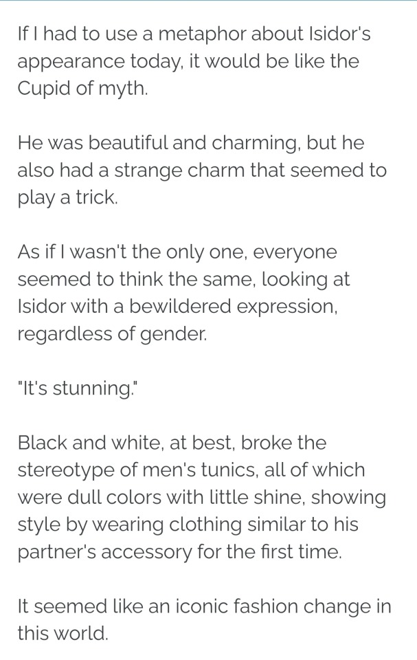
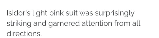
Light Pink and like a "Cupid of Myth" quite the strong descriptors. And I do like how Isidor looks even if the shades used seem to be a bit too strong for my light pink standards. Specially with that cravat like what is that man?

But when compared to other men in the manwha.

Yeah the difference doesnt feel that impactful to me. How is that supposed to be "little shine"? Again I have only read unofficial translations so maybe im the one in the worng so who knows?
I just honestly dont know what happened here my guess is that the artist had to work fast and couldnt make the proper verifications I know because sometimes I also decide to trust my memory when it comes to details but well there isnt anything we can do about it now.
I do plan on drawing a more novel accurate look later since it really peeves me to see how they left everything in the manwha. I alreay have the desigb all planned and sketched up!
Just keep in mind that I will take some liberties with my design ☝️☝️im planning on making it in my own style after all.
So I will see to it that it is posted!!!
#the perks of being a villainess#manwha#isnt being a wicked woman better?#critique#long post#on god we are redisigning this fit I swear it#also sorry for the tipos english is not my first language#webtoon#shoujo webtoons#also apparently this will return soon with more content soo??#if you saw this posted when it still incomplete no you didnt
3 notes
·
View notes
Text
Ro’wynne and her relationships with the rest of the firstborn
Doing all of this under the cut bc it’s gonna be a long ass post
Wynn
Wynn thought it was fun that she shared part of a name with Ro, and used to joke that Ro’wynne quite literally wasn’t complete without her. While Ro was watching over her siblings in the night Wynn would often come and sit quietly with her, when unable to sleep due to the secret she carried (I think it weighed really heavily on her). Ro never pried but it seemed that was enough for Wynn. They rarely held an actual conversation yet always seemed to be close due to their dream connection. Ro doesn’t know the truth about Caithe killing her and I don’t think will ever know. She pleaded with Wynn not to leave, they had already lost Riannoc, but Wynn had reassured her before leaving that she’s be alright.
Caithe
Ro and Caithe have had a strained relationship due to many different factors. She loves Caithe, but was very upset at how she treated the secondborn sylvari. She then went with Caithe to rescue the second born that were captured by asura and stayed with them while Caithe pursued Wynn. She sees her sister as selfish due to her secretive nature, and Caithe thought she was cold due to her rough personality. Over time Ro does gain an admiration for her efforts against the elder dragons. They don’t get along very well but do love each other even if they have a hard time communicating that. Post mordrem corruption they haven’t seen much of each other.
Dagonet
Ro admires his position as a diplomat but worries a lot about him. When he first left to study away from the grove she gave him a thorn from her armor to remember her by, and to use in emergencies. She tried to teach him how to defend himself before he left, and the thorn was as close as she could get to being there herself to keep him safe. They write letters to each other somewhat often and he tells her about his studies abroad. I think this quote from him
“A true sylvari should have two hearts: one soft and pliable as hot wax, and the other as hard and impenetrable as an icy diamond. The first, he should show to his companions, the second, to his enemy. Woe to the one for whom the two are the same.” Is inspired by her.
He writes more to her post mordrem recovery, she can’t really travel so he tries to bring bits of the world to her.
Faolin
it sounds like Faolin’s always been a little shit in many respects from what I’ve read lmao. She used to mess with Ro’wynne and test her patience when they were saplings. After the Wynn incident Ro’s connection to the dream allowed her to feel her mother’s bitterness towards Faolin, and although she didn’t know what had happened, she stuck with the Pale Tree. Once Faolin created the court and started tormenting the rest of her kind though, all bets were off. Ro’wynne’s only left the grove a few times in her life prior to HoT, and she went with Caithe to twilight arbor to put a stop to Faolin’s nightmare. By the end they hated each other, only for mordremoth to corrupt them both.
In a sick twist, Faolin was turned into the vinetooth creature by Mordrem Champion Ro’wynne. As mordrem they worked together to try and take down destiny’s edge, which ended with Caithe killing Faolain as we know. She does not miss Faolain but does regret not doing better in trying to help her against nightmare.
Kahendins
these two are very very close. Ro’wynne was the protector of everything Kahendins built. She’s so proud of him, she used to quietly sit by him as he would explain his plans to build a new house, or a new defense for the grove. He greatly enjoys her company and they live together, even though Ro has her own place now (I imagine she used to stay with him in the early days, and even after he shaped a house for her she stayed. He doesn’t mind).
Post mordrem he helps her heal and they do a lot of things together. They built a garden and he also built a quiet little spot for her to get away from all the noise when she needs it.
Malomedies
he was the Riannoc incident before the Riannoc incident and the reason Ro’wynne is so overprotective. She blames herself for not being there to prevent the asura experimenting on him. They weren’t super close but whenever he had nightmares after coming back she’d always be there as a shoulder for him to cry on. She’s one of the only people he makes an exception for, in being allowed to interrupt his studies. Mainly because she’s quiet and he knows she won’t bother him. Maybe also because he feels safer sometimes knowing she’s watching his back.
Riannoc
her baby brother, she loved him so much. His cheerful and outgoing personality would bring the hidden side of her out, and he would playfully mess with her as she watched over the grove. He looked up to her example as a warden for the grove, but when he decided to pursue Mazdak she begged him not to. Even when the Pale Tree gave him Caladbolg Ro’wynne feared for him. After the death of her brother Ro’wynne began taking her role as warden much more seriously, the first death of a sylvari was a great shock to everyone and she was going to do her best to prevent more of them.
Trahearne
due to his time spent away from the grove they never grew very close. Her connection to the dream allowed her to check on him from far away, and on nights he was lonely in Orr, he’d still find himself able to fall asleep feeling safe. At the world summit during lws2 he saw her flee with the mordrem and later he caught glimpses of her as a mordrem, ravaging the pact. They don’t see each other for years and he assumes she’s dead until he visits the grove and learns about her recovery. They still haven’t talked though, he’s been busy with his own life and he’s not quite sure how he’ll be able to handle seeing her, the one that killed so many of his soldiers and turned many more. She likewise is afraid of him, he was the pact marshal and he ordered cannons to be fired against her. She of course understands his reasons but those thoughts still linger.
Aife
they’re pretty close after HoT. Aife had always seen her as a distant figure (most did) but she was one of the firstborn, along with Niamh, who first met her post mordrem. Due to her position as a luminary the two don’t see each other often but try to spend as much time as they can together when they have it.
Niamh
Niamh officially founded the wardens as a group, and Ro’s been one since the start. The two of them are very alike when it comes to being protectors, and Niamh understands a lot of Ro’s reasoning for many things. As saplings the two would bicker over who should be the one to keep watch, etc, and Ro would often win just due to her imposing presence. However, the two do love each other. Post HoT Niamh is very wary of letting a mordrem into the grove, but over time the two are able to regain trust with each other.
7 notes
·
View notes
Text
I don't think I've actually talked about Tern (aka Legion baby OC) before so maybe I should do that. Tern Var is supposed to be the second Coluan Legion representative, sent to train at the academy after Querl starts to indicate that he's leaving and Colu insists that they still want representation. Not all planets do, but they do.
Tern is older than Querl was when he joined, which is still very young by Coluan standards, and they're fiercely pro-ColuGov despite also belonging to a political movement that is trying to make Coluan politics less of a gerontocracy. They despise Querl because of what they perceive as a total lack of loyalty and care for his planet and people. And to some degree because they blame him for their current predicament.
Tern used to be a lab assistant in one of several temporal labs that sprung up on Colu after people started associating Coluans, but only really Querl, with time research. A failure of safety protocols exposed them to a burst of temporal energy that most calculations thought would be lethal, but instead of killing them it imbued them with the ability to move through space but not time for short periods, essentially allowing them to freeze time. The accident also destroyed some of the joints in their left arm, which were replaced with fully integrated prosthetics.
Tern is deeply ashamed of what happened to them. They blame themself for not knowing better or for not preventing it, and a lot of their family and former colleagues, political allies and friends kinda agree. It came as a surprise to them when they were called to serve as Legion representative and while they didn't actually want to do it they saw it as their duty and a way to atone for their previous mistakes. They don't know that ColuGov saw it as a way to remove a political opponent and potential threat.
Tern tries to be mature and serious at all times, but isn't quite as mature as they think they are, in part due to a very sheltered upbringing. They're also rather bossy and a stickler for rules, to their team's dismay. At the academy they've shown themselves to be an excellent hand to hand combatant, though they lack the patience for a large part of the lab work their predecessor used to be tasked with. They speak warmly of Colu, but haven't been back since they left. Their family rarely contacts them.
Tern has a great dislike for languages that use gender to dictate pronouns. Their native language doesn't do it and they think it's crude to make that the most significant part of one's identity.
Tern has short, reddish hair, medium green, cool toned skin and dark green eyes. They have the Var house marking of a diamond shape and two rectangles on their forehead and a rectangle on their chin to indicate that they're on longterm off-world duty.
11 notes
·
View notes
Note
Is Aki a beauty?
Anon u are asking such good questions!
Honestly i think this is a good debate to be had. Its kinda a common troupe in BL for the uke to be some famous beauty. But just as common as that is- the troupe of the uke just being a normal run of the mill young man.
So which is aki?!
In my fics iv done both troupes - hes either a famous beauty or hes really just a normal dude thats really no expectional beauty. (But of course he is probably still traditionally attractive!)
In a way, I wanna say he is both those things. A beauty but also no expectional beauty. And what i mean by that is that I personally think Aki doesnt put a lot of time and space into his looks. He’s never shown as vain. Or really thinking about his looks - i mean the dude is traditionally described as someone who throws on a pair of worn out jeans and t-shirt most of the time.
Compare that to Asami who we know has a routine in the morning, he slicks back his hair and wears custom suits, and obviously must work out to keep his abs! Now there is a man that obvious puts time and thought in to his apparance! In fact Iv always thought of Asami as some one who knows he is good looking and always uses it to his advantage, and so he goes the extra mile in taking care of himself and keeping himself in tip top shape!
But Aki is kinda the opposite, he eats what he wants, he does what he wants, he wears what he wants. And he never thinks about how he looks or if he is good looking? Though we do see him feeling insecure when he mets people who are potential love interest for Asami - Like Fei Long and Sudo. Fei Long is often called by everyone a beautiful man, and even aki says so and i think thats comes from a place of recognizing that he isnt that. Sudo too is almost presented to us as a version of Akihito that is better then him in every way- he is more refined, professionally sucessful, and a more attractive version of Akihito. And Aki certainly feels super insecure about Sudo and what his relationship is with Asami.
Having said all that - it would kinda make us think that aki is maybe more along the lines of the - “No expectional beauty”. Especially since most of the charatcers seem shocked that Asami would even show any interest in Aki at all, as if they think he is nothing special.
BUT then we also get basically most of the characters falling for aki in some way or another? So maybe he is an expectional beauty after all!!
Here is what i think, and how he can be both at the same time- I think on first glance, he looks like nothing special. He wears juvinelle clothing, he has a kinda a sloppy exterior. He’s not refined or graceful. I sorta picture him being very boyish, clumsy, doesnt really hold himself with any grace or confidence. Sure you would probably find him to be traditional attractive (clear skin, nice smile, good build) on first glance- but you would def not do a double take or think WOW looking at him.
But that is where i think he is a little decieving. I often describe him as a hidden prince. because i think there is something about his looks that are more - hidden gem kinda a thing. Diamond in the rough as the saying goes.
He has all the makings to be a great beauty. If he cleaned him self up a bit, dressed better, put some effort into his look. But because he does not, he just flies under a lot of peoples radar on first glance.
None of them have fallen for him at first sight, it usually takes them a minute, because they slowly realize that actually there is something special about him. That he is not just how he first appears to them, and there is something beyond the surface level that is incredible attractive and desirable.
So yes in a way - i do actually think he is a great beauty under neath an exterior that is maybe hard to see past.
It is true that some of the characters (fei long, asami) find themselves to start falling for him, not just because his looks but for his personality which i think increases his overall attractiveness, but that is of coruse, that is after they’ve had a nice taste of his body and shown interest in him sexually. There something about stripping aki of his clothing that suddenly makes them all understand that he is something special.
I actually have a bit of a HC about how Aki is the way that he is. I imagine when he was younger he was actually considered a pretty boy and as a child people would confuse him for a girl, or otherwise think his looks where dainty, or that he was pretty like a girl.
I’ve always thought he’s had some internalize homophobia that he’s had to deal with. I can see him being considered “pretty” in his youth, being a huge sore spot for him, because aki is actually a very prideful person. This is where i see some of his years as a delinquent came in and he was doing everything he could to be percieved as “masculine” and not as a girl, or as weak. I see those years as a time when he put on this exterior of being tough, pushing boundaries and being a daredevil, as a way to disguise himself.
Even now that he is older, he is still ‘performing’ this hyper masculinity to the point that he wants to compete with the likes of Asami in terms of who is more masculine?? He refuses to let himself be vulnerable, or be percieved as weak. Even when he is competting against the likes of cold blooded criminals.
12 notes
·
View notes
Text
Cards I made as fanart for a space-themed mobile game
The game, Seedship, doesn't have any cards or visuals (aside from the loading screen). I just made cards for fun based on what I think they'd look like. If you want to see the full cards and some of my thoughts about them, I have them attached below.

Since the point of the game is to find a new planet to settle on, I wanted the animal card to show a creature that looked like an animal but also alien. My main photo resources for this render were cows (for their face shape and fur texture) and geckos (for their pupils). Then I doubled the eyes and pupils to make it look even more alien. This was one of my fave cards to make.

If memory serves me this was the first card I made. I wanted these circular shapes to give the card an airy feel. I would continue to use the half circles to visually tie the cards together.

I am not used to doing landscapes much less ones done in a birds eye view. Tackling the concept of "Resources" felt a bit nebulous. The main resource images used were photos of abandoned quarries. I don't know if I could do this any better now or if I'd struggle even more lol. But hey! Semi-circle clouds!

In Seedship, planets can be goldilocks, super cold, or super hot. I decided that focusing on the extremes would make for the best visual. I think my main inspiration for the sand visual was actually the new(ish) Dune cover illustrated by Jim Tierney. In this illustration you can also see the diamond shape I'd use in other cards to visually tie them together.

Similar to the Animals Card, I wanted to portray alien plant life. I wanted to do a close up similar like the Animals card. Surprisingly choosing to do a close up of an alien plant made it difficult to read as a plant. I didn't want to do green on the plant originally, but it just didn't look very plant like to me otherwise.
I am 99% sure if you look up "watercolor ocean tutorial" on youtube the tutorial I followed to make this will pop up lol. Solid tutorial
Believe it or not but this was a LOT harder to get right than you'd think. Blur is both my enemy and my friend. I had a LOT of fun painting the planet and its clouds
I consider this to be the sort of visual linchpin for the series. It has both the diamonds and semi-cirle clouds in one image. By far one of my faves for the series.

Probably one of the prettiest cards of the series (though I am proud that there are so many pretty cards to choose from). The illustration is based on recent(ish) portrayals of black holes.
Its funny to look at this with eyes open to one of my childhood Artist inspirations, David Christiana. He has this beautiful motif of swirls in his work. I didn't make the connection back then, but having recently painted my Siren painting and looking at his art for reference, that I have been strongly influenced by his work for a long long time.
#illustration#digital art#digital illustration#card art#cards#card illustration#space#space illustration#alien animals#alien planet#alien plants
6 notes
·
View notes
Photo


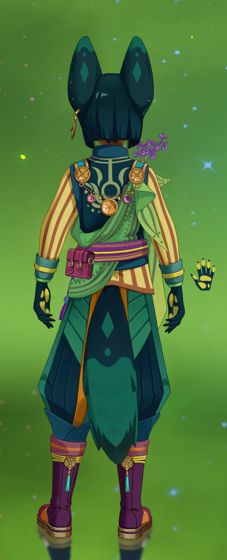
[image ID: 4 images of Tighnari from the game Genshin Impact. the first 2 images are the same front-view, full-body screenshot, while the next 2 images are the same back-view, full-body screenshot.
the first front and back views are unedited screenshots of how Tighnari appears in the game. he’s light-skinned with teal/brown eyes. he has straight, smooth, black/teal hair cut straight at chin length, with some neon green, “leaf-like” accents in his bangs. he’s got tall, pointed black fox ears on the top of his head, and a black/teal fox tail with green diamond/circle patterns. he’s wearing midnight blue pants with red accents, and a midnight blue hoodie with green/magenta accents. the hoodie has one long, skin-tight sleeve, and one short, loose sleeve. he’s wearing one white sash with red/blue/gold accents wraps around his upper body, and a magenta wrap with white/yellow accents holds the white wrap up around the waist, along with a cyan/magenta/grey rope. another large, green, leaf-shaped sash hangs off the back of his right shoulder. a silver latch with cyan accents sits on one shoulder, while the other shoulder has a large yellow flower, which pins up the white sash. a large golden disk with tangerine/pink/lavender accents and long extensions of filigree sits on the back of his right shoulder. he’s wearing black gloves with gold/grey/orange/cyan accents, and dark blue, calf-high boots with black/white/gold/neon green accents.
the next two front and back views are heavily edited versions of the original screenshots. Tighnari’s skin is now dark brown, and the hair and ears are dark teal. the ears have been widened, rounded out, shifted down, and given green accents matching the tail. the hoodie has been changed to a dark teal vest over top a yellow/orange long-sleeve, striped shirt. the pants have been shifted to dark teal, and the boots now have a magenta/orange/yellow color scheme. the two sashes have been reduced to one green sash with some leaf-shaped corners hanging off the shoulder. the gold disk on his back has been changed to a gold chain hanging between the two shoulder latches, holding smaller orange/pink/lavender-accented golden disks. more pink/purple flowers have been pinned around the large yellow flower on his shoulder. most of the red/blue/cyan/neon green accent colors have been shifted to appropriate yellow/orange/pinks, all the silver has been shifted to gold/bronze, and all the blacks/whites have been shifted to a different color.
end ID]
I can’t believe Genshin released a character catered to me specifically (field ecologist, bio nerd that loves to share botany facts, antisocial academic, foxboy, etc.), then nerfed him with the worst design in the entire game. his color palette, clothes design, general silhouette... it’s all just a huge mess. even knowing this going in, he ended up being a lot more involved that I’d originally anticipated-- even more than Yanfei, who used to be the most ambitious one of the bunch! I still a lot of fun, but good god I’m glad to finally put this lad to rest...
I have a lot more thoughts about my process/choices, so if you’d like to read on, my full design notes and more detailed image descs are under the cut!
EDIT: I added some orange/yellow/green to the pants to break up the blue, I think they work better now
before I get into it, I have to admit... I messed up the light source on Tighnari’s back view. I had assumed that the light source was locked to the character rather than the screen itself, so I thought the light source would flip to the right side of the screen when I flipped the character around. I only realized that the light source had actually stayed on the left side of the screen after I’d already shaded most of the edited aspects, so it was easier to just flip the light source on the unchanged aspects too (mainly the tail and hair). to be clear, the flipped light source is not meant to be a “fix”, that’s just a silly blunder on my part, and there are prolly still some wonky shadows I didn’t catch...
and one more note for clarity: while I usually refer to “viewer left/right” when describing these things-- that is, the left/right that you, the viewer, see on your screen-- I’ll be doing something different this time. since I’ve got both the front and back views here, I’ll be referring to “subject left/right”-- that is, the left/right that Tighnari himself experiences. it may get a bit confusing when describing the front views, but it’s the best way I can think to keep the directions straight
now, let’s first discuss the broadest aspect of this redesign: the color palette
I think we can all agree that the OG design is... a lot. there’s firetruck reds. there’s midnight blues. there’s neon greens. there’s tangerines and magentas and cyans... it’s Too Fucking Much. which is shocking, because as much as I complain abt half of Genshin’s designs, I’ve almost never had a problem with the color palettes. Genshin palettes can be boring at worst, but I usually love most of them!
if this were any other character, I prolly would’ve just cut some colors from Tighnari’s palette and called it a day. I prefer limited color palettes in my own art, and I find it more effective to capture a character’s tone/vibe with just a few colors. however, given the bizarrely hectic approach compared to other Genshin designs... I get the impression that Tighnari is supposed to be a wild mix of colors, to represent his botanical work and the vibrant flora of his home
thus, rather than using my typical visual art perspective, I approached Tighnari’s design from my florist perspective-- hello friends, genuine florist here, at your service!
while I’m hesitant to use too many colors in my digital art, I have a completely different perspective at work-- I LOVE to make vibrant, multicolored arrangements! I think floral work has honestly improved my color theory in a very hands-on way, but I never considered extending that approach to my art before, which feels silly in retrospect lmao
anyways, I get requests for “bright and cheery” arrangements a lot, so I reconstructed Tighnari’s palette around that idea-- a mix of mostly bright, poppy colors, tempered with deeper, richer jewel tones; warm and cool colors complementing and enhancing one another rather than clashing
another problem is that the colors are all so completely separate from one another in the OG design, it feels like my eyes hit a wall every time they shift from one part to another. I see the midnight blue, then my eyes slam into a wall of firetruck red, or I see flat white, then my eyes hit a wall of magenta. in my redesign, I tried to make the colors flow into one another-- blue to teal to green, then yellow to orange to red. there are clear sections of warm vs. cool colors, but I tried to make sure that little accents of one section would dip into other sections, and that no one section of color felt too overwhelming
additionally, I use black/grey/white verrryyy sparingly in my own work, unless black/white serves as one of the big base colors. Yanfei and Yoimiya, for example, both use black/white as broad base colors, so I was happy to continue that. in Tighnari’s OG design, the black/grey/white just clashes with every other color in the piece, and especially with the “bright and cheery” floral palette of his redesign, so I tossed them completely
also, I need to point out the black gradient on Tighnari’s hair specifically, cus’ it’s just so unbelievably ugly
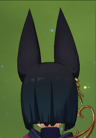
[image ID: the OG back shot, cropped to just Tighnari’s head. the ears and crown of the head are a flat, dull black, which sharply fades into a dark teal down to the tips of the hair. END ID]
the black is so flat, and stops so hard before the teal, it looks like a fine layer of dust or drywall fell on Tighnari’s head! dust your head, boy!!
also note that there’s no more silver metal in the redesign

[image ID: the OG and edited front shots, cropped to the left shoulder latch. the OG latch is silver, while the redesign is gold. END ID]
mixing metals is considered a big fashion faux pas b/c different metals usually clash. obviously this isn’t a hard rule, cus’ mixed metals can work, but they have to be balanced very intentionally-- like with Zhongli’s design. Tighnari’s metals, on the other hand, are mixed very... messily. none of the metals match each other or any other part of the design, and they just look ugly all together
since gold complements Tighnari’s new palette better than flat grey, I just cut all the silver. however, the “golds” vary across my redesign b/c they already vary in the OG, and I’m not sure whether that’s the lighting or genuinely different metals. I’m more willing to mix bronze/brass with the gold, though, because they’re all warm metals, so I just kept it
finally, palette talk DONE
so, Tighnari’s ears.

[image ID: the OG front shot, cropped to Tighnari’s head + ears. his ears are tall thin, and sharply pointed. the outsides are black, while the insides have bare pink skin, with some tufts of black fur lining the inner edge. this gives the ears a thin, delicate look. the ears are based at the very top of the skull, sticking straight up near the crown of the head. a dangly gold, leaf-shaped earring hangs off the base of the right ear. end ID]
good god.
as a furry and connoisseur of fluffy ears, I gotta say: Tighnari’s ears look like shit. they’re naked and flat, and they move like flimsy pieces of wet paper. I get that fennec foxes have somewhat less fluffy ears than other foxes for heat dispersion, but this just ain’t it.
to fix them, I took some tips from the best ears in the game-- Gorou’s!

[image ID: a front-view screenshot of Gorou, cropped to just his head + ears. he’s got smaller, triangular ears, modeled with rounded fluff inside the whole ear. the backs are a golden brown matching the hair, the inner edges are creamy white, and the innermost ear is pale, fleshy pink. end ID]
it’s like Mihoyo forgot they already had the golden standard here to reference from, smh
anyways, my redesign works off of similar design principles:
[image ID: the edited front shot, cropped to just Tighnari’s head + ears. the ears have been widened and the tips rounded, matching real fox ears. the bases have been shifted forward and down towards the sides of the skull, with the outer edges of the ears leading down towards the same level as the cheeks. the bases are dark teal, matching the new hair color, with lighter teal fluff ringing the inner edges, and a pale teal for the innermost ear. the dangly leaf earring has been flipped to the base of the left ear, and two studs (one pink, one tangerine) have been added to the outer edge of that ear, while the right ear has one lavender stud. end ID]
using real fennec foxes as reference for the shape and fur distribution, I tried to mimic the way fluff is modeled in Gorou’s ears, to give the ears a fuller shape
I flipped Tighnari’s leaf earring from his right to his left ear b/c it interfered with the flowers on his right shoulder. the extra studs match the colors of the glass circles on the gold disk (or gold chain in the redesign) on his back
I also mirrored the circle + diamond design from the tail onto the backs of the ears, to extend the shape design across more of the character
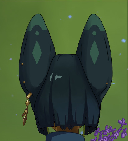
[image ID: the edited back shot, cropped to Tighnari’s head + ears. the base color of the ears is dark teal, while the tips are green. a half-circle of dark teal is cut out of this green, and a green circle sits inside the half circle. a green diamond sits at the center of the ears, straight down from the circle. the dangly earring and the gold backs of the studs are visible from the back. end ID]
I also shifted the ears down because... look, I’m a biologist first, human second. while I appreciate that Mihoyo doesn’t do double-ears for their animal people, I still get a lil insane about ears based at the top of the skull. I’d ideally move the ears down a little further, but it felt a little too off-model from OG Tighnari, so I settled for the current redesign. I’m just imagining a little more ear hidden behind the hair that leads down to the ear canal, since the new position already implies that. maybe the ear canal is even a tiny bit higher than in regular humans-- I’m willing to allow that
and since we’re already here talking furry biology, I shifted Tighnari’s tail down as well
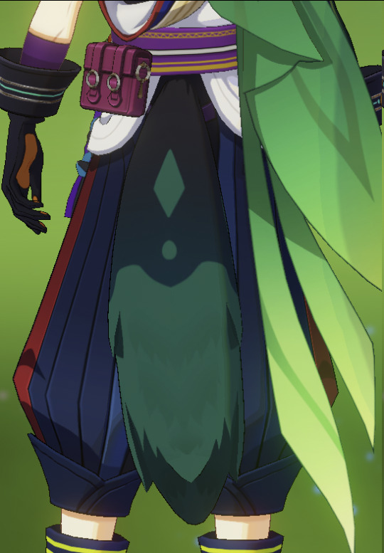
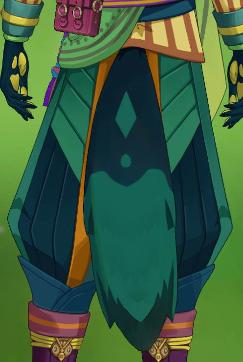
[image ID: the OG and edited back shots, cropped to the tail/pants area.
both tails have a dark teal top half and a green bottom half. a half-circle of dark teal is cut out from the green, and a green circle sits inside the half circle. a green diamond sits at the center of the tail, straight up from the circle. while not visible from this angle, this pattern repeats on the sides of the tail as well. the pants on both designs are long and puffy, with wider, flared-out bottoms that pinch into slightly thinner cuffs. the base fabric is split into vertical strips or folds, giving the pants a visually ‘striped’ pattern.
the OG tail is based at the waist, just under the magenta waist wrap. the base of the OG tail is also more black, fading into dark teal further down. the pants framing this tail are midnight blue, with single strips of red fabric on the outer sides of the legs.
the edited tail is based at the bottom of the hips, just under the bottom edge of the shirt. the base of the edited tail is fully dark teal. the pants framing this tail are dark teal, with lighter teal cuffs, single strips of green on the outer sides of the legs, and single strips of orange along the inner thighs. additional strips of lighter teal fabric cut diagonally down the rump and back of the upper thighs, angled down towards the inner legs.
end ID]
now the base of the tail actually extends from the end of the spine~
also note the lighter panels on the redesigned pants, framing the tail. the pants and tail are the same dark tone in the OG, so it’s hard to tell them apart. changing the pants to a teal hue only exacerbated the problem, so those lighter panels help block out the tail as separate from the pants
this is also part of the reason I made the inner section of the pants lighter
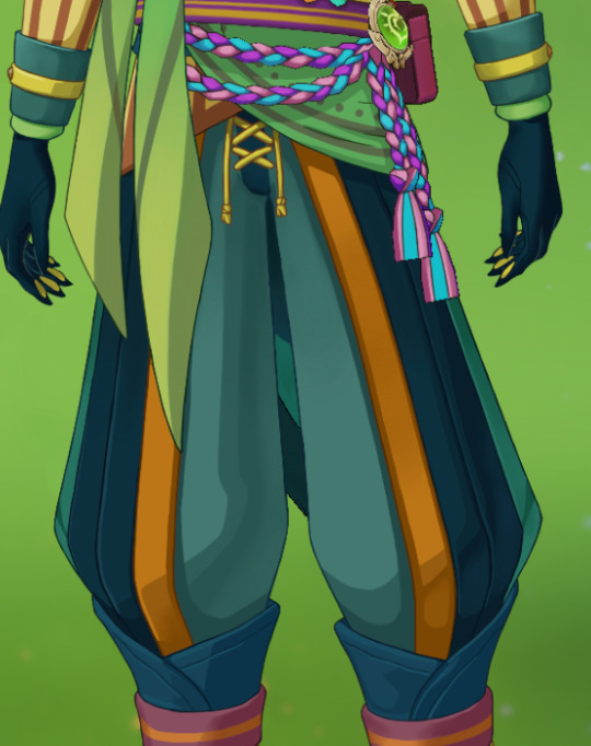
[image ID: the edited front shot, cropped to the pants. the cuffs are lighter teal, with a single stripe of green on the outside of each leg, and a single strip of orange fabric vertically bisecting each pant leg. the outer half of each pant leg is dark teal, while the inner sections are a very pale teal. the fly section has a strip of dark teal fabric, with yellow ties lacing the sides together. end ID]
but as you can see, the pale inner section of the pants is only visible from the front, so it didn’t help the tail issue much, lmao. I kept it anyways, tho, cus’ it breaks up that big block of dark pants from the front, and helps the eye move more smoothly across the figure
now, let’s talk sashes
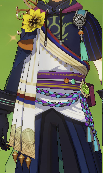

[image ID: the OG front and back shots, cropped to the sash areas.
the main white sash is wrapped loosely around the waist and pinned up to the front and back sides of the right shoulder by the big yellow flower and gold disk, respectively. this sash has stripes of firetruck red, blue, and light gold around the edges, with some gold diamond accents. either a matching white sash or an extension of the white sash hangs from the front of the right shoulder, pinned in place by the yellow flower. it’s long and squared-off like a scarf, hanging down to mid-thigh and folded into a few vertical strips. this sash also has red/blue/god accents, with some metallic gold diamonds hanging off the end. an additional small block of fabric hangs over the scarf-like sash, folded wave-like so that both the outer midnight blue and inner orange are visible.
a magenta-purple wrap holds the looser white sash in place, wrapping snugly around the waist in an wide strip. this wrap has yellow stripes/patterns with some zig-zag patterns. a white cord is tied around the center of the wrap, holding an orange bead, a cyan bead, a Dendro vision, and magenta hip bag. a couple of cyan/purple/grey ropes hang from the bottom of the wrap, the ends pinned to either hip.
a different sash hangs off the back of the right shoulder, large enough to end around mid-calf, and pinned in place by the giant gold disk. this sash is leaf-shaped, with a couple of additional thin, tapering strips of fabric hanging underneath. the sash is green, starting lush green at the pinned base, then fading to yellow-green near the tips. some darker green patterns emphasize the leaf shape.
end ID]
I already discussed my thoughts on white in this design, but I just need to emphasize how jarring this white sash is in Tighnari’s design. it’s weirdly distracting, and feels especially bland compared to the leaf-shaped sash on his back. why relegate the lush leaf symbolism to just his back?
it seems obvious to just combine the two sashes into one single design
[image ID: the edited front and back shots, cropped to the sash areas.
the first white sash is now fully green, with darker, dull green stripes and circles lining the edges. the scarf-like sash has been changed to a couple strips of green fabric in long, tapering shapes, ending around mid-thigh. the additional block of fabric has been changed to a couple small blocks of fabric shaped like leaves, framing the yellow flower. the large green sash on the back has been downsized to a very small, single leaf shape, ending just past the elbow. all the sashes and leaves have stripes/patterns/circles of darker, dull green that emphasize their shapes, and their tips fade to yellow.
the cord over top of the magenta wrap has been changed to yellow, and the grey parts of the hanging ropes have been changed to pink for a pink/purple/cyan color scheme.
end ID]
this pulls the leaf shapes and green palette onto his front, mixing the shape/color design more evenly across the body
you may have also noticed that I drastically reduced the size of the sash hanging off the back shoulder, and I have a good reason for that!
it’s not visible in a still image, but in-motion, the sash creates a flowing, trailing shape behind Tighnari when he runs/walks. that would be fine if the sash was the only thing back there... but he also has a tail. so Tighnari has these two big, distracting shapes trailing out behind him when he runs, and it really muddles his overall shape in-motion
but even in the still image, that massive sash covers too much of his upper body for my liking-- cus’ who wouldn’t want to get a full view of Tighnari’s stupid shirt?

[image ID: the OG front shot, cropped to the upper body.
underneath the white sash, Tighnari is wearing some kind of midnight blue hoodie. the hood has a magenta back, and is pooled around his neck, black drawstrings hanging down his chest. the left sleeve is short, wide, and loose, with thin, vertical blue stripes. this leaves the left arm bare at the elbow, before the glove. the right sleeve is skin-tight and covering the full arm, with some vertical stripes of neon green down the outer arm. there’s a light green, “leafy” filigree symbol across the chest of the hoodie.
Tighnari also seems to be wearing a midnight blue, skin-tight shirt underneath the hoodie, which hugs high up his throat. this may be the source of the skin-tight sleeve? but it’s unclear, considering there’s no loose hoodie sleeve on that side.
while the right side has a yellow flower, the left side has a shoulder latch hanging over top of the shoulder. the main strip of the latch is teal edged in silver, and each side of the latch (front and back of the shoulder) ends in a round, silver buckle. the buckle has a clover engraving, and a decorative tassel hangs from the front buckle-- cyan with an orange bead at the top.
end ID]
like, what is this? what the hell is this?? one long, skin-tight sleeve, and one short, loose sleeve? hello??
the “hoodie” look is also weirdly anachronistic. like, I know Genshin is a silly mix of “modern” and “ancient” fantasy, but the hoodie makes Tighnari look a little too much like... just some guy I could meet at work.
but before I could reconstruct the shirt, I had to figure out what stylistic base to work off of-- that is, what cultural base. but because Sumeru is a horrific frankenstein of a country, I had to make some executive decisions
so I looked up Tighnari’s namesake, then the natural range of fennec foxes, then chose the country that was closest to modern-day Spain, and got Algeria. then I googled Algerian fashion and worked from there. but looking at Tighnari’s wiki again, it seems a new note about Amazigh influence was added more recently, and I wish I had known about that earlier so I could’ve referenced more Amazigh fashion too 😭... ah well, at least I chose one of the right countries, and his sash is kinda reminiscent of Amazigh fashion...
ANYWAYS, I settled on this
[image ID: the edited front shot, cropped to the upper body. the hoodie has been changed to a vest/shirt combo.
the shirt is a long-sleeve button-up with loose/puffy sleeves tucked into the glove cuffs. the base is pale yellow with a burnt orange collar + edging, burnt orange vertical stripes across the fabric, and gold buttons. the collar of the shirt is lower than before, leaving more of the throat bare.
the vest is open at the front, with a high, straight-up collar. it has a dark teal base and lighter teal collar + edging. there are also a couple of visible pockets on either side of the vest, each with lighter teal top edging.
the shoulder buckle has been mirrored underneath the yellow flower, though it isn’t very visible. the silver on the latches has been replaced with gold, and a little circular pocket magnifier hangs next to the decorative tassel on the left shoulder.
end ID]
a lot of the Algerian fashion I found seemed to favor vests, which was a great way to balance warm vs. cool hues in the shirt vs. vest. a lot of the shirts I saw were usually white, but since I’m staying away from white, I just made the shirt a nice dull yellow, to complement the vest’s teal. I also tried to give the shirt a “loose-sleeve” look, as I saw in references-- a bit similar to Kaeya’s loose sleeves, but still distinct in shape. I think it gives his upper half a nice silhouette~
I also gave the vest a bunch of pockets, as a nod to the utility vests field scientists love to wear, to store all our small tools, samples, and cool rocks <3. realistically, Tighnari would store his pocket magnifier in one of those pockets (and the magnifier would have a little flippy cover to protect the glass), but I thought it would look fun hanging off his left shoulder latch~
and since the front is essentially split by the vest, I shifted the green symbol from the front to the back of the vest instead

[image ID: the edited back shot, cropped to the upper body. most of the back of the vest is visible underneath the green sash, showing the light green, “leafy” filigree symbol that was originally on the front of the hoodie. when the top of the symbol hits the collar, it circles around the bottom of the collar in two lines. end ID]
but speaking of baubles, let’s get a load of that flower!

[image ID: the OG front shot, cropped to the right shoulder. a big yellow flower is pinned to the front of this shoulder, while large, swooping, gold filigree curls up behind the flower from the gold disk on the back. end ID]
y’know what I thought as soon as I saw that big yellow flower? I thought, “oh, Tighnari saw a broken flower and stuck it on his shirt! I do the same thing at work when I see a broken flower-- I stick them in my headband! :) ” then I heard his “hobbies” voice-over and I felt so vindicated!! YES SAME HAT!!! I’ll just paste the voice line here, it’s very cute:
“Leaves and flowers often drop onto the ground of the Avidya Forest, sometimes perfectly intact. Leaving them on the ground would be such a pity... I can't help but pick them up and keep them as biological specimens. They can be used as educational materials for Forest Rangers or as decorative pieces. Very versatile.”
anyways, Tighnari needed more accent colors on the sash, and I was already treating him like a flower arrangement anyways, so I just added more flowers! I think I spent a good 2 hours researching Algerian flowers for this, lmao

[image ID: the edited front shot, cropped to the shoulders. the flowers have been labeled, and are as follows:
Anacamptis morio: this is an orchid, with many small, purple flowers growing off a long, thin, stalk-like inflorescence. the flowers have the typical orchid resupinate shape, with a modified “lip” and surrounding petals. two stalks of these flowers sit just behind the original yellow flower, curving up and out, high over the shoulder.
whatever the hell: the original yellow flower. it has bright yellow petals and a dark center with what might be a few yellow stamens. the petals are broad, round with pointed tips, and arranged in a double-layer radial pattern.
Iris tectorum: this is an iris, with three long, drooping sepals, and another three shorter petals. most of this flower is purple, with lighter patches near the center. this iris is pinned just underneath the yellow flower, hanging a bit downwards.
Linum grandiflorum: this is a flax flower, with the typical 5 broad, round petals arranged in a neat radial pattern, and 5 small stamens. this flower is pinned just to the side of the yellow flower, just underneath it.
Moricandia arvensis: these small pinkish flowers have a cruciform pattern of 4 petals with a few yellow stamens. a couple of these flowers are pinned just to the side of the flax flower.
end ID]
anyways, please ignore the fact that these flowers prolly all grow in different biomes than the jungle-type biome of Avidya forest; I already had a hard enough time trying to find the right color flowers to fit this palette... also ignore that the sizes are off b/c I couldn’t draw them too small (I KNOW the flax is way too big..)... also ignore that that the flower structures are a bit off b/c it would’ve been WAY too much detail for a Genshin design if I drew them accurately... please just be gentle, it’s been a while since I’ve gotten to be academic about it all...
I have no idea what exactly the yellow flower could be, though. it’s so generic, it could be literally anything. but before anyone suggests it-- I doubt it’s a sunflower, since it doesn’t look like a capitulum inflorescence, and the petal shape/arrangement is wrong
and fun fact! the Iris tectorum is Algeria’s national flower!
also note that the orchid serves as a replacement for “thing sticking off the right shoulder” in Tighnari’s silhouette, b/c the gold disk on the back is just too stupid for me to handle

[image ID: the OG back shot, cropped to the shoulder/upper back region.
the main disk is massive-- at least the size of a spread hand. three glass circles of different colors/sizes/placements are set into the gold-- one large tangerine circle, one medium light pink circle, and one small lavender circle. floral engravings decorate the disk, surrounding the glass circles. elegant, swirling, filigree projections curve from the side and top of the disk, curling high over the shoulder.
additionally, there’s a large gold loop set on Tighnari’s upper back, underneath his hood and the sashes. vine patterns are engraved in the loop, and two flowers (respectively purple and pink) sit on the loop.
end ID]
like, ok I admit, it’s very pretty. I like the orange/purple/pink palette with the gold, and the filigree is pretty on its own
but like most of Tighnari’s design, it’s just too much, y’know? I can excuse impractical accessories if they fuck hard enough, but this just crosses the line into obnoxious. like what even is that thing??
but since I still like the idea of a gold accessory on the back, I just reconstructed it into something else:
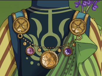
[image ID: the edited back shot, cropped to the shoulder/upper back region. both the shoulder latches are visible from this side, and a gold chain drapes between them. three gold disks hang from the chain, each with a single glass circle set into the disk. the center disk is the largest with a tangerine circle, while the two smaller disks to the sides respectively have a light pink and lavender circle. each glass circle is engraved with a simple 5-petal flower, while zig-zag patterns are engraved in the bordering gold disk. a few small, flat gold coins hang between the disks. end ID]
I think this is an elegant way to keep a shiny-gold trinket on the back (complete with the tricolor accents~), as well as nod to that... flower loop(?) on Tighnari’s OG back, under the sash
speaking of filigree, I also removed the excess “filigree” design on Tighnari’s boots
[image ID: the OG and edited front shots, cropped to the boots.
the OG boots reach mid-calf, leaving a small gap of bare calf between the top of the boots and the bottom of the pants. the main block of material around the calf and sides is midnight blue, the tongue and top of the foot is white, and the toe box is black. the thick cuff is midnight blue with two horizontal stripes of neon green. filigree patterns decorate the sides of the shoe-- lighter blue on the midnight blue sections, then midnight blue when they trail into the white. the outsole/tread is gold, and the laces are very dark blue with silver latches.
the top of the edited boots has been lifted to reach the bottom of the pants, leaving no gaps of bare skin. the main block of material around the calf and sides is dark magenta/purple, the tongue and top of the foot is orange, and the toe box is magenta. the thick cuff is light magenta with a horizontal stripe of orange around the center. the filigree patterns are gone, replaced with a single yellow diamond at the center of the top of the foot (in the orange section), framed by a small yellow circle on either side. the outsole/tread is still gold, and the laces are yellow with gold latches.
end ID]
shape-wise, the filigree just doesn’t do much for Tighnari-- it’s too “flamboyant” and “wispy” for his character, if that makes sense? the “leafy” symbol on his vest feels floral enough to stay, at least, and it feels more intentional than the other filigree designs. imo, circles/diamonds feel more simple and “practical” for Tighnari’s overall shape design, and better match his ears, tail, and sash.
you may also be wondering why I lifted Tighnari’s boots up higher, and to that I say: have you ever heard of ticks??
any field scientist (or even just... hikers...) knows that open cuffs are just begging for ticks and burrs and bites. Tighnari knows better than that!
which brings us to the gloves-- why are the cuffs so damn wide?
[image ID: the OG back shot, cropped to one glove. while the glove is slim-fitting around the hand, the cuff widens into a thick, wide flare up the arm, reaching midway up the lower arm. this forms a wide, open cup around the wrist area. the base color of the glove is black, with some horizontal stripes of cyan and silver around the cuff + a small bronze buckle. the main palm of the glove + small patches on the pads of the fingers are orange. this glove sits on the left arm-- the one with a short sleeve and bare arm. Tighnari seems to be wearing a skin-tight, purple glove or sleeve under the main glove, ending just under the elbow. end ID]
Tighnari could collect rainwater in those things!! time to slim down


[image ID: the edited back shot, cropped to one glove. the cuff has been drastically reduced in size, now tucked snug against the sleeve of the arm with no open gaps. the cuff is still thick, reaching about midway up the lower arm. the main glove is dark teal, the cuff is teal, and a small section between the glove and cuff is light green. the cuff also has a thin yellow strap around the middle, latching with a small gold buckle. notably, claw-shaped points have been added to the tips of the fingers, to accommodate claws underneath. an additional screencap of the palm in full view shows how the palm “padding” has changed-- now all yellow. the main palm padding has been split into three sections-- one large section under the base of the fingers, one large section under the base of the thumb, and one small section opposite the base of the thumb. the patches at the pads of the fingers have also been enlarged a bit. end ID]
now the sleeves can to tuck comfortably into the glove cuffs; ticks BEGONE!!
added claws b/c all the animal people in Genshin deserve claws <3
and I only changed the padding cus’ I prefer to follow the natural curves of the palm in my own art. emphasizing those rounds and shapes makes for a much prettier design than just laying one flat cover over the palm, imo. especially for gloves that are meant to subtly nod at fox pads~
and finally, Tighnari’s skin tone

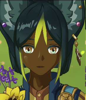
[image ID: the OG and edited front shots, cropped to Tighnari’s face. the OG face is pale-skinned, with black lashes/eyebrows, and two-toned brown/teal eyes with light teal pupils. the edited face has dark brown, warm-hued skin, with dark teal lashes/eyebrows to match the hair, and the same brown/teal eyes but with dark brown pupils. end ID]
I mean, there’s not much to say tbh. Genshin’s colorism wasn’t necessarily excusable before, but at least the reference nations before this point aren’t necessarily “““known””” for having darker populations (weak excuse, dark people are everywhere, but the bar is on the ground, here). but Sumeru? the stand-in for Africa/the Middle East?? a nation where most of the dark-skinned characters are enemy npcs?? where the dark-skinned characters are barely even dark in the first place??? disgusting
anyways, Tighnari just looks better brown too, imo. his silly lil leaf hairs stand out better against dark skin, and the warm tone I used works well with his new clothing palette. I considered giving him cool undertones rather than warm, but I think contrasting the warm of his skin against the cool of his hair/ears works better, considering the mix of warm+cool across his whole outfit
also gave him dark pupils cus’ he just looks so dead-eyed in the OG...
oh and I changed the shade of his lashes/eyebrows to dark teal, to match his hair. not very noticeable, but it’s important to me lmao
#tighnari genshin impact#genshin impact#ganch redesigns#/chewing on a stalk of hay/ fixing Genshin characters ain't much but it's honest work#long post
29 notes
·
View notes
Note
Note that all of the following is good faith criticism. I don’t want to shoot this project dead in the water I just want them to learn & improve.
I take issue w the use of the Ainu in fixing Rwby, and no personal grudge to the other person who mentioned working on it but your team was NOT respectful or conscientious of what culture you were using.
The Ainu historically and currently face a lot of struggles bc of Japan’s racism and ethnocentric culture, one of the main stereotypes includes being barbaric- how did you guys thinking that using an indigenous culture and making them into bandits was a good idea? You said there were hours long discussions and feedback but did any of you bother to do research on Ainu culture and the stereotypes that impact them in modern day? Did none of you have the basic common sense to go “hey maybe using an indigenous culture and making them into a bandit tribe isn’t good”?
On top of that- the Vernal design doesn’t hit the mark for someone who is supposed to be Ainu, have any of them actually researched Ainu clothing & design? All Vernal seems to have is the tamasay/shitoki- which they don’t even refer to as such in the concept art.
Why does Vernal look so not warm? Do they know that the Ainu traditionally live in cold regions? “Well the Branwen Tribe moves around-“ Yes for their murder and banditry that you’ve decided to associate w a minority group- great reasoning.
Where are the patterns on Vernal’s clothes, Ainu clothing has very distinct patterns, where is it? This doesn’t look Ainu it looks like Rwby flavour weeb Japanese.
Why is Vernal’s tattoo is just stamped on her bicep? I’m assuming they took the diamond shape from traditional Ainu tattoos but that’s not where the Ainu put their tattoos, Ainu tattoos go on their mouth or on the back of their hands + forearms.
(Not to say her design isn’t cute, but in no way do I clock it as Ainu, the “inspo” is v little & overrun by etsy Japanese)
If FRWBY wanted to keep the bandit tribe Japanese in some way then how ‘bout idk- SAMURAI?
Samurai are literally right there and they’re already keeping Raven’s weeb samurai canon outfit so the most obvious decision is to make the Branwen Tribe akin to a group of rōnin, which actually has a historical basis for being wandering criminals with combat prowess! It makes all the sense without stumbling into racist stereotypes. Make them a warped version of the 47 Rōnin tale if you want an allusion for it too.
I don’t like being overly hard on the snap when it comes to giving criticism, but the way the other person pumped themselves up and claims that they shouldn’t be accused of appropriating / being insensitive bc you “did all the work” when you CLEARLY didn’t do ANY work here. If you did the work you would’ve known how to better design an Ainu character, if you did the work you would’ve known more abt Ainu culture & clothing, if you did the work you would’ve known that making the bandit tribe Ainu would be incredibly insensitive and racist.
I’m sure you guys DID have long discussions & brainstorming & feedback, I’m sure you DID care and put a lot of thought into your project- but that isn’t enough. You need to be culturally sensitive and research the cultures you’re including to guide your writing. If you cannot do that then simply do not include those cultures.
You failed here. You cared, but not enough to do proper research. Sincerely, with good faith, do better.
I’m not gonna add anything to this, rather let my friend explain it in this ask since they are far more knowledgeable in this than I am.
41 notes
·
View notes
Last Seen Blogs
mozzarellamotley
Yeah... all I do is ramble
crash-knb
KnB Stuff, Really
starrywisdomsect
Starry Wisdom Sect
sophysourpatch
All Hours Are Loving
Ryuji Sakamoto Hours

dirtangeldean
best bottom boy.