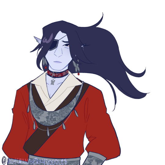
#S2 art book
Text
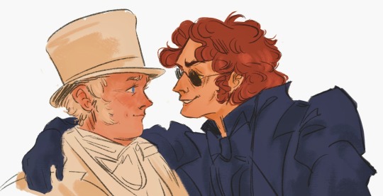
cannot get enough of these guys (man-shaped ethereal beings)🪦
#good omens#my art!!#gomens#good omens art#good omens book#good omens fanart#fanart#gomens 2#gomens spoilers#good omens 2#good omens season two#aziraphale x crowley#crowley x arizaphale#crowley#aziraphale#wip#work in progress#i love being wine drunk#he is me#good omens s2#gomens season 2#gabriel#i hate u metatron
10K notes
·
View notes
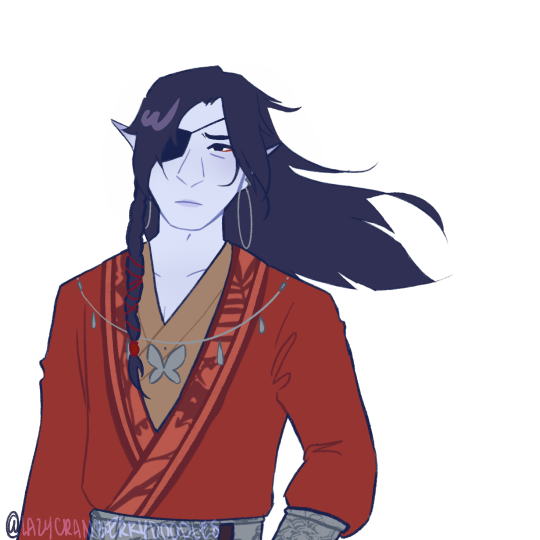
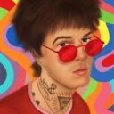
Text
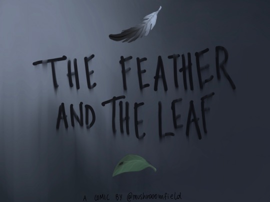
I think I have a natural talent for turning comedic scenes into angst
#i’m not ok#i hope we’ll get some of crowley’s backstory in s2#good omens crowley#good omens#good omens s2#good omens quote#crowley good omens#crowley#good omens fandom#good omens fanart#good omens comic#fanart#ineffable husbands#crowley x aziraphale#azicrow#anthony j crowley#good omens book#good omens art
3K notes
·
View notes
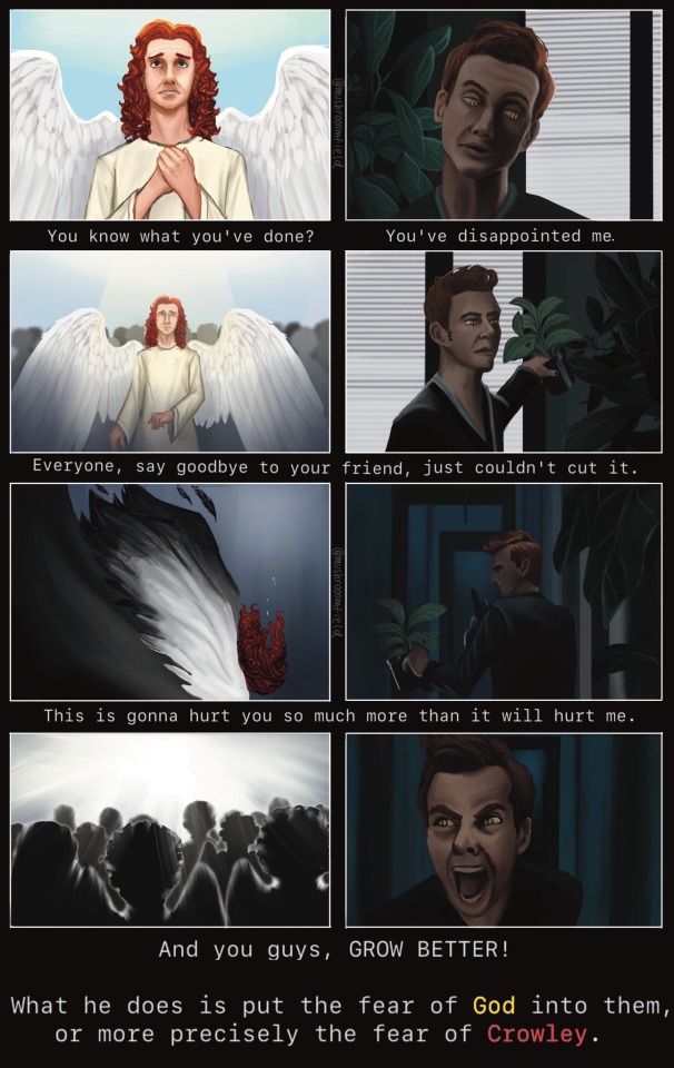
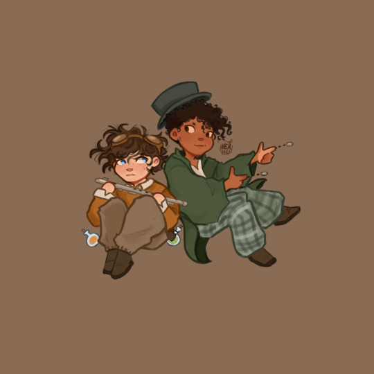
Text

Today instead of another page, I bring you... DTIYS!
What is is? Why are they cats? I don't know. I just wanted to paint clouds today. And I felt like doing DTIYS for the first time. So please go wild and have fun!
#goid omens#aziraphale#crowley#good omens 2#ineffable husbands#crowley x aziraphale#go s2#good omens art#good omens fanart#draw it in your style#good omens dtiys#draw this in your style#artists on tumblr#fanart#ineffable cats#good omens cats#cat aziraphale#cat crowley#book of miracles#aziraphale is loafing#Crowley is a long boi
211 notes
·
View notes
Text
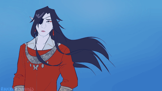
i am waiting for you / even if it takes a lifetime
all of the stills for the curious and hua cheng obsessed:


#you know the reltable moment when you accidentwlly make a picrew of your fave character. yeah#hehehe i love him. fashion icon#including manhua-ish outfit s2 donghua-ish outfit and book cover-ish outift but with my own touches#AND THE ETERNAL FAITH OUTGIT!#art#my art#tgcf#tian guan ci fu#hua cheng#heaven official’s blessing fanart#heaven official’s blessing#crimson rain sought flower#tgcf gif#animation
372 notes
·
View notes
Text
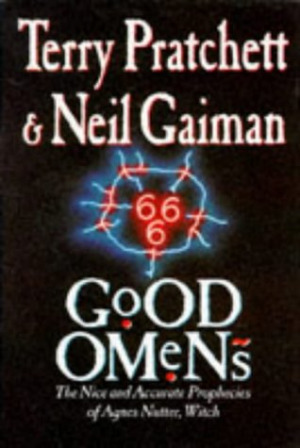
The art director & the Good Omens book cover tier list of doom, part 1
part 1 l part 2
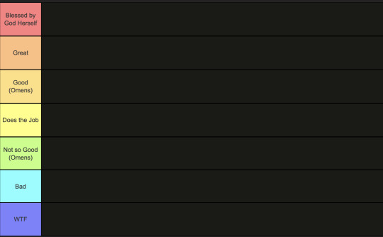
This is going to have to be a multi-part series because there are *checks notes* 64 different covers that I've found so far.
I am your resident Art Director/Good Omens enthusiast,
and welcome to my completely meta-free book cover tier list.
Listen, making a book cover is HARD. I should know. But while we salute these artists for their hard work and time, I think we can all admit that once in a while, the vision is just not on. And on very rare occasions, publishers seemed to have managed to commission the cover art directly from hell...
1. The original UK cover
Ahh, the standard by which all shall be judged. We're starting off with a nice & easy cover, with adorable woodcuts of Aziraphale and Crowley flanking a custom Good Omens font! While I have to take a few points off for the terrible kerning of the word "GoOD", the blockprint vibes and general bitchiness of Aziraphale's teeny weeny wittle face, along with the sick colour palette puts the orignial in my good graces.
Tier: Great
2. The duelling US covers
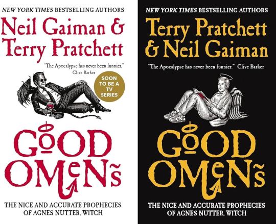
Progress! Hail to the designer who figured out trying to make "GoOD" and "OMeNs" fit the same width was a fool's errand, and even managed to IMPROVE on the original handmade title by adding a little halo and devil's tale to the design. Aziraphale and Crowley are facing each other, while also managing to serve absolute cunt. Aziraphale is wearing EIGHTIES SNEAKERS. Crowley's little snake boots have HEELS. They've managed to keep the woodcut vibes and colour simplicity, while balancing out the full title of the book. Both authors get to trade off on who's name comes first! Dare I say, this is a work of genius. I could dock some points for Crowley's sad bat wings growing out of his right clavicle, but who am I to question greatness.
Tier: Blessed by God Herself
3. The Halo Master Chief(?) cover

How the mighty have fallen... As a Canadian child, I was subjected to maybe the most horrifying ad in existence by the War Amps warning children about machine safety. This cover is the paper embodiment of that ad. I am confused by the purple haze. I am frightened by the seeming ethereal flatness of Adam and Dog. I am strangely aroused by Aziraphale's eyebrows, and intensely saddened by the terrible outline/drop shadow they had to inflict on the type to fit "Pratchett" in that god awful space.
Tier: WTF
4. Germany, Ein Gutes Omen covers
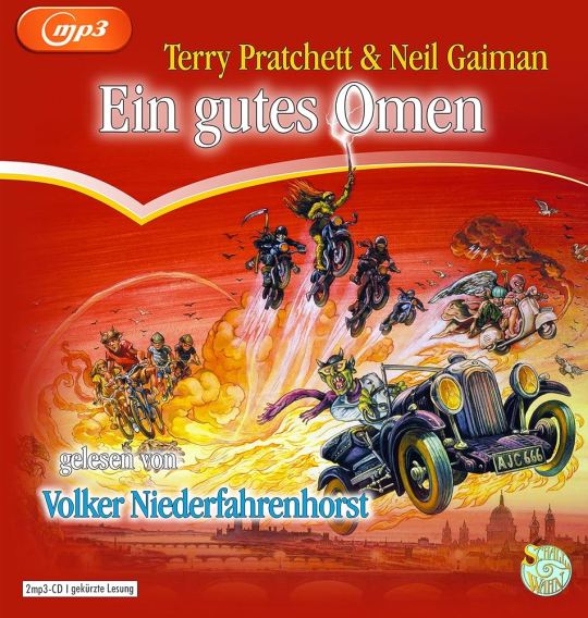
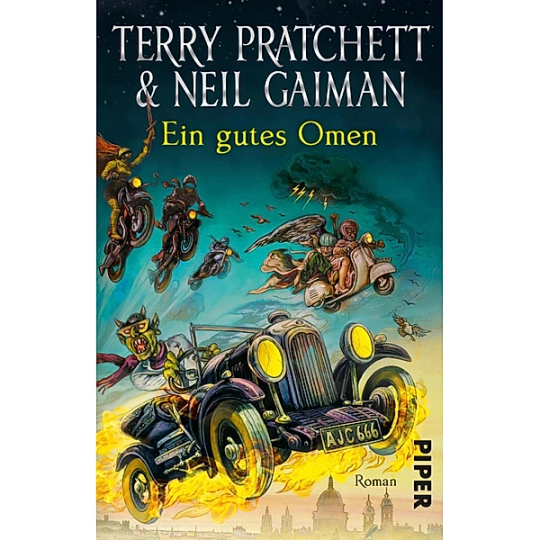
This cover inexplicably exists in two colour ways: red and teal. I put the audiobook cover here so you could experience the full illustration, and also how fucked up it is that they cropped the book version to include three horse-people of the apocalypse, but cut off DEATH on the regular cover. Points must be given for drawing a pretty slick Bentley, but I think we have to take even more points away for turning Crowley into a Ray Charles/Mike Wazowski hybrid. The ducks are nice.
Tier: Not so Good (Omens)
5. Germany, Ein Gutes Omen covers continued
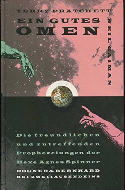
I don't know if the German designer of this cover *knew* that they were using western yeehaw cowboy woodblock letters when they made this cover, but judging by how they spaced the rest of the text at the bottom, THEY DID NOT CARE. And that seems to be a running theme for this one. We get kind of a duality thing going on with the black and pink background, but it just seems like somebody whispered the general themes of Good Omens into a jar, and threw it down a well, and this poor chap came along and picked it up. The baffling choice to align every piece of text on the cover *except* Neil Gaiman's name which is right aligned and rotated 90 degrees (not even real vertical type) will haunt my dreams, I think.
Tier: Bad
6. US, UK The Traffic Jam cover
For the love of Good Omens, WHY. I can think of so many more interesting symbols to put on the cover of this book than the ODEGRA SIGIL TRAFFIC JAM. Props for keeping the good colours and type, but like, I think this cover was secretly designed by @amtrak-official, or someone who just really, really likes public works.
Tier: Does the Job
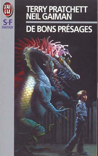
7. France, De bons présages cover
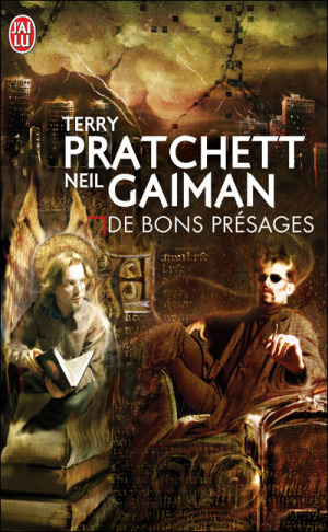
Leave it to France to make sure people know that Aziraphale and Crowley fuck severely. While I can't condone leaving out half the title of the book (and thinking a red carpenter's square counts as decoration), I can begrudgingly acknowledge that Ron Pearlman and Benedict Cumberbatch's love child is excellent Crowley casting. I think I give this a solid dark academia/10.
Tier: Good (Omens)
8. France, De bons présages covers continued
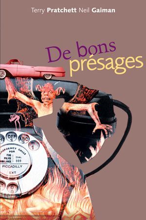
Just imagine with me, if you will, the absolutely hilarious reality that this cover posits: Good Omens is exactly the same in every respect, but Crowley drives a pink 1950s convertible. Why do all of the colours on this cover look like they've been pre-digested? Why are the font choices and placement so bafflingly bad. My face is the demon's face holding that car. I feel his pain.
Tier: WTF
9. France, De bons présages covers continued
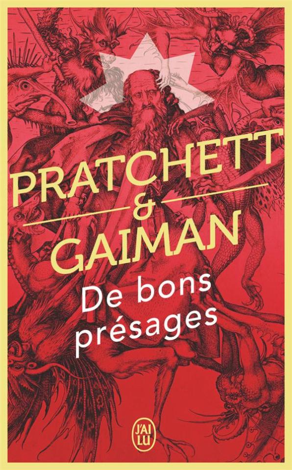
Minus points for not managing to write the full title of the book once again. I don't know what it is with the French. They seem pretty set on Good Omens being demonic. While I do appreciate a good Bosch-style demon party, the dude in the middle confounds me. All-caps Museo Sans that isn't even *centred* in the frame is just so lazy. I am le tired.
Tier: Bad
10. France, De bons présages covers continued
Uhh. The font. The font is okay.... I think? Yeah. The font and kerning are. Okay. OHHH GOD I LOOKED DOWN BELOW THE TEXT WHYYYY.
Tier: WTF
END of round one. I need a nap.
#good omens 2#good omens fandom#good omens#art director talks good omens#tier list#cover art#aziraphale and crowley#aziraphale x crowley#book cover#go s2#gomens#good omens analysis
162 notes
·
View notes
Text
older kanej being in love. living an ordinary life full of ordinary things and all that
#my art#he's holding a poetry book#also look at his hand 👀#kanej#the crows#six of crows#soc#crooked kingdom#ck#crows#Kaz brekker#Inej ghafa#shadow and bone s2#shadow and bone show#shadow and bone series#sab s2#sab (TV)#shadow and bone netflix#sab netflix#grishaverse#geisha#fanart#my fanart#digital fanart#digital sketch#illustration
1K notes
·
View notes
Text
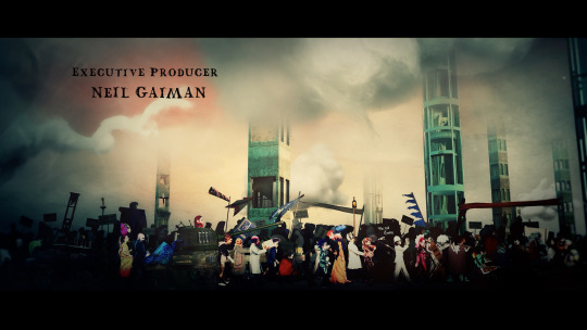
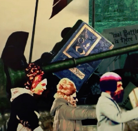
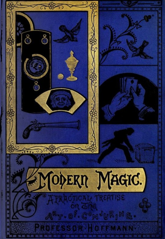
The blue book here in the S2 Opening Title is Modern Magic: A Practical Treatise on the Art of Conjuring by Professor Hoffmann from 1876 and can be read online under the Project Guttenberg :).
From wiki: Modern Magic by Professor Hoffmann (real name Angelo Lewis) is a treatise in book form, first published in 1876, detailing the apparatus, methods and tricks used by the magicians and conjurors of that era. Hoffmann was considered to be one of the greatest authorities on the theory and practice of magic, despite his own limited professional experience as a magician.
The first edition of Modern Magic "sold out within weeks and subsequent printings continued to fly off the shelves." Its popularity was due in part to the scarcity of teaching materials available to would-be magicians in the late 19th century. Modern Magic was the first book in the English language to really explain how to perform magical feats The publication of Modern Magic was controversial, however, as some magicians were outraged that their secrets were now published On the other hand, it appears that Hoffmann only published secrets with their creators' permission.
Modern Magic, and Hoffmann's writings in general, influenced several well-known magicians including Howard Thurston, Chung Ling Soo, Alexander, and Harry Houdini. David Copperfield's private museum is home to Hoffmann's personal copy of Modern Magic. Copperfield believes that "the book eventually played an essential role in elevating the art of conjuring and may have acted as a catalyst for the entire golden age of magic".
#good omens#gos2#season 2#s2 opening title#fun fact#books#magic#modern magic#Modern Magic: A Practical Treatise on the Art of Conjuring by Professor Hoffmann
632 notes
·
View notes
Text
orko screencap redraw
#my art#orko#he-man#he man motu#he man orko#he man fanart#orko fanart#episode is s2 e11 the great books mystery#this is just my redesign!
186 notes
·
View notes
Text
Ohmigosh!!! First post!!! I love Ineffable husband's they're life uguejdjj I love them!!! Also how do I use Tumblr ◉_◉
#fan art#books#digital art#david tennant#good omens#michael sheen#neil gaiman#terry pratchett#good omens fanart#ineffable husbands#inneffable idiots#crowley#aziraphale#good omens s2#good omens s3
142 notes
·
View notes
Text

demon muriel <3 (somewhat inspired by @underlined-in-spirit’s art, which was inspired by @phoen1xr0se’s fic!)
#again this isn’t quite finished but I don’t want to work on it anymore lol#I hate the outfit but whatever lol#I’m obsessed with Muriel u don’t understand — they’re such a sweetheart#something something crow-adjacent (cause of the book at the end of s2)#Phoenix I haven’t read your fic yet but I hear it’s INSANELY good <3 on my to-read list hehe#crowley#good omens#ineffable husbands#good omens 2#aziracrow#aziraphale#go2#ineffable lovers#ineffable wives#good omens season 2#gomens#gomens 2#good omens art#good omens fanart#my art#gomens art#Muriel art#Muriel good omens#demon!muriel#good omens muriel#inspector constable#ineffable divorce#aziraphale x Crowley#Crowley x aziraphale#digital art
151 notes
·
View notes
Text
Sticker design :)
When will I actually make stickers for sale? I guess we’ll never know…
#art#artist#fanart#digital art#illustration#my artwork#book fanart#wesper#jesper x wylan#wylan van eck#jesper fehey#Wylan fanart#jesper fanart#six of crows#soc#soc fanart#shadow and bone#shadow and bone season 2#shadow and bone series#shadow and bone s2#wylan x jesper#wylan and jesper#digital drawing#sticker design#book tumblr
885 notes
·
View notes
Text
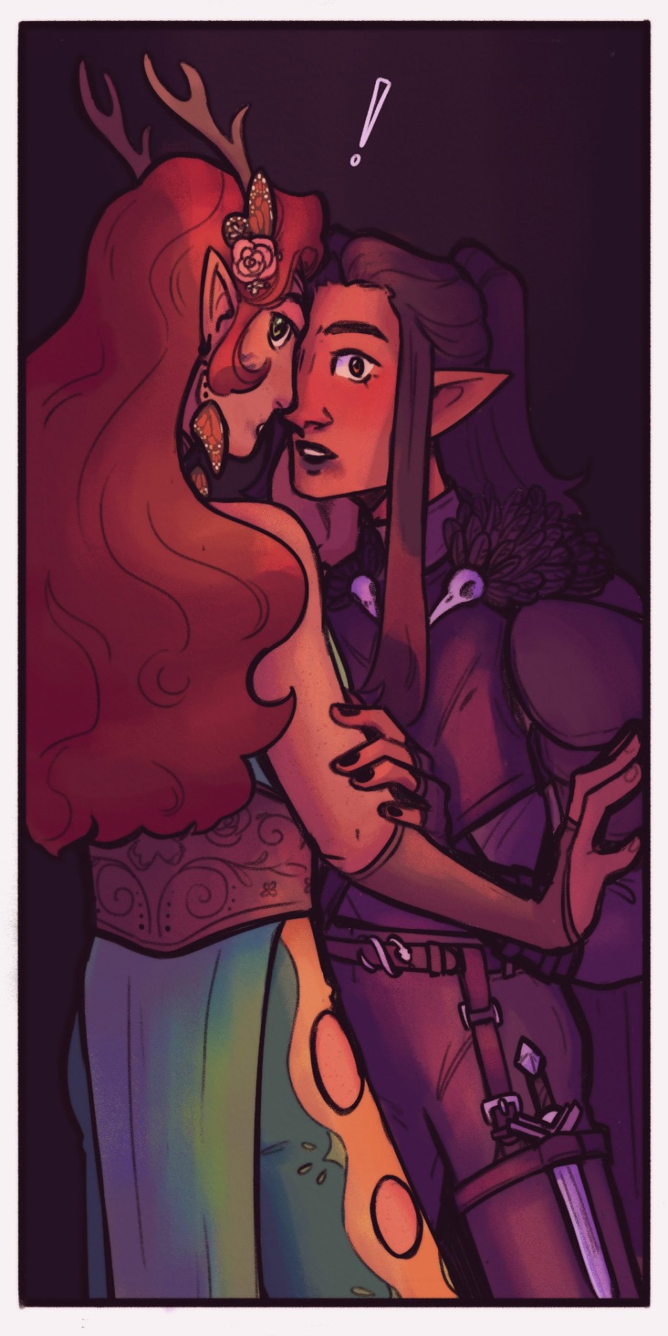
[ID: A digital illustration of Vax'ildan and Keyleth from Critical Role. They're stood very close together with their hands on each others faces and arms. Vax's dark lipstick is smudged and some has transferred to Keyleth's mouth, implying they were just kissing. They're both looking towards the viewer with expressions of surprise, with an exclamation point drawn over their heads. Behind them is a dark background. End description.]
Finally found the time for something very self indulgent <3
#vax'ildan#keyleth#vaxleth#my art#critical role#critical role fanart#vox machina#vax'leth#i love drawing vax with lipstick so i can draw lipstick kiss marks on keyleth#very excited to be very annoying about them again when s2 of tlovm starts this week#also my dissertation is done now!!#i keep stressing that i made some mistakes or something but there's not really anything i can do about it now#and now i finally have some time for a bit of personal work before i have to start working on my final comic book project
863 notes
·
View notes
Text

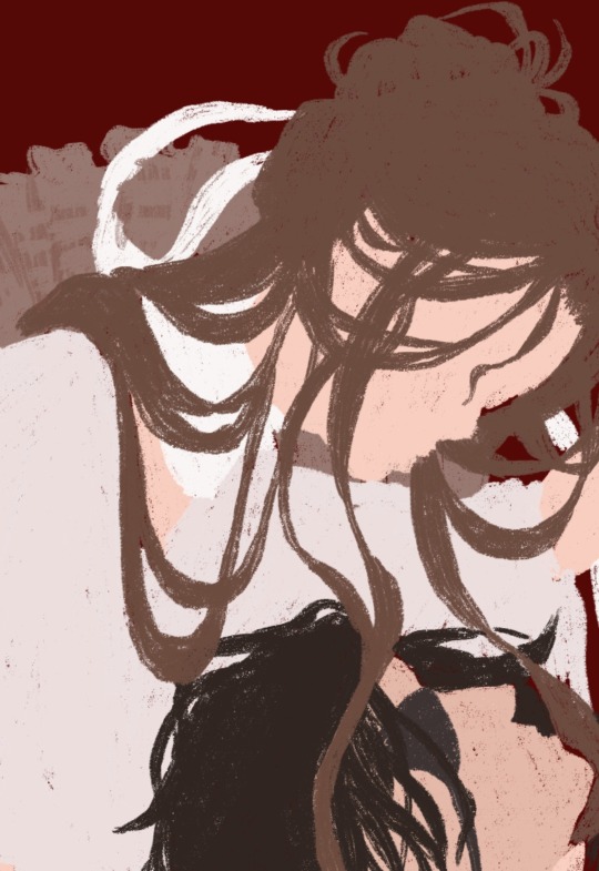
a doodle i never finished 🍎
#my art!!#good omens#good omens art#gomens#fanart#good omens book#good omens fanart#good omens spoilers#good omens 2#gomens 2#anthony j crowley#crowly x aziraphale#ineffable husbands#ineffable divorce#snake crowley#crowley#aziraphale#i don’t like the ship name aziracrow sue me#not tagging it here#good omens s2#good omens season 2#gomens spoilers#aziracrow#there u got me#i want this to reach many people and many people follow that tag#it’s a tragedy#they’re literally married#they’re ineffable#ineffable fandom
267 notes
·
View notes
Text
So Heaven Official's Blessing is really good huh? (sneak preview of a wip im working on)
#yeah this is a whole piece and it might take me a moment to do but wowwwww this show has taken over my brain#i had seen s1 a long time ago but never got super invested but s2 has me hooked#im looking into how to read the books and ive already started the manhua super excited#tgcf#heaven official's blessing#hualian#hua cheng#xie lian#fanart#wip#art wip#digital art#my art
101 notes
·
View notes
Text
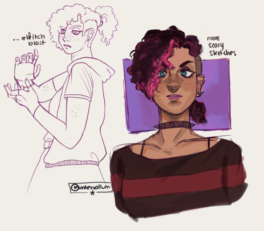
scary sketches
#scary marlowe#dndads#dndads quest#dndads s2#dungeons and daddies#fanart#dndads fanart#dndads scary marlowe#its super fun to draw her#also love just giving her new clothes everytime i draw her#because why not?#also scary to me is definitely a poser#shes way more into emo than genuine goth punk#i feel like she would have a tumblr blog where she'd get into constant discourse about like...warrior cats#“heres 10 reasons why firepaw copperpelt is actually problematic and you should hate yourself if you like him(10k word essay)”#(idk if that is an actual warrior cats character i have only read the first book in middle school okay)#my art
222 notes
·
View notes
Text

back from vacation, here’s a little nark i drew on the drive home! (they are sad, as usual)
#nark#dungeons and daddies#dndads#dndads s2#dndaddies#dndaddies s2#dndads fanart#dndaddies fanart#lark oak garcia#nick foster#nick close#nicholas foster#nicholas close#my art#nark nation#so excited to draw on my computer again ooooo wheeeee#i only brought a sketch book to draw in bc i knew i wasn’t gonna have much free time and i only ever used it this one time on the ride home#time to torment the dndads tumblr fandom again hehehehehehehehehhehehehehehehehehheehhehehe
358 notes
·
View notes
Last Seen Blogs
iliketheflavourofchlorine
Mariam is a loser

juliettespencerus
Updates By Juliette
psychgazer
PSYCHGAZER

142cags
Untitled

mhizuki
كيفية شراء الأثاث المستعمل