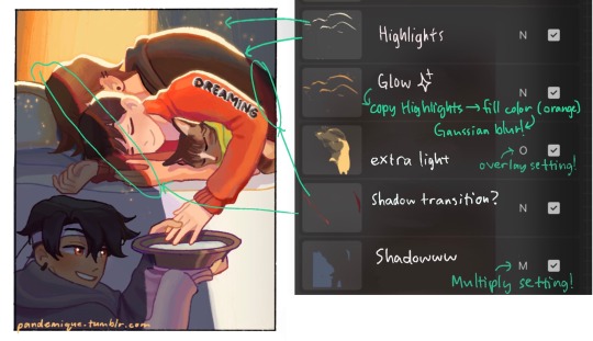
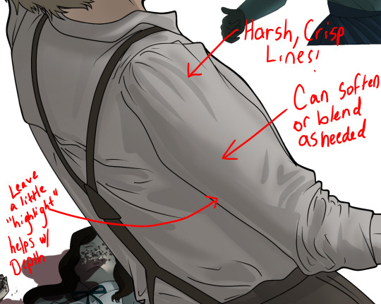
#i think doing the lineart like 3 days after the sketch?? made it better????
Text
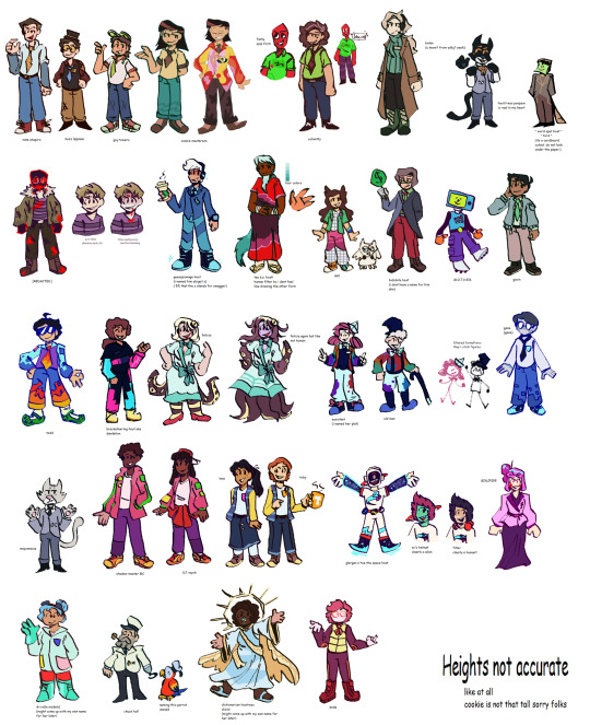
remembered some of my host design thoughts from 2020 just gonna straight up copy and paste them some grammar mistakes don't mind that too much
host design progress/thoughts/etc/etc
schmitty - when i listened to his (scared) tmp2 voicelines i imagined him (and did like 2 doodles) as a humanoid red quip. whether or not that's because me and my friends memed said quip a lot and i began assoisating the quip with schmitty might...idk be up in the air lol.
anyways i basically made him a human verison of the red quip and my human verison for him came later
cookie masterson - i think i listened to his F U easter eggs? and then boom. cookie, made his tie a ...cookie tie bc of his name lol
REDACTED - i think i listened to the tmp1 " voice reveals "? i forgot, man it's only been two months. anyways i know i based their look soley on something said on their tumblr page, " based raised in the woods ". and i made their " not shadowy " form not too long after
to quote myself: " well hes a serial killer or something right " . oh and i believe i made his shirt purple bc that color is sometimes associated with evil! woo. as for my first take on his Totally normal man in society he did not seem like a guy that could play off being a Totally normal man in society. he had fricking pink eye and was bleeding from his mouth and looked really sickly
todd - ah the funny internet man! my first design for him ..funky hair. i know i went through like 3 hairstyles for him and whether or not i wanted to give him shorts.
the 3 things that stayed through out all the designs are: shades, fire tie/fire on the pants and green crocs. now that i think about it his clothes are weird lol..
nate - soley based on his F U easter egg. " i'm pretty (fricking) expensive. " i also wanted to use a different head shape.
from my first sketch of him, nothing has really changed except for the stripes on his tie
guy towers - oh fgod my first reference drawing of him, the colors and design are pretty much the same now except i changed his shoes a bit and give him a short ponytail
idk hes the sports guy and sports people wear visors...yea
oh my gosh i think i gave guy a ponytail bc of some " au doodle/ the whereabouts of the ydkj hosts "
binjpipe - oh uhhhhhh ,is pink , hair shapes a b, she is the only character with a eye color (i guess bc i didnt really bother giving eye colors to any of my hosts)
my design for it has not changed, the onyl thing i added recently was circuits on her hands! bc . idk circuits are cool
schmitty but human - ohhey i found it, i imagined in his ydkj days hes just...pretty tired. hence gray hairs! and i know the tie i very loosely based on Funny Faster Funnier or wahtever it is
dr ro (hc name: dr.rangsey) - short science girl! idk i think the phrase " lab safety is mint colored! " fits her and thats something i thought about..and her colors are based on her game
again her design did not change much i think i just made the labcoat look better
hfelicia - ohhh i remember really wanting to make a design for her . i was like I GOTTA DO THIS.. and tentacles were a requirement. and a eyeball in her hair
one sketch i have is her with eyes on her arms which i believe i did put in, in her monster form . ok i just found when i got around to linearting and coloring, i realized her outfit was too similar to the mother in her game so i changed it (and ngl i was thinking of maid outfit kinda) i looked up vintage clothes and gave her something from that, and red shoes lol
guesspionage host (hc name: abigail s) - oh!! i doodled him on paper first, my final design is pretty different my gosh
my next sketch for him then has boots and a different head shape , uhh yea, eventually i made the shoes Not fricking big and i gave him some cool glove thing with...circuits! bc to quote on my reference page " epic shocking prank ". ngl that was mostly bc of gandra dee in dt17 bc she has nanobots or whatever on her hand and its pretty cool and i thought this host would be the kind to get stuff like that
and could be used for self defense i think? shocking hurts and its like ..opposite of binjpipes' kinda. his are on the palm while hers are on the opposite of the palm (??i dont know my human terms)
dandelion - design hasnt changed much either! and i hc him to be schmitty's brother so i uhh yea made them look similar somewhat. BUT MAN THE SHOES IN HIS FIRST DESIGN............not great. i added a bit more to his suit..jumpsuit? in my latest design for him! swaggy
buzz lippman - when i first heard him there were 2 things i know were needed - a tophat and yellow glasses
my first design for him isnt different from his latest deisgn, i jsut gave him a blue tie. blue as to tie into nate bc theyre cousins and i gave nate a yellow tie os yea
dixie - aww my first sketch for her was cute, i wanted something flowy, i made her somewhat angelic! and her dress has clouds ..and the thing around his waist and her cape are supposed to represent the millions of words made up! (vaguely bc no way am i gonna write words there) oh and the cape is kinda uhh like her wings persay!
civic doodle hostress and old man - AHHA my first doodle of old man was just a stick figure bc thats how hes shown in the ride. and i gave them both stick figure forms bc why not? EHAj i wasnt sure what colors to give to them at first so i used ms paint colors, AND OLD MANS BEARD WAS MADE OUT OF POMPOMS..God haa i didnt give him a beard at first when i finalized both of their designs
gene - referenced from his ingame look in sti, thought hed be a office guy so yep! and his pants have pixels similar to todd's sleeves , bc they are kinda a duo right
helen - awhhg she looks pretty anger in her first sketch and latest design...i thought of her color being green at first and man her skin color was more sickly
otherwise her hair style and form havent really changed. ohh there was a short time where i thought she was the ceo of binjpipe ..glad i didnt continue on with that thought, anyways stan helen bc she has to deal with 5 men sending each other to the bottom constantly </3 , or did so in teh ride
dot! - ah! my first digital sketch of her, really the two things that changed were her hairstyle and her pants. hairstyle is a thing thats stumped me several times lol, ooh her colors changed a bit too
ahh i wanted to give her a tuxedo shirt at first but i didnt 😔
bob - hairstyle REALLY stumped me with this one . and for my first digital sketch i quote myself " honestly keep seeing bob as bald " , then i saw the tvtropes page where it says he implies he has 80s hair or something and i was like " shit "
bidiots host (hc name: quant) - not much here, i based his suit on one i saw on a show we were watching in one of my classes. idk why i gave him a red gem thing tho, why not i guess!
dode - i know i looked up reference images for short hair! her design has changed p much the same the most ive changed were her colors
eventually i drew her ingame look :P
word spud host - literally a cardboard cutout, i think it was seriously inspired by box from inanimate insanity / a humanization of box that was a cutout cardboard and i thought it was nice
as for a serious design for them? maybe,
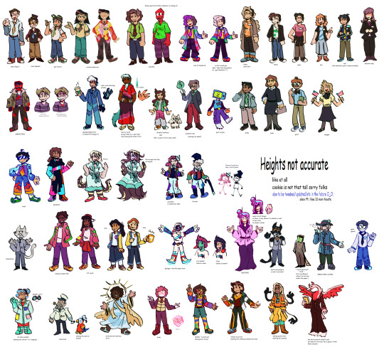
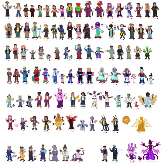
Ok um i guess the canvases are down here it goes august 2020 -> september 2020 -> started in 2021 minor edits here and then so this is most recent one 2023 -> december 2023

8 notes
·
View notes
Note
hiii your art always make my day better, so hope u had a good day too. But can I ask what brushes you usually use in your arts? Like the way you use brushes and colors are so good TuT I can't fathom it sometimes. How do u make those kinds of textures. I'm new in this tumbler, so apologies if it's already been answered before. <33
Heyo anon, thanks for asking and no problem! I've answered this a couple of times before across all my platforms, but ig this is a good opportunity to answer and add to my carrd FAQ! <3 Let me break down what I use them for a bit too. (lots of blabbing below so I'll but a read-more tab)
Main:
(sketching) Design pencil (default in CSP, you can probably find it on the assets store because it was from the earlier version of CSP)
(sketching/coloring/general use) G-pen
(sketching/coloring/general use) Dense watercolor (same case as the design pencil)
As for brushes that I use for texturing and painting, I use the Daub brush pack for CSP. My favorites come from the aenigma, pigmento, and basiliscus sets. You can find them on gumroad, or just google! I believe they have brushes for procreate and photoshop too but I think the brush packs aren't the same across platforms.
For making the texture itself, it's kind of a random process that idk how to explain properly lmao. Let me link my Kokomi timelapse so you can see how much I jump around the canvas to carve out the textures:
I like to use different blending modes and layer tons of different colors. The color jitter function is super amazing too for that purpose, but probably shouldn't be overused for the sake of balance. (personally still trying to avoid over-saturating my works with textures tbh)
To be 100000% honest though, I tend to jump around a lot, and I certainly don't use all of those brushes in every piece.
I used to lurk around a lot myself and hoard tons of brushes other artists were using, until I saw a comment of an artist I admire: "sometimes the brush you use really isn't important. Without practice the painting will be ugly."(not the most accurate translation probably because it was written in another language)
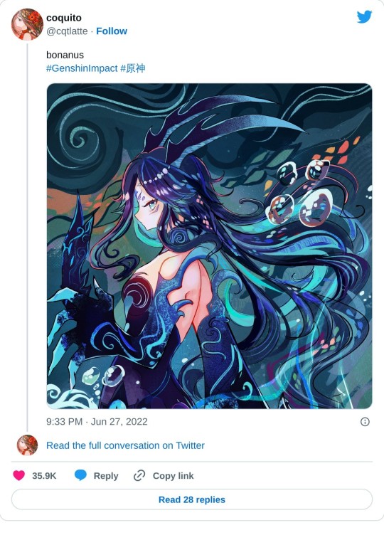
After that I had like… an epiphany moment where I really believed them, and drew a Bonanus fanart in June. I made the lineart with a g-pen (which I never used cuz I always thought I'd be somehow inhibiting my creative power using default brushes or something), and the piece ended up blowing up on twt much to my surprise.. LOL. After that, I started to care less about other's brushes and instead of looking for more, try to figure out how I could make cool textures and strokes with the ones I currently had at my disposal.
(said bonanus art)
This isn't a statement to say "stop looking for other artist's brushes, copying brushes bad, etc" because there is a LOT that you can learn from using other artist's brush inventory.
But you can also have a lot of fun drawing when you focus less about what other's use, and more about what brushes YOU are comfortable using + feels right to you. Sometimes you may even need to tweak them a bit in their brush settings instead of using their default form before they feel comfy for you! It's a matter of exploring and figuring out what works and what doesn't in your workflow, hehe.
Anyways I hope this answer helps as we all continue our art journey together. Sending positive vibes your way anon! <3
20 notes
·
View notes
Note
I do hope to see more of crystal moon art and please take your time to draw them, good luck ^^
Hello and thank you for the ask! I’m still not quite sure how I feel regarding crystal moon, but if I did have a story revolving a healthy romance between them, this is what I think it would look like!
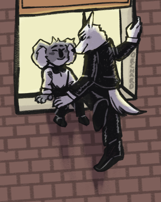
What could have been. 1/2
A few things,
1. This is actually a part 1 of a duality drawing I wanna do! This is the good side of the coin, and the second draw will be similar posing but like. Not happy? Aka them from my story I’m writing. Aka a lotta angst. But this ain’t that! This the cute stuff
2. I had a broad sketch of the basic pose, then one with more detail with a less chunky but still chunky pen, but I couldn’t for the life of me do a lineart with a thin pen that I felt satisfied with. So I just went to the chunky pen layer and kept messing with it and cleaning it up and I like how it turned out :)
3. About the au!!! Idk if I’ll ever like, actually write this? I prefer angst to just solid fluff, but if any of y’all wanna do something with it (or any of my stuff actually) go ahead! Wether that be writing, art, edits, I really don’t care, I just would like to be tagged so I can see it :)
4. Lastly, a bunch of rambling about what this au entails!
A. Following the sing movies, this au happens after Jimmy Crystal is jailed for assault and attempted murder against Buster Moon. Buster Moon decides to visit him in jail. To talk to him.
B. They actually get along pretty well. Buster apologizes. He realizes what he had done, yknow, lying to get his own goals, wasn’t exactly the most righteous thing either. They talk for a while. Buster visits multiple times a week. Communication is a good thing, yknow?
C. Jimmy gets bail, and is freed on parole. He was originally going to have an ankle bracelet, but Buster shows to the hearing and insists that he doesn’t need to. Buster had the option to get a restraining order against Jimmy to further protect him, but he denies that as well.
D. Even with Jimmy apologizing himself and slowly making the steps for being a better person, Busters friends still don’t like him. So Buster and Jimmy decide to be a little mischievous and keep their meet ups a secret
E. Sneaking around is actually a lotta fun, they realize. Night time is the perfect cover, as each are supposed to be asleep in their respective home. They visit local parks, diners opened past midnight, anywhere where they could find peace and quiet to talk in. The rebelliousness made them each feel young again, like a teen sneaking around with a forbidden lover.
F. That said, a few months into this secret friendship, Buster realizes he’s found feelings for the once cruel wolf. He is the one to confess, and while Jimmy requited said feelings, he said he preferred friendship to romance. Buster is upset but decides it must be for the best.
G. Jimmy then realizes it must be his internalized homophobia talking, so a few days after the confession he sneaks off to Buster’s apartment, opening the window and apologizing to the koala. He apologizes and confesses that he also feels the same, but that feelings of that caliber are difficult for him, especially after the death of his wife a decade prior.
H. Buster listens and accepts his apology, moving to sit on the window sill which Jimmy is still hanging awkwardly off of. They talk quietly with each other, and Buster is daring enough to press a kiss to Jimmy’s snout, flustering the wolf who almost falls in return. They laugh once Jimmy regains composure, and are happy together.
I. Will this be an easy relationship? Hell to the no. Will they try? Yeah. And really, that’s what matters when trying to heal such wounds.
#orchard draws#orchard writes#buster moon#jimmy crystal#crystal moon#sing 2#sing2#sing 2 spoilers#sing buster moon#sing jimmy crystal#no content warnings??? on an orchard post???#wild I know but I needed to try my hand at fluff for once
54 notes
·
View notes
Note
2, 3, 16 for the artist asks!
2. 5 favourites of your own work?
ooohhh, good question....
these 3 from my blog i really enjoy. the Joan of Arc one i think i enjoy more cuz it took so fucking long to do. like, ten times longer than normal, but i was procrastinating pretty hard. i love that Link and Ghirahim one to pieces. probs my favorite to date

and then these last 3 are really old ones, before i did digital. i just always think of them cuz i like them so much, though i believe i have done technically better work. i even remade that Michael and Lucifer, and they were better, but i didn't like them as much.
the last one is my OC Irisadiel, whose name i stole, ehehe. it wasn't the first pic i drew of him, but it was the one that made me fall in love i suppose.
16. What’s the most daunting part of your process? Ex, planning, sketching, lineart, rendering etc
contrary to every other artist on the internet, line art is actually my favorite part. the most difficult thing for me is to even get started. i'll usually have an image stuck in my head for a few days, and drag my feet on finding a reference for the pose. thats usually the hardest part for me. after i get a sketch down in pencil, i wont say it's smooth sailing, but every other step is usually very logical and acts out very methodically.
Thank you Sun for the asks!! i appreciate them!!
2 notes
·
View notes
Text
thinking out loud about art process/medium
pros of tablet (screenless):
-no art supply costs after initial cost (in my case it was like 80 bucks cause i use an old bamboo pen&touch)
-hand doesn't get in the way of seeing
-1 physical tool for everything (pen)
-can resize, undo, erase ink, and very importantly use bucket tool
-coloring is easier (see bucket tool)
-hotkeys (ctrl-z....)
-no need for scanner, digital only takes up less physical space
-pattern brushes! 3d models! assets!
- rulers, grids, snapping etc. shift for straight line, line tools
-change colors easily
-choose canvas size arbitrarily and at any resolution i want, plus cropping and cutting, copying, pasting etc.
-screen doesn't need a light on to see (at least not these days lol)
-text tool
-some tablets come with free software bundles (mine came with photoshop and corel, though not the new ones lol)
-if tablet is durable, may be cheaper in the long run (my first lasted about 5 years? i think? only busted because cable got damaged; current one is still fine)
-weird filters and effects, blur, etc.
-bitches love layers (i'm bitches)
-i can resize shit when i inevitably fuck up proportions
cons:
-upfront cost is expensive if it breaks (tho there are more cheap options on the market now)
-less intuitive for my brain-to-hand connection and coordination personally... harder for me to recreate lines digitally --always impressed by people who can follow their sketch precisely cause it's literally impossible for me 😂 i've gotten better at the intuitive stuff since i first started 10 yrs ago but it's still always a liiiittle awkward haha... but tbh this is still true for traditional to a lesser extent
-i get tangled in my cables a lot 😂
-digital storage on pc only, have to have printer for physical copies and colors can come out weird since i draw in rgb lol, risk of deletion or file loss or corruption
-using refs can get cluttered on only one monitor
-handwriting becomes even more illegible and calligraphy pens are kinda meh (at least defaults are)
-hand hurty because cramped space
-future...? longevity not any clearer than physical media tbh. might last forever or might be gone in an instant, even before considering future of technology... shrug! lol
-screen colors and brightness?! girl help my art looks different on every device i own 😂
-if you forget to save it's gone (luckily i save compulsively)
-csp text tool kind of mediocre tbh
-companies want you to buy new programs, stop supporting old ones, charge subscriptions, etc etc etc....
pros of traditional art:
-tactility and naturalness of hand on paper makes lineart and stuff a little easier--i'm still not very coordinated though so i still have issues with this regardless of medium...
-can look at reference on screen separate instead of swapping between tabs or cramming on one screen or canvas (physical references like books or objects make this moot for either medium tbf)
-medium experimentation easier than digital in that it lets you feel the different textures and behaviors in a way that's less functional digitally (tho there are some great brush sets) and more tactile or even potential 3-dimensional (ie thick layers of oil paint or mixed media painting with sculptural techniques)
- handwriting is (marginally) more legible...
-physical object, already exists, cannot be deleted (but ...)
-color not completely dependent on screen (but can still be affected by lighting or fading, in fairness)
-i like doodling with ballpoint pens (i do all my thumbnails with bic pens and yellow legal pads or sketchbooks lol)
-if you don't save, nothing happens because it's just an object you made irl lol there's nothing to save; it exists (see physical object)
-no cables
-no download or program (or subscription) required (not that i use Photoshop except the free copy that came with my tablet but it's relevant as a digital artist)
cons:
-buy new art supplies constantly cause stuff runs out; markers are expensive (though ink refills in long run less expensive than buying new markers, still needs frequent replacement for certain colors such as skin tones, still adddds up)
-have to buy or otherwise acquire everything separately, can't experiment in different mediums without buying more stuff... different paper.... different pen types... ink types.... etc. and then if you don't like it or use it, it's like.... ok i'm out $20 (or more)
-hand is always in the way! ahh!
-no undo or any of that and no saving copies unless manually tracing or you scan it first
-if you are bad at letter placement you can't move or resize 😂 i def have trouble with this sometimes lol
-i don't like coloring in traditional mediums and filling large inks is time consuming and generally unpleasant... alcohol markers are better but i am just not a colorist at the end of the day... obviously other people like it more (i enjoy abstract watercolor though)
-can't change colors after the fact... (probably good to swatch huh)
-erase erase erase ugh i hate erasing...
-can't hide layers or group together cause it's all one layer (at least, in practice. i'm sure it's technically scientifically in layers of ink, paint etc.)
-white gel pens never work 😂 and i can't do large areas of white on top unless I'm using opaque paint (not always feasible) (maybe i should have become a painter, huh)
-shitty or cheap materials feel tangibly worse to use; also my inking pen of choice is microns and similar felt tip technical pens, and they can feel unpleasant on a lot of paper types, plus fast lines are harder to do without skipping and scratching, and larger nibs often aren't very good tbh (maybe my pens are just cheap?)
-have to manually measure out frames, panels, borders, use physical ruler for straight lines, often with pen bleed if you do it wrong....
-doesn't have any of those easy assets, models, pattern brushes etc. (well, partially; they do make stuff like screentone, manga background assets, and you can do collage in theory or trace stuff if you have a lightbox)
-messy or smelly depending on what you use (paint pens, alcohol markers etc), sometimes requires extra ventilation or working outside for safety (tho really at that point you probably wouldn't be using a technique that works digitally anyway so i guess it's an inevitability lol)
-some materials take longer to dry than others, need protective coating or are not archival/will fade
-physical object, requires scanning and editing (esp to make copies), takes up space, can be destroyed or lost (not so different from digital in that regard) also takes up more physical space to store lots of drawing or paintings, art supplies, etc.
-requires working space especially if you work larger or are using lots of colors etc.
-needs light (... usually. i did make a painting in the dark once but that's usually not practical lol)
-cannot type on drawing (well. you CAN but it's less straightforward than clicking a text tool)
-hand still hurty
-no resizing! have to live with fucked up proportions 💀 (i'm working on it)
no point to this just thinking about things i like and dislike about both ways of creating
when it comes to writing i will take typing over handwriting any day though
0 notes
Text

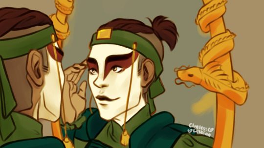
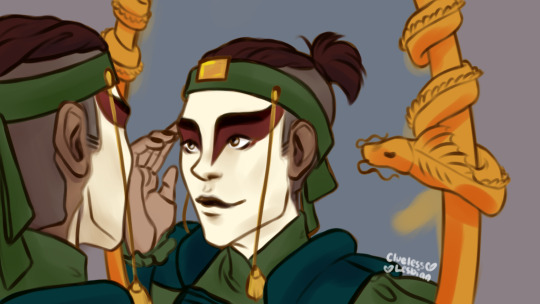
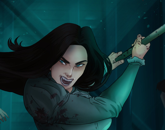
Sokka Week 2021 💙
Featuring Sokka appreciating how he looks in red and green ....and an Unagi mirror lol
Also yeah idk- I always liked the thought of Sokka gaining a new appreciation for colours (and visual arts!) after the Kyoshi warrior experience bc?? I mean the Water Tribe uses a lot of blues and grays that reflect the environment right??? So getting a chance to see himself in more vibrant colours mightve been? inspirational ykno???
#LIKE A WEEK LATE BUT ADHKL I GOT SAD AND DIDNT WANNA DRAW ✋😭#i think it was worth the wait tho!! heck- i might reblog with sketch and the lineart bc honestly??#i think doing the lineart like 3 days after the sketch?? made it better????#ok ok i will be quiet now asfjkhl#stirring up delight#sokkaweek#sokka week#sokkaweek21#sokkaweek2021#sokka week 2021#atla#avatar the last airbender#atla fanart#sokka fanart#atla sokka#avatar sokka#sokka#illustration#drawing#art#digital art#artists on tumblr#kyoshi warrior#unagi#sokka kyoshi warrior
793 notes
·
View notes
Note
hI!! i love your art and was wondering if you could make a tutorial showing how you paint stuff? only if you can! it's just really pretty !!
hi nonnie! thats very flattering !! i’m sorry i dont think i’ll be very helpful bc i’m a mega noob as well :D but i’ll try my very best <3
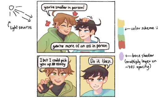
my process is very tailored for speed instead of quality (oops soz LOL) so i do suggest this for if u have short doodle breaks ⬇️⬇️⬇️
thumbnailing (for comics) -> lines (sketch who?) -> bucket tool/color drop in the base color -> color in the lines -> one multiply layer for a “base” shadow (in the vid below its purple!) -> one (1) render/paint layer a.k.a lawless no man’s land
full rendering process & more general painting tips below the cut‼️
NOTE: i’ll be focusing more on traditional/fundamental tips for stylized art because i’m sure there’s a much more effective way in digital. I truly do only use one normal layer for render... i think this is bc before i made this blog, my only prior experience in drawing is middle school art class, so all i know is traditional painting on one layer.... pray i can answer this again in the future with something smarter lmao
🌺 MY PAINT PROCESS
1. Choose a color scheme!
It doesn’t have to be set in stone like below, but i at least keep in mind the color range i’d like to use depending on what i want to convey (ex. soft pastels for soft fluff, or warm colors for happy vibes). I try to be as limited as possible for base colors because I tend to go ham when painting, you’ll see later AHAHA
2. Base coloring + Base shadow
Base -> bucket tool in the color scheme (I know other artists are against this but when i discovered the bucket tool in digital art I immediately divorced manual coloring i’m sorry i loved you tho bae) (this is why my style and lines are simplistic as they are, so the color drop works!)
Base shadow -> in theory, warm-colored light creates cool-colored shadows and vice versa. because i’m a fluff addict i mainly use warmer light, so i like using blue/purple as the shadow. generally u can’t go wrong with complementary colors!! (yellow light & purple shadows / orange light & blue shadows).
I make a new multiply layer (decreased opacity just bc i like things soft okay) and clip it on the base layer, then block in the areas i think would get blocked from the light.
3. Color in the lines!
for simplistic styles i swear this works wonders. i just clip a layer to the lineart and manually color the lines with a darker but more saturated version of the base color. it just tends to look more dead i guess with low saturation lol (ex. u can see above i use both peach and red or pink for lines of skin, i guess it implies the blood under the skin too. or something :D)
4. RENDERRRR
when i’m not in a rush i just paint things completely (and mindlessly), but here are the things i almost always do:
line the shadows with a saturated color! i’m not sure this is common but i love it lol, in almost all my doodles just check the shadows—on the edges, there’s bound to be a wild color :D (usually its the light color, shadow color or a color scheme color but sometimes i’m just like boY do i loVe piNk)
my art major friend told me about saturated colors on desaturated bases and my life was changed forever lol. u can see below even when my base is very grayyy, my rendering is very gay :D ❤️🧡💛💚💙💜
make the shadows darker where i think they should be darker. usually i can just colorpick from that darker, saturated lineart color!
if it’s a more realistic piece i usually make the highlights lighter, but in simple doodles i find it unnecessary, and i dont like how light/white it looks :( i tend to just make the areas exposed to light more saturated
color in the rebound light~ in reality there’s usually not only one primary light source, at least there’d be secondary light from where light bounces off objects. in art we just emphasize that! so in large shadow areas, or in areas close to other objects/colors, i like to ‘splash’ other colors on
yeah this part is less intuitive for beginners and u have to learn a grasp on the concepts over time, like for lighting and structure. values can be more important than color, so i do suggest learning shading first before coloring, but only if u like (u can always be like me and just pull up references when u dont get how the light would fall on some materials :>). i have more general paint tips below! don’t give up okay, i believe in u nons, we’re all still in the eternal learning process together ( •̀ᄇ• ́)ﻭ✧
5. OOOOHHH SHINY ✨🤩
this step is just me being mesmerized by how easy it is to play with lighting in digital. i play around with the layer settings (multiply for shadow, overlay for light, and often try out the other settings too!). my favorite effect is the highlight glow thing, where u just make a copy layer of the highlights below the original layer, and blur it slightly so it looks like glow ✨✨🤩 overpriced acrylic could never
6. COLOR ADJUST / EDIT
Truthfully i usually skip this step, but my more pro friends really vouch for it!! i think definitely an incredible thing with digital is that u can edit proportions and even color after you’re done. i think they usually use like the curves adjustment layer in photoshop until they get colors they like, but for me, well, in a reaally diligent day i like to slap on the “auto” fliter in the iphone’s photos edit button lmaoooo
🌺 GENERAL PAINTING TIPS
learn basic theory: i think theres free courses everywhere online, but heres a few things u might like to have a basic understanding of: color, perspective, shape language, lighting, composition. don’t sweat it too much tho, it should be fun to explore the concepts!
and for drawing hoomans: proportion, gesture, expression, and veery basic anatomy. i find that overall forms are so much more important to learn than like detailed anatomy bc u can always look it up lol
but remember, u mostly want to learn the rules so u know better ways to break them :)
uuuuse manyyyyy referencessss every time u draww!
^this includes other people’s art — when u see good stuff, figure out why u like it and apply it to ur own art
get feedback!!!!
draw tons!!! brainrot helps !! ;D
aaand thank u for coming to my ted talk! sorry for the ramble nonnie, i hope u got something out of this lol
#VERY LONG POST ALERT‼️#thanku for enabling my rambliness nons#thanku for asking <3#love u anon#demi rambles#untagged#art advice#art tips#art tutorial#art#painting#i’ll update this as i go bc lord knows im also just a noob
182 notes
·
View notes
Text

Happy Saiou Day!! 💙💜
So if anyone remembers last summer I said I'd post the complete portraits of my talentswap designs and a climactic scene from the AU with a full summary when they're finished? Well, I didn't forget!
So, below are my headcanons for Ultimate Supreme Leader Shuichi and Ultimate Detective Kokichi~!
(I'm really passionate about this AU, I hope you read it ':3)
(Tho no climactic scene unfortunately)

Ultimate Supreme Leader Shuichi
So first of all Shuichi's parents are still celebrities, move overseas and leave him with his uncle. However in this AU Shuichi's uncle is a politician who actually has a really good reputation. Problem is, his uncle is incredibly busy and is almost never home because of that. Still, he wants to be like his uncle (though the wish is fueled more with wanting to be good enough and accepted). Shuichi's personality is basically the same.
So then one day I Alligator girl's (Gonna call her Wani) alligator gets stolen by some group who're going to sell it and they threatened Wani to not call the police or tell anyone. So she asks Shuichi to help. Somehow they manage to retrieve the alligator together secretly (idk) and right afterwards one of Wani's friends is in trouble with some shady local business. So Wani suggests they make a group to stop these sorts of people and that Shuichi would be the leader. He agrees, he still wants to do something to make this world a better place like his uncle.
After that Wani starts asking her most trusted friends at school if they'd like to join (Shuichi would never have the social courage to ask someone that). When they get to 10 members (all girls) they stop growing for some time and decide to get themselves uniforms. When they're finally considering getting more people into the team since Shuichi doesn't really know these people, he decides to start wearing a mask to be safe. He also starts using the code name "Crow". The other 10 members go by flower names.
The group then grows a lot. And by the time Shuichi's officially scouted to be an Ultimate, it has around 1500 members. And it's making him very worried as Shuichi's not even sure anymore if he's skilled enough to lead it. The group started out stopping or changing corrupt businessmen, unethical businesses and other evil groups. And although that still is what they do, he's realized that the way they go about things is pretty illegal. (When he first realized this, he started wearing a hat.) Obviously he forbids violence, but they still use blackmail and steal information. Also they need money for the group to function at this point so they've had to get it through illegal means that Shuichi's not sure of anymore. So Shuichi is immensely scared of being revealed as the organization's leader because it would completely destroy his organization and it would also annihilate his uncle's as well as his parents' careers on the spot. Basically everything would get ruined and it would be a nation-wide scandal. Perhaps even an international scandal.
He gets even more worried when the police finally start realizing there's some sort of group that's blackmailing big businesses and start investigating.
When he gets scouted to Hope's Peak, the letter comes to his base and even HPA doesn't know his identity, just that he's a high school student. He doesn't think like he deserves the title at all since it's really his organization that does the hard stuff and Wani's the one that's made it grow and he shouldn't be panicking like this if he really was a "great leader". But he still decides to go due to "If you manage to graduate from Hope's Peak, you will be set for life!". But as his family can't know of him being scouted there as the Ultimate Supreme Leader, he forges a letter claiming he's the Ultimate Lucky Student which he shows to them. And at HPA he requests he be referred to by that title.
Problem is, now his year group has 2 Ultimate Lucky Students and a certain Ultimate Detective gets suspicious.
Miscellaneous: Shuichi really wants to use make-up but he's really afraid to at home since he feels his uncle would think it's really weird. So at the organization's base Wani heard about it and got him some makeup and now Shuichi wears makeup when on missions and at the base. Also the organization has a helicopter. (It's a central part of that climactic scene I talk so much about.) Shuichi thinks about becoming a detective perhaps, but he's not sure how he'd be able to leave his group anymore so...

Ultimate Detective Kokichi
For Kokichi I still have my pretty elaborate origin story. His early years are great until at some point his real father finds out that Kokichi's mother had actually had the Kokichi and his older twin brother with him and not her husband leaving him alone. And thus he murders Kokichi's mother out of spite. Kokichi and Tamotsu (my headcanon name for his twin) see the murder take place and flee. However, they were never actually able to make out who the murderer was and they knew even less of why their mother was murdered.
The murder never gets solved and this mystery stays in Kokichi's mind. Who ruined his life, who killed his mother?
(I feel they'd have like an uncle and their mother's husband lived with them obviously. There'd also be other factors like disposed evidence and the suspects vanishing making the murder so much harder to figure out afterwards.)
So Kokichi and Tamotsu end up at an orphanage, one related to the one Maki's at. It's kind of a terrible place, but it's where Kokichi meets (most of) Dice. They become inseparable friends (tho don't form a group with the name Dice. I'll still call them that here for clarity's sake though). However Tamotsu who had always been supporting Kokichi and being there for him at his side starts becoming bitter (jealous?) against Kokichi due to dice and starts turning against them. This is the time when Kokichi starts developing his lying to protect himself from Tamotsu as well as the borderline abusive authority at the orphanage. He's also started to figure out the dark secret of the orphanage training children to become assassins.
I feel like during this time a detective was investigating the orphanage. So when things get too dire and Kokichi and Dice escape the orphanage the detective ends up taking them in after finding them on the streets afterwards since he can't just send them to an orphanage at that point. So Kokichi and Dice end up staying with the detective and start helping him out. Kokichi's especially interested in the orphanage now and he and the detective with the help of the other Dice members figure out a lot of stuff. (This is also the time the rest of the Dice members "join".) Until one day the detective gets assassinated by someone from the orphanage sending them a message to stop the investigation.
So Kokichi takes over the Detective's office and to get by he starts working on all kinds of small cases with the help of Dice. And that's what they mostly do. Among those small cases are often cases that have something to do with saving children. However Kokichi occasionally also takes on homicides and investigates organizations. He wants to be prepared for when he finally investigates his mother's murder as well as the organization behind the orphanage. He wants those people locked up in jail forever.
Personality wise Kokichi's pretty much the same. He still loves pranks, lies all the time and would have elaborate stories (lies) about like for example how he was the one who managed to put the previous Queen of Novoselic's assassin behind bars. (The previous Queen was not even assassinated). He'd also jokingly blackmail people by claiming he knows something about them or could figure out something incriminating about them. He never really means it, though he would like try to find out harmless embarrassing secrets to mess with people.
Around the time he gets scouted to Hope's Peak he's specifically requested to assist in the investigation of a mysterious organization that steals information and sends blackmail and other such things. It's a huge flashy case, so of course he picks it up.
At Hope's Peak he then meets an (surprisingly mysterious?) Ultimate lucky student who seems really interested about his Ultimate detective talent and his lying.
Bonus
The original portraits from summer 2020. My laptop just broke when I finished the lineart and then I couldn't really edit them on my new tablet anymore and they were getting really old so I just decided to completely redo them. Also lmk if you want the sketch of the climactic scene since I'm not sure if I'll finish it even though I really like it. It looks pretty okay even if it's unfinished.
Also hope this is coherent and that I haven't forgotten anything aah. And damn if you actually made it this far gezus. This took like 4+ hours?? oops.
#saiouma#oumasai#shuichi saihara#kokichi ouma#danganronpa v3#saihara shuichi#ouma kokichi#saiou#danganronpa#ndrv3#ndrv3 killing harmony#saihara x ouma#ouma x saihara
108 notes
·
View notes
Photo
Haha hey remember that post I made awhile back, speculating on what a bad idea it might be to fuse dead things in the godless Frankenstein fossil machine
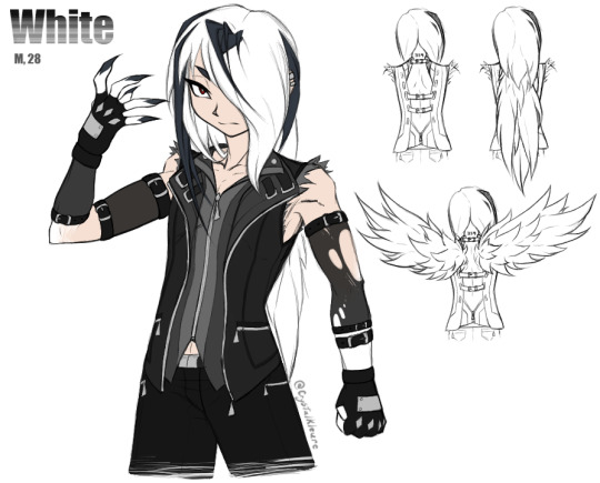
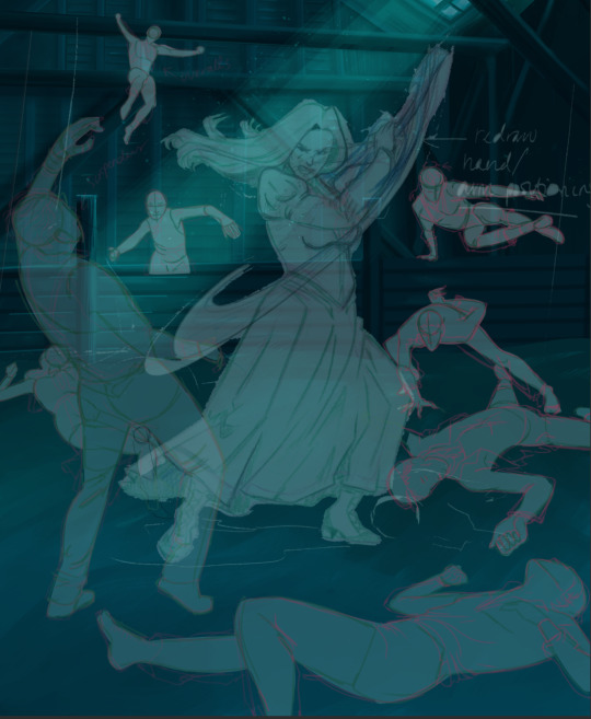
Meet White. He is a reanimated corpse. Two of them, actually. Or more like 1.5. [And I whipped up this half-assed partial reference sheet in one night instead of sleeping, so don’t look too hard at the chickenscratch lineart and visible guidelines, and kindly ignore the total lack of shading as well as any other messy jankiness.]
White is a product of me wondering not only about what happens if you NecroFuse a human with a Pokemon, but also what happens if you make it even worse and specifically fuse that human with a Pokemon capable of mega evolution. Because canon seems to imply that mega evolving is at best deeply uncomfortable -- and at worst outright agonizing -- for whatever creature is going through it.
Character Lore under the cut. Lots of text:
White is one of actually multiple undead guys who got mashed together with bits of dead Pokemon. They’re science experiments, so they've got the dex numbers of the Pokemon they're spliced with tattooed on the backs of their necks, and those numbers were treated as their names In The Evil Science Lab.
In his Original Life, White [and some of his buddies] got gored to death by some escaped Horrible Fucking Monsters that were accidentally [...and then not-so-accidentally] created via Two Pokemon At Once In A Fossil Resurrection Machine, because hey, it is SUPER easy to think you got Just One Thing's Bones from an excavation dig but then later you realize that Some Of Those Bones were from something TOTALLY different that just died in the same place. It happens. So, some Fossil Scientist People accidentally resurrected an Abomination, realized they fucked up pretty fast...and then started wondering if they REALLY fucked up or if this is Cool, Actually. And then the team of Science People split into two Morality Factions, with one half being like “This is unethical as shit, we need to make sure this doesn't happen again because it's not natural so who knows how this poor fucked up creature is suffering” and the other, cooler half being like “WE NEED TO DO THIS AGAIN RIGHT NOW BECAUSE SCIENCE. IMAGINE THE POSSIBILITIES HOLY SHIT.”
Cooler group splits off from the Horrified Group With Morals, and they promptly use their Science Knowledge to Construct More Machines and Make More Monsters. Doesn't take too long for them to realize, however, that Abomination Pokemon are stupidly hard to control, because not only are they suffering, their masters obviously don't care for their wellbeing, so Revolt Inevitably Occurs and they escape to wreak havoc upon the nearest congregation of townspeople. They promptly maul some people to death at a nearby local rock concert, scientists chase after them to clean up the mess, realize “Oh Shit, Manslaughter Charges Impending”, and then realize...
Science Guy 1: “...Hey, what happens if you put a dead person in the fossil machine?”
Science Guy 2: “Hey, people probably listen better than Pokemon. We can, like, TALK to people.”
Science Guy 3: “Lads, I got a stellar idea just now. And we got plenty of Dead Guys to start with right here! Great way to hide the bodies too, probably.”
This goes approximately as well as you would expect, and precisely as ethically. A smashing success!
However, because they Fucking Died, the reanimated Newly-Monsterized dudes do not remember shit about who they were pre-resurrection. They're not technically even the same people, they’re more like clones. They've been remade. So, all they know now is Science Lab Life, and they have no initial attachment to eachother aside from "that other guy is also a Science Experiment Person just like me, so Same Hat @ Labrat Neighbour ig", in spite of several having been friends or even family prior to death. They also just...don’t know/remember things in general. They are fresh blank slates. And to a morally-bankrupt team of scientists, that’s perfect! They can train these guys to behave however they please!
...However, people might be People Instead Of Animals, meaning they can be Reasoned With And Manipulated And Coerced far better than animals due to their far better communication abilities with the Science People, but...there is Still A Problem in the sense that Holy Shit, A Person Can Only Take So Much. You can only treat someone as "Experiment [number]" for so long, blatantly putting no value on their life outside of The Value Of Scientific Research, in spite of literally basically needing to raise them like a normal child due to the Lack Of Memories issue. Eventually they're not gonna be able to take that anymore and they are gonna Fucking Leave, too. And they’re gonna be much harder to track down than the rampaging Pokemon were. Impossible, actually, once they’ve ripped out their tracking chips.
So then there's just these monster dudes, who don't actually know what they are because they weren't ever told anything more than necessary to get them to cooperate with Tests And Experiments, just Escaped Into Civilization and having NO idea how Anything works. Fun! Especially considering how, at first glance, these just look like Normal Dudes. Their monster bits either aren't apparent or just look like funky body modifications.
They've also got Science Things in them and they Don't Know What The Fuck Those Things Even Are. They've just got these little Devices in/on their chests, and they were never informed of the exact functions of them because there's no reason to explain to the experiment What Is Happening, just that the experiment needs to Hold Still and Cooperate and Now Do This, Now Do This, Now Do That, Good Job That's Enough For Today, etc.
Those devices contain both key stones and mega stones.
If you were a Mad Pokemon Scientist, you would most certainly be interested in the mega evolution phenomenon. What would YOU do if some of your Undead Fusion Experiments happened to be spliced with bits of Pokemon known to be capable of mega evolving? You’d kill two birds with one enigmatic set of stones, that’s what you’d do. Your Frankenstein Experiments can even TALK to you and tell you exactly what they are experiencing when you run tests on them! It’s perfect!
So, if a rock-bearing monster’s heart rate goes too high, part of the little device, which is a barrier between one type of rock and the other, opens up and Exposes One Rock To The Other Rock. Which exposes the monster to the Rock Energy Reaction. The greater the stress, the higher the dose. And I’m sure you can see the snowball effect that’s gonna create, at least the first time or two.
They were INTENDED to eventually be made to Physically Fight With Eachother to gauge the effects of The Rocks™️ when the Guys With The Rocks are under Stress and need to Do Some Self-Defense. The Science Squad was basically trying to suss out the Actual Purpose of mega evolution. Because mega evolution is weird -- it puts ENORMOUS stress on the body of whatever is undergoing it, so the hypothesis was that its true power is probably drawn out best via a perceived life-threatening situation, like it’s a type of hysterical strength, because what else would cause a need for that kind of ability. And aren’t ethics a bit overrated?
So, there’s our premise. White is just wandering around without any particular purpose outside of never ever going back to Science Hell, and he has no clue what the funny little doohickey buried in his chest does until it activates one day and absolutely fucks him up [...as well as everyone around him. Mega Absol radiate an Aura Of Sheer Terror that can literally scare people with weak hearts to death if they’re not careful.]
And now, some Miscellaneous Character Info:
The bit about Lots Of Death happening at a rock concert specifically was important. White was actually the vocalist of the band that was playing. He doesn’t remember that now, but he still loves music and has the same strong vocal cords. And THAT is important because White is partially an Absol now and Absol naturally learns Perish Song. These Fusion Monsters are absolutely capable of using Pokemon moves, though whether they’re aware of this is a different matter entirely. Imagine what happens when they end up tapping into those abilities accidentally.
That band was a relatively-unknown little local band. White was by no means anywhere near famous. Very few people even realized he was gone, and most of the ones who would have noticed also ended up Equally Unalive.
That black stuff between the belts on White’s arms is mesh. Like, stocking mesh. It gets Ripped The Fuck Apart when he goes Mega Mode and his arm fur gets Extra Spiky. Hence one stocking being a bit tattered in that reference pic. He frequently has to replace those things, they are fragile.
“How did White get his name if he doesn’t remember his original name and didn’t have a real name in the lab” I am glad you asked! Post-escape, he eventually encountered a situation where someone asked him what his name was, he bluntly told them “I don’t have one. I am #359.”, they said “Well That Is Not A Name, I need something proper to call you”, and he was just...Super Apathetic. So, the other person picked out the name “White” just based on the fact that White’s hair is white, and he just shrugged and rolled with it.
As you can see in my Incredibly Quick And Rough Sketches, the backs of White’s shirts are open to accommodate that huge amount of fur that bristles out into false wings when he goes Mega Mode. Because his Actual Normal Hair is relatively long and overlaps with that fur, it blends in with his Actual Normal Hair and doesn’t look too odd [when it’s down]. Probably mostly because nobody’s expecting it to be anything OTHER than Perfectly Normal Hair That Just Happens To Be Very Long.
White does not particularly like violence. White does not want to beat you up. He will, though, without a bit of hesitation, if there’s some logical reason he feels like it’s the most practical course of action. Being essentially raised by Cold, Emotionally-Sterile Scientists With No Care For The Wellbeing Other Living Beings uh, tends to affect a guy a little bit. White has a bit of an internal dilemma regarding “It would be efficient for me to just Harm This Other Person to defuse the current situation, because attempting nonviolence will be overall more risky somehow” vs. “Holy shit it feels bad when I hurt people. Why does it feel bad when I hurt people. Is it...SUPPOSED to feel bad when I hurt people?? No one ever felt bad for hurting me.” He Figures Out How Empathy Works Eventually. He is a good guy at heart. He is a Monotone Snarker, but not actually Cold or Malicious at all.
If an Absol can do it, White can probably do it. He has incredibly keen senses and a STRONG ability to Detect Impending Doom. He has exactly the amount of Supernatural Absol Powers you would expect. He is also stupidly physically strong, way more so than he appears to be.
White can’t punch people. Look at the fist he’s making in the pic, he’s doing it wrong. If you punch someone like that, you WILL break your own thumb. That’s not a Revving Up To Sock Someone pose, he’s just tense. He’s using his thumb as a buffer between his long-ass Sharp As Fuck claws and the flesh of his palm. If White tries to punch anybody, or just makes a proper fist at all, he will impale his own hand on his nails. Like, all the way through. He CAN slash straight through things like metal and bone with those claws, though.
White...is unsettling. Completely accidentally, and unknowingly. He just radiates an Aura Of Intimidation [...or Pressure], even when not in Mega Mode, that scales depending on his mood. Just being near him tends to put people and Pokemon on edge. Thus, he’s generally avoided.
The latter point is especially unfortunate, because White’s preferred method of Socializing and Bonding is to just kind of quietly hang out in the same room as whoever he is trying to Socialize and Bond with. He just wants to, like...chill out Near A Buddy and watch a movie and share a bag of chips or something. His social skills are predictably not good.
#DO YOU LIKE MY TOTALLY NORMAL GUY#HE SUFFERS#He's pretty though and that's what actually matters here right#I need to draw the other Totally Normal Guys sometime too. White is Part Of A Set.#Pokemon#CK's art#OCs#I have Long Pointy Fingernails myself can you tell
12 notes
·
View notes
Note
😳👉👈..its uh. lobotomy anon-and I have one (1) question.
How the heck can you do clean line art?? I've tried but the attempts don't look good
Mhhh- dunno how much I can help with that ‘cause, to be honest, my lineart is rarely actually clean sdhgsdsd. (most good lineart in my art is like an illusion caused by my editing/coloring ahah.)
What I can say is that the pressure (especially for line width) and the stabilizer change the art game A LOT-
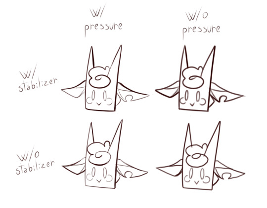
(Note: I gave the same care and the same time to each of them- also used the same sketch.)
The stabilizer is especially a life saver if you want smooth/clean lineart but don’t have the firmest hand (Like me- who got it all the way up to S-7 on my SAI :,>). So don’t ignore it like I did for my first hellish year of drawing-tablet art;;;
Those two aside- Personally, I tackle the lineart in three different ways (that sometimes overlay with each other).
1- Actual lineart: I just finish the sketch and after days of pondering over it I force myself to line it. With this one you just gotta be decise with your lines, this means no jagged lines trying to follow the sketch underneath or very slow hand motions, just one decise stroke. Undo and repeat until success-!
Example -of me suffering and deciding to color instead of continuing the lineart sdhdhsd:
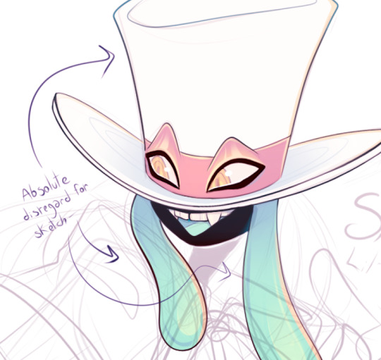
(*Sigh* Some sacrifices must be made to appease the lineart gods- so sometimes parts of the sketch will just be a guide of where the thing is supposed to be instead of a base to line;;)
2- Clean sketch: You keep on searching and cleaning the sketch, layers over layers, until it looks like a “messy lineart”. Then you carefully clean them lines!
Example of what I mean by “messy lineart”:

(The only “sketch” worthy parts still visible are in the ribbon and in the arm- the rest is quite easy to clean. The masks and eyes, for example, are practically ready to be used in an actual “clean lineart”- just need to clean the particles).
3- Painted over: I haphazardly make the lineart and then I take my time painting over the mistakes or unclean lines- usually at the end of the piece.
Example: ( a bit messier than my usual, but still shows it)

(Some pieces look a bit weird ‘cause I had to remove the blood layer to show it better- but you can see what I mean if you look at the fingers and nails in the foreground, oh and also at the eye-!)
What these three “methods” have in common is a lot of trial to see what sticks and/or what is the most comfortable option ouo (there are days when I’m all about that pure lineart, while others I just want to chill and slowly clean or paint over a sketch.)
There isn’t really a unique way in which you can do clean lineart- I mean, from what I see from your art.. maybe the “painting over” one might work for you! Because I can see that in many places there are clean lines (like the teeth in that first post- heck those are looking hella clean and precise!)- so I think you struggle more with the consistency of that precision more than the lineart itself, and since you also seem to have a painterly style for shading- I think that painting over the lines to clean them could do for you-!
It also works with pieces with a simpler style btw.
These are just how I see it myself, can’t really say much else since I dunno what exactly makes you think your attempts don’t look good so-;;; hope this is in some way helpful or at least understandable?
#the cloud can speak oh boi#sorry about the long post- I'm trash at explaining so I gotta show what I'm talking about sdgsdsjd#btw- little reminder that a clean lineart isn't a must!#I personally find *messy* lines extremely expressive and energetic if used correctly#Also.. completely off-topic but- in two of those pieces... were they lyrics from *My Ordinary Life* and *(Vampire) Culture*??#'cause if so- damn that's good taste right there :eyes:#oke oke I'm done rambling in the tags sdgdshf#...actually- one more thing!#I find your art hella rad!! And it's extremely interesting to see how much you experiment with the style and colors!#oke now it's all ahah
40 notes
·
View notes
Text
the always wonderful shelley @shanheling tagged me to do this thank u so much!! i think that everyone i wanted to tag has already been tagged to do this but if you feel like doing this feel free to consider urself tagged by me!! im putting this under a readmore bc its long and i ramble a lot
the piece i was tagged to explain my process on is this oc piece! unfortunately i have a habit of deleting my original clip studio file once ive finished my art and saved it as a new png file, so i dont have the file to show the sketch and different stages of this piece. but I still can go through my general process and talk about how i did that piece!
1. planning
honestly i think about the art that i want to do a lot, and in this last year or so ive thought about the art i want to do more than ive been able to actually create and finish that art that i want to do. for my planning i tend to do a lot of different thumbnail sketches for the art im thinking of
these are some examples of thumbnails, a lot of times ill do thumbnails just on pencil and paper and with some of these theyre done quickly with my fingers on my phone note function on a day where i was feeling too bad to get up and draw on paper but still wanted to get the thumbnail ideas down. two of these are for the same songxiao piece that i still havent finished and i have more thumbnails digitally on clip studio for the same piece, i do a lot more thumbnails when a piece isnt working the way i want it to and theres times where ill completely scratch a thumbnail or a sketch and start over in order to do more thumbnails because i dont feel happy with some aspect of it.
two of these are small gouche painting thumbnails for two pieces i did maybe a month or so ago, i did the thumbnails and then tried to expand on them digitally and im wanting to do more thumbnail paintings like this in the future because it was fun
for the piece of my oc trio it was based off a series of ask prompts i got for a few different outfit prompt memes i had reblogged, so i based their outfits on the ones in the meme. when im drawing figures i tend to try and get the movement down in the poses when im sketching, i do several rough sketches of the pose before beginning to start setting down lines (if im doing lineart at all because sometimes i dont like doing lineart and do a more lineless painting kind of style). i really try to get my art to convey some kind of emotion, in the oc piece i wanted it to feel fun and like youre seeing three best friends while theyre out on the town having a fun night
2. creating
this is the only real example i have of a piece in the middle of being filled in and created, this piece is one that im really not very happy with & have had lying around for a while and ill probably scrap it and try to come at it from a different perspective at some point. but anyway it still shows what i do, i lay down a kind of neutral gray color underneath my final sketch/lineart if im doing lineart in that piece and then i start picking out the colors that i want for the piece and kind of setting out a pallette for myself. i dont do this color pallette thing 100% of the time but i do it really often, especially if im working on a commission or a larger piece where i know theres going to be a lot of colors or if its a piece where im not sure exactly what color scheme i want so laying out the colors together helps me kind of decide what kind of scheme i want. i am sooooo picky about my colors in my art i am genuinely obsessed with colors in art and there are times where i really have to stop myself from working on something forever just constantly adding more colors or putting little tiny changes and gradients in the colors.
after ive got the colors i want down i tend to try and block out parts of the piece with the base color for that section, and then i start to paint with the colors that i want to go on top of that base color from there.
once im satisfied with the colors/shading/rendering and everything ill go back and look over things and will fix things that look off or sometimes completely redo segments if they dont look right to me. when i was younger and mainly doing digital art using my phone and my fingers i would use a lot of filters and overlays on top of my art once i was done, and honestly im glad to not be doing that anymore because i dont think it made my art look any better. i do color adjustments and sometimes will put on a color overlay or a layer to emphasize the shadows and the light in the piece, but i try to keep those layers to a minimum and like i said before i have a tendency to obsess over the colors and ill spend a good amount of time in the color adjustment tool of clip studio and then ill just decide "actually it looks fine as it is" so yeah!
3. posting
i feel like i dont have a lot to say here gbfm i mean i honestly have a lot of thoughts about the relationship between artists and social media and how social media changes our views on art including our own art and how we can feel like we constantly need to be posting new art and just become content machines churning out new stuff. but ill save that rant for another time. i used to be really concerned about how many notes my art would get when i was younger, and i dont at all blame anyone who still is very concerned about that bc it sucks when u work hard on something youve created and then you dont get a lot of recognition for it, but honestly within the last two years or so i feel like ive begun to have a lot healthier relationship with posting my art. i really just post my art on my art blog, reblog it to my main blog, and then thats that yknow! i do really appreciate any and all support people give me, it means the world to me, but for me having the mentality where i dont need to post all the art i make and i dont need to be posting every day or every week or every month even has been a lot healthier for me because then im not constantly asking myself why didnt this get notes is my art awful??? and yeah i just kind of post it and my brain goes okay were done with that art we gotta make more
ive honestly been struggling a lot with art thru the pandemic and if youre reading this and have been struggling with creating in any way recently or even before the pandemic, please know theres no shame in having trouble creating and it doesnt make you bad at whatever it is u create!
thank you for reading this, feel free to consider urself tagged by me again if u want to do this!! love u all
6 notes
·
View notes
Text
How I Digitally Paint like a Scenic Artist/Designer
Aka: how I did this and put my degree to good use.
LONG POST WARNING
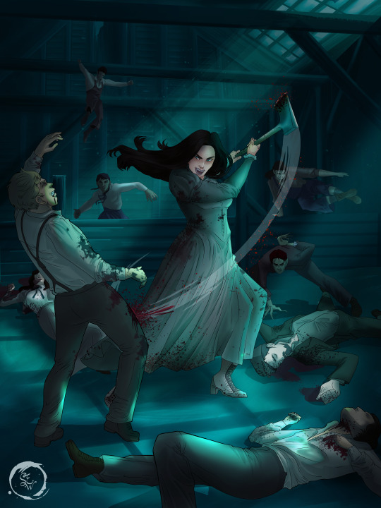
Step 1: Research.
First off, get to your image search. If you are going to be using Google, you may want to type “-pinterest” in the search to eliminate the countless boards.
I had to figure out clothing that is vaguely late 1800s. I found a multitude of reference images that were fancier clothes- but I wanted to find images of clothing for kindred across all social classes. Photographs from the era and paintings are your friend. They will more accurately showcase what was worn.
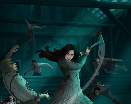
After Fashion research comes location research. The 1890s in America is known for the rapid industrialization. Factories were getting bigger and work days were getting longer. But, I wanted the moonlight to be cascading into the place, illuminating the scene. This means I needed to find a structure that had skylights or let sunlight in. And the best images I found? Slaughterhouses. Fitting, huh?
The same rule for fashion still stands- if you can find photographs or paintings from the era- they’re better. There are tons of places still standing today from the 1800s. But today, they look WAY different. Ya know, Abandoned! So just be sure to take this into consideration if you search “abandoned slaughterhouses” or go trespassing like I did.

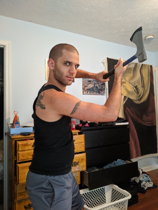
Lastly, pose research. Finding the poses for a fight scene can be tedious. So, I enlisted some help from a few fight choreographers and stunt men. You can record their fights and play them back at quarter or half speed. You can also get a mirror and flop on the floor a bunch. I did both. This lets you see the action/motion lines you are going to replicate in the drawing. Heres how we initially did fina’s pose:
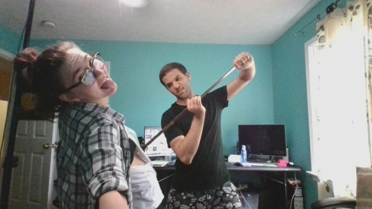

And sometimes you have to go back and get a clean shot. I ended up using this pose for the axe.
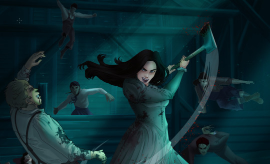
Step 2: Set up and Background!
When you open a new file, set it to the dimensions and resolution you want. I was working at 600. Usually, I’m working at 300-350. You can always reduce resolution. Its hard to prevent fuzzy lines if you increase it later.
I cannot stress the following enough:
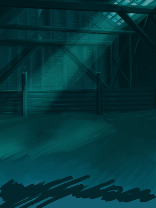
You work background to foreground. Big Shapes and areas to little shapes. Work your way forward. What this means is you need to fill in as much space as possible first. Then build your details. I prefer working as follows: Big Solid tones, Soft shadows, Dark Shadows, Highlights, then final blend. Once you finish this, put an overlay on top. This knocks everything back and helps create the illusion of depth. See this at work with the video below or here
Step 3: Figure Drawings + Composition
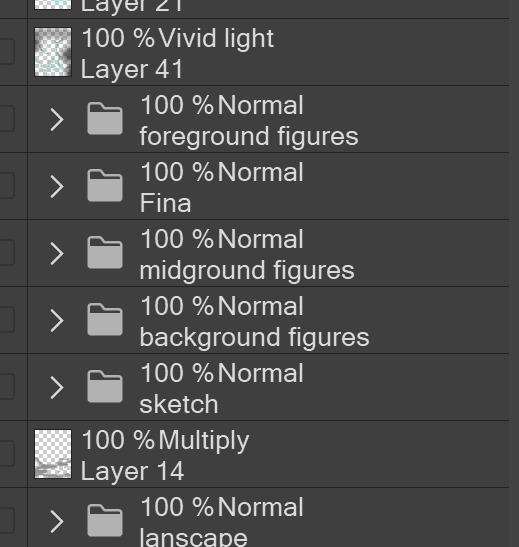
Utilize that research and images you collected to pose your characters. I create subfolders for each set of figures. Organization is important here. This will help keep you on the right layer and prevent the eternal digital artist struggle of “Fuck that was on the wrong layer!”
Even after you move on to lineart and shading, Keep the sketch layer as a reference. You may need to see what youre original notes/ figures looked like as you do the lineart and shade. Don’t be afraid to move them around and alter the composition rn. You want to be able to make changes. Make notes! Detail light sources!
I’m about to through out some art jargon:
You want to think about asymmetric balance. The easiest way to achieve this in an eye-pleasing manner is to use the Fibonacci spiral. Yeah. This boi:

Place your figures and actions in a similar sequence to the spiral and the viewer’s eye tends to naturally follow it. This is sometimes called the Golden Ratio in the art world.
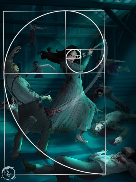
Doesn’t need to be perfectly on the spiral. You can break it- but its an excellent tool to plan how things move in the piece.
Step 4: Lineart
Once you got things sketched- its time to do the lineart. I’m using clip studio paint’s standard brushes. Nothing fancy. I often switch between the G-pen and the For Effect Liner. Mapping and Turnip are for thicker lines.

Usually I set these pens to a specific thickness depending on where I’m drawing.
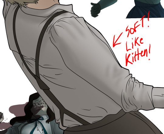
My background figures are lined at 0.05 thickness, the midground is .1 to .2, Fina is .3 and the foreground is .4. I set my stabilization high to help keep my lines smooth. Stabilization 100 means there’s a significant delay between where the pen is and the cursor. I like the stabilization to be at 20 for freehanding and at 50 ish for outlining. Dont become completely reliant on the stabilization though. Good and smooth lineart is drawn from the arm not the wrist. Your range of motion is severely limited if you only move your wrist. Practice moving from your elbow and you’ll be surprised how much smoother your lines get.

Once I finish lining the figures, I usually go around it with an outline. This does three things:
1. Solidifies the figure and cleans lineart for paint bucket tool. More on that in the next step.
2. Its a stylistic choice. Helps give it that comic book feel with a heavy outline.
3. Pushes figures forward or back in the composition. Thicker outline helps denote that a figure is farther forward than another. My background figures have no outline to push them away
Step 5: Digitally coloring
For each figure you are going to select outside the lineart.
Create a new layer under the lineart
Invert the selection. Paint bucket. You should now have a solid shape of the figure under the lineart. Do not deselect.
Create a new layer above the one color. Title it solid colors. Paint in thick, solid tones. I like to use the mapping pen and turnip pen to color in my solid tones: skin, clothing, hair, etc.
After that, deselect. Create a multiply layer if you can. If your program does not have a multiplier function, Pick a tone you want to use for shadows and lower the opacity (usually 30-40% I like to use lavenders or blue tones). It will not be as vibrant, but you can edit it in post. Select off of the solid colors layer. I like to start with skin tones. Use the airbrush tool to create soft shadows. You don’t want to create harsh lines on this layer.
Then repeat this process with harsh lines.
Then knock it all back with an overlay. If you dont have the ability to create an overlay, you can again drop a solid color and lower the opacity, but you’ll have to mess with the color balance/ brightness/contrast to let all the hard work come through.
You’re going to repeat this for every single figure. Here’s a few color theory tips though.
Your overlay colors should be darker (not more vibrant) in the foreground and lighter (avoid using pure white) in the background. This helps with the depth of the piece. Things closer tend to be darker (not always true, depends on lighting)
You can choose to use color theory to aid your shadows. Instead of choosing black or grey for shadows, choose a complimentary color. I used a lot of green for this piece, I used red for really dark shadows. Its not that black drains color- its just loses some depth if not used carefully.
Keep your colors consistent. Helps unify the piece. You can strategically break the consistency to draw focus. For example, Fina is the only figure with a true blue overlay. This helps her stand out from the other figures who have reds and greens.
Step 6: Touch Ups and Final Renderings
Now comes the most tedious part. If you’re like me, your computer fans have been whirring for the last few hours trying to render this monster of a file. If you havent already, SAVE FOR THE LOVE OF ALL THINGS GOOD

These are the last four layers I have for the entire piece. Here, I am trying to create effective and believable lighting. This kind of work I have only been able to achieve in clip studio or photoshop. You can do it with normal layers, but choose your colors CAREFULLY. Stay away from pure white. Carefully utilize your knowledge of light and shadow to create soft highlights. Harsh lines tend to be a stylistic choice for me. The final layer, subtract, dulls out harsh red tones. I used this as a final overlay to help put everyone and everything in the scene. Without it, things are a little too green and skin tones are a little too blushed for vampires.
The challenge here is I want to tone down the red, but not lose the vibrancy of the blood. So, shift it to a blue. This also helped reinforce the “nighttime” effect. Its only a slight change.
Final thoughts:
Whenever you finish something, its important to reflect.
1. I am so FUCKING PROUD OF MYSELF. This is easily one of the most complicated pieces I’ve done in a while- and I’ve made 16′ tall faux stained glass. Brag. Let yourself feel awesome cuz you just made something awesome.
2. I timed myself on the piece. I could have easily spent another 7 hours on it. But its important to know when to stop messing with it. Partially for budget reasons but also when you get down to the details you can make yourself go insane. Theres also a ton of detail work I lost cuz of overlays or its just too small to notice. Fina’s face? hard to see cuz its not close enough.
3. I needed to take frequent breaks for this piece. That was good. Resting and stretching was very important. That is one of the reasons why I was able to work so fast.
4. I started doing more digital art in April 2020. I have to say, practice makes perfect. I practice drawing and digital painting for at least 3 hours a day.
That discipline has allowed me to improve so rapidly. So- I don’t wanna hear shit about I can’t possibly get this good! Or I couldn’t even draw a stick figure! BULLSHIT. You can. Get yourself some free software like Krita or Autodesk sketchbook and start playing!
And thats what I got! Thanks for coming with me on this long post!
27 notes
·
View notes
Text
Yuumi’s art process (with pics!)
This is how I go about doing the art palettes, and generally how I do art (specially on lose, not so long pieces such as these). I’ll breakdown the process under the cut so I don’t spam people’s timelines (´・ω・`)
I was going to put these final advises at the very end but someone else might make use of these instead of going through the whole thing so here:
Important things to keep in mind in case you’re learning and actually think I’m worth being listened:
References are GOOD. No one is perfect and no one knows how to draw stuff from their memory so go google weird things, Google-sensei won’t judge. Hopefully. (else set your navigation on private).
Brushes and whatnot don’t make the artist, but it sure as hell help you feel like you’re doing what you like or not. I can’t stress enough how many times I’ve just not finished works because my brushes felt “off”.
Posemaniacs is very good for both anatomy and speed practise (I’m aware I’m really fast compared to my fellow artist friends but by no means it’s a standard, I just got used to work fast uwu)
Be careful with your wrist!!! use your whole arm when drawing!! and also T a k e · b r e a k s.
Art block is a bitch and strikes anyone. I’m usually artblocked but if you find something you’re passionate about go draw that, whatever it is. (I hadn’t consistently drawn in p much 5 years after college and thanks to MLB season 3 here I am LOL)
And now for the actual breakdown:

Step 1: Sketch
My first step is the sketch, which some of you might think “but it’s SO CLEAN!!”, yes, sometimes I leave my sketches as lines and polish them a bit. Anyways, these is what my sketch looks like and next an important thing:
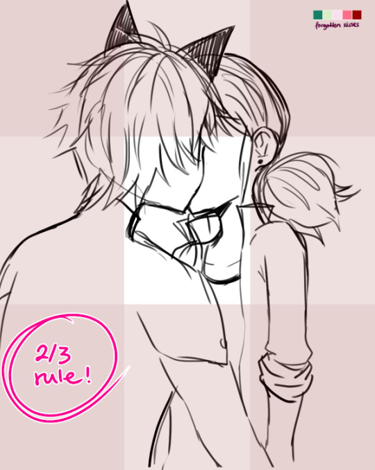
...which is the 2/3 rule! Photoshop blabbery ahead, tl:dr how i made the grid
I’ve been doing this small trick by filling a layer of any color, lowering the opacity to 50% and transforming it to 33,33% it’s height duplicate and place on each side of the canvas and then merge, and then another layer doing the same but doing 33,33% width instead of height. Then I merge both layers, set the opacity to 30% and the result is that perfect 2/3 rule.
If you don’t really know what the rule is, I kindly suggest this instead of my explanation bc words are not my forte.
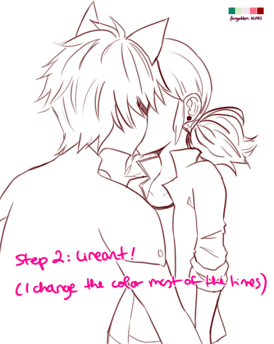
Step 2: Lineart!
Nothing to say here other than cleaning the lines from earlier with a different (or the same in this case) brush as the sketch one. Opacity varies from day to day.
I have several styles of lineart and they all come with the mood I feel on that day, so don’t be afraid of experimenting and finding what you like most! I personally like thin lines a lot but also thick lines too! i’m constantly looking for the perfect line™ and to give an idea this is what my brushes look like:
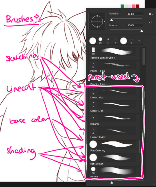
in summary, practise with as many tools you can find around and see which ones you like most uwu

Step 3: Base Color
This is probably the part where I give up the most bc it boooooores me LOL. I try to spend as little time as possible in order to overcome this step. These are usually colors I use in 99% of my pics, since... idk years. If you look in my old arts in twitter you’ll see them haha.
Something important I’d like to mention here is ✨LAYERS✨:
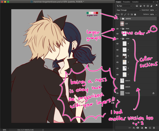
This is how my layers look like in the base color part. I tend to do 1 for skin color, 2 for hair / eyes, 3+ for clothes and stuff. I tend to separate them in colors so they don’t merge! I go with numbers because... I think it’s faster to type and I’ve been using this way of naming for years so it works for me, what matters is that you group your layers and keep them organized uwu (specially if someone else has to look at your psd files >>)

Step 4: Shading!
Normally, I shade every single layer with a proper shade but on the case of the palette challenge I’m doing just the skin because I want to stress the light mood. Liiiike if I want to go with a softer light I’d use lighter shades or a stronger light = stronger shades. To pick colors, I usually go with that brown from Chat Noir and Marinette’s jacket as my universal black (I don’t like working with black, I’m weird), and most of the colors I just eye pick from the Color Picker on Photoshop. In the right you can see my swatches:
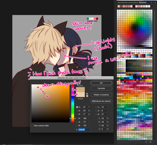
To choose the shade tone (in this example we’ll use Chat Noir’s hair), I picked a Yellow -Adrien’s hair is specially hard to color ugh- And then with that same tone I’d choose its shade going diagonally looking for a darker tone. This way you can find interesting colors! On this pic I did that for Adrien’s hair and... the rest I did the following:

I did my lazy shading™ : which consists in a layer set to Multiply with 50% opacity (this varies depending on the light, again), and I shade everything with the same tone (my to go is purple, but sometimes I use other colors too). This gives a sense of uniformity and the resulting shades are way nicer in my opinion.

Step 5: But Yuumi... where are the palettes???
I take that people straight handpick the palettes and use them to shade all the way and I respect them for that. I instead decided to do whatever floats my boat so I color regularly but add the palettes over the whole thing to change the overall mood and colors of the illustration. I randomly use the Gradient Tool and use the palettes’ colors around and then set that layer to Screen, Multiply, Focal Light, Overlay... etc etc, whatever I feel like doing in that moment, and so the magic happens! :’D
I don’t usually do this on my works but this is a new way to experiment for me and I’m having fun with it!
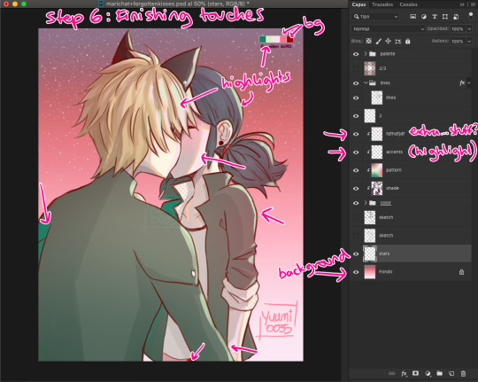
Step 6: Finishing Touches
Here is where I use the palettes the most, adding random highlights in whatever way I feel like. Yep, I pretty much Ladybug my whole coloring process: Wing it and go with the flow™. I’m still learning about lighting and whatnots but I really don’t care at this point LOL
To which you’ll say: But Yuumi?? In art school they told me that---
To which I say: shhhhhhhhhhhhh assigntments are over for me. go watch some Bob Ross (I am serious). Do whatever you feel like. Be happy. No one is going to judge you, and if they wanna judge they better be paying for your work first. so. whatever you do: BE HAPPY. or don’t do it. unless it’s a school assignment, in that case go do it or i’ll kick your ass.
✦ Finishing Notes ✦
So yea, that’s my art process in how I’ve been doing these Miraculous Color Palettes and generally how I go about my illustrations most of the time. For more complex illustrations, I need to remember how I did those (oops). And actually, do them. These illustrations usually take up 2 or 3 hours to make, on other pieces i’ve been working on them for up to 8 hours, it really varies from piece to piece, but I hope this was helpful!
Please let me know if you have any questions, commenting in this very post will help me -and others?- keep track of things and learn together! My asks are also open and I’ll reply as fast as I can uwu (my requests are still waiting there, don’t worry).
aaaaand that’s all, folks. Stay Peachy!
53 notes
·
View notes
Text
Devlog #34 - Status Update, Character Design, and UI
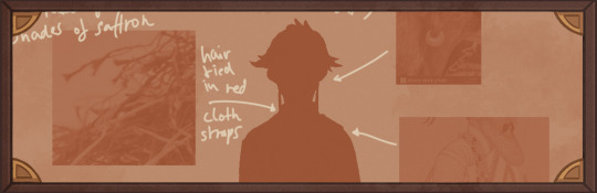
Hello! It's time for another update on the development status of Brassica. It’s also our first actual devlog purely about Brassica!
After working on separate projects for a while, we are now in the process of getting back on track working on the same game again.
Because of that we're happy to announce that the rest of Brassica's Act 2 will be released in March!
It grew a bit in size from what we originally planned but that just means more game for you~
The exact date will be announced when we can more clearly estimate how long the remaining tasks will take but we're in the process of finishing everything up so it shouldn't be too long.
As for Act 3, our current plan is to release it in April. From now on development should be a lot faster but because we mainly worked on it on the side until now, that is still only a rough estimate. We'll definitely keep you updated on any developments regarding the release dates though!
Well, and that's about it for the status update. Because it's been a while since our devlogs actually described much of our development process (and we haven't shared much about our thought processes behind Brassica), we decided to bring that back with today's devlog.
PECTIN will tell you a bit about Saffron and his design while eZombo describes the development of the UI.
So without further ado, here we go:
Art - PECTIN
Saffron is the curious prince the player takes control of in Brassica. Before I began concepting him Felix and I defined his character. At this point we already knew he would be one of the princes Sappho tricks into going on the journey. (And would then fall in love with another prince because YaoiJam'18). We soon agreed on naming him Saffron. So I already associated the colours of the spice "saffron" with him here.
We also wanted to make him a protagonist with his own personality. Thinking of the player who role-plays him we thought it would be cool to have his character split into three separate personalities he could have:
- the cunning and a bit wild prince
- the typical goody two-shoes type of hero
- and the soft boi who's overwhelmed by the whole predicament and really needs a hug
Another external influence was, my intention to try and fuse traditional things with modern sportswear. Brassica is a fairytale but it's told in a contemporary voice. That's where the idea came from.
...Okay. So I had his name, colours I could associate with him, the three archetypes and my goal to fuse sportswear with traditional clothing. Having all of these "pointers" I began looking for reference pictures. I browsed through online stores of popular sports brands to find things that would fit the character. Due to Saffron's character ranging from cute to rather untamed (in the sense that he would climb a tree without hesitation) I thought that wearing shorts would be most suitable and comfy. But for the top and the overall outfit I wanted to let myself get inspired by traditional elements. The name "Saffron" reminded me of the spice and then its use in Indian culture. I never designed a character with Indian influences before and thought researching into that would be interesting. I found a lot of stuff I could translate into the design. Even the leggings Saffron wears were intially inspired by my findings about Indian culture.
Here's a visual breakdown of what inspired what (excuse my srawly handwriting >-<):

During the process of drawing out his design, as I always do, I thought about how each component of the outfit would "flow". There're lot's of lines and intersections in his outfit that guide the eyes along the his body:

And here is our boy again as a sprite. Not much different right? Here I put one of his hands in his shorts' pocket, because I think it would suit someone who is either unsure and does that or feels liking hiding something.
That's it about Saffron! I could go on about his colours but I'll save that for when I explain the general artstyle of Brassica! :3
UI - eZombo
Because Brassica was planned as an entry for Yaoi Jam 2018, we thought about ways to keep the scope small. One idea we came up with was to reduce the size of the screen that shows backgrounds and characters so producing the art is a bit faster than filling a full HD 16:9 canvas. One inspiration for that was Sticky Zeitgeist by Porpentine & Rook but something like the Undertale console version where the graphics at the border of the screen change based on the in-game location was also something we considered.
When it came to actually planning the screen, Undertale's influence came through again, because the main area of the screen actually has an aspect ratio of 4:3. This obviously leaves a lot of unused screen space but one thing we knew we could definitely use to fill this was the text box. Having it separate from the main screen also made sure that it didn't overlap with the characters or backgrounds so the space that was reserved for that could be used to its full potential.
With two elements already on the screen, we still had the sides to fill with content. Just using graphics as borders definitely was an option but because Brassica's story plays out a bit like a road movie, we thought having a map of the game world would definitely add to the feeling of that. And to make the UI visually more balanced again, the last bit of free space was then filled with some information on the time of day and how many days were left for the quest of the princes which basically added all the important context for what is going on in the center of the screen.
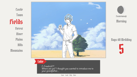
A first mock-up of the UI featuring a familiar face and St. Bernard...
Around that time, we also developed the idea of presenting the whole game screen like a paper or puppet theater. This seemed like a good way to bring all these different elements together while still supporting the colorful fantasy-ish look of the game art.
I did a quick sketch of how this could look, which turned the mock-up into this:
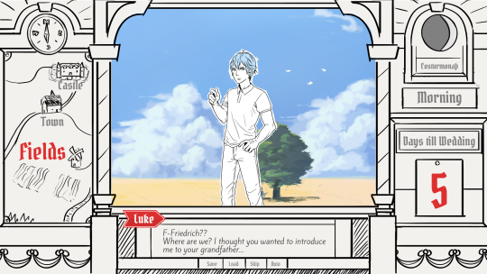
Aside from adding some more purely graphical elements, I adjusted the text box and the flag that showed the name of the character that is currently speaking.
The map was graphical now instead of just a list (which would have given away future locations) and I was overall fairly happy with the direction the UI was going in.
A few of the border elements overlapped with the main screen now but I tried to make sure it only happens in areas where we wouldn't put any focus.
After getting some feedback from PECTIN I then went on to work on the final lineart while also trying to simplify all the shapes. By then, the characters were also being concepted so instead of Luke I could put Ode into the mock-up (along with a reference for a possible background style).

As you can see, some unnecessary lines, elements, and text were removed to simplify the look of the UI and make sure that the important elements aren't overshadowed by anything else. Overall I tried to keep the lines clean without making them look overly sterile, so any round shapes are generally drawn freehand instead of using any vector shapes. Except for the compass, moon, and their enclosing arcs. Those just looked sloppy when they weren't exact. Not using fixed line widths was another way to make the lines more organic even when they were perfectly straight.
The idea to use different colored flags for each character also came into play now, although Ode's color here is actually used by Hans now…
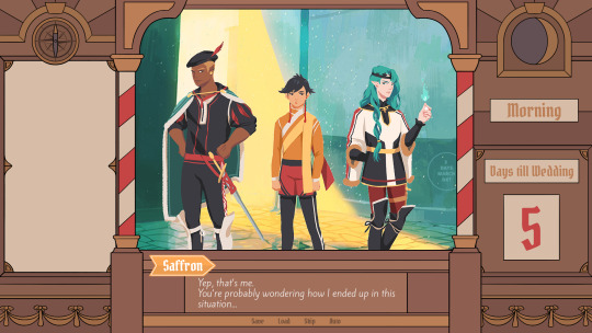
Colors were next on the agenda. First a basic pass, followed by some adjustments and line colors to make the lines fade more into the background. Having the concepts for the three princes was very helpful for this step because it was important that the UI colors fit into the overall color scheme while keeping the focus on the actual game art.
That's why red is only used close to the center and for important UI elements (the current location on the map is also marked in red). The rest of the colors are rather muted and monochrome on purpose with only a little bit of gold to break it up.
Throughout the whole process my main references were old paper theaters but especially during the coloring process I deviated from these references in favor of using colors that would match with most backgrounds.
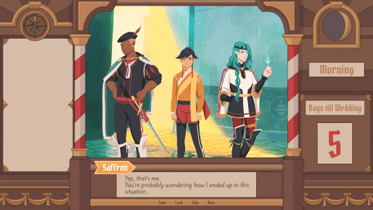
Once we were happy with the colors, I did a relatively quick shading pass, just adding shadows with a fairly abstract light source to keep most shadows parallel to the lines. I also added some subtle noise to make everything look a bit more organic.
For the most part it still looked too clean though, so PECTIN suggested overlaying the UI with some watercolor textures.

Which lead to this final mock-up and not only solved the problem but also gave the UI a more painterly look that didn't interfere as much with the general artstyle.
Well, but as always, there are still a few things that changed on the way into the engine.
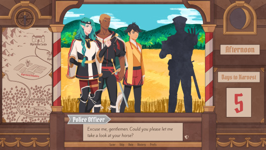
The map was obviously added (which could probably fill a devlog by itself), the text on the side was changed to better reflect the current quest of the princes (although the other sign may or may not return in future acts...), I added a CTC icon and updated the quick menu (although I can't remember why "Load" was removed so maybe that will return again), but most importantly:
The text box was reduced from three to two lines of text. This wasn't as much an active decision as it was caused by the fact that small line spacing in Ren'Py cuts of parts of some letters until all lines of text are displayed. There are some games that still do this but personally I don't really like how it looks while the text appears. Increasing the textbox would have caused a lot of work because I would have had to shift around more elements of the UI to keep a balanced layout so it was simply easier to remove a line of text and increase the line spacing.
This had a pretty strong effect on the writing because sentences have to be fairly short now or if that doesn't work, broken up into multiple lines.
Even if it wasn't exactly planned, it still influenced the writing style of Brassica and further distinguished it from our other games (although there's more to say on that one) and in hindsight, only two lines of text also look a lot cleaner in this layout.
I could go on about the actual implementation of the UI but this has already been a pretty lengthy post so maybe I'll save it for another devlog.
But that's it for now! We'll be back in two weeks with some more development insights and our current status. We also plan to start posting these devlogs regularly again, so stay tuned for that!
As always, thank you so much for reading and we hope you could find a few things of interest in this devlog.
#brassica#fairytale#devlog#gamedev#game#development#otome game#romance#tutorial#visual novel#indiedev#indie#okay
8 notes
·
View notes
Note
Thank u for that sweet sweet awase content, I love that boy
Thank you for liking it!!!! :O
Anon said:Do you take constructive criticism? (Not a joke lol actually curious)
Nope. Since I don’t study art, I’m not currently actively trying to become better at it, all I do is doodle whatever silly idea I have at the moment without an actual clue of what I’m doing while at it and post it cause people seem to like it when I do, concrit is literally the last thing I need. By which I mean, I already know my art could be way better than it is, but getting better at it isn’t really the reason why I’m posting it. To be honest, if I wanted someone to crit my doodles I’d sign up for an actual class to have a real teacher tell me how to get better, I wouldn’t turn to the first random anon on tumblr with no way of proving to me they have any more clue about art than I do
Anon said:Imagine this, Kirishima with really long hair
No need to imagine it when @50shadesofhq already did such an amazing job drawing him~
Anon said:Hey!!! I want to thank you for...existing 😁 Tonight I was feeling really sad and finding your art has “brought me back to life” so as to say, so thank you. Your art is incredibly good so please keep believing in yourself and your skills, and keep making beautiful pieces like you are doing now 🤗🤗🤗
Thank you!!!! So much!!!! I’m glad my stuff could help you feel better ;^;
Anon said: hi i just wanted to let you know that you're one of my favorite artists ever and you make so much good content for so many fandoms that i love like i first found your blog through haikyuu!! and then i found the bnha and now yowapeda and everything else aaaaaa i'm rambling now but whenever i see your art it makes my day and j wanted to say that by e
!!!!!!!!!!! glad you like my stuff!!!! and mostly glad you like ywpd, that fandom feels so small honestly!! :D
Anon said:Hey I just wanted to let you know that I love all of your artworks with all of my heart and it always makes my day a bit brighter to see that you have posted something new :)
Oh man thank you so so so so so so much!!!!! ;O;
Anon said:I'm not even all that familiar w awase but I'm still blown away by your drawings of them they look !!!! So good !!!
THANK!!!!! YOU!!!!!! He’ll play a nice part at some point next season, I hope you’ll end up liking him!!! ;u;
Anon said:I love seeing that kiribaku at the top of your art blog (at least on mobile??). It makes me feel so warm the moment I check your blog. (Still love the old banner too tho!!!!)
I’m glad you like it!!!!! Warm colors make me feel good so I wanted something like that on my blog :D one day I’ll change the icon too..... one day........
Anon said:I LOVE YOUR ART OK?? AND I MAY HAVE JUST SPENT TWO HOURS SCROLLING THROUGH YOUR BLOG BUT OH MY LORD IS IT WORTH IT. You are an amazing artist and I hope you have the most wonderful and brilliant of days. Ps. Thank you for giving bakubro the love he deserves PPs. Your jirou drawings make me unbelievably happy
THANK YOU!!! THIS IS SUCH A GOOD ASK I’M HAPPY THANK YOU SO MUCH!!!! ;O;
Anon said:Do you still headcanon baku and Mina as dragon shifters or is it just Kiri at this point? (I still freaking love tiny dragon baku lol)
Yes and no! My fantasy drawings aren’t exactly telling a story, so I’m doing whatever with them - it’s not really headcanons, it’s just me playing around with any idea I find entertaining at the moment!! So yes, definitely, Baku and Mina as dragon shifters are still a thing I love a lot and I might draw more in the future! But that doesn’t exclude me drawing for the AU in a setting where only Kiri is a dragon either~
Anon said: Ur dragon Kiri half-shifted made me have this idea : if he n Baku r cuddling and he's like that and Baku feels an itch, he'll just rub himself against Kiri to do the scratching (Kiri isn't even bothered, nor complaining, Baku kinda looks like a cat when he does that and he's in l o v e)
You know anon, considering Kirishima’s quirk Bakugou could technically do that in the original universe too hahaha
Anon said:More band au bakushima pls!! 🙏 My crops are dying
Anon said:You better do the after show of the band AU or i will die. I mean... i already die with Bakugou say "pretty boy" to Kiri, but you know.... please do the after show asdfghj
Maybe soon!! I don’t exactly have a clear idea of how that plays out, but I enjoy drawing Bakugou like that so why!!! not!!!!
Anon said:I live for your art! Thank you for creating such amazing content ♥️
SOB thank you for liking my stuff and letting me know you do!!!!
Anon said:HOOOLLLYYYYY SHIT, THAT SKETCH OF BAKUGOU W THE HELLA EYELINER AND THE TATTOOS??? I AM SHOOK
GLAD YOU LIKED HIM!!!
Anon said:Oh mamma the way you draw Kiri’s forearms! Le swoon 😍😍😍
!!!!!! He’s a buff boy after all!! :D
Anon said:Are you okay with fans coloring your lineart, or does it bother you? (Not with the intention of posting anywhere, just for fun and maybe to submit it back to you later) I know how you feel about altering your work, but what's the drill for this specifically?
I don’t mind but you have to promise me you’re not posting them anywhere - if it’s just for your personal entertainment then it’s fine, I can’t really stop you anyway, but I really don’t want them anywhere online.
Anon said:Hello! I wanna say your bakugou and kirishima comics are adorable! I wanted to ask, do you think Bakugou would be as open with showing his soft and mushy emotions for kirishima around the others like in your comics? Like how he was okay with snugs on the couch, you don’t think he’d want to be more privet?
Sure, why not? Bakugou’s never hidden his feelings in the manga, nor has he ever felt embarrassed by them! He’s a bit awkward in showing affection I guess, but to me it feels more because he isn’t used to it than because he wants to hide it - if he were to start dating Kirishima he’d definitely have no problems with letting everyone know they’re in a relationship of that sort, I think :D well, it’s just my interpretation of it anyway haha
Anon said:Your art is just so beautiful, Im iN LOVE I CANTNWKWISIWIKW PLS KEEP DRAWING
I CAN TRY !!!!!!!! Thank you so much for the support!!!!
Anon said:Do you ever get that feeling when you have a ship and you see art for it and suddenly you get hit with a "oh fuck I really love them" cause that happens every times you post kiribaku ! I always get butterflies in my stomach when I see your art, you make the cutest scenarios and you keep their personalities right it never seems ooc. You honestly make the best comics/art I'm so glad you're in the bnha fandom
Oh my god thank you so much!!! ;A; sob
Anon said:you've heard of jiroukami but have you considered: jiroushido
Yup! I’ve also drawn them in the past!! They’re in my MinaJirou tag :D
Anon said:your band au is officially my favourite thing on this site i love it and i love you thankyou
Thank you so much holy heck!!!! ;O;
Anon said:Your art is so cute and makes me smile everytime I see it! Thank you for always making my day better!
Ahhhhhhhhhhhhhh!!!!!!!! I’m!!!!!!!!!!! Glad !!!!!!!!!!!!!!!!!!!!!!!!
Anon said:I’m so gay for your art it’s so fucking sexy dude
Oh my g od are you sure the word you meant to use is sexy I’m ??? !!!!
Anon said:Consider,,,,, bakugou with glasses
I did draw that in the past!!!
Anon said:pssst fran have u heard that in bnha light novel baku is actually scared of ghost story???
Seriously??? :O is there a translation for that part anywhere online?? :O :O
#fran answers#i just realized the answer about the concrit sounds a bit snappy#that wasn't my intention at all#all i mean is that im a fragile baby that gives herself strength to keep posting and drawing#through knowing this is a place for sketches and doodles of dubious-to-low quality#i don't really need to change that or put pressure on myself to try and be good#when i know i'm really not#the moment i'll wish to change something in my style i'll look it up and slowly work to fix whatever problem i found#meanwhile im definitely not posting to be criticized over something i never even studied seriously#so there's that#anonymous
162 notes
·
View notes
Text
Updates for TMK and reason for the delay
( I wanted to post this earlier but I fell asleep and wake up like 3:30am )
Hi guys
Sorry for all the slow progress during the past few months
Here is a non spoiler (kind of?) update from my side.
-Detailed non-ending cg sketches for Julius, Seth and August are done.
I kind of go overboard for Seth and most probably will cry when doing lineart and coloring , but that is for another time.
-Detailed sketch of ending cg for Julius , Seth and August are also done . I kind of went overboard for most of the ending so lol
-All backer commissions are done, just need the last backer to get back to me so that I can make changes or send out the image.
I have started lineart some of the cg and if everything goes well , cg progress should be smooth.
I kind of cause myself to burnout recently because I rush to finish the cg sketches asap. Now I kind of think it would hurt the project on a long run therefore I need to slow down my pace a bit.
Also I would like to address about my family issue as stated from the monthly update ( still affect me but not as bad as past few months)
Because I feel like I own reason to all the backers who have backed on why there is a delay in progress.
So here you go.
My Father passed away during August.A lot of things happened and most of them were/are unpleasant. I needed some time to deal with a lots of things that sadden me but I am getting better now.
For now, I need to isolate myself from most of the social media stuff ( except Twitter since I find lots of nice drawing there) so I can concentrate on finishing all the cg.
( I don’t think you would notice but the mourning dress of Lydia Mother was last to be shown in the update, because I could not being myself to draw it , or rather it was half done , and I could not bring myself to finish it after I found out my father’s passing )
If you want to know more detail of what happen you can continue reading the keep reading section . If not I think is more than enough information for tmk. Because everything in the keep reading section is long winded , out of sequence points and lots of bad English lol
He lived in Hong Kong while I living in Singapore. He was uncontactable for at least 3 days before my relative called the police.He passed away alone at his house. He did not pass away in a hospital so the government considered his death as unnatural
Due to all the things happened, (conflict and unhappy moments), his funeral was held on mid September and that why I was away for a week. I went back to my birth place Hong Kong . We were advice not to look at him one last time because the remain had already started to decompose.
A lot of things happened during the funeral and to make it worst when I return to Singapore I had conflict with my mother on how to handle my Father belongings. It kind of made me really depressed.
I tried not to neglect tmk development by finishing the backer commission and wallpaper so I still in touch with drawing .
But in the end the feeling of wanting to give up everything I did was still strong .
It is a kind of depression but I think it is not really serious as I am aware of my negative emotions and try to deal with it.
Then oct came and is time for inktober. :p
I took the opportunity of drawing inktober to do some soul searching and along the way learning some new things .
I also took some time off to see if I can be a part time game design lecturer. Well, I did get an offer but in the end I had turned down the offer.
The main reason is that they are hiring me in hope to keep in touch with my boss ( he is a Lv99 ninja , unless he comes to look for you to talk about business, usually you cannot find him ,he is also a kind of influence on how I deal with a lot of business related things).
The school wanted to send some intern to my boss company and they think it would be easier if I am involved. But no school it DOES NOT WORK THAT WAY lol . My boss don’t entertain such thing .
I absolutely don’t want to get involved of such business because dealing with my boss on this kind of issue as it is really pain in the butt. So yeah I decline the offer.
I familiarise myself with after effect , since basically it work similar to flash it is not really hard for me . The programming part of AE is more like upgraded version and more user friendly version of Action script.
Here is a small animation I did with a test Sprite I did .
https://youtu.be/B5Ch9wThYBk
I did not go in depth to learn more about after effect, but those I learn should be enough for vn making .
Then I move on to unity , which is more like learning c# , as I have object oriented programming background so it is not very bad in learning it.
Also during the end of oct I was lucky to get involved in designing characters for another project . I really enjoyed working with her, as we both share similar visual reference library which I am pleasantly surprised.
And then nov came and I kind of recover from my negativeness and start to work on tmk properly again.
But I need to isolate myself from most of the social media stuff ( except Twitter since I find lots of nice drawing there) so I can concentrate on finishing all the cg.
Thank you for reading till here , since my English is really bad.
One more thing would like to bring to your attention if you are still reading.
After my father passed away I started to be more actively donating to Charity ( previously not as much ), there is one Charity that is really meaningful but unfortunately only available in US only.
It is called Kits for Kids
https://projectcure.org/programs/kits-kids
Basically they give you a list of medications to buy and a box to pack all those stuff. You need to spend the effort and money to buy them send back to the center and they will donate to places in need.
I find this really unique as usually donation just ask you to pay money but this organisation go one step in further. It takes heart and effort to make this donation happen.
So if you are in US and have some spare cashes and time with you, I hope you will consider to donate to this “kits for kids” , it helps to save young live in many different countries.
19 notes
·
View notes
Last Seen Blogs
wasleichtesart
art sideblog // former Wasleichtesdraws
blogquantumreality
Quantum Reality
glorfindels
wish you were here.
imeasygt
제목 없음